#i play on switch that's why the graphics and quality are so bad
Explore tagged Tumblr posts
Text
[now entering: the OPINION ZONE]
the way i feel about Booktok(tm), as a phenomenon, or maybe more as a weird miasma that is seeping through every bookstore i enter, is that we don't see eye to eye. i'm sure it's got a lot more variation and diversity than whatever weird takes bubble up to the surface for my tiktok-less self to stumble upon - mostly i just feel like my motivation for reading books is different than theirs. there is the occasional overlap in the Books I Enjoy / Big On Booktok venn diagram (which makes me feel very weird about those books but that's for me to sort out), but i cannot personally Trust a booktok recommendation, if that makes sense. either way, it's none of my business what other people like to read, and i think me and booktok can peacefully coexist in each our own spheres. (if all of this is completely incomprehensible to you i salute you and envy your peace of mind.)
anyway, a very fascinating discussion that keeps showing up recently is the phenomenon where popular booktok influencers admit to skipping paragraphs that are too long, or only reading the dialogue of a book, or performing shock at a printed book containing Too Many Words Per Page. what fascinates me is not so much that it is happening (though it DOES fascinate me), but how much people reacting to this struggle to explain exactly Why it's so aggravating.
like, i feel like the obvious takeaway is that these people are monetizing their alleged joy of reading, and then... don't? even like to read? that the consumerist aesthetic of Being A Reader is more profitable on a video platform than doing the due diligence of reviewing books properly? that the content machine marches on and if you're too slow you'll fall behind??
INSTEAD the discussion seems to center around the good old "oohh nooo people read BAD BOOKS instead of GOOD BOOKS and IT'S IMPORTANT TO CHALLENGE YOUR BRAINNN or else the MEDIA LITERACY....." and i'm sorry but i think this has been a moral panic for as long as we've had literature. media literacy has never had a golden age that i'm aware of. there's always been trashy romances that authors pump out on the monthly for easy consumption. capitalism is gonna value profit over quality for as long as it's in charge. people who read for fun are gonna read what they're gonna read, and they're gonna read it in the way they enjoy reading. i agree that reading Good Books is deeply fulfilling! but that is my personal and subjective experience that not everyone is going to share.
i think the reason i feel weird about the insistence that you Must, at least occasionally, Challenge Yourself while reading is that... i'm exhausted in my brain. too exhausted to challenge myself for fun. maybe it's a burnout thing. i really really get looking at a paragraph and finding it simply too much to absorb right now. my main method of getting through books these days is in audio format, even if i would personally prefer to read them visually (they'd stick to my brain better, i would see how names are spelled, sudden POV switches between paragraphs would be less confusing). but reading a book in text form is taking me weeks at best - unless it's a special kind of book that i can't help but devour immediately, sleep schedule be damned (which is another toll to pay). some books are just too complex and need too much focus for me to enjoy right now, so i keep having to goldilock my way to what feels Just Right. some books, i'm sure i'll get back to later. some i've made my peace with never picking up despite the fact that they feel Obligatory (my apologies to lord of the rings. i've Tried and i just can't do it). so like i GET IT. sometimes reading is too much.
what i Wish the discussion was more about, was instead finding ways to read that's enjoyable for you. there is literature and screen plays that are Only Dialogue. there's graphic novels. there's audiobooks and e-readers that let you change the font sizes. there's lots and lots and lots of fanfiction that's literally just banter and smut. there's no shame in reading what you enjoy! there's no shame in spending months on the same book! but i suppose it's not as ~Aesthetic~ as purchasing 10 editions of the same book series on amazon dot hell!!!!
#reading books in and of itself is not a moral virtue. it's just a thing u can do#thank you for journeying through the opinion zone with me. now leaving#also personally i can't even imagine skipping a paragraph in a fiction book and that's part of my exhaustion tbh#i remember telling a therapist how i struggle to move on to a next page unless i feel like i have sufficiently absorbed Every Single Word#and i keep getting stuck a lot because of it
45 notes
·
View notes
Text
9th feb '24 - [arch] characters, interactions and emotion - making a mini webcomic
Gahhhh Shri this has been an absolutely crazy couple of weeks!!!! Hope you are doing well :)) First of all, WOW! You have a lot of goals, and I’m sure you’ll get them done! I’ve worked a lot on my graphic design during the process of making Winter Wellbeing. If you wanna see a blog post dedicated just to that, I can do so! It would be cool to compare notes on the approaches we take for graphic layouts. If you wanna share your knowledge of camera skills when you build that up that would be awesome 😭😭
It’s been a tough few weeks, art wise. I have been reflecting on my process, motivations to create, the ego and all the baggage that’s lumped into the creative process for me. It turns out there’s a lot. I took some space from my illustration practise (literally for a weekend!) and began to realise how dysfunctional it is. I’ve been writing a lot about that so there may be a larger piece of writing coming about that at some point (no promises!!)
But for now, let's talk about little successes!
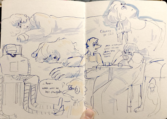
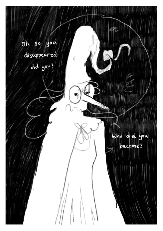
I’ve been playing with some characters for a while but I’d hit a bit of a block with the plot. I realised the expectation of having a finished project of high quality soon is unrealistic, and an unhealthy expectation to put on myself. I rarely give myself time to play with concepts for a long time and let the characters, plot and interactions evolve naturally. Maybe this in part came from sticking to the short university module turnaround. I noticed that that short turnaround was causing a lot of block, so I have decided to bench it as a comic for now and focus on using it as a playground - falling in love with the characters, creating stories and drawing them for fun. Maybe years down the line I’ll make them into a comic - we shall see!
I *tried* to do hourly comics day this year and it didn’t quite work for me. I think I made 3 comics? And then got distracted with a bigger project that ended up taking a week or so to complete. Let’s have a look at it, shall we?
[you can find the full version here]
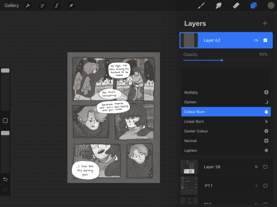
First of all, it’s based on an unfinished fanfiction I started a couple of months ago, which was mostly bad, but there was one nice scene that I liked and wanted to expand on. I started by having a look at the script I wrote and thumbnailing on the iPad. I’m away from home at the mo and usually would prefer to do most of my artwork traditionally, but because I don’t have access to a scanner, the whole process was digital this time. A lot of the pages got scrapped because the dialogue wasn’t necessary, and I’m not drawing pages that aren’t necessary.

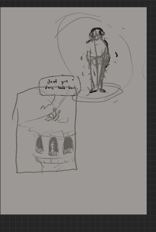
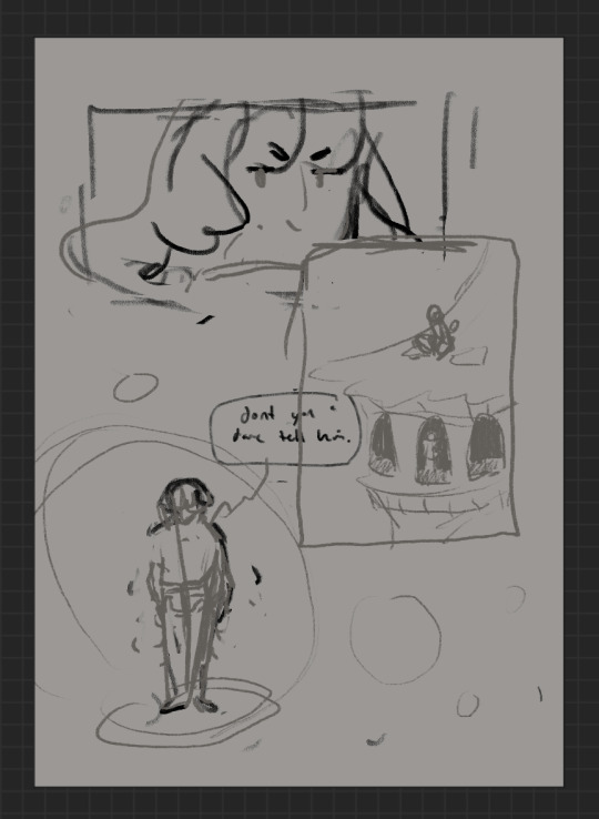
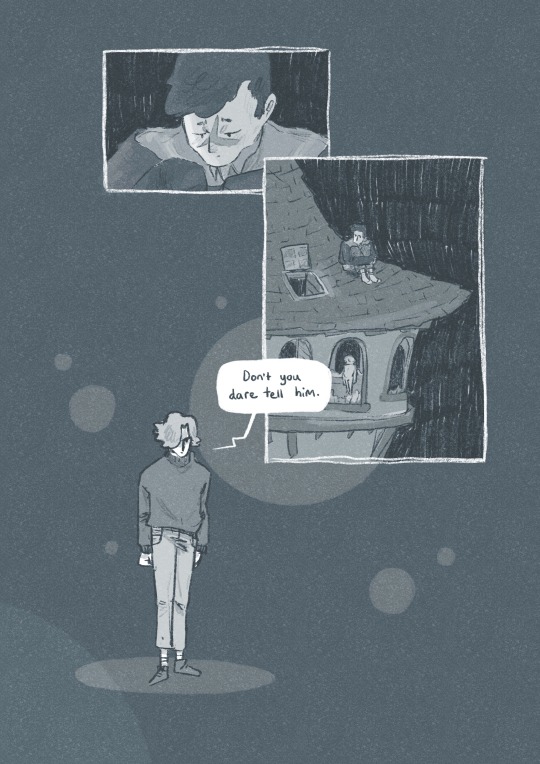
some more development screenshots
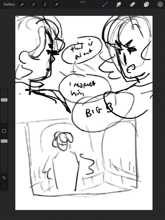

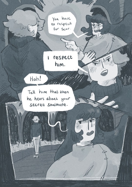
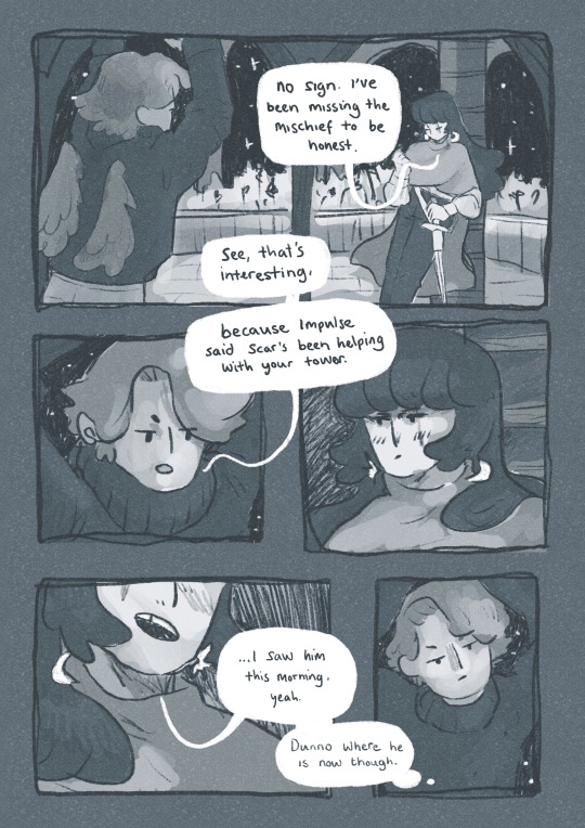
I thought a lot about posing during the process, acting the scenes out in my mind and sometimes physically, really understanding the emotions of the characters, why they’re saying what they’re saying, their tone and how to convey that though their body language and expression (i find grian really annoying normally [affectionate] but I want this grian to step on me).

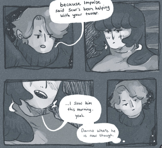
Pearl was hard with this because she’s quite erratic and unpredictable in this series, so I wanted her to switch from raw explodey anger to playful jabs at Grian. I’m hoping this comes across as somewhat insane, rather than tonally off and inconsistent. I did super enjoy drawing her and her explosive nature though, especially in comparison to Grian’s coldness.


I played with levels and monotone colour too - I’m not working with multiple colours much at the moment so I’m able to focus on things like values composition, characters and backgrounds. My skills limit the kind of stories I can tell currently, so I’m working to improve those foundations. Maybe when I’m back in the riso studio I can play with colours a little more.
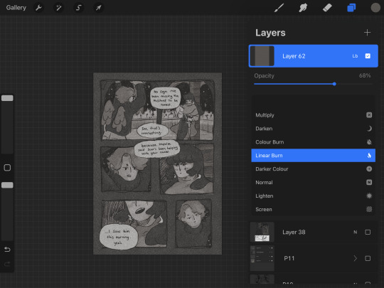
Colours - despite the simple pallete it gets a bit nerdy here.I stuck to specific flat percentages for most of it - Pearl’s hair and Grians jumper are 60%, Grian’s hair and Pearl’s cloak are 20%. Then I added a 14% layer for shadows, using a ahrd blend eraser tool for highlights, making the images quite dark. I fill a layer with texture from Forystr’s riso brush for procreate, and turn it into a 40% opacity colour dodge layer. This gives it some much needed texture and makes the lighting feel low and nighttimecore. It also pushes the values to look really nice - I tend to be too scared to push them by myself.
I tried a few different colour layers to get a *vibe* but settled on a low percentage riso blue in a colour layer. All layers besides the riso blue are in a riso black, colour picked from a riso colour pallete. I learnt these tools - using percentages to get good values - from working with risograph. I really recommend having a look at these techniques and doing some monotone work. It's really improved by character designs, page layouts and compositions.




That's all from me today, though I have had MANY other thoughts over the past two weeks about creating, but perhaps we'll dive into them another time. If you (or anyone else) has any questions, hit me up with a reblog or an ask and I will get right to it. Lovely to hear from you! Hope your art is going great too :)) Arch :)
#archillustrates#arch is learning#project development#art#art process#art resource#process#artists on tumblr#illustration#comic#picture book#small art blog#art blog#illustration blog#female artists on tumblr#queer artists on tumblr#illustrator#book illustrator#female illustrator#queer illustrator#comic artist#comic art#female artists on instagram#artists on instagram#procreate#digital artwork#digital artist#artist blog#artist on tumblr#web comics
28 notes
·
View notes
Text
Why I switched from Choices to Romance Club 📖
I started playing Choices in 2019 and I was always so delighted when they veröffentlicht published a new story. I really loved playing that game, but last year I discovered a girl on YouTube who was posting some let's plays from Theodora and I immediately wanted to try this game.
~ The graphic is waaay better and more realistic.
No reused faces nor characters. I am always amazed about every new book and its characters. Even the so-called "unimportant" side characters have their own design and are not reused which cannot be said about Choices unfortunately. 😔
~ Better character development. Your choices really matter and have different outcome for the MC.
The way you interact with each of the characters has its consequences. The LI's also interact like real people and if you date someone and then decide to switch to an other LI, their romance path is closed. You really have to choose wisely for whom you decide to be with.
~ Quality over quantity
I don't really remember how many books are currently published (ended and ongoing) in RC, but it's definitely not as much as in the Choices app. I HATE the VIP books and that fact that you have to wait thousand years for it to get widely released! 😵 And when you open the first chapter you see that it's just another single love interest book with some three macho guys you are not attracted to (I respect everyone who's into the standard "sexy" type of men, of course, it's just not me 😇) and three girls from whom you choose the kleinste smallest evil.
~ More accessible diamonds and teas
I LOVE Diamond Rush, Tea Parties and so on 😍 It's sooo player-friendly and so worth it! Even the access to diamonds and teas is more suited for wide audience and honestly - when RC is so generous and want to give you so much for free, then you want to buy some diamond/tea pack from them even more, because you know they value their players. 🙏
~ No single love interest books!
Oh my gosh, I have been so annoyed that most of the books Choices release lately is meant for single romance. The problem is not with faithfulness, but with the fact that everyone has their own definition of attraction and beauty. And most of the main LIs in single love interest books are written stereotypically (Bad Boy, guy nextdoor, rebellious girl...) I miss the plasticity of their personalities, of their appearances. Not everyone who matches today's beauty standards is actually beautiful. There should be diversity in LIs. Some of them should be curvier, more slender, with glasses, with bigger nose, with disability, with albinism... Just go on the street and look at the classic human beauty seen every day in public transport! Stop giving us some plain definition of beauty which lacks its own charm.
The only thing I would improve in RC would be the option to choose if we want to play as a male, female, non-binary...etc. As far as I know, only Gladiator's Chronicles have a male MC.
Now I have some personal highlights about Choices I'd like to get rid of because it's been in me for so long 🙉
First thing's first, The Princess Swap was such a good book. I loved the idea. Still, I've got a certain love-hate relationship with this book. First of all, biology and genetics does not make sense in this standalone. Secondly, lord Cecil was not as bad as everyone thinks. He and the king were my most favourite characters, actually. 🤭 Third, I was so annoyed by the prince/ss of Ismar. We were forced to marry them, we could not even say no.🤦
I loved BOLAS N° 1. I replayed the story twice. I was in love with Tyril Starfury. Even though I loved Kaya Duskraven more. She was sooo gorgeous! When they introduced the sequel to us I was naively hoping that we might get Kaya back. That we would find some magical artefact, for example, and bring her back to life, so that she can join the party and be our new love interest. I would definitely switch to her. Instead, we got Valax... I am a little bit disappointed by the sequel, to be honest. They were promising us so many mesmerizing things and I was just expecting a little more from the three years waiting episode. Not only did I not understand why Cherta and Willow joined our party and then they left afterwards... I was like: okay, new love interests apparently. And then whoosh, they vanished. And we ended up trapped with the Valax-drama until the last chapters... I respect everyone who likes the sequel, it is just not me. Unfortunately. I will stick to the good old first book, which I love. 🩷
#romance club#choices#my story interactive#astreas broken heart#rc heart of trespia#choices bolas#bolas#blades of light and shadow#tyril starfury#kaya duskraven#lord cecil#the princess swap#romance#romance club and choices comparison#comparison#why i switched from choices to romance club#my opinion#rc heaven's secret 2#rc heaven's secret requiem#rc heavens secret#rc dracula a love story#rc kali flame of samsara#rc kali call of darkness#rc time catcher#rc vanora#rc arcanum#rc song of the crimson nile#rc soulless#rc garden of eden#rc astrea's broken heart
15 notes
·
View notes
Text
Wuthering Wave (WuWa) DAY 1 Review

Wuwa finally opened their server today (May 23) so as DAY 1 player I gonna write a little review :
For now I finish main quest and stuck at level 21 quest and already try some bosses too~
PS : if you're Asia players but not JP KR CN I suggest play at SEA server for better connectivity~
For beginner banner I think they're pretty generous, guarantee one non limited 5* for max 50 pull with discount 8 ticket for 10 pull means max pull are 40, after you get 5* the banner gone and change to focused non limited 5*. But if you asked me, most 5* kinda groggy and some 4* are better. Imagine genshin non limited banner and you're good (I gonna take Yangyang route until endgame lol)
And into banner currency, same like most gacha games except guaranteed at 80 pull and they added one more for limited weapon. Tbh I still don't understand for whoever reason they seperate limited character and limited weapon currency...
For story tbh I don't understand anything (lol) but I gonna pointing at skipable story. Yups, some main story can be skipable. Look at left above button from screenshot below, skipable means it just showing us something or any useless info but non skipable means some info important enough to read.
Additionally, all side quest can be skipable~


Nonono even if there's skip button, I won't skip cutie Yangyang holding a cat scene 🤣
Now onto negative things, their loading very slow ! It include entering the game, loading after domain farming, even teleport. Imagine everytime you want to teleport only to wait like the one element attached on right below side Genshin loading.

Resin usage. Or what WuWa called it. I know it's 240 energy but it balancing with 60 cost energy every raiding an ascension and weekly boss... But if we think we don't need to farms relic artifact means it's balancing each others
This one more into bugs/their developer side don't know but for mine it's clunky movement, my joystick movement kind of slow respond means sometimes I can't walk straight or climbing switch to glinding even climb straight on ladder...
(this bug seems exclusive for android only, so yeah too bad on us android user lol)
Plus low graphic eventhough I use medium quality, my eyes hurt bc of blurness everytime I want to see anyone faces... This one need to fix asap, I'm one of players won't read any stories aside main bc of can't look straight at NPC blur face~
Aside that I like the gameplay, despite their clunkyness movement, the battle phase which pretty same like HI3 PGR are unbelievably smooth. Which indicate more question like why their normal state are more laggy than battle one (lol)
Plus good test run with how to use their characters. It have the best ways to show players how to use each of them in simple ways and it still one of my many question why Genshin can't add their test run character just like WuWa and HI3.
Verdict : I know this sounds like die hard fans but from WuWa I just realize what a breakthrough hoyo makes with Honkai and Genshin...
For how long I gonna play this game I guess depends, if nothing much change in one year eventhough I just got Jiyan it means uninstall. First of all, please fix clunky movement and graphic problem or Kuro just throw an useless money on this project~
Oh and adding can't play more than half hours per day, better take it slow I guess~
5 notes
·
View notes
Text
a drunk, rambling (of both positive and negative sides) of pokemon scarlet (my pick) and violet. spoilers ahead under the cut. you’ve been justly warned
tl;dr up front, this game in terms of Story, Characters, Battle Mechanics, and new changes to the overworld far exceed the lack luster trash that I think gen 8 is. as i make my next sandvich to feed to the stupid lizard i named Heavy because of its addiction to said sandviches i think about what this game has brought to the table, and it’s got a lot of filling in it,but arguably its execution of has been for some funny, others an embarrassment, and others still, a blatant showcase of why first party pokemon games are going the Way of the Dodo in terms of quality.
it has been Five days since generation 9 has had its rather divisive release into the public space, most certainly one of the most anticipated releases for the switch this year, and for a not insubstancial vocal contingency have been raking it over the coals for a lot of reasons, predominantly performance and graphics issues. its so hilariously bad on this front because the frame rate dips, shadow rendering and sometimes piss awful rendering speeds make the game look like something out of a goddamn steam greenlight submission (remember those????). now see i dont normally even care about that sort of thing or can just easily ignore it. except this happens so frequently i cant even go a few minutes without something getting choppy. and yea when it comes to a first party nintendo release fuck up should be a badge of shame we should put not on gamefreak but rather the fucking corporate investors that forced an obviously crunch-induced deadline. it has all the hallmarks of a game put under crunch, and while GF is quite famously press shy (especially after the dexit thing last gen), so we’ll probably not know the whole story unless someone does The Game Journalist and digs up as much of the story as they possibly can.
but alas i dont play pokemon for graphics. im mostly into battles and well, I was actualyl pretty surprised with some areas and parts.
i actually really like the idea of terrestalizing, and changing a pokemon’s typing to another thing. it opens up a lot of strat and team making that suddenly some mons which may have been held back by massive type weaknesses can now suddenly get a chance to shine in ways never before possible. the game really doesnt do it much justice since they basically treaded water for a majority of the big fights, but some notable outliers are out there. but some fights are a fucking joke at the point you reach them; WHY THE FUCK WOULD YOU PUT A FUCKING ***GOGOAT*** ON THAT PERSONS TEAM WHEN YOU LITERALLY COULD HAVE PUT ANYTHING. FUCKING. ELSE. ON IT I SWEAR TO FUCK I AM GOING TO CHOKE A FUCKER. that one battle (if you know you know) was so underwhelming bc of that team line up i still wonder who thought HM WE SHOULD DO THIS FOR THAT BATTLE.
the real strengh of gen 9 is in its story characters in multiple fronts. After the fucking embarrassment of a rival that was fucking Hop, you’re greeted out the bat with a Champion rank trainer who basically just wants to Battle All the Things and wants a challenge again. This would be annoying as Nemona pops up all over the bloody place and at times much like the Hopeless Hop, but instead she tries to actually build the player character to reach her level so she can finally have the real challenge again. it doesnt actually stop with nemona either, you also get introduced to Arven, a young man who is so Done with the Stupid Sanvich Addicted Lizard that he just gives it to you and now You have the unsubtle legendary which you can just ride in plain daylight and nobody bats a bloody eye. his line involves finding The Perfect Food Ingredient for personal reasons that also happen to be important for some reason. and then there’s the whole thing with Team Star, which as you progress you actually get a thing where, depending on how well your time in school was, you may very well understand and appreciate whats going on there. unlike every other pokemon game out there, there’s no hard order for you to do things. if you wanna march right up to the strongest gym leader, the only thing there to stop you is pokemon well above yours in level, and the fact you will Get Your Shit Kicked In(ask me how i know). there’s rewards for talking to things and doing things unrelated to the main story line(s!) and taking a bit of time away from the battle and world to read things is a good way to get some decent rewards early game. and the final areas are actually p. gud in terms of what they bring to the table, its what happens after the main story where things get Meh and enough for me to put down the game for a few months.
The (non performance/bugs) weakness of gen 9 right now is the lack of a real postgame. even sword and shield gave you a Battle Tower to just keep doing things. but after you clear every thing leading to what i see as the final task, you basically only have the tera raids and a tournament thing to do. and let me tell you those tera raids at their highest levels are, at the time of writing, are impossible to solo for me. you gotta have Friends to do em afaik and one fuck up or RNG Bullshit.tm will halt a run instantly. i don’t enjoy em, and since I have seen all that i deem to be seen for now, I am back into Monster Hunter Rise/Sunbreak where i am now mercy-killing infected monsters. There’s obviously going to be DLC for this game at some point, but lets face it with the Amount of Bugs currently plaguing it, i dont see that happening any time soon. closing notes, i know some of the tunes are bugged, but some of them are really, really fucking good. one of them beats out the famed Gen 5 tune for that type of trainer. if you know, you know and i will die on this hill that gen 9s is better than gen 5s. fight me. i also have found three shiny mons after not encountering a single one since 20-fucking-10. a Summer Deerling, a Houndour and a Skrelp (oooo!)
final drunk noivy ratings Story: 9.1/10, probably one of the strongest ones since gen 5 Battles: 7.5/10, terrestalizing is a cool concept, but the game doesnt deliver on it well enough anD SOME OF THE FIGHTS ARE A FUCKING JOKE, FUCKING GOGOAT MY FUCKING GOD. but some of the fights are up there in difficulty graphics/performance: lol its better than sword and shield. and then some. that first bar isn’t hard to clear for me. but it does enough out side of the glaring bugs to convince me that yea it was ok purchasing it day one. probably won’t do that for gen 10.
2 notes
·
View notes
Text
I played the sonic frontiers demo on switch and why is the graphics quality so bad...is it bcs it's a demo? Or is the final game like that as well?
1 note
·
View note
Text
what's been totally fucking batshit to me is that the ports/remasters of Rune Factory 3 and 4, fucking DS games btw, make my surface hot as a goddamn oven. I would literally have less of a problem just emulating the game. Other games of similar quality do not do this.
I can't run slime rancher 2 on it at all and even my actual fucking gaming PC can't run it nearly as silky fuckin smooth as slime rancher 1 even at the lowest settings. Maybe this is a slightly unfair comparison given slime rancher 2 isn't done, but at the same time, if they're not optimising their code from the start they're going to run into the same issue the among us team where the code is so jank that they'd have to redo it anyway, and that just wastes time.
There are some things that are just not super possible on old hardware. My dell pc can't play most games because it doesn't have, like a separate graphics card (or something. i don't honestly understand it). Won't even run sildurs shaders, which are the lightest shaders around.
I actually remember I couldn't run Starbound and Chrome at the same time on the dell. I couldn't do Minecraft and chrome either. I could also only run Minecraft if I also had optifine installed, presumably because there was some horrible jank related to the graphics code that optifine fixed. I shouldn't have to use mods to make the game run right!! This was at the time a computer that should have been able to handle these games just fine! Starbound is LITERALLY pixel art tf you mean it lags really fucking bad if I have the wrong thing open.
Shit like minecraft shaders and not being able to run Vampyr are why I ultimately upgraded.
Chrome running as ass as it does is a pretty big reason why I switched to Firefox even though Firefox doesn't have tab folders like Chrome does (which is a crime btw).
Putting the game's default settings in the middle or, god forbid, the highest settings, instead of starting them at the lowest so that the player can actually move if their computer struggles at higher settings is also a really annoying and stupid choice that I've seen made over and over and over and over again. If the graphics are making my computer lag really badly, it's going to be horrible and hellish to try to change the graphics settings.
Btw 25 kilobytes in the original Super Mario Bros
we should globally ban the introduction of more powerful computer hardware for 10-20 years, not as an AI safety thing (though we could frame it as that), but to force programmers to optimize their shit better
#important#ive actually like...#genuinely developed a love for older style games#cavern of dreams and super kiwi 64 and pseudoregalia and corn kidz 64 and the like#i dont want perfect and realistic volumetric lighting in my stylised farming sim#realistic lighting in slime rancher 2 would probably not do anything for me#i honestly think games should look a little worse#the n64-like games don't literally kill my surface#i figure they were doing their best to work by the constraints of that system#so shits tight and relatively well-optimised as best as indie devs can do
230K notes
·
View notes
Text
This Paper Mario Remake needs a more unique Spin
I had a lot to say about the Super Mario RPG remake last year, and I can’t find it in me to feel the same way about Paper Mario: The Thousand Year Door. I guess because it’s not that much different overall to me. It didn’t get a graphical overhaul in the same way. It looks better for sure, but it already looked great before. SMRPG was a game I didn’t like the look of and the remake fixed that completely for me. The gameplay is basically the same. There are quality of life features sprinkled throughout, but none were a real game changer. The framerate is lower now, but I barely noticed. The story is basically the same too. The translation is the biggest highlight for me as now Vivian is explicitly trans which kicks ass. The unique battle themes are also a huge plus. I wasn’t super impressed with a lot of the remixes, but the new stuff was great and it gave me the option to just switch back to the OST.
It’s not a bad thing that this game isn’t dramatically different than the original. This was already a fantastic game, so there wasn’t much to add. I think I’m just a bit disappointed that the one issue I have with the game still remains. You just move too fucking slow. It takes forever to cover any ground. If this game wasn’t as long as it was, it would be acceptable, but this is a chunky game compared to the older Mario RPGs. and while Yoshi alleviates this in chapter 3, it's still a character you have to switch to, and switching to a character takes time to do. It gets tedious, especially when you don’t want to use them in combat. The spin in Paper Mario was vital to the quality of that game and I still don't know why they took it out. Even if it wasn’t actually that fast, it felt fast. It felt like you were blasting through the world at breakneck speeds. They could have not made any of the changes they made and just released a rom hack that had the spin from the first game implemented, and I would have happier. I don’t care if it gets me canceled, I will sacrifice any amount of trans representation if it means I can zip around Rogue Port with the press of a button. This was the true eye opener after playing this game for like the 4th time in my life. Bring Back The Spin Nintendo.
0 notes
Text
Dragon's Dogma 2 thoughts:
Personally I love the game. I was goofing off in the free character creator before the micro transaction fiasco started and was already a fan of the first game and intended to play. The whole "no fast travel" thing sounded like a load of bullshit due to ferry stones being a thing in DD:DA.
1: There IS a fast travel system. HOWEVER not the way gamers are used to. You can go to a few predetermined hubs and can make up to 10 custom fast travel points using an in game item. The item used to fast travel does cost money and is a one time use. There are the oxcarts that travel only during the day between predetermined locations and can be attacked en route by monsters. This is intentional. You are supposed to run around exploring and fighting and levelling up. Not zipping around the map. Is it tedious? Maybe. But I personally feel like Bethesda spoiled a lot of rpg players with a freebie fast travel system as long as the location is discovered.
No access to character creator after starting. Not immediately no. You have to make it to the first major city. But there is a book that is available for purchase to allow you to change facial features, body shape and skin. It's not too expensive either. It's just that the currency is harder to come by if you aren't using the online pawn loan system. Still can't get your pawn loaned? Make a mage with all support spells and decent armor. Hell, even my archer has had me rolling in Rift Crystals. But you need to think about what other players need for party synergy. You can also get it in chests via exploration. Even if you don't want to do all of that. A barber can do basic cosmetic changes for you and your pawn for 10,000 gold. Which is fairly easy to start raking in with quests and taking out goblins. It's not difficult.
It's goofy. Yeah it's a Capcom game. It's a little goofy. In the same way eastern fantasy doesn't translate well when written by a western creator the same can be said in reverse. It's not bad. Just a tad goofy.
You can't pick your stats to boost. You can KIND OF. When you level up, your stats increase at predetermined amounts based on the vocation you are playing as. So you probably will get waffle stomped by an ogre if you played 60 hours as a mage, switched to warrior and didn't have the base stats to make it work. But that's kind of why you need to be a bit more fluid with your game play and level up all of your vocations evenly. It's a VERY different levelling system so I get the frustration but changing vocations is encouraged by the game.
The economy is an economy. You unfortunately can't just steal everything and sell it for gold. In fact the game has some restraint and has no standard stealth system. You actually have to work for the money.
The graphics are outdated. Start a 20 v 6 That spans the map with magic effects filling the screen and never experience a SECOND of frame loss and you will start to appreciate it. I personally think the game looks fine. And I turn off most post processing in every game anyway because bloom, lens flare, and all of the other stuff gives me a headache and doesn't add much in my opinion. But the game can go from "Me and the lads running around" to "Me and the lads, 6 wolves, 8 goblins, 5 bandits, 3 harpies, and a cyclops from the top rope" very quickly so lower graphics quality for better performance suits me just fine
All in all a lot of the complaints seem to stem from the game requiring you to actually play and put in the work to gain money. You have to quest. You have to explore. And for that work you have to actually be decent at combat. And I think a lot of people are used to being able to fudge the system to over level early in the game and that's just not feasible here. So I feel personally it was just Capcom being impatient and releasing the transactions on day one. They should have given it 2 weeks to a month and felt out the player opinions before releasing micro transactions.
TL;DR
The game requires you to play it to continue. And it's a design choice that Isn't popular in the age of "broken builds" and cheesing gameplay.
Of course these are my personal opinions. I love the game. I even restarted on a 112 hour play file because a character I liked got kicked out of his home and was sad. So you know. I feel like a lot of people are frustrated by the fact that the game won't let you cheese the system for an easy way to get what you need. It requires you to put in the work.
0 notes
Text
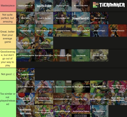
My loz tierlist
Thoughts under the cut!
Masterpiece: Ocarina of Time is my favorite Zelda game, and I know it is at least partially due to nostalgia, but it holds up so well today and is still an absolute joy to play. Personally I think it is the peak of 3D Zelda, i give it 10/10 in every category across the board - dungeon design, overworld, plot/dialogue/side quest stuff, music, gameplay… tears of the kingdom may also be one of my favorites due to recency, and not nostalgia, but I find it very difficult to believe it will ever diminish in quality greatly over time. There is so much to do, and it really took what was good about botw and made it even better. I was in awe the entire time I played, and I will only continue to play it as time goes on, coming back to it again and again. I think there are a couple nitpicks the game could improve upon but it is an excellent early swan song for the switch. Botw, truthfully should be somewhere between masterpiece and not quite perfect, simply because totk improved it so much it’s harder to go back to it. But it was also an amazing journey.
Not quite perfect, but amazing: wind waker is a game i so desperately wanted to put in the masterpiece tier, but simply was unable to do so. There are several frustrations I have with the game that stop me from calling it perfect. I only had the GCN copy, so perhaps the Wii U version fixed these issues, but slow sailing, the triforce fetch quest, and how aggravating getting all the pictobox collectables are dampened my enjoyment. However, I want to emphasize that the dungeons are nearly on par with ocarina of time here; that the graphics are beautiful and aged well even on GCN; and that the music is a true delight. It’s why I recommend it to everyone, if you can handle these annoyances littered throughout.
A link to the past is another game I wanted to call a masterpiece, but had to settle for second best. I replayed it 2 years ago and while I had as much fun as the first time, there were surprisingly a couple parts that did not hold up as well as I remembered! Mainly, a couple of dungeons (fuck skull woods) and overworld progression. However, like wind waker, the highlights of the game are unparalleled and when the dungeon design is good, it’s fantastic. Majora’s mask is a very unique Zelda game, one that I personally champion, and like wind waker, it just has some imperfections that do frustrate me going back to it. For example, the tight time limits on dungeons (especially that godawful great bay temple) were agonizing, especially if you were trying to get every fairy. It was also hard to keep track of all the side quests, even with the 3ds journal. But it is such a special game!
Skyward Sword is a game I’m glad is being reevaluated now that it’s on switch with options for no motion controls and less of Fi. Because it’s amazing! I will never forgive anyone who told me the game was bad! Unfortunately, after games like botw and totk it makes the “open-ness” of the world feel very small and limiting; the great sky is empty and barren, and the surface being separate regions kind of hurts. Late in the game, it also gives way to padding; I think the spirit trials were terrifying and very cool, but “you’re trapped and now you need to find your gear again!” And “find all the stupid little tadpole things I forgot what they were maybe they weren’t tadpoles!” Was just so unnecessary. And I do not want to even talk about the imprisoned’s toesie-woesies!!! Kill me!!! But the rest of the game is so good it nearly makes up for all of it!!
Great, better than your average game: the minish cap is a game I remember very fondly, although not without a few gripes. I think the npcs and hyrule town are some of my favs in the franchise, and I actually enjoyed for the most part the Kinstone quests. But after playing parts of it again recently, and watching videos on it, I acknowledge it has faults that stop it from achieving true greatness. Phantom hourglass is also a game I think was great, at least partially because you made your own maps. I love making maps! And the gameplay was good! But my god, the ocean tower…. An absolute slog! A nightmare! Evil! The first Zelda is so simple, but holds up as being very fun even today, despite its shortness; of course it belongs in this tier.
Links awakening dx/hd had some amazing moments, but a few bad ones too. I either loved or hated the dungeons, some of the side quests were mehhh, but the overall game is delightful. Hd is recommended because you can have more weapons equipped at once! A godsend! Spirit tracks, it didn’t particularly stand out to me much, but I did have fun with it! And the Oracle games I am a fan of, I think they’re good but have a couple limitations from the hardware that irk me. If they had remakes, I think they would actually go to near perfection tier for me! Who knows!
Good/Average: I have a confession: I am not a link between worlds lover. I enjoyed it quite a bit when it first came out, but going back to it has been hard; I don’t get very far before dropping it. It feels kind of like a lesser link to the past, but with a worse central mechanic. I liked the non-linearity, but disliked having to rent items, and it meant that the only upgrades found in dungeons couldn’t be items you need for progression, really. A shame, because the dungeons could be quite good. Four swords adventure is good, but it’s such a hassle finding 3 other players and setting it up! I was never able to complete it. The adventure of link is rather unique, but not bad; in fact I liked the metroidvania elements! It’s worth playing, but will not blow your mind. Lastly, twilight princess… this may surprise you, but I was never a big fan. It’s so slow! The opening makes me tired thinking about it. I also felt the graphics aged poorly, and while the dungeons are good, they aren’t nearly as great as other games have been. It’s all very disappointing.
Bad - tri force heroes was bad I am not explaining why. You agree.
1 note
·
View note
Text
I've seen plenty of bad takes on this accursed website before, and this isn't even close to the worst ones i've seen, but it still baffles me nontheless.
Like firstly the "shorter game and with worst graphics"part in the context of pokemon is hilariously, because while pokemon games aren't THAT short (althought they aren't very long either), if modern pokemon game had worst graphic than they already have, you would think they came straight out the WII era.
But that's nothing really compared to how infuriating this line of thinking is. So according to this post, the reasons a lot of video game devs are paid like shit for their work and have to deal with ludacris crunch time on a consistent basis is apparently because their games are too long and with graphics too elaborates. Two problems with that.
Firstly,there are plenty of game with both longevity/depth of content and great graphics made by people who weren't treated like shit in the process of making them. Now whether or not those games are exceptions to the rule is another question entirely, but the fact that they even exist allready somewhat disprove this line of thinking.
Secondly, and perhaps most importantly, even if we heeded this posts advice and lowered the technical quality of games. Game companies would still pay their employes like shit and crunch the shit out of them. Because why wouldn't they? How does lowering the technical efforts required to make a game impact the profit insensitives which are at the sources of those terribles work conditions in the first place? If video games took less technical efforts to make, companies would just see this as an excuse to pay their employees less and give them tighter deadlines. Ironically, Pokemon is a perfect exemple of this. The recent pokemon games have often been criticized for being pretty abysmal from a technical standpoint, especialy compared to other games on the switch. And yet pokemon devs face time crunches that might be worst than for most other game companies, including those who make games that are strictcly superior to pokemon games from a technical standpoints. If pokemon game had gamecube era graphics and could be completed in 1 hour, then pokemon games would come out every 4 months and pokemon devs would be paid approximatively 7$ a month.
The only answer to the terrible work conditions plaguing the industry is to make it so game devs are paid what they deserve for their work and to put regulations in place so that companies may not be able to impose such time crunches on their employees. Lowering the technical efforts required to make games won't change anything one way or the other.
But the thing is, like I said, it's not exactly the worst take I've ever seen, I think it's wrong or at least terribly misguided, but at least it's (somewhat) got the spirits, at least it is standing up for the devs. What really makes me frustrated however isn't exactly the argument and the fact that it's, in my opinion, misguided, so much as it is the reason for why it ended up being misguided.
Maybe i'm playing armchair psychologist a bit too much, but i can't help but feel like the reason why "pokefanchick" posted a meme saying texto "the sources of the pokemon devs' problems is that the pokemon games are just too good" is because they are part of this group of people who simple CANNOT admit that a pokemon game might be bad, even with all the evidence to the contrary and even with the knowledge that it cames from a team of devs crunched out of their mind, the games MUST be good for them, it simply can't be otherwise. And so, it is without much surprise that, being allready fonded mostly on denial, the position of "pokemon devs are overworked, but the games are still good" devolved into " pokemon devs are overworked because the games are good".
Even if I'm making too much of a reach and their reasoning didn't take this exact path, i can't help but feel like the general logic of this post is still "yeah i kinda want to stand up for the gamefreak employes, but most importantly i want everyone to know that I think the game they have slaved over is actually very good", and that's what frustrate me.
What frustrate me is that the reason why this posts miss the point regarding the working conditions of the gaming industry, is because it's more concerned with trying to argue that a mediocre game is good actually. It feels equally if not more concerned by a 4/10 piece of software than it is by how game developers are squeezed dry of the sweat and paid a pitance. And because of those misplaced priorities, it ends up completly messing-up the point it's trying to make. That's what relly annoys me about this post.

ugh
#Long post#pokemon#seriously#the staunch refusal of a lot of pokemon fan when it comes to even beginning to think that a pokemon game might be bad#makes it nearly impossible to have a worthwhile conversation about how gamefreak employees are treated#or anything of the like#their insistence on defending the games pretty much always make the conversation deteriorate one way or another
17K notes
·
View notes
Text
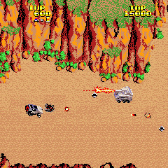
Break Thru
Developed/Published by: Data East Released: 1986 Completed: 18/04/2023 Completion: Got to the end by feeding credits. Version Played: Retro Classix / MAME Trophies / Achievements: n/a
Stop! Before you read this, you should know that you can only order a physical exp. 2601 from my ko-fi shop until May 1st! Remember, as a subscriber, you get 35% off instantly!
You may have seen recently that the “Retro Classix” line of Data East re-issues, available on GOG and Steam, are being delisted at the end of April, and wondered “should I get those before they’re gone?” Well, I’m here to answer this, because I took a cursory look at them, downloaded the one that I think is earliest in the Data East chronology (Express Raider might be earlier?) and gave it a shot.
No. You don’t want to get any of them. Break Thru is probably the worst retro release I’ve ever played! To be clear, I’m not talking about the quality of the original game (which I’ll get to–it’s no great shakes, but it’s not the worst I’ve ever played) but the release, which is bare-bones to the extreme. Buy this and you get the arcade rom… and a 3D arcade wrapper that makes it feel like you’re playing it in Grand Theft Auto 3. You can, thankfully, turn that off, but what you can’t turn off is terrible smeary graphic smoothing, and you–at best–have to mitigate it by also using the included CRT filter. Now, I’m not a fan of “perfect pixel”–I prefer even a weak attempt at a CRT filter, usually–but the one here is nasty (maybe even worse than the Astro City Mini) with horrible curvature and a general dullness.
And that’s… it. There’s no save states, no dip switches or settings, nothing else. You'd be better off being handed a zip file with the rom in it.
I’m not entirely sure of the provenance of this series of Data East reissues. Before the Retro Classix line these were all included in the similarly weird “Johnny Turbo’s Arcade” series for Nintendo Switch, which all seem to have been yanked from the eShop at the end of October 2023 (which is after the Retro Classix versions were put on sale.) I assume that whoever has the Data East rights has been selling them off cheaply but with limited and non-exclusive rights, which is why you get things as tossed off as this, but it’s interesting to note that the Johnny Turbo’s Arcade releases managed to have better graphical options and save states, so they at least did the bare minimum.
(Though it gets odder. The Retro Classix versions were also on sale on Switch until November 2023, from the same publisher as the Johnny Turbo’s Arcade series, “Golem Entertainment” though they all have the same crappy emulator wrapper as this release, even though the at least slightly better Johnny Turbo’s Arcade versions were already there. Confusing!)
Anyway. You now know to let the Retro Classix line go off gently into that good night in the hope that the next suckers to buy a job lot of Data East releases goes to the effort of putting them out nicely (I’m looking at you, Digital Eclipse). But should you play Break Thru anyway? The answer to that is… also no!
Gradius was released in early 1985 and set the benchmark, and this doesn’t even reach the lofty heights of Sega Ninja. A side-scrolling shooter with five levels, the “twist” here is that you’re driving a car, though the stand-out thing about the car is that it does two things that cars don’t normally do: it shoots bullets and it can jump, awkwardly, into the air. The latter quirk is supposed to be the highlight–as you now have to leap over obstacles, and can even leap to land your car on enemies and squash them.
There’s one power-up (a three way shot that’s generally on a timer, but sometimes it isn’t) and a small number of enemies. Shockingly, there are no bosses.
The thing about Break Thru, really, is that it… sucks. There’s little to no variety, the enemies don’t do anything much (only a few have interesting attack patterns) and the controls feels so bad that I actually had to test this release against the MAME release just to make sure the emulation wasn’t fucked up here. I mean, to be fair, the emulation could be fucked up on MAME as well, but the car in Break Thru controls horribly. You can speed up, but it feels like it makes everything on the screen speed up, and there’s no sense of friction. You get the idea–that you’re supposed to speed up to dodge bullets or enemies–but it just doesn’t seem to work.
In fact, once you know the levels, the majority of Break Thru is absolutely trivial, with the only speed bumps the few enemies that you only seem to survive randomly. There’s a helicopter that I couldn’t kill that you just need to be lucky to leap past, and a gauntlet of small tanks in the final level that almost goes full bullet hell.
I guess there’s actually a wee animation at the end to make this feel worth beating, but without a final boss or anything it feels wildly anti-climactic. Everything about this, really, is just very, very bad.
Will I ever play it again? If there really is a Digital Eclipse Data East collection I’ll boot it up… once.
Final Thought: Something else a bit strange: there were 17 Johnny Turbo’s Arcade releases, but only 12 “Retro Classix” releases, which is why I picked up Break Thru and not Shoot Out (I think the earliest of the Johnny Turbo releases.) I have spent too long thinking about this!!!
Hi. Thank you so much for being a supporter. I'd like to ask you for one more favour--could you check out the fundraiser my best friend Steven is running to help cover travel insurance costs? I know there are so many deserving causes, but Steven has a stage 4 brain tumour and it would mean the world to me if you considered donating, or sharing his page, to help make his remaining time the best ever.
#gaming#video games#games#txt#text#review#arcade#break thru#retro classix: break thru#retro classix#data east#1986
1 note
·
View note
Text
My opinion about Another Code : Recollection Part 2
Now... the bad part...
- Negative :
Pretty but empty The graphics are prettier than the OGs. but it's like I said, it's empty. It feels lifeless. It works well with Two Memories but with R... It just feels weird. Some of the objects are also in a lesser quality than it was in the OGs, it's less detailed and blurrier.
Missing cutscene There's was some missing bit in Two Memories but I was very disappointed in R for not putting some of my favorite scene. /!\SPOILER for the Another Code R (Wii)/!\ At a specific moment in the game, Ashley talk with Matthew about D. It was short but I really liked this scene and I had the hopes they'd talk about it more... But it was cutted out instead. They also deleted lots of scene with Charlotte and memories of Sayoko. /!\END OF SPOILER/!\
Missing Location Like the title say. I was surprised at all the place missing. I remembered there was a little shed?house? before entering the Edward's Mansion, it wasn't there. There was a round room with painting and birds statues in the middle of it, as the first room you visit in the mansion, again it was missing.
D.A.S too powerful It's very specific but I didn't like the fact that they changed some of the puzzle to "let's use the DAS who now has this special option to resolve it". Again, it's only in Another Code R that it bothered me. In the Wii version, there was other means to resolve some of the mysteries and it felt more believable, than a convenient application that will resolve everything.
Missing Puzzle I understand it wasn't possible to put every puzzle in the game, but some of them were important to reveal some things in the story. I know it was difficult to "translate" them to the Switch, so that's why they changed and cut a lot of things but I really liked some of them a lot. And now it feels less like a puzzle game but more like one with some puzzle in it.
Missing interaction It's kinda linked to my "Pretty but empty" point. They kept some objects like a desk with lots of drawer, papers on it and picture on the wall on top of it but you can't interact with everything anymore. You'll be able to touch 2 max then move on. So, Ashley won't be able to say little things about them anymore. It's also kinda linked to the "Missing Puzzle" point. At some point you can see pictures of the Captain from the first game. You can only interact with one of them. The second one, where's he's with a woman (Rosa, a character from Hotel Dusk, another Cing game), you can only try to guess what you can see from the picture from afar because you can't touch it and Ashley won't react to it.
Loss of DS & Wiimote mecanics This was bound to happen; I was prepared for it but it's still a shame to see it. I really liked how they used the full potential of the DS and Wiimote and it's nice to see that they tried to do that with the Switch but it's sadly not the same.
Wobbly ending for Matthew's story This is what pissed me off the most. I've always wanted to see his story's ending for YEARS. Since I've first played Another Code R... And to see this... I kinda think it would have been better left alone and for him to never have a conclusion if it was to do this kind of end. It feels rushed, flavorless, unoriginal and too easy. Before it went to financial bankrupt, Cing had announced that Ashley's story was over but were planning his own game for Matthew. So, to conclude his story in an easy way within a few dialogues when he was supposed to have his own full-length game... Yeah. It pissed me of.
End of Part 2
---
Part 1 - Part 2 - Part 3 - Part 4
#another code#another code spoilers#another code spoiler#another code recollection#another code r#another code two memories#trace memory#my post#ramblings
1 note
·
View note
Text
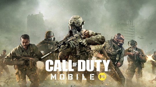
I don't know if I have said this a lot here but I tend not to play a lot games on my phone as I am really not all that big into the mobile game stuff as, in my opinion, 98% of mobile games are either terrible or are littered with constant, annoying ads that one is forced to watch a million of. Anyway, out of curiosity, I decided to give Call Of Duty Mobile a try and here are my thoughts on this one.
Graphics: for a mobile game, the game doesn't actually look all that bad. Yeah, it's one of those mobile games that boasts about having console quality graphics and I'd say the graphics are close to like PS3/Xbox 360 era which is pretty decent for a mobile game to have.
Controls: I'd say that the controls are fine enough at best. There's the option for simple controls and advanced controls. They have a virtual thumb stick on the left side of the screen and on the right is the ADS, fire weapon, jump and reload buttons. The only difference between simple and advanced is that advanced gives you a button to fire your weapon whereas simple lets you aim at an enemy and the weapon just fires at the enemy you are aimed at. The middle of the screen from left to right is your scorestreaks, switch weapons and grenade. Also, the top right of the screen is where your like operator power weapon is. It's not a terrible control layout but it can lead to some issues I have found. This games causes my phone to warm up and that causes my finger to stick sometimes and sometimes makes screen taps not register. The point is that when I tried playing CoD Mobile with a controller is was SO much BETTER, it's like a night and day difference. I used a PS4 controller. R2 & L2 are ADS and fire weapon, R1 & L1 are grenades, X is jump, square is reload, triangle is switch weapons and the D Pad are the scorestreaks and that makes playing the game a thousand times more comfortable to play, so much so that I need to keep playing it this way.
Maps: It's a pretty decent selection of maps here but the problem is a lack of creativity because all of one map is actually original and the rest are from past CoD games. I don't remember the names of all of the maps but they are from CoD 4, MW2 (2009), MW3 (2011), Black Ops, Black Ops II, and Modern Warfare 2019 and I am pretty sure that is it. The maps are small to medium size and that works here with matches being 5V5.
Music: The music only exists in the main menus and is pretty awful if you ask me. I really love rock and metal music and this game uses this generic rock music that just isn't very good at all and doesn't make me think of CoD at all either. If they're so obsessed with past CoD games in this one, why not use past CoD game music for this one? What's worse is that when you get into a match, there isn't any music at all and that makes the match feel kind of lifeless to me.
Weapons: The weapons all look pretty good. I do find it weird how a lot of the weapons do not have their proper names anymore. I recently unlocked the SCAR but it has a completely different name and that seems weird to me. Did CoD like lose the rights to actual names to these weapons that they use the designs and just name them something else? They all sound pretty good too but they sound better in the PC & console CoD games.
Modes: I'm sure it's obvious but, this game doesn't have any kind of single player campaign and I feel like that's expected. Multiplayer has a lot of different modes like TDM, Free For All, Kill Confirmed and so on. There's also the Battle Royale and I have no idea how that is because I've not tried it because I don't like Battle Royale games. The last thing it has is zombies which I also have yet to try. I am not a fan of CoD zombies but I will probably give it a go at some point just to say that I did.
Overall, I think that CoD Mobile is a pretty decent little phone game. The thing is that I'd really only recommend this to people who are obsessed with CoD and people who can only play games on their phone because I'd definitely highly recommend a controller for playing this game and that's not something I'd recommend to someone who plays mobile games casually as a controller that connects to ones phone isn't cheap.
#video games#mobile gaming#call of duty#call of duty mobile#fps#the dragons speak#Call Of Duty#Call Of Duty 2#Call Of Duty 3#Call Of Duty 4: Modern Warfare#Call Of Duty: Modern Warfare 2#Call Of Duty: Modern Warfare 3#Call Of Duty: World At War#Call Of Duty: Black Ops#Call Of Duty: Black Ops 2#Call Of Duty: Black Ops 3#Call Of Duty: Black Ops 4#Call Of Duty Black Ops: Cold War#Call Of Duty: Ghosts#Call Of Duty: Advanced Warfare#Call Of Duty: Infinite Warfare#Call Of Duty Mobile#FPS#Activision#Sledgehammer Games#Infinity Ward#Video Games#Call Of Duty: WWII#Call Of Duty: Vanguard
1 note
·
View note
Text
Pokémon opinions coming in
Here’s the thing I do like what I’ve seen so far in terms of content and such. It has some neat new mechanics and content. It would be great if not for some serious problems overshadowing the good
The problem is it’s at best annoying to play and at it’s worst borderline unplayable at times because of the enormous amount of technical issues.
I’m legit going to wait till they (hopefully) patch the game to play any more of it because I got that annoyed with the frame rate and general glitchy, buggy gameplay.
I’m just gonna go play some of the older Pokémon (on switch) games. Fresh start baby, starting with Let’s Go Pikachu! :)
But seriously it’s inexcusable to release a game in this state. I genuinely think they need to let go of their release a game every year model.
I get that they want to keep content for all Pokémon media (the card games, anime, other games spin-offs etc) flowing but it’s just not working anymore.
They need more time or they need a bigger team (or both). It’s irritating because people would be willing to wait longer for a polished game that works rather than getting a game that doesn’t more quickly.
They’re a billion dollar company. There’s no excuse.
I don’t think it’s necessarily the Switch’s fault. I agree the Switch needs an upgrade in general but I don’t think that’s why it’s struggling to handle Pokémon Scarlet and Violet. It handles games that are a lot bigger and more detailed fairly well all the time.
It’s just poorly optimized, rushed and unfinished because of time constraints.
That’s not most of the team that’s working on the game’s fault of course. It’s whoever sets the damn deadlines and makes it into one Big Crunch fest.
The pure potential Pokémon has now that it’s on something that can handle so much more than a 3DS can…they’re wasting it.
I loved Sword personally. Unpopular opinion I know. It had its issues but I genuinely found it fun and really liked the characters. I was able to mostly ignore the bad because I enjoyed the good so much.
I can’t do that with Scarlet at this point in time.
I could also talk about the graphical fidelity and animations in Scarlet which is a lesser issue but one that’s noticeable. It just doesn’t..look great in a lot of places. Pokémon games have never been games you constantly fawn over the graphics in but I would enjoy a visually pleasing game nonetheless
I don’t mean hyper realism or anything obviously. I just mean a rich, detailed world that looks good.
Some of it is so low quality I’m like how can you put this out without being ashamed, Gamefreak? (The Sandwich eating animation haunts me)
There are games that look gorgeous on the Switch, so again there’s no excuse. Pokémon Snap is so goddamn gorgeous and I get it’s a spin-off game and they don’t have to focus on as many mechanics, the gameplay, etc as main series games…but they /could/ look like that if they put the damn time and effort in.
Imagine a rich beautiful world with Pokémon running around and interacting with the environment, with each other, with you like in Snap in the main series game.
Also I know I know people are tired of hearing about the National Dex but personally I think they should have all Pokémon in there (I thought this with Sword and Shield too) I don’t care if it takes longer because they have to animate and create more models. I’m willing to wait.
(I don’t mind if some pokemon come in later expansions either as long as they do make it into the game. That’s actually probably the best way to do it so it isn’t overwhelming)
I admit I’m not a big fan of the crystallizing gimmick this time around or whatever it’s called. I think it’s kinda underwhelming? They should have kept dynamaxing imo. The different forms were neat and who doesn’t like giant Pokémon?
People complain about the gimmicks but they’re usually pretty neat it’s just annoying how they’re thrown out never to be seen again next generation? I mean obviously we can’t have them all in one game that would be convoluted, overwhelming and overpowered but still. Maybe some should stick around.
Also In the list of issues this is pretty low but I think it’s time to introduce voice acting too. It’s starting to look weird lmao. (Flashbacks to Piers in Sword visibly singing with no sound coming out of his mouth) Again this would lengthen production time and be expensive but it would also be a nice improvement. (Billion dollar company they could definitely afford it)
There’s lots of other features and improvements I’d love to see but more than anything I just want a game that’s playable.
They really did take a good step in terms of content and gameplay but it’s overshadowed by the technical issues
1 note
·
View note
Text
POV you're my cat sleeping peacefully in your little hammock in your cat tree and I come say hi to you


#fortnite#cuddle team leader#rift tour#fortnite rift tour#fortnite chapter 2 season 7#fortnite c2s7#i play on switch that's why the graphics and quality are so bad
6 notes
·
View notes