#i mean the design and the whole vibe was very fitting too
Explore tagged Tumblr posts
Text
Wait wait wait - XD
Mismag episode 7 spoilers
---
[Prefacing this with I'm not angry nor judging anyone at the table - having no idea what their true thoughts on these things are, just pointing out how silly and perhaps purposefully 'missing the point' some of the characters are being played as]
Please tell me the adventuring party was Brennan still doing a bit about not understanding that Tabby was 100% directly mimicking Evan (even though it started out Evan realizing he was looking in a mirror, then idk if everyone just got lost in the sauce and that realization just got buried in the improv yes-anding far away from the starting point)
Brennan just screamed that Evan's vibes are RANCID!
Evan who just gave a whole speech about how he was emotionally crushed (and low-key judgy) about how Jammer said 'family on 6' but his single mom of 3 didn't adopt a troubled 17 year old whom she'd never met. Then feeling icky that a rock they've been traveling with and using for info wants to be a part of the friendship.
How the whole point of him wanting to be a dog was that people didn't get rid of you - they kept you and you didn't need to be explicitly useful for them to still want you. Then Tabby literally said the exact same thing - being afraid they'd leave him behind when they found the wall he was supposed to go in despite how useful he'd been with as much energy as he had with the magic and Evan POINT BLANK REFUSED TO PROMISE IT!! Despite Evan asking the same of his group of friends.
Claiming that Tabby was 'love bombing' them to get them to do what Tabby wanted, but not recognizing Evan does the same - then blames people for abandoning him even though none of them have.
AND THE PARALLELS WITH HOW EVAN TAPES OUT A PLACE FOR EVERYTHING AND TABBY HAS A LITERAL OUTLINE IN A WALL HE'S SUPPOSED TO DIRECTLY FIT INTO AND YET EVAN CLAIMS TO WANT TO BE ABLE TO BREAK OUT OF THAT 'NECESSITY' TO HAVE A PLACE WHERE YOU FIT AND JUST BE ABLE TO EXIST WITHOUT NEEDING TO FIT A SPECIFIC SHAPE/PURPOSE IN THE WORLD
How Evan only sees one way his 'needs' can be met - and that's with the group all living together with their themed rooms and adventuring forever (exactly what Tabby said) and getting really disregulated when the group wants to be in each other's lives in a different way - leading Evan to almost fully cut everyone off because they didn't fit in the small box of 'this is the way they'll show they love me', completely missing all the ways that they, too, get to be their own person and just because Evan isn't stitched to them at the hip doesn't mean they aren't a family.
Tabby is pretty clearly just becoming 'sentient' and he's mimicking what he's seeing around him - namely, Evan's desperate need to belong and be a part of something permanently
I have no idea how much of all that was a bit meant to highlight how Evan just can't clock that comparison (even though at the beginning of Tabby waking up fully he seemed to - and then promptly decided that instead of facing that in himself and extending some compassion and empathy to Tabby, he veered to a hard 'we need to destroy this thing that reminds me of how I behave') or how much was Brennan and Lou just getting lost in the sauce of how to interpret Tabby's every move into something bad, but I'm glad the fems and thems of the table called it out and acknowledged that's what was happening.
I really hope the next episode circles back on Evan's initial realization that Tabby was like looking in the mirror and that's how Evan is to be around and there will be some growth there instead of Evan and Jammer just teaming up to destroy Tabby. K dropped the line about making love sustainable which earned a knowing look from Aabria, so I hope that, since Evan was allowed to have his tirade against K (for good reason) episode 3, K will get to call Evan on his shit too.
I think it was a really smart design to have the motives be so explicit this season and at this point I'm very very interested in seeing how the different characters realize their motive, but also reach the point of understanding what they thought they wanted wasn't actually exactly what they need - Jammer realizing that 'teamwork' might need to be achieved differently from how he's been going about it, he might need to pivot. Evan realizing that 'belonging' doesn't mean everyone is with you all the time and constantly reassuring you they don't hate you, they can live their own lives without that meaning they've ditched you.
Idk, very rambly, but the last episode sparked so many ideas in me about how the characters can face themselves and grow due to the wonderful world, mechanics, and plot Aabria has set up.
43 notes
·
View notes
Text
I love how in Frieren the character names are everything but subtle.
Like, Übel? Really? Straight up naming her bad/ill?
#i mean the design and the whole vibe was very fitting too#sousou no frieren#mystuff#i just find it very entertaining
14 notes
·
View notes
Text
I think a lot of folks in indie RPG spaces misunderstand what's going on when people who've only ever played Dungeons & Dragons claim that indie RPGs are categorically "too complicated". Yes, it's sometimes the case that they're making the unjustified assumption that all games are as complicated as Dungeons & Dragons and shying away from the possibility of having to brave a steep learning cure a second time, but that's not the whole picture.
A big part of it is that there's a substantial chunk of the D&D fandom – not a majority by any means, but certainly a very significant minority – who are into D&D because they like its vibes or they enjoy its default setting or whatever, but they have no interest in actually playing the kind of game that D&D is... so they don't.
Oh, they'll show up at your table, and if you're very lucky they might even provide their own character sheet (though whether it adheres to the character creation guidelines is anyone's guess!), but their actual engagement with the process of play consists of dicking around until the GM tells them to roll some dice, then reporting what number they rolled and letting the GM figure out what that means.
Basically, they're putting the GM in the position of acting as their personal assistant, onto whom they can offload any parts of the process of play that they're not interested in – and for some players, that's essentially everything except the physical act of rolling the dice, made possible by the fact most of D&D's mechanics are either GM-facing or amenable to being treated as such.*
Now, let's take this player and present them with a game whose design is informed by a culture of play where mechanics are strongly player facing, often to the extent that the GM doesn't need to familiarise themselves with the players' character sheets and never rolls any dice, and... well, you can see where the wires get crossed, right?
And the worst part is that it's not these players' fault – not really. Heck, it's not even a problem with D&D as a system. The problem is D&D's marketing-decreed position as a universal entry-level game means that neither the text nor the culture of play are ever allowed to admit that it might be a bad fit for any player, so total disengagement from the processes of play has to be framed as a personal preference and not a sign of basic incompatibility between the kind of game a player wants to be playing and the kind of game they're actually playing.
(Of course, from the GM's perspective, having even one player who expects you to do all the work represents a huge increase to the GM's workload, let alone a whole group full of them – but we can't admit that, either, so we're left with a culture of play whose received wisdom holds that it's just normal for GMs to be constantly riding the ragged edge of creative burnout. Fun!)
* Which, to be clear, is not a flaw in itself; a rules-heavy game ideally needs a mechanism for introducing its processes of play gradually.
7K notes
·
View notes
Text

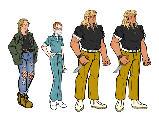

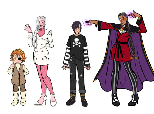

Made a TON of Venture Bros. genderbends :D
Bonus + some of my thoughts on all the designs under the cut:

This is from a conversation I had with a friend about how Dermott and Hank would behave in this AU (its exactly the same as normal)
Ok now some thoughts on my design process
Hank: I think I drew Hank's face actually perfect, I made her so cute. I also feel like there's a common trope with genderbends where athletic characters get short hair so I gave her long hair and gave Dean short hair. I actually think the longer hair fits her perfectly. ALSO I LOVE HER BOOTS.
Dean: I gave goth Dean more Accessories than normal because normal goth dean had no fucking swag (it was besties idea to make her pants ripped). Even before I started drawing college Dean I knew I was giving her those legwarmers you can pry them from my cold dead hands. Same with the legwarmers I knew the first dean design needed a Jean skirt its just the vibes.
Dermott: The millisecond I even thought about doing Dermott I KNEW she would be 2012 grunge girl aesthetic. Gigantic shoplifting energy. Love her.
Rusty: I wanted her to look like a mean mom and I believe I accomplished that goal. Absolutely had to add the glasses strap. Very Jamie Lee Curtis.
Brock: I drew the one with the hair down first and my friends preferred the one with the hair up so I just did both. I wonder if she was a cheerleader in college and killed another girl on her cheer squad by throwing her too far/dropping them.
21: I drew 21 then I realized I had just drawn myself with bangs. Also I drew her with a blunt because there's an episode where 21 has a joint in his mouth the whole episode the other henchmen are standing in stupid poses in the background and its maybe one of my favorite bits in the entire show its so stupid.
24: 24 took several attempts to get the hair right I kept drawing it short and curly and my friend told me to give her Elaine from Seinfeld hair which I think ended up working really well.
Monarch: One of my favorites I did. I feel like this one you can definitely tell how Bayonetta completely re-arranged my brain chemicals as teenager. I love the hip cutouts, I made a tummy cutout to kind of mimic how Dr.GF's monarch costume is kinda skimpy. It's also hard to tell because of the cowl but I tried to give her like a finger waves hairstyle.
Dr.Gf: I tried a bunch of different hats but my friends liked the brimless hat the most and completely doomed him into looking like a Bellhop (more than he already did). Its giving Tyler the Creator at the 2020 Grammys. I still think he's cute though :)
Billy: I really didnt want to just draw her in a suit because thats boring. The show always gives me 60s vibes despite being set in modern day (I'm sure its on purpose) and I definitely channeled that with Billy. It took a couple tries to find a balance between fitting her body but still looking adult but I think I got it in the end.
Pete: YAYYYY PETE YAAAAYY!!! ^_^ Shes so Ava Max Coded. I also gave her giant buckles on her shoes to match his stupid ass one two buckle my shoes ass shoes.
Triana: Very much looks like putting emo boy in the Pinterest search bar. I made her thigh highs into his sleeves and I gave him square bangs like her.
Dr. Orpheus: NEEDED to make her a hot milf and I did. Its a little hard to see but her shirt has lace over the open part. I love the hair Jewerly at the bottom of her braid. :)
#venture bros.#venture bros#Hank Venture#Dean venture#rusty venture#dermott fictel#Dermott venture bros#brock samson#henchman 21#henchman 24#the monarch#monarch venture bros#dr. girlfriend#billy quizboy#peter white#triana orpheus#dr. orpheus#Gary Fischer#billy whalen#dr. mrs. the monarch#Dr. Byron Orpheus#my art#venture brothers#genderbend#genderswap
2K notes
·
View notes
Text
Niffty Redesign🐛

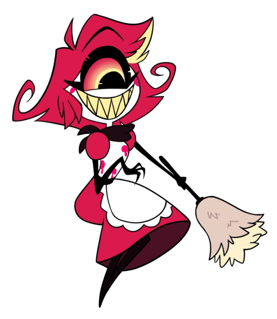
Made my own take on Niffty for Fun!!!!!!!!💖 I def thought a lot on what to try with her!!!!
Pushed for a more 50’s Housewife aesthetic/hotel maid vibe. She’s wearing a pinafore apron which was very popular during that era and I took the poodle skirt idea and reworked it into the apron, but rather than a poodle it’s a bug 🐛. Also brought back warmer colors like the pilot look had. Pastel yellow was def a pop color!
Also added a name tag as to show she works for the hotel 🏨
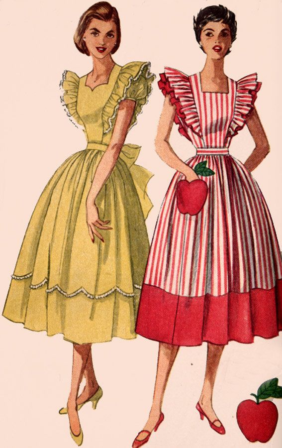
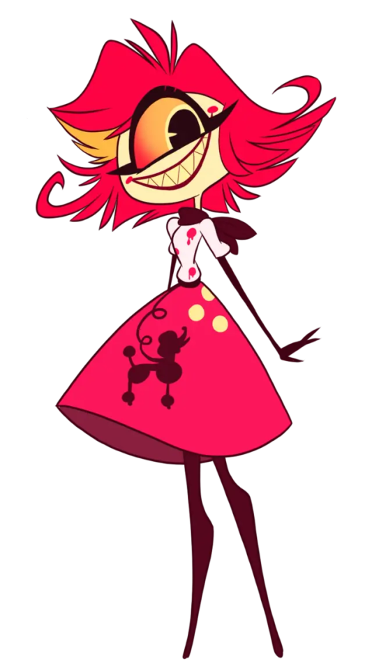
Added more splotches and made them bigger on her apron. Polkadots were popular in that time and I think are cute(lot of her concepts had polka dots on her) plus I can see her wanting people to assume she’s a ladybug or Asian Lady Beetle 🐞 (@peeperscreeperz made a take of Niffty being that which is AMAZING and I considered making her that too but I ended up going a different route). I can see her also wanting them to give off flowers…only for most people to see them as blood stains.🌸🩸
Also gave her those iconic cleaning gloves 🧤. Shes the Hotels maid AND cook afterall 🧽 👩🍳
Gave her a bandana bow for the housewife and maid look and because I think it’s cute and lowkey gives off antennae. I LOVE the idea of her being a bug demon so I went with that. I was going for a subtle ambiguity of what she’s suppose to be(she’s hiding what she is).
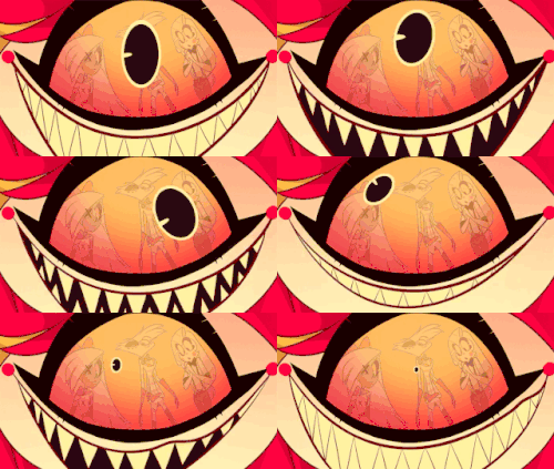
Gave her warmer eye color back! Also made the pupil more leaf shaped 🍃.
Added gradient for her limbs.
Added extra limbs. Great for extra cleaning 🧹 🧼
Her hairs actually antennae…and extra legs 🦵
Gave her three fingers.
Made her eye bigger(bugs often got big eyes! Or for her case eye 👁️)
Added a lil bug instead of a poodle for her apron!🪳
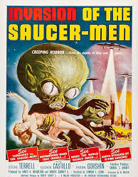
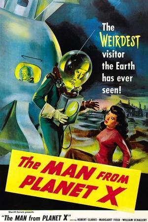
For her color motif, went back to warmer colors and because for mine I’m going with a rainbow motif she’s Yellow💛🌈 the color known for its positives such as joy and friendship…but can also mean negative things such as Deceit, illness and often used as a warning color⚠️ it was also a popular color for Sci-Fi posters(she was based on B-Alien Movies)
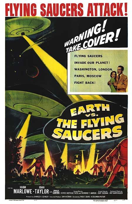
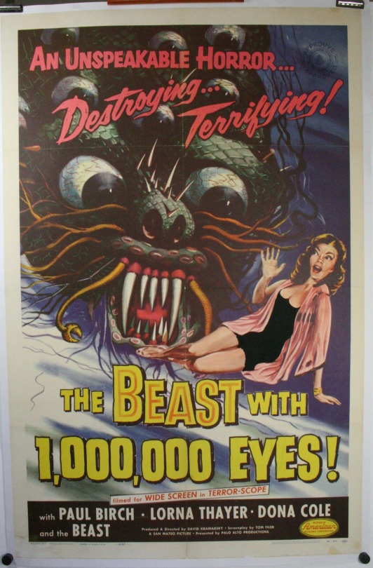
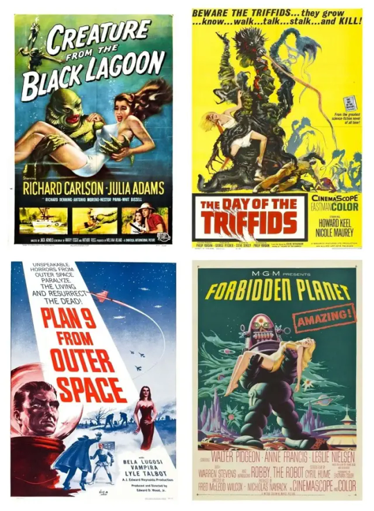
Made her skin a kinda warm pastel orange🧡 I missed her having a warm palette but I also get why they changed it due to her roots 🇯🇵. So I went with orange!!!! Her hairs also a more brownish red-orange.
For her bug theme,
I went with something that I figure would connect her both to her ability to take down pests so well and Japanese origins. The Japanese Centipede! Centipedes are great for pest control but apparently to Japan they’re considered symbols of evil and rottenness, plus with how they look they often scare people even those they don’t pose serious threats to humans, which I think fits Niffty’s whole desire to be loved only to accidentally scare people away…shunned & unloved by a world she can’t seem to fit in💔
HUGE Spoiler alert!!!! Hazbin Hotel
With the reveal of Husk being once an Overlord I like to believe the same with Niffty but rather than souls(talked about this with @a-sterling-rose, she was an immensely powerful sinner like Alastor, but alas her form was far too big and scary for people to want to get close to and she was alone…until Alastor offered her a deal he’d provide a more approachable form in return for her eternal service)
A lot of her looks meant to be hiding what she is. Disguising her extra limbs as hair, her body’s color scheme based on a centipedes, poofy dress that could cover extra, even the bug design could be Interpreted as a long centipede. I was also going for a subtle sharp, mini legs for her apron ruffles, giving off her trying to look sweet and soft but could also be interpreted in another way…
I read and learned from a @lovesart23 redesign vid for her that, she was meant to be based on B-Alien Movies. LOVE that and I tried it myself(hardest part was figuring out what bug to make her and what themes to go with) but I ended up going for another Sci-Fi route. Kaiju/Giant Bug monsters. Creatures like Godzilla or those giant bugs creatures like “the Tingler” 1959(which was a centipede monster I read). I figure it’d connect well to both her struggles of fitting in but also her Japanese Roots.
Monsters are tragic beings. They are born too tall, too strong, too heavy. They are not evil by choice. That is their tragedy. They do not attack people because they want to, but because of their size and strength, mankind has no other choice but to defend himself. After several stories such as this, people end up having a kind of affection for the monsters. They end up caring about them."
— Ishirō Honda The Director of Godzilla
Plus some certain Kaijus could qualify as Aliens!.
There’s even a Yokai/demon based on the centipede know as the Ōkumade!
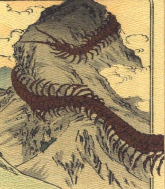
CW freaky Pictures of centipedes and Mice
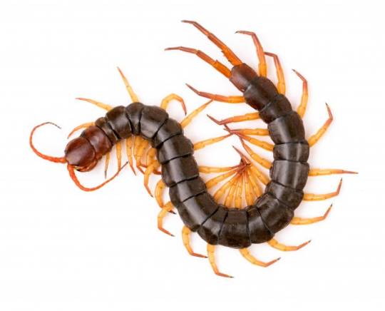
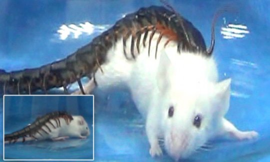
What do u think? I’d love to know💖
I’ve also done Charlie, Vaggie and Angel🍎🦋🕷️
#Hazbin hotel#Hazbin hotel redesigns#Hazbin hotel niffty#niffty#nifty#niffty redesign#Nifty redesign#hazbin hotel redesign#hazbin hotel fanart#my art#my redesign#hazbin redesign#hazbin redesigns#Hh#hazbinhotel#Overlord niffty#hazbin hotel art#Hazbin hotel rewrite
121 notes
·
View notes
Note
if there were a Steven Universe-themed cafe, what would you want on the menu?
Ya know, this would be very difficult to narrow down, even with you saying it would be a whole café with a Steven Universe theme so it wouldn't have to share with any other theme! Having made well over 150 Steven Universe recipes myself, I know there's a LOT to choose from, and it would be hard to get a good highlights reel down.
However, if you're gonna go with a Steven Universe theme in a café, you would have to be able to appeal to casual fans as well as deep Steventhusiasts. That means you would want the well known classics as well as stuff that the hardcore fans would remember, but you would also want stuff that's Gem-themed and fits the vibe without necessarily referencing specific food that's been eaten on the show! But of course, you also wanna have a good mixture of nutritious/filling food and snacky/desserty food. So you'd need a good variety!
We'd have to call our café The Best Diner in the World, of course.

BREAKFAST
Together Breakfast (Single or Family Size)
Best Breakfast in the World
Bagel Sandwiches
Biscuits & Jam ("He's the biscuit!" "And she's the strawberry!")
Waffle/Egg Sandwiches
Baby Melon
Various cereals (the show has cereals that look like Cheerios, Froot Loops, and Honey Smacks)

MAIN COURSES / SPECIALS
Fish Stew Pizza
Square Pizza
Hot Dogs / Veggie Dogs
Pizza Bagel with Fantastic Fries
Salmon Bagel Sandwich ("Perfectly Timed Afternoon Sandwich"), comes with Chaaaaps
Club Sandwiches with Gem-themed anchoring toothpicks
Amethyst's Torta (also comes with Chaaaaps)
Zucchini with Linguine
Pepe's Burgers Meal

SIDES & SNACKS
Fry Bits
Snack Sushi
Caprese Salad
Chaaaaps
Onion Rings
Breadsticks
Popcorn
Spicy Pretzels
Mozzarella Sticks (to violate the food treaty)

BEVERAGES
Sugar Shock Shut Down
Fountain Soda
Coffee
Tea
Fresh-Squeezed Lemonade
Apple Sidra
Fancy Orange Juice
Hot Cocoa
(You could put some of the beverages in cups or cans labeled "Guacola" and "Durian" but I recommend against actually making a drink with those.)

DESSERT
Donuts (Fire Salt optional, in cute tubes. Use Pop Rocks for sizzle!)
Cookie Cats
Ube Roll Slice
Star-shaped cookies
Steveny Gem-themed cupcakes

KIDS' MENU
Crying Breakfast Friends meal
Noodles and Butter
Hot Dogs
Juice Boxes (Durian design)
Macaroni & Cheese (Maybe let them mix it themselves, so they can be served macaroni & nothing)
Pepe's Burgers Kids' Meal
I have no idea what I would order. It would all be too tempting!
You'd have to have a performance stage up in the corner with a banner over it that says BEACH-A-PALOOZA and have local acts or open mic stuff sometimes, and stock the place with games (some SU-themed!) as well as having maybe a little gift shop with Steveny trinkets and coffee mugs. Yesss!
62 notes
·
View notes
Text
2023 Special Helmets: An Analysis
Helmets are where we get to see the creativity and personality of drivers come alive. Not too long ago, I looked at and analyzed the normal helmets that all 22 drivers wore. That analysis was heavily focused on color because there isn't much room for creativity in those helmets and color is one of the main things that drivers can play around with to show their individuality and creativity.
However, with the special helmets drivers wear during the season, we see much more about the drivers and their creativity.
In the 2023 season, there were 23 events (with the 22 grand prix weekends and preseason testing) in which a special helmet could be worn, and with 20 drivers on the grid at any given event, there was potential for 460 special helmets. Obviously, every driver isn't going to have a special helmet for every single event.
However, there were 114 instances (that I was able to identify) in which drivers wore a special helmet. Or 114/460 = 0.248 = 24.8% Which is a far cry from the days were drivers were only allowed one special helmet per season.
Methodology
After combing through social media posts, news articles, images from race weekends, and different sessions, I was able to identify 114 instances in which the 22 drivers who participated in the 2023 season wore a helmet that was not their "normal" helmet. I went through this process approximately three times to ensure that I didn't miss anything, but I was doing a lot of this during the end of my thesis and finals time, so there might be some things I missed. In which case please do let me know.
All of this data was put into a spreadsheet:
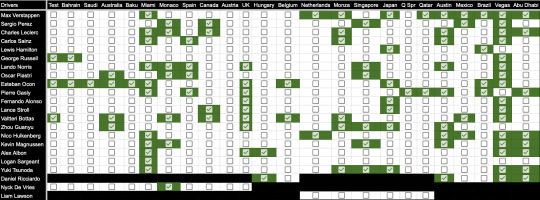
The next step was to organize the data and find the meanings given by the drivers for why they wore the special helmets. This again meant more time for social media posts and news articles.
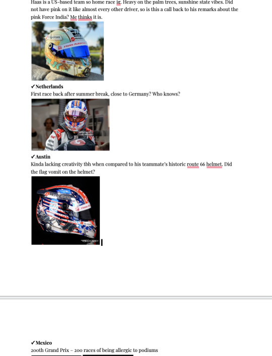
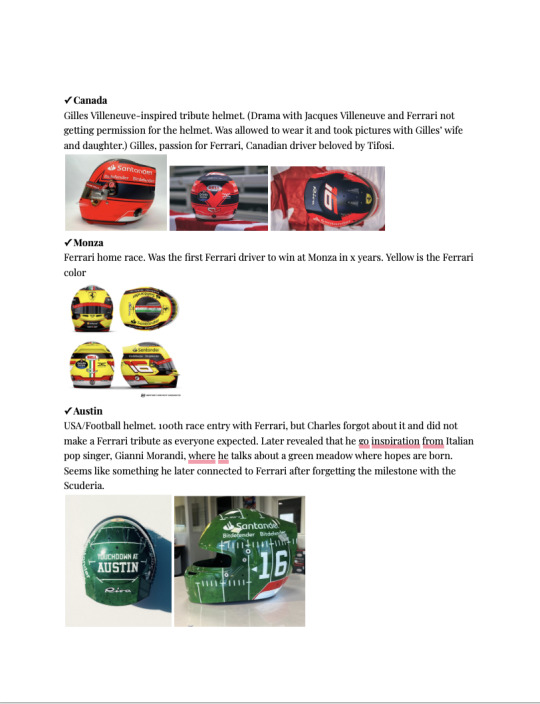
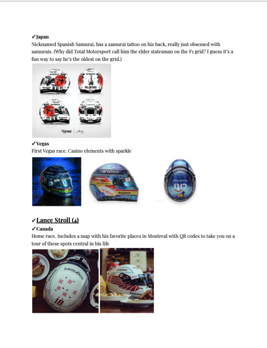
With the data gathered, there was a need for analysis. While the individual stories behind the helmets are very interesting on their own, they don't tell us much about special helmets as a whole.
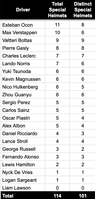
The first method of analysis was the number of special helmets per driver. While it sounds straightforward, some drivers did reuse special helmets for more than one race.
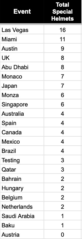
The next method of analysis was the number of special helmets per event. Though in the spreadsheet, the Qatar GP and sprint are separately listed due to Pierre having two helmets that weekend, I did count it as one event because it is the only instance in which two helmets were worn in one weekend.
The last method of analysis was the reasoning for the special helmet. In this, the possible reasons for the helmet were considered. Essentially, what was the reason for having a special helmet - as it was given by the driver/team/helmet design?
For this last analysis, I created 21 different reasonings based on the data I had gathered during the research phase. Most of the helmets fit into more than one of the following reasons:
Host Tribute: The helmet heavily features a design related to the city or country they are racing in. It somehow is a tribute to the host.
Team Home Race: The helmet was worn during a race in which the team is somehow based. This could also be a main sponsor home race, i.e., Honda or Alfa Romeo.
Inaugural Race: The first time a race was held at the location.
Home Race: A race in the country that the driver was born in, races for, etc.
Sponsor Collaboration: A driver partnered with a sponsor and it is clearly visible in the design.
Vibes: There's no explanation that I could find.
Livery Match: The helmet features design elements similar to a one-off/special livery.
Team Milestone: The race is a major milestone for the team and the driver has some sort of tribute for it.
Tribute Helmet: The helmet is meant to be a tribute to someone(s) special to the driver. Could be F1-related people or people that are special in their personal livers.
Race Milestone: The race is a major milestone for the driver.
WDC: This one is just for Max Verstappen and the helmet he was gifted by Red Bull after winning the WDC in Qatar.
Artist Collaboration: The driver worked with an artist that was specifically stated.
Night Race: This was only used if I could not find any other explanation for the helmet, and it featured either glitter or chrome.
Race Beginnings Tribute: The explanation for the helmet somehow relates it back to the beginnings of their racing career. Color or design elements from first helmets.
Team Tribute: The helmet is meant to show love and appreciation for the team.
Movie Release Collaboration: The helmet corresponds to a movie that is soon to be released.
Honorary Home Race: While not the driver's home race, the country has become like home and/or taken them in as one of their own.
Investor Tribute: Helmet showcases something meaningful to a team investor.
Embodies the Samurai Spirit: Fernando Alonso's samurai tattoo and love for Samurai culture.
Comeback Race: This was only used for Daniel Ricciardo in Hungary because there was no other reason for the special honey badger on the back of his helmet and it quite clearly said "I'm Back."
Last Race: While Abu Dhabi was a night race, the helmet used during the race did not feature glitter or chrome. It was just a special design different from the normal helmet worn.
There was a caveat with the host tribute and team home race. A helmet that featured location-specific designs was either counted as a host tribute or a team home race. So a Haas driver with a special helmet In the US would be considered for a team home race, not a host tribute, whereas a Ferrari driver with a US-themed helmet would be considered a host tribute. Additionally, for the Las Vegas Grand Prix, special helmets were considered as inaugural race helmets, not host tributes. Unless it was for the Haas drivers, in which case it was a team home race and inaugural race helmet.
Analysis
How Many Special Helmets Were There Per Driver?
There were a total of 114 instances in which a special helmet was worn. However, there were not 114 different special helmets worn. In quite a few cases a special helmet design was repeated over 2 or more race weekends.
Max Verstappen wore a special helmet at 10 different race weekends, but for five of those weekends, he was wearing his WDC helmet. The WDC helmet was given to him after winning the championship during the Sprint race. It was then worn for the Qatar Grand Prix, in Austin, Mexico, Brazil, and Abu Dhabi. So while he wore a special helmet for 10 race weekends, there were only 6 different special helmet designs worn by him. Sergio Perez wore a special helmet at 5 different race weekends. Unlike his fellow Red Bull driver, he did not repeat a special helmet during the season. Each helmet had a distinct design to fit the race weekend.
Charles Leclerc wore a special helmet at 7 different race weekends, whereas Carlos Sainz wore a special helmet at 5 different race weekends. Neither Ferrari driver repeated a special helmet design during the season.
Lewis Hamilton had 2 special helmets during the 2023 season - the second least amount of special helmets for a driver who raced for the entire season. As such, he did not repeat any special helmet designs. Meanwhile, George Russell wore a special helmet at 3 different events. However, he only had 2 distinct designs as the special helmets for testing and the Bahrain Grand Prix were the same.
Lando Norris wore a special helmet at 7 different race weekends. However, he wore the same special helmets for Monaco and Spain, which happened to correlate with the McLaren Triple Crown special livery for those weekends. Oscar Piastri wore a special helmet at 5 different race weekends. Like his teammate, he wore the same special helmets for Monaco and Spain which correlated with the Triple Crown livery.
Esteban Ocon wore a special helmet at 11 different race weekends, which was the most special helmets worn by a driver. However, while he wore the most special helmets, Esteban did wear the same helmet for 4 weekends (testing, Bahrain GP, Saudi Arabia, and Australia). The Baku helmet was the same as his regular helmet, but instead of black lines, he had white lines. So, Esteban did have the most special helmets, it was largely due to a repeat of special helmets at the beginning of the season. There were only 8 distinct special helmet designs. Pierre Gasly wore 8 special helmets during the 2023 season. Each special helmet had a distinct design, Pierre even went so far as to have 2 different special helmets for the Qatar race weekend.
Fernando Alonso wore 3 special helmets during the 2023 season and was one of the few drivers who did not have a special helmet design for his home Grand Prix. Teammate Lance Stroll had 4 special helmet designs for the 2023 season.
Valtteri Bottas had 9 special helmets for the 2023 season and no repeats at any point in the year. He had the most distinct special helmets. Notably, most of Valtteri's special helmets were designed by professional cyclist and partner, Tiffany Cromwell. While Alfa Romeo had been largely forgotten during the season, Valtteri's helmets were extremely memorable with the fun and creative designs. Zhou Guanyu had 6 special helmets for the 2023 season and there were no repeats in special helmets. However, at least one design was the same as his regular helmet but with the colors changed to fit the race weekend.
Nico Hulkenberg wore 6 special helmets during the season. However, his special helmets for Austin and Las Vegas are seemingly the same helmet, while the Abu Dhabi helmet was his normal helmet but with chrome where it used to be white. Kevin Magnussen also had 6 special helmets for the 2023 season. Each helmet was distinct in its design, however like Nico, the Abu Dhabi helmet was his regular helmet with chrome details where it had been white.
Alex Albon had 5 special helmets for the 2023 season. Alex used the same special helmet for Silverstone and Hungary, otherwise the 799th and 800th races for Williams. Logan Sargeant had the least special helmets for a driver who participated in all 22 races with just 1 for his home race of Miami.
Yuku Tsunoda had 6 special helmets for the 2023 season. However, 3 of the special helmets were his regular helmet, but with different colors to fit the race weekends. Daniel Ricciardo had 4 special helmets for the 2023 season. However, he wore the Las Vegas helmet for Abu Dhabi as well. Nyck De Vries had 1 special helmet and Liam Lawson had no special helmets.
In the end, there were a total of 101 distinct special helmet designs worn in total.
How Many Special Helmets Were There Per Race?
For this analysis, there were a total of 23 weekends that a special helmet could have been worn - testing and 22 races.
Of the 23 weekends, there was only one event that had no special helmets from any driver. Austria was the only race without at least one special helmet for the entirety of the weekend. Considering that Austria is the home race for Red Bull and the race was at the Red Bull Ring, it was somewhat surprising to see that there were no special helmets by any of the Red Bull drivers.
The race with the most special helmets was the Las Vegas Grand Prix. It was the inaugural race and 16 of the 20 drivers had a special helmet for the race weekend that either fit the Vegas vibe or was glittery/chrome for the night race. A consistent theme was that the American races had the most special helmets. In Miami, 11 drivers had special helmets, and in Austin, 9 drivers had special helmets. I believe that this could largely be due to sponsors and a push towards engaging the US markets. Additionally, it was only the second race in Miami and COTA has always been a race that drivers/teams go all out for.
Also, notably, Qatar had 3 special helmets, but only 2 drivers due to Pierre Gasly having 2 different special helmets for the weekend. He had one for the sprint and one for the Grand Prix.
How Many Special Helmets Were There Per Reason?
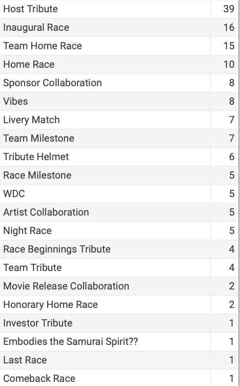
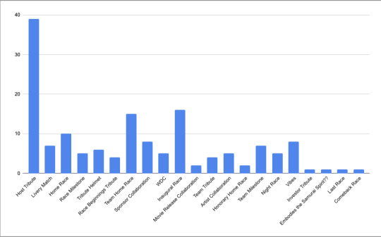
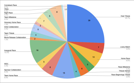
As I mentioned above, 21 different reasons were given for wearing a special helmet. In most cases, there were multiple reasons or explanations for why a driver chose a special helmet for a race weekend. Some reasons were much more common than others.
Most commonly, drivers chose to wear a special helmet to honor the city or country they were racing in. These helmets had some sort of design elements that paid tribute to the city or country. So think of the Monaco helmets. A lot of them featured iconic parts of the city. For example, Valtteri Bottas' helmet, while Pac-Man themed had different parts of the Monaco track like the tunnel and piscine. Kevin Magnussen's Monaco helmet also featured iconic Monaco imagery.
The next most common reason was an inaugural race special helmet with 16 of the 20 drivers having a special helmet for Las Vegas.
Home races were also a very common reason for a special helmet, whether it was for a team home race (15), a driver's home race (10), or an honorary home race (2).
There were a lot of milestones celebrated this year for teams and drivers when it came to the number of races that they'd completed. Most notably, Williams reached 800 races, Lando Norris competed in 100 races (as did George Russell, while he did not have a special helmet for the occasion, Mercedes did release vintage-style merch that coincided with George's 100th race weekend), and Charles Leclerc reached 100 race entries with Ferrari the same weekend as Lando and George. While Charles did have a special helmet for the race weekend, it was not originally for that purpose. The original meaning behind his football field special helmet was a host tribute, but when his race milestone was brought up he attributed the green of the football field to Italian pop singer Gianni Morandi's green meadow where hopes are born and connected it to Ferrari.
Concluding Remarks
Special helmets reveal so much about drivers and what they deem important or worthy of a special helmet. Each special helmet is unique in its own way.
Something I found very interesting is that of the 11 drivers who wore special helmets in Miami, only Nico Hulkenberg did not have a hint of pink on his helmet. While still very Miami, he didn't have the iconic pink color that the other 10 drivers did. And while that can mean absolutely nothing, looking at that in context to his tweet about the pink Force India, it's a little bit more than just not having pink on his helmet.
Or based on Fernando Alonso's Japan helmet, you could go into the connection he's had with Samurais and his back tattoo and nickname.
These special helmets open new avenues to understanding how drivers think and which narratives they want to highlight. There may not be extensive stories to tell with each helmet, but a good chunk of them can take you down a few different paths to understand either the drivers or the teams that they drive for.
And finally, after looking at 101 different helmet designs, here are some of my personal favorites
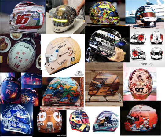
Share your favorite helmets or least favorite helmets - I have pictures of all the ones used for this analysis in the Google Docs link attached.
Notes for Special Helmets: https://docs.google.com/document/d/1WWx8gVzkMzy_l6zwG0u1Vx2mAzPOjK3LqOLaz8z6v3w/edit?usp=sharing (I may have been a hater during some of my notes, but in my defense, I was tipsy and I'd looked at a lot of helmets and articles)
2023 Helmets Analysis
#formula 1#daniel ricciardo#max verstappen#lewis hamilton#charles leclerc#alex albon#f1#special helmets#oscar piastri#lando norris#george russell#yuki tsunoda#fernando alonso#logan sargeant#carlos sainz#sergio perez#nico hulkenberg#kevin magnussen#valtteri bottas#zhou guanyu#lance stroll#esteban ocon#pierre gasly#nyck de vries#2023 formula 1 season
165 notes
·
View notes
Text
Happy 1st Anniversary to the Batmanfruitloops!!! 🎉
Whoo! This is such an achievement, but also it's such a crazy thought that it's been a WHOLE YEAR??? It means a lot that so many other people like our au as much as we do, and even more that we've been able to make friends; we want to thank all of you new and old for joining us here to have fun and enjoy the journey of our au!
With that said, I'd like to share some old art that's "behind the scenes" stuff from out time since we started our au.


also if you've been here since these were the profile picture and banner, you're a real one;

Fun fact, I (Sarsee) don't like fruit loops, but it was the first thing I thought of to name the blog, plus it was memorable. The au name being "Batman: A New Gotham" came later! Double plus, the abbreviation is BANG and I find that coincidence just delightful.
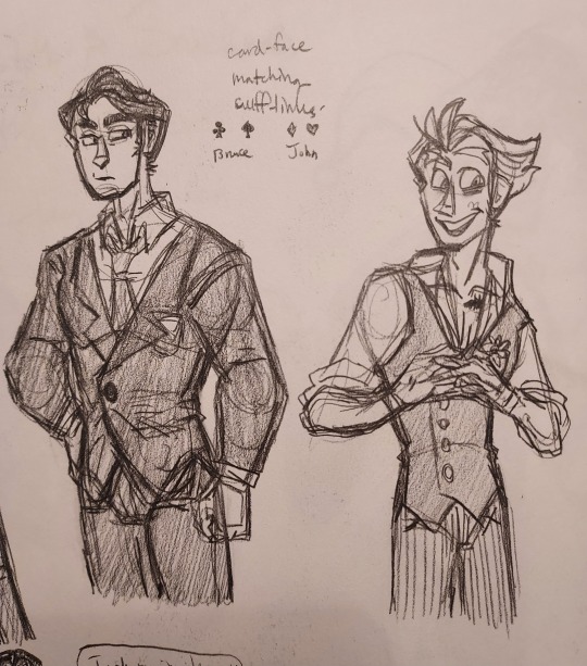
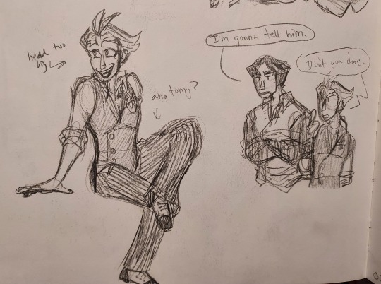
One of favorite changes that happened out of nowhere was John's eyes changing from more round to almond. He used to look a lot more like the Telltale Joker, but I feel like his current eyes fit better with his personality in our au. This also isn't going to show up because it's file names, but I had originally wanted to call the Joker "Jbird" like Batman calls him in the Lego Batman movie. (for context, it's the scene where Joker is tied to a bunch of balloons - you know the one - and side note, I want to redraw a screenshot from that with our Joker eventually) I don't have any pictures with a "Jbird" design because I never got the idea to work, I just thought it could have been interesting considering Joker works with Batman in our au and that would put him on theme with the Batfam being flying mammals/avians.
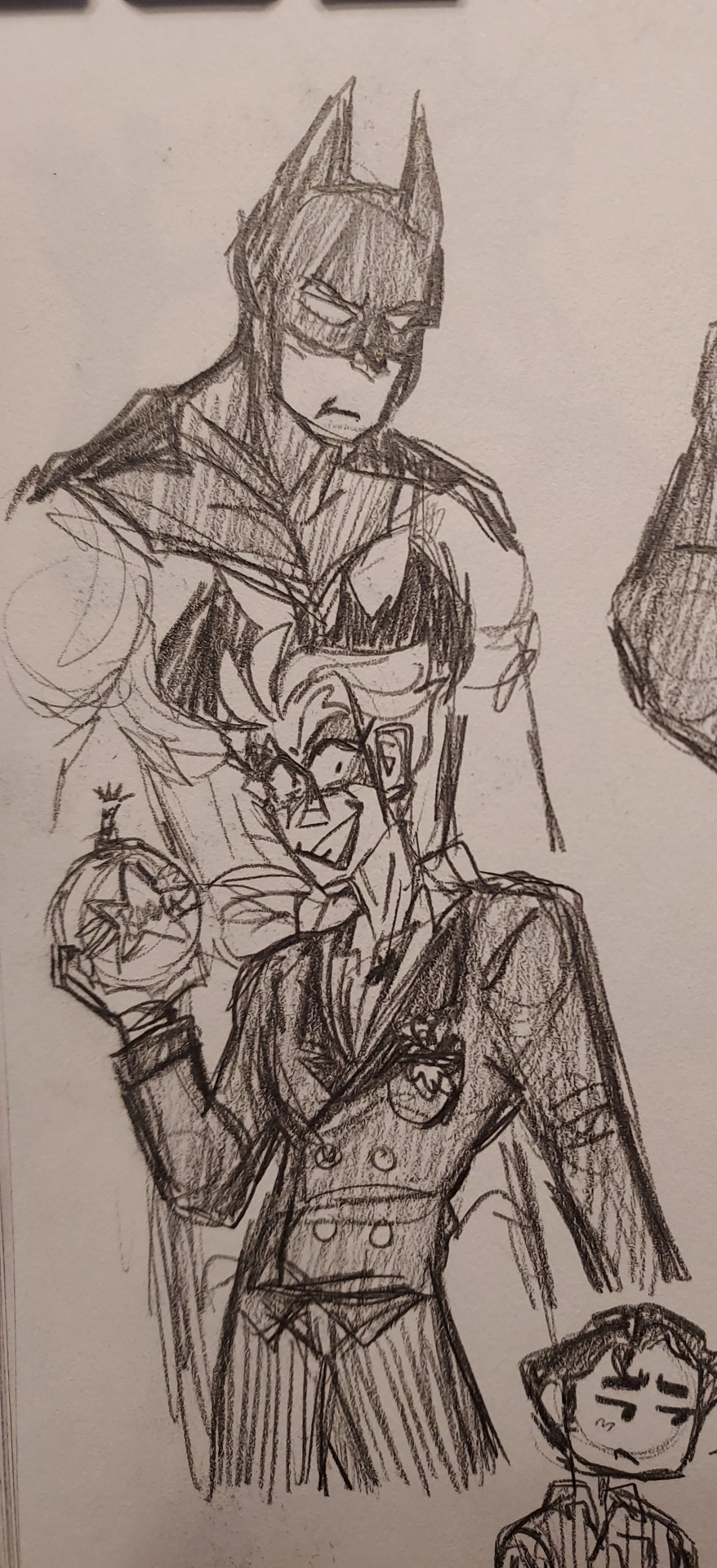
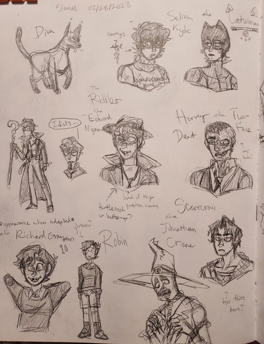
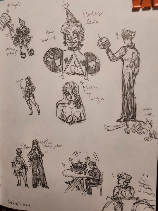
Most of the other original designs aren't too drastic either - or at least it doesn't feel like it to me. Scarecrow and Riddler have changed a lot though. And I think the changes that came about with Fluffy joining on board were much needed (Scarecrow's costume was always done by Fluffy, but I designed him out of costume originally -I was originally making the au myself, but that didn't last long when we started yapping about ideas to one another and never stopped) She also couldn't understand how I stylized his hair, so it became puffy and unruly instead of curly and gelled back. Ed can still gel his hair if he wanted to, just for special occasions.
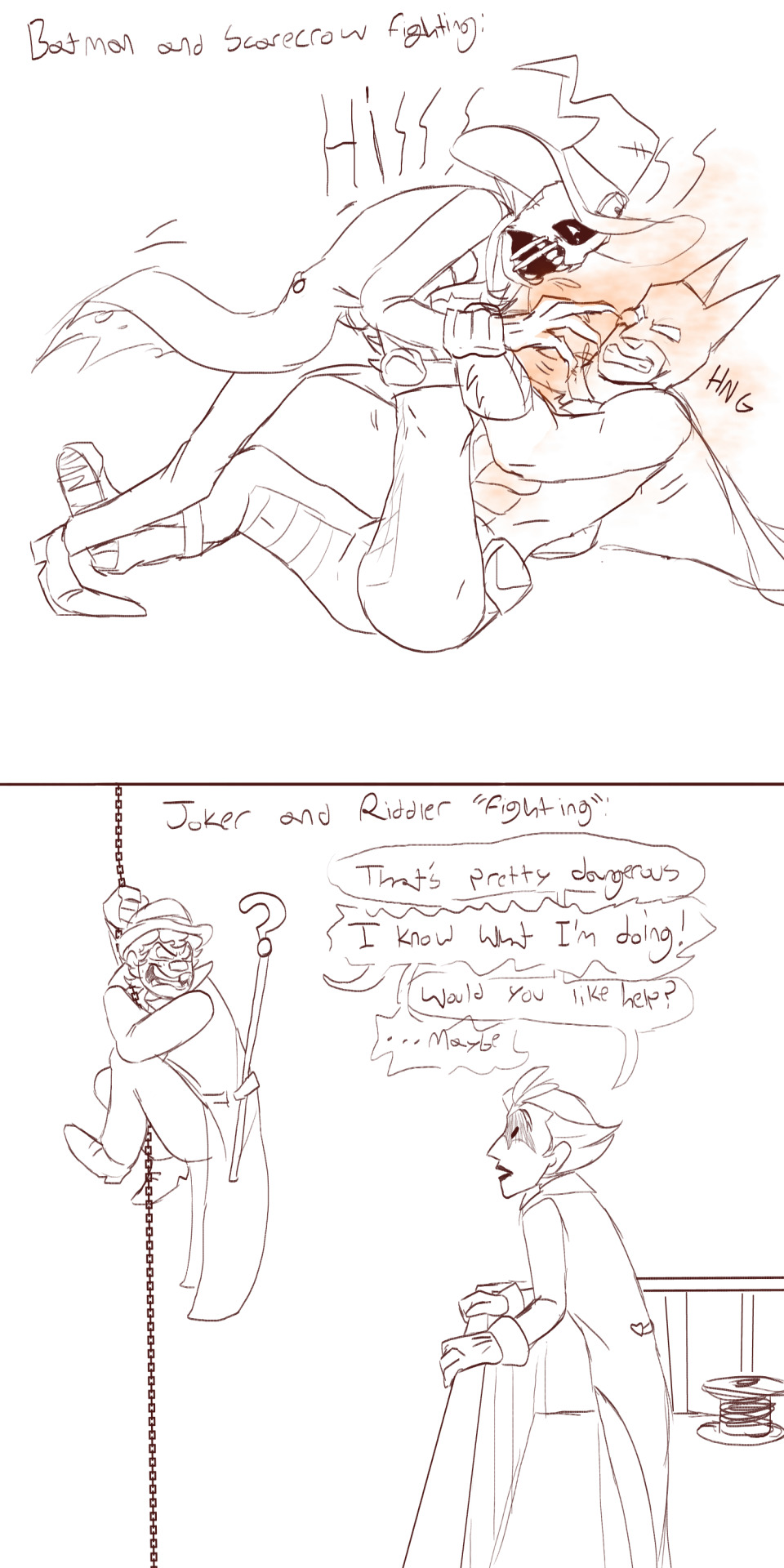


Some old sillies as well from Fluffy;
we find the contrast between Batman vs. Scarecrow and Joker vs. Riddler very funny because it's so drastically different. The Joker and Riddler never really try to hurt each other, they just like to play into the dramatics and vibe while still on their separate sides. Batman and Scarecrow want to tear one another's throats out and watch them suffer for it because they have no idea what's going on in their heads.
with the villain!joker timeline, there's an alternate version of the Goon squad (Dork Squad + Joker) where it's Harvey instead of the Joker. Or as well, there can be all five of them. Harvey is the only person who can scruff Jo like the gremlin he very much is and he'll just let it happen.
I don't know if this will show up in the comic anymore, but at one point the Joker was going to refer to Scarecrow and the Riddler as Samhain and a leprechaun because they're both partially Irish - couldn't really be that specific with voice claims, and they'd be offended

and lastly, Ed gets cranky when he's tired


Batman and Riddler are the only two to get digital references at the time and man, do I much prefer how streamlined the final ones look. I mean, what was the dingy brown I had behind Batman? For a split second, Ed's coat was almost purple, but thankfully, Fluffy convinced me otherwise and suggested his shoes be purple. This is also before his vest, and now there's an in story reason for why he doesn't have it in the beginning. Also look at how skinny and tall Ed looked!! (he was still short, he's not allowed to be tall in our au)
That's all I have for now, we'd love to hear any thoughts/memories/etc. in the comments!
Love, Sarsee and Fluffy, your batmanfruitloops creatures
57 notes
·
View notes
Text
The full lineup is almost done!! (just needs some touch ups and a Chunsik design👍) FEEDBACK IS GREATLY APRECIATED!!
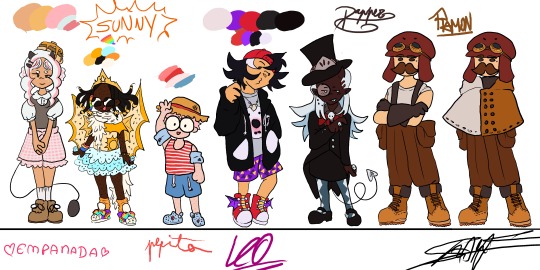
Design process under here (whole lot of yapping)
General thoughts: Ive given them in my previous design sheet (you can find it in my blog)(tldr: designs match characters but still childish, 8-12 years old). Only thing different here, is that these eggs were eggs who I had less of a clear idea of what I wanted to do with them (though I still really liked where I ended up!!)
Empanada: Didnt want to go for the full sweet lolita route, mostly because I thought it'd take away the "little kidness" of it all, but something that still resembles the aesthetic. She's wearing "carneirinhos" (idk the name in english) which is very cute little girl to me, and shes also a demon! Her tail resembles a frying pan!! Though I might change her fringe (it was supposed to be baby hairs but now that I think about it, her type of hair probably wouldnt have them) and put some argyle pattern in her sweater vest. I just forgor💀 to do that...I also wish I had made her shorter, but unfortunetely I drew this before the eggs did the height check (YES ITS BEEN THAT LONG).
Sunny: My beautiful baby girl. She means the world to me. I love this minecraft egg with all my heart. Shes wearing Light up sketchers and some fairy wings like Pomme, and shes actually wearing a swimsuit, she just put a tutu over it. The diamonds they're always holding are rings, they have a "terere" in their hair (idk name in english😭😭) and the beads were inspired by an artist on twt (@\BLUETOMATOSODA). Also if you are wondering why her hair looks like tentacles, its because I had originally made it puffy, but changed my mind after doing the lineart, so i had to get creative with me covering it up. Just pretend she has a fan, shes a star after all!
Pepito: Basically, he is very smoll. Chiquito even. He has strawberry hair and MASSIVE glasses that take up his entire face. Hes wearing a swimsuit aswell (dont ask how it works idk either), and has floaties since he cant swim. Hes got crocs, since flip flops hurt his toes, with a spider man charm on them! Also hes got a sunhat, mostly cause I wanted some other accessorie but didnt want to go with gas mask since it'd kinda kill the whole swimming vibe (since his model is wearing a swimsuit). sorry if its not too accurate to his character. Side note: Him, Em and Sunny all have freckles! Him and Sunny all over their bodies while Em just has on her cheeks.
Leo: Cute sporty vibe, love her shorty spiky hair. Wanted to try to make her face spiky aswell, for the whole shark dad thing. Shes got a necklace with a shark tooth (I guess she got it from Foolish??). He changes tshirts randomly, and opens and closes his attack on titan hoodie depending on the tshirt's expression (basically my version of Leo changing her player heads constantly). His trainers have dragon wings and also: whealies!!
Dapper: Im gonna be honest: did not expect to like his design THIS much. The colouring really elevated, with the long blue hair (the same colour as the ghosties!). Wanted to make them, y'know, dapper, so I had to sacrifice some of the "little kid vibes" unfortunetely, but I think it fits her still. The hat has part of the helmet that they used to wear a lot, demon horn to match Pomme, and a suit that is VERY inspired by Death the Kid from Soul Eater (very fitting for a reaper in training imo). Might be my favourite design!
Ramon: Jesus fuck you'd think designing your fav egg would be easy BUT NO. I struggled long and hard. Again, he doesnt have that much "little kid" vibe whatever man😭😭 Im just happy that I even managed to make SOMETHING. Hes got Create googles, his meathead is a massive hat that completely hides his hair. Very simple, very Ramon, though I will probably end up making a version with an ugly sweater just like he likes instead😔. I still like it but. man...
ANYWAYS IF YOU READ ALL THAT MWAH, YOURE A REAL ONE, THANKS FOR ENTERTAINING MY THOUGHTS🫶🫶🫶
#qsmp#qsmp fanart#qsmp eggs#qsmp empanada#qsmp sunny#qsmp ramón#qsmp ramon#qsmp pepito#qsmp leonarda#qsmp leo fanart#qsmp dapper#qsmp sunnysideup#ramon the egg#ramon qsmp#leonarda#leonarda the egg#leonarda fanart#leonarda qsmp#pepito#empanada#sunnysideup#sunny the egg#empanada the egg#empanada fanart#sunny fanart#dapper the egg#dapper fanart#breakfast trio#my art tm
80 notes
·
View notes
Text
You know what, I love the colors on the Combaticons. I could get into how each color design suits their personalities because man they really do but I won’t because that’s a whole post in of itself.
But anyway. Onslaught’s colors? I mean, look at that. Beautiful.

I think Brawl has a similar green for his frame, but he ALSO looks really good in it. Also very pretty.

Blast Off? Kind of an interesting color combination, but I LOVE IT. It really really suits him… don’t ask me why I think that, I can’t explain it. Kind of gives sopping wet kitten vibes but I’m here for it.
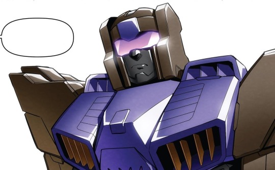
I FUCKING LOVE VORTEX’S COLORS. The teal with the grey, a little bit of purple in there too? Also some red because of course… It’s so different, almost random, so unique. IT SUITS HIM SO WELL. I love him. I love it.

I left Swindle for last, the flamboyant little bastard, but his colors are so pretty. Eye-catching, a little glamorous, really fit his personality. Holding myself back from going into a character study based on their frame colors but here have it just have it already. Full body pic for him, gotta get all of the goodness.

I love them all so much, but I especially love their colors.
#taao#combaticons#onslaught#brawl#blast off#vortex#swindle#maybe if you guys are interested I’ll do some of that character study stuff#but with their chosen paint jobs!#we’ll see
116 notes
·
View notes
Note
ok I’m not sure if you guys have thought about the movie timeline at all in context to this AU buuuuuuuut I feel like 31 on that angst prompt list would fit especially well if a certain turtle gets saved from the prison dimension… idk could just be me, feel free to ignore this ask if it’s not your vibe!!! (also as an aside I’m still getting caught up with everything but I LOVE this AU and all of the time you guys have put into it!! It’s so well constructed and I love the designs for the characters!!! It’s amazing!!!!)
Thank you! That means so much you have no idea. I'm also very happy to hear you're enjoying the AU ^_^
here's ur prompt request <3 | prompt list
--
31. "You came back for me. You actually came back for me."
[Disclaimer: since this is later in the AU, One has already received the name 'Leo']
He draws in a shaky breath, rosy eyes fluttering open to meet a bright and busy city. Is… is he dead? Titan, do dead people feel this much pain?
Leo blinks and sucks in another painful breath. All at once, his ribs, knee, and— his whole body, really— feels like it’s either broken or inflamed, like his muscles have been torn open and tossed in a blender. “Ow, ow…” he groans.
Okay… maybe he’s not dead. He’s… actually surprised that he’s still alive. The last thing Leo remembers is the chill air of the Prison Dimension… and the pissed off alien overlord beating him to Hell. Then he blacked out.
“Leo!” a voice screams his name. Leo blinks again, then he sees Mikey hovering over him, eyes wet with tears. “What the hell were you thinking?” he sobs.
Leo’s chest wrenches at the grief glistening behind Mikey’s eyes. Oh. This is his fault, isn’t it? He recognizes it all too well. He’s seen it in the faces of the people he terrorized. He’s seen it in his family, more times in Mikey than anyone else, and he doesn’t understand why his youngest brother didn’t just let him die.
“What the hell were you thinking?” Leo retorts weakly. “I mean, you actually came back for me. After everything I—”
“Of course I came back for you!” Mikey yells as his splotchy markings flash orange. “You’re my brother, Leo, I don’t care what you’ve done! You could destroy the whole planet, I’d still love you!” Mikey takes a deep breath but his tears don’t stop flowing. Leo feels a few drops on his cheeks. “Don’t you ever do anything like that again, do you understand?”
How? How can you forgive me that easily?
Despite the doubts floating in the back of his mind, Leo smiles. “Sure thing.”
37 notes
·
View notes
Text
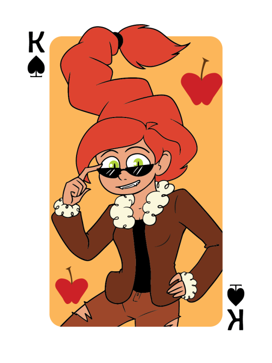
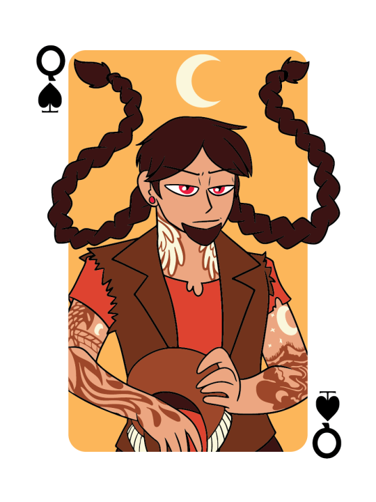
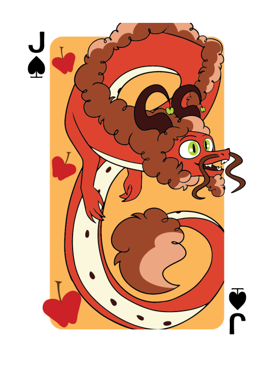
Spades
Spades(Here) Clubs Hearts Diamonds
Starting a small series for the next few days, and I'll be at Fan X by the time the last of these post! I'm not making a full set, but these are the hypothetical face cards of the card deck! All characters depicted are OC's and I'll add more info about them under the cut!
Get Your Own Art!
Cat (Catherine) ~ King of Spades
Cat has had the most changes out the entire cast. Originally she was just a normal college student who found herself wrapped up in the supernatural world. Nowadays, she's the Tether to Cosmo, the Apple Dragon!
Her vibe is that classic, vintage, Americana feel, and she aspires to one day own a Harley. Cat is 4ft 8in tall, plays softball at the local college, and tries her best to stop Cosmo from getting her in trouble. She can bemoan how she got to be a Tether to such a lame dragon, but over time she learns to appreciate Cosmo and master his power!
Her main weapon is a baseball bat and she will take your kneecaps with it.
Mentor ~ Queen of Spades
This character is currently unnamed because I need to put more research into naming conventions. This character is Indigenous American, and I don't want to have something too stereotypical or something that doesn't fit. I designed him with ethnicity in mind because I don't see a lot of Indigenous American representation and I wanted to branch out!
He is the Tether to the Moon Dragon, who is constantly being hunted by the Sun Dragon. So, as you can imagine, he's on the move a lot! He's a biker who travels from Coast to Coast, doing odd jobs and living life on the road. He ends up teaching Cat a thing or two about being a Tether, and why she should respect her dragon. He can't stay long though, he has to keep moving.
Cosmo ~ Jack of Spades
Now, you may be wondering why an Apple Dragon, living on the west coast of America, is an Asian dragon. That's a fair question! Turns out, apples originally came from Kazakhstan, supposedly going through Russia, before finally landing in Europe! "American as Apple Pie" really takes on a whole new meaning huh?
Well, Cosmo followed a similar route! He's the sweetest dragon ever and really just wants to help out his friends. He'll stand up for what's right and help out those in need. Cause of this, he chooses his Tethers very carefully. Aldar Kose, Robin Hood and even Jonny Appleseed were all previous partners of his, and he believes in his Tethers even when they don't believe in themselves!
That being said, he's a tiny dragon and is often underestimated. He's a dragon of Apples, after all, not a dragon of anything important. But he doesn't need to be! He's happy with himself and he can look out for the little guys like him! And hey, if he can save the world in the meantime? Well that'd be just dandy!
(Also, yes, he is designed to look like an apple peel with chocolate on top, cause he's just so darn sweet!!)
#my art#original character#original characters#card design#character design#playing cards#spades#playing card designs#urban fantasy#dark fantasy#dragon tethers#tethers#dragon#dragons#apple dragon#moon dragon#cat#original story#Living with the Monsters#tentative name for now
22 notes
·
View notes
Text
“The outfits in Descendants: The Rise of Red are so bad” “I hate them” what Descendants are y’all talking about?
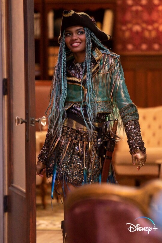
We gonna start off with Uma. No, I’m sorry, Principal Uma! She looks so good! D2 vibes all around. Sure, there’s not as many sea trinkets as I’d like there to be but I can live with that. I missed her Pirate hat and her fringed skirt! The shredded shirt, I see you, Harry Hook inspired! I love the brown sleeves with glitter, that definitely reminds me of the sea. I just got black fingerless gloves but now after seeing her, I want gold…Great. I haven’t talked about her jacket cause there’s no discussion to be said. No defense to be made. Uma will always have that fashion!

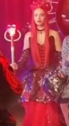
Princess Red of Wonderland here is slaying! The designer understood the assignment! Red’s style is like a combination of Mal and Evie. The gown gives Evie’s royalty and the other gives Mal’s edge. Let’s start with the dress, I have always had a thing for corsets , I don’t know what it is, I just love them. Her arm warmers! Maybe it’s something on the arms, I just find it so sexy (y’all should’ve seen me swoon over Mal’s D3 moto sport fit). Why does her dress give more Queen of Hearts then the actual Queen of Hearts. And don’t act like we didn’t see that crown, Miss Ma’am.
Now the other picture, it may be dark but I saw everything I needed to. I think that’s a double belt she’s wearing and I love wearing more than one belt! The leather pants with the gems on the side, love that! Combat boots are my true love, but y’all. Y’all. The hood. THE HOOD! WITH THE GEMS!! OHHH! I need the character pictures to drop so I know what to gender-bend and thrift.
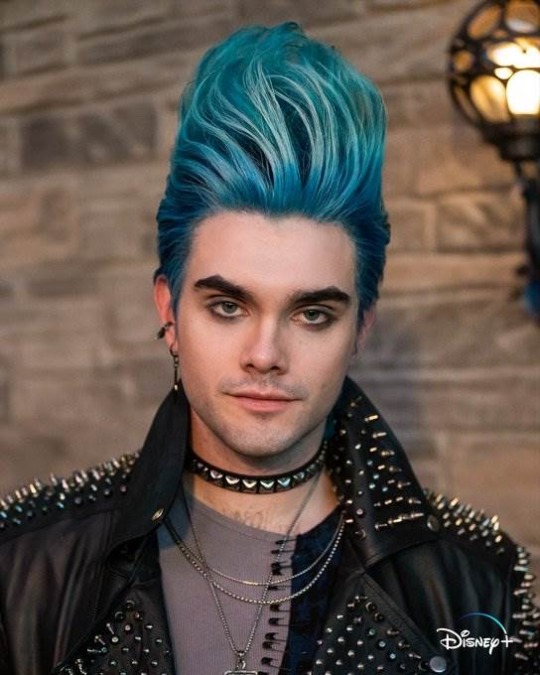
First off all, Hades always got it on but THIS! Hades is my spirit god! I am Hadie. I can see how he pulled Maleficent. This is my father, I dressed up as this specific Hades for Halloween. I love it when my gender wears makeup, I personally like painting my nails and wearing eyeliner so to see it on Hades, I’m very happy. I am a sucker for jewelry and that choker around the neck! I recently bought my own choker because of him! His leather jacket is everything! The studs! I haves stud fetish! I need the jacket but it’s just too expensive. Now the main thing we need to talk about is THAT SHIRT! OR SHIRTS! I fully believe these are two shirts safety pinned together! I think that the blue might be long sleeve while the gray is short! I got the safety pins so I find the right shirts, I will my customizing!
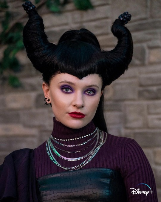
The Mistress of Evil, Maleficent always has that fashion chic. The complaints I do understand are from her horns and hair. We’re gonna start with her hair. People were expecting it to be people because Mal’s was purple. Y’all, you cannot expect me to believe Mal’s hair was an inherited trait, I did not believe for a second that Maleficent had purple hair. (Imma have to do a whole other post on that). Now the horns, I do believe that her horns are there and her hair is just long enough to be wrapped around her horns. (And if not, then we go all Dragon). Now let’s talk about the pros. THE PURPLE EYESHADOW!! I LOVE THAT! The leather corset, again, something about a corset! Why do I have the feeling that’s dragon leather? If that’s a thing, is that a thing? Now let’s talk about that single arm sleeve. Even as a teenager, Maleficent still looks regal! How many chains does Maleficent have? I love that. Ulyana is a mean girl, Maleficent is a BAD girl!
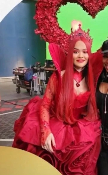
It’s not that she doesn’t look good, it’s just that it’s all red. I know that’s her main color, but she does also wears black with a little bit of gold. That’s pretty much my only complaint, she looks beautiful, I love how the dress looks like roses! The sleeves, I love translucent or mesh or whatever it’s called. The crown is crowning! Don’t get me started on that corset turned collar!! But I do understand why they made her all Red so she can contrast with Queen Cinderella!
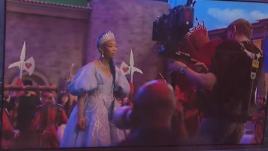
I’m am rating this because the other one we saw is not a dress, that is a cape or cloak or something, I don’t know what it’s called. This dress is very beautiful, I have always preferred her blue over her silver but I do like how the designer added silver swirls. The jewelry is everything! The earrings, the necklace, THE SILVER CROWN! IT’S BEAUTIFUL! Brandy is royalty herself! I’m not sure if you guys can see it, but she does have these shiny translucent gloves and I like them. I don’t care what you people say, even if it’s a little random, her blue braid is absolutely beautiful! I absolutely love it!! The first black Cinderella then the first Cinderella with blue hair, Brandy is the literal definition of iconic. She is the history of Cinderella.
Emilio Sosa, the designer, is amazing and he deserves his roses and trophies
#disney descendants#descendants#descendants 4#descendants the pocketwatch#disney descendants 4#descendants the rise of red#the rise of red#descendants uma#uma daughter of ursula#uma descendants#red daughter of the queen of hearts#descendants rise of red#red descendants#red#hades descendants#descendants hades#young hades#disney hades#hercules hades#descendants maleficent#young maleficent#maleficent#the queen of hearts#queen of hearts#cinderella#brandy#rita ora#kylie cantrall#china anne mcclain#anthony pyatt
52 notes
·
View notes
Text
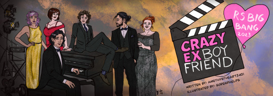
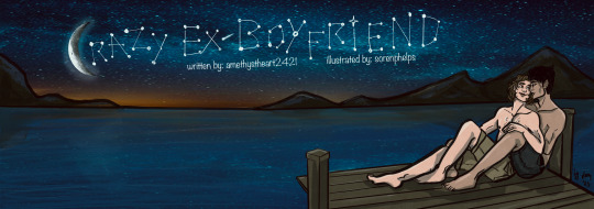
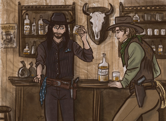
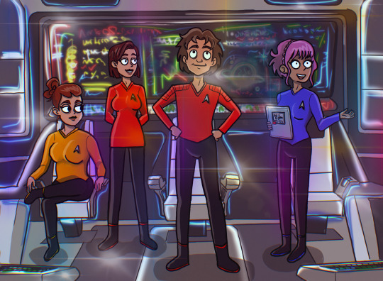
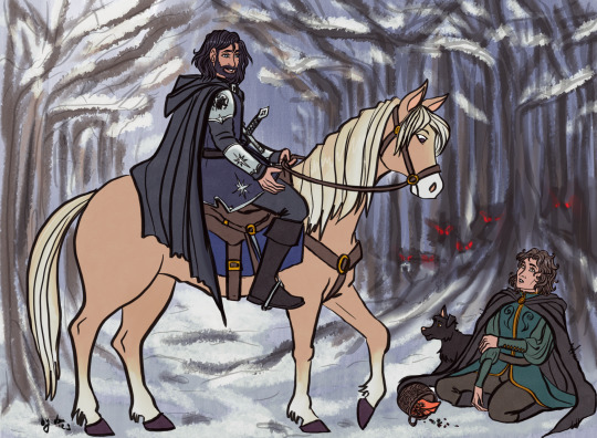
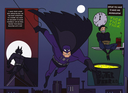

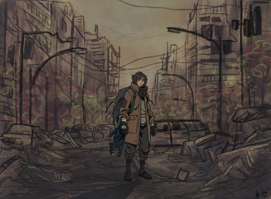
All the artwork I made for the fanfic Crazy Ex-Boyfriend by @amethystheart2421 for this year's @rsbigbang!
It was a wild run, we got paired up quite late due to our original pairs dropping out of the Bang, and even though it was already December and time was running thin, I decided to make this whole deal a way bigger challenge than it supposed to be... So I ended up drawing all 7 fantasy sequences, trying to mimic a different style for all of them, and finishing both versions of the banners I had in mind. I know, I know, but I swear even I wasn't aware that I am such an overachiever either!
Also, I usually like to hide little details as easter eggs on all of my artwork, so naturally this was the case with these too. I'm gonna list them one by one, also share a little story about each piece, sort of like a "directors cut werk", just so we stick to the screenplay motif. The numbers in brackets lists the order in which I drew the pictures.
The banners (1.,9.): I haven't watched Crazy Ex-Girlfriend the show, so I really had no idea about this whole thing, hence my initial idea of re-drawing one of the official promo posters of the show as the banner. But then Nicole shared the first scene with me when we got paired up, and also told me that her original artist wanted to draw the stargazing scene, which I also really liked. I sketched out both versions to see which one would look better, and also to warm up a bit for this version of the characters. (Nicole also shared some faceclaims, so except Sirius' and Lily's design, I tried to stick to her vision as much as I could.) The Netflix poster was considered the final one for quite a while. The stargazing banner was the last piece of artwork I finished, which I also edited to be used as Chapter dividers. I liked the idea so much I actually referenced the starry sky on the other pictures too. On the Netflix banner, Remus' socks and Sirius' suit handkerchief (how do you call those things in English, gahh) both have the starry pattern.
The western (3.): By this time it was decided that I'd do all fantasy sequences in a different art style, but I couldn't really come up with any specific style which could have fit the western vibes, so the characters are drawn in my own usual style, only the colouring is different. I tried to go for a sepia effect, without using a filter, I think I could pull it off well enough. I was considering to draw Sirius as a Native American for this, because I just don't see him as Caucasian in general, and also, Black Dog sounds like a badly translated indigenous name... But I discarded this idea for the sake of "historical accuracy" (and to save time, haha), as I think they wouldn't visit a saloon this way. I added the starry sky pattern to Sirius' handkerchief and... scarf? (I really should learn how certain textil items are called in English...) There is a wanted poster in the background with Voldy. And I swear I didn't mean to draw Remus looking this horny, it just kinda happened by accident! He is sure VERY fascinated by Sirius'... pistol.😜
The Star Trek (6.): My original idea was to draw like usual and just add so many lensflares to the picture that it's not visible if I copied another style or not. But in the meantime I started to watch Star Trek: Strange New Worlds with my bf and also found out that there is a new cartoon too, so it was then settled. This style is very different from my own, but it was so much fun! It was weird not to draw every single strand of hair in excruciating detail, actually that was the hardest part, haha! I struggled a bit with the placement of the lensflares too, the first version had too many and too bright, it had a disco vibe rather than a spaceship. I wanted to add easter eggs to the background screen, but I was running out of time, so there's only one light blue star similar on the screen! Also now I know that the uniform colors are not really consistent in Star Trek, and Remus’ might have had to be gold as Captain…🤷🏻♀️
The Disney (2.): This one sparked the first idea in my head after I read all fantasy scenes Nicole kindly shared with me. When I first sketched this, I still had no idea that I will end up drawing for every chapter and the style copying was not settled either. It started with this piece, I had the vision of the wolf chasing scene from Beauty and the Beast, and we were discussing whether it's plausible to collect berries during the winter or not... I've tried to make the final piece look as classic Disney as I can, and since I could pull it off, it was not a question anymore whether I'd try to do this with other styles for the other scenes. Retrospectively, this one was the easiest to make, apparently my usual style is not that far from Disney (I grew up watching those movies, so it's not a surprise), but I had to really focus on drawing the animals, it's been ages since I last drew any! (The trick is to give them eyebrows, and bam, it's Disney style!) Sirius' armour, clothes and sword has the star, and I also designed his own "crest" with the black dog and a star on his shoulder plate. The whole concept of the picture is Sirius' side being very bright coloured, while Remus' with the scary wolves in the background being very dark. This might have worked better if it was not set in the winter, but I wanted to stick to the Beauty and the Beast vision I had.
The Comicbook (4.): I was very excited for this one, I really like the looks of the old Batman the animated series, and the way some of his comics are drawn. It's such a unique style, I really like the simple shapes and bold contrasts. Well, it turned out I am very bad at this! I struggled quite a bit trying to capture what I had in mind, but I couldn't even come close to it... So I kinda cheated a bit because I just traced the lineart directly from the reference pictures of Batman comic books I found online. I tried to make Remus less buff, but it looked very weird, so I let him keep his muscular Batman body instead. I drew the wolf mask and the whole Sirius panel, and the coloring went smoothly after I finalized the lineart, even though I only realized that I switched the colour schemes of Remus' superhero outfit when I looked up the quotes for the comic panels, oops. Overall I like how it looks, but I am not that proud of it as I had to "cheat".
The Hobbit (5.): I've probably spent the most time with this one! I actually really like Martin Freeman as an older Remus FC, so I was quite excited to do this piece. My original idea was to mimic John Howe's style, as he is the Tolkien illustrator god, but his level of skill and mine are very very far from each other... and as I struggled a lot with the Batman piece, I felt like going for a smaller challenge. That's why I decided to have a go at Alphonse Mucha's art nouveau style. Turned out it was the worst possible idea! 🤣 The whole point of art nouveau is depicting attractive ladies in an ethereal way... But if you switch the ladies with a fat hobbit, the vibe def won't be the same! The first version just looks so extremely absurd, it's both awful and hilarious. By the time I could fix the pose so it wouldn't look as ridiculous, the final style looked nothing like art nouveau... I still have no idea what style it is now, not my own or any of the ones I tried to capture, that's for sure. I considered adding the star pattern to that tablecloth, but I decided that the lupin flowers in the foreground and the whomping willow-like tree are enough reference for this pic! I like how it turned out in the end tho, I think I could do justice for the watercolor-looking coloring technique, and the end result looks a bit like a fancier version of old children's book illustrations... Which is essentially what The Hobbit is, so it all sorted itself out by the end.
The Anime (7.): I like anime (I'm a little picky about them tho), so it was not a question that I would give this style a try! I am a huge fan of cyberpunk (the genre), so initially wanted to do that, I'm such a slut for Ghost in the Shell and I really like the aesthetics of the Akira posters, but after reading the actual scene, it was not really fitting. So I saved the cyberpunk AU for later, and went for the post-apocalyptic vibe instead. Obviously anime had a great influence on my art style, so similar to the Disney one, it was not that much of a challenge to mimic it. However I'm not that good at drawing backgrounds, and oh boy, I really made myself get over this obstacle with this series of pictures! Also as I was more comfortable with this piece, I actually added the starry sky pattern from the beginning to the scarf/blanket Remus has on this picture!
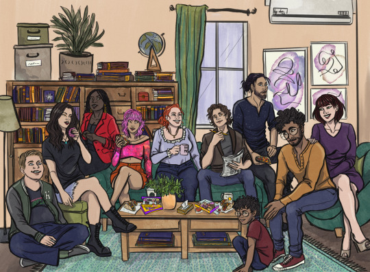
The Sitcom (8.): The original idea was to copy Hanna Barbera's old family cartoons' style, but as my deadline was very close and after reading the scene I realized that it will have a shitton of characters, I quickly abandoned my original plan. So this one is drawn in my own style, sort of, the designs of the characters are more aligned with Nicole's vision (sans Sirius, Lily, and partly Peter). The hardest part was definitely to figure out how I could fit 10 characters into one picture, let alone sitting in a living room! Also, I had to actually draw the living room too, considering perspective and scaling... Something I am not that good at. In the end the coffee table is maybe a little too big, but I needed that to hide the legs of the characters sitting on the sofa, haha! Also, the sofa is the Millennial Dark Green Velvet Sofa, because I also want to have one and it really emphasizes the general existential dread! (Just kidding.) Also also, I just realized that I have no idea how to eat tacos without making a mess (they are not that popular where I live). I added the starry sky pattern to Sirius' shirt, and gave a Teenage Mutant Ninja Turtles T-shirt to Peter, as he is talking about that in the scene. I wanted to squeeze in further references to the newspaper Remus is holding, but it was too tiny. The star from Knight Sirius' armour is in the background on the bookshelf. Also that globe just makes no sense but I had no better idea how to fill the empty space 😅. Molly is holding a mug with "BEST MOM" written on it, and I intentionally made Marlene's eye colour the same as Remus', who btw should have worn a bathrobe according to the original scene, but it was too late to fix that by the time I realized it. All in all, I am quite satisfied with how it turned out, it has the necessary sitcom vibes. And it is kinda a record for me in terms of number of characters drawn (the most was 12, but that one has no background, so I'd call it a tie!)!! I am very proud of myself for pulling this piece off, it really is the achievement of the year!
TLDR; (I mean really, my rambling is just too long!) I am happy that I was paired up with Nicole, working with her was such a creative process! My absolute favourite thing to do is work on AUs, and she has provided me with the opportunity to do so, I am grateful! It was truly a pleasure to participate in this (even if it's not that clear from all the complaining I just had above, haha)! If you ask me nicely I might show you the cursed first version of the hobbit picture!
#r/s big bang#wolfstar#sirius black#remus lupin#regulus black#james potter#lily evans#nymphadora tonks#molly weasley#peter pettigrew#harry potter#marlene mckinnon#dorcas meadowes#crazy ex girlfriend#lotr au#cowboy au#disney au#star trek au#anime au#sitcom au#batman au#fanart#art by lau#lau draws with a tablet#collaboration#marauders#amethystheart2421
66 notes
·
View notes
Text
RE8 Lords (+dimi sisters) Opinion on crocs!
~~~~~~~~~~~~~~~~~~~~~~~~~~~
Mother Miranda
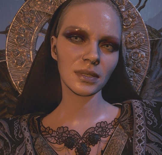
The bird mommy herself. A true lady. Gothic aesthetic and all.
I think she would be an avid croc hater
I mean, she works in a lab, closed toe shoes. They’re not very practical for experimentation or any thing else
Plus her other outfit is goddess apparel or old hag.
I just can’t see her enjoying them whatsoever. They clash with her whole vibe.
If offered, Miri would most surely wrinkle her nose and scoff at the very notion.
“Ugh. Begone, mortal. The day you goad me into those atrocities of footwear is the day I surrender my subconscious to the megamycete,” Mother Miranda waves you off with a flick of a taloned hand.
Mia left a pair in the lab once and she tried them on. They remind her.
Salvatore Moreau
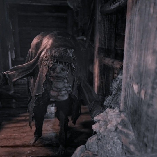
Fish man!
Moreau would be a huge fan.
Seriously, he lives in constant sogginess. A pair of shoes that can fit his deformed and damp feet would be welcome.
He pads around the reservoir in crocs all the fricking time
Over time, the sound of the rubber squelch becomes associated with his approach.
He would be gifted his first pair, but soon amass a bit of a collection- his favorites are the blue pair and the black one, but he’s also got green.
(In the church) *squish squish squish squosh squish* “hi, mother!” Moreau garbles. “Like ‘em?” He asks, gesturing to the tye dye crocs currently adorning the lower half of his slimy body.
He doesn’t wear them in public after Mother Miranda glared at them though
Heisenberg
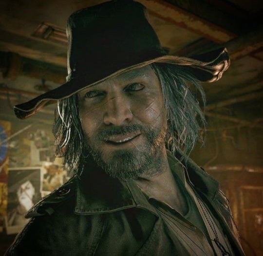
Metal bending dilf
My guy isn’t the biggest fan of crocs, they just don’t work for him
The factory is difficult enough to manage in steel toed boots. Rubber slippers are not ideal.
I think he wears them solely to meetings to piss off Mirander (it works every time)
He was approached by his nieces with a pair of solid black crocs, and they were too insistent for him to deny them entirely.
Heisenberg thinks they’re fine, simply not his cup of tea though.
“Fuck!” The lord curses, his voice echoing against the metal walls of the factory for the fiftieth time. “Damn pieces of junk.” Heisenberg mutters after dropping a piece of scrap onto his croc bearing toes once more.
Alcina Dimitrescu
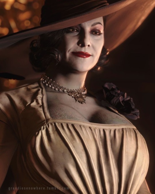
No.
Just no.
Absolutely not.
Lady Dimitrescu , the countess, the favorite of Mother Miranda, mother of three, would not be caught dead in such apparel.
It’s less that she has an issue with their design, and much more that she’s disgusted with the thought of looking so undignified.
She wouldn’t be threatening anyone when she whips her crocs into sports mode before unsheathing her mighty claws.
Alcina doesn’t mind them on others, but not her. She’s a noble lady and far above such peasantry.
Also they don’t make them in her shoe size.
“What…” she drawls, looking scornfully down at the maiden presenting her with such blatantly hideous shoes, “are those?”
Donna Beneviento
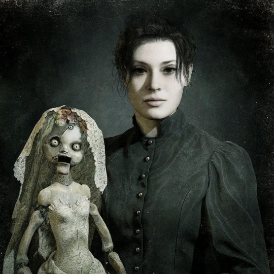
The dollmaker and illusionist ~
Donna is chill, I’d imagine she wouldn’t have too strong an opinion on crocs
She owns a pair in black and likes to wear them around her workshop
They’re quite comfy, and since she’s not always on her feet, they serve as very nice house slippers
She likes to pair them with fluffy socks to really get the full coziness effect
Besides, her skirt is long enough where they’re not really noticeable
A quiet melody sways within the air of Lady Beneviento’s workspace. Humming to herself as she worked and Angie looked over her shoulder. Dexterous hands wield pliers to work the last bit of wire into the joints of her newest creation. And as a finishing touch, a mini croc is slid onto this doll. A small smile quirks her lips beneath the veil.
“I want some!” Angie shrieks once she sets eyes on the crocs.
Bela Dimitrescu
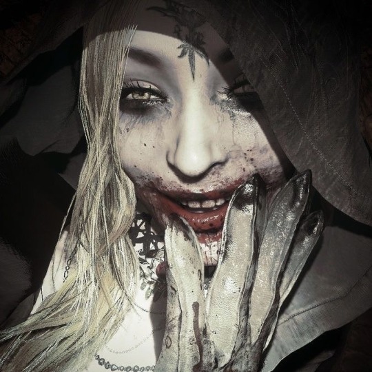
The eldest of the flies, and the blondest
Bela follows in her mother’s footsteps on this one, she despises crocs.
She simply doesn’t see the appeal.
They’re rubber, they’re not particularly fashionable, and they clash with the lace of her dress.
Eyeing her sister up and down, Bela just scoffs judgmentally before walking away.
Daniela Dimitrescu
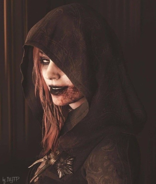
Our delulu queen <3
She is the biggest crocs person ever.
She absolutely loves them, much to her sister and Mother’s dismay.
Dani just thinks they’re the coolest thing ever
You don’t have to lace them, there’s different modes, and you can decorate them??? What more could you ask for!
She had a whole wardrobe. I think she had every color. Depending on the occasion, she mixes and matches.
Dani is also big on jibbitz.
“Look!” The ginger squeals excitedly as she swarms into a maid’s face. “It’s a fly!” Dani says with a delirious giggle, shoving the new charm into the frightened woman’s vision.
Cassandra Dimitrescu
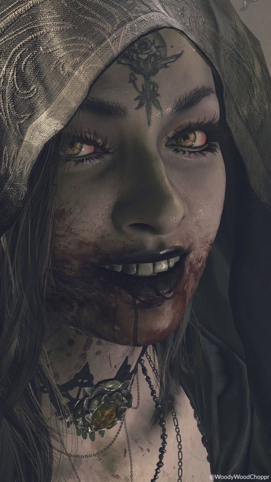
The ravenette of the trio
Cassie likes crocs a normal amount
She doesn’t own her own pair of course, the only reason she ever wears them is to snatch them from Dani and make her mad
She also delights in how Bela and her mom glare down at her whenever she wears them
All in all, Cass doesn’t wear them as a fashion choice, she wears them for the drama
“Hehehe, you’re coming with me,” Cassandra whispers to herself as she steals Daniela’s prized flamingo print crocs from her room.
#resident evil#resident evil village#alcina dimitrescu#mother miranda#karl heisenberg#bela dimitrescu#daniela dimitrescu#cassandra dimitrescu#donna beneviento#angie beneviento#salvatore moreau#headcanon#for funsies#i know no one cares#but this has been eating away t my brain space#I want Cassie to get Alcina a pair customs made#imagine her chasing Ethan around the castle#wearing bright pink crocs with heart jibbitz#idk how to tag this#I CANNT#crocs
147 notes
·
View notes
Text
Ranking Hazbin Hotel Songs (S1)
I’m seeing people do this on TT, but I don’t like posting on there, so I’m posting my list here instead. Obvious warning, but these are my own personal opinions. I think all of the songs are absolute bangers, but there are some that are better than others, so keep that in mind.
16. Welcome to Heaven
Pretty much the general fandom consensus. It’s not a bad song, and I like Darren Criss as a singer, but it’s too short and doesn’t do a whole lot for the plot.
15. Finale
This might be a pretty hot take, but I’m not that big of a fan of the finale. There are some parts that I like individually, but as a whole song, it doesn’t do it for me. It’s still good though.
14. Hell’s Greatest Dad
I think this one is the one that’s gonna upset a lot of people, but I really don’t vibe with this one. No, it has nothing to do with Mimzy. In fact, I actually like her a lot, but that’s besides the point. I’m not a huge fan of talk singing, and that’s what both of Alestor’s songs are, so they aren’t going to be very high. Not even Jeremy Jordan can save this song.
13. Stayed Gone
Again, I’m just not big on talk singing. I like this one just a bit more because I like Christian Borle’s voice as a talk-singer just a bit more than Jeremy Jordan.
12. More Than Anything (Reprise)
This is a really cute song! I wish we had more Chaggie moments in the show, but I’m glad we got this. It would be much higher, but I don’t like how short it is.
11. It Starts With Sorry
Idk why so many people hate this song. It’s so cute! Charlie’s voice is so good, and I like the lesson Sir Pentious learns. It gives off children’s show song, but in a very good way.
10. Out for Love
Carmilla my beloved! I am obsessed with her. I like how she taught Vaggie in this song. Again, my only real problem with it is how short it is. Idk why they made some of their best songs so short, but I need a longer version.
9. Happy Day in Hell
I am a big fan of introduction songs in musicals, and this is a perfect example of why. It’s a nice way to see Hell, especially through the optimism of someone like Charlie. It’s silly and upbeat, and I like that a lot.
8. Poison
I love this song so much! Blake Roman did such a fantastic job with his performance as Angel. I’m not usually a big fan of this particular type of pop, which is why I have it a bit lower, but I think it fits well with what they were going for in writing this song. It’s absolutely perfect.
7. Whatever it Takes
I need these two to have another duet at some point. Their voices fit so well together. Both of their individual parts are also very solid. All around just a good song.
6. You Didn’t Know
I blast this song at least once a day. My fave part is Lute, and I wish we got more of her singing voice this season. Jessica Vosk is so talented, so I hope we get more in season two. Obviously, Charlie and Emily’s part is also amazing, and I like Sera’s parts as well.
5. Hell is Forever
Ah yes, my favorite Christian rock song. Seriously though, this song is so good. It’s most similar to the actual kind of music I listen to, so of course it’d be pretty high on this list. It’s a good intro to Adam and the angels in general, and it slaps.
4. Respectless
Velvette might actually be one of my favorite characters. She, for sure, has my favorite design of any character, and she might have my favorite female voice as well (tied with Lute). Also, she was so real for what she said to Carmilla. Her voice is just very fun to listen to.
3. More than Anything
Jeremy Jordan is the reason I live and breathe. His voice is literal honey. He and Erika Henningsen harmonizing has brought new meaning into my life. I may not have daddy issues, but I think this song healed them anyway. It’s so cute.
2. Ready for This
I’m a sucker for a good rally song, and this is exactly that. Cannibal Town is also my favorite location of any place we’ve seen, both in Hazbin and Hellava Boss, and I adore Rosie. The cannibals were very funny in this number, and I like that Charlie was able to gain some confidence.
1. Loser, Baby
I’m officially changing my brand to the #1 Huskerdust shipper ever. I’m so obsessed with them. This episode is tied for my favorite with Hello, Rosie! Keith David needs another song immediately, and so does Blake Roman. They sound so good together, and I can’t wait to hear more of them!
#Hazbin hotel#charlie morningstar#angel dust#alastor#vaggie#sir pentious#hazbin hotel lute#hazbin hotel adam#lucifer morningstar#carmilla carmine#hazbin hotel rosie#hazbin hotel husk#hazbin hotel vox#hazbin hotel velvette
41 notes
·
View notes