#i like the posing of some of the sketches more than the final pose but oh well
Explore tagged Tumblr posts
Text
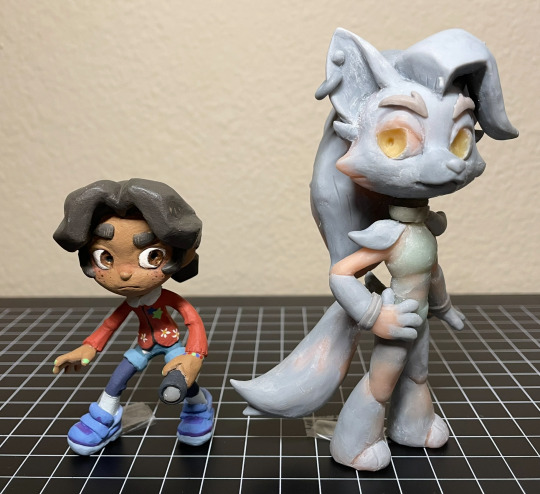
Abandoned wip Cassie & Roxy figures. From ~2023
They’re about to go into storage, so I took some photos. And I figured I might as well post them since they’re never getting finished. So yeah
More photos & notes below the cut :)
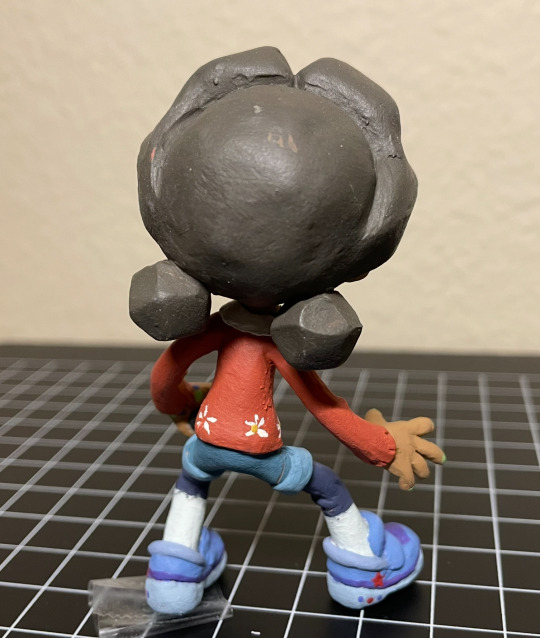
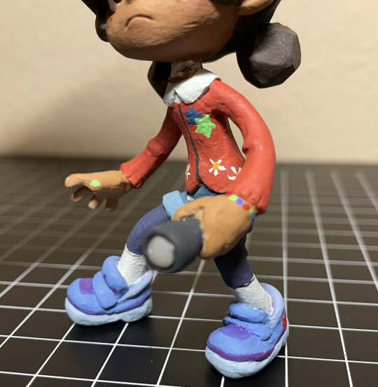
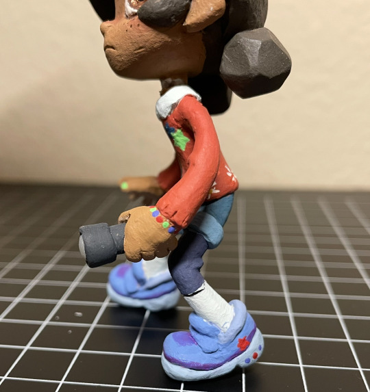
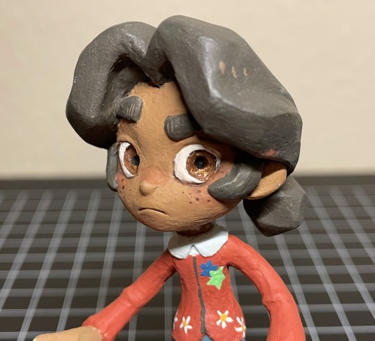
Cassie! Her design is sooo cute. I enjoyed translating her into my style + into 3d. I was (& still am) really happy with how I sculpted her face and hair. Up until this point I rarely sculpted human faces, so I was surprised how well it turned out (then again it’s very stylized so. Whatever). And her hair came out almost exactly like my reference drawing! Which doesn’t happen as often as I would like it to. The paint job came out nicely as well, I’m especially proud of the sneakers and the tiny stars & flowers on her cardigan. Anyway, She was looking really good overall! That is until she fell off my shelf and broke her neck. Unfortunately, that was the breaking point (lol) for me, as I was already having problems with Roxy, and I didn’t want to go through the trouble of repairing her tiny little neck after she was almost fully painted, so I scrapped the project entirely.
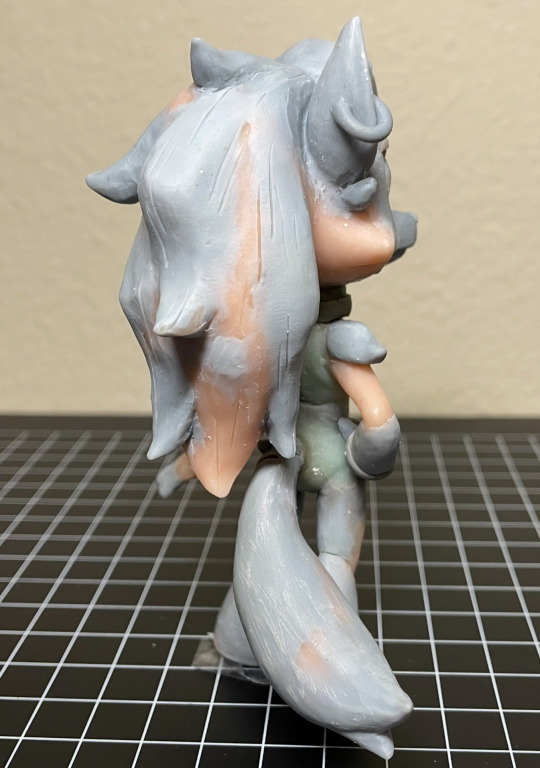
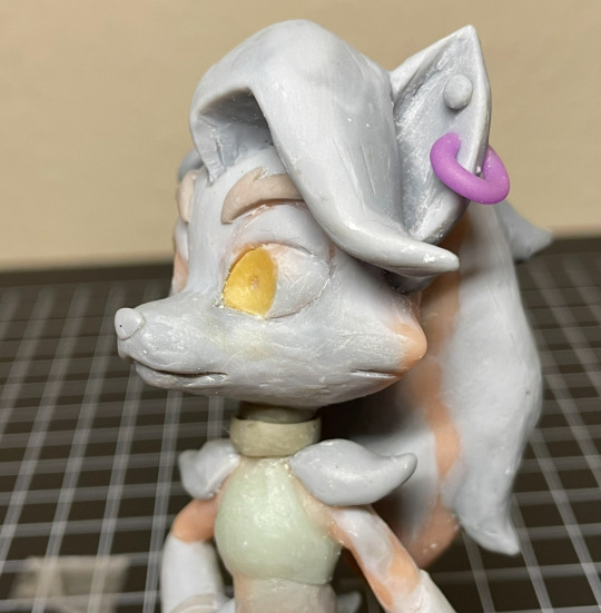
Only a few Roxy photos since she wasn’t painted. I had made her before cassie, (I was originally going to only make Roxy) but never managed to get to the painting step for mainly one reason: Her neck kept breaking. (I have bad luck when it comes to necks, it seems. Probably because I like chibi proportions.) I had to repair her neck, like, 5 times, before finally deciding to use apoxie sculpt instead of my regular polymer clays. (Which I probably should’ve done sooner) But then the apoxie dried in the wrong position, so she couldn’t stand on her own anymore (she needed to be in a very specific pose to stand. her hair is heavy!!). Thinking back on it, I’m really sad I never got to paint her, because I think her form ended up looking really nice. If you’re wondering why neither Cassie nor Roxy have eyelashes, that’s because I was planning on doming both of their eyes with resin, then sculpting eyelashes on top. But I never got to that step. Fun Fact!: Roxy’s eyes are glow in the dark :) so is Cassie’s flashlight
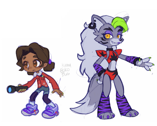
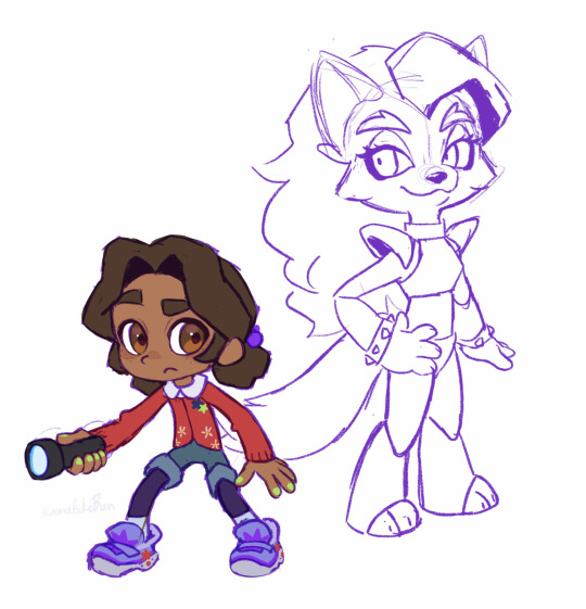
And lastly, here is the art I made for me to reference. Left is the original sketches, and right is the revised poses/designs + traced off of the figures I had already started making. Fun fact: halfway through sculpting (after baking in the pose) I realized that, in-game, cassie holds her flashlight in her left hand and not her right, so I had to completely remove & remake her hands.
I really want to try remaking these two someday, not only because I think I can make them better than I did before, but because Cassie & Roxy are probably my favorite SB characters and I still want to have cute figures of them to display on my desk lol.
Alright that’s all bye bye
60 notes
·
View notes
Text

色彩 [Shikisai]
#my art#jujutsu kaisen#jjk#itafushi#fushiita#yuji itadori#megumi fushiguro#fanart#jjk fanart#megumi#yuuji#finally...some not angst.....#im worried out of my mind fr these two right abt now but we cope we cope :)#i woke up early n rushed to render this bc im leaving 2 catsit today n wont b able to spend every waking hour drawing like i have been#almost uploaded it without rendering megumi's ear and frgetting the sukuna scars so im sure ill find something i missed once i hit post smh#this pose fought me also >:( sighs why when i try to do not angst they do not want to cooperate . do they prefer being hurt#anyway !!!#i dont think any1 Listens when ppl put song links in the caption but if anyone is curious ! colours/shikisai galileo galilei#SO themcore im unwell i say that a lot but i mean it every time#speaking of colours i Love how these turned out but they ended up being a lot more cohesive than i intended GKHSDFK#wanted to have yuuji in warm and megumi in cold but that appears to have blended everywhere but their uniforms Oops#sighs these 2 and their sun/moon imagery r my cause of death. i die thinking abt it#resisted the urge 2 have a lmhs caption but let it b known. i amn Thinking it.#anyway i say ill b away from my drawing tablet but i fully plan 2 uber home one of the days so i can draw#i cant b slacking now the itfs reunion is nigh and i feel nauseous abt it i need to channel the nervous energy#have sketches.......just in case....but we dont Talk abt just in case >:(#itfs nation hold strong <3
988 notes
·
View notes
Text

Sparkly man (sketches under the cut)

#flight rising#fr art#i like the posing of some of the sketches more than the final pose but oh well#tundra on top!! i gotta draw obelisks at some point but the curly mane makes me want to gnaw on drywall
905 notes
·
View notes
Text
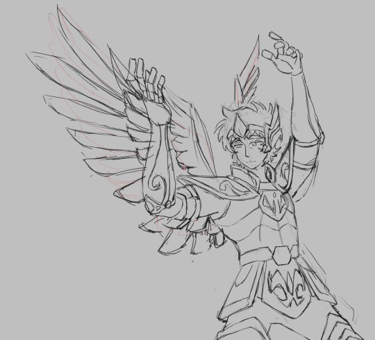
Finally got around drawing Aioros :D
#saint seiya#saint seiya fanart#los caballeros del zodiaco#sagittarius aiolos#I remember reading somewhere (either a post or some wiki page idk) how aioros is often revered as the perfect saint an almost divine figure#and I’m pretty sure aioros initially refutes being the next pope saying saga would be a better fit (it’s 4am so correct me if I’m wrong)#anyway I watched some of kotz for fun and saw that scene. he seemed rather upset at the news but a sense of distress I can’t really describ#even when keeping in mind that he was only 14 I don’t think it was the responsibility that comes with being a gold saint/pope successor#but more combining the first bit of being highly viewed. he seems like a rather humble guy who’s rather content with risking his life#or has at least excepted that fact. but when seem as more than a simple soldier it makes him uneasy. because he knows he’s not a god#yet is put in such position that when adding his sacrifice at an early age he’s practically legend. and despite the initial denial he will#always be obedient enough to accept the duty placed upon him. this is all to simply say I tried drawing him smiling but it didn’t look righ#so ye. (feel bad for just leaving the thought process to the sketch in the tags but it’s not my best wording so it stays down here)#a smol trivia nugget: I still don’t know how I want to draw aioros :p actually better trivia nugget: the pose/composition is from a photo m#they saw I had taken a photo but my angle was rather bland so they decided to absolutely blow me away with one heck of a photo#theres even nice lighting and everything. real glad I finally used the reference as reference :]
11 notes
·
View notes
Text

Urggghfhfhg
#im TRYING#anyway the camera i was using as a reference is a minolva maxxum 7000 from 1985#but ACTUALLY i think he's a nikon guy#nikon used (and still uses as most do) the same lens mounts across multiple models#so the lenses could be used for more than one body#but that mintolta model didnt#he's probably got a camera from 81-83 that's lasting him until after everything with Rabbit#OOH.. alex's camera should get damaged at some point...... in any verse honestly dhshDNDN#also rabbit sketch pose is not final i just realized it looks like the bigfoot walk dbdDBDB
2 notes
·
View notes
Text
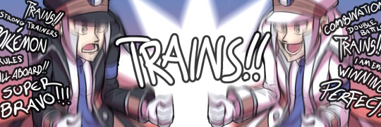
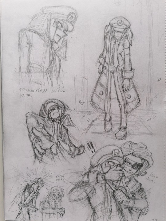
Submas Sketchdump Vol. 4 July 2022 Part 2!!
I knew that particular month beat my all time record for productivity multifold but I had forgotten SO MANY PIECES from the original collection!! I think I finally got them all?? More stuff under the cut!!
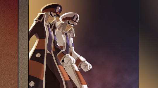
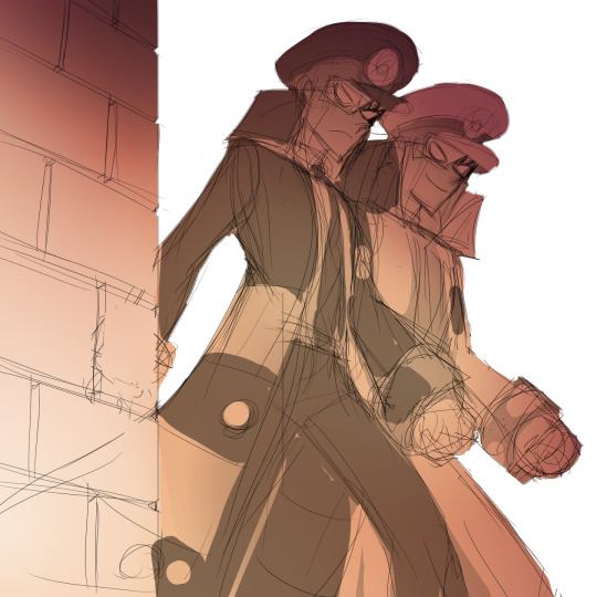
BREAKMAS!! WIP of the first piece I posted of them, here's the link to the final version! I tried coloring this first but the black & white had ultimately more impact so I went with that!
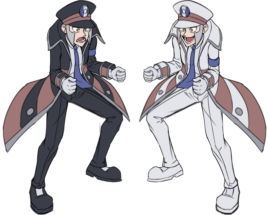
TRAINS!! I like this base color version too! Link to the final version!

The top sketch is a direct reference to Cluedo! A spinoff game, "Missingo", starring certain familiar characters trying to figure out what happened to Ingo/trying to prove their innocence in the case! Also WIP sketches for these two Breakmas comic pages!
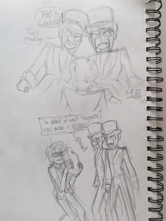
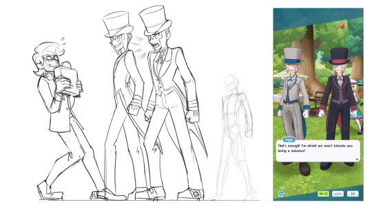
As you may know I adore butlermas! For the classy and stylish look which appeals to me in general, and coincidentally I had played PLA & got hit by submas train only one week before butler Ingo's banner rolled out! The pure bliss of finally meeting both twins in a game I felt was incomparable!! This moment in the Curious Tea Party event was really entertaining to me! We got to see submas get serious and stand up against this selfish collector thief! Two towering train twinks with commanding voices looming over the unfortunate guy was enough to make him change his mind ahah! They truly are the protectors
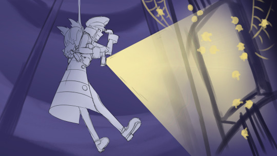
1-hour submas challenge prompt "Descend"! This is the actual one hour result before I continued rendering this!
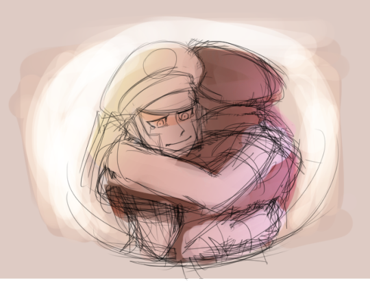
Mmmmm not my first attempt at drawing them hug and definitely not my best OR last. I want to make that moment something very special when I finally go all out on it!!
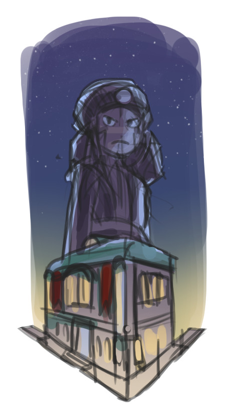
Comic cover vibing~
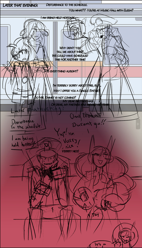


The scrapped last page for this silly comic! Sorry the dialogue is all over the place on the first piece, might be hard to read! I wasn't happy with how I presented Elesa, I wasn't familiar enough with her character back then so I thought of her carrying a toy taser to threat her friend even as a joke was too much and I couldn't come up with anything else for it. This held me back from posting the other three pages for another 5 months! In the last panel
I prefer to not mess up the twins too much but my brain is still very curious and conjures some peculiar stuff like this sometimes.. I think I may have broken his arms there looking at the anatomy, ooops! I hope you don't mind the photo quality or the two weird guys in the corner, they escaped containment!
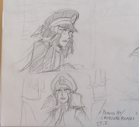
Idea of warden Ingo, being projected to modern era by his Alakazam, walking through crowd on a train platform & Emmet standing inside a passing train. Their eyes meet for just a few seconds...
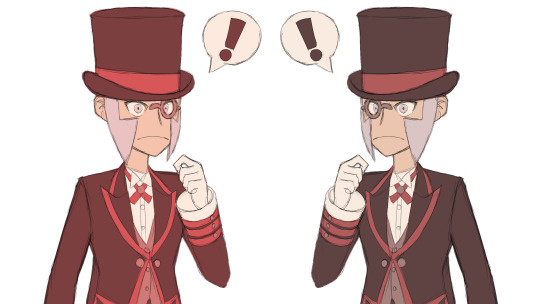
Pokemas Ingo practise!

Another WIP of a piece I posted! I started this piece like this but then later I decided to flip the whole thing.
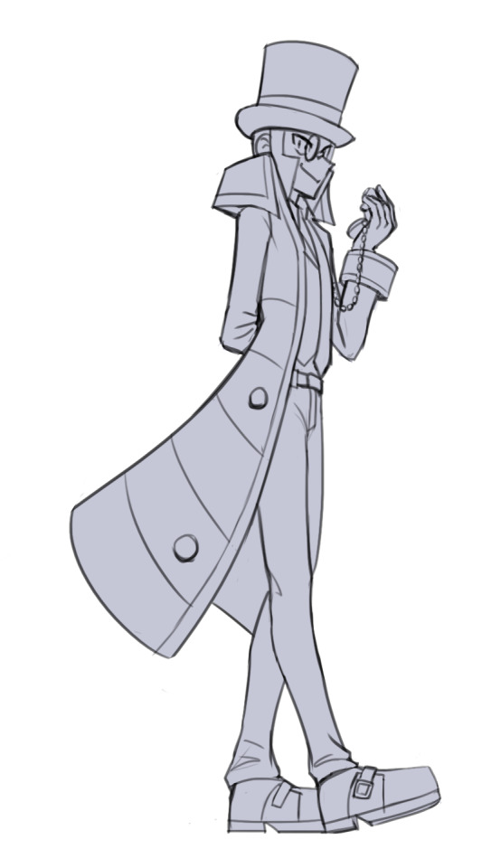
YET another WIP of something I already posted! No idea why I went and mixed up his suits but I like this sketch! They rarely end up looking this clean haha

Sketch version of the self-defense practise piece! I love getting creative with action stuff! I barely ever think of how difficult they are to draw, I just get so excited and fixated on visualising the scenes in my mind I just keep at it, pull out refs and pose in front of mirrors until it looks good to me! I want to draw more action scenes but besides being challenging to draw my brain comes up with more silly and cute ideas than cool ones unfortunately ahah

One more WIP, here's the link to the final results!! I really like how genuine their expressions look here even if the faces are a little off. I recall spending a long time figuring out this perspective. I thought it would be fun to you to see how all these pieces started and... looking at the sketch above and the stuff before that, you can compare some range of my style!

RANDOM SUBMAS MISSILES GO
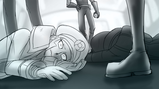
OHHH looks like some nasty passengers got the best of them!! If I recall correctly there was no fight because they managed to paralyse the two before they could act. Fully awake yet completely helpless... how convenient unfortunate. Thank you so much for checking these out!! Not every sketch is that exciting but I'm always happy to hear your thoughts on these!
Previous posts: Sketch dump Vol. 1: April-June 2022 Sketch dump Vol. 2: July 2022 Sketch dump Vol. 3: August 2022
#tw holding at knife point#submas#subway bosses#subway boss ingo#pokemon ingo#submas ingo#warden ingo#subway boss emmet#pokemon emmet#submas emmet#butlermas#submas butlers#team break#breakmas#team break submas#pokemon elesa#elesa#ingo#emmet#team plasma#galvantula#joltik#sketch dump#pokemas
696 notes
·
View notes
Text
CW FLASHING IN THE VIDEO (3rd from the bottom)
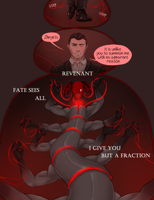

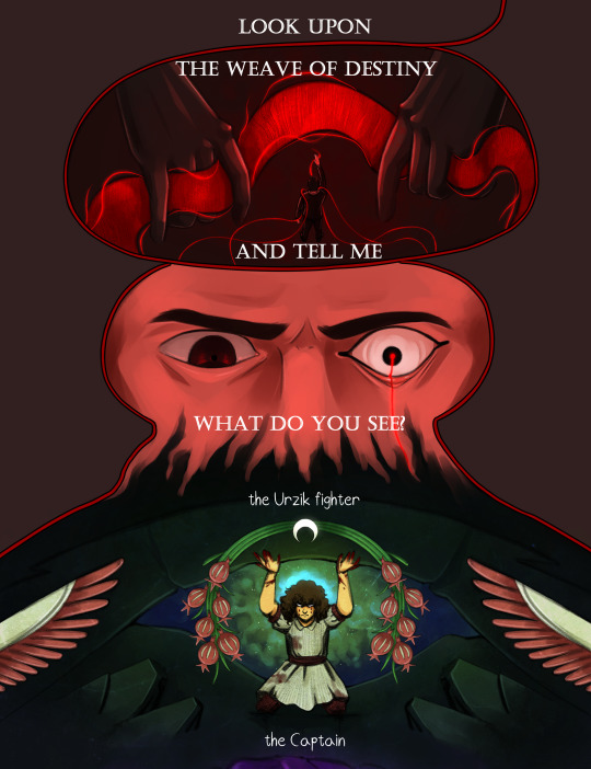
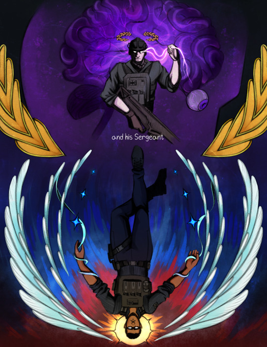


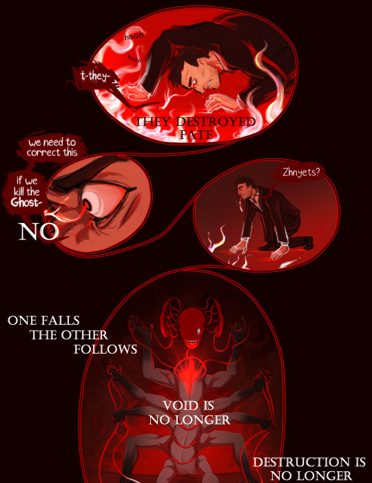

This is it. 3 months in the works, the comic (and video) are finally done.
A little over a year ago, I uploaded the first work in Revenant AU, Ghost's origin comic. I never thought I'd write a whole series for this, but I'm so glad I did. I got a whole new hobby out of it, haha.
I already began working on part 2, but this for me marks the start of it. I'm really excited to get back into this world!
Under the cut there are some comments on the comic I thought some people might be interested in (don't wanna make this post longer than it already is lol). I will upload the frames from the video separately, with comments on it there.
Bottom line is, thank you for letting me just go wild with this :)
Okay, I'm mostly gonna talk about the part where Fate shows Makarov the 141+Farah. Makarov doesn't see the Fate of people as literal images, he often has to interpret odd symbolism in the flashes he gets from the Weave of Fate.
I decided to go for a style I saw in a collection of calling cards in MW3, mainly from this one:

You can really see it in the faces and pitch-black cel shading.
I'll be going in order of appearance, starting with Farah.
Obviously, each of the "flashes" shows the Reaping of each person, Farah being crushed under rubble. Behind her is a helo of green gas, which symbolizes the Russian experimental gas. The motifs around her are more interesting imo - they're taken from the Urzik flag (and yeah apparently it's "Urzik" and not "Urzikstani"... according to the wiki at least). Wings, plants (feels to me like a pomegranate and some sort of crop, but I couldn't find what it is specifically), and a moon, upside down.
I'm skipping ahead a bit, but I've had the idea to make a drawing of Gaz in the Hanged Man pose since I started the AU basically. I tried sketching it once, and it went bad so I gave up lol. But I decided to come back to that here, and add some sort of tarot connection to all of them. I know practically nothing about tarot, googled the meanings of each, they fit well enough, I called it a day lol.
So Farah is the Moon, upside down.
Price is next, showing him taking control of the brain of someone. I didn't use the flag of the UK for the 141 (it'd be kinda boring...), instead I took the Taskforce 141 logo, and broke it down to different elements.
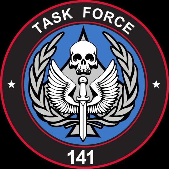
I took the laurels for Price, both framing his illustration and sitting above his head like a crown. I decided he will be the Emperor.
Next up is Gaz, the Hanged Man of course. Gaz gets both the wings and the stars (I changed mine to 4-pointed because... I like them better). Pretty clear why, both symbols relate to the sky. The illustrations kinda follow a rough day cycle, if that makes sense. Farah being night, with the moon. Price with his golden and purple color palette, twilight. Gaz being sunrise, and Ghost and Soap, day. This is why Gaz has a sun behind him.
Ghost was fun because he's the only inhuman one out of the group. I'll let you think what that implies, that even in Fate's Weave, Ghost is an outlier... Ghost gets the skull, and the card "Death". That one was easy, but what I did add is blood flowing down the skulls, like tear tracks...
Soap, the problem child, gave me the most issues as always. For once, it wasn't his fucking face, it was the flames behind him, and overall contrast and readability issues. Soap's illustration is probably packed with the most "hidden" details, though they're obvious if you've read the fic and Konchar's side story. The headless man behind Soap is Konchar himself, holding 4 chains with dog tags on them. The 4 soldiers from Soap's squad, who he killed before Soap was Reaped. Soap's pose is from the moment he came to his senses, after getting shot in the head and destroying a large part of Verdansk. He has 4 swords, pointing at him and downwards, so his card is 4 of Swords, upside down.
Between Soap and Ghost is a circle and a triangle. I'll explain that in the post concerning the video, since that's where I got that from.
If you read all of this, thank you so much! There will be another post for you to read in a moment lol
#cw flashing#call of duty modern warfare 2#cod mw2#cod ghost#cod soap#cod gaz#cod price#cod farah#revenant au#simon ghost riley#john soap mactavish#kyle gaz garrick#john price#farah karim#vladimir makarov#call of duty modern warfare#call of duty fanart#cod fanart#its been so long since i used the rev au tag...<3#as you can imagine... drawing a creature with literally 10 arms flailing around was quite painful#i think you can see me give up on the anatomy in real time there lol#but i do like how this turned out. the video couldve been better edited but#after effects crashed on me 4 times in the few hours i worked on it already so. fuck that lol.#also makarov isnt having a good time huh#deserved tbh
322 notes
·
View notes
Text
Heroes of the Dragon Age
An animation I've made for Dragon Age Day 2023, featuring my main Warden (Alyssa Cousland-Theirin), Hawke (Eleena Amell Hawke) and Inquisitor (Sulevin Lavellan)!
It's to this day one of my best artwork and I thought I should share it here too! 90+ hours between the original sketch, outfit design, the rough animation, rotoscope, inking, flat-colours, background shading and even the audio :')
Interested in the process? I detailed it below since it was my first time doing something like that:
I would like to start by saying I'm not a professional animator!Everything you've seen here is the result of experimentation and a lot of practice to learn and understand how 2D animation works.

My first idea started in May 2023. I just finished rewatching DA Absolution for the X time, and wanted to analyse why I loved the intro so much. (Even after countless rewatch, I never skipped it once.) I was inspired to study it with my main three protagonists!


Then came the first test with Alyssa Cousland-Theirin, my Hero of Ferelden! I tried to understand which part to separate for the animation. Mainly the hair and cape because it flows a lot more than the rest! If I recall, my first idea here was to make her counter flame attacks (?). Then, as the camera turns around her, I tried to add a grid to know how the camera would work around it.
I ended up making the clip longer, so she could position herself to the further left and leave space to the two other protagonists.

Now it was time to try to animate Sulevin Lavellan, my Inquisitor. I really kept that quick doodling style just to capture the vibe without putting too much time/effort into it! The background would be static to contrast with Alyssa's. I also loved the idea of a rogue sneaking!

Instead of working on Eleena Amell Hawke, my Champion of Kirkwall, I went back to Alyssa and started working with Clip Studio Paint 3D models (this entire animation has been done on the EX version of the software!) It helped for rotoscope animation and maintaining likeness! That's when I got the idea to make the background swirl around the character to let the eyes be guided by the rest of the screen!

After a couple more hours, I planned the entire animatic with 3D models and quick doodles! I finally found a cool pose for Eleena Hawke, which was honestly the hardest of the three to imagine for some reason? I tried many other poses but ended up picking an animation from the game!


This whole time, I was studying a bunch of background ideas and how studio Red Dog Culture House (who made Absolution) work! Thankfully, they have a YouTube Channel where they shared some BTS content so I could analyse it!


Then, I simplified my character and their original designs in the style of the studio! These outfits are how I imagine them after Trespasser. Alyssa as the Queen of Ferelden, looking for a cure to the Calling, Hawke following Fenris to Tevinter & Sully as a Red Jenny Inquisitor!


The idea for Sulevin's animation actually came from a piece I doodled on a live stream, when I was drawing pose studies and turning them into finished artworks haha As for Alyssa, I wanted to draw the fight that got her facial scars!

Once their designs were ready and the background ideas too, I made the rough version of the animation! Basically a sketch done on top of the 3D models to add the details, staying pretty rough just to capture the idea and movements.


Then it was time to start the lines! I decided make a folder per frame, so I could separate all he main elements and draw them one by one. It helps keeping the likeness of a character in the different frames without having big "jumps" between frames! In fact, every parts were coloured differently to recognize them, and then I used vector erasers and masks (Ah yes, the entire lineart is done in vectors of course! It's easier to adjust and save time when working on similar frames!)


At first of course, everything overlaps! But I find it easier to draw too much and erase after, just to make sure everything is coherent in each frames! The cool thing about CSP is how you can change the colour of the layers in one click! So all the coloured lines turned into black in one second, and I could reverse it just as quickly to double check!

Then I started working on Sulevin! I made a blue line to mark where her feet were, as the sketch in the background wasn't perfectly straight! (Like Sulevin's sexuality 🤭😂) The silhouettes were very quick to do, but I had fun adding more & more details as she came closer to the foreground!

I really wanted to add that little dagger trick, but I remember it required me to change the pacing of Eleena's apparition, as it was recovering her arm too quickly! I had to change the pace of multiple frames quite a lot during the project, to make sure the flow was right! For Eleena, most of her animation remained around her arms and the staff itself, as magic would be the most difficult part! That way each character has their own focus: Alyssa has a very animated background, Sulevin got the grappling hook and Eleena the ice!

Then it was time to start adding colours! Just like for the lineart, I separated every colour on it's own layer, so I could easily adjust the colours later if needed. I added one colour at the time, going through all the frames, and then another colour!
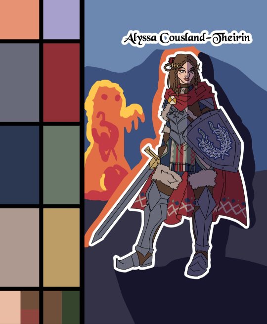
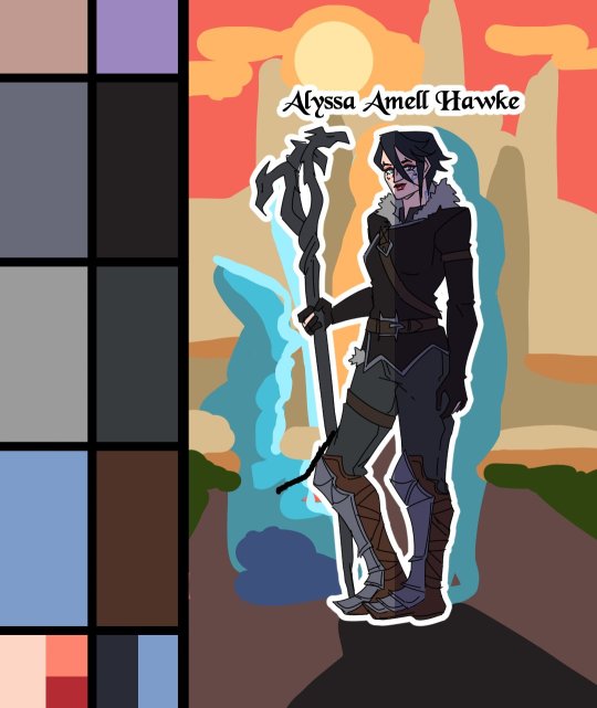
I made full palette tests with the colours I would use for their background at this point, checking if the details remained readable! Alyssa was the most challenging in terms of clothes, because I made her a very detailled armour! I had to simplify the Theirin heraldry, vectorize/redraw the Cousland, and make a brush for her cape's pattern!

Once I was done adding the flatcolours, I started the background, and oh boy it was a wild ride. For the cave, I painted multiple tests. I imagine was to use CSP panorama tools, which transform a texture into a 3D sphere, so each corners must match to look good. Sadly, it made the background very blurry, so after hours of testing, I changed ideas. Instead of the random fire balls (?) I originally imagined for Alyssa, I made three simple frames of a Rage Demon to attack her.


I ended up using the cave as a repeated pattern to make it turn 360° around the character. For Eleena, I mixed inspiration from the comics, Dreadwolf & Absolution, using warm colours matching Hawke's signature red. Just like I made the cave very grey/blue to match Grey Wardens. For Val Royeaux, it was more complex because I wanted to make it green, matching the Inquisitor's signature green. But bright green couldn't work, and the original colour during day time was blue/white/gold. So I added more leaves, played around the design a bit! After adding the rage demon, I made the shading! It was surprisingly easy and quick to do now!

I clipped a white layer on the flatcolours to not be distracted by the colours, and made thin lines to separate the light/shadows, then simply filled everything with the bucket tool! Then you set the layer to multiply and remove the white layer, and you have celshading shadows! Now the character looks out of the picture, so I added layers of blue in color burn, saturation and substract blending modes to make her look like she's in the right setting! Of course, I did the same with the other two, giving Hawke a red overlay and Sulevin green shadows!

Then I added the details, it went from white irises, to sword/staff smears to earrings and smaller finition that goes on top of these layers. To add the lights, I simply selected the shadows and reversed the selection! Using warm and cold tones to create contrast with the purple/bluish shadows! I also added more ambient light layers for Alyssa to reflect the Rage Demon fire. Now it was time to add ice magic! My first attempt had too many frames, making it look weird! Sometimes it's better to lower the frame rate to make things less bumpy!

Then I downloaded some cool ice brushes on CSP assets that made it look less like blue magical flames! But when I covered the screen in ice, I realized "Oh wait, I could make a cool transition from the ice, to blue lyrium turning red?"Red Lyrium truly links these three games and The Veilguard somehow! I spent the next hour painting over the idol and putting it in a black background, with lyrium and then the golden Dragon Age title text.
For the SFX, I used free youtube libraries sounds & "Darkspawn!" comes from the violent human female voice set (iconic for ""Can I get you a ladder? So you can get off my back!"😂🤭) After editing all that, the animation was finally done!

Here's the final math:
About 15 hours for the sketching/rough/animatic phase, 30h for the lineart, 25h for colours, 10h for backgrounds, 5h for details & 5h for music & SFX, for a total of 90 hours. Aka the same amount of time it took me to finish Baldur's Gate 3 the first time lol
If you have any question regarding the animation or the softwares etc. do not hesitate to ask, I'll do my best to answer!
#dragon age#dragon age origins#dao#dragon age 2#da2#dragon age inquisition#dai#da4#dragon age dreadwolf#dragon age the veilguard#animation 2d#original character#tutorial#warden#grey warden#warden cousland#alistair x cousland#alistair x warden#ferelden#hero of ferelden#queen of ferelden#hawke#fem hawke#eleena amell hawke#mage#warrior#rogue#lavellan#inquisitor lavellan#solavellan
253 notes
·
View notes
Note
I have this idea floating around in my brain for a while about a reader who likes to draw and because they have a crush on Jax they draw him. Jax eventually steals their notebook and probably teases them about it lol.
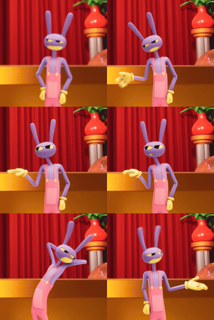
Jax x Crushing!Reader
warning(s): innuendos, bullying/teasing, Jax note(s): Look it's me and Jax, there's gonna be innuendos or some spicy wording and bullying. It's like a packaged deal or something. A/N: If you see me mixing Angel Dust's speech into Jax, no you didn't. If you didn't notice, I don't know how to tease and not be an asshole, so pretty on the brand I guess.
Caine had given you a sketchbook upon request, it was a little different than an actual sketchbook but it did the job regardless. Ever since your arrival, your fingers have been itching to draw, there were so many new sights and so much new inspiration.
There were so many things, so why did it seem like the doodles of Jax ended up on almost every page?
Easy, you had a crush on the apathetic, mischievous jerk named Jax.
Why? Well, now that’s the million-dollar question. He’s not inherently awful, no, that’s a lie, he’s an asshole. You don’t really have a good read on him yet but he’s funny! That’s gotta be redeemable, right? However, his jokes are usually backhanded and often involve being mean at the expense of others.
Okay so he’s a walking red flag but there’s something about him that has you crushing on the purple bastard.
Looking down at the sketchbook on your lap shows another two pages filled with sketches of random things, though most of the page is filled with Jax. You had taken to sketching things back in the real world to remind yourself of home, but eventually, those sketches would involve Jax doing mundane things.
Thing’s like sitting at a table eating real food, though you took creative measures when drawing an open mouth on him, it still looked off but it was serene and domestic. Then there’s the little sketch at the bottom of the page of Jax leaning against a window and staring outside. You’d manage to nab the pose and angle when he was leaning against one of the many random geometrical-shaped things in the main room and later added in a window.
It was embarrassing that almost more than half of the pages in the book involved Jax to some degree. Some pages weren’t even subtle, the whole page taking up a detailed portrait version of the male. Sometimes you even got creative and put him in different clothing.
Thumbing through the pages you saw there weren’t that many empty pages left. You’d need to ask Caine for another one and figure out what to do with this one. It couldn’t be left out in the open, you knew Jax had keys to everyone’s room and wouldn’t put it past him to go snooping. He’d already questioned you about the sketchbook before.
You’d been so focused on the sketchbook that you hadn’t noticed the man of the hour walking up. Jax noticed your intense focus and peeked over to see the infamous sketchbook on your lap, and with practiced ease managed to yoink it right off your lap.
“Well, well, well, what do we have here? You finally showing me what you keep your nose buried into?”
A yelp left you, stumbling to get on your feet you rushed to him and began swatting at the book and of course, he’d keep raising it just out of reach. “You took it! I didn’t say you could look at that!”
“Nah, pretty sure you said I could look at it.” He continued to lower and raise the book as you jumped to grab it. Sure he was curious before, but with a reaction like that? How could he not be even more curious? What kind of seedy shit were you drawing? Or perhaps some spicy nonfamily-friendly content?
Jax ignored your frantic words and opened the book to a random page, he was going to tease you about whatever dumb stuff you drew since you always had your nose in it but all he saw were sketches of himself.
A normal person might get embarrassed and hand the book back, but he’s not a normal person. It’s a little freaky, he won’t lie. A glance downwards shows him you’ve gone silent in front of him, simply staring down while he invades the privacy that was your sketchbook.
Your face is red and you look like you’re going to cry any second.
He’s a jerk, he was going to fuck with you, and he still is, but for the moment he’s taking in all the creative little pieces involving his face. Ya know, he never really thought much about how he’d look in other clothes. Gotta say he looks pretty snazzy in something that isn’t these shitty overalls.
“You know if I didn’t know any better,” his fingers still flip through the pages as he steps closer, circling you. “I’d say you like me.”
“I don’t.”
The reply is rushed and he rolls his eyes at the blatant lie, he’ll humor you this time. “Oh yeah? Does that mean you’ve got sketchbooks for everyone else too? Cause I’m pretty sure this is the only one I’ve seen you with.” He taps a doodle on the cover that gives away it’s the same notebook he always sees you with.
Tears trickled down your cheeks, you knew he was a jerk but this felt like too much. You just wanted your sketchbook back and to run away to your room, maybe pin something in front of the door that would render even the key useless.
His eyes roll the second he sees a tear, he’s not really seeing the problem here. You’ve got a book full of creepy—okay not completely creepy, he’s a good model so good on you for seeing that—sketches of him and he’s truthfully honored. It’s clear that you didn’t do this with everyone, so he’s honored to be your little model. Besides, it’s not like you actually have a crush on him, right?
Minutes tick by of him simply eyeing you, you’re still crying and it’s starting to get a little ugly and snotty, ugh. But you aren’t trying to further deny his little comment about you liking him. He’ll have to have a little talk about that later, what you could possibly see in him because he knows that you aren’t a sadist—oh, are you a masochist? That’d explain a lot.
Jax sighs and closes the book but doesn’t hand it over, simply putting the free hand on his hip. “You know if you wanted to see my face all you gotta do is ask. I’ll gladly show you this handsome face any day toots.”
Of all the things you thought he’d say, that wasn’t it. “H-huh..?” You embarrassingly wipe away the tears and snot before looking up at him.
“You heard me. Ya know I love this face too, very handsome. Maybe we can get Caine to put up some artwork in the tent of yours truly.” Jax wouldn’t consider himself vain, but you did have a way of making him look more, dare he say, attractive.
“I-I don’t… I don’t understand…” Was he still making fun of you?
He rolls his eyes before playfully hitting your head with the book. “Jeez, and here I thought you were smart.” Jax leaned over like he was speaking to a child and pushed the book to your chest. “I’m saying, the next time you wanna draw me I’ll give you a front-row seat. Maybe even take it to the bedroom so we won’t be disturbed.”
You push the book into his face to cover up that growing smirk and blush furiously. “Wh-what?! N-no I-I don’t…!” It’s hard to tell if he’s being serious or not in his offer to model for you, especially with the bedroom comment.
“C’mon, clearly you got taste. I mean that book is filled with sketches of me. I’ll commend you on your immaculate taste.” Jax taps the book before playfully bopping your nose. “At least let me give you the pleasure of seeing me close up. I’ve never been a model before so you might have to get a little hands-on to get me the way you want me.”
As the innuendos continue your face feels like it’s getting impossibly red and warm. Somehow this is worse than him telling you a sketchbook full of his face is creepy, in fact, you’d almost prefer it because your poor little heart can’t take anymore. You let out a yell and it stops his tangent but that stupid smirk of his never disappears.
“Offer still stands. You know where to find me.” Jax turns away but not before throwing a little wink over his shoulder. He still plans on pestering you about what you see in him, but for now, he’ll cut you some slack. You’re about as red as Ragatha’s hair and as much as he loves to see it, he didn’t plan to get this sidetracked when he saw you on your own.
He’s got a sucker to prank.
1K notes
·
View notes
Text
lessons in anatomy

a yandere art professor Wick x drawing model muse! reader AU...
CHAPTER MAP-> part 1 part 2 part 3 part 4 part 5 part 6 part 7
I.
-You’re a favorite amongst the studio art students at the university where you model. Not because of your looks, but because of your exceptional ability at sitting still. When you retreat inside your mind and you’re sitting in a position that doesn’t have any pinch points, you can go a solid hour without moving a muscle.
-Maybe it helps, that you were once an art student too. You’ve studied the classical positions immortalized by the greats. The drama of the Renaissance martyrs to the quiet repose of the Impressionists to the silent anguish of the Pre Raphaelites. You do a damn good Odalisque, if you don’t say so yourself.
-You’ve been doing this for a while, and you’re pretty comfortable with it. That is, until you walk into the first day of Figure Drawing 101 to find the most handsome man you’ve ever seen behind the desk–decidedly not the usual portly, gray-haired, female professor who hired you years ago. He is tall, and dark, with soulful black eyes that make your lady parts ache. It’s incredibly embarrassing when your mitt veritably disappears in his in a cordial handshake (good lord, what poetic, long-fingered hands!) and you almost forget your own name.
-He is incredibly gracious about your impression of a goldfish at feeding time. Undoubtedly, he’s used to this effect he has on women. Deep down, he must be laughing at you, and this more than anything helps you get a grip as you disappear into your little supply closet to change.
-You emerge in your pretty paisley-print robe that sweeps the floor, and you realize you haven’t been nervous about taking off your clothes in class since your very first day on this job. Your palms are actually sweating, as you perch on the model stand with your legs crossed, watching him out the corner of your eye. He is stupidly dapper, in a dark tweed suit and tie. His hair swings down into his eyes as he reads something on his desk, and you’re not proud of what you would give for the privilege to run your fingers through that fluffy dark hair.
-Thoroughly disgusted with yourself, you’re grateful when it’s time for class to begin. You’re surrounded by young adults who are [mostly] eager to learn with charcoal in hand. All eyes are on you, but its Professor Wick’s eyes you feel like a weight on your skin when the robe slides from your shoulders. You are so glad you can blame the air conditioning for your state of…attention.
-You start with quick warm ups, then some five minute studies, and finally an extended pose with small breaks in between. When the kids take a break in the middle of the three hour period you slide back on your robe and make a round of the room, perusing the sketches. You can already tell who will be at the top of the class, but also who has potential for improvement if they work hard and practice. And some…better be good at math, because art is not their thing.
You do not hear him behind you, until he speaks. “I'm not sure how your clavicle could be at that angle…unless it was broken in two places.” You cover your smile with your hand as you glance back over your shoulder at him, a hot blush spreading like wildfire up your neck for some ridiculous reason.
Mere proximity, you fear.
“Maybe their professor will set them straight.”
He chuckles with a charming self-deprecation that you find painfully endearing, scrubbing the back of his neck.
“I like to see where everyone stands on the first day. I promise that lessons in anatomy will be forthcoming.” He only meets your eyes for a bare second as he tells you this, but you are astonished you do not spontaneously combust.
TBC...
___
pinterest board/photo credits
#oh god here we gooooo 🤪#john wick#john wick x reader#john wick x you#john wick x y/n#keanu reeves#professor wick AU#yandere john wick
134 notes
·
View notes
Text
“Something cute” won the poll for what I should do for my 100 followers special, so I tried to come up with something pretty dang cute~
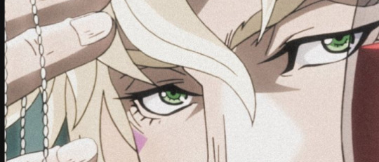
Various jjba characters x reader in: Artsy Date
Drawing each other sounded like a great date idea at the time.
Content: nothing really beyond a bit suggestive
Characters: Joseph Joestar (Part 2), Caesar Anthonio Zeppeli, DIO, Rohan Kishibe, Jotaro Kujo (part 4), Yoshikage Kira, Guido Mista, Bruno Bucciarati, Leone Abbacchio, Diavolo, Jolyne Cujoh, Johnny Joestar, Gyro Zeppeli, Diego Brando
Joseph Joestar: Oh he was QUITE confident in his ability to capture your essence on paper. And no matter how you insisted this was only for fun, not a competition, he was determined to be better at this than you. And he even tries to sabotage you, just a bit, by doing a hard pose to draw when it’s your turn to sketch him.
He IS fun to model for though, flirting with you while he directed you on how to pose for him. For a moment you almost feel like an actual professional model with the way he plays it up. He even makes a camera click noise with his mouth when he’s finally happy with your pose.
He works pretty quickly, talking out loud to himself as he goes, occasionally holding up his handiwork so he can compare it to you.
“Tell me how much you love it.”
He says it SO confidently given how…unimpressive his art skills are…
I mean…you can definitely tell it’s you. Because the character he drew has your outfit. But it’s a bit exaggerated proportion wise and he REALLY cannot draw faces to save his life wow-
“Is that my…nose?”
He’s a bit offended. “NO, that’s your mouth. This is your nose.”
You squint when he points to a spot on the drawing but you don’t really know what he’s pointing to.
But you’ll treasure it forever, you had so much fun being his model and doodling each other. And he quite enjoyed modeling for you, too, very happy to have a sketch of himself drawn by you. You drew him winking with a smug smirk on his face while in that stupidly complicated pose he decided to do despite your protests.
It’s unmistakably Joseph Joestar.
Caesar Anthonio Zeppeli: He loves this idea, but takes it SUPER seriously. He has you very carefully posed, and really takes his time illustrating you to the best of his ability. He even uses watercolors to add to your “inherent elegance” as he calls it.
When you finally get to see it…
It’s a bit amateurish, but still quite impressive, though he totally exaggerated your grace and poise. Your clothes flow in the wind as you pose delicately by a fountain…he definitely took some artistic liberties because there wasn’t any wind when you posed for him, and your outfit wasn’t THAT pristine, but it’s a lovely portrait, and you can’t help but smile learning Caesar really sees you as such a graceful and lovely person.
You feel yours isn’t nearly as grand in comparison, as you drew him much more casually, resting with his chin on his hand, looking quiet and contemplative. He adores every gift you give him, but something this personal is especially wonderful to him.
But you’re a bit embarrassed to see he went through the trouble of framing your drawing of him…sheesh Caesar…he’s so extra sometimes…
DIO: He could maybe make some free time for you in his evenings to indulge in the fine arts. You’re not sure if you’re surprised or unsurprised he actually takes a bit of interest in such things. You want to draw him? He’s happy to indulge you.
You’re off to a strong start because you have to hastily tell him he doesn’t have to take off all his clothes, you’re not making THAT kind of drawing-this was supposed to be cute!! Just pose nicely!
He can’t help himself and goes with something pretty provocative, but whatever. At least your drawing is gonna reflect his personality well.
He’s not opposed to drawing you in turn but he’s bossy just for the sake of it. He wants you to pose a certain way and if you move at all he swore he was going to stop immediately. And he was a man of empty promises, but not empty threats, so you held as still as you could manage, a bit embarrassed at the pose he demanded of you. He chides you a bit for acting surprised that his sketch of you actually looks really good.
You, posed with your arm on your own shoulder, and your head tilted so your neck is very exposed and you are surrounded by darkness. It’s a beautiful sketch, done quickly, and he has signed his name in big letters right on the drawing of you. Such a Dio thing to do. You understand even clearer how he feels about you.
He thinks you should consider it a generous gift that he deigned to waste his time illustrating you, so you’d better treasure that half-hearted sketch he’s made for you.
He has no interest in taking great care of your sketch of him though. It will be tucked away in a book somewhere and promptly forgotten about, but if you were to suggest another drawing session while he was in a pleasant mood he might not refuse.
Rohan Kishibe: Only AFTER suggesting it did you realize perhaps it was not such a good idea.
Rohan was a Very Fast artist. As soon as you suggested it he had an amazing illustration of you done in five seconds flat. You tried to explain it completely defeated the point to go so fast, and that you were supposed to pose for him at least while he drew you!
Well…he doesn’t really see the point in that. But it’s not like he’s swamped with work so…he will try to indulge you if it would make you happy.
You ask him what pose you should do and he says you can do whatever you want because he could replicate it accurately.
Once again defeating the point but whatever.
You try to do a cute pose in the hopes you can convey your romantic intent with this activity. All he does is quirk an eyebrow at you and mutter that your pose looks a bit uncomfortable to hold, but that he’ll be quick so it’ll be fine.
You sigh. He was so unromantic. You were posing SO cutely and he STILL wasn’t getting it.
His illustration of you is professional, even inked and colored with markers, and it only took him a few seconds. You’re posed draped across the couch, with your arms spread and your legs bent to give the appearance of stretching charmingly.
He narrows his eyes in confusion when you proclaim it is his turn now. Apparently he wasn’t listening very closely to how this was supposed to work.
He doesn’t want to pose so you can draw him! That’s boring. He could be doing something else. This really isn’t supposed to be an argument, so you suggest he reads a book or something so he’s not entirely “wasting his time” while you draw him.
He’s grumpy about it, but relents. As long as you promise to be quick.
He just quietly reads in his chair while you doodle him. It’s awkward and not nearly as romantic as you were hoping for, but you’re pretty happy with how your sketch of him turned out.
He doesn’t have much to say on your drawing, quick to excuse himself so he can finally go back to doing whatever he was doing before you interrupted him with this date idea of yours.
But he loves it very much, and keeps it safe in his studio, but he’ll be a bit of a brat about it if you ask because he’s embarrassed to admit it makes him feel good.
Jotaro Kujo: He’s decent at drawing, but only animals, not so much people. But if you’re both not busy one evening then fine, might as well.
He tells you to keep your expectations low, but you’re just glad to finally be spending some quality time with him. He’s not the easiest man to schedule time with, always busy with something.
His drawing of you is simplistic but recognizable, since he knew he’d struggle with detail and it’d just end up bad if he tried.
You love it! It’s rare for him to do anything like this for you, so the drawing is very dear for you, regardless of how he insists it’s not anything to be so excited about. He doesn’t really say anything, but he’s glad it makes you happy, even though he doesn’t feel like he did much.
You accidentally draw his hat too big when it’s your turn to draw him, but otherwise you think it looks pretty cool. You tried to capture the coolness of his white jacket blowing in the wind. You can’t really tell if he likes it, but he ends up folding your sketch nicely and keeping it safe somewhere, so you like to think he enjoyed this little bonding activity.
Yoshikage Kira: UGH, you’re not sure what you were expecting. The drawing he makes of you is…interesting. You’re recognizable, slightly above stick figure status…but he put a Very noticeable emphasis on your hands, putting much more effort into them than anything else in the drawing. The more you look at it the more you realize it’s just a really low-quality imitation of the Mona Lisa. Now you understand the purpose of the pose he suggested. But he seemed to moderately enjoy himself, so…Success, you suppose.
He’ll cooperate and pose for you as long as it doesn’t take too long.
You go for something casual, his pointer finger against his cheek, his other fingers against his chin. Relaxed, but stylish.
He thanks you for the drawing and tucks it away somewhere. It’s safe, but out of mind.
He doesn’t really care if you keep ahold of his drawing of you though. You’re free to do whatever you want with it, he’s not an artist so he understands if you don’t want to keep it, it didn’t take that much effort to draw anyways.
You keep it for a bit but eventually lose track of it. It’s pretty funny when you accidentally stumble across it after it disappeared for a long time. Oh yeah. That weird drawing Yoshikage did of you where he only tried when he was sketching your hands. You had forgotten about that. For good reason.
Guido Mista: He’s definitely not an artist but if you don’t care about how it turns out and just wanna spend time with him through this activity then he’s totally down.
The bullets end up wanting to draw you too so…you end up with a lot of poorly drawn portraits of yourself. Honestly you couldn’t pick out Mista’s drawing from the bullets’. How do they all draw the same way…
All the drawings of you are pretty much just stick figures with very large heads. He said he wanted to capture your facial features accurately so he had to make your head bigger. More room for the eyes. Yeah he’s definitely not taking this too seriously but you expected as much from him. So to counter him, you draw him poorly as well, and then all of the bullets large and in as much detail as you can manage.
He pretends to be offended by it. “Why’d you draw my eyes so big?!” he asks. Because beyond his sense of fashion his deep dark eyes are his most notable feature! Duh.
He ends up losing the drawing on accident within a week but! The important part was how fun it was! The finished products weren’t that important-
Please don’t be mad at him-
Bruno Bucciarati: He thinks it’s a lovely way to spend some time together, so he does what he can to clear his afternoon so he can spend it with you. He starts by saying he’s not an artist so don’t expect too much from him, but his brow furrows in concentration once you’ve assumed a pose you thought he’d like. You go for something cute but
stylish, sitting with one leg up and your other outstretched along the couch elegantly.
His drawing of you is cute. Soft lines and very simple, mostly just capturing your pose than any other details, with dots for eyes because he claims he cannot draw eyes for the life of him. It’s sweet, surprisingly adorable for the serious capo. He tells you not to show his gang though, or he’ll never hear the end of it.
You embarrass yourself a bit when it’s your turn, because you spent a very long time concentrated on his chest trying to get his tattoo accurate. And he’s not helping with his flirty little remark where he suggests you could probably see a little better if you sat closer to him. And then pat his own lap.
It totally breaks your concentration, so you decide your drawing of him is now finished, handing it over to him before he can fluster you any further.
He thinks it’s lovely, and he promises to take care of it, and make even more of an effort to carve out some free time to spend with you, even if it’s just half an hour or so.
He’s already planning a date he can surprise you with next time.
Leone Abbacchio: He’s not one for sweet romantic gestures, so he pushes back a bit, but if you nag him he’ll give in pretty quickly. It’s not like you’re asking him to do something he really hates doing, and he has a particular weakness for you…so fine. But just this once.
He’ll hold still so you can sketch him, but only for ten minutes, and he gets to choose the pose.
At least the pose he chooses looks nice. Despite his jaded personality, he’s a pretty and elegant looking man. You draw a side profile of him, his expression that usual impassive frown, but his features have a sort of rugged grace.
When you slide your masterpiece over to him, he exhales through his nose so he can maintain that grouchy persona, but he’s gentle when he actually takes the drawing from you.
When it’s his turn to draw you, he works quickly and silently, not even looking at you, which leads you to think he’s still unhappy about being asked to do this.
He won’t admit it but he didn’t look at you because he didn’t have to. He’s replayed memories of you through Moody Blues enough times to have your face memorized.
You weren’t expecting much when he casually slid the piece of paper over to you.
But when you look, you can’t help the way your jaw drops. A side profile of you that mirrors the one you drew of him. Drawn amazingly well. It’s accurate, elegant, surprisingly soft…he’s even sketched a few flowers alongside you to make the piece more aesthetically pleasing.
The way you stare makes him embarrassed, and he ends up biting out that if you didn’t like it you should just throw it away.
You respond by clutching it protectively against your chest. It just makes him more embarrassed to know you’re going to be clinging to that thing for a while. There’s really no winning with him-
WHATEVER.
You can do whatever you want with it, but do NOT show that off to Mista, Narancia and ESPECIALLY NOT Giorno (not that Giorno would tease him, but the mortifying idea of that blond knowing ANYTHING about him makes Leone feel ill).
Once enough time has passed, you can start convincing him to make a few quick sketches for you, since they make you happy for whatever reason, and unfortunately for him he loves making you happy even if that means dropping the apathetic gangster disposition for a moment.
Ghiaccio: You thought that you had finally found something that was relaxing for both of you and wouldn’t completely frustrate him and result in him losing his temper. Again.
Turns out you were incorrect. Again.
Firstly he’s not a fan of sitting still. He’ll sit in one spot for you, but he’s tapping his foot the whole time and fiddling with his phone. So you try to go as fast as you can before he gets too impatient with just sitting there waiting for his turn to draw you.
It turns out a little bit rushed, but you feel like you captured his look pretty well, even adding some red to his glasses and shoes for a splash of color.
But when it’s his turn to draw you…he starts getting frustrated fast. He keeps erasing and starting over, the poor paper getting smudged and wrinkled into oblivion, and eventually he gets mad enough to stop when he accidentally rips through the paper with his pencil.
He shouts a slew of Italian curse words before saying he’s done with this stupid date, slamming the sketchbook onto the table in front of you and storming off in a huff of embarrassment at how poorly the drawing turned out.
Well that went great.
His drawing is honestly pretty cute, the condition of the paper and the eraser smudges and rips tell quite a story…
Because of how crumpled the paper turned out it kinda looks like the hastily drawn version of you got hit by a frying pan or electrocuted by a lightning bolt, but you still like it. It was nice of him to at least entertain your idea, even though it ended up frustrating him.
Diavolo: Draw him? NO.
Not a CHANCE in HELL.
Remove that idea from your mind immediately and never bring it up again. He will not allow even one vague sketch of him to be made, and if you do it anyways he will not forgive you.
Really you should’ve expected that reaction. What were you thinking with that one…?
But if you irritate him enough about it, he’ll Eventually get fed up and tell you to sit down and hold still. If all he has to do to get you to stop whining was sketch you, then FINE. He’ll sketch you.
Stop squirming in your seat and squealing with excitement…you’re giving him a headache.
You try to hold still for him.
He radiates irritation at having to do this, his gaze intense and the strokes of his pencil harsh and deliberate.
“There.”
He tosses the sketchbook over to you and promptly gets up and leaves before he has to hear your feedback.
It’s pretty good actually. A little rough since he drew it while in a particularly foul mood, but if he actually tried he could really make something nice.
If you tell him you love what he drew for you he’ll dismiss your compliment immediately. He doesn’t care about his art skills, he has much bigger things to concern himself with than sitting around sketching his partner whenever they begged him for that kind of attention.
Jolyne Cujoh: At first she thinks it’s a super cute and romantic date idea, so she’s eager to try it with you.
She does a cool pose for you, elegant but powerful, and she tries to hold it for you but it ended up not being the easiest pose to hold so you have to work fast. She ends up having to stretch after that painful pose, and even though you feel a bit bad listening to her complain about how she pulled a muscle doing that, it’s hard not to enjoy how she rolls her shoulders to loosen them.
She says it was totally worth it because she loves your sketch of her. You better believe she’s going to take good care of it, even if you say it’s not good because you had to rush it. Too late. She’s not giving it back. You’ll have to fight her for it, and you know from experience you’re not winning if you try playfully roughhousing with her.
When it’s her turn to draw you, she pretends to be highly concentrated and serious, but she ends up feeling a bit embarrassed when she actually finishes her sketch of you.
It’s not bad at all, very cute, and she gave you sparkly anime eyes since they’re the only type of eye she knows how to draw. The proportions aren’t perfect, your head looks kinda big compared to your body, and it’s pretty simple, but in a way where you could claim it was a stylistic choice and not on accident.
If you really insist you love it she’ll be slightly less embarrassed, but don’t go showing that around to everyone! It’s for your eyes only!
She signs it for you with a playful green lipstick stain.
But seriously. Don’t show it around.
Johnny Joestar: Usually you’re both too tired by the time you’re setting up camp when it starts getting dark during the SBR to think about doing anything cute with each other.
But one evening you have an extra burst of energy, and there’s juuust enough light by the fire to do a sketch of Johnny.
Well, if you want to. He’s not ready to fall asleep yet so you might as well.
You really wanna capture his intense eyes. So you don’t make him do anything in particular except look at you on occasion so you can make sure you’re getting his face right.
It turns out okay. At least you got the eyes right. He doesn’t really know how to react beyond just thanking you and tucking the drawing away. The two of you can only hope nothing happens to it, but it can’t be helped with all the action during this race if your drawing ended up destroyed.
When it’s his turn to draw you, he’s quiet and concentrated, occasionally glancing up at you for accuracy’s sake but otherwise he seems to know what he’s doing, to your surprise.
“I think it turned out alright,” he comments, handing it over to you after signing it with a little star with two J’s in it.
It’s a bit of an understatement, even in the darkness with only the light of the fire to see, he captured an amazing amount of detail. You, sitting contemplatively by the fire, shadows dancing across your face with the flickering of the flames…and he got the scenery really accurate.
“Do you like drawing landscapes, Johnny?”
His sketch of your surroundings was done remarkably skillfully.
He shrugs, but then thinks about it for a moment before saying yeah, landscapes were more enjoyable to draw for him. You have to slow down a bit to capture the details of your surroundings accurately in a drawing so…perhaps he likes the change of pace every once in a while.
Gyro Zeppeli: He acts sooo confident despite knowing full well that he cannot draw people. And he’s a bit of a menace to you, since you said this was only for fun and nothing to take too seriously, then surely you don’t mind him constantly moving around and striking different poses and making weird jokes. If he was going to be ridiculous then FINE, you would draw him ridiculous.
You confidently declare your drawing is quite flattering and then spin your paper around to show him a half-hearted attempt at a sketch of him lying on his side with a rose between his teeth, surrounded by hearts. You’ve purposefully given him a tiny head so it looks silly.
He takes it as a personal challenge, declaring it was his turn so you’d better be ready. While he’s drawing you, you pretend to fall asleep like he was boring you.
You were expecting his drawing to be unprofessional but at least recognizable. When he confidently hands you back what he’s drawn you genuinely aren’t sure what you’re looking at.
“This is me?”
“YES, see this is your hair, and these are your arms…” he explains the drawing to you but can’t help the occasional laugh that escapes. So he WAS messing with you with this incomprehensible scribble he presented you with.
“You really captured my essence,” you say, holding the picture up next to your face to compare them.
“Like you have a twin,” he declares, accompanied by his signature laugh.
He’s such a TEASE sometimes-
Diego Brando: He’s really struggling to grasp the idea that this is just for fun and isn’t supposed to be super serious, because as soon as he’s done posing for you he’s hovering over your shoulder while you draw and backseat sketching for you. He’s like ‘oh my hair should be a little longer, you got my nose shape wrong, that’s not how my eyes look, etc.’
Ok Diego why don’t you draw yourself if you know so much about art, sheesh-
Even if you say that as a joke he might actually end up plucking the sketchbook and pencil from you and finishing it himself so it’s to his likeness. You find it a bit irritating that he’s actually pretty good at art and his additions to your drawing of him really make the piece come together. So annoying. How dare he be innately talented at drawing?
AND just to show off he makes you do a complex pose when it’s his turn to draw you. He ends up capturing it and your appearance on paper wonderfully.
You look great sketched by him, due to the pose he chose it almost looks like you’re in the middle of a dance, a sense of movement that made you look graceful and powerful. Just the type of thing Diego liked in his partners.
You’ve been a bit idealized in his drawing, not to your surprise, but you’re quite fond of it anyways. You make a point of not laying on the praise too thick though. Otherwise it would go to his head, and the last thing he needs is an even bigger ego.
-
Which Jojo character would you want to draw you? Personally I’d love a Rohan original but. I actually think DIO’s art style would be aesthetically pleasing to me-
#thus wrote Mrs Zeppeli#jjba x reader#jojos bizarre adventure x reader#joseph joestar x reader#caesar zeppeli x reader#dio x reader#rohan kishibe x reader#part 4 Jotaro x reader#yoshikage kira x reader#guido mista x reader#bruno bucciarati x reader#leone abbacchio x reader#jjba diavolo x reader#Jolyne Cujoh x reader#johnny joestar x reader#gyro zeppeli x reader#diego brando x reader#x reader
87 notes
·
View notes
Text
How I deal with shapes


@spadefish @kobothesmall So for shapes, the way I work with them is from studying how things break down individually, instead of following a broader ruleset for character design that you see a lot in tutorial posts (the triangle, square, circle theorem basically).
The way shapes work in humans is different from other animals (which also differ from each other), which is different from objects. The same shape can be used for different goals depending on what you're drawing. So there's no one size fits all, and especially in styles that have a bit more of realism going on, those shapes will behave differently than extremely cartoony styles.
Process wise, a lot of it ends up happening in my head than in the canvas, because I spent years dealing with this shape philosophy of "just bang your head for each thing you're drawing", which I understand is very tedious to some people, but I love studying individual things vs following tutorials because it teaches me 1. how that thing works in a context 2. gives me a new book to my visual library which I can pull from, which is often what happens! That, and a lot of it is just staring at references too. Still, I'll try to draw something up for this.
There are 2 ways to approach shape design. You either start with the shapes and then apply a concept to it, or you start with a concept and apply shapes to it. The former is much harder to do without practice (and also comes more in concept art which is rough, unfinished and meant to be done and redone dozens of times by design). So, I tend to do the latter: I start with a concept of what I want. This can be as simple as "I just want a character that's fat/standing" or more abstract like "I want a character that feels like a river/I want this to feel like an outburst".
Let's start with a concrete concept: I want a design that looks like a pacman frog, and just a standing pose that isn't too stiff.
I grab some pacman frog references, and sometimes if the pose is complex, I'll find references for that too. Pacman frogs are pretty pudgy, and their legs aren't that long compared to most frogs, even when unfolded, and their faces have a nice triangle-ish forehead with a nice shape for the mouth.

The result is that i use large shapes for most of the body. Curves contrast with sharper lines, giving the sense of something geometric but still organic. The line of action here helps me pose these shapes in a way that gives some movement to something as simple as standing (and you'll gain a lot of mileage from learning how to rotate shapes! this is how you're able to position them in different ways and create more dynamic poses).
For something more abstract, like a crouched pose meant to be angry, I take some references when i can and start doing something like this:

Note that these shapes seem weird because I'll have a naked fullbody wip below any clothed characters to have some anatomical guidance, but for actual final shapes and silhouette, what matters is the final elements, and that includes clothes! so i try to build shapes that emphasize this droopy, closed off feeling. This sketch isn't even that good really, there's plenty of errors, but I hope it gives an idea of whats going on.
I hope this weird rambly nonsense helped LOL
249 notes
·
View notes
Text
how do you keep your pants up when you’re performing? it’s incredible!
belt.

i started this with a sheet of upholstery vinyl that i laminated together front and back using heat-n-bond. i then cut out each of the pieces i needed and painted the edges with a black satin paint to create the illusion of burnished leather! i used riveting tools to cut out all of the holes on the belt, and of course, to install the rivets that hold the buckle in place.
the first belt accessory is the potion! i’ve had this bottle sitting around for like three and a half years now, empty, from the target dollar spot around halloween. it was finally time to put it to good use! the solution is water, acrylic inks for color, and gold and silver mics powder for the shimmer when agitated! i was trying to capture the nuances between the greyish color of the turtle master potion in recent updates, and the bluish purple of the enchantment glints prior. after mixing it up, i simply sealed it with some silicone. all of these materials were just things i had sitting around my studio already, which is awesome.


i cut and painted more strips, and modeled a potion holder after ones i’ve seen at every renfaire and convention vendor hall since i can remember. no use changing up a formula that works! i did end up adding a decorative cover to the snap here, and painting the rivets to match the belt’s hardware.

using the same processes, i made a loop to feed through the loop on the totem!


again modeled vaguely after another design for a sword frog i liked online, i sketched up a pattern for a weapon frog! i wanted it to be somewhat versatile since i’ll have more than one weapon i’ll want to put in it, so i opted for three snap straps to hold whatever weapon it is in place. again, i covered the snaps with decorative ones and painted all the rivets gold.

it fits toothpick with just a little give, so it can fit a weapon up to just a little bit bigger around than toothpick’s upper handle!

originally that was everything i had planned for the belt, faux leather wise, but I realized there was no way in hell i was carrying a bag with this cosplay, so I wanted a pouch for my phone. I made a couple mistakes while working on this. most notably, I chose a metallic cord for the thread. why did i do this. it took probably twice as long as it would have had i just used embroidery floss because of the nightmare challenges metallic threads pose.


I do think it ultimately turned out nice, though!
The only pictures I have with all of the finished pieces on the belt at once are on the next full costume sneak peek, so you’ll have to wait either for those to be ready or for me to finish the wither skull props, whichever comes first ;)
taglist under the cut, reply or send an ask to be added!
@too-much-alphabet-soup, @embers-archive , @nothing-to-see-around-here, @pluralphilza, @aleeaviancrowalt, @islib
93 notes
·
View notes
Note
hello! hope the new year has been going well so far!
i would like to make a request; can i ask for a Vil x reader, can be platonic or romantic your choice, where the reader is an artist that has drawn a portrait of everyone EXCEPT for Vil and he just tries to do everything to get the reader to draw him. like, posing more dramatically while doing mundane things or sets up dramatic lighting in a classroom
just to have the reader finally draw him after he gets caught in the rain or something XD
sorry if this is too much, feel free to change anything or ignore
Draw me, I demand it
Vil x Reader

Vil would insist he wasn't petty or Divine forbid, jealous. He was a celebrity, an icon, he knew his worth more than anyone. But to know one of the few people he'd ever dare call his friend seemed to be purposefully excluding him made him a bit...upset.
The prefect was a lovely person, fun to talk to and occasionally had an outsider perspective on the media he was engrossed in. While they didn't have the pleasure to talk often, he considered them fond of each other at least. He did anyhow. That was until he learned from Epel that the prefect was an artist, traditional in sense with the medium of simple pen and paper.
Such a fact had been made know because Epel had shown him a sketch the prefect had done. While it wasnt a masterpiece, Vil wouldn't deny it carried potential and clearly show cased a high amount of skill. It was during the conversation that Epel had stated the prefect had drawn all of them.
So the next day, when their paths had crossed, Vil had asked with a teasing edge to see one of the sketches they had done of him. Thats when he learned Epel was wrong. The prefect had done at least one sketch of everyone from their collective friend group, except him.
He'll admit, he was mad in the moment. But now, days later, he finds himself putting more effort into his makeup and hair in the morning. Wearing new tie and shirt combinations with various patterns and textures. Trying new shoe styles for the sake of the Seven. But nothing seemed to spore the prefect to pull out that damned spiral bond black book and annoyingly powdered yellow pen.
At some point, he had even enlisted Rook to plan and stage worthy environments to spark artistic creation. None of which worked, other than Rook appearing all too happy as he put together an entirely new scrapbook of his own.
It wasn't until the weekend. A torrential downpour had suddenly affected the campus, sending students flocking into buildings and dorms. Vil had been in the middle of another attempt to swoon the prefect into sketching him when the rain started. An hour of crafting a vine and flower arch ruined. By the time they had made it to Ramshackle, they were both nearly soaked through.
So now he sat in the lounge of the rundown dorm, a towel that smelled lightly of mothballs and holding an old mug of cheap hot chocolate being warmed by a fire. The prefect had just stepped in the lounge, mouth open with their own mug before they froze. Then they scurried away, returning with that forsaken notebook and started to scribble.
Vil raised an eyebrow, confused as to what they could possibly be sketching. Looking out the window at his side, Vil noticed in the sanctuary of an overgrown bush and the windows ledge were two butterflies. One noticeably bigger, wings packed with technicolor blues and purples, while the other was a simple silver-grey. He huffed, seeing the cosmic irony of the two insects cuddled together while he sat across the room from his own plain butterfly.
The rain didn't let up. It rained for hours at the same intensity it had started. With his drink gone and the prefect lulled to sleep, Vil finally stood to gently pull their sketchbook from their limp hands. Looking through the pages, he couldn't help but pout at seeing multiple sketches of the others and none of him. But on the newest page, he was met with a picture of him waterlogged, sitting by the fireplace and smiling into the mug of hot chocolate.
"..." Vil chuckled, looking to the sleeping freshman before slipping the book back into their hands, "Silly potato. At least you captured my beauty properly..."

110 notes
·
View notes
Text
DCA Subnautica AU
Version #2 of the designs, including the bioluminescence! + fun tidbits on each of the goobers and a visual on Y/N!
(Edit: it’s out now! Check my bio for the link)
Eclipse is up first!
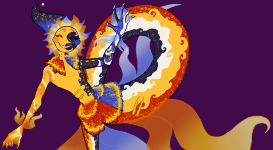
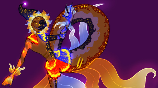
Theirs was the first design I drew out in any detail (as shown in the crude MS Paint drawing), so it's the one that needed the most work. Even after making the more detailed version with the lights, I still ended up changing things as I got a better grasp on what direction I wanted to head in. Fun lore tidbit! Eclipse is a freak of nature and should not look like that! They're properly split down the middle between day and night. Also I messed it up in the drawing because I was tired when I made it, but they're also covered in scars and bite marks.
Sun !!
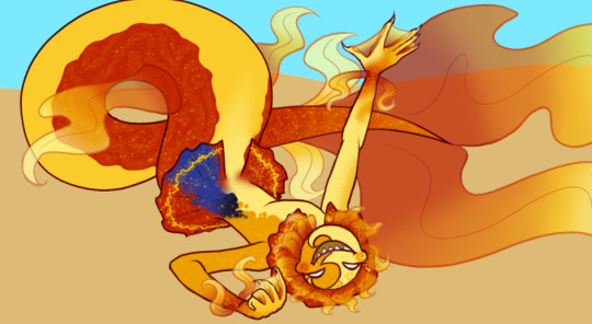
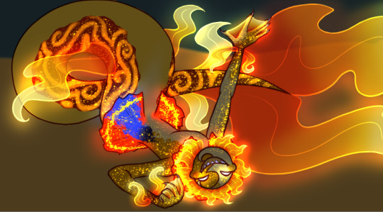
I did Sun next, and here I had a better idea for what I was going for. There were still a few problems with this design though, which got changed. This is also where I started drawing the pattern on the tail, which I felt looked weird in this picture. Fun tidbit! Sun has an inability to express his feelings in the appropriate fish mermaid way, leading to much confusion.
Moon !!
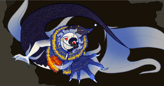
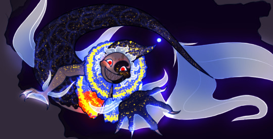
Moon was done last. Once again, I learned from this drawing and changed Moon's design to match, however Moon is the one that remains the most unchanged! I knew what I was going for by the time I got to him each time, so I guess that helped. Something I did alter, however, were some of the lights. I found that they either blended together too much or weren't as visible as I would have liked. Fun tidbit! This is pose actually based on a scene in one of the chapters. It was actually one of the earliest written scenes.
Y/N, my beloved <3
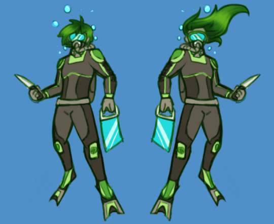
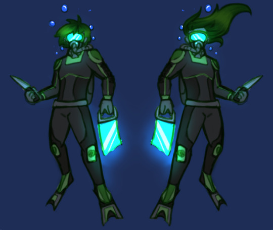
I did 2 versions of Y/N, one with longer hair and one with shorter. It was important for me, when writing the story, that I kept the person I'm imagining as vague as possible, with the only physical descriptions being "physically fit" and having a few scars (for plot reasons), so this is only for me and whatever drawings I do. As a result of trying to keep it vague, I ended up going with the shorter hair (though in the final reference I made it a bit longer than shown here). Fun tidbit! The green is because whenever I'm sketching, I have 4 colours I sketch in to differentiate parts of the picture (usually background vs foreground or different people), and green was the one I used here (red, blue and purple were taken, I'm sure you can understand why). It ended up sticking, since I didn't want to go with the orange that's on Ryley's suit in order to avoid possible confusion.
That's it for now! At some point, I'll post the full references for each of them, but until then, the next thing I post will probably be chapter 1!
#dca mer au#art#my art#fnaf#my goober#fnaf daycare attendant#fnaf au#mermay#fnaf mermay#fnaf y/n#fnaf sun#fnaf moon#fnaf eclipse#the daycare attendant#dca au#daycare attendent#mer sun#mer moon#mer eclipse#A Lucky Charm
236 notes
·
View notes
Text
BNHA girl's redesigns
(pt.2)


Thoughts & Comments under the break. I always make a lot of small, conscious decisions when redesigning characters so I hope it's interesting
PS I do intend to do the other half, I just didn't like my original sketches so I'm restarting :)
Tsuyu Asui (Froppy)
I wanted to give her kind of a baggy jumpsuit that would accentuate her lanky posture. I struggled slightly in giving her frog motifs, but I eventually put together the liminal spots, the shape on the rim of her gloves, cap & goggles, and the translucent sleeves. All of them together make her costume look rather frog-like I think, and of course the frog toes on the boots. Also, the twin braids just felt right for her character, as well as her freckles.
Momo Yaoyorozu (Ms. Architect)
Obviously, Momo's hero costume is the most problematic of the canon designs, so this is my take and I'm actually really proud of it. I also renamed her because I think most of the girls' hero names are a bit... simple, cheap, and uninspired. (Especially compared to most of the guys') I chose Ms. architect by using thesaurus for the word "creator" since an architect is someone who plans and makes things, it's also much more respectable.
Honestly it's kind of a simple design but I think it suits her in a way. It has a red top that's cut low in the front and back, especially since we rarely see her use her quirk from her stomach. Then she has shorts that reach just above her mid thigh, with an apron over it to carry, pens, her notebook, and a measuring tape to help with her quirk since she has to understand the structure.
Ochako Uraraka (Uravity)
It's hard to tell with the pose I put her in, but I mean for her to be tall and thin/lanky, like someone who runs track, mainly to give the sense that she's light (which is more obvious in the design sketch.) I made her slightly tan with a bit more ginger brown hair in a longer bob simply for some variation and I like it. For her costume, I wanted it to vaguely resemble an astronaut for the space/gravity theme. I also absolutely had to get rid of that line that goes down her crotch bc it makes me uncomfortable.
My original sketches to work out the designs---I did do some reworking on the final, but for the most part they're the same. Also you can see the varied body types better here than in the posed drawings

#fanart#bnha#33xhausted art#character redesign#tsuyu asui#froppy#momo yaoyorozu#creati#ochako urakara#uravity
244 notes
·
View notes