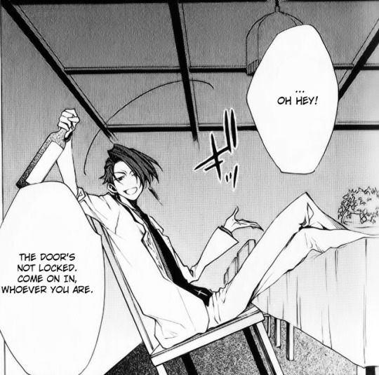
#i like how characters are drawn in specific styles sometimes???
Explore tagged Tumblr posts
Visit Tumblr Blog
Explore Tumblr blogs with no restrictions, modern design and the best experience.
Last Seen Tumblr Blogs


Fun Fact
Tumblr is available in 18 languages.
Text
i reblogged some of that barabims persons art but looking at it again today zooming and moving around the image its AI generated with some retouching. i saved an image of joseph last night and what clued me was this weird lump that looks like an ai conglomerated signature that theyve since deleted with an updated image.


structure is inconsistent without seeming human logic or intention,bangs blending with the headband design for example, masses of clothing folds that have no human logic to them. some images have very low resolution, and zooming in on any image shows lots of the image tends to smear and blend together. hands while having the right number of fingers, they dont have logical proportions or positioning when the other parts of the piece are extremely anatomically correct. shading and lighting under closer inspection i very nonsensical in some areas. things that if an artist intentionally stylized i would think nothing of but become very obvious its the work of an AI when compounded with everything else. these are things that come off as amateur mistakes that an artist of that presumed skill level wouldn’t make often, but that a computer that doesnt understand would.

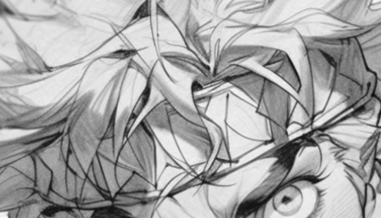
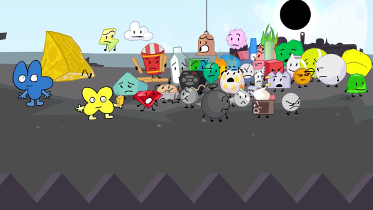
jotaro extra knuckle kujo, giorno weird ear and floating earring. weird giorno earrings the sequel.
hair blending with design in sleeve, etc. these are tells that come with AI art. its been getting better and can do the correct number of fingers and more stylized images, i was even tricked at first glance. but any close scrutiny reveals these things.
#barabim#sorry#an artist posting a large gamut of highly rendered pieces with 0 other internet presence#and stylistic inconsistencies are numerous between pieces#once you start seeing the AI tells they just pile up very quicktl#they can just post a speedpaint if they arent using AI but i doibt they will so#its whatever tho#just thought id let people know#theyre trying to pass themselves off as an actual artist so im worried they might try to make money off of people#also notice how all of the jojo images resemble the jojo characters strongly but are missing a lot of key character design details#because AI cannot be that specific#also the styles while similar do change enough between pieces that they sometimes look to be drawn by different people#just no consistency#that new ceasar image they posted also his shoulder is connected to his neck like lol#the final fantast images are also very AI#ill add to this if people want more proof bc i have a lot to say about that johnny joestar image
81 notes
·
View notes
Note
Hi! I’m working on an original character project that I want to include a lot of casual representation in (“casual” meaning that the characters don’t need a justification for being disabled/fat/POC/etc, they just are because people can and do exist that way in reality!)
I was wondering if you had any suggestions for finding resources for drawing facial differences(and maybe other visible disabilities), especially in a cartoony style. I’ve looked through the Facial Equality Week tag but would like to see more examples, and since my art is so… goofy, for lack of a better word, I would love any help I can get in integrating differences without being offensive or upsetting.
Sorry if this is a bother, and thank you for all that you do!
Hey!
I'm not aware of any guides for drawing facial differences specifically (or at least, good ones. There's 1 billion tutorials telling you that scars are just a Singular Line, always, but that's not... correct), but perhaps someone in the notes could help out?
For my own advice, you could check out this old post I made. Because you mentioned your art being cartoony, I would specifically urge you to not overexaggerate facial differences the way they often are. A prime example would be how a lot of cartoons portray strabismus;
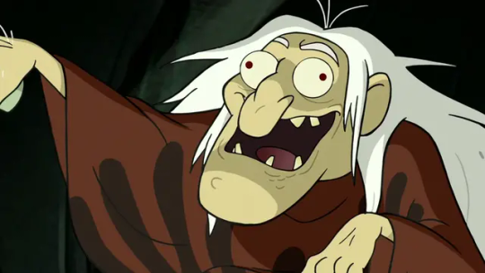
It's just a funny gag to them rather than, IDK, how some of us look like. Not to mention that one of these is also a mockery of intellectually/developmentally disabled people with "Derp" in the name, but that's beside the point here.
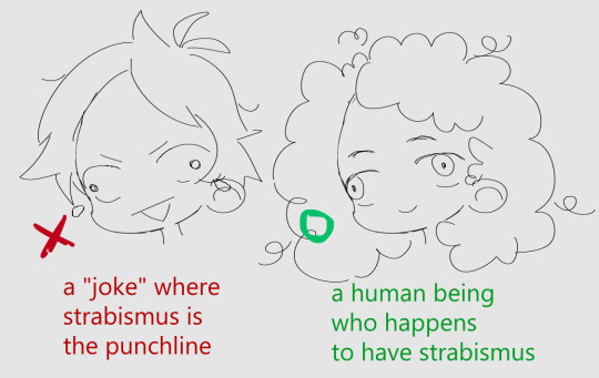
It's the whole "the character is crazy/stupid/wild/whatever and that's why they have it" that's the problem with how it's often shown. You can also see it in how characters who don't even normally have it will be shown with it for a scene where they're saying something nonsensical, etc.
Another example that's nowhere near as rampant is the split-face thing with various facial differences being used. Mostly vitiligo but sometimes also facial palsy. I'm talking about this weirdly perfectly halved face that looks extremely different on each side, often used to imply that a character is two-faced but mostly just signals that the author doesn't know how vitiligo looks like.
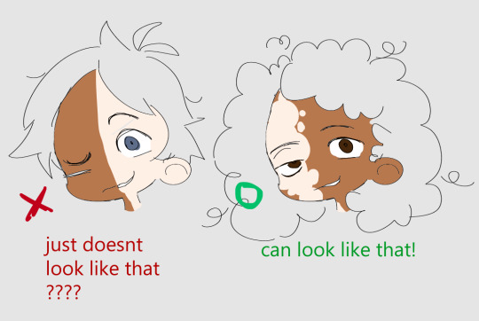
[note: vitiligo also shows up on lighter skin. I wanted to make sure it's visible here for tutorial clarity purposes.]
This one is just weird because it straight up doesn't look like that. I have no idea where it came from, but it should go back there. Facial palsy doesn't make someone look like the antique comedy/tragedy theater mask.
Unless I'm forgetting some other annoying cartoon trope, these would be the big ones that you should stay away from.
Outside of that, it's really on a case by case basis on how a specific FD should be drawn because they're so different. A birthmark can just be a differently colored patch of skin, but a craniofacial difference would require some more changes to be included. Alopecia is well, lack of hair, and can be done very easily but ectrodactyly can be more complicated to show properly because of the limitations of a cartoony artstyle when it comes to hands. And while I do think it would be great to see more of those facial differences that tend to not be included in art at all, there's nothing wrong with deciding to go for the things you can represent more faithfully, especially if you're just starting.
I will say that if you're making an honest attempt at being respectful and trying to get it right, most of us will still be excited to see your work. Even if it's not perfect or has some inaccuracies. I will take a "'yeah more or less' correct with a happy, human character" over a "Very Technically correct but tagged as #tw burns and with blood splattered on them" any day.
Lastly, I wanted to share some art featuring characters with facial differences (and other visible disabilities) that are done in a cartoony, or at least somewhat simplistic artstyles (I'm using both terms very widely here) - maybe it will give you some ideas.
Man with Treacher Collins syndrome (also one of the first pieces online where I saw a character with an FD portrayed in such a lovely way. A fav of mine.) Girl with Pfeiffer syndrome Too many characters to count Woman with burns Woman with a limb difference Multiple characters again Animation featuring people with Down syndrome [youtube] Multiple characters, including a girl with neurofibromatosis, a burn survivor, a girl with a cleft lip and another with TCS [twitter]
If you have a more specific art question ("how do I draw a person with XYZ facial difference?") you can send me an ask on @saszor. I prefer to stick to the writing theme on this blog but would still like to help if you need it.
Hope this helps,
mod Sasza
Edit: apologies for the lack of alt text on one of the images, it has been fixed.
707 notes
·
View notes
Text
please tell me this manga/comic/show exists i do not wanna have to make it
okok I've posted about this before but I'm watching animation content on youtube again while getting work done and by GOD I WANNA TALK ABOUT THIS AGAIN
There's a specific concept I want to consume as content/art so badly but it came to me in a stupid dream. BUT. Sometimes, a dream means I DID see a hint of it somewhere and my brain accidentally plagiarized it which provides me with the teensiest sliver of hope that exists already and I don't have to work on it
It's a kind of a reverse isekai, right? But instead of an instant portal, it's time passing. And what I mean by that is that it's a Sun Wukong story, but the branch off is that after the main events of Journey to the West he gets either water temple'd or trapped in magic sleep again, not for a few hundred years but a few THOUSAND.
He wakes up to an incredibly far-flung China that remembers his myth and only his myth.
The art style that operated in this dream was sort of. Textured but 3D? Think nimona's buttery lighting but instead of emphasis on light and shapes to operate with the stained glass and solarpunk-medieval style the models are textured in a way that just invokes traditional brushwork and colour bleed even in a more cyberpunkish setting. Think like. Whenever there's a night scene the astigmatism glow of lamplight bleeds a little, like ink feathering on paper.
It's a little bit of a Steve Rogers treatment in a way, the world has moved past him, but also completely mythologized and capitalized on that mythology. Rather than treat that man out of time narrative as an aspect of backstory, it's the MAIN character narrative, because this ISN'T a world that needs him. This world is doing pretty okay, actually.
This a story about him.
Not about his feats or how cool his powers are or the 8 gajillion things the magic staff can do but just.
How ya doing, bud?
From the vaguely coherent notes that I could garner from my sleepily typed googledoc, it seems that I wanted this to be a love letter of sorts to the Asian diaspora experience? A specific sort of loneliness? Where the world you experience has a sort of disconnect in that it makes plain you belong there but you also don't, you never have, and there's no way to go "back" but going forward feels like groping blind through the muck. How much right to the past does he feel like he has? When it's been built into something he can't recognize and is clearly important to other people.
I want the pickup of the plot to gain him friends, family, maybe even a conflict or two but the stakes should never elevate vis a vis physical enemies to battle.
It'd be about 2/3 of this sort of narrative drawn story and the other 1/3 just hogwild worldbuilding and design
I've looked at a few other journey to the west adaptations but they mainly just use him as a funky lil action figure hero that's there to be cool as hell and save the day
99% likely this is just a thing my brain is made up and I'd need a several million budget and about 25 additional skills to start the ball rolling but hey, worth it to ask yall again
#sun wukong#journey to the west#mia dreams#i get these cinematic dreams once every now and again maybe i'll use that tag to post more of em
890 notes
·
View notes
Note
you're talking about the elitism and classism baked into the way modern Riddler's competency and education level is upped and I fully agree but can I add that...I don't want to call it whitewashing because it's not like he wasn't a white guy before but there's something to the way this change in competency and education level came along with a redesign that changed his look from a dark haired and often brown eyed man that sometimes was drawn a bit tan and/or with a hooked nose to a very pale blue or green eyed ginger with a button nose. this might just be me but imo pre New 52 Riddler generally can pass as italian-american or otherwise as being an ethnicity that's not "white anglosaxon" while the modern design usually lacks any of his old features that could make him read as not north-western european, and the way this redesign was brought in to divorce him from the older, sillier, less "smart and successful" version is....idk it feels bad
it's like that fucking. where's that post where the characters from Frozen got edited to be like a very specific flavor of 21st century American hot and somebody was like "how do you whitewash white people?" it's like that. like yes he was always white but now he needs to be conventionally attractive to fit the current DC uncanny valley smoothed out pretty style so he's WHITE white, which here is shorthand for the most aggressive possible arrangement of conventionally attractive features. he's paler he's younger his weird nose and fucky hairline are gone he's better educated and has business acumen and I hate him!!!!
111 notes
·
View notes
Text
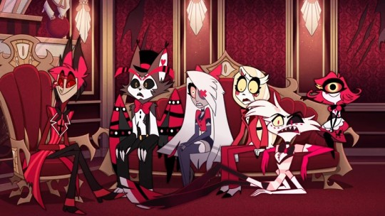
Hazbins bad character design
I feel like there is a definitive lack of varitey when it comes to the designs in HH as well as a problem of characters' designs not fitting them or what the show wants us to assume about them.
I've said it before and I'll say it again (like lots of other ppl already) but the designs in HH specifically mostly don't work. They're fine if you look at them disconnected from the show. Maybe as just random characters who don't really have to carry a show visually. But they don't work if you actually put them into context and into the background of Hazbin Hotel.
Obviously this stuff is very objective and if you do like the designs thats fine (which I shouldn't even have to say). Also I didn't study art or character design and I don't think you have to to be good at it/be able to form opinions on it and this is mostly just me compiling what I don't like while using some basic knowledge on how shapes, colours etc work.
(rant under the cut)
One problem I really have is, that as soon as you have a design there are immediate assumptions about the character. In the sense that if person A is very muscular and fights against person B, who is maybe slimmer or less buff, you would probably immediately assume that person A wins, atleast in physical combat. Whereas person B would probably be the assumed winner in a stretching or flexibility competition. Often characters are designed with these assumptions in mind. Muscle, height, weight, age, clothes etc. give way into assuming stuff about people, their condition, lifestyle or personality.
The expectations that are set up by the design choices are usually either picked to genuinely represent something about a character or to be subverted and shock/confuse the audience.
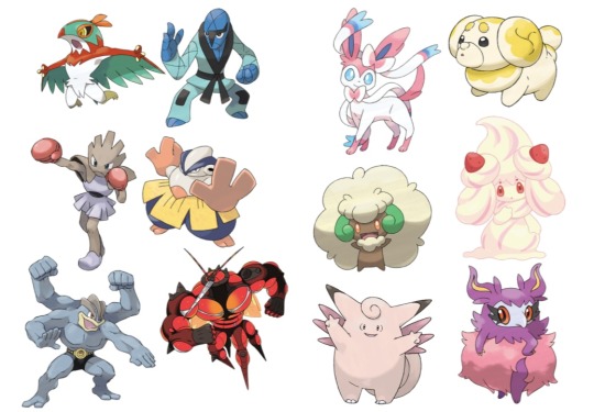
Like how a lot of fighting types in Pokémon will either be more muscular or have other details relating to certain fighting styles/sports and the fairy types are usually pinkish, fluffy and cutesy. Because these elements are something typically associated with these types and when we look at them we can pretty easily tell which type they're supposed to be.
Otherwise, Monster girl from Invincible is drawn as a twelve year old girl, so it subverts expectations when she turns into a big green monster and generally doesn't stray away from violence, because it's something you wouldn't have assumed about her from her appearance.
In Hazbin Hotel most of the time the character designs don't necessarily fit what they're supposed to be and they also don't use the other design choices as subversion (the one that would probably count here is Nifty with looking and acting very childlike usually but then also acting violent/crazy sometimes).
The first thing would probably be that characters don't look their age mostly.
Charlie and Valeria (Vaggie, but I really don't wanna keep calling her that so she gets a new name) look fine as they're supposed to be around 20. Rosie and Carmilla also look alright for what we can assume their ages are supposed to be. But Alastor is in his 30s or 40s (what it says on the fandom wiki) and he looks around 20 as well. The same thing goes for Lucifer. He looks so young that he could also count as just Charlies brother or friend rather than her dad, because he doesn't look like he could be the dad of a 20 year old. This makes the song "Hell's Greatest Dad" a bit awkward because these men are singing/competing about who is better as Charlies father but they don't look a day older than her. Husk also looks way too young for someone in his 60s-70s (again from the wiki).
The body types being all the same also doesn't help.
Mimzy and Adam are pretty much the only more relevant characters who aren't like all the others in terms of body shape. All the other relevant women in the show have a tiny waist and either big boobs/big hips or just a slimmer build in general. All the men have thin waists and then broader shoulders.
And for some characters it makes sense. Like Angel is really flexible and his more lanky body fits with being a spider. But why are Lucifer and Valentino like that? Other than the fact that Viv doesn't like drawing muscles there is really no reason for them too being build like every other skinny man there. Valentino is supposed to be intimidating not just by how he acts but physically too. He seemingly has a bit more muscle than others but his arms are still super thin and look like they could snap if I look at them wrong. I'm not trying to say that abusers all have to be buff, but simply from a design perspective the scenes with him would be a lot more effective if we saw him actually have a big physical advantage over Angel and others, even when he isn't necessarily threatening them. As soon as he comes on screen, we could see him as a much more intimidating presence, especially when all the other characters look like sticks. Or they could make it so, that he hides his muscles under his coat and when we get the reveal of him actually removing it, it's more shocking and immediately makes the situation more tense.
Lucifer could've had a more confident frame as well. He's the king of hell and the strongest being in hell, so just for the diversity I would give him some muscles too. Husk is also super skinny and for someone who only sits around and drinks alcohol all day, he should definitely have a beer belly (please I swear to god I wanna see more men with bellies, Mammon was great). Also for Valeria and Lute and pretty much all the Angels I don't get why they wouldn't be more buff either. Valeria is a fighter, she's Charlies bodyguard but she looks like all of the other women there. It's stated that Angels fight so wild because they don't know they could get hurt. And while I know that the Angels can really only get hurt by angelic weapons, having this whole reveal that they can be injured would've definitely suprised me more, if they actually looked like they couldn't be injured in the first place. But then again, Valeria looks like her arms would break as soon as a breeze hits them too hard. In some episodes her thighs look a bit more muscular, but not notably and she also doesn't fight using her legs (like Carmilla) so only her thighs being bigger sort of doesn't make sense. In general, she or Lute don't show any difference to the women who aren't physical fighters. And obviously just to have a more interesting show to look at, including different body types would do a great job at making these characters stand apart from eachother more.
While we're on the topic of diversity, another obvious thing that makes the characters redundant and borig (sometimes ugly too) is the reused colour pallette. Colour coding is probably one of the easiest things when talking about character designs and it's something atleast Helluva Boss understands.
What effect warm/cold tones have or what feelings we associate with different colours is a great way to bring stuff about characters across without being too on the nose. Obviously colour can also be used to either connect characters or to make them very distinct. Shape language also plays into that of course. In Inside Out the emotions are mostly characterized by their respective colour and by their distinct shapes.
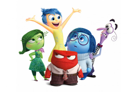
Joy = yellow (bright colour often associated with the sun/light)
Sadness = blue (cold colour often associated with tears/rain)
Anger = red (very strong colour with aggressive association with fire or when someone turns red because of anger)
Fear = purple (light colour here, mix between red and blue as fear often falls into a more angry or sad feeling)
Disgust = green (colour of most dirt or puke or other stuff people usually see as gross)
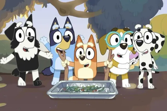
Or in a show like Bluey, where different patterns, shapes and colours show the breed of the dog and also how characters might be related to eachother (same breed/mix of breed = usually related).
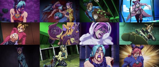
Or how colours can be used as lighting effects to create cool shots when the colour pallette changes all of a sudden. In JJBA these changes happen often when someone is in distress or unsure of themselves. Also in tense moments to make them seem more exciting and interesting.
Hazbin Hotel has very limited range when it comes to the colours of the main cast. All of them feature some form of red and that usually in combination with black or white (if they aren't just purely red like Alastor or Rosie). This makes them not stand out from eachother and creates very similar colour pallettes which get boring once you've seen them repeated over and over again. It also makes the visual connection between characters who are actually related (like Charlie and Lucifer) a lot less strong because so many characters share similarities already.
Also they just hurt to look at sometimes because the background is mostly red as well and with a lot of them being very overly detailed. People have also spoken before about the show being pretty inaccessible for colour blind/vision impared people due to these issues with the colour.
And now you might say that it's hell and therefore it makes sense for all of them and the background to be red. But firstly, I don't think that there is a definitive source which decides that hell is red and can only be shown/interpreted as red. And also there is another show, also set in hell which actually does a much better job at that and actually shows different colours in hell. Like in Helluva Boss the rings are all colour coded.
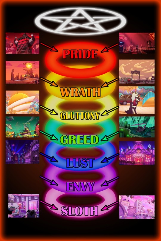
And I know, that HH plays in the pride ring fully, but imagine how cool it would've been to see sinners have colours similar to the sin(s) they committed. This could lead to them looking distinct from eachother and the background and would also lead to us being able to assume stuff about them, if we're familiar with the colour coding. In "Hell's Greatest Dad" they do a fun colour change with different light and it's really refreshing and I just wanted to see more variety like that (of course I kinda get that the colour changing isn't really part of the shows design but it was pretty cool to see in that song).
There also is the issue with characters that are supposed to be animal-like sinners not looking like the animal they apparently take inspiration from. The thing is that the animal/object parts don't necessarily have to be visible to understand a character. But in the show, how sinners look in hell is often influenced by their life on earth. Vox's head being a TV is because he was a Tv-show host when he was alive. Nifty also is supposedly a bug, which makes sense because she hates bugs and probably hated them in real life too. But that is where it would be great to actually have Nifty resemble a bug, instead she has no features of one and just looks like a regular humanoid sinner. The same thing happens with Alastor being a deer, Valeria a moth, Charlie goat-like and Angel a spider (also Mimzy is apparently based off of a chicken). Like I said, the animal inspiration isn't essential to the characters, but emphasizing these design elements could help the characters stand out instead of them all just looking like sort of human characters. Sir pentious and Husk work the best in terms of presenting their animal inspiration (though pretty much everything else about Husks design sucks ass).
And then there are complaints about the characters that are supposed to be people of colour not having any features that resemble their race. It's just a bit weird when a mostly humanoid sinner doesn't really seem to resemble how the person looked in real life. Black characters have really desaturated and sometimes just straight up grey skin in HH. Alastor is probably the most egregious in that regard, but also Emily has just light blueish gray skin and no textured hair or other black features like the nose or lips or palms. Velvette and Sera have darker skin but also no other features (except for when we see Velvette's natural hair texture in like one shot at the end of the season). I know there are other things wrong with how Voodoo is presented in HH or with Mimzy's design often being seen as a jewish caricature, but I don't wanna focus on that fully, because I feel like there are people better suited for talking about that (black people or jewish people ofc).
In general HH is a show with pretty bad designs (imo). That's actually a thing I prefer about Helluva Boss, because there the designs are mostly okay or actually sometimes pretty good. Striker is probably my favourite design in both shows (he reminds me of Dillon and that's cool).
I like Mammon, Asmodeus, Octavia and Loona as well. I would still probably change a bunch if I were to redesing the HB cast but they overall look more solid than the HH cast.
This was another post which pretty quickly became an excuse to talk about other media I enjoy. I might do that more often, because comparing elements of HH or HB to other stuff makes it kinda easier to articulate my feelings. Also just because I enjoy talking about other stuff too.
#hazbin hotel critical#vivzepop critical#hazbin hotel criticism#hazbin hotel critique#anti vivziepop#character design
218 notes
·
View notes
Note
(Technically 3 question about Shamura)
Do you think they would speak similar to the Gman from Half-Life? As in similarly awkward pauses/stutters/inhales/drawn-out syllables on account of their brain injury?
Also, do you think them having a sudden episode of visions could/would be similar to the whole "leave me alone" meme from Akira (like imagine them just chilling around having tea and then suddenly random images of Narinder going on a bloody rampage while flipping off the camera start flooding his mind).
Please tell me I'm not the only one who's always pronounced it "sham-yura".
ALSO CAN I JUST SAY YOUR VERSION OF KALLAMAR IS ONE OF THE MOST PERFECT KALLAMARS I HAVE EVER SEEN, LIKE LITERALLY YOURS AND AVELOKA-DRAWS VERSIONS ARE MY CURRENT TWO ABSOLUTE FAVORITE KALLAMARS AND I DESPERATELY NEED ONE OF THEM TO SWEEP ME OFF THE GROUND BRIDAL STYLE SO I CAN KISS HIM ON THAT TOOTHY FUCKING SPLIT MOUTH OF HIS!!!!!!!!!!!!!!!!!!!!!!!!!!!!!!!!!!!!!!!!!!!!!!!!!!!!!!!!!!!!!!!!!
(oh and your Narinder somewhat reminds me of those awful prank youtubers like Jack Doherty, like literally the most perfectly awful combination of spoiled+narcissist+sociopath, the only thing he's missing is that dumbass broccoli haircut)
I haven't played half life in forever but now that I'm rewatching the gman cutscenes, you're definitely onto something....if I could come up with what I think shamura could sound like, it'd have to be your suggestion blended with beatrice horseman (from bojack!) after she develops alzheimer's. I think gman's incredibly uncanny way of speaking mixed with beatrice's distantly pleasant cadence masking unending terror would be PERFECT for shamura.
NO WAY YOU MENTIONED AKIRA AND SHAMURA IN THE SAME SENTENCE CAUSE I LITERALLY DID A SHITPOST ANIMATIC A FEW WEEKS AGO THAT USES THE "DING!" SOUND EFFECT FROM THAT SCENE. I'LL HAVE TO POST IT SOMETIME. For my specific shamura, their visions and prophecies appeared only in dreams before The Incident, so their next angst comic is gonna be about the visions coming back while they're still awake. THAT'S when it becomes more like the LEAVE ME ALONE!! scene
I've heard youtubers say it like sham-yura but I'm dead set on shuh-murr-uh personally, I think they say it like that in kallamar's metal song!
OH GOD LMAO I FEEL LIKE JACK DOHERTY IS MORE OF AN EVIL PRESENCE THAN NARINDER CAUSE AT LEAST NARINDER IS FUNNY. My sister told me I should draw him with the fuckass broccoli cut, but I think narinder has been through a lot at this point, he doesn't need the prank youtuber haircut on top of that :')
ALSO, I'm very glad you like my kallamar that much and as such, I present you with this drawing! Idk how to draw a bridal carry but kallamar is just a bunch of wiggly tentacles so this was probably the perfect character to draw with this pose

138 notes
·
View notes
Text
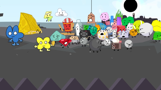
MY HUGE TPOT 15 THEORIES AND OBSERVATIONS AND JUST RENERAL RANTS AND AUTISM POST. SPOILERS AHEAD
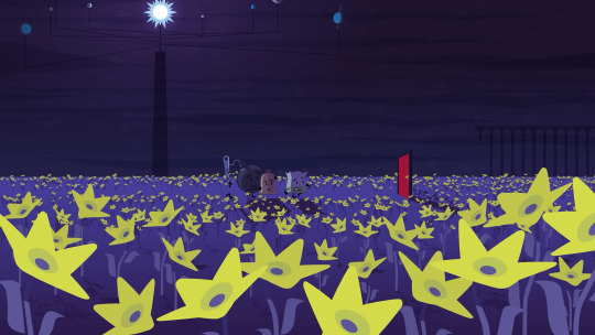
i NEED TO TALK ABOUT EAN AND VERPT(? NO SUBTITLES YET) RIGHT NOW
I NEED PEOPLE TO REALISE THEY CALLED THEMSELVES A LETTER. NOT A VARIABLE. A LETTER. ALSO CALLS VERPT A LETTER.... also awesome 1 legged algebralien and no limbed. we love to see variations :> excited for eventuall floater algebralien
PLEASE CORRECT ME IF IM WRONG BUT ASSUMING THIS IS WHERE THE ALGEBRALIENS COME FROM I THINK THIS IS THE FIRST TIME WEVE SEEN THIS???
HUGE WIN FOR NUMBER AUTISM
SOMETHING I JUST REALISED WHILE GOING FRAME BY FRAME FOR LAST IMAGE, MARKER. IS PURPLE HERE BUT THEN

YOU CAN SEE THE EFFECTS TAKING PLACE!!!!!
THATS AWESOME!!!!

these little shits are remind me of goo man from TPOT 11 (out of the blue)
looking back at goo man im not sure why

IM SO HAPPY THE VR HEADSET HOST FINALLY GOT USED

according to the awesome wiki
"The character was shown during the production of BFB. They may have been the original host of BFB, given the tweet description, but was replaced by Four and X.
Sometime after the VR Headset post was posted in jacknjellify's Twitter, Satomi clarified VR Headset was never meant to be a host or any sort of character, and was drawn simply because Michael thought they would be cool to draw."

HIIII PROFILEY... AWESOME TO SEE THEM BACK. REALLY COOL PARALELL HERE METHINKS BC THEYRE VOICED BY THE SAME GUY AS TWO :>
jumping around a bit. this was shown earlier and not expanded on untill the end. this. this drives me insane
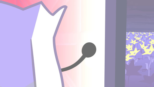
thats ones equivilent of the fourest, it has a link to the equation playground I WAS RIGHT
very interesting its also plant based.
I CANNOT FIND . WHEN I WAS BLABBERING ABOUT THIS SO IT MUSTVE BEEN IN A VC. BUT I CALLED THIS. also barf bag literally my face when i saw this lollll
okkkk back to like the usual time
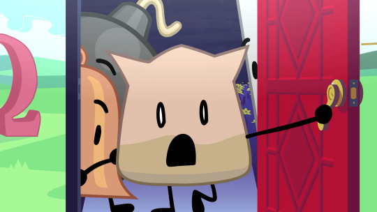
HI EVIL LEAFY HIIII IM SOOOO HAPPY SHE APPEARED. THIS DOESNT MEAN SHE ISNT LIKE DEAD AFTER IDFB BUT IM GLAD WE GOT TO SEE HER IN TPOT .. AND AS A HOST NO LESS!!


ID ALSO LIKE TO POINT OUT not sure if this is just startled or pin here being AFRAID for a second of EL
ABSOLUTELY HEARTBROKEN RF AND BB GOT OUT SAME TIME. HORRIBLE also neat they used the ending of the bfb intro here
X host.... imagine. life could be a dream
ok let me go over all the style stuff we see here also in order
(starting at the start of cake at stake (or cake at skate))
for the entire first half its just the usual TPOT style so i wont make a huge deal of that
Ean's part is also in TPOT

Pan Flute here's part is in the style of BFDIA specifically the newer episodes, figures, thats what hes from
EL's part is also in BFDIA style (with some very old assets behind), however id like to go over something else here


RIGHT BEFORE SHE APPEARS PIN GOES THROUGH SOME OF HER BFDIA ARC CHANGES. NEAT
also the music in the background here is "The Fiber" (thats what its called in the bfb ost release at least) WHICH IS ALSO THE SONG THAT PLAYS ENTIRELY THROUGHOUT BFDIA 5B!!!! AWESOME!!!!
youtube
GONNA BE HONEST NO IDEA WHAT STYLE THIS IS SUPPOSE TO BE... THE ANIMATION IS SUPER WEIRD AND DIFFERENT. it actually reminds me of how sacri animates her shows!!
hold on i need to make a new post i cant upload any more images
62 notes
·
View notes
Text
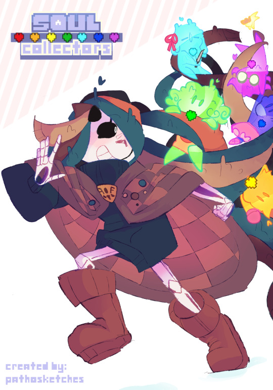
SOUL COLLECTORS MASTERPOST
FULL CHRONOLOGICAL TIMELINE
PART 1; 1 - 2 - 3 - 4- 5 | PART 2; ...
SOUL COLLECTORS ASKS
(Al & Ditto) 1 - 2 - 3 -...
(N/A) 1 - ...
(World/Random Timelines) 1 - 2 ...
SOUL COLLECTORS BONUS(es)
it's time (not really) - Asriel Dreemurr takes off - 100 notes - can't shatter SOULs - Twitter special PT.1 - Twitter special PT.2 - squeezable Soul - Undyne's boots - wet jacket - UTY Special (1) - UTY Special (2) - UTY Special (3) - Good Boys - Skeleton teacup - Pie tasting - Fellsweep loss - Gaster's followers - Fall - Lego and S'mores - SOUL Chain! - Vess goes to jail - 2025 New year! - hello Vess! - Interesting. - Anon and Maker - Maker's glasses - Chatting - ...
CHARACTERS
[SOUL] - Design - Intro
[MAKER] - Design(s) - Intro
[LYGO] - Design
[VESS] - Design - Intro
[AL] - Design
[DITTO] - Design
(...)
(OTHERS)
[CROW] - Design - Intro
[EDU] - Design
SC; MAKER TIMELINE
1 - 2 - 3 - 4 - 5 - 6 - ...
(In progress...)
GENERAL INFO
What is 'SOUL collectors'? (and why is it called that?)
SOUL Collectors is an Undertale multiverse for several different Undertale OCs I have created.
A collection of their interactions with each other, the multiverse, and their arcs into achieving their wants or needs.
It's also sometimes Open to Asks towards or about the characters!
basically my sandbox for ideas and OCs lmao-
SOUL Collectors is a passion project that only has me, @pathosketches working on it, It doesn't have a specific schedule for posting and not everything is set in stone, I'm only having fun here :]
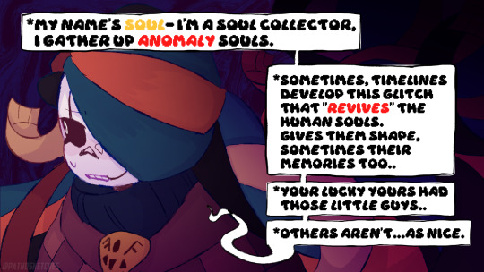
SOUL Collectors is also the name that Soul (the guy from the poster) dubs himself as being one, seemingly able to literally 'collect' SOULs.
what makes this Multiverse special? (Why do SOULs look like that?)
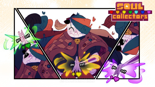
The SOUL Collectors MV has a special 'glitch' that appears in some timelines after a run has ended (pacifist, neutral, or genocide) that gives the fallen 6 Human SOULs shape and prevents them from being shattered.
They’re called Anomaly SOULs.
BASIC INFO ABOUT ANOMALY SOULS
(From part 1 [5])
You'll learn about them and how they work from the story as it progresses and from Asks-
How many 'Stories' are there? (what is Maker timeline?)
SC has two main 'stories':
'SOUL collectors' itself.
'SOUL collectors: Maker timeline' a subplot/Secondary story that takes place before the events of SC. It (mainly) follows a Gaster variant that learned of his inevitable "fall" into the CORE and how that affected him and his timeline.
'SC: Maker timeline' will usually be drawn in a 'sketchy' style :)
Can I draw the SC cast with my ocs? / Can I draw the SC cast?
Yes!! absolutely!! Any art made of my silly characters would make my day!! and interactions with ocs are so much fun to see!!
Just remember to be respectful! (No NSFW/excessive gore/weird things/etc-)
(This post may be updated in the future, I hope you come to enjoy the freaks I created ˘͈ᵕ˘͈)
161 notes
·
View notes
Text
Whumptober Interview with Amethyst!
Before the glorious event that is whumptober, I reached out to Amethyst to ask a bit about her process and what to look forward to. (Everything is shared with her permission.) You can find her tumblr @amethystfairy1 so hop on over and give her some support for October!
Q. How does the writing style and process change for a month-long event verses just writing?
A. I guess with like, my long form stuff, I write with a ton more detail for the month long events, especially since I've done multiple now, I try to pick out a specific thing to center the fic around and use that as a through line, strip it down to it's bones, and just go with that... I try to be a bit more abstract and use extended metaphors for the month long events
Q. How do you find a balance between the TTSBC AU and the TT au?
A. I don't. [A]ctual answer... um...I don't (Interviewer: Well, you know you have a 50/50 split for whumptober, right?) I DO... WAIT... I DO???... THAT WAS A TOTAL ******* FLUKE... you give me far to much credit... no that was a total coincidence
Q. Are there any characters you feel like you’re drawn to for whump?
A. Tango and Scott. [I]ts just because they feel so bright and spunky... so breaking them in different ways is really interesting... And it's different from like, Grian Pearl and Jimmy because with the three of them their fannon characters have such a wide expanse of styles that slotting them into the broken avian mindset wasn't impossible...it was tricky at times for Grian to write him being so docile and obedient because pesky bird and all but even still, with Tango it doesn't fit, and so finding a way to make it fit is super interesting! Same with Scott!
Q. Is there anyone who isn't easy/fun to whump?
A. Everyone is fun to whump in some way... As far as not easy ...Pearl has been tricky, mainly because I write her so as being so solid in her emotions usually
Q. Is there anything you think will surprise readers for the coming whumptober?
A. I think there's a lot more plot relevance than people realize on the way. Several of the fics are... crucial to the plot going forward.
Q. Do these writing challenges help you come up with some of the plot or does the plot just fall into them?
A. Both! The plot has it's shapes and curves already, but doing these writing challenges sometimes helps me put pins in specific themes to tie in important plot points and drive the au forward.
Q. Finally, is there anything readers should watch for and what day are you most excited for?
A. Day 10 and Day 25 will probably be the most plot relevant of the bunch! As well as Day 31! I'm personally the most excited to for Day 10, as I think it's going to be super amazing seeing the response to that from everyone who's been so kind as to follow my AUs for so long!!!! (Interviewer: It's a well done major ouchie) I love thinking about that as I'm writing, especially since both TT and TTSBC have gotten so much love, imagining what folks are going to comment and enjoy about it!
#traveling thieves au#ttsbc au#through the sky blue cracks#ttsbc ficlets#traveling thieves fics#fanfic#a03 fanfic#hermitcraft#hermitshipping#traffic smp#life series#empires smp#amethystfairy1#amethyst rambles#amethyst asks#tt au#artists on tumblr
74 notes
·
View notes
Text
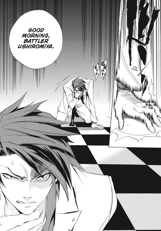
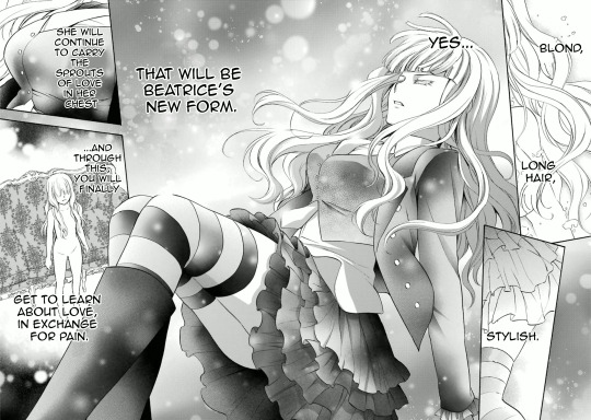
A 'skill' I've ended up honing is a sense of the various art styles of the Umineko manga artists. Generally when I see a panel I can tell what episode it's from based on either context, it being an often-posted panel, or even just... how it's drawn.
Episode 1, 3, and 8 are drawn by Natsumi Kei! Natsumi Kei doesn't draw Battler with his vest. She has a specific way of drawing eyes (for example, drawing Beato's with no/little shading) and Battler's hair is super spiky. She draws Beatrice's dress as entirely black besides the pattern, with some white parts for shading/lighting - a trait which most of the Umineko artists share She also has a tendency towards some fanservice angles/poses (such as that oft-memed panel that shows off Eva's ass while she's raging at her misogynistic brother/family).
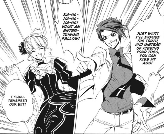
She likes to do these 'close-up' shots to show off detailed expressions.
She also draws Beato's eyes with blonde eyelashes! So pretty... A lot of the Umineko manga artists draw Beatrice with blond eyelashes, which always seem so delicate when they do the detailed close ups.

The EP2 mangaka, Jiro Suzuki, contrasts Natsumi Kei a lot. They use heavier shading at times, and their anatomy is also different - I often get the impression that their Beato is more broad-shouldered, while their Battler is more skinny. Like a twig.
From this panel, you can really get the impression of 'glowing' in a way that you can't get from Natsumi Kei's work.
In general, their style has a lot more detail for things like face and hair. Just like Natsumi Kei, they draw Beato with blonde eyelashes, though they interpret Battler's hair differently.
Battler's clothes feel very flowy, which adds to the sense of him being very skinny. Just like Natsumi Kei, Battler is drawn without his vest. I feel as though there's a sharpness to the joints.
EP4 is drawn by Soichiro! A return to spikier Battler hair. I feel like they tend towards narrower, sharper eyes.

Soichiro has a certain way of paneling... It relies a lot on very similar-looking boxes. They're generally all the same shape, and often the same size. Some examples:
As you may have noticed, Battler is still bereft of his vest. It's probably a choice all of these mangakas made in order to simplify his design.
...I would also like to submit for your consideration the travesty that is the paneling in this page. It's... a bit confusing to follow. This is a tendency in their style - sometimes the emphasis, paneling, etc. isn't quite right. They're a great artist, but I get the feeling that they weren't quite accustomed to this medium at the time of drawing.
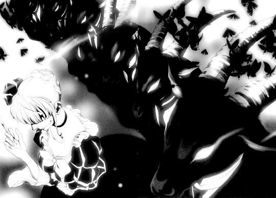
EP5 is drawn by Akitaka.
Akitaka is one of my favorite Umineko manga artists by the sheer virtue of the fact that Akitaka restores Battler's vest to its proper place: on his body. Battler's hair is still spiky, but it's a different, sometime toned-down interpretation. The way they shade his hair feels really unique to me - a mix of the usual screentones with some black sections (depending on the angle and level of detail). In general I feel like Akitaka works a lot with screentones to add a lot of shading to their panels.

Rather than using pure black for Beatrice' dress, it's a mix of black and screentones. Part of this is for lighting, but it also allows Akitaka to show a lot more details for the dress, which the artists who use primarily black for the dress can't do.
Akitaka also has some really detailed expressions. They manage to bring a lot of character to even the 'dead' Beato.
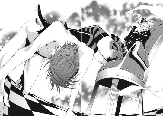
EP6 is drawn by Hinase Momoyama. Battler's vest, the most important character in Umineko, triumphantly remains. However, Battler's hair is less spiky and more slicked-down. Like Akitaka, there are often black sections of it, but these are more often at the front, rather than the back, of the head.
Beatrice's dress varies from "mostly black" to "mostly screentones" in EP6. Elder Beatrice, however, has these very detailed and eye-catching ruffles to her skirt. She is also drawn with sharper eyes and expressions than Chick Beatrice, who is wide-eyed and has very flowy princess sleeves on her dress.

Battler comes off as super cute when he's angry, rather than something more menacing or serious, as he does in Natsumi Kei's art. For comparison: (EP6, then EP8)

This is probably a result of how Natsumi Kei draws 'sharper', while Momoyama uses rounder shapes.
EP7 is drawn by Eita Mizuno, who is a saint for managing to draw beautifully for all NINE volumes. NINE. A saint.
They draw Beatrice's dress primarily with screentones, and have very bright, wide eyes.

They use a lot of texture with their screentones, which gives their art a unique feel amongst the artists for the manga.
I'd also like to have a special shout out to this page. The way the art style shifts in the final panel to reflect Lion's shock and horror is an incredible use of the medium. This artist really seems to like these horizontal spreads, but they use the space well.
More masculine characters like Will have narrower eyes, though the pupils/light isn't that different. While characters with light hair like Lion have no screentones for their hair, Will receives a healthy mix: primarily black, with some screentone highlights. Of course, light-haired characters will have screentoned hair depending on the lighting, but in bright lighting, Lion has entirely white hair.
...Also, Battler has once more lost his vest. At least his hair is spiky again...?
That covers all the main mangaka, but there's also the mangaka for the side manga, Tsubasa: Fumi Ito. Their art is really cute and suits the often-comedic stories well. The small highlights they put in hair feels characteristic of their style. They often draw characters with wide, round, bright eyes.
Battler's hair spikiness is toned down (so fluffy...) and his vest returns for the final time. A true blessing.

This is just a super brief overview of it all - there's a lot of characters whose varying depictions I didn't mention, I didn't really talk about how they do backgrounds, and plenty of other things. But Umineko has a lot of talented artists who worked on it, and many of them still sometimes post fanart (or new official art) for the series!
I feel like we should appreciate the amazing range of artists who have done their best to interpret Umineko's story. They all did a great job!
#umineko#umineko no naku koro ni#manga#umineko spoilers#just in case since I grabbed panels from everywhere
185 notes
·
View notes
Note
do you have a process for drawing dragon faces? their expressions are so fun and lifelike to look at :]
Sure I do!! I don't think about it too much consciously nowadays but I definitely have a process. Mostly it's informed by previous experience doing human expressions? Specifically a loooot of anime style characters, but I also use the same basic layout for pretty much every character I draw from dragons to ponies; only thing that changes is the proportions and whether or not I need to add a snoot.
I threw together my best shot at a guide, hope it helps~!!
(I am aware that my chicken scratch is very messy and accessibility is a good idea so I'm gonna throw plaintext of what I wrote beneath the cut)
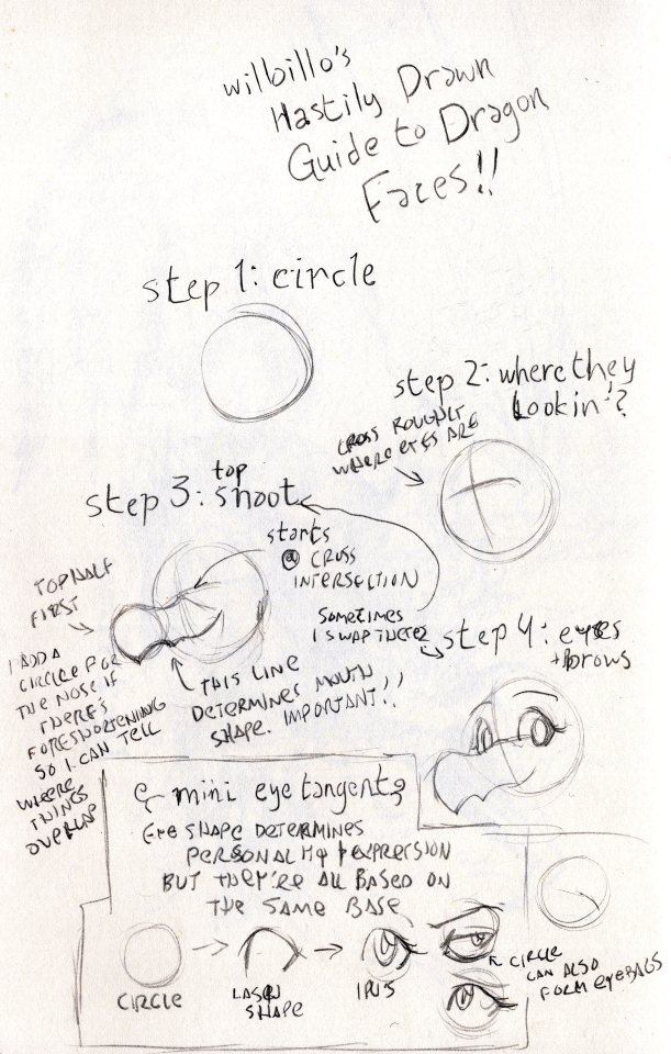
Willoillo's Hastily Drawn Guide to Dragon Faces!!
Step 1: Circle [image ID: a sketchy circle]
Step 2: Where they lookin'? [Image ID: the same circle, but with a cross drawn on it. the lines that make up the cross are curved slightly to show dimension.]
Cross roughly where the eyes are
Step 3: Top Snoot [Image ID: The same circle with the cross, but now with a collection of curved lines making up the top half of a dragon's snout attached. The mouthline is curved upwards to show a smile.]
top half first
I add a circle for the tip of the nose if there's foreshortening so I can tell where things will overlap
this line determines mouth shape. Important!!
Step 4: Eyes + Brows [Image ID: The circle with the snout, now with a pair of eyes and raised brows looking at the viewer.]
Sometimes I swap steps 3 & 4
Mini Eye Tangent [Image ID: a series of three drawings showing how to build an eye shape, starting with a circle, then adding a top and bottom lash to create a specific shape, and finally showing the eye with an iris looking at the viewer. Next to it are other eyes with different shapes and expressions, with the circle behind them shown to show how they were built from the same template. One of the eyes has a heavy eye bag drawn, following the shape of the circle behind it.]
Eye shape determines personality and expression but they're all based on the same base
Start with a circle, then do the lash shape, and finally the iris
The circle can also from wrinkles/eyebags
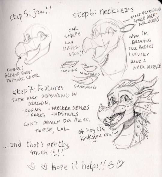
Step 5: Jaw!! [Image ID: The same dragon, but now with a lower jaw. The line for the back jaw is drawn visible through the snout to show how it connects to the face on the other side.]
Connect the back jaw behind the snout to make the cheek
Step 6: Neck + Ears [Image ID: Same as previous, but now with a curved neck added connected to the circle, as well as leaf shaped ears. An additional circular sketch has been extended behind the original circle past where the ear is connected.]
Start extending our circle back to make room for horns
When I'm drawing full bodies I usually have a neck already in place
Ear shape can differ a ton!! [Image ID: examples of how I draw different ear shapes for icewings, nightwings and sandwings; the icewing ear is sharp and jagged, the sandwing ear is long like a rabbits, and the nightwing ear is twisted like a goat's.]
Step 7: Features [Image ID: A finished sketch of Kinkajou from the Wings of Fire series with a happy expression. An arrow is pointing to her with the line 'oh look it's kinkajou now' written next to it.]
These vary depending on dragon.
Horns, frills, freckle scales, nostrils
Can't really show all of these, lol
... And that's pretty much it!! Hope it helps!!
#illustrators on tumblr#willoillo#artists on tumblr#art#illustration#drawing tutorial#lillo answers#wings of fire#wof art#wof#dragon#dragon art#pencil sketch#sketch#sketchbook
64 notes
·
View notes
Text
OKAY. HERE WE GO. my black bulls doggies!!!! :D
there's definitely a noticeable difference in style/quality of some of these just due to time between each design and/or how i was feeling at the time of drawing them (these hot and rainy summer months have been super rough on me)
ALSO they were all done symmetrically so that i wouldn't burn out and could actually finish them LOL . OK EVERYBODY BELOW


starting off with asta, a husky/coyote mutt!! :D in my au, devil users end up becoming hybrids of whatever their devil is. so since liebe is a coyote, that's what asta is too!! (also, i haven't drawn him yet, but yuno is a malamute :D similar looking breeds but different since they're not actually related!)

(here's liebe too hehe, scrappy lil coyote!!)

then of course, noelle, who's a saluki!! a very regal breed for a very royal gal!! i thought making her pigtails into her ears was a fun idea HEHEHE

(+ an alternate design version!)

here's finral, he's a shetland sheepdog!! gentle and sweet and always trying to herd his people together :) you might notice that with some of my designs, i end up doing extra scarring; that's usually just personal headcanons, as i think some injuries would be too grievous to fully heal. though some (for instance, gauche) don't have a canon story behind them, i just think they're fitting

vanessa, who's a cavalier king charles spaniel!! her ears sorta blend into her hair lol, i had an alternate version where they were the same darker brown as her fur but i decided that them blending in looked better and fit the breed standard as well.

gauche, the ever wary american akita!! being a fiercely loyal and protective breed, but aloof and suspicious of strangers.

then there's grey, who's a long-haired chihuahua!! sweet and skittish HEHE, also i haven't drawn it yet but i've always imagined her big transformation disguise that she's first introduced as to be a rottweiler LOL
next up is luck, a jack russell terrier!! i've always thought this was a very fitting breed pick, intelligent but highly energetic and a little mischievous !!!


and of course, magna is never far behind luck; he's a dobermann pinscher!! similar to luck in energy and intelligence, but even more fiercely protective of his loved ones.


GORDON!!! actually one of my favourite black clover characters, he's a dalmatian not only because of the fitting aesthetic, but also because of his kind and sensitive personality!


the masked supermage zora, a german shepherd! watchful and sometimes stubborn but loyal nonetheless made this pick fairly easy to come to. though, before getting to see more of him, my initial pick was actually a kai ken!

charmy's design is one that i'm the most proud of for sure; i mentioned in an earlier post that the different peoples are different species of animals. well charmy is a half toy poodle, half american badger!! i thought a badger was a VERY fitting pick, as they are generally unbothered by much unless their food is threatened LOL


and finally, lastly (for now) is nero!! she's a bull terrier, but i really wanted to keep her twin tails from her anti-bird form! her outfit is definitely the one i edited the most, i just wanted to give her something more practical out of personal preference.
additionally, henry is an old english sheepdog, nacht is a black norwegian elkhound/fox, and yami is a wolfdog!
I HAVE SOME OTHER CHARACTERS DOODLED HERE AND THERE but nothing else really finished yet. if there's a specific character anyone would like to see i would be SO happy to draw/doodle them to show off!! i honestly have a huge list of dog/cat breeds picked out for every character i could think of; i just am hellishly indecisive and can never pick who to start on next AHDSJAGDJSDK
THE POSITIVE RECEPTION TO MY ART SO FAR HAS MADE ME SO HAPPY BTW AUAGGHHH i have no idea how/if im able to reply to people directly but just know that i keep reading over everyone's reblog tags and stimming like crazy IM SO HAPPY THANK YOU GUYS SO MUCH AUHGHFEHGGRH
#black clover#bark clover#asta black clover#liebe black clover#noelle silva#finral roulacase#vanessa enoteca#gauche adlai#grey black clover#luck voltia#magna swing#gordon agrippa#zora ideale#charmy pappitson#nero black clover#secre swallowtail#the black bulls#tabbies art#im so sorry to henry nacht and yami fans#i promise i'll do their designs soon
87 notes
·
View notes
Note
Ima be real honest when I first came to your blog ages ago the designs of Ludwig and Santi made me assume it was a gay (mlm specifically) blog (due to most male characters being so when presented in that way), which would have been fine but it’s not really the kind of thing I’m interested in often so I probably wouldn’t have stuck around.
I was pleasantly surprised to find out that most of your characters are bisexual and also that your blog is mostly geared towards women as most of the monster stuff I’ve come across has been geared towards men, which has made it annoying to try and find things more relevant in the past. Whenever I have actually occasionally come across monsterfucker content geared towards women in the past it’s usually just been humans that hardly look monstrous in the slightest (aka maybe they just have fangs) or are too far on the other end of the spectrum where it almost just feels like beastiality
No- No anon- You can't just drop this in my hands and take off running. What. What do you- Be honest. Do I have the artstyle of a gay man? Putting that one aside (which I will need to unpack rsrsrs)-
I absolutely understand what you're saying. More below.
While a lot of the monsterfucker content I consume is veered towards women, most of that content is written. Because when it's drawn, it doesn't always meet my standards, just like it doesn't for you. It could be because the character is indeed too humanoid, because it's generic werewolf_#32980, they're too pretty, or anything else really. It's hard to explain but it doesn't always hit the spot.
I'll concede that sometimes it's quite hard to determine how sentient a described monster is, but you can always explicitly impart sentience onto them as the creator (like a licker from RE, for example. Sentience? Ehh, questionable. But a licker OC who retains sentience after transforming? Okay with me.) Unfortunately, some people like to lump teratophilia and literal animals in the same bag. I've had one admitted zoo follow me, instant block naturally.
A lot of the inspiration and personal favorite monster drawings of mine are, actually, made by gay men. They draw monsters better, I just can't pinpoint why. I like the style better, which inhuman features they choose to incorporate and how they do it. A lot of it is from gay furry artists that don't even consider themselves monsterfuckers yet draw monsters like they were born for it. I like it when they're cartoony yet still hot, they have more style variety, I think. There's so much to like that you often don't see in a woman monsterfucker's work. It saddened me a lot, before I started making my own content, that all of it was for men. Thus my enjoyment was always a bit tainted by disappointment.
I never made a conscious effort to emulate the style of mlm artists, truly. I just try to draw what I like. But a lot of what I sometimes attempt to syphon into my art comes from possibly mlm or not entirely originally women-oriented styles, yes.
You've made me question the vibes of my own art now. 🤔
46 notes
·
View notes
Note
I absolutely adore your art style! Do you have any tips? Specifically for the fairies cause I am struggling to draw them.
thank you so much! well, this is gonna be a long post.
Im gonna be real, the best art advise anyone can give you is to use references and to break complicated stuff down into easier shapes. for example:
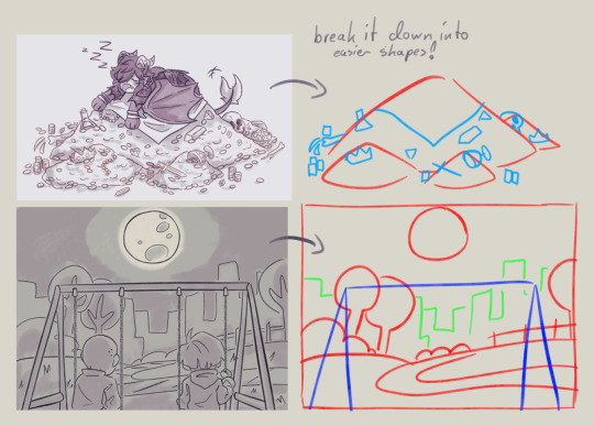
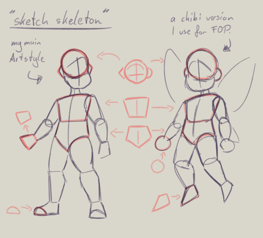
this is my basic body skeleton! i always start with the circle of the head and work my way down to the feet. i have highlighted some part of the body which are actually just simple shapes.
the center line down the middle of the torso also helps me draw on collars, bra cups, ties, or any other more difficult clothing more accurate!
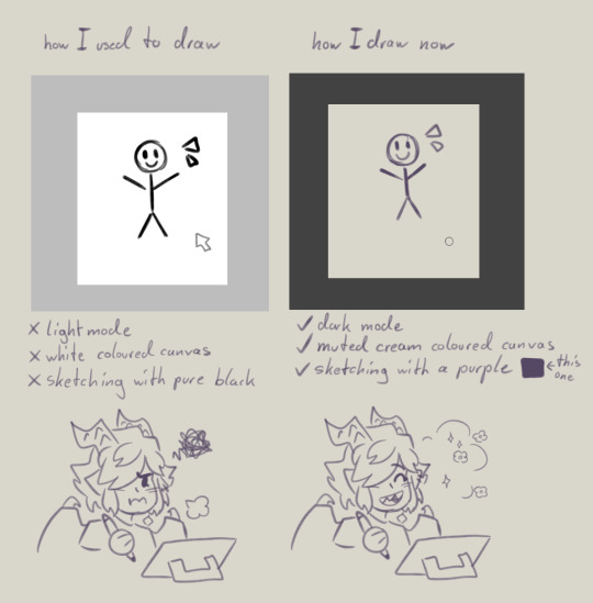
However i have to ask you, are you comfortable while you draw?
I remember when I first started drawing digital, i was really uncomfortable with the basic set up of my program. The white canvas and the light setting of the program was really bright and irritated my eyes. And the contrast of the pure black I used for drawing wasn't really helping. sketching and doing line art was my least favorite part of drawing because of this.
you don't have to draw on a white canvas, you can also use multiple colours for sketching if you wanted. Once I stoppend using a pure white canvas I noticed i stopped staring at a empty canvas not knowing what i wanted to draw anymore!
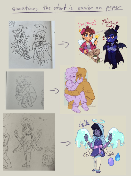
also sometimes when a drawing doesn't want to look right, i switch back to traditional. idk why but when my brain sometimes struggles with a specific pose or character design, it comes to me a lot more easier when I switch back onto paper. i guess the change of scenery opens up the creativity again haha.
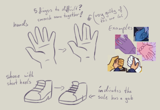
don't be afraid to simplify stuff, you don't have to draw everything! As long as it still translates to the thing, it should be fine.
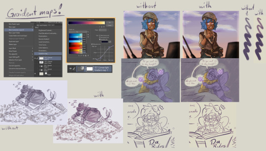
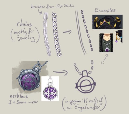
these two are a bit clip studio exclusive,
but Gradient maps! god how I love my gradient maps, it just makes the colours pop! I never draw without it anymore. I always pick the sunset gradient, put it in Linear light mode and put it on 10% (cus its really saturated on 100%)
usually i have it on while i sketch and line, and turn it off so i can properly colour and shade. i turn it back on at the end again
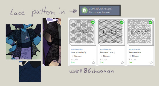
the clip studio assets has a lot of beautiful stuff in there created from other users. (a good amount for free too) for example I got the lace pattern of my shawl from there. and its really easy to import the downloaded stuff into the program.
now this is a drawing hack that blew my mind when I first saw it! i use it all the time and I just have to share this!
whenever you want to draw something random like sparkles, stars, bubbles, feathers, falling leaves, or anything that you want to float around your characters, position them in the form of a triangle.
its even better if you put two points of the triangle closer together and then the third further away. this makes it look random but still looking appealing to the eye, and not oddly placed.
now that thats out of the way! Fairies! The one thing i struggled with when drawing them first is their hair. I suggest looking through the fop tag to see how other people have drawn them and take inspiration from your favorites and make up your own. (do not trace tho! that should be obvious!)
when I draw hair I think of it separated in two parts, the front and the back. I usually start with the front hair pieces, then draw in the jaw, ears and rest of the head, then continue with the back section of the hair.
the only outliers of this are Timmy and Peri. when I draw Timmy (Ymmit as well) I start with his hat, before drawing his hair. Since I draw Peris hair-swirl over his hairline, i start drawing his upper back hair style first before drawing his head and then his mullet.
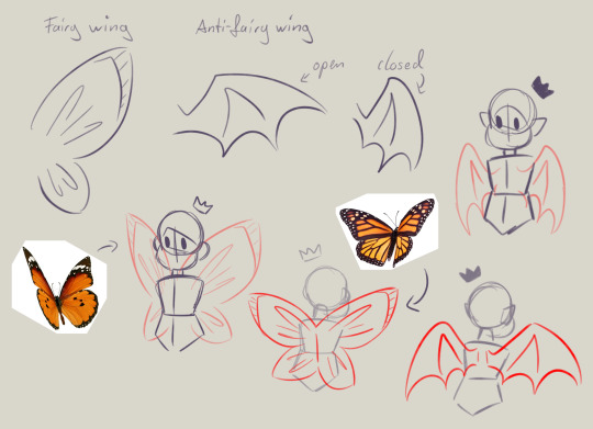
wings can also be tricky. the fairy wings i have given then have a more butterfly look. if you also want to base off the wings to real life animals or bugs you can use them flying as references to. Or you could even cut out the wing shape out of paper, fold it in the middle and take pictures in the angle you desire.
I hope this somehow helped, I thought about what could have helped me if I had known it sooner. even if most of these were for generic drawing.
#my art#asks#art tips#drawing advice#clip studio paint#fop#if anyone has more questions about how i draw#once i open up the ask boy again feel free to do so
49 notes
·
View notes
Note
aw, man. i actually don't like conflict or negativity, and i hate that some ppl seem determined to pit the couples against each other in the first place, but i've seen/read two things in particular today that have got my hackles up (the poll being one) so i'm gonna say it: i don't think i've seen a single post that enthuses about kb at the expense of fs (maybe one anon but that's bout it), whereas the number of times scrolling through the tag i've seen ppl feel the need to crow about how much more invested they are in fs, how fs are carrying the show, etc. - yes, we all vibe with different characters/dynamics and that's fine - vibe away! nay, enthuse away! but, shocker, you can actually do that without invoking your lack of interest in kb (which, frankly, is your loss!). and, since i'm being blunt, there are, imo, two fairly obvious main reasons for the scale of the disparity (so beyond general variation in taste), and neither are particularly flattering for those in question, so i'm not gonna say them out loud! and that's because i recognise some things you can just keep to yourself, and that way everyone gets to have a good time! sorry to be bitchy, but when stuff like that is in the general tag it's hard to avoid, and even though i know i should just brush it off (cos everyone's entitled to their wrong opinions!), it gets me down nonetheless.
yeah, i'll never understand the need to pit them against each other for one reason or the other tbh. like you said, everyone has their own feelings and opinions and sometimes you're just gonna be drawn to one couple over the other, or one character over the other! i know i personally enjoy both fadelstyle and kantbison, and i adore all of our main four characters in their own ways. it's funny cause in the first few episodes, i was sort of flipping back and forth in terms of who i was more invested in, which was honestly a shock to me because while i have enjoyed joongdunk in the past, their shows and characters haven't compelled me in the same ways that firstkhao's have, so i went into thk figuring that they would be the ones to hold my attention the most. and while that did end up being the case, fadel and style have ALSO become beloved to me in their own ways and there was even a period in the beginning of the show where i was MORE invested in them! but kb have definitely captured my attention the most and again, it does just come down to personal taste - i find the layers of their story to be personally more compelling, and i find kant's character specifically to be incredibly fascinating because of the absolute lack of agency he really has in anything he does up until now.
but again, it's all a matter of personal taste. i recognize not everyone is going to view these characters the same way i do or have the same attachment, and that's okay! and it's very odd to me the way that a lot of people who prefer fs will choose to hate on kb or flaunt which one they prefer more. like if you post about the things you love, we'll get the message either way without you needing to bring down the other pair and make others feel bad for enjoying them. i don't think anyone before now has really questioned which couple i prefer, but the only time i ever actually acknowledged that (outside of this ask) was to say that i was SAD fs didn't interest me more because i do genuinely enjoy them as characters, but kb take up so much of my brain that i just can't focus on them as much.
and it's not to say if you wanna be a hater, you can't be a hater, like that's fine. but at the same time idk. people that DO like those things don't wanna see that when they're just trying to enjoy the tag of their fave show, yknow? but that's also why i at least prefer to keep to my dash instead of going into tags, cause i prefer keeping it to those i trust to keep it tasteful than those that will go into main tags and shout their hate for things from the rooftops sjdfsdkj
#also if you would like to talk about those two reasons you think there are for the disparity PLEASE dm me im curious to hear what those are#the heart killers#fadelstyle#kantbison#asks#nonnies
23 notes
·
View notes
Text

Fanart of my own fanfiction (Chimera Teto x Android Miku)
Good news! When I woke up and looked at my art again today, I liked it, so here's the uncolored version! I trust you tumblr people, so here you go! You may view. This technically means I've drawn UTAU Teto (here) and SynthV Teto, but I really want to color this and take my time doing so, so here are the lines before it turns into something else hahaha 😂😂😂 Read More for the stuff I wanted to write last night but was too tired to (also the art time lapse)
I showed like two WIPs of different ideas on Twitter but none of them were this LOL (just goes to show how much I wanna draw and see of these two specifically) but the reason I decided to go with this is 'cuz that fanfic I wrote in like one day really got me excited and it made me really want to draw them as I was imagining more stuff about them. Here I'll talk about what I had in mind
I love chimera Teto, especially her majestic wings, and what I drew here is basically inspired by that! Teto's basically the only "living, sentient" thing around Miku so far (I dunno how to approach adding more creatures just yet), which makes Miku extra interested in her. But basically Miku likes Teto's wings and tail too and is very fascinated by them.
I had an idea where Miku is just holding or playing with Teto's tail out of nowhere and complimenting the heck out of her, and that was condensed into this piece. It was too crowded on Miku's side to have Teto's tail there as well, but the reason Teto's embarrassed (tsundere is nice, aint it xD) is 'cuz Miku is indeed praising the heck out of her. Calling her cute and saying how cool her wings are and whatnot.
The dialogue kinda goes like, "Your wings are so cool! And I really like how expressive your tail is! I wonder what I would do with a tail. It's so cute! Actually, now that I think about it, all of you is really cute!!" (Teto, embarrassed: "Stop talking now.") wwww
Miku does have a kinda tail actually! It's the chain on top of her skirt. As an android, I was thinking it works as sort of a battery plug or USB or something. I can show off more of that later (since it's really small here lol) but she can use it to receive electricity and recharge herself, I guess~. (Note to self: make it bigger?)
I haven't shown off much of my art style, but most (normal) characters usually don't have pupils. (See: this Teto, who's a living breathing creature.) As a result, I decided to give Miku pupils (kinda robot-like) to make her seem like more of a robot. She also wears the thing (headphones) over her ears, of course, which I can also use to make her seem more robot-like. There's no green flashing of code in her eyes right now but I might draw that sometime too, after my loads of other ideas...
Teto's wings aren't fragile. They're probably firm, hard, and could even be scaly/rough (up to my own whims or the reader's own preference). Her letting Miku touch her (wings) is probably a huge display of trust/confidence. Teto's wings are strong enough to carry her far distances and even allow her to fly in bad weather, I think. It's up to Teto herself how much energy/desire she has to do things like that though.
This is mentioned in the fic too, but Teto probably folds her wings a lot so they don't get in the way. She's kinda like a bird. I think her silhouette against the sun or moon, with full wingspan, is probably majestic (I'm imagining the Batman symbol for some reason lol). I know some people color Teto's wings as purple, but I specified black in my fic to match her tail. ^^
In order for her wings to breathe, there are probably holes in the back of her outfit to accommodate them, but they're only big enough for the wings (ellipses/ovals probably): she either tears/cuts holes into the shirts she wears for her wings or they already fit her wings so there's no problem. I wonder if Teto made her UTAU outfit herself in this setting. xD (A girl has to pass the time SOMEHOW plus she's probably at least a little bit handy when it comes to clothes and stuff (survival).)
If, while I'm coloring, I need to make adjustments to the seating and lineart and all that, I will, but I figured I'd show off what made me stay up 'til 5 AM last night and then get embarrassed to post 'cuz I thought I wasn't finished yet. I woke up and I liked it, so I'm just gonna put it in this here blog. c:
I don't know how to color, so coloring will be a trip 😂
#my art#vocaloid#utau#negidrill#mikuteto#tetomiku#kasane teto#hatsune miku#uncolored#lineart#chimera#android#song fanart#end of the world au
63 notes
·
View notes