#i like changing a characters design slightly for no reason at all
Explore tagged Tumblr posts
Text
vivian drawing i made a month ago

#floating hands 😊#i like changing a characters design slightly for no reason at all#paper mario ttyd#vivian#paper mario the thousand year door#notareblog#myart
246 notes
·
View notes
Text
man, you know, nobody asked me, but I have such conflicting opinions on some of the fat falin art, where on one hand: it's always nice to see A Fat Body in fanart anywhere + it's being done in positive ways, for funsies and on the other hand, there is something so familiar about how you are automatically The Fat One if you are a woman simply standing next to a more petite woman, bc I've had a 0% hitrate in seeing people change Marcille's body type and keep Falin's, or change both of them. it's just Falin
#it gives me a negative feeling that I seldom/never get from seeing fat art which is rare#like she's not fat out of thin air For Fun And No Other Reason and she's not fat bc of context#(out of thin air being like just picking a character you like and changing their design just cuz. Kabru maybe.)#(and Because Of Context being the way ppl draw fat Usagi from sailor moon. which i have been meaning to do btw)#but rather she's fat just bc to be Not the thinnest woman in the room is to be fat. like it happens specifically by scale#because marcille is so much physically smaller and petite and falin is bigger in the ways that a Human Woman is bigger#than an elf woman#and it's funny bc it's something i see all the time already#people also really don't seem to have an interest in making marcille butch in fanart in a way#that is sort of sad for me bc it's like ah well she's the thin small one so of course she gets to be feminine#if you're physically bigger then of course you get to be masc of course of course of course...#i also love good butch art esp fat butch stuff but this is about the phenomenon where if you're with#a thinner shorter woman then that means you're the butch now which is a place I have been to#and I did not like it there#I think part of why That sticks it to me is bc marcille has such a Butch Girlfriend personality and falin acts so demure LMAO#but she's slightly bigger so the writing is on the wall#sergle.txt#Godspeed to you if you choose to read these thoughts in bad faith bc I can't give you more clarifying statements if I try#like I said. conflicting feelings#i don't know if anyone else has similar thoughts it May Just Be Me#I don't think ppl think about this stuff when they make their fan redesigns but it gives me a certain feeling
386 notes
·
View notes
Text
arcane characters proposing x fem reader
characters: viktor, jinx, vi, caitlyn, jayce, ekko, silco, mel and sevika.
writer's note: it was so satisfying to have written this after so much dramaaaa. i really liked this dynamic and i'll exploit it with so much more scenarios so be prepared for a lot of fluff, btw my favorite proposal was jayce's, he was all cute and clumsy. as you already know request are open ;)
wedding link:
Viktor
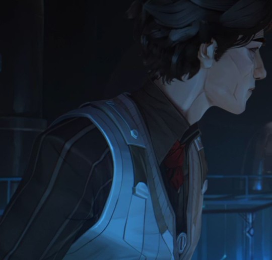
The silence in the lab is heavy, interrupted only by the soft hum of the machines he has designed himself. You’re beside him, watching how his fingers move with skill, adjusting a piece of the contraption he holds in his hands. The dim light from the lamps reflects on his face, casting shadows that highlight the features of his face, always so serious, so focused. But in his eyes, there’s something different today. Something... softer, deeper.
You’re used to seeing him in his colder, distant side, but something has changed. There’s a strange calmness in his presence. When he looks up and meets your gaze, his lips curl slightly, a small but meaningful smile.
"Science is my life," he says in his deep, measured tone, as if evaluating each word before speaking. "And it always has been. But some time ago, something changed. Something that... has nothing to do with experiments or formulas. Something I can’t measure or control."
He looks at you with an intensity that feels almost uncomfortable, as if he were exposed, vulnerable, on ground where he doesn’t have all the answers. His voice, though firm, carries a vulnerability he rarely shows.
"You’ve given me more than I thought I needed," he continues, his eyes never leaving yours. "It’s not just what you’ve done for me in the lab. It’s... what you’ve done for me as a person. You’ve been my anchor, my reason to keep going when everything seemed lost. In a world that doesn’t have clear answers, you’re the only certainty I have."
The distance between the two of you seems to shorten. Viktor takes a step toward you, although his movements are slow, as if each one carries meaning. He stops beside you, almost as if it were a gesture of trust, of allowing himself to be vulnerable in your presence. He closes his eyes for a moment, as if preparing to say something that has taken him a long time to decide.
"What I’m about to say... doesn’t have any exact formula. No calculation that validates it," he says, and you can see his hands tremble slightly. "But I know that, with everything I’ve done, with everything I still want to do, I would never feel complete without you."
His voice is soft now, much quieter, as if what he’s about to say is a secret, one he’s revealing only to you.
"I’ve seen you beyond the brilliant mind, beyond the scientist who always challenges me. I’ve seen you as someone who, no matter how many times I shut myself off from the world, continues to be by my side, expecting nothing more than... to be with me."
He takes something from his pocket. A small metal case. He opens the lid carefully, revealing a simple ring, but with an elegance that only he could have imagined and created. The Hextech light reflects off the blue stone, casting glimmers that make your breath catch for a moment.
"My life wouldn’t be the same without you. And if there’s one thing in this world I don’t want to lose, it’s the opportunity to have you by my side forever."
Viktor looks at you deeply, waiting, more vulnerable than he’s ever been. And finally, after all the science, all the advancements, all the sacrifices... he asks you with a sincerity that cuts through the air:
"Will you marry me?"
The silence that follows is absolute. You stay motionless, unable to articulate a word. The weight of his declaration, of his vulnerability, pierces you, but instead of an immediate response, you dive into the intensity of his eyes, looking for something, any sign, any confirmation that this isn’t a dream. Viktor begins to worry, and the discomfort is reflected on his face.
"It’s a shame... I can’t do it the conventional way, kneeling..." he murmurs, his voice trembling. "But... I guess..."
You can’t let him finish the sentence. The anxiety in his eyes, the insecurity in his posture, prevents you from doing so. You move quickly, placing your lips on his with a soft kiss, but one filled with everything you can’t put into words. The world seems to fade away, and all that remains is him, the beating of your heart, and that silent connection between you two.
When you finally pull away, his gaze is still fixed on you, expectant, anxious. With a tenderness that comes from deep within, you take his face in your hands, your fingers caressing his skin as if it were the most precious thing in the world. And it was. He was the most precious thing in your world.
You look deeply into his eyes, every word that leaves your mouth filled with love, promises, and everything you haven’t said until now.
"Yes, Viktor... yes, yes, yes. Always yes."
The air between you both is filled with a new energy, one that needs no more words, because the simple fact of being together is enough.
Jinx
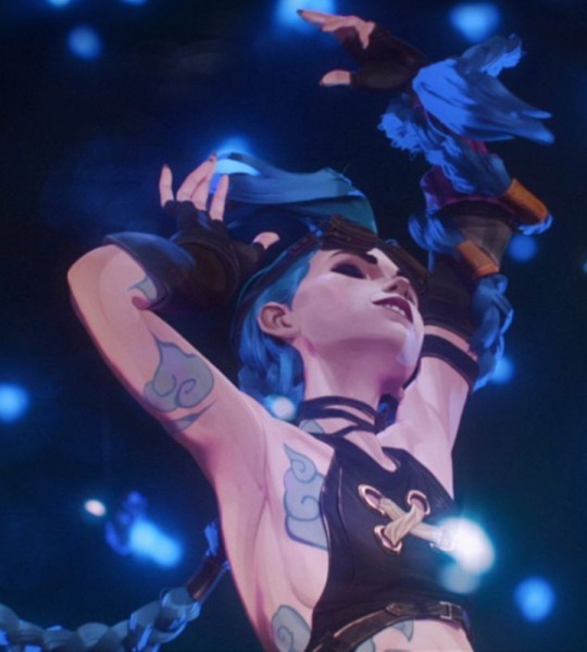
The night has fallen, but it’s not a peaceful one. The air is charged with electricity, as if the whole world is waiting for something, and you, trapped in the whirlwind of the city, can’t help but feel that something is about to explode. Literally.
You walk through the dark alleys of the Undercity, the neon lights flickering around you, when suddenly, a familiar laugh makes you turn. Jinx appears, her electric blue hair waving in the wind and a spark of madness in her eyes. She’s holding a large, seemingly heavy box in her hands, grinning mischievously.
“Surprise!” she says, her voice overflowing with excitement. “I’ve got something incredible to show you. It’s bigger than anything you’ve ever seen!”
Before you can say anything, she grabs your hand and drags you toward an open space, where a small platform is set up, filled with wires and explosives. The sense of danger is in the air, but it’s impossible not to feel the adrenaline she radiates. You know that with Jinx, you can’t expect anything conventional, but that’s what makes her so unpredictable. So... perfect.
“What are you doing?” you ask, although you can already imagine the kind of madness she has in mind.
“Doing what I’ve always wanted to do! A celebration of love that no one will ever forget!” she replies, her smile so wide it almost lights up the city’s darkness.
Jinx runs toward an improvised control panel and presses a button with exaggerated theatricality, as if it were a grand revelation. Suddenly, the sky lights up. A flash of colors bursts above you, as if the very chaos inside her wanted to spill over into the universe. Fireworks. A visual spectacle so dazzling that it takes your breath away. It’s as if the whole city is alive, as if life and death themselves were dancing in the sky.
While the explosions of colors fill the air, Jinx approaches you, her eyes sparkling as if she had immersed herself in her own world of madness and love. She’s not one to beat around the bush or speak sweetly, so when she takes your face in her hands, her fingers cold but full of energy, you know what she’s about to say is as unexpected as everything she does.
“Listen,” she says, looking at the colorful stars exploding above them. “What I love most about this world is the chaos. Things don’t have to be perfect or make sense! But... there’s one thing I’m absolutely sure of.”
Your heart beats faster, but you can’t help but smile at her wild declaration.
“I want you to be my chaos,” she continues, her voice full of determination. “I want you to join me in this journey of madness, to hold on to me when I explode, to keep laughing when the world falls apart, to follow me... because you and I are invincible!”
With a nearly mischievous grin, Jinx pulls something from her jacket: a ring. It’s quirky, like everything in her life, with visible gears and sparkling stones, some even crackling slightly, as if they’re about to explode.
“What I mean is... will you marry me? Tell me yes before I run out of fireworks!”
Jinx’s laughter is a little overwhelming, an echo of her own unpredictable essence. But despite all her chaos, there’s something so sincere in her eyes, something that makes you feel that, even though the world may be on the edge of destruction, this moment, this chaos, is the only thing that truly matters.
You stand there, speechless for a moment, overwhelmed by the light bombardment and the madness of the proposal, but when you see how she looks at you, waiting, you realize you have no doubts. Jinx has made it clear in her own language: love is a dangerous game, but you want to play it by her side.
With a brilliant smile, you approach her, and between the lights, amid the roar, you whisper:
“Yes, Jinx. Yes, to this chaos. Yes, always.”
Vi
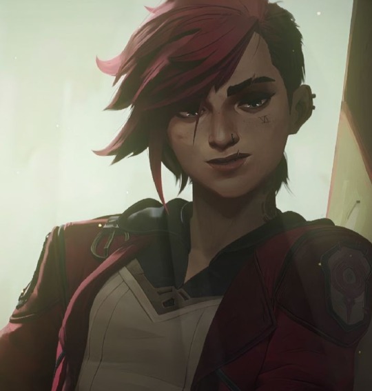
You’re lying on the couch, comfortable and relaxed, with your head resting on Vi’s legs. The soft sound of the city that never sleeps drifts in from the window, but inside the house, the silence feels cozy. Vi is sitting, her muscles tense but calm, with a thoughtful expression as she plays with your hair, something that always soothes you.
The warmth of her presence surrounds you, and for a moment, everything seems perfect. But something in the air changes. Vi’s relaxed demeanor begins to feel different, as if she’s holding something back. You realize that, for the first time, she’s not being the confident Vi, the one who always has everything under control.
“Are you okay?” you ask, lifting your head from her legs to look at her directly. Vi doesn’t answer right away, and her fingers stop moving through your hair. There’s uncertainty in her eyes, something you haven’t seen before.
She shifts, crosses her legs, but doesn’t seem as comfortable as usual. “You know... I’m not really good with these things,” she says, her voice softer than usual. “I’m always the one who throws punches and solves everything my way, but now...” Her gaze drops to the floor for a moment, avoiding eye contact.
You look at her, sensing that something important is about to come out of her mouth. On her face, that nervous grimace is a clear sign that she’s struggling with herself. Something’s going on, but she doesn’t know how to express it.
“What I mean is... I’ve never been good with words,” Vi continues, letting out a nervous laugh. “And I’m not one for grand gestures or fancy things. I’m not someone who can give you the best, like... you know, expensive jewelry or fancy places. But there’s something I know I want.”
Vi takes something from her pocket, and when you see it, a small ring appears between her fingers. It’s not shiny or flashy. It’s simple, made of metal with a rustic design, almost as if she made it herself. A small symbol of her effort and her love.
“This... isn’t much,” she says, looking at the ring with a slight embarrassment. “I got it with what I could save. It’s not perfect, but... I want it to be a symbol of who I am for you. Of everything we’ve been through together. And... I want us to be together. I want to spend the rest of my life with you, even if I’m not the best at this. Because, despite everything, I love you more than I can put into words.”
Vi looks at the ring like it’s a simple object, but in her eyes, you can see how much it means to her. Her insecurity is palpable, as if she’s waiting for the ring to not be enough. But you know that’s not what matters. You know it’s all she has to offer you, and that’s what makes this moment even more special.
You see her nervous, waiting for a response, and you can’t help but smile. You get up and stand in front of her, gently touching her hands, and when you look at her, the insecurity on her face melts away, though her voice is still a fearful whisper.
“Vi,” you say, with a sincere smile. “I don’t care about the ring, I don’t care about what you couldn’t give me. What matters is that you’ve shown me more love than I ever imagined. Yes, I want to marry you. Yes, I always want to be with you, by your side.”
Vi looks at you as if she can’t believe what she just heard. Her face lights up with a pure expression of relief and happiness. Even though the words aren’t perfect, everything this moment means is in her eyes. She lets out a nervous laugh and, without thinking, pulls you into a tight hug.
“I knew you’d say yes,” she whispers, but her voice is full of emotion. And you, amid the laughter and the embrace, know that despite everything that has happened, this moment couldn’t be more perfect.
Caitlyn
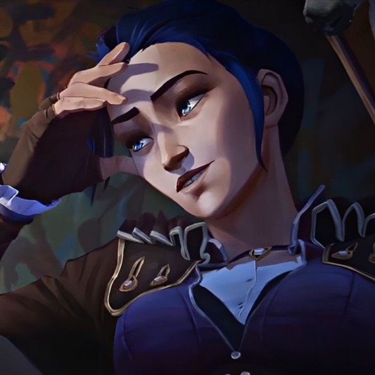
Night has fallen over Piltover, and the city lights shine with a golden glow, reflecting the majesty of the buildings and the life that has always characterized this city. Caitlyn has invited you to dinner at one of the most exclusive restaurants in town, an elegant place, tastefully decorated, where the panoramic view takes your breath away. The atmosphere is calm, yet filled with a sophisticated air. The murmurs of other diners do not interrupt the softness of the background music.
Caitlyn looks impeccable, as always, in her elegant dress that accentuates her delicate but strong features. The soft candlelight flickers on her face, highlighting the concentration in her eyes. From the moment you entered the restaurant, you could sense something in the air, but she is determined to maintain composure, even though her hands occasionally move restlessly over the table.
The dinner goes on as usual, with Caitlyn talking about her latest research advancements, her projects, and concerns about the future of Piltover. But even though the topic is important and her voice is firm, you can't help but notice the tension inside her. She drinks a bit more wine than she normally would, and from time to time, her fingers play with the glass as if she is seeking comfort.
"I've been waiting for this," she says suddenly, her eyes fixed on you, although her tone betrays her nervousness. "I don't know if I'm good at this, but I think... well, I need to be honest. I don't like hiding things, and this is important."
Your eyes meet hers, noticing how a slight blush begins to appear on her cheeks. Caitlyn, the woman who always has a logical answer for everything, now looks completely vulnerable. But it's not her nervousness that makes you smile; it's the way she looks at you, as if this moment is more important than any project or achievement.
Caitlyn sighs deeply and finally gets up from her chair, giving you a little spin around the table. You don't know if it's to calm herself or because she needs to distract her thoughts, but she approaches slowly, as if each step is a challenge. Her hands tremble slightly as she places them on the table, and you realize that something very important is about to happen.
"I know this isn't something I planned in the traditional way," she says, her voice soft but firm, "but... this is how I feel. And I want you to know." She lifts her hand, showing you a small ring, whose shine is subtle but radiant. It is a delicate ring, with a simple yet elegant design, of impeccable quality. And when you see it, you realize it's not just any jewel.
It's the ring her mother wore at her wedding, the same one Caitlyn had seen so many times, the one she had touched with so much love when she was a child. A symbol of tradition, of enduring love. A symbol of family.
"This is my mother's ring," Caitlyn says, almost whispering. "I know it's not a modern ring, nor expensive compared to what I could buy, but... it holds a very special meaning. For me, it means everything I want to offer you. My family, my love, my commitment. My promise that I'll always be by your side."
She looks at you, her eyes shining with emotion, as if it were the first time she showed something so intimate, so hers. There are no doubts in her gaze, only a deep certainty of what she's saying, but her voice remains soft, sincere.
"I love you," she says, with a clarity that reaches straight to your heart. "And I want you to be my partner in all of this, not just in the good moments, but in the difficult ones. Because, for me, there is no one else I want to be with. Only you."
Caitlyn places the ring in front of you, and for a moment, all the bustle of the restaurant disappears. Only the soft sound of her breath and the beating of your heart remain. You know what you have to do, but this moment feels so perfect, so genuine, that the words seem stuck in your throat. All you want to do is take her hand, look her in the eyes, and say yes.
Finally, your words come out with a wide smile. "Yes, Cait. Yes, I want to spend my life with you."
Caitlyn's eyes light up with a happiness that makes you feel as if everything is in its place, as if nothing else matters about what may come in the future. This moment, this commitment, is everything you both needed.
Caitlyn hugs you tightly, and the ring shines on your finger, a symbol of a pure and deep love, born from honesty, vulnerability, and sincerity from a woman who, despite her external perfection, has always been real with you.
Jayce
The day had been long and full of work, but Jayce, with his determined spirit, decided to surprise you. Instead of taking you to a fancy restaurant or preparing something sophisticated, he had a much bolder idea—a homemade dinner. That made you smile immediately, knowing that Jayce wasn’t exactly an expert chef. But you didn’t care; the idea of sharing something so personal with him excited you more than any gourmet dinner.
When you entered the kitchen, you found him with an expression of total concentration, mixing ingredients in a way that left much to be desired, but you found it charming. He had made pasta, something simple, but it had surely cost him more effort than he wanted to admit.
"Surprise!" he said as he saw you approach. Although the dish wasn’t a culinary masterpiece, you sat with him, and despite the imperfections, you enjoyed every bite. The smile on his face as he watched you eat was enough to make everything seem perfect. And when, after a while of talking and laughing, you got up to go to the bathroom, he took the opportunity to open a special bottle of wine.
When you returned, the glass was ready, and seeing the wine in it and the label on the bottle, your eyes lit up with excitement. It was your favorite wine! You couldn’t stop smiling as you smelled it and took a small sip.
But then, suddenly, something wasn’t right. A strange piece caught in your throat made you cough hard. The wine spilled from your mouth as you tried to catch your breath, and in the midst of coughing, a strange sensation made you feel as if something was stuck there. In an instant, Jayce was by your side, looking at you with panic.
"What happened?! Are you okay?!"
With a quick maneuver, almost instinctively, Jayce patted your back and, with a racing heart, helped you spit out what was stuck in your throat. To both of your surprise, what came out was not just a piece of food, but a small ring now resting in your hand.
Jayce was in shock, looking at the ring and then at you, completely red with embarrassment. "Oh no! That wasn’t part of the plan! How did that get there? Everything has gone wrong... I’m sorry, I never imagined this would happen."
You laughed, almost hysterically, as you cleaned the ring with a napkin and held it in your palm. Despite the comical situation, Jayce was clearly frustrated. He wanted everything to be perfect, but you didn’t care. It was clear that all that mattered was that he was there, in front of you, despite the fiasco.
"Are you going to ask me or not?" you asked, the smile on your lips growing as you watched his face change from despair to disbelief.
Jayce looked at you, and for a moment, he didn’t know what to say. He was nervous, completely out of place. "Really? Now…?" he asked, with a nervous laugh. But it didn’t take long for him to do what he had to do. With a shy but genuine smile, he knelt before you, somewhat clumsy but sincere, and with a nervous laugh, he said:
"Well… since it seems I can’t do anything right today, maybe this will be the one thing that goes well. Will you marry me?"
The scene, as clumsy as it was funny, made you laugh even more, but in the end, all that mattered was that he was there, in his own way, loving you. The ring, somewhat imperfect in all its disorder, represented more love than anyone could ask for. Without thinking any further, you took his face in your hands and kissed him tenderly, answering in the simplest yet most profound way possible:
"Yes, Jayce. I do."
Ekko
The Undercity held its own kind of magic. The faint lights of the streetlamps flickered through the mist, and the distant sounds of the markets blended with the steady flow of water running through the pipes. You were sitting on an improvised bench in a hidden corner, surrounded by the crumbling walls, but to you, this place felt like the very heart of the world. Ekko had made it a refuge for the two of you, a space where you could escape from the chaos and, for a moment, forget about everything else except the present.
There was something special about that night. The way Ekko looked at you, the spark in his eyes... it wasn’t like the times before. There was something deeper now, a sense of resolution, as if he was on the verge of making a decision that would change everything. And he did.
"You know," Ekko began, his voice more serious than usual, "I've been thinking a lot about things lately. About how everything we've lived through... everything we've overcome... has changed us." His words carried a weight they usually didn’t.
The conversation didn't seem to be heading towards a cheerful topic, but there was something in the air that told you what was coming was important. You leaned in a little closer, sensing that the atmosphere was charged with something.
He pulled a small device from his pocket, something that looked like an old piece of machinery, but upon closer inspection, you realized it was no ordinary gadget. It was a pocket watch, but not the kind you'd find in a store. This one was modified, a timepiece that seemed designed not only to measure time but also to control something else... something intangible, like destiny. It was something Ekko had built over the years, a reflection of his constant efforts to understand the flow of time.
"This watch," he said with a faint smile on his lips, "is a reminder. A reminder that even when things seem out of control, we can always find a way to move forward. Like us, always moving forward, no matter what comes our way."
He looked at you with a seriousness you’d never seen from him before, and for a moment, he fell silent, as if searching for the right words.
"And… what I’m trying to say is that, even though we don’t have control over time, even though we can’t stop what’s coming, I want you to keep walking by my side. Every second, every minute, every step."
Despite his usual relaxed demeanor, in that moment he seemed more vulnerable than ever. The watch he showed you wasn’t just a machine; it was a symbol of what he had been searching for his whole life: a way to stop time, so that the most important moments wouldn’t slip away.
"So, if at any point you feel the same way," he added, gently taking your hand, "I’d like this... what we’re living... to never end. That we can keep making memories together. I don’t know if there’s a right way to ask, but... would you like to be with me, always?"
He looked at you with a vulnerability you’d never seen before, almost as if afraid you might say something that would break the magic of the moment.
You couldn’t help but smile, at first as if you were in shock, speechless. This Ekko, the one who always had a plan, the one who had faced a thousand battles, was now asking you to be by his side forever, with a sincerity he rarely showed. It wasn’t a grand traditional gesture, but to you, it was even more meaningful.
You were silent for a few seconds, and that made Ekko feel even more unsure, his gaze beginning to fade as if he thought you had already decided not to answer. But before he could pull away or say anything more, you caught him, quickly closing the distance between you.
"Yes," you whispered, but it was a resounding yes. "Yes, Ekko, I want to be with you. Always. I don’t need a watch or a perfect plan. I just need you."
You held his hand more firmly, looking into his eyes, and his lips formed a slight smile, though his face still carried a trace of nervousness.
"Together, forever, babe," he said, pulling you close and resting your back against his chest. You smiled happily as his arms wrapped around you.
You took the watch and kissed it, feeling the cold scent of rusted metal.
"Forever," you replied, and that word felt like the beginning of something eternal.
Silco
It was another night when the soft light of candles flickered, casting shadows in the corners of the room. The atmosphere in Silco's office was charged with tension, as always, but tonight something felt different. The usual coldness of the room had transformed into something warmer. On the walls, shadows danced to the rhythm of the flames, and the scattered papers on his desk seemed to tell stories of past struggles and uncertain victories.
However, Silco wasn’t at his desk. He stood in the center of the room, silently watching you as you leaned against the door, returning his gaze. His presence was magnetic, as always, but there was something different about him tonight. Something more vulnerable in his stance, as if he had been waiting for you—or rather, waiting for you to understand what lay beneath those deep eyes.
“This is a different kind of night,” Silco spoke, his voice grave, deliberate, as if weighing each word. He motioned for you to come closer, but not to him—toward the far side of the room. A table, delicately designed, rested just beneath a window overlooking the chaotic landscape of the Undercity.
As you approached, you noticed several boxes on the table, some open, some closed. One wooden box caught your eye. Silco’s gaze hardened on it, almost as if he feared what might happen when it was opened, or perhaps what it represented. He moved toward it slowly, like someone executing a carefully planned act, and gently opened the box.
Inside lay a ring. It wasn’t the kind of ring you’d expect from someone like Silco—no extravagant jewels, no grand display of wealth. Yet, there was something profound about it. The fine, dark metalwork and the stone that caught the light in a way you couldn’t ignore seemed to tell a story. It was as if the ring itself embodied both the harshness of his life and the softness of feelings he had long kept hidden.
“This is the kind of thing I never cared for,” he said, his tone mixing toughness with an unexpected sincerity. “A symbol without meaning. But since you arrived, I’ve learned that there are things worth more than logic.”
For the first time in what seemed like forever, Silco showed a hint of insecurity. His gaze clouded for a moment, as if he feared your reaction. But instead of saying more, he stepped closer, the ring in his hand, and slowly sank to his knee before you.
“I’ve sacrificed so much, maybe that’s why I never let myself desire more. But now I know. I know because I want you. And because I don’t want to do this alone.”
There was no grand gesture, no theatrics, but the weight of sincerity in his simple act stunned you. He looked up at you, his eyes full of vulnerability, asking for something more than anyone had ever dared to ask before.
“Will you marry me?”
The silence in the room was thick, filled with everything Silco couldn’t say but what his proposal meant. It wasn’t a casual request—it was a serious commitment, as serious as everything he’d fought for in his life.
For a moment, you stood still, heart racing—not because of the surprise, but because of the sheer intensity of his words and the unexpected gesture. You had seen the calculating side of Silco, the way he controlled every aspect of his life, every decision with precision. But this—this was something entirely different. It was the purest form of vulnerability, someone willing to give it all up for love, to risk everything they’d built for someone who meant more than any achievement.
Finally, you took a deep breath and, with a soft smile, nodded. “Yes,” you said, your voice steady but full of emotion. “There is nothing I want more in this world than to be your wife.”
The air shifted instantly. Silco stood slowly, and his normally implacable face softened. It was as if he had laid down an immense weight, as if the future finally had a clear purpose.
Without another word, he pulled you into his arms. In that moment, the shadows in the room seemed lighter, less oppressive. With the promise of a future together, everything that had once seemed distant, unreachable, now felt within both your grasps.
Mel
It was a quiet night, one of those where the sounds of the city reached you muffled, as if time was willing to grant you a break. Mel's living room, as always, was a perfect display of elegance and order, but something about the atmosphere that night felt different, warmer, more intimate. The soft light from the lamps illuminated the carefully arranged furniture, and there was a rare calm in the air, something that only happened when the worries of the outside world seemed to vanish for a moment.
Mel had invited you to her house that night, but not for dinner or a formal event. Instead, she had wanted to show you something more, something personal. And seeing the invitation in her eyes, you knew this moment was special.
When you entered, the house had a more relaxed vibe than usual. The fireplace flickered softly in the background, and the air was filled with the delicate scent of incense. However, what truly caught your attention was what was in the center of the room. A large painting, a framed portrait, was leaning against the wall, carefully placed under a soft light.
"I want you to see this," Mel said with a slight smile, her usually firm voice now tinged with an unexpected sweetness. She approached you, guiding you toward the painting. Though her face didn’t give it away, there was a slight tension in her movements, as if she was waiting for your reaction.
You stepped closer to the portrait, and your breath caught as you saw the image in front of you. It was a portrait of you, painted with a level of detail that only someone like Mel could have achieved. Every line, every shadow seemed to capture something beyond your appearance: a reflection of your being, how she saw you. It wasn’t just a painting; it was an expression of how Mel perceived you, something that had been rendered with such dedication that the work itself seemed to come alive.
"It’s… incredible," you murmured, unable to articulate a more complete response. Mel watched your reaction, her eyes fixed on you, but without saying a word. You knew that, for her, this work meant far more than just a portrait. It was a piece of her soul, an extension of her deepest feelings.
"I did it because… because I wanted to capture something that could never be expressed just with words," Mel said, her tone calm but loaded with meaning. "It’s hard for me to share something so… personal, but with you, I feel like it makes sense."
You turned toward her, surprised by the vulnerability she was showing, so rare in the woman who had always kept everything under control. But there was something in her gaze, something in her posture, that made you see what she truly felt.
Mel took a step toward you, her gaze softening even further. "You are… the only person who has truly shown me what it means to let someone in so deeply. I’ve spent my whole life building walls, creating an image of control, but you… you’ve shown me something I didn’t even know I needed."
There was a softness in her words that you had never heard before. You knew her as a strong, calculating woman, always impeccable. But there, in that moment, in front of you, there was something more, something that only you had been able to awaken in her.
"And now I want you to… be part of my life. I want you not only to be part of this portrait, but of everything I’ve built. I’ve had all the power in the world, all the control I could wish for, but that doesn’t make sense without someone like you by my side."
Mel paused, almost as if she were fighting against herself, and then, with a smooth movement, extended her hand toward you. In her palm rested a small box, which she carefully opened, revealing a simple but elegant ring. It was beautiful but not ostentatious, with a unique beauty, a design that spoke of her personality: refined, but with a subtle touch of surprise. The golden ring glimmered softly under the candlelight, like a reflection of the same gentleness Mel had shown in her words.
"I want you to be my partner," Mel said, her voice a barely audible whisper, but filled with meaning. "Will you marry me?"
The moment was marked by a tense silence, loaded with emotion. Mel wasn’t seeking a grand declaration or an ostentatious proposal. She only wanted to share her life with you, in the way she knew how to do it: with a sincerity that only she could offer.
Without thinking, you stepped closer to her, took her face in your hands, and without saying another word, kissed her softly. The kiss wasn’t just a response to her proposal, but an affirmation of everything you shared, of everything that moment meant.
When you pulled away, her eyes were filled with something you had never seen before: vulnerability, hope, love. You took her hand, and with a warm smile, you said what she had been waiting to hear, what you both knew was true.
"Yes, Mel. Yes. I’ve always wanted this, to share all of this with you."
Mel smiled, her face lit by a deep emotion she had never shown before. Without saying another word, she hugged you, and in that embrace was everything she couldn’t say with words. The future, her promises, her fears, her desires. It was all there, intertwined in an embrace as warm as the painting she had created just for you.
Sevika
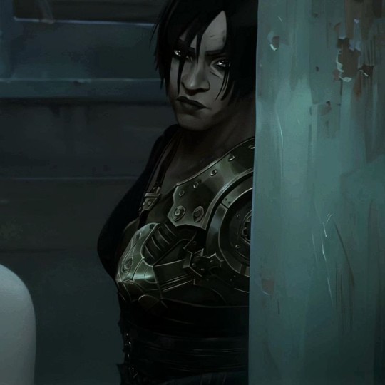
It had been a long and dangerous night, more than either of us had anticipated. You had gotten yourself into a mess, bigger than anyone else would have dared to handle, but there you were, beside Sevika, helping her get out of danger. There were a few of Silco's enemies, but with her strength and your ingenuity, you managed to make it all end in the blink of an eye. The tension eased, and calm washed over everything like a wave.
The air was charged with adrenaline, but also with a strange serenity when the two of you were finally away from danger. Sevika, with her impassive face and intense eyes, looked at you with a mix of gratitude and something more. You couldn’t say it was love at first sight or anything so romantic, but there was something about that moment that felt different, something raw, something real.
You stayed looking at her while both of you took a breath, your bodies still trembling slightly from the tension. She was so close you could feel her breath, as heavy and rhythmic as your own. Without warning, her eyes locked with yours, and for a moment, the outside world disappeared. There were no more enemies, no more worries, just the two of you.
Sevika didn’t speak at first. The full moon illuminated the corner where you were, but it was her silence that spoke volumes. Then, as if it were the most natural thing in the world, her low voice cut through the air:
"Do you want to marry me?"
You stopped, surprised. Had she really said that? Or was it one of her usual jokes? It couldn’t have been more unexpected, could it? You laughed lightly, thinking it must have been a joke. But when you looked into her eyes, as serious as always, a knot formed in your stomach. Sevika wasn’t joking. Not this time.
"Just like that, out of the blue?" you asked, unable to suppress a smile of disbelief. It was as if all the chaos of the night hadn’t been enough to spill over into the unpredictability of her proposal.
She didn’t flinch, her lips curving into a slight smile, but her eyes stayed fixed on you, determined. "And why not? The best things come out of nowhere, don’t they?" she said with a tone that left no room for doubt. Her voice was strong, direct, but there was a softness hidden beneath her arrogance. Sevika had never been one for too many words, but the few she spoke always carried weight. As if nothing in her was accidental, and every decision she made was calculated down to the last detail.
She looked at you for a moment, evaluating you with the same intensity she always did, then added, "So, do you want to be my little, spoiled wife? I promise to put up with your snoring and you kicking me out of bed for all eternity." She joked, a low laugh escaping her chest, and you were a little surprised by the lightness in her tone, as if, in the seriousness of the situation, Sevika also needed to soften the moment in her own way.
Your reaction was automatic, more because of the teasing tone than the content of what she said. "Hey! I don’t snore that much!" you exclaimed, pretending to be offended, but the truth was, you couldn’t really be angry. You couldn’t be upset, because there was something about her that drew you in in a very unique way.
So, you decided to raise your right hand and move your ring finger. "No ring, no wedding," you warned, then flicked your hair in the air. "I’m not a girl who settles for little, and you know that."
Sevika approached you, never losing her smile. "Believe me, sweetheart, I’ll buy you the biggest, most expensive ring in the world. Tell me how many carats you want, and I’ll get it exactly how you ask for it." Her promise was full of a confidence only she could have. Every word sounded so convincing, so solid, that there was no room for doubt. Sevika never made empty promises, and this was no exception.
Her voice was deep, playful, as if she was willing to fulfill anything asked of her. You smiled, pleased, but something in her attitude sparked a mischievous glint in your eyes. Instead of continuing the joke, you went straight to the point and leaned close to her ear, whispering with a touch of playful innuendo:
"Since the best things come out of nowhere, why don’t we fast forward to the honeymoon?"
Your whisper was soft, but with an undertone of suggestion that didn’t go unnoticed. Sevika blinked a couple of times, clearly surprised by your response. But instead of being bothered, something on her face shifted, and a sideways smile appeared on her lips, as if you had pulled the idea right out of her head.
"I like that," she said, her tone now low and filled with palpable desire. "I love that you don’t beat around the bush." Her voice was hushed, heavy with desire, accentuated by how close she was to you. "Let’s make this night something much more... memorable."
Suddenly, the environment around you both ceased to exist. Only her eyes, the heat of her body near yours, and the certainty that, despite everything, something had begun in an unexpected way remained. The best things come out of nowhere, and tonight, Sevika had shown you that her way of loving, though fierce and daring, was also the most sincere you had ever known.
#arcane x reader#arcane fanfic#arcane imagine#arcane x female reader#arcane#arcane fluff#arcane x you#ekko arcane#viktor imagine#viktor x y/n#viktor x reader#viktor arcane#jinx arcane#jinx x reader#arcane vi#vi x y/n#vi x reader#arcane caitlyn#caitlyn x reader#arcane jayce#jayce x reader#silco x reader#silco arcane#ekko x reader#mel x reader#mel arcane#sevika x reader#sevika arcane#sevika x you#vi x you
1K notes
·
View notes
Text
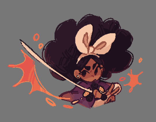
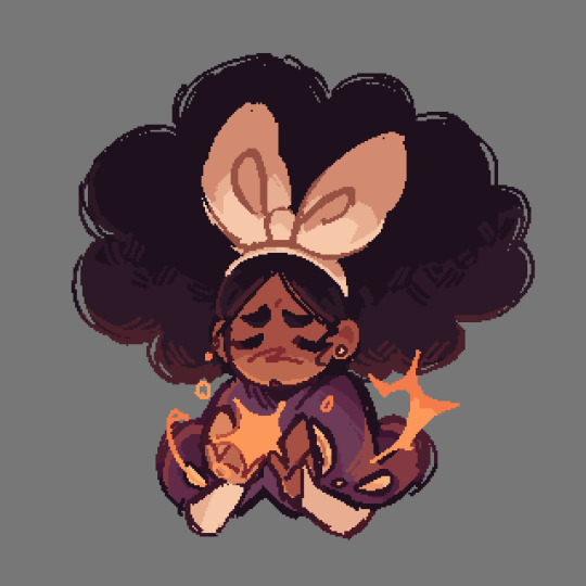
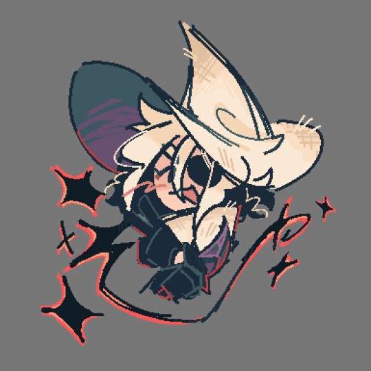
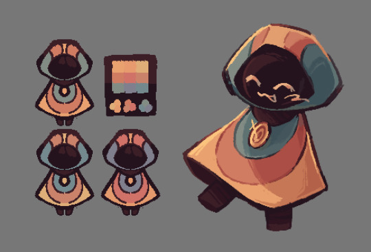
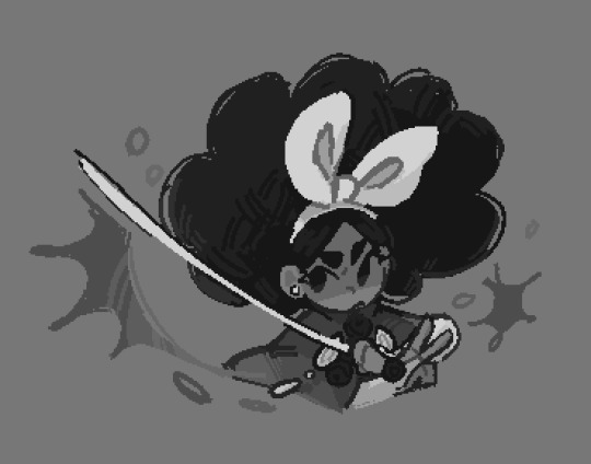
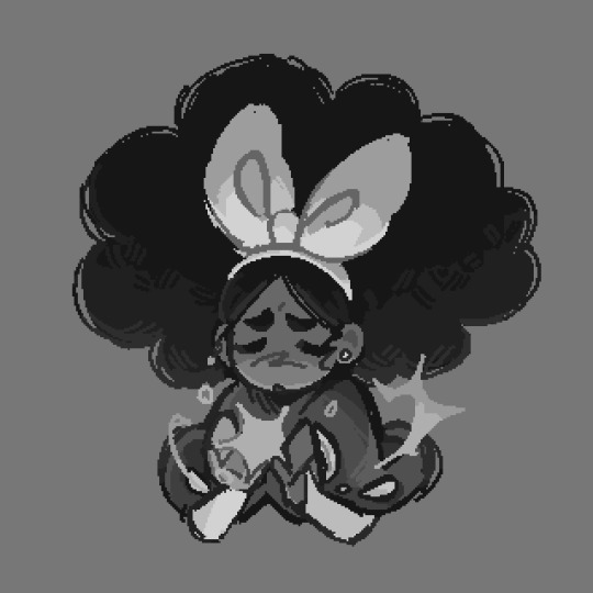
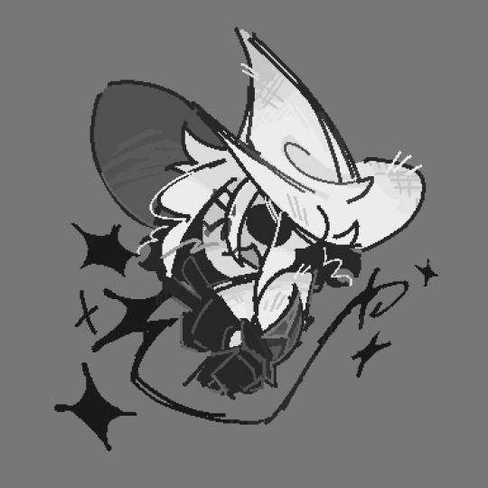
HAPPY (kinda late oops) BIRTHDAY MIWA!!!!!!!! ignore the other two LOOK AT HER!!!! IT’S MIRABELLE MSUNDAY!!!!
greyscale versions + my very normal color ramblings below!
ok full disclosure i already had this post drafted before realizing that mira’s birthday was coming up. i kinda debated just posting the mira doodles on their own but!!! i want to talk about my craft/general color headcanons still. and the mira art is part of that!! so be warned. also, this is going to reference my post about my craft headcanons a lot so like. read that if you so desire.
i personally think that mira’s healing craft is some form of creative craft, since the game describes her holding her palms up when she uses it (iirc anyways). this doesn’t really have an effect on anything, but it’s why i decided to color it yellow!
(also i ended up making mira’s scissors craft a lot more orange than i initially planned but that’s ok!!! i think both of her crafts would be pretty Orange. just thought i’d mention that since it’s a bit different from my first post)
i already explained sif’s craft in my last post so now i get to talk about the change god!!!!!! this is like. probably the most out there in terms of my color headcanons? but i have a reason for that. since the change god is, well, a deity, i thought it would be fitting for their design to match the colors of the 3 craft types (red, blue, and yellow)! this was a little hard to work around given that i also try to give my vaugarde designs warmer color palettes, but i think it worked out!
i also gave them a few slightly different palettes, since i think it’ll make sense for the change god’s colors to be variable. they never look the same, so why would their palette look the same? + i’m indecisive and liked all of these palettes lol
sorry for the ramble! i really like talking about character design and i’m not. very succinct. thanks for reading all this (if you did, perfectly fine if you didn’t!), here’s the greyscale versions as promised!!!
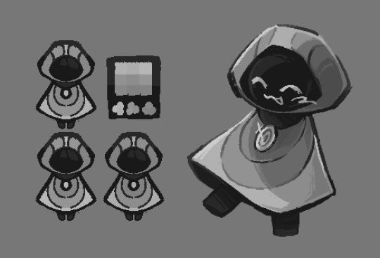
#marshdoodles#isat#in stars and time#isat spoilers#HAPPY BIRTHDAY MIRABELLE!!! sorry for hijacking your birthday to ramble about colors 🩶#i usually reserve my character design infodumps for the tags but i REALLY wanted to talk about my change god design. sorry#dont mind the fact that the change god palette looks like mettaton#this isn’t the first time i’ve drawn the change god btw! i just. haven’t posted those#because they’re for isatscryption#also posting this at a different time than usual because i don’t want to actually miss her birthday lol#anyways again!!! sorry for the infodump!!!!
3K notes
·
View notes
Text

Only one guy on here has two eyes, and even then, they're fake eyes. It's big-tits-McGee, Mr. logic man extraordinaire, Geneva Suggestion Believer himself: Shockwave! Yep, all 12 of him, a reasonable amount of alternates to have, unlike some people... Shockwave Height Chart, everyone, fuckin wee.
Edit: I didn't like the old scaling I had so I changed it. The old chart is at the end of this post.
Quick Disclaimer, if any of the images look weird, it's because I had to stitch a few separate images together to create a full body shot of the character.
Here are links to my Bumblebee Chart, my Optimus Chart, my Megatron Chart, and my Soundwave Chart. !!NEW!! -> Ratchet & Ironhide. Please go gawk at how many Optimus designs there are, sweet fuck, there are so many. For future reference, all these charts will be filed under my "Transformers Height Charts" tag and my "aka the adventures of a..." tag.
Master Post
Explanations and Sources below the cut.
Unicron Trilogy Energon - ~14 feet 3 inches (No actual source, and Energon doesn't have any listed heights anywhere. For the uneducated, the Unicron Trilogy has given each of its 3 seasons separate names and 3 separate art styles. This is the design used in Energon (S2) though he only shows up in Energon. I was able to compare him to Optimus, and using Cybertron's listed heights, I got this number. I am in physical pain, it does not get better from here. Hilarious side note, his Japanese name is Laserwave, which contains the missing "wave" of Shockwave in this iteration's name.)
Earth Spark - ~15 feet (No actual source for ES, but using a barn door to get Bumblebee's height, then Optimus's, then Megatron's height, I was able to make a guess at Shockwave's. Shockwave comes up to about Megatron's chin; I lost the screenshot I used. It's so convoluted, I know, but it's all I have, also, tiny universe, everyone is so small)
TFA Longarm/V1 - 15 feet 2 inches (Animated has no actual numbers, but the lovely @phoenix-inanis has provided a frankly astounding resource with their own calculations for the heights of all the TFA characters. Go look at it, it's wonderful -> https://phoenix-inanis.notion.site/TFA-Height-Chart-f6ad2960ca8c4c5b859ee4958723aaa4?pvs=4)
Gen 1 - ~18 feet (TFWiki, uuuuh I've got nothing to add)
Netflix Cybertron Trilogy - ~18 feet (I have no source for this, other than assuming that because this design is identical to Gen 1, they are the same height. That's it, really)
Knight/Capel-Verse - ~18 feet (No source, and he never stands next to anyone I can measure him against, but because the TFOne director has said that this movie is both canon to the LA movies and its own separate canon, I am assuming the height I figured out for TFOne applies to this universe as well. Until proven otherwise. Capel directed the ROTB movie if you're wondering why his name is there)
One - ~18 feet (No source, I got this number by comparing him to Optimus. Now, I am aware of the TFO heights listed on the wiki, but I reject those numbers on principal. A: Those numbers are sourced from the Walmart Promotional AR Experience that came out before the movie. B: There are three decimal points, and that number does not convert into a whole number in meters (which is originally what I thought was weird about it). C: The director has said that this movie is both canon to the LA movies and its own separate canon, so I have elected to use the few given heights we have from KCV and worked from there. My Optimus post has slightly more context if you want it)
Cyberverse - 20 feet (This comes from a screenshot of this video which has the Cyberverse height chart everyone uses, though the quality of the screenshot is iffy.)
Aligned Cont. WF/FOC/TFP - 26 feet 2 inches (This number comes from Fandom and I completely believe it, even if they don't list their source, because the entirety of this universe is freakishly tall. Go look at my other charts, all the ALC designs are monstrous compared to the others)
TFA V2 - 29 feet 11 inches (Once again, phoenix-inanis did a fuck ton of work, go look at it, it's wonderful -> https://phoenix-inanis.notion.site/TFA-Height-Chart-f6ad2960ca8c4c5b859ee4958723aaa4?pvs=4)
Bayverse - ~30 feet (Ok, so I don't have a source for this one. There used to be one, BV Shockwave used to be listed as 40 feet tall bc of an article done to promote the movie, but that is no longer listed for reasons not known to me, and making some comparisons to Optimus, I have found them to be kinda close in height. It's very hard to actually validate any of this. Shockwave never stands normally next to anything I can use as a ruler at any point in the movie. He's always at a dramatic angle or partially covered by something in the shot. It's so violently frustrating. I am confident he is around this height though, I just can't figure out how much taller than Optimus he is)
And that's it. I didn't have to leave any designs out, all of them are included here (hopefully). It was so nice to work with a character where I wasn't drowning in 20+ designs across every goddamn universe.
Edit: Here are the different layers separated.


vvv Old scale vvv

#personal stuff#transformers height charts#aka the adventures of a mother fucker with the power point program#stare at his glorious rack across the multiverse#actually it's less of a rack and more of a shelf#maybe a cupboard#transformers#macaddam#macadam#shockwave#g1 shockwave#unicron trilogy shockblast#unicron trilogy laserwave#< i think it's funny that his normal name is split in half#tfa longarm#earthspark shockwave#wfc trilogy shockwave#knightverse shockwave#tf one shockwave#cyberverse shockwave#wfc shockwave#tfp shockwave#tfa shockwave#bayverse shockwave#there's only 12 what kind of paradise is this#this one was so blessedly simple to do after my meg and op ones#freakazoid continuity#bc the entirety of the aligned cont is so freakish I renamed it in my head
414 notes
·
View notes
Text

woe cwilbur be upon ye. as promised here are my designs for every cwil era/stage/what have you + my reasons behind each design. design breakdown will be under the read more :>
as a disclaimer going forward: these designs are heavily informed by my own headcanons (namely the nature spirit headcanon, which i will only briefly explain here- if you want more of a background on that here's where I first shared the hc and explained it a bit) i'll be honest idk how much of these hcs/analysis abides by canon? so if you prefer to closely abide by canon this may not be for you. having said that, let's get into this. So one question that may initially come to mind when looking over this is "Why a nature spirit?" which is a reasonable question all things considered. I've already gone over the Watsonian explanation in the past, so instead I'll cover the Doylist take- which is more interesting as it pertains to these designs. Wilbur, as I see her, is a character that has many faces- she warps and changes to embody the view of herself she sees as necessary for the situation, whether that be the revolutionary or the villain. Simultaneously he has this core that's deeply eccentric and often difficult for the characters around him to grasp- this can come in the form of benign weirdness to the struggles with mental illness we see him go through throughout his various arcs. There's this push and pull between the person they want to portray and who they are fundamentally that's always at play.
Them being a nature spirit embodies this to an extreme. As a nature spirit their physical form is informed by their self perception (the one that's warped by the role they feel they need to take) and their own mental state, both aspects of the character that are foundational.
Another question that may arise upon reading all of this is "Why not just make him a shapeshifter?" which is also a valid question. Truthfully this one is rooted heavily in my own ideas of the character, so you'll have to take that with a grain of salt. I am, unfortunately, prone to making shit up /lh With that in mind however, the reason I choose nature spirit over shapeshifter is that, the way I interpret it, it's much more... animalistic? Let me explain: the way I tend to see shapeshifters portrayed is either a. having a base form that's relatively humanoid and then multiple other forms or b. having no base form but still presenting as generally humanoid. As a nature spirit Wilbur has a natural (ba-dum-tsss) tie to well... nature, and all that lives within it.
She's this manifestation of the wilderness whose form isn't even naturally human, yet she shapes herself into something presenting as such. As a nature spirit Wilbur occupies this weird nebulous space between human and beast, never fully embodying either. I find this incredibly interesting for a character that wants to feel and to be treated as human so badly, one that also clearly resents being seen as monstrous (despite leaning into that perception of themselves)
TLDR; Wilbur's 50 contradictions in a trenchcoat (literally) and being a nature spirit gives these contradictions/masks/ect. a physical manfiestation Now that we're 500+ words of analysis in, let me breakdown each individual stage :3 /lh
Pre-SMP + L'manburg


The most "human" Wilbur ever gets here- technically these two are different designs/eras but they have similar design notes so I'm lumping them together here
During this stage of his life Wilbur has a fairly good handle on his shapeshifting and is consciously choosing to look more human
Small details like the fangs, pointed ears, claws, and pupils allude to an inhuman nature. I like to think there's something uncanny valley about them- they look human but the longer you look at them the more small discrepancies you notice
Both look relatively generic appearance wise, if you can't tell this was Wilbur's "I am a Normal Human Man era" but with slightly more gender /lh
Decided to stick Wilbur in a different outfit Pre-SMP than the actual skin most people reference, mostly because I thought it'd be fun. The trenchcoat follows her throughout her development
Lots of goofy ass patches and pins on the coat
I personally hc that Wilbur always has some sort of oversized clothes on because it's a bit like a security blanket for him, very grounding and all that- anyways that's what the trenchcoat is here
Limited notes on L'manburg era- main thing is the glasses; they got cracked in conflict and they just never bothered to fix em
Pogtopia

As a result of stress (and personal perception) Wilbur lost control over his shifting entirely
Wilbur views their nature as inherently monstrous, thus when they think of themselves as monstrous or evil they lose most of their human appearance
Much taller in this form than usual, this reflects both how she feels she's perceived and how she perceives herself (monstrous, scary, inhuman, ect. ect.)
Their height also serves to emphasis the claustrophobic nature of the ravine and especially the button room
Eye color changes from brown to red, yet again another thing which reflects his self loathing
Coat is the same one worn pre-smp, just with some adjustments
Pins & patches removed from the jacket (my friend suggested it saying that he "ripped them out because they were too happy" and I find that mental image particularly silly so it stays)
Covered in stains, partially because the ravine is just. awful. and partially because this thing is not taking care of herself even a little bit
Lenses are even more cracked than they were during the revolution
Ghostbur

This section has a lot less points then the others on account of Ghostbur being fairly self explanatory, but shhhhhh
Reverted to "base form" post death, form is extremely fluid as a ghost- she tends to shift depending on the topic of conversation or the person she's speaking with (Explain being: whenever she talks about "alivebur" she becomes more human)
Less of a note and more rambling: fox ghostbur is especially fun to me given the hatred Wilbur has for Ghostbur. Ghostbur physically reflecting the parts of Wilbur that they hate the most in themselves
For Wilbur their base form- just a normal widdle fox- represents vulnerability. It is quite literally a small, fuzzy animal with little means to defend itself and it is also the culmination of everything Wilbur is running from. Ghostbur embraces this form fully yet is seen as more palatable by the people around her than Wilbur ever was
Constantly leaking a jammy, blue substance from his eyes and the cut in his chest, yucky
Especially long sections of "fur" like their tail and the back of their neck are constantly "dripping" little wisps like rain
Post-Revival

Post-revival his shifting is still fucked up (thank the mental illness for that) but he's got a slightly better handle on it, enough to look semi-human
Eyes have reverted back to brown but their lenses are tinted red anyways (often looks red)
The coat makes a comeback, edges are all fucked up from the explosion
That funky little overcoat/cloak/ect. got yoinked by Niki
Disheveled appearance meant to reflect her rancid ass mental state- namely the hair and the facial hair. Hair is grown out because she can't be bothered to cut it (you bet that shit is full of knots)
Nasty awful smeared eyeshadow as a treat <3 (I just think he deserves to be a little cunty yk?)
Got a little tired near the end here which is why the points got a bit sloppy, maybe I'll add more at a later date who knows. If you made it this far I hope you at least enjoyed reading all of this :>
#romeos ramblings#my art#dsmp#c!wilbur#dsmp fanart#dsmp wilbur#c!wilbur analysis#dsmp headcanon#there's some things i didn't add onto this because i wasn't too sure of them- stuff that might change in later iterations of the design yk#also don't ask me about the logistics of the coat during Pogtopia or how that fucked up yellow sweater got the stitches in it /hj#this post took me 3 days to properly construct I'm going into hibernation now
387 notes
·
View notes
Text
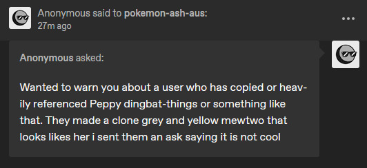
Yeah, We are NOT doing this. No one should ever do this, and no one should feel like this is okay.
Please, please, PLEASE, do NOT white knight on my behalf. Pepper and the Dingbat's new Mewtwo have a similar color scheme, and that's where the similarities end. Besides I KNOW about the new Two, even before they posted it on Tumblr.
If you feel like a design is heavily referencing mine and want it to be known, come to ME. Send ME that DM first and foremost. 9/10 it was a coincidence, and the other 1 could have been resolved quietly.
Also, you didn't say "It's not cool."
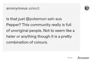
You outright called them Unoriginal, you are the ONLY one who called to the fact that Ding's new Mewtwo had a color scheme similar to Pepper's. You weren't nice about it, and you sure as hell had no reason to stick your nose in the way you did.
If you had even looked through mine or their blog, you'd have seen that we have done collabs before, I draw their characters on occasion!
Look with recent drama and all that good jazz, I get it. But no one should EVER handle a situation like this.
To anyone else out there, creating Mewtwo's is a dime a dozen. Most of my OCs have very simple but easy-to-follow designs, and that's okay. it's okay to take inspiration, it's okay to want a Yellow and Gray Two, and it's okay to want an Alpha Mew. I draw the line when you copy/paste and adjust the color slightly. I draw the line when there is no difference other than a small little color change.
This?
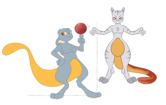
These are NOT the same Mewtwo, not even CLOSE.
Anyways, rant over, I'm off to block that anon, and for the rest of you
Check out @dingbat-things, they are a silly goober and their art is cute.
Spread love to them, especially after this disaster of a take.
#Don't do this#i am 100% serious#DM me if you think it's an ACTUAL offense#otherwise don't you DARE attack any artists for it#DM THEM before you make such baseless accusations#what a shitty way to end my night lol!
436 notes
·
View notes
Text
Analysis of Laios and how he hugs/interacts with people, pre and post-manga.
Reading body language in real life is basically pseudo-science most of the time, however, these aren't candid photographs of real people I'm analyzing, they are drawings purposefully made by Ryoko Kui to tell us something about Laios and his relationships with other characters.
These illustrations are designed on purpose to communicate information. So what do I think they say?
Here's the illustration of how things are at the start of the manga:
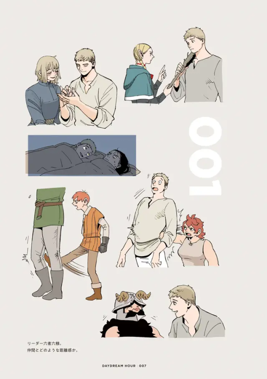
NAMARI AND CHILCHUCK
They're both rough towards Laios, expressing displeasure with him, using violent physical touch to get his attention or punish him for something.
TOSHIRO
His reaction to Laios is totally passive. He isn't turned towards Laios, but he isn't turning away either. He's staring up into space with a look of discomfort, suggesting he wishes Laios would leave him alone... But that he is too polite to openly reject him.
We know this is partially a cultural issue: because Toshiro is Japanese, he considers it catastrophically rude to tell someone "no" in a blunt way. He is trying to communicate his discomfort and disinterest to Laios, but Laios isn't understanding Toshiro's signals.
Meanwhile, Laios is turning his whole body towards Toshiro, his eyes are wide open, he's smiling. He's very eager to interact, in a way that he isn't with any other character on this page except Falin.
MARCILLE
They are having a neutral interaction. Neither of them seems excited or interested in each other, but they are talking seriously. Marcille is gesturing at Laios in a way that seems scolding, they are standing at a polite distance, and Laios is standing at his full height, perhaps even leaning/straining away from Marcille slightly. There is a physical object (Marcille's staff) acting as a barrier, and it's physically pushing Laios away from her.
But it is worth noting that he has his hand on the staff, suggesting that he's not letting himself be pushed away any further, that he's having a reciprocal interaction with Marcille, not a passive one where he just stands there and gets lectured. Laios is participating and engaged.
FALIN AND SENSHI
The only people having unambiguously positive interactions with Laios on this page, which makes sense since they are the two people who are the most friendly towards him at the start of the manga.
Laios and Falin are touching hands, smiling and their bodies are turned towards each other, showing enthusiasm and a mutual interest. This is less intense than the hug in the post-manga illustrations, which maybe suggests that there's something distant and unresolved between them here, like resentment and guilt.
Laios and Senshi are closer to each other than Laios and Marcille. Laios is sitting or crouched down to get closer to Senshi's height, and they are both smiling and turned towards each other. Senshi may even be laughing!
Here's the "post-manga" image...

What a huge difference!
All of these interactions are basically positive, so I'll just go left to right, top to bottom. Also for some of these, we can't see Laios' friends full reactions, so I'll focus on what we can see, and how Laios is behaving.
SENSHI
They share a gentle hug. They both have their arms wrapped around each other, so the desire to touch is mutual. Laios bends to reach Senshi, and has a calm, content smile on his face while they hug. Laios rests his head on top of Senshi's head, showing trust and intimacy and a desire to be physically even closer to Senshi than just hugging. Senshi isn't pulling away, so I think that's a good indicator that he doesn't mind it, and possibly even likes it!
Which is a big change from how he felt violated by Laios touching his chest earlier in the manga, even though Laios was trying to heal him... I think Senshi isn't someone that easily lets others touch him, so this is a big improvement.
CHILCHUCK
The size difference makes this hug awkward, but that's not the only reason! Laios has both hands on Chilchuck and he is bending down in order to reach him, suggesting that he wants to embrace his friend, however Chilchuck is not straining to reach Laios, and he is only using one hand to touch him, suggesting that Chilchuck doesn't want to embrace too closely. Chilchuck is willing to allow a hug, and he is willing to touch Laios back, but he doesn't want it as much as Laios does.
I think Laios is aware of this, because he isn't trying to push the hug to a higher level of intensity. He's holding back to the level he thinks Chilchuck is comfortable with.
MARCILLE
They share a happy, but not overly intimate hug. Their chests and bodies are pressed together, but they are turning their heads away from each other.
Laios' hands are resting side by side on Marcille's back, and it seems like she is hugging him back in a similarly loose way. His arms are not overlapping, and they aren't squeezing or grabbing each other, just holding on lightly while pressing their chests together.
TOSHIRO
What a fascinating set of drawings!
I'm going to assume that the color drawing is what happens first, and the black and white line drawing is what happens afterwards, solely because if the black and white drawing is meant to just be Laios' fantasy of hugging Toshiro, then surely he would imagine Toshiro hugging him back enthusiastically, and not a more passive reaction like Kui drew.
Kui wrote a note here to remind readers that hugging is not considered normal in "the East", where Toshiro is from, to give context to why the character seems so uncomfortable.
Laios is approaching Toshiro at high speed, arms open and reaching for Toshiro, eyes wide, with a happy expression. He clearly wants to wrap Toshiro up in a big, enthusiastic hug.
Toshiro is sweating with discomfort, and he has a hand pressed against Laios' chest, attempting to stop him… However, the arm is not extended and his elbow is bent at an acute angle, and it looks as if no force is being applied. Toshiro perhaps feels a need to offer a token protest, but he isn't really trying to stop Laios.
In the black and white hug drawing, Laios has both arms wrapped tight around Toshiro, much tighter than Senshi, Chilchuck or Marcille, and he's pressing their bodies together and resting his head on Toshiro's shoulder. He's turning his face towards Toshiro's neck, and smiling serenely.
Toshiro's body is stiff, he's sweating, and his arm is held at a rigid 90 degree angle… But he isn't using it to push Laios away, just holding it uselessly at his side. Perhaps he is half-way towards returning the hug, thinking about lifting his arm a little higher and resting his hand on Laios' back, but he isn't sure if he wants to do that yet.
Toshiro is bending his body towards Laios, and allowing himself to be pressed against the other man. He's staring out into space with a neutral expression that suggests either discomfort or surprise. I think we're meant to understand that he has given up fighting against the foreign, offensive hug, realizing that it isn't offensive for Laios, and therefore it might be okay to allow it...and it might actually be more offensive if he rejected the hug.
FALIN
Falin has thrown herself at Laios with considerable force, and Laios has his arms overlapping across Falin's back. They are both squeezing each other tightly with their arms, and even Laios' hands are gripping Falin tightly. There is an overjoyed look on Laios' face, and I think this embrace shows how Laios has healed through the course of the story.
KABRU
Since Kabru is one of Laios' newest friends, it makes sense that the hug would be the least intimate.
The two of them have a complicated relationship in the manga, but the complete world bible shows that Laios has finally accepted that Kabru is genuinely his friend and not just trying to use or manipulate him. He's made an effort in the post-canon to reach out and try to be Kabru's friend in return, and Kabru has forgiven Laios for not listening to him in the past.
Kabru is turning his body away from Laios, which puts his shoulder towards Laios' shoulder at a perpendicular angle, forcing distance between them. Laios is fully facing Kabru, and has one arm behind his back, a hand resting on Kabru's shoulder, and another hand resting on his chest. The hand on the chest is attached to an arm that is bent at an obtuse angle, holding Kabru at a distance, with no indication that he is trying to pull Kabru in. Both hands are relaxed, like in the Marcille hug, indicating that Laios' grasp is loose.
This arm position is pretty unusual for an embrace. It allows Laios to keep Kabru at a distance where he can see him, and control where he moves, and how close he's able to get to Laios… and Kabru isn't returning the hug in any way, instead allowing himself to be touched and held in place.
Their bodies aren't pressed together, and Kabru's arm is down at his side, neither encouraging Laios nor pushing him away.
Laios has a big smile on his face, and he looks enthusiastic. Kabru on the other hand has a calm smile. In my opinion his expression is less enthusiastic than Marcille's.
I think Laios can't tell how Kabru feels about the hug, and so he's holding himself back. He's not blinded by emotion like he is with Toshiro, so he's not flinging himself at Kabru… And because Kabru is such a new friend, Laios is also probably hesitant to get too close to him.
There may also be some lingering trust issues, if Laios still isn't completely certain if Kabru genuinely likes him or not. Laios has often had trouble telling if people really like him, or if they are just being polite (Toshiro), or using him (former party members), so it makes sense that it would take awhile for him and Kabru to become truly comfortable with each other..
#dungeon meshi#delicious in dungeon#kabru#laios touden#falin touden#marcille donato#senshi of izganda#chilchuck tims#toshiro nakamoto#shuro dungeon meshi#theories#my stuff
589 notes
·
View notes
Note
What're your thought on Skully/Skelly so far? Personally, I like the kid, he seems fun and cute (might even adopt him too lol)

I’ll make an update post later once the full event is out; this post will be my first impressions of the guy! Thought it might be interesting to document my feelings now and see how those change over time.
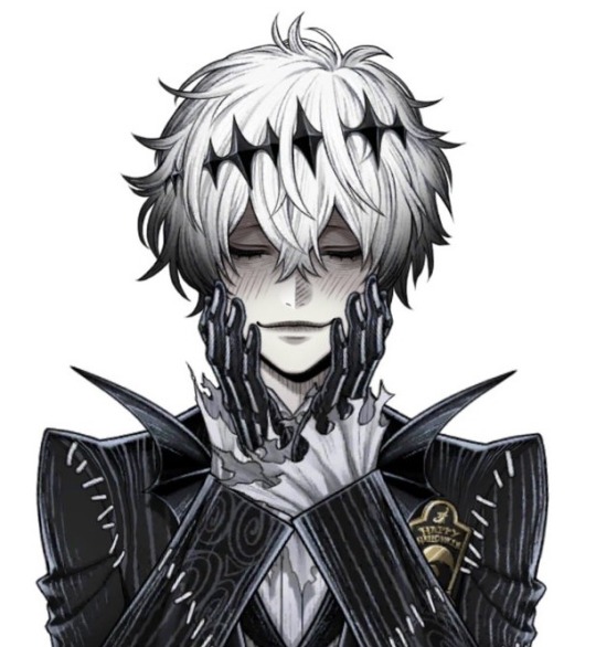
First thing I’ll say is while I like his design, his personality didn’t match my expectations. I expected him to be polite yet also eccentric and a little sinister, not… going around kissing the hands of everyone he meets. Skully also comes off as much more harmless than he appears. It’s an odd mix of demure but also really excitable when his special interest (Halloween, lol) comes up in conversation. A fun-loving guy! He definitely looks a lot more imposing and mysterious than he actually is.
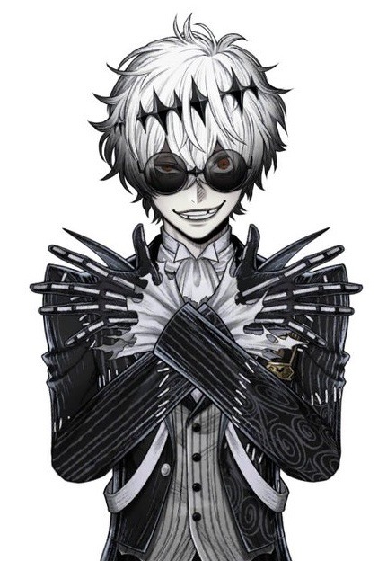
I think a lot of his intimidation factor comes from the shades. If you take them away, he looks more like a dejected fuzzy animal or a Halloween-flavored Idia/Saeran (Mystic Messenger boi). LIKE SORRY BUT WHY DOES HE LOOK LIKE A SAD PUPPY LEFT OUT IN THE RAIN… His spiral eyes are cool though ^^ It’s just slightly hard to see sometimes because of the shadow his hair casts and the shading around that area.

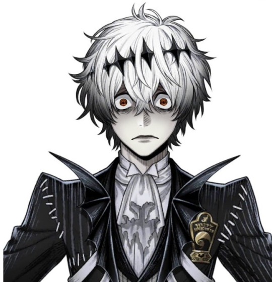
His overall expressiveness is great! He looks cute when he smiles and blushes (from his idol complimenting him, haha). It feels very pure and innocent, which contrasts with his more… deranged expressions.
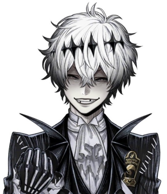
The way he speaks surprised me too… He talks about coming from a rural place, but he speaks so formally! Sometimes even more formally than Jade. I wonder if that implies being of high class/social status or if he just taught himself to speak this way for personal reasons. My worst nightmare (hah) is that Skully devolves into a heavy Kansai accent later in the event (if only because I’m not sure how to transcribe the Kansai accent into English when I write his dialogue 💦).
I mentioned in an earlier post that Skully’s outfit is a Nightmare Suit provided by the book. We don’t know what he actually dresses like irl which is a shame. Knowing that would really help with getting a read on his character, even if he were just in a school uniform (because different people can wear their uniforms very differently, as we can see in the NRC School Uniform line of cards). Stuffing Skully into a Nightmare Suit by default doesn’t tell me much about how he presents himself outside of the book, in reality.
There’s definitely a lot of interesting (and vague) lore around him 🤔 like how he doesn’t know what magical pens are and how his hometown is the only place that knows who Jack Skellington is… Hopefully those questions get answered by the end of the event. I also have to wonder why he’s such an intense Halloween otaku??? There could be no deep reason behind it, but I’m a little suspicious since this is a Halloween event. It feels like Skully’s hiding something and/or he’s not confident in himself since his dialogue implies he’s a loner irl. Maybe he’s attracted to the idea of Halloween because even the dead and creatures of the night can fit in (so he, the outcast, can also have a place among them)?
That being said, I do find Skully’s personality charming, especially when he’s opening the event with his little dramatic monologue about Halloween. It’s a nice way to interpret Jack Skellington’s whimsy and child-like wonder into a Twst character. However, I don’t exactly find myself completely endeared to his character yet. He feels a little too… safe? Too… sweet. Unless this was all intentionally and he's actually a RSA student or something/j I’d like to see more of his villainous traits and weaknesses on display to get a full scope of his character. *rubs hands together* I want to see what he’s like when he snaps… We already saw some glimpses of his nastier side when he calls his classmates worthless for not understanding him. I want to see that unleashed on the NRC students! As is, I’m not sure if I enjoy him talking down to others (he calls his classmates worthless) for not being on the same wavelength as him when it comes to his interests. It feels like something elitist otaku do (Idia has definitely done this), and that’s a big yikes for me.
#twisted wonderland#twst#Skully J. Graves#disney twisted wonderland#disney twst#twst jp#twisted wonderland jp#jp spoilers#twst halloween#twisted wonderland halloween#notes from the writing raven#question#jack skellington#mysmes#saeran choi#mystic messenger#Idia Shroud#Jade Leech
236 notes
·
View notes
Text


Finally got around to doing this, here are some rough sketches of my idea of how Lester looks each book! Some books are more different than others, like I don't think much changed between books 1 and 2, but I had fun doing this! Look under the cut for some notes about things I added for each design.
Book 1: Not much changes from how he's described in the books. All of the clothes he borrowed from Percy are a bit too big for him, but the flannel he borrowed from Will fits pretty well, only being slightly too long (I think Will has like, an inch over Lester)
Book 2: Basically the same as book 1 Lester. He keeps the flannel Will gave him, but it gets pretty beat up over the course of this book so he has to switch it out before book 3 :(. Hair is just a lil bit longer, and he gets clothes that fit a bit better. Headcanon time bc if Rick won't give me substantial Thalia and Apollo interaction I'll make it myself: Thalia gives Lester archer's gloves at the end of TDP, which he wears for the rest of the series. He didn't even think to wear gloves bc as a god he wouldn't need them, but Thalia noticed his beat up to shit hands at the Waystation and went "bestie... bestie no...." and gave him a pair.
Book 3: Will's flannel has been swapped for a big coat and Lester get his iconic pink camo pants. His hair is long enough to start getting weighed down a bit, and also way messier bc he's been in the labyrinth for like a month. The beat up sneakers he was wearing in books 1 & 2 get replaced with much more reasonable boots. Eyebrow scar shows up, a reminder from one of the many concussions this poor man has suffered. Also another HC time! Georgie gives Lester a little handkerchief that he wears for the rest of the series (I was gonna use Paolo's handkerchief, but Lester canonically gives that back so boo)
Book 4: The Lester looks like shit book /j. His hair is now long enough that he should really be doing something with it but he is not. He has a zip up hoodie now to cover up all his fun purple veins. Just more beat up in general honestly. Also I hc that Apollo actually lost some weight here (both bc he wasn't really eating well before getting to New Rome bc of stress/grief, and bc he got really sick and continued to not eat well while that was happening) But it obviously doesn't do anything to help his self-esteem or mood in this book. Kind've a visual way of being like "the superificial flaws Apollo clung to in the first book weren't the real issue, he was just hyperfixating on them to distract himself from what he was really upset about, so when the superficial issues get solved he doesn't even notice bc he's grown enough as a character to cut the bullshit and focus on what's really bothering him." or idk something like that. I like to contrast this with a hc I've mentioned before about the time between books 4 and 5, which is that the physical flaws Apollo whined about in book 1 (i.e. the acne and his weight) get "worse" throughout the road trip from California to New York, but Apollo truly just does not care that much about that shit anymore and that's why it doesn't come up in the narration.
Book 5: Final Lester! It's been over a month since the last book so I'm taking liberties and saying Lester's hair is long enough to pull up now bc I want him to be able to do that goddammit. Final outfit is borrowed from Percy again, so that's why it's so big. He also has a pendant that Lavinia gave to him bc they're besties. Also I forgot to mention it, but his shoulders are slightly broader here (and have been getting broader throughout the series) bc he's been working those muscles so much with the constant archery.
Also I didn't draw his quiver bc honestly I forgor, but I like to imagine he's been getting little pins and bobs from a lot of his friends that he's been sticking on his quiver strap. A few examples that come to mind are:
Kayla: A classic hot topic pin with a sun with sunglasses on it.
Leo: A pin made of scrap metal with the alchemical symbol for fire carved in.
Agave: Pinned a clover to Apollo's quiver for good luck. It didn't stay on there long, but it was the thought that counted.
Hazel: A piece of citrine decorated with metal cords.
Lavinia: Another classic hot topic pin, this one is heart shaped and has a picture of Hatsune Miku on it.
Jason: One of the monopoly houses he'd been using to mark the positions for the temples. A lot of the little houses had fallen off the diorama during the car crash at the beginning of TTT. The night after, Apollo asked Reyna if he could make sure the diorama was fixed. Reyna agreed, and he put it back together based on what he remembered. He spent an hour or so gluing on houses and hotels for Mars, Somnus, Fons, Salus, and on and on, until he got to the last one. A red hotel meant to show where the temple of Apollo would go. Apollo poked a little hole in it, and fastened it to his quiver with a bobby pin. It's nestled close to where the strap meets the quiver itself, so it's less likely to fly off.
Meg: Pinned a rose petal to his quiver right before he went to fight Python. It lasted for even less time than Agave's clover did, but again, it was the thought that counted.
#sunny speaks#long post#trials of apollo#toa apollo#lester papadopoulos#apollart#fun fact: all of the colors I used for these were color picked from the covers of the books they came from!#oh and i forgot to mention he also get more freckles as the series goes on bc he spends so much time outside
209 notes
·
View notes
Text

Professor Caduceia and Snakely
Checked out the storyboard for the deleted s1 episode "Homesick"
You can read it here : https://t.co/WpZJFWbR48
I just loved these cut villains, one whose design def seemed like it was given to raine when they got cut. (I wonder if the color palette was similar, but we don't have a reference to that so idk)
Thoughts on the cut episode below:
An episode where king and owlbert of all characters bond is kinda neat, especially since it provides owlbert himself a bit more character here.
The opening is def far different from any of the final ones we ever see in the series, in fact it feels like it should be taking place during the episode but it can't be given we see hooty from being sick to not being sick in pretty chronological order?
A focus on the healing coven was nice to see, especially since we never got that in the show itself, and get some idea of their powerset and what they do magic wise.
So Manny was an ambulance driver, and Camila was a nurse in this. People originally assumed camila was a nurse when the show started, and it makes me wonder if that was changed between seasons at some point cause clearly the crew decided to change her profession and it's unclear why.
you can use your palisman as a communicator? and an umbrella? I do think it's so weird that even at the very end of the show, they establish brand new rules for palisman. Like them being able to shapeshift into objects is straight up not explained and just sorta....happens in the show, like i feel like hunter would have no issue hiding flap if this is a thing. (It also kinda makes stringbean's ability slightly less unique) Like this is displayed in these boards, but they kept it even in the show itself, and i think palisman might need a proper rulebook.
On that same note, owlbert uses magic in this board, like we kinda knew palisman could do some magic without a witch, but this is the only time we've seen one use it to fight another witch that wasn't the batqueen. Like owlbert tries to full on blast people in this. I don't know if removing this episode makes this ability less canon in the world itself since they still can do magic in the show, it's just worth noting that palisman, according to this board, CAN fight back, even if they're not incredibly strong it seems. Certainly the kinda thing that makes you think on other episodes tbh.
This episode also brings up the idea that eda actually CAN and DOES bring human food to the BI, which never happens in the show, in fact luz implies she gets to eat very little options there, so this idea seems no longer canon?
The demon hunters at one point don't even seem to recognize owlbert as a palisman, which does not entirely make sense given they seem to be mostly common to the townsfolk, so I'm kinda glad for that plot hole being gone.
Caduceia makes it out like the emperor's coven forced her to teach? and she thought handing over a house demon to belos would get her out of teaching as if it were some kinda punishment or job she was made to do? I have questions
side note, house demons are called rare in this, like they're not common, not sure if this still applies in the final show, but yeah.
there's some very sweet moments in this with luz and eda especially, but also some funny moments, and some jokes that land a little less....i don't think we needed Caduceia to be kissing her snake like that from that angle, even if it was meant to be a little uncomfortable.
one reason i think this episode did get cut? we got a glyph in this
a healing glyph, which has some ties to water based on it's symbol
i'm guessing since they kept the main glyphs element based, a healing glyph would of stuck out and been a bit weird. Like it just heals people, it doesn't produce water despite looking close to the alchemy symbol for water, and well....we already got ice so this would be redundent.
so yeah, this episode introduced a new glyph that saved them in the end so it would of come back in future episodes, but to keep it simple that would mean cutting the entire episode as a whole just to keep the four.
Since they enjoyed Caduceia's design so much, they must've repurposed it for raine somewhere down the line.
very fun insight into a scrapped episode.
402 notes
·
View notes
Note
I recently ran an oneshot for my friends in Eureka.
It was a lot of fun and went mostly smoothly! The charakter creation was very easy. It still took more time than I expected, but that was simply because the players needed it to decide on which traits etc. to pick.
The central resolution mechanic with 2d6 is of course tried and true (I assume. Never played one of the many other 2d6 games.) but especially the Eureka system felt really good.
I think I read in a recent post of your's, that you are overhauling the chapter on combat. That seems very important to me. Even though I read the whole book once before running the game, I had immense problems finding out how small details of the combat worked during play. The musings on game design (eg, "yes, the combat is deadly, thats on purpose heres why" and such) where really enlightening to read, but got in the way when searching for concrete stats.
I will run the same oneshot again for different friends. The game seems really promising to me.
My mystery took place on a single in game evening, and none of the players were monsters. Having therefore only scratched at the surface of Eureka, I am looking forward to running it more.
Woo! We LOVE hearing about this kinda stuff!
And yeah everything about how the combat-related rules are structured is getting overhauled. All of that was written like 2 years ago when I was a slightly worse game designer and MUCH worse at writing coherent paragraphs and hasn’t been touched since until now. Instead of being split across like four paragraphs (what was I thinking), there will be just two chapters on it: “Instruments of Violence”, which is mostly just a giant list of references for the stats and special rules of weapons and armor, and “Dangerous Situations”, which covers every rule related to how your investigators can get killed. Some of these clean-ups are already available in the latest patreon release, and the rest are coming soon to both patreon and the itchio beta.
Combat is a very rare thing in Eureka, but when it does come up, we want it to be tight and granular, but without wasting the players’ time, which I think we’ve done pretty well at.
Like the book says, combat is deadly and there’s a reason why: so it doesn’t waste the players’ time.
This is a twofold problem to solve. The first layer of it, we solved by making sure the numbers are low. Most weapons can take a character down in 2 to 3 hits, so a single instance of two guys smacking each other will never take too many rounds.
Secondly, well, combat is dangerous and deadly, and if the PCs approach it without a plan, they’re gonna die, or at least get their asses kicked fast. Otherwise, well, I consider that a waste of the players’ time. If it was predetermined that the PCs would win otherwise the story can’t continue, well, what did we roll all those die, look up all those stats, and track all that HP for? Why didn’t we just describe the PCs winning and move on? Combat matters because it can change the outcome of the adventure, and if it can’t change the outcome, why are you rolling dice? Of course with death being so possible, to keep it fun, we gotta include lots of “tools” like cover, positioning, different weapons, special melee attacks, etc. that the PCs can use cleverly to give themselves an edge, and *earn* their survival.
Oh and also yeah can’t wait to hear what you think about the monsters. Funny thing about that, everyone who has read the rulebook knows that monsters and other supernatural creatures are supposed to be really rare, like one supernatural person for every 3,000,000 normal people kinda rare, but, monsters are super cool and fun to play, and are one of the big draws of the system, so we were kinda worried that that rarity wouldn’t come through in play, everyone would just be monsters. We considered setting a limit on how many monsters can be in a party? But quickly decided against it, because then players would have to compete for the limited monster slots, and people might even feel like if they’re not filling in that slot every single adventure, they’re missing an opportunity, and so every party would max out their monster limit every time and there’d, again, be way too many monsters.
In practice, though, most parties in Eureka seem to be comprised of all normal people, or all normal people and 1 monster at most, even without the limit. And I suspect this is both because monsters are kinda difficult to play despite their immense power, and, just to brag, because we made the normal PCs fun has hell to play too. :)

#ttrpg#ttrpg design#ttrpg community#ttrpg tumblr#artists on tumblr#rpg#tabletop#indie ttrpg#indie ttrpgs#queer art#ttrpgs#indie game#queer rpg#queer artist#free rpg#rpgs#fantasy rpg#supernatural rpg#monster girls#monsters#eureka#eureka: investigative urban fantasy
122 notes
·
View notes
Text
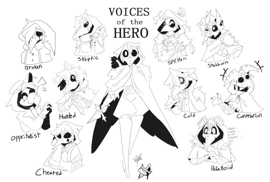
Voices and the Hero I DID IT I FUCKING FINISHED THIS PIECE YEAAAAAAAAAAAAAAAAAAAAAA!!!! I have Thoughts about my designs for these guys so uh Design Notes under the cut!
I'm bad at drawing actual birds (if the narrator on the hero's shoulder is any indication) so I went with the next best thing that I'm better at: plague doctors! Plus plague masks are just fun to draw. I tried making each of the voices match the princess they correspond to, but it got tricky with a couple of them. In no particular order, here we go! The Hero is a bird guy with a bird mask. Perhaps the mask is meant to keep his identity locked away? Either way, the outfit is more shapes than actual fabric, similar to the Princess' gown. Simple enough to register as clothes, but vague enough to change and be recognizable as the loops splinter. Also the cape is hims wings! The Broken is made to be the wettest, most pathetic little guy, but also ever so slightly like a priest. This is to reference the Tower (mommy- I mean mommy- I mean-) saying that the hero's place by her side is "that of a priest, or a pet". So I made him look like a depressed little priest. The Skeptic is the voice that joins you on the route of the Prisoner, so what would be more fitting than a warden? Or maybe an escaped convict? Either way I love his little ponytail poking out of his hood. The Hunted looks like a feral wild child. Feather-hair out and messy, cloak made of scraps of fabric. I figured the most wild looking of the voices would be the one that corresponds to the Beast. The Smitten is all puffy and soft shapes to match the Damsel's rufflier dress and softer appearance. Also my friends recommended the hat and I agree 11/10 would hat again. Gave him a bowtie AND a cravat because the Smitten strikes me as just that extra! The Opportunist's beak is meant to resemble a parrot's, as he just parrots the ideas of whomever he considers to be "winning". This is also why he's dressed like a businessman. He kinda looks like a villain version of the Smitten, but I haven't played the Thorn's route yet, so idk if that's relevant. Also isn't this guy the only voice that doesn't show up in the Chapter 2 routes or am I forgetting one? The Stubborn has demon horns to match the Adversary (and the Eye of the Needle HOOGH MAMA). He's also got battle damage, and his mask is fashioned to look like he has a wounded and scarred eye. Fun fact! Stubborn was supposed to get the ponytail, but I decided while lining that a half cut looked better. The Cold looks the most similar to the Hero, but he's just a bit less put together. While I was drawing his hair I was thinking of L from Deathnote for some reason? Probably the cadence the Cold has. The Cheated is supposed to look like a gambler, given his title and speaking patterns. There...wasn't a good way to pair him with the Razor, but I suppose the spade on his cheek could be seen as a nod to the razor's blades? I dunno, I'm reaching here. The Paranoid suffers from my lack of impulse control when it comes to giving characters goggles. I fucking love steampunk goggles. Much like the Cold, he looks like a less-put-together Hero, but this one is a mess, actively having a panic attack, but is pushing through it because NEITHER THE HERO OR THE NARRATOR IS FUCKING HELPING. Also the stitches on his mask are meant to mirror the cracks on the Nightmare's mask. The Contrarian has a mask with three beaks as a mirror to the Stranger's three heads, but also because the two on his head make him look like a little jester and I felt that was fitting for this smartass. His cape is asymmetrical to spite the status quo.
I hope you enjoyed my art + rambles about these designs. I love doing this!
#digital art#digital drawing#slay the princess#stp voices#voice of the broken#voice of the paranoid#voice of the cold#voice of the contrarian#voice of the hero#voice of the smitten#voice of the skeptic#voice of the stubborn#voice of the opportunist#voice of the cheated#voice of the hunted#slay the princess fanart
431 notes
·
View notes
Text
MORE HEADCANONS BECAUSE I’M ALL POWERFUL
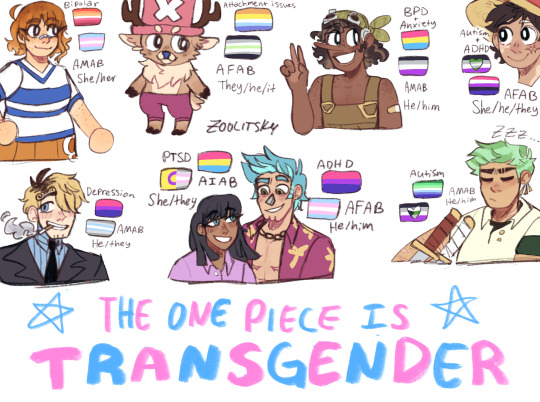
Please don’t get upset if you disagree with any of these!! This is just how I see the characters ^^ More context about the headcanons under the cut!
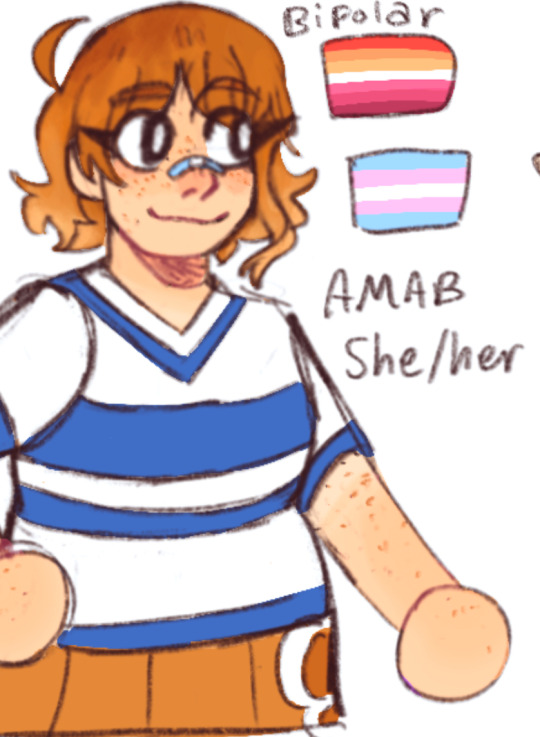
Nami
Transfem lesbian!!
Basically married to Vivi (who isn’t pictured but she gives me demigirl bisexual energy with a preference to girls)
CHUBBY BECAUSE I SAY SO!!!!! 🧡🧡🧡
And she’s still beautiful and wonderful and Sanji still simps for her. Chubby people are gorgeous
She’s technically pale but tanned a bit from being outside so much
Aaand bandaid because she’s literally just a normal girl and is susceptible to minor injuries unlike the other weird built different ppl on the crew (aside from Usopp)
sPEAKING OF USOPP!!! She’s absolute besties with him like they talk about everything and anything and gossip and all that jazz. They’re so special to me.
I’m not sure if bipolar fits entirely, but there’s definitely something with her mood swings and the intensity of her emotions. If this is insensitive at all please inform me
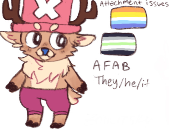
Chopper
Agender aroace reindeer fella??? SiGN ME UP
Both male and female reindeers have antlers so I used that to my advantage because gender silly
I think Chopper uses they/he/it, but slightly prefers to be referred to by their name rather than pronouns
Chopper has attachment issues, but I couldn’t find anything other than avoidant attachment disorder (which doesn’t seem entirely fitting). But it definitely gets very attached to others when it trusts them and has a hard time moving on.
Also I just like to draw Chopper more reindeer-like than Chopper’s canon design but aside from that I don’t really make too many design changes? Just… floofy Chopper… 🩷🩷🩷
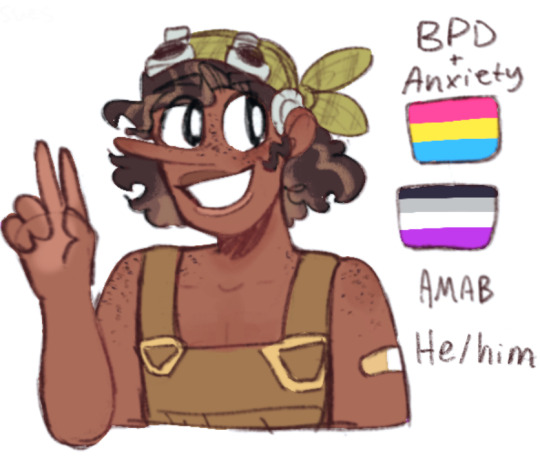
Usopp
Panromantic asexual!!
Down bad for Sanji (he has terrible taste /j)
I had a revelation after drawing this so Usopp isn’t actually cis lol- they’re a demiboy but in a genderfluid kind of way, some days he feels more masculine and other days they feel more androgynous
I have very mixed feelings about the hair highlights,, I lowkey might not keep them but it was an experiment
FRECKLES!!! USOPP HAS FRECKLES PASS IT ON PASS IT ON!!!! 💛💛💛 Bandaid like Nami because!! They’re literally just a normal teenager!!!
Usopp has anxiety and borderline personality disorder because the feelings of superiority and inferiority? The constant fear? Being immune to Perona’s ghosts from dealing with mental illness their entire life???
Luffy
Asexual grayromantic
If he had a partner it would be gay regardless of his own gender expression (I’m projecting because I feel gay when I’m attracted to anyone)
Genderfluid, some days they prefer different pronouns but most of the time they use all at once (also is this ironic bc Luffy can’t swim but is swimming in fluid pronouns)
King of the pronouns!!! King of the genders!!! Will steal your pronouns and gender!!! Watch out!!!
I gave her vitiligo on a whim to be 100% honest, but I feel like it’s very fitting and also very fun to draw ❤️❤️❤️
I only did a headshot here because I have another post with a bunch of other drawings of this Luffy
I feel like I don’t need to explain but Luffy is very very AuDHD to me
He has so much energy and is easily distracted and gets really focused on things and likes to talk about anything and everything
Sanji
Bisexual-est guy on the planet (loves all boobs /hj)
Down bad for Usopp (they have great taste)
Demiboy but in an interchangeable kinda bigender way, he’s just both enby and male at the same time
Darker roots!! Sanji’s body hair is always notably darker than his blonde hair so I decided on darker roots
CURLY/WAVY FLUFFY HAIR SANJI SUPREMACY 💙💙💙
Depression—WHICH THEY ALL OBVIOUSLY HAVE BUT
Depression in the sense it’s the reason he smokes. It’s a kind of coping mechanism.
It makes them dazed enough that they don’t have to fully feel their own despair
GIVE HIM HEALTH PROBLEMS ODA YOU COWARD. I KNOW HE’S UNREASONABLY BUILT DIFFERENT BUT LIKE
Imagine Sanji wheezing and struggling to breathe after a fight!! Emotional scene with Chopper trying to convince them to stop smoking!!
Robin
Pansexual
Married to Franky 💜💜💜
Intersex demigirl! Like- the whole being called a monster/demon her whole life and trying to find someone who accepts her is such a good (unintentional) metaphor for the gender discovery experience,,
GIVE ROBIN THEIR MELANIN BACK!!! I don’t care if it wasn’t their original colors… neither were the blue eyes but I’m giving both to them because they deserve it!!
I wanted to give Robin more of a curly hair texture but I was concerned it would start to not really resemble her. I might play around with it another time though and see if I can achieve something still recognizable
PTSD
Do I even have to explain that-
They are traumatized and get flashbacks and night terrors
Franky
Bisexual
Married to Robin 🩵🩵🩵
TRANSMASC. I AM THE BIGGEST BELIEVER OF TRANS FRANKY.
He was abandoned by his birth parents, he has a name he doesn’t use anymore, calls everyone bro regardless of gender, HE LITERALLY REBUILT HIS ENTIRE BODY-
Even though Franky’s a cyborg I gave him visible top surgery scars. I think he would show them off with pride and doesn’t necessarily need/want to be seen as a cis man. He’s just a man who once had boobs yk?
The underside of his hair is an even brighter blue because silly!!
ADHD—he hyperfixates like a madman and is also very loud and passionate. Also idk if this is an actual ADHD thing but like he’s super empathetic and cries easily? I’m like that too so idk lol
Zoro
Demihomoromantic asexual
Hopelessly, dare I say pathetically, in love with Luffy. I want to clarify that this doesn’t make Zoro less gay and this doesn’t make Luffy less genderfluid.
Also as much as I adore trans Zoro, I think the fact that he’s a cisgender feminist is important. So I headcanon him as cis.
FLUFFY HAIR ZORO FLUFFY HAIR ZORO FLUFFY HAIR ZORO 💚💚💚
I can’t decide whether or not I like the striped hair,, I’m still on the fence about it lol
Covered in scars because he’s done so much training and fighting, I know they kind of look like something else but they aren’t, don’t worry
Idk why but I always give him a dark green undershirt
Autistic!! He has a narrow range of emotions, makes nonverbal grunts, super into swords, he’s blunt, follows routine, etc.
Aaaand that’s all of them! Phew! Thank you so much for reading 💖
Reblogs, asks, and comments are super appreciated!!
#one piece#op#anime#one piece fanart#sanji#zoro#nami#straw hat pirates#usopp#strawhats#pride headcanons#headcanons#nico robin#tony tony chopper#cyborg franky#luffy#one piece fan art#one piece headcanons#one peice#opfanart#frobin#monkey d luffy#roronoa zoro#black leg sanji#god usopp#cat burglar nami#franky one piece#my art#my post
247 notes
·
View notes
Text
Tbh a pet for Timmy could have worked and I like actually believe that. There were multiple problems with sparky, such as being such a late introduction to the show, extremely poor writing, Awful character design, etc. Sparky was doomed from the start. He didn’t really change much of the show either, and that would have been ok if he wasn’t such an obvious presence. He reminded me of Mark Chang but worse. I also hated the fact he could speak, my man needed to stfu at ALL times. So I propose my own idea, slightly sparked from my own experience with my pets. Timmy instead of a Dog, gets a old ass cat :]
Cats are usually calmer (especially when they’re old) and are habe more boundires then dogs, and I think this is exactly what Timmy needs. A cat would calm him, and make him feel even more special whenever the cat chooses to sleep with him. A Huge reason Sparky failed was cause he was TOO energetic, to snarky, to everything. He was some how overwhelming and yet added nothing to the show, when it was obvious he was suppose too. The cat could be a background assest to Timmy, having wishes be resolved around them, bonding moments, and lessons about how Timmy needs to be paicent with others more often. He could also hate the idea of having one at first, wanting an energetic dog, but slowley falling in love with the cat and wanting to keep her forever. It could just act as a contract to Timmy and it would be good to add something to the show while also not completely overwhelming it!! It could legit just be a cat and something that helps Timmy though day to day life rather then be another magical creature tied to fairys. It would be nice for Timmy to have his own thing!
Idk I lowkey wish the Pet thing was not so shit and actually had some good writing behind it and I think a cat would work well heart emoji
109 notes
·
View notes
Text
Ludovika vs Shuri, a facial comparison breakdown
While it's obvious that Ludovika and Shuri have their similarities, as pointed out by various members of the ASM cast, let's break down some of their differences, shall we?
But before we do, let's address a few things!
ORKA takes design seriously! We can't just chalk up slight differences to "one-off mistakes." As you can see below, she did a study on her OWN designs, micro detailing down to the curve of each character's eyebrows. But to be fair, we will only be using art from recent chapters, as ORKA's style has evolved since the early chapters.
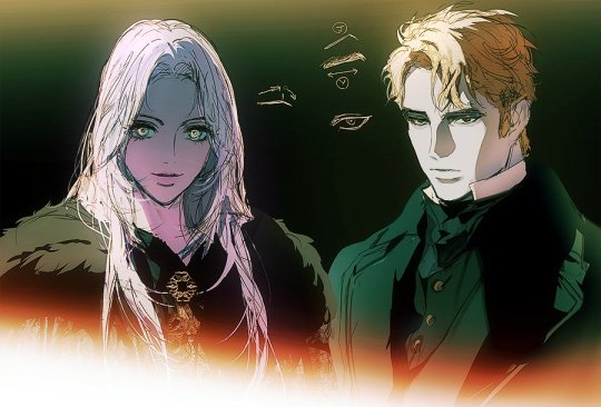
Another reason why we will be only using recent chapters is to avoid differences that may be as a result of Shuri being several years younger than Ludovika. I will also try my best to take this into account as we go.
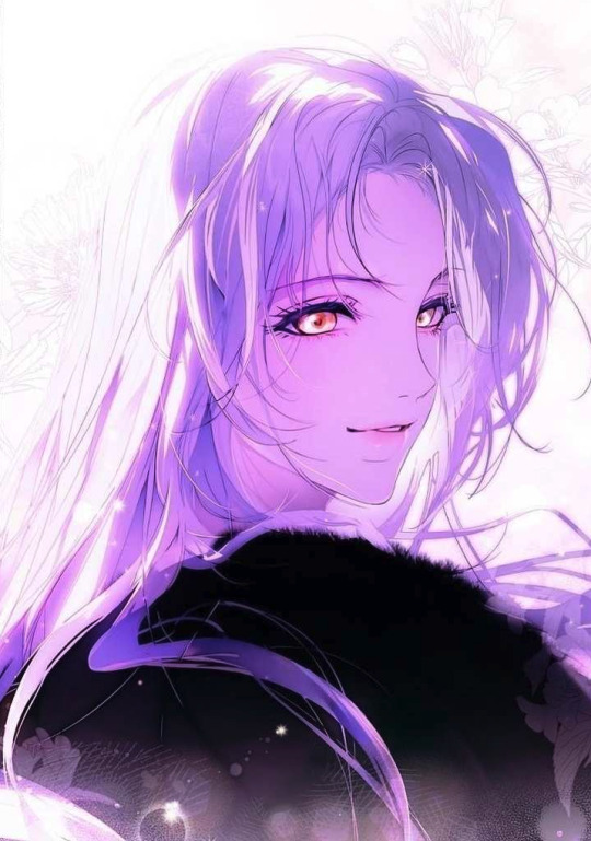
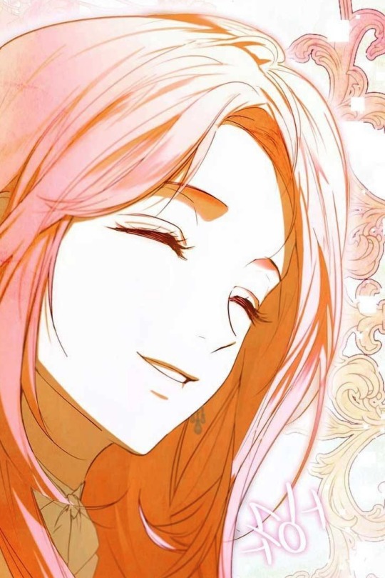
First things first, let's get the obvious differences out of the way. Ludovika has a lavender hair, parted down the middle and golden eyes. Meanwhile. Shuri has light pink hair parted to the side with green eyes. So you might be thinking, if not for the color differences, they would look exactly the same!
But that's not the case! In some instances, seen from Max or Johannes' POV, Ludovika and Shuri almost seem 1:1. However! We must take into account that given their history with her, they are unreliable narrators, and may show a warped perspective on their memories of both girls.
So why don't we remove all the color! Here we have Ludovika on the left and Shuri on the right down below.
Since we don't have a 1:1 shot, here's the two in similar lighting situations with similar expressions and another with a similar angle.

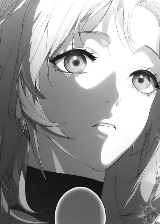
Here are all the points of differences I noticed below!
Ludovika's long arched brows vs Shuri's downward sloping brows with no arch
Ludovika's long, straight, and slightly wider nose vs Shuri's small pointed, upturned nose
Ludovika's narrow and long face with a distinctly V shaped chin vs Shuri's fuller cheeks and shorter face
Ludovika's full lips, distinctly her full bottom lip but also the way the middle of her upper lips under her philtrum has more volume, often highlighted with a tint on pink (that may be makeup) vs Shuri's thinner, almost pointed lips (almost in an elfy way)
Ludovika's narrower eyes that sit higher on her face as a result of her brow to tip of nose ratio being greater than the top and bottom thirds of her face vs Shuri's larger eyes and 1:1:1 proportioned face (though this may change with age)
It's so fascinating how ORKA illustrates the two to look so similar, yet different. Noticing these small details really shines in on the fact that the two are TWO COMPLETELY DIFFERENT PEOPLE.
We've seen so many members of the cast chasing old ghosts that we're forced to compare and contrast Ludovika and Shuri. In reality, it seems like there are more differences than we initially thought, right?
#a stepmother's marchen#the fantasie of a stepmother#ludovika von bismarck#shuli von neuschwanstein#stepyapping
157 notes
·
View notes