#i kinda wanna draw this pose again with just them lol
Explore tagged Tumblr posts
Text

ATLA x Hermitcraft (+empires and life in the future)
i think it would be kinda cool if Scar uses his earthbending to move around
joel maybe a part of the royal family? he just kinda gives off those vibes
etho and gem have to be siblings i mean c'mon
any suggestions for the other hermits/lifers/emporers and their bending would be appreciated! - i've put more of the au in the comments if you'd like to see it!
#smallishbeans#joel smallishbeans#hermitcraft#life series#trafficblr#hermitblr#empires smp#ethoslab#geminitay#geminislay#goodtimeswithscar#gtwscar#gtws#grian#life smp#grian fanart#ATLAxhermitlife+#plus ig a tiny bit of#boat boys#i kinda wanna draw this pose again with just them lol#me art
2K notes
·
View notes
Text
((I tried to draw the cuddle beanbag pile but I'm stopping here bc I hate this now but it's still a cute idea in my head that I can't portray lol
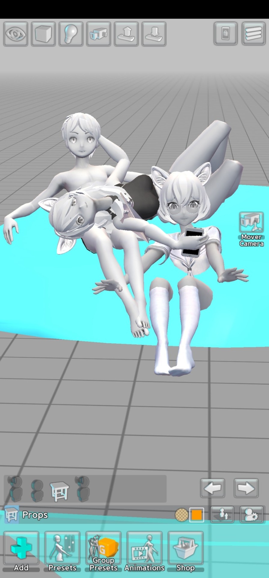
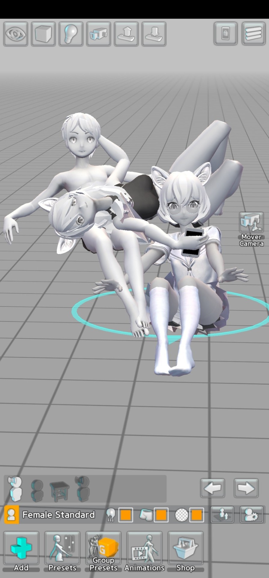

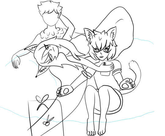
I tried to make it doodly and cartoonish but I'm just not gonna be able to get it. if you use your imagination it's cute tho
I have a thing abt awkward complicated poses bc if photos are candid and the characters are chilling out then they're probably in a really weird position that's not great for photographing
also wtf are wings these sprites are killing me
Tii (middle) is showing Davepeta (right, also my muse but not on Tumblr atm) something NSFW. whether its furry porn or if its something more. personal. we'll just never know!
Tii is wearing a sparkly dress and DPS is wearing a cute lil jumper and skirt, but isn't good at remembering to be polite and sit w their legs closed. I was gonna try and put a santa hat or one of those cracker paper crowns on Davesprite (@asskraehe) but idk why I just could not draw his face after like 5 attempts so I gave up 😭 he is getting all of the attention from the kitty cats tho
#ooc post.#vatta WIPs#readmore.#in the pose app Sock actually has his hand on Tii's ass but I did NOT mean to do that I was just chucking it behind out of the way lmao#made me laugh tho#I brought up that pic Sock's mun posted recently to ref from bc I LOVE his design. his lil claw hands are my life. I did wanna draw them bu#I suck too much lol. love claws tho. so does Tii#I rly wanna get my PC working so I can use Daz3D again;;;;;; I had wings and stuff and you can pose so much nicer#and they're realistic proportions. Easy Poser is kinda anime propos
2 notes
·
View notes
Text
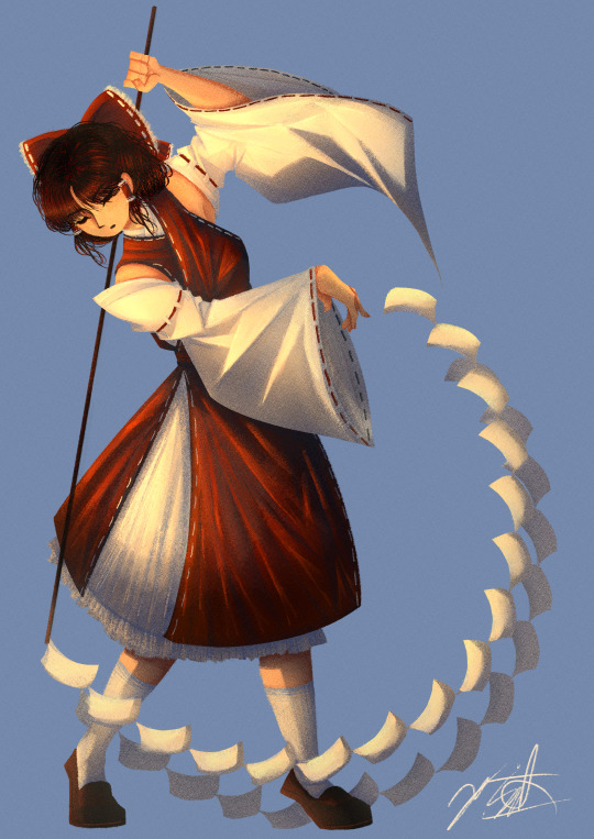
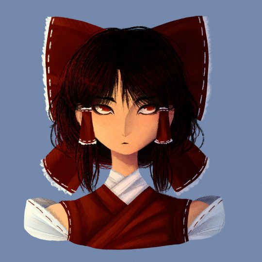
Finally decided to play around with my old lineless style again! Also figured out a way to draw Reimu that I actually really like!
Artist's Notes;
I've mentioned in a few earlier posts that I've been wanting to draw in my lineless style again for a while as a way to test what I've learnt from my previous style in regards to lighting. I did the face first and then for a while was thinking about doing a full body illustration of Reimu just to draw her outfit again. I'll talk about the face first since that's the first drawing I did in this batch.
For the longest time I really couldn't find a way to translate Reimu's face into my style. I was able to make her clothes work out well, just not really her face. I did like elements of how I drew her face a few other times, namely the tiny eyebrows and her pupils, but they didn't really feel like Reimu to me, or at least how I imagined her in my head. I then realized that it was less of a problem with the entire face and moreso the eyes, and it took me quite a bit of trial and error to make something that I was happy with. Also, as much as I thought the tiny eyebrows were cute, it didn't really make sense with her character. Like, from what I know about Japanese history, plucking your eyebrows was something that nobles (rich people) would do, and since Reimu is...neither of those things, I decided to just give her some thicker eyebrows instead (I will be saving the plucked eyebrows for another character though, so they will return). After I got to a face I was happy with, my next challenge was the hair. I did the front part first and liked that enough to continue, and then after more trial and error I realized that deep down I was a short-hair-Reimu-is-best-Reimu-truther this whole time because once I gave up on the long hair and gave her shorter hair something just clicked in my brain. And so, after drawing her outfit in again (this time without the yellow tie which is kinda sad but I'll find a way to incorperate it into future designs because it just was not making sense to me in context with the rest of the outfit) and finnicking around with the bow, I came to a version of Reimu's face that I actually liked. I thought that it made more sense for her character to have her cut it short, mainly because she's doing a bunch of Youkai extermination and she has to keep her hair out of her face somehow. I still wanted to make it kinda messy though, as Reimu is probably too lazy to clean it up herself. I think another reason I like it so much is because in Forbidden Scrollery, Moe Harukawa gave Reimu short hair and that really suited her, so I guess that was just a subconcious reason as to why I liked it so much. I also think that the shorter hair helps to separate her a lot from Marisa, as I think Marisa looks really good with longer hair. Speaking of, now I wanna do a drawing of her and Reimu together to really solidify how I draw them (unlike the previous version where it was just them standing). As much as I do like the face, I am concerned if she looks too much like how I drew Keiki now, but that might just be a product of the stylistic choices I made with her eyes and I might just be overthinking it. I am hyperaware of same face syndrome so that's probably the reason I'm so concerned about it lol.
Now for the fully body drawing. I was struggling to think of a good pose for her, so I just took a picture of myself and used that as a reference while still making slight adjustments for readability's sake. This is another case of, "I've looked at this too long and can spot every single issue with it" but this time I'm still happy with the final product mainly because this was a test drive for how I want to develop my lineless style in the future and for what it is I am more than pleased with the result. The main reason I deviated away from my lineless style was mainly because I was having a hard time with the lighting and making it interesting, and I am so glad that I've finally found a way to make it work! I'm especially happy with the clothes, as I think clothing folds are really fun to draw. I was somewhat inspired by the works of J.C. Lyendecker and the way he draws clothes, though admittedly it is not a one to one, since I mainly wanted to try implying the shading of the clothing folds with shapes (I do really want to do a study of his style one day as his art is incredible). So for the sleeves, I drew in a bunch of triangles where I wanted there to be a strong highlight, roughly coloured in the inside, and then blended them all so it looks like a more subtle. On both of these drawings, I also added in a noise filter to give it some texture (as that's what I used to often do with my drawings) and while I do like it, I might want to experiment with making it more subtle in the future, as it's pretty noticeable in both these drawings. Overall, I'm really happy with the lighting and colours of this drawing, and while I could nitpick several aspects of it (her hand holding the gohei looks too tense, I tried making her look like she was standing on the balls of her feet but the positioning of her Gohei's trail of papers ends up making it look weird, and I could've put more effort into the hair and bow and so many more things), this is more of a piece for me to experiment with my style again, and I'm excited for when I get a new idea for a piece, as I really wanna try some more stuff out with this style!
615 notes
·
View notes
Note
how does one go about practicing on drawing mechs? like, how did you do it? I have no idea where to start aaah 😭😭 any advice would be so helpful
i have soooome notes but! truly it comes down to looking at a LOT of references! references and REPETITION!!! i swear i have dozens upon dozens of photos of characters pulled up when i start drawing. it gets easier with each time that you sketch ‘em i promise!!
(i also “cheat” a lot and look at my figures when i wanna put them in certain poses—this goes heavilyyyy for megatron LOL)
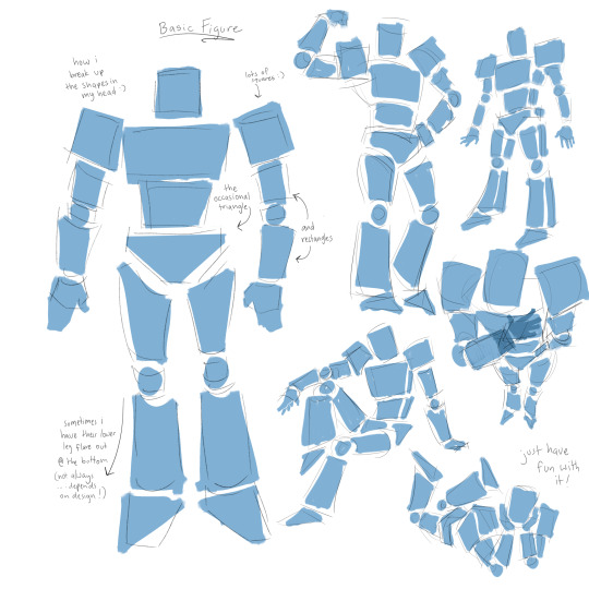
and i hate to sound like a broken record because i’m sure everyone says this…but truly i break them up into shapes! they really are just layers of geometric shapes layered on top of one another with pretty little details etched on top :)
this is kinda how i see their figures! these kinda forms are how all my drawings start out before i put the armor on top of them!
also important to remember that the inside structures of organic figures (bones/muscles/etc) are completely visible for mechs! you can see the joints and gears that bend at their knees/elbows/shoulders/hips/feet rather than them being hidden by skin and clothing. i think this is the part that i have the Most trouble with because it’s a lot of small moving parts layered together. forgive the messiness…i’m still learning myself honestly haha and this is all compiled after looking at a LOT of art and models and whatnot. included in this are hands…which have a Lot of the small exposed joints.
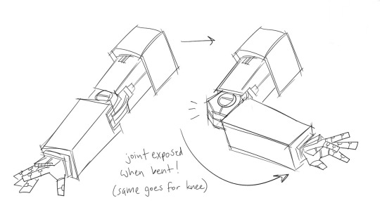
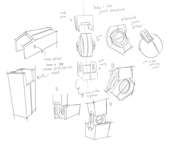
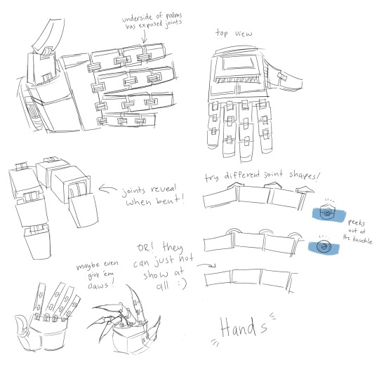
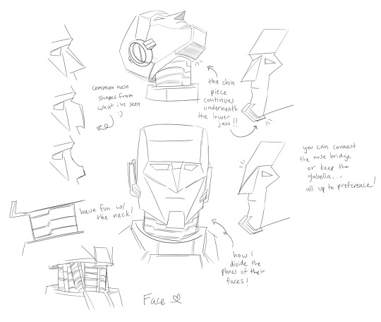
anywayyys that’s all i have in terms of general advice that i can give…if you have any specific questions feel free to ask! i am an open book and will do my best to answer with words or visuals lol
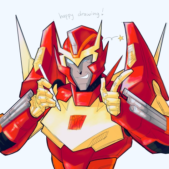
but really—just have fun with it! experiment and try try try again
#asks#art#fanart#transformers#maccadam#transformers art#tf art#guide#i guess???#i tried LOL im not very good at advice stuff#i hope this helps….
201 notes
·
View notes
Note
OH GREAT SOPUU PLS TEACH ME ON PERSPECTIVE 🙏🙏🙏
SHDJFK UHh i think this post covers most of the stuff i wanna say!
and hmm this is one thing that sorta goes unsaid but try to avoid what i call waffle grids! like your typical tic-tac-toe grid where both vertical and horizontal lines are parallel to their axis cause it’ll just look very flat.
if you slant them to point to a certain…point tho then it makes everything look more dimensional!

same thing if it’s angled- take this top down view for example

the top drawing’s lines ARE slanted but again, verticals and horizontals are parallel and the surface/intention isn’t well defined. so using 1 or 2 point grids you can get a bunch of different results depending on what you want with the same top down angle
oh also sometimes i cheat by drawing the grid after the character lol BUT it helps learn what kinda grid suits what pose! so try that too if it works for you :)
201 notes
·
View notes
Text
a pencil, paper and an uncontrollable crush
♧♧♧♧♧♧♧♧♧♧♧♧♧♧♧♧♧♧
opla!luffy x reader

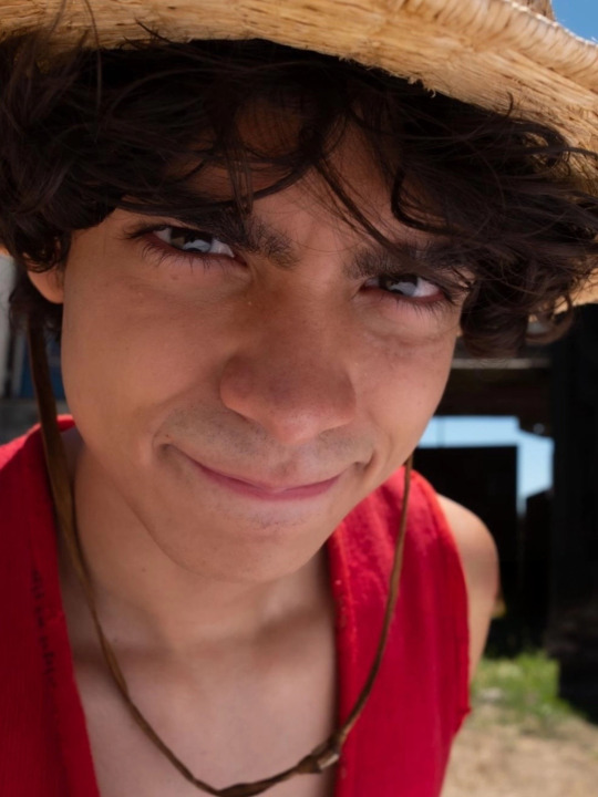
requested: yes (I mixed 2 reqs so idk if that counts but reqs are still open for anyone)
genre: oneshot but in headcanon form? gn! reader, artist! reader
warnings: none, just some fluff!
a/n: I won't be writing as often becusde I'm writing my final rn, also this is short because i have a hard time imagining luffy being romantic so... enjoy!
♧♧♧♧♧♧♧♧♧♧♧♧♧♧♧♧♧♧
now, it doesn't matter how obviously and hopelessly in love you are with Luffy, he's just not going to see it.
he doesn't see you make starry eyes at him, because his eyes are just as starry on a regular basis. when he catches you admiring him, he just assumes that you zoned out. (because he does that alot too)
so when he finds an incredibly detailed sketch of himself laying around on the ship, he excitedly goes from crew member to crew member, asking who drew it.
when he gets to you, notebook and pencil in hand drawing yet another portrait of him, you hang your head in mortification as he marvels at your work.
so imagine his suprise when he snatches that notebook our of your hands with a quickness to see what else you've steched in there, only to find himself on every. single. page.
I swear that his excited screaming is enough to alert other ships at sea of your exact location, but he can't help it, every drawing you've done deserves a reaction that fits how well you did it.
after he finds out about your habit, he starts striking poses for you and holding them right until your last pencil stroke on paper (or until he gets bored/hungry lol)
one night, you get a frantic knock on your door followed by Luffy's muffled voice yelling "are you still awake? I wanna show you something." so you open the door and he shoves a crumpled piece of paper right in your face.
you back up just a little bit and adjust your eyes, and you see a drawing of... some sort of animal? oh, wait nevermind, it's of you.
it's not the most artistically or anatomically sound drawing you've laid your eyes on, but it's... surprisingly detailed. he's drawn on pretty much every single visible scar, mole, freckle and mark, even some that you didn't know you had.
when you question how he managed to be so accurate, he tilts his head, pursing his lips and farrowing his brows in thought before answering. "Well, it wasn't on purpose, but I always look at you when you're around me. you catch my attention, kinda like food does!"
pause.
did Monkey D. Luffy, the strawhat captain, mister gum gum himself, just compare you to food...? moment of silence, because this is so much bigger than all of us.
after hearing this revelation, you cave and plant a quick kiss on his cheek as a thank you (and as a means to let him know of your more than platonic feelings for him), slamming the door in his face before he even has the chance to react.
p.s. Luffy doesn't have any idea why you kissed his cheek, but he knows that it made him feel good, and he wants to get one from you again.
#one piece#one piece live action#one piece x reader#opla#masterlist#one piece headcanons#opla x reader#luffy x reader#luffy live action#monkey d. luffy#one piece luffy#luffy#luffy x y/n#luffy x you#one piece smut#straw hat luffy
560 notes
·
View notes
Text
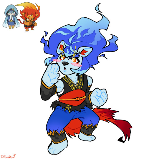
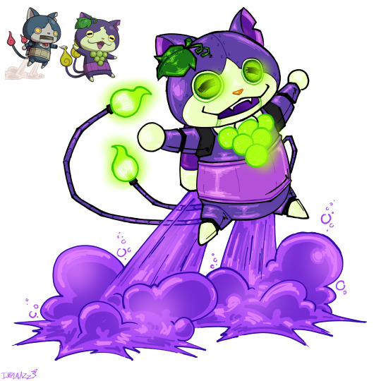
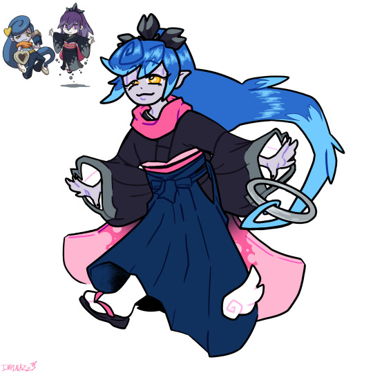
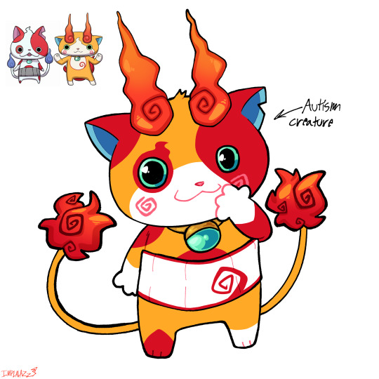

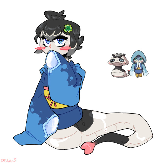

Waaaaaaaaa I’m back with more yokai fusions & also a comically small Buchikoma
L-R: Blazitina, RoboGrapenyan, Damonono, Buchikoma, Komajisan, Pandatina
Again more design thoughts under tha cut ✌️
My fingers always feel sore after typing this much….. Lots of learning about the details of traditional clothes this time. I chose these pairings cuz I felt lazy & wanted to draw the simpler ones first lol
Blazitina: Lion girl 👍 First thing I can think of in my thought process was making the belt an obi sash. Tattered at the ends to batch Blazion’s & with an obijime for fun. I didn’t super feel like giving her the same kind of Miku-esque kimono sleeves that I gave Lord Lie-In so I just made them weird kinda arm warmers. Did the same for her pants too, I’m not sure what they’re called but they’re inspired by the leg warmer kinda things in PLA on the fancy kimono. Also gave her a juban cuz idk I made her gi dip too far under her arms & yknow she’s a little lady she’s gotta stay covered up. I know all of this traditional kimono gear isn’t conductive to good karate but whatever…… She doesn’t get boots cuz I like drawing paws & her ahoge mimic Blazion’s scar (I didn’t have enough room to fit it in). I was thinking of giving her an x shaped hair clip but I thought it’d be too busy on her head. Overall despite some things I’d change (the way I shaped the obi I know realize the shape is TOO stylistic) I think this is my favourite design of the bunch
RoboGrapenyan: Very much inspired by the pkmn Violet paradox mons* (*See the bells & eyes.) Not much to say it’s a pretty straightforward fusion. The tail onibi are lightbulbs because it feels more robotic & I thought it’d be cool. The jet exhaust is grape soda……. That was a choice. LOOK I’LL EXPLAIN, uh….. grape….. grape exhaust? Grape vapor? Grape soda????? Sure. Also I think in the back of my mind I was thinking of that soda gun from that one episode of SpongeBob. Naughty Nautical Neighbors. I had to google it I had to know what episode it was….. yeah.
Damonono: YAAAAYYYYY FIRST TIME DRAWING HAKAMA THEY’RE WEIRD BUT I’LL GET BETTER AT IT!! They’re supposed to be split leg hakama but in every reference I looked up they’re so wide that they just look like the skirt kind rather than having two leg holes. I gave them hakama cuz bootleg jeans would be weird with a kimono. And I like hakama. That’s it. The sleeves….. Let’s talk about those. I didn’t wanna give them the heart guns/cannons cuz idk…. I liked the way Damona’s hands were posed & I wanted to keep that. So instead they have weird fucked up heart shaped kimono sleeves. I wanted to keep Damona’s long obi too but I thought it might mess with the silhouette already having the sleeves & also that’s just not a thing you do with hakama. So….. her sleeves are kind of like the end of her obi…….. I’m only now realizing she could’ve had them tied up normally & they could still hang that low….. whatever. In my mind they go under the obi, get tied up so they can put on the hakama, & then untie them & let them hang over the hakama. Look I don’t think of fashion in terms of is this normal? Is this practical? If it looks good I do it. Not much else to say. I had to look up a tutorial on how to put on hakama cuz I wanted them to be as accurate as possible……. And now I know how to put them on so that’s cool I guess. I LOVE LEARNING!!!!!!!!
Buchikoma: Again pretty simple. I gave him a little tuft of hair to emulate Buchinyan’s wispy hair tuft. I forgot to draw the spot of the side of the right thigh, lol. His eye spot is shaped like an onibi cuz it’s cute 👍. His haramaki has the patterning of Jibakoma’s tummy spot cuz I can’t not give him the haramaki that’d be a crime. His ears are farther apart & smaller like Jibakoma’s, & his tail onibi are shaped like that cuz idk I tried to imagine what Jibakoma’s tail looked like & I thought of that. Overall another one of my favourite yokai fusions I’ve done. That’s my son
Komajisan: SPLIT EARS!!!!! Inspired by a fandom design of a certain character from a certain comic I won’t name….. IYKYK. Split ears cuz 2. Also extra swirly bits on the swirls cuz 2. I was thinking of adding blue spots to his bindle but I didn’t like how it looked so I didn’t do it. Fun paw spots cuz it’s cute. Forehead onibi are kinda angry lookin cuz idk….. I just felt it. Also mini onibi in between the forehead ones cuz 2. Some makeup accenting cuz……. IT’S CUTE!!!!!!!! I was also thinking of making the onibi half brown & half blue but it looked bad so yeah, I didn’t do it.
Pandatina: Probably my favourite in terms of lineart. I actually got noticeably better at drawing kimono particularly the sleeves. I’m proud :]. I honestly didn’t feel like giving her a haori/cape/whatever so I didn’t (also I just forgot to lol.) So she has a good sewn into the collar of her kimono. Clover shaped obijime like Slimatina cuz it looks cool & I like it, also I needed more clover shapes lol. She’s got one in her hair because of that too, I was thinking of making it blue but I thought nahh. She’s intentionally very pale cuz I wanted her skin tone to really match the snake part of her body. And she has eyeshadow on to emulate the spots around Pandanoko’s eyes, same with her pupils. Again just a simple fusion
#🔩.my art#yokai watch#yokai oc#fusion#Frostina#blazion#robonyan#grapenyan#casanono#damona#pandanoko#komasan#komajiro#buchinyan#jibakoma
134 notes
·
View notes
Text


OMGGG Guuuys I had a great birthday yesterday!
I went to MagicCon with my 2 besties❤ & I'm SO happy to have gotten that nice photo with Elijah Wood! I actually got an autograph ticket last minute because I thought "Huh, why not? I have the money!" (which was good because the photo session was VERY quick).
We were in this huge room which almost looked like one for an orchestra and Elijah's place was down the stairs in the corner lol. When we arrived the employees told us that he's having a break rn and will be back in 5 minutes. Oddly enough there were only about 3 or 4 other people so it was pretty empty at his table. Then I heard voices, turned around and there was Elijah sauntering down the line of chairs behind us, chatting with Dominic Monaghan. I was like "Oh, there he is!" and it was so surreal! Also felt hilarious because I was BOTH "Wow, he's actually just a guy!" AND super star-struck.
And guys I can tell you that: I'm still SO mad at myself that talking to Wood made my stupid lizard brain flush my english-speaking-skills down the drain (the Terrible Terror from HTTYD comes to mind, staring into the void while licking its own eyeballs). Safe to say I was giggling the whole time and just started with something along the lines of "WOAH Holy shit, hi Elijah! Haha! Here!", handed him my drawing and told him that it's actually my birthday. He of course wished me a happy birthday, looked at my drawing for a while and went "Wow, that is SO pretty! Very pretty!" while signing it. As I was about to walk away I sent him into a laughing fit because I stared at him like a maniac saying "YOUR EYES ARE SO PRETTY!". So yeah. I REALLY hope to meet him on another convention to tell him why I love Frodo so much and maybe get a hug without my brain shutting off.
After that I did see him again at the photosessions (which had a long line this time but I didn't mind because I was chatting with my friends). I literally arrived jumping towards him, responding to his happy "Hi!" with a "Hi, it's me again!" lol. I wanted to put my arm around him but seeing the like 3(!) fat signs they put up informing us of the rules - consisting of "Please don't touch the actors" and "Don't do poses" (???) - made me re-think it because I'm a scaredy cat (despite living in Germany - the land of strict unnecessary rules) so I decided to hold my One Ring up. Obviously nobody cared about the no-touching-policy (when I left Elijah was just jumping onto someone's back lol) and if you look closely you can see that I actually DID put my arm around him but not as much as I would've liked haha.
Originally I wanted him to sign one of the photos of one of my favorite LOTR scenes (Frodo falling down in slow-mo at the "Prancing Pony" Inn, trying to catch the ring) but I failed to realize that you had to get the autograph photos at the entrance and having him sign my drawing turned out to feel much more sweet and personal - and I got a Happy Birthday from him anyway! And Frodo himself SAW and APPROVED of my first Frodo drawing!! (I kinda hope that it helped me to stay in his memory for a while - that or the fact that I was dressed entirely in bright red and probably looked like a walking strawberry to everyone.)
Fun Fact: I'm actually a bit taller than Elijah but because of my pose & his thick shoes we appear to be the same height. He doesn't seem too short in person though. Also, his eyes are very blue & nice, but not that unnaturally almost neon blue. I think the lighting & color correction of his movies make it look like that sometimes.
Despite me turning red and answering them - very audibly - with a "Nooo!" my parents REALLY wanna frame that photo now lol
OKAY it felt super good venting here a bit because I'm SO INCREDIBLY MAD AT MYSELF for not telling him how much I love Frodo and why and for for not asking for a hug on my birthday AND for having missed his panel because I was too distracted and stupid to find the right room but I'm still happy to have been able to show him my drawing, gotten the photo and to have met him overall. He seemed open and happy and when he comes to a convention in Germany or the Netherlands again I'll try to meet him again!
#my thoughts#fandom stuff#fan meeting#elijah wood#frodo baggins#magiccon 2024#star meeting#favorite actor#lotr#the lord of the rings#convention#myself#drawing#traditional art#lotr art#my art#hobbit#fantasy#my experiences#fangirl problems#favorite characters#my photo
14 notes
·
View notes
Text
✨🌈💖Doodles n Ocs !!!!!! 🌈🌈💖
I was energized yesterday, so I grabbed my pencil and started looking around for interesting ocs lol
(( @minoru-eno // Idk what Kitty's @ is.... ))
First and foremost was this booger
Cant remember what his name was... But I really loved his zombie//rotting body
If I have a second chance, I'd draw a bit more gorey or twisted poses with him, since he can just regen himself>>

Have to say, this sketch turned out the BEST purely bc at a character standpoint, its amazing cough
Second is how well he can integrate himself in the detailed, Jmilo style
And also cus he's a cutie patootie...
And well, most of my energy was really put into this sketch
I had a lot of fun with him!!
MINORU IF YOURE LISTENING GIVE ME MORE CRUMBS STOP GATEKEEPING GRRRRR
.
.
.
HONESTLY after drawing 'experiment boy,' I knew that I wanted to do KittyLilyHeart's oc, Amcy, next
I wasnt certain what kind of pose I wanted
So, in the heat of the momment, I kinda... Redrew her refrence pose..
IN HINDSIGHT i could've just read her lore ((bc im a sucker for transmigration stories, my pfp boy is LITERALLY from one + 1 Lefe Lore point))

I think that she looks so much more... savage-like? An almost fox-like slyness...
What really stood out to me was her wide smile
It would be a dishonor!! Of me to make it smaller
Soo...
Nayway! I wished I leaned more into her transmigration plotpoint
Maybe a high tech panel to her sides, showcasing profiles of her 'units' and current progression eithin each story ...
Ah, but from my own speculation, she doesn't necessarily like or want to do it, huh?
Her dialogue on her refrence sheet is strange; "HELP" written in a light blood, red handprints on her shaded figure, a glitched and foreboding scream "GET ME OUT OF HERE!!!"
I like this aspect of her; it seems to me that she doesn't wanna be in this endless loop of romancing pointless people in a pointless story
If I had understood this earlier on, I would e implied ot better with the sketch
Hmm... Maybe a disgruntled expression while staring at a True Milo? A bit complicated... Ahh
I do like her though. I'm not fond of many characters, but shes got a place somewhere here
.
.
.
OK AT LONG LAST
Eerie Day
EERIE DAY, THAT ONE PL G*N OC
who happened to win a "whos the most unhinged" poll, cant forget that!!
Im surprised that he... Well, whatever
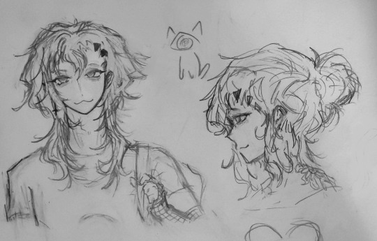
Pretty boy smh
Im showing his ugly picture, just for his humiliation fun!!

I
Actually liked drawing him again
.
Just kidding he needs to go back to jail
Stupid
ugly
Get in there, pretty face!!

Heh
One bad thing, put behind bars
Speaking of metal things, remember Opal? Yeah uhm. He's here too...
It seems like all my ocs are making a reappearance after weeks!! (R.i.p Cherry...)


Its been TOO LONG
and frankly I
Opal isnt suited for Jmilo style tbh
For one; no nose, no eyebrows, big boba eyes, unrealistic hair details
Ahh
Hes always meant for Jchan style I guess
Cutesy, big eyes, unrealistic hair
ehe, Speaking of Jchan style ...

Ta-da!!! A little present for coming down this far
Long road of me yapping
I like to yap. Just that nobody is here to listen.
Nayway!!!
Theres a few (ton) more ocs/characters I want to draw
Lots
All the milos, for one
And maybe another Pl oc? Ehe
Oh well~ Ill get to a certain nredeacterjecjevavtsbrsvg eventually
Anyway!! Heres a small sketch of myself!
My persona tbh... Same thing! Person! Same person!

Ahh
Thats all the tumblr images can handle
Thanks for seeing them all! I wish more people could tell me that I didnt waste my time, more often
Cya tmr! Or today? Its 2am... Ahhh
*falls backwards into coffin
10 notes
·
View notes
Note
Hi um I really like the Arashi magical girl au so I hope it's alright if I talk a bit about what's in my head. I wrote down a few scenarios and did a quick storyboard for one (will draw everything out later). er here one of the scenarios I wrote (don't wanna make this post too long)
Scenario based on how Nazuna left Shu and how Mika does the same later
Mika: I still remember that day when Nazuna left…
Dark, dreary bg colors, Nazuna’s back is facing camera.
Mika: Nazuna-nii? Where are you going?
Nazuna pauses. He turns his head a bit. Close-up of his mouth.
Mika (Voice over): His words were a whisper… but I heard him clearly.
Nazuna: Sorry. I hope you'll understand one day...
Back in present. Mika holds a burned photo of him and Arashi. The side with Arashi is burned but bits of her hair and clothes can still be seen. (Shu was the one who burned the photo after seeing Mika look at it. Me thinks he threw it in a fire and after he left, Mika managed to salvage it but the side with Arashi is completely burnt)
Mika: I understand now. And I know what I have to do now.
Um there is a scene where Mika screams at Shu. Mika grabs Shu by the front of his clothes and flings him to the ground. Mika then walks away, now his back is facing camera.
Shu: Don’t you dare take another step or I’ll-
Mika (turns around): Or you’ll what?
Close-up of Mika’s face.
Mika: I won't let you control me anymore.
Mika walks away.
Flashback to another scene in the past when Nazuna was still working for Shu.
They have come to Earth for the first time. They somehow come across a photo booth. Mika is very excited about what it is and Shu is about to scold him, telling him that their mission is more important. Shu then looks at Nazuna, who is quiet but is clearly interested in photo booth too. Shu relents and they take photos. At first they don’t know how it works so the photos turn out goofy. Then after getting the hang of it, Shu makes them pose a certain way. When he sees the photo strip, he does admit that the humans are interesting to have this sort of method to store memories. He cuts and throws the goofy trial photos away but Nazuna secretly takes them out. Perhaps when he betrays Shu, Nazuna’s final way to move on is to burn those photos, although Mika and Shu do not know. (yes photos being burned for dramatic flair)
In present, when Nazuna meets Mika after he leaves Shu, they hang out. They see a photo booth again. Nazuna makes a small remark about the previous photo with Shu. He asks Mika if he wants to take another photo. Mika asks if the Knights could take a pic with them too. In this pic, Mika is far happier.
was thinking of parallels for Nazuna and Mika
Nazuna left quietly (was afraid of confronting Shu so he just wrote a note) Mika left with a bang! screams at Shu and grabs him by front of his clothes and throws him on the ground :D The photo that Nazuna kept of him, Shu, and Mika made him stay longer than he would have. Looking at it made him guilty for wanting to leave. Mika's photo of him and Arashi makes him realize that he has to leave Shu.
ok I will run away now. have a nice day :]
hihi! hello ask from 4 months ago haha /sobs/ im glad you enjoyed the au! sorry for not answer before haha,,
actually i loved this idea sm that i made a drawing about this at the time! i didn't liked the result and burned out lol, tried to make like a fake screenshot but it looked wonky tbh
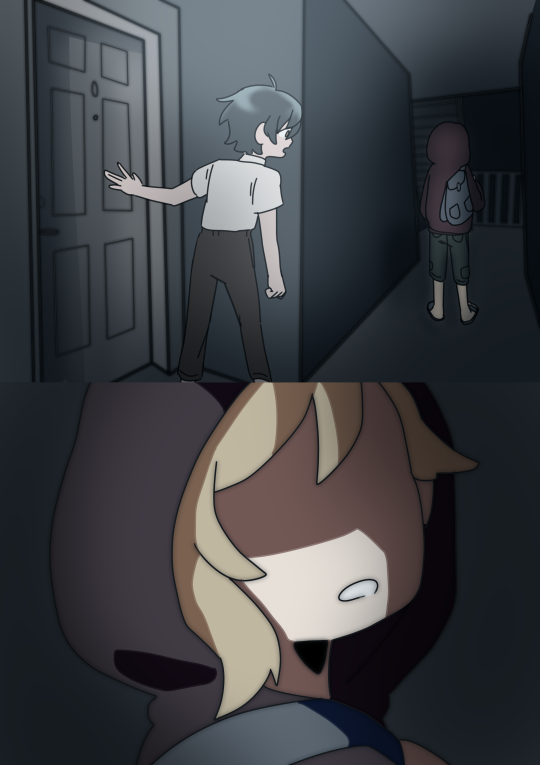
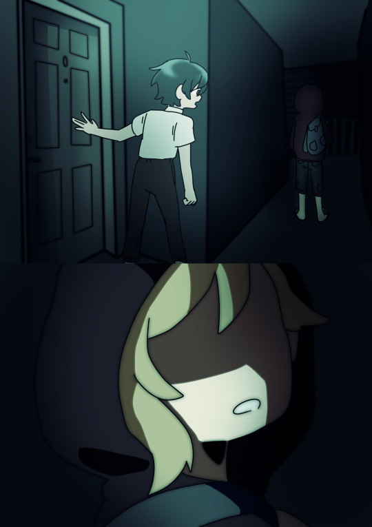
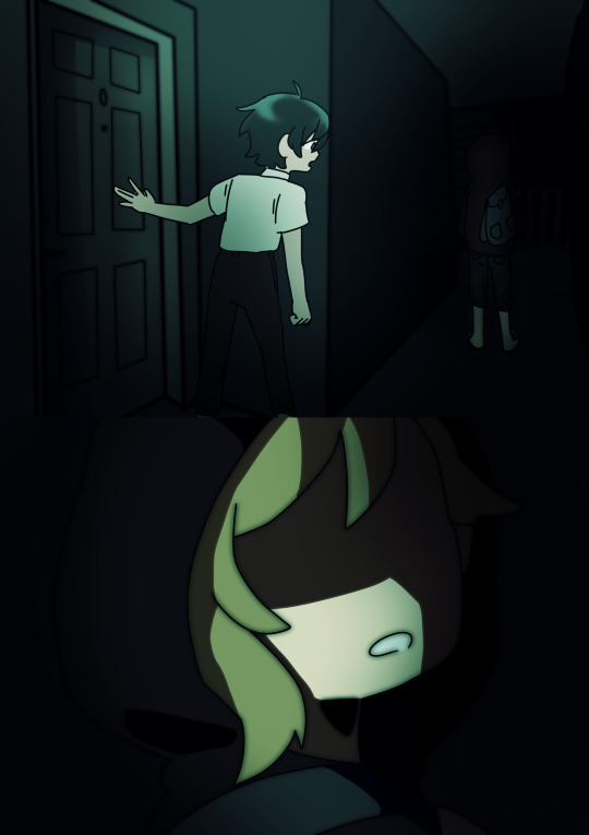
i edited it a bit today (mabye i went overboard with those two, it looks kinda too dark even for a night and it looks unsettling lol) so it wasnt too gray (and mabye cuz i wanted to use these new cool effect in clip i learned the other day)
and my friend let me say that i loVE when photos have a heavy sentimental value for characters, im a sucker for the burned photo trope
+ Shu, Mika and Nazuna not being from earth makes me laugh for some reason, like, does this count as scifi if arashi is fighting vs technically aliens?/j
but if i think about it it would be like Madoka Magica(?), like, Arashi's cat should be an alien so why not the villians? i makes sense for me at least
also the parallels between Nazuna and Mika?!??!!"?!? im in love!??!?!??! the way they leaved Shu in such different ways?!??! the way their actions get affected by a simple piece of paper that means a lot for them?!?!??! thats my favorite part fr
and yeah go mika go! tell him his truths! he deserves it! *cheer moves*
byee! i loved this sm!! sorry for not answer this before!!!
#ensemble stars#enstars#arashi narukami#rui draw smth#?¿ it counts if its from 4 months ago?#mika kagehira#nazuna nito#shu itsuki#enstars magical knights au#(omg magical girl arashi)
24 notes
·
View notes
Note
Can I ask when you started drawing? Where you learned to draw? Any inspirations for how your art style is like now?
hghjgfhjytggfghjhygthjuhygt uuuuhgh idk i just do that??? first of all it's super sweet of you to ask, if you ever want to message me and get some more proper tips and whatnot feel free. i love helping people out when it comes to that kinda thing and i am FAILING to do so right now:
uuum, i'm not good at the teachy thing lol. lets see, i "started" drawing i wanna say around fourth grade? i mean i've never not drawn things as far as i'm aware, but that's the earliest i remember
wheni was in sixth grade i constantly plagiarized because i cared more about impressing my friends than feeling good about myself. don't do that please.
i didn't really "learn" to draw, i mean my parents are artists but they're glass artists and don't really use pen and paper and whatnot. i guess i just taught myself?
my inspiration throughout the years is almost solely fanart. people make cool shit and i wanted to join the shit show.
i only started posting my art online at the beginning of this year, and i plan to keep doing that indefinitely.
i've always been encouraged to draw and to do art from my parents, friends, and schools so it's no surprise i'm still doing it.
if i had to give an actual tip though, don't think about it as something you have to learn from someone, but rather something you learn from trial and error. make sure you really try to put thought and effort into it sometimes or you'll get upset with the outcome and think silly things about yourself. you need to know you actually can get something you're happy with when you keep a calm head and keep trying. don't be afraid to try something wacky and different to how you normally draw, it's how i get my best style changes.
and lastly, don't give up! you're awesome, and if you keep trying, one day you'll be awesome and content with your skill!
heres some little tips that i've learned through my experience: get ref for hair. and preactice a bunch, hair was hard at first for me, but now it's the easy part.
try all sorts of shit with noses, there'a a lot of ways to draw them and they're all cool
eye shapes carry a lot of emotion, so think about the shape your eyes are in when you show those emotions
same thing w/ eyebrows
mouths are weird. but it's weirder to leave that spot blank because you don't want to "ruin the drawing"
color theory exists, but you can't think too hard about it.
try fun poses.
that's all for now, sorry this is so wack.
i think i'll only be able to help you annon, if i know specifically what you stuggle with, and what you're aiming for. thanks again so much for the questions, i really love to hear it
#keter-class-complements#art “tips”#long posts#just text though#long text post#please like i said message me and i'll see if i can give any help that isn't bullshit#i've got a lot going on#BUT if you do want any help annon feel more than welcome to ask some more stuff#art tips#artist things#how do i tag this#it's super flattering that you like my artstyle enough to ask about it#thank you again
4 notes
·
View notes
Photo
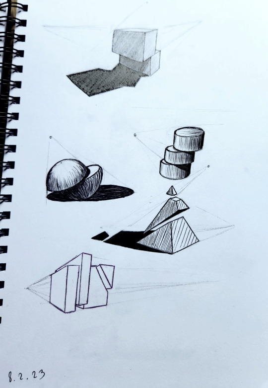
May or may not have forgotten what I posted here myself months ago so the last post had a few repeats. oops.
Well I know for sure this one won’t because I stopped posting when I started the second semester, which is what this post is about. So the drawing above is the start of working with more complex shapes, using the ones we learned from last semester. This is also where things got interesting, since I could see the potential for architectural drawings.

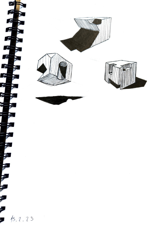
There are a lot, and I mean A LOT of drawings like these in my sketchbook, I’m gonna show you only the ones I find interesting.
After that we went back a bit for cast shadows, which I have decided are my new mortal enemy in art. A long time ago it was rendering hair, but that’s nothing compared to this.
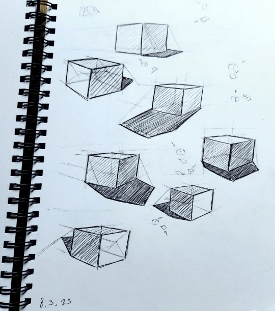

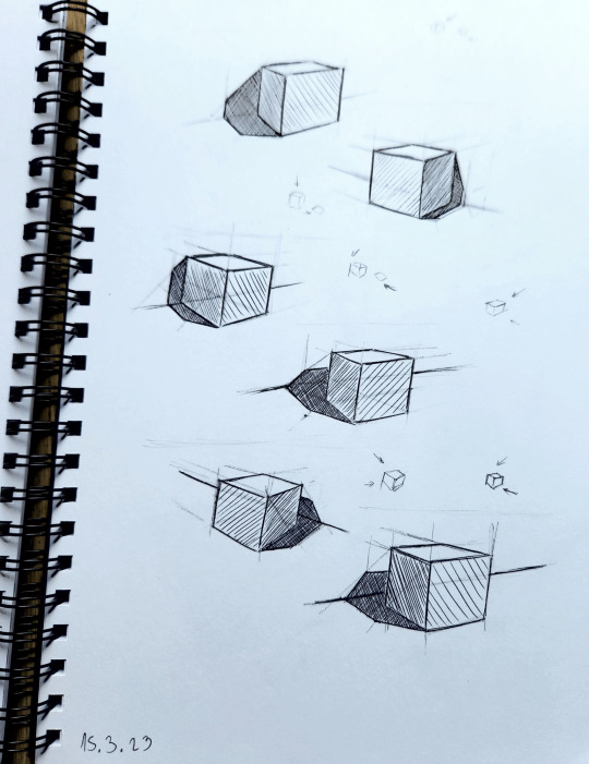
The amount of calculations you need to do for this and the different formulas for each shape make me wanna rip my hair off. And that’s before getting into more complex shapes.
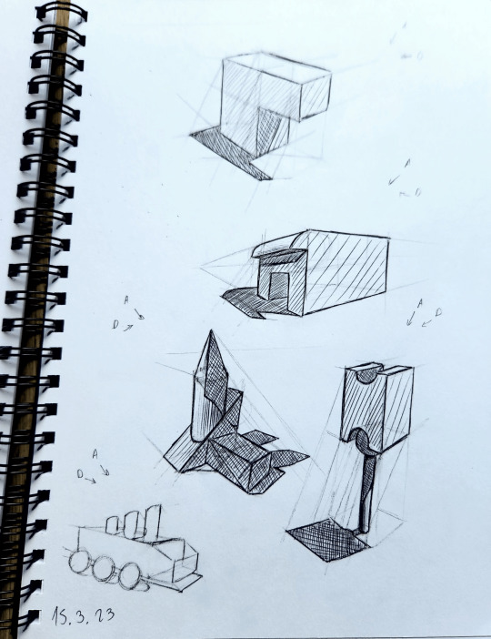
They're not 100% correct but my teacher said the majority of people won’t notice anything wrong so I shouldn’t worry about it. I won’t until I need it for a personal project, then I’ll get very annoyed again.
After that nightmare I got rewarded with finally using colors to render for the first time!!! I love rendering with colors so I was very excited haha

The copper (right middle sphere) is my absolute favorite, and my teacher really liked it as well.
We also had a small lecture on arrows and ribbons/fabric and we got to render them with colors as well.

For all the colored drawings I used a combination of alcohol markers and colored pencils. The markers melted and blended the pencils and I could use this to mix colors I didn't have. For example, I didn’t have a red marker at all.
After that we had a fun exercise where we needed to either study an object or design our own. The purpose was to use the previous lessons about shapes in perspective, and the rendering of different materials. I went with a gun design, but not just any gun-this one is technically 3 guns, a pistol and an SMG that you can connect and form an assault rifle. So I designed each gun separately (somehow I managed to turn this exercise to designing 3 objects instead of one, leave it to me to make it harder on myself lmao), and thought about how they connect, making sure the chambers kinda align and stuff like that.
I don’t wanna brag but I got the highest grade in the class for this assignment. Mostly because I’m the only one that actually rendered the different materials (or tried to), but also because my teacher liked the idea and thought it was interesting, and something people would actually buy if it was real.

It’s not the best but I literally didn’t have a grey marker so I was pretty limited. I chose a stained-glass theme for some reason, I didn’t want to make it a normal looking gun. The scan made it a bit more contrast-y than it is irl.
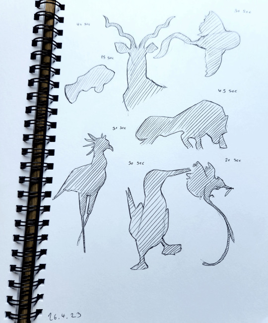
After a huge break we came back and had one lesson of silhouettes, something I kinda knew but never went out and made studies of. The challenging part of this was the time limit, at the start we had a minute, but it went down to 30 seconds. We were allowed to go overtime but it wasn't considered good.


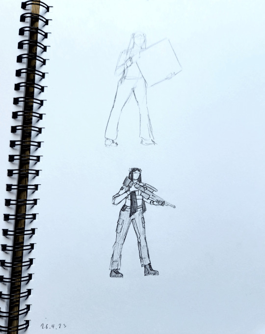
On the same lesson, we also had life drawing, using each other as models. We had to get the pose down in one minute, and then take that as a reference for a more detailed drawing. I chose to completely change the context at that point lol


The next lesson was about isometric perspective. I don’t think I’ve actually talked about this here, but I got scammed by a guy who asked me to make him a city island in isometric perspective, then when it came time to pay, he “took a vacation” for two weeks. Came back to tell me he’s definitely gonna pay me. Proceeded to disappear. Anyways I haven’t done isometric from that moment until this lesson, where we were given a prompt word and had to draw an environment following it. I used only colored pencils for this one because I forgot to bring my markers, but it was a nice restriction to only use 12 colors and try to combine them to make the rest. I really enjoyed this one since I got the freedom to make something cool.

(the prompts are top-to-bottom forest, COVID-19, underwater and space) my teacher walked up to my desk to see what I’m doing while I worked on the space one, and he said “you are crazy” every time he passed by. He showed everyone’s work around, and a lot of people liked mine :) The space one is based on a black hole btw, but if it was an eldritch horror.
The last lesson was a time for the teacher to review everyone’s work one by one, so most of the time we were waiting for our turn. He put up a pic of an old camera if any of us wanted to draw it, but I used it as a reference for a building because it reminded me of art deco architecture. After finishing that, I had an idea for a shrine kind of place, inspired by a spot I built for a friend’s minecraft server that we didn’t end up using. And I topped it off with Lykena and Eivrun sketches (that for Eivrun might turn into a full painting when it’s her turn)

The entire year my teacher was occasionally asking me if I’m not getting bored, because we were going through a lot of basics I was obviously proficient at already, but I always found something new to learn, no matter how small, even on topics I practiced a lot before. So I’d say this workshop was very useful for me. And besides, it’s always good to get critiques from a professional, and from people who are interested in art.
#original art#Art Studies#uni work#my teacher was pretty mean but he wasnt mean to me#probably bc i never gave him trouble but also i dont think i look like the person that can take his roasts lmao#i learned a lot about perspective from this year#which is good bc it was a weakpoint for me
5 notes
·
View notes
Text
this is just me thinking out loud
trying to organize my thoughts to make things easier on myself but I'm worried if I'm making it harder maybe???
nah, it's helpful to have outlines
but I'm at the point where I'm like---- once again ready to buy 50 billion cork boards and lay them out across my walls and just go nuts with it
idk I just need to pick something and write and even if it sucks just like--- having SOMETHING on the page will help
though I do think reorganizing some of my notes or maybe even typing my outlines out will help like--- unclog my brain a little, ya know???
idk, I just need something to be working on constantly. And arts been nice but my art is so INCONSISTENT
and I know how it gets more consistent and how it gets better is just like-- DOING it.
And I know that if I kept writing I'd probably find the same inconsistencies there too-- I kinda already do
I think on some level I just wished I really liked my work ya know?? Like-- obvs I like my work just fine, I like it fine enough to not fully abandon it. But I never LOVE anything I put out ya know?? I dunno, I think every creative is like this. You never fully love your work.
God if I'm having this many road blocks with fan works I'm gonna by so screwed when it comes to original shit
or maybe I won't. Maybe it'll be easier. WHO KNOWS!
idk I'm just trying to work around my mental blockade.
Other people like my work and I guess I just wish I saw something in it that other people seem to...
BUT I GUESS THAT'S ALSO A MICROCOSM OF MY WHOLE LIFE, ISN'T IT.
Idk-- I'm clever and witty and so creative and full of ideas ravenously chopping at the bit to get out. But I'm also a whiny dimwitted dunce who can't finish a big thing and is, consistently, one of the stupidest people I've ever met.
Love that bitch, but I also hate that bitch LMAO
idk I need to do like a nanowrimo thing. Just a whole month, get something down on a page everyday, and have it like--- reasonably completed by month's end.
I still wanna do more animatics though. On top of that. Cause they're fun, and they're HELL, and idk I think I'm actually decent at them. Not like great, but I've always like-- *geusters* had an animator brain and I'm decent at posing and I feel whenever I put the pose first my work comes out better. THAT'S ALL ANIMATION IS, A BUNCH OF POSES! (at least when you work in tv, but I always wanted to work in tv so-- there's that I guess)
BUT THAT'S ALSO MORE DRAWING
drawing in sequence
a bunch of drawings!
they never end
idk, at this point I'm trying to list my way out of this whole
just make list after list after list until my thoughts are organized enough that they HAVE to work
but mostly I should probably just go to bed
FEH
I can't tell if I need to try and engage more of if I should just turn my brain off fully
I feel like I've been doing both at once which technically means I'm doing neither actually lol oops
idk, I should sleep, I can't stop yawning, I'm going to sleep
#legit just rambling#almost want to put it on the vent blog but like#IN CASE FOR EVEN A MOMENT ANYONE OUT THERE THOUGHT I MIGHT KNOW WHAT I'M DOING#*gestures to the post* CLEARLY I DON'T.#bruh#I need a vacation#or a staycation#or BOTH#just an extra day or two off#but I also wanna work more#and get MONEY#and be productive and contribute to society and also goof off with my co-workers#BAH#I need sleep#gn
1 note
·
View note
Text


Here, have a fairly light sketch dump with two relatively complete sketches and some of the process for the main Zanmu one. Also, Gensokyo's specalist girl makes an appearance here too
Artist's Notes;
Zanmu is such a fun character to draw, like, there's so many little aspects in her design that you can emphasize, and her colour palette is so satysfying too. The reason I ended up drawing this was because when I was scrolling on Pinterest I found a specific pose that just screamed Zanmu to me (it was the skull that did it for me) and I just had to draw her in that pose. I did end up taking my liberties with my reference though, and also I am not drawing feet, I just straight up don't like it, and this is mainly something more on the sketchy side so it didn't really matter lol. Also, IDK too much about the hands, I'm usually pretty good with them but I struggled with them a bit this time. Also Zanmu is sitting on nothing because I just didn't feel like drawing what she was sitting on (plus I already drew in the clothes and including what she was sitting on would mean having to change the sleeves and I just didn't wanna do that lol). Also realized that I should probably start trying to improve on drawing frills in clothing, and I tried a new technique for drawing them. I do like how they look, but at the same time it can still be better.
I do love how Zanmu's pose turned out the most in this batch of sketches. In my process, I put the reference image on the canvas and then roughly blocked in the silhouette. One change I knew I wanted to make since the beginning of the sketching process was opening up the space between the bent arm and body more, mainly to make the silhouette of the pose clearer (even though with the addition of the clothes it does get closed up a lot). I also wanted to turn the torso towards the viewer and change the position of the legs to something more cross legged/casual. In another sketching pass, I just kinda quicjly scribbled what I wanted the pose to look like just so I could get my idea out and I'm glad I did that because that helped me focus more on the pose itself rather than the small details. Afterward, I did a sketch of the body, clothes, and hair all together and then coloured it to get the coloured Zanmu sketch!
Again, I could've done a better job with the feet and the legs themselves for that matter, but the nice thing about sketches is that they don't need to be perfect, and I was more so focused on the gesture/feel of the pose rather than the minute details. With her facial expression, I knew that I wanted something very specific with her eyes, so I just simplified it into this "almost closed" eye and I do like how it turned out a lot. Also, a problem that I often have drawing Zanmu is that in the poses I put her in, I don't really know how best to draw in those triangle cut outs she has, so instead, I added these little triangle details onto her sleeves and pants to add some visual interest and allude to them instead, also because they can kinda allude to a crown and Zanmu is the king of Hell so it fits lol (also, love it when people add details like that onto sleeves sm lol). The hair and tassles did a lot of heavy lifting when it came to making the drawing have a nice flow to it, and I have the headcanon that Zanmu is just able to make those float on there own by.... honestly I don't know, I just like the idea of her tassles defying gravity and floating all the time. Also IDK if you can see them, but I did make sure to include her scars as I'm basically adding that as a part of my way of drawing Zanmu. It just adds a certain something, y'know? Also found a specific reference for the skull and made it the red that it is in Touhou 19, and also because drawing skeletons and skulls is just fun lol.
Now onto Reimu, so that face drawing was mainly there just so I could get a better idea of how I wanted to draw her face in the future. My main concern was trying to make it different to Keiki and Zanmu's faces, so as I was sketching hers I had the drawings of Keiki and Zanmu's faces turned on to make sure I wasn't drawing the same thing again. Down here I included this little test I did where I hyper simplified the eyes of the three faces and just traced over their face shapes, noses, eyebrows, and mouths. While the nose is the most consistent trait shared among the three of them (tbf that can just be chalked down to an aspect of my style), I feel like the three are different enough from each other to where they don't have same face syndrome, even if you simplify the eyes into dots and also didn't include the detail of Zanmu's scars on her face.

I'm obsessed with giving Reimu these tiny little eyebrows for some reason, IDK it just works for her. I also really like using a red as a highlight for whenever I draw her hair black, mainly because it helps to give the illusion that her hair is just a really dark brown and incorperates her main colour of red into another aspect of the design. I also wanted to try and draw Reimu's eyelids differently to try and imply monolids but tbh IDK how well that reads. I also like how her pupils turned out, as I'm experimenting with different characters in my style having different kinds of pupils. I didn't even bother properly rendering her clothes, so I just did them linelessly (I think I wanna try drawing in my lineless style again for a future piece sometime as I kinda miss the feel it had). I of course had to give Reimu her big bow, and also use that specific shade of red. IDK what it is about that shade of red specifically, but I just love it, it looks so nice to me you have no idea- Now that I think about, I kinda wanna draw Reimu more now, as I feel like I can still do some more experimenting with how I draw her eyes specifically. Also because I've got some ideas when it comes to how I wanna draw her body type.
#touhou project#art#fanart#sketch dump#digital sketch#zanmu nippaku#touhou#reimu hakurei#touhou 19#unfinished dream of all living ghost
220 notes
·
View notes
Note
how much more does csp slap than procreate? wanna know if i should buy it
hmmm i haven't used csp pro as much recently cause of how busy i am, only for achelous's banner and the new references for my ocs, but if you're currently using procreate or any other drawing app that doesn't have a complicated-looking interface, the interface and controls for csp can be difficult to understand. there's kind of a learning curve to get over, i had to look up a youtube tutorial on how to edit the interface to my liking when i first bought it lmfao but the brushes are SUPER nice with all the different textures, and the blending is so interesting to learn how to use since i rarely use the blending/smearing tool in procreate cause i have a difficult time understanding how to use it. the pieces i made so far come out crispy clear on my phone when i send it, which is personally amazing cause i always zoom in and inspect each little detail to see if i missed anything. AND YK HOW IN PROCREATE WHEN YOU BARELY ADJUST THE LINE DURING TRANSFORMING, IT BLURS TO SHIT???? IT DOESN'T REALLY DO THAT AT ALL FOR CSP, THAT SHITS GENUINELY A BLESSING. also i found out how to kinda use the 3d models, so i can do more dynamic poses AND practice my anatomy. genuinely, i really find csp quite an upgrade from procreate due to how many features it contains, BUT i still enjoy using procreate.
i don't have csp on my ipad and as much as i want to for accessibility purposes (i don't have the ability to bring my drawing tablet on me all the time + the wires are a hassle to set up, just imagine setting up in public when you already don't like being in public spaces for a long time, esp with what you draw 😭), you got me immensely fucked up if you think i'm doing a subscription instead of a one and done payment like procreate and csp on my laptop. procreate is mad convenient, i can doodle whatever i want with it, even while taking notes at the same time if i am using it for notes. i use gumroad to find most, if not all my brushes and it's so fun shopping for them like the csp brushes. i'm also super used to how each brush i use works cause i've been using it for nearly 4 years now, and ik how to work around certain elements to my liking, esp the liquify tool cause the liquify tool on csp lags and sometimes does not "listen" to what i'm trying to do with the drawing. i feel like procreate is sorta beginner friendly for digital art, ik other people say otherwise cause it is pretty lackluster compared to other professional digital art programs, but that's just what i think. also i like speedpainting process videos, i just watch them whenever i want to and remember what i was thinking or feeling during a particular moment in it.
all in all, i heavily believe that it's just personal preference on what feels the best and works right for you, because i went through many different drawing apps/prgrams before i finally settled on csp, procreate, and sai (on occasion lol). you also gotta make a heavy financial decision on csp if you're choosing to do either the pro or the ex version, but i'd wait until the discounts come out again if you choose to purchase csp. i think there's the free trial for csp to see if you rock with the interfaces/controls as well before settling on one or the other ‼️‼️
i ain't a big professional or particularly nit-picky on what i think is overall the best, i simply love making art with whatever media i'm using 🙇♂️
0 notes
Text
MY WELCOME HOME OC’S STORY KINDA SORTA SLIGHTLY PREDICTED-ISH THE RECORD!!! (Not really)
General story and some sketches vvv
(It’s long and rambly and the sketches are rough, so fair warning lol)
My little guy is named Richie Rings, he’s a lonely little clown who lives off on his own and sneaks around the neighborhood at night. He was introduced in a fully animated Halloween special where Eddie shares a story about the boogie man and spooks everybody, then Wally is sent off to get something (maybe snacks? I thinks that’s what I said?) where he’s mysteriously stolen away without a trace.
The episode splits into two separate stories. One of Wally and the mysterious figure (Richie), and the other with the neighbors searching for him.
Wally finds himself in a circus tent where Richie creeps out to spook him, only for Wally to tell him that it’s not nice to take people places without asking first. Those kinds of interactions proceed back and forth until Richie finally confesses that he was lonely and wanted to join their party but was too scared to ask. Wally takes him back to the group who all celebrates when they find him and he says “look, this is our new friend, Richie!” And that’s generally where the episode would end. Happy ending for all yippee woo!
Then, since Richie didn’t have a puppet made for him, he wasn’t in any more episodes until the Christmas special where they made him a puppet that looked much softer and nicer than his Halloween animated self. Everyone’s a little hesitant since, well, he kidnapped Wally last they saw him. But the special is all about forgiveness and being neighborly and such. Eventually everyone warms up to him, in one way or another and at drastically different levels. (Ex. Poppy is nervous around him since he did pose a literal threat, Home isn’t a fan since he took Wally away, but Barnaby warms up to him pretty quickly as they bonded over loving jokes and such, and Wally, being Wally, just vibes with him from the start, ironically)
(I say I predicted this, but it’s mostly just the spooky stories at Halloween time thing, and maybe the clown part but I don’t wanna make Sally mad)
Anywho, here’s some drawings I did of him! (I few things have changed since I drew these, but I haven’t gotten around to making him an official character sheet type thing)
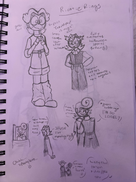
I decided he’s actually quite a bit taller than Wally, and I’m trying to make his “nicer” outfit a little more period accurate, it looks too 80s. Also Wally isn’t tied up, just snatched.
And then of course I have a shit load of angst.
So you see, since Richie was only made for specials, they didn’t give his puppet the full treatment, you know? They didn’t make him as sturdy as the others, so when there was a bit of an accident that involved lots of boxes falling at a bad time, his arm was completely torn off. Rather than fixing him then as they would another puppet, they said eh, we’ll fix him next holiday season, and tossed him in a closet. Spoiler alert, they never fixed him. They just stopped adding him into specials. He was only in two or three, so when he stopped showing up hardly anyone noticed or cared enough to bring it up. So, he rotted away in some storage closet.

The time and rot left him so damaged he couldn’t walk and could barely speak. He gave up on looking for help, until one day he heard the door creak open. He begged for help, crying and sobbing and trying to make his way to the door, dragging himself hopelessly across the ground, only for the door to slam in his face as soon as he felt hope bubbling up in his heart again. (Can you tell literature is my favorite school subject?) The door had opened and shit many a time, but he hadn’t gotten nearly as hopeful with them as he had with this one, because in the brick moment he locked eyes with the figure, he recognized him…

(That picture is so rough I’m crying just looking at it dear lord I need to redo it 😭)
But yeah, that’s Richie’s general story for you! I have an idea for a happy ending for him in mind, but that’ll depend on how the actual lore of Welcome Home develops.
I hope I can give him a happy ending because that would mean Wally got a happy ending too, my poor darling.
A few other little traits of Richie’s:
+ He refers to everyone as his favorite (blank). I was gonna list examples but I’m blanking, so just come up with your own idk.
+ He is surprisingly quick to tears, though he usually tries to fight them off
+ I’m not 100% on this, but I’m thinking his skin will be some kind of pale green/teal/blueish color, but his face is white!
+ He’s more of a Gonzo type clown than a Barnaby type. Much more slapstick and accident prone.
+ He wears big tall boots under his leg warmers that helped him stand up, since his legs were less sturdy than the other puppets. Eventually a worker came in and took them for another project, leaving him mostly unable to walk, barley angel to support his weight with his calves, though he could move in his knees for a while until he rotted away.
+The accident with the boxes is what tore his arm off and mangled his other hand, leaving him unable to grab things with any force. Aka, why he was unable to open the door.
Anyway this post is long enough already, but if anyone is interested I’d be more than willing to ramble on about him for hours, I’ve got so much rattling around in my mind! I love Richie with my whole heart and NEED TO DRAW HIM MORE!!!
#welcome home#welcome home oc#welcome home original character#my art#long post#ramblings#i love him so much#also I will probably take away his middle part because people keep thinking it’s supposed to be me
0 notes