#i hope one day he is too
Explore tagged Tumblr posts
Text
x
#sometimes i think im selfish that i moved out and left the state and got a girlfriend and our pet cat and made my own little family#and then i think#i still calls my parents and my grandparents and i still visit home and i still text my brother (not as much as i should) and#i am still part of my origional family i just made a new one too#because no offense but my old one sucks a little and for a long time they made me feel very afraid and very unwanted#so i made a new one and just because they never kicked me out didn't mean i wasn't prepared for that and planned accordingly#and now my brother is being passive agressive and texting me about our family being together on the holidays#like bro if our family being together meant so much to you you'd answer the phone when i call#and i know its hard#because our stepdad is dying and our family is never going to be together again on thanksgiving#and the grief is large and hard and i dont know how well my brother is doing handling it#but ill be home for christmas and we can be together again#or maybe he'll die before then and we wont be and my brother can hold that against me however long he wants to#but i am with my family#and i had a good day even with the sadness and the grief and i am okay#and i fought too hard to be okay to go crawling back just because he wants to play happy family#it was never a happy family#it wasnt all bad but im done pretending everything was sunshine and roses#me and my brother both almost killed ourselves playing that game and im done playing#i hope one day he is too#i wish i knew how to help#but i dont#and i genuinely think i am as okay with that as i can be
2 notes
·
View notes
Note
Rowling isn't denying holocaust. She just pointed out that burning of transgender health books is a lie as that form of cosmetic surgery didn't exist. But of course you knew that already, didn't you?
I was thinking I'd probably see one of you! You're wrong :) Let's review the history a bit, shall we?
In this case, what we're talking about is the Institut für Sexualwissenschaft, or in English, The Institute of Sexology. This Institute was founded and headed by a gay Jewish sexologist named Magnus Hirschfeld. It was founded in July of 1919 as the first sexology research clinic in the world, and was run as a private, non-profit clinic. Hirschfeld and the researchers who worked there would give out consultations, medical advice, and even treatments for free to their poorer clientele, as well as give thousands of lectures and build a unique library full of books on gender, sexuality, and eroticism. Of course, being a gay man, Hirschfeld focused a lot on the gay community and proving that homosexuality was natural and could not be "cured".
Hirschfeld was unique in his time because he believed that nobody's gender was either one or the other. Rather, he contended that everyone is a mixture of both male and female, with every individual having their own unique mix of traits.
This leads into the Institute's work with transgender patients. Hirschfeld was actually the one to coin the term "transsexual" in 1923, though this word didn't become popular phrasing until 30 years later when Harry Benjamin began expanding his research (I'll just be shortening it to trans for this brief overview.) For the Institute, their revolutionary work with gay men eventually began to attract other members of the LGBTA+, including of course trans people.
Contrary to what Anon says, sex reassignment surgery was first tested in 1912. It'd already being used on humans throughout Europe during the 1920's by the time a doctor at the Institute named Ludwig Levy-Lenz began performing it on patients in 1931. Hirschfeld was at first opposed, but he came around quickly because it lowered the rate of suicide among their trans patients. Not only was reassignment performed at the Institute, but both facial feminization and facial masculization surgery were also done.
The Institute employed some of these patients, gave them therapy to help with other issues, even gave some of the mentioned surgeries for free to this who could not afford it! They spoke out on their behalf to the public, even getting Berlin police to help them create "transvestite passes" to allow people to dress however they wanted without the threat of being arrested. They worked together to fight the law, including trying to strike down Paragraph 175, which made it illegal to be homosexual. The picture below is from their holiday party, Magnus Hirschfeld being the gentleman on the right with the fabulous mustache. Many of the other people in this photo are transgender.
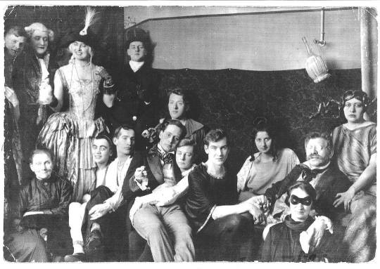
[Image ID: A black and white photo of a group of people. Some are smiling at the camera, others have serious expressions. Either way, they all seem to be happy. On the right side, an older gentleman in glasses- Magnus Hirschfeld- is sitting. He has short hair and a bushy mustache. He is resting one hand on the shoulder of the person in front of him. His other hand is being held by a person to his left. Another person to his right is holding his shoulder.]
There was always push back against the Institute, especially from conservatives who saw all of this as a bad thing. But conservatism can't stop progress without destroying it. They weren't willing to go that far for a good while. It all ended in March of 1933, when a new Chancellor was elected. The Nazis did not like homosexuals for several reasons. Chief among them, we break the boundaries of "normal" society. Shortly after the election, on May 6th, the book burnings began. The Jewish, gay, and obviously liberal Magnus Hirschfeld and his library of boundary-breaking literature was one of the very first targets. Thankfully, Hirschfeld was spared by virtue of being in Paris at the time (he would die in 1935, before the Nazis were able to invade France). His library wasn't so lucky.
This famous picture of the book burnings was taken after the Institute of Sexology had been raided. That's their books. Literature on so much about sexuality, eroticism, and gender, yes including their new work on trans people. This is the trans community's Alexandria. We're incredibly lucky that enough of it survived for Harry Benjamin and everyone who came after him was able to build on the Institute's work.
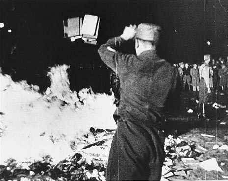
[Image ID: A black and white photo of the May Nazi book burning of the Institute of Sexology's library. A soldier, back facing the camera, is throwing a stack of books into the fire. In the background of the right side, a crowd is watching.]
As the Holocaust went on, the homosexuals of Germany became a targeted group. This did include transgender people, no matter what you say. To deny this reality is Holocaust denial. JK Rowling and everyone else who tries to pretend like this isn't reality is participating in that evil. You're agreeing with the Nazis.
But of course, you knew that already, didn't you?
Edit: Added image IDs. I apologize to those using screen readers for forgetting them. Please reblog this version instead.
#transgender#trans history#transsexual#transphobia#Magnus Hirschfeld#holocaust#holocaust denial#book burning#j.k. rowling#jk rowling#just in case you missed what i mean by all this: go fuck yourself anon :)#trans people have always existed#and we will always exist#if you really wanna pick a fight with me over well-documented history then you better bring in some sources to back your shit#queer history#queer#lgbt+#lgbta+#lgbt#lgbt history#edit: i finally got around to those damn image IDs. i am so very sorry for totally forgetting that's my bimbo moment of the month#also real quick i thought about adding an image of the actual building but the only one i can find has a Nazi parade in front of it#it was taken the day of the book burning raid and honestly if i were to include it then i'd add it to the first few paragraphs#and i think the story's better told when you uphold the hope Magnus Hirschfeld and all the researchers he worked with had#also keeps being brought up: yes Hirschfeld was a eugenicist. it was a popular belief set that was only discredited after WW2#Hirschfeld died in 1935. he literally didn't live long enough to see science turn against those beliefs and practices#considering how he changed his mind on transitions i like to think he would've changed his mind on eugenics too if he'd lived
17K notes
·
View notes
Text

[right to left]
finally finished This Wip from Ever ago and so now i ask you ever look into another dudes eyes and suddenly want to do whatever he wants
#xmen#xmen comics#cherik#professor x#magneto#charles xavier#erik lehnsherr#erik magnus lehnsherr#the kids are here too but i aint taggin them vaeLKEVJKLJ#snap sketches#posting this now and not obsessing over the details i need to SLEEP#please click/tap and zoom to read anything im sorry theres so much dialogue#i thought i was gonna finish this sooner but i went grocery shopping with my bro today and that took longer than expected !!!!#ALSO CHAT. if youre up to date on My Lore via my tags ... my prof's lettin me submit my assignment ... life's so good...#speaking of life being good i was giggling like stupid while drawing this . i named it 'this is stupid' and i stand by that#this is so unserious im gonna make myself throw up ITS SO CORNY i make myself sick with what i draw <- will continue to do this#only god knows if this is even how that power of his works i just saw an opportunity and ran with it#the trick here is he doesnt even have to use any 'power' he can just do that to charles by default#however im making them be obnoxious about it. i am making them obnoxious over dramatic grandpas because i can#my only crime is loving the utter cheese and corniness of the 60s comics like God. anyways bye !!!!!!!#maybe one day ill finish that other comic i sketched for this weekend but i fear i wont have time to so next weekend me thinks ....#for now i hope you all enjoy this. goofy as hell nonsense jLAKJVEKLVJ
1K notes
·
View notes
Text

act 4 :(
@chipper-smol and i came to a realization
#THID FUCKING GAAAAAAAMMMMEEEEE#i have more i wanna draw but my hands not working orz.. maybe ill get around to it later idk#i finally FINALLY managed to get inside that star room.. my own clone!! now neither of us will be virgins!!!!#i dont have anything to go off of but when the journal mentions making another 'me' it reminds me of loop saying theyre like a mirror#theyre always able to read siffrins mind without actually reading their mind (or so they say) but maybe it could just be tone matching???#or smth like that.. idk if these two things are connected though so maybe its more like subtext#i hope im not the only one who made the childrens hospital joke when it came around to color lore part 2#im also getting the sinking feeling of watching siffrin toe his way near the deep end like bro is so so close to losing it#i feel like if i knew nothing abt the game beforehand and why siffrin is looping in the first place my feelings abt this would be different#cuz id be pretty angry too if ive been stuck in a loop long enough to feel like everyone around me is pretending nothings wrong#than the fact that i have decided not to disclose im in a time loop and that everyone is living this day for the first time#although i also get hes doing this for a reason and when u believe in the universe i guess it also comes with sunk cost fallacy#'this is the path the universe led me down before i even knew what i wanted so all i can do is double down' THATS THE FATALISM TALKING#puppy plays isat#in stars and time#isat#isat spoilers#isat act 3 spoilers#isat act 4 spoilers#in stars and time spoilers#sona#puppysona#friends#chipper#doodles
650 notes
·
View notes
Text
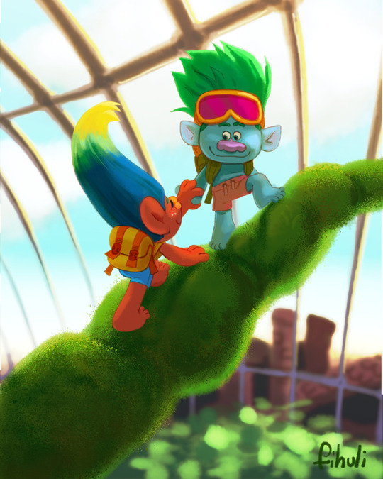

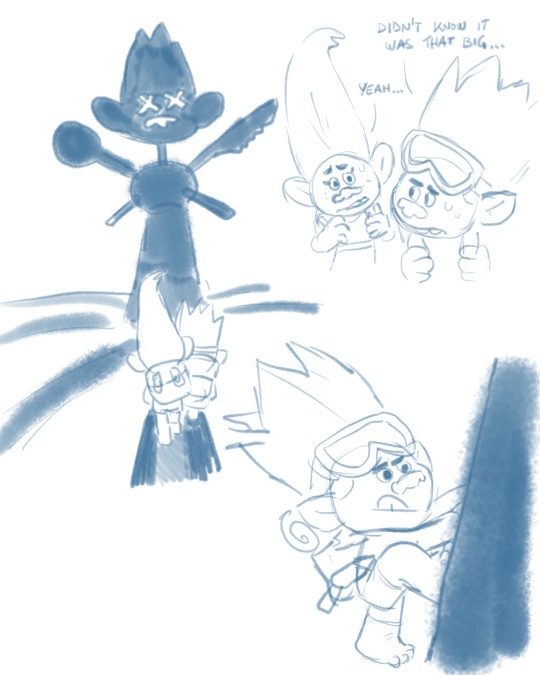


so many brainworms about life in the troll tree and jd's adventurous side...
#they were that active couple whose ideal dates are going on hiking trips and doing all sorts of sports like skiing and climbing#(which i hope to see myself a part of one day jdhbsdjhcbjdf)#trolls#dreamworks trolls#trolls 3#trolls band together#my art#trolls john dory#trolls oc#freesia#tulip#trolls floyd#trolls spruce#trolls clay#brozone#young brozone#i think jd was like the coolest big brother until. yknow...#also his hair ended up too bright in the illustration#and now i'm chewing on the thought of what if that was his original hair color when he was younger#but it then got darker after the parents died...#hmmmm...#it would still match the hair colors i picked for the parents...#*chews louder*
2K notes
·
View notes
Text
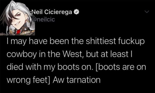

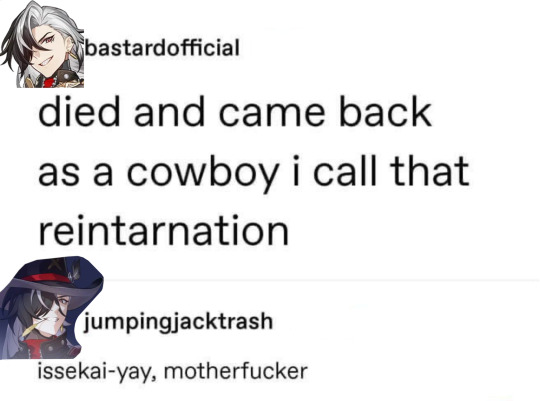
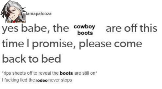
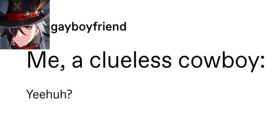
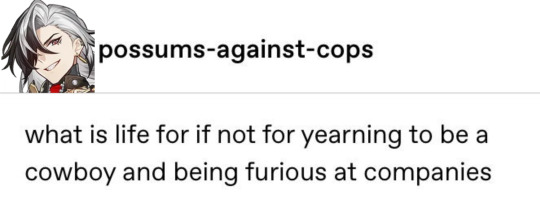

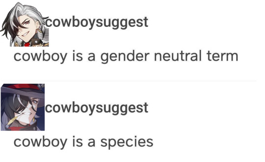
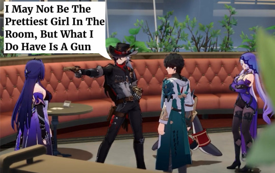
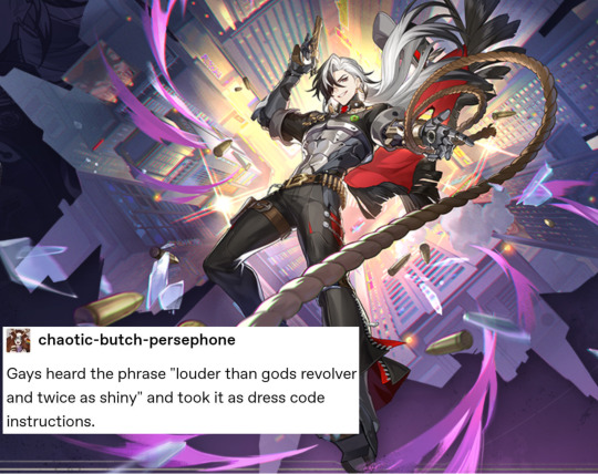
Making Incorrect H:SR Quotes Until I Run Out of (hopefully) Original Ideas - Pt. 4 - Nuthin' but Boothill Edition
[Pt. 1] [Pt. 2] [Pt. 3] [Pt. 5] [Pt. 6]
#boothill#honkai star rail#hsr#hsr incorrect quotes#hsr memes#honkai star rail memes#hsr meme#honkai star rail meme#hsr textpost#hsr boothill#boothill hsr#hsr spoilers#hsr 2.2 spoilers#hmmm... don't think it's worth tagging the others in the 9th image. this ain't about them#still unsure abt how to do the alt text for these kinda posts properly but hopefully i'm improving#anyways. don't think i've ever seen heard and typed "cowboy' so many times in one day as i have while making this good lord#i did a bit of digging around and haven't Seen any of these done yet so. here's hoping that's the case!#i'm only ~3/4 of the way through the 2.2 main quest but the need to make these compelled me to put these out Now#i can already tell u that there Will be more of these for Boothill tho bc i'm crazy abt him. probably enough to make another dedicated post#but i'm gonna wait until i'm fully caught up on the plot (and will probably spoil myself for more of his character lore after that as well)#speaking of. i'm gonna go eat mac n' cheese and stay up too late playing through the rest of the main quest#i'm loving it so far. many thoughts head full abt it all but in a good way. hoping for more Boothill moments as we approach the end#he's def not the main character here but he is to Me okay. he is to me. i'm scarfing down every crumb he drops#i'm also suffering from Aventurine withdrawals out here. Argenti mentioning him was Interesting but i need More. Where Is He.#also. was Argenti intentionally not voiced or was it a game issue?? the hell was that. threw me off so hard when i couldn't hear him speak#anyways i'm getting off topic and wasting precious gaming time so i'll be takin' my leave now
624 notes
·
View notes
Text
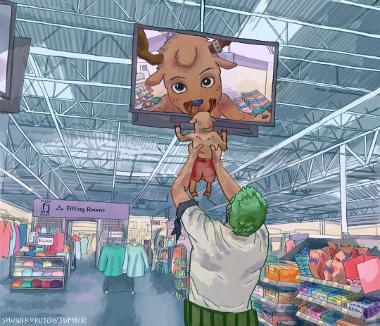
zoro got lost in the store and thought this would help him find the rest of the crew (it did work but probably not the way he imagined)
inspired by this art by @bluechanas!!
reference: showing baby to supermarket camera meme
#one piece#one piece fanart#tony tony chopper#roronoa zoro#q: why is chopper shirtless?#a: he lost almost all his clothes in an incident. that's why they're in the store#i spent way too long on this but. it was fun#anyway. first one piece fanart i hope it is enjoyed :)#my art#edit: forgot to add the reference photo and a link to the meme#thought the meme would be pretty easy to recognise on sight but i like having references bc. it's nice for the 10k people a day etc#also PLEASE go look at bluechanas art. fave one piece artists ever#500
743 notes
·
View notes
Photo
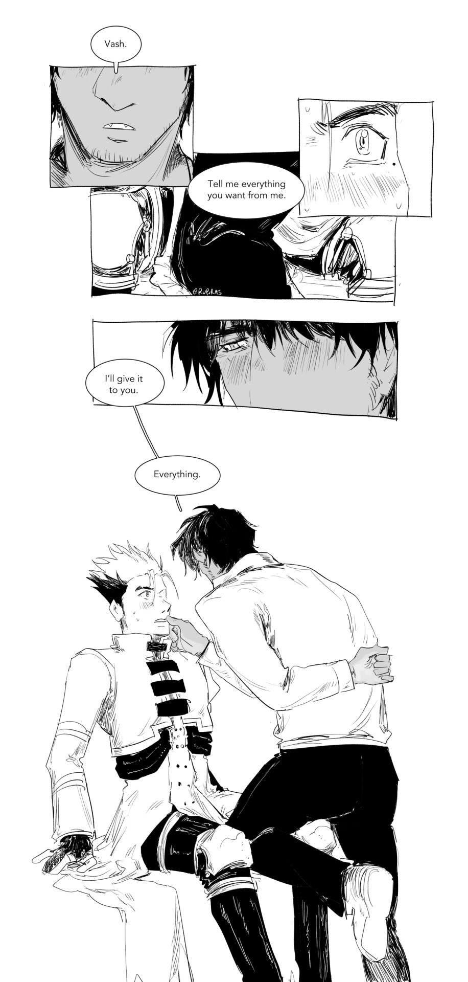
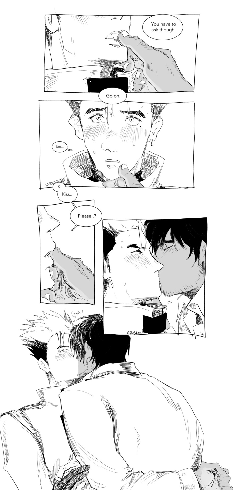
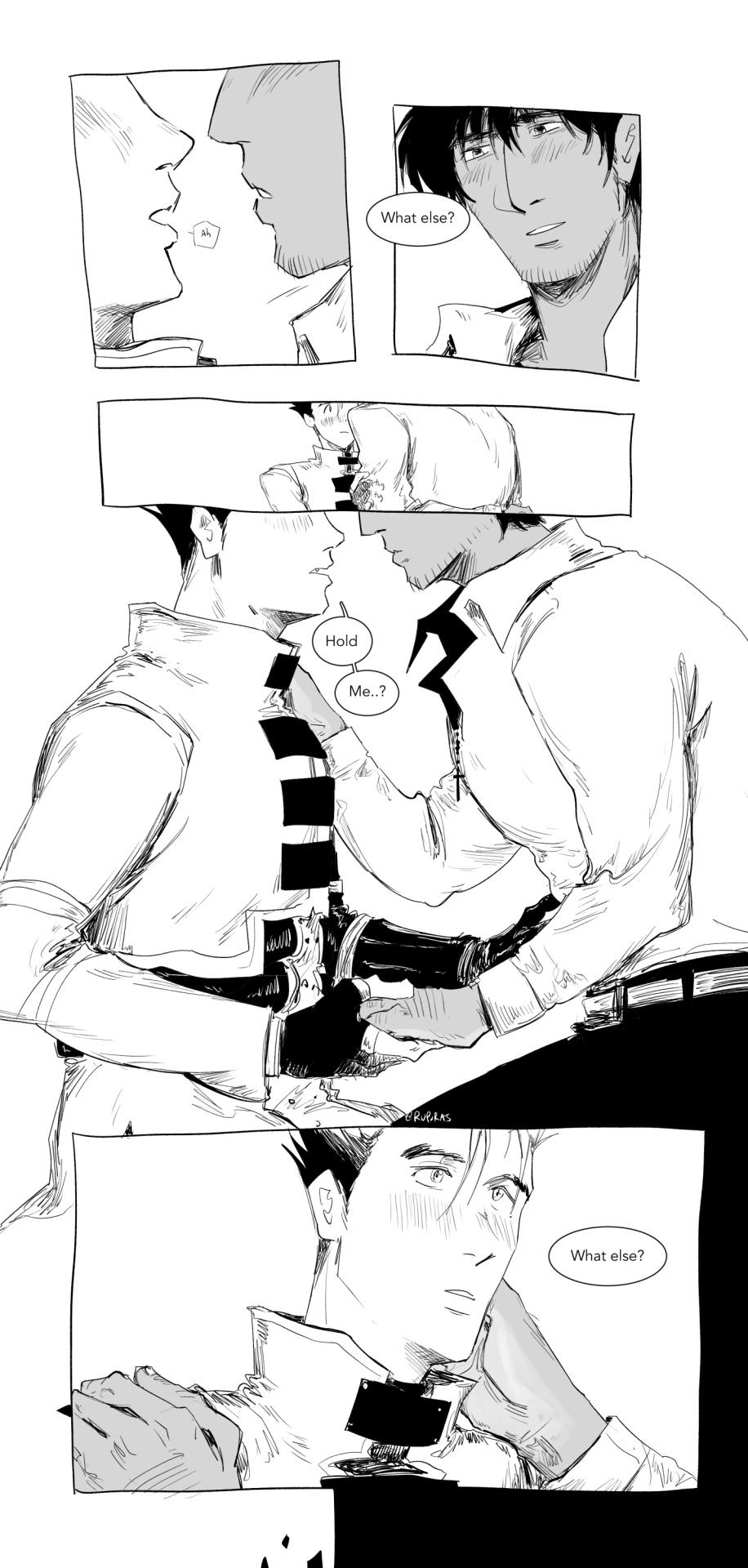
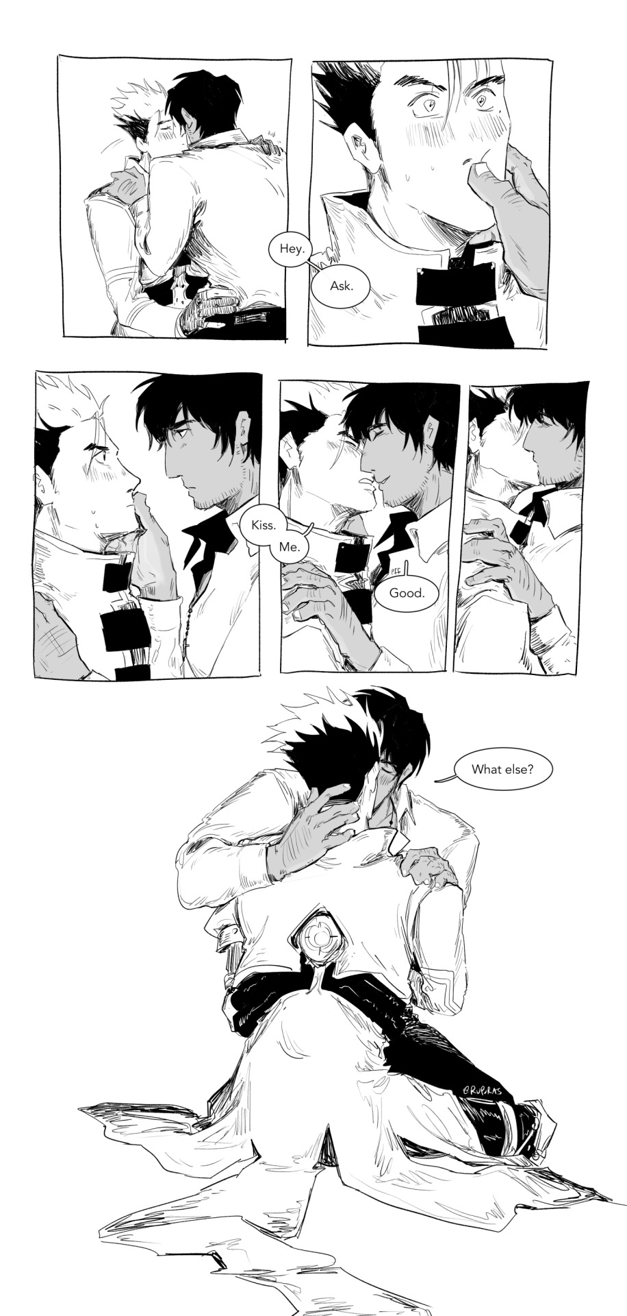
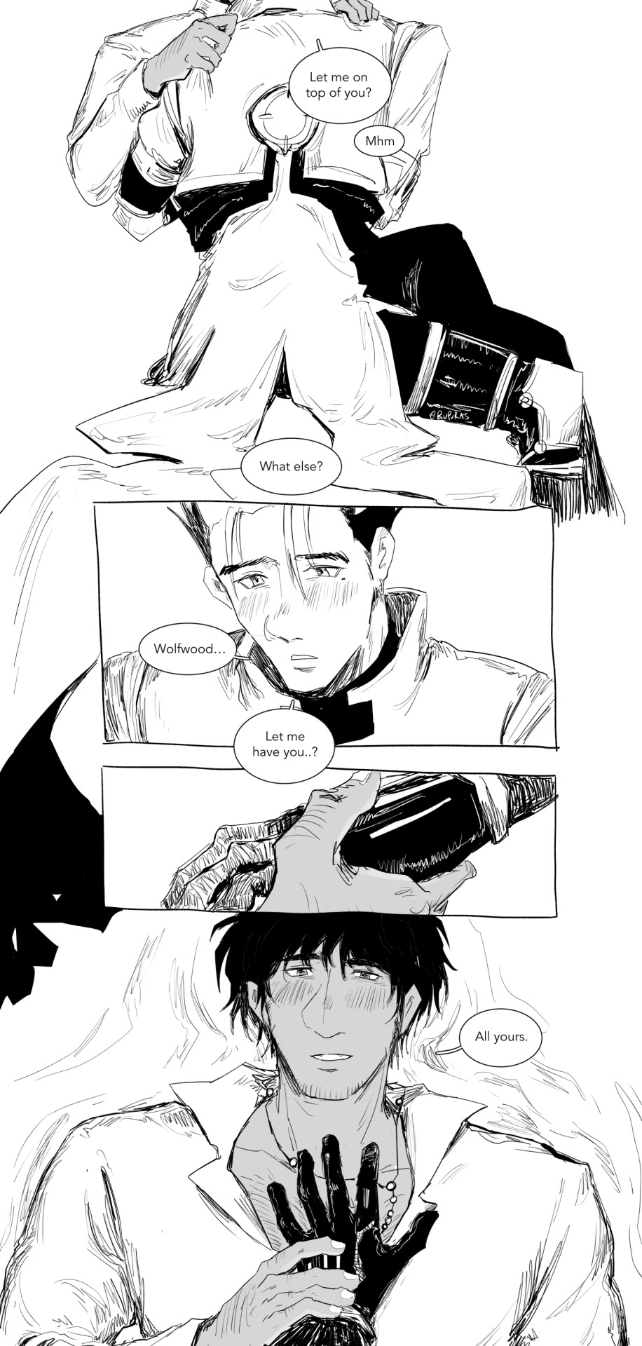
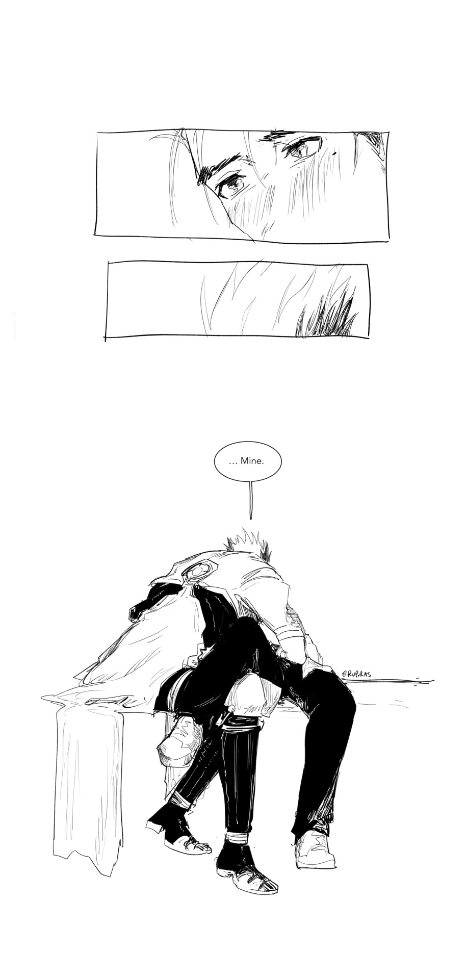
asking and receiving (bonus below readmore)
[ID: A black and white, digital Trigun comic of Vash and Wolfwood. In the first panel is a close up of Wolfwood's mouth as he says, "Vash". Accompanying it is a close up shot of Vash's eye, widen and cheeks flushed. Wolfwood presses a knee against the open space between Vash's legs and says, "Tell me everything you want from me." Wolfwood's face is equally as flushed. He continues to say, "I'll give it to you. Everything." As he talks, a wide shot shows the both of them in white space. Vash is sitting, leaning a little back with both hands pressed against the surface he's sitting on. Wolfwood is in his white dress shirt, stripped of the blazer. He's still leaning in with one knee in between Vash's spread legs, his right hand touching Vash's lips and his left hand behind his back.
The shot closes in on Vash's mouth and Wolfwood's hand against it, pressing down on the lower lip as he says, "You have to ask though. Go on." His hand moves down to Vash's chin, gently holding it. With a shy and uncertain expression, Vash hesitantly asks, "Um... K... Kiss... Please?" Wolfwood, without wasting a second, leans in and kisses him and indulges by pressing deeper, eliciting a small noise of surprise from Vash.
Wolfwood moves away from Vash first and with a smile, asks, "What else?" Vash tugs on Wolfwood's left sleeve, wordlessly budging Wolfwood to give him his hand that was still behind his back. In the next panel, Vash utters, "Hold me..?" He's holding Wolfwood's left hand with his own while his right hand is reaching for his waist. Wolfwood complies, moving his left hand to Vash's shoulder and his right hand continues to touch Vash's cheek. Wolfwood asks again, "What else?"
More comfortable now, Vash leans in to kiss Wolfwood. Wolfwood catches him immediately, pressing his thumb against Vash's lips to stop him before demanding, "Hey. Ask." Vash looks back in surprise and Wolfwood meets his eye with a quiet, insistent look. They're quiet for a moment before Vash leans in again and curtly requests, "Kiss. Me." Wolfwood says "Good", smiling as he lifts his hand away, and meets Vash's lips. In the next shot, Wolfwood had adjusted his position, sitting on Vash's thigh. The hand that was once on Vash's cheek has moved its way to Vash's nape, pushing away the collar of his jacket with his pinky. His other hand continues to grip on Vash's shoulder. Still kissing, Wolfwood asks again, "What else?"
In the next shot, Vash is starting to turn, moving Wolfwood with him. Vash asks, "Let me on top of you?" Wolfwood says, "Mhm" before asking again, "What else?" The next panel shows a close look of Vash's face. He's looking down, flushed and shy just as he had been at the beginning, but now, more decisive. Vash asks, "Wolfwood... Let me have you..?" A panel of Wolfwood taking Vash's hand into his, pulling it towards his chest. The next panel shows Wolfwood lying down where Vash had laid him. Vash's hand is on Wolfwood's chest, covering the cross of his rosary while Wolfwood's hand lingers against his, loosely pressing Vash's hand in place. He looks up at Vash with a shy smile of his own, flushed cheeks. He says, "All yours."
A panel shows a close up of Vash's tender gaze before he leans down to be closer to Wolfwood. The final shot is a front view of their positions, Vash's face turned away from the viewer; Vash is leaning over Wolfwood who's lying down with his right leg draped over Vash's legs. Wolfwood's left hand holds onto Vash's left arm. With finality, Vash says, "...Mine." End ID]
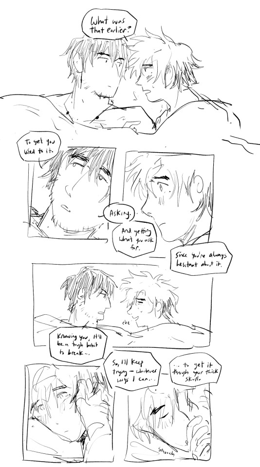
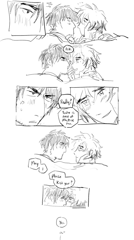
[ID: A follow up bonus comic in a looser, sketchier style. They're laying comfortably in bed when Vash asks, "What was that earlier?" referecing to the start of the previous comic. Wolfwood glances away and says, "To get you used to it. Asking. And getting what you ask for. Since you're alwasy hesitant about it." Vash's eyes widen, tight lipped. Wolfwood continues, "Knowing you, it'll be a tough habit to break..." When he says this, Vash can't help but laugh, unable to deny it. Wolfwood slowly brings a hand to Vash's cheek and continues to say, "So I'll keep trying -- whatever ways I can... to get it through your thick skull." Vash takes Wolfwood's hand with his, kissing the the palm gently. Wolfwood's eyes soften and holding onto Vash's cheek, he leans in to try for a kiss. Vash says, "Hey..." before stopping Wolfwood's lips with the back of his hand, a smug look on his face, "Ask." Wolfwood's embarrassed and with little irritation, asks, "Really?" Vash smiles, saying, "You're in need of practice too." They pause for a moment, Wolfwood looking contemplatively, before he's leaning in again, asking, "May I please kiss you?" Vash looks him in the eyes and says, "Yes." The comic ends with a "chu", indicating an off-panel kiss. End ID]
#vashwood#vash the stampede#nicholas d wolfwood#trigun#trigun maximum#it took me so long to post this even after getting clarification about the maturity warning and stuff#bc i am so shy about it. SDGMKDSGMKSD I LIKE THIS COMIC BUT IM ALSO SO LIKE... AUGHHHH....#when i posted this on twitter though it was like... a few days after ep 11? ive always had the thought circling about vash deserving of#asking for things... and getting what he wants bc he never gets both. doesn't get the opportunity to ask and hardly does he get what he want#maybe the results can go in his favor but at some point along the way he'll still lose something bc nothing can ever go perfectly for him...#and he's usually the one begging and pleading with people to not. do something. it's not even asking at that point it's just straight up#please believe me. please trust me. please don't shoot that person. please don't kill anyone. please don't do it.#and wolfwood.... it was not always this lovey dovey ok. he wouldv noticed this habit miles away and they got into a fight about it the first#time they talked about it bc wolfwood is being hypocritical too. as he always is!!!! but i think as they get more intimate#wolfwood finds ways to make vash understand. smth smth insatiable want and love and desire for wolfwood that makes it much easier to ask.#wolfwood can also just be so compliant. sometimes. which is also an issue in of itself that id love to explore at some point#but he also just enjoys giving into vash fully and completely.#bc he loves him a lot. but anyway#i hope the id is comprehendible.... please lmk if there's something wrong with how im doing it asfdgkdsmgs#ruporas art
3K notes
·
View notes
Text
not a day goes by without me thinking about this wob
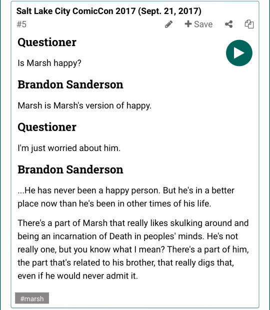
#i'm holding out hope that he WILL be truly happy one day#but at least he's doing better. and having a little bit of fun letting his dramatic side out#(side note i think he'd find wayne's impressions of him quite amusing)#but like. let him have some FRIENDS too please#it kind of sounded at the end of TLM that him and marasi saw each other somewhat regularly? maybe? i hope so anyway#only good things for marsh forever and ever thank you very much#cosmere#mistborn#marsh
1K notes
·
View notes
Text

the man on the moon is real and he is DEEPLY sad
#thats right. still clayposting#i watched the quality of the image die in real time as i uploaded it i have to hope that its not too awful once i post#they make me so SAD#clay i know you existed for like one minute but i miss you so bad#apollo is just like me (wishes clay terran wasnt dead)#apollo justice#clay terran#claypollo#dual destinies#ace attorney#he misses his best friend 😭😭😭😭😭😭😭😭😭😭😭😭😭😭😭😭😭😭😭😭😭😭😭😭😭😭😭😭😭😭😭😭😭😭😭😭😭😭😭😭😭😭😭😭😭😭#maybe ill draw them happy one day maybe ill draw klav too
237 notes
·
View notes
Text
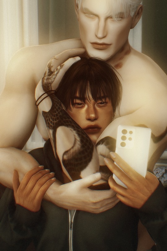
birthday boy 🎂
#river dipping#theodore doe#matthias evanoff#a burning house to live in#echthroi#ts4#ts4 edit#simblr#ts4 screenshots#theo i hope you're having the most insane birthday sex rn i hope it's ******** and ***** and ***'** **** *** **** ***** :)<3#sorry i put off making your birthday edit for so long that i had to pivot and post this edit instead of the one i wanted </3#...very funny how similar this is to that LAST render i posted... well so WHAT!! if i think matthias looming is sexy!!#this is based on a photo that everyone was drawing their ocs as so really it's not MY fault he's back there clinging and being a freak#actually if y'all want this pose lmk... i'll share it but fyi it's only meant to be seen from the waist up and idk how it'd look#on a sim that doesn't have the same muscle mass and like. bulk. that matthias has......................................#just got rock hard after typing that... anyway.#HAPPY BIRTHDAY THEO <333333333 LOVE YOU SO MUCH I PROMISE I'M GONNA KEEP WORKING ON THE //ACTUAL// BIRTHDAY EDIT!! like .#posted abt this on the sideblog but the real edit i have planned for him is making me lose my fucking gourd#and it'll probably take me :))) a few more days to figure out#expect a depressing theo-as-a-teenager edit eventually tho. with writing!! accompanying it!!#matthias's face has changed again btw 😭 i redid it almost immediately after i posted that first render attempt so he looks DIFFERENT!!#i posted screenshots of him in cas just the other day on my other acc and he looks so good in them i might post them here too#oh and!! this edit looks massively different than my last because this screenshot was taken with a new preset i made specifically for#the real birthday edit i'm working on... it's a hallway scene so i figured out depth and density to get this really cool fog effect#i'm really excited for it!! in my head the way it looks makes me crazy but idk if i can pull it off properly. but like i WAS SAYING!!#new preset is sooo sexy after i post this i'll reblog with the before and after to show you how good it looks even w/o any editing#like. the colors....... literally have always wanted a preset like this i'm so glad i spent yesterday fucking around with it#ALSO!! i've been doing those oc/ship dynamic templates for fun recently so i might post a few of them here soon#realize i'm rambling so much in these tags bc i haven't been here in forever kfjnkfjhn ummmmm. let me stop.#EVERYONE WISH THEO HAPPY BIRTHDAY RIGHT NOW 🫵‼
227 notes
·
View notes
Text
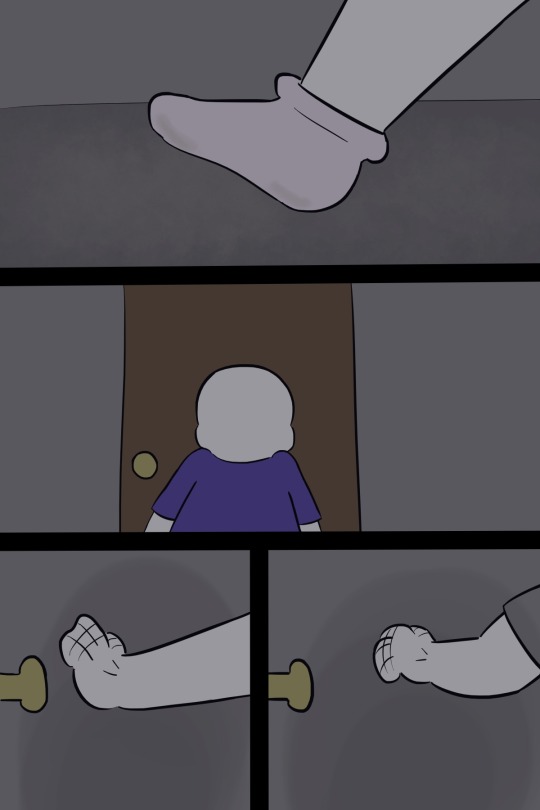
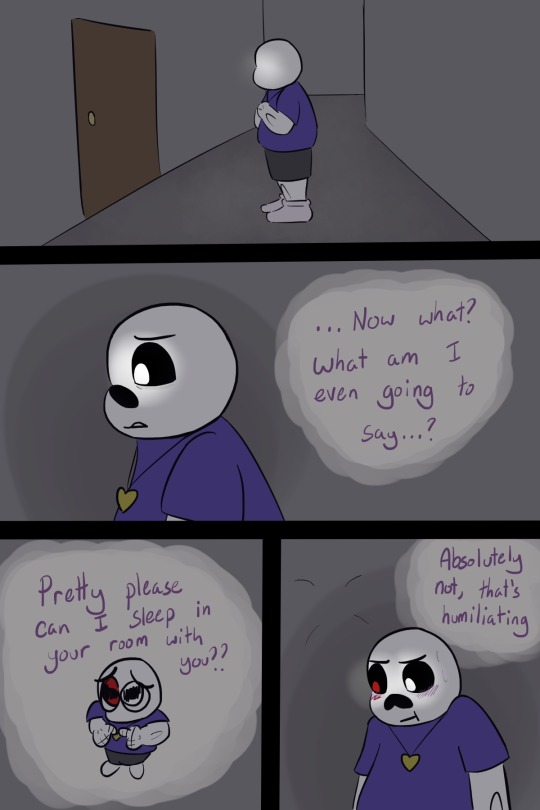
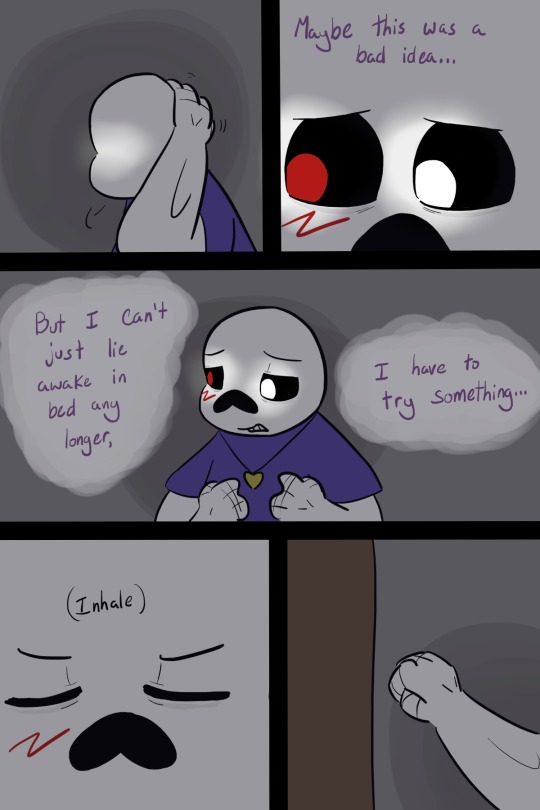
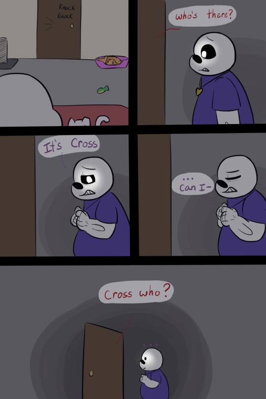
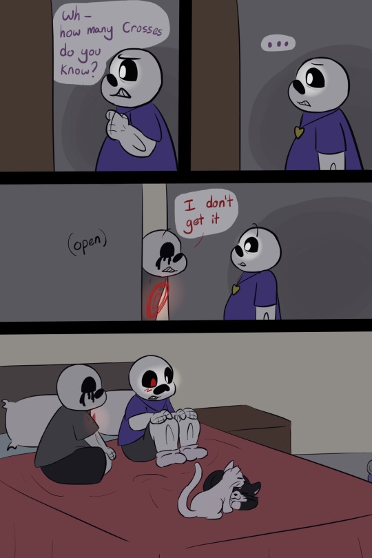
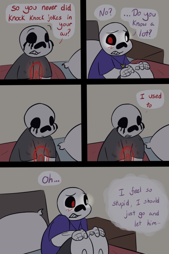
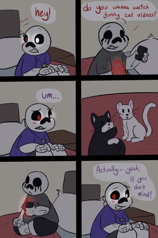
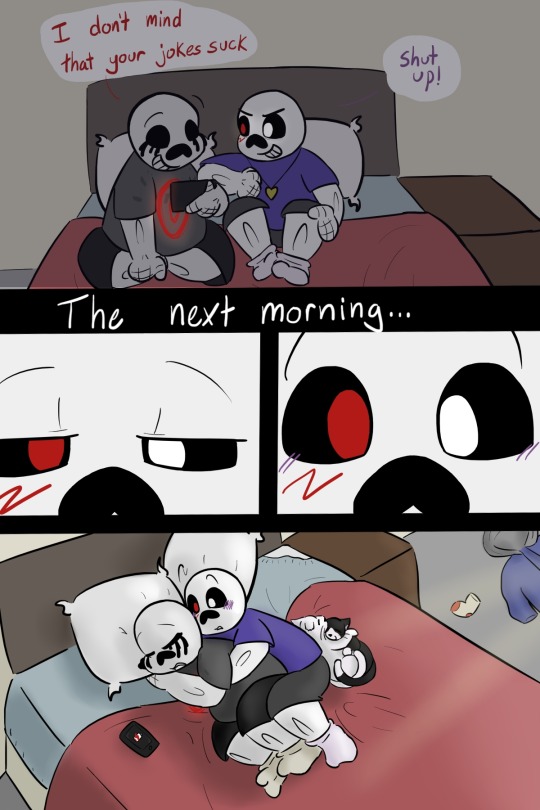
Cross has trouble getting to sleep alone in his room and goes looking for a distraction, but ends up finding a solution for both of them
#UTDR#UTMV#Cross Sans#Killer Sans#Kross ship#(Kinda. It's up to interpretation)#Long post#I'm so sorry I didn't mean for it to be THIS much#I started this like a week ago -A-#Lies down and lets out a long howl it's finisheeeeeed#I could have just drawn them spooning and written the rest but noooo I love to do things the hard way#Anyway I think they should be bed buddies#The company helps Cross relax enough to sleep and the touch helps knock Killer out#Cross has to be big spoon because otherwise Killer's soul gets squished and it's too uncomfortable to sleep#Also I realised Cross and Nightmare are the only two in the castle who didn't have knock knock jokes in their backstory#I like to imagine Nightmare has had similar confusing interactions with at least one of them#Cross probably spends the rest of the day panicked that he overstepped a boundary or the others will make fun of him#Not realising that Dust and Horror have fallen asleep together many times#Or that Killer hasn't slept properly in weeks and he's in heaven#I'm NOT drawing a follow up so just imagine Killer coming to Cross's room the next night and finding every excuse to stay#Because he wants it to happen again but he has no idea how to ask (and also Cross seems kinda awkward about it)#Absolutely terrified that I spent my whole week off working on this and it might be not that great so I hope at least one person likes this
310 notes
·
View notes
Text

Finished!
A lazy summer day by a stream~
I finally put my illustration degree into good use and made a proper traditional illustration (although still fanart 😅). Sometimes I really wanted to just "undo" some strokes or move some things around haha but man was this relaxing and satisfying to work on, also I am just so proud of the outcome. I haven't done a proper traditional illustration on this scale since my thesis so it's been a few years.

I took these photos with a phone outside to try and really capture the colors and details.


#i'm so happy with this 😭#now onto my next project which i think will be also fun#my art#trolls#dreamworks trolls#ex bandmates#trolls floyd#trolls oc#flea#les#liv#hed#scaab#scaab's first appearance!#though i think his design still needs a bit of work#he's too cute here lol#he's supposed to be an european stag beetle#but here he just has sexy red high-heeled boots attached to his face lmao#trying to scan a vibrant A3 illustration with my old as balls A4 scanner was disappointing to say the least#so i hope you don't mind phone photos. tho my work phone makes killer photos so you probably don't#i want to get it properly scanned one day too. to make a few giclee prints#would anyone be interested in buying one?
235 notes
·
View notes
Text
why Aurora's art is genius
It's break for me, and I've been meaning to sit down and read the Aurora webcomic (https://comicaurora.com/, @comicaurora on Tumblr) for quite a bit. So I did that over the last few days.
And… y'know. I can't actually say "I should've read this earlier," because otherwise I would've been up at 2:30-3am when I had responsibilities in the morning and I couldn't have properly enjoyed it, but. Holy shit guys THIS COMIC.
I intended to just do a generalized "hello this is all the things I love about this story," and I wrote a paragraph or two about art style. …and then another. And another. And I realized I needed to actually reference things so I would stop being too vague. I was reading the comic on my tablet or phone, because I wanted to stay curled up in my chair, but I type at a big monitor and so I saw more details… aaaaaand it turned into its own giant-ass post.
SO. Enjoy a few thousand words of me nerding out about this insanely cool art style and how fucking gorgeous this comic is? (There are screenshots, I promise it isn't just a wall of text.) In my defense, I just spent two semesters in graphic design classes focusing on the Adobe Suite, so… I get to be a nerd about pretty things…???
All positive feedback btw! No downers here. <3
---
I cannot emphasize enough how much I love the beautiful, simple stylistic method of drawing characters and figures. It is absolutely stunning and effortless and utterly graceful—it is so hard to capture the sheer beauty and fluidity of the human form in such a fashion. Even a simple outline of a character feels dynamic! It's gorgeous!
Though I do have a love-hate relationship with this, because my artistic side looks at that lovely simplicity, goes "I CAN DO THAT!" and then I sit down and go to the paper and realize that no, in fact, I cannot do that yet, because that simplicity is born of a hell of a lot of practice and understanding of bodies and actually is really hard to do. It's a very developed style that only looks simple because the artist knows what they're doing. The human body is hard to pull off, and this comic does so beautifully and makes it look effortless.
Also: line weight line weight line weight. It's especially important in simplified shapes and figures like this, and hoo boy is it used excellently. It's especially apparent the newer the pages get—I love watching that improvement over time—but with simpler figures and lines, you get nice light lines to emphasize both smaller details, like in the draping of clothing and the curls of hair—which, hello, yes—and thicker lines to emphasize bigger and more important details and silhouettes. It's the sort of thing that's essential to most illustrations, but I wanted to make a note of it because it's so vital to this art style.
THE USE OF LAYER BLENDING MODES OH MY GODS. (...uhhh, apologies to the people who don't know what that means, it's a digital art program thing? This article explains it for beginners.)
Bear with me, I just finished my second Photoshop course, I spent months and months working on projects with this shit so I see the genius use of Screen and/or its siblings (of which there are many—if I say "Screen" here, assume I mean the entire umbrella of Screen blending modes and possibly Overlay) and go nuts, but seriously it's so clever and also fucking gorgeous:
Firstly: the use of screened-on sound effect words over an action? A "CRACK" written over a branch and then put on Screen in glowy green so that it's subtle enough that it doesn't disrupt the visual flow, but still sticks out enough to make itself heard? Little "scritches" that are transparent where they're laid on without outlines to emphasize the sound without disrupting the underlying image? FUCK YES. I haven't seen this done literally anywhere else—granted, I haven't read a massive amount of comics, but I've read enough—and it is so clever and I adore it. Examples:


Secondly: The beautiful lighting effects. The curling leaves, all the magic, the various glowing eyes, the fog, the way it's all so vividly colored but doesn't burn your eyeballs out—a balance that's way harder to achieve than you'd think—and the soft glows around them, eeeee it's so pretty so pretty SO PRETTY. Not sure if some of these are Outer/Inner Glow/Shadow layer effects or if it's entirely hand-drawn, but major kudos either way; I can see the beautiful use of blending modes and I SALUTE YOUR GENIUS.
I keep looking at some of this stuff and go "is that a layer effect or is it done by hand?" Because you can make some similar things with the Satin layer effect in Photoshop (I don't know if other programs have this? I'm gonna have to find out since I won't have access to PS for much longer ;-;) that resembles some of the swirly inner bits on some of the lit effects, but I'm not sure if it is that or not. Or you could mask over textures? There's... many ways to do it.
If done by hand: oh my gods the patience, how. If done with layer effects: really clever work that knows how to stop said effects from looking wonky, because ugh those things get temperamental. If done with a layer of texture that's been masked over: very, very good masking work. No matter the method, pretty shimmers and swirly bits inside the bigger pretty swirls!
Next: The way color contrast is used! I will never be over the glowy green-on-black Primordial Life vibes when Alinua gets dropped into that… unconscious space?? with Life, for example, and the sharp contrast of vines and crack and branches and leaves against pitch black is just visually stunning. The way the roots sink into the ground and the three-dimensional sensation of it is particularly badass here:

Friggin. How does this imply depth like that. HOW. IT'S SO FREAKING COOL.
A huge point here is also color language and use! Everybody has their own particular shade, generally matching their eyes, magic, and personality, and I adore how this is used to make it clear who's talking or who's doing an action. That was especially apparent to me with Dainix and Falst in the caves—their colors are both fairly warm, but quite distinct, and I love how this clarifies who's doing what in panels with a lot of action from both of them. There is a particular bit that stuck out to me, so I dug up the panels (see this page and the following one https://comicaurora.com/aurora/1-20-30/):

(Gods it looks even prettier now that I put it against a plain background. Also, appreciation to Falst for managing a bridal-carry midair, damn.)
The way that their colors MERGE here! And the immense attention to detail in doing so—Dainix is higher up than Falst is in the first panel, so Dainix's orange fades into Falst's orange at the base. The next panel has gold up top and orange on bottom; we can't really tell in that panel where each of them are, but that's carried over to the next panel—
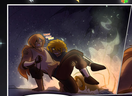
—where we now see that Falst's position is raised above Dainix's due to the way he's carrying him. (Points for continuity!) And, of course, we see the little "huffs" flowing from orange to yellow over their heads (where Dainix's head is higher than Falst's) to merge the sound of their breathing, which is absurdly clever because it emphasizes to the viewer how we hear two sets of huffing overlaying each other, not one. Absolutely brilliant.
(A few other notes of appreciation to that panel: beautiful glows around them, the sparks, the jagged silhouette of the spider legs, the lovely colors that have no right to make the area around a spider corpse that pretty, the excellent texturing on the cave walls plus perspective, the way Falst's movements imply Dainix's hefty weight, the natural posing of the characters, their on-point expressions that convey exactly how fuckin terrifying everything is right now, the slight glows to their eyes, and also they're just handsome boys <3)
Next up: Rain!!!! So well done! It's subtle enough that it never ever disrupts the impact of the focal point, but evident enough you can tell! And more importantly: THE MIST OFF THE CHARACTERS. Rain does this irl, it has that little vapor that comes off you and makes that little misty effect that plays with lighting, it's so cool-looking and here it's used to such pretty effect!
One of the panel captions says something about it blurring out all the injuries on the characters but like THAT AIN'T TOO BIG OF A PROBLEM when it gets across the environmental vibes, and also that'd be how it would look in real life too so like… outside viewer's angle is the same as the characters', mostly? my point is: that's the environment!!! that's the vibes, that's the feel! It gets it across and it does so in the most pretty way possible!
And another thing re: rain, the use of it to establish perspective, particularly in panels like this—

—where we can tell we're looking down at Tynan due to the perspective on the rain and where it's pointing. Excellent. (Also, kudos for looking down and emphasizing how Tynan's losing his advantage—lovely use of visual storytelling.)
Additionally, the misting here:
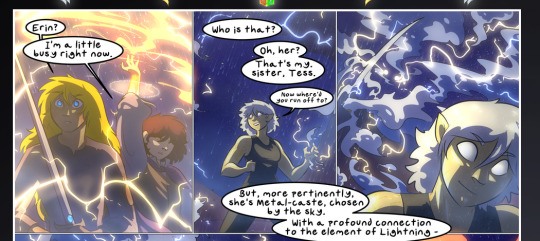
We see it most heavily in the leftmost panel, where it's quite foggy as you would expect in a rainstorm, especially in an environment with a lot of heat, but it's also lightly powdered on in the following two panels and tends to follow light sources, which makes complete sense given how light bounces off particles in the air.
A major point of strength in these too is a thorough understanding of lighting, like rim lighting, the various hues and shades, and an intricate understanding of how light bounces off surfaces even when they're in shadow (we'll see a faint glow in spots where characters are half in shadow, but that's how it would work in real life, because of how light bounces around).
Bringing some of these points together: the fluidity of the lines in magic, and the way simple glowing lines are used to emphasize motion and the magic itself, is deeply clever. I'm basically pulling at random from panels and there's definitely even better examples, but here's one (see this page https://comicaurora.com/aurora/1-16-33/):

First panel, listed in numbers because these build on each other:
The tension of the lines in Tess's magic here. This works on a couple levels: first, the way she's holding her fists, as if she's pulling a rope taut.
The way there's one primary line, emphasizing the rope feeling, accompanied by smaller ones.
The additional lines starbursting around her hands, to indicate the energy crackling in her hands and how she's doing a good bit more than just holding it. (That combined with the fists suggests some tension to the magic, too.) Also the variations in brightness, a feature you'll find in actual lightning. :D Additional kudos for how the lightning sparks and breaks off the metal of the sword.
A handful of miscellaneous notes on the second panel:
The reflection of the flames in Erin's typically dark blue eyes (which bears a remarkable resemblance to Dainix, incidentally—almost a thematic sort of parallel given Erin's using the same magic Dainix specializes in?)
The flowing of fabric in the wind and associated variation in the lineart
The way Erin's tattoos interact with the fire he's pulling to his hand
The way the rain overlays some of the fainter areas of fire (attention! to! detail! hell yeah!)
I could go on. I won't because this is a lot of writing already.
Third panel gets paragraphs, not bullets:
Erin's giant-ass "FWOOM" of fire there, and the way the outline of the word is puffy-edged and gradated to feel almost three-dimensional, plus once again using Screen or a variation on it so that the stars show up in the background. All this against that stunning plume of fire, which ripples and sparks so gorgeously, and the ending "om" of the onomatopoeia is emphasized incredibly brightly against that, adding to the punch of it and making the plume feel even brighter.
Also, once again, rain helping establish perspective, especially in how it's very angular in the left side of the panel and then slowly becomes more like a point to the right to indicate it's falling directly down on the viewer. Add in the bright, beautiful glow effects, fainter but no less important black lines beneath them to emphasize the sky and smoke and the like, and the stunningly beautiful lighting and gradated glows surrounding Erin plus the lightning jagging up at him from below, and you get one hell of an impactful panel right there. (And there is definitely more in there I could break down, this is just a lot already.)
And in general: The colors in this? Incredible. The blues and purples and oranges and golds compliment so well, and it's all so rich.
Like, seriously, just throughout the whole comic, the use of gradients, blending modes, color balance and hues, all the things, all the things, it makes for the most beautiful effects and glows and such a rich environment. There's a very distinct style to this comic in its simplified backgrounds (which I recognize are done partly because it's way easier and also backgrounds are so time-consuming dear gods but lemme say this) and vivid, smoothly drawn characters; the simplicity lets them come to the front and gives room for those beautiful, richly saturated focal points, letting the stylized designs of the magic and characters shine. The use of distinct silhouettes is insanely good. Honestly, complex backgrounds might run the risk of making everything too visually busy in this case. It's just, augh, so GORGEOUS.
Another bit, take a look at this page (https://comicaurora.com/aurora/1-15-28/):
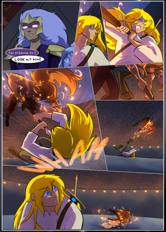
It's not quite as evident here as it is in the next page, but this one does some other fun things so I'm grabbing it. Points:
Once again, using different colors to represent different character actions. The "WHAM" of Kendal hitting the ground is caused by Dainix's force, so it's orange (and kudos for doubling the word over to add a shake effect). But we see blue layered underneath, which could be an environmental choice, but might also be because it's Kendal, whose color is blue.
And speaking off, take a look at the right-most panel on top, where Kendal grabs the spear: his motion is, again, illustrated in bright blue, versus the atmospheric screened-on orange lines that point toward him around the whole panel (I'm sure these have a name, I think they might be more of a manga thing though and the only experience I have in manga is reading a bit of Fullmetal Alchemist). Those lines emphasize the weight of the spear being shoved at him, and their color tells us Dainix is responsible for it.
One of my all-time favorite effects in this comic is the way cracks manifest across Dainix's body to represent when he starts to lose control; it is utterly gorgeous and wonderfully thematic. These are more evident in the page before and after this one, but you get a decent idea here. I love the way they glow softly, the way the fire juuuust flickers through at the start and then becomes more evident over time, and the cracks feel so realistic, like his skin is made of pottery. Additional points for how fire begins to creep into his hair.
A small detail that's generally consistent across the comic, but which I want to make note of here because you can see it pretty well: Kendal's eyes glow about the same as the jewel in his sword, mirroring his connection to said sword and calling back to how the jewel became Vash's eye temporarily and thus was once Kendal's eye. You can always see this connection (though there might be some spots where this also changes in a symbolic manner; I went through it quickly on the first time around, so I'll pay more attention when I inevitably reread this), where Kendal's always got that little shine of blue in his eyes the same as the jewel. It's a beautiful visual parallel that encourages the reader to subconsciously link them together, especially since the lines used to illustrate character movements typically mirror their eye color. It's an extension of Kendal.
Did I mention how ABSOLUTELY BEAUTIFUL the colors in this are?
Also, the mythological/legend-type scenes are illustrated in familiar style often used for that type of story, a simple and heavily symbolic two-dimensional cave-painting-like look. They are absolutely beautiful on many levels, employing simple, lovely gradients, slightly rougher and thicker lineart that is nonetheless smoothly beautiful, and working with clear silhouettes (a major strength of this art style, but also a strength in the comic overall). But in particular, I wanted to call attention to a particular thing (see this page https://comicaurora.com/aurora/1-12-4/):
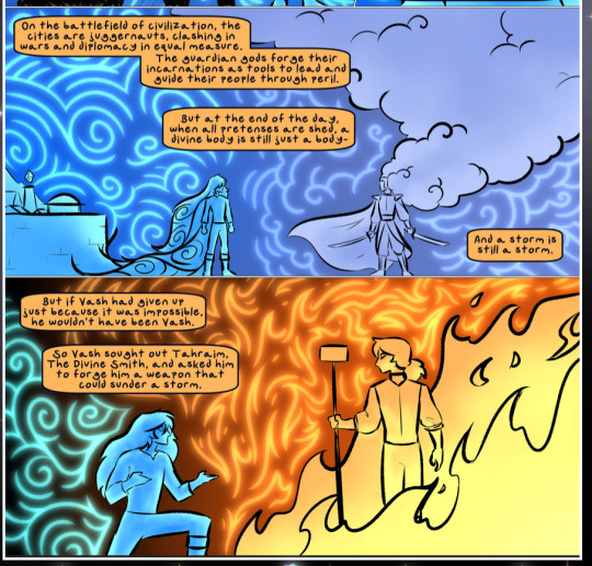
The flowing symbolic lineart surrounding each character. This is actually quite consistent across characters—see also Life's typical lines and how they curl:
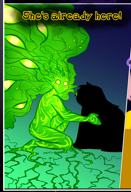
What's particularly interesting here is how these symbols are often similar, but not the same. Vash's lines are always smooth, clean curls, often playing off each other and echoing one another like ripples in a pond. You'd think they'd look too similar to Life's—but they don't. Life's curl like vines, and they remain connected; where one curve might echo another but exist entirely detached from each other in Vash's, Life's lines still remain wound together, because vines are continuous and don't float around. :P
Tahraim's are less continuous, often breaking up with significantly smaller bits and pieces floating around like—of course—sparks, and come to sharper points. These are also constants: we see the vines repeated over and over in Alinua's dreams of Life, and the echoing ripples of Vash are consistent wherever we encounter him. Kendal's dream of the ghost citizens of the city of Vash in the last few chapters is filled with these rippling, echoing patterns, to beautiful effect (https://comicaurora.com/aurora/1-20-14/):
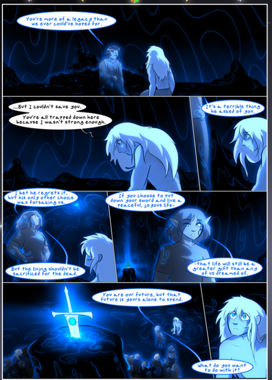
They ripple and spiral, often in long, sinuous curves, with smooth elegance. It reminds me a great deal of images of space and sine waves and the like. This establishes a definite feel to these different characters and their magic. And the thing is, that's not something that had to be done—the colors are good at emphasizing who's who. But it was done, and it adds a whole other dimension to the story. Whenever you're in a deity's domain, you know whose it is no matter the color.
Regarding that shape language, I wanted to make another note, too—Vash is sometimes described as chaotic and doing what he likes, which is interesting to me, because smooth, elegant curves and the color blue aren't generally associated with chaos. So while Vash might behave like that on the surface, I'm guessing he's got a lot more going on underneath; he's probably much more intentional in his actions than you'd think at a glance, and he is certainly quite caring with his city. The other thing is that this suits Kendal perfectly. He's a paragon character; he is kind, virtuous, and self-sacrificing, and often we see him aiming to calm others and keep them safe. Blue is such a good color for him. There is… probably more to this, but I'm not deep enough in yet to say.
And here's the thing: I'm only scratching the surface. There is so much more here I'm not covering (color palettes! outfits! character design! environment! the deities! so much more!) and a lot more I can't cover, because I don't have the experience; this is me as a hobbyist artist who happened to take a couple design classes because I wanted to. The art style to this comic is so clever and creative and beautiful, though, I just had to go off about it. <3
...brownie points for getting all the way down here? Have a cookie.
#aurora comic#aurora webcomic#comicaurora#art analysis#...I hope those are the right tags???#new fandom new tagging practices to learn ig#much thanks for something to read while I try to rest my wrists. carpal tunnel BAD. (ignore that I wrote this I've got braces ok it's fine)#anyway! I HAVE. MANY MORE THOUGHTS. ON THE STORY ITSELF. THIS LOVELY STORY#also a collection of reactions to a chunk of the comic before I hit the point where I was too busy reading to write anything down#idk how to format those tho#...yeet them into one post...???#eh I usually don't go off this much these days but this seems like a smaller tight-knit fandom so... might as well help build it?#and I have a little more time thanks to break so#oh yes also shoutout to my insanely awesome professor for teaching me all the technical stuff from this he is LOVELY#made an incredibly complex program into something comprehensible <3#synapse talks
778 notes
·
View notes
Text
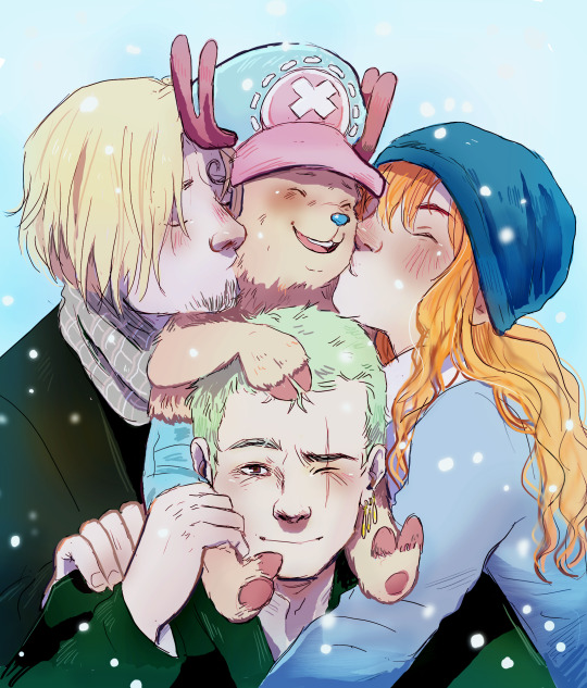
I finished another one of the prompts!! (like, last minute for 2023) I had two good days and then I kinda deflated 😅 I might come back to some of them next year even though it's not christmas anymore but still winter so psssstt but that prompt was just too cute!
#one piece#art#tony tony chopper#nami#roronoa zoro#black leg sanji#vinsmoke sanji#(how do I tag him he's not a vinsmoke aaa)#my weeb roots are showing#zombie kaiser draws for christmas#excuse me chopper is just too cute but I was too tired to draw them all#I had two days drawing!! and then I was back to a fever again#oh boy#but ending 2023 with SOME art feels good so off we go!#in the hopes that 2024 gets better creatively
616 notes
·
View notes
Text


I SWEAR CELEBI'S THINGY IS COMING SOON BUT I REALLY WANTED TO POST THIS ALRIGHT
yeaah... future trio got me too...
and Darkrai is there too, because of course he is.


hey look i drew a cute Drifloon :D
...ignore the rest
whatever started at Darkrai doodles ended in brainrot of future trio + darkrai and I'm blaming @scribz-ag24 for this
#Can you believe between the first pic and the 4th pic is only a week inbetween. I sure can't but like why did I mirror the pose...#ON ACCIDENT??? Everytime I look at the two Grovyles I'm like... how... how did they end up so differently???#also probably blaming @cozybells as well for this but I really fear tagging people so I'm just letting y'all know in the tags because#I do wanna let everyone know who inspired me when someone did <333 better get running [you know who you are!!!!] DusnoirXDarkrai is next...#also: upon seeing scribz-ag24's art my brain said: You need to color too! ah yeah that went well with the doodle batch#I really hope you're able to read everything with how messy I can write sometimes. If not please let me know and I'll add sth in this post!#Also the doodle batch was the first thing I drew so well... never drew dusknoir before and grovyle once i think...#please go easy on me I have yet to explore the relationship between literally everyone😭 and I have no idea what I‘m doing and I'm a little#lost I normally only draw King Boo or Darkrai but I'm sure scribz-ag24 sprinkling in bits of Darkrai got me in love with the future trio to#grovyle#future trio#celebi#darkrai#dusknoir#pmd hero#pokemon#drifloon#totodile#my art#my stuff#tagas friend spoiler#pmd#pokemon mystery dungeon#IS THERE A SHIP NAME FOR FUTURE TRIO... there must be. ...oh... is it just...#futuretrioshipping#i feel sooo stupid rn.#also everytime i drew darkrai i had evil spiteful bastard in mind (except for the one with an arrow pointing out he's redeemed) but i think#i literally mixed every possible version of him in my head so got absolutely no clue what i'm doing :D#anyways i hope you enjoyed this and thanks for reading through my ramblings! Have such a wonderful rest of the day yippiee <333#pmd2
120 notes
·
View notes