#i hate working with gradient bgs
Explore tagged Tumblr posts
Text
Texting it out down here cause in video would go by to fast. Also the video for the sketch layer didn't save so it picks up at me starting on Cross's face. Not too much missed, I only rough out some shapes and copy/paste them where I want them from frame to frame.
It takes me about 2 hours or so to make one of these. I'm using a mouse rather than a tablet so you'll notice my style is more like carving with lines rather than drawing.
I fill my background and put down a very rough sketch. I keep it rough mostly do to impatience. The line work does turn out better if I do a more detailed sketch but that doesn't matter. None of this matters.
Things I always do that I know to correct in my line work as I go: "That head too big! Always too big! Eyes too! Shrink erything."
I do the line art in a free program called ProMotion. It's for animation but I don't care, I'm looking for clean sharp lines and tools that let me copy/paste and instantly make brushes of pieces that I highlight. Its a pixel based program and I would normally use it to make sprites for my RPG maker games.
IMPORTANT STEP: ZOOM IN AND OUT OVER AND OVER AND OVER TILL YOU DONT CARE IF IT LOOKS RIGHT ANYMORE.
Then we take that line art and shove it into Photopea for coloring. This is another free program that's a clone of Adobe because I like photoshop tools but hate Adobe as a company with a fiery passion.
Yes I just kind of choose whatever color. I could make a reference sheet with saved colors but TRUST ME. I wont use it. I almost never use references, i forget, okay. Mostly drawing from memory.
Each color gets a layer essentially and then I "paint" them with the burn tool. (Midtones 20%) Cross's armor gets highlights on the ridges with the dodge tool. (Also Midtones 20%)
Add Blush to the skin! Thin points like face, shoulders, finger tips. Blur Blur Blur till it looks right.
Also, remember how I said I was looking for clean clean lines with no blur? That's cause I just clean up the "paint" by selecting with the magic wand and deleting it.
I make my backgrounds out of stock textures mostly. Though this usually takes a little bit more collage work this strip is simple so I just used the gritty/tech wall texture. Blur that bitch. (Gaussian Blur under the filter tab, whatever looks right but the default 7 pixels is usually good for the BG)
To add motion I copy the bits I want to seem like they're moving and use the "Motion Blur" filter, then I put that copied color over the background line art.
Add shadows! Under the coloring layers, that handy gaussian blur again.
Add Lighting! I usually have the overlayer set to "Soft Light" and then I use the gradient tool to filter everything to look cohesive. (You might notice I keep their skin tone pretty dark but it might look different when I change the lighting.)
Warp the action words... just...whatever feels appropriate at the time and set that layer to "Color Burn"
I just use the Oval select tool with the feather set between 3-5 pixels to make word bubbles. Paint it in voila. Add Text. All done!
Cross x Tahny: +A Summary+

My philosophy : Style matters more than skill and you should cheat and cut corners as much as possible. Peace and Love.
-++-++-++-++-++-++-++-++-++-++-++-++-++-++-++-++-++-++-++-
Tags:
@feral-ferrule @eobe @ghostymarni
#Time lapse#drawing time lapse#art time lapse#the bad batch#sw oc: tah'nyem ra#sw oc#tbb#crosshair x f!oc#drawing comics
34 notes
·
View notes
Text
@unknownsodabrand Well Lucky you, I also love the artistic process and I keep all my sketches!! (seriously this is the most self indulgent question I could ever answer, thank you sm I'm gonna ramble a while sorry)
First I was only planning on doing the one Geno Illustration, I mostly wanted to experiment with the long 1000x2000 format bc I thought It could make for an appealing composition and it ended up being pretty challenging to get right.
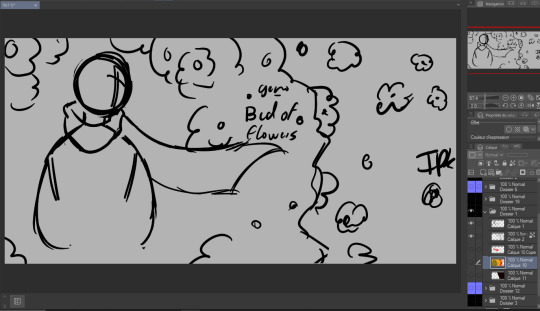
So. I started with some rough planning of where I wanted everything:
Since this was gonna be a full Illustration I planned the colors earlier than I usually would (I have a love/hate relationship with coloring):
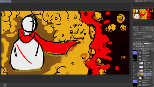

Didn't really like how it came out the first time so I just put a color mask over it, I wanted something a little warmer+brighter cause the flowers looked kinda green to me (Geno's was the one that gave me the most trouble and I liked it the least at first, by the time I finished It was my favourite XD)
Then I decided to make the three parts:
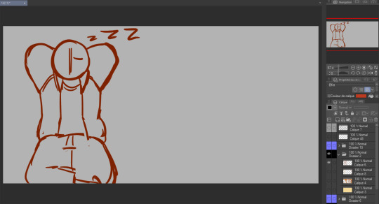
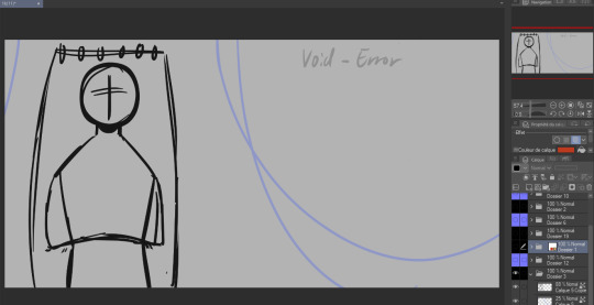
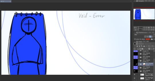
again used the same planning, rough sketch then color.
Then onto actually starting the Illustrations. I worked on these one by one but I'll show the process for all three by the steps rather than saying the same thing thrice.
as much as I wanted to keep the best for last I couldn't help myself and did the characters first.
Lineart:
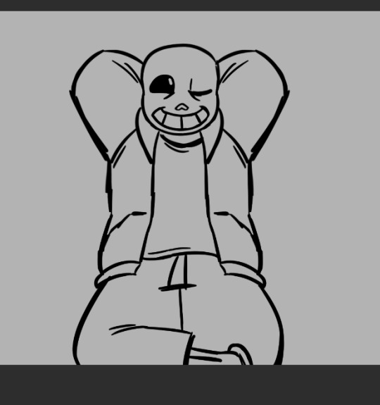
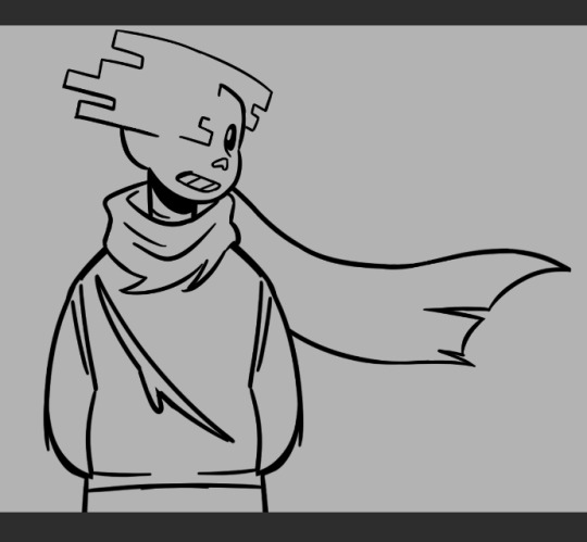
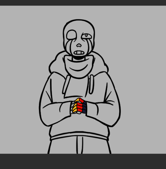
(Error was supposed to be holding a golden flower so I made his hand's lineart and color layers it's own folder so I wuldn't mess it up trying to draw the flower. I looked a bit stupid so I scrapped the idea)
Flat color:


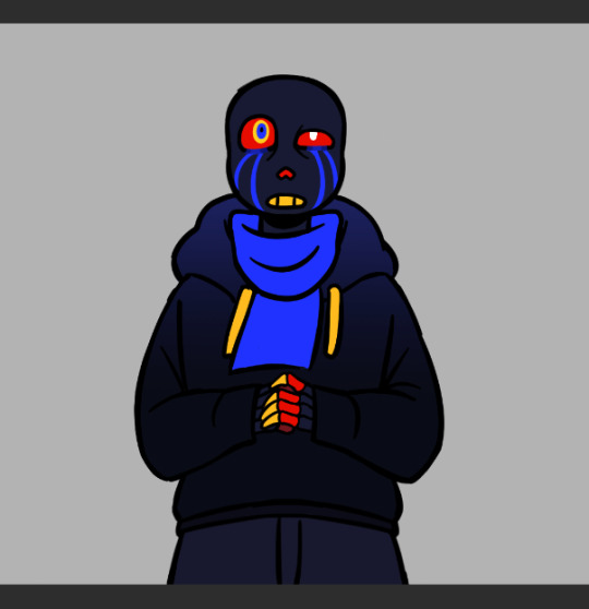
(I think I did Error's coloring after his background?)
In terms of backgrounds:
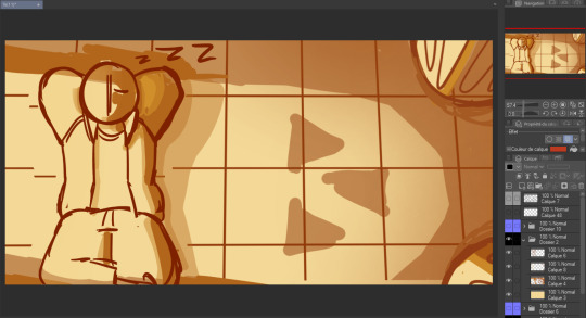
for Sans I started with the grid pattern, so I used a ruler tool and went in with color directly (the gradients are changes I did at the very end but I'm not editting out) Then I added the columns and the flowers were a last minute addition because the piece just felt a bit... naked. (also! I say columnS cause I planned on putting two, couldn't make it work the angle and space so I scrapped the bottom one)
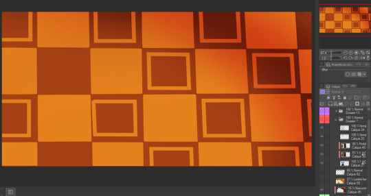
The light is a yellowish white with gaussian blur of orange, it's an 'add' layer? ("ajouter(éclat)" because my app is in french) It's about 50% opacity.
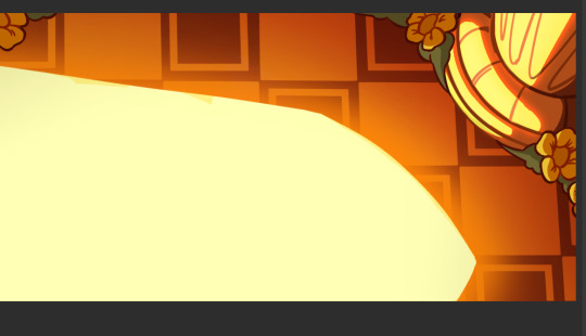
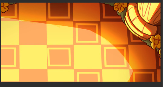
I also shaded Sans at the same time as this with a multiply layer with a dark and light color (reddish brown and like light yellow) I'm not showing it bc I do have a 30 image limit I think
Then for Error's background it's just a case of making the lineart for the hammock, haing a layer underneath for the color, a white bg with blue gradient and the strings
For geno I have underneath the black to grey of the save screen, then I have the moss and the flowers
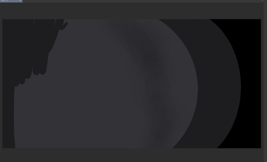
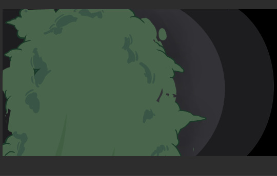

(The flowers were very fun to make I think I only copy pasted one?)
The lighting is a multiply layer over the whole image made the exact same way as Sans' coloring, I thought it was maybe a bit too dark so I dupplicated geno's lineart and colors folder to overlay over the lighting so he would pop more (seeing this now I think either would have been good. The first one might be better actually)
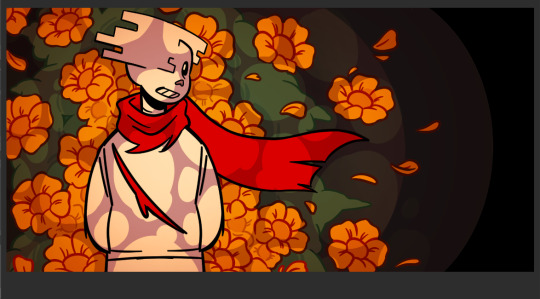

and that's it I think! If you read all of this, well first of all thank you but don't you have anything better to do?
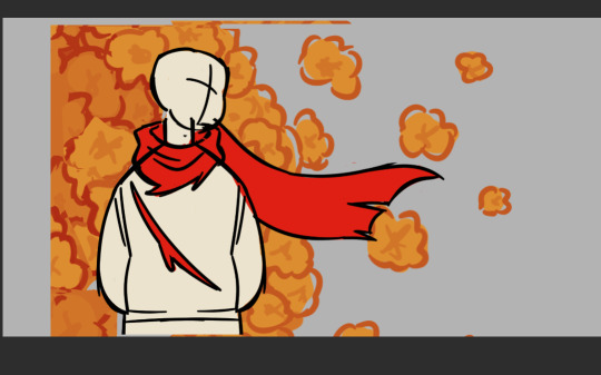
also revised Geno's sketch once but it didn't fit in any where:
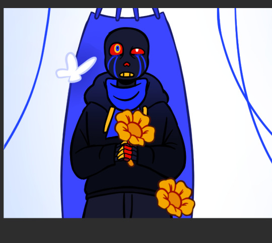
Error with my attemps of making the flowers work
#my art#undertale au#undertale#sans au#pigeon's art stuff#art process#digital art#digital illustration#I hope this is clear#If someone wants me to explain anything in more detail (which I doubt) send an ask
52 notes
·
View notes
Note
Any advice on how to draw backgrounds? Gotten to the point in my art where im semi confident in drawing poses and expressions but backgrounds?? girl help i can only somewhat draw a tree
oh hell yeah i love backgrounds, ive been working on more interiors lately (when not overburdened by sbc work lol) but im assuming you're asking about nature so that's how im going to answer it as okay so: -first of all find yourself a good TEXTURED blending/smudging brush because it will save your life. i use these rock texture brushes from This Studio Ghibli pack, it's $6 and i HIGHLY recommend the whole pack because it's the main one i use for most of my bg foliage/grass ect and i love it dearly

-find references either in irl photos or other artist's work. if using another artist's work watch their speedpaints or look at what you like about their art style and techniques and steal it. im serious. obviously don't trace it and pass it off as something of your own but look at how they do the aspects you struggle with, and try to incorporate that
for me, that struggle is forest foliage because i have a hard time filling out the spaces without everything looking like same colored blobs, so i looked at how my buddy hannah mudshadow does bgs because she's really good at filling out a scene and making it look natural, and i noticed she uses a lot of abstract shapes instead of trying to render every leaf, so rather than doing my base work for bushes/trees with a leaf brush, i use a chunky scatter brush now and it looks really good, and then i can go and add some leaf brushes on top of that for more definition in areas that might catch light ect so that will give it the thick, bushy .. bush look without looking crowded or too shaped
-nature is messy as hell and things are never going to be perfectly shaped and toned unless you're drawing perfectly managed hedges or something. got some dirt brown on your green bush? those are dead leaves now. accidental weird texture on your tree? the bark is gone there, something ate it. bushes and trees have dead branches that just hang out there in them, grass grows long and sometimes a deer or whatever doesn't eat the whole patch so there's long uneven sprigs sticking up. petals fall off flowers. trees have huge webs of branches
-don't try to detail everything. make things further away more abstract and messy to give the illusion of detail. throw a gradient over it for some slight tone variation or something so it;s not completely flat but ppl are going to look at your subject and see the rest of it with the corner of their eyes, so you don;t need to fully render every flower in the field. here's some examples of that
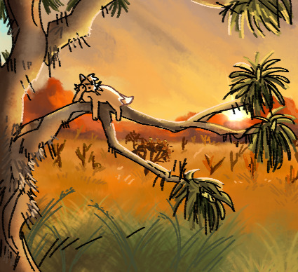
the cactuses in the far BG are just V and Y shapes, the joshua tree in the middle distance is dark with some light blobs right on the edge where the needles would catch light.
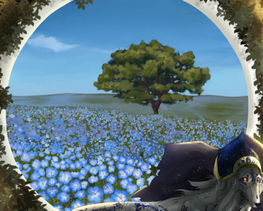
this is from 2021 so be nice to me but as the flowers go back in the distance, i stop rendering their petals and start doing blue dots with white dots, and then even further away i just sorta blend blue and green together to give the illusion of a field of flowers.
-i dont know what your style is, but i personally hate using a ton of layers and tend to merge them as i go, but for the most part i draw every panel of SBC bg on the same 1 layer, going back to front (start with sky, mountain, bg grass, foreground grass and cactus, then go back and scatter foliage as necessary) and it keeps my stuff loser and i tend to get less precious about making things look perfect. i also work very fast because i am unironically really lazy at art and am desperate for shortcuts.
-oh yeah one more thing. assuming you draw cats, cats are SOOOOOO small in comparison to literally everything. as warrior artists i think our perspective gets a but confused sometimes (i am certainly guilty of this too!) and there is absolutely nothing wrong with this because sometimes that's just how you have to build your scenes, but it really makes me laugh when i see scenes of like, rusty jumping off his fence to go into the woods, but the fence is only a bit taller than him. so try to remember things are huge and cats are small as hell
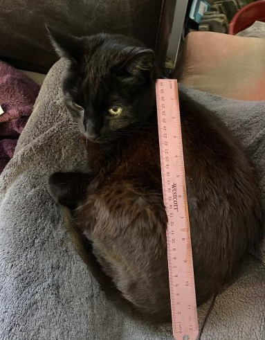
na'ni's a huge cat, all things considered but look at her compared to my small aloe plant

or the cedar tree in my front yard.

absolutely microscopic. don't look at my slippers.
so yeah. i hope this helps, it's not so much a tutorial because i don't think i'm the best person for tutorials because honestly i dont know much and this is all stuff i've picked up on, like i dont know shit about composition or values or color theory but this is important stuff to keep in mind about the environments themselves. don't worry too hard about colors at first because you can always change it by adjusting your curves n stuff. or slap a filter on that bad boy. or dont. also pay attention to your horizon line because it helps angle the rest of your piece. but look up tutorials for that because i only started learning about it like a week ago
55 notes
·
View notes
Note
If you've seen the new trailer for Pokémon Legends what are your thoughts on it?
You mean the one with Kleavor? I don't know if it really changed my opinions on it much (still just cautiously optimistic), but here's some notes:
The graphics really don't look... great? I'm willing to forgive it if the gameplay and story are decent, but I really wish they outsourced it to the people who made the Snap remake or something.
Gamefreak please just hire voice actors I am literally begging. no the grunting doesn't count
Wild Pokemon just standing around in groups doing nothing is gonna be a big problem in terms of immersion
I really wish the photos had like. outdoor BGs instead of just gradients (also isn't this shogun japan why are there cameras here)
It's really funny that that one pretentious lady is like "ohoho don't you know my pokemon chooses to say with me without Pokeballs" blah blah while her Pokemon is a first stager that evolves via friendship
(side note, in her defense, I don't think people probably know how Pokeballs work yet, as they seem to be a newish thing for the most part)
Not the biggest fan of Kleavor's design. don't hate it, but don't love it either
I'm also still wondering about the main gameplay. Is there anything to do other than catch Pokemon and battle? if not, it's gonna feel hollow.
33 notes
·
View notes
Text
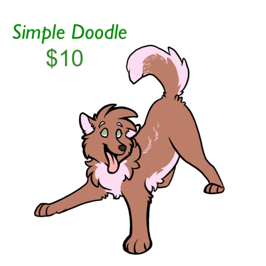
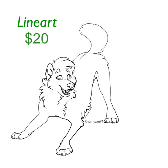

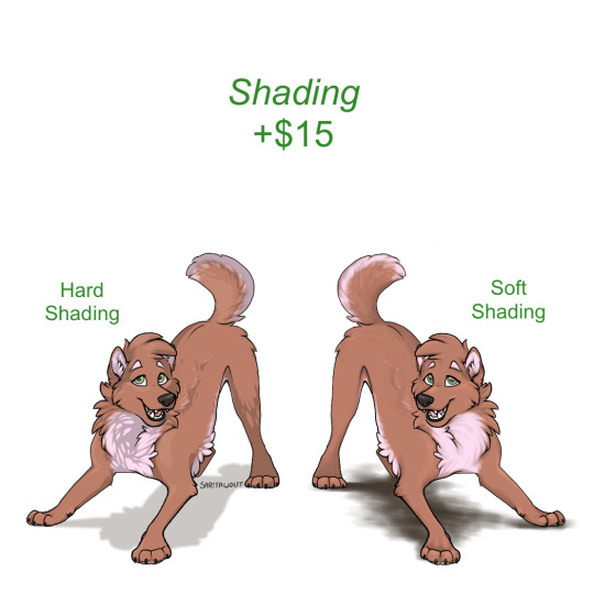
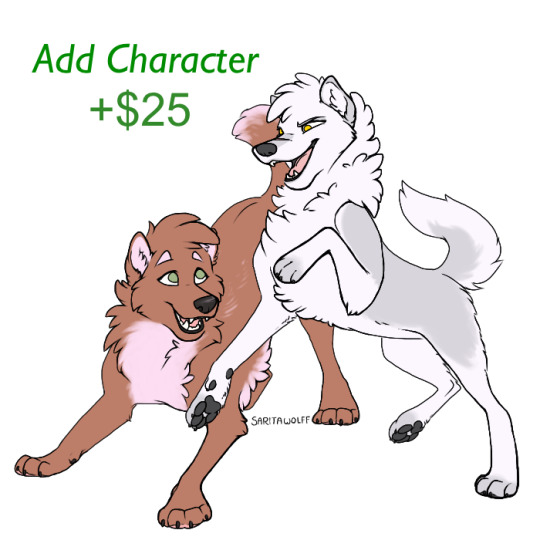
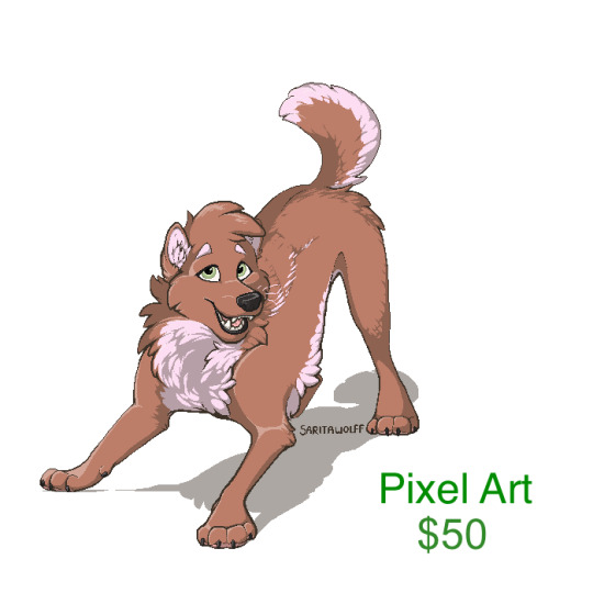
- Digital Art Commission Prices -
~~~~~~~~~~~~~~~~~~~~~~~~~
Simple Doodle ~ $10
Lineart ~ $20
Flat Color ~ $30
~~~~~~~~~~~~~~~~~~~~~~~~~
Add Shading ~ +$15
Add Character ~ +$25
~~~~~~~~~~~~~~~~~~~~~~~~~
Simple Background, Environment, and/or Object Interaction ~ +$15
(Very simple bgs such as a color gradient or shape are free)
Complex Background ~ (currently unavailable) ~~~~~~~~~~~~~~~~~~~~~~~~~
Pixel Art ~ $50
Add Pixel Environment ~ +$30 ~~~~~~~~~~~~~~~~~~~~~~~~~
Note: The price is the same whether you want a portrait or full body. Portraits will just be more detailed.
~~~~~~~~~~~~~~~~~~~~~~~~~
Guidelines:
* I am not comfortable drawing humans and buildings, but I will if you insist, as long as you know it might not come out as well as an animal would. *
* I will draw OCs and characters from existing media, either in my style or in as close as I can get to the canonical style. *
* I can not work without references. If you would like me to create a reference sheet for you, see custom ref commission prices. *
* My comfort level varies on NSFW or kink art. I will not draw genitalia, anything overtly sexual, anything nonconsensual, or any NSFW art containing my own characters. I AM okay with drawing gore, to an extent. If you want to commission something that could be considered NSFW or kinky, that does not sound like the above, send me a private message and ask if I would be comfortable drawing it! *
* I will not draw nazi or kkk imagery, or anything that could be construed as hate speech. I will not include racial slurs in my art. I am a Christian and am uncomfortable drawing Satanic symbols such as pentagrams and upside-down crosses. Please respect my comfort levels. If you have anything you are unsure about, send me a DM! *
* Art may not be re-sold (ie, used for adoptable bases, character giveaways, redbubble designs, etc) for anything more than what you payed for it. If art is of a character that does not belong to you, it may NOT be sold or redistributed. *
* You may NOT remove my signature for any reason. *
* Payment is in USD through Paypal. Payment must be payed up front. If the commission is over $100, it can be payed half before the commission and half after. *
* Tips are appreciated but not expected *
* If you are unsatisfied with the commission after the first sketch and do not want me to try to improve it, you may receive a full refund but no rights to the sketch. If I have proceeded any further than the sketch, then a refund will be given according to how much of the commission I have completed. *
#sorry it wouldn’t let me edit the old one and I had to update some prices#I really do need to update the art in this though it’s still my fursonas old colors lol#my art#GetSaritasArt#will add a read more as soon as I can get to a computer
3 notes
·
View notes
Note
hi how can i do a header like yours? ive tried so many times but i dunno how to make it :( can you make a little and fast tutorial, pls? tysm!
hi nonny!
I’ll try to explain it as best I can. If you’re familiar with photoshop, it should be a fairly simple process.
So basically all I did was take a canvas with a white bg and used the gradient tool (set to a single color) and sample colors from my icon and then layer gradients on top of each other. So like pink/purple in the corners, orange coming straight down in the middle, I did a green round one from underneath, etc. Then I switched to a white gradient and did a straight white gradient up from the bottom of the header so that all the colors at the top fade into white. I use white for mine because my bg color on my mobile blog is white, but you could do this with whatever color you have set & as long as gradient is tall enough, it makes it so you can’t see the border around your icon.
I’ll add a couple gifs showing the layers on my header & another couple showing the process of making a new one quickly.

^^so this is my current header (01/07/21) just clicking on the layers so you can see what each gradient looked like.
and here’s an example of me just making a random one very quickly.


I would recommend generally creating a new layer for each gradient color so that you have more control over getting rid of something if you want (which I didn’t do in this example since I didn’t intend to keep it, but did do with my current header, which is how I was able to show each layer of it in the first gif), but you definitely don’t have to. I am someone who tends to build in as many “failsafes” into my work as possible because I hate it when I want to change something weeks later and basically have to start over.
anyway, I hope this makes sense! if not, let me know!
8 notes
·
View notes
Photo
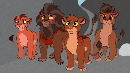
Night Pride redesigns! For context: Night Pride is the name of the Tree of Life protectors from The Lion Guard S3 And their og designs… kinda don’t click for me. Not like I hate their og designs, (the dozen ear details are a lil’ weird) and it’s cool to like their og designs. But I gave them redesigns! You might like them, or not. but these are my interesting takes And in this house we pretend the Night Pride symbol does not exist. Like the Lion Guard symbol is understandable at a few levels, the Night Pride symbol tho? no. Also sidenote… why do we only see the royal fam? Could we at least get some few lions in the bg, or other non-lions as Night Pride members? Hello? I am confusion. …and yes this a screenshot redraw don’t @ me (More detail under desc)
Nirmala: -Kind of hc she’s got blood from the Outsider pride, so line through nose, ear stripes, spots under eyes, head stripe, the works! -Adjusted hair stripe -Pelt more reddish -Uncolored paws -Since a lot of people hc she’s married into the Night Pride royal fam I tried making that more obvious in her appearance bc her og design looks too Night Pride for her to be someone that joined -dark nose gradient, since her stripe used to extend to her nose it’s a little call back. Surak: -Loses ear rims but has ear stripes still, they’re thicker though than Nirmala’s -Bunch of nasty scars, I’ll talk about the one on his eye later when I get to Rani, but as defenders from all sorts of nasty predators they all have some scars. -Same stripe as Rani does. -Dark nose gradient -Mane has two dif colors bc Asiatic lions, the lions I think the Night Pride are based off of (mane behind ear rims) have different colors, and it makes his fluffy mane pop a bit more -His pelt is more darker in color, makes him very scary but Surak is just a soft gentle giant, at least to his family. Rani: -Has her grandma’s eyes. I kind of went for “Scar but not Scar” look-ish… y’know bc of her plotline with Kion
(sidenote their romance feels rushed I’d prefer if they just were good friends. but y’know… we can’t have boy/girl friendships anymore) -The “mysterious scar” is on her shoulder this time, due to the hc I have that the incident that killed Rani and Baliyo’s parents was a fire. Rani and Surak have burn scars as reminders, Surak’s is much worse bc he saved Rani from inside the tree. -Same eye rim shape like her Uncle, but darker to make the eyes pop out more -Light nose gradient -Adjusted ear rims and color -tail tuft same as Surak and Baliyo, runs in the family! -Hair tuft, wild hair runs in the family as well -No spots on legs Baliyo:
-Still no whiskers, I hc Baliyo as trans, thanks to Tree of Life magic he’s able to grow a mane but it’s slow… and it might not be a full mane but he likes any mane in general -Eye color matches Surak. I love blue-eyed Baliyo but it made him look more related to Nirmala, and golden-eyed Baliyo is a hot take -Adjusted ear rims, he has a few notches tho -Tried toning down his head tuft a tad-ski. -His pelt is a less reddish version of Rani’s. Adjusted spots tho so he only has the ones on his leg
#the lion guard#the lion king#the night pride#tlg rani#tlg baliyo#tlg surak#tlg nirmala#Sparky's art
9 notes
·
View notes
Text
EMERGENCY COMMISSIONS!!
Hey guys!! Something's up with the car, so I need to take in some commissions to get it looked at and fixed - we’re looking at $100 diagnostic + a minimum of $75 for the simplest repair (and hoping it’s the simplest....), so anything offered is appreciated! Contact me at [email protected] if you're interested! So, here we go: $25 Full Body/$20 Half Body/$15 Bust, Single Character with Swooshy Border or Abstract BG: (Extra character $5)


$20 Full Body/$15 Bust, Single-Character with Color/Gradient or Transparent BG: (Extra Character $3)


$10 Palette Challenge: Send me five colors and a Character! (extra character $2)


Single Character Headshot Sketch: $5


Will Do:
OCs
Sonic, My Little Pony, Steven Universe, Undertale, and most other animated or game fandoms; feel free to ask!
Anthro
DnD Characters
Won’t Do:
NSFW
Hate Art
Complex armor or mechs
Real People
Personal use only unless we work something out beforehand. You MAY NOT post to deviantArt, FurAffinity, or any other art gallery site. (Toyhou.se and similar character profile sites are fine; ask first on tumblr.)
Turn-around time is one week; if any delays are anticipated I will let you know, and you will have the opportunity to request changes until lineart is complete (or one change on sketches). Payment is half up-front and half on completion for anything over $10, and up front for under $10.
Reblogs are appreciated! If you want to help out but don’t want art, please see my Ko-Fi under username Bunnikkila.
Thank you!
87 notes
·
View notes
Photo


Here’s a little... background information. >:3
In October 2019, I remember reading that “Silver Shoals” would be the location of the dance. I did not realize that they meant “Seaward Shoals” as in the town, not “Silver Stables” as in the retirement community.
So, I assumed the latter, figured there was a canon version, and made a composite screenshot using assets on a wiki and some youtube screenshots.
Then I spent the next several months carefully vectoring over a composite low-res background (image 1) to try to render the interior of the largest building I was aware of, and made a skybox based heavily on the night sky from Season 1 episode 2. It’s been rotated and some liberties have been taken because I was working with a low res image, but I did my best to match the constellations from the show. (You can see the original version of this skybox on the Doodle Response image I posted.)
Why vector? A big part of it was clarity. If you do a zoom of a png screenshot, you get lots of large pixels. By vectoring the entire background, I could resize it to get closeups with no loss in fidelity (just some minor adjustments with line thickness et al) and separate foreground elements from background elements, allowing characters to stand on the second floor behind the railing.
The other reason was it would allow me to very effectively switch the scene from day to night without any fuzzy edges.
I decided to remove the furniture and plants because I was concerned that overzealous dancing might knock them over; in hindsight maybe I should have left a few of the plants at least. I also removed the two lights coming out of the wooden second floor balcony on the left because the wiring made no sense to me at all.
You may have noticed that I was unable to replicate the wood grain; this is in part due to relative lack of skill on my part, limitations of the software I use, time constraints... and that the shots under magnification were really quite blurry when it really came down to it. In the end, I decided that it just wasn’t worth it.
There are some minor inconsistencies; the shape of the big lamp, the size of some of the lights, the shape of that giant mirror on the left (I hate that giant mirror on the left) and how some of the shadows are laid out on the floor, but on the whole I’m pretty pleased with the overall result.
Of course, had I known that the prom was being held at the Town Hall at Seaward Shoals instead of being held at Silver Stables, the background would have been quite a bit less exacting, significantly less exhausting, and would not have taken as long as it did to try to painstakingly replicate gradients and paths using a mouse. I spent many, many hours on this bg.
Remind me never to do this again. I’ll figure out my own backgrounds from here on out and they will be far more simple if I can help it.
Anyway, try the guava punch, it’s delicious. Really.
5 notes
·
View notes
Text
COMMISSION POST / I NEED NEW SHOES
SORRY IN ADVANCE FOR THE LONG POST
Hi there! I’m an autistic nb lesbian, and I work 8 hours a week, most of which is on my feet. I only have 2 pairs of shoes and the pair i wear practically every day are literally falling off my feet. The money I make from work and that I get from the government mostly goes towards therapy sessions, doctors’ appointments, and public transport. I’d really like to get a new pair of comfortable, waterproof, and sturdy shoes to work in and so I decided to make a new commission post! I’d love to get paid for my work as well because art is something I’ve always wanted to do as a career.
Small
Pixels:


simple character pixel: $5
shading: +$1
2-frame animation: +$3
Medium
Pixels:


simple character pixel: $7
shading: +$1
2-frame animation: +$3
Large
Ms Paint art:


Bust or waist up ONLY ms paint doodle with creative freedom (i tend to be more experimental in ms paint): $7
shading: +$3
Rendered art (Clip Studio Paint):


Bust/chest up: $15
Waist up: $20
Full body: $30
Part shading (only face/skin): +$3 shading: +$5
simple bg: +$3 (plain colour, gradient, or transparent bg is free!)
add a character: +$10 (won’t do more than two characters in one pic, sorry!)
Traditional art (lines drawn in ink pen, scanned, cleaned up, and coloured in CSP):


Bust/chest up: $20
Waist up: $25
Full body: $35
Colour: +$3
shading: +$6
simple bg: +$3 (plain colour, gradient, or transparent bg is free!) add a character: +$15 (won’t do more than two characters in one pic, sorry!)
Will draw:
- humans
- monsters (love drawin these!)
- any type of humanoid
- anthro furries (i’m still learning with these! if i think i won’t be able to draw your character, i may turn it down)
- light gore, blood, body horror, nonsexual nudity
- fan characters (Even if its from a media im not familiar with)
- fanart
Won’t draw:
- mech (unless its really simple)
- feral furries (just bc i suck at them)
- nsfw/porn
- hateful, offensive imagery in any way. (for example: no n@zi ocs, no homophobic imagery etc)
- anything i deem too difficult to accurately draw
- characters from media I don’t agree with (ask!)
PM me here or on deviantart for a commission. All prices are in AUD and will be taken through paypal ONLY. (Open to discussing alternate forms of payment)
Order form:
username: character reference: commission type: shading: [y/n] colour: [y/n] **FOR TRADITIONALLY LINED ART ONLY** animation: [y/n] **FOR SMALL OR MEDIUM PIXELS** specifics: [pose, etc]
49 notes
·
View notes
Note
Are you planning to have a break down process of that second pic of Bruce? It's beautiful and hearing how you worked on it would be interesting
sure
1. sketchd it out

2. line it (and inked it on one layer because i hate doing things the easy way for some reason)

3. color it (didnt color in the eyes or bottom part of mouth bc its just the bg color i was using anyways)

4. some highlightz on the gloves and on a layer above the lineart/inked part, i had a layer with a bit of dark blue gradient clipping below onto it

5. add cool part of drawing (more deets below)

6. black out the outer bit so it looks like a window but not really

now im pretty sure youre mostly wondering how i did that background part, so let me explain that in more detail

using clip studio paint (idk how to do this elsewhere so dont ask), get your background color set, add a blank layer, and go to Sub Tool [Figure]

i used dense saturated line


combine it with the blank layer below it so that you’re able to transform it
then, up top above the command bar, go to Filter > Transform, and choose one of the options listed there in the drop down
i used zig-zag for this one

just adjust the settings til it looks good and then you’re done! make sure you try the other settings bc you can do cool stuff with those as well

164 notes
·
View notes
Text
Sidewords Visual Development
Oh hi, we have a new game out called Sidewords! It’s a chill word puzzle game you can play on iOS right now (more platforms coming later this week...)

I stumbled across a PureRef document I’d been maintaining during development of the game, where I’d save new mockups every time we changed the look. It’s got mockups right from the start, all the way up to launch. I thought some other folks might like to see how much the look of a game changes from start to end, even on a small word game project.
Matt and I started working on Sidewords in April, 2017, when Matt first had the idea for the core gameplay mechanic. The very very first version of the game actually looked like this:

This was a very quick prototype I did in Google Sheets to see if what Matt was describing to me over Skype was fun. Spoiler: it was!
So Matt started working on a proper prototype and I started working on some mockups for what the game might look like. The very first mockups were pretty ugly, but were mostly about figuring out what user interface needed to be there and how it would work on a mobile screen.

You can see that it contains most of the elements that ended up in the final game. It’s just really, really ugly.
So I took those initial quick mockups and started doing some reference gathering and from there started working on a new direction. First I tried some more tactile feeling things, and we didn’t like it almost immediately.

In talking with Matt we both agreed that we wanted a more minimal look. The buttons with edges felt too much like real buttons, and that’s not what we wanted. But I kind of liked the shapes and the board and the colours, so I went with that in a new direction.

You can see we were also trying to decide how to handle the words that filled the board. We couldn’t decide whether to fill in big blocks of tiles as single elements (which we did in the end), or individual tiles each having the full word inside. This ended up feeling way too cluttered in the actual game when implemented, so we ended up grouping them up.
Design-wise, by that last mockup we finally felt like we were getting somewhere, but Matt felt really strongly that the game should use lighter colours by default. I had kind of got stuck in the dark theme, but I agreed to try a lighter colour scheme.

At this point that I had to admit that Matt was right (I hate doing that), that the lighter colours worked better and made the game feel more approachable. But, we still felt like there was too much visual clutter with the design. We talked about ditching the rounded corners and trying a more modern, square approach. I also got excited about the colour possibilities with a lighter colour palette.

I got a bit carried away. Matt also wanted to see what a more “spicy” palette might feel like. But eventually we inched our way closer and closer to a colour palette closer to what we’d ship with.

Heyyy, now we’re on to something. But we still weren’t happy with that solid background grey. It felt too washed out, too muddy. It muddled the colours in the foreground too much.

We did some variations with gradients in the background. You can see that we’re mostly refining things at this point. By this point Matt also had the game running, so a lot of the more subtle choices were being made in the game itself and the mockups were mostly being used for colour and font choices. At this point we needed to finalize a font.

Fun fact: none of those are the font we used. The font that is in the game is one called Quicksand, which you’ll see in the next screenshots. By this point we were pretty happy with things, but one of the last major UX challenges we ran into was that people didn’t understand the relationship between the selected letters and the tiles that lit up on the board. So I did some mockups for some different approaches we could use.

These mockups now have our final font in them, and the letters light up yellow to match the yellow lines that extend out of them, and hey, look, better colours (the ones that are actually in the game)! Ultimately we decided on a larger yellow square at intersection points rather than dots, but that was something Matt just did in the game. You can see we also abandoned the checkerboard pattern in the bg of the board at a very late stage. We found during playtesting that it confused some players, and it also added visual clutter. In the end, every tile has a lined background, which I think works the best of anything we tried. In the final game there’s also a subtle, animating background that we never mocked up. Matt just put it in the game one day and we both really liked it.
In the end, I really like where the game ended up visually. It just took some time (and work) to get there.

Owen
2 notes
·
View notes
Text
Breaking CSS Custom Properties out of :root Might Be a Good Idea
CSS Custom Properties have been a hot topic for a while now, with tons of great articles about them, from great primers on how they work to creative tutorials to do some real magic with them. If you’ve read more than one or two articles on the topic, then I’m sure you’ve noticed that they start by setting up the custom properties on the :root about 99% of the time.
While putting custom properties on the :root is great for things that you need to be available throughout your site, there are times when it makes more sense to scope your custom properties locally.
In this article, we’ll be exploring:
Why we put custom properties on the :root to begin with.
Why global scoping isn’t right for everything.
How to overcome class clashing with locally scoped custom properties
What’s the deal with custom properties and :root?
Before we jump into looking at the global scope, I think it’s worth looking at why everyone sets custom properties in the :root to begin with.
I’ve been declaring custom properties on the :root without even a second thought. Pretty much everyone does it without even a mention of why — including the official specification.
When the subject of :root is actually breached, it mentions how :root is the same as html, but with higher specificity, and that’s about it.
But does that higher specificity really matter?
Not really. All it does is select html with a higher specificity, the same way a class selector has higher specificity than an element selector when selecting a div.
:root { --color: red; } html { --color: blue; } .example { background: var(--color); /* Will be red because of :root's higher specificity */ }
The main reason that :root is suggested is because CSS isn’t only used to style HTML documents. It is also used for XML and SVG files.
In the case of XML and SVG files, :root isn’t selecting the html element, but rather their root (such as the svg tag in an SVG file).
Because of this, the best practice for a globally-scoped custom property is the :root. But if you’re making a website, you can throw it on an html selector and not notice a difference.
That said, with everyone using :root, it has quickly become a “standard.” It also helps separate variables to be used later on from selectors which are actively styling the document.
Why global scope isn’t right for everything
With CSS pre-processors, like Sass and Less, most of us keep variables tucked away in a partial dedicated to them. That works great, so why should we consider locally scoping variables all of a sudden?
One reason is that some people might find themselves doing something like this.
:root { --clr-light: #ededed; --clr-dark: #333; --clr-accent: #EFF; --ff-heading: 'Roboto', sans-serif; --ff-body: 'Merriweather', serif; --fw-heading: 700; --fw-body: 300; --fs-h1: 5rem; --fs-h2: 3.25rem; --fs-h3: 2.75rem; --fs-h4: 1.75rem; --fs-body: 1.125rem; --line-height: 1.55; --font-color: var(--clr-light); --navbar-bg-color: var(--clr-dark); --navbar-logo-color: var(--clr-accent); --navbar-border: thin var(--clr-accent) solid; --navbar-font-size: .8rem; --header-color: var(--clr-accent); --header-shadow: 2px 3px 4px rgba(200,200,0,.25); --pullquote-border: 5px solid var(--clr-light); --link-fg: var(--clr-dark); --link-bg: var(--clr-light); --link-fg-hover: var(--clr-dark); --link-bg-hover: var(--clr-accent); --transition: 250ms ease-out; --shadow: 2px 5px 20px rgba(0, 0, 0, .2); --gradient: linear-gradient(60deg, red, green, blue, yellow); --button-small: .75rem; --button-default: 1rem; --button-large: 1.5rem; }
Sure, this gives us one place where we can manage styling with custom properties. But, why do we need to define my --header-color or --header-shadow in my :root? These aren’t global properties, I’m clearly using them in my header and no where else.
If it’s not a global property, why define it globally? That’s where local scoping comes into play.
Locally scoped properties in action
Let’s say we have a list to style, but our site is using an icon system — let’s say Font Awesome for simplicity’s sake. We don’t want to use the disc for our ul bullets — we want a custom icon!
If I want to switch out the bullets of an unordered list for Font Awesome icons, we can do something like this:
ul { list-style: none; } li::before { content: "\f14a"; /* checkbox */ font-family: "Font Awesome Free 5"; font-weight: 900; float: left; margin-left: -1.5em; }
While that’s super easy to do, one of the problems is that the icon becomes abstract. Unless we use Font Awesome a lot, we aren’t going to know that f14a means, let alone be able to identify it as a checkbox icon. It’s semantically meaningless.
We can help clarify things with a custom property here.
ul { --checkbox-icon: "\f14a"; list-style: none; }
This becomes a lot more practical once we start having a few different icons in play. Let’s up the complexity and say we have three different lists:
<ul class="icon-list checkbox-list"> ... </ul> <ul class="icon-list star-list"> ... </ul> <ul class="icon-list bolt-list"> ... </ul>
Then, in our CSS, we can create the custom properties for our different icons:
.icon-list { --checkbox: "\f14a"; --star: "\f005"; --bolt: "\f0e7"; list-style: none; }
The real power of having locally scoped custom properties comes when we want to actually apply the icons.
We can set content: var(--icon) on our list items:
.icon-list li::before { content: var(--icon); font-family: "Font Awesome Free 5"; font-weight: 900; float: left; margin-left: -1.5em; }
Then we can define that icon for each one of our lists with more meaningful naming:
.checkbox-list { --icon: var(--checkbox); } .star-list { --icon: var(--star); } .bolt-list { --icon: var(--bolt); }
We can step this up a notch by adding colors to the mix:
.icon-list li::before { content: var(--icon); color: var(--icon-color); /* Other styles */ }
Moving icons to the global scope
If we’re working with an icon system, like Font Awesome, then I’m going to assume that we’d be using them for more than just replacing the bullets in unordered lists. As long as we're using them in more than one place it makes sense to move the icons to the :root as we want them to be available globally.
Having icons in the :root doesn’t mean we can’t still take advantage of locally scoped custom properties, though!
:root { --checkbox: "\f14a"; --star: "\f005"; --bolt: "\f0e7"; --clr-success: rgb(64, 209, 91); --clr-error: rgb(219, 138, 52); --clr-warning: rgb(206, 41, 26); } .icon-list li::before { content: var(--icon); color: var(--icon-color); /* Other styles */ } .checkbox-list { --icon: var(--checkbox); --icon-color: var(--clr-success); } .star-list { --icon: var(--star); --icon-color: var(--clr-warning); } .bolt-list { --icon: var(--bolt); --icon-color: var(--clr-error); }
Adding fallbacks
We could either put in a default icon by setting it as the fallback (e.g. var(--icon, "/f1cb")), or, since we’re using the content property, we could even put in an error message var(--icon, "no icon set").
See the Pen Custom list icons with CSS Custom Properties by Kevin (@kevinpowell) on CodePen.
By locally scoping the --icon and the --icon-color variables, we’ve greatly increased the readability of our code. If someone new were to come into the project, it will be a whole lot easier for them to know how it works.
This isn’t limited to Font Awesome, of course. Locally scoping custom properties also works great for an SVG icon system:
:root { --checkbox: url(../assets/img/checkbox.svg); --star: url(../assets/img/star.svg); --baby: url(../assets/img/baby.svg); } .icon-list { list-style-image: var(--icon); } .checkbox-list { --icon: checkbox; } .star-list { --icon: star; } .baby-list { --icon: baby; }
Using locally scoped properties for more modular code
While the example we just looked at works well to increase the readability of our code — which is awesome — we can do a lot more with locally scoped properties.
Some people love CSS as it is; others hate working with the global scope of the cascade. I’m not here to discuss CSS-in-JS (there are enough really smart people already talking about that), but locally scoped custom properties offer us a fantastic middle ground.
By taking advantage of locally scoped custom properties, we can create very modular code that takes a lot of the pain out of trying to come up with meaningful class names.
Let’s um, scope the scenario.
Part of the reason people get frustrated with CSS is that the following markup can cause problems when we want to style something.
<div class="card"> <h2 class="title">This is a card</h2> <p>Lorem ipsum dolor sit, amet consectetur adipisicing elit. Libero, totam.</p> <button class="button">More info</button> </div> <div class="cta"> <h2 class="title">This is a call to action</h2> <p>Lorem, ipsum dolor sit amet consectetur adipisicing elit. Aliquid eveniet fugiat ratione repellendus ex optio, ipsum modi praesentium, saepe, quibusdam rem quaerat! Accusamus, saepe beatae!</p> <button class="button">Buy now</button> </div>
If I create a style for the .title class, it will style both the elements containing the .card and .cta classes at the same time. We can use a compound selector (i.e. .card .title), but that raises the specificity which can lead to less maintainability. Or, we can take a BEM approach and rename our .title class to .card__title and .cta__title to isolate those elements a little more.
Locally scoped custom properties offer us a great solution though. We can apply them to the elements where they’ll be used:
.title { color: var(--title-clr); font-size: var(--title-fs); } .button { background: var(--button-bg); border: var(--button-border); color: var(--button-text); }
Then, we can control everything we need within their parent selectors, respectively:
.card { --title-clr: #345; --title-fs: 1.25rem; --button-border: 0; --button-bg: #333; --button-text: white; } .cta { --title-clr: #f30; --title-fs: 2.5rem; --button-border: 0; --button-bg: #333; --button-text: white; }
Chances are, there are some defaults, or commonalities, between buttons or titles even when they are in different components. For that, we could build in fallbacks, or simply style those as we usually would.
.button { /* Custom variables with default values */ border: var(--button-border, 0); /* Default: 0 */ background: var(--button-bg, #333); /* Default: #333 */ color: var(--button-text, white); /* Default: white */ /* Common styles every button will have */ padding: .5em 1.25em; text-transform: uppercase; letter-spacing: 1px; }
We could even use calc() to add a scale to our button, which would have the potential to remove the need for .btn-sm, btn-lg type classes (or it could be built into those classes, depending on the situation).
.button { font-size: calc(var(--button-scale) * 1rem); /* Multiply `--button-scale` by `1rem` to add unit */ } .cta { --button-scale: 1.5; }
Here is a more in-depth look at all of this in action:
See the Pen Custom list icons with CSS Custom Properties by Kevin (@kevinpowell) on CodePen.
Notice in that example above that I have used some generic classes, such as .title and .button, which are styled with locally scoped properties (with the help of fallbacks). With those being setup with custom properties, I can define those locally within the parent selector, effectively giving each its own style without the need of an additional selector.
I also set up some pricing cards with modifier classes on them. Using the generic .pricing class, I set everything up, and then using modifier classes, I redefined some of the properties, such as --text, and --background, without having to worry about using compound selectors or additional classes.
By working this way, it makes for very maintainable code. It’s easy to go in and change the color of a property if we need to, or even come in and create a completely new theme or style, like the rainbow variation of the pricing card in the example.
It takes a bit of foresight when initially setting everything up, but the payoff can be awesome. It might even seem counter-intuitive to how you are used to approaching styles, but next time you go to create a custom property, try keeping it defined locally if it doesn’t need to live globally, and you’ll start to see how useful it can be.
The post Breaking CSS Custom Properties out of :root Might Be a Good Idea appeared first on CSS-Tricks.
Breaking CSS Custom Properties out of :root Might Be a Good Idea published first on https://deskbysnafu.tumblr.com/
0 notes
Text
Breaking CSS Custom Properties out of :root Might Be a Good Idea
CSS Custom Properties have been a hot topic for a while now, with tons of great articles about them, from great primers on how they work to creative tutorials to do some real magic with them. If you’ve read more than one or two articles on the topic, then I’m sure you’ve noticed that they start by setting up the custom properties on the :root about 99% of the time.
While putting custom properties on the :root is great for things that you need to be available throughout your site, there are times when it makes more sense to scope your custom properties locally.
In this article, we’ll be exploring:
Why we put custom properties on the :root to begin with.
Why global scoping isn’t right for everything.
How to overcome class clashing with locally scoped custom properties
What’s the deal with custom properties and :root?
Before we jump into looking at the global scope, I think it’s worth looking at why everyone sets custom properties in the :root to begin with.
I’ve been declaring custom properties on the :root without even a second thought. Pretty much everyone does it without even a mention of why — including the official specification.
When the subject of :root is actually breached, it mentions how :root is the same as html, but with higher specificity, and that’s about it.
But does that higher specificity really matter?
Not really. All it does is select html with a higher specificity, the same way a class selector has higher specificity than an element selector when selecting a div.
:root { --color: red; } html { --color: blue; } .example { background: var(--color); /* Will be red because of :root's higher specificity */ }
The main reason that :root is suggested is because CSS isn’t only used to style HTML documents. It is also used for XML and SVG files.
In the case of XML and SVG files, :root isn’t selecting the html element, but rather their root (such as the svg tag in an SVG file).
Because of this, the best practice for a globally-scoped custom property is the :root. But if you’re making a website, you can throw it on an html selector and not notice a difference.
That said, with everyone using :root, it has quickly become a “standard.” It also helps separate variables to be used later on from selectors which are actively styling the document.
Why global scope isn’t right for everything
With CSS pre-processors, like Sass and Less, most of us keep variables tucked away in a partial dedicated to them. That works great, so why should we consider locally scoping variables all of a sudden?
One reason is that some people might find themselves doing something like this.
:root { --clr-light: #ededed; --clr-dark: #333; --clr-accent: #EFF; --ff-heading: 'Roboto', sans-serif; --ff-body: 'Merriweather', serif; --fw-heading: 700; --fw-body: 300; --fs-h1: 5rem; --fs-h2: 3.25rem; --fs-h3: 2.75rem; --fs-h4: 1.75rem; --fs-body: 1.125rem; --line-height: 1.55; --font-color: var(--clr-light); --navbar-bg-color: var(--clr-dark); --navbar-logo-color: var(--clr-accent); --navbar-border: thin var(--clr-accent) solid; --navbar-font-size: .8rem; --header-color: var(--clr-accent); --header-shadow: 2px 3px 4px rgba(200,200,0,.25); --pullquote-border: 5px solid var(--clr-light); --link-fg: var(--clr-dark); --link-bg: var(--clr-light); --link-fg-hover: var(--clr-dark); --link-bg-hover: var(--clr-accent); --transition: 250ms ease-out; --shadow: 2px 5px 20px rgba(0, 0, 0, .2); --gradient: linear-gradient(60deg, red, green, blue, yellow); --button-small: .75rem; --button-default: 1rem; --button-large: 1.5rem; }
Sure, this gives us one place where we can manage styling with custom properties. But, why do we need to define my --header-color or --header-shadow in my :root? These aren’t global properties, I’m clearly using them in my header and no where else.
If it’s not a global property, why define it globally? That’s where local scoping comes into play.
Locally scoped properties in action
Let’s say we have a list to style, but our site is using an icon system — let’s say Font Awesome for simplicity’s sake. We don’t want to use the disc for our ul bullets — we want a custom icon!
If I want to switch out the bullets of an unordered list for Font Awesome icons, we can do something like this:
ul { list-style: none; } li::before { content: "\f14a"; /* checkbox */ font-family: "Font Awesome Free 5"; font-weight: 900; float: left; margin-left: -1.5em; }
While that’s super easy to do, one of the problems is that the icon becomes abstract. Unless we use Font Awesome a lot, we aren’t going to know that f14a means, let alone be able to identify it as a checkbox icon. It’s semantically meaningless.
We can help clarify things with a custom property here.
ul { --checkbox-icon: "\f14a"; list-style: none; }
This becomes a lot more practical once we start having a few different icons in play. Let’s up the complexity and say we have three different lists:
<ul class="icon-list checkbox-list"> ... </ul> <ul class="icon-list star-list"> ... </ul> <ul class="icon-list bolt-list"> ... </ul>
Then, in our CSS, we can create the custom properties for our different icons:
.icon-list { --checkbox: "\f14a"; --star: "\f005"; --bolt: "\f0e7"; list-style: none; }
The real power of having locally scoped custom properties comes when we want to actually apply the icons.
We can set content: var(--icon) on our list items:
.icon-list li::before { content: var(--icon); font-family: "Font Awesome Free 5"; font-weight: 900; float: left; margin-left: -1.5em; }
Then we can define that icon for each one of our lists with more meaningful naming:
.checkbox-list { --icon: var(--checkbox); } .star-list { --icon: var(--star); } .bolt-list { --icon: var(--bolt); }
We can step this up a notch by adding colors to the mix:
.icon-list li::before { content: var(--icon); color: var(--icon-color); /* Other styles */ }
Moving icons to the global scope
If we’re working with an icon system, like Font Awesome, then I’m going to assume that we’d be using them for more than just replacing the bullets in unordered lists. As long as we're using them in more than one place it makes sense to move the icons to the :root as we want them to be available globally.
Having icons in the :root doesn’t mean we can’t still take advantage of locally scoped custom properties, though!
:root { --checkbox: "\f14a"; --star: "\f005"; --bolt: "\f0e7"; --clr-success: rgb(64, 209, 91); --clr-error: rgb(219, 138, 52); --clr-warning: rgb(206, 41, 26); } .icon-list li::before { content: var(--icon); color: var(--icon-color); /* Other styles */ } .checkbox-list { --icon: var(--checkbox); --icon-color: var(--clr-success); } .star-list { --icon: var(--star); --icon-color: var(--clr-warning); } .bolt-list { --icon: var(--bolt); --icon-color: var(--clr-error); }
Adding fallbacks
We could either put in a default icon by setting it as the fallback (e.g. var(--icon, "/f1cb")), or, since we’re using the content property, we could even put in an error message var(--icon, "no icon set").
See the Pen Custom list icons with CSS Custom Properties by Kevin (@kevinpowell) on CodePen.
By locally scoping the --icon and the --icon-color variables, we’ve greatly increased the readability of our code. If someone new were to come into the project, it will be a whole lot easier for them to know how it works.
This isn’t limited to Font Awesome, of course. Locally scoping custom properties also works great for an SVG icon system:
:root { --checkbox: url(../assets/img/checkbox.svg); --star: url(../assets/img/star.svg); --baby: url(../assets/img/baby.svg); } .icon-list { list-style-image: var(--icon); } .checkbox-list { --icon: checkbox; } .star-list { --icon: star; } .baby-list { --icon: baby; }
Using locally scoped properties for more modular code
While the example we just looked at works well to increase the readability of our code — which is awesome — we can do a lot more with locally scoped properties.
Some people love CSS as it is; others hate working with the global scope of the cascade. I’m not here to discuss CSS-in-JS (there are enough really smart people already talking about that), but locally scoped custom properties offer us a fantastic middle ground.
By taking advantage of locally scoped custom properties, we can create very modular code that takes a lot of the pain out of trying to come up with meaningful class names.
Let’s um, scope the scenario.
Part of the reason people get frustrated with CSS is that the following markup can cause problems when we want to style something.
<div class="card"> <h2 class="title">This is a card</h2> <p>Lorem ipsum dolor sit, amet consectetur adipisicing elit. Libero, totam.</p> <button class="button">More info</button> </div> <div class="cta"> <h2 class="title">This is a call to action</h2> <p>Lorem, ipsum dolor sit amet consectetur adipisicing elit. Aliquid eveniet fugiat ratione repellendus ex optio, ipsum modi praesentium, saepe, quibusdam rem quaerat! Accusamus, saepe beatae!</p> <button class="button">Buy now</button> </div>
If I create a style for the .title class, it will style both the elements containing the .card and .cta classes at the same time. We can use a compound selector (i.e. .card .title), but that raises the specificity which can lead to less maintainability. Or, we can take a BEM approach and rename our .title class to .card__title and .cta__title to isolate those elements a little more.
Locally scoped custom properties offer us a great solution though. We can apply them to the elements where they’ll be used:
.title { color: var(--title-clr); font-size: var(--title-fs); } .button { background: var(--button-bg); border: var(--button-border); color: var(--button-text); }
Then, we can control everything we need within their parent selectors, respectively:
.card { --title-clr: #345; --title-fs: 1.25rem; --button-border: 0; --button-bg: #333; --button-text: white; } .cta { --title-clr: #f30; --title-fs: 2.5rem; --button-border: 0; --button-bg: #333; --button-text: white; }
Chances are, there are some defaults, or commonalities, between buttons or titles even when they are in different components. For that, we could build in fallbacks, or simply style those as we usually would.
.button { /* Custom variables with default values */ border: var(--button-border, 0); /* Default: 0 */ background: var(--button-bg, #333); /* Default: #333 */ color: var(--button-text, white); /* Default: white */ /* Common styles every button will have */ padding: .5em 1.25em; text-transform: uppercase; letter-spacing: 1px; }
We could even use calc() to add a scale to our button, which would have the potential to remove the need for .btn-sm, btn-lg type classes (or it could be built into those classes, depending on the situation).
.button { font-size: calc(var(--button-scale) * 1rem); /* Multiply `--button-scale` by `1rem` to add unit */ } .cta { --button-scale: 1.5; }
Here is a more in-depth look at all of this in action:
See the Pen Custom list icons with CSS Custom Properties by Kevin (@kevinpowell) on CodePen.
Notice in that example above that I have used some generic classes, such as .title and .button, which are styled with locally scoped properties (with the help of fallbacks). With those being setup with custom properties, I can define those locally within the parent selector, effectively giving each its own style without the need of an additional selector.
I also set up some pricing cards with modifier classes on them. Using the generic .pricing class, I set everything up, and then using modifier classes, I redefined some of the properties, such as --text, and --background, without having to worry about using compound selectors or additional classes.
By working this way, it makes for very maintainable code. It’s easy to go in and change the color of a property if we need to, or even come in and create a completely new theme or style, like the rainbow variation of the pricing card in the example.
It takes a bit of foresight when initially setting everything up, but the payoff can be awesome. It might even seem counter-intuitive to how you are used to approaching styles, but next time you go to create a custom property, try keeping it defined locally if it doesn’t need to live globally, and you’ll start to see how useful it can be.
The post Breaking CSS Custom Properties out of :root Might Be a Good Idea appeared first on CSS-Tricks.
😉SiliconWebX | 🌐CSS-Tricks
0 notes