#i hate lineless art so fucking much
Explore tagged Tumblr posts
Text
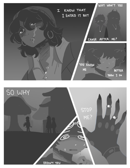
paint it over
#dream smp#dsmp fanart#karlnapity#dsmp angst#quackity#sapnap#karl jacobs#fan art#dsmp lore#digital fanart#dsmp stuff#fiances breakup#i hate lineless art so fucking much
533 notes
·
View notes
Text
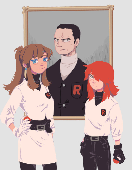
Family for day 6 of SpeSilverWeek! Edition uuh found biological and crime I guess...
#this was the first one I completed tbh and I'm not vibing but it was rly good warmup and tbh working lineless is so much easier...#I get lazier and messier concerning anatomy esp and stuff but I have fun...#spesilverweek#pokespe silver#pokespe blue#pokespe#my art#the thing about this is. I have so many thoughts about this one very specific rocket au where they aren't dex holders but find Giovanni#instead but he still goes missing and they still kind of hate team rocket bc the whole mask of ice thing still happened so they try to fuck#shit up from within now that giovanni is gone even though they also rly just kinda want him to return and deal with stuff himself#and the admins have these rly fun roles of all being in disagreement on what to do#like the boss might be dead his kids should take over or we Must find the boss or lol no boss my team rocket now#and then the dex holders get mixed in too and it's Fun bc everyone is fighting everyone#also sorry Giovanni for making you look like that#it's like 5min til day 6 technically but my laptop is being a butt so in case it won't turn on tomorrow here it is now#I will not wait 5min for midnight I got a new pillow for christmas and I wanna SLeep on it noW! hell yeah !!#pokemon
475 notes
·
View notes
Text
skeledog Leander WIP

the skull here is actually modeled closely after a deer skull, just compressed to fit a dog's overall face shape. also tried to make the eyes a little less wide-set than a deer's without making them completely front-facing like a dog's. here's the rest of the (still un-rendered) body:

i'm testing out the screen recorder i just downloaded so if that ends up working the way i want it to i'll have a timelapse of this piece when it's done :)
#whump#i mean leander is unharmed#he is fine#but i would NOT put it past him to go whumping someone else while he's like this#or most any other time really#tor draws#original characters#oc: leander#leanimals#drawing#art#don't think this really counts as gore but perhaps i'll tag it as#horror#if of a milder sort#skeleton#bones#drawing wip#also fun fact! i am doing all the painting and rendering on one layer for the most part#like the rough sketch is on a separate layer but i'm painting completely over it and all that is being done on a single layer#i hate to do that with art of humanoid characters#it's just really difficult for me for some reason#but when it comes to animals and monsters and creatures and such i actually really prefer doing things on a single layer as much as possibl#which is weird bc for years i've been a steadfast 'has dozens and dozens of layers for a single drawing#so every little thing can have its own layer' kind of girlie#still can't get the hang of single-layer painting for humanoid characters tho#can't seem to get the hang of applying this same lineless painterly style to humanoid characters either#which causes me absolutely no end of grief#i WANT to#but it's so fucking hard lol#but ig that's what practice is for 😔
14 notes
·
View notes
Text
it is absolutely infuriating how the popularity of an art piece seems to be inversely proportional to how much time and effort i put into it. realistic lineless that took me 10 hours? maybe two pity likes from friends. quick chibi sketch that took maybe 10 minutes? a dozen likes right away.
edit; i had an epiphany and realized that the reason for this is that everyone is looking at my art on tiny ass phone screens, so they can't fucking SEE actual, detailed art. everything has to be super basic and low-res or people just scroll on by because they can't fucking see it. i fucking hate smart phones.
5 notes
·
View notes
Note
🧙🏻 Trick or treat-- what's the writing trope or art technique you want to try someday, but you're still psyching yourself up for?
Happy Halloween!! 🍬🍬🍬
Hmmmm. Very good question!
As far as art goes, I've been wanting to try a somewhat more lineless/less cartoon-ish style, but I'm super intimidated by it because it would be totally reliant on shading/highlighting that I really don't do a lot of right now.
As far as writing--this isn't really a trope, so I'm not sure it counts, but there's a fic that's been rotating in my mind like a rotisserie chicken for a long while that I want to write, but it would end up being super long probably and I think to really pull it off I would have to be a lot more nuanced with a character that...isn't really my favorite.
There was a post going around a while back (fuck I wish I could remember whose it was) about wanting to see stories about Jedi returning to the Order when the war started rather than just stories about them leaving, and I've always thought that it would be a fantastic character and general meta study to explore a universe where Obi-Wan had decided to stay on Mandalore with Satine, but finds that he cannot sit idly by once the war breaks out and decides to don the robes again.
It would probably be end-game Codywan (bc I am who I am, and I'm very interested in the concept of the clones being very why the fuck are they sending us some fucking New Mandalorian Duke to be our general and eventually coming around, because it's Obi-Wan), but it would also be way too easy to fall into that nasty trope where the protag's current spouse is just an irredeemable bitch, especially since she isn't really my favorite character like I said, and I hate that trope, so writing that story would require me to be cognizant of what I was doing and how things were reading pretty much the entire time.
That said, I do also think it would be a very rewarding story if I was able to pull it off, so I probably will give it a try eventually. I'm just really intimidated by it lol.
Thanks for playing, @lttrsfrmlnrrgby!! :))
8 notes
·
View notes
Note
Hello~ 🙋🏽♀️ Your art is really, really cool and beautiful, tysm for sharing it with us! 💕💕💕 I saw you mention that you would like more asks so I wanted to ask you, what's your favorite phase and why?
Hi! thank you so much for liking my art T__T and as for your question it's hard to decide since i like most of the phases a lot...
I'd say style-wise my favorite would be phase 2? I love that it's way more grungy and nasty looking, esp with the new greyer palettes and soft shading. it's in that perfect sweet spot of being more realistic but still having the stylized shapes and anatomy of phase 1, which is great because i get to see jamie's lineart. also big fan of the way he drew everyone's hair kinda choppy here it's soooo cute. most of my favorite gorillaz art all come from this phase
Story-wise tho then obviously phase 3. like plastic beach might've been a hot mess while it was releasing and a lot of things just never got followed through but fuck if it doesn't feel cinematic as hell and the most fleshed out out of all the phases. like the web game ??? and obviously the emotional weight of the story, murdoc alone ruling over a literal pile of garbage and the only people he has with him is a soulless copy of his daughter that HE killed and someone he's holding captive, his only outlet being songwriting and broadcasting a radio show that he knows no one will hear all while being chased down by all those he's crossed both demonic and mortal. like i could really go on it makes me so emo I dont even care if the lost chord doesn't make that much sense. it fucks me up either ways to see it wrapped up like that.
although music wise (and just general marketing and promotions) i LOVEEE phase 1 so much. EVERY song on that album is so memorable and i love the amount of weird noises and falsettos 2d did. love the hologram concerts and the ones with their vas up, 4 whole music videos and an animatic (AND THE GBITEZ!!!!) and a whole interactable website of their studio... INSANE like the dedication to making them seem real is insane i wish we still had that instead of them being glorified mascots. . .
that's honestly not to say i don't like the others as hell tho like humanz had a great art direction too with the photobashing and lineless style and personally i love realistic proportions soooo and the mocap interviews were funny as hell even if i hate kevin bishop. the now now was soooo crazy too im a big fan of spiral imagery and just.. the pink/blue thing is great Fav album art love the emotional complexity it gives 2d (never recovered from souk eye) and honestly song machine is amazing too i adore the "episodic" formula of the music videos and like personally i don't even mind keyframe 2d that bad since i barely noticed it within the videos themselves its the endless marketing that reuses that same pic that drives me insane (billboard near my college STILL has keyframe fred perry 2d on rotation and it ambushes me every time)
ANYWAYS i kind of rambled on but!!!! basically phase 1-3 i love those the most. Thank you for enabling me
#asks#siu talks#sorry if i explained things badly im sooo not literate when it comes to english#phase 7 is still ongoing so... not making hard opinions until the album drops#altho its not looking great so far... !!!
11 notes
·
View notes
Note
u dont have to but ur like my biggest art inspo ever.. whats ur art process? any tips?
i’m very bad at explaining my art process but… i do have tips!!!
1. NEVER force yourself to get an idea. if you’re trying really hard to come up with something good, you’ll never get it the same way as if it naturally came to you. do not work against your brain, work WITH it when it feels like it. allow yourself to be inspired on your own time, not force yourself to feel inspired. this is how you can avoid crashing and burning. sometimes it’ll take a while to get a good idea to pop into your head, but it’s better than shitting out a bunch of bad ideas you’ll end up hating.
2. allow yourself to make mistakes. does your art look bad? i bet nobody will see those mistakes if you post it. we all draw characters in an awkward pose sometimes, and usually most people don’t even see what’s so bad about it. scribble. experiment. draw poorly. it’ll help you feel more confident about failing, then improving afterwards. not every piece is going to be perfect
3. be kind to yourself when you draw. listen to what your body has to say! if it’s starting to hurt, change positions or take a break. if you can’t draw no matter what, it’s time to come back to it later. don’t punish yourself for something you can solve in a few hours or days
4. indulge a little. draw the things you like. it’ll be much more rewarding when you have to draw the things you don’t like, such as art assignments or commissions. you should draw things because it makes you happy, even if others might not enjoy it (this rule is to an extent. i’m talking about harmless things like making crossovers of your fav series)
5. don’t compare yourself to others yadda yadda you’ve heard this too several times. it’s not a competition and nobody is winning LOL
6. always experiment. once you’re comfortable with the way you draw, take it to the next level. find different techniques, use color combinations you haven’t used before. try lineless art. it’s good for the soul
7. fuck it we ball
6 notes
·
View notes
Text
Clip Studio and ibisPaint. I used to use ibis a lot, but everything I would make started to feel stiff and lifeless, so now I use Autodesk Sketchbook and HiPaint more often.
Left, 100%. Don't know why, it just. Clicks better.
Basically, I draw cats a lot. I was a warrior cats kid.
I agree with the previous statement, if anybody or anything it's definitely Aziraphale.
99% of the art I make gets posted. The other 1% are studies that I feel I fucked up so badly they don't deserve to be associated with my name.
My years of warrior cats YouTube. You can see the style, even in my non-feline drawings.
Fucking watercolors. I love them so much but I am so shit at them.
I once started a comic about an aroace lioness named Asta. Made about 6-8 pages, probably 20 panels, and then just. Stopped.
Don't actually know what this means, sorry.
TURTLENECKS, BABEYYYY!!! Almost every Crowley drawing I make is her in a turtleneck.
Depends on what I'm drawing. If it's Good Omens, I have two playlists for that, and if not, I have dozens of playlists I could be listening to. But almost always yes.
Eyes, man. Sooo fuckin easy like nooo it's not just because I spent an entire year studying eyes and only eyes in fifth grade I sweeear-
No, not really. I admire a lot of artists but I like to think that I enjoy all art types. Except splatter paint. I do not enjoy that art type, nor do I admire any people who make it, because I don't like it, but if you do, then cool. Great. Definitely not for me.
Urgh, uhhh, not sure, really.
Anywhere. My preference is on my porch swing or laying in the grass, but I can draw while walking, riding in a car, laying in bed, sitting in the bath, wherever.
Coloring. It's my least favorite part of any drawing. I know, I get it, it's necessary, and my artworks always wind up looking much better after color is added, but I just don't enjoy it.
Yes. Water or orange fanta and sunflower seeds.
Honestly, shockingly few. A couple copic markers, a few graphite pencils, but that's mostly it. I try my best to take care of my things, and I think I do pretty well considering I have a 9-year-old brother who doesn't understand personal space or property.
I... do not like drawing inanimate objects, honestly. The only ones I don't hate at this point are probably trees and lanterns.
I'd have to say either hands or ears. Hands take me a while, but they're actually pretty fun. And ears, I just understand the general shape of really well.
Any that are lineless. How the fuck?? How? I do not understand. I could never. Lines are my safe place and home. Incredible though. Love what you've done with it, but how?
None.
I don't actually know what this means, but if you're referring to the blend modes then yes. If anything else, I have no clue.
No.
Donald Fucking Trump 💀 I was devastated and appaled.
...i could go with "same as above" because I drew Aziraphale (/Michael Sheen) and someone told me it looked like Donald Trump and I almost fucking cried. But also I drew the ineffable husbands with Azi leaning on Crowley's shoulder, and my dad told me it looked like Aziraphale was biting Crowley??? And like wtf, no?
Occasionally I'll do a couple sketches before I do a full drawing, but rarely.
None.
Dead End: Paranormal Park. Fucking love it, not my style though.
I'm... not sure. Honestly I dunno if any of my stuff is actually "underrated", I'm not really all that good, but if I had to go with something, I'd say this one. It's probably the best of my recent works.
Not gonna tag anyone, just feel free to join if you see this! :D
Weirdly Specific Artist Ask Game
Didn't see a lot of artist ask games, wanted to make a silly one.
(I wrote this while sick out of my mind last year and it's been collecting dust in my drafts, I might as well let it run free) 1. Art programs you have but don't use
2. Is it easier to draw someone facing left or right (or forward even)
3. What ideas come from when you were little
4. Fav character/subject that's a bitch to draw
5. Estimate of how much of your art you post online vs. the art you keep for yourself
6. Anything that might inspire you subconsciously (i.e. this horse wasn't supposed to look like the Last Unicorn but I see it)
7. A medium of art you don't work in but appreciate
8. What's an old project idea that you've lost interest in
9. What are your file name conventions
10. Favorite piece of clothing to draw
11. Do you listen to anything while drawing? If so, what
12. Easiest part of body to draw
13. A creator who you admire but whose work isn't your thing
14. Any favorite motifs
15. *Where* do you draw (don't drop your ip address this just means do you doodle at a park or smth)
16. Something you are good at but don't really have fun doing
17. Do you eat/drink when drawing? if so, what
18. An estimate of how much art supplies you've broken
19. Favorite inanimate objects to draw (food, nature, etc.)
20. Something everyone else finds hard to draw but you enjoy
21. Art styles nothing like your own but you like anyways
22. What physical exercises do you do before drawing, if any
23. Do you use different layer modes
24. Do your references include stock images
25. Something your art has been compared to that you were NOT inspired by
26. What's a piece that got a wildly different interpretation from what you intended
27. Do you warm up before getting to the good stuff? If so, what is it you draw to warm up with
28. Any art events you have participated in the past (like zines)
29. Media you love, but doesn't inspire you artistically
30. What piece of yours do you think is underrated
34K notes
·
View notes
Text
Caution/trigger warning for:
Psychological/Body Horror
Teeth
Extremely Thin Character
sum creepy shit down there-

#haha#the first thing i saw last night :')#i hate it#i hate it so much#yet i am proud of myself for:#1 facing my fear and actually drawing this#2 holy crap that is really creepy how the fuck did i do that#3 shading UwU#digital art#art#drawing#lineless#tw: body horror#tw: teeth#tw: psychological horror#and onto the next one#and that one's gonna be 10x worse and i hope im not left lying in bed crying like last night#this was surprisingly therapeutic-#like yeah#this still makes my skin crawl#but it wasnt as bad as last night#like#i can look at this fucker without breaking into tears#my art
4 notes
·
View notes
Note
You probably get this question a lot, but how do you keep yourself motivated/engaged with art?
Has it become routine for you because of the deadlines you had at uni, or is there something that I'm missing?
I would love to get into a regular routine of improving my art, but on the rare occasion that I do create art, I get halfway through it and hate the way its working out, which demotivates me..on top of that, I have ADHD so my attention span is shocking.
Sorry if you've already answered this previously!
i actually dont know or at least remember if ive been asked this. i prolly gotten similar questions but i most likely gave generic advice back then
im not exactly sure how its become a routine. ig its either because:
its a part of being an internet artist where you have to keep making something to stay relevant
im not satisfied with what i can do so i keep experimenting
i like to see how people react
simply bc i enjoy making art
im working towards a goal. an example would be like a scenario that i thought of that i think will look cool so i do everything i can to make that scenario real
its a tug-o-war between all of those which all pull into driving me to make art
but whenever i finish something, whether big or small, its just a matter of moving on to the next thing. not that youre not allowed to linger on your work, just enough to recollect yourself after the experience and take what you learned to your next projects
I get halfway through it and hate the way its working out, which demotivates me
ohhhhh boy i experienced that a lot but i cant remember what initially made me push past this feeling. these days whenever i feel that i just think abt the pieces where i had a similar feeling, pushed past it and liked how it turned out. i just keep thinking that i might like it in the end
if something isnt working out but you still really wanna make that idea real, you can try approaching it differently. ive had artworks where it took me several iterations just to get the feel right. whats important is that youre happy with it. it sucks to keep working on something that youre dreading
like in this example: i initially wanted this to be a lineless painting but i realized it looks like shit so i just went with the style im comfortable with

another example: while i was already liking the progress on the left pic, i still wanted it to be more semi-realistic so i went fuck it, 3d tracing time
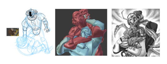
it seems counter productive to stick to your comfort zone but if youre just making art out of enjoyment, might as well
as for attention span, i have a lot of unfinished works just bc new ideas keep coming. while it does feel bad to leave countless wips, it feels worse forcing myself to finish them. the best case scenario is hyperfixating so much on an idea you finish it within your attention span. dont forget to eat, drink water and take breaks when you go on these binges
idk what else to say for now but i hope retellings of my experiences will help
34 notes
·
View notes
Text
Gay people

I love youth pastor craig and imp tweek so much
I haven't done lineless art like this in a while, ibis paint fucking hates me now lol
#south park#south park fanart#south park phone destroyer#south park tweek#south park tweek tweak#tweek tweak#imp tweek#south park craig#south park craig tucker#craig tucker#youth pastor craig#south park creek#sp creek#lynx posting
40 notes
·
View notes
Text

Btw here’s a little bit of original art. This is me experimenting with my tablet and brush settings to try and reproduce the coloring style I made on my iPad. I’m not particularly happy with the process although the end product does resemble my current stuff.
Honestly, it’s kinda weird seeing my OCs in a style I’ve only used in fanart so far. It’s a really weird feeling. My original stories have always had their own individual style aesthetics, so it’s kinda… strange. Heroism is the closest aesthetic-wise to the one I developed for the DSMP, but it’s still weird. Both DSMP and Heroism is very colorful and highly saturated against a very dark background. However, the difference in how I perceive them in through their line quality. Heroism is wispy, like grainy watercolor with the thinnest lineart I’m comfortable with doing. Whereas DSMP is bolder and highlighted, with water-stained pigments. It’s just weird seeing Heroism in my DSMP style. I’m never doing this again.
Anyway, the whole point of this was to see if I could finish my WIP to a satisfactory degree on my computer, and the answer is No. There’s a reason I preferred lineless art for the longest fucking time, and it’s because I Fucking Hate Lineart. My Apple Pencil and iPad is the only time I’ve remotely enjoyed lineart, and it really showed.
I’ll probably be doing more original art until I get my replacement pencil next week. I haven’t posted my original art much here, and I might keep it like that.
#personal#dreamlessart#heroism#I started tumblr as a blog#and I continue to treat tumblr as a blog#I am here to post my bullshit and move on
1 note
·
View note
Note
How do you ink and color? Any tips? I love your art! 💜🖤
oh shit i got this ask months ago and forgot to answer
inking: god i hate lineart so much. the trick is to not do it 😂 unfortunately, i still find myself spending hours on lineart all the time @_@
the biggest thing i’ve found is making your lines varied in thickness. it adds to the interest. i also try to make my outside line thicker than my inside ones to break up the figure from the background. don’t be afraid to skips some lines and imply them with shading instead. i will color over my lines at the end to make them not as strong, but i’ve learned to still keep some lines black for extra emphasis.
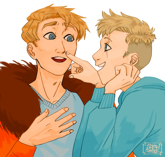
^ here’s one of my older pieces that i’ve been considering redoing. it has very little line variation, ALL the lines are colored so there’s no solid black, and there’s very little hard contrast in shading values. overall, it looks flat and uninteresting and if i had the time i’d redraw this one.
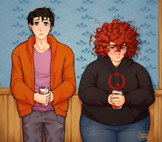
this is a more recent example of lineart that i think works a lot better. the characters are really well defined with a strong outline, but the inside lines aren’t harsh and distracting. you can see i recolored the lineart in kyle’s hair to be a dark red, and in some places it blends with the shadows to imply areas with more highlights. stan’s pants don’t have and lines in them, just the outside shape and pockets.
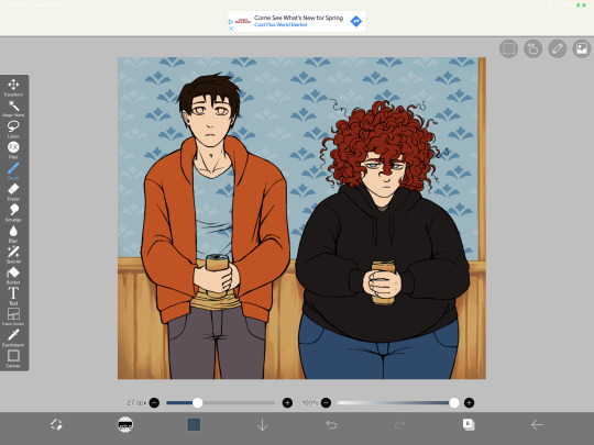
you can see in this wip what the lineart looks like before i do all the shading and fancy stuff. stan’s pants look totally flat and straight until i start shading.
a lot of the time though i won’t even do lineart, especially if it’s a big scenic piece. the more zoomed out less detail you can convey, and lineart takes up a lot of space.
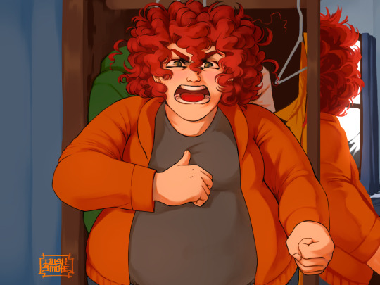
^ this piece is an example where i do both, lineart and no lineart. the mirror image of kyle isn’t the focus, and i honestly didn’t feel like going in and drawing exact lines because they’d probably look fucked up anyway. i typically don’t put hard lines in backgrounds because it would take FOREVER and just be distracting.
the one thing you do have to be careful of with lineless art is contrast. hard lines are good contrast that show you what you’re looking at, and without them your image can blend together.
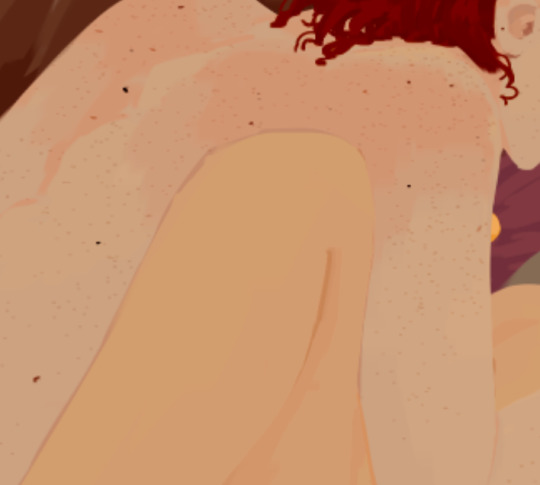
here’s part of a painting i did last august, when i was first experimenting with lineless styles (full image on my NSFW twitter). can you tell what’s going on here? i sure as fuck can’t. there’s no contrast, and it makes all the skin tones blend together in an unintelligible mush.
contrast has always been one of my biggest weaknesses as an artist, so i’ve been trying to improve over time. here’s a more recent lineless drawing:
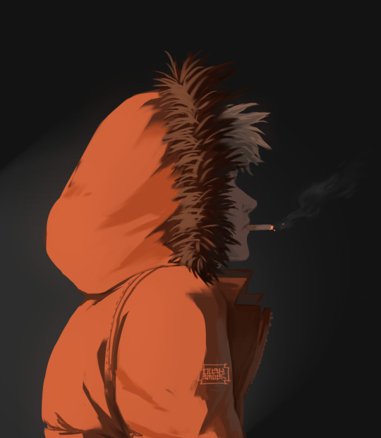
this one works because it had high contrast. the highlights are really bright and the shadows are really deep. you can still make out the facial features too, but there’s no ‘lineart’ layer’. everything was painted on in the same layer.
-
-
coloring: oh my god i love coloring. it’s my favorite part of drawing and the reason why shit takes forever. a lot of the same stuff from before comes into play, like contrast. you can also portray some really interesting moods based on colors if you’re being stylistic, but also pay in mind to your environment.
i always color my background first. in fact, a lot of the time i’ll do the entire background before coloring a piece. the environment establishes your light levels and light source, and it’s typically easier for me to tweak colors on a figure than the ones in the background. in the above example with kenny, the background is a mostly solid black with a beam of light from the left. i picked kenny’s colors to fit in this environment.
it’s also important to use references.
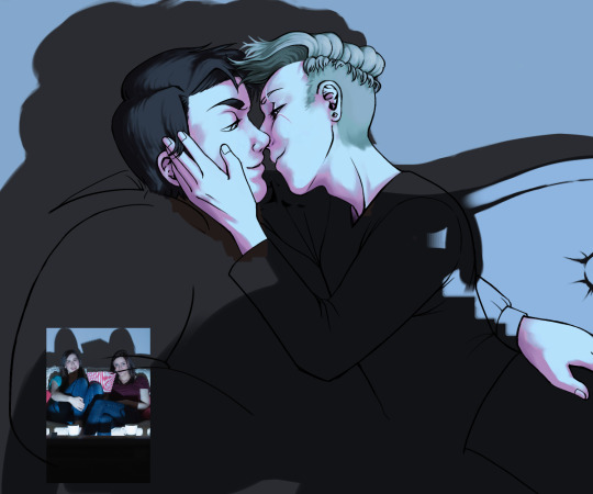
you can see in this wip i’ve got a reference image for how light from a TV looks against figures and the way their shadows are cast across the wall. it also helped me figure out what colors to use in this situation.
a lot of coloring is just trial and error to see what works. i usually start with a flat base color and add value to it. if you put all your colors on different layers it’s really easy to change them quickly.
here’s an example:
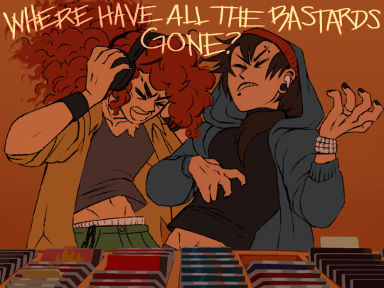
i got my base colors down and here i can see the skin tone is blending with the background, so i lightened it up for better contrast
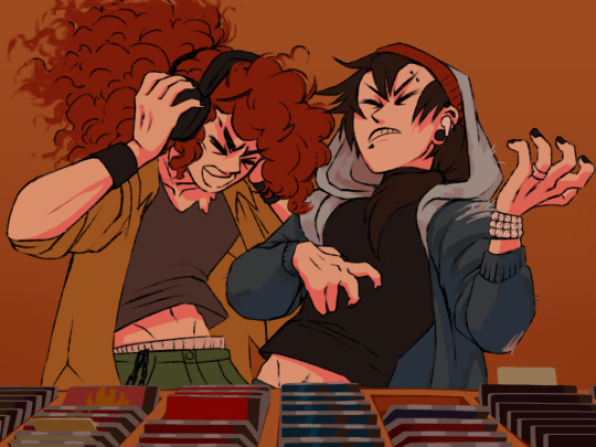
i typically shade the skin first, then clothes. you can see here i did a dull skin tone with a bright colored shadow. this adds more contrast and interest. i always try to avoid doing dull shadows where you shift toward black. black shadows are really uninteresting and they can make your piece look muddy. i’ll typically shade with an orange, red, blue, or purple.
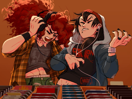
the final piece has a really bright highlight on it coming from behind. this just adds more visual interest and contrast. you can also see i’ve gone back into the pink shadows and added an even lighter, brighter peach value in places to show reflected light. this also gives the darker pink shadow an added outline effect, because it touches the base skin tone but looks lighter within.
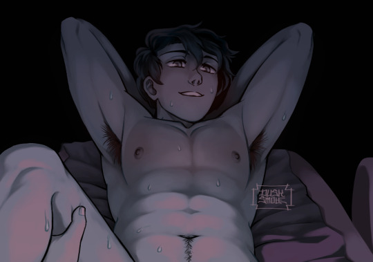
^ this one’s a good example of light and shadow (full image on my NSFW twitter lmao). there’s not a lot of color because it’s dark out, so everything had to be conveyed in values. there’s hard light across the stomach and then a shadow over the chest, but there’s still light being reflected up into stan’s face that lets us make him out. the rest is deep shadow and unimportant, so it’s all black.
that’s the other part, color and value determine where your eye is gonna look, so consider that when drawing.
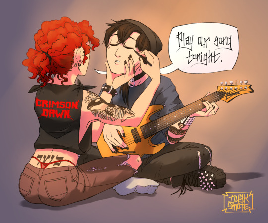
^ consider this piece i drew like a year ago. it has a lot of blues and reds, and originally i was going to make stan’s guitar blue. i don’t have the wips anymore, but it didn’t stand out and it didn’t look right with the image. after a lot of playing around i went with yellow because it’s bright, it breaks up the image, and it adds another color to the piece to balance it out.
the same thing happened when i was working on the cover image for What They Say About Us.
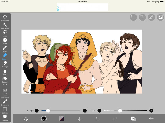
you can see in this really early wip that i’d blocked in the colors and butters is totally naked. for one, i was like “damn that kid is WAY too naked in this image” and he also blended in with stan and cartman. additionally, there was a lot of warm colors on the left, a lack of color on the right, and an overall lack of blue.
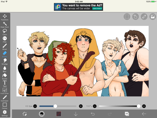
first change i made was throwing a shirt on him and it made a huge improvement. the image looks much more balanced now and he’s not super distracting with his naked-ness.
other than that, coloring is just picking your base colors, blocking in shadows, adding highlight, and cleaning it up. if you wanna improve, look at photo references. look at other people’s art and examine how they use color and value. practice practice practice. have fun with it. the most fun i have coloring comes from figuring out interesting textures like the pharaoh headdress or kenny’s leather jacket.

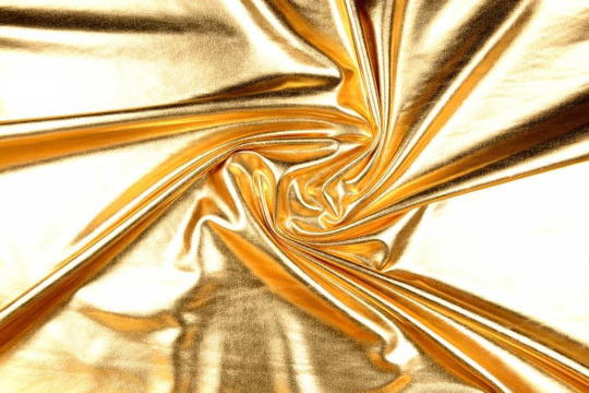
i find stock photos like this and study them to see how the light works
other than that, the rest is just playing around, seeing what works, and making things up as i go!
70 notes
·
View notes
Text
Art evolution :] (when it comes to humans not my umm other artwork)
March 11 2021:

Tbh uhhh I kinda like this ig :"]
March 31 2021:

(first time drawing gogs and like ew -vomits organs out-
April (insert number cuz I forgot), 2021:

Bee boy :DD the first time I have drawn him :]] Idk what to feel about this
June or july, (insert number cuz I forgot), 2021:

August (insert number cuz I forgot), 2021:

and thats my ever first post :"D I hate it :]
August, 13 or 18, 2021:

September (insert number cuz fuck me), 2021:

First time doing lineless art :]
August 23, 2021:

Toms :D
Okay tbh my art took me a month to improve. So yeah also I thank you, guys! why? well, you made me feel motivated, loved and amazing with you guys being with my side for a long time I was able to improve a lot (not just my art but as a person) thank you guys so much <33 -cries and hugs you-
-Caden
10 notes
·
View notes
Text
Sooo, someone on Rewritten Belial wanted to know what I see wrong with mid fight masses. Boy, boy oh boy, where do I fucking start
ANIMATION
My god. My god the animation. The problem for the most part isn't the animation itself (except for the title screen, fuck that, it looks so weirdly floppy and stiff), it's the fact the animations aren't aligned properly. Take one good look at Sarv's sprites in the first 2 songs. Look how often her position shifts. There's seemingly no ground whatsoever for her, her feet get positioned up and down seemingly at random with the notes and it's REALLY frustrating. It isn't even bc of exaggerated poses, Week 4 shows that exaggerated poses can work while still making sense with where the floor is. Sarvente continues to be an offender in that regard with the fact the telephone animation looks EXTREMELY choppy and lacks a lot of inbetween frames, not to mention how stiff it feels.
Ruv is a lesser offender, the only thing that bothers me is how his feet curve down on his idle stance, because, again, That's Not How The Ground Works.
Selever. Dear god. His idle animation is so fucked. He goes 3 steps to the left by standing still. And this is purely an XML issue btw, bc there's a gif in the files with the animation in its raw state and it looks just fine
ART
THE BACKGROUNDS, DON'T GET ME STARTED. They're completely fucking lineless. That's NOT what you do with FNF. In FNF, lineless stuff is the environment, a car, the sun, a house, individual objects that are supposed to be in front or behind of one another are lined, always, and the mod NEVER does this, making everything blend in super hard.
Then there's a problem all the sprites share. They are by no means in FNF's style. FNF's art style consists of a lot of thick lines, big shapes, and a generally very street-like style. MFM does none of that. The lines are thin (with sarvente having completely lineless elements, which you should NEVER do for fnf character sprites unless it's pure black) and look very out of place when put next to every other character. Ruv is, again, the lesser offender, although he's definitely still one.
THE CHARTING
Hell. Hell. HELL. SO MANY NOTES THAT AREN'T EVEN IN THE SONG ITSELF, SUCH AN ABSURD OVERUSE OF TRIPLES AND DOUBLES, because god forbid the player actually has fun doing patterns for fast songs, right?! Gospel is safe in this regard, meanwhile Zavodila. Why. Zavodila could have been perfectly fun and difficult without them. Why did you do this. They're not inherently wrong, you just need to implement them really well and chief this ain't it. Jacks and multis aren't to be abused, ever. Patterns are best, always.
THE MUSIC
Subjectivity zone has been entered. Worship, Parish and Gospel are very subjective and down to taste, personally I ended up only liking Gospel out of the three even if I insist it should be a metal song bc demons are just like that.
Now Zavodila I have an objective complaint about, AND IT'S THE BEST SONG IN THE MOD. This isn't too much about the song on its own, but as an FNF song. Listen to it. Listen to it and tell me Ruv's voice sounds like a voice at all. No. It's just hard bass without a smidge of voice on it. If it was a voice with a filter on it that made it kinda sound like hard bass, fine, Whitty is good for that reason, it's a voice with a filter that makes it sound SIMILAR to an instrument. But when it's JUST an instrument, you've gone overboard. Idk what Selever's song is called but it has the exact same issue.
THE WRITING
ULTIMATE SUBJECTIVITY ZONE ENTERED. PROCEED AT YOUR OWN DISCRETION.
The writing is very lackluster. Everything just kinda happens for the sake of it, there's no background motivator or thing that got BF and GF there against their own will, it just kinda. Happens. And the reveal for Sarv's demon form is VERY lackluster, she just goes "lemme show u a secret actually" and transforms for no reason other than an excuse for a harder song. And to be blatant hornybait btw, I saw the namefiles, this demon form was designed with pure libido and no brain processes. Either way; everything just kinda happens for no reason here. It's not good. It's. Very, very bad.
And then you get into the background lore and it all gets so goddamn confusing because Dokki literally dug up OCs from when she was a kid and tried to bullshit up some backstory for them and it all crashed horribly. Every little fact is thrown in just because, like. She's lucifer but also didn't want to become lucifer and did so on accident?? How? It's never elaborated on? And WHY would she help God, who she hates, to bring people to heaven, what kinda consequence is there to not doing it, why is she being told to do this, and yet she's apparently NOT an actual nun and is just wearing a costume. What the hell is going on there. It's a mess. And Ruv. What's going on with Ruv I actually don't know I just know apparently he has dead nerves that make him unable to smile (which btw THAT'S NOT HOW NERVES WORK THEY'RE SPREAD ACROSS THE BODY AND ARE VERY, VERY LONG, THEY'RE NOT DIRECTLY CONDENSED INTO ANY SPOT AND THEN THEY JUST STOP THEY'RE INTERCONNECTED) and that he "kills for a sense of justice and ends up becoming an antagonist because of it"?? It's all so confusing and it makes 0 sense. They should have been remade from the ground up instead of having been picked up and thrown a buncha shit onto. You don't pick up a rotten piece of meat, slap a buncha sauces on top of it and make it taste good. It's still old, rotten meat, and you should just get fresh meat instead. Same type, new start. Remake, don't rehash.
CONCLUSION
In my sincere opinion? This mod had a TON of potential. You could have done a lot more under more capable hands. On every single end. Writing, charting, art, music to a lesser degree, if it had been done by more capable and experienced people it could have been one of the best mods. But then it wasn't. And it got popular anyways. This. This all is why I'm reclaiming it. Because I see what could have been. How much you could have done with this mod. And I wanted to take a shot at the writing end of things, because that's what I'm most capable of, even if it isn't much. That's why I made Rewritten Belial. And why I hope I did a good job of making something worthwhile with these characters.
ALSO THE DEVS ARE SO ENTITLED HOOOOLY SHIT YOU LITERALLY CANNOT POST RECHARTS ON GAMEBANANA ANYMORE WITHOUT GETTING BANNED BC THEY GET MAD WHEN PEOPLE FIX THEIR HORRIBLE CHARTS. THEY NEVER, EVER ENCOURAGE FAN CONTENT THAT ISN'T SUCKING UP TO THEM AND JUST COPYPASTING WHAT'S ALREADY THERE WITH 0 MODIFICATIONS. MIKEGENO UR THE ONLY DECENT PERSON HERE BLESS YOU
7 notes
·
View notes
Note
How did May come out as trans to Winter? Also I love Show Your Teeth and your art is gorgeous please keep up the outstanding work :3
Thank you! My art style is a really weird combination of line and lineless so I worry people dont like it sometimes lol. Sorry this took awhile, I wanted to answer it as a short fic.
Winter was always the lead in everything. Even her sister's tenth birthday party. There were whispers around the room that May ignored. It was stupid comments by adults who knew didn't know her. They barely knew where the fuck their money comes from and didn't have the balls to say it again as the music stopped and the Schnee sisters took a deep bow to finish their dance.
May stood at the side, little ways from her annoying cousin and family. After she embarrassed Henry, they only brought May for show.
Like how the Schnees dragged their protegee eldest around.
Winter walked to their usual spot before her eyes even focused on her. "Eyes up, Marigold," Winter said with a smirk.
May glared hard, the heat in her face a mix of anger and embarrassment. "What are you wearing?" She said, hating the natural low tones of her voice. It took months to perfect her octave but she couldn't use it in public... not even Winter.
The Schnee stared at her with a condescending raised brow. Silence was louder in the right context and this one screamed 'idiot, oblivious' and 'baited.'
"A suit," Winter brushed imaginary dust off her flat chest. May looked back up at that smirk. Winter was gifted in every way May wished she was. Especially in terms of body. They were only teenagers but it was obvious Winter was going to grow into a beautiful women while May...
May growled, glaring at the floor and glancing away.
Winter invaded her brooding space, arms crossed over that flat chest. "It's weird," May said.
"And I should care what a silver medal thinks," Winter said with a roll of her eyes. May clenched her fist.
"The only reason you won was because of stupid technicality!" May quietly yelled. Their last tournament was suppose to be a draw. The buzzer rang as they both lunged, rapiers bending into their protective armor at the same time.
Only May's foot was a bit off. The few inches in height she had over Winter used against her, deducting points and putting Winter in first.
"Then you should stop caring about it," Winter said with a shrug.
May's face was burning again, shoulders pinched. A few adults went silent around them, unsure if they should intervene or let the combat trained teenagers fight. They both glared at them, challenging the cowards to speak up. Almost immediately May's own family looked away, almost scared.
May scoffed and Winter sneered.
"A rematch without those stupid rules," May said. She was itching to get out of the suit. It was too tight around the wrong places and showed off what she knew she lacked.
Winter glanced towards the crowd, feet rolling to the balls of her heel-less shoes. Weiss was standing at the stairs, greeting guess with her mother who was nursing a cup of wine. Whitely was standing bored behind them.
"Come on," Winter said, giving May a light nudge and quickly ducking into the dark corners of the room. They laughed softly, pulling a hidden lever the and dashing into the servants corridors.
Finally free from her parents rule and Atlasian protocols, May pulled the tie loose and Winter undid the cuffs to move her arms around a little easier.
"Okay seriously, Schnee. How the fuck did you get your chest flat?"
"Compression, usually called a binder."
May licked her lips, staring at Winter's back. The girl looked good in everything but looked the best when she was confident. Which wasn't fair because she was too arrogant.
"Why would you hide-" May nearly bit her tongue off once she realized what she was saying. Stupid, Marigold. "I mean are boobs that much of a hassle?" She tried to joke.
Winter groaned eyes, shoulders finally slacking free from that Schnee image. "Strap watermelons to your chest and see how running feels."
"Sounds like a bet," May said with a laugh. For a moment she lost concentration, the low tones slipping a higher than 'normal.' May cleared her throat and nudged Winter. "Loser does whatever the winner tells them too."
"Fine. I won't be responsible if you get disowned,"
"Don't bribe me into losing, Schnee," May said with a smirk. With the servant corridors running hidden paths directly to each room, Winter lead them to the training room with just a few bad turns.
Luckily fencing equipment was fairly neutral. Downside it was completely ridiculous and made them both look like marshmallows. May giggled quietly in her mask. Somehow Winter managed to look good as a stupid marshmallow.
They took their places on the floor. May swung her rapier a few times. She never liked it but it was another class with the only rich kid her age. Henry would never count and he wasn't a fighter anyway.
"Ready to lose?"
"Don't tempt fate a second time, Marigold." Winter taunted an ungloved hand running the length of the training blade. "Ready when you- Hey!" Winter dodged back with an angry yell.
May laughed, openly and honestly, enjoying how her practiced high pitch bounced off the sound proof walls.
"Don't tempt fate, Schnee!" May yelled back. Winter scowled swinging her rapier hard against May's instead of the elegant and soft parry they were taught. May stepped back with each block, clicking her tongue and waving a finger. "For shame, Winter. Tis' not a barbaric cutlass". May said and ended by mimicking their teacher.
Their female teacher, near perfectly.
May stilled completely horrified. For a second she was happy the mask helmet thing completely covered her face. Then she hated it because Winter was laughing hard and shaking her head.
"Don't cheat!"
"You're not even fighting right!" May argued deflecting as much of Winter's swings as possible and straight up running with a laugh when Winter did an illegal lung and stab for her.
"I thought this was a fight without those 'stupid' rules," Winter taunted chasing. May smirked throwing her helmet at the Schnee and activating her semblance. Winter grunted, almost falling back as shock and impact hit her. Winter pulled off her helmet and threw it into the empty space May moved from. "Of course a Marigold would run and win by cheap shots."
May dropped her semblance nearly appearing inches from her face. Winter didn't scream, she never did but she did jump back rapier aimed for May's chest. May laughed, easily parrying, blade gliding down her blade and stabbing her hard in the chest.
Winter grunted falling back and rubbing the spot. "Ow... reinforcing it with Aura really was cheap."
"Only stupid people limit themselves," May mock. She held up a hand, offering to help Winter up. Winter only took it when she wanted to, good mood or no.
Winter looked at it, thinking for a moment. Then she stared hard into yellow eyes. "So what am I doing?"
May grinned, tapping the rapier against her shoulder. "I always wanted see you black hair but..." But May's heart suddenly twisted in pain. She watched as Winter removed the marshmallow fencing garb. She forgot about that... binder thing.
Winter looked back up May with a frown. "If you ruin my hair..."
"I'm not touching your hair princess. Even I'm not that evil," May drawled rolling her eyes. Winter... Winter wasn't like other Atlesians. She was better than the bullshit.
"Call me May and..." Treat me like a girl? May cringed at that thought. It didn't feel right but it was better than being called he. Or... Swallowed hard, throat flexing into her truly natural tone, "Don't call me guy. Not when it's just us."
"May Marigold, huh?" Winter said. She looked at the hand May held out for her. She smiled and took it, pulling hard. May gasped in her high pitch voice. She was suddenly sprawled on the ground next to the Schnee. "Nice to meet you."
"You're such an ass," May grumbled but playfully shoved her back.
tl;dr Winter and May skipped a party to play fight, but loser has to do whatever the winner demands. May asked to be called by her preferred names and pronouns.
#winter schnee#may marigold#rwby#rwbyv7#asks#rei-of-sunsh1ne#fic#hellbore#may x winter#winter x may#wlw
58 notes
·
View notes