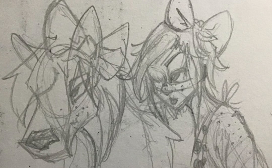
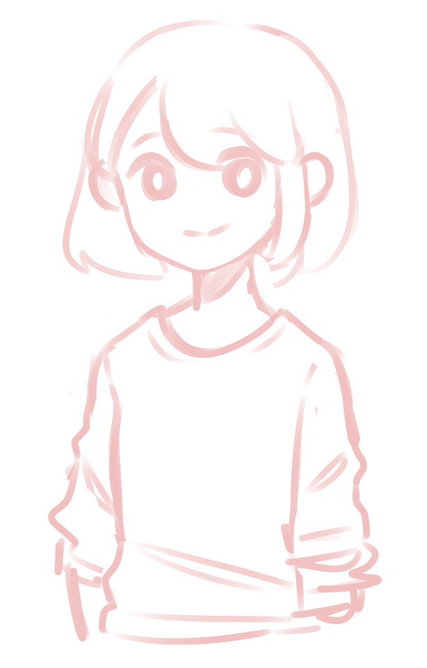
#i drew this for like a tutorial but realized i didnt have a way to 1) explain my process 2) wing my shit constantly 3) didnt like my format
Explore tagged Tumblr posts
Visit Tumblr Blog
Explore Tumblr blogs with no restrictions, modern design and the best experience.
Last Seen Tumblr Blogs


Fun Fact
12.7% of mobile users access Tumblr.
Text

ponies
#mlp#my little pony#pinkie pie#fluttershy#applejack#i drew this for like a tutorial but realized i didnt have a way to 1) explain my process 2) wing my shit constantly 3) didnt like my format#twilight sparkle#forgor her...#myart
2K notes
·
View notes
Note
9 and 10 for the artist ask game plz 💕
thank u 💕!!!
9. What is your favourite resource?
i mean, the resource i use most often is like. google lol. there are a lot of reference websites and tutorials, and tons of other stuff i dont use that would fall under the category 'resource', out there but i forget about them a lot and make my life harder by using google. although... theres a tumblr post somewhere that documents every corner of Five's bedroom in great detail and I owe that post my life
10. How has your style changed over the years? (Examples welcome!)
oh boy a memory one. lets see... I taught myself to draw using how-to-draw books, most of which had strong influences on my style, at least during the time i was using them. one of the earlier ones was a series of how-to-draw-manga books (that I've since been told aren't very good lol), so for a while even tho i didnt watch anime, my drawing style definitely looked like i did.
(this is my self insert Maximum Ride character from when I was like.... 10ish)
Since then the degree of anime in my art style has waxed and waned lol. At some point i got a book on how to draw fantasy by an artist that was definitely a furry, so the way I drew animals, especially dragons, had that furry-art-style look for a bit. I also had a deviantart wolves period (That second wolf is copied from the instructions in the book, which is why it looks so good lol)

I dont know how much of Seth's art style is present in mine, but I've copied his style since that Lemony Snicket series first came out in 2012 until... now lol (holy shit thats a decade what the fuck).
Another artist that had a huge effect on how i drew animals was Stephanie Pui-Mun Law, who you'll note is the only how-to-draw book artist whose name I remember. Her animals were a lot more realistic, and rather ethereal-looking, but she had (and has tbh) a HUGE influence on how i use watercolor. (I can't find any examples of watercolor so you're not getting any unfortunately)

At this point I also started being online, and found fanartists (mostly Percy Jackson fanartists at this point, tho eventually also Voltron) whose work I liked and whose styles I would borrow for a bit and discard. One of the artists I really liked was a furry, so this is furry art style 2 electric boogaloo
we're starting to understand the concept of proportions, folks!
here, you can see a drawing that is influenced nearly exactly the same amount by the perviously mentioned furry fantasy book, and Stepanie Law.
And of course, Steven Universe was huge for me. Now we're in "some of this art I still like" territory, or the last 3 years of high school
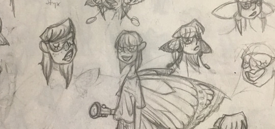
Thats Thanatos and Hypnos btw. Hades did the sleep mask thing too, which amused me when i realized.
This is around when I got my tablet and started doing digital art! My art style is pretty fully formed by this point. I think the main things that have changed since then are that the Steven universe influences have gotten less obvious, i have never settled on how I like to draw eyes, and I've gotten like. better at it lol.
#for the void#trying to construct my vague memory into a timeline was HARD folks!!!#but it was fun#in case you were wondering 9th grade is like. the year my art got 'good'#i went from art in 9th grade being mostly bad with some stuff i still like#to 10th grade being mostly stuff i still like okay with some stuff thats bad#long post#thanks for the ask!!! this was fun#if anybody still wants to ask me any of these i'm still good to answer
4 notes
·
View notes
Text
Lets talk about the destructive mindset we artists have
Ive probably talked about this before (call me araki bcs i cant remember shit), but it wont hurt to talk about it again.
So, for about 8 months now ive been trying to get back to my old way of thinking surrounding making art. Back when i was horrible at art. I mean, look at this, its hot fucking garbage.

But the thing is, it dont matter. I had fun making it. I drew it in some manga art software about 8 years ago. All i had was the mouse. This character is one of my own, i drew her constantly. Back then i didnt care what people thought. I didnt care about peoples expectations. I just wanted to create bcs thats what ive always loved. Ever since my mom gave me pen and paper when i was 9 months old bcs she couldnt afford toys for me, i have been drawing. Once i started art school when i was 16 i started to care. I started to feel bad that after drawing for my entire life my art didnt look good enough in my eyes. “Ive had my entire life to get better and yet im still drawing bad”

The thing is tho, i wasn’t that bad at drawing for being 16. But back then i wasnt enough. That way of thinking have been following me for 6 years. I became my worst bully. I started watching videos of people saying that “dont do this and that bcs its bad, same face syndrome, dont use layer effects, black lines bad, and so on”. I also watched a ton of tutorials, wich isnt bad, but i was looking at them from a bad perspective. I now knew how to do how they were doing, so why didnt it turn out good?? I even started to put expectations on others, that they needed to be better.
That way of thinking havent helped me in the least, fuck the worst thing imaginable for my art almost happened last year, I almost gave up on doing art. Thats when i realized that i need to stop thinking like this. I went from painting like this


to this. None of them look bad, but one of them def had less effort put in it. For the first time in a long time, i had fun drawing. I didnt care about the outcome. All i cared about was to have fun like that over and over. Sure i still did my paintings now and again, but i did them bcs i wanted to. Not bcs that was what i though was what i was supposed to do.
Comparing my simpler art with the paintings i did back when i had that destructive mindset i can see a huge difference. The simpler art had feelings, dont look stiff and forced. I can see how fun i had.
Now and then i slip back to that mindset and i still have a hard time seeing the good in my art, but every time i do i remind myself “who cares. if you have fun thats all that matters.”
You dont need to be good at art. There are tons of people out there that dont care about even making art and they dont need to be good, so why should we artists need to be?
A good way to get out of the toxic mindset is to remind yourself “why am i making art. Is it for others approval or for my own enjoyment?”
It takes time to get out of that mindset, but its worth it.
109 notes
·
View notes
Note
Your art is so aesthetically pleasing! I was wondering if you could tell how you draw folds? I mean, how to understand them, I'm terrible at them and look super stiff and unnatural ... if you don't want to, I understand, and I hope I didnt bother you! have an amazing day
Thank you so much! I’m sorry this took me approximately 10 years to answer, you’ve probably mastered clothing folds by now and dont need advice from a pleb like me but!! here i am anyway! The usual disclaimer: I haven’t done a proper study of folds in a loong time, now that I’ve left art school I mainly have been focusing on my own stylized art so I’m pretty rusty. That being said, observation and practicing from life is the best way to learn! It doesnt even have to be clothes (though fashion studies are the best and i realize now I should have done some for this tutorial and I am a fool) but just placing cloths over random objects and drawing them can help you learn how cloth works with different shapes. And since the body is essentially made up of a bunch of geometric shapes, this will translate over to clothing!But yeah, this tutorial is pretty hypocritical since I dont always pay attention to fleshing out folds in my art hehe
Let’s start by introducing Blank Slate-chan or Blank-chan for short uwuI’ve given her a Tshirt, and it looks okay but its a little flat. It looks more drawn on then anything.
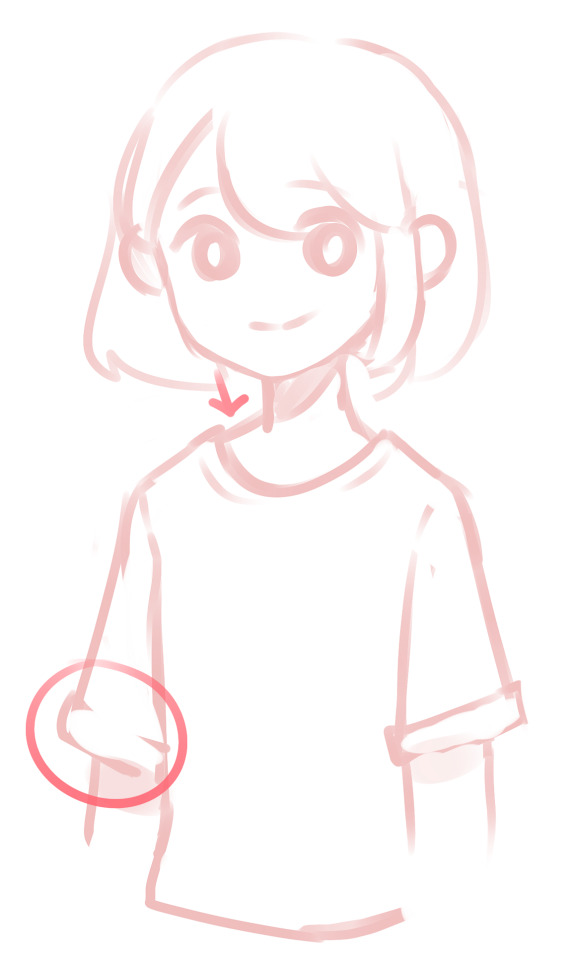
Right off the bat, before we even begin to cover folds, we can add some details that make the shirt pop off the character. For instance seams on the collar, shoulders and bottom (though I didnt add any on the bottom in the example) and rolled up sleeves/like those fake rolled up cuffs that are sews on to tshirts can already add depth. Furthermore I’ve added some cast shadow from the oversized sleeves onto the arm, and the shirt separated from her skin at the top so its resting on it rather than looking like it’s part of her body.Seams can be especially important when indicating what kind of fabric or style of a piece of clothing your character is wearing. I find them especially helpful in separating jeans from say dress pants, as well as formal clothes. It helps to observe and thing about how a piece of apparel is sewn together to determine where you want to draw the seams.
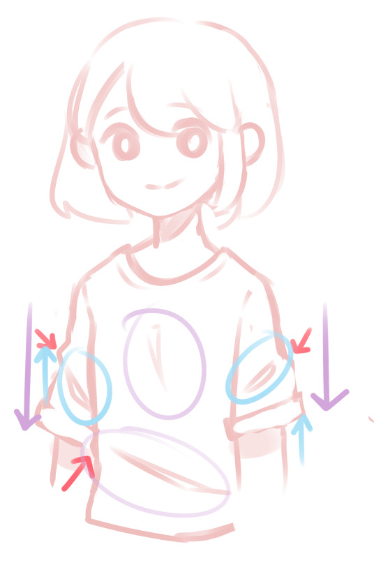
Okay this mess of arrows is my fault but bear with me ;v; In this portion I’ve now moved on to folds. Before we get into the details of the image, there are 3 forces that affect folds, and you should keep them in mind when drawing. Those forces are gravity, compression, and stretch. I’ve color coded each of these forces, though stretch is not shown in this image.So first off the purple arrows represent the force of gravity. This is always going to be a force on earth and cause folds from handing fabric like in between the chest or at the looser areas of the shirt.Then the blue is compression. I don’t have a good example of it here since I’m drawing mostly lose fabric, but its where the cloth bunches up because its met with two forces moving towards each other. In this (poor) example, the clothes are slightly compressed because Blank-chan’s arms are down, preventing the fabric from extending all the way down. I drew up arrows but its not so much as a force moving up as it is the fabric being caught. A better example of this would be tighter fabric gathered around a joint like jeans around a knee when its bending. If you can visualize that you’ve pretty much got the idea.Honestly, don’t let all this force stuff confuse you! I know I didn’t explain it amazingly, but you kind of get used to was looks more natural as you draw more fabric.And lastly the red arrows are just to point out that you need more than just suggestions of folds. Like the collar of the shirt sitting on the skin, the shirt will bend if there are folds so make sure you draw it sticking out rather than just being flat.
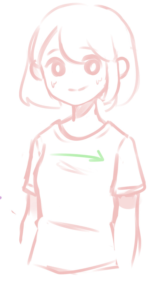
For the sake of an example let’s give Blank-chan a slightly bigger chest and some tighter clothes. The shirt is a little more formfitting and so it stretches over the chest. Cloth that is stretches usually has folds that are more horizontal or vertical depending on the points of tension. With tighter clothes, more of the anatomy shows through which is why you should always consider what the body is doing underneath. Though this still applies to looser clothing and you should be considering the body, you can get away with anatomical errors more easily which, confession, I do a lot.I prefer wearing and drawing looser clothes, so I’m not an expert on tight shirts and folds. Even this shirt I’ve drawn in this example is pretty loose but you can always change it as you see fit.
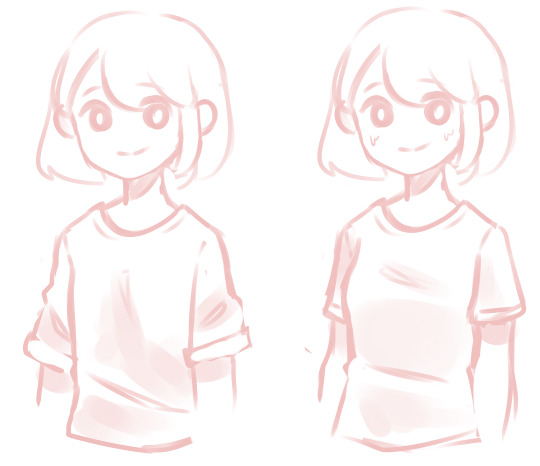
Here’s a comparison of the two without the messy arrows and with some additional shading. Shading can really help define even more shapes and bring depth to the folds, but that falls more under a coloring tutorial so I won’t go into that too much.You can of course exaggerate either of the two examples, either making the clothes a lot looser and adding way more folds or making the fabric tighter and adding more compression folds and showing the form through the clothes. Be careful with adding too many folds though, as it will either looks too crowded or like your character is soaked, unless you’re going for that.
And then last few tips that I wasn’t sure where to put. If you’ve notice, a lot of the fabrics I draw tend to look heavier, like sweaters. In this super messy example you can see that adding tons of compression folds and making the fold rounder makes the fabric look heavier. Like wise using maybe more gravity folds and sharper/thinner edges may make the fabric look lighter!When drawing folds I like to use triangles to represent them. I think those shapes tend to look the most natural. Again, you can round those off or sharpen them depending, its all up to you!
mm, this is a pretty basic tutorial, and there’s lots more information that I could talk about like materials, different styles of clothing, etc etc but I think this is enough to start out with? I hope I helped at least a little and remember that fashion studies are your friend!
432 notes
·
View notes
Text
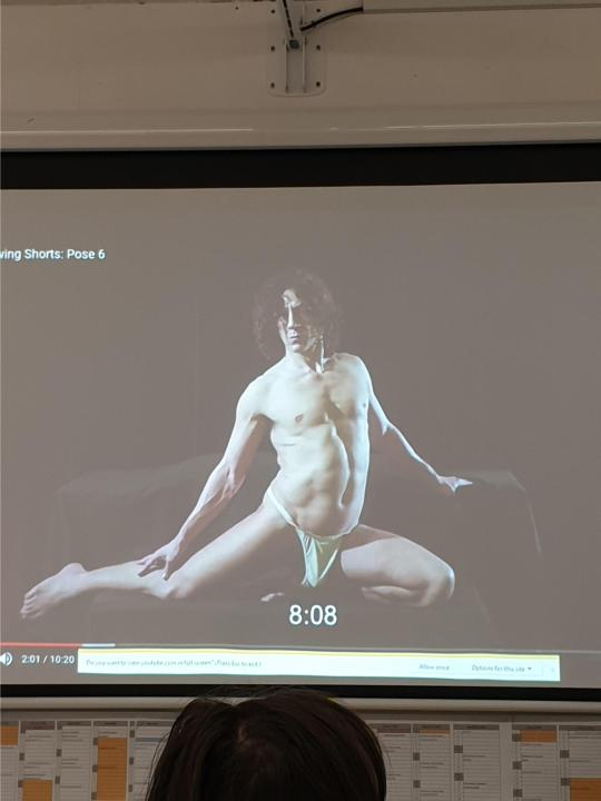
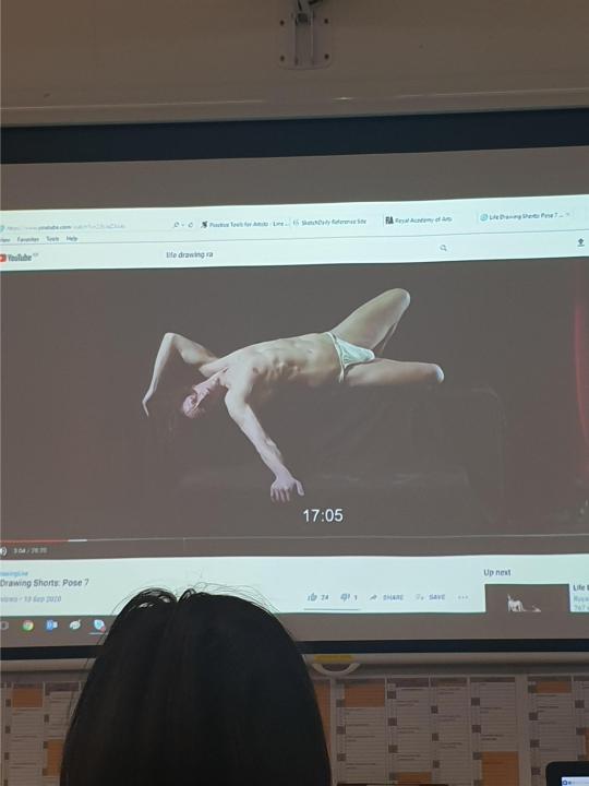
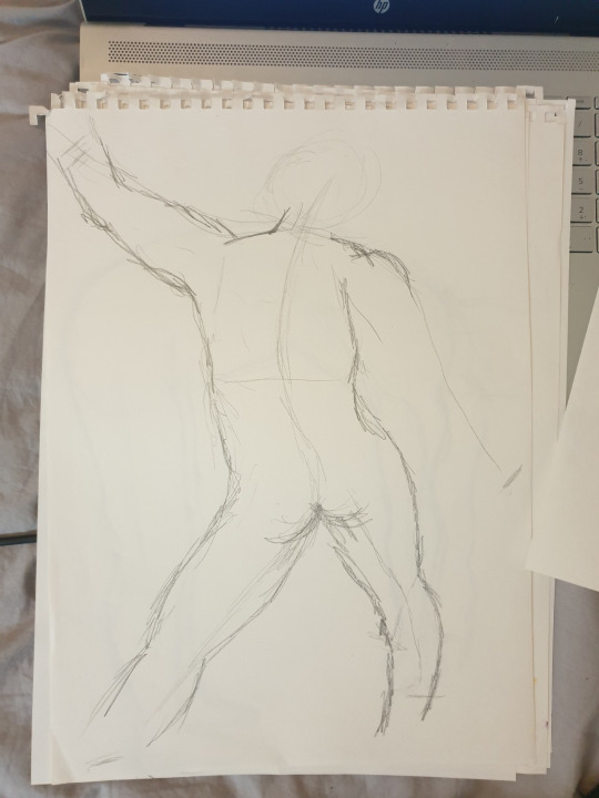
Life Drawing
my personal experience of life drawing for the first time, we unfortunately due to corona virus could not do actual life drawings from a life model standing in front of us, we opted to draw from the royal academy life drawing model videos on you tube.
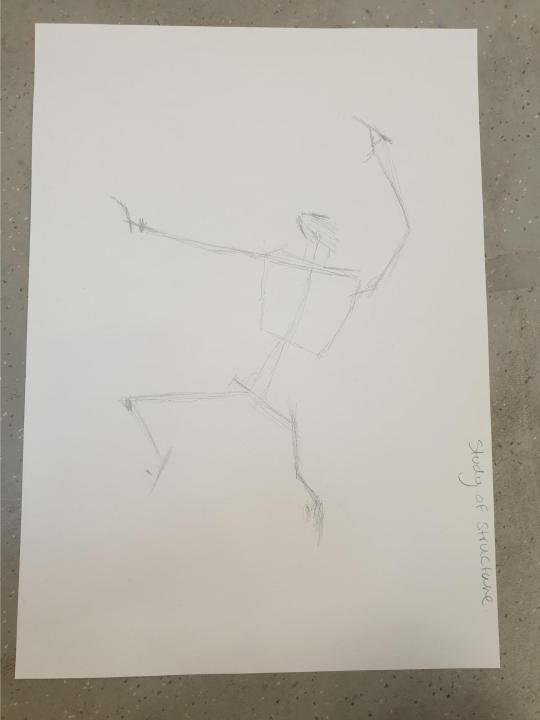
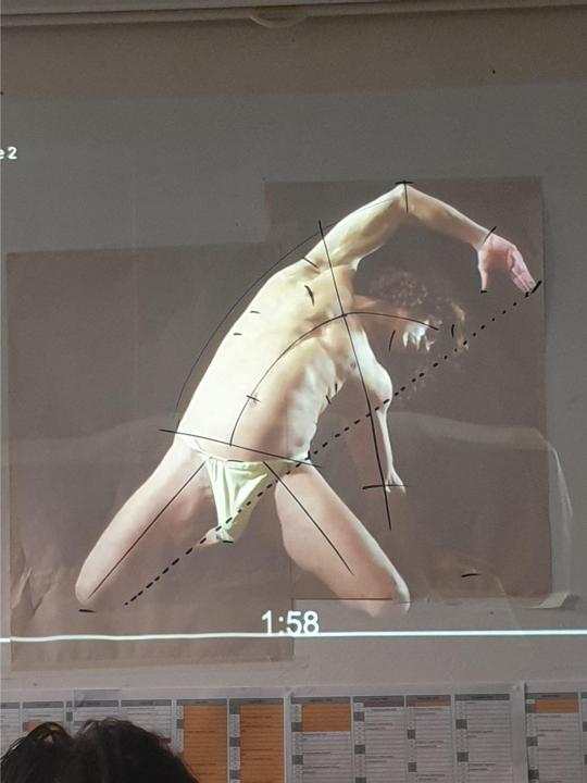
the first sketch was just the lines of the body, basically stripping back all of the skin and imagining the skeleton and where certain bones would be and whats connected to those bones, i found it easy to pick out the four main corners on the first would of been the right knee right hand left hand and left foot , marking the whereabouts of these main parts helps me figure out the proportions and i manage to fit it all on the page rather than go off or go too small.
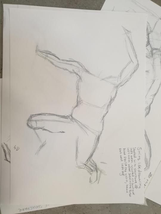
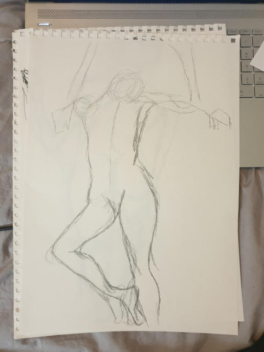
we then started to do the main body lines around the structure, this time we were timed 5 mins, personally i was quite impressed with how well i did in the 5 mins as i was quite anxious to draw the human form
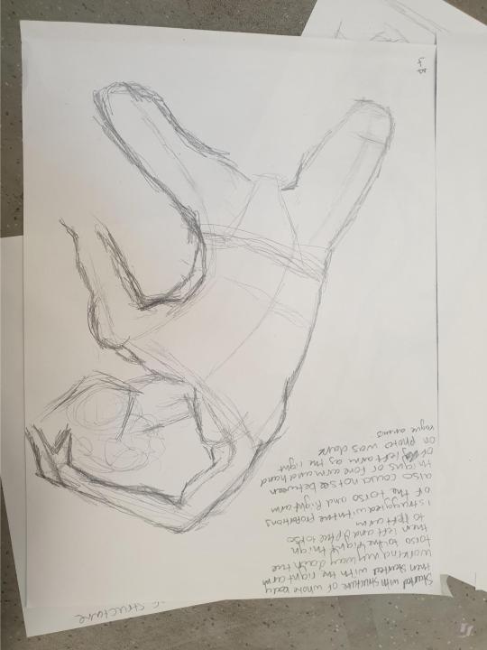
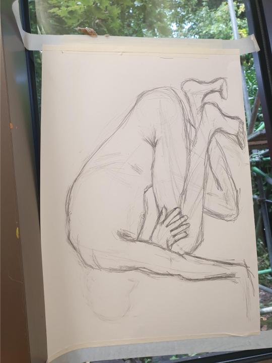
my second go in a different position was much more difficult, i really didn’t find this position easy for some reason and got it wrong many times as seen where there two arms and the proportions are really quite wack.
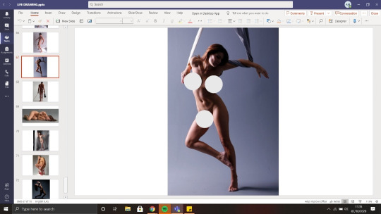
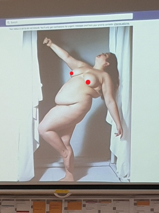
reference photo
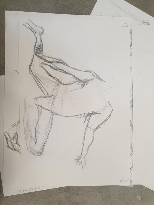
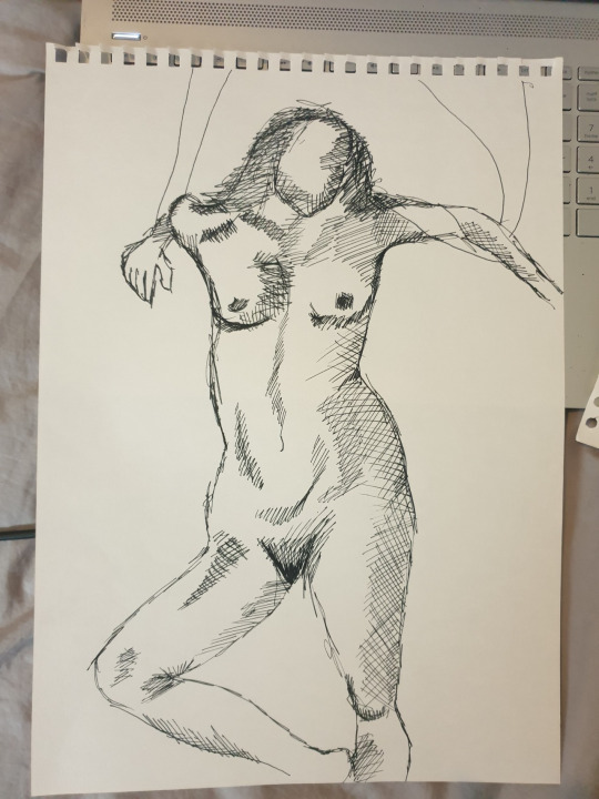
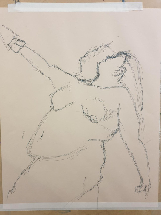
this was my favorite timed one i felt like i had learnt a lot by the time we drew this one, it was timed 20 mins and the model was positioned on boxes so i did draw them in to get an idea of where to place the body, its not perfect but you can clearly see its a man lay in that awkward position.
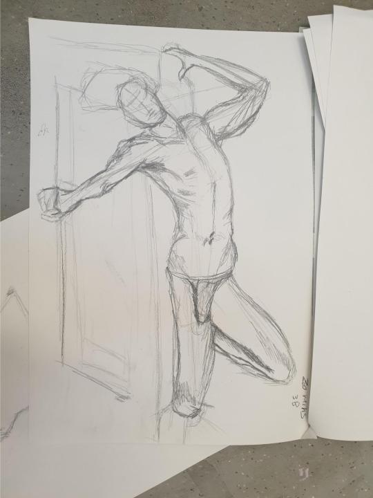
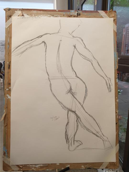
after we all drew together i went to my space and did a couple of my own, i moved from a3 to A1 so i had more freedom and felt like i could get the proportions better on a bigger page.
Life Drawing 2
i wasn’t in for this lesson but i attended online and took part. my screen was a lot smaller than what it would be in the studio projected on to the wall so i had some difficulty with proportions more than usual.
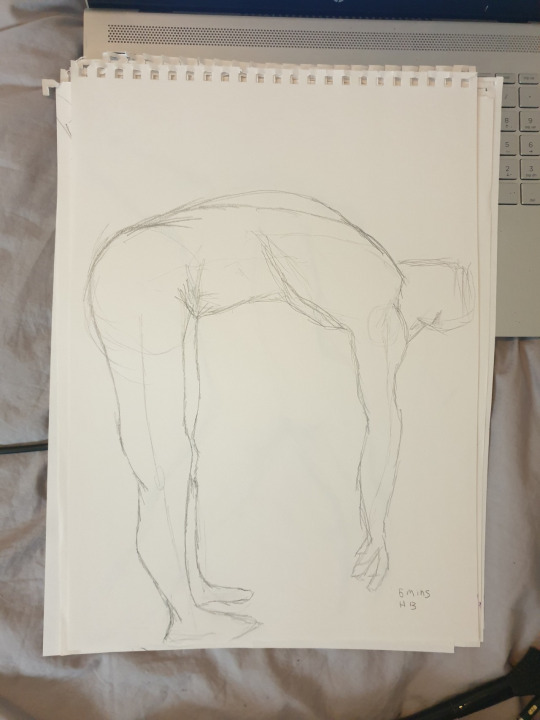
first attempt was a non timed 5 mins in HB i started off with the main points which were, head, bum, hands, feet. i then drew the structure stripping it back to the skeleton i then drew the general shape of the body around the lines i had made, i tried to keep my lines to a minimum as i often get very sketchy and lose the shape that i am trying to achieve.
i marked the main points which were feet and hands but then i drew the body way too big and didn’t fit all of the body parts on the page. this drawing was around 2 mins timed in 6b, i used the same process as the one before. points, lines. shape
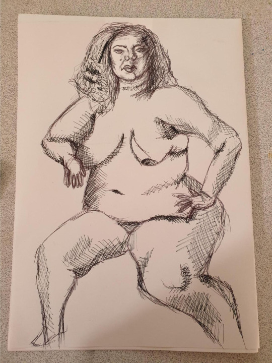
fine line drawing with cross hatching as the main technique. this one i was nervous about since it was pen and quite bold, i started off just drawing the main shape of the body, no key points, no lines just went straight in with the outline. at first i hated it and thought it didnt even look like the right shape but then i started adding tone and debth with crosshatching and darkening the lines and by the end i loved it and its one of my favorite life drawings i have done, the proportions are slightly off but other than that its really successful.
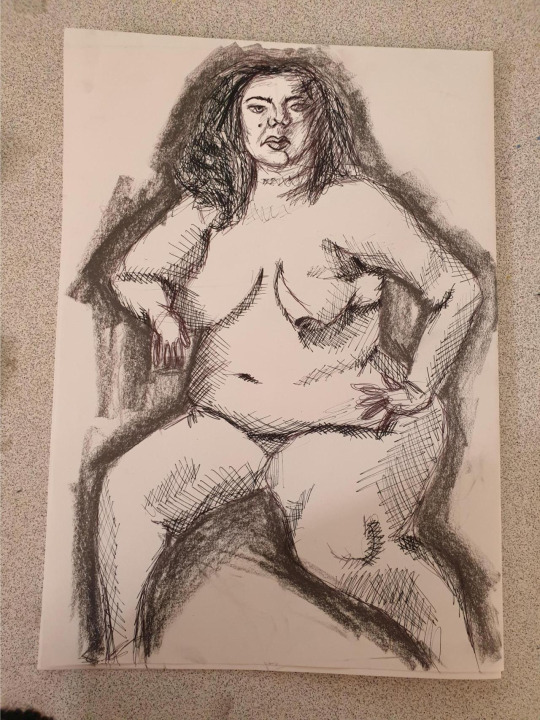
i hated this black fine liner continuous line drawing. it was awful and i hated the whole process, i kept feeling the urge to want to take the pen off the page and i could not hack the proportions at all. but on a positive note the arse is quite peachy.

this one was very rushed but its not the worst, i used a pink sharpie as it gave a different effect. the proportions are still bad but in its own way and style its quite an interesting drawing that i don’t hate to death
life drawing 3
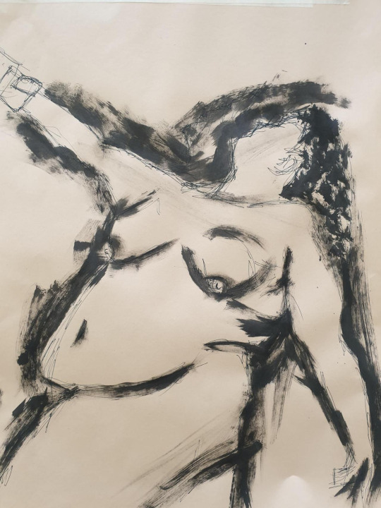
this life drawing was on a larger scale and on a different type of paper (no idea what the paper was) we did a line drawing in fine liner, i was quite pleased with my proportions even tho i managed to not fit the legs in i was happy with how it looked in just fine liner. after we were happy with the shape we had created we went in with ink, i used a sponge to get a texture similar to the dry brushing technique we used the other week.
i feel like i lost my image by using such a thick sponge i wasnt able to get the defined lines i wanted, i was much happier with the fine liner outcome rather than when i had added the ink.
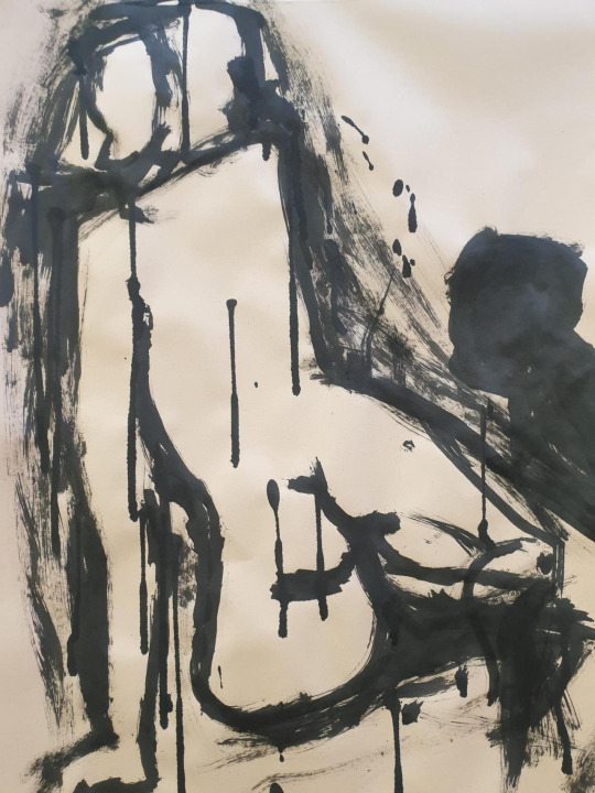
second time around we went straight in with ink, no fine liner line drawing to map out the shapes just ink. i immediately messed up hence why the head is completely deformed, the ink was runny so i made some accidental drips om the page but decided to ad more and claim it as a stylistic approach.
Life drawing 4
A3 fine liner,biro and graphite drawing
i started the drawing in biro making a sketchy style outline then adding shade with cross hatching with fine liner to make the drawing appear more three dimensional
i then used graphite to add a dark harsh shading to the outer side of the body, giving it even more dimetion than before, i am quite proud of the outcome and even tho the proportions are off it really shows my progress in life drawing so far in to the course.
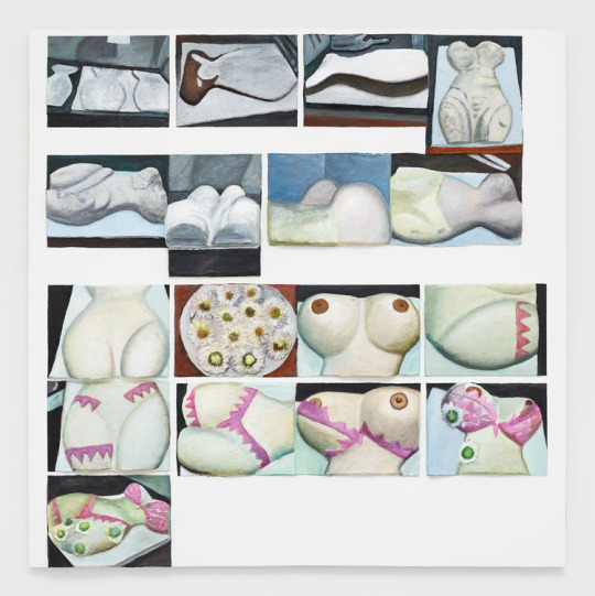
Gina Beavers
Gina Beavers is an artist who lives and works in Newark, NJ. She holds a BA in Studio Art and Anthropology from the University of Virginia (1996), an MFA in Painting and Drawing from the School of the Art Institute of Chicago (2000) and an MS in Education from Brooklyn College (2005).
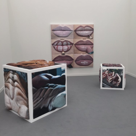
She creates paintings and installations from photos culled from the Internet and social media and rendered in high Acrylic relief. Series include paintings based on the creative realms of body painting, social media user’s photos of their meals, make-up tutorials, memes, and body builder selfies.
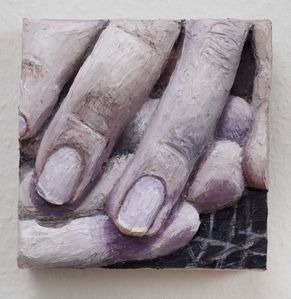
To create her three-dimensional canvases, artist Gina Beavers often works closely from photographs or Google image searches, reproducing even the smallest of details. Her reverence for the original image extends photorealism to its extreme in her reliefs of acrylic paint, pumice, and glass beads. Her work walks the line between high and low, and art and craft, while, as critic Roberta Smith once wrote, Beavers “exaggerates and satirizes the act of painting.” Favorite subjects include food, which she renders with the deflated realism of a Claes Oldenburg sculpture, and the human form, as seen in images of a body-painted Demi Moore or exaggerated six-pack torsos.
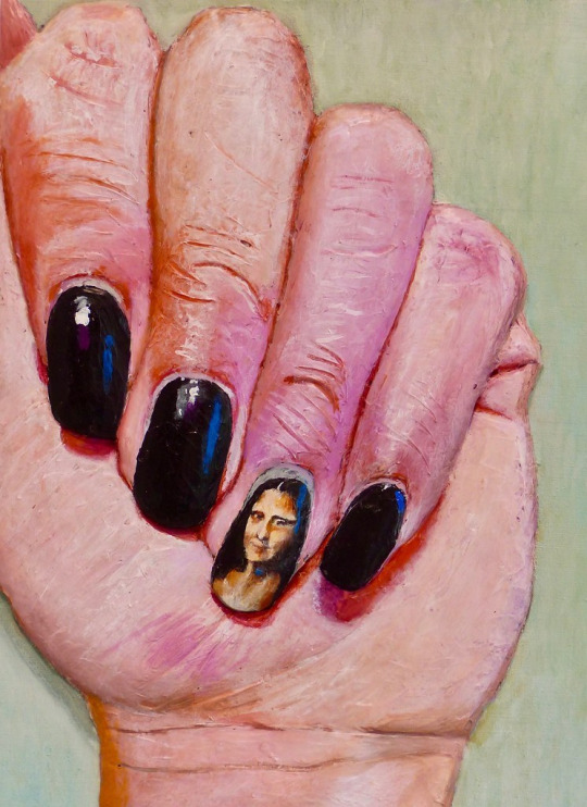
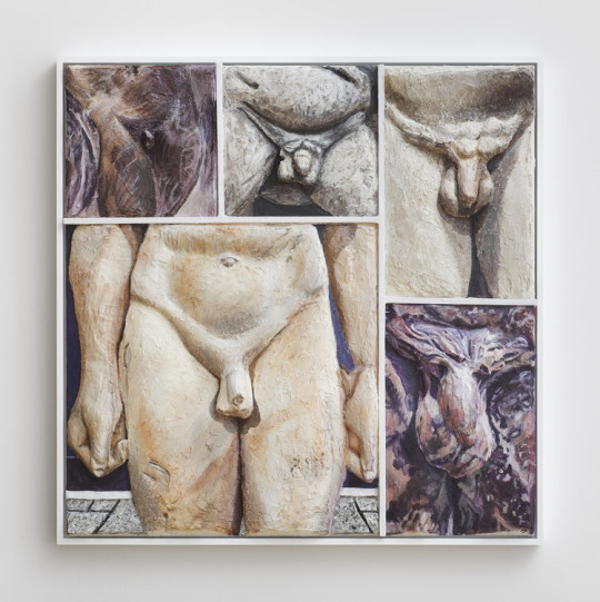
I chose to research Gina Beavers because her work on human form really intrigued me as it was not only human form it was 3D and sculptural, it also reminded me of my sculptured toe shoes by the texture and unusuality of them.
Though my work was made with toilet roll and pva glue, hers was not, it was made with acrylic paint and acrylic moulding paste, some of her larger sculptures required wood with the acrylic moulding paste to create a larger structure.
I also like her take on the human form as its not accurate, its her own interpretation, its got her own style on top of it which is key as she uses found images off Instagram and google.
Still Life
we were tasked to create a still life with found objects in the studio, my first thought since it was life drawing at the moment was human form so i bought in a bust mannequin and a mask to stand as the face
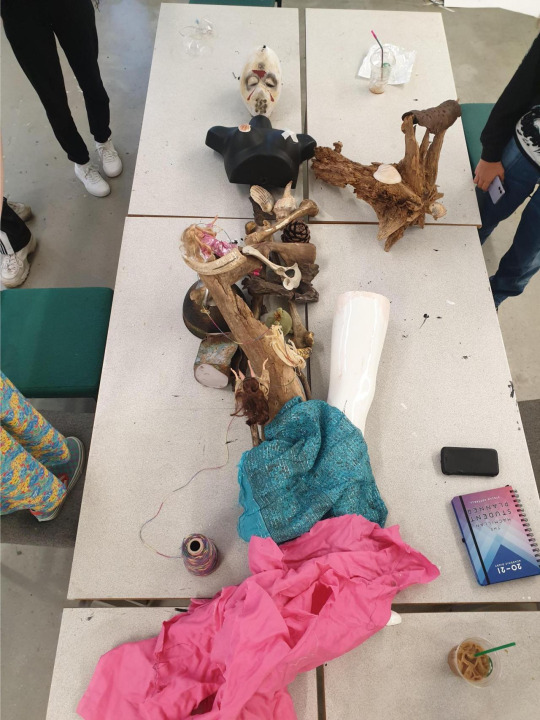
our first attempt took a matter of mins and the end result looked like a mermaid from above. but david wasnt happy with that was he . so we tried again
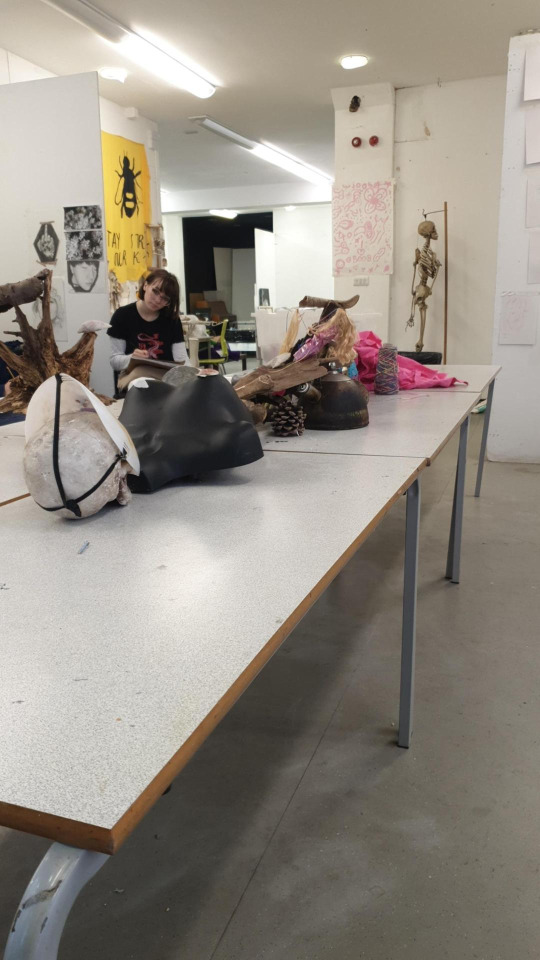
we started building up height and using the space around us not just the table, but after this attempt we realized we werent working as a team we were just doing our wont thing and not communicating with others so there was no flow to the matter.
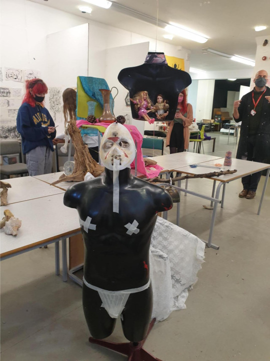
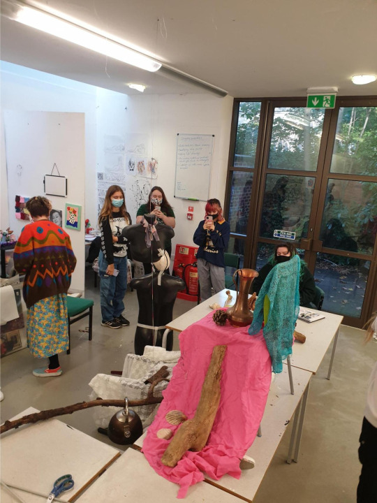
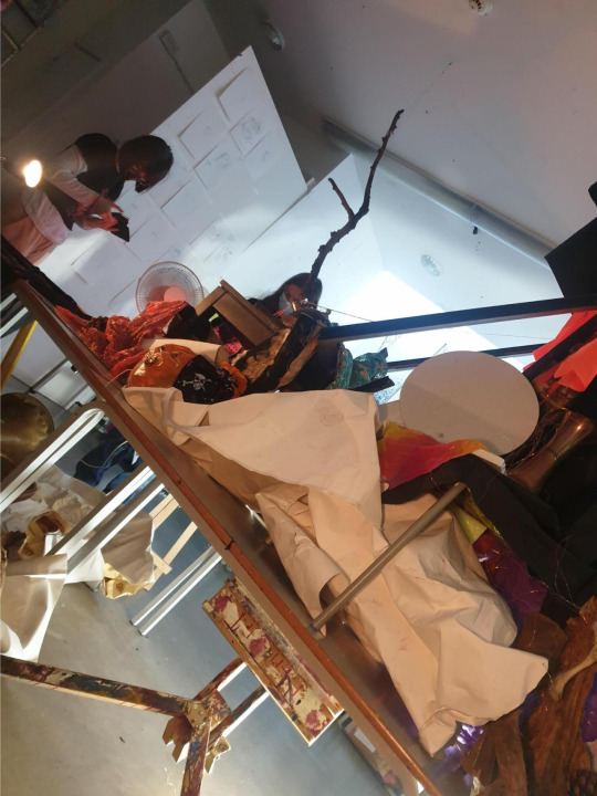
so we went higher and bigger and better putting each person in a team to work on the specific area of the structure and it all started to come together.
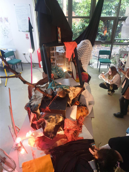
we even added lights to give it more tone and depth
the still life no longer looked like a human form but a flow of our minds working together to create a composition that could be explored in so many ways.
0 notes