Learning to put myself out there into the art world.Documentation of this processes highs and lows.
Don't wanna be here? Send us removal request.
Text
Artist Instagram Update
Over the course of the project I have been posting on and interacting via my artist instagram. Here are some pictures of interactions and what I have posted.
I have found that using tags has helped me reach out further and gain a bigger following. I also use tags to find other creators who I hope to interact with, such as collage makers.
I have also had a few people reach out to me and ask me for collaborations, which are to go ahead this summer! I am excited to continue on learning about how to promote myself.


0 notes
Text
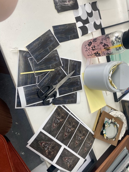
One of the students within my class commissioned me to make them more stickers, as they enjoyed them so much during the test site exhibition. This was a lovely experience, which allowed me to think about how to interact with a client. I had to ask what they wanted, the size, colour and shape. Then once printed I cut them out by hand, which was time consuming but I was willing to put in the time as a paper cutting machine would have been harder with how I laid out the pictures. We also discussed cost of my labor, which is something I have only thought about when developing my depop account. We decided that if she helped me with some of my work, such as some writing I had to do, I would consider it even. She was happy with this and so was I, if this were a normal customer and not someone I knew, I would have asked for money but this worked for me perfectly. When she received them she was very grateful and I can't wait to see them on display at the next show.
0 notes
Text
Artist Statement - Draft 2
After speaking with a lecturer about my artist statement we decided it was not hitting the mark it needed to. Instead, I will be tailoring it to be more inclusive of the upcoming degree show, instead of a general statement. This will allow me to use this statement at the show and have it displayed beside the art, helping visitors understand me and my process a little more.
Looking into more documents of information, I will take nots and be able to adjust my statement so far, taking forward what worked and discarding what doesn’t.
Final
I could argue almost everything is a form of collage, Hannah Höch being the seed of this with her philosophy that any item is worthy of inclusion. To quote her; “There are no limits to the materials available for pictorial collages—above all they can be found in photography, but also in writing and printed matter, even in waste products.” Contorting me into a form of magpie picking up discarded materials as 'potential' inspiration. Using sweetie wrappers, price stickers, discarded magazines, charity shops finds and more, I unite them into one story. Reusing the old and forgotten to make new, thought provoking subjects based around the waste we contribute while conforming to trends.
0 notes
Text
Critical Review
This project has led me down a path I had not expected myself to enjoy, one of which I feel will encourage me to continue exploring and researching. As someone who has been described as quite literal, their art leaning to the easily readable with straight forward intentions, I have found myself dipping into the conceptual avenue. Asking myself to look beyond the physical and experience the idea for more than just a starting point. Taking the picture from the frame and asking, which is more important, is it, and why?
‘However, the frame is still considered secondary to their work of art. A simple reason that the frame is given a lower status to the painting, is because at the end of the day, it is a utilitarian object. Regardless of other implications, the frame’s main function is to protect and preserve the artwork.’ (Kapczynski, I. (2019)) Having read this piece Artist Frames: A Lost History Tracking the Innovations of Discarded Visions by Isabella Kapczynski, I wandered through the exhibitions, finding myself scrutinising the frames rather than the pieces themselves. Seeing the carvings, the paint, dirt build up, was all so important to me that I felt I could not look away. Seeing the varying uses of the frames and how the artist could incorporate it into their work, for example, some continued to paint onto the frame as they did with the canvas, making the frame less of a border and more of a textural enhancement. Or those who used more than pone frame, prompting the questions of when did the art finish and the frame begin? This is exactly what I was looking for to find inspiration on where to go with my work into the unknown category to me of conceptualism.
To dive into this, I had to think about what the frame was providing for me. For me to do that, I decided to take it apart, by doing so I was getting personal with the frames, learning about the varied materials, details, forms, and sizes, as well as how they are treated and change overtime. Continuing to use discarded/second-hand materials, I collected my frames from charity shops. Seeing how they vary from brand new and tarnished, even smashed. At first, I enjoyed this, seeing a plethora of choice in my local area, however over time there seemed to be less and less. This then became a challenge, one I had to keep on top on to make sure I could fund my collection and research. Turning to friends and family for any collections they may have and not need, I managed to stay afloat. When I first started this project, I would never have guessed this was what I could come to. I often do not care for what my art is made on, or how it is displayed, focusing more on the imagery itself and the relationship with the audience. However, with talking to lecturers and eager to breach my bubble of comfort, I branched out into conceptualism. Conceptualism within art is a movement from the 1960s, which took off between 1960’s and 1970’s. The movement encouraged that the meaning behind the piece is of higher importance than its physical form. (Tate (no date) Conceptual art, Tate.) I put my collage to one side for a brief moment and plugged into this new pool of possibilities.
Making collages feels natural to me, playing with different materials and combining them for contrast and compliment I could sit with glee for days unblinking. I owe this passion to Hannah Höch, who’s pioneering within political collage material inspired me to pursue the same methods. Höch was born in Germany, but her work created during her career has touched hearts and minds across the globe. Höch declared that anything could be used within collage; “There are no limits to the materials available for pictorial collages—above all they can be found in photography, but also in writing and printed matter, even in waste products.” (Seiferle, R. (2020)) This encouraged me to be more liberal with the materials I use, letting go of my ego and using items I would have normally discarded, such as cardboard, sweetie wrappers, packing paper, carrier bags, clothing tags, string and more. Using these to find inspiration and add depth to my work, I feel a sense of success and glee, like a child gluing cheerios’ to craft paper. It was speaking to me, a younger and more vulnerable version.
Since I was wading in new waters, I looked for guidance from lecturers, who directed me towards Martin Creed, particularly his stacking chairs and deconstructive pieces. This led me to investigate deconstructing my collages, and instead see them for what the individual pieces are. Not tools, but art. Developing this I began to strip down the picture frames into four piles; the frame, the metal turn buttons, glass and the stand/back piece. Seeing it for the pieces they are, what it takes to make a frame, a collage within itself just comprised into something that can be used, rather than for pure aesthetics. Could everything be described as a collage? I suppose it is arguable, if we used the basic definition of it; “COUNTABLE NOUN [usually NOUN of noun] You can refer to something that has been made by combining a number of very different things as a collage of a particular kind”. (Collins English dictionary (no date)) This is something I feel strongly about and can feel myself continuing to explore longer after the end of this project.
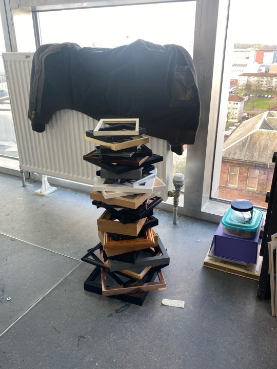
Compiling these piles of rubble into their individual sections of glory, I decided to try different methods with them. The towers of wooden frames I glued together with nail glue, something I found accidentally to work well with a range of materials (i.e., spilling it accidentally), it would dry quickly, invisibly, and held strong. The back support/stand and buttons I felt would look best loose, especially the buttons, allowing the viewer to touch if they felt the need. Touching is an important part of interacting in general, and I feel frames can often take away that personal connection, with the partition between I and the piece. The back/stands would be left askew among the ground, no longer used for support to hang, or hold the piece up, but contrastingly left to lie, with nothing to hold it up. With help from a lecturer, I was taken to the glass floor of my college where we cleaned the glass and arranged them into towers replicating that of the frames. Leaving them in the kiln, they melted down into an almost squishy, jelly like structures. This was a fantastic contrast to the glasses scary edges which threaten to shred who dare touch, now rendered smooth and friendly. Altogether, it looked more like a factory out of business than a usual exhibition. I was delighted.
They look fragile, but are strong and reliable, referring nicely to my collages which include dried flowers, as with a blow of the wind they move and sway yet stay strong where they are. Martin Creed wrote within his essay Paragraphs on Conceptual Art written in 1967, “When an artist uses a conceptual form of art, it means that all the planning and decisions are made beforehand, and the execution is a perfunctory affair.” (Nowakowska, Z. (2023)) Thus, inspiring him to create art where the meaning, influence and desire hidden within the art is more important than the physical. This is proved further on when he comments “the idea becomes the machine that makes the art” (Nowakowska, Z. (2023)). I have rendered these frames unusable in my process, pulling them apart. They no longer hold my art but have become it themselves.
Visiting exhibitions, I was able to explore how artists before me used frames. The craftmanship was incredible, to think how they used to be sacred and used for the most important imagery (primarily the church), now machine made and sold at cheap prices globally. The most notable detail being they are often not made by hand. The frames used to be apart of the art, coming together to compliment and blossom together. (Rogers, M. (no date)) However now, they are merely used to hold art, photography, mementos etc. Originally it was the Egyptians and Greeks who came up with using these borders, with the earliest frames dating back to 50-70 AD. Within the 12th and 13th centuries, frames developed into being a handcrafted passion, used as décor to boost the appearance of its contents. Shifting over time, instead of the art being made to fit the frame, the art is made, and the frame is second thought. (Rogers, M. (no date))
I wanted to show this personal development, which may not be obvious to an audience. From beginning with partly literal collages, pertaining to the concept of beauty and growth. From which the frames begin to disembark from the collage pieces, ending in piles of frames, glass, and metal turn buttons. For the viewer, I personally would read such a piece as being the de-escalation of creation. The de-evolution of the pieces. Contrastingly, to me, it is my evolution. It is my rendition of how I have grown over the past year, breaking through a boundary I have tiptoed around for as long as I can remember. Being able to create something conceptual, was a struggle I needed to tackle to blossom. The closer we got to install, the more excited I became. I do not think I have answered my original queries of which is more important, or why, but I suppose it will take longer than one project to digest and confirm. As though I was finally proving myself to be a proper artist, whatever that truly means I am not sure, but I could feel it. And that is enough for now.
Bibliography:
Collins English dictionary (no date) Collins Dictionary. Available at: https://www.collinsdictionary.com/dictionary/english/collage (Accessed: 19 April 2024).
Kapczynski, I. (2019) Artist Frames: A Lost History Tracking the Innovations of Discarded Visions, Digital Commons. Available at: https://digitalcommons.sia.edu/cgi/viewcontent.cgi?article=1019&context=stu_theses#:~:text=However%2C%20the%20frame%20is%20still,protect%20and%20preserve%20the%20artwork. (Accessed: 21 March 2024).
Nowakowska, Z. (2023) Sol LeWitt - why is this art!?, The Art Story Blog. Available at: https://www.theartstory.org/blog/sol-lewitt-why-is-this-art/#:~:text=In%201967%2C%20in%20his%20essay,craftsman%2C%20he%20decided%20to%20approach (Accessed: 19 April 2024).
Orley, H. (no date) Hannah Höch , Moma. Available at: https://www.moma.org/artists/2675 (Accessed: 19 April 2024).
Rogers, M. (no date) A brief history of picture frames, Frame Destination. Available at: https://www.framedestination.com/blog/picture-frames/a-brief-history-of-picture-frames (Accessed: 11 February 2024).
Seiferle, R. (2020) Collage Definition Overview and Analysis, The Art Story. Available at: https://www.theartstory.org/definition/collage/#:~:text=H%C3%B6ch%20created%20photomontages%20for%20the,oeuvre%20challenged%20%22the%20racist%20and (Accessed: 12 April 2024).
Tate (no date) Conceptual art, Tate. Available at: https://www.tate.org.uk/art/art-terms/c/conceptual-art#:~:text=Conceptual%20art%20is%20art%20for,1960s%20to%20the%20mid%2D1970s. (Accessed: 19 April 2024).
0 notes
Text
Degree Show Proposal
I have grown a lot personally through this project and have found things I both love and dislike, a true learning roller coaster. So, for the final, I will aim to have a piece of everything on display, in hopes to show a glimpse of this. From my collages in the frames, preferably displayed on a wall, cascading down until it meets 2 plinths of different sizes. On the plinths will be the melted glass, high enough for viewing and out of the way of being stepped on or in danger of falling. Then coming up from the floor will be the towers of frames. I will practice this in my space beforehand, to get a good idea of materials for suspension, space, and configuration. Beginning this project by focusing on beauty and what this means to the holder. Researching who truly defines these standards and what is wrong with our base components? Why was the original form not enough? Stripping down imagery I found within magazines, to then display, leading me to then strip down the display piece itself. How much can we take away from ourselves before we are no longer ‘ourselves’, but a bundle of pieces?
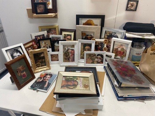
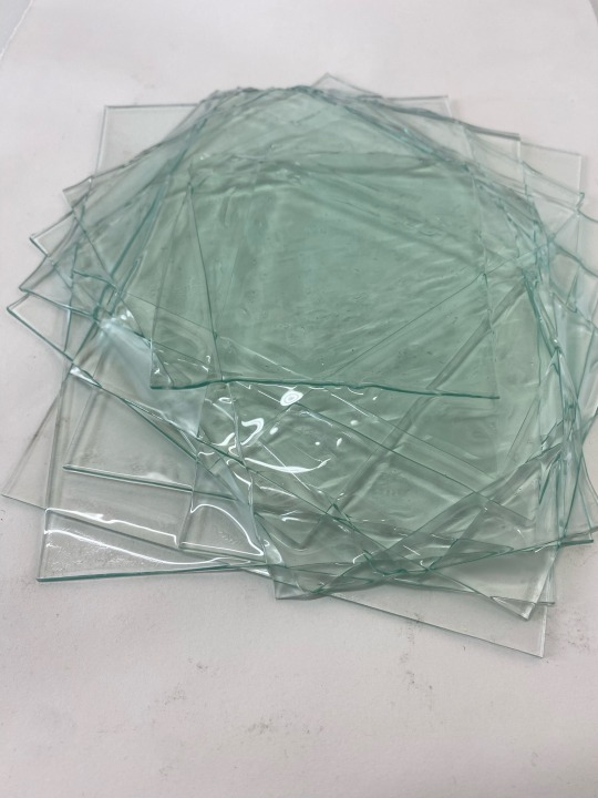
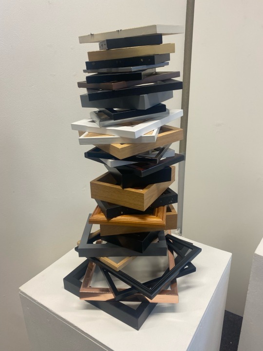
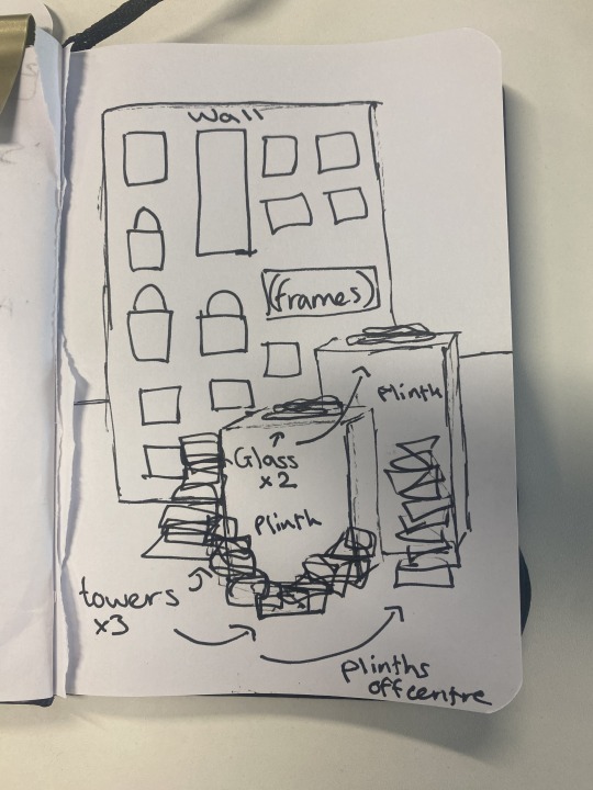
A narrated sketch to visualize my idea, which helps me curate and build confidence during the planning process. On the wall (around 120x240cm), I have found recently that frames are held up well with command strips, so I have bought many of these in advance. However, I am prepared to use nails and a hammer, if need be, as the frames have built in hanging points. Command strips will also allow me to move them around a little more to play with composition, with little to no damage to the wall. The glass will be fine sitting down on the two plinths, they are heavy, so they hold themselves down well against any budging/nudging of the table they are on. The towers are also sturdy, being held with strong glue and hold up well with food traffic around it. I have tested this by dancing around and using heavy, bouncing steps to find a breaking point. A slight wobble, so there are no concerns. I want the plinths to be off-centre to the wall, as a hint towards my progression here was not linear, nor what I had in mind for the show at the beginning of the project.
0 notes
Text
Artist Statement - Draft 1
I could argue almost everything is a form of collage, Hannah Höch being the seed of this, contorting me into a form of magpie picking up discarded materials as 'potential' inspiration. My work chases the feeling of 'completeness', being able to look at the piece and feel content, as though it was the puzzle piece within my journey as a creator.
0 notes
Text
Artist Statement Research
Notes
Authors says within an interview with art critics about when they read artist statements, the general answer was that they do not. That they find them to be generally inaccurate or poorly written.
BUT, we still have to. Even if they are rarely read, it can be used as a way to vet professional artists from the lesser so.
Rewriting them over and over again helps you to weed out the waffle.
Shorter seems to bring out better quality, less space for rambling.
Avoid buzzwords like 'creative expression of feelings' and art jargon like ' juxtaposition of daily like and spirituality' will not gather an audience but lead them away. It does not separate you from other artists.
Subjective terms are a no, as the reader might not agree. The viewer does not need to be sold on the value of the art if they are not buying it.
Keep it professional and on topic, if your work is humourous then having some humour is fine, but otherwise no.
'I' or third person is fine. You should sound professional and good to work with.
Include; materials and media you work with primarily, not a scope, also the viewer does not know off the cuff what you have done and how, so explain it. Concept and subject matter, which are not the same thing all the time, your concept is why, the subject is the view. What does your work do and why. Use active words like connect, experiment, challenge etc.
---------------------------
Notes
General introduction to your work and you.
Open and clear.
Short as possible.
Overall visions.
How does it relate to the surrounding world.
Influences.
Is there important factors you do not want missed; techniques or mediums used that is not obvious to the viewer.
DO NOT; explain your role in the world, use cliches, jargon writing, long dissertation of the work and yourself, brag.
------------------------------
Notes
map out your ideas and pick key words and phrases which describe you and your work.
Try not to sound the same, read as many statements as possible to get a gist of how people can sound, and bring your own personality into yours.
Avoid models or formulas.
Write down and answer questions you would want an interviewer to ask you. Or perhaps get someone to ask you questions after seeing your art.
Set a timer so you can be quick as possible, this leaves out room for rambling to come in.
Write many drafts, statements will and SHOULD change over time, reflecting how you have changed too.
0 notes
Text
0 notes
Text
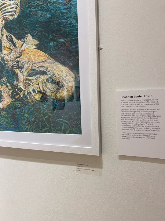
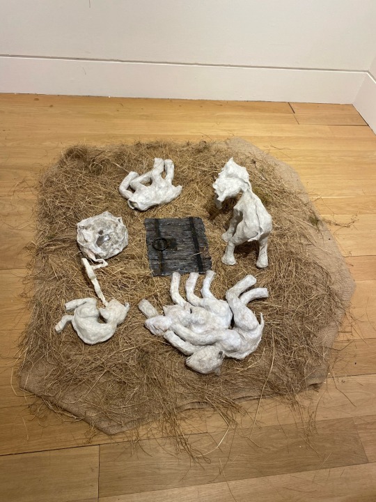
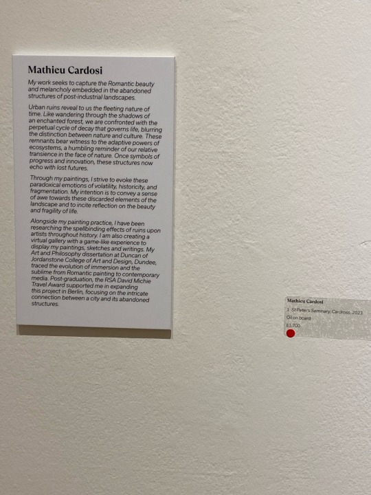
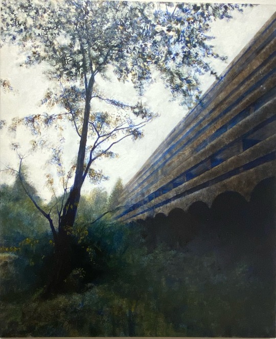
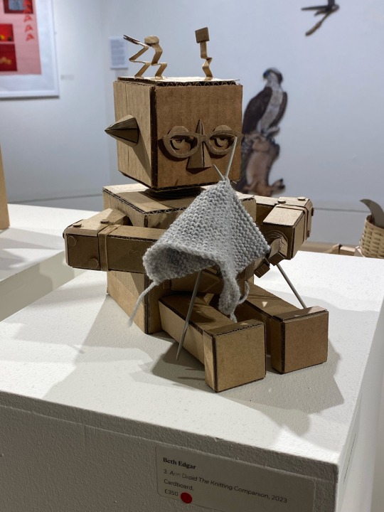
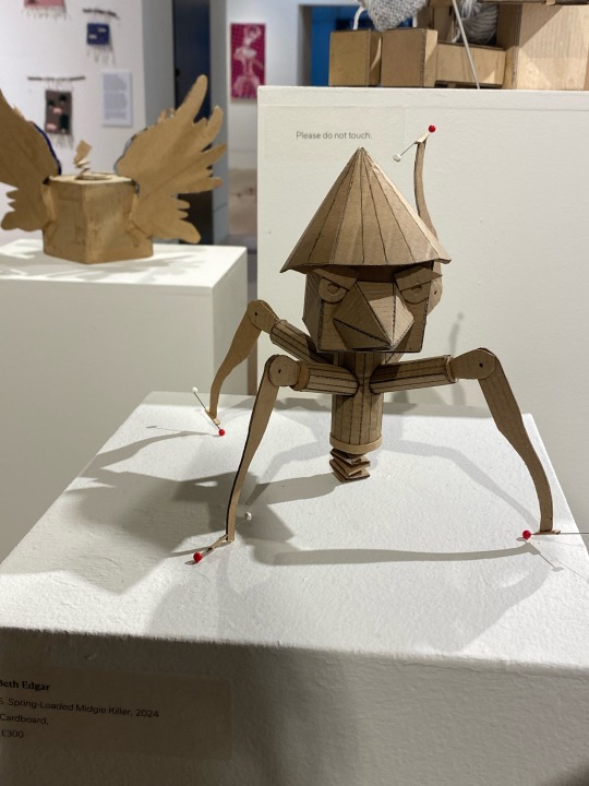
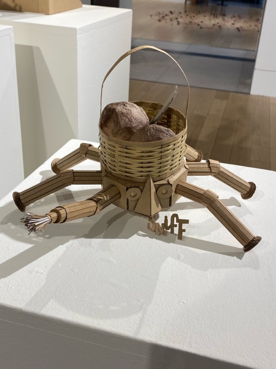
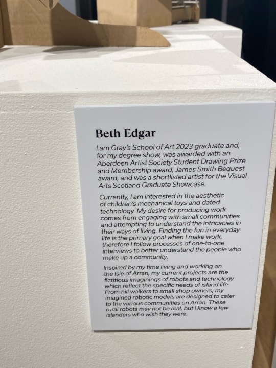
Next we have some floor and pedestal pieces, which apply to me greatly due to the towers and piles I will be displaying. The work of Edgar was particularly curious to me as the display of the pedestals looked rather quirky and different. Not straight and perfectly square but laid out in a fashion that was unique and somehow mathematical, quite like the models displayed on top. This will make me think about how I can display my work and the plinths they will be on.
0 notes
Text
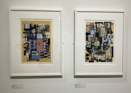
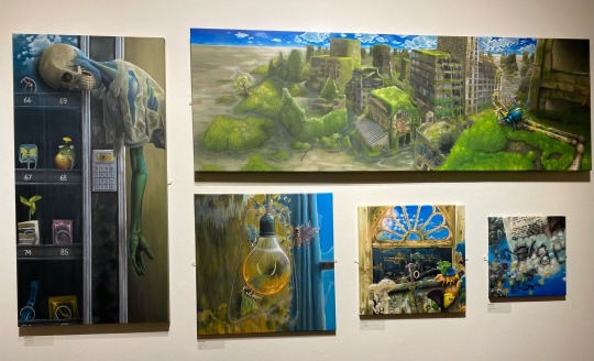
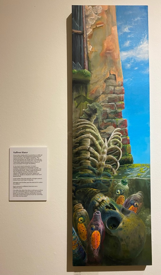
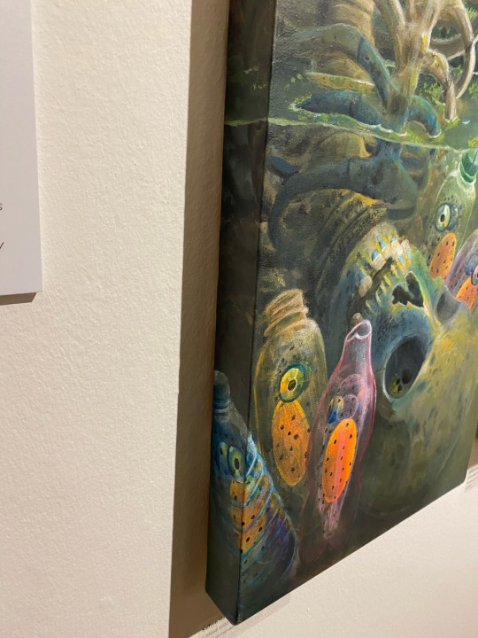
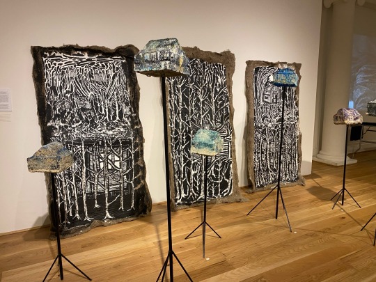
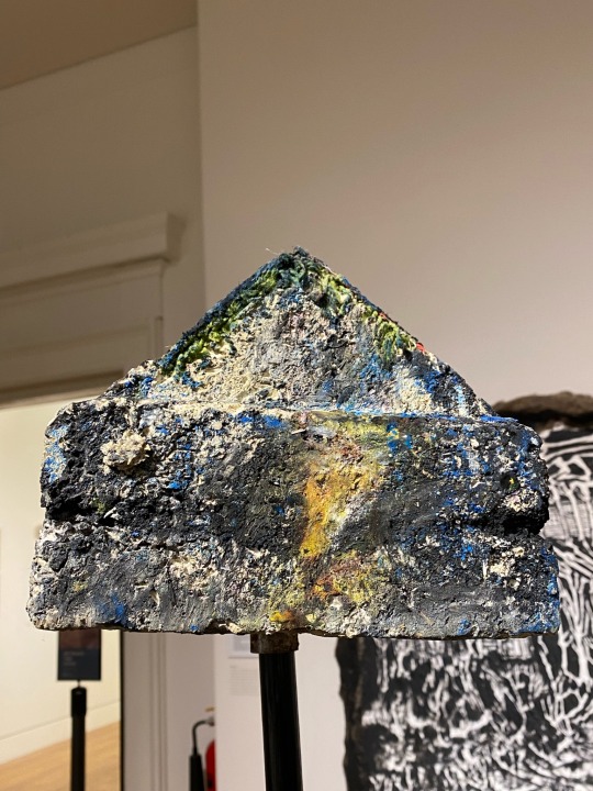
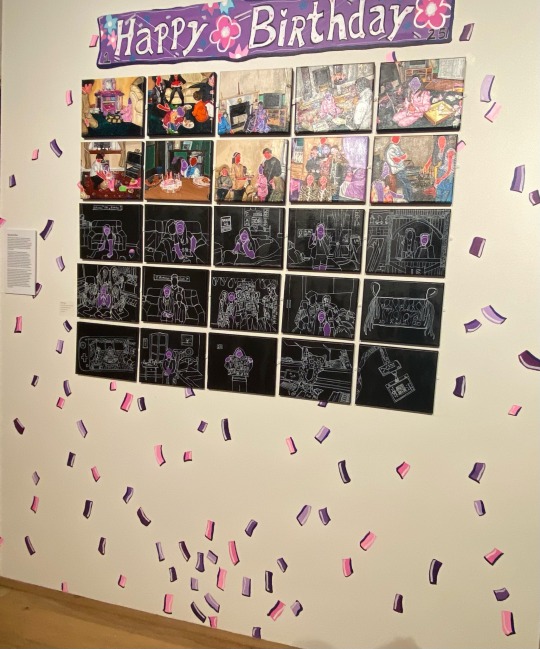
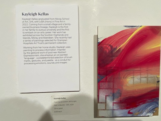
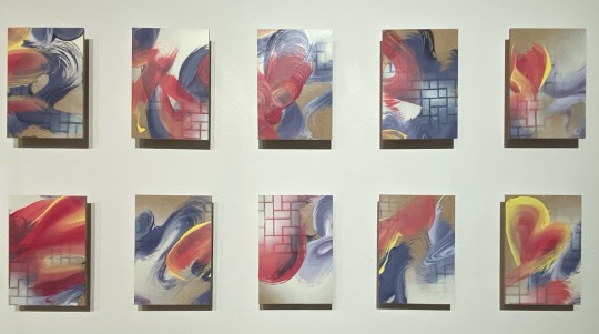
These examples have many things I love about their installation. For example the paintings of the post-apocalyptic world, where the painting continues onto the sides of the canvas. I felt this was a perfect accent to the piece, perhaps alluding to how time can go on, even at what seems to be the 'end'.
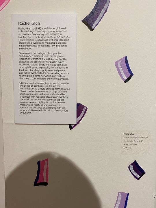
The 'Happy Birthday' piece included painting the confetti onto the wall. This helped to lead the viewer in and extend the piece. I think it was a fantastic decision, as subconsciously I find that bright white walls are intimidating and unwelcoming when it comes to art, so this helped the piece blend in to the wall and feel at home, rather than just simply stuck on.
0 notes
Text
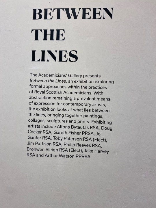
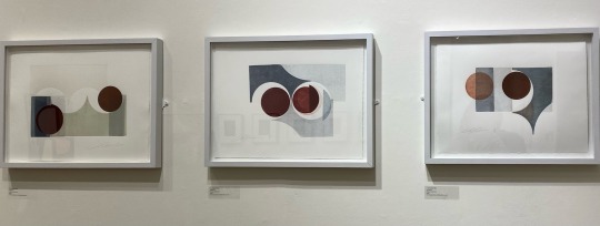
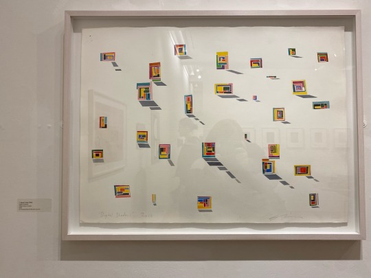
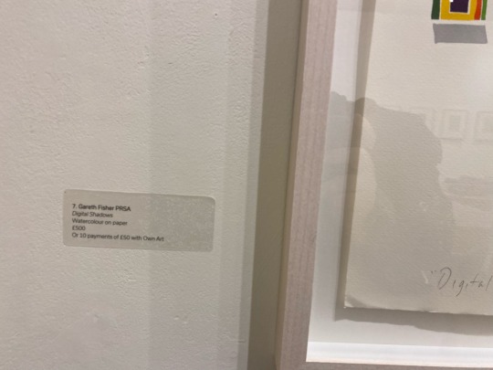
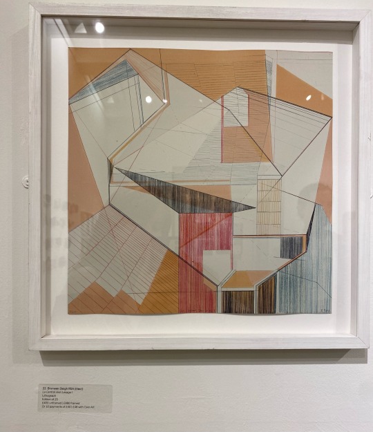
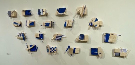
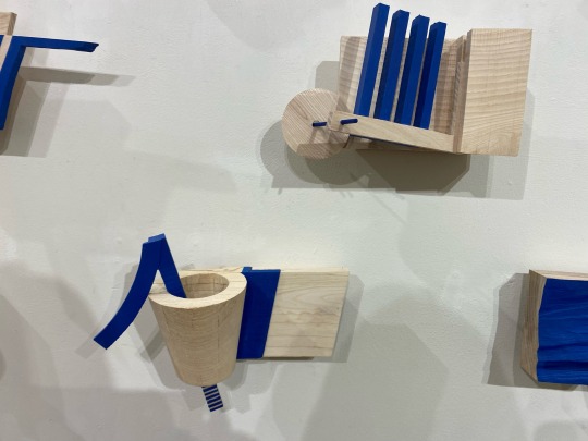
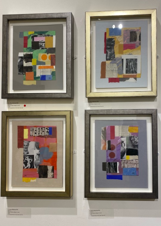
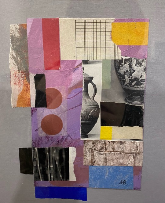
Exhibition 5 - The Academicians Gallery; Between the Lines
This is possibly my favourite exhibition that I have visited lately. I was even considering buying some of the art it moved me so much. Especially the pictured collages, which is right up my ally.
A range of installation types were here as well, from floor space to hanging from ceiling, even homemade pedestals.
0 notes
Text
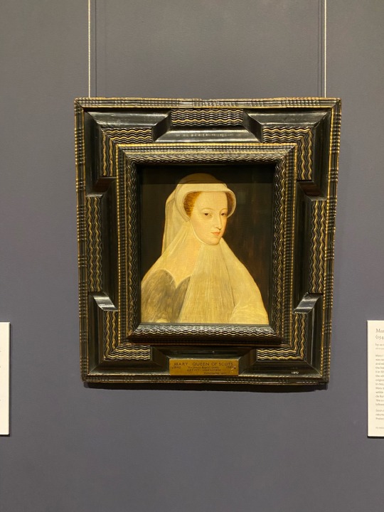
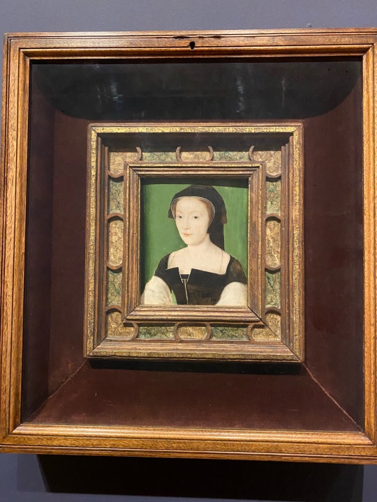
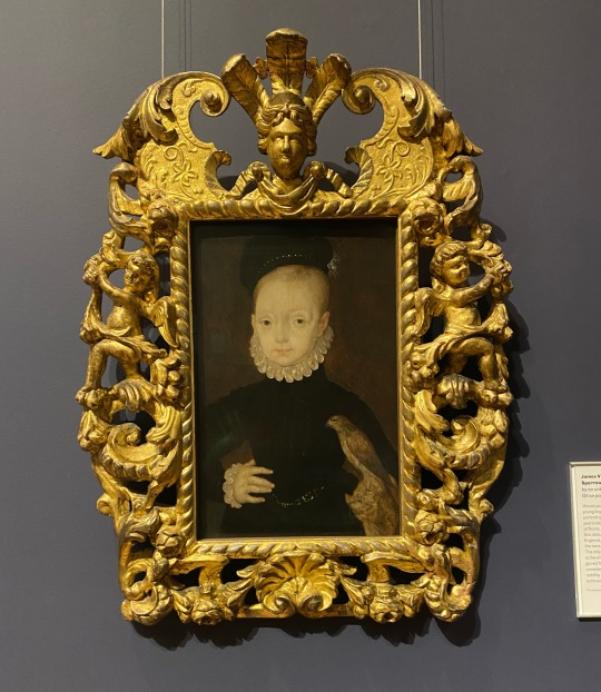
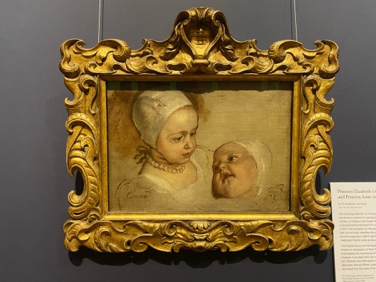
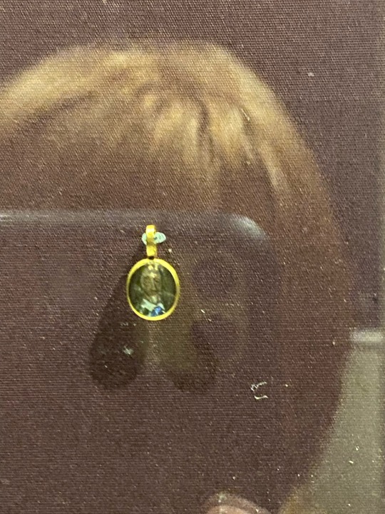
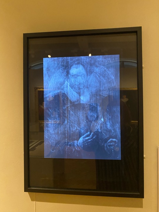
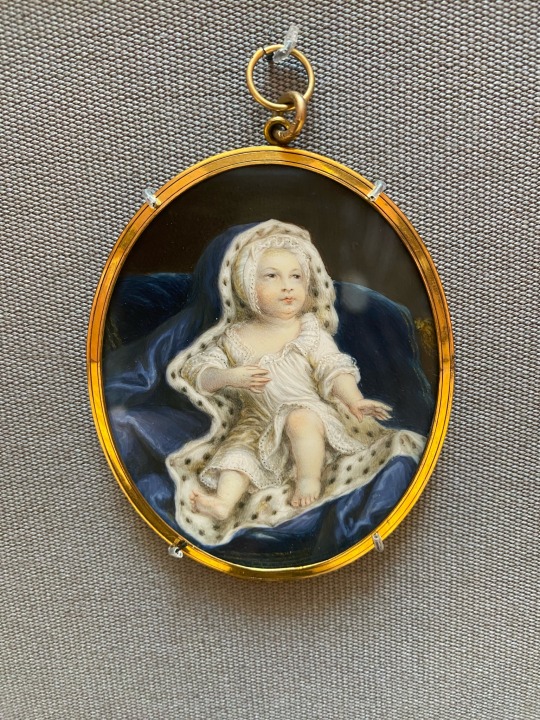
Exhibition 4 - National Galleries of Scotland: History of Portraits
This is within the same museum as the last exhibition but is independent from it. Looking more into the UKs history and culture, I learned about the history of displaying art.
Here I found some of the most beautiful frames I have ever seen, which were clearly handcrafted by the attention to detail and expensive feel of the pieces. Back in these times the frames were made before the art, the art then made to compliment the frame, which I found this contrasted amusingly with modern times, it now being the opposite.
0 notes
Text
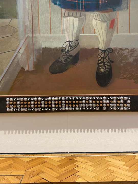
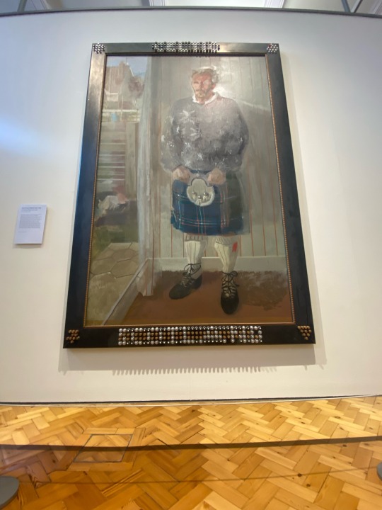
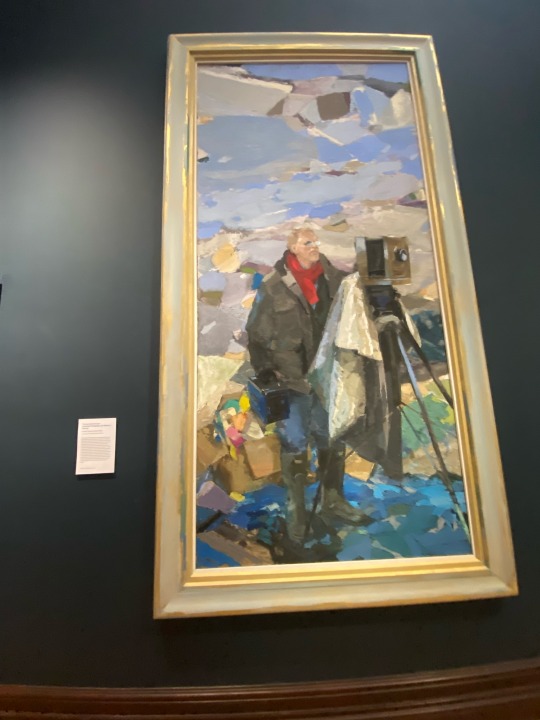
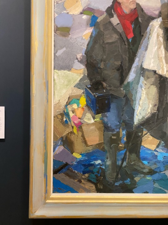
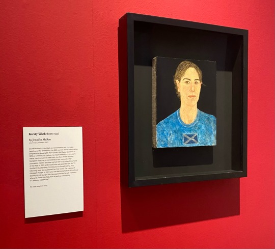
These ones are a great example of the framers I was referring to in the last post. The video is of a frame that sparked this fascination. The intricate detail put into the frame, handcrafted unlike the frames I have gathered, modern versions machine made, lacking the personality of a craftsman's love and thoughts.
More examples here are the boot caps spelling 'CELTIC' and 'SCOTLAND' out of football boot spikes. It was a little hard to read but after seeing the statement beside it point it out, it was then clear. I love the incorporation of the frame, not only is it there to protect the piece, but there to compliment and accentuate it.
The next example is of the painted frame, where the artist has continued the painting of the landscape onto the frame, ending the art but allow a clear border. This is not something I see often and find I really love it. Bringing the frame and piece together.
There was also this one, where the art is framed, but is away from the corner of the wood. It stands alone, independent but contained.
Within Creative Enquiry, I have been obsessed with frames, these have only cemented my adoration for the creativity artists can have. So many unique ways to use a frame, more than I had ever thought possible.
0 notes
Text
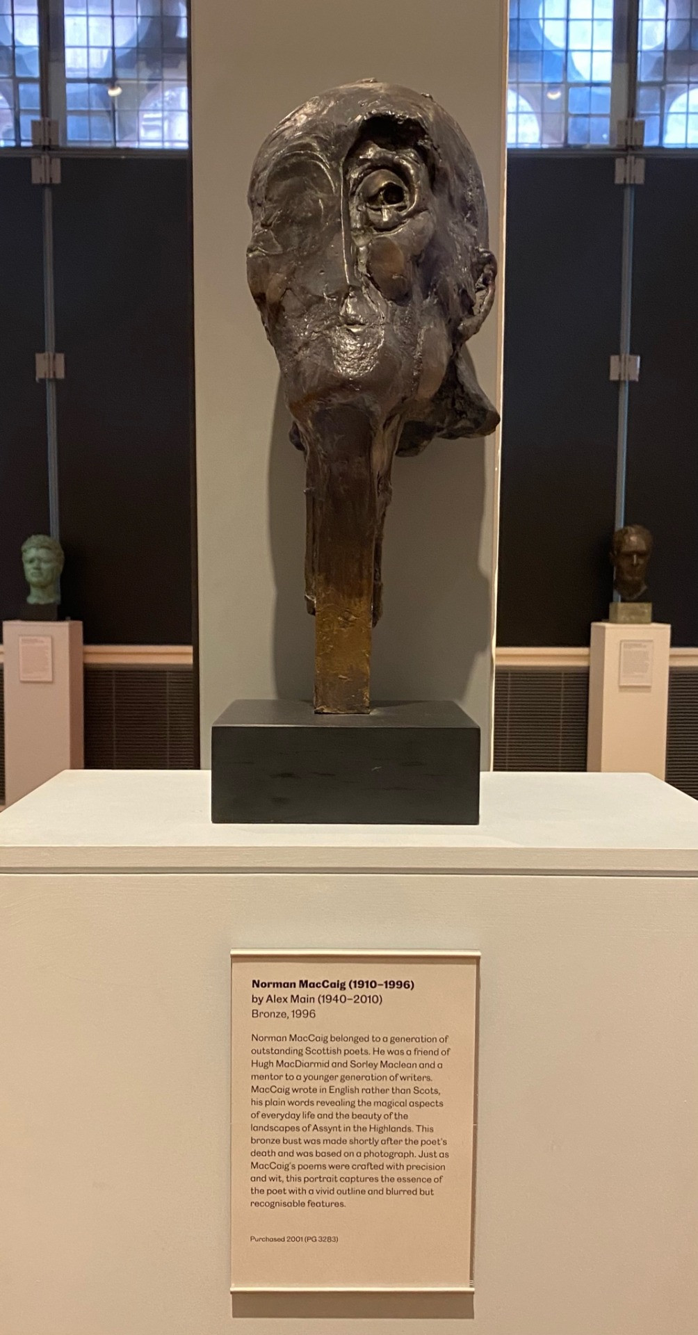
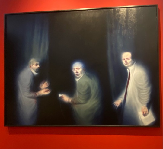
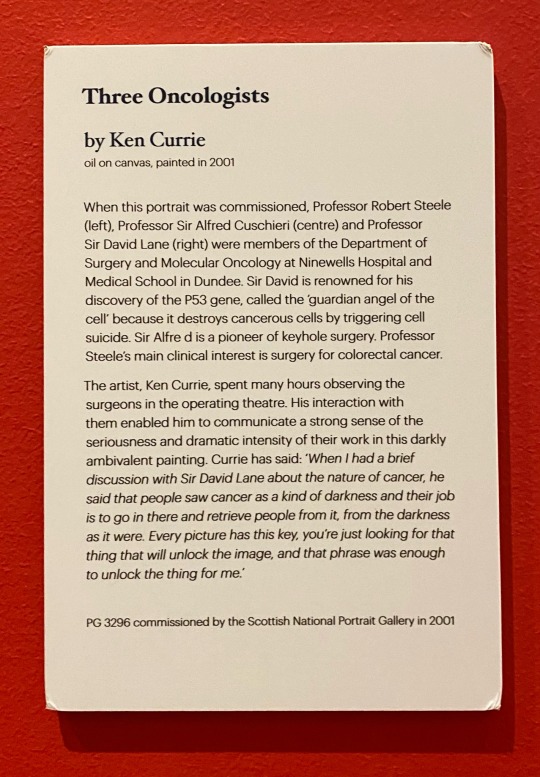
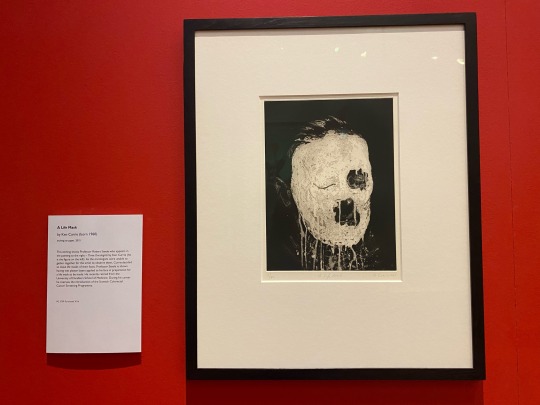
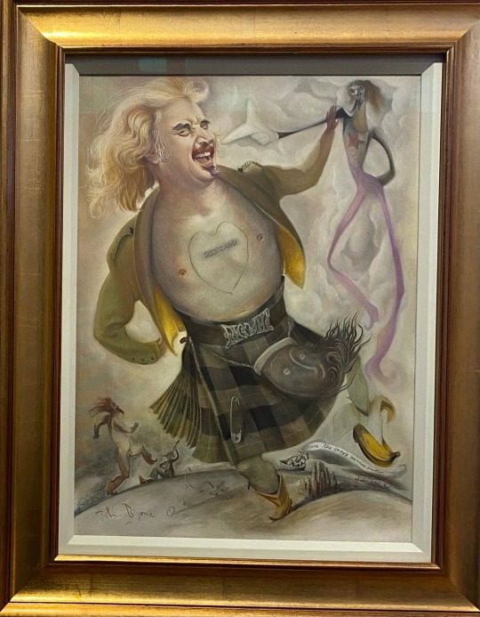
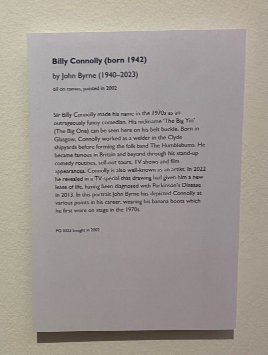
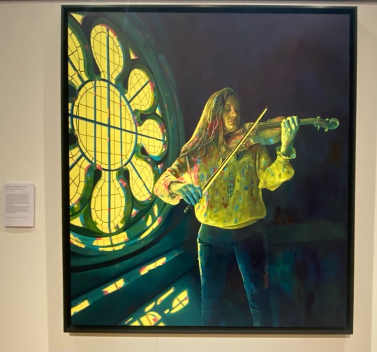
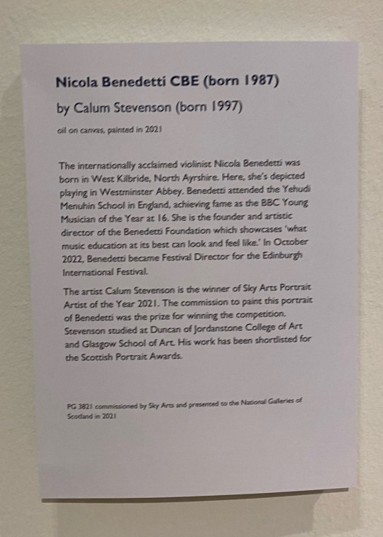
As I moved through this exhibition I saw a range of displaying techniques; hanging from walls, suspending from ceiling, floor space and plinths. Another headpiece caught my eye, this one of a different form. It was stood directly under a light, allowing it to capture the highlights and shadows perfectly to accentuate the details of the piece.
Something I also noticed was the range of frames within show, with a difference in colour, shape and texture I found myself more intrigued by these than the actual pieces.
0 notes
Text
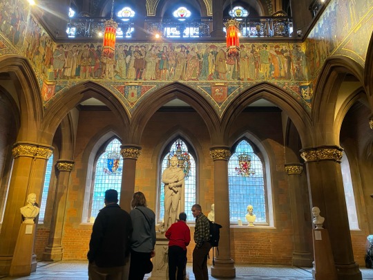
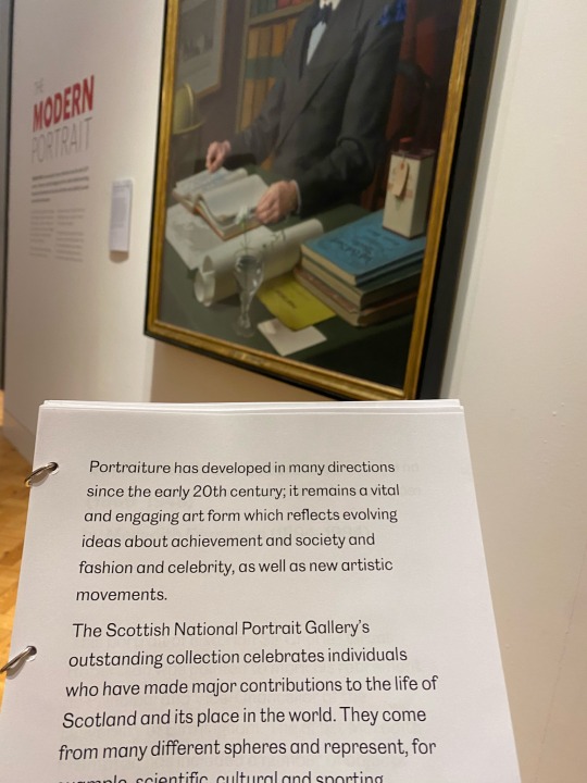
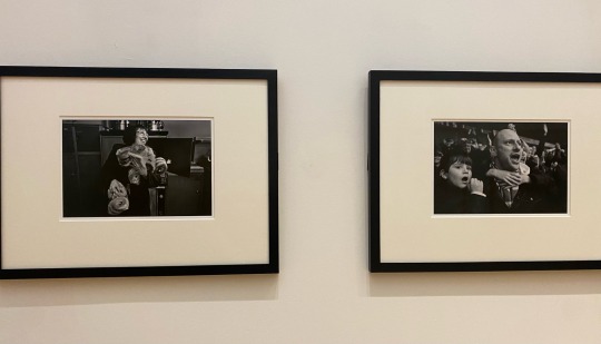
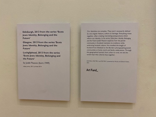
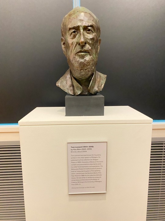
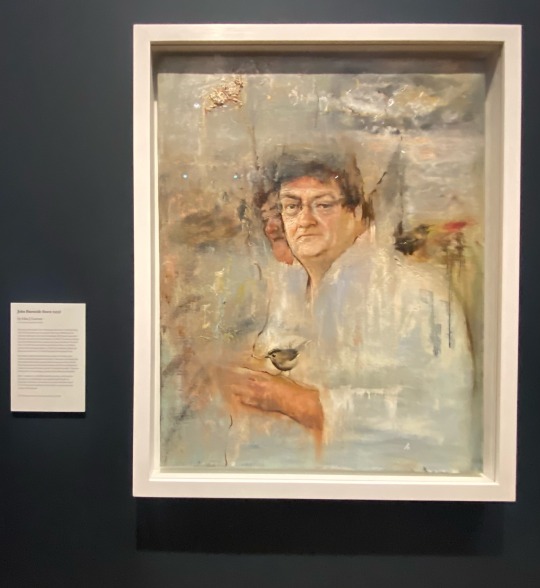
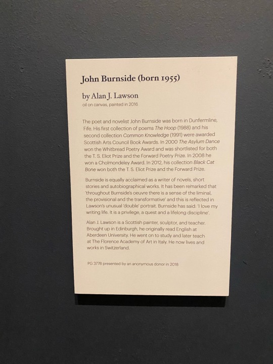
Exhibition 3 - National Galleries of Scotland: The Modern Portrait
A range of works were on view here, form painting to sculpture to animation. I was quite excited for what could be here, seeing raving reviews online.
The video shows a piece I found uncanny to look at, I felt the eyes follow me and could almost feel warmth from it. The attention to detail is amazing. This is not a medium I see often so it was interesting to see how it can be displayed, it was the perfect height to be at eye level, and had the perfect amount of space around the plinth in order to get a 280 degree look. It stood out nicely against the 2D framed pieces surrounding it, complimenting each other.
0 notes
Text
What is an art portfolio? A collection of projects to best present an artists work. Can include actual artwork, a weblink to artwork or photographic documentation of the work. Relevant to the place being applied to.
Why does it matter? It is a showcase of your skills, technical ability and overall what kind of artist you are. It is a checklist of your work as an artist overtime. Helps you identify as an artist and helps you to stand out of the crowd. It is essential for applying to art programmes and participating in exhibitions.
Tip 1 - Look at the criteria of what is needed i.e media, when due and how/where they accept it.
Tip 2 - Tell a story, help them remember you.
Tip 3 - Choose examples wisely, show the best examples, knowledge of different media, technical skill and influences and sources.
Tip 4 - Get outside feedback to see if anything is missing, gauge how intriguing it is and if it is memorable.
(examples given of portfolios, this will be good to look back to when adjusting mine)
0 notes
Text
Now looking at my portfolio, this needs a reboot. I would like to showcase more recent art and themes as I have progressed since making this a few years ago. Hopefully I will find some good tips here, if so they will be down bellow.
-------------------
Notes
Read the criteria closely; What requirements are you trying to hit?Who is this for, i.e a school, they will have their own rules that needs followed and have examples of what they want, as well as when it is due etc.
Organize examples effectively; Be conscientious about the order of the work, in order for a viewer to understand without you having to guide them.
Write clear, concise labels; Basic information, title, date, description of medium.
Be ready to discuss each piece; If an interview is needed, you don't have to memorise the details of all pieces, but try to remember the creative process and why it is important for your portfolio.
Tell stories; Have works that show your storytelling skills, the deeper meaning within the conceptual.
Don’t get hung up on quantity; Quality over quantity.
Get outside advice; This allows you to get out of your head and hear from outsider opinions. Broadening your perspective.
Showcase your technical ability; Show technique that can be developed, what you know and how you can utilise it.
Don't choose cliché examples; Don't blend in with others, be unique. Still life is unlikely to show a story, so compliment this work with something more conceptual and thought-provoking.
Show how you'd like to develop; Have a direction you want to go forward in i.e a career. Show what you want to improve on and why.
0 notes