#i dont post many pencil sketchs
Explore tagged Tumblr posts
Text
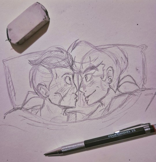
Oh my God there's only one bed.
Araki let them snuggle you coward.

Hair down josuke is my favourite thing. Also he defo drools in his sleep. Let me have this.
#you know they have sleepovers in the same bed#art#sketchbook#my art#fan art#jojos bizarre adventure#sketch#jojo no kimyou na bouken#traditonal art#drawing#jojo fanart#jjba#jjba part 4#jojo part 4#jjba diamond is unbreakable#diamond is unbreakable#josuke higashikata#okuyasu nijimura#josuyasu#i dont post many pencil sketchs#it feels somehow indecent
101 notes
·
View notes
Text


☆ Shops: Etsy │Ko-fi
☆ Tips: Ko-Fi - All my new art is posted here first, any tip, commission or shop orders grant you access to that art early!
☆ Commissions: Ko-fi │ Etsy [ Commissions are open on a revolving basis I tend to only accept 2 commissions at a time, when those are complete I re-open them ]
Mini Painting [Pokemon] │ Mini Sculptures │Sketch/Watercolor
Other places to find me:
Twitter(inactive) │ IG (Inactive) │ Blusky │ Cara
Craft Blog @zuccninis │ Sketch Blog @squashni
Miscellaneous info below (Mediums, Contact, etc):
Mediums: I'm a traditional artist and my main medium is watercolor.
I'm not being paid to promote any specific brand, if your looking to start out use what is accessible and affordable to you! With that said here is what I use:
Watercolor: Renesans Half pans, Holbein watercolor tubes, Winsor & Newton Professional, and Daniel Smith Extra Fine Watercolor.
Watercolor inks: Dr. Ph Martins Radiant Concentrated watercolor and Ecoline Liquid Water Colour (These are why some of my watercolor pieces are so vibrant.)
Brushes: 0.5, 1 & 2 Foldable travel watercolor brushes, and those waterfilled brushes.
Paper: Fabriano Hot Pressed Watercolor paper, I usually bind these into my own books.
Other Mediums: Microns, Prismacolor Color Pencils, Posca Wax pastels, Paint markers, Tombow water based markers, Ballpoint pens, Acryla Gouache, and Crayola crayons.
If you are looking to get into watercolor my best advice is to invest in actual watercolor paper. For watercolor the most important thing is the paper, nice paper can make even crayola look beautiful. 300 Gsm is ideal.
For Mini Paintings:
Liquitex Acrylic Gouache and Golden SoFlat Acrylics
Mini Canvases (3x3in)
Mini Easels (5in)
Clear Gesso
Small paintbrushes, brand does not matter I tend to buy whatever is tiny and is a reasonable price. I use Synthetic brushes.
It should be noted that I do scan in all my artwork, I use a epson perfection v370, I've had this scanner for years and it works pretty well, you just need to mess around with the settings. I edit all my art in Clip Studio Paint to remove any lint or dust and to fix up colors.
[Traditional art can be pretty expensive so I recommend if your looking to try any medium to buy a little bit at a time and buy things piecemeal.]
Other Info:
Business Contact: [email protected] [Don't send me unsolicited trash]
If you wish to contact me for other matters most of my DM's are closed, Best places to contact me is Etsy for order issues, or Ko-Fi. (Don't ask me for my Discord that's for friends only.)
If You see my art getting reposted/re-uploaded, report it, the only accounts I post on are included above. Anywhere else I'm being impersonated. Please don't support low quality repost accounts that steal art from actual artists. Many times these accounts screw over actual artists since they love to monetize and sell stolen work.
I schedule posts on here on all my accounts! Schedule is Mon-Wed-Friday on Zuccnini, Bonus posts/Reblogs are Tues-Thurs and Saturday-Sunday.
Dont tag my OC / Original Character art with "pokemon" or any other fandom tags, This is NOT a pokemon blog this is my illustration blog.
As for Fanart: People are free to draw and commission art of my OCs, feel free to tag me in it! I do ask no nsfw without my permission.
That's most of the info I can think to include for this.
-
Extra-Curricular art:
[18+ Obviously]
nsfw twitter │ NSFW Bluesky
250 notes
·
View notes
Text
random assorted headcanons for Turbo because I like thinking and having fun !!!! 🎉

Read More to Find Out...or are you too scared?... i bet ur too scared ahaha youre too scared Lol! Hahaahaaa!!!
The steering wheel of his kart is covered in bite marks, similar to how one would bite their favorite pencil. he bites things to mark his territory because Nobody is gonna touch that unless they want all of his diseases (150+).
i just know he was fighting to restrain himself not to chew on any of the candy civilians
when it comes to music, he doesn't see the point of listening to it. he doesn't have enough patience to really take it in; to him, it's just a thing that exists and not much more than that ¯\_( ∵ )_/¯
adding onto that point, this guy listens to metal clanking sounds and loud engine roaring for entertainment because he likes things that would overstimulate any normal person. turbo is incredibly sensory-seeking and will do anything for The Sensations
someone should take him to a heavy rock concert i think it would change him a little. keep that thang on a leash
related to being sensory-seeking, i think he would absolutely love running his hands over random textures. if anyone has run their hands along a wall while walking alongside it...He does that...If u know u know... he is SO stimmy its unbelievable. Unreal.
very pain-tolerant. he'll whine and complain about it for attention, but physical hurt really doesnt bother him much until it gets in the way of what he wants to do.
funnily enough, he is very picky when it comes to temperature. he can handle getting ran over but if its 1° too hot or cold he'll start nagging and nagging for it to go back to normal. turbo really needs his own enclosure i think it'd do him a lot of good
this is a more popular headcanon and its canon-leaning, but he's an artist :-] he usually sticks to graffiti art because its generally considered more "rebellious and cool" but he also sketches cars, design decals, and other stuff when hes alone!
i would love to see his process of character designing king candy because i dont think he really knew what he was doing
he was just like "ok what does a generic king look like. uhhhhh.... 1, old and jolly like santa claus.... 2.... uhh crown..... 3......... purple.... FUCK YEAH im so good at this!!!!🔥🔥🔥"
i just noticed how his design has like 0 actual candy motifs aside from his bow being a candy wrapper and his shoes having those little gumdrop end pieces. what was he THINKING
while King Candy has a lisp, i think it's a coverup for his actual voice because of how goofy and recognizable it is. Overall its the same as his regular voice, he just gets silly with it. i noticed that he still does retain some of his lisp when hes screaming his lungs out at Vanellope, however, so maybe he genuinely does have a lisp that makes itself known when furious :3
another thing i noticed is how he hisses his S's. very cool very cool the reptilian
@/tasticturbo made a post abt how he has tinnitus from the constant noise in his game and i couldnt agree more
AND THE PRESCRIPTION GLASSES. where did he get those...he needs to See
side note, the aforementioned account has made so many interesting analyses on turbo and theyre all so insightful. i recommend u check them out
i think he gets migraines from stress. constant buzzing or pain flood his head but hes like "IDGAF i need to DO something at ALL TIMES no matter what"
hes like a shark in that way. if hes not moving he'll die instantly. idk a lot about sharks or if thats how it works srry but im going off of what the Worms are saying to me and i dont have much to work with
i think a really big contributer as to why he lacks in the self care department is because he fails to notice that something in his body is wrong. hes far too distracted on something he thinks is more important than remembering to Eat Food or Drink Water or Wash Himself or
he's like "WHY DO I FEEL LIKE SHIT ALL OF THE TIME!!! I HATE MY LIFE" and he hasn't slept in 4 days
hes so me. Sorry.
i dont think turbo is necessarily suicidal, but the way he behaves shows a clear disregard for his own safety and wellbeing. he thinks that he knows what he needs but he really doesnt :-[ i think he has some kind of immortality complex, feeling untouchable and like nothing could get to him. as scared as he was when ralph was about to turn him into sloppy mush, he didnt take the threat very seriously. like it was some kind of joke
his kart regenerates every time his game starts up, so what if he smashed it into buildings for fun. He's the number one fan of car accidents. he is all about that shit
i think his living space would literally be a garage btw. its a place to sleep and a space for his car all in one!! he thinks its very convenient and awesome but i think he is coping. he has some old dingy stained sheetless mattress that he has never washed in his life and its covered in dirt and smoke particles. no wonder he has such heavy eye bags Dude Please
the turbo twins have a garage used in a similar way, and while its still pretty shitty, they still at least TRY to maintain it. they just fight a lot over who has to care of it. nobody taught them how to take turns ever
but this aint about them. maybe another day
i think that turbo would find comfort in garbage and keeping it around because its familiar to him. a big clean empty space would make him so mad and if anyone moves even an inch of scrap off to the side he will throw a fit. he generally doesnt pay attention to his surroundings but when its his personal space he is 1093 times more neurotic
i think the big empty castle he stole wouldve been a big transition for him. maybe it helped him clear his mind a little more to practice his tricky schemes...it helped him get more subtle
thats all i have for nowww ty for reading ^_^ if anyone else has any wacky ideas pleeeease tell me i would love to hear them!!
#tw suicide mention#its very brief but still#also little edit but i changed my mind a little on the music thing...he listens to it sometimes just not actively --#-- he needs stuff that immediately hooks his attention and relates to his interests#side note i really want to talk about the turbo twins bec i fuckin love them but then i remember they have no personality in the movie--#--so id be making analyses on other peoples interpretations of them HAHA. EVERYONE STOP BEING CREATIVE NOWWWE!!!!#turbo wir#turbo#king candy wir#king candy#headcanon#analysis#<- ??#wat ever#i like little details that dont impact the story at all whatsoever. it just makes the characters feel so much more lively#like i could have full conversations with this guy in my head (normal)#love for ever#wreck it ralph
103 notes
·
View notes
Note
DUUUUUUUUUUDE your alcohol marker works r SO sick i saw that sequence of process pics u had and my mind was just Blown . can you elaborate more on ur process ?!?!? /nf
hello ! thank you for your kind words. i apologize for taking a while to answer this. the process of coloring the drawing i did as an example was rocky, and ive been busy with school.
i'll preface this by saying that i have a few posts with process pictures on twitter (i treat it as a wip dump when i remember to post). heres one of the few where the pics are all together, but my media tab has a fair amount scattered around.
this is going to be long, so i'm putting the 'read more' here.
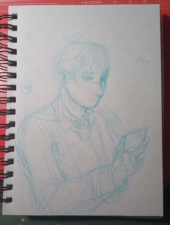
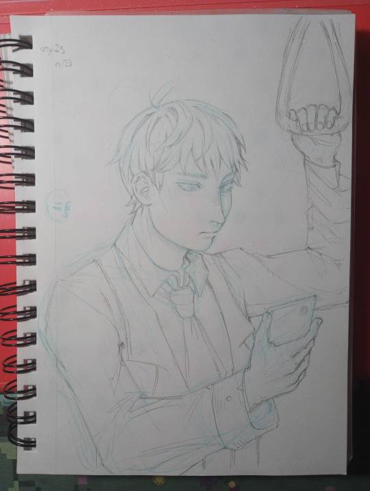
step 0 : sketch. i start with blue erasable pencil, lighten it, and do my lineart with a mechanical pencil.
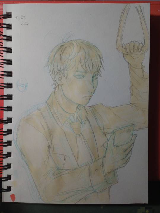
step 1 : base color. half frivolously chosen as a neutral color to set it off from the white of the paper, half "whats the color of the light / the lightest color being reflected by the material its cast on"

im going to stop numbering the steps. i immediately went too dark with the hair and failed to consider the strength of the light in the setting / how reflective hair is. also i colored the basic color of the eyes and the rough shadow under the jaw. dont get attached to any of this.
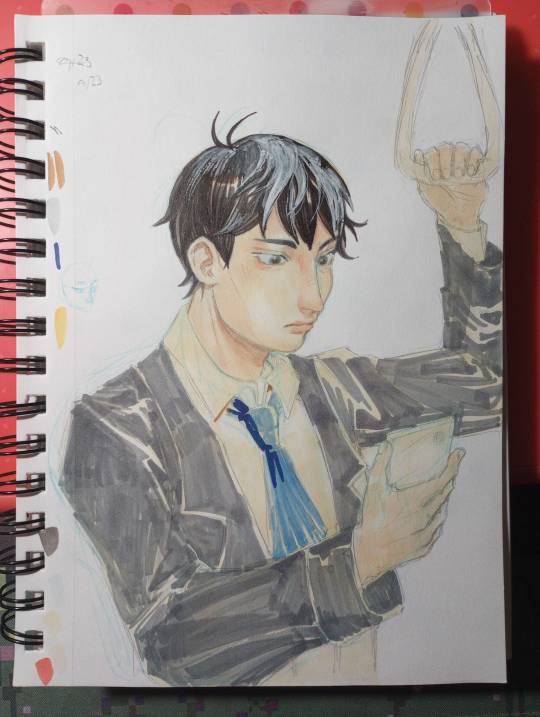
broke out the "ph. martin's bleed proof white paint" my mom gave me a jar of years ago. it does well enough at bringing back light, but the texture youre left with is not ideal. lightly shaded the face skin with a similar color. i also blocked in the rough color for the suit jacket and tie here. the marker doesnt have to be evenly applied because you'll be going back over in enough layers that it'll even out.
i wish i stopped here.
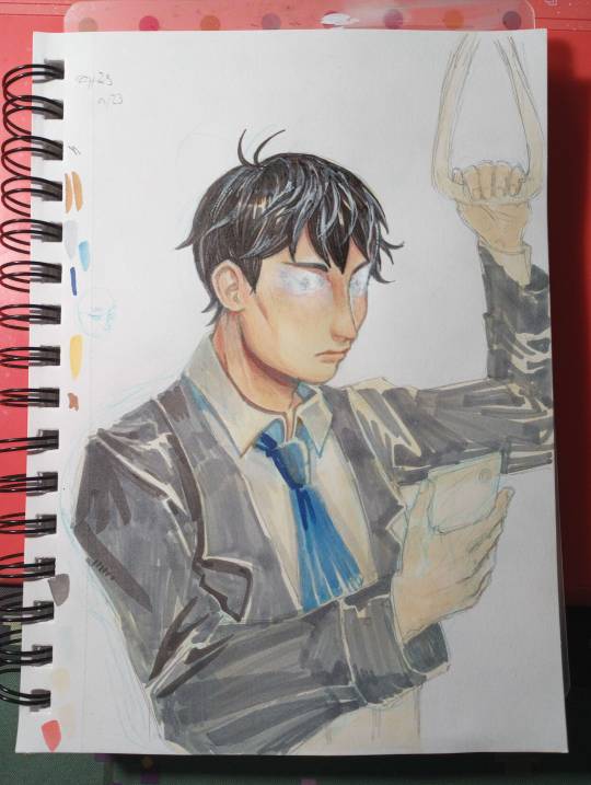
things start to go off the rails. painted over his eyes because "why did i give him double eyelids" tried to paint over just the eyelids. didnt go well. scorched earth. reshaded the hair, deepened shading on the face and neck, started on the shirt, and applied a cursory pass of shadow on the jacket. the light angle does not remain consistent with this.
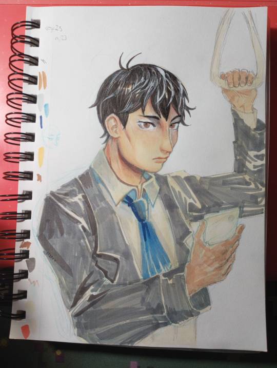
redrew the eyes. the angle feels uncanny. i wish he was still looking at his phone but the paint is not taking ink well and i doubt another layer would make it better. at some point i applied rough shadow to the hands. dont worry about the inconsistent lighting.
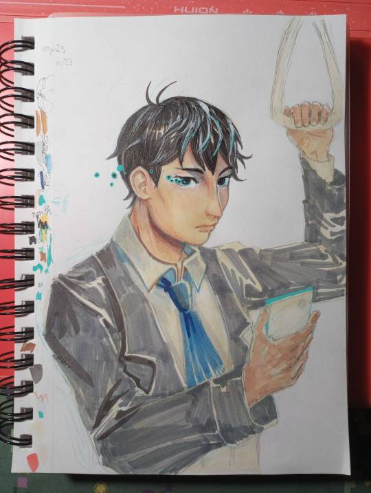
darkened the eyes so they were less creepy. didnt work. i assume the ink bled (alcohol ink soaks into paper, but since this is now on top of white paint, it just sits on top and pools out), so i embellished with posca marker to cover it up.
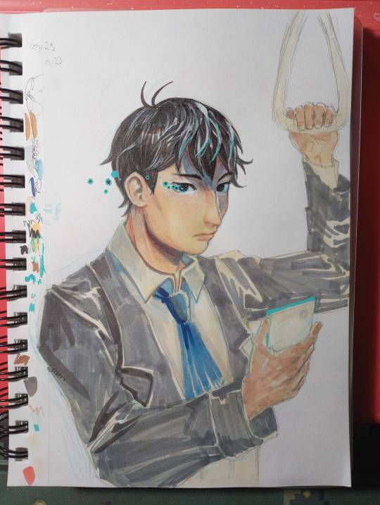
realized that with the length of the shadow the brow ridge was casting, the hair should cast a shadow too. light source starting to be established.

im really sorry. i didnt realize there was such a drastic jump between this one and the prior photo. basically, i started defining edges and areas of deepest shadow. fine edge definition was done with the cheapest ballpoint pen i own. dark marker blends fairly well, but only put it where you WANT it to be that dark, and blend outward from there to darken surrounding areas. many, many layers of grey and light blue, brown and darker brown for the jacket. now that i had a vague idea of the light source, i just had to place the shadows and follow the folds. hitting the points of shadow with brown (base color but darker + warm tinge to suit base color) and blue (reflected light).
this also wouldve been a fine stopping point.
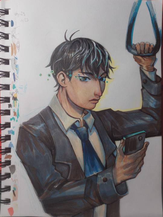
used posca to outline the edge of the face + sharpen edges. added more pupil-spots. messed up the mouth some more. whatever. calling it done here because the jacket looks good and the face is freaking me out.
overall, i treat alcohol marker like watercolor. a big wash of color, rough base colors. roughly block in shadows, gradually add washes of deeper shadow. define edges. etc.
its harder to blend colors directly than with watercolor but thats nothing more layering cant fix. and then white paint if layering doesnt work. and then more layering.
19 notes
·
View notes
Note
i dont remember why im following you but i just wanted to say i LOVE your animal sketches. i want to print them out or copy them to stick to my walls and desk. they are so NİCE and CUTE and have i mentioned i love them
^_^ !!!! i'm so glad!!! i love drawing animals but they're really more conducive to pencil and paper than digital, idk why, but something about the texture of a physical medium really encourages drawing Little Guys... so i don't post very many because they don't seem particularly showy or flashy or eye-catching. but i really do need to post more!!
16 notes
·
View notes
Text
I'm experiencing rn a terryfying paralysis of creativity and drawing that is making me go insane. I want so badly to draw my characters PERFECTLY canon compliant that everything that I draw that deviates slightly is trash to me. I look at so many artists out there that draw pictures that look fresh out of the show, and all I want Is to be like them, but I CAN'T and it's so frustrating.
I have zero skill on digital, and in traditional im very lacking. Yet, i see all the time so many amazing painters and digital artists and inkers and pencil artists that make it look so EASY to be like them. But when I try, i immediately get frustratred and lose my motivation. I havent drawn anything i feel particularly proud of for a long time, the last time i remember i was 12 years old. I havent DONE anything, to be honest. All i do are little sketches on my diary and books, made without any effort or particular concentration. And I want to get better, but every time i'm either too busy with school or stuck in a mindless scrolling on social media. My perfectionism is literally killing me. I haven't felt creative for YEARS at this point. I can only copy, never create original artworks. I have a lot of ideas and concepts, but im never able to translate them on paper. I hate the way i draw, the way i colour, the things that i've created. I used to be so inspired and creative, even if I couldnt draw at all. Now i can a little bit, but its always not enough for me. I cannot come up with any dynamic composition, draw different facial expression, i dont understand perspective nor colour theory and clothing shapes and folds are alien to me. I used to love art so much, now i cant even pick up a brush. I feel always tired and angry and unmotivated. I wanted this to be an art account, but I ended up posting very rarely. I miss my old me, i hope one day she will come back.
2 notes
·
View notes
Note
could you post some work in progress stages of you're drawings and paintings? i am trying to improve my art and i like you're style but i don't really know how to get there. and many tutorials are for digital art only or there very anime style so it dos not very help in what i want to draw :(
but only if it is not to much work of course!
have a good day :-)
thank you, anon!
starting is really tough, i get you, and yes, i finding the tutorial for a style that you want to work in is often a struggle, but often you can apply the general rules to any style!

the most important thing is to not stop drawing! just keep going, a little bit every day/every few days and you WILL see the improvement! its super frustrating when you dont get the results you want immediately, i know that - ive been doing this for so many years now and i still produce pics that i dont like, where im disappointed in myself. but you cant let this drag you down too much, because everytime you fuck something up you learn something, too! you know then that this thing doesnt work - in a way failures are actually way more helpful. (still sucks a lot...)
as for wips: i found a few photos i took of two recent paintings; i dont know if it will help you, though. generally i just do some outlines roughly, then clean them up and then just...fill it either with paints or pencil. i dont do the whole grid method or assisting lines thing or something like that. before i start the proper drawing i often make a small quick sketch to know where everything has to go (see: first pic; youll notice its mirrored - i decided to change the entire orientation last second; i kinda wish i kept it, but its too late now) and then i just...idk? put it on the paper in a way that would make every art teacher cringe in pain (i know that, because it happened multiple times).
as for water colours its the basic rules: start with the bright parts and then go darker; make sure to use good paper, let the stuff dry before going for a new layer etc. add fine details/highlights at the end,
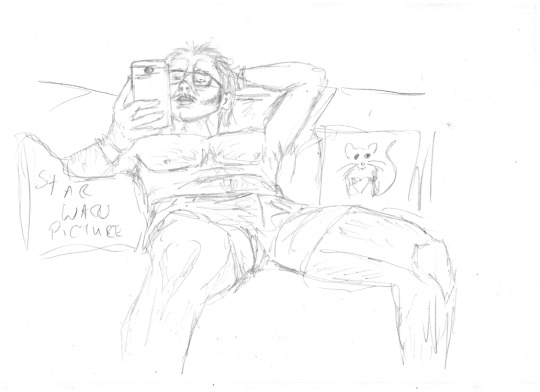
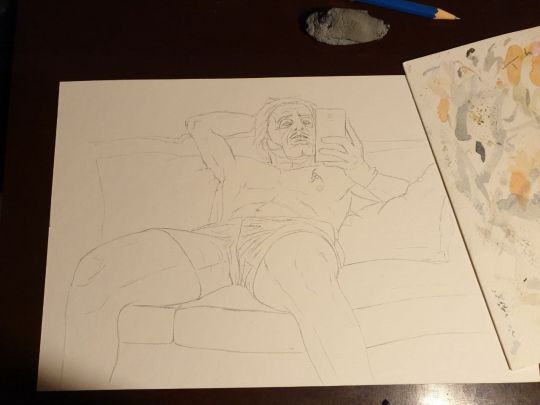
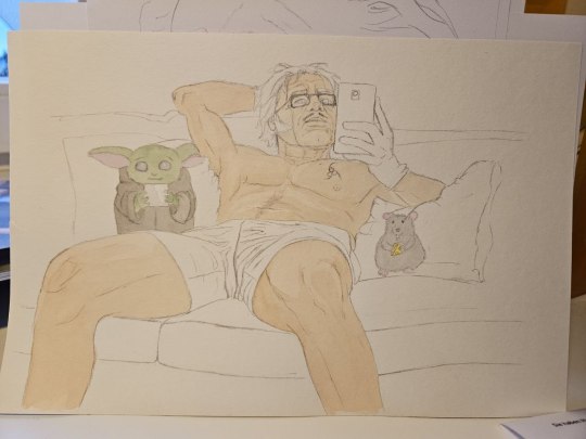
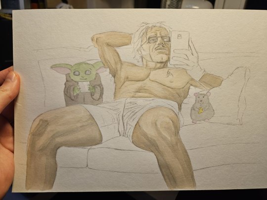
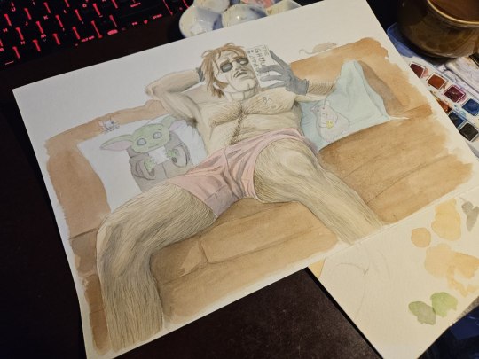
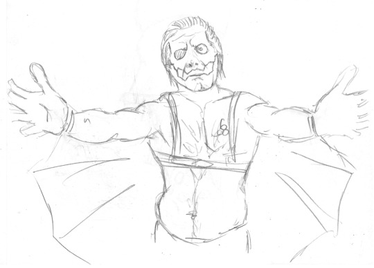
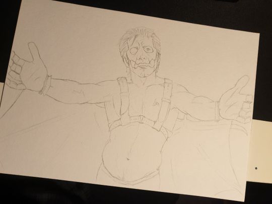
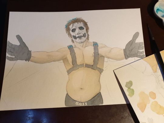
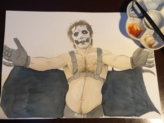
(hello no-hair-papa-anons, have some food here)

if you have any specific questions dont hesitate to ask, ill try to help! if you can afford it i recommend going to a proper class of an artist in your area, that can be lots of fun and really helpful. in 1st grade i was for a few weeks in a free weekly thing of a local artist and she introduced me to oil paints and taught me to just let GO sometimes of the perfectionism and the control of paints (yes, even tiny 5-6 year old me was already a control freak). the things she taught me are still with me.
#ask#it talks#Copia#ghost#wip#long post#tutorial#pls tumblr why are you hiding this post from dashboard now again i swear to the gods
13 notes
·
View notes
Note
ok im so sorry for continually asknig you how in the hell you draw so good but how in the hell do you draw hair specifically so good ok thank you <3
no its no problem at all! hair IS a tricky one, i still struggle a lot with it myself, and up until recently i HATED painting hair it wasnt until using SU-Cream Pencil that i figured out a way to detail strands in a way that worked with my semi-realistic style. (you can actually see in my art tag the difference in the way i paint hair, my first wilson painting is the first time i used that brush, everything before it i hadnt) sometimes it is a matter of finding the right brush for the job but i’ve never used brushes solely made for painting hair, like those ones that look like lines made by a rake? i find those kinds of brushes totally egregious and deeply unhelpful for actually painting hair realistically.
my first piece of advice for hair, and really for painting in this kind of style is that the goal is to make it look Convincing. it does not have to be 1:1 with the reference and you’d be setting yourself up for an impossible task anyways in trying to do so. there’s also the fact that overdetailing hair Can end up reaching a level of uncanny valley very fast, which is honestly never appealing. multiple times i’ve found i’ve added too many strands and had to paint over it and try again while limiting myself to how many fine details i can add.
to gauge where you’re overdetailing you really can use your reference to point towards where exactly the most visible strands of hair are and where it sort of all blends in together. really you can get away with very little detail in some chunks and it will make your art look way more convincing. for example my house art you can see that by the left side of his temple theres a chunk of dark greyish-blue that washes out all detail. compare that to the right side of his hair that has the highest level of detail. you can still see that there are small chunks in the right side where theres very little detail (like the triangular chunk just above his ear), just to ensure there’s a balance of detail in order to prevent it crossing into the uncanny valley.
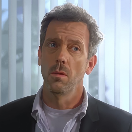
you can even see i have that same effect in his face if you can compare the left and right side of his forehead and the level of detail in his wrinkles. the way the grooves of his wrinkles stop as it moves into the shadowed part of his face. you can understand he hasnt like deaged in the shadows its just about understanding what level of detail Should be visible as dictated by the light. you can also see this effect if you compare the wrinkles under his left eye and right eye, as well as the difference in levels of detail in his stubble on the left side of his face compared to the right.
so getting back to hair specifically, and ensuring it looks convincing enough, is i would say the way i paint hair is 50% planning/following the reference and 50% bs.
the way i start with the planning part of hair is with a really blocky sketch which just begins with planar boxes of how the hair flows and breaks into segments, its really just breaking down the existing reference into the simplest shapes possible.
next is i then draw a more detailed sketch above the original simple sketch where i add more detail. you can see in the image below the level of detail i get to on my second sketch as compared to my original sketch. i dont go too detailed because i will use this second sketch on a layer with lowered opacity above my painting layer as a guide to begin my painting. if its too detailed it��ll confuse me, but if it’s not detailed enough it’ll be more difficult figuring out where to put what colour.
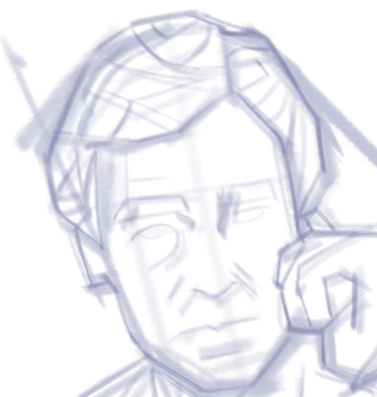
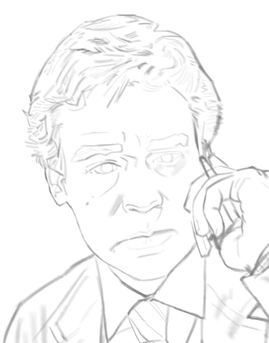
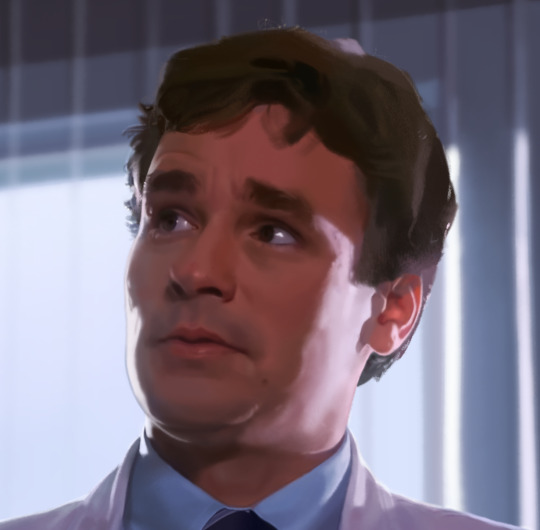
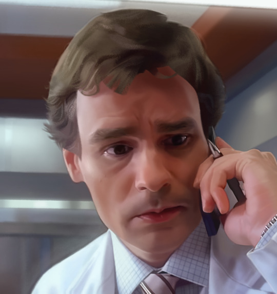
since i start painting after this i’d like to start by saying how i make my colour choices in the first place. since i have limited images i can use in a tumblr post i won’t show examples but i suppose mostly everyone can gather that the real life references we use tend to have a lot of muddy, dark (and boring) colours that dont translate well in painting. i avoid this in two major ways.
the first is i always edit the colours in my reference image. any program will do, i personally use video star to edit my colours but that isnt an app available to everyone and i really wouldnt specifically recommend using it unless you already owned it and liked using it. im just mentioning it because it is what i use to edit colours. btw before video star i used to use prequel, another app that can edit colours. u can just as easily edit saturation and colour levels etc in just about any image editing software or art program.
the other way i avoid using muddy colours is by colour picking then manually altering the colour-picked colour so that it’s brighter and more saturated, and sometimes by sliding the hue just a little. this is really broad advice of course but hair colour is tough to get right (especially blonde hair tbh).
another little tid bit more correlated to choosing hair colour is when im in the early part of my painting process im thinking already about how i’m ensuring the hair blends into the face easily. to achieve this i like to blend in the colours i've use in his face, into areas like the fringe and sideburns. you can see underneath in the right image that wilsons sideburn ends in more of a pinkish colour compared to the rest of his hair.
my next step is blocking out the colours of the hair based on the sketch and the reference. it’s important to start as broadly as possible, like for example, you can see i’ve got big dark chunky shapes where wilsons hair parts in both images below. the immediate simplified shapes dont have to be largest shapes just shapes that do the most work in defining the shapes of his hair. like for instance in the right image below, you can see in wilsons fringe, that theres a singular bright gold thin strandlike stroke, and its just a really simple stroke but it does a lot of work in defining the shape of the chunk of his fringe.

another thing i wanted to mention is the way i block fringes. you can see in the right image above that his fringe is completely solid. i just start with as broad and simple a shape as possible and dont worry about individual strands of the fringe this early on in the process. the left images fringe also looked as solid as the rights, but i didnt have an image of the part of the process before i started blending his fringe in with his forehead.
in the image below you can can compare the fringe to the image above, and see where i've begun blending it into his face with the colours from his forehead. it's important i think to mention again i'm an artist who uses separate layers to paint on instead of just the one layer. so the hair layer that i'm painting on is transparency locked. it really ensures i keep the shape of his fringe intact to paint this way.
you can see above as well that at that point i had begun adding individual strand detailing into his hair. and really at this point this is where you have to use your own sense to decide what details get the shape of the hair across, this is the bs'ing part where i am using my reference as a guide to how my subjects hair works but not trying to be so overly precise as to kill myself with impossible perfection. you can probably see the that even though im painting what looks like strands its not anywhere near as thin as what itd realistically be like. i think making sure your brush isn’t too thin helps a lot in avoiding the uncanny valley. if you look closely at the image i have of house at the top too, you can see that i never go too thin with the details there either.
transitioning into the fine details is just making sure to work in sections that i've defined by my largest shapes. i'll show a few process shots of a wilson painting and you might be able to spot how i go from a larger shape of the hair to smaller detailing.

im at my limit for images so i couldnt show all of my process shots for his hair but you can kind of see how systematic my approach is, how i go to a chunk of basically defined hair, and then add the finer detailing to it bit by bit.
lastly i’ll just mention i use two different brushes for hair. i use analog anabelle (which is part of the frenden brush pack) for the big basic shapes, and then i use SU-Cream Pencil for the finer details. you don’t have to use the same brushes as me but the main difference in these two and how they’re useful in my process is the amount and the type of texture in the brushes. analog anabelle has a subtler papery texture, but the cream pencil has sort of a hard pixelly effect to its texture? and i find that the heavier texture of the cream brush gives an illusion of detail without me putting in the hard work of actually painting it.
if you go into my art tag and find a painting titled ‘kiss from a rose’ you can see i used a soft untextured brush for sevens hair, and it doesn’t look anywhere near as realistic as the hair im painting now. i’m sure other artists can use soft brushes to detail hair well but i personally have no idea how to do that so i’d 100% recommend playing around with textured brushes and seeing what works for you👍
so sorry if any of this sounds like gibberish, again, i really do love talking about my process so i would 100% welcome more questions if any of this was unclear!
#asks#hope ANY of this helps i realise i have a longwinded and scatterbrained way of explaining things so i can never really tell haha
3 notes
·
View notes
Note
14. 🍋 and 🐝
Question 14 of the artist asks (Im sorry ive been sitting on this one for so long aaa): How has your art changed over the years?
My art hasnt changed much honestly! i've gotten better at watercolor painting, and acrylic paints, and i'm getting the hang of digital too! - 🍋
🐝 - ...Oh boy, another long history lesson today, Strap in. To keep things a little easier on me to keep condensed, I'm only going over my traditional pony art and NOT digital art. (Im not sure how much of the digital art i could even recover anymore)
TL;DR I've gone through many phases in my art, both pony and otherwise. I started out drawing ponies in 3rd of 4th grade in a very cartoon style, then trying to copy the show style, then with anime eyes to varying success, and finally to where i am now.
Alright so long ass history lesson:
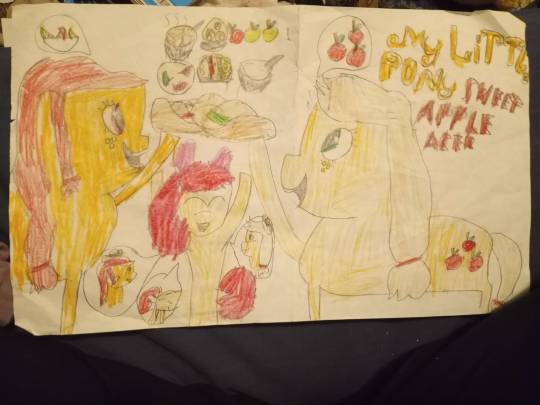
This is my earliest attempt at making my own ponysona; i was really into applejack and wanted my pony to be in the apple family! This oc didnt really go anywhere though, and i dont think i drew her again. This was also early on, before i started following tutorials for drawing ponies.
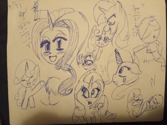
A bit later, after drawing ponies while following tutorials for a while, I started trying to draw them in my own style. At the time, I was mostly trying to draw in an anime style with my humanoid drawings, and so the big eyes transferred over. During this time, most of my drawings were in blue ballpoint pen on notebook paper or printer paper. I was drawing a lot during my (online) classes and I would fill out pages and pages like this.
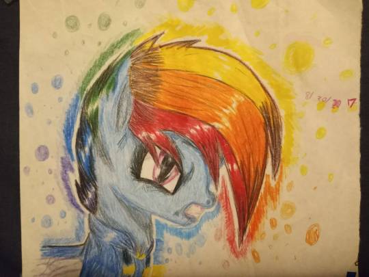
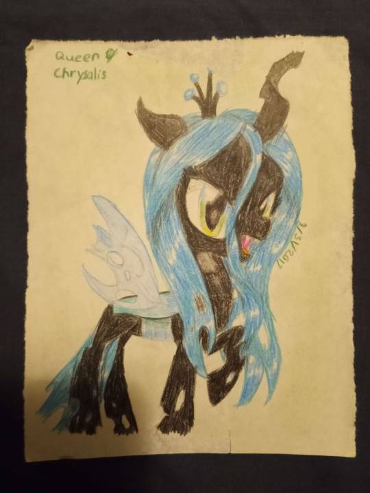
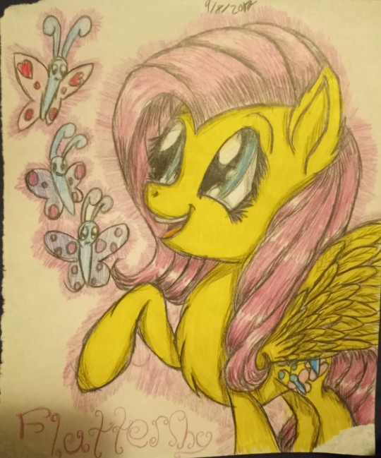

While i wasnt using tutorials as often anymore, i still watched a LOT of pony drawing content. At some point, i discovered some videos that inspired me to expand how i drew even more, and i started adding more graphite and colored pencil into final drawings.
Videos in question:
-https://www.youtube.com/watch?v=RSmSN3VtdD0
-https://www.youtube.com/watch?v=sTyMx2H-nuI
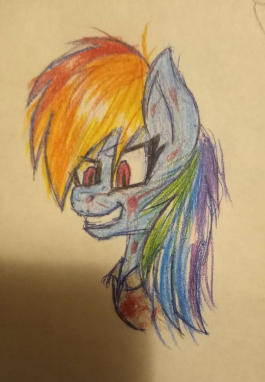
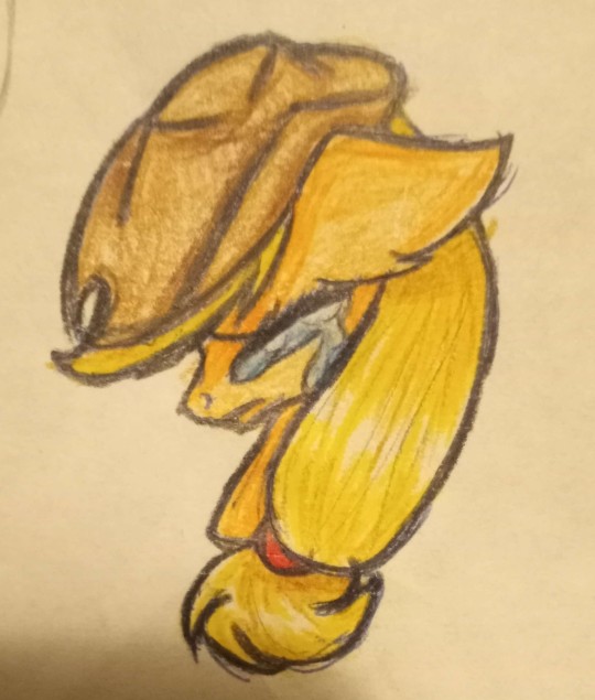
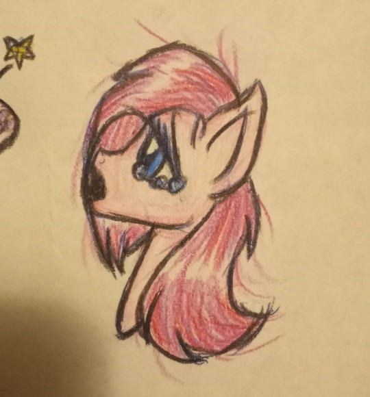
A bit later, i also got into creepypasta drawings for mlp and some of the songs (specifically for rainbow factory), but i didnt ever read or listen to MLP creepypastas on their own until much much later. I did however, write my own two page creepypasta comic for pinkie that i never kept up. I think i intended to but after 24 hrs i forgot and dropped the project. Ironically, I tried to redraw it a few years ago as a humanoid comic, stretching it out into i think...10 pages? until my hand got tired and I never actually got to the creepypasta part of the original first comic page. (If you'd like to see, let me know! I still have them, but there would be too many images to post in this already really long post)
Oddly enough, i noticed that around this time i was also mostly drawing either creepypasta, psychotic ponies, or drawing ponies sad and crying. Just a weird little note.
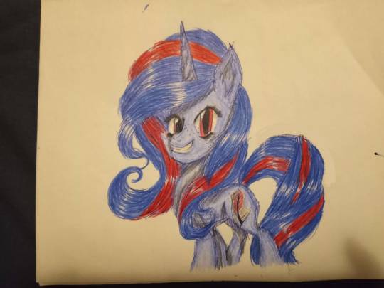
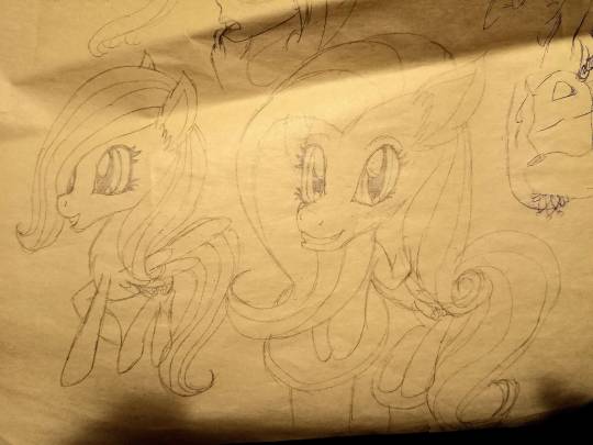
I had a short phase where i drew ponies with more boxy muzzles too, but most notable here is that i finally remade a ponysona! I would keep this sona until I would stop engaging with MLP content and go through my "Ew, mlp weird" phase.
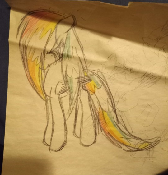
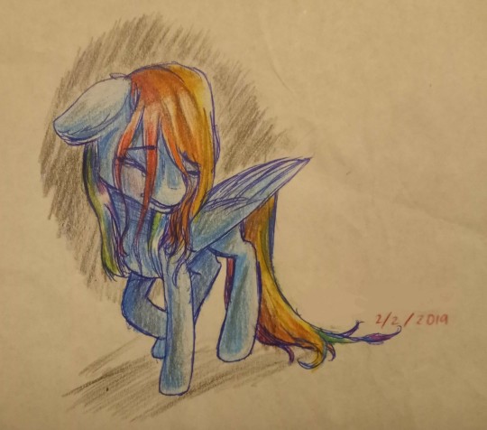
This was also from my time of boxy nosed ponies, and I think the first image was inspired off of a drawing that came up on a google search but i dont remember. I redrew it a while later, after practicing with colored pencils more. The redraw happened sometime during my "Ew mlp" phase.
And now we enter more current stuff. all these drawings are still old but are more in line with what i draw now, and were while i was starting to come out of my "Ew mlp" phase.
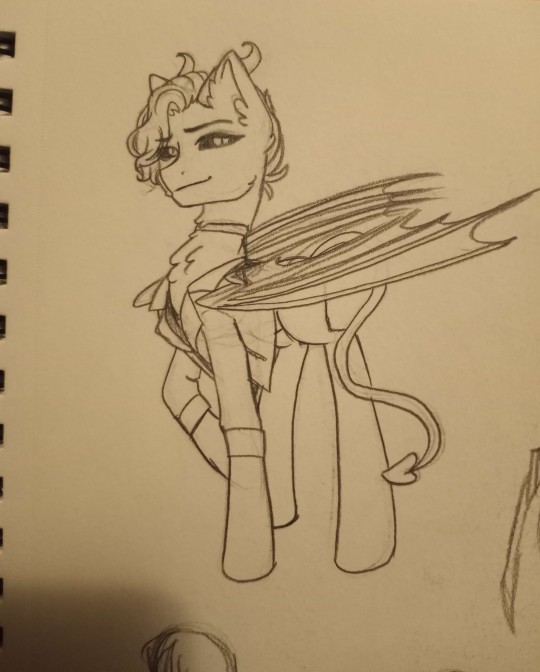
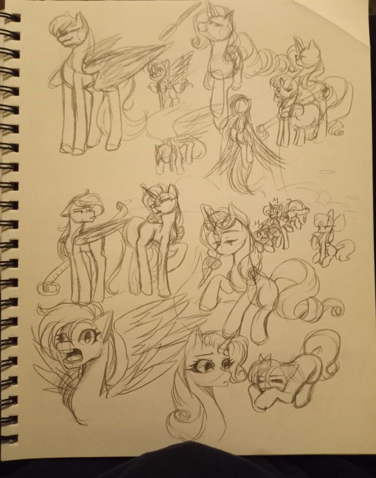
First image, you can see this is one of the first times I drew Lucious as a pony. At the time, in the main rp he's from he was still just straight up a demon. And in the second image is a sketch dump of the mlp characters, where i was jut getting more comfortable drawing them again. Still held onto those boxy noses though.
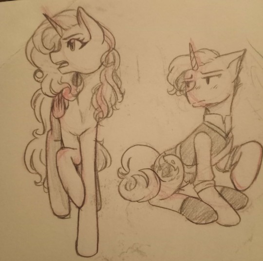
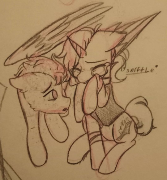
No style change here, but there was a time in my humanoid art where i would draw my and Mocha's characters as royalty. Then i went and drew them as ponies in those outfits! the first image you can see Cinna as an alicorn, and an early version of Lemon was just a unicorn. In the second image, was one of my first attempts to draw Jaysir! I guess its not too far off.
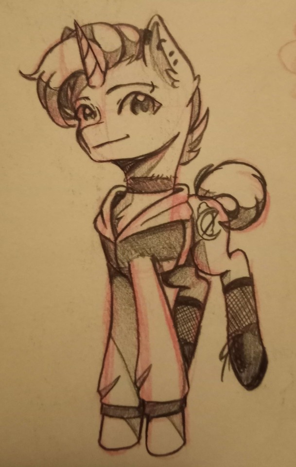
Last is just this pencil drawing of Lemon when their name was still Lemon Sugar-Moon! After this point, i think i took another break from drawing ponies until we come to current day where my style of drawing ponies has less boxy noses, and more pointy, less realistic and just a bit more fun for me personally :D
Who knows where my pony art will go next! Thank you for your ask and I'm sorry again that this has taken so long for me to finally just sit down and type out lol
#mlp oc#mlp art#mlp fim#my little pony friendship is magic#my little pony fanart#art progress#redraw#creepypasta#mlp creepypasta#old art#art dump#mlp ask blog#ask blog
3 notes
·
View notes
Text
Welp been a bit, sorry for not being very active, kinda just had the last part of the year relaxing a bit but now im all fired ready to start the new year
speaking of which i got color markers gifted to me, so i been trying them out

here is the first drawing i did with them, just did 3 characters to get to use most of my colors, its not quite noticible with my shity camera but there is a lot of bleed and weird stuff

and here is another drawing i did just now trying to mix my color pencils with it (as i have notice i dont actually have many greys),
so yeah i have ways to got with this but its been really fun trying them out
also the last one is an oc here the last post i did with her
#txtart#traditional art#oc#original art#artists on tumblr#so yeah been really fun to try them out#i still need to figure out how to blend properly and how to color#i am having a bit of a problem with that tho it might have to do with 2 things#1 the paper im using is really thin and 2 i belive this markers need another marker to blend#still not sure but i will figure out as i go#also also yes the last oc has gigantic proporcions... i wont lie i did it on porpuse lol#its been a running joke with a friend each time i draw that oc i tend to do them bigger... so i kinda just said fuck it and roll with it lo#i fear when i have to draw her again how i will 1 up myself
1 note
·
View note
Note
For the artist asks... 5, 7, 13, 15 & 28? Really been enjoying your linktober stuff lately!😊
thank you!! <3
5. What’s your favorite thing to draw?
I love drawing faces, especially noses they are so fun to draw. Also hands, unpopular opinion i know but once you figure it out hands become really fun
7. How often do you use references?
Not as often as i should. Because i forget. But pretty often, especially if i cannot figure out a pose or i am drawing a character with a lot of detail. Its amazing how much easier drawing is when you are looking at reference
13. Do you prefer to keep your art personal, or do you like drawing things for other people?
I like drawing things for other people, i had requests open a lot back in the rvb days, but most of the art i do is personal. The amount i post on tumblr is only a fraction of what i draw. i will draw and color and fully render a piece and then never post it anywhere and just look at it myself.
15. How long does an average piece take you to complete?
Depends on what we're calling a "piece". Like the linktober pieces were each like an hour or two at most maybe? But thats just sketch and lining. If its something more complicated that im coloring it will take several hours, usually stretched out over days. The gif in my pinned post, that took me like 2 weeks. I tend to work fast though bc if i dont i will lose interest lol
28. For traditional artists: what medium do you like most? (Pencil, charcoals, etc)
Ballpoint pen. Easy. Its just soo fun to work with...ive got a bunch of pens in different colors and i just love the texture of them and the way they feel on the paper and how you can get such a range of values. I have so many much fancier art supplies and yet my favorites are the cheap ballpoint pens.
artist asks
0 notes
Text
Art probably. Idk I finally have my headache down to a 1 for the first time in days and I want to ramble lol
Content warnings: body horror, bright colors (they make my eyes hurt if I don't have my screen brightness dimmed fully), psychedelic visual effects (best way I can think to describe it), Too many eyes! I dont remember the word for that but one image is literally a fuckton of badly proportioned eyes, along with the body horror i suppose blood is an easy interpretation in the piece.
Let me know if I missed something
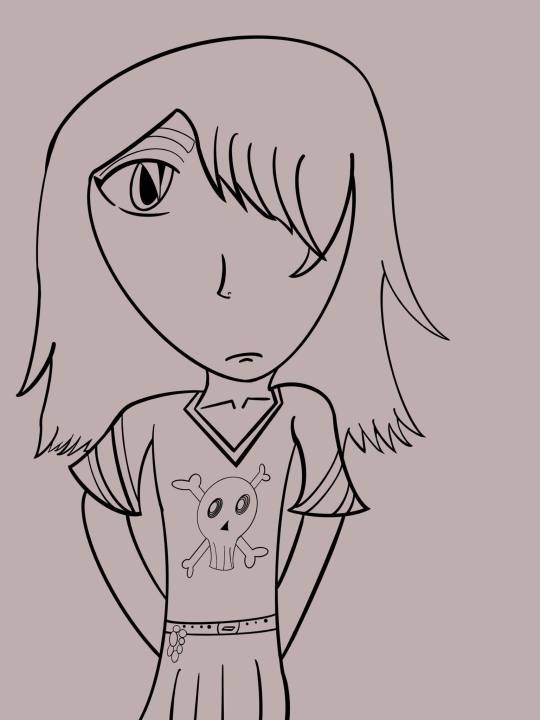
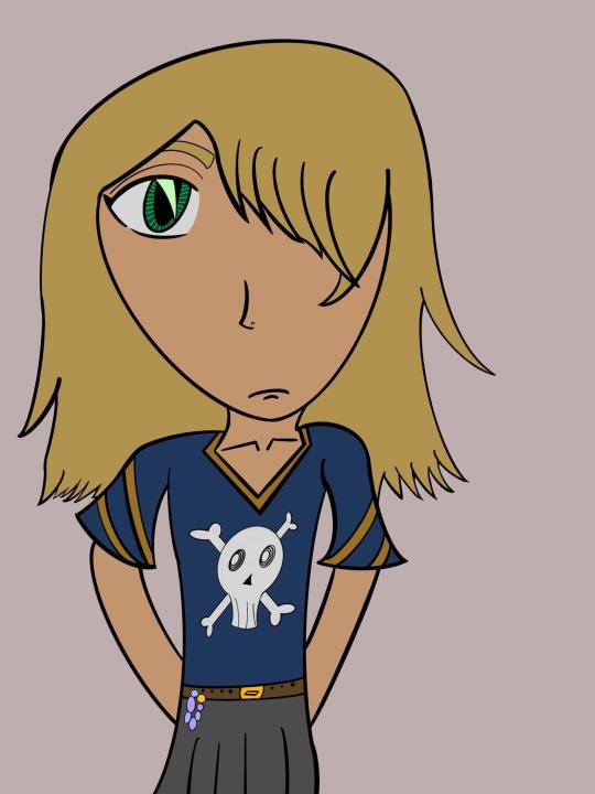
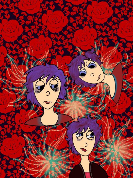
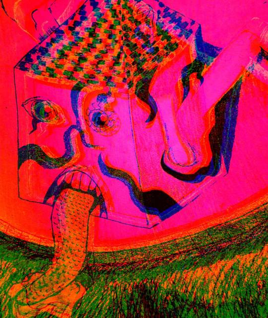

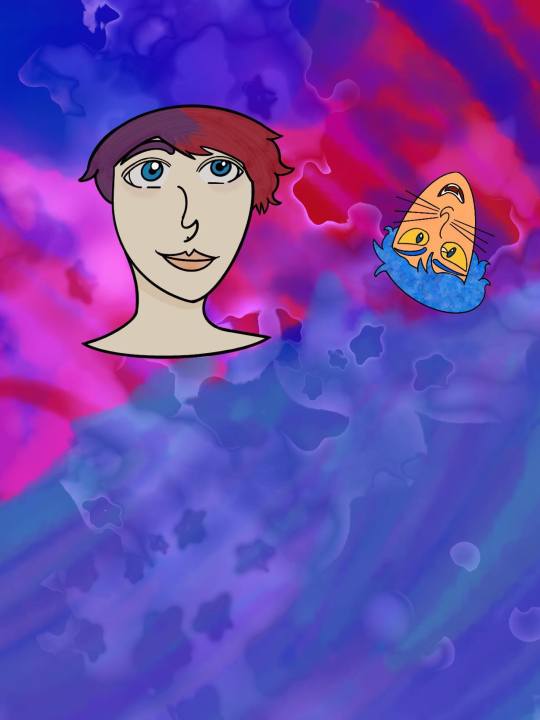
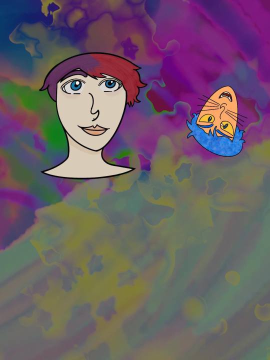
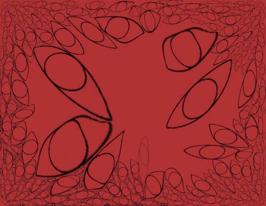
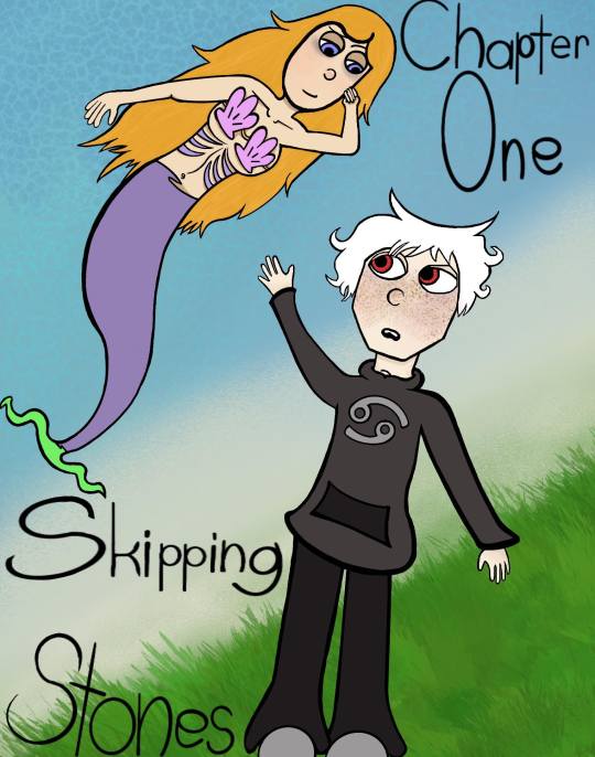
My headache has come back to a three in the process of making this post because this is my life 😎🙃 aside from that the weird big head blonde is an old oc I drew one time in middle school and said fuck it and redid it digitally. Uh the mermaid one with a human karkat is a digital remake of a cover from a stick figure comic I used to draw. I'd already done this piece twice with watercolor, ink, and alcohol markers but none of it looked the way I wanted. So there's this version. If I ever manage to finish the fucking introduction I'll probably want to redo the piece again. Lol, we'll see i suppose. The pink house one? Thats an old highschool traditional piece all done in plain mechanical pencil. I wanted to see what I could do in procreate to just edit a photo without me having to really draw. The vibrant monstrosity is the result, I like it, but it really does make my eyes and in turn my head hurt. The one with the roses in the background are just lined and colored digital redraws of some past sketches of mine (maybe a few months? Maybe more? Time isn't real) of myself, or at least how I would like to look at least. The other sketch with the headshot of a red and purple haired person and a smaller cat person headshot is the same, lined and colored digital versions of traditional sketches. The eyes? Thats a work in progress that is going to be a lot more work than I was prepared for going in. The wacky background for the headshots was me playing with brushes and blenders then screwing around with layer affects.
#art#karkat vantas#bright colors#tw body horror#tw blood#tw eye horror#i think#fuck my head hurts#i need more tags to organize my art this is getting a tad ridiculous to keep track of#digital art#re creating old art#im sure theres a better wording for that but whatever#headache has moved to a four#re creating old ocs#photo editing
0 notes
Note
all of the numbers i dont got time to count
what is your favorite color to work with? I think like…creamy peach pink, from magenta to orange hues
who is your favorite character to draw? Gozu ad mezu <3
what song(s) do you listen to when you do art? Just the usual music. About half the time I stay within the appropriate vibes corner of my music taste to draw so it depends on the tone of the piece..
how often do you draw? I TRY to do at least a little every single day. It ends up being more like every other day though…every day is the ideal
digital or traditional? I amm a digital enjoyer. Traditional is good but I spend all my time on digital. Brb going to do traditional art i love chalk pastel
tag your favorite artists/inspirations! No im scared. Instoh, kikosuu, mintaii, nibeul, cassandrajean
do you prefer sketching, outlining, or coloring? I do not outline I just color the sketch lol. Coloring’s the best out of these I like seeing the image really take (metaphorical) shape. Atmosphere and weight of objects are really set with color
show us at least 2-3 drawings from 1-2 years ago. Ive got so so many from 2yrs ago
what drawing program do you use? (if the artist does digital art) Clip studio paint beloved forever
are you right or left handed? Right
warm or cool colors? Warm
draw one of your favorite characters in 15 seconds.
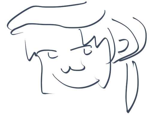
mezumaru im so sorry
what was something that you used to draw a lot that you don’t draw as much anymore? ,,,gozu and mezu my beloveds..........
when was the last time you did art? just now babey
what kind of tablet do you use? v v Wacom Intuous S. no-screen kind (i prefer it this way actually)
(alternative for traditional art ) ^ ^ do you work with pencils or pens more often? Pens actually! Most of my traditional art is pen doodling in history hdarhdkgh
how long have you been drawing/ when did you officially “declare” yourself as an artist? Since basically forever. Declared myself an artist late elementary school I think? I’d say I really got serious at the start of 2021 though everything before that was like. ego.
do you like drawing short hair or longer hair more? Long hair. Oooh flowy (way easier for me)
how often do you get art block? I do not keep track so idk..
draw one of your original characters.
TO-DO
do you use a mac or pc to do (digital) art? Pc. i use my laptop so I can take it places and draw at like school drjdgs
draw your fav as a vampire
TO-DO
how many followers do you have? (on your art blog) An entire 35 people on tublr…. 350 on instagram
where in your house do you usually do art? At my desk in my room
draw urself! (it doesn’t have to be detailed)
TO-DO
ill do the remaining three art ask questions+tag u at a later date ajdsgkjasjadh this is gonna get buried in my drafts if i dont post it rn
1 note
·
View note
Text
How to fill a sketchbook and not die trying
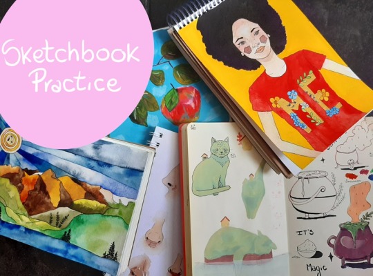
If you are reading this, you probably have a sketchbook (or many) waiting for you. Or maybe you are thinking about buying one. Perfect! Welcome to the club!
The most difficult thing is to fill the first page, the reckless blank page. And for that I have a very simple solution. Don't use it! How? Yes yes, you are reading it right… start on the next page. It seems like a very silly thing but it really works and it takes all the pressure off to start something new.
Now, before continuing, I invite you to confront some myths regarding sketchbooks. Of course, it's my personal opinion and we may not agree in everything, but after years of failure, I learned a little bit and now I really enjoy the minutes I can dedicate to my lovely sketchbook.
Use a sketchbook that you like. It doesn't have to be very expensive, otherwise it can be intimidating. But you have to be attracted to it, you have to like it. You can do it yourself without knowing anything about binding. Chose the sheets, go to a printing shop (i dont know the correct name in each country) and bound it with a spiral. Ta dah! A perfect sketchbook with the best paper for the materials you will use, or a mix of papers.
Your sketchbook doesn't have to be perfect but it doesn't have to be a disaster either. We are always advised to use it as a notebook, as the name says, for sketches, but the ones we see online are works of art themselves and we want ours to be similar, right?. So, if what we do is very ugly, we hate the sheet and if it is an amazing work of art, it generates us too much pressure to continue it like that. If it's for drawings or doodles, I rather use cheap paper or other simple notebooks. In my sketchbook I draw slightly more elaborate sketches that don't take much time. And if I do something ugly, I remember that "I DONT HAVE THE OBLIGATION TO POST EVERYTHING I DO ON INSTAGRAM".
You can have a sketchbook for each type of material that you use or purpose that you are going to give it, but if you are just starting, I recommend using only one so you will not end up with four incomplete ones.
Use materials that are suitable for the type of paper that your sketchbook has. If it's plain computer paper, using watercolors is going to be impossible. Unless you have 300g watercolor paper. Otherwise use pencils, markers, gouache, crayons. But if you really want to use watercolors no matter what, try to make a few washes because the paper will get ondulations because of the wáter and it may bleed to the other side.
1 note
·
View note
Photo


obligatory end-of-year memes - 2021 summary of art & art vs artist. i do not normally photograph well but halloween was good to me
this year was crazy busy because i went off and opened an etsy, and most of my commission work this year happened to be big pieces, so that all was keeping me real occupied behind-the-scenes. it was hard putting together the summary cuz i was so inactive some months. last year’s summary said “i wonder if i can get an illustration in every box next year” and if i were pulling from my etsy & commission log, i probably would be able to, but i mostly only use personal pieces in these so. lol. (... except for July that’s artfight but that one came out really good it can be an exception) i didn’t want any overlap between the two so the summary took priority, but i think the AVA is more a reflection of my usual work anyway so that’s fine probably
this is the part where i name my art goals for next year but you know what i’m just going with the flow. whatever happens happens. shrug emoji. really need to get more comfortable drawing perspective though so i guess that can be my goal
oh, aaand i think my favorite piece from this year... is tied between March, July, September, and December. they’re all good
Blank Meme || 2016 | 2017 | 2018 | 2019 | 2020
#art vs artist#summary of art#summary of art 2021#art#meme#its crazy how much i did this year that isnt reflected in these memes though#i made so many new characters too#seven if my TH is correct#so much merch design too#and again a fuckton of commissions#i went the fuck off for artfight this year#developed a new style thats more like returning to my roots really#2020 was the year of sharp lines and finished things but 2021 saw more of a return to that pencil sketch n loose colors vibe#that ive had for so many years#but now like. i have Both styles at once. how fun#and im better at freehanding and cleaning up sketches so sometimes i post things that are a little messier#but that dont look Bad or Sloppy#idk its interesting#god im getting old#look at all those prev years#i graduated 2016 wtf#dat me
54 notes
·
View notes
Text
i really wanna draw with thicker mechanical pencil leads more often because i like how it makes me draw larger than I do with 0.5 mm lead BUT the problem is that the buffalo branded 0.5 lead i’ve only been able to find in the far back corner of a pharmacy for 1 dollar is the most wonderful material for sketching ive ever used and i dont know how anything else can compare
#its hb but its got like. the softness and smoothness of b lead. but the eraseability of h and hb#its a little brittle (not as brittle as like. whatever lead i bought from dollarama when i was 12 is tho)#its a little brittle so itll break every once in a while if you press hard#so its not the greatest for writing hard or like. final rendering drawings. but thats what i LIKE about it!!#i think the brittle quality of the lead makes it draw so smooth down on the paper#so you dont need to press super hard so its still easy to erase#my sketches are ephemeral. they are gone once i line. they need to be ERASED#(unless i like em lol sometimes i keep a few sketches as they are)#(most of the time they are too visually incomprehensible to be useful for anyone but me tho)#(i sketch with the intention of making guidelines first and making a visually appealing product like. 47th)#(just the way my workflow had evolved over the years)#but man. i have never been able to find lead as simultaneously smooth and pigmented yet easily eraseable since#but i also. want to draw in .7 lead. maybe even .9#i wanna draw bigger!! i dont know if its obvious but most of my doodles are like 5 x 5 inches at most. many smaller#you can see the paper grain in a lot of them. thats not a thing i added in post. thats because i use canson xl mix media paper#which while pretty smooth it still has a decent amount of texture. albeit a fine texture#but you wouldnt know its so fine because ive been drawing too tiny!!!!!!#where will i find a good .7 lead. where will i find one with the erasability of hb but the softness of b#also i am aware about how terashits per gigafart this entire tag section looks for those who dont use mechanical pencils. im so sorry
2 notes
·
View notes