#i dont own the image i based my drawing on
Explore tagged Tumblr posts
Text
Day 8 of posting my GCSE coursework:


Portrait of Robespierre in the style of Gerard Way
#robespierre#gerard way#portrait#i dont own the image i based my drawing on#marker pen art#gcse art#gcse coursework#favourite parts from my gcse coursework
16 notes
·
View notes
Text
My Favorite Cheap Art Trick: Gradient Maps and Blending Modes
i get questions on occasion regarding my coloring process, so i thought i would do a bit of a write up on my "secret technique." i don't think it really is that much of a secret, but i hope it can be helpful to someone. to that end:

this is one of my favorite tags ive ever gotten on my art. i think of it often. the pieces in question are all monochrome - sort of.
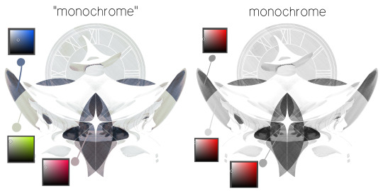
the left version is the final version, the right version is technically the original. in the final version, to me, the blues are pretty stark, while the greens and magentas are less so. there is some color theory thing going on here that i dont have a good cerebral understanding of and i wont pretend otherwise. i think i watched a youtube video on it once but it went in one ear and out the other. i just pick whatever colors look nicest based on whatever vibe im going for.

this one is more subtle, i think. can you tell the difference? there's nothing wrong with 100% greyscale art, but i like the depth that adding just a hint of color can bring.
i'll note that the examples i'll be using in this post all began as purely greyscale, but this is a process i use for just about every piece of art i make, including the full color ones. i'll use the recent mithrun art i made to demonstrate. additionally, i use clip studio paint, but the general concept should be transferable to other art programs.

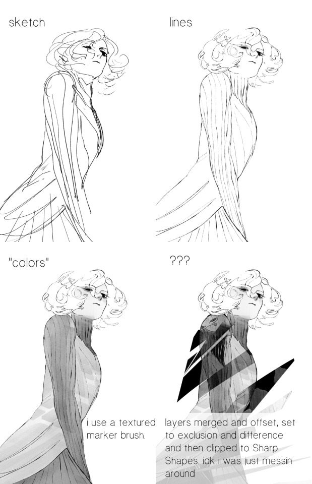
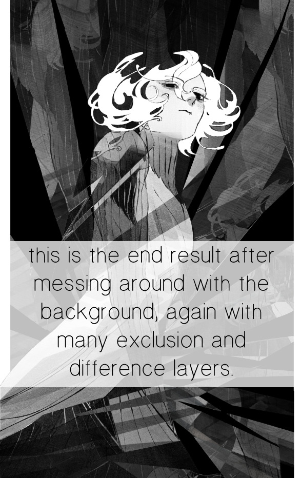
for fun let's just start with Making The Picture. i've been thinking of making this writeup for a while and had it in mind while drawing this piece. beyond that, i didn't really have much of a plan for this outside of "mithrun looks down and hair goes woosh." i also really like all of the vertical lines in the canary uniform so i wanted to include those too but like. gone a little hog wild. that is the extent of my "concept." i do not remember why i had the thought of integrating a shattered mirror type of theme. i think i wanted to distract a bit from the awkward pose and cover it up some LOL but anyway. this lack of planning or thought will come into play later.
note 1: the textured marker brush i specifically use is the "bordered light marker" from daub. it is one of my favorite brushes in the history of forever and the daub mega brush pack is one of the best purchases ive ever made. highly recommend!!!
note 2: "what do you mean by exclusion and difference?" they are layer blending modes and not important to the overall lesson of this post but for transparency i wanted to say how i got these "effects." anyway!
with the background figured out, this is the point at which i generally merge all of my layers, duplicate said merged layer, and Then i begin experimenting with gradient maps. what are gradient maps?
the basic gist is that gradient maps replace the colors of an image based on their value.

so, with this particular gradient map, black will be replaced with that orangey red tone, white will be replaced with the seafoamy green tone, etc. this particular gradient map i'm using as an example is very bright and saturated, but the colors can be literally anything.
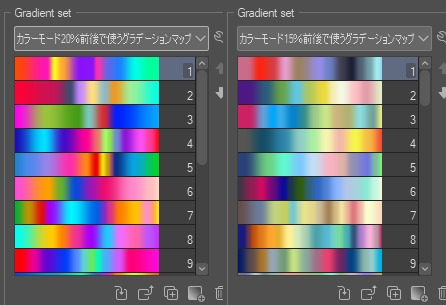
these two sets are the ones i use most. they can be downloaded for free here and here if you have csp. there are many gradient map sets out there. and you can make your own!
you can apply a gradient map directly onto a specific layer in csp by going to edit>tonal correction>gradient map. to apply one indirectly, you can use a correction layer through layer>new correction layer>gradient map. honestly, correction layers are probably the better way to go, because you can adjust your gradient map whenever you want after creating the layer, whereas if you directly apply a gradient map to a layer thats like. it. it's done. if you want to make changes to the applied gradient map, you have to undo it and then reapply it. i don't use correction layers because i am old and stuck in my ways, but it's good to know what your options are.

this is what a correction layer looks like. it sits on top and applies the gradient map to the layers underneath it, so you can also change the layers beneath however and whenever you want. you can adjust the gradient map by double clicking the layer. there are also correction layers for tone curves, brightness/contrast, etc. many such useful things in this program.
let's see how mithrun looks when we apply that first gradient map we looked at.

gadzooks. apologies for eyestrain. we have turned mithrun into a neon hellscape, which might work for some pieces, but not this one. we can fix that by changing the layer blending mode, aka this laundry list of words:

some of them are self explanatory, like darken and lighten, while some of them i genuinely don't understand how they are meant to work and couldn't explain them to you, even if i do use them. i'm sure someone out there has written out an explanation for each and every one of them, but i've learned primarily by clicking on them to see what they do.
for the topic of this post, the blending mode of interest is soft light. so let's take hotline miamithrun and change the layer blending mode to soft light.

here it is at 100% opacity. this is the point at which i'd like to explain why i like using textured brushes so much - it makes it very easy to get subtle color variation when i use this Secret Technique. look at the striation in the upper right background! so tasty. however, to me, these colors are still a bit "much." so let's lower the opacity.
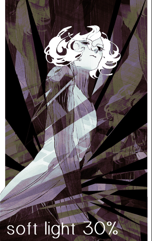
i think thats a lot nicer to look at, personally, but i dont really like these colors together. how about we try some other ones?
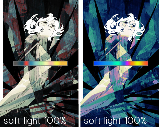
i like both of these a lot more. the palettes give the piece different vibes, at which point i have to ask myself: What Are The Vibes, Actually? well, to be honest i didn't really have a great answer because again, i didn't plan this out very much at all. however. i knew in my heart that there was too much color contrast going on and it was detracting from the two other contrasts in here: the light and dark values and the sharp and soft shapes. i wanted mithrun's head to be the main focal point. for a different illustration, colors like this might work great, but this is not that hypothetical illustration, so let's bring the opacity down again.
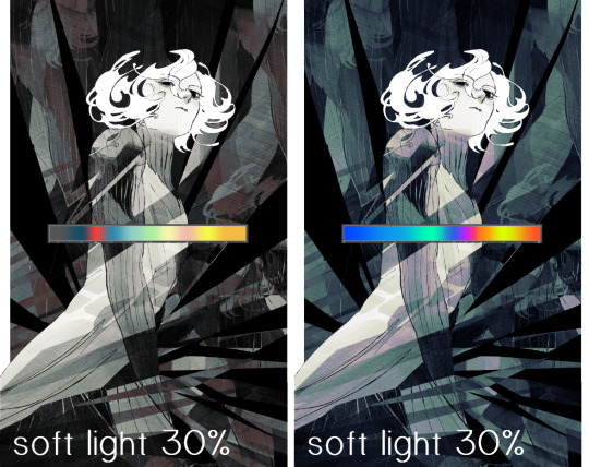
yippee!! that's getting closer to what my heart wants. for fun, let's see what this looks like if we change the blending mode to color.
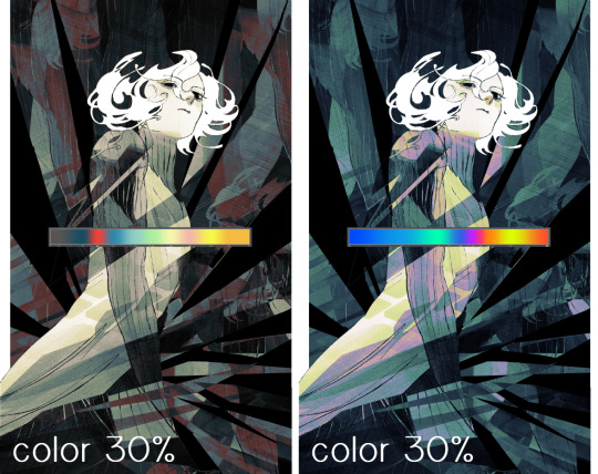
i do like how these look but in the end they do not align with my heart. oh well. fun to experiment with though! good to keep in mind for a different piece, maybe! i often change blending modes just to see what happens, and sometimes it works, sometimes it doesn't. i very much cannot stress enough that much of my artistic process is clicking buttons i only sort of understand. for fun.
i ended up choosing the gradient map on the right because i liked that it was close to the actual canary uniform colors (sorta). it's at an even lower opacity though because there was Still too much color for my dear heart.
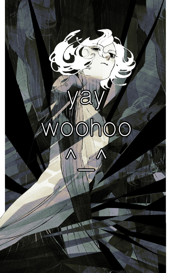
the actual process for this looks like me setting my merged layer to soft light at around 20% opacity and then clicking every single gradient map in my collection and seeing which one Works. sometimes i will do this multiple times and have multiple soft light and/or color layers combined.
typically at this point i merge everything again and do minor contrast adjustments using tone curves, which is another tool i find very fun to play around with. then for this piece in particular i did some finishing touches and decided that the white border was distracting so i cropped it. and then it's done!!! yay!!!!!
this process is a very simple and "fast" way to add more depth and visual interest to a piece without being overbearing. well, it's fast if you aren't indecisive like me, or if you are better at planning.

let's do another comparison. personally i feel that the hint of color on the left version makes mithrun look just a bit more unwell (this is a positive thing) and it makes the contrast on his arm a lot more pleasing to look at. someone who understands color theory better than i do might have more to say on the specifics, but that's honestly all i got.
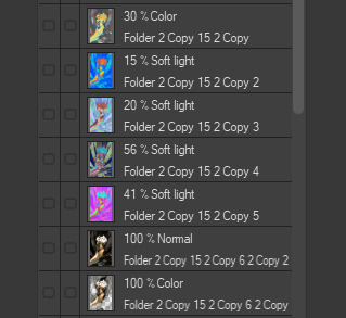
just dont look at my layers too hard. ok?
2K notes
·
View notes
Note
If I want to study someone's art or style, how do I do that? Like where do you even start when looking at an illustration that they made 😭thank you!!!
Here’s stuff i think about. i don’t do that many style studies, so idunno how helpful it is! pls sound in tha comments if anyone has tips:)
Pinpoint what stuff you like, and focus on that. Focus on technique rather than exact replication, for example ( just first thing comes to mind) if you like rostov’s disco elysium cover art and want to study it, don’t just repaint the image, find what’s key in the style. looseness, maybe? then, instead of copying the image with your technique, try to apply the same looseness. (feat. shitty 5 min sketch plz dont judge example of how i normally approax paintings, versus a study. ALSO not to say u CANT do this it's just how i would study, myself. )
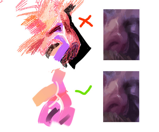
That being said, don’t force yourself to make art decisions that feel unnatural to you. a lot of the time artists make decisions based on their weaknesses as well as strengths. I do very shaky, hatchy lineart because my hands are very shaky. I focus on painting what I* feel is important and fun.
Instead of copying a style from a picture, look at a variety of pictures and find technique. For example a lot of people redrawing a screenshot in “sailor moon style” or “ghibli style” will draw… let’s say, an old man, looking like a usagi because that’s the screenshot they looked at, instead of watching what stylistic choices for example takeuchi made when stylizing an old man. So the “studies” end up homogenous. I personally find it unproductive to replicate a painting for purposes of study, but like focusing on individual elements. say you like egon schiele, replicating whole paintings at a time IMO isn't gonna do much, but maybe you can set out on a series where you sketch copy his hands or feet from different paintings, and then try stylizing your own hands the same way? Or maybe your fave artist draws moonlight like a blue stream, or a red one? Try applying only that light to your paintings.
You could also color pick or look at the colors they make and paint whatever you want with those same colors, to understand how they work together and what can be done with them.
Also, if you can, look at their influences! Everyone learns art by seeing others art. Chances are they saw art they liked and picked from there what elements they enjoyed. Looking at the inspiration can help make some of the techniques more obvious.
Basically focus less on copying(not that copying is bad- but not always helpful for studying), and more on what you like. If you find what you like, you can work from there and try to think about your own art from the same perspective.
IDK if this helps as i said, feel free to add onto^_^
482 notes
·
View notes
Text
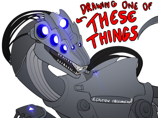
only finally time to post this. also this isn’t a step-by-step tutorial. im assuming you generally know how to draw already, this is just a bunch of references compiled together that could help you draw them easier.
SENTINEL REFS :3
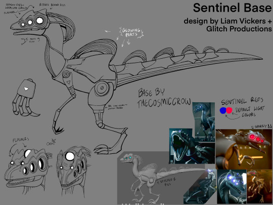
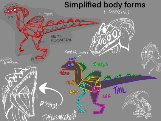
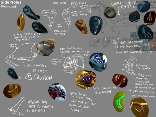
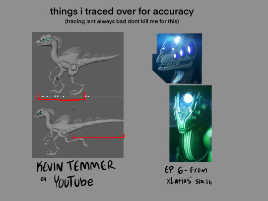
extra notes:
dont worry about a bunch of the smaller details. sentinels are littered with them and itd take ages to draw them if you tried to make them 100% every time. just focus on the bigger shapes and add from there.
their eyes ARE octagons, not circles. that being said it does not matter how you draw them because octagons are absolutely fucking obnoxious to consistently draw. i know, i have a half-sentinel oc, ive given up by now. do not place that burden on yourself. the rest of their face lights ARE circles though.
the smaller two flashers are part of their head ridges. their eyes are on a completely separate layer, and have duller ridges atop them. sentinels just have a lot of ridges in general.
if you want to use real-world dinosaurs as reference, i would use Velociraptor, Utahraptor, Deinonychus, and Dilophosaurus as references, given that theyre all similar in body shape and structure. In the concept art, Sentinels looked extremely like the Dilophosaurus, though it got switched to being more raptor-like in the actual show.
I also MORE THAN LIKELY drew their tail wrong. So if you wanna figure out its design on your own, go for it. I just had to put something down so I tried my best, but it is absolutely NOT perfect.
Same with their colors! they’re almost a completely solid grey so it was difficult for me to tell what colors went where, so I just kinda put em at random in that first image. Doing something completely different is also good, since nobody can tell anyways :)
and on a final note, you technically do not have to follow any of these!! stylize them all you want. these are just references for anyone that may want to draw them more accurately :)
transparent sentinel base png: (MAY NOT BE VISIBLE IF YOURE USING ANY DARK MODE, BUT ITS STILL THERE!)

if it doesnt download as transparent, you can set the layer mode as multiply and it’ll work perfectly as lineart. this is free to use, I just want people to be able to make ocs easier :) i just ask that you leave the watermark in, and credit me if you use it, but you dont have to ask to do it.
(plus the image @1-800-hellyeah made for her sta.sh that i used as reference)
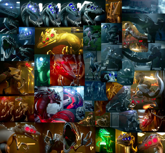
Happy dino drawing!!
(ps. you should totally show me any sentinel ocs you make :3)
#murder drones#murder drones sentinels#sentinels murder drones#sentinel references#murder drones art#thecosmiccrow#my art
219 notes
·
View notes
Note
you said you think gay sex cats is the new duchamp's fountain. i dont disagree and i kinda see what you mean already but please elaborate
it was a silly and tongue in cheek way to say that a lot of people are getting mad about it in a way that implies reactionary views on art, and that there's no way to say gay sex cats isn't art that wouldn't also imply that the fountain isn't art. a funny meme image is a funny meme image, but it is also funny to overthink and recontextualize them as art.
and the reaction makes the comparison even more apt. neural net generated artworks are anonymized mass produced images, vast majority having no artistic pretension or meaningful content such as a thomas kinkade painting. gay sex cats was made with no intent to be art, but the discourse it has with audience reaction and its appropriation in derivative works make it so. why is gay sex cats not art if people talking about it negatively allow it to be called art? is art only things you find beautiful and valuable? if so, what is value and beauty, and how do you draw the line? if gay sex cats was still ai generated but had more "aesthetic qualities" would it be art? if someone copies the original image by hand with all its ai generated faults where is the value generated? does the original still have no merit of its own, even after appropriation as a digital ready-made?
but the main reason as to why gay sex cats is comparable to the fountain still is because it made a lot of people with bad takes on art really really mad. and that the pissed off tags wouldn't look out of place as reaction to modern art in the 1920s. art is a flat circle
EDIT: well. putting an addendum because in retrospect more people took either or both the op and image in face value and much more self serious than ever intended. a lot of people understood the tone i was getting at, and i still stand by the questionings i added on, but still for clarification. the original comparison is not serious. it's self evidently ridiculous to compare a meme image to a historically significant artwork, the comparison was only drawn because they were both controversial to an audience, who reacted denying their status as respectively as an image and as art, and that it was funny that the negative reaction people had to the original image explicitly denied its status as art, even if the meme never had pretension to be art, so it was funny to draw a comparison and iterate on that.
i did think it was valid to bring in questionings about art and meaning because that's the reaction i saw most and wanted to make people think about the whys, and that also i do not think it's valid to base your dislike on ai art on either grounds of questioning its position and value as artwork, or even as a question of ip theft. regular degular handmade art can be soulless, repetitive, thoughtless, derivative, unethical, open and blatant theft, and much more, and that does not make it any less of an artwork. neural nets are tools that generate images by statistic correlation through human input.
the unambiguous issue with neural nets in art is its use as a tool by capital, to threaten already underpaid and overworked working artists and to keep their labor hostage under threat of total automation. in hindsight i regretted not adding the paragraph above as it was a way in which people could either misinterpret or assume things about me, but hindsight is hindsight and there's no way to predict how posts would blow up. so shrugs. i had written more posts in my blog that elaborated on that because asks would bot stop coming. and i think my takeaway is that people will reblog anything with a funny image without reading the words around it, or even closely looking at the image.
1K notes
·
View notes
Text

ms paint. you know her. u used her age 8 to make loads of rainbow ovals all over the canvas and then scramble it with selection tool. now u will know her true powers with my handyrandy tips under the readmore. some will be pretty basic and others are very special.
this post has 8 cool trix to learn for you. enjoy and i may do another in the future if i remember/learn more stuff
some of it might be common knowledge. but its got some deep cuts. all tips have gifs to show process easily.
🙂 enjoy and i hope this encourages you to fuck around in mspaint more
soundtrack for this post (loop it while you learn for advanced learning experience)
TIP 1) the right click trick
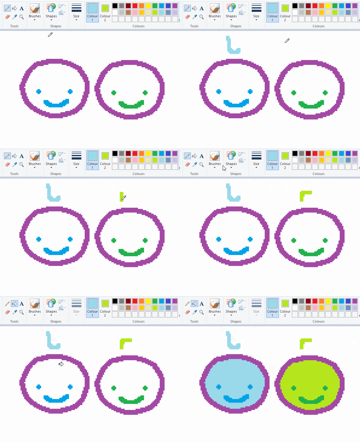
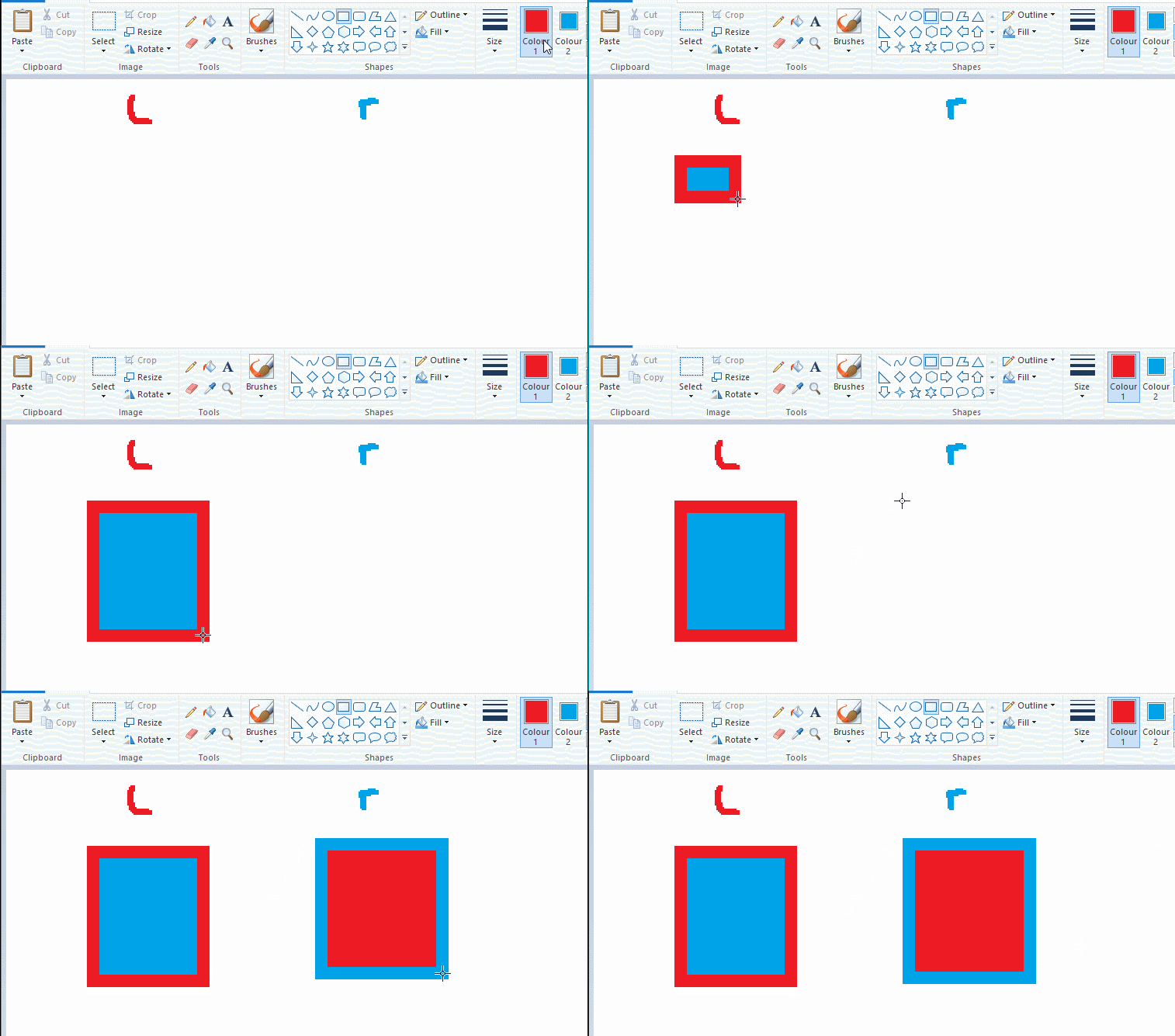
left and right mouse click correspond to col1 and col2 respectively, which u can see in the top bar. this applies to all brushes and the fill tool like above. when using shapes col2 will be the fill colour (if you have solid fill selected). right clicking with shape maker will reverse the colours use on the shape.
TIP 2) right click eraser
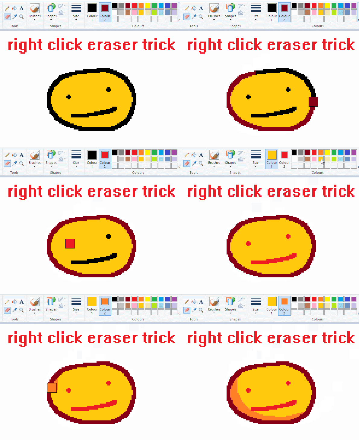
this one is extremely helpful for lineart or add shading. the eraser always uses col2. so your eraser can technically be any colour. but here's where you get powers: right clicking with eraser will only erase onto col1, with col2.
TIP 3) transparent selection change a guy destination
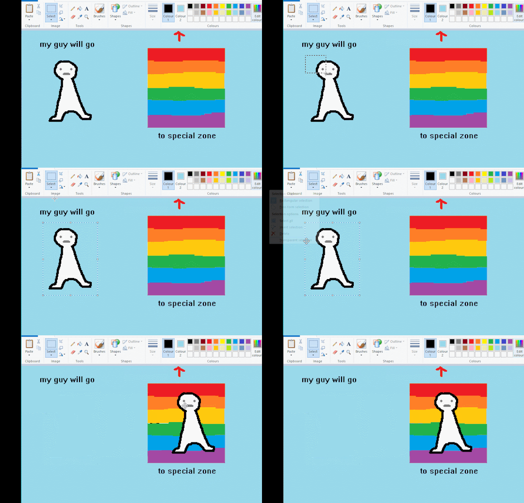
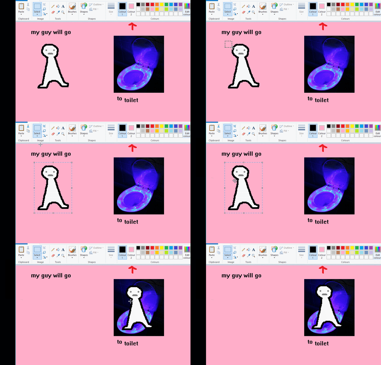
the beloved transparent selection tool works based on what is selected as col2. so long as you have the correct colour as col2 you can make any image transparent and put it on top of anything else. and yes this works with photo bg as you can see.
TIP 4) the gradience
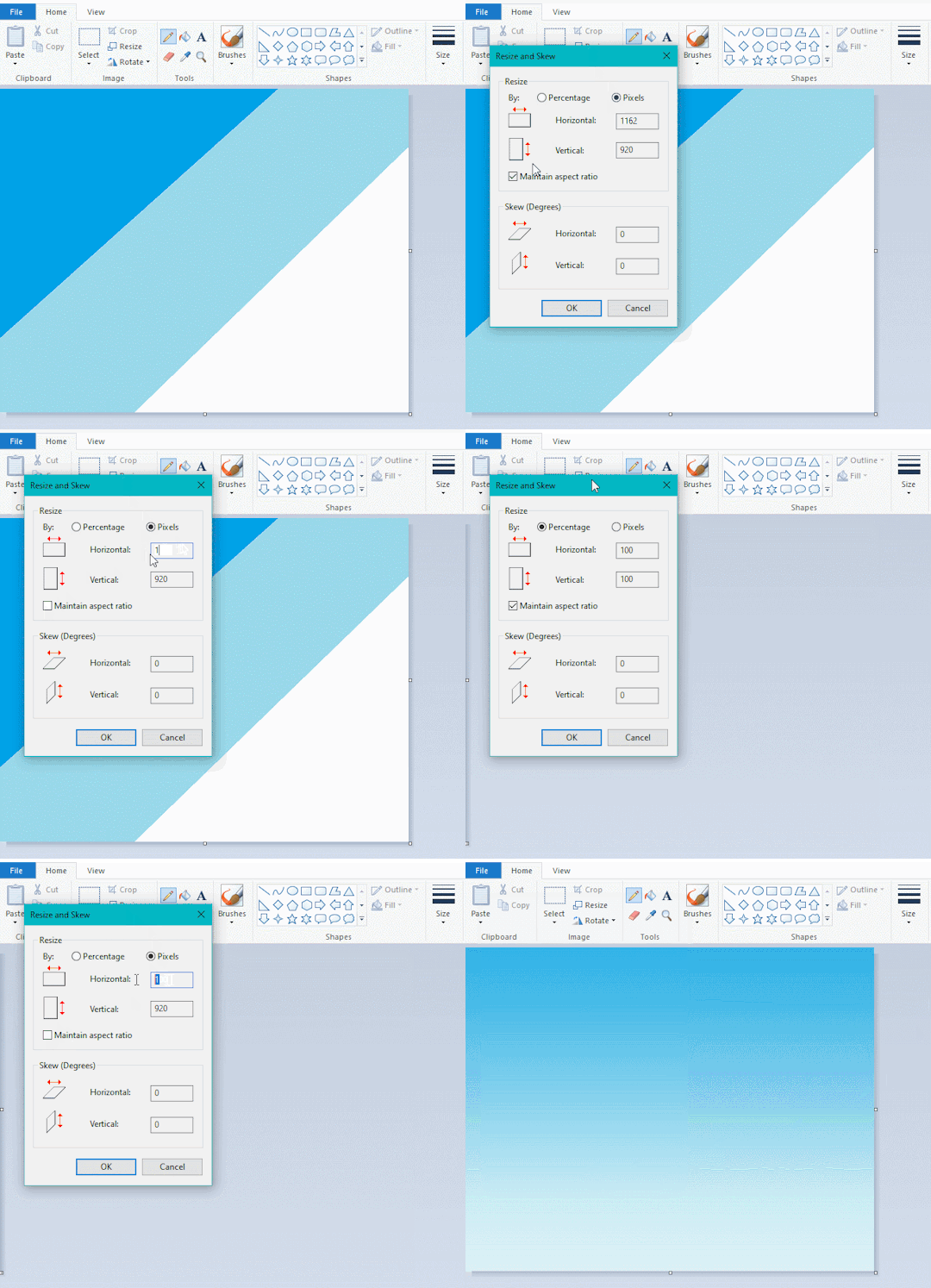
this one is a little more complex. you want to start off with any canvas size, and make as many diagonal coloured bands as you want. (protip: holding down shift makes a perfectly diagonal line with line tool)
then you need to resize the canvas to a width of 1px (make sure you resize by pixels, and do not maintain aspect ratio). then resize again back to its original width (or a different width i cant stop you). you will have your lovely gradience.
TIP 5) superimposter

so. you got a cool gradient and wanna put a guy on it. heres what i do:
i open a 2nd mspaint with same canvas size and draw whatever i want on there. i then pick a completely unrelated colour to my entire piece, and set that as the bg. you could use white, pink, geen, whatever you want as long as it doesnt appear somewhere else in ur drawing. copy the guy.
go back to your gradient tab. ensure that col2 is set as that bg colour you picked (lilac for me). have "transparent selection" enabled. paste your guy in. cue fanfare
TIP 6) advanced superimposter
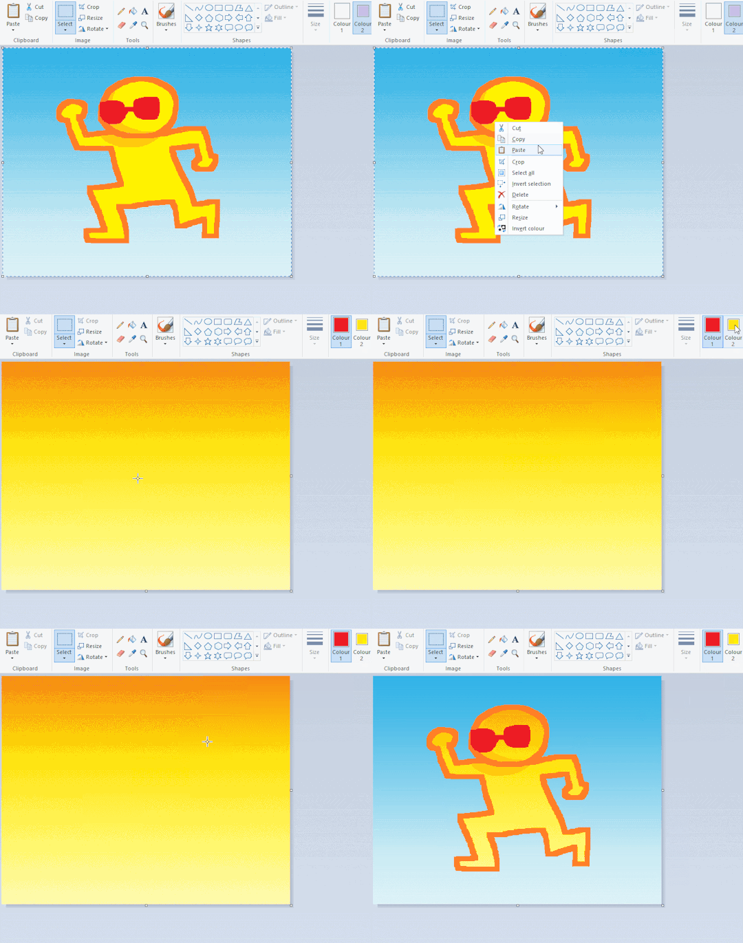
the great thing about this method is u can put multiple gradients in multiple areas of the image. this is where it gets all japanese printmaking type of shit. ukiyo-esque
all you need to do is make another canvas with a new gradient, ensure col2 is set as the colour you want to replace, then paste your original piece onto the new gradient. now my guy has a soft fade. you can do this as much as you want. (you could even make a canvas with a texture or photo and paste your drawing onto there)
TIP 7) "sketch layer"
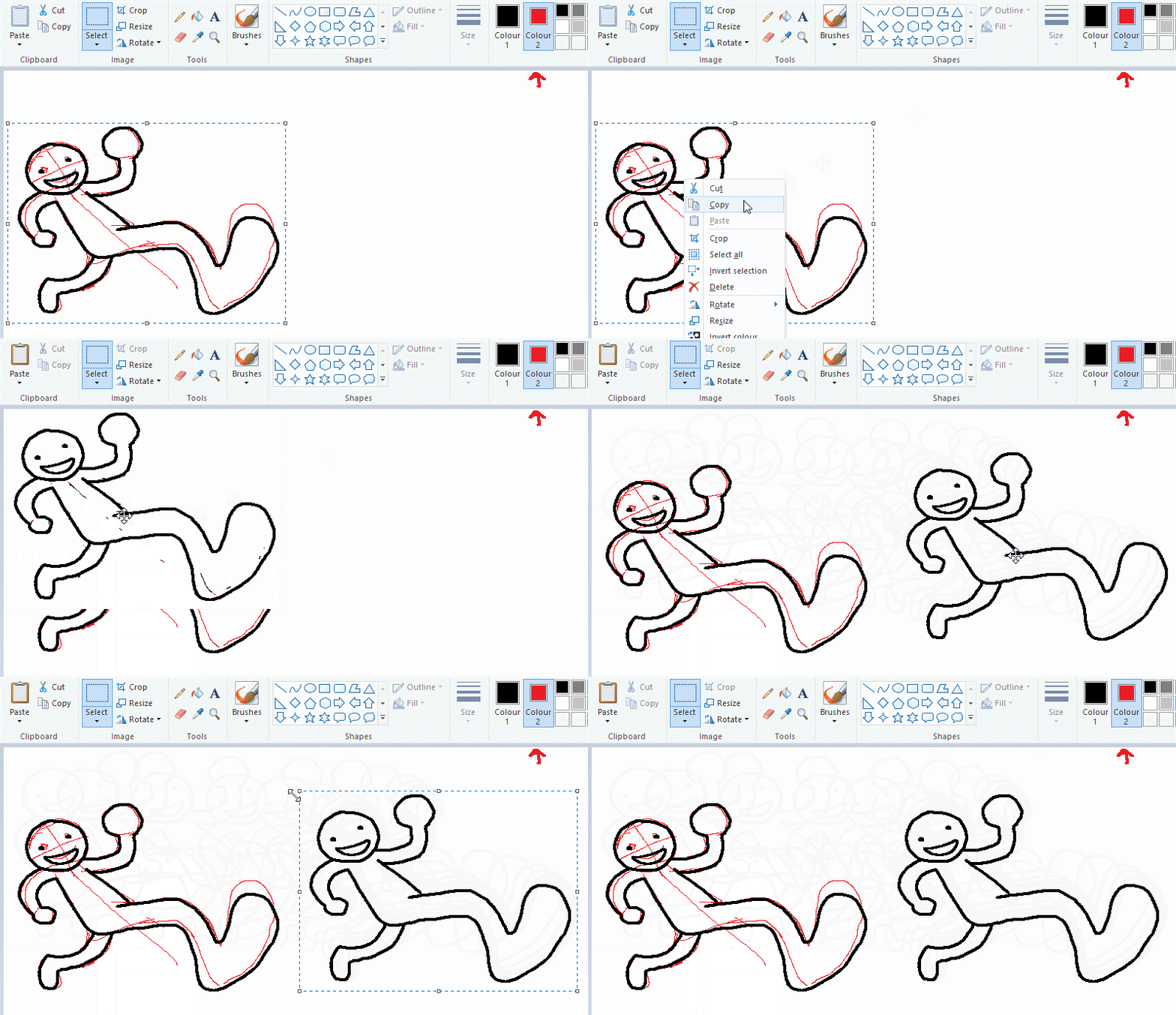
so as you now know, col2 is what is removed when you click "transparent selection". which means you can also remove any instance of a colour from ur drawing. which means you can have a unique colour for sketch layer and remove it from the drawing later. i admittedly dont do this but it is a great trick to have.
now combine this with lowering your dpi for smoother lines. may seem obvious but it helps. its like a free stabiliser whenever u want.
TIP 8) rainbow art
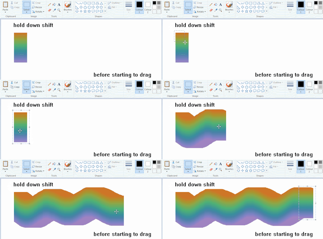
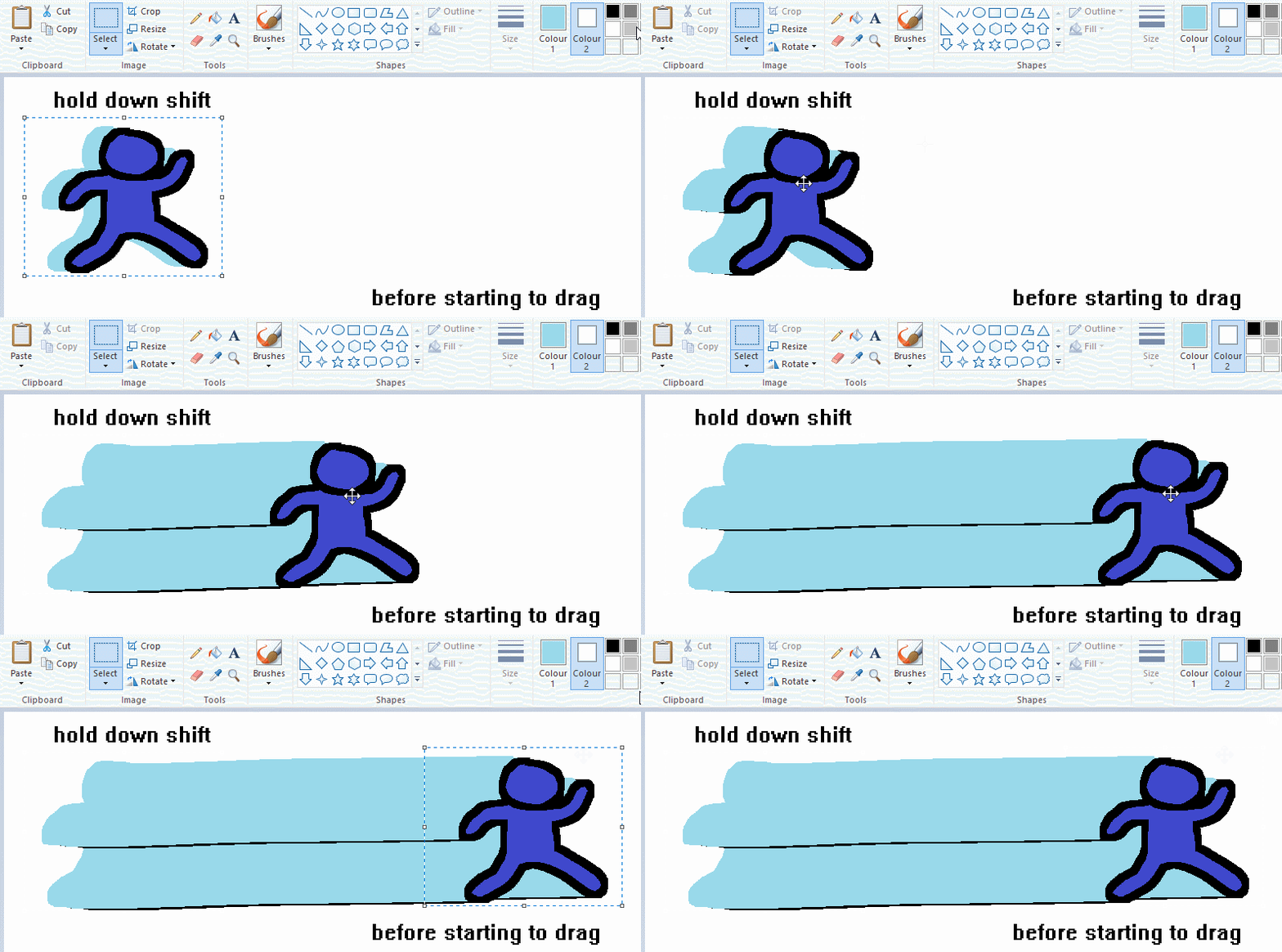
now this is where you can get dizzee rascal "bonkers". check out my small and shitty rainbow trick. you can select anything and hold down shift, then drag with left mouse, to turn that selection into its own brush. i even did it with a guy. and you can of course do this with a photo as well.
🙂well that it for now. hope you liked it thanks for reading now back to your regularly scheduled tgcg programming
2K notes
·
View notes
Text

It sounds like a wolf, thought Sansa. A ghost wolf, big as mountains.
So a few days ago I decided to start learning how to do digital drawing. Now, I don't think art is anything I have a huge passion for, so who knows if I'll pursue it, but I had a ton of fun making this.
A few disclaimers:
-i was using a reference panel from a manga as the base pose bc how do bodies work?? And I was mostly just trying to figure out how to use the art program/pen. Unfortunately, I was clicking through lots of pages/images and cannot for the life of me remember what the manga was or where I got the image. I almost didn't post this because I wouldn't be able to credit them, but I will say, it's only the pose & hair shape that I used, everything else I did on my own. You can tell by how sloppy it is :)
-dont @ me about the shaky lines and poorly drawn bricks. Idc I had FUN and that's all that matters right? RIGHT?
-the wolf shadow is free clipart lol. I tried to draw my own but ya girl is NOT there yet
-why is Sansa in a sky cell?? Who knows. Trying to hide from LF probably. She's also growing out her hair in defiance bc why not
-ooh or maybe it's an au/future fic where sansa is put in the sky cells for something. and maybe a ghost wolf comes to get her out. who knows
#presenting my first digital art#that i worked on for hours over the course of 2 days#probably couldve spent longer on it#but oh well#kinda dont want to put this in the sansa tag tbh#i dont love being perceived outside of the people that follow me#so this is for my followers#and ill also tag#jonsa#bc it is#this line is jonsa to me all day every day
314 notes
·
View notes
Text
ty! \(^_^)/ feelin good so ill try answer in detail for ya!!!!
most of the time i just do basic cell shading. here ill explain my rendering process after i choose my base colours, ill try keep it short & sweet!! nvm warning buckle up its really super long.
flat colours -> fully shaded!!


⭐️Picking shading colours!
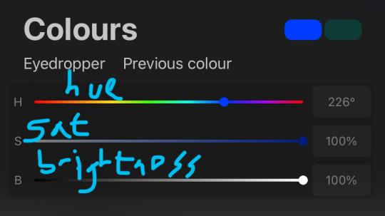
usually it's just the base colour with +saturation OR a hue shift! i dont really lower brightness.
This is what i mean by HSB, i never use the colour wheel i prefer the sliders!!!
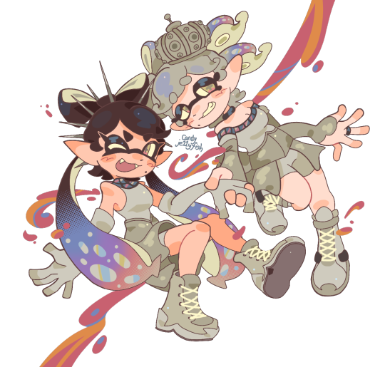
i like my art to look super colourful so i do things like shading pink with blue instead of with a darker pink or red, as shown in the above callie piece.
examples ft lumity:
skin: i always keep it very simple & cartoony! over the nose, below the eyes, the neck & sometimes the tips of the ears is where i'll put shading
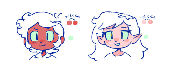
hair: as u can See, it's not darker than the base colour at all!! for dark hair like luz's, i brighten & saturate the colour, and for light hair like amity's i just shift the hue a little!
⭐️more kewl tips:
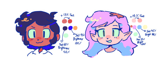
colourpick from yourself!!!! instead of making a new colour for everything, try using a colour u already have down!!!! like below: by limiting my colour palette, it looks more harmonious
really messy image but i hope u get what i mean. also the "off white / black" thing is a separate choosing base colours thing!! i can expand on that if anyone's interested 😙

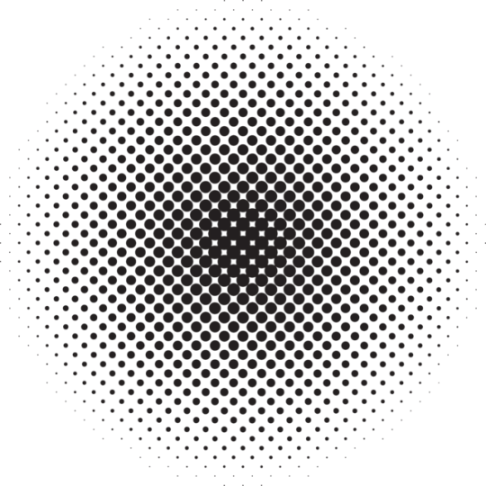
shove halftones in wherever they fit. here are the 2 pngs i use!! there a rlly good alt to gradients, i used a LOT of them in that callie piece!!! clipping mask over where u want it & alpha lock to change colour.

⭐️here's a WHERE i put the shading:
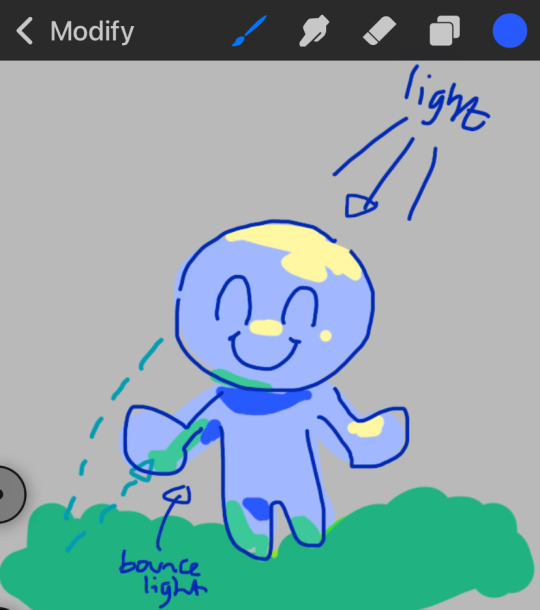
look st the environment ur guy is in!! pick where your light source is coming from & look where that light will hit and where it is blocked by something.
bounce light: the sun's light is also shining on the grass! so powerful the green reflects right back!
this is kinda more realistic lighting now.
i kinda just put a circle wherever theres a corner!
and i put that Beautiful Shape a lot wherever. i change it a little depending on the character, sometimes its triangular or squarey but thats the base shape! i dont even know what its called but i love it.
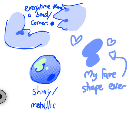
look at this hello weird shape guy!!!
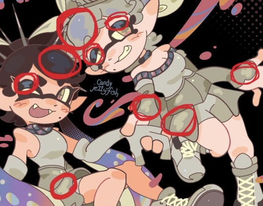
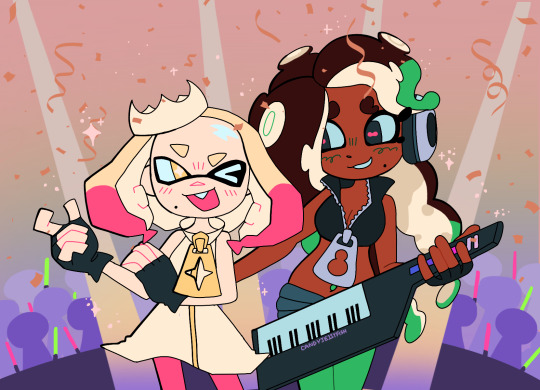
actually, my grandfest art are probably some of the most detailed art i have! u can see urself where i put shading & stuff - they do have more desaturated colour palettes though:

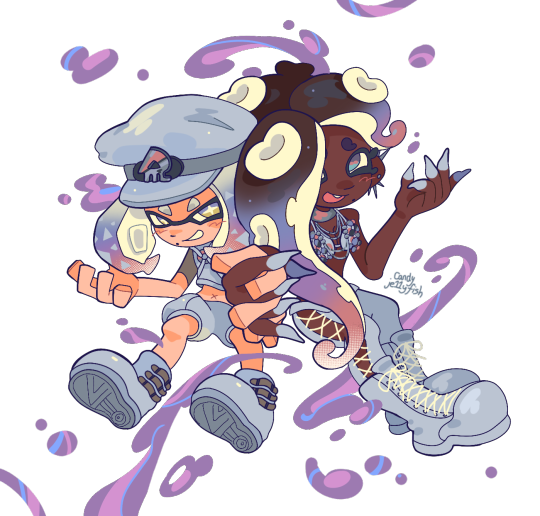
& here are some additional examples ^_^ flat colour -> shaded -> multiply layer -> lighting


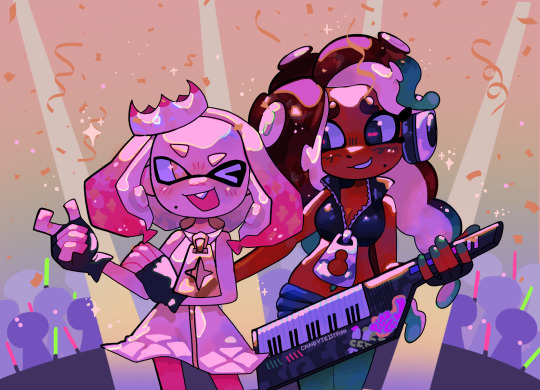
in this one u can see the hand & leg at the back are completely in shadow too :)

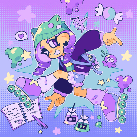
anyway i think that's kinda it? i dont really know how to explain it, i just do what feels & looks right to me??? remember that im Not an expert & this is just how i do things :)
i will always repeat my no1 tips tho: keep drawing!!! and copy ur fave artists!!!!!! it really will hell u find what u like!!!!!!!!!!!!
i hope this post helps a little & answers ur question😇 never be shy to ask me anything cuz i love answering & chattin w u guys!!!!
EDIT: just saying these arent set rules or anything!!!! u can see just how many times i Dont follow my own advice LOL. my artstyle is super inconsistent, i rarely draw things the same every time
173 notes
·
View notes
Text
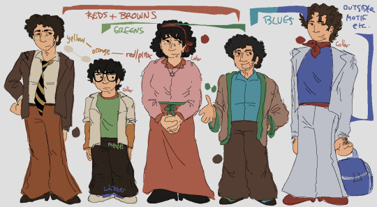
hi so i posted a drawing just now and heres a long post under the cut on my design choices If you were curious . or you can just look at this image for the basic color motifs
Ok. hi. waves
overall its 100% obc + motf oobc based etcetera If you know me you know this is Always basis for everything marvin trilogy i draw
detailed descriptions + other things linking characters together that arent covered by the Image:
marvin dresses like shit but there's Some cohesion there keeping it together. his family shares his warm colors; mendel uses his browns a little differently, and whizzer doesn't share his pallete at all
trina's favorite color is pink :) there are literal articles of clothing that are tied on her, one is red for marvin and the other is green for mendel. as the story goes on she would probably swap this and have a green tichel instead
trinamarvin have similar shades of pants/skirt, and jason has the mix of their yellow and red as an orange on his arms. travel travel travel from side to side!!!
^ on this note jason has things from his 4 parents and theyre all strangely layered all together
ie both him and whizzer have white over the rest of their clothes
whizdel and whizzvin are the only combinations which don't share at least one color, but:
whizdel have light/dark blue contrast and complementing red-green
whizzvin blue yellow contrast babyyyyyyy yeaaaahh boyyyyy!!!!!!!!! they wont agree
whizzer's got the most unique color palette also the least direct connections to everyone else: only trina, who wears a tichel paralleling his ascot and ties them back to marvin, and jason
trinamarvin's shoes are the same, each their corresponding hair color; mendel wears something most similar to marvin's shoes but he gets silly with it; whizzer gets to have shoes that stand more. he's cool; jason's got sneakers! and theyre whizzer colored because whizzer has his own whole deal with running
^ jason trina and whizzer all have red around their necks; mendel also very specifically doesnt have it
mendel and jason Dont have belts or anything resembling ones. this was deliberate but honestly theres not meaning to it
so yes. marvins setting the base the others generally interact with; trina tries to be plain; mendel is goofiest; jason is still figuring things out; and whizzer outsider themes Save me. whizzer outsider themes. save me whizzer outsider themes
ok That is all thank you. small bow
149 notes
·
View notes
Text


i have been focusing on my gcse aet for sometime, and i don't know, if I can post this or not, but since it is unfinished... this is my transcription of Philippe de Champaigne's Triple portrait of Cardinal Richelieu
#portrait#unfinished#i dont own the image i based my drawing on#pencil art#watercolours#acrylic#cardinal richelieu#the three musketeers#transcription
34 notes
·
View notes
Text
okay im gonna put all my thoughts about the hotguy zinethology on here based on the incoherent ramblings my friends received while i was reading it
(obviously spoilers below the cut)
okay so first of all the first part was SO fucking funny i cried laughing multiple times
the first time i saw cute guy i SCREAMED
HOTGUY TRYING TO GET CUTEGUY TO JOIN HIS UNION AND GRIAN JUST GOING. NAH. WAS SO FUNNY
@cornpapers draws scar SO pretty
mumblr is SUCH a funny name 10/10
the "dont you think cuteguy and hotguy having matching names and outfits is queerbaiting" post is SO FUNNY
THE GRIANVERSE
SHE'S HERE !!!!!!! ARIANA GRIANDE !!!!!!!!!!
THIS IS SO FUCKING FUNNY. GRIAN LOOKS LIKE THE SAD HAMSTER
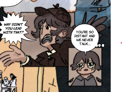
REALLY GOOD PANEL
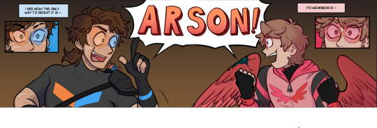
this whole comic was so funny i loved it loved the cub
THE EMAILS PART WAS ALSO SO FUNNY
this is such an interesting and fun way to tell a story i loved the email part
in general the posts and stuff were SO funny and very realistic for the internet 😭
yeah
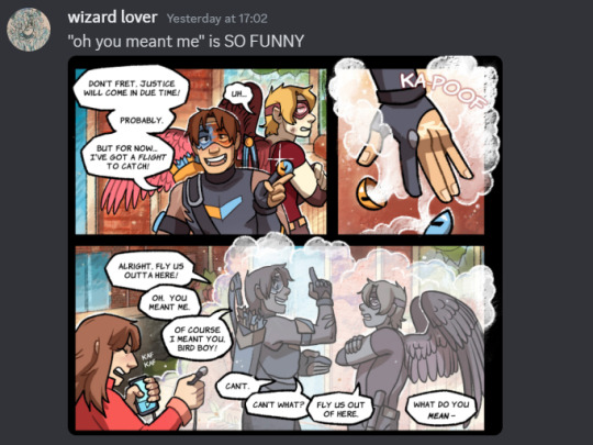
grian desperately trying to not let scar reveal his identity 😭😭 girl (this also hits so different now after reading the whole thing btw.)
the comparison to a wild horse in this first fic also killed me
i can't really put a lot of images but there were some really classic superhero comic looking panel that i thoroughly enjoyed
scar tangled in his own grappling hook. classic. very funny
I LOVED THIS FIC SO MUCH. scar voice this is gonna ruin the tour. grian voice what tour. scar voice the world tour.
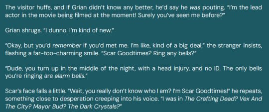
scar saying he's playing volleyball. haikyuu reference!?!?!?
just putting this here
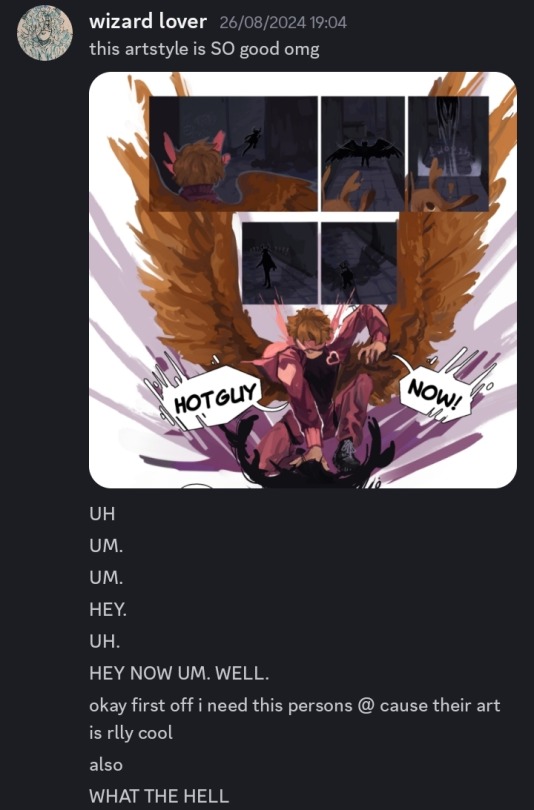
LOVEDDDD THIS GEM DESIGN
moon mask i immediately called pearl yes pf course
GRIAN REFUSING TO SHOW EACHOTHER THEIR IDENTITIES AGRHRGRHRVH
"you and your cuteguy" arggrgrhsggrgrhgr
murder camel REAL !!
I DIDN'T TRUST THIS FOR A SECOND. PEARL AND HER SOUP I DONT BUY IT
"i cant believe you guys fucking killed jimmy solidarity" <- actual message i sent to mochi
SCOUR KNOWING SCARS NAME. AGRHSGRHRGRHV
i literally had to Go Take A Walk after this fic
i really like how the pearl thing was resolved in this it felt like such a good act 2 reoccurring villain exit. very superhero comic/movie like or even dnd like
'vincent berger' made me laugh
ZEDDIT
MOCHI FIC !!!!
first off every single fic has SUCH a cool cover i love them all
poor grian has ptsd :((
i LOVEEE how mochi writes angst always they're so good at it
the fact that he never found jimmys body immediately made me call the fact that he wasn't really dead and would come back btw
gem would lovee to drive grian slowly crazy tbh
"IVE COME TO PICK UP MY BIRD" AGRHRGRHGRHRVRBTBJRG
JUST LOOK AT THAT GREAT BIG BEAUTIFUL TOMORROW !!!!!!!
i was going insane at this point
this whole zine had me feeling like that meme thats like first i laughed.. then i serioused (the first part was SO funny and then golden era was psychic damage /pos)
IMPULSE :D
GEMPEARL <33 they are so everything to me
SCAR WHY WOULD YOU LEAVE SUSPICIOUS POSSIBLY EVIL FOREIGN TECHNOLOGY ON YOUR BODY. SIR.
NOT THE DESTIEL MEME
they look SO fucking cute
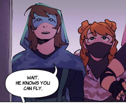
both scar and grian look sooooo scrumptious in this comic argh
THE MIND CONTROL. THE. RHE MIND CONFNTOL.
THESE 2 FULL PAGES ARE ABSOLUTELY SO INSANE. I WAS AND STILL AM FOAMING AT THE MOUTH
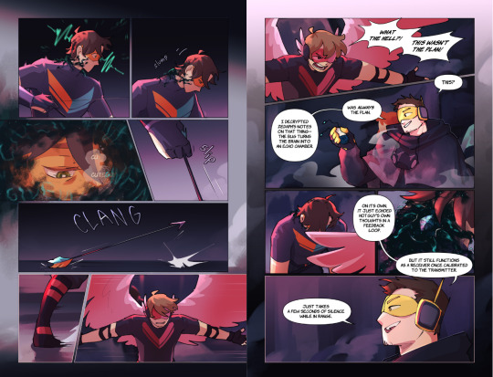

THIS IS SO. GOD THIS
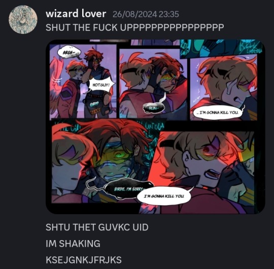
THE WAY GRIAN JUMPED AND SCAR JUMPED AFTER HIM. THEYRE CRAZY !!!!!!!
THE WIPING THE BLOODY NOSE AND THEN SMILING LITERALLY WHAT IS WRONG WITH YOU !!!!!!!!!!!!!
HE TOOK THE MASK OFF
mumbo <3
THE HUG. ☹️☹️☹️
great big beautiful tomorrow :((( the parallels :((
GRIAN BEING TOO FLUSTERED BY SCAR KINDA FLIRTING THAT HE DIDN'T REALISE HE WAS DROPPING HINTS ABT HIS IDENTITY WAS SO FUNNY
cutiebird..
scar playing w his hair when cuteguy was hurt :(( so cute
REALLY FUNNY
THEY'RE HOLDING HANDS ☹️☹️
the tcg voice: theyre holding hands.. i want them dead
SKIZZ !!!!
ETHO !!!!!!!!!!
awhh skizzly :((((
THIS IS SO UPSETTING
"It's our Impulse, Gem" IM SO UPSET SHUT UP
god the way she puts on the mask and immediately is emotionless im gonna throw up
OBSESSED. THEY'RE EVERYTHING TO ME

im so obsessed w this cuteguy i love him
grian voice omg im the only bitch serving cunt in this place im so embarasseddddd
they are serving SO much in this comic
ETHO EYHO ETHO ETHEO
SCAR APPOINTING GRIAN AS LEADER. EARURGRHVRH THEY'RE EVERYTHING
READING THIS WAS SO CRAZY IT LITERALLY FELT LIKE WATCHING ENDGAME
JIMMY SOLIDARITY !!!
MUMBO JUMBO !!!!!
impulse thinking about skizz as he's dying :(((((
HE DID IT ALL FOR SKIZZ :(((((((((
i was so upset this made me sob like a baby
SOUP GROUP :(((
SKIZZLY!!! :(((
warden :/
SCAR PEARL INTERVIEW :( HOTGUY RETIRING :( I LOVE THEM
THE CHEMICAL MUTATING PEOPLE IS JUST ESTROGEN BEING A GIRL JUST DOES THAT TO YOU
grian and scar playing volleyball is that a haikyuu reference....
OH THIS PEARL IN THIS COMIC IS REALLY GOOD
cuteguy is so spiderman coded
GREAT BIG BEAUTIFUL TOMORROW !!!!!! WE'VE COME FULL CIRCLE !!! SOBBING !!!!
god all in all this was so crazy. it was such an obvious labour of love and everyone who was involved with it did such a good job and obviously put so much love into it AND IT WAS WORTH IT !!!! insanely good work thank you to everyone for doing this and sharing it for free?? @hotguycomiczine y'all are crazy. incredible work <333
#hotguy zine#hotguy zinethology#hotguy#cuteguy#goodtimeswithscar#gtws#grian#desert duo#hotguy comics zine#hgcz#ALSO I AM SO BAD AT REMEMBERING NAMES even though i knew a lot of these artists/writers im sorry if i didnt name you guys 😭😭
57 notes
·
View notes
Text
im continuing my benny posting by sharing my benny hcs. in no particular order. and very quickly typed up. enjoy ^_^
- tattooed. he has lots and lots and lots of tattoos from when he was a boot rider. all kinds of tattoos. some desert themed, some things based around him, some others depicting things he just likes. he doesnt mind them much nowadays, hes so used to them that he sees them as part of his skin. although hes a little bit iffy about showing others his old tattoos. hes got an image to upkeep after all - speaking of boot riders. he got a canine knocked out by bingo during their fight. so he got a gold one fitted shortly after he became the leader of the chairmen. and it glints like hell - he wears lots of gold jewellery. especially pre-war rings. he prefers engraved ones, ones with little images etched into the metal or ones with short messages rather than ones with gems. he also wears a cross necklace under his shirt - despite his gun and necklace...hes not christian. like at all. he doesnt care for religion and hasnt read anything about the engraving on his pistol or the meaning of necklace. he just likes how flashy and elaborate the imagery looks - by the time the courier rolls around hes 31. he's also 5'5". - he has a dad bod. i will personally fistfight anyone who draws him muscular and dehydrated. living the cushy and comfortable life of a casino boss means hes not some lean bodybuilder - however...thats not to say he ISNT strong or that hes unhealthy. he has a really high endurance, and can last for a long while out in the desert. also he doesnt like admitting it but hes probably a fraction better at straight up punching someone than shooting them at point blank range - since he was always outside and always doing something, he used to have super calloused hands. but again, casino life means theyre much more pampered and soft now - however hes still got one hell of a grip. he can very easily grab you by your shirt and throw you out of the front door without even breaking a sweat - hes Bi. theres literally no way he isnt, fuck you. BUT he really isnt one for meaningful romantic connections, he much prefers something quick with zero extra baggage (i.e. one night stands, friends with benefits) - hes super nosy. and almost terrifyingly good at recognising and remembering faces. he sees a new face in the tops that he doesnt instantly match to a regular? he needs to know their name. and then he promptly loses all interest because the mystery is lost and the people turn out to be, by all things considered, really fucking boring - even further...anyone who doesnt fall for his charismatic charm (or, even worse, doesnt care about his reputation) becomes a nuisance and he NEEDS to at least form some sort of impression on them, be it good or bad. like full on “if you dont form an opinion about me i will pull my own hair out” - he used to have an absolute love for geckos. he didnt tame them, he was more so inclined to hunt than to nurture, but he would feed scraps to the younger ones - which meant they began to follow him around from time to time... not anymore though. he thinks theyre dirty and brutish and a reflection of what it was like to be a boot rider - hes called Benny Boots (mockingly) by people around the strip. at least by those who knows about the three families past. other than that his last name is Gecko. he also personally calls himself Benny 'New Vegas' sometimes as a sort of boastful title because he thinks hes the shining face (not the heart, mind you - thats House) of the strip - hes a huge morning person. its something he picked up, and cant get rid of, from the boot rider days. he wakes up super early in the morning, rising with the sun - and hates sleeping in because he feels like hes wasting time. he goes to sleep pretty late, since new vegas is awake at night, but he doesnt feel tired. a couple hours of sleep is good enough for him.
#ooouoououh this was rlly fun to think abt ngl :3#it talks#fallout#fallout new vegas#fnv#benny gecko#fnv benny#benny fnv#benny new vegas#fallout headcanons#headcanon#head canon#bootriders#fnv the tops#the tops
90 notes
·
View notes
Text
*sighs loudly* so i Was going to draw them but turns out my own design is too difficult for me to draw. but i'll be making this post anyway bc this au has been cooking for so long i might as well!
Featherless Flight AU
aka dca avian au where these fucks r BIRDS
(disclaimer this is a sun x moon au. it also deals with heavy themes such as child abuse, death, violence, and. ya know. wutever tws come with the apocalypse (also these will not be talked about in detail in this post))
nothing robotic in them. just feathers, blood, and bones. a lot of that stuff may be lost or break throughout their story! but lemme at least tell u wut they look like (without having my own drawings OTL (i only have a ref for their faces (which im not confident of)))
a quick note for both of their designs, they r both Fully Covered in feathers, including their arms and faces (yes they have arms And wings). the only places that dont have feathers is their lower legs and hands. they have anthropomorphic legs. and their face shape is also similar to a barn owl, as shown here (ignore the lack of mouths, idk wut to give them)
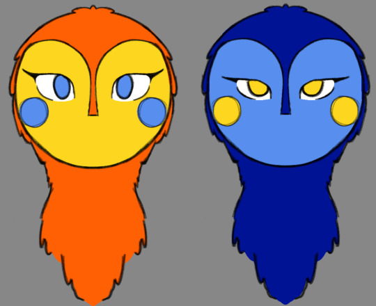
suns design! he has the coloring and general design of a sun conure. hes full of bright reds and yellows, tho the green is replaced with a bit of blue. he has multiple crests around his head that fluff up similar to a cockatiel but theyre in a way that make it look like rays. in the drawing above is wut they look like without their crests raised; that is their default. suns feet r grasping feet which r 2 toes in the front and 2 in the back. sun has high speed wings so aes a lot faster. (if u dont know wut any of this means i recommend u look it up, im a bird nerd) sun is also specifically an omnivore (them having different diets is actually plot relevant)
moons design next. moon is the color of a hyacinth macaw tho his anatomy is closer to an owl. he has one large crest on his head like a cockatoo. its also colorblind! since its anatomy is based mainly off of owls, for moons ability to see at night means he can see less colors. and bc hes more sensitive at night his eyes r always half closed in light, making it look sleepy despite being fully awake. moon has raptor feet with 3 toes in the front and 1 in the back. xis claws r also much larger than suns. moon has passive soaring wings which is better for longer flights. and moon is a carnivore :)
theres also an eclipse but their design is an enigma to me even in my own mind
but back to sun and moon! if anyone is curious moon uses he/it/xe pronouns while sun uses he/it/ae pronouns. they r both aroace and love each other deeply (qpr babyyyyy). sun is genderfluid while moon doesnt give a shit (agender).
sun is more bubbly and energetic. very much high energy bouncing off the walls. hes the kind of optimist where u cant tell if their "bright side"s r trying to help or be condescending. its a master at back handed compliments. heavily a perfectionist and will reach the point of screaming fits if wut he doesnt isnt perfect. ae has a lot of self image issues. ae hides a lot of aers lack of self confidence and doubt behind a wall of "im the best", tho that wall can crash very easily. a bit of a flirt, but mainly bc he just enjoys seeing how ppl react. he takes compliments from everyone but moons compliments r always the best
moon is lower energy and calmer. at least, he acts like it. hes more reserved and if it wasnt for sun he wouldnt have any friends or talk to ppl at all. he fears abandonment and sun is the only person who has stayed with him this whole time and is the only person he truly trusts. is very aggressive towards anyone it doesnt know. despite being shorter than sun (hes 6ft while sun is 7ft) it definitely does a good job at intimidating ppl. over time when xe becomes comfortable with someone xe will eventually calm down and show a bit of a softer side to them. when xes actually calm and likes someone xe can be a bit... chaotic :)
im honestly not sure where ill start their story since ive already thought about their childhood but i also wanna write about their adulthood as well. the story of their childhood mainly deals with the abuse they went through, then with adulthood theyre shoved into an apocalypse bc... y not :) (btw the apocalypse is mainly just bc ive been enjoying apocalypse aus a Lot lately and wanna write one. the child abuse is for their development and to show y they act the way they do. while it will be fun to write their development, i am by no means saying abuse is okay and this topic will be treated carefully and seriously.)
oh theyre also nd as Fuck
but yeah. these r my babies! i hope to at some point start writing the fic so i can show it to u all, but im already in the process of writing another fic, which will be coming out soon!
#birdcage rambles#shippin hour#birdcage scribbles#sundrop#moondrop#sun fnaf#moon fnaf#fnaf sun#fnaf moon#dca au#avian au#featherless flight au#btw the name 'featherless flight' actually has a deeper meaning :)#sundrop fnaf#moondrop fnaf#sun x moon#guys pls ur gays r here/j#also idk if theres gonna be a yn...#im very conflicted if im gonna throw one in there or not#bc i already have another au with a yn thats fully fleshed out and im like 'mm yes i like this one'#but any yn added here could be a bit... sloppy?#idk i need to plan this au more thoroughly#SPECIFICALLY their adulthood#but anyway#enjoy the gays
62 notes
·
View notes
Text
Okay I've been thinking about this pretty much all day since I saw the hbomberguy and then todd in the shadows video i just have so many thoughts. While I wouldn't necessarily call myself a Video Essayist™ (I've only made a few over the years) as a youtuber and someone who has made video essays i definitely have more experience than the average person. There are so many things that stand out to me about this whole debacle i dont even know where to start.
First I want to just give a little insight into the process for making video essays from people who've never given it a shot and just how absurd it is to do the type of plagiarizing James has done. Video essays take a fuckton of research, even for pretty simple topics, but on top that you also have to make them with the medium of video in mind. it's really not enough to just take an essay you would write for a class and read it out loud. the flow is different, you have to have accompanying visuals, often background music, etc. They're a beast to make. My Twisted video for which i used literally two sources for my research (Sondheim's books and the musical Twisted) still took days of thorough reading, note taking, watching the musical, watching the musical again, watching the musical and taking notes, cross-referencing my notes, etc. For videos that synthesize multiple sources or are covering multiple pieces of media, that time goes up exponentially. Then there's writing, recording, gathering clips (often one of the most difficult parts depending on how obscure what you're talking about is), and editing. Even for a silly video like my Glee video, I still had to do a ton of research to make sure I was getting things correct, and that was a funny tier list about freaking Glee! There is just no way you could come up with a thorough analysis by just copying and pasting. Which brings me to my next point.
I think James may have thought (or more likely rationalized) what he was doing as analysis based on like the vaguest definition. When you do any kind of analysis, what you're doing is taking research from multiple different places (news articles, primary sources, existing analysis, etc.) and coming to your own conclusions, whether that's a synthesis of those different sources, or applying it to a specific thing like a movie. Really simple example is my Twisted video where I take Sondheim's writing and apply it to a specific piece of media (in this case Twisted). I'm using existing work but coming to my own conclusion. In the Spies Are Forever video, I took existing research about the Lavender Scare and the Hays Code, including primary sources from the time period, and applied it to the musical Spies are Forever. What James seem to do is take a bunch of existing scholarship, copy and paste it all together and then come to a "conclusion" that was not actually his own original thoughts but either "facts" he completely made up or something that didn't do anything to actually link his other "sources" together. I can see why it has the veneer of analysis, but making up a random "fact" you think might be true is not the same as a drawing a conclusion based on research.
I also think Todd made a really good point in the part about England's propaganda campaign against Italy around 9:30 that it's just really bad video making to not include examples of images from this so called propaganda campaign. I have a ton of examples of news clips, government reports, etc. in my SaF video about the Lavender Scare because...it was a real historic thing that happened! If something was supposedly so widespread and not even that long ago, you can probably find evidence of it somewhere. Kaz Rowe (who is also linked in the queer creators playlist on hbomberguy's vid) talked about this a lot in their video about tiktok misinfo where people often make these outrageous claims but the thing is if something so outrageous happened (like people constantly shitting on the floors of versailles), other people at the time would probably be talking about it somewhere. It's a big red flag when someone makes such bold claims and has no evidence to back it up.
Putting this last section under the cut because I go talk about WWII, Nazis, and HIV/AIDS a bit (watch Todd's video for some more context) so if you don't want to see that post is over here.
Lastly I wanted to talk about something else Kaz brings up in a lot of their videos when talking about historical topics and that is the tendency to dehumanize people of the past, often as unwashed, unintelligent masses who would just do any ridiculous disgusting thing because they were so stupid and disgusting. There are a lot of things to criticize about the people of the past and their actions obviously, but we cannot forgot that they were in fact, people. Real individual people with their own lives and dreams and ambitions and individual opinions and they have never been and never will be a monolith. Claiming anything is broadly true of "the victorians" or "the ancient egyptians" or whatever other vague historical group you want to talk about is usually a lot more nuanced than "they all thought or acted in this one particular way". I'm certainly not a historian and i've only done one history focused video but James Somerton seemed to make a lot of broad historical claims in his videos that I think fall into this trap.
The one that stood out most to me in Todd's video was the claim about Nazi body standards which is a whole mess in general that Todd goes into for a while, but the way he talks about WWII soldiers was just like...weird. Besides the fact that a lot of his claims about Nazis seem to be bordering on glorifying them and their aesthetics (gross), I think we should remember that WWII was less than a century ago. There are still over 100,000 surviving WWII vets in the US. My grandfather who was in the Army during WWII (he didn't serve overseas but he was an enlisted soldier I can literally look up his enlistment records in the national archives online) was a real person who I obviously knew personally and who died fairly recently. To think he enlisted because he was jealous of German fitness or whatever and wanted to prove how tough Americans are is an absolutely hilarious thing to think if you knew him. I'm sure there are as many reasons for enlisting as there were enlisted soldiers. When James talks about even as relatively narrow of a group as "WWII American soldiers," he's still talking about a very large group of real and diverse people and to make such broad claims that "most" or even "a lot" of them were just so taken in by strong german physiques or whatever is frankly insulting. I haven't watched the entirety of James video so maybe he does address this at some point, but from the clips I've seen it seems very generalized and implies some level of racism when WWII soldiers in fact included a lot of racially diverse people. IDK, i think if you're a supposed historical researcher and you're making a video about WWII and you don't know about groups like the Tuskegee Airmen or the Navajo Code Talkers, that's on you. I don't want to discount some of the really horrible shit that American (and obviously other countries) soldier's did in the war and how many of them held disgusting views (even my grandpa who I love dearly was not the most politically correct person to put it lightly) but Jame's claims are not criticizing any real ideology or the consequences of them, they're oversimplifying complex and harmful historical ideas and attributing them to something he pretty much made up. I'll also give you a little hint about something. When people fall into Nazi ideology, it's because they ultimately agree with the ideology, not for some surface level aesthetic reason of "fitness" or whatever. They are antisemitic, they are racist, they are eugenicists, plain and simple. They don't just think the Nazis are cool except for all their beliefs. I also think (and again I could be missing a part of the video here) the hyper focus on the Germans and the Soviets and not mentioning Italy is at the very least an oversight too. Mussolini, like Hitler and Stalin, had a pretty big campaign of promoting an ideal strong race which he tied to ancient Romans. Like this was also a country controlled by a fascist dictator that American soldiers fought in idk it just seems weird to me to leave it out. (okay edit i looked up the transcript and he does talk about Italian fascism a little bit but only about how Mussolini rose to power, nothing about his ideologies or anything really related to the main topic of body image).
And one more thing on that note that bothered me a lot. I think his claims about HIV/AIDS is probably the most well-known here on tumblr and has been pretty thoroughly destroyed by this point, but I do just want to say one more thing about it which is that AIDS isn't gone! I feel like they way he talks about it from what I've seen of this video makes HIV/AIDS sound like a problem of the past now that we have drugs for it, but that is just not the truth. There are still tens of thousands of new infections in the US each year and way more globally and yes, people do still die from it. I just don't like when people talk about AIDS as if it's this problem of the distant past, a separate era that people went through in the 80s rather than an ongoing epidemic that still does not have a cure. Safer sex, clean needle usage, and getting tested are just as important now as they were in the 80s and 90s and don't forget that.
123 notes
·
View notes
Text
HAIIIII my new reference sheet 4 any1 who wants 2 draw meee :333


i have way more outfits than just these 2 but i dont have the energy 2 draw that much lololol
the raccoon tail patterns that go infront of my chest are fake hair extensions btw :)) i have a lotta different ones
ANYWAYYYYYY the rest of mah info under the cut :33 !!!!!!!
Full name: Bugthing (you don’t get to know my last name 😁)
Aliases: Bug, Creature — Buggie (FRIENDS/FAMILY ONLY)
Species: Concept Dragon (Fire, Type 3) / Angel (Type 4) hybrid
Planet of Origination: The Concept Universe / ‘The Void’
Age: I’m not telling you that. (OOC: usually it depends on which universe i throw him it but i typically characterise him as my age. which makes him a minor.)
Height: 8’9”
Gender: Biologically female; identifies as transmasculine & xenogender
Pronouns: He/Him/His, Xey/Xem/Xeirs/ It/Its/Itself, They/Them/Theirs — Blood/Bleed/Bloodself, Gore/Gory/Goreself (FRIENDS/FAMILY ONLY)
Sexuality: Solian, fictosexual, fictoromantic (i use the term aroace in conversations tho, its easier :3)
S/O: None. Technically. Unless you count my F/Os (that being Galacta Knight, Holly/THK, Moonjumper, and Shamura)
Family: Parents, brother, a number of cousins (and technically that one fankid i made for me n holly named Moggie but. They’re not canon.)
I’m an artist and fanfic author, and Nebbie’s assistant as a newly ascended Creator entity!!!!
Buddies with uhhhh God :))) (or Jesus ig but her name is Yk here. I call her Nebulis/Nebs/Nebbie tho. Bc we’re friends :3) (he uses all prns btw)
Bc of my fun powers and rights as Nebbie’s assistant creator I get to travel to whatever universes I feel like. Both to make sure everything’s going well and nobody’s broken the space time continuum and also to hang with my favs.
I like to call myself a Nice Boy(TM) but thats only really to my friends/family (not including my brother because I fucking hate him). I can get REALLY mean when I’m upset/if i don’t like you. But yeah I’m usually pretty ok!! Not the best person out there but at least I’m not a bigot lol. SPEAKING OF BIGOTS a lot of my very outward “”””cringe”””” behaviour is from me just being comfy in my own skin and pissing ableists off On Purpose bc I find it funny (it is).
I’ve lived in the Concept Universe/Void my whole life, but I tend to wander off to various universes both for My Duty(TM) and also I Like The Characters. I was first given the opportunity to leave the Void when I was abt 8 I think? My good buddy/auntcle figure Xephyr asked me and my brother if we wanted to check out what ppl were doing down there (with Nebs’ and our parents’ permission ofc), and we agreed. I’ve never been normal since (that’s a good thing though).
I don’t USUALLY do fighting stuff (unless I’m in like a COTL variation universe or something) but when I do I usually just use fire. I might be a pyromaniac. Which is concerning because I have fire magic and can easily commit arson. Yeag :)
Hex codes
(Not including the bracelets or hair extensions)
Body/both fits or smth:
#0E0E0E — Horns / Burns / Burnt feathers / Fit 1 base
#0400B4 — Iris
#D80000 — Tail tip
#FFB7A7 — Blood / Blush
#F8D7CF — Scars / Wing webbing
#EBE6E6 — Freckles
#FAFAFA — Skin
#FFFFFF — Teeth / Talons / Septum piercing gems / Glasses lenses
#F7FBFF — Sclera
#F2F2F2 — Hair / Feathers (the ones that AREN’T scorched)
#F9DEBF — Halo star / Light magic things 2
#F3B16D — Halo / Light magic things 1
#000000 — Nose / Septum piercing / Fishnets (alt fit) / Glasses frame
Usual fit:
#0F0F0F — Belt base
#910000 — Fit accents
#C40000 — Belt accents
#BEBEBE— Belt buckle
#3A2222 — Socks (ignore the fact that this isn’t in the ref image plsss)
Alt fit:
#161616 — Shirt base
#2E2E2E — Shorts 1
#464646 — Shorts 2
#CCCCCC — Belt buckles
#DFDFDF — Belt 1 studs / Chains / Choker & cuff spikes
#F3F3F3 — Shirt pattern 1 (anarchy symbol)
#81FF5A — Shirt pattern 2
#FF5AEC — Shirt pattern 3
#FA0000 — Cuff / Choker
Funny Rainbow Checker Belt (gets its own section bc SO MANY COLOURS):
#D70000 (red)
#D76D00 (orange)
#D79200 (orange-yellow)
#D7C000 (yellow)
#65D700 (yellow-green)
#00D73E (green)
#00D7BD (teal)
#009ED7 (light blue)
#0034D7 (dark blue)
#5300D7 (purple)
#7200D7 (purple-magenta)
#B600D7 (magenta)
#D700B7 (pink)
#D70065 (pink-red)
Socks (again, its own section bc too many colours):
#FF6690 (pastel red)
#FF9997 (pastel red-orange)
#FFB881 (pastel orange)
#FDFFA7 (pastel yellow)
#84BCFF (pastel blue
#9C84FF (pastel purple)
#A210FF (magenta)
(istg if you draw any nsfw of me ill devour you)>🐜
~bugmod
#original character#oc#my oc#my character#furry#sfw furry#fursona#sona#my sona#my fursona#furry art#fursona art#oc art#art#my art#digital art#ref sheet#reference sheet#cw sh#imadge from the fucking guy#shut up boything#uhhh do i tag this as nudity.#idk#anygays :33#(my ass using uwu and owo for the first time in 2 years bc im not paying for a calligraphr acc)
16 notes
·
View notes
Note
Hi I’ve been replaying black myth wukong and rewatching the monkie kid show (as well as watched the other monkey king films XD)
I was wondering do you have any tips on making a oc ? (If not no worries hope your doing ok 💗)
Hii ♡♡♡
Omggg ive been binging Wukong films too 😭😭 unfortunately i lost all motivation for LMK cuz of college ARGHH ILL TRY TO GATHER MORE MOTOVATION FOR IT THOUGHT AAARGSHGS
Also i definitely can share how i make my ocs!! but im not a professional so gather as much info from others as u can too!!♡
Read as much information as you can around the main story that you want! Knowledge is power ofc, and try to make your oc relevant to it if you want! Irrelevant is also okay, theres AUs for that
Create your oc based on a few characters, aka make a moodboard about them!! Gather little ideas you have and write them down, doodle them, etc. Personally i like to create Pinterest boards and spotify playlist!
Making a shuffle/rough compilation of images to create how you want your ocs to look like also helps! Incase you cant draw!
Use the characters they're based on as a guideline on making your oc's personality! This applies if you've designed how they're going to be but have a hard time fleshing them out.
When drawing the oc, especially historic ones. Make sure to do research on the clothings, garments, cultural tradition, etc. This would help a lot in inspirative way and insightful way! Or if the main plot has a certain artstyle that simplifies every character, be sure to apply that to your oc!
Doodle your oc a lot, preferably their interactions with their s/o or the canon characters
If you're unsure with their design, you can do a "pattern" design or "silhouette" check!
Pattern - the oc has a certain pattern or motifs thats repeated in their design, like suklha having more sharp lines in her design or characters that has inward motifs tend to be introverted.
Silhouette - make sure to doodle your oc in a silhouette. Like a splash art for your oc, to see if they're distinguishable compared to others!
Make sure your oc isn't "perfect" a flawed one is more realistic and fun to do crackheaded memes on 🫣 also might be a good time to use your own habits and telepathically give it to ur ocs its fun i swear-
Lastly, dont be afraid to show others your ideas! There are people who would love to hear about their plots, ideas and personality! I was hesitant to share about suklha at first, but seeing people liking her made me happy!! Let us see the beautiful works that you've fermented in your mind 🥺💕
Also this is just MY preference, but i tend to like characters that have unique traits! Like color palettes, Attributes, habits, physical traits. I've created a few ocs that has questionable personality, but they're so fun! 😭 just be sure not to stray too far so others can imagine how they're like
I think thats all that i havee!! I hope i explained it properly! Thank you for askingg 🥺🥺💕💕 have a nice dayy anonn xoxoox
9 notes
·
View notes