#i did not use lineart which while i love to paint this was. so much.
Explore tagged Tumblr posts
Text
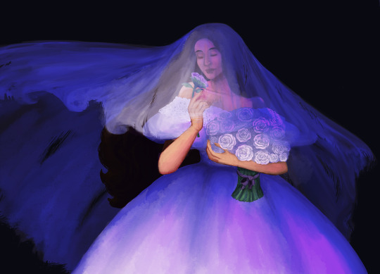
this was just supposed to be practice and it got out of hand
#ama doodles#giselle (oc)#curse of strahd#cos: hunted#there was supposed to be a background too but im. not doing that 💕#i did not use lineart which while i love to paint this was. so much.#shes my cos pc for those in the tags. say hi
63 notes
·
View notes
Text

ms paint. you know her. u used her age 8 to make loads of rainbow ovals all over the canvas and then scramble it with selection tool. now u will know her true powers with my handyrandy tips under the readmore. some will be pretty basic and others are very special.
this post has 8 cool trix to learn for you. enjoy and i may do another in the future if i remember/learn more stuff
some of it might be common knowledge. but its got some deep cuts. all tips have gifs to show process easily.
🙂 enjoy and i hope this encourages you to fuck around in mspaint more
soundtrack for this post (loop it while you learn for advanced learning experience)
TIP 1) the right click trick
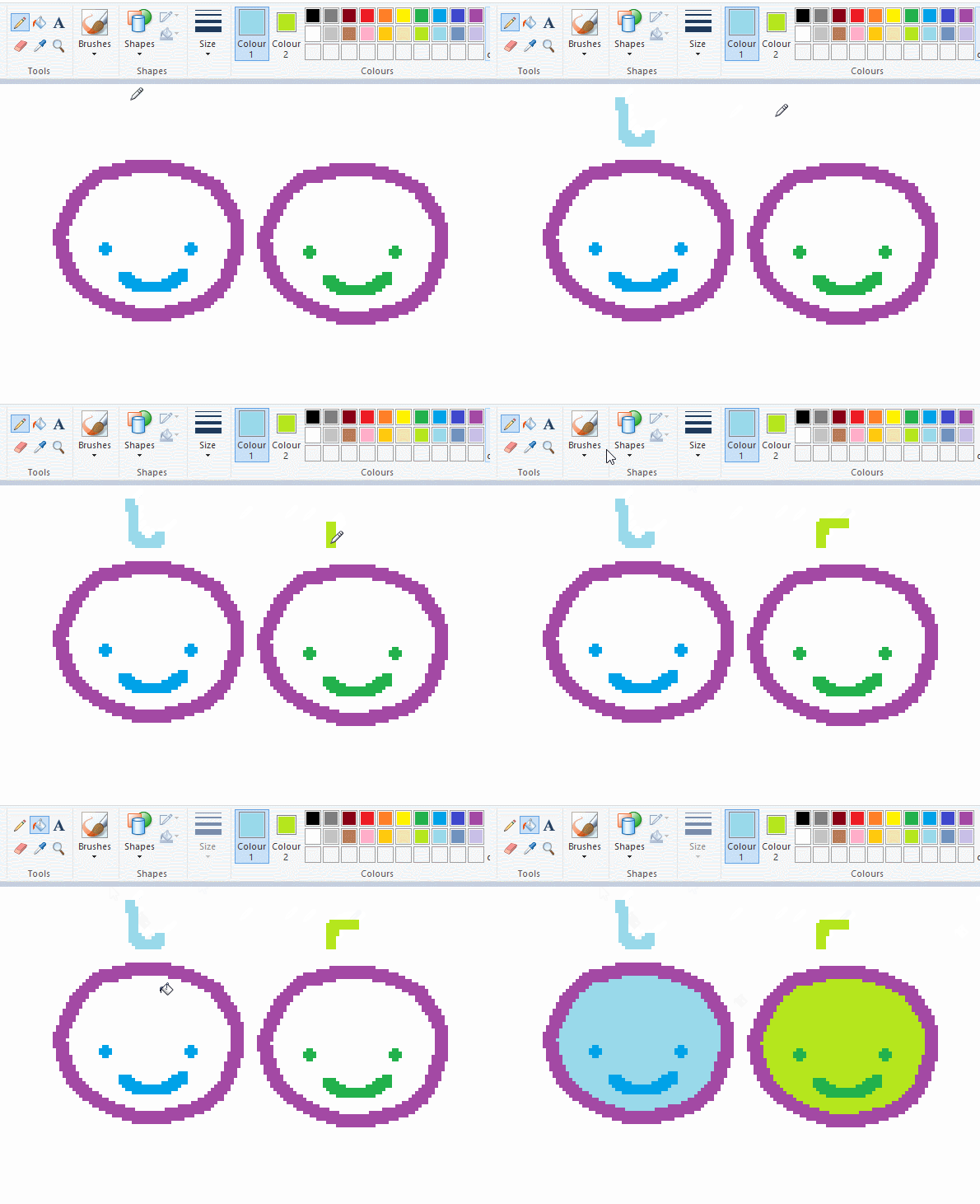
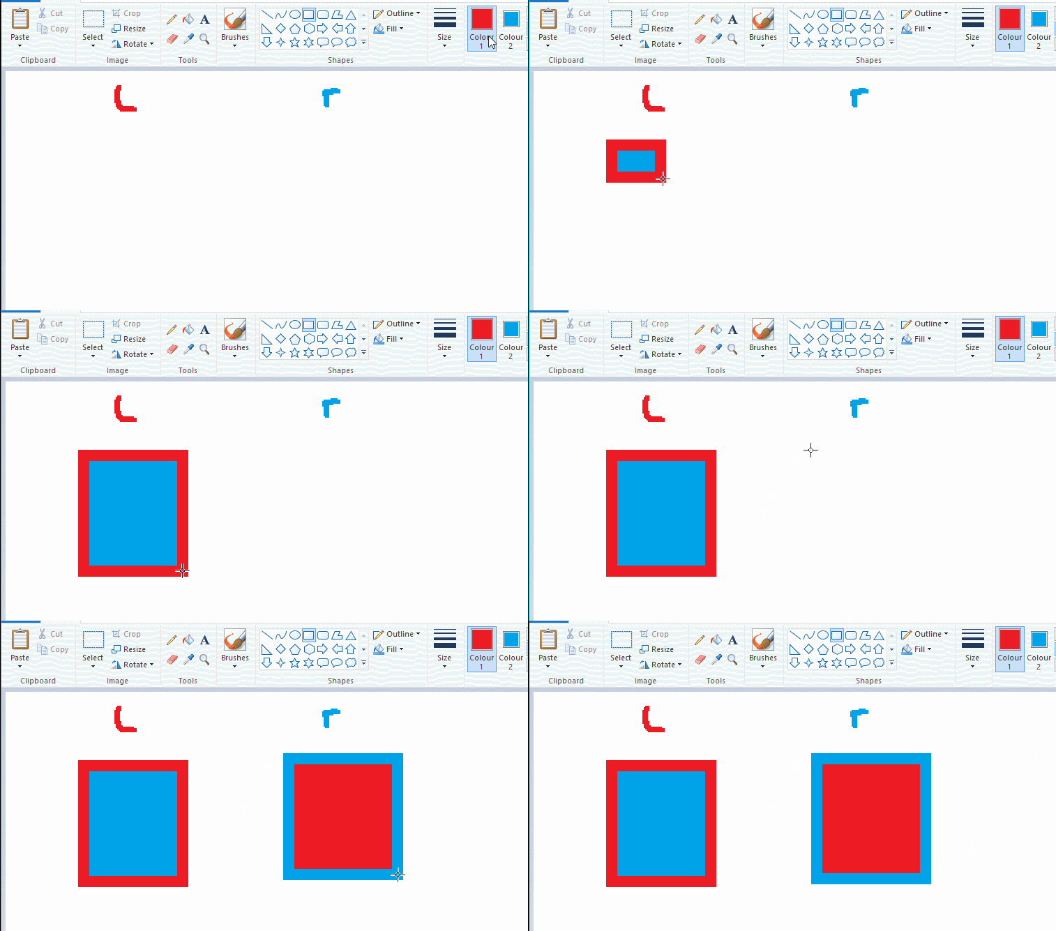
left and right mouse click correspond to col1 and col2 respectively, which u can see in the top bar. this applies to all brushes and the fill tool like above. when using shapes col2 will be the fill colour (if you have solid fill selected). right clicking with shape maker will reverse the colours use on the shape.
TIP 2) right click eraser
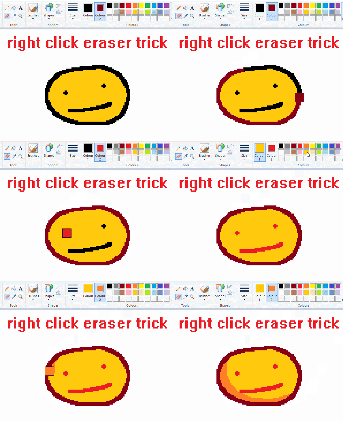
this one is extremely helpful for lineart or add shading. the eraser always uses col2. so your eraser can technically be any colour. but here's where you get powers: right clicking with eraser will only erase onto col1, with col2.
TIP 3) transparent selection change a guy destination
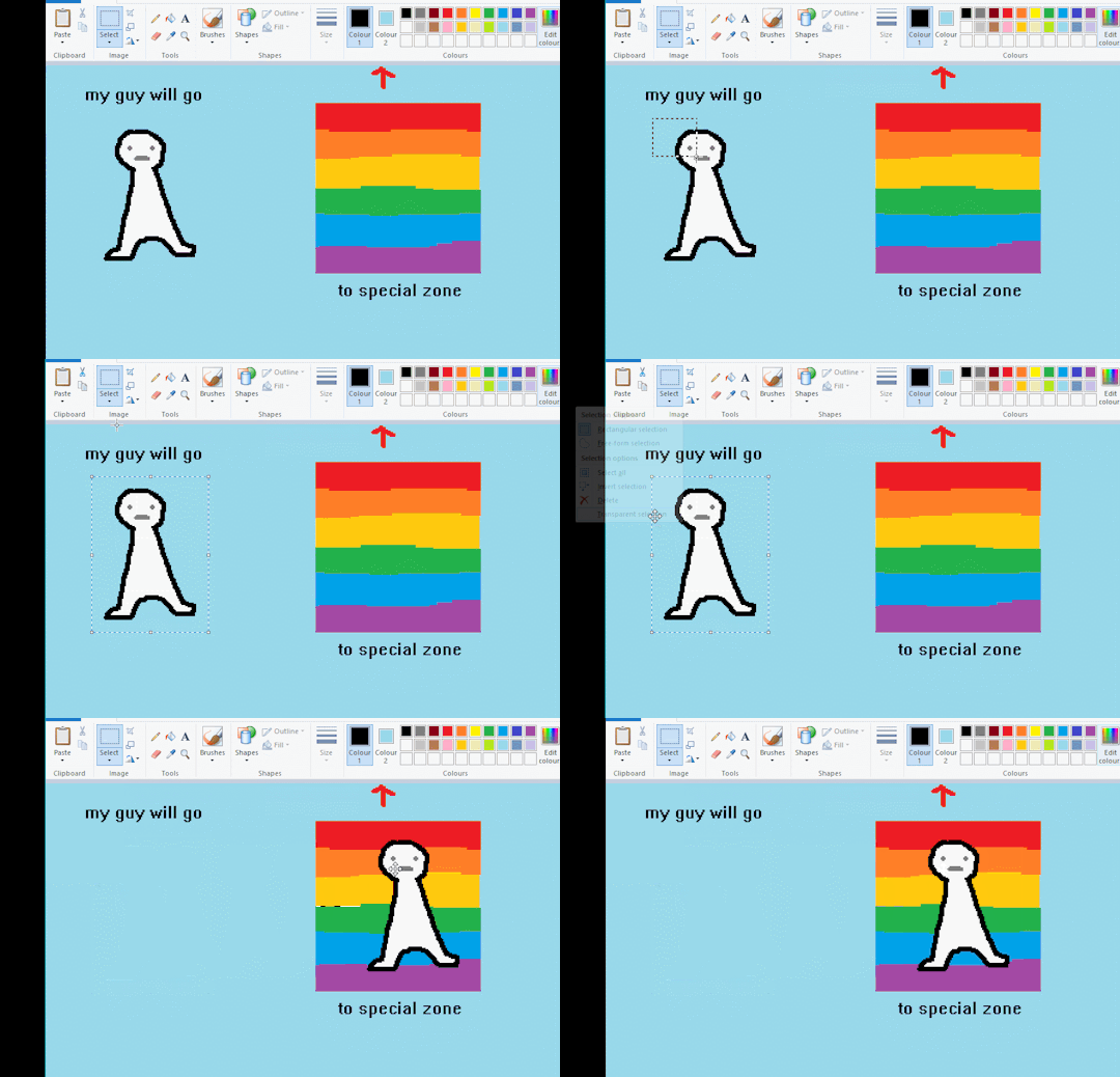
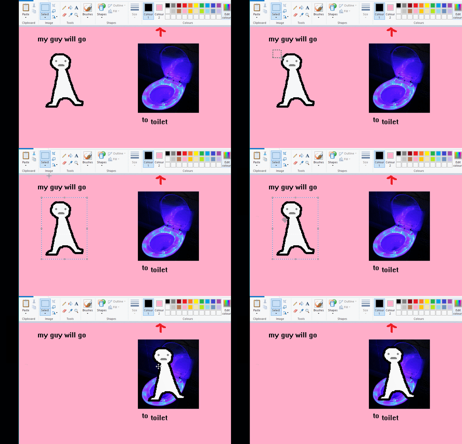
the beloved transparent selection tool works based on what is selected as col2. so long as you have the correct colour as col2 you can make any image transparent and put it on top of anything else. and yes this works with photo bg as you can see.
TIP 4) the gradience
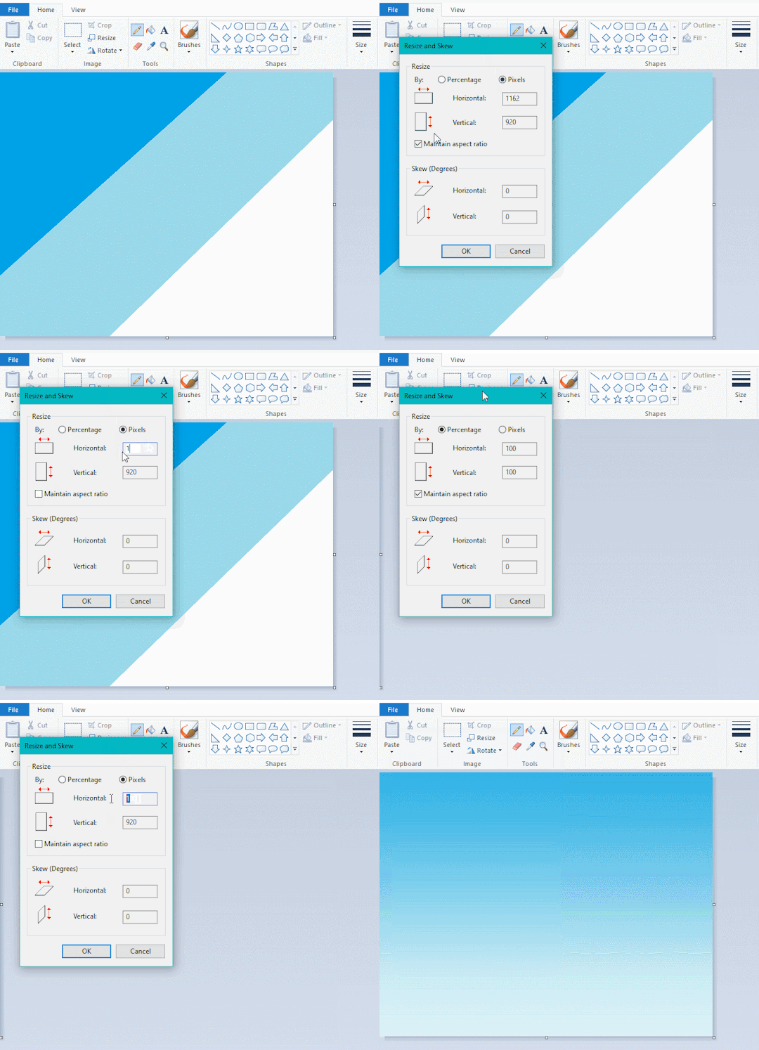
this one is a little more complex. you want to start off with any canvas size, and make as many diagonal coloured bands as you want. (protip: holding down shift makes a perfectly diagonal line with line tool)
then you need to resize the canvas to a width of 1px (make sure you resize by pixels, and do not maintain aspect ratio). then resize again back to its original width (or a different width i cant stop you). you will have your lovely gradience.
TIP 5) superimposter

so. you got a cool gradient and wanna put a guy on it. heres what i do:
i open a 2nd mspaint with same canvas size and draw whatever i want on there. i then pick a completely unrelated colour to my entire piece, and set that as the bg. you could use white, pink, geen, whatever you want as long as it doesnt appear somewhere else in ur drawing. copy the guy.
go back to your gradient tab. ensure that col2 is set as that bg colour you picked (lilac for me). have "transparent selection" enabled. paste your guy in. cue fanfare
TIP 6) advanced superimposter
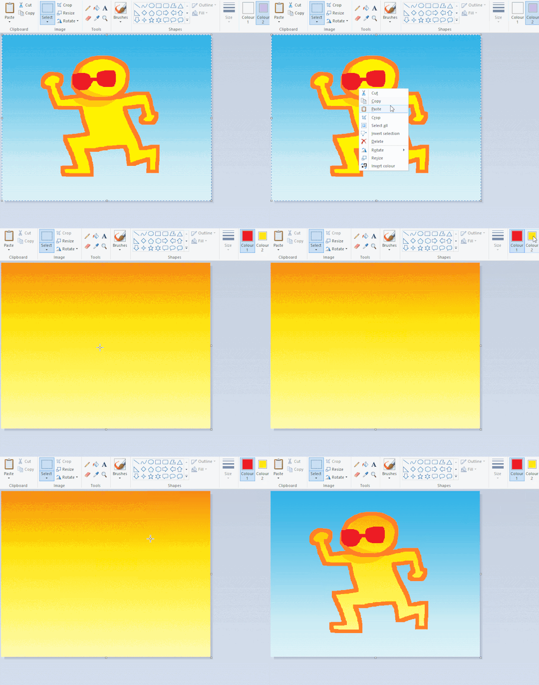
the great thing about this method is u can put multiple gradients in multiple areas of the image. this is where it gets all japanese printmaking type of shit. ukiyo-esque
all you need to do is make another canvas with a new gradient, ensure col2 is set as the colour you want to replace, then paste your original piece onto the new gradient. now my guy has a soft fade. you can do this as much as you want. (you could even make a canvas with a texture or photo and paste your drawing onto there)
TIP 7) "sketch layer"
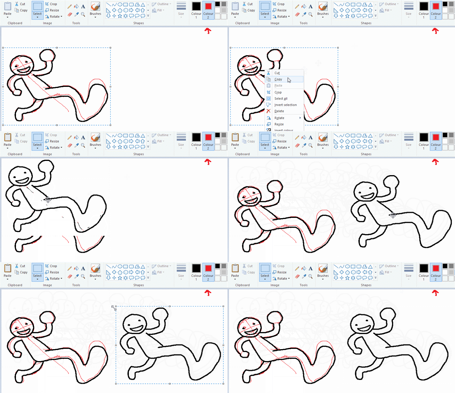
so as you now know, col2 is what is removed when you click "transparent selection". which means you can also remove any instance of a colour from ur drawing. which means you can have a unique colour for sketch layer and remove it from the drawing later. i admittedly dont do this but it is a great trick to have.
now combine this with lowering your dpi for smoother lines. may seem obvious but it helps. its like a free stabiliser whenever u want.
TIP 8) rainbow art
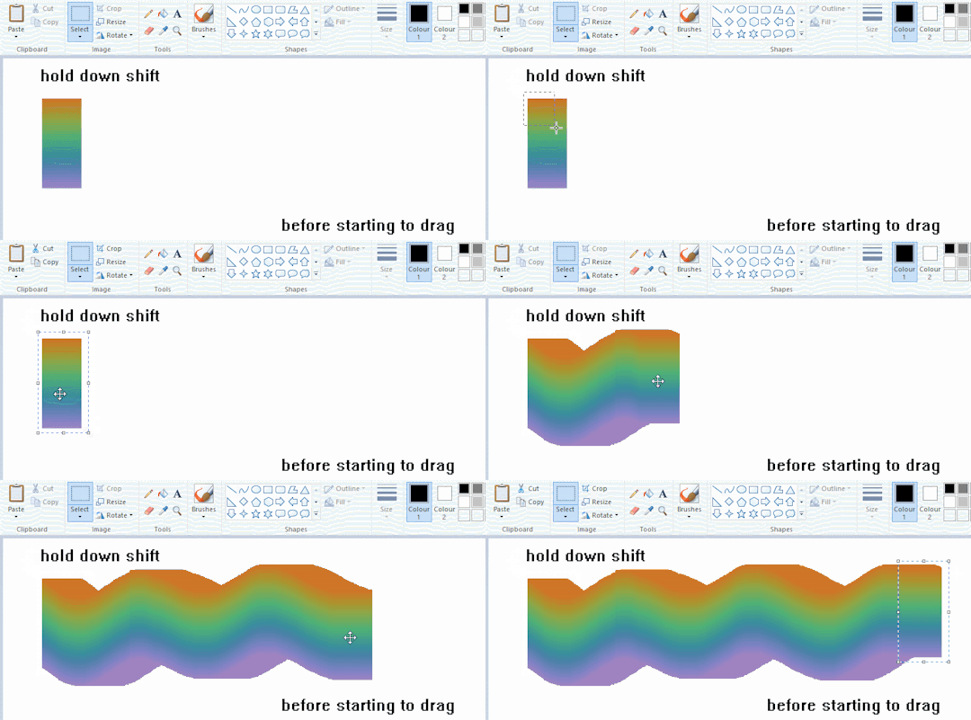
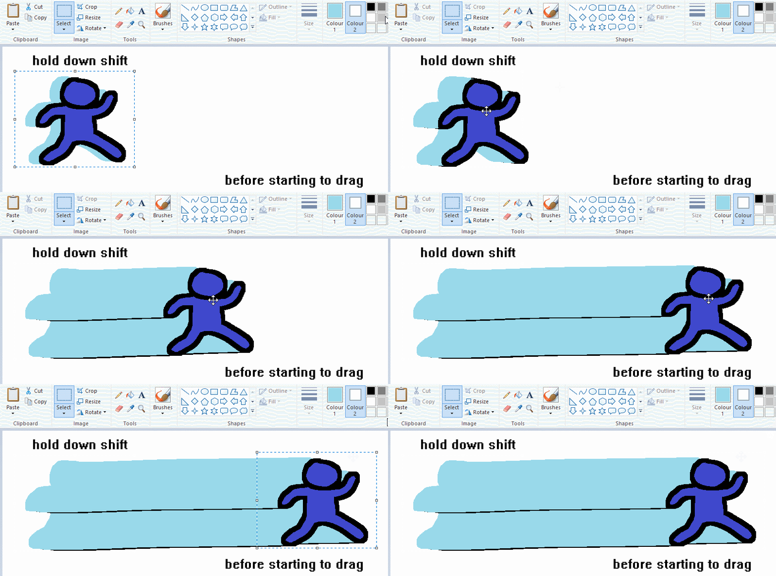
now this is where you can get dizzee rascal "bonkers". check out my small and shitty rainbow trick. you can select anything and hold down shift, then drag with left mouse, to turn that selection into its own brush. i even did it with a guy. and you can of course do this with a photo as well.
🙂well that it for now. hope you liked it thanks for reading now back to your regularly scheduled tgcg programming
2K notes
·
View notes
Text
genuinely think this is my peak in digital art

season nine gem my beloved,, idk what to do with her legs so they're kinda posed awkwardly but yknow that's fine I'm so proud of this considering I'm usually so bad at doing this kind of painterly thing (digitally especially !! so difficult !!!)
reference from alphonse mucha, i have been very inspired by paintings like this one for so long, they are too good i love them so much <3
also the sketch i did in my sketchbook which i then used as a base for the lineart


anyway image description below
[1st ID: A full body digital art of Geminitay dressed in clothing inspired by her season nine skin. She is sitting on a rock while leaning her arms and head on an arch resembling her season nine castle's bridge. On her left is a tall tree with sparse leaves. The background includes a yellow sky and some blue-ish trees in the distance. Gem is smiling at the viewer, she has some strawberry plant's flowers and leaves on her head. Her hair is braided. End of 1st ID.]
edit: i forgot the second part of my ID's, sorry!
[2nd ID: a painting by Alphonse Mucha, of a brunette girl sitting by a riverbank. The pose is same as in the first image, as it is the reference. This girl is leaning on a branch. The colors in the image are soft, mainly yellows and oranges, with some green in the plants and a stronger red in the flowers on the girls head. End of 2nd ID]
[3rd ID: The sketch of gem which the first image is based on. It is done with blue pencil & gel pen on a physical sketchbook page. End of 3rd ID]
242 notes
·
View notes
Note
Hello :D
I have been following you for the last year or so (a few days after I got my Tumblr lmao) and I absolutely love your art!
I have been wanting to study your art style for a while but don't really know where to start,,,
Could you please show me a small portion of your art process, if it isn't too much trouble of course. Thank you and have a nice day!
hello. oh my god. this took forever to find.
im sorry it took 2 WHOLE FUCKING MONTHS for me to respond to this but i wanted to put it off until i felt happy with my art process again, so here it is
my fall 2024 rendering tutorial!
(this will be very very long)

FLATS AND WHATEVER YOU WANNA DO WITH LINES GIRL. then make sure to recolor the lineart to better match your base. trust me it helps, bold dark lines are Not your best friend when rendering. wait for that post-rendering
i start off with a doodle or a sketch, and then filling it in with flats and other details such as blush

FIGURE OUT YOUR LIGHT SOURCE. FIGURE IT OUT GIRL YOU CAN DO IT you can make it as simple as possible, make it as big as possible, dont even THINK about the details.........just make it really fucking big so you at least know where the shadows and the light goes THEN add smaller shading details LISTEN TO ME. LISTEN TO ME OKAY!!!!!!!!
my key point with this is for you to learn lighting fundamentals.
it's SOOO ANNOYING but alas......they are all correct. it helps a lot.
one thing i also really want to point out is that i like creating a big shadow shape first before fixing up the little details (such as folds and whatever) because it helps me focus on the way the lighting actually works instead of tunnel vision-ing into making the shading make sense on the clothing.

contact shadows (i dont remember if thats what theyre called okay) theyre fucking ugly because im not actually thinking sorry 💔
okay so basically:
contact shadows (if that's what they're called) are the spots in shading and lighting where light will NEVER hit.
shadows are still influenced by the colors and lights around it (it's why a blue shadow and a yellow shadow feel completely different, despite both being shadows) so it's not always COMPLETELY dark.
BUT! there are small points in shadows where light never hits, and they're almost always super dark or pitch black.
it's hard to explain shadow and light so briefly for a tutorial, but you'll notice it when watching fundamental studies and when trying it out for yourself


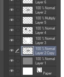
YES i unclipped the multiply layer YES its ugly and terrifying but it makes coloring the multiply layer easier okay the colors merged w multiply so now it looks cool and has depth overlaying colors that actually make sense
so basically what i did was color the multiply layer that i used to shade the overall drawing
adding a band of red/orange/yellow around where the light hits, and blue where the shadows get big and wide, gives it a fake ambient occlusion effect in the way that a person would get if they stood under the sun with a clear blue sky
the colors don't have to make sense, especially because i never draw backgrounds, but coloring the shadows really help it give a sense of depth and extra subtle detail and effect that just helps make the painting look nicer
around the end, i also put in colors (in an overlay layer with a low opacity brush) that actually make sense in context of the drawing, which is the lit cigarette and the yellow eyelights
mostly because none of the colors were making sense and i needed to actually make use of the lighting that DOES exist in the drawing lol

adding a muddy golden yellow pin light layer (opacity turned down to like 40-50%) to make the light colors less ugly lol
i SWEAR by the fucking pin light layer style. it's so useful and so so underrated.
i used an almost brown-ish gold color on stop of all the layers, and with the pin light layer, it helped make the bright (almost blue-ish) white colors more warm and more yellow. it just helps make things more warm (something i prefer)
i could probably show what it looks like without adjusting the layer opacity to truly show off what i mean (like in the coming section) but i sadly forgot to do that lol


make a layer on top of your drawing with this color in these ranges YES the drawing is fully merged NO don't be afraid, the base was fucking ugly anyway 💔 make this layer into an exclude/exclusion layer style TRUST turn down your exclusion layer opacity from a range of 10% to 40% literally until you're happy with the contrast and the way the color over the drawing. use your eyeballs. i know you can do it im so proud of you
this is pretty self-explanatory instruction-wise, so i'll go into why i do this instead
i really like art that seems like it has low contrast, with almost mid-gray shading and lines. i don't personally use dark and bold lines and shading, unless i find it necessary for the tone of the piece, so using this method helps lower the contrast of the art and make it look "pleasantly muddy" in the way that it's easier and softer on the eyes.
the inverted blue color also helps makes things warmer!
the exclusion layer style is still a bit of a mystery to me but i really like the effect it gives, even if i don't completely get how it works lol
if you want an alternative method to this, and if you have access to it (because i primarily use sai and sai only),
i absolutely encourage you to play around and experiment with gradient maps.
there are so many out there you can make yourself or even get from others that just give the painting an extra amount of depth and color variation. they're SO fun.
personally, if sai2 gets a gradient map update, it's over for y'all it will literally be so over no one will be able to stop me


then i merged everything and actually adjusted the contrast back up because it was looking too muddy for me 💔 but the color adjustments are still there so all hope is not lost here's a comparison of the adjusted contrast in black and white (adjusted on the left) (newly merged layer without adjusting the contrast on the right)
as you can see, i actually turned the contrast back up (despite talking all about how i liked things with less contrast lol)
i wanted to demonstrate that doing adjustments should be done in moderation, and is why i adjust layer opacity often when making color effects
you are free to play around with colors to help your style, but don't lose your initial idea and colors along the way.
you still need to trust your own colors and intuition!
along with that, i just want to say that it's completely okay to change your mind mid-painting, and it's okay to make somewhat drastic changes.
don't be afraid to change things you don't like or change your mind about certain aspects way later on
that's basically the whole thing of this!!! don't be scared!!!

now im gonna hold your hand when i say this..........but you need to learn how to render by yourself. it seems like i can teach you but i literally can't, because rendering is different on every piece and depending on how clean your base is. i have to render A LOT because of how fucking ugly my sketches are LMAO to simplify it, think of it as obsessively cleaning up every detail you can see, but with a color picker and a clean, hard edged brush. if you have shit lineart, you don't have to redraw it cleanly over and over, just paint over it. that's basically what rendering is
THIS especially is where you need to be brave and stop being scared.
like i said, i can't teach you how to render, and it's something you have to discover yourself because rendering is something that will always be personal to every single piece you make. the way you render on every piece is different.
on one piece, you will barely need to render, and on another, rendering is more than half of your ENTIRE process.
don't be afraid to paint over your old art.
rendering is a process that's both very perfectionist yet also very careless.
find your balance and just go for it.

and then that's it……..u did it………..now yuo know how to paint and render. it's literally just layering shading and lighting knowledge until you think it makes sense and looks okay lol additional note: since i render in only one layer (you don't HAVE to do this, but it'll be harder for you…), i also made slight adjustments with the transform (and liquify, if you have it) tool to make things more proportionate. (i drew the head too big lol)

if you compare the finished piece to the final unrendered base, you can see that a LOT changed, including a bit of subtle proportion adjustment.
particularly, the sleeves changed A LOT (because i really didn't like them)
but it's also over all cleaner and more coherent, instead of having haphazard colors and shading just thrown about.
rendering is when you finally use all 100% of your brain to finalize and figure out where the shading should go, where to clean up your lines, where to ERASE or ADD BACK in lines, and make sure all your colors look coherent.
it's not as intimidating as it seems, i only use a hard edged brush with a little bit of color mixing and my color picker.
it's like dragging and dropping colors to cover up mistakes, it's really quite fun when you get used to it
i wish i could explain it clearer but it's hard to describe without visuals!
i hope this helped, and i hope all my yapping isn't annoying (art as a special interest beloved)
have fun studying and trying to render in my art style!
#long post#art tutorial#rendering tutorial#art help#art tips#tutorial#kia doodles shit#artxstic-scr1bbles#tutoriel
193 notes
·
View notes
Note
hello!! i love your art so much, your colors are beautiful and your characters are just so 👁️👁️ and i adore seeing them on my dash :)
i had a question about how you do the details on your fabrics: how do you keep the patterns on clothes on a body looking so,,, clean and readable while also making it make sense on the form under it?
like the cape/sleeve(? idk what it is but it looks cool as hell) on the magnolia commission pattern looks so cool and it's still readable on the fabric (like, if i wanted i could probably do a silly sketch of it) BUT ALSO it seems to make sense with the folds so it doesn't just look unnatural and stiff?
i'm so sorry this is kind of a long ask but like. would you be down to talk about your process for patterns on clothing? it's cool if you're not, that's totally fair, just figured i'd ask
have a wonderful day!!
OOOH Thank you so much for the ask!! I wanna do a more in depth tutorial, but I tend to make patterns in two different ways, with one being fully hand-drawn and the other playing with mesh transforms or the... Uh, liquify CSP tool? Let me find examples

This is an example of a fully hand-drawn pattern. No trickery here- Only trying to eyeball everything. It's kinda a lot of work to draw it manually, but it's the more convenient option if the character I'm drawing doesn't have files for the patterns, or if the files are a bit too different from my usual style, as they could potentially not look great with my linearted or painted style
And then- For cases such as Nolia's cloak, I did the entire pattern as a separate file, then placed it using Photoshop's mesh transform!

Here's a WIP file from when I placed all the patterns after finishing the lineart, where you can see them in full contrast. I tend to keep my patterns in different files- The black parts here are not joined with the base color of the cloth, so I can bring nice highlights and texturing when they're meant to be golden inlays, for example. Now, the Photoshop mesh transform is a bit finnicky to use, and I don't have any proper step by step of it- I could potentially record how I do it someday. But let's take the humble cylinder and demonstrate it quickly:

So, the mesh warp tool is the one on the right- You can see these sort of blue lines creating a mesh. I'm sure CSP has it in it's pro level or something? Correct me if I'm wrong. You play around with the different sections, move it to the right place, and put it on the cylinder. This is a very simplified form. You can make many subsections to your meshes (that's 3x3- you can have stuff such as 20x20) for when you have multiple folds.

And then you can just shade your pattern accordingly so it fits the volume of the drawing, and- ta-daa!
This is by no means an easy method. Sometimes you can get away with the Liquify tool (which CSP has and it's very decent), which I've used when the pattern in question was over a simpler surface with few folds. It takes some practise to use that well, and it isn't gonna be the best for complex ones, but it's also an option. Let me do a lil compilation of some patterns I've done and which tools I used for each!
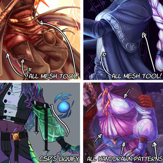
The tool I use highly depends on the time I have, the level of finish for the drawing, and so on. CSP's liquify is probably the fastest but gives simpler results, drawing them manually works better with some styles and more organic/less geometrical patterns, the mesh tool takes a bunch of time but it's great for small repeating patterns that are meant to be very precise or geometrical.
If people would be interested in it, I may someday do a video tutorial of me doing a pattern and then putting it over a folded cloth. I do hope this can help a bit tho!!
116 notes
·
View notes
Text

it was suggested I post this to the tags as well >:D
fuck it ima tag @transcendence-au as well because tbh I'm very proud of my silly little animation
some me being a nerd under the cut!
okay so this all started when I read the original post this was inspired by and though 'wouldn't it be silly to add some art to this 3 year old post?' but then I decided to animate it for funsies!
and gosh I sure do love animating!
So I got the base sketch and then got into the lineart animation for each component!
i don't have the sketches/wips saved at all sense this wasn't really a project and it took less than a day to complete. but here's a peak at the timeline
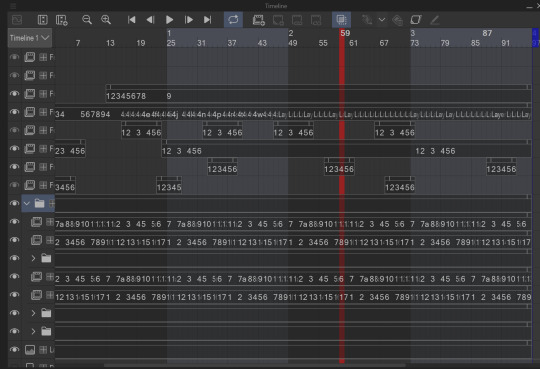
I animate entirely in my ususal drawing software: clip studio paint. It's just what's easiest for me.

all of these layers outside that folder are just the sparkles! after I finished I added some sparkles for fun! there's a lot of them because it involved a lot of copy and pasting sparkle layers
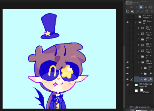
the bottom folders here are the wings body and facial expression! for everything like the wings arms and flags I was able to just copy paste, reverse, and then align the timing correctly in the timeline
one thing unique about this animation is that the lineart and colors are in separate layers! I tend to do line and colors on the same layer but this time I was using a brush that doesn't have the same lack of anti-aliasing and sense it's a small animation I wasn't as worried about keeping a minimum of layers like usual.
also the movement of the body is only 4 frames! and one one of those is just the hat shifting position
initially I wasn't going to have the second facial expression but when I got stuck on animating the flags I added the second facial expression while taking a break.
the arm animation is just 8 frames! honestly the only tricky part in this is the flags, everything else was pretty simple, which made it super fun to work on because I got both a challenge and mindless therapeutic drawing out of it.
NOW THE FLAGS there was 3 throw away attempts before I got it: you see the thing that made this tricky is finding the balance between believability and visual appeal. a big part of animation is creating the illusion of physics, this is the 'believability' part, I need these to look like flags that are moving and made of flat fabric, HOWEVER if I animate these one-to-one with realistic physics: it won't look good! I can't apply wind to the whole drawing because then the hair would have to react, and wind goes one way, and I wan't the flags to be pointing opposite directions. so without wind the flags would be laying down flat, but that won't look good at all! and furthermore realistic physics would have the flag not being all nice and front facing most of the time. so the trick here was figuring out how much physics to apply to make it look believable, while still making it look good.
one trick I did to help me animate the flags is I actually made a plan rectangle flag as a guide so that the general mass/volume of the flag would stay consistent, this is something i highly recommend when animating! like having a circle guide along a characters head to keep their height and proportions consistent.
after I finally found the balance with the flag lineart coloring wasn't too hard! sense I just had to follow the lines, and THANK GOODNESS the trans and aroace flag have the same number of stripes: saving me time!
and then it all comes together to make a satisfying perfectly looping bundle of cuteness >:DDD I feel like the tau fandom doesn't have as many artists with particularly cartoony/chibi art styles so I've gotta play my part in spreading the joy-whimsy-adorable-sillys >:D
anyway! hope you get to see a cool beetle today :D
#kyukyudraws#animation#alcor the dreambender#tau#transcendence au#the transcendence au#gravity falls
112 notes
·
View notes
Text

(Click the image for better quality)
Yipeeee that Keiki and Mayumi fanart I posted the WIP of is finally done woooo- This piece was a very experimental one that I'm kind of OK on. Maybe because I've just gone insane looking at it for so long and I'm my own worst critic lol.
Artist's Notes;
So I've once again been playing around with my rendering style, mainly because I have been wanting to improve my lighting for a while now and as I was just scrolling through Tumblr, I saw some of the official art for that one webcomic-turned-animated-TV-Show Lackadaisy and was immediately inspired. I also have seen a technique a few times in the past where the lineart and shading are merged together, so I've been meaning to try that for a little while.

I did some experimentation on this one sketch of Keiki I posted in my sketch dump and I really liked the results of it, so I carried those over to this piece.
I ended up scaling up Keiki and Mayumi from the original WIP because I felt like they were both getting lost in the composition, and I'm glad for that because I think it works a lot better. I'm not a fan of how Mayumi's sword turned out at all, but it's not really meant to be the focus of the piece so eh. Overall, I think I could do better with my colours, probably because with Keiki and Mayumi's colours, I did them flat in greyscale and then used a brush on the overlay blend mode to colour all of them over, after which I changed the base layer for their colours from white to yellow and then lowered the opacity so it all went together better. I also decided to use gradient maps for a lot of the background elements, mainly to experiment with getting in my values first to make them pop out more. I ended up finding a really nice sky gradient on Clip Studio Paint that I really liked, and that kinda helped to establish the colour scheme of the background a lot. I think the whole "start in greyscale then colour" thing really works better with painterly styles rather than more illustrative ones, and while it is good at making sure your values are more readable, I honestly don't think I have the skill level to pull that off yet. Honestly, I think I've been looking at this drawing too long or maybe I added too much to it, but I wish I could've made the colours less monochromatic, but I'll just save that for the next piece I do.
I do love how the flame (...well it's more of a weird space rift than anything in this piece) and the lighting turned out, those were fun to do. I was initially struggling with the flame and how Mayumi is positioned in front of it before realizing "Oh wait! This is a weird abstraction of a weird creature! I don't have to follow the laws of anatomy!" and just dislocated it's flamey bottom jaw from the main body. I also changed the colours of it since I was really not liking how incredibly bright it was when it had lighter colours. Again, the gradient maps served the more painterly style of the flames well.
I also love how Mayumi turned out. I could do her sleeves better but that's more of just me needing to study how those types of sleeves fold in that position more. I'm also very happy with the posing, the technique I used for that was taking photos of myself in the positions I wanted, blocking in the silhouette and then modifying that by adjusting it to my lines of action that I drew on top of the original photos, and then sketching over the silhouettes and drawing in the shapes of the hands overtop of the photo if I needed to get the fine details right. As for what I do to take the pictures myself, I use a tall chair I have, prop up my phone with a phone stand, put on a ten second timer and scramble to get in position. Yes, I did have to use a bunch of thin markers I had to try and get the hand positioning on Keiki's pose right, yes I do have a fake sword that I used to get the positioning of Mayumi's arms and hand right, the sword was for an old Halloween costume from several years ago. I really like how both Keiki and Mayumi turned out in this drawing, I'll have to play around with these designs for them more in future drawings.
Also, if you wanna know why I draw buildings like that, when I watched Fantasia 2000 as a kid (One of the Disney movies where they make really beautiful animations to classical music) the way they drew the buildings in the first few sections Rhapsody in Blue segment (the jazz one with the cities) changed my brain chemistry and now whenever I need to draw buildings really quickly, I refer back to that. Since the buildings aren't really the main subject, I didn't put much thought into them.
As you can tell I am very tired of this piece, mainly because I made things harder for myself by overcomplicating the process compared to what I usually do, mainly with the whole "starting in grayscale then adding colour." I'd honestly just prefer having a black layer set to colour that I can just toggle on and off when I need to see the values, but it was good to experiment. And that was mainly the point of this whole drawing, to experiment. I'm definitely going to have to play around with this new style I'm going for, mainly because I liked how it turned out a lot in the augmented Keiki sketch, and also because I want to find ways of making it suit my style more. I also really want to keep experimenting with my lighting like this, it's very fun. Last but not least I am never starting in greyscale again because dear god I do not like the workflow it forced me into. I don't have a problem with the method itself it's mainly just a skill issue lol.
If you wanna read my headcanons for these two, I put them in my WIP post, so you can read them there if you want to. The more I look at this the more I prefer the simplicity of my WIP. I might go back to this and just take away the fancy colours and effects to see what it looks like without all of that stuff and reblog this post with that drawing, but for now, I don't think I can look at this drawing again for a while.
#touhou project#art#fanart#touhou fanart#touhou 17#wily beast and weakest creature#keiki haniyasushin#mayumi joutougu#haniyasushin keiki
116 notes
·
View notes
Note
Okay hello hi hello,
First off you're amazing and a gift to the world, I wish I had even half your talent. Your last piece blew my mind and I just HAD to ask,
How long have you been drawing/painting for? I imagine forever but I'm always curious how long it takes before artists reach these sorts of levels where it evolves into full-scale projects as opposed to smaller hobbyist crafts. There are so many beautiful art pieces on this platform as a whole and I'm constantly baffled by it all
Sorry if my excitement is off-putting that piece is heavenly and my mind is blown. Hope you're doing well!
Hi and thank you! That's a good question
So I've been drawing since I was born, but I've been drawing digitally for 8 years. I think in the very beginning most artists should just focus on having fun, you'll basically improve by default
after a while you will want to improve. It will be slow, but this is the stage where you'll recognize what you need work on
I'd say the turning point is when you've finally gotten far enough into your art journey without any sort of formal training (ie, a lot of artists dont learn the basics/fundamentals first, which is fine since most of us start as hobbyists) But I think learning them really did help me a lot. You start to think more about how light and shadow lays, depth, 3D objects, and more.
I highly recommend watching this video about levels of art, it's been really helpful and motivating to me throughout the years
This part is going to be long so you don't have to read it but I just wanna give my personal journey and how I got to now if anyone thinks it'll be helpful:
(2017) With digital art, I started off on ms paint and occasionally ibis paint x. Mostly using anime deviantart bases (EMBARRASSING), but after a while I developed my own style based on the people I was inspired by at the time, I was just happy to draw and didn't care much about improving at this time


(2019) The people you look up to artistically will naturally change over time (and thats okay), after a while I decided to switch to firealpaca, where I guess I got more invested on how light and shadows work, as well as making my characters look a bit more natural and develop my own style, your preference in aesthetic may also change over time which is noticeable here


(2021) Eventually, I began to lean more into semirealism (which isn't everyones preference and thats okay! realism shouldn't be the ultimate end goal of art) but I really enjoyed making stylized characters look 3D and in natural looking environments, since I felt it spoke to my own experiences, a lot of artists draw from real life experiences. I focused more on anatomy at this time as well as textures and environments, composition also became a big deal for me at this time, as well as wanting to use different colors


(2024) The change from LINEART to DIGITAL PAINTING in 2022 was the hardest for me once I switched to clip studio paint, it was basically like starting all over and I was so lost. I had a lot to figure out on my own but I knew it was a transition I had to make to draw the kind of art I wanted. But I began to study and take more things into consideration, I didn't like my art so I simply kept going "I can do better", learning from my previous mistakes and slowly making something I would be more satisfied with. At this point art felt more like "projects" then anything, because I wanted to make pieces that were of quality and had time and care put into each of them, sure it meant there was no longer much quantity. but hey that's what my smaller Cult of the Lamb lineart drawings are for!! 💙


I'm still growing and I definitely have a long way to go, but I am very proud of my progress this year, and I'll continue to grow until I'm satisfied (haha im stubborn) I also want to develop my secondary lineart style that I do when I'm not painting, since I feel that is important too
in short; time, practice, dedication, and passion are the most important, draw what you love above all else because it will be your drive to keep going, staying motivated was the most important for me

Sorry for the long post 😭
#digital art#art#art journey#this was a long one guys sorry#its been a long time since I've been asked this#I've changed a lot this year#and honestly it's thanks to cult of the lambs amazing community for keeping me motivated#thank you#oc#original character#fanart#cookie run#timekeeper cookie#ever after high#lizzie hearts#cult of the lamb#ms paint#ibis paint x#firealpaca#clip studio paint
42 notes
·
View notes
Text
hello i was tagged by @18minutemajor for WIP Wednesday. it is not Wednesday but i am also not a cop so . here we gooo!!!!!!! tagging my esteemed colleagues (very politely and with no pressure!!!):
@neonfretra @oensible @sorrellegiance @moregraceful @stereax
@wheelsnipecelebrini
@korshrimpski (EDIT: it won’t?? let me tag you. unless these are on separate lines <3)
what's in-progress in your life <3 writing? art? recipe? skill acquisition?
if any crafty people see this - if ANYONE sees this - and would like to join in, feel free and consider yourself tagged <3 (and tag me back so i can see your stuff!!!) link to 18minutemajor's post if yall curious :3 my VERY long wip dump + ramblings under the cut!
its christmas soon and i like to paint gifts for my friends + and i'm finally revisiting my anime/lineart/inking era (here you are K!! my lineart past, present, and future!! <3) so here are some things i've been working on/coming back to/MAY NEVER FINISH: hockey related:
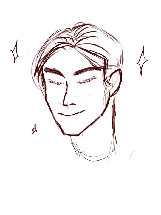
this is juraj slafkovsky and his dinky little middle part which he can absolutely learn to style into something a little less dinky but never does. i am so charmed by him. i imagine he just rocks it because his pretty privilege supersedes dinky middle parts . LMAO!!
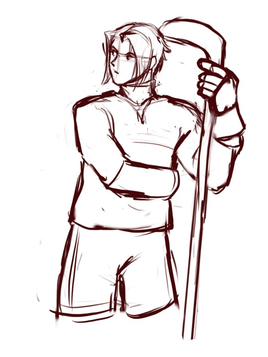
here is Sasuke from my Naruto Hockey AU. I am a little stuck on jersey mockups lol. here he is. our haunted little 1OA who is absolutely normal and regular about his captain (LOUD incorrect buzzer):
personal oc art
wanna know some puckpocketed deep lore? i've never been one to make OCs. i was just not a very creative kid tbh. spent all my time drawing sailor moon instead. i still go back to her sometimes because she is one of my favourite shapes in the WORLD!!
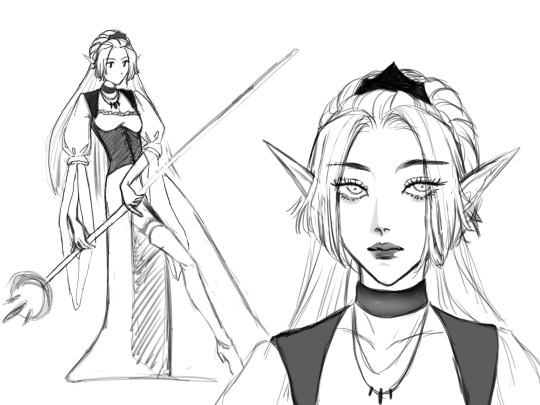
in my 20s i took up playing d&d because of the. uh. plague. <3 and got pretty close to having OCs!! those count right? anyway. here is my tavern-wench-turned-wizard!!! i think i painted this 2 years ago? <- put dates on your works guys it saves lives. her name is Mel (short for Melins (pronounced like melons. on account of her knockers. can you tell i never grew out of my 12 yr old booby/cock joke era?) i revisited Mel recently and have started painting her in earnest again!! :3
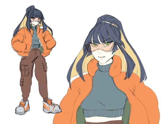
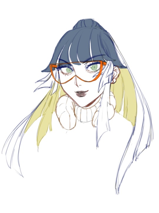
I briefly dated someone who was very into streetwear and fashion, and I fell down a techwear/gorpcore/cyberpunk rabbit hole for a couple days out of curiosity. i remember literally zero salient info on any of it except the broad strokes of silhouetting and Vibes. what i emerged with, however, was a ?? sorta OC?? im not sure what to call them. they dont rly have a name or gender. I did this little sheet ages ago + the aborted attempt at a portrait later:
Here are my most recent explorations (i have been doing SOOOO much art. <3) which include:
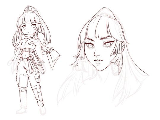
unfinished character sheet + chibi art. I played with their jacket (much more structured/square/tailored thing) and added a lotta random buckles and belts. i took textiles class years ago and have a little experience in garment construction. and i know for a fact this thing does not make any sense. it hurts me to look at a little bit LMAO so i've paused it while i go draft patterns (badly. i was never good at drafting. i think i may have to break out my scrap fabric stash and hand sew a real life mock-up. HELP!)
here is me having fun with them and imagining them as some kind of cyber-fisherman. the best part of every game is the fishing mini-game to me. i love fishing mini-games so much. I made their hair really big because i wanted them to have big unwieldy hair and the vibes told me i should add more movement to the piece aside from the fishing line. I messed with their jacket AGAIN because i can't stop thinking about what kinda jacket they'd wear. gorp-core ? idk. it sure is something!
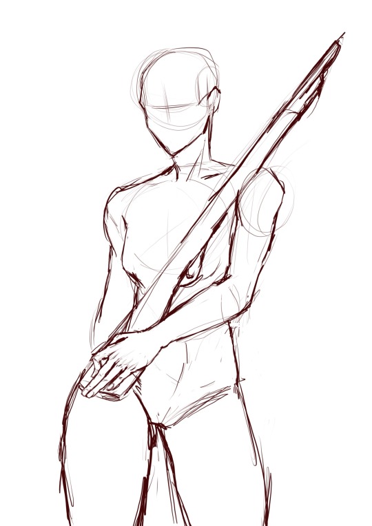
gifts for my friends :3
back in my weeb era for real YAYYYY!!! up til now i'd been making hockey art using a zero pressure sensitivity pen brush because i simply did NOT want to deal with that. it is and has always been a barrier to me making art that uses line art. <3 easing my way back into it though!
I used to paint gifts for my friends and then get them printed into lil posters and mount them on nice backing :3 i am now ready and back to painting.
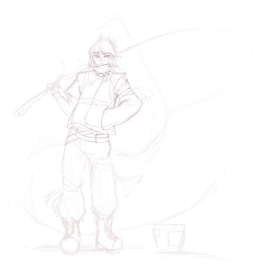
Here is my girlbestie's OC. just a rough pose sketch. i think im pretty unsatisfied with the gesture of the head/hand. i wanted to include her gun in some way. i fear i may have to rework the pose entirely <3
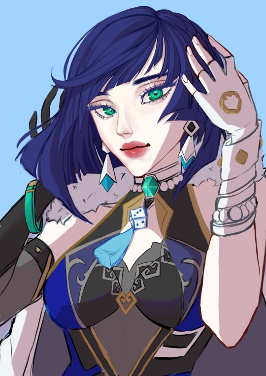
For the genshin girlies.. here are some of my friends fave characters.
Yelan - this one i started many holidays ago and put on the backburner because the colouring was wigging me out. you can see where i started rendering stuff + got sidetracked and started on something else (the crystal choker IM LAUGHING @ past me...)
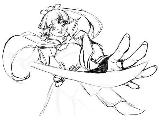
Ayaka - I reaaally like what i did here with the perspective + foreshortening. I don't know if the pose or expression is in-character or not, but i had fun :3 got stunlocked looking at references of genshin weapons so this is where i left off:
if you made it all the way down here hi... <3 ice hockey really cracked the ketchup bottle open for me when it comes to making art again. i love the communities i've found, and i'm inspired by every artist on here every day. thanks for being so cool + have a great day :)
#hiiii... late with starbucks (gigantic wip dump now i feel good about sharing again)#puckpainting#tag game#eye contact#the . the tag thingy for half of these aint working HELP <3
20 notes
·
View notes
Text
holy shit this year marks 10 years of this blog and moz!! i can't remember the exact date i started posting here - my archive says i have one post from november 2013 but let's disregard that - but i do remember it was around late 2014/early 2015 :)
^ one of the very first moz art pieces i ever drew, for fallout week 2015!!
memories and art through the years under a read more bc it got long
2014 → baby's first rpg!! i started playing fnv on my cousin's jailbroken xbox late 2013 and finished mid 2014 and i loved every minute of it. i remember waking up at 8am and playing almost nonstop until 2am the next day haha!
i didn't play moz on my first playthrough - but i did start creating a character that would eventually become her: a shorthaired ex-boxer who punched her way through obstacles when diplomacy failed. i remember she spent a lot of time with boone. i liked him then, because he saved my ass more times than i can count. but i digress. this is draft 1 moz essentially
2015 → this is the year that i was doing my thesis so i could graduate but i was so depressed and stressed about it that i distracted myself by replaying fnv on pc, where i played through the dlcs for the first time. i fell in love with the dlcs' oversarching story; particularly ulysses, who i became obssessed with, especially since i couldn't find any content of him at the time. in the game, i played as moz; i had most of her personality and choices down, but her backstory was still up in the air.
fun fact: this was an existing sideblog that i remade to be a fallout blog so i could look for ulysses content, and when i couldn't find any, i made some myself, featuring moz as my main courier six. originally, i didn't ship them, but eventually i ended the year as a courier/ulysses otp shipper.
this was the year i started drawing digitally - my uncle let me borrow a drawing tablet and i used an old copy of photoshop i pirated hehe
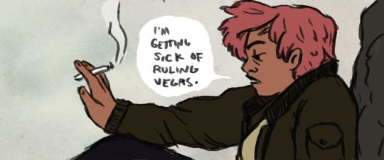
2016 → i graduated this year!! and promptly fell deeper into my depression. this was the year that it got so bad that i had to be medicated. through it all, this blog and moz and ulysses and my fandom friends were with me. and for that i am truly grateful :) this was the year i figured out how to lock transparent pixels so that i could color my lineart lol
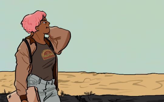
2017 → i started hammering out moz's backstory this year i think. there's a lot of sketches of her and her family in my files. i experimented with shading and backgrounds here but that experimentation was pretty short-lived
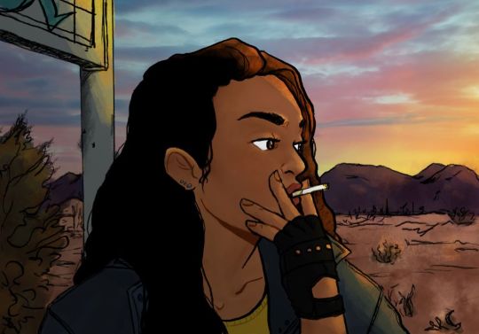
2018 → i started using references seriously!!!! i did a lot of oc on oc kissing this year, featuring mostly moz and many friend ocs haha

2019 → didn't draw much this year. actually this year was a blur and i can't remember much from it except from it being the year of my terrible no good bad copywriting jobs... anyway i did manage to continue my courier/ulysses brainrot and make this piece, which i'm still proud of
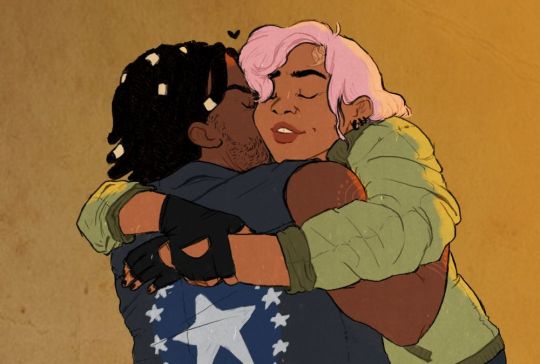
2020 → pandemic time. i spent a lot of time asleep at home and i think this was also the year i started doing commissions?? shoutout to anyone who has ever commissioned me - thank you so much, i truly appreciate it!!

2021 → i switched from my old-ass pirated photoshop to clip studio paint and never looked back. also i did a bunch of commissions for my grandmother's surgery, which failed, and i distracted myself from the sadness by drawing my ocs over and over and playing disco elysium

2022 → by this year, i've got moz down pat and have started vaguely developing other ocs instead. but she's still always at the back of my mind

2023 → i bought new brushes from true grit texture supply and immediately found new favorites that i started using for everything. i tentatively started incorporating background elements in some pieces!
2024 → while it's still too early to say where this year will lead me art-wise, i will say that i started experimenting in realistic paint studio (which i bought in 2021, the same time as clip studio paint) a few days ago and i'm liking the results so far. we'll see!

all in all, these last 10 years have been quite a ride, but i'm glad i stuck around and i'm glad you guys stuck around too!! much much love 💖💖💖
#shh peri shhh#god. look at that old art... i took the ones that i still kinda liked but the rest...#well i don't hate them. but they're old and of their time and i wish i could redo them lmao#my art#moz
89 notes
·
View notes
Text
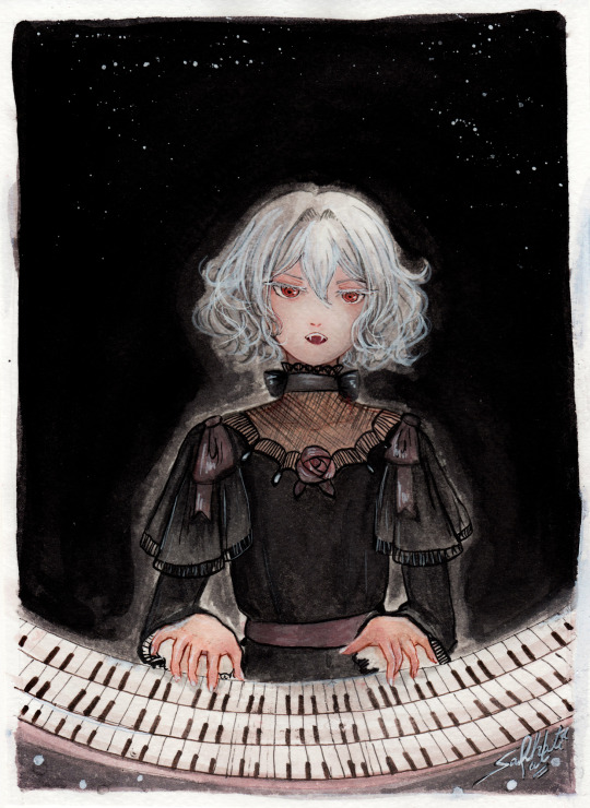
"Noble d'Apchier"
A little watercolor painting of Chloe,with the Zorn palette! I found out about this palette a while ago and I really wanted to try it out! (More on that below )
Chloe's hair is something I adore, it's gotta be one of my absolute favourite character designs ever,I love how swirly and fluffy it is,very fun to draw. I've drawn her normally before,I wanted to do one with her vampire eyes and fangs too. I decided to try to draw a white fuzzy rim around the foreground against the plain background,for a change,like in some of the VnC panels.
The Zorn palette,or Apelles Palette was a colour scheme used by Anders Zorn in the late Victorian/Early Edwardian era. It ,or something similar,might have been used by artists of old civilizations too, because it avoids the use of blue and green entirely: which would eliminate the need for rare pigments . It's essentially a colour mixing challenge,to draw the entire paintings with 4 pigments,2 basic colours: Ochre yellow, Vermillion,and Black and white,which can be mixed into different shades. It can be an excellent exercise and means for portrait painting
Modern artists use red instead of vermillion,but the essence is the same. So that's what I did too. I considered using vermillion,but I realised that it would introduce a lot of yellow tint, making the picture very warm. Which is usually something I prefer honestly,but not what I was going for here. Also,I need to consider the fact that I'm a watercolour artist,which is very different from the original intended palette. Zorn used oil paints,but other artists use it fine for gouache and acrylic too, however,that too is different from watercolor, because instead of mixing with white, I'll be diluting with water,which changes the composition of the palette considerably. So I went with these supplies: ochre yellow and red watercolor pencils (for me, basically watercolor pigments,I don't use them to draw,I grind and dissolve them in water),white and black watercolor tubes,and white ink. In addition: lineart with sepia,grey and black brush pens,which are well within the bounds of the palette
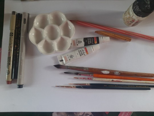
To be honest,I ended up not using the white paint tube at all,water makes more sense to me. I didn't use anything else though,and stuck with the original materials.And the results:
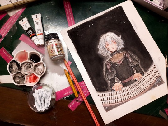
Does it work? Hell yeah. It's not perfect,but I'm happy with how she turned out
Was it restricting? That's kind of the point,to paint with some limitations
Was it hard? Honestly? No. Not at all. It's definitely very different from what I'm used to,I use a lot of colours both as is and mixed,but this was surprisingly easy. Perhaps because of my subject,which didn't have much colour to begin with
Do I recommend it? If you want a small challenge,or to experiment or practice colour mixing,definitely
Will I do it again ? Absolutely. I feel like I haven't utilised much of the potential of this palette. I ended up using mainly red and black, hardly any yellow at all. So I'd like to do something more colourful with this palette, perhaps a sunny painting of a gingerhead girl with flowers,and for this I'll probably use vermillion,not red
Anyways, that's all! If you read all this,thank you for your time!!
#chloe d'apchier#the case study of vanitas#vanitas no carte#VnC#my art#traditional art#zorn palette#vnc fanart#vanitas no shuki#jun mochizuki#case study of vanitas
291 notes
·
View notes
Text
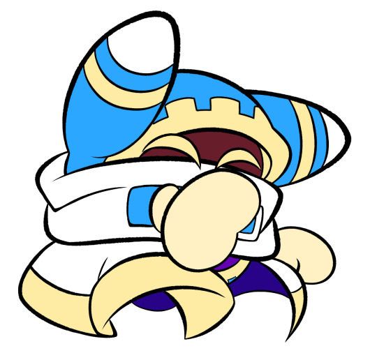
im so sorry it took me so long to answer these oml but YES i'd be happy to show how i draw and color :)
— SKETCHING
please note that i almost always sketch traditionally first lol it's just a lot easier for me to determine how the drawing is placed that way, but i always go over and re-sketch it digitally
for magolor i always start with a basic egg shape (lmao) and then i add his ears. then I draw the scarf; it's easy to determine the shape and dynamicism based on where the bottoms of the ears are located
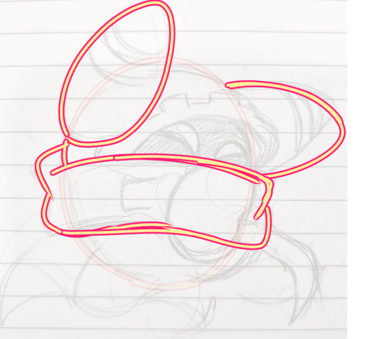
then i usually add the cape and hood together. where and how these are placed and what these look like in general are very important because they're the main area that perspective is directed to (the ears and everything else is important too ofc!! but the hood and cape usually help demonstrate where he is looking and how he is moving the most). then i add everything else, usually his hands last!
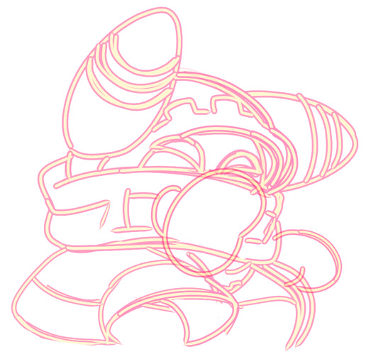
— LINEART
ohhhhhh god my worst enemy. Hope youre sitting down because this will be embarrassing LMAO
lineart is easily what i struggle with most and is more often than not the most time consuming and grating step for me. If i had a choice i would drop it in a heartbeat, but my style is so dependent on thick lines and shapes that it's difficult to 😭 a hole i dug myself into unfortunately ITS FINE THOUGH. ANYWAYS I'm getting sidetracked
i use my finger to draw all my digital art, which means i usually have to use a Heavy stabilizer to avoid shakiness and staggered lines. Unfortunately ibis paint's stabilizer is actually dog water and doesn't even stabilize more than half the time (in which case i have to repeat lines over. And over. And over again until i get it right) but when it does like me and works properly it's very helpful!
i always use the soft school pen bleed brush as my main tool for lineart. This brush has been my best friend for everything, i even use it for sketching idk it just really like the way it looks lol. sometimes i change the aspect if i want the lines to look more ,, chalky?? or smoother depending on the work

i don't really use this tool much but for this specific piece, force fade was my partner in crime
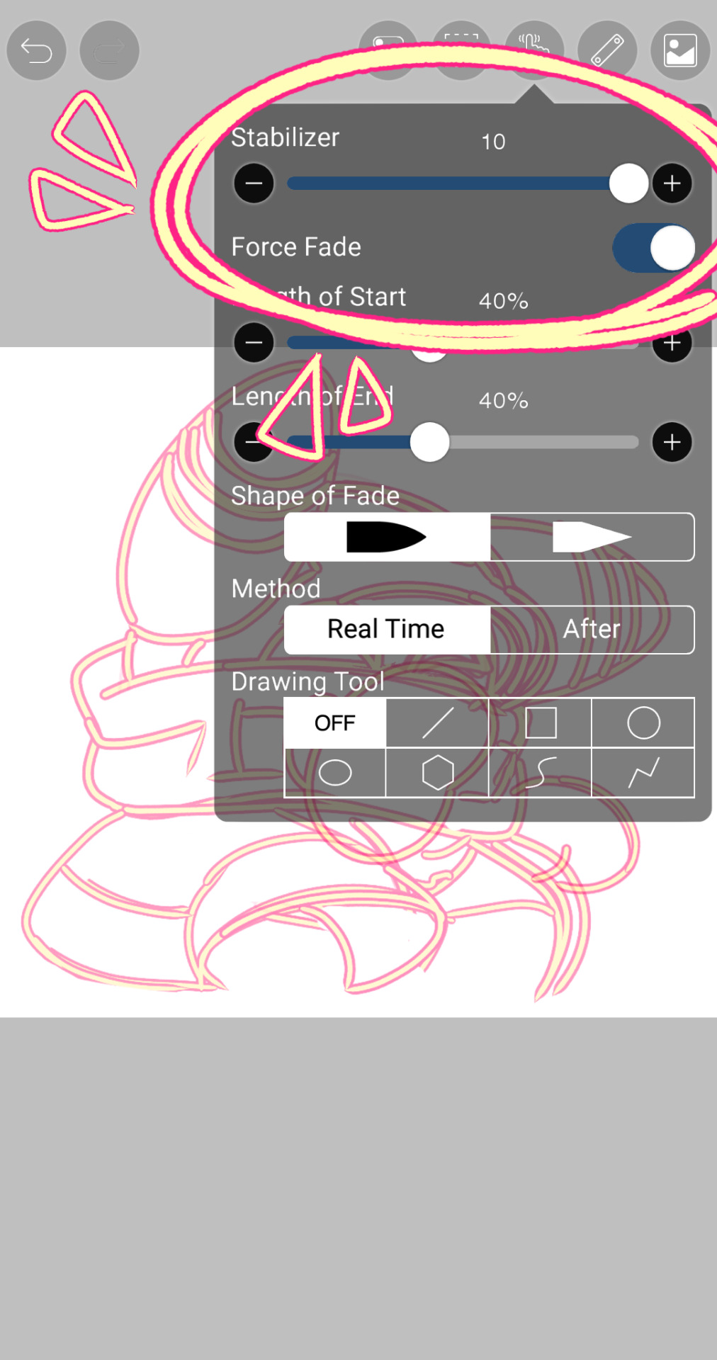
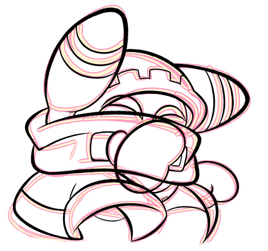
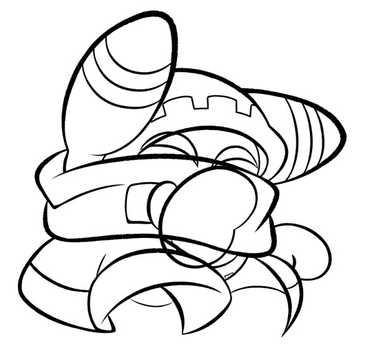
also i think i need to mention that i use so many layers for this. So many layers lol like to the point it's embarrassing. and at the end i merge most of them (except for the gear patterns, rings on his ear, and eyes + hands, which usually need to be by themselves as they're colored separately) Thank you for layers
and i end up with this!
— COLORING && SHADING
yippee yahoo the fun part !!! the part that i love the most
at this point, if i havent already, i always create a folder for convenience in organization because this is the part that i stress the most about what details are on which layers lmao
then i add ANOTHER layer below that for the color, then i put every single color used on their own separate layer!
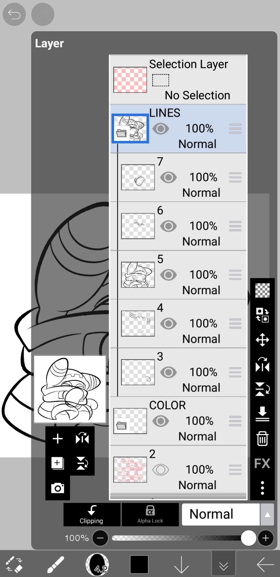
now, for shading, if im working on larger pieces with more complex shading, i'll usually plan it all out. normally when just drawing magolor, i don't really need to do this anymore because i'm so used to it lol, but for funsies i did it here anyways
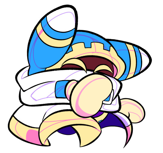
then i use the bucket tool to fill them all in
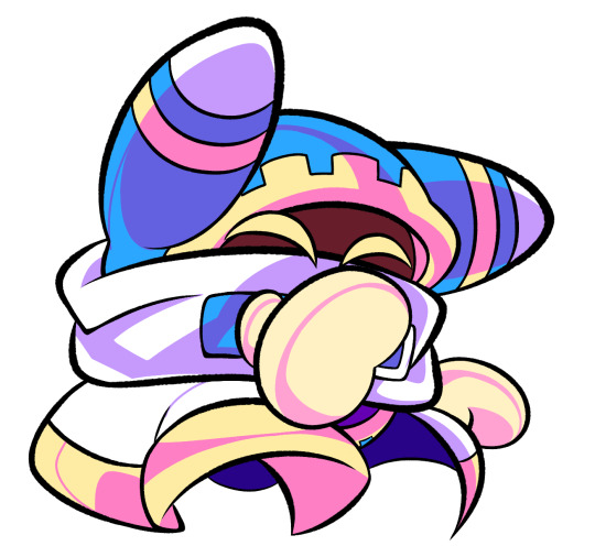
i usually have a set color palette for all the characters i draw (though the way i shade white differs. A lot between my work as you can probably tell fhdfgf). For every color, i have two specific tones that are associated with the shading. for example, indigo + violet are shaded with my blue, pink + light orange (or lighter pink depending on my mood lol) are shaded with yellow, etc.
so, i shade the other areas with the 2nd shading color

a big tip i can give for coloring is to look at a color wheel when you draw. i know that sounds like. Such basic advice LMAO but that seriously was a huge help for me when developing my shading and something i learned while studying — if you notice, in all of the shading in my work, all of the colors used are analogous on the color wheel. note that not ALL combinations will work together like others obv !! but it's a huge step in knowing where to go with it
then i add other extra details like extra lighting, halftones (if i feel like it // if it fits the work), glow to his eyes, and color the lines and ta-da!

another tool i use a lot especially with my more recent art are blending modes, especially multiply. i use a clipping layer to add a dark color (usually a dark blue or purple) and set it to multiply, then erase the areas that emit light

and this is the end result! this is a very very basic demonstration of it fhdjg i was a pretty messy with the lighting and erasing in this example but you get the general idea right

and that's how i draw :) i hope this was helpful, and thanks for asking and being so patient with the response!
#ask#magolor#kirby#macdraws#ive wanted to make a tutorial for So long and finally found a bit of time to do it lmao
144 notes
·
View notes
Text
ask dump #3!
rch
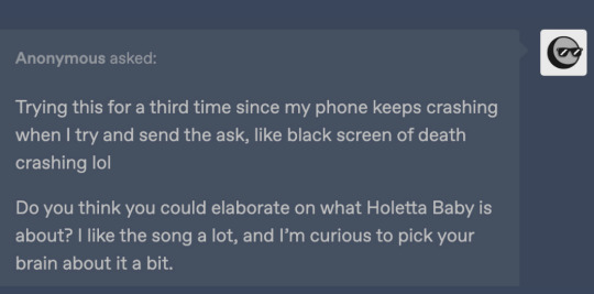
Yes and no! Holetta Baby is a character song for a story I wrote in high school with some friends I've since fallen out of touch with --- because of that (esp. since some of the characters were based on ourselves), and because it's frankly bizarre, I don't know if I'll ever share too much about it.
All you really need to know is that it's from the perspective of a man whose wife flew away as he gradually realizes that she's never coming back. IIRC she was just fleeing for a while because their love was forbidden, hence "Loving you's so good I fear it's wrong." In reality, she got trapped on an island somewhere and he was too heartbroken to consider the possibility that she might need rescuing.
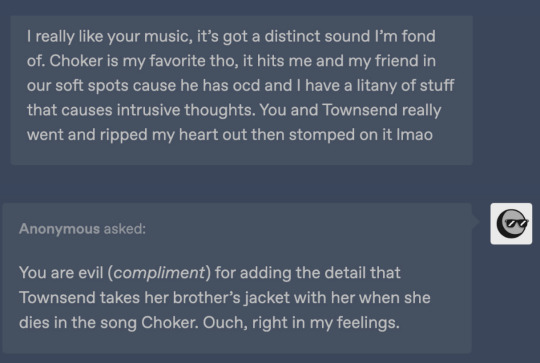
Thank you!!! I really can't overstate how happy I am that Townsend resonates with other people who have intrusive thoughts. It's something I still have trouble talking about but she's been a good outlet for that. Also quite happy that the angst is hitting right ehehe
art

Honestly no, I have so much trouble with that too OTL. Occasionally I use the warp tool on a sketch to help put an interesting line of action before I actually do lineart? I recently started experimenting with drawing in fisheye perspective too, and that definitely shakes things up.
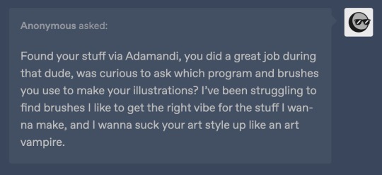
Thank you so much!!
I almost always draw in Procreate (with an iPad + apple pen). I have 2 sets of favorite brushes on there - these are what I usually use:
6B Pencil (found in the "sketching" category). I use this for EVERYTHING from lines to rendering.
Studio Pen ("inking")
Medium Hard Airbrush aka the most generic brush on earth
Inka ("inking")
Spectra ("painting") - annoying because it can alter colors by pressure though
Then I have this set I call 'ink kit' which I use when I want to change things up without actually switching mediums lol
Blackburn ("drawing") - Really thick brush that makes me think a little harder about lines. I also have a duplicate modified to make it a little smoother and smaller & I switch between those two when doing lineart on these pieces
Gesinski Ink ("inking") - one of those pens that's flat so it's really thin or wide depending on the angle
Oil Paint ("painting")
Watercolor ("painting") -- just for coloring stuff in when it doesn't have to be precise
Also these niche uses:
Driven Snow ("elements") for freckles
Nikko Rull ("painting") for skin texture
adamandi

It was just a fairly thick curling iron (curled upwards all over my head) and then a lot of hairspray. If I remember correctly, the first night it was done by our costume designer Hahnji Jang (@/hahnjij on insta!) and then I did it myself the rest of the nights. It was definitely their idea at least - my hair is naturally pretty flat and up til then I assumed Vincent's would be too, lol.
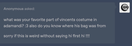
No idea where the bag (or really any of it) is from, sorry. I really liked walking around in his swooshy jacket, and I ended up buying it afterwards. As far as normal people clothes I would actually wear, I really really liked his pants, which I was unfortunately not able to keep.
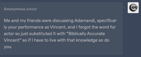
There actually exists in my mind a completely different "biblically accurate Vincent," which is the Vincent I had been picturing all the way up until the actual performances. I always pictured him with long black hair and freckles, and I considered drawing on freckles for the show because of that.
12 notes
·
View notes
Note
i've admired your art since forever and wondered how you did your inks!! do you use a pen with no pressure sensitivity or just one with a super low one so you can still get tapered but boxy edges? also do you change the size a lot for your detail work? it's so cool, i've always wanted to do the same inking style!
Depends which of my lines you're looking at for inspo! I always use pressure sensitivity, and my pressure sensitivity isn't particlarly low or high - I occasionally change my line weight, but a lot of the time I forget to lmao. I just use less pressure for details. my most recent work is done in Clip Studio Paint with a textured nib pen brush I downloaded from the free shared resources in Clip Studio, they're a set of Japanese brushes. Before that I was using photoshop, and I used a brush from this huge scam of a brush pen pack, but it did come with this lovely angled rectangle-shaped brush. These were done with that photoshop brush v

vs this, which is the CSP japanese brush. I'm certain I went down a size to do the shirt pattern, keys and chain + some other details for this lineart.

But the main difference between these is the CSP brush is a texured circular brush, while the photoshop brush is a rectangle at an angle; it's mimicing something close to a marker or a pen nip that's being pressed wide. That rectangle base is what results in the blunt edges; the brush itself simply didn't taper that much. I assume thats what it is anyway!
49 notes
·
View notes
Note
Any tips on how to emulate isat's art style?
Hi!
I am but a humble mimic, I sense there are folks who can tell you more accurate details BUT I also love explaining steps I make while making my own art so I'll tell you how I improvised~!
Firstly, I found the wiki (no, not the Fandom one) for all the references. I tried to study how the characters work and I used a lot of just color picking to get the grayscale hues accurate
The lineart is obviously much thinner than what I went for and it seems to use a crispier brush for it to resemble pixel-esque kind of vibe but I wouldn't know which brush it is, I assume it's a custom/adjusted brush!
What I used was "Real G-Pen™" in Clip Studio Paint!
What's fun about this brush (and superior to G-pen brush) is the fun little texture it has that also resembles some of the crispiness but I think the ISAT one has a much finer texture, to give it the aforementioned pixel like vibe.
The thick line I used was just my preference but if you use Real G-Pen with smaller scale and basically only mild pen pressure, you get similar results to the OG style:

(some of the Sif's images has their lineart thicker in some places to give just a smidge of lineweight feel, enough to work with the depth but I demonstrated here how it looks with basically no pressure applied, it has a bit of that crisp and you can probably get a better one if your canvas was bigger than mine here (just under 1200px lol))
I then color picked from the original images to get the flat colors in!
What I did for shadows is just use the layer set on multiply above all the flat color layers, color pick from the white base gray (that Sif mostly has haha!) and use the that shadow for just about anything. I think I also played around with Overlay in the bigfrin image? you can play with layer settings too and see how it works! You will notice that depending on the mood of the scene in the game and the emotions of the characters take priority over how all of this works.

This isn't 100% as it is in the official artwork but I rolled with it most of the time!
You can throw some adjustments and extras here and there if you want it to resemble the dynamic party portraits even more (the extra line strokes, adding a bit of weight to the line, the white line strokes on clothes and hair...)

You essentially end up with something like this!
For the white outline, you can either copy the base color layer (if it covers the whole form) or the lineart layer but move it under the base color and use the border option:
Regular portraits don't seem to have that outline but I like it a lot personally, it makes the image pop XD
That's basically it! I love how simple and effective it is!
How you stylize the character and how you draw them is all up to you!
Many credits to insertdisc5 since I basically just tried to mimic their style with some liberty sdhjdfg
16 notes
·
View notes
Note
um um um I'm back and I decided to analyze your art cause I really admire it :')
Honestly, I've noticed you use the same line width, if not similar line widths throughout the entire piece, which makes the dresses easier to swallow compared to how some artists draw, and I also think it goes perfectly with the overall simplicity of your art! While it is rather simple, it is also rather easy to add details into it to make it much more fun to do and gorgeous to look at.
I also love how you color things, as it is also pretty simple and goes with the line art, but it's also really easy to add details that you can overlook but still add to the drawing! Not even to mention how well the background goes with the outfits, especially in cases like the black hole dress or the white and blue angel dress (which both look amazing and are easily some of my favorite pieces ever)
Anyways once more, your art looks gorgeous and has given me so much inspiration and insight into my own art and how I can better it, as well that keeping things simple can totally help my art a ton!!!
um anyways sorry for the paragraphs but tysm for making the blog, it has cheered me up multiple times before and it probably will do it again countless times <33
This is so freaking cool to read, you absolutely hit the nail on the head with some of these comments :D Hope you don't mind if I add some insight on my part since it's so lovely idk if I could post it without anything to say.
But yeah, my usual choice in brush is literally a default CSP brush with the pen pressure turned off, and it tends to be 6-12px wide? There's nothing particularly special about it other than drawing with a smaller brush size helps me keep my canvas roughly the size I like (since I alter it each drawing), and I'm not a big fan of line weight in general lol. I'm definitely not the kind of person who will swear by a special custom brush or specific settings, I've always been the kind of person who will just make art with whatever the fuck I'm given.
If I can be honest, a lot of the time I just wing it with colours and the background- so you don't see it but there's a lot of me trying to slap a bandaid on a leak I created by not planning ahead. Sometimes things go smoothly, other times it doesn't.. For the record, an artwork will turn out wayyy nicer when you have a complete idea of what it's meant to look like. Do not aim to emulate me 100% I am but a fool in the grand scheme of things.
ANYWAYS, you wanna know something fucked up that might make ppl look at my art differently? This is my process for the latest drawing I did. I took my sketch, I drew it over it digitally and inked it, THEN I overlayed the sketch because I liked how it messed with my colours-


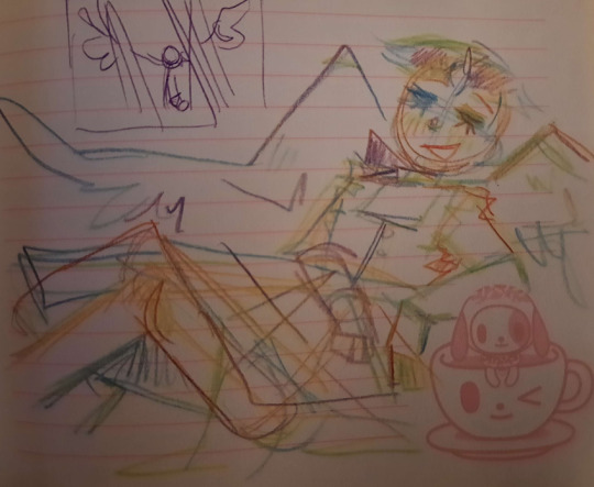
I paint OVER the artwork, realised my sloppy colouring makes the bottom part stand out so I add a shadow trying to adjust for this, decided I needed the artwork to be 100x more vibrant so I upped the contrast a bajillion times..


Then the rest was just shit i painted over:

I didn't even have lineart for the angel dress.. Check out this freak shit:


Have fun guessing what part of my artwork is what now,,,
#asks#ppl dont even know whats happening inside my dark sick and twisted mind.....#and neither do i my process varies a lot#all my art files are FUCKED girlies u dont even kno
9 notes
·
View notes