#i did like a limited color palette which looked very pretty but the colors match a little too well so the skin looks off lol
Explore tagged Tumblr posts
Text

Feeling lucky 🍀
#yay this was fun#thanks nopsi for the background idea#Suzumiya Hii#saiki k#saiki kusuo no psi nan#saiki#i did like a limited color palette which looked very pretty but the colors match a little too well so the skin looks off lol
162 notes
·
View notes
Note
Happy Storyteller Saturday - what pictures of your characters do you currently have? Which characters have art, and which ones don't have art yet?
*whips out my art folder like a proud parent opens their wallet to show you pictures of their children*
to answer your question, most of them have! although not all of them are up-to-date with the design changes i've been doing to them in my head
also limiting myself with max 2 pics per character bc otherwise i'd be here forever lmaoo
okay ready? 3, 2, 1... GO!
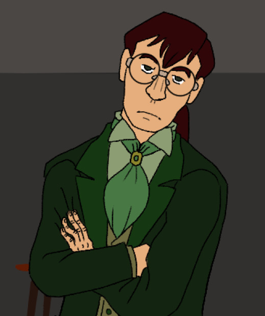

Agnes: the refsheet is THREE years old but still holds up pretty well! main physical traits: big squarish nose, very long hair (usually tied up) and round glasses. too many drawings and doodles of her to count

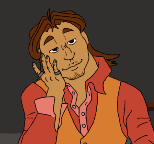
Ryan: oh man, his hair. his hair. it's given me trouble from the very beginning of his conception. i'll spare you all the phases it went through lmao. main physical traits: broken nose, wide face and that little bit of chin stubble. a few drawings


Lisabel: one of my most recent OCs, so she only has these two official drawings. she uh, likes to squint a lot appearently. main physical traits: short hair, sharp nose and glasses. since i don't have a proper ref for her, i'm thinking of changing the glasses and make them a different shape to differentiate her more from her sister
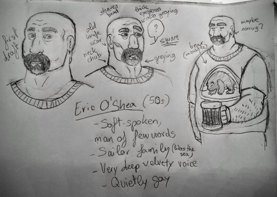

Eric: i need to draw him more ;;;W;;; main physical traits: big, bald, graying beard. unsure about the scar

Léan: only this image of them exists, sorry 😔. main physical traits: short hair, braces (not depicted) and freckles (also not depicted)
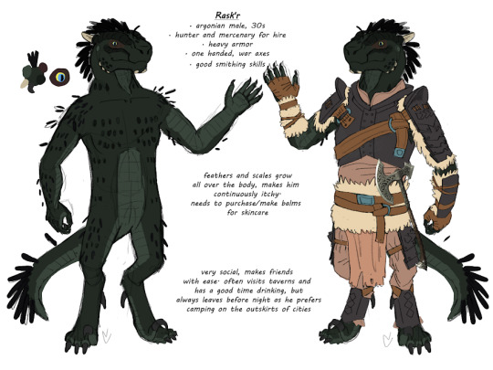

Rask'r: you might recognise that werewolf form! :³ main physical traits: feathers sticking out of places where they shouldn't, red eyeshadow (natural skin color) and filed-down facial horns. another one of my go-to OCs to doodle


Raz: okay yes i like to draw men with long hair, sue me. these drawings are the very first ones i did and i haven't drawn him ever since. the fact that he looks too much like Ryan bugs me, so i may rethink his design from scratch some time in the future. main physical traits: unkempt spiky sideburns, hairy body and raggedy clothes
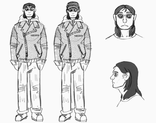
Donovan: another man with long hair, and another character i've only drawn once. planning on adding more undeadness to his looks. main physical traits: straight thin black hair, slightly translucent skin and clouded black eyes
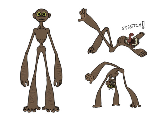
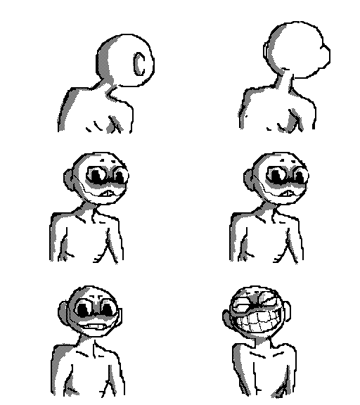
Lee: oh my son! my child! my baby! my dearest boy! main physical traits: uncanny longness, very thin body, thick forelimbs, round head, hands on both arms and legs, no nose, big eyes and teeth. another of my go-to OCs to doodle :3

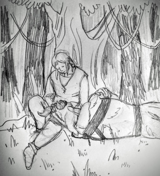
Vreytus: oh man. i have sooo much unfinished stuff of him. he's got these patterns on his fur that i'm never happy with, regardless of how many times i try designing them. frustrating. main physical traits: two pairs of wood-like horns, long proportions, the aforementioned patterns and a tail that's longer than his own body, ending in a tuft
Human form Vreytus: haven't drawn him yet so here goes a quick description: a tall black man with long black braids. haven't figured out his clothing but imagine something flowy with green earthy tones


Bug: another design in the oven. it's supposed to be a mix-n-match of different arthropods but i have trouble with busy designs. main physical traits: uhhh pretty much everything
Human form Bug: haven't drawn them yet, but i do have a general idea of their appearence. an androgynous short young white person with a buzzcut (not human hair, it's actually bristles lol) and black irises. dresses up very simply/poorly
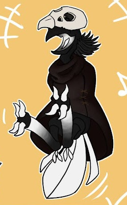

Voirdity: mischievous thing. may or may not be related to unspeakable horrors. who knows! main physical traits: short, B&W palette, hidable arms, skull helmet, leathery robe, head with no eyes (ignore that one doodle), bristle mullet, zygodactil feet
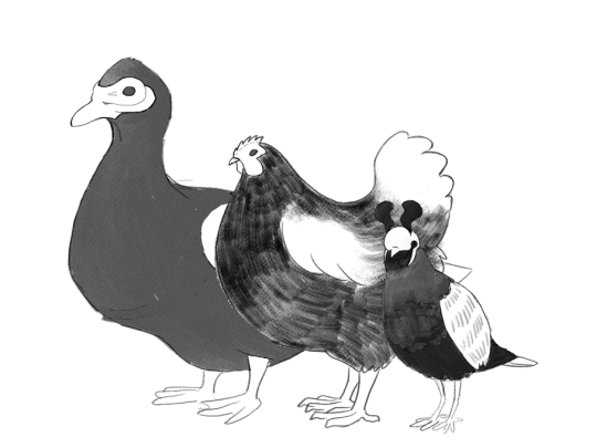
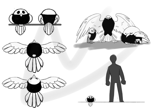
Voirds (species): Voirdity's eyes. can take any avian shape. main physical traits: void-like black body with wisp/flowy elements, white legs, wings and tail feathers, skull-like head with black empty eyes


Chad: bastard. main physical traits: kept sideburns, balding, buff except for his badly scarred left arm (not pictured)
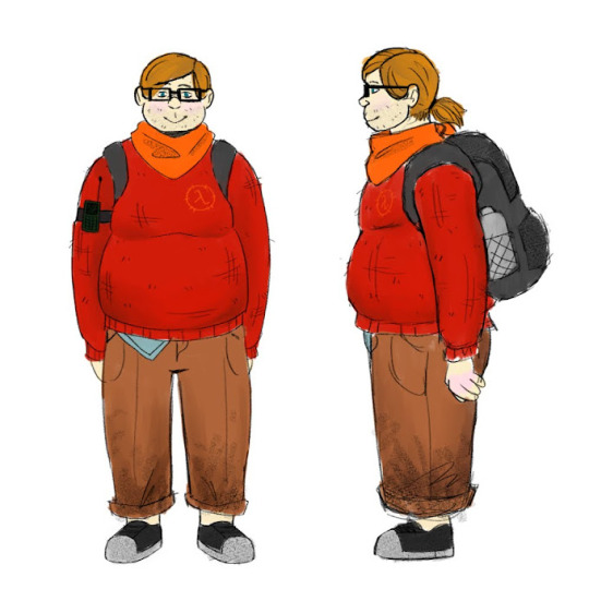

Lewis: softest man you'll ever meet. main physical traits: light-brown hair (usually on a ponytail), blue eyes, fat, unshaved stubble, frog mouth
tempted to do a lightning round of random OC art or characters that didn't make the list but i think it's been more than an hour since i started writing this post and i need a mental break hgjfdkghjfdkghd
Storyteller Saturday is on!
#chatter#the Nexverse#thanks for the ask!! i had to dig deep in my gallery and i think i've never posted some of these so enjoy!! ^^#STS
8 notes
·
View notes
Photo
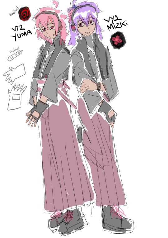
OK. A very scuffed and crude base draft for my VY designs. I shall try to explain myself under the cut
OK first off le BabymetaI influences are very obvious I know. Which I think is what might’ve caused me to give them such limited palettes and make them very very very matching.. I do mean to amend the former but I think it’s neat so their overall palettes probably won’t breach beyond like, two colors + black & a nice accent color which will probably end up being blue. And obvio I made them very matching because they’re paired/partner vocals lol. So in this.. iteration? They have basically identical outfits but flipped. Yuma’s spiked (I know I accidently wrote “studded” on the image instead) bracelet is on their right wrist, so Mizki’s bracelet is on their left wrist. Yuma’s mole is under their left eye, so Mizki’s is under their right. So on and so forth. And also I forgot to make their jackets also spiked along the collar/zipper line..
Another thing is that I want to make them quite androgynous (’cause, y’know, sex & genderless.) and so I’m giving them hakama pants because I think it’s fitting how from a distance they kind of look like a very long pleated skirt. And I just want to give them kind of loose-fitting ish clothing to sort of “smooth out” any bodily curves. I also initially planned on giving Mizki a very long hime cut but I figured it’d be a bit predictable and well, not generally the most ‘androgynous’. And obviously there comes sort of traditional Japanese influences but I kind of ended up neglecting that other than the obvious parts (hakama pants, obi, Mizki’s hair ornaments, etc etc) lolol. I did have an original Yuma design that was much, much more samurai-ish (but I wanted to depict Yuma abit like Nagone Mako in that they would be a samurai that was quite reluctant to do their work and would rather spend their time singing and performing) but I scrapped it because I felt I couldn’t fit in Mizki alongside them well enough (and also because I was scared I made Yuma look too much like Gackpo). I really want to emphasize their status as a pair.
Other than what I’ve already said I think I want to.. Maybe modernize them a little bit. I thought about giving them arm warmers and have the armpit exposed rather than the wide sleeves, but I feel like detached sleeves and arm warmers are already pretty.. played out in VocaIoid designs. I don’t want to follow the Miku formula, if you couldn’t tell. I guess if I could sum my intentions up it might be something like, two performers from somewhere around the Edo period who somehow end up in the Heisei era and take a very delighted interest in modern EDM. (EDM by reason of my personal tastes and also the VYs demos all being very techno-y songs. Saiba Sanda Saida and all that)
But contrasting that, I thought about giving them a couple more samurai elements. Like maybe somehow incorporating kataginu. But eh. (also, if you can’t tell, I’m not the most knowledgeable on Japan’s fashion history)
I didn’t think too much about personalities or anything, just emphasizing their status as a pair but still contrasting them. I have always kind of envisioned Mizki as the ‘elder [sibling]’ of the two, though. Also, I kind of envision them as weirdos who might be a bit sheltered, and are just strange and very ‘in their own world’ in a way. Which I guess kind of goes with my original Yuma concept. They’re both people who have duties, but would rather go on their own doing what they like, which might result in them seeming like slackers. Silly! Also, I’m very on the fence about the hair colors. Pink is a must, though.
5 notes
·
View notes
Text
nie mingjue’s outfits appreciation post
This is way longer than I expected oh gods, please forgive me for it.
It’s a well known fact that Jiang Cheng has the best wardrobe of all CQL characters, I’m not here to argue with that, but I think it’s time for us to stop sleeping on Nie Mingjue’s absolutely fantastic fashion sense.
I mean have you seen him?? The man is out there serving looks even with the Nie sect limited color palette. Please let’s ignore the context here and just look at his robes
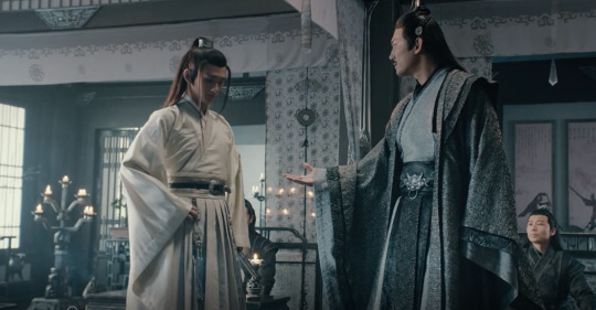
I wasn't sure if I should rank them, so I’ll just ramble about them in order of appearance:
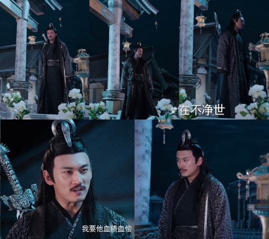
1. The gray “I’m the boss” one

That’s the first time we ever see him and what can I say? He does leave an impression. We see him using these robes two times, in episodes 10-11 and on the beggining of Fatal Journey, as the first picture shows, which makes me wonder: Is this his stay-at-home set of robes? ‘Cause damn
I don’t know how I should comment on the particular details of his robes but I really appreciate how wide this extra fabric layer makes his shoulders look.
Really imposing and powerful look.
2. The Sunshot incredibly beautiful "this is how you win a war" one
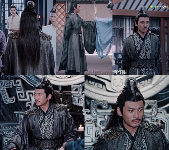
Look, this one might be my favorite, it has EVERYTHING
Shoulder game is strong here, and this bronze-like color goes really well with his belt. Now let's talk about his outer robe for a moment, just THE COLOR I mean it's the prettiest shade of gray I've ever seen.
Also Long Sleeves
And a CAPE. A f**king CAPE. I'll never get over this look and I'm really glad the costume department let this king wear a cape again in Fatal Journey, he was made for it.
Next comes the inner layer that's not really a robe, as you can see when he's standing, but the silver pattern is what really does it for me, guys. It's probably the first thing you see once you look down from his face, 'cause I know we all get lost on that beautiful mustache, and it's perfect.
You can’t lead a war campaign if you don’t look good, I see.
3. The "I didn't really want to be here but I’m looking good anyway" one

It's so dark, it probably reflects how he was feeling during pretty much all the scenes he's in while wearing it.
Once again he accentuates his shoulders with an extra fabric except this time his sleeves are not long at all. I personally think he looks even more handsome like this, it makes his arms look bigger. What is it called? I don't know, but it matches his belt as well.
( Is it really a belt, guys? I don't wanna disrespect but I don't even know where to start looking for names nor I know other english names for belts)
The subtle golden/bronze details on the outer robe and on the inner robe's collar contrasts really well with the black and dark gray
Sad thing he looked really miserable wearing it :c
4. The "big event he seemed ok with attending" one
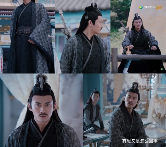
Dark again. But he didn't look as depressed as in the previous one, he actually had fun that day, which is good. Enough of tears and betrayal for now.
May be the wider sleeves he ever wore, perfect for clapping his hands like a happy toddler. There's also a lovely flowery pattern on the darker robe that you can easily miss if you don't pay enough attention.
For the first time his shoulders are not accentuated by fabric or shoulder pads and it's really nice to see him like this. We all love a buff Mingjue, but CQL Mingjue is not that buff and I love him just as much.
Really elegant, not as imposing and he has every right to want to look civil for once. It may be the series' way of telling us that he's not dressed for real combat or war, who knows.
5. The "all this just for a flashback?" one

Listen, this one right here is just AMAZING
I don't understand why they dressed him so beautifully for what? 10 minutes of a flashback. I wanted to see it for more than a couple os scenes!!
Everything here is different, so this will take time.
First: His inner robe, the first one, is not the usual black, it's light gray, it's lighter than his robes actually, and we don't see him wearing it like ever again since chronologically in the series this is the first robe he wears. Does it secretly mean that all went wrong from the moment he met MY? who knows
Second: The outer robe is fancy. There’s so many details to it and it may be the lighting of the scene, but it seems to be a warmer shade of gray, doesn’t it? The golden\bronze thin strip around the silver larger strip is perfect. It kinda has the opposite effect of his shoulder pads, since it makes his shoulders look a bit smaller but it’s so very elegant.
Third: The upper part of the inner robe. I mean who gave him the right to look that good ??? It’s dark but it has golden little shapes in it!! And it kinda looks like there’s a zipper in there because of that mid section. And oh to be a single jewel resting over Sect Leader Nie’s chest...
Fourth: The bottom part of the robe is also something new. We see pleats on Huaisang’s main robes, but never on Mingjue’s until now, that’s why I took the last screenshot, nothing to do with the bloody Baxia at all. I wish we could have seen them in pretty pleated robes together.
It probably contradicts what I said about his shoulder things being a code for battle, since the first thing we see him doing with this outfit is killing some guy/puppet; but for the rest of the time he wears it is peaceful
Honestly, imagine how Meng Yao felt. It was some fairy tale thing, wasn’t it? You’re a nobody eating bread and drinking water and then this king pops up out of nowhere and defends you from bullying and offers you a job and takes you home with him??
6.The “kick your local murderer down the stairs” one
I don’t really know what to say about this one. The context kind of ruined it for me, but let’s try.
It resembles the fourth outfit since it’s a really dark inner robe and a lighter and patterned outer robe. Except this one has this nice and shiny thin strips around the sleeves and the waist.
It’s pretty but not especially pretty in my opinion. If I were to rank the outfits, this one would rank last.
7. The “fighting qi deviation and needing emotional support” one
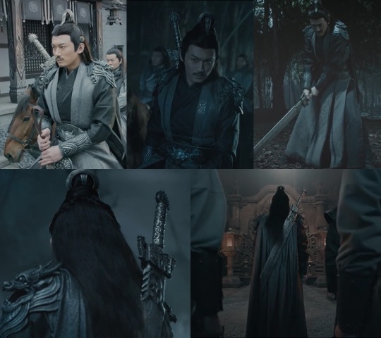
Fatal Journey, baby.
I know what I said about the second one, but this might be my favorite. It’s practical, no long sleeves or heavy outer robes. It’s also appropriate for horse riding, wich is great. The simple, sleeveless light gray outer robe is really nice.
There’s a cape again!! And I have to say the cape looks even better now that his sleeves are tighter, the way it falls gracefully on his back is perfect. I love the way it seems to be attached to the shoulder pad too.
The robes are simple but the thing is: The accessories are not.
His belt is now silver and if we ignore that the production team just painted it, we can assume he has two sets of identical waist belts, one is bronze and the other is silver. Now the final touch: The shoulder pads. This is what makes this outfit the most extra of them all. It’s silver and just so, so pretty I wanna cry everytime I look at them. I mean, the layers, the dragon\beast entire head makes him look so fierce and ready for the fight.
I wonder how comfortable they are tho.
10/10 would rank first place.
bonus: Baby Mingjue
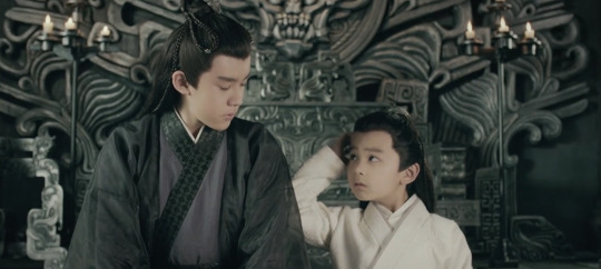
We love a consistent king after all! Has he been wearing dark robes since he was a baby? We will never know. I love this dark yet translucent outer robe tho.
1000/10 the cutest and best dressed child out there.
Conclusion: Nie Mingjue is a fashion icon!
* Do not take this too seriously, I did zero research and english is not my first language. If there’s any terrible grammar mistakes, point them to me and i’ll edit it. If I’m somehow disrespecting Chinese culture, please also point it to me and I’ll apologize, edit or even delete the post.
#nie mingjue#cql#chen qing ling#mo dao zu shi#is this meta?? idk#poorly analyzing fashion choices#nie brothers#the untamed
1K notes
·
View notes
Text
chivalry is dead (20)
A/N: BIG YEEHAW HOURS TODAY Y’ALL ITS BALL TIME!!!!!!! AND WE CAN’T HAVE A BALL WITHOUT A PRINCE *stars bawling*
costumes will come in another post bc i. got really excited and then drew them all like, last month (most of them, some were finished last night y e e et)
WARNINGS: remus mention, heist details, wound descriptions, sword mention, scar descriptions, threats of violence, thoughts of dying — alright, im pretty sure that's it, but this chapter has thicc details so if i missed anything pls pls pls lmk
Words: 4550
AO3 link!
MASTERPOST! <– look here!! for the longterm warnings!! including sympathetic Deceit and cursing/swearing!
enjoy !!! <3 <3 <3 ,3 <3

Deceit really was right, Patton thought while he looked around at the town. His arm was linked around Logan’s as they walked down one of the town’s side streets, from Dr. Picani’s office, and he was taking the time to admire how intricate all of the architecture had gotten. It was intricate and worn and every building seemed unique now, something that he hadn’t realized was missing during their first pass through.
There were arch ways, bridges between doors on the third floors of buildings. There were seemingly hand-woven canvases shielding some of the streets from the sun and, if Patton squinted hard enough, he could see actual detailed stitching and some stains of age. They passed buildings that had scratches and chisel marks, and Patton could clearly see that it was made from stone bricks that had been painted over. Twice, actually. Once with a very old and faded blue, then with a lighter cream that still let the blue show through in spots where the paint was gone.
He wondered a little what had caused those spots. Was it because you weren’t supposed to layer house paint? The spots were different sizes — how many memories were made here?
Patton stumbled, tripping over his thoughts and heels, and leaned more into Logan’s side.
Logan tugged at his arm. “Don’t ponder too hard, Patton,” his voice was soft, hushed to not draw attention.
They’d figured that the best thing to do was to not think about the world around them. Thinking too much about the world and specifically the things that they would affect about it made their focus wander onto fixing those things. Logan would get a headache, Patton would space out, and Deceit would….well, okay, Deceit hadn’t disclosed how and if he’d been affected. But Patton noticed he’d been sweating like a sinner in church, and how his fist would clench every so often, so it was clear that something was happening with Deceit. He didn’t want to force him to talk; honesty wasn’t Deceit’s strong suit.
The four Romans had agreed that that was the smartest decision; none of them nor all of them together were able to limit the Imagination enough. The Playwright had argued that, had Dragon and Damsel known that it was hurting the other Sides, then they would probably all have a unified thought enough to close up the unused worlds. But that would require discussing the entire matter with them, which, as the Thief pointed out, is “pretty fucking useless where they are now.”
So the focus thing was their current strategy. Patton grinned at Logan. “Thanks for the reminder, Octo-cutie-pie,” he smiled wider as Logan blushed.
“I–I’m–Octopi is the plural for octopus and there is only one of me,” Logan bit his lip, then patted Patton’s hand gently, “Thank you.”
Patton giggled, snuggling against Logan’s side briefly as they kept walking. They hadn’t actually talked about the whole love thing, hadn’t really established boundaries, but that seemed like a problem for tomorrow.
Right now, they were all going across town, invitations in hand, to the ball. And, at the very specific right now, Patton was admiring the Playwright and the Artist’s handiwork. They’d worked together to make everyone’s outfits and he’d be a liar if he said they weren’t handsome and beautiful.
Patton himself was themed after a cat — a grey cat, but a cat nonetheless! His dress had a long train for a tail, made of shimmering silver tulle, the same as his poofy sleeves. The skirt went from his waist to the ground, with a built in flair in his corset at the waist. Like, all of it was sparkling, all three tiers of his skirt, which went from grey to black with an inner layer gradient of blue to grey. His favorite part were his gloves, though. Silver for the most part, but with soft circles on his palms and the tips of all his fingers. His own lil’ toe beans!
Logan’s outfit was one of Patton’s favorites. His was themed after an octopus (“Known for their intelligence,” the Playwright had explained, face bright red as he tied Logan’s necktie into an Eldritch knot) with a dark blue blazer and slacks. He wore a vest that shimmered royal blue, with a white button down underneath. There was a piece of coral in his lapel where a flower would usually go, and his coat tails seemed to spiral in shapes that resembled an octopus’ arms. There were even rhinestone bubble decals on his shoulders, or suckers, if you wanted to interpret it that way. The Artist and the Playwright had a small argument about that.
He was dashing, in summation. Patton leaned his head against Logan’s shoulder. “Who knew the town was so big!” he said.
“That’s actually on purpose,” the Playwright said from behind them, “It’s actually not so big as the castle is small, using the same foreshortening techniques used at the Disney theme parks to make Cinderella’s castle, or Sleeping Beauty’s castle depending on which park you’re at—”
“I think he means how far Picani’s office is from the castle, God Mod,” the Thief responded.
The Thief and Deceit were walking in front, swords drawn on the chance that they ran into any guards, and so that the Thief could critique Deceit’s sword fighting skills. Surprisingly, he’d taken to the weapon, something about it being good to have at his disposal while dealing with the Others. The Thief offered to make him one once this escapade was over.
Or maybe it was an excuse for the Thief to keep touching Deceit’s hand. Because that was happening every so often. A lot more often than would be considered normal.
It wasn’t like Deceit was complaining about the touching. It was more the other way around. The yearning for physical contact was frustrating, but neither of them were going to admit that they wanted to hold hands. Even though they’d confessed to at least caring about each other.
“Oh,” the Playwright hummed.
“Cheer up, butter cup, I love hearin’ bout the forced perspective! The Disney parks are so~o~o fun,” the Bard sang out. “When’s the next time we get to go to California? Are we making a trip down to Anaheim? Can we PLEASE take a trip down to Anaheim!”
One of his arms was looped around the Playwright’s, while the other was looped around the Artist’s. They had settled on outfits that complemented each other’s, pulling from the same red and black color palette.
The Artist was the only of the trio in a suit, though his outfit could be considered the loudest. Buttoned down the middle with a high collar, half of his shirt was a solid black, while the other half was a diamond checkered pattern. All of the accents were gold, and his pants were half solid red and half checkered as well. Tonight, the Artist would be a jester.
An improvement on his self-esteem, the Bard had thought. The Artist had said so, too, saying he’d be dressing like a joke. It...was nice to hear.
The Playwright had also gone with a more light-hearted outfit, pun completely intended. He was dressed as the queen of hearts, with an A-line skirt that skimmed the ground and was almost entirely a replica of the skirt worn by the Queen of Hearts in Disney’s Alice in Wonderland animated movie. His corset had a low scoop neckline with a long heart that stretched down from the neckline to the bottom of the waist. His sleeves were poofy, black with red stripes between.
It was a deck of cards theme between the three of them. Honestly, they took a bit of solace in their three Musketeers situation. The Bard was dressed like a harlequin in a ball-dancing dress. His entire dress was checkered, a stiff corset traded for a looser fit bodice that was sinched at the waist by a thick black belt with a heart clip. Bits of tulle were attached to his wrists, ideal for dancing in, which was perfect for the plan. He and the Playwright had matching heart chokers, too.
As he’d said earlier, “We cute.”
Neither the Artist nor the Playwright had argued, and they had yet to pull away from him holding their arms. Maybe they didn’t hate him.
They didn’t! They were moving beyond all that!
Because they had to get the Child back, and Virgil back, and save the Damsel and they had a plan. Actually, they should run through the plan again, because the Bard had already forgotten most of it.
“Thief?” he called ahead.
“Mhm?”
“Can we run through the, uh,” they had a code word for it, shoot, what was it? Oh! Oh, right, “The waltz again?”
“Great Mona Lisa, Bard, how the fuck did you forget how to waltz?” the Artist groaned. “We’re going to a ball.”
“No, no, no, THE waltz,” the Bard nudged the Artist’s side with his elbow.
The Artist shot him a small confused glare, but realization struck his face quick after. “Oh. Oh, that waltz. Yeah, uh,” he turned to the Playwright, who also seemed confused, then to the front again, “Before we get in, we should go over the waltz again.”
The Thief and Deceit both stopped as well, fingers brushing once again. The Bard saw the motion and chuckled to himself. Sweet Chopin, they needed to just hold hands already. He could envision the love birds flying around their heads.
He felt a smidge bad, though. After all, he was the lucky Roman who got to kiss Patton.
Logan and Patton both turned back to them. Patton let go of Logan, then looked around. They weren’t quite at the castle yet; a side alley, wide enough for all of them to stand in and with ample trees, barrels, and an open door beside it would provide good cover.
“Let’s go over there,” Patton grabbed Logan’s arm again and led them all into the alley.
They grouped up into a small but tight circle, the Thief pulling them together. He was in a suit, and an ironic one at that. Originally his costume was intended for Deceit, but he suggested switching them, so that the Dragon would think he were Deceit while being less suspicious. He was themed after a snake, though the theming was less noticeable than the color palette; there were yellow sequins arranged in scale patterns across his black blazer’s forearms, and his vest was black as well, undershirt yellow, and bowtie black. It looked a little like a snazzed-up version of Deceit’s lawyer suit and, though he’d tell no one, the Thief loved the look.
Deceit had said it looked nice on him, too. The bowtie, specifically, but also the entire outfit, and also the Thief simply looked good — yeah, they were both kind of messes. Gone was the ability to seamlessly flirt, apparently.
Still, it was nice to see Deceit in something other than yellow for a change, too. He was dressed as a peacock, with no blazer but a side-cape that shimmered iridescent purple and green. Part of it had blue and green rhinestones inching up the shoulder, and his vest beneath was teal, while his undershirt was mint green. There were bands on his upper arms, keeping his shirt bunched back, that were dark blue. Even his ascot was an iridescent purple and blue.
They leaned against each other in the huddle. Brown eyes trailed all around the group, meeting similar expressions of steely determination.
They could do this.
“Alright,” the Thief started, “For the first hour, we’re gonna scope out the room and surrounding rooms. Meet wherever the snacks are in pairs, alternating pairs, and spread details. Patton and I will go twice.”
“Because you and I are gonna peel off after the first hour to go get Virgil and the Child,” Patton said, meeting the Thief’s eyes.
The Thief nodded. He looked around at everyone — Deceit and the Bard had both been fairly defensive about that choice, but he argued that they needed people who were good at causing distractions on the floor. Patton would be the best at comforting both Virgil and the Child, and the Thief was the only one who had any inkling of what the inside of the castle looked like.
He continued. “Right. We’re gonna try to get out and—”
“Say, what d’ya think that’d make us?” Patton asked, a tiny grin on his face.
“Oh, no,” Logan groaned, “Not—”
“Cat burglars!” Patton exclaimed with a giggle.
The Bard immediately broke out into a fit of giggles, leaning into Deceit a little as he did so. Deceit just rolled his eyes and patted the Bard’s back, letting him cling to his side.
The Artist stifled some chuckles of his own, and the Playwright grinned. Oh. Oh, no, not the idea grin.
“I think Dragon will be hard pressed to find flaws in our purr-fect plan,” he said, eyes shining as Patton laughed as well. “We’re just gonna have to distract him with our adorable kitty-Pat.”
Logan groaned again, in good humor this time. “I thought you were supposed to be on my side, Playwright,” he grumbled.
The Playwright immediately sobered up, mouth pressing into a line. “Ah, Logan, darling, I’m sorry, I didn’t—”
“Hey, but,” the Bard raised a finger at the Playwright, smile wide and mischievous, “If he catches wind of anything, you, Artist, and I can pull a wild card and deck him.”
That got the Artist and Patton to both laugh aloud, and even Logan smiled a tiny bit at the Playwright, if only to reassure him that his frustration was not directed at him.
The Thief seemed actually annoyed, though. He snapped his fingers in the center of the circle. “C’mon, focus here. Patton and I are going to get Virgil and the Child, then we’re going to come back up to the ball room at the second hour. At that point, Deceit—”
“I’ll be dancing with Dragon and, once you’re back, I’ll be distracting him enough for you to get out,” Deceit waved his hand, also slightly exasperated. He wanted Virgil back immediately and, as the time to pull off their hest approached, he grew more nervous.
“Right. Then, Playwright will take you backstage once everyone else has filed out,” the Playwright nodded to the Thief regarding his involvement, and the Thief looked around the group once more, “All of that sound good? Everyone else, be on the look out for Damsel. We don’t know where he’s gonna be. If he’s out on the ball floor, Logan, you—”
“I will approach him and explain that we are here to get him out,” Logan grimaced, “If he is not on the ball floor….”
“Then I’ll be on standby to head into the dungeons,” the Artist said, smile deflated, brow furrowed in thought.
“Good,” the Thief patted his shoulder, gripping reassuringly, “And if Remus is there, then Bard is going into the dungeons with Patton and I’m staying in the ball room to kick his ass.”
“This all sounds like a plan, Thief,” the Bard said, smiling at him, “Logan, thoughts?”
Logan huffed, frowning at the ground. He’d rolled the details over in his mind a few times, so he’d already worked out some of the issues, such as the irrationality of the original plan’s “jump out the dungeon’s windows, really, how large are the windows, and how do we know it’s not underground.” For right now, it seemed as though the plan were efficacious, but they couldn’t be certain until it was enacted.
But at that point, it’d be too late to change the plan to any degree of impeccability. They would have to wing it. And Logan wasn’t a fan of that.
But what choice did they have?
“It is as detailed and as faultless as we can arrange for it to be currently,” he said.
The Thief’s mouth twitched into a slight grimace, but he nodded all the same. That was as optimistic as he would be. “Once this is all over, we meet at the tree as fast as we all can get there,” the Thief said, casting one more look around, “If we pull this off right, no one’ll be leaving alone. If your partner gets injured, you carry them to the tree.”
“I don’t think….” the Artist said, frowning a tiny bit as his voice trailed off.
The possibility of injury was very high, actually. Death for the Romans, at least. And they didn’t know if the Dragon had injured Virgil or the Child. To be honest, they didn’t know if the Child was alive. Oh, goodness, what if Dragon had killed him?
“It’s gonna work,” the Bard said, “It’s gonna.”
He squeezed the Artist’s arm and gave him a nod. It was going to be okay. Roman was optimistic by nature, and the Artist did crave that sort of positivity.
“It must,” Deceit affirmed none too positively.
“It will,” Patton said, smiling at them all again before clapping, “And break!”
Everyone stood up on instinct. Then, they all shared slight laughs, small smiles.
The Bard leaned over and hugged Deceit with an arm, reciprocated a little. Patton leaned against the Artist, who didn’t hug back, but also didn’t flinch finally.
They were getting somewhere. It was going to be okay.
It was going to be okay.
….Without Virgil, they all felt as though their optimism was naively placed. But that was why they were going to get him back!
Once he was back, Deceit thought, he was never letting go again. If he was back. No, no, once he was back. He was coming back soon.
“Let’s go,” the Thief pulled his mask out from his coat, a black half-face mask covered in yellow sequins arranged like scales.
Everyone shared looks, nodding to each other as they slid on their own masks. Logan, Patton, the Artist, and the Playwright all had special masks that mimicked their glasses prescriptions so they wouldn’t need contacts, too. With faces obscured, they nodded once more, squeezing arms in reassurance and patting backs and giving smiles, and hurried out of the alley.
The Playwright walked at the front of the group, the only one not paired to any Side. He looked up at the sky. A storm had grown, clouds angry and grey above the castle, which was only a few blocks away now. Perhaps it would thunder during the ball.
He wondered vaguely what had caused the sudden shift in weather. During their week alone, it was all sunny skies.
Was it….
No. No, no part of Roman was that desperate, to have gone to Remus. Right? He’d been telling himself that ever since they’d begun this game, but the darker their future seemed, the more he worried about the Duke’s involvement.
The Thief seemed to think it was very real, enough to have a back-up written into the plan. C’est la vie. Such was life, he thought, the show must go on.
They walked quietly for only a few minutes. The closer they got to the castle, the more Imagination inhabitants they saw walking around them, some in pairs, some in groups, some alone. Everyone was in costume, most intricate. Good. This would be good, for coverage. The Thief had been a little worried that the ball would be sparsely attended, but this was good.
It was going to be okay.
They approached the drawbridge. Patton leaned against the Artist, gripping his arm tighter as the wind picked up. The Thief and Deceit were stoic behind them, and Logan and the Bard were simply quiet, though their hands were interlaced tight. It was going to be okay.
A line had formed on the bridge, in front of one man in a suit, perhaps the medieval equivalent of a bouncer. The group shuffled into the line, looking around at the castle, at the moat (“I think it’s filled with alligators,” the Bard murmured to Logan, who shook his head and was about to respond that that didn’t make sense, until an alligator’s maw jumped up and snatched a low-flying bird) and at the sky.
Angry, angry clouds.
It took an excruciatingly long eleven minutes for the Playwright to finally reach the front of the line, but when he did, he immediately grinned. He had to hand it to the Dragon.
“May I see your invitation?” Zac Efron asked, dressed in a black butler’s outfit.
Bless the Imagination’s castings. The Playwright handed over his invitation, and Zac looked over a list in his other hand before handing back the invitation and checking off a name. “You may enter to the ball room,” he motioned to the door.
The Playwright curtsied and hurried in. Behind him was the Artist and Patton, both of whom gasped a little, becau se holy shit, it’s Zac Efron.
The Dragon was really out here casting Thomas’ celebrity crushes as butlers. It was the first thing that the Artist had wholly agreed with the Dragon on, actually. Once they were Roman, they were going to have to look into that as a possibility.
One by one, each entered, walking down a grand hall with a ceiling so high and so vaulted that there seemed to be a sky inside. But, then again, there probably was. This was the Imagination. It looked somewhat like the Great Hall from the Harry Potter movies, this time shining with stars and constellations.
Logan could identify Aries and Pieces. That was actually accurate for the season and hour, so he gave a mental kudos to Roman for his design, then considered if it were his knowledge that had been used to perfect the stars. Well. That was inconsequential, I guess?
The hall was also lined with suits of armor, and bannisters adorned with Roman’s full crest. Though, Deceit noticed while he walked through, the entire crest was outlined in gold and the castle in the center was colored with grey and brown and black. He thought the Dragon was only supposed to be the outer tower and walls. If the Dragon called all of the shots around here, then why was the center tower also colored?
The walk was long, heels clacking against the stone. They turned with the carpet to the left and entered through a pair of double doors that had to be at least two floors high.
Inside was life. The room was massive, stretching almost the size of a football field. There was a stage near the entrance door where there were musicians (with undetailed faces, Deceit noticed) were playing loud enough to echo across the room. The dance floor seemed to take up about half the room.
Farther away from the entrance were some circle tables, arranged around with some citizens already sitting down. Further back were some long tables, food stacked atop them, and even further….
The throne was elevated so the Dragon could see across the hall to the dance floor. The Thief’s fists clenched immediately upon seeing him wearing the Prince’s attire, white uniform a stark contrast to the black he was typically adorned with. It was a jarring difference.
He was taunting them. By Doc Holliday’s pistol, they were gonna take him down.
Beside his throne was a large Ottoman seat, where there was another figure. The Damsel, most likely, though his face was obscured by a sheer red veil and distance. He was wearing a large dress, which had a triple-tiered skirt that seemed to flare out orange, then red, then black. His corset was decorated with red and orange and yellow rhinestones, and raised behind his head. It almost looked like flames.
Burned. The Damsel’s scars were also entirely visible, scabs on his arms angry and red, clearly not fully healed. They weren’t openly bleeding, but the Playwright could tell that they would start bleeding at some point in the night.
His nose scrunched as he examined the pair. They didn’t seem to notice him, the Damsel leaning against the throne’s side and not moving, the Dragon stroking his chin and looking across the hall absently. He had a sword sheathed beside the throne, too, with its handle sticking up in an easily accessible manner.
He was waiting for them, he realized. Of course he was, this was a trap, you fool. You knew this. You’d planned. It was going to be okay.
The Playwright turned back to the group just as the last pair, Logan and the Bard, entered.
“Okay. I am going to move toward the snack table,” he nodded toward the thrones, “Octopus, would you like to join me?”
Logan let go of the Bard, who curtsied and stepped back, and then offered a hand to the Playwright. “It would be my pleasure,” he said, “How about we acquire a table, Hearts?”
The Playwright nodded, then shot the Thief a look. “Snake,” he said, a promise, a warning, “Let’s waltz.”
“Let’s,” the Thief responded, squeezing Deceit’s arm.
The Bard and Patton had already taken each other onto the dance floor, hoping to not be conspicuously waiting in a group by the door way, and the Artist was meandering around — nope, no, he just asked an Imagination citizen to dance. Blending in well.
Operation save Virgil and the Child was a go.

Virgil could hear the faint music from above. He squinted up, then closed his eyes and exhaled. What’d that matter?
His side was throbbing. It seemed that just wrapping a bandage around a wound did fuck all to stop it from hurting, or bleeding, especially if it was just wrapped once and around the front. Virgil would have to remember that for the next time he got stabbed by an evil Dragon, he thought snidely.
He and the Child had relocated themselves to the bed. Pretending to not be panicking was tiring, but luckily for him, the Child had fallen asleep.
He sniffed quietly, rubbing his eye with the butt of his palm. For the past half an hour, ever sine the Child fell asleep, Virgil had been silently crying. And there was no Damsel to conjure him a glass of water or tell him it’d be okay. Because he knew it wasn’t going to be okay.
Even if he didn’t die in the Imagination, he’d be exiting it alone. And that was fine!
The Child snuggled closer to his chest, tiny arms wrapped around him. Virgil sniffed again and hugged him tight.
If he did nothing else, he’d at least protect this Roman.
He wished he’d at least told Roman how he felt.
Maybe he’d never get the chance.
Gosh, this was really fatalistic, even for him. It wasn’t like he was gonna die in the Imagination.
Virgil shielded his eyes with an arm and, as illogical as it was, wished that he could use that one arm motion to block out the sounds of the ball going on above. Shit, he was gonna die in the Imagination.
….Usually that’d freak him out a bit more. Maybe he’d bled out to the point where he was too tired to be worried. And, maybe it was childish, but he really did want to dance with Roman.
taglists!
chivalry taglist: @starlightvirgil @forrestwyrm @daflangstlairde @marshmallow-the-panda @askthesnake @k9cat @patromlogil @theobsessor1 @ninja-wizard101 @fandomsofrandom
general taglist: @jemthebookworm @okay-finne
#chivalry au#fic#my fic#roman#patton#logan#deceit#virgil#remus#roman sanders#ts roman#patton sanders#ts patton#logan sanders#ts logan#deceit sanders#ts deceit#virgil sanders#ts virgil#thomas sanders#sanders sides#ts fanfic#woweee that's a lotta tags#asdkghjsdf i should get out of bed to do this#but also if i get out of bed im going to be empowered to put on my clothes and start the day#and i still. wanna post the costumes.#sdlaksghsadlfkhaslkfdhasd#can we get an f in the fortnite chat
46 notes
·
View notes
Text
My 2019 Bullet Journal

First things first, I’m no bullet journal expert. This is literally my second one to ever own, but you can say that I’ve done some extensive research, trying to get the hang of the whole process. And I would like to believe that I did figure out the gists of a bullet journal.

1- Get a notebook that suits your needs.
It doesn’t have to be hella expensive, nor does it have to be some brand everyone uses on this platform. it just has to be a notebook. Simple. For me, I generally need one with a strong binding and a sling (?) to keep it closed and keep it together. My journal cost me 10$ from my local stationary store.

2- Stationary.
YOU DON’T HAVE TO BUY EXPENSIVE PENS TO HAVE A BULLET JOURNAL. You don’t need muji pens nor pilot ones. You need a normal pen. And if you want remotely fancy ones, you can order from Ali Express. I get most of my stationary from there and let me tell you that the pricing is very reasonable. for example instead of the Stabilo pastel markers –which cost 1$ each in my country– I bought a set of 10 markers, all pastel and equally amazing, for only 3.47$. For me, I use 2 black brush pens from Ali express (they’re actually a set of 3 brush pens for 1.5$), Stabilo pens (Got the set of 7 pens for 4$ from my local stationary store), STA metallic brush pens (from Ali express for 4$ the set of 8 pens), and Edding 780 paint markers in Silver and Gold (Got the both of them for 5$ both)


You can use plenty of other stationary supplies, whatever you have available. heck even a Bic classic black pen is amazing. I even use it when I just want to write things down, because remember, the bullet journal is for you, it’s to please YOU, and not anyone else.
3- Setting it up
This is where you start to get creative. You can literally do whatever your heart pleases. There is no limit. Want it to be simple? you got it. Want it to be funky and all that shebang? Go grab a magazine and start cutting out whatever you find pleasing. Basically, your bullet journal can be a chance to recycle things. How is that possible? Well, that’s how I do it;
Use those brown shopping paper bags. McDonald’s delivers the food in its classic brown bag, why not save it (if it’s clean) and use it later. Or the Starbuck bag you get when you order takeaway (this is what I usually do) because the sides of the bag have this amazing pattern that truly makes your spread aesthetic.
Remember Last year’s calendar that’s hanging on the wall (maybe?) well, cut the pictures out of it! The calendar that I own has pictures of nature and sceneries, so I cut them out in different patterns and shapes. they look especially beautiful when you put them behind a piece of brown paper.
Make up boxes are too pretty to throw them away. I don’t do make up, but my sister does, and she has this obsession with eyeshadow palettes. What did I do? I took the box and now I use it for its shiny look.
Now to my favorite part of everything; choosing your Washi tapes. I have an obsession with them, and I’m so thankful for Ali Express for having them in such low prices (I might seem like I’m sponsored or something but I just really love Ali Express). I have a set of 6 shiny sparkly washi tapes, and a bunch of other ones with patterns on them. What I do is that I try to match their colors together WITH the color them of my spread or the page. it adds an amazing touch to the whole thing. But if you don’t have washi tapes, then it’s okay!


As for writing things down, you don’t have to be able to calligraphy. Calligraphy is something you can work on, there are many youtube tutorial videos that are quite helpful, but you really don’t have to include it.
4- Remember your Key
I never thought I would say this, but your key is really important. it keeps your tasks organized and everything clear for you.
5- Spreads
Your bullet journal is there to house all your needs. You can set up a page for whatever you want. Let it be reading list, movies to watch, or TV show tracker, everything has a place in your journal.


here are some page ideas;
2019 goals
2018 reflection
yearly spread
year in pixels
Movies to watch
Series to watch
to buy list
I wish (basically your wish list)
Reading list
winter break to do list
Just stick it (this is where you can stick a sticky note of a task that you have to do but don’t know where to write it down, or maybe just a reminder)
Birthdays
Ideal morning routine
what to do when you’re bored
Swatching page (this one is for when you want to buy a pen or a marker and you want to try it. this page is very essential for me hehe)
playlists (I like writing down my ideal playlist)
savings tracker
mood tracker
habit tracker
wall of memories
favorite quotes
Frankly the list can go on, but these are the ones I find most useful. You can add whatever you want, depending on your needs of course.
So this is roughly how I set up my journal. It’s nothing fancy but it’s mine, and I love it.
#bullet journal#bujo#student#studybuzz#studyblr#medstudyblr#2019#journal#tutorial#spread#washi tape#stationery#stabilo#markers#bujo spread#bujolove#bujocommunity#study space#med student#advice#plannercommunity#plannerlove
402 notes
·
View notes
Photo

Mon Cher
Oh look, more painting stuff! :D After resisting the urge to break into them for over a week because I had other projects to work on, I finally broke into the 60 set of Arteza watercolors that I'd ordered, and after swatching and a little testing, this was where I went with them. But I'm not going to focus on a review/first impressions of the paints here, as I want the focus to be more on the piece itself since I'm really happy with how it turned out. (If you're more interested in my thoughts on those paints, I'll link to the piece I have coming up that I made more specifically to talk about those as soon as it's up.) This piece was also inspired largely by Leonidafremov, one of my favorite artists here on deviantArt who passed away recently, which is a large part of which I ventured further outside my comfort zone to make it. I may make another piece inspired by/dedicated to him at a later date now that I'm dipping my toes into acrylics, but I'm not sure yet. As for the here and now; I went with the Effiel Tower as my main subject of choice partly because of the reason above, and also partly because I have dreams of visiting Paris someday and thus it has become a sort of default artistic subject for me. After browsing through Pinterest for a bit for some extra inspiration, I couldn't decide between doing a more dreamy, sakura-tree surrounded tower, or a more "realistic" cityscape surrounding, and in the end I more or less combined the two with the trees poking in on the left and the city poking in on the right. Once I had a plan, I did a little practicing sketching and painting to think about how I wanted to paint and shade the tower as well as how much thought/sketching needed to go into this before I brought the paint to the paper. Thanks to that, I did end up doing some light sketching for the tower, the tree branches, and the outlines of the city buildings, but I tried not to be too fussy about it--no rulers allowed!--since I didn't want to spend super long on the sketch and really wanted to be a little looser in my watercolor technique overall. My main concern was that I didn't want the tower to look like it was drunk and/or you were looking at it through a kaleidoscope, and I think I managed to accomplish that, even if it is a little off in some places. I was also working with a limited color palette because I fell in love with the six colors I used when I saw them all lined up in my swatches, and I did have white and black on my palette just in case, but I didn't touch the black at all and I was pretty sparing with the white. (Which is a highly unusual thing for me to say.) I had a really pastel yellow, a peachy pink, a muted lavender, a darker true blue, a dull teal-ish blue, and a very pale pastel blue. Since I'm very often a stickler for color matching or using a more realistic palette, it was fun to experiment with something more centered around a particular palette that gives a much different look for more realistic/natural color choices. I started by going in with the yellow on the tower, as I'd decided in my planning I wanted to go with a light-to-dark side shading on the tower, starting with the yellow and transitioning across the colors into the blue, using the pink to make a prettier transition. Using the dark blue was the trickiest part since I didn't want it to spread too far and start making green with the yellow, but I did want it to be noticeably present and not blended out to a pastel blue and/or purple. Especially since I had plans to bring the blue up in the background later. I also tried to keep the shading simple but still sensical, meaning I tried to shade the little ledges and stuff properly, but again I tried not to be too fussy about it. While the tower was drying, I moved on to the trees. I start by dabbing on the pink that I had unaltered and without much water so that the paint would be more opaque, then I added some water to pale it out and let the petals "bloom" and float a little, and then I started adding on layers in the same way with a lighter pink I made by mixing in the white, some white the yellow, and some with the purple and a little bit with the blue that ended up getting mostly covered by the branches later. My goal was to add a little more depth & dimension but still keep it pretty abstract. Then while that was drying, I moved on to using varying amounts of water to create the buildings on the right, and I did mix in a little purple and pink just to "blend" the buildings into the rest of the painting a little better. This was a bit of an exercise in patience and experimentation as far as that goes because I have had minor struggles with that in the past, but I think it worked out as well as I needed it to here. And I did end up adding a couple of extra buildings beneath the tower that I hadn't sketched in because I felt like the colors were a little off balance and I wanted to try and remedy that. With the buildings filled in to my satisfaction, I went back to the now-dry trees and took the teal-ish blue I hadn't used yet and started lining the branches. And again, I tried my best not to be too fussy or particular about them, especially since once I added the petals most of my sketched-in lines disappeared because they were hiding behind the paint. By that point, the buildings were dry enough that I was able to go in and do the lines of the tower (as you can see some of the buildings are basically touching parts of the tower), and at first I wasn't sure if I was just going to do the more noticeable/necessary outlines and leave the bulk of the tower with just the sketch lines, but as I went it became kind of a no-brainer to me that, as trying of my patience as it would be, I needed to go over pretty much all of the lines to "complete" the tower look. And I do like the emphasis the outlines place on the colors/shading of the tower, especially since it's lighter than the darkest blue, so in person, you almost expect there to be some sort of shimmer when you move the paper. It's a pretty interesting effect if you ask me. After all of that, I waited what felt like ages for everything to be dry so I could go in and add a light wash of color for the background. (Which admittedly in hindsight I should have done first before I did anything else with the paint, but I didn't think about it until it was too late.) And I did try to get a transition from just a hint of the yellow to a hint of the pink to a hint of the purple, while still blending the edges of the colors against the trees, tower, and buildings as best I could without disturbing the paint that was already there. I had to do a couple of layers to try and build up the color I wanted, and on the scan, it still looks too pale (though in person it is paler than I was going for, it's just enough that it works to my eyeballs), and unfortunately despite my best efforts I did end up with a few pretty obvious water lines/spots from that. Though on the scanned version they're less noticeable. I think. Then while my faux-background was drying, I went back to the buildings and layered on some spots to indicate windows and on the slanted one, what I imagine to be a kind of giant glass-terrace for very fancy upper-class soirées. And admittedly my windows aren't terribly nice in share and aren't as opaque as maybe they should be, but since I was going for loose, I'm not going to count that too hard against myself. Finally, that upper right corner felt very empty compared to the rest of the drawing, and though I debated on it at first, I ended up adding a moon and very few small stars just to give it a little something and round out the painting a little. And of course I had to add my signature, but I'm trying not to look at/think about it because that pink gel pen came out way more pinky than I expected it to. Overall, I know there are a lot of mistakes and learning hiccups here, but I really am happy with how it turned out in the end and I really had a lot of fun getting lost in the artistic process with this one. At one point, I looked and the time was 2 am, and then I looked up again at it was 4 am! Two hours had passed in what felt like maybe thirty minutes. And despite its flaws, this is one of those pieces that has boosted my confidence in working with the medium used to create it, and so I say the experience was very much worth it, and thus I am looking forward to trying more larger watercolor pieces like this going forward. (I am especially eager to try a larger one on canvas, between this and my experiment with watercolors on canvas I did a while ago, so maybe look forward to that in the future?) ____ Artwork © me, MysticSparkleWings ____ Where to find me & my artwork: My Website | Commission Info + Prices | Ko-Fi | dA Print Shop | RedBubble | Twitter | Tumblr | Instagram
3 notes
·
View notes
Text
lair review for goldenlionsnake/olega!
@golden-lionsnake
first, can i just say? you have some freaking gorgeous dragons, and that makes my life incredibly difficult. i’m gonna go ahead and try to pick 5, but i make no promises that i’ll be able to limit myself. behind the cut because i don’t know how to be concise and wordiness what this is all about anyway BABEY!!!

seuku is without a doubt one of the best uses of apparel i’ve ever seen. the mistlurker’s garb is a great piece but a bit challenging to fill out just because of how naked it leaves the back half, but you’ve put him together in a way that is absolutely phenomenal. it looks like a cohesive set. the dragon himself radiates this dark feeling, and despite all the color on your first page, my eye went right to him.
i think it’s because of the spinner, much like a deepsea fish the vivid blue just catches the eye in all that dark. likewise, the coal skink’s bright yellow accent really makes his eyes pop. his lore is.... *kisses fingers* so good, so good. i want to know more about him, because the little bit that you have paints him as this mystery and i just wanna know what’s going on in that noggin of his.

velodin, god help me?? what is this, how can a dragon be this freaking gorgeous, absolutely unfair. this is what stained was made for, baby, the colors are such an unusual palette and then you have all those luscious silks to really bring out the richness in him. i know a lot of people put focus on matching eyes, but his eyes stand out on the rest of him in a way that i find deeply satisfying. doesn’t hurt that lightning unusual eyes are my favorite color.
he doesn’t have lore yet, but it’s like i can feel his character, he seems like an arrogant and prideful creature, which is. so deserved. he’s glorious. did i mention the skin yet? well. consider it MENTIONED, because i’m losing my mind over it.

sometimes i click on a page/tab and my eye just SNAPS to a dragon, and that’s exactly what happened when i saw xylia. as previously mentioned, that rich teal does me in, and the seamless way it blends with her lovely and ridiculously prim and fancy clothing is a delight to my eyes. the layering of apparel, especially the CLAWS, is just so good. but the real killer is just that color scheme. i love the way her secondary/tert really set the teal up to shine.
she’s clearly a fancy lady, and i’m love her. god the more i look the more i appreciate the way these colors play with each other and with the apparel, you’ve managed to match every little highlight.

i have a problem with teal, i admit it, but that isn’t what grabbed my attention with wealthy. it was actually that green, popping out and giving this very haunting air, like ghost energy flowing around. as a random little note, her earring? adorable. the art?? incredible. her LORE??? i’m. shook. you better believe i trawled through everything you have for her. her character is such a good dichotomy of good and sinister. like, if i encountered her in a game, i’d go along with it but feel uneasy the whole way through.
god, i’m just in awe of how pretty she is. what really dragged me in and made me flop on my back like a dead bug is the thoughtful way you’ve written her character. what a good dragon.
(random note that i just took in and appreciated deeply is the tie-in between her rich brown eyes and the trim on her pants/sleeves. a++++)

asweferjfnrvfg i finally made it into the lorelock section and i’m fuckin dying over here, your dragons are too good, this is agony. spyrunt. how to even begin?? it’s funny because what caught my attention was the peacock, which seems like exactly what you’d expect in nature: catch attention. very good. but what it really is is the incredible synergy between the secondary/tert, with primary serving as a good neutral setting to really let his wings and accent shine.
the little roses are adorable for a reason i can’t quite put into words. also, i giggled at the child named “acceptable”.

well ok fine i have to do one more because for me to not slather love on a rb is unheard of, especially when they’re as lovely as ereshkigal is. they have a grace in that quiet dark space, making me think of foggy nights in the cold, empty places - not forests, but abandoned places, forgotten places, and the dragons who fill in the voids.
they have this... almost serenity, it’s hard to describe the exact way they make me feel. the touches of brighter red in the apparel are like a warning, but they don’t feel... threatening? like, not malicious. just something to be respected.
basically: me big love
8 notes
·
View notes
Text
Review: Silverline SR17 Supreme loudspeaker
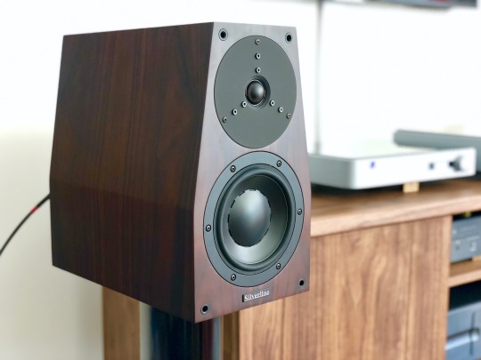
Silverline SR17 Supreme loudspeaker
The Audiophile Weekend Warrior (TAWW)
TAWW Rating: 5 / 5
Combining the body and scale of a larger speaker with traditional mini-monitor virtues, the SR17 Supreme is an exceptional conveyor of musical color and expression.
PROS: Organic midrange tone; top-to-bottom coherence; ample scale and dynamics; superb imaging; unfussy setup.
CONS: Smidge of lower midrange coloration; favors acoustic over electronic music; awkward recessed terminals.
This review has been a long time coming. Back in 2010, @mgd-taww gave the Silverline SR17 Supreme (USD $7,500) a rave review in Bound for Sound magazine, and heartily recommended them to me as an upgrade to my Merlin TSM speakers. It took me 8 years and a move to the West Coast to finally reach out to Silverline for a review pair; then another 15 months of listening to get around to this review. In the meantime, lots of speakers have come and gone in the market, particularly in the 2-way monitor category saturated with offerings at every conceivable price point. And yet, to my ears, the SR17 Supreme endures as one of the most satisfying speakers of its kind. Read on for my take on how it’s withstood the test of time.
History & Design
Silverline is a small speaker manufacturer based out of Walnut Creek, California, a short drive northeast of San Francisco. The SR17 is one of their first models dating back to a couple years after their incorporation in 1996:
1998: The SR17 debuted at the 1998 Stereophile Show in LA, sporting a Dynaudio D28/2 tweeter and Esotec 17WLQ midwoofer.
1999: Updated with an Esotec D260 tweeter and revised crossover.
2004: The SR17.5 was introduced, with increased internal volume via a deeper cabinet for better bass response.
2009: The SR17 Supreme is introduced with an Esotar T330D tweeter and further refinements.
Proprietor/designer/craftsman Alan Yun has continued tweaking the Supreme over the last decade, and though the Dynaudio drivers he prefers are out of production he’s stockpiled enough units for years of production and repairs. The enclosure, recognizable by its trapezoidal shape and depth, is manufactured in China by a shop that does cabinet work for a number of high-end marques, with final assembly performed by Alan’s own hand. He shared a bit more about their production:
California has strict environmental regulations. The paints on cabinets are governed by strict rules, and is why there are fewer and fewer cabinet makers in California. Many manufacturers now find their production overseas.
Actually our cabinets were rawly made in China, painted, and the final detailing is done by me, also putting sonic materials inside the cabinets. This job is pretty tricky for tweaking the sound. The crossovers were handmade by me, matching components, soldering, etc. The drivers were fitted carefully and precisely by my hands with European-made T-15A screws. Final testing and listening are all done by me in my workshop. 😅 Therefore, the SR 17 is rather unique. I am also the original designer of this shape/type of speaker cabinet since 1996. I did research and to the best of my knowledge there were no similar designs then.
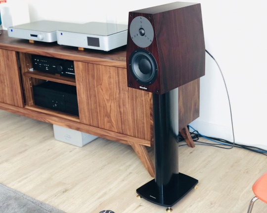
Large, but not ungainly, atop Dynaudio Stand 6′s
The depth of the cabinet - 15 inches, to be exact - gives it a rather top-heavy look on a typical stand, but it’s mitigated by the elegant tapered profile. My pair was impeccably finished on all sides in rosewood veneer. Rapping down the sides revealed it to be very solid, but not as fanatically braced and damped as my old Merlin TSM monitors or the Audiovector SR 1. Each speaker weighs around 26 lbs. The bi-wire terminals are recessed, which made them a bit of a pain, particularly as they have larger rectangular posts that will take 1/4" spades only in certain directions - I recommend banana terminations.
The crossover sports just 4 components, with 1st order high-pass (tweeter) and 2nd order low-pass (woofer) filters. Parts quality - Solen metallized polypropylene capacitors, a generic-looking wirewound resistor and an air-core inductor - is solid but hardly fancy, a deliberate decision by Alan who isn’t much of a believer in expensive boutique parts. Based on the results he’s achieved here, it’s hard to argue.
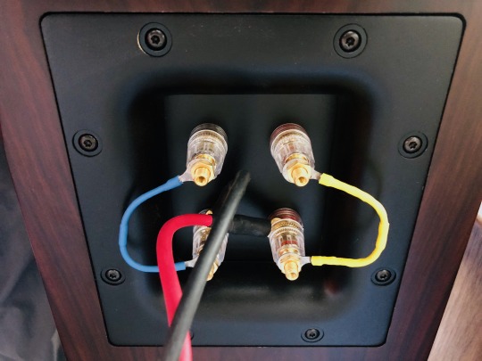
Cardas jumpers sounded better than the stock bridges to my ears. Stick with bananas for the cable termination - spades are awkward.
Setup
The SR17 is fairly efficient (nominally 90.5 dB/watt @ 8 ohms), but more importantly it's easy to drive - my Ayre AX7e, known for being rather limited in the power delivery department, sounded open and effortless. Alan Yun said the Dynaudio drivers love current and will benefit from powerful amplifiers, yet will sing with low-powered tube amps. I can confirm it loved the grunt of the 300wpc Bryston 4B Cubed, yet I never felt lower-power amps like the Ayre or Bryston B60 integrateds were lacking for dynamics. And my favorite pairing by far was with the 55-watt Valvet A4 Mk.II class A monoblocks sporting a single pair of bipolar output devices. (Incidentally, Alan’s favorite amp paring with the SR17 is the 30-watt Pass Labs XA30.5, which @mgd-taww can attest to being a magical combo.)
Similarly, I found the SR17 easy-going when it came to cables. My preferred cable had more to do with the amp used, but I got good results from a single run of Audience Au24 SX [review], Cardas Clear Light and DH Labs Q10 Signature cables. With the Audience, I felt the speaker was the sweetest and most dimensional; the DH Labs brought out more bass power and treble brilliance; while the Cardas brought out more upper midrange presence. With the Bryston 4B3 amp, I settled on the Cardas; with the Ayre and Valvet, the Audience was the clear winner. Unlike with the Audiovector SR 1 Avantgarde Arreté (review forthcoming), I didn't find bi-wiring to lend a noticeable improvement, but I did prefer replacing the stock metal jumpers with nicer Cardas ones from my Merlin TSM's for a little more refinement.
As with any high-quality monitor, stands are important. Something around 24-25” height seems right, though I wouldn’t be afraid to sit them an inch or two lower as the speakers are capable of projecting good image height. A trend these days is to decouple speakers from the stands/floor, but the SR17’s are “old school” in that they prefer tight coupling, meaning heavy suckers with spikes and a judicious amount of BluTack on the top plate. My old Osiris stands, heavy dual-column steel beauties loaded with sand, were a perfect match, but sadly I sold them with my Merlin TSM’s; they were replaced by higher-WAF but inferior-sounding Dynaudio Stand 6’s, which in stock form are quite light and choked the sound of the Silverlines. Fortunately I was able to get them to a better place with some tweaks; not as good as the Osiris, but close. A better choice sonically might be something like the Target Audio MR stand with the four pillars mass-loaded.
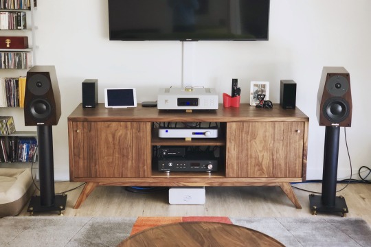
Pulling them out further improves imaging, but they still work well relatively close to the back wall.
Placement was pretty standard for a monitor speaker - keep it at least a couple feet from the back wall, with a 2:3 width-to-listener distance ratio and toed in about halfway. In my room, which has a number of living constraints, I had the back of the speaker about 21” from the wall, tweeters 76” apart and the plane of the speaker 8 ft. from my ears. While many small-box monitors rely (often excessively) on rear ports for low-end boost, the bass tuning on the SR17 is far more subtle and sophisticated - putting my ear to the port, I heard a fairly modest amount of output. I remarked this to Alan, and he described the port as more a method of pressure equalization than bass volume. This means in a pinch I could push the speakers as close as 12" from the wall without fear of low notes booming out of control. All in all, for being such a high-performing design, the SR17 is remarkably easy to live with.
The Sound
The first thing my wife, a professional oboist, noticed about music through the SR17 is how dynamically alive it was. I had just wrapped up my review of the Silverline Minuet Grand, a superb $2k speaker that is no dynamic slouch itself. And even though the SR17 was fresh out of the box and Alan warned me it would take some time to run in, the very first notes from the SR17 sung with expressiveness and vibrance. I think it took all of 15 minutes of listening to Royal Concertgebouw Orchestra streaming radio for her to remark, “I like this speaker.” She’s normally nonchalant about hi-fi, and yet has ears that can pick apart sonic deficiencies in about 90 seconds, so that amounts to a rave! And what made it so immediately engaging wasn't some artificial emphasis or hype; it was a feeling of unimpeded dynamic flow that makes most other speakers sound a bit drab. The SR17 lets music breath freely, carrying you with the ebb and flow of a tune and conveying every turn of a phrase with a sense of ease and conviction.
The next thing we noticed is how natural and palpable everything sounds through the SR17. Tonally, the SR17 is on the very slightly warm side of neutral; it combines reassuring solidity and density from the mid-bass through the midrange with an open, extended top end and fine harmonic resolution. Its ability to paint with a wide palette of tonal colors brings out the distinctive character of instruments and voices, making orchestral music a delight - just put on a Living Stereo recording such as Debussy’s Iberia [Tidal, Qobuz, Spotify] and the front of your room will explode with the virtuosity of the Chicago Symphony Orchestra’s playing. Scale it down to smaller stuff like a Beethoven string quartet, and you’ll savor the finer gradations of timbre between the cello, viola and violin.
What you won’t notice is any discontinuity between the woofer and tweeter. These Dynaudio drivers were made to work together, and the minimal crossover mating them is superbly executed. The upper midrange around the crossover point is seamless, and I can’t remember a single moment over the course of hundreds of hours of listening when I noticed the tweeter sticking out on the face of the speaker, something that ails even the finest, most expensive dynamic speakers from time to time. In this respect the SR17 is up there with the very best and is utterly free of listening fatiguing.
As a violinist, I feel obliged to point out the Silverline’s superb reproduction of the violin G string. If you ever want to test out a speaker’s tonal truthfulness in the lower midrange (right around middle C, 262Hz), put on the 2nd movement of the Glazunov violin concerto performed by Jascha Heifetz [Tidal, Qobuz, Spotify], or the 2nd movement of the Sibelius concerto performed by Lisa Batiashvili [Tidal, Spotify]. This is oh-so-tricky to get right; as the lowest string on the instrument, it’s the richest and deepest; and yet the violin is not a viola or cello - it’s a more subtle and delicate richness. Speakers that lack body will sound thin and washed out and minimize the difference in timbre vs. the D string above; woolly or bloated speakers will thicken it or blow the instrument out of proportion. The SR17 performs this balancing act better than anything I’ve heard in my living room, or in most any system for that matter. It rides the line between warmth and clarity in that register, lending tangible realism to piano, male vocals and low brass instruments as well.
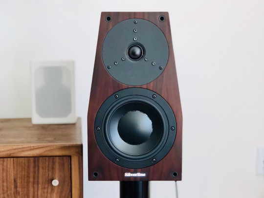
Going down the frequency range, the SR17’s extra cabinet volume vs. a typical mini monitor gives it power and scale more akin to a floorstander. My room is a 17 x 19 x 8.5 ft. open layout living/kitchen area with floor-to-ceiling windows and an offset listening point along the long wall, so while not huge, it presents a bit of an acoustic challenge that smaller speakers have struggled to fill. The SR17 had no trouble projecting a big, bold sonic image, and can cleanly play as loud as you’d reasonably want in such a space. It has sufficient body and power down to 60Hz or so to give music real foundation, with meaningful output down to 40Hz. I think Silverline’s quoted 32Hz bottom limit is a bit optimistic (or perhaps you just need the right room), and I preferred the speaker with my REL T-9 subwoofer providing a little extra oomph. But for a great many listeners in moderately-sized spaces, this will be all the speaker you ever need. Listening to “The Elephant” from Saint-Saëns Carnival of the Animals [Tidal, Qobuz, Spotify], a track I’ve heard on some very full-range speakers (e.g. Focal Grande Utopia EM Evo), the double bass is big and present, lacking a bit of rumble that was easily provided by flipping on the REL sub. Piano left hand similarly has nice weight, never sounding diminished in scale as typically happens on small monitors. Debussy’s Ariettes oubliées song cycle from the album Paysages by soprano Susanna Phillips and pianist Myra Huang [Tidal, Spotify] is a lovely test of colors, with ethereal vocals floating above dark undertones from the piano’s lower register. The Silverline possesses suficient extension and body to bring out these contrasts with depth and balance.
At the opposite end, the old-school Esotar tweeter is still one of the most musical high frequency transducers around. It balances detail with smoothness, extends low enough to mate perfectly with the woofer, and never sounds strained - a substantial upgrade in resolution and realism over the typical metal or silk domes in lesser speakers. In top-end extension and speed it might be bettered by some of the newfangled devices like Focal’s beryllium or B&W’s diamond domes, Scanspeak’s latest Revelator or the fantastic AMT in the Audiovector SR 1, but it’s a relatively small sin of omission and a worthwhile trade off to avoid any hint of unnatural edge or ringing. And it still has plenty of sharpness and sparkle, lending nice bite to trumpets and sheen to triangles and cymbals.
Last but not least, there’s that soundstage - present and tactile, but never in-your-face. Particularly when coupled with gear with sufficient resolution to relay subtle ambient information, e.g. the Pass XP10 preamp, there’s a real sense of the layout and layers of a symphony orchestra. The hi-res LSO Live recording of Mendelssohn’s "Reformation" Symphony with the London Symphony/Gardiner [Tidal, Qobuz, Spotify] paints a vivid picture of the stage of the Barbican, with brass fanfares anchored closer to the back wall of the fan-shaped stage, and the smaller string section sounding up front and intimate. An interesting twist in this performance is Sir Gardiner had the violinists standing to emphasize the virtuosity of Mendelssohn’s writing, and while I can’t say I would have been able to tell this from listening alone, the Silverline does convey a subtle sense of freedom and space to the violin section that I’ve missed when listening to the recording on other systems. And it has no trouble imaging well outside the bounds of the speaker, with percussion and harp on the extreme left of the stage floating eerily behind and beyond the left speaker.
I think my wife put it best when I asked her one day how the system sounded with the Silverlines: “this is what I imagine it sounded like in the concert hall.” While I’ve broken down a bunch of its strengths in audiophile terms above, it’s the way it puts everything together into a musically vivid whole that makes it special. There’s an evenness of tone, a naturalness of perspective, an ease of dynamic expression, a consistency of refinement from top to bottom that gives music a sense of rightness that allows one to forget the hi-fi aspects and focus on the musical performance. In this respect, Alan Yun has crafted something truly masterful in the SR17 Supreme.
Caveats & Comparisons
I’ll nitpick a few things that were relatively minor deficiencies to my ears, but may weigh more heavily for people with different tastes. These were highlighted in my own home by direct comparison with another very fine monitor speaker, the Audiovector SR 1 Avantgarde Arreté ($6,200 in premium finish). I also have my long-term reference, the Merlin TSM-MXe (around $6k several years ago) as a baseline.
First off, I suspect the Silverline’s hint of lower midrange warmth, while sounding natural and consonant with much of my favored acoustic music, may come from a bit of otherwise well-controlled cabinet resonance. It gently highlights the woody quality of acoustic instruments, but with electronic music it comes across as a slight coloration - a bit like wearing orange-tinted sunglasses that make everything look a little less cool. It’s very subtle, and not enough to sound overtly “boxy” or throw voices off, but it’s not transcendentally-clean like the Audiovector or, say, a Magico. My sense is Alan wisely tuned the SR17 cabinet for this response, as additional bracing would just make the resonance peakier and higher in frequency where the ear is more sensitive; as it is, it’s a gentle and diffuse coloration. Part of this may also be the sonic signature of the Esotec woofer’s magnesium silicate polymer cone, which I’ve heard in a number of speakers and to my ears trades better damping for a hair less crispness vs. some of the fancier treated paper or composite cones out there. On the plus side, it never sounds dry as some of those drivers can, but with Erlend Øye’s Unrest [Tidal, Qobuz, Spotify] or Carley Rae Jepsen’s Emotion [Tidal, Qobuz, Spotify] I found the Audiovector conveyed more of hard-wired immediacy and edge suitable for those albums.
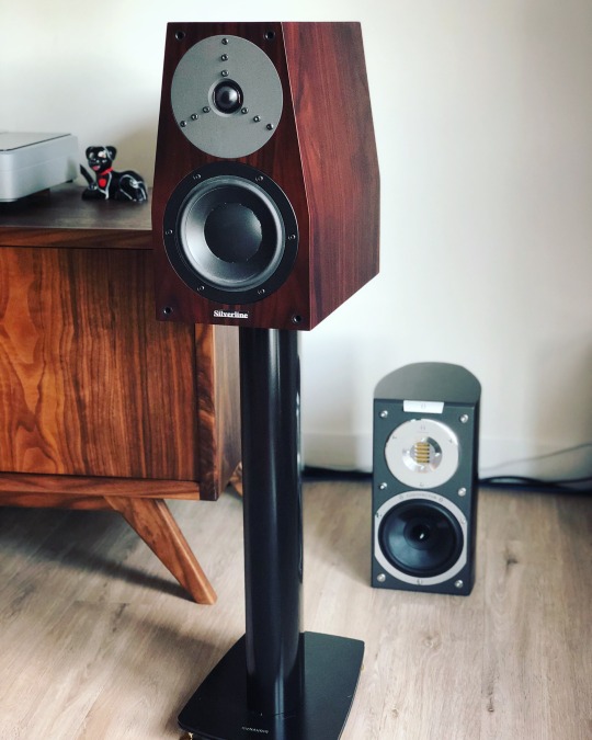
Taking turns with the Audiovector SR 1 Avantgarde Arreté
Another area where the Audiovector came out slightly ahead of the Silverlines was in resolution during loud dynamic peaks. The Audiovector is truly special in this regard, being designed for minimal signal compression and sounding incredibly collected the louder you play them. The Silverline also plays loudly with ease, but vs. the über-clean Audiovector it’s very slightly thicker and more congested. Case in point are the fortissimo climaxes and interruptions in Rossini’s L’italiana in Algeri overture [Tidal, Spotify] - when the orchestra comes crashing in after the pianissimo pizzicato opening, both speakers are clean and explosive, but the Audiovector sorts out the different instruments playing in unison for that brief moment a hair better, while the Silverline has more low-end oomph.
As mentioned prior, the Silverline’s superb Esotar tweeter isn’t the state-of-the-art in extension. It has plenty of resolution, but if you favor extremely extended and airy highs, e.g. the 52kHz-rated AMT tweeter in the Audiovector will give you more of that. I don’t think that ultimately matters so much for musical enjoyment (and many people can’t hear very well above 10kHz anyway), but it does make a subtle difference in realism. It also makes the Silverline’s treble a bit more forgiving of poor recordings and upstream components (silver cables could work) - it’ll never, ever burn your ears off.
The $7,500 price tag of the Silverline puts it squarely above the very crowded $5k-and-under monitor crowd, but short of the $10k+ “super monitor” category. Comparisons with other speakers are more conjecture on my part as I haven’t heard them in my own room... but I’ll mention a few things I’ve gotten a good listen to at shows, dealers, and other people’s systems.
Paradigm’s Persona series seems to be mentioned quite frequently in audio forums these days, and I heard the Persona B monitor ($7,000) briefly at RMAF. I’ve also listened to the floorstanding Persona 3F a bit, and there’s definitely a common house sound - fast, crisp, detailed and dynamic. I’ve never warmed up to either of them - they’ve struck me as rather strident, with instrumental interplays like oboes and clarinets playing in harmony tending to sound compressed. The Silverline by comparison may sound a bit thicker, but it has far more natural instrumental timbre to my ears, is less bright and thus easier to match to more systems, throws a more dimensional and properly-placed soundstage, and is very nearly as “fast” without sounding edgy. I’m honestly at a loss as to why the Personas are garnering so much praise, so maybe it’s just me? A similar argument could be made for the B&W 805 S3 ($6,000) - while I haven’t auditioned them specifically, I’m pretty familiar with the 800-series sound and again, it’s not my cup of tea. The Silverline’s balance and openness just strike me as much more natural than anything I’ve heard from B&W. So if the likes of B&W and Paradigm leave you a bit cold, the SR17 Supreme might be a step in the right direction.
An obvious comparison is to Dynaudio’s own bookshelves, specifically the Contour 20 ($5,000) and Special Forty ($2,995). You can read about them in my quick review from a dealer audition, and while I haven’t heard them head-to-head, I posit that the Silverline a worthwhile step up in coherence and musicality. If you can’t stretch the budget for the Silverline I think the Special Forty would be a good alternative, but it does not have the near-reference level neutrality of the Silverline. In the past Dynaudio had a bit of a reputation for not being as good at implementing their own drivers in complete loudspeakers as other companies were, and while I think their latest efforts are much improved, Alan Yun still seems to be squeezing more out of the old Esotar/Esotec drivers in the SR17... methinks this is a reflection of Alan’s sharp ear and painstaking hand-tuning.
A few more offhandish observations based on extremely limited auditions, so take with a block of salt: I heard the Wilson Audio TuneTot ($9,800) at a dealer shortly after its release. With the caveats that it’s designed for a totally different use case, it was in an unfamiliar setup and this pair wasn’t fully run in, I didn’t find it nearly as compelling or expressive. I got a good listen to the TAD Micro Evolution One ($12,495) with a couple different amps and found its midrange rather dry, upper midrange a bit peaky and its bass lacking fullness and extension vs. the Silverline. The Artist Cloner Rebel Reference ($16k w/stands) wowed me at RMAF - it seemed to have more speed and resolution than the Silverline, though the upper midrange was a hair pronounced. It would be an interesting comparison, even at twice the price. Another interesting monitor at RMAF was the Stenheim Alumine Two ($13k) which was super clean and detailed, but perhaps not as liquid. A more logical competitor/upgrade could be the Sonus faber Electa Amator III ($10k) that I also heard at RMAF. That speaker absolutely blew me away with its expressiveness, natural richness, insane dynamics and huge presentation in the show setup. It’s the speaker that I’m most dying to compare to the Silverline.
And to wrap up the comparison to my Merlins and the Audiovectors - I sold my beloved Merlins shortly after receiving the Silverlines, and wound up purchasing both the Silverlines and the Audiovectors as I just couldn’t decide between the two. That should give you an idea of just how much I like them both; I’ll have more to say about the Audiovector in a forthcoming review.
Verdict
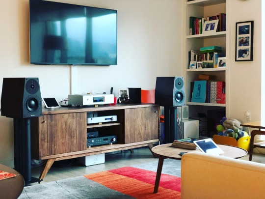
It's been said speakers mirror the personality of their designers, and if you've met the talented and affable Alan Yun no doubt you’ll feel his influence. Much like the man behind it, the SR17 Supreme is sharp, earnest and engaging, yet easy-going, with an unforced warmth and great attention to detail. There’s something grounded and unfussy about the way it allows music to flow forth, feeling like it's taken an expressive limiter off of a recording without hyping it in any way. It checks off many of the audiophile boxes too - imaging, tonal balance, bass power and extension, etc. etc. - but focusing on those mechanical aspects, as excellent as they are, would be selling Alan’s accomplishment short. The SR17 Supreme is first and foremost a faithful and thoroughly enjoyable reproducer of music, one capable of strongly evoking the beauty of the original musical event. There are countless 2-way monitors superficially like this one, but few that I know that are so meticulously and lovingly tuned to such great effect.
I've spent a lot of words espousing this speaker, but I think it's deserving of it, not just because of the obvious quality of the product, but because Silverline is a small manufacturer flying under the radar without a big dealer network or advertising budget. While Alan continues to develop his entry-level Minuet and Prelude lines at a more rapid pace to keep up with market demands, he doesn’t pen up new versions of his reference models every couple years to generate hype. He’s instead chosen his design fundamentals wisely and focused on perfecting their execution through years of painstaking refinement, much as the late Bobby Palkovic @ Merlin Music did. Like Bobby, he has a great ear for music, does a lot of the production work himself, and gains most of his sales through word of mouth. This does make it trickier to find than the big brands at a typical shop, but I strongly encourage seeking out an opportunity to hear it. The SR17 Supreme is a special speaker, and it won't be leaving my living room any time soon.
Silverline Audio P.O. Box 30574 Walnut Creek, CA 94598 USA
3 notes
·
View notes
Text
With Krolia’s appearance there’s been an entirely predictable surge of fanart and speculation around Keith’s parents, so, I wanted to make a post talking about Keith’s Dad, what we know about him, and a few major inferences we can make.
Appearance

Keith’s dad is taller than his son. Specifics are hard to finesse given s2e8 doesn’t give us very good shots to work with and he hasn’t appeared in the posters for seasons 1 and 2, but he’s fairly tall by human standards. Eyeballing here, he would seem to be half a head taller than Keith- Shiro’s height.

This would make him shorter than his partner, Krolia by a pretty impressive margin- Krolia would be at least a full head taller if not moreso.
Keith’s father seems to have gray or slate-blue eyes. While it’s possible (and I’ve speculated before) he may have the same purple eyes as his son, I’ve moved away from that headcanon, since Keith is more likely to have inherited those eyes from Krolia. Either way, specifics are difficult in the heavy sepia tone of the dream.
His most noteworthy feature, besides his height, is a good-sized diagonal scar notching his right eyebrow. He has thick, dark brows, strong cheekbones, a straight nose and an angular jawline. In the dream, he appears with stubble along the bottom of his chin, but not on his upper lip.
He speaks with a low, soft voice, with a noticeable southern accent. His word choice is pretty casual but he doesn’t seem particularly inclined to colloquialisms.
Keith’s father has short, shaggy black hair, and it seems that Keith inherited both his skin tone and hair color. He appears to have wide shoulders, giving him a sturdier build than Krolia’s more typical-for-a-galra whippy physique- in this sense Keith seems to take after his mother more than his father.
The Shack

Keith’s father appears to have a personal connection with the shack and it may be a place from Keith’s past- as the dream takes place within it, and Keith’s father states “You’re home,” implying the shack was at least for a time, a home to Keith. Keith also states he felt lost and “drawn out to” the shack when his instinct seems to naturally point him towards certain things of significance to him.
It’s more likely that Keith’s father, rather than Keith himself- the latter being a recently-expelled student without an obvious job or income- was the original architect of the shack, or at least, heavily renovated it to make it a livable place. Thus, there’s some things we can infer about Keith’s father from the nature of the shack.

Visually, the shack is very humble. It has curtains and a table, but the curtain is effectively a piece of sheer cloth tacked to the wall in strategic places and the table is a slab stacked on top of concrete bricks. The couch has a blanket, suggesting it doubles as a bed, and the walls are discolored and partially cracked.
This would seem to suggest Keith’s father is someone of very limited means, and possibly- like Keith himself when he withdrew to the shack- someone trying to avoid calling attention to himself by retreating from society. The drab colors of the shack match the clothes Keith remembers his father wearing- a palette of grays, browns, and whites.
However, “impoverished” is not the only message sent by the shack. It’s also rather crowded- and what it’s crowded with.
A simple shelf has been built into one wall and filled with books; more books top the cabinet and are stacked under the table, and several boxes full of more books are tucked in the corner. Another box full of what appear to be rolled posters or maps is near the shelf.
The reading material in the shack is not referenced so far, so we can’t guess at subject but they appear to be fairly thick volumes, in decent condition (not yellowed or battered-looking) and they have monochromatic, dull dust jackets.

Besides the books, one wall features a large poster that looks like specs for some form of hovercraft. (this picture also shows off a fair number of the books referenced before; note the labels affixed to some of them). Besides the large cork board, small notes appear tacked to the wall near the poster.
Also, in contrast to the very humble furniture, the shack is rather heavily technologically equipped. In the wide shot in the dream (first picture at the top of the post) there’s a desk with a computer keyboard, and several unknown machines are littered around the room. Most notable is the tall cabinet, which conspicuously, in the dream, Keith’s father makes his first appearance fiddling with one of the dials, appearing to tune it like a radio. (Personally, I find this very suspicious given that in s1e1 Pidge was canonically able to listen in on extraterrestrial radio chatter given a setup that she could build on her own and carry in a backpack)
While it’s ambiguous how much of this Keith brought in starting his own work looking for the Blue Lion, I’m very skeptical that again, a freshly-expelled student without a job brought all of these books, papers, and the cork board with its pins and strings in to accommodate it.

Especially not Keith- who has been shown to keep very spartan quarters in the castleship and as of s2e6 everything he owned could fit in a single, not especially heavy bag.
That in the dream, his father is the one tampering with the equipment while Keith in the shack never touches it would further suggest that it isn’t Keith’s setup- it’s his father’s. Quite possibly Keith didn’t even know what to do with it.
It’s also noteworthy that the shack, viewed from the outside, seems to have both an antenna and a small, boxy, metallic attachment that would seem to be a generator.
Assuming the shack and most of its furnishings are the handiwork of Keith’s father, with Keith himself only bringing to it a backpack’s worth of belongings and the papers/photographs relevant to his personal study of Blue’s cavern, this implies several things about Keith’s father:
He is a resourceful person, having possibly constructed a one-room house off the grid and assembled furnishings. Someone who makes the most out of very little- and can work pretty well with bare minimum.
Someone with fairly significant technical skills, who could get all of this together, use and maintain it. Possibly having built the generator and wired things into the walls.
Highly educated, either self-taught or with impressive schooling. The books, the schematic posters, the equipment- that these things are maintained, when he seems to have shorted his own needs (the couch-bed) to maintain this.
Acting according to some kind of goal- the shack has the feeling of a research outpost.
Not picky or fussy, someone who seems to have lived in this very humble and potentially uncomfortable environment for a good amount of time. Again, much of the shack’s humbleness is echoed by Keith’s father’s appearance- the unshaven stubble, the humble, sturdy browns and grays.
Behavior (the trial dream)

It’s worth noting the trial is, partially, an unreliable narrator. We can see this comparing Shiro to his trial self. But Keith’s father appearing in the trial at all tells us something about him, and his relationship to Keith in particular.
When Trial Hologram Shiro shows up, the real one questions Kolivan about this- to which Kolivan replies:
His suit has the ability to create a virtual mindscape, reflecting its wearer’s greatest hopes and fears. And, at this moment, your friend desperately wants to see you.

So the second half of the trial is a fairly standard “get in your head and tempt you with what you really want’, but, it’s worth noting the context here.
Keith is injured, exhausted, and alone in an unpleasant environment. Without obvious enemies to fuel his contrarian streak or any clear objective in front of him to focus on, and as weak as he is (he basically passed out on the floor to begin this segment) he’s experiencing a very natural phenomenon: he doesn’t wanna be here. He yearns, specifically, for comfort, reassurance, someone to get him out of here and take him back home where he feels safe.
And this is exactly what hologram Shiro initially offers him- immediately greeting him warmly and soothingly, talking about how Keith won, he did it, he succeeded, he’s achieved amazing things and they can go back to the castle now.
The temptation the trial is dangling in front of Keith is that sense of reassurance. And the first party is one where we have a good sense of his relationship with Keith, and what that means.
Shiro wasn’t selected because he was there in person, he was selected by Keith’s mind, because when Keith is looking for someone to help and comfort him, he thinks of Shiro. Shiro who’s been there for him before, who he values his connection with very highly. Simply- Shiro, to Keith, is a kind of safety person. On a certain level, alone and miserable, what Keith’s mind kicks out is “I wish Shiro were here to help me.”
But even though Shiro was the main person in Keith’s life before Voltron, and in s3e1 Keith says Shiro was “the only person to never give up on me”- he’s not the only person that fits that bill.
The other person Keith wants to see... is his father. And the trial hologram of his dad exudes much the same kind of presence hologram Shiro does- this warm, soothing reassurance that everything’s gonna be all right, it’s gonna be fine. You’re safe now, Keith, you don’t have to worry, you can give in to your exhaustion and just... rest. The people that love you will take care of it.
Unlike Krolia- who Keith doesn’t appear to have a clear memory of, only a vague sense of “she was there up to a point and then she wasn’t”- Keith remembers his father clearly, and the implication of the holograms would suggest that Keith remembers his father as a kind, nurturing presence- even more than Shiro.
Because hologram Shiro, when refused even slightly, loses his temper- snaps at Keith, calls him selfish, storms off on him. Which is true to life in the sense that Shiro, while compassionate, is also pretty snappy- and untrue in the sense that Shiro is a lot more sympathetic to Keith.
But the hologram of Keith’s father, which should logically be less sympathetic, less supportive, and more manipulative than the real thing because it ultimately only exists to lure Keith off the proper path and into giving up... stands out noticeably compared to the first hologram.
He never once raises his voice, and as opposed to holo Shiro, who, again, tries to shut Keith down as soon as he starts disagreeing- the image of Keith’s father spends almost the entire scene with his hands outstretched, palm-up, towards Keith, the knife resting on his open hands.
In short, the impression given by Keith’s father is gentle and soothing. He presses very little, which is again noteworthy because the hologram’s objective is to manipulate Keith; that manipulation comes through in the form of repeated reassurances that everything will be fine, they’re safe here, it’s okay. Keith’s mother is coming home, they’ll be together, they need to catch up after how long they’ve been separated.
And Keith, in response... is surprisingly mild-mannered himself when it comes to his father. We wouldn’t expect Keith to apologize for running to Red during an attack.
In short, the implication is that Keith remembers his father as an incredibly gentle, emotionally nurturing person- someone who virtually never raised his voice, and someone who, even after years of separation and a lot of unanswered questions, he still views warmly. Between Krolia and Keith’s father, it seems like the latter was Keith’s primary caretaker, at least the one he remembered more strongly.

Keith also seems to remember his father as grieving. Not only this particular mournful look that he gives when Keith is about to leave the dream, but the weary way he says “Son, so many years have passed...”
Whatever was going on in their lives when Keith and his father were together, it seems to have been an emotional burden on his father, leaving him in Keith’s memory as kind of a melancholy fellow.

It’s also possible that Keith’s father not giving him solid answers and instead trying to reassure him was something else the trial took from real life.
We know that Krolia is a soldier, on the lines of what has been, for the Blade, a very long and rather hopeless-seeming war. Before Voltron took the field, the empire had been steadily encroaching further and further, conquering more and more, and the Blade had their small acts of sabotage in the dark, for which many of them paid with their lives.
Keith’s father has to have known that. It’s very likely given the implications of the radio (and worth noting that the sound of garbled voices from the radio undercut a good part of the conversation Keith has with his dad) he was desperately looking for some kind of news from Krolia- possibly even a sign that she was still alive.
It’s stated in official sources that Keith lost his parents at a young age. He wasn’t a young adult the last time he saw his father- these memories are old, of a time when Keith was much smaller.
Most people, especially empathetic parents that appear to be making a lot of effort to be reassuring, aren’t going to want to tell a young child that their mother may have died in space fighting a thankless war and that an unstoppable space empire is going to descend on Earth to kill and/or enslave them all. There’s really no good way to soften the edges off that.
Putting it all together
So the implication here is that Keith’s father is a sort of humble, down-to-earth and gentle person, but with a keen intellect and very resourceful. He doesn’t appear to make his opinions very easily available, and possibly is even the type to bite his tongue on issues he doesn’t like.
Keith seems to recall him as a sweet and empathetic parent. It’s clear from the way Keith talks to him in the dream that he still has a lot of respect for him even after years of separation- he thinks fondly of his father, though there are also a lot of questions that Keith badly wants answered. And whether or not it’s the influence of the trial, at least what we’ve seen of Keith’s father so far suggests he’s a bit inclined to beating around the bush.
Implicitly from the face he makes at the knife and how he talks both about catching up with Keith and offering reassurances that Krolia will be coming as well- Keith’s father really wants his family to be together. This is likely the root of his somewhat mournful behavior- while he was raising Keith, it seems as if he was visibly upset that Krolia was no longer part of their lives, enough that this became an enduring part of how Keith remembered him.
As was him messing with the radio- seemingly, waiting on some word from her.
It’s also surprisingly easy for Keith, someone who has been shown to assume no one will miss him, to view his father as earnestly wanting him back, waiting for him with both literal and figurative open arms. If anything, the image of his father is hesitant, apologetic- seeking Keith’s consent to be there at all.
All of this seems to suggest Keith’s father is not a very confrontational person at all. If upset, he tends to suffer in silence, and this may be a way in which Keith takes after him- if we can assume Keith and his father share the same tendency to internalize and stew in feelings for long periods of time.
However, the implications of the shack would tell us that Keith’s father is not weak-willed or passive. The shack implies someone who’s able to endure hardship, practically solve problems and, if need be, get off the grid and stay off the grid for long periods of time. Living alone distant from society is difficult, and it’s not for everyone. That he would do so as a single parent raising his half-alien son would tell us that Keith’s father is made of some tough stuff.
That even with the trial having a vested interest in manipulating Keith, it’s hard-pressed to create a “convincing” scenario of Keith’s father losing his temper at him would tell us, rather than the man having no backbone, he cared about his son a lot.
Which makes a lot of sense, from what we see on Krolia’s end. Keith’s parents’ situation was not ideal, nor was it comfortable. They weren’t going into something where they could retire comfortably to the suburbs and have two-point-five children. Especially given the obvious and rather nasty prejudice the empire has against half-galra, Krolia was painting a big target on her back and that of her future children by choosing Keith’s father as her partner.
And yet- Keith exists. And unmistakably, what we see from both of his parents is they wanted him. Krolia- distant, pragmatic Krolia- unmistakably puts Keith as a very high priority, derailing the all-important mission in a heartbeat rather than gamble his welfare.
And as far as Keith’s father- it’s entirely possible he basically became a hermit just to protect Keith. He harbored some pretty terrible knowledge of what potentially was to come, what might be happening out there, what he might be completely powerless to stop- and for all the stresses of Keith’s family situation, Keith seems to remember his father as someone who, even in a disagreement- would never close himself off.
Right up until the end of the dream, Keith’s father stands back, not intruding, still offering the knife, that opportunity to go home, reconnect with both of his parents. There’s no “wrong answer” Keith can possibly give that will make his dad give up on him- which means breaking the dream, waking up, falls to Keith. Keith has to open the door and leave the protection of the shack to go to the Red Lion.
Significantly, in doing so, he’s taking up his mother’s cause- stepping into that same war against the empire.
But equally significantly, if the shack is something built by Keith’s father... it’s interesting that in basically his darkest hour pre-series, it was there for him. Interesting that the dream characterizes it as a fortress, in effect- that Keith’s father might not be fighting the empire, seemingly, but he was sure as hell prepared to hide a paladin of Voltron from attacking soldiers. Again, just because Keith remembers him as a very gentle and accommodating person doesn’t mean his father wasn’t a hard person to be on the wrong side of... just that his willpower seems to assert itself in very quiet ways.
1K notes
·
View notes
Text
Ternet Ninja review (spoiler free)
When you mention the years 2004 and 2018, animation fans will tell you that these are the releases for The Incredibles and its anticipated sequel, but it also happens to be the time frame for another sequel gap in animation: Anders “Anden” Matthesen’s Terkel in Trouble and its spiritual successor, Ternet Ninja. Terkel, with its sharp sense of humor, is a massive cult hit among younger millennials and older gen Z kids here in Scandinavia, so now that Anden returns to the director’s chair, was it equally worth the wait as Brad Bird’s followup was, or is he better off committing seppuku after this? Let’s find out
The story
The movie spends its time answering a rather simple question: what if a possessed killer doll were to be the good guy, merely motivated by revenge on an evil man? The answer is a well told buddy story with its own set of twists and turns. If there’s one grievance I have, it’s that it has a very telegraphed third act misunderstanding, but even then, the scene where Aske and TN make up is still well put together with some great jokes. Speaking of which, the humor is also rather well done. It’s notably more subtle than that in Terkel for reasons I’ll speculate about later, characters don’t swear as much, and jokes aren’t unneccessarily crass solely for chock value. There are some references that might come off as dated, such as fidget spinners and dabbing, but again, they’re subtle, and I’d say Ternet makes these references in the same way Captain Underpants makes low-brow humor: Not out of a cynical belief that it’s the easy way to make kids laugh, but to tune in to the kids’ wavelength while being self aware about it. What the story offers has minor issues, but these are overshadowed by its positives
The animation
To an outsider, this might look like a rather generic 2010s CGI movie, but when you put it into the context of being a Terkel in Trouble followup, it truly shines for what it is. The animation had to have this look, partially because it comes from a small country, partially to match the more subtle humor, but especially to be an upgrade to its predecessor without being jarring, so the characters have a more realistic look to them that you can still buy as belonging to the same world. As for the character animation, it’s more on the energetic side, but is very capable of slowing down for quieter moments, something that Terkel really didn’t pull off too well. It also has a lot of creative moments, such as TN ventriloquizing with Aske as the dummy, or our two protagonists building a structure on the local playground and using its construction against Glenn. It also shines in its action scenes, being a big step up from Terkel.
On top of that, it has a scene done in 2D. In a better world, there would have been a certain treshold for CGI movies incorpating 2D in specific scenes that, when met, would bring back 2D, and in that better world, that treshold would’ve been met when Sherlock Gnomes did it. But alas, we’re still here, starved for those scraps of 2D that are thrown in every now and then. And I can’t say no to this 2D. I can only really describe it as having the general aesthetics and limited color palette of Kung Fu Panda’s 2D scenes with the stiff, paper cutout look of Quang’s Song from Terkel, and I’m really digging it
If there’s one thing I don’t like all that much, it’s the designs of returning characters. It shows that these characters were originally purposed for the rubberhose style of Terkel and that it doesn’t necessarily translate to this movie. Stewart looked jarring at first but I eventually accepted it, but some characters, like Arne and Terkel, straight up look younger than they did when we previously saw them. I struggle to believe that this Terkel is a father.
It might look generic on the surface, but for what it is, it’s very well crafted
The characters
There are only really three characters that take the front seat, but that’s all this movie really needs, so let’s get the others out of the way first. Sune is Aske’s brother and the comic relief alongside Aske’s friends, Jessica is the love interest, Glenn is the bully, Aske’s parents are mercifully not the typical asshole parents you’d see in a movie like this but don’t really stand out too much. These characters just provide a backdrop and that’s perfectly fine
As for the characters that debuted in Terkel, they play a similar role to the recognizable cartoons in Roger Rabbit and the video game characters in Wreck-it Ralph, all of them except Stewart are one-scene wonders and their main purpose is to draw in an audience already familiar with these characters, though Stewart has a major impact on the plot
To the main three, we have Aske, Ternet Ninja and Philip Eberfrø. Aske initially comes off as an audience surrogate, but gets a pretty well developed arc in which his friendship with TN (the heart of the movie by the way) causes him to care less for minor inconveniences in his life and more towards fighting for justice. He is also a pretty believable kid character, as we understand that the reason he’s so occupied with petty matters is because he’s just a kid who hasn’t really opened up his eyes to bigger injustices in the world.
Philip Eberfrø is the villain of the piece, being the owner of a sweatshop and having blood on his hands. What little we see of him committing acts of evil is hard to watch, but he spends most of the movie looming in the background. Certainly not a memorable villain, but a more down to earth and realistic one
And THEN there’s Ternet Ninja himself, Being a possessed doll with one very specific motivation only: Making Philip Eberfrø pay for his crimes. On the surface, he seems to act on pure samurai logic and tends to take things literally, which clashes with Aske’s modern suburbia life, but to a degree, he seems to be obfuscating that persona, seeing as he knows enough about petty school drama to weaponize it against Aske when he does not cooperate. He definitely has a mischievous streak and impersonates Aske on several occasions to further his own agenda, but deep down, he has a soft spot for the kid. There’s a lot more to him, but he really has to be seen to be believed
The movie doesn’t give a lot of characters development, but the development it does give is given where it matters
Verdict
This is a worthy followup! While certainly not perfect, Ternet Ninja gives us far superior animation to its predecessor and a mostly enjoyable story with a good heart, as well as well crafted humor. It certainly has problems, but few enough of them for me to give it my seal of approval
Story: 9/10 Animation: 8/10 Characters: 9/10 Overall: 9/10
1 note
·
View note
Text
Fantastic Beasts - Perfumes I associate with the characters (part 1)
Being really interested in fragrance profiling, I thought it could be fun to attempt this with the characters from Fantastic Beasts; hopefully you will find reading my list as entertaining as I did making it. This list includes recent and/or still available fragrances and vintage ones that were available during the movies time period (more or less, i choose 1935 as a limit). Please also check this list by @headsindreams. While I started mine before seeing their post, it certainly inspired me at some point and there’s some great choices there so check it out.
Newt Scamander
For Newt, I decided to go with fresh, green and aromatic scents with notes of citruses that translate both his love for nature and his optimism. I feel like natural, clean and slightly androgynous scents fit him the best. And I don’t know for you but a nice blend of green, herbal and citrus scents reminds me a lot of Hufflepuff!
Both Blenheim Bouquet by Penhaligon’s and Selection Verte by Creed are available since the early 1900s and both offer citrus accords, with a woody base for the first one and fresh minty notes for Selection Verte.
More recent fragrances that could fit him would be Verde by Nest, which feels more woody and “wild” (he’s an adventurer after all), with notes of fern, verbena, cedar and vetiver; and Verveine by L’Occitane en Provence, more floral than the others, but with a prominent note of lemon verbena.

Gellert Grindelwald
The leather family is the only olfactive family I could think of for Grindelwald. I wanted something strong and really intoxicating, dark and possibly reminiscent of winter.
Cuir de Russie by Guerlain fits really well in the sense that it opens on aromatic notes of lavender, thyme and rosemary, that give it a more “pastoral” effect (I feel like it could have given Credence a sense of freedom, compared to what he’s used to?), and progresses towards darker and muskier notes of resins, woods and civet.
For my modern pick I went with Dior Homme Parfum by Dior, which opens with a strong powdery iris, and progresses towards wood and leather accords.

Tina Goldstein
Tina’s color palette immediately came to mind when trying to find a match for her, so I decided to include white and “blue” flower notes. The comforting powdery effect of iris and violet felt also fitting for her protective and familial side, without feeling to warm. I tried to keep a woody or musky base to go with her “career girl” look.
My vintage picks may be more fitting for her “evening” look at the speakeasy, and share main “blue” notes of iris, violet and heliotrope. I choose L’Heure Bleue by Guerlain, which has more oriental and spicy notes than my other picks like vanilla, anise and clove, and Soir de Paris by Bourjois, slightly more sweet and fruity.
I went in a few different directions for my modern picks while still keeping a musk/floral/woody pattern. I really like the white floral and coffee notes of Noa by Cacharel for Tina, but the wood and iris notes of Chanel No 19 Poudre by Chanel are really fitting as well. And then there’s Daisy by Marc Jacobs, which as a more fruity side to it.

Percival Graves
Percival was a bit tricky since we didn’t truly see him in Fantastic Beasts. I didn’t want something too reminiscent of Grindlewald but they still needed some sort of connection. So I choose to keep the aromatic notes mentioned in Grindlewald’s part (mostly as a “at first you think it’s Graves but dig a little and you realize it’s not him” but also because I feel like Percival would like something that smells clean and fresh). Add to that some woody notes to make it more “classic masculine”, and eventually some other notes that reminded me of Seraphina.
And that’s how I decided on Hammam Bouquet by Penhaligon’s for my vintage pick. It does have the aromatic and woody feel I wanted for him, but with a strong note of rose that reminds me of Seraphina.
My modern picks are all pretty different... At The Barber’s by Maison Martin Margiela is a very convenient fresh, masculine and clean fragrance. Endymion by Penhaligon’s feels more sensual and warm, with main notes of lavender and coffee (we all know he lives on coffee). And then for Percival as “the President’s right hand” i choose something a bit different: Oud Wood by Tom Ford, which compliments well Seraphina’s perfume (see part 2).

(part 2)
#fantastic beasts#Perfume#fragrance#newt scamander#tina goldstein#percival graves#grindlewald#fbawtft
10 notes
·
View notes
Photo

Back to childhood with AppleWorks
Hi everyone! Today I'm going to tell you about a very old software that kept me busy for many, many hours during my teenage years and that I've had the pleasure of rediscovering these days. Apple fans will have glitter of nostalgia in their eyes, others will have the opportunity to discover a beautiful tool that has not forgotten to be compatible with Windows. It is AppleWorks! AppleWorks was an office suite, installed on all Apple computers of the time, which, in addition to the classic word processor, spreadsheet and Power Point presentation, also offered a vector drawing tool and a bitmap drawing tool. It was my first experience in digital drawing and photo manipulation and with a bit of inventiveness, I was able to get some amazing things out of it. Behind its apparent simplicity, this little soft hides an unsuspected power. Let's go for a little trip back in time!

Small overview
The painting module
Gallery of illustrations
Install AppleWorks (Yes! It still works! )
Small overview
AppleWorks is 6 softwares grouped into one. When you launch it, it offers you the possibility to create 6 types of documents: word processor, spreadsheet, database, presentation, bitmap drawing, vector drawing.
I quickly talk about Spreadsheet, Database and Presentation because I never used these modules. Anyway, know that with Spreadsheet you could make like with Excel, with Database, create databases and with Presentation, make like with Power Point. (You can click on the images to enlarge them to full size.)

And here are, then, the 3 modules that I really used!
The word processor

I wrote all my comics scripts, presentations and internship reports there when I was at school, until my dad bought Microsoft Office. Hard to compete with the Word arts. 8D Except that Microsoft Office did not offer vector drawing software, nor bitmap drawing software. So it was not about to dethrone AppleWorks.
The vector drawing module

This module helped me a lot to make diagrams to integrate in the word processor, draw dungeon plans for our Donjons and Dragons sessions, make some logos or paste editable text on images like my comics pages. I particularly liked its ability to generate gradients that roughly matched the shape in which they were applied, and there are recent vector drawing technologies that still can't do that and that's a little bit annoying to me. And finally, here is the module where I really spent the most time!
The bitmap drawing module
Well... Some geometrical shapes, a pencil, a brush, a filling tool, an eraser... So far it doesn't look much different from Paint. Wait until you see what it is capable of. :p
The painting module (bitmap drawing)
To begin, AppleWorks 6 is not the first version of AppleWorks that I worked with and already at that time, I had my little habits and what a disappointment for me when I didn't find my favorite features !! Looking for a little bit it turned out that they were just a little hidden and just needed to be tidied up a bit. Because yes! This small software already had a customizable interface by drag and drop as on a modern Photoshop!
Now all is clear, we can get to the heart of the matter: drawing! :p I've already mentioned the toolbar on the side earlyer, which is already familiar to you if you've ever used Paint. Now, let's move on to the area just below: the palettes. AppleWorks offers a limited palette of colors.

You can combine the selected color with a pattern to apply. Some of them look like manga screentones.

Some fun colorful patterns are also available.

And finally a small palette of gradients is also available.
Well... A few funny patterns, some gradients. It's enough to have fun for 5 minutes, but nothing special. We will going not very far. That's where the real work begins. :p Do you remember? A few moments ago I added buttons in the horizontal bar at the top, including this one.

And this is what it opens!

A customization window! :D Not enough colors in the default palette? Never mind! You can create as many color palettes as you want.

Not enough patterns either in black and white or in color? You can create as many pattern palettes as you want!


The default gradients palettes is too poor? No problem! You can create as many gradient palettes as you want! And for the moment, I spent a lot, a lot, a lot of time on this section! You can make circular gradients.

Linear gradients.

And gradients that fit the shape in which you apply them. Well, it's far from perfect with concave shapes, but it already allows for interesting things.

And to give the coup de grace to Paint, with AppleWorks you could even create your own brushes! :p

There are even some effects available such as blurring.
This AppleWorks is a piece of cake in the belly! :D Now that we know about its possibilities, I propose to show you a small gallery of what I was able to do with this software from end of nineties to middle of 2000s. :D
Gallery of illustrations
Let's start with the very first drawing I made with AppleWorks in 1998. We didn't have a scanner at the time, so I had to do it entirely with the mouse. It was also a time when I didn't have much notion of saving the original files and I considered that as soon as I had printed the drawing, it was no longer worth keeping it on the computer to save space (the hard drive was 4 GB). So this is a scan of the printed version you see here. x)
A good old Darth Vader! (1998)
Well, making a drawing from A to Z entirely with the mouse was laborious, so I also used AppleWorks to create backgrounds and print them. Then I would do my drawing by hand and cut it out and paste it onto the printed background. I was able to make interesting effects by understanding the limitations of the software and exploiting them. By understanding that gradients were composed of a series of solid color bands, I could make focus line effects by filling them with the filling tool with a different patterns or gradients.
This posing remind some Dragon Ball character (Between 1998 and 2000)
It is also with AppleWorks that I made my first attempts at photo manipulation. I used photos from an encyclopedia we had on CD-ROM and manipulate them by tinkering them and copying and pasting small pieces here and there. Then I printed my montages and paste them onto the comics pages.
My montages were mainly used for space scenery. (1999 - 2000 in collaboration with my sister)
This software really pushed me to be creative to get what I wanted out of it. I had even managed the tour de force of pasting a white lineart over a photo.
(2000 - 2001)
In the absence of layers, I had to work on 2 files in parallel and with the lasso select tool. And then one day, our first scanner finally arrived home! There the serious things could begin! I was able to stop trying to make drawings with the mouse and use AppleWorks to put in color drawings made with the traditional way. So I was able to go further from the end of nineties. It obviously started with Saint Seiya. x) (You can always click on the images to enlarge them to full size.)
I loved the Aquarius saint. He was my favorite character from Saint Seiya. ^^ (2000 - 2001, this way)
At the beginning I was just doing solid colors, but as I experimented with the features and learned how to combine them, I ended up getting more and more advanced renderings.
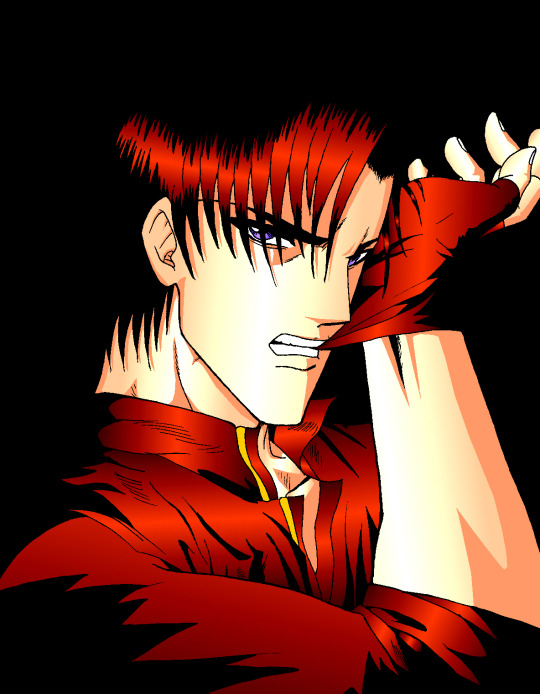
Aoshi Shinomori from Kenshin and Ashram from Record of Lodoss War. These two were also my favorites characters at one time. (Between 2004 and 2006)
If you have enlarged the images you must have noticed that the line is particularly crenellated. There was no antialiasing, no layer system with opacity levels, no tolerance threshold for the filling tool. So it had to be black, or white, but not in between. As a result, AppleWorks was not really adapted to work on drawings with small details, hatching or heavily detailled backgrounds...
I tried anyway. :p These last 4 examples I think I made them between 2004 and 2006. The comics pages come from the first version of the Nécrotech project which is currently in a dormant state (but which I intend to resume one day). You'll notice on the first image of the last page some effects whose style stands out a bit from the rest. It's normal, I made them in another old painting software, Art Dabbler, but this is another story. :p In 2007, I got tired of suffering, I started to use The Gimp, in 2008 I bought my first graphics tablet, in 2009 I embarked on the Photoshop adventure and you know the rest: I sold my soul to Promarkers and Clip Studio Paint. And then there are days like that, we fall back into childhood. (Click on the image to see it at full size and distinguish the pixel patterns. I know, I repeat myself, but the devil is in the details. :p )

Last week, I decided to make a theme of the Drink'N'Draw from A to Z with AppleWorks to see what I could get out of it with 15 more years of experience in drawing and illustration. 8D With some tips you can get a pretty amazing result! I am happy with the result, especially the colors. It wasn't done without pain. The feature I wanted to take full advantage of (customizing color patterns) is buggy on the Windows version of the software, so I had to set up a Mac OS X Snow Leopard virtual machine to be able to do the finishing touches. What an adventure! In any case, AppleWorks is always well adapted to make pixel art and this experience has allowed me to learn new things applicable in recent and professional softwares. I had never really tried pixel art, which I love, by apprehension of the execution time. I think I found the trigger to get serious about it. I will explore it further. :D Well, well, well! But in fact, calculating gradient patterns for pixel art with shaders shouldn't be complicated. I think I will add such an effect in Péguy ! :D
Install AppleWorks
You've read it right! You can still install and use AppleWorks in 2021! :D
Windows
I did the test with Windows 8.1 on my Cintiq Companion tablet from Wacom, and in the comments it seems that it also works very well on Windows 10. To do this you will first install the latest version of QuickTime 7 which you can find on this page. You double click on the installer and you do next, next, next... Even when you are asked if you have a product key. It is not mandatory and useless for our needs. Then you go to this page and download the first file. You unzip the file and double click on the installer, then same procedure as before: next, next, next... You can do retro digital painting now! :D
Mac OS X
Apple computers have changed so much in 20 years that it is now impossible or at least very complicated to run the original programs on today's machines. The manipulation therefore consists in using the Windows version with the Wine emulator. If I had no problem with the procedure, it may seem a bit complicated for non-technical profiles so I simply propose you to download the final application I created myself via this link on Google Drive. You just have to download it, unzip it (with a double click) and launch it. If you're a computer geek and want to get a version of AppleWorks without the color pattern bug, you can get the .dmg here and install it in a Snow Leopard virtual machine.
Be reasonable about the size of your files. This is an old software that will have trouble supporting surfaces exceeding 2000px by 2000px. There is a way to cheat a bit, it is by creating a vector drawing file and creating a bitmap drawing surface inside.
That's all for that nostalgic moment. I think I will come back with some illustrations made with AppleWorks in the future. :D Have a nice day and see you soon! Suisei
P.S. If you want miss no news and if you haven't already done so, you can subscribe to the newsletter here : https://www.suiseipark.com/User/SubscribeNewsletter/language/english/
Source : https://www.suiseipark.com/News/Entry/id/308/
0 notes
Text
Genice Chan on BNA and Collaborating with Studio Trigger
Studio Trigger is no stranger to cross-cultural exchange. Their anime projects (Promare, Kill la Kill, Little Witch Academia) frequently pull inspiration from Western sources ranging from American children’s cartoons to Hollywood blockbusters. Their latest merging of East and West comes in the form of an unexpected hire: the young Chinese-Canadian illustrator and animator Genice Chan (Twitter, portfolio site), who works at Canadian studio Giant Ant but provided concept designs and directed the ending animation for Yoh Yoshinari’s noir-tinged anthropomorphic animal saga BNA. Yoshinari is himself a fan of Western animation, but Genice’s colorful, graphic style really grants BNA a unique look and feel compared to its Japanese contemporaries.
In a podcast episode available exclusively for Ani-Gamers Patreon subscribers, I sat down with Genice for a lengthy interview covering her remarkable career, striking art style, and the challenges and rewards of working remotely with the Trigger team. The following transcript covers a small portion of our conversation. For the full interview, subscribe for $5 a month on the Ani-Gamers Patreon!
Ani-Gamers (Evan Minto): You worked with Yoh Yoshinari and other members of the team during the design phase. What kind of references did you use during that process?
Genice Chan: In the very beginning there was a Pinterest board. But then, throughout the production, they would also put together packages of reference pics of the direction they had in mind and stuff like that. Then on calls, they'd be like, “what should this character’s cloak look like?” And I'd send them a picture of a Snuggie. Then they’d send me a picture of these Star Wars soldier dudes. The stormtroopers or the red robe guys.
Ani-Gamers: Oh wow yeah! That could either be the ones from Return of the Jedi or The Last Jedi.
Chan: Yeah I think for that conversation it was about Nazuna’s cape. They were like, “we want her to have a cape but we want her arms to be able to stick out.” So I'm like … “cape where the arms can stick out ... a Snuggie?” They were like “what’s a Snuggie?” so I said “here’s a Google Image pic” and they like “huh, no.” And then I think it was [Trigger producer] Will Feng that was like “how about those Star Wars dudes?”
Ani-Gamers: What kind of adjustments did you have to make to your art style for BNA?
Chan: I kind of see my style as a toolbox where I have a bunch of different tools. Depending on the needs of a piece or a project I just pick up different tools and throw them together. I think for BNA, what they liked from me is probably the colors, but also maybe the graphic-ness. And the focus on shape language in some of my work. So when I did image boards and stuff for them, that's kind of like the area that I leaned into. (EDITOR’S NOTE: Image boards are colored pre-production sketches showing vignettes of key scenes and locations.)
Ani-Gamers: So you got initial sketches from Yoshinari and then did image boards based on those?
Chan: What I was doing was a mix of character design and image boards, or character concept design. So for character concept designs, a lot of it was based on sketches that I would receive from Yoshinari. For the image boards, sometimes I only had the script to work off of. Other times there were also storyboards, which are usually by a mix of people.
Ani-Gamers: It sounds like you were integrated on an episode-by-episode level, not just doing a bunch of overall pre-production for the style of the show. You were actually on each episode getting in and designing stuff?
Chan: Yeah. There are a few things that ended up directly in the show, which I think is pretty cool.
Ani-Gamers: What are some of them that you're proud of?
Chan: For the sequence in episode eight with Shiro’s backstory, the art style change, I got asked to do the visual development for it. I did some frames for them and some of my art ended up in the final scenes.
Ani-Gamers: You were the character concept designer, but Yusuke Yoshigaki adapted your designs into the final animation-ready ones. How closely did you work with him?
Chan: I actually never interacted with him. Would love to though.
Ani-Gamers: Wow, so you basically left sketches and notes and things, and then it was communicated through Yoshinari or [producer] Naoko Tsutsumi?
Chan: I think Yoshinari and Tsutsumi would pass things down to people. I would write stuff when I could think of stuff to write, and then everything needed to get translated. I'm not actually sure how much of the stuff I wrote got translated. I think sometimes not all of it was.
Ani-Gamers: How developed were the initial sketches from Yoshinari when you got them? How many of the decisions were already made about what the characters were going to look like or even what animals they were going to be?
Chan: For the main and side characters, everyone that has a role in the story, they decided the animals. In my opinion Michiru and Shiro’s designs aren’t too far off from the very early concepts. But for the rest of the people there's quite a mix.
There are some that I didn't get any sketches for. For example, Mayor Rose. I think that was mostly from scratch. There are other ones where I got a bunch of sketches, but they’re in a lot of different directions. So what I do is I kind of pick and choose a few things, put my own spin on it, and then send it back to them.
Ani-Gamers: There are a few designs in the show that read as more “anthro” or “furry” designs than the other ones, particularly the ones with larger snouts. Was that something you were specifically going for?
Chan: I think whenever I designed people's beast forms, I tended to lean a bit more anthro or animalistic, but then in production it sometimes got pulled a little bit back. For example, I think I've done one or two concepts of Nazuna’s fox form and I always gave her a bit more snout. But then in the final version her face is a bit more similar to Michiru’s, which is kind of flat.
Ani-Gamers: Did you have any involvement in the show once it hit the animation phase? Were you consulting at all or taking a look and making sure things still matched up?
Chan: No, basically I just handed stuff in and then took it wherever they wanted. I think it's also tough because I'm overseas and working remotely. There’s the time difference and also the language barrier.
Ani-Gamers: The ending animation has an even more pronounced neon-colored art style than the rest of the show. How did you land on that? Were you worried about it not fitting in with the rest of the show?
Chan: I was a bit worried. At one point I asked Yoshinari, “are these colors too bright?” I've been looking at this for so long. I feel like I'm kind of getting blinded by this pink.” And he was like, “no, it's fine. Don't worry about it.” Which was nice.
I think the color direction of the ending was guided by a few things. First of all, there was the Pinterest board from very early in the pre-production. I think it was like Tsutsumi or something that put it together and that's kind of the reference I had to guide the style I used for image boards and stuff. When they asked me to do the ending, they said they really liked the image boards I had done and they wanted something in that realm. They also liked the first key visual illustration that I did, and they were interested in having something in that style. Also, I think around that time I had also watched Promare and I really liked the version of the credits that I saw when I went to see it in theaters. It was this bright pink with black text on it. It's simple but really slick. So that was on my mind as well. When I designed the BNA ending credits I tried to mix all those things together.
The other thing I had to keep in mind was that our manpower and our timeline was pretty limited. So I had to come up with a lot of ways to simplify things and make life easier for my animators.
Ani-Gamers: What were some of the simplifications?
Chan: First of all the backgrounds are really simple. There are a few scenes where we reuse the animation too.
Ani-Gamers: The ones where Mitsuru is split into four mirrored versions of her?
Chan: Yeah, you just change the color palette, but it's really one animation.
Ani-Gamers: Right. It's a great example of how that stuff can look great even when you're cutting corners, because you’re doing it in a creative way.
Chan: Yeah, exactly. I think those were the main ones. Like the run cycle in the first scene is the same one as the one in the stars scene. Also, in each scene like there are only one or two characters.
Ani-Gamers: You have this really unique experience of having your day job at a North American animation studio and then doing work with a Japanese studio. Were there any big differences you noticed in the process or even just the creative outlook that the team had at Trigger?
Chan: First of all, my experience with studios is super duper limited. I basically interned at a TV animation studio on a kids TV show doing background layouts. And then I've been at Giant Ant, and then I've worked for Trigger. But I would say the differences that I noticed are more differences in the industries that we're in.
For example, at Giant Ant we specialize in motion graphics. We do a lot of one-off short projects that focus on advertising, presenting an idea or product. Also, we're a very small studio and team. So what happens is a lot of people do work in multiple areas, and then everyone's in positions that kind of change depending on the project.
Whereas with TV animation and bigger studios, the project is more long-form. There's a bit more of a focus on telling a story and developing characters and stuff. Also, because the studio and the project is bigger, each person's role is smaller and more specialized. That’s just what I’ve noticed.
I think there’s a bit of difference between the Eastern and the Western approach towards animation as well. I think in school and watching Disney or whatever, there's a lot of emphasis on high budget equaling high frame rate and staying on model, etc. Limited animation is associated with cheap, lower budget animation, whereas something that I find very interesting in anime is the use of limited animation in a high budget way.
Ani-Gamers: Yeah, the frame rate modulation techniques that they do.
Chan: Yeah, I think that's super cool. But I also noticed that as both of the industries develop, there's more overlap between the techniques that people use.
Ani-Gamers: And overlap in staff, as you’re evidence of. Thanks so much for your time Genice!
Chan: Thanks for having me!
For the full interview in podcast form, subscribe for $5 a month on the Ani-Gamers Patreon!
Note: All images in this post are original artwork by Genice Chan!
Genice Chan on BNA and Collaborating with Studio Trigger originally appeared on Ani-Gamers on October 6, 2020 at 3:52 PM.
By: Evan Minto
0 notes
Photo

Starfall Mountains
Alternate title: Reasons Not to Buy the Dirt-Cheapest Acrylic Paints You Can Find I normally do like to keep an inexpensive stash of acrylic paint around because even though acrylic paint is not a medium I dabble in often, it much like fabric/puffy paint can come in surprisingly handy. And every once in awhile I will use it for it's intended purpose just to stretch my artistic muscles. Well, one of my art students recently started asking questions about acrylic painting and through giving them what advice I could (knowing arguably too much about acrylic painting for someone that rarely if ever does so) I felt that familiar artistic itch settle into my brain. And then I remembered that between my own one-off projects and a couple that my mom borrowed my small paint stash for, the stash that I had is down quite a few tubes that are just completely gone/empty. And what colors are left (mostly browns and greens, maybe a yellow) are not terribly pretty or useful colors. Thus my wandering art supply eyes started watching for some cheap acrylic paints to add to and replenish the stash. And admittedly to a certain extent, I wanted to take the rare occasion to take a stab at making a proper painting, partly just to see if I could do it and partly so I wouldn't just be throwing my student to the wolves with my advice. I found such paints in the form of an 8-pack set of 9.5 ml. tubes from Dollar General. The set was $4. Now, I know and can accept that this set was not meant to be artist-quality by any stretch of the imagination whatsoever. What bothers me is that my pre-existing stash was a very cheap set that was probably at best meant to be student-quality paint (and there's a good chance that's being generous) and you can get craft paint from Walmart for less than $1 for much larger tubes, and both options are more pigmented than these paints were. Do not be fooled by the results before you; I am fortunate enough that I have a moderate amount of artistic skill, pretty good knowledge of the medium (at least for someone that doesn't use it often), and I've done enough experimenting and encountered enough problems before to be comfortable trying to power through and work with what I had. If I were a humble beginner with much more limited knowledge of art supplies and how to use them, I highly suspect this would be one of those supplies capable of turning someone away from that type of art supply, if not art as a whole, in its entirety. If you've ever used finger paints for kids--you know how in the container and one congealed drop of the paint it looks like a nice, solid color, but then when you start to spread the paint around it's way more transparent and you have to really commit to get the color pay-off you were expecting? That's an accurate description of these paints. The thing is that they aren't totally lacking in pigment. They're about as pigmented as cheap watercolors or gouache. The problem with that is that they are still acrylics at the end of the day--the paint binder is a plastic, which means they dry relatively quickly and typically will not reactivate after they've dried. So if you want the same experience but a medium that's easier to work with, watercolor or gouache would be a better option. But it gets weirder. I noticed that these acrylics dry a little on the slower side compared to what I'm used to, which is a mixed bag. It helped with blending a little, but it also made the lack of pigment more frustrating, as it meant I had to wait longer for the paint to dry between layers, which I needed in order to make sure I was A. covering the canvas and B. getting the color payoff I wanted. Additionally, it is probably a very good thing that I was using a small 4"x6" canvas board and not one of the 8"x10" canvases I have on hand, because the size of the paint tubes combined with the lack of pigmentation means I very likely would've run out of one or some of the colors. (Almost definitely I would have run out of white because white is always my most overused color). To a certain extent, I did expect to have to layer and do a lot of "put paint on, cover it up. put paint on, cover it up, put paint on--" you get the idea. Acrylics, even when they are better pigmented, can be a more challenging medium to work with because of the aforementioned quicker drying time. But even so I feel like the work I had to do to get good color pay off, decent coverage of the canvas, and smooth blending all at once was still a little more than I should've had to put in. The most egregious and obvious offenders of this would be the orange behind the mountains and the snow/ice caps on the mountains, the latter of which I'm still not totally happy with, but I kept going back and forth with it and eventually just said "y'know, that looks pretty okay, I'm tired of messing with it, and I'd love to not use up the entire tube of white on this one small painting, so I'm done with that." The orange I think turned out fine, though the transition between it and the rest of the sky is a little harsh for my liking. (I'd say it doesn't match the reference photo but that's not really fair as overall I took quite a few intentional and unintentional creative liberties between my reference photo and the final product.) Anyway. Once I had layered enough various shades of purple and bluish-white on this thing to make an eggplant and blueberry salad jealous and fed myself up with the mountains, it was 4 a.m. and I was tired and so I decided to let what I had dry overnight and then finish it the following day. I did wrap my tiny 6-well palette up in a plastic baggie to preserve the mixed paint that hadn't already dried just in case I looked at the painting with fresh eyes and couldn't help but touch it up some more. But fortunately, that didn't happen. Instead, I used some washi tape to make a mask over the mountains and then broke out a bottle of white ink to splatter some stars across the sky, because I knew the white acrylic paint was a serious risk that was likely to not work out the way I wanted it to. (In this case. I have used white acrylic paint before that would've probably worked just fine using the same splatter method, but I didn't want to take the risk with how not-pigmented this white was.) And then I went in with white gel pens to emphasize a few stars, add some white spots in that I wasn't able to do with the paint, and I did end up adding a little extra highlight to some of the mountains in the vain hope of making them look a little better. This is where the title comes in; I think I got a little carried away with the highlight on the mountains vs. the stars in the sky, and so instead of the traditional "snowfall/snowy" mountains, I thought calling them "starfall" mountains might make more sense based on the visuals. One that was done and I was confident that everything was dry, I went over the whole thing with some gloss-finish ModPodge (which smells horrible by the way; the matte-finish ModPodge has a way less offensive smell to me), in two coats, and then re-applied my gel-pen signature in the top corner because for some reason the ModPodge just kinda wiped it off. I don't like ripping on a supply so hard, and I'm sure if you look at some other supply tests of mine that it's pretty obvious I try very hard to give the benefit of the doubt when I can. These just disappointed me on so many levels. Don't get me wrong; the end product still turned out decent, but that's because I more or less know what I'm doing. As I said before, I'm not confident that a beginner wouldn't be totally frustrated by these paints. And yet I can't deny that they're probably fine for younger kids that don't really care about proper acrylic painting, and that's really who they're probably for anyway. If nothing else, I can say this experiment has pushed me towards getting a better quality, wider color-selection set of acrylics to keep in my stash, because I really don't see these working out as a good stash set for me. It's going to be a tricky decision though, because I want something that'll give me the option to do a proper acrylic painting like this if I want to, but has a price I can justify even if I don't use the paints terribly often. So we'll see how that turns out for me further down the road. I really don't think I'll ever be primarily an acrylic painter (not because of this particular experience--there's just something missing that doesn't draw me into the medium like other mediums have drawn me in before), but sometimes you get an artistic itch and you just have to scratch it, and I have to admit that I don't think I've fully satisfied this itch just yet, so there may be more acrylic paintings to come out of me yet. ____ Artwork © me, MysticSparkleWings ____ Where to find me & my artwork: My Website | Commission Info + Prices | Ko-Fi | dA Print Shop | RedBubble | Twitter | Tumblr | Instagram
2 notes
·
View notes
Text
Palettes
e.l.f Cosmetics Cookies 'N Dreams Eyeshadow Palette - Blue eyeshadow is so slutty that's why I have three palettes of them. I ordered this at the same time as Rose Water and while that was wrapped in a layer of foam and protected (based on elf standards), this was just left free floating in the box. To no one's surprise, one of the shades did not end up in one piece but it was only a tiny corner that didn't make it so I didn't bother emailing customer service. It's not a shade I see myself drawing on giant circles of so that little loss is okay with me.
e.l.f. Cosmetics Bite-Sized Eyeshadow (Rose Water) - Apparently the quality really varies based on which color you get (and Rose water is on the lower end of that list) but we'll just... ignore that. The verdict seems to be it's workable but not as amazing as it could be. That's how I am as a person, so I'll take it. I got it on sale after seeing it used in some pretty douyin looks.
I'M MEME I'm Multi Cube (#001 All About Candy Pink, #002 All About Apple Red, #003 All About Juicy Peach, & #004 All About Chocolate) - They came out with a new version of this after I had just bought the entire collection so fuck me I guess. The shimmers are a little putty feeling and smooth, the mattes are mattes, the colors aren't bad per say, just not my style anymore, especially when they're all used together as advertised. They come with a matching blush in a cute layered compact. It was helpful when I just started getting into makeup and needed guidance on eyeshadow but now? I just do whatever
Colourpop Shadow Palette (Hello Hollywood, By The Rose, Making Mauves, & That's Taupe) - I used to have Nude Mood and Coast to Coral but have since decluttered both since corals just aren't my thing anymore and Nude Mood is noticeably warm toned which I've been straying from. The eyeshadow itself is great and I had no problems using them (sometimes I think about having Nude Mood again...) but my tastes have shifted from what they were when I was starting to really get into makeup. Hello Hollywood is a cute all matte palette perfect for a simple neutral brown look with or without a pop of blue I see getting a lot of use in the summer for a Barbie look, That's Taupe is a good collection of cool toned browns, Making Mauves expands on the vibe of Rose Water which I find very pretty, and By The Rose is a nice pinky palette I couldn't resist. Even though the last three of them are all 9 pan palettes, By The Rose is slightly bigger in both pan and compact size?
BH Cosmetics Poison Shock Venom - Goth bitches wya. Got some gorgeous inner corner highlights and gray tones, really only missing a matte black to make the perfect all in one alt palette. Well, that and maybe a good red. Halloween makeup collections my beloved, as much as I like the cute pink heart shaped shit I love Halloween a lot. Wish it wasn't almost always limited edition.
Urban Decay Cosmetics Naked Smoky - My most used palette after I decluttered Nude Mood. Actually used to be my mom's (which was a gift from the same Ulta Beauty aunt) who really didn't like it and only used the two lightest shades. She's missing out but also she doesn't like deeper grunge makeup. Not me though, I eat that shit up. Some people online consider the Naked Smoky as the downfall of the line, I personally like the color story and will be using it for the foreseeable future.
Makeup Revolution Dark Reign - girl what year are we in (affectionate). Gives me early 2000s visual kei vibes. I'm into it. The shade names were on the plastic sheet on new eyeshadow palettes and not on the palette itself so that's a bit annoying but not the end of the world. Each shade has a matte and shimmer version. Some of these are not getting use.
Profusion Cosmetics Superbloom Ethereal 20-Shade Palette - A beautiful color story but man is the packaging annoying. The little plastic window is far too malleable and it wants to stick together so prying it open is a regular occurrence. Don't get me wrong, it's not difficult to get it open since it is cardboard based but unlike Colourpop's cardboard palettes which are also magnetized but you don't give a second thought of while opening, this is more... "huh this packaging is kinda cheap" feeling, you know?
Euphoric Sun BB Blue - I'm telling you. Slutty blue eyeshadow. The pans are nice and big, the art is very cute (is it just me or is the artist really familiar? I can't remember their name off the top of my head, but I swear I followed them a few years back... it's not Sun's art) and I actually seeing myself use these colors often. In the summer of course but still.
Coastal Scents Original 88 Color Palette - Blast from the past!! My cousin had been hanging on for a minimum of one year on a brand-new palette before she decided to declutter it to me. I wasn't wearing makeup when Coastal Scents got popular online, but I remember that era of beauty YouTube. There's a lot of colors and the pans are small so it's good for whenever I need a specific color I otherwise would never have.
AOA Cherry Blossoms 9-Color Eyeshadow Palettes (Hirosaki & Maruyama) - can't go wrong for $1.88. Weirdly I find the cherry blossoms line as a whole really orange toned? Makeup brands release a cherry blossom collection that's actually pastel pinks and spring themed challenge. Hirosaki is so pretty to look at even though I hate oranges. That purple is putting in the work.
2023 Makeup Collection
Do I wear a full face of makeup on a regular basis? No. Do I still have a lot of makeup? Yes. Let me have my collections of trinkets, very little things bring me joy nowadays
The worst of my impulse purchases have arrived so I think this is a good time to round up the products and see what I have, what I like, what I don't like, what I've been neglecting, etc. I don't want to do project pan since I only leave the house like two or three times a week (but only for like. Things that don't matter. Who's getting ready to go to the fucking supermarket for 15 minutes) so it would just be me setting myself up for disappointment and that's no fun. How about this; I'll set some small, realistic goals for the year for some products and we'll see what happens. Swatches later maybe
Face Primers
Kose Suncut Water in UV Protect Essence SPF 50+ PA++++ - Yes this is technically a sunscreen but it also doubles as a makeup primer! This is the second primer sunscreen hybrid I've used (the first being Kao Biore UV Aqua Rich Watery Essence which I also like and feels similar to this one). It's no longer available on YesStyle, which is where I get the majority of k and j beauty products, so that kind of sucks but I like trying out new products anyways. It feels hydrating but not heavy and absorbs into the skin not immediately but like. After a reasonable amount of time considering I slather a good amount of this all over my face and neck. No problems with laying foundation over it, no strong fragrance, no whitecast, the color isn't the stark white nightmare from my childhood, and while it doesn't completely smooth out my problem areas like the T zone or my cheeks (to be fair that's where all my large pores and acne are), it leaves the rest of my skin nice. This is my only sunscreen so obviously I'm going to use it until I either run out or it goes bad.
Milk Makeup Blur Stick - Hm. I used to really love this. It's easy to apply, glides smoothly, and leaves a nice velvet finish. Maybe there's a layer of grease that's built up over time (I should,,,, sanitize it regardless let's be honest) but I find it pilling in the more dehydrated nooks and crannies of my nose and over the textured parts of my skin. It's fine if I apply it on a flat and clear section but my acne is not taking it well. Can't say I recommend it if your face is a slice of pepperoni pizza like mine, but I will still be keeping it only to use on the outside of my face as I'm an incredibly oily and sweaty person and I find this keeps unwanted moisture from seeping out. It doesn't feel drying on the skin but it does feel dry so let's hope I can avoid two summers ago when my makeup melted off my face and sweat dripped from my hair down my forehead making it look like I just got out of the water. I was taking a leisurely walk downtown. I found the full size at a Marshall's for much cheaper so if you're paying full price for this you are an absolute clown. I did find it a couple of years ago so I doubt there's still any more left (plus it seems like Milk is paying more attention to their other primers) but at the very least, don't get the full size if you're a casual makeup wearer. Or do whatever you want I'm not your mom. I want to flatten the initial mound of product completely and start having to twist it up since holy shit I've had this since the 10th grade
Touch in Sol No Poreblem Primer - Oh my god this is my favorite primer so far. It does what the Milk used to do for me before it decided flaky skin was the look and lays beautifully over my large pores, acne, and weird patch on the side of my nose that for some reason decided to be a problem one day. I don't think acne scarring to blame but who knows at this point. It's more hydrating and a thinner consistency than the blur stick and doesn't have that balmy feel as it's a liquid, my nose looks and feels fine with it under foundation and powder, 10/10 I will use this until it's dead. I am not even rating these that's how you know I love this. If you see this at a Marshall's turn the other eye and leave that shit for me. There's a green one for redness I was also going to buy but decided against it specifically because the line was too long lol.
The Face Shop Air Cotton Makeup Base SPF30 PA++ (#01 Mint) - I got this for my "boy" makeup days where I want to look perfected but not actually done up. Haven't gotten around to using it since I got it pretty recently and been on a full color correcting kick nowadays. But sometimes I want to be a "yeah I have blemishes, what of it" kind of girl but also do I need to look like Rudolph the red nosed reindeer meeting up to gossip with my friend group???? No.
#makeup#palettes#eyeshadow palettes#review#collection#elf cosmetics#i'm meme#colourpop#bh cosmetics#urban decay#makeup revolution#profusion#euphoric sun#coastal scents#aoa
20 notes
·
View notes