#i cleaned the lineart! sorta
Explore tagged Tumblr posts
Text

Week Ninety Five
17 notes
·
View notes
Text
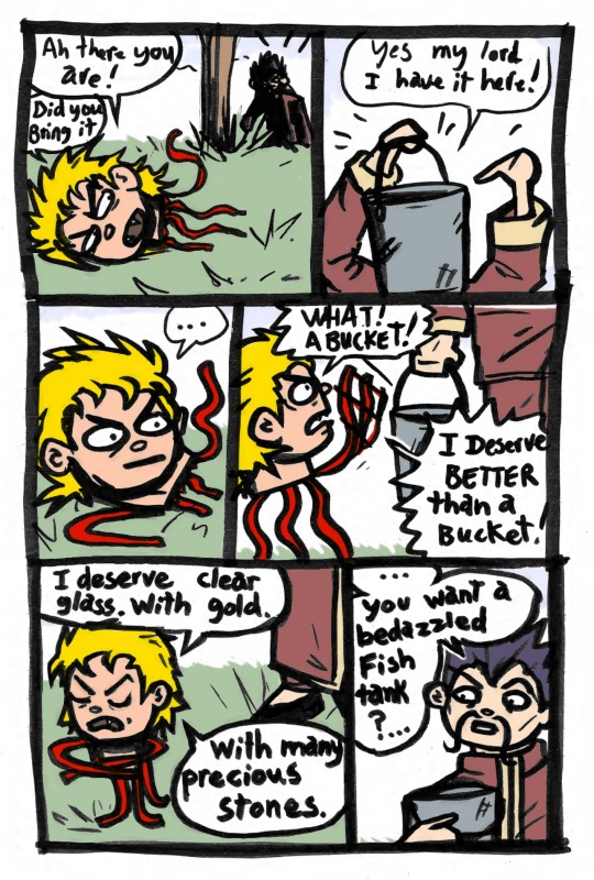
DIO's Phantom Blood head jar origin story
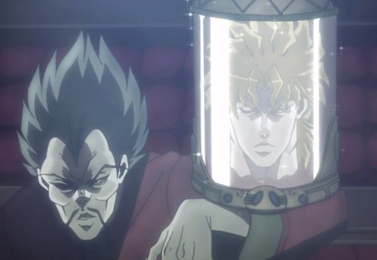
I wonder how many pet shops Wang visited before finding the right fish tank for DIO
#jjba#phantom blood#part 1#wang chan#dio brando#dio is extra#lolo original art#jojo comic#i did the lineart one lunch break i had forgotten my phone#with a too wide tip#digitally colored and sorta cleaned up last night#jojo meme#jojo no kimyou na bouken
136 notes
·
View notes
Text

my favorite bocchi the rock character, akita neru /joke
timelapse under the cut ^_^
#bocchi the rock!#ijichi nijika#if the lineart looks messy it's because it's not lineart!! just cleaned (sorta) sketch#also this is from like a month ago but i finally decided i like it enough to post
5 notes
·
View notes
Text

colored a sketch of my persona/oc in a mc/mcsm au of mine
waho
#dragonschellisart#schellisart#schellis ocs#schellis aston#yeah my screenname is the same as my persona i never got around to changing it#but this is from a minecraft / mcsm au that nobody will understand except for three people on this hellsite who Know:tm:#anyway coloring sketches digitally is sorta fun - i think itd look prettier with digital lineart but i was too tired to get through clean#lineart for this
6 notes
·
View notes
Note
your rendering is so good how do you do it
Thanks, I love your rendering too!! Gonna try and make a tutorial ^^
To start off, I'm on Clip Studio Paint and these are the brushes I use! First two for rendering characters (round brushes) and the other two for mostly backgrounds (square brushes)


I used to do lineart, but it takes too long >:( now I just make a sketch and sorta clean it up!

Next I fill it in with a gray color. For simpler pieces I just put in the flat colors, but for more paint-y pieces I do grayscale -> color! I'll be doing that here :)
Also, I make 3 clipped layers on top of the gray - two are multiply, and the top one is screen. On the first multiply, I do a soft gradient using an airbrush
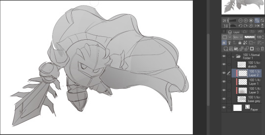
On the next multiply layer, I fill everything in with either a cool-ish or warm-ish gray, depending on the mood ^^
I also determine a light source, and use the lasso tool on the screen layer to block out where (I think) the light hits! Tbh I just do wherever feels right lmao, but I recommend having a reference! I like doing it in triangle patterns
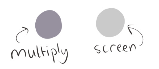
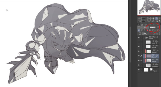
Then adjust the opacity of each layer to whatever feels right, and merge everything (I don't merge the sketch/lineart yet, I do it before adding colors in!)
Now... rendering. Some tips I have are color pick (greys) off of the canvas and use them to paint! Clean up the sketch more, erase edges, but I save details (like Galaxia's red gem, his eyes, etc.) for the end, or during coloring.
After I'm sorta happy with it, I merge the sketch layer, then duplicate it, and add a gradient map! I did this sunset-y one but changed the hue to yellow-ish, then lowered the layer's opacity ^^
Play around with the hue-saturation-luminosity setting!
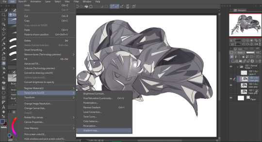
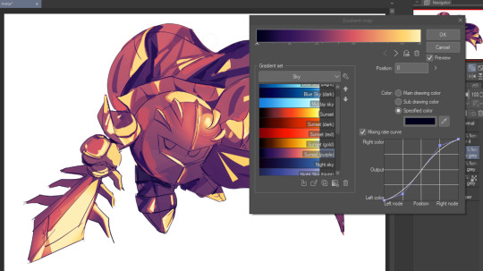

Now go crazy with blending modes! Multiply, overlay, color, glow/color dodge, etc. Feel free to layer them up on top of each other too, and this is to add the character/piece's actual colors in. For example, I used a white-blueish overlay layer for his mask and glove, blue for his cape, blah blah
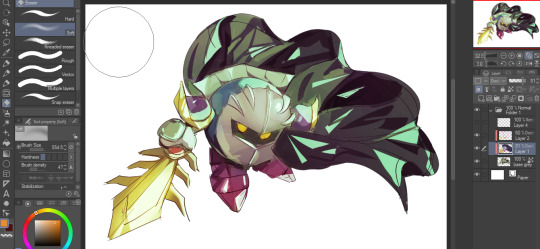
Now I clean the sketch up/refine it more. Also, to "harmonize" the color palette, you can add a colored gradient on top. Then set it to multiply, and add overlay/glow dodge layers with any colors you see fit! I like using teal and light/warm orange! Here is an example of a colored gradient:
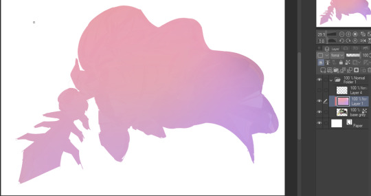
Another tip is to add saturated colors on the edges of both lighting and darker shadows, before blending it:

Also I usually add in a light blue/grey in shadowy areas, and lower the opacity for reflective light:

Also! You can lasso + use an airbush with a light blue to block out parts of the background (his cape here, for example). It helps with more depth!
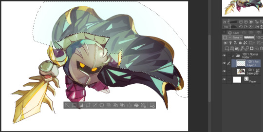
Finally, I like adding sparkles on low opacity :3 And gaussian blur to certain areas! I'm using radial blur on this piece though ^^

For the background, I like doing blocky shapes!! I use my square brush on 90% ish opacity, to color pick different hues from the piece. For lighting I use a glow dodge layer, here's a mini timelapse as well as the finished art!
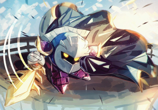
At the very end, play around with the hue/saturation and contrast tools to change the colors :)
#iiii hope this helped??#first time making a tutorial sorry!!#art tutorial#kirby meta knight#meta knight fanart#meta knight#nintendo kirby#kirby nintendo#kirby fanart#kirby series
562 notes
·
View notes
Text
How I draw: Proportions/sketching
The first response to a few art questions from @johnny-and-clyde :))
sketching:
So I honestly used to be a lot more…intentional about my sketching?? Up until a few months ago I would draw out actual sketches that I’d then cleanly ink on top of in a separate layer, like this:


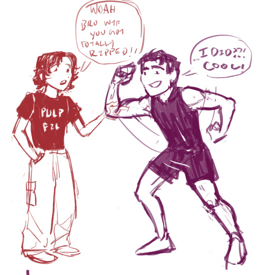

I’d try to keep things loose and easy, but I’m not fantastic at that lol
I have a tendency to over complicate sketches- It’s not super obvious here, but I did semi-map out the anatomy under the clothes and fabric folds. That’s probably a good thing to do, generally, especially since I was and am still learning anatomy.
I don’t do it much anymore tho, because I often got caught up in little details that just wound up covered by clothes 😭 So I generally focus on mapping out the clothing shapes over the proportions/ anatomy. Definitely study anatomy anyway tho- this only works for me nowadays because I did and still do study anatomy a lot lol
These days though, I don’t r e a l l y sketch that much. I mean, I do- but instead of making another layer and inking it, I kinda just clean up the sketch the way I would if I were using pencil and paper. I don’t have a lotta example images of this, because it goes from the sketch to the final lineart in one layer?
tried to reverse-engineer it here on this Angela drawing. idk how helpful that is tho lol.

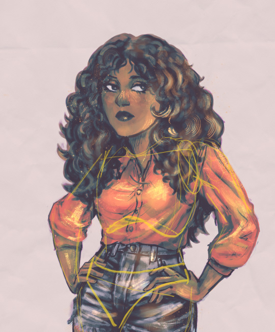
Idk, most important thing for me while sketching is remembering that everything has a 3D form, and also to FLIP MY CANVAS FREQUENTLY so that it stays balanced lol. -also- I almost always take note of the ribcage, the clavicle angle, and the hip angle when planning poses
-And I consciously try to keep things from getting stiff, and think of the pose as an intentional composition. I actually struggle most with plain standing/walking poses, because I very often can’t think of ways to make them look…idk, interesting? That’s why it’s taken me so long to finish pt.2 of my Outsiders character designs- I can’t find good dynamic-but-also-stagnant poses for them
proportion:
Honestly man idk I just sorta say “fuck it we ball” and hope for the best. I used to think a lot more about this one but as it’s become more and more natural to me I become less and less able to define/describe it?? I dunno lol.
My art style is semi-cartoony, and honestly kinda inconsistent in terms of proportions. I generally aim for the hands to be similar in size to the face, and for the shoulders/chest area to have enough space to fit the clavicle…but none of this is really a conscious decision? It just sorta happens. The heads/eyes of my characters are usually stylized, and so the hands end up a bit bigger to match the faces, and I tend to exaggerate muscle mass but not really muscle definition…And I also stylize things for characters to better contrast each other. For example, I’ve noticed I draw Steve Randle stockier/bulkier than he is to better highlight Soda’s slenderness.
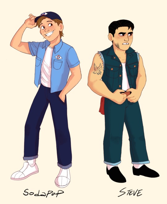

(see how they’re not as drastically different in build as I draw them? Steve seems bulkier mostly cos he’s shorter but has a similar amount of mass I think) (don’t quote me on that tho idk how to put this shit into words lol)
I have a pretty decent idea of how proportions are supposed to work from years of studying them, and I have no idea how to explain any of it. Just…do a lot of figure and gesture drawing, use a lotta refs, and it’ll make sense eventually 😭
#ask#how i draw#digital art#art tips#rambling#long post#< I mean not very long really but yk just in case
67 notes
·
View notes
Text
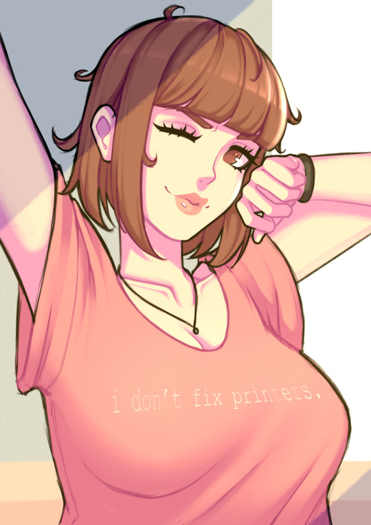
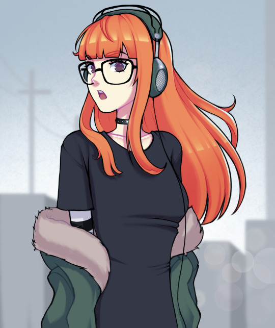

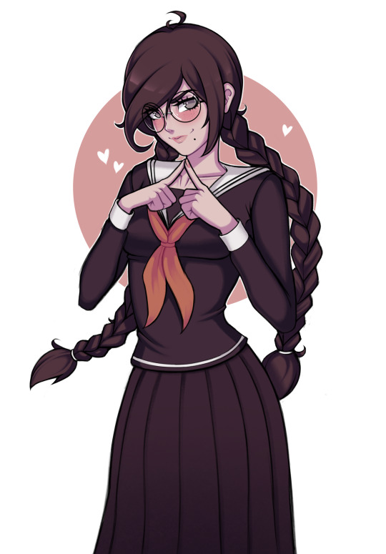
a handful of my favourite drawings this year
gonna just bury a personal post in here too, give it a read if you fancy:
as i've said a few times, this is the first year in a long time where art has had no monetary component for me, and it still took a little while, but i feel like this is the year where i've actually managed to de-program myself from years of being a Twitter Artist, and switch over my mentality from drawing what i think people want to see, to what i want to make, and also learn not to force myself not to draw if i don't want to, and on that note i dunno if i'm just feeling residual burnout from the years of grinding out for twitter or what, but i was kinda surprised how small my appetite for drawing actually was
that said, when i do draw now, i know it's because i'm actually really excited to be doing it and i feel like it's shown in the results tbh, there's way less drawings this year where i felt like i'm just going through the motions and drawing for the sake of getting something out there, and i look back at basically everything i've drawn like "yeah, that was cool, and i had a lot of fun making it"
part of that is that i've also discovered just how important it is to actually enjoy every part of my art process, i've sorta just cut out parts i don't enjoy - i'm way more willing to just leave things looking slightly wonky, and i haven't done any fuckin lineart this year at all, i've cut that shit out entirely because i don't like doing it, instead i just spend 10 minutes cleaning up my sketches and go straight to colouring and it feels like nobody's even noticed, it rules lol, and i've put a bit more focus on making things that feel like "scenes" rather than just "pretty girl in white void (with optional background circle)", not that all my art needs to be that, but it's been satisfying taking the time to just draw little simple backgrounds or focus on building an overall vibe, rather than just the character
tl;dr dumbass girl learns to have fun drawing again by not giving a fuck
love u lot <3
342 notes
·
View notes
Note
*Floats and T-poses and headed straight for fear-
Hug!*
*Startled by their sudden approach*
"O-Oh?!- S-Sure..."
*Fear accepts the hug, awkwardly.*

"T-This... Is quite... Comforting; Huh..."
//WOOOO I WAS WATING FOR THIS ASK WOOOOOOOOO
Yes fear does give the best hugs, along side Greed (and at least they wont pickpocket you while hugging)
Im surprised at how clean the lineart is sorta, although sorry if it looks kinda akward ejehvsjehekehdjdbdjvej
#fear block tales#blocktales parody#block tales parody#tumblr parody#parody#fear answers#blocktales#roblox block tales#block tales#roblox#fear#fanart
24 notes
·
View notes
Text
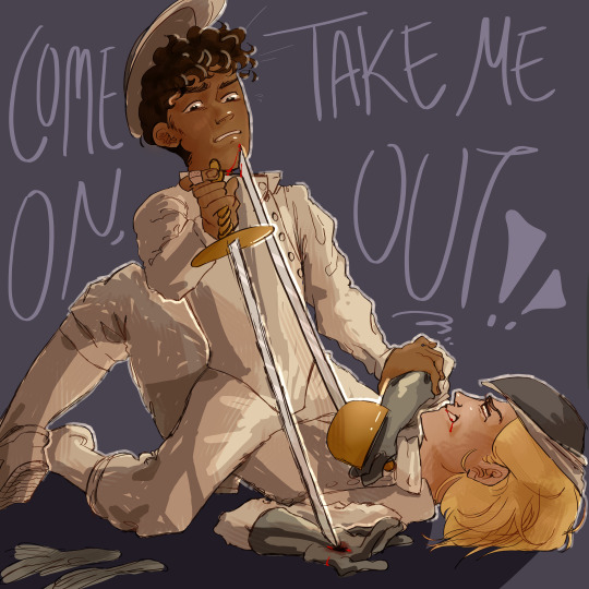
i'm just a shot away from you.
sketch here and here.
hihi! long time no see! i'm gonna infodump about this piece down here.
so when i first started drawing, i focused really heavily on lineart. i was super into finding my "style" in terms of how i would stylize faces and bodies. my coloring style was kind of an afterthought and wasn't really in the place i wanted it to be, so this is me kind of experimenting and trying to go wild in that department.
i think the reason for my years long art block was perfectionism. specifically for digital art, i was very focused on making things pristine and clean looking. i mean that may or may not be obvious from my more recent pre hiatus art, i don't remember, but 😭 mentally that was the issue. i used to always like my sketches more than my lines, and at a certain point i was like, i may as well just have the lines be really sketchy and irregular and chunky or edgy in parts because i seem to be drawn to that, and clearly this precision thing isn't working out. i'd definitely attempted that at other points, but i hadn't really committed and was never really confident about it before now. i think ultimately i just had to reach enough of a 'fuck it' point before i could do it. it's a similar philosophy with the coloring and shading. i'm just letting all the textures and irregularities come through without worrying too much
the idea for the piece changed a LOT. like i started sketching and attempting to color this well before my art block, and i've only just finished it. initially, the doctor and the master were wearing their normal clothes and were holding daggers to one another while locked in an embrace, so the idea was like, the closer they get, the deadlier it is. for some reason i just couldn't get that to work? at some point i gave the doctor navy wings, so there was almost an angel of death thing going on (think the master asking her to kill him), but eventually i went for this! there's still kind of the erotic element with the master straddling the doctor and her Thrusting up, but now they are fencing, and the weapons are a little more front and center instead of hidden, as they were initially. i don't know how obvious it is, but what's happening is the master seemingly has the doctor pinned, both physically and with his rapier, but as she thrusts up, she actually moves his face closer to her blade. his hand on her elbow looks like it's part of the pin, but actually he's trying to stop himself from getting cut more. this thing of the master looking like he's winning, but the doctor actually holding the deadlier (though not necessarily better) position was very important to me, i don't know why. it was a feature of all of the sketches, although in the dagger sketches, there was an element of the doctor's blade being more hidden than the master's, ie in the embrace, the master (facing her) has an arm wrapped around the back of her neck with a blade at her throat, and she wraps her arms around him with a blade pointed directly at his back. you are going to have to figure out the symbolic intricacies of that yourself because i was just doing what felt right sjdjsdk
almost forgot: it's not just the positioning that sorta favors the doctor, it's also the fact that she is slightly more armored than the master. i don't know if you would call that armor, but let's go with that. her mask is pulled slightly more over her face than the master's, she wears her gloves and shoes while the master wears neither, and her rapier has a little cover that goes over her hand, while the master's just fans out. obviously they both have minor injuries, but the doctor also has some Ambiguous blood at her mouth. is it his? is it hers? i don't know. but she has blood in her mouth vibes when it comes to her interactions with the master so there u go
there's also an element of like, fencing is not supposed to get this crazy, so something has gotten severely out of hand here. but mostly i thought it looked cool.
if i could change anything about this, i would make it so that the doc's blade is pointing directly at the master's chin instead of having just grazed his lower face, with the master trying to lift his head away from the blade as he slides down, just so that the threat felt a little more.. i don't know, imminent? so that the strain is more pronounced? they're simultaneously being pulled toward one another (by gravity) and desperately trying to push away. i might've also fucked around with the text a little more because i'm realizing now that it could very easily be misread shjshdjs. but mostly i'm just glad that it's done and it looks cool. it's been YEARS and i finally feel like i'm back on my art feet. but don't hold me to that
#spydoc#thoschei#doctor who#no id#doctormaster#there's a good chance i've gotten something about the uniforms or rapiers wrong but hsjdhsjdh shhhh#dhawan master#thirteeth doctor#13th doctor#fartposting
36 notes
·
View notes
Text

Very basic thingy of Minthara where I just sorta experimented with a couple things and practiced.
Main things were:
1. I didn’t do a super detailed sketch for this, just a basic blockout, so then the initial go of proper lines are the ones that end up in the finished thing. Tried this because I still consistently find that I like my sketch layers more than final lineart, and I think it’s because I make the lineart too clean/monotonous for my style. So, as I like to do, aimed to be a little bit scrungly.
2. To that end as well, I tried using more varied brush thicknesses in different areas. This mostly amounted to using a much thicker brush than usual on her eyes and general face structure, whilst I used my usual brush thickness for her strands of hair and little textures. When I compare my art style to those of my influences, and others, line thickness variety is honestly the biggest thing I notice that I’d really like to practice.
3. And lastly, still on lines, I used colours for the lineart instead of just the black or dark grey that I default to. It’s very hard to notice (I mean, the lines for her hair are still grey, just lighter), but her face is lined with a very dark purple, actually just the same shade as her skin but turning up the darkness. The effect is most apparent on the lines I did around her iris, I’d like to try do this more with coloured pieces, I think it’ll help make my colours feel more connected to the drawing and not as jarring as I think they tend to be.
10 notes
·
View notes
Text
was just gonna clean up the doodles of potential clay animations i made last week, finished the cleaned up sorta sketchy lineart, and decided right then right there... nah i gotta take this all the way
so ig now I'm making fully refined versions of all of them 😭
I was gonna say oh. absolutely not animating them. but I basically have the mouth animation loop memorized so I could at least do that. And blinking is simple enough,
#brodoroki personal#it will take me longer but I;ve been doing so many sketches lately that committing to something longer feels nice
14 notes
·
View notes
Note
I said something similar on my blog but I feel I didn't word my thoughts better:
The newer phases' art styles feel too polished for me, from the lineart to the boring shading and saturated colors. (Especially with phase 6) I miss the messy feel of Phase 2, 3, and even 4 because it still kept the feeling of the older phases. Phase 5 I'm iffy on because imo it still looks fine with the colors but still has that modern Gorillaz art style I dislike but it still sorta felt experimental in a way?-. On it's own the art styles are...Alright, but for Gorillaz I just don't think it fits, I love the cartoony art style from the earlier and find it more charming and memorable. I don't think I'm saying this out of nostalgia (I joined the fandom during 2018, lmao) I think it's just because of my own preferences
I saw someone say that it's like Jamie is trying to make the characters more conventionally attractive and I couldn't agree more.
hmmm ..... ive heard many people say this but i have mixed thoughts on it.
the tone of gorillaz overall taking a turn towards being more brand-friendly is definitely a factor, but i dont think its the only one. i really do think jamie gets bored and its not just me speculating, apparently he said he was "fucking bored of drawing those characters" in 2008, yes, since BEFORE PHASE 3. i do still think he has a lot of enjoyment in drawing them (otherwise he'd probably quit) but you can really tell when he's drawn something just because he felt like he had to. that's why gorillaz promotional art seems to be increasingly lacking in personality, imo. something really changed around song machine era where stuff was just getting pushed out as fast as possible and predictably got rushed. because ive brought this up before, if youve seen his art in the gorillaz artbook it's an entirely different vibe than promotional artwork cause thats the stuff where he does whatever he wants and is free to experiment. but that level of experimentation that he wants to do is very non-commercial, and it would've been in any phase. (that semi-realistic murdoc rasputin picture freaked people out when it was released but thats the kind of thing he really wants to do!!)
it's not only got a lot more personality and life to it but it's retained that edge that earlier gorillaz art had, despite using brighter colors and overall more poppy visuals. there's a murdoc shrunken head ffs. i really like it. i hope we see more of that kind of stuff in phase 8.
here is the edgy 2d everyone's been asking to make a comeback, in the 2020's:

personally i dont mind the brighter colors and overall more clean and lighter vibe. it doesnt resonate with me quite as much, but i dont think its neccessarily a sign of becoming more commercial. it can look that way and have edge at the same time as seen in the artbook.
murdoc becoming neon green is an eyesore often times but i think it's made up for by the fact that it's really funny in an ironic meta way. some day he will just transcend the color spectrum visible to the human eye probably....
i dont see how the characters have gotten more conventionally attractive. for example noodle had her whole eyebrow shaved off on the meanwhile ep art. theyve always been ugly and to get rid of that youd have to change their designs and personalities to make them unrecognizable. plus i think murdoc's actually somehow managed to get uglier... his face looks more misshapen as he's aged.
one thing i dont like in newer gorillaz art that i havent seen anyone else point out is how much jamie's horniness leaks into it. maybe i have just noticed it more than everyone else. dont get me wrong i think its totally fine if he draws that stuff on his own time of his characters if he wants to but when it gets into official gorillaz stuff its just plain weird and unneccessary and makes me uncomfortable 😭 like wtf ....
7 notes
·
View notes
Note
Your artwork is a major inspiration to me, I really admire your ability to mix realism and stylisation so seamlessly. I would ask how you get such thin lines to be so clean and confident
Sorry for seeing this so late -- thank you so much! It means a lot that you like my artstyle. In regards to my lines, i sorta just have a tendency to draw really fast with hard strokes, so finding the right brushes that manages to translate that is really important. I usually draw without any stabiliziers which really helps since i think it creates latency in the strokes sometimes. ( Not procreate tho that shit is like drawing on glass. Stabilizier is neccessary for Survival there. But i still keep it like 30% ish ) Also i think u just have to train urself to get used to using thin lineart cus sometimes thick lineart just doesnt cut it if you wanna draw lots of details
10 notes
·
View notes
Note
4, 9, and 28 for the artist ask game :0c?
YAUY
4. piece you wish got more love?
THIS ONE 😭😔 I was really proud with how the background and lighting came out but it only got like 3 notes 💔

9. whats something you always come back to when drawing?
I’m a lil confused on what this question means but I’ll assume it’s about last minute details or tweaking in which case sometimes I’ll try to clean up the lineart a bit more or to just add some more details within the lighting here n there
28. whats a piece you would like to redraw at some point?
probably this one!

I feel like it’s been awhile since I drew this one and now that I’ve sorta got some design tweaks for both of these guys coupled with me learning some new art tricks hopefully I can make a new version that improves on some of things here ^^
3 notes
·
View notes
Text
WE DID IT!
We've reached 100 followers everyone! Thank you so much for your support! This has been such a journey and never in a million years would I have expected people to like and enjoy my stories as much as I do, seriously, it means so much to me! Thank you all once again for your support, it's been amazing and has made me so happy to read all of your asks
I would also like to apologize for not posting as much recently. My brain has been a little fried from writing, but I'm slowly but surely working on the drafts! Sorry for the people who sent asks and are waiting!! Here's to hoping this event will be a little bit more of a break and motivate me again!
ANYWAAAAAYS!! For the poll, Mine doodles won! I'll be taking 50 requests for Mine doodles! I've also decided to add some flat colors! As mentioned in the poll post, in the beginning you may only request one drawing that way anyone who wants to request gets a chance, after requests start dwindling/ a certain time period ends(still deciding, maybe a week or two!) you'll be able to request more, all a ask is that you don't spam please! No need to worry if you don't get to ask a request, either because you weren't here the first time, or time ran out or all the slots filled up, this event will be repeated eventually and you can ask then!
I do have a few more things you can request/rules and what you can't! Please read carefully and if you have any questions let me know :3
CAN
Request multiple Mine characters in one piece
Request your oc/s with a Mine character or multiple!
If there's a specific pose and/or outfit you want me to draw the Mine cast in, please send in some references, thank you!
I ask that you send requests in my askbox, you can turn on anon ofc!
Also please be kind of specific about what you want. like if you want to suggest maybe like Yani and Jun, like what are they doing, is there any sort of place you had in mind for where they are? Any kind of outfits you want to put them in? If you just want a drawing of one of the characters, you can just say (name) plain and I'll try to come up with something! I'll also assume that an ask with a Mine character and you oc is romantic unless stated otherwise, so please be as specific as you can, even if you think I may not need it or it should be obvious, I need things stated to me clearly :3
CANNOT
Request nsfw(I'll probably have that event on twitter at some point!)
honestly, anything that goes against my rules so like no proship or bigotry or anything else gross like incest(Please dni with my stuff if you're into any of that stuff)
No requesting other people's yandere's(You can suggest your yandere oc with mine though if you want to, just not any solo drawings of a yandere not in Mine.) Also if you're requesting your own yandere, I ask that you keep anon off for that ask, just so I can make sure it actually is your yandere, thank you! Also if you don't want your account to me linked with mine, then you can send me a message of your ask and I'll send the ask to myself :3
Also I'd prefer to not draw any solos of your ocs(Once again, totally fine if you want me to draw them with the Mine cast :3)
Please don't request shading or clean lineart, it tuckers me out quickly and makes me lose motivation, if I did that, this event would never finish LMAO
Please don't rush me either, I have a life outside of Tumblr and Mine. I may also not like how the drawing is turning out(I'm sorta a perfectionist when it comes to my own art) and I may also lose motivation or just may not feel like drawing(Kind of like what's happening with writing rn)
Honestly, for my don'ts I don't think I have to worry, everyone who has followed me has been really kind and respectful but I felt the need to clarify things and say things because of some of the stuff I've seen on social media. Anyways, HAPPY 100 FOLLOWER MILESTONE EVENT!! I appreciate each and every one of you so much more then you could ever know, I wish I could express my joy and gratitude better! MWAH MWAH <333333
With that, let the event BEGIN!!
#💝-minevn#visual novel#yandere vn#🐠-Minato#📙-Haruto#🎀-Jun#🍽️-Hoshi#🎻-Habiki#👤-Kage#💻-Kei#💕-Yani#🐍-Aki
17 notes
·
View notes
Text

Hey i wanna respond to this!!! I want to explain the exact technique used on my previous piece if i may!! (Im having some sort of hyperactivity episode let me let meeee;!!!)
using a stripped, cropped version of the original for demonstration purposes

i cleaned him too! :}
Its actually a duochrome piece!!! The only actual colours actively used used were #ff0000 AND #0000ff!!! Just plain old red n blue! With #000000 and #ffffff in there for good measure!

The technique is basically just the various default pixel brushes for krita!! which are... _pixel_art, _pixel_art_fill and _pixel_art_dithering! riveting stuff i know ... but thats how i got the half toning
-not using any blurring whatsoever as to not wash out the pixels
now for the effects, because my lineart isnt teachable for me unfortunately. i used advice from a youtube tutorial i stumbled upon YEARS ago for the chromatic aberration, linked here! the main edits done consisted of
-adding a pure white difference multiplier layer over the WHOLE drawing to wash out the neons, we want this to look grungy and papery
-making sure to use soft light on the grain INSTEAD OF OVERLAY!! the next super secret twist will explain why
-ON THE BOTTOM COLOUR OF YOU CHROMATIC ABBORATION LAYER KEEP IT AS NORMAL- if you want the EXACT same effect that is

put it together and voila! you have this! im a bad teacher sorta but i really REALLY really really am proud of my technique and would love others to tweak and experiment with my jank ass experimental artstyle!
#mutedeclipse#digital art#digital art tutorial#<sorta#brain bomber as my lovely assistant for demonstration :}#SORRY FOR LIKE SINGLING YOU OUT IN THE TAGS LUNAREMY IM HAVING AN EPISODE I WANT TO SPREAD MY WISDOM AND APPRECIATION (???)#eyestrain
6 notes
·
View notes