#i also use the pixelate brushes and all texture brushes
Explore tagged Tumblr posts
Visit Tumblr Blog
Explore Tumblr blogs with no restrictions, modern design and the best experience.
Last Seen Tumblr Blogs


Fun Fact
Forty percent of Tumblr users are between the ages of 18 to 25.
Note
Your gif blending skills are *chefs kiss* so, so good! Any tips/tricks you could maybe give for a seamless blending? Thank you! 💕
Thank you for the kind message!! I'd be happy to share how I blend my gifs! I did a basic blending tutorial here that just covers how to put two gifs on top of each other on the same canvas, but I can explain more about how I clean up my blends and make them seamless.
The key components are black brushes, the eraser tool, and layer opacity

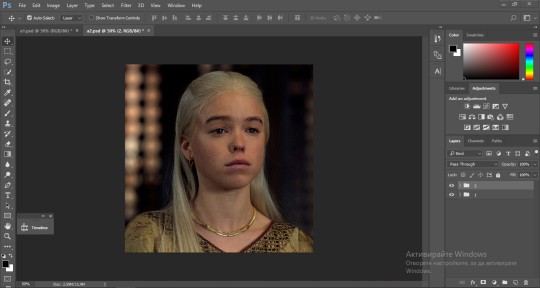
So the below gif is what I get when I simply put my two gifs on top of each other and position them the way I want, but I want it to look a bit cleaner.

This is how I have my gifs set up, with the gifs and the colourings within separate folders (b for Buck on the left, and t for Tommy on the right).

And this is what it looks like when I open up one of those folders.

Now when I blend, I add a new layer within each folder on top of all the colouring layers, (the layer blend mode is set to normal), and I do the same thing in the Buck folder

Painting with black brushes
So now I use a big, soft, black brush to paint on this new layer I created. Wherever I paint is the area I hide. Since I'm starting in the Tommy folder, I'm going to paint over the areas from the Tommy gif that cover Buck, so that these areas get hidden.

I want to hide that bright spot on top of Buck's face (which is coming from the tommy gif) so I take a brush that roughly matches the size of the area (the circle that I drew). So in this case I'm using a 300px brush at 0% hardness set to black. And all I do is move my brush to the area I want to cover, and *CLICK ONCE*. I don't drag the brush, I simply move it into position, click once, and let go.
Here you can see the before and after


As you can see, Buck's face is a lot clearer now. And this is what my layers panel looks like.

Let's say I want to hide a little more, and clear up Buck's face even further. I simply create another new layer within the folder (above layer 4 in my screenshot) and again, click once over the desired area with my brush.

This is what it looks like now, but let's say I want to add some of that texture back. I simply go to the layer, and reduce the opacity. I usually play around with anywhere from 20% to 80% opacity.

Now I do the same thing for the Buck gif, but this time I paint over Tommy's face, meaning that I'm hiding the areas of the Buck gif that are covering Tommy's face.


This time I clicked twice with my black brush because I didn't feel that one click hid enough of the gif. Also, if you feel like you brushed over too big of an area, just take your eraser (usually the same size as/slightly smaller than your brush, also at 0% hardness) and CLICK TO ERASE. This is the final blend that I'm happy with.

Final comments
I found that this is the easiest way to blend, because other methods using layer masks sometimes leave you with those transparent pixels to deal with. Just make sure to CLICK with your brush/eraser and NEVER DRAG. This method is also super helpful when you have two "incompatible" gifs, such as when one gif is really bright. By clicking with a big soft brush you can still show the gif behind it while not making it look too disjointed, like I did here:


Here's another tutorial that I find helpful, which goes over using the dark spots in your gifs to help with the blending. Hope this helps!!
#answered#tommykinardbuckley#*tutorial#useraljoscha#userchibi#carolook#userbaz#userahri#userrobin#userwintersoldado#userbunneis#tuserheidi#usermibbles#usertj#wardengrill
39 notes
·
View notes
Note
what brush do you use in krita? im still getting used to it and i love your works<33
thank you! for my smoother rendering i use a custom brush made with kritas pixel brush engine, and for everything else i use the default my paint pencil 1
#lumoncholy asks#im sure any hard round brush will do the same#just add a bit of grit to it#i also use the pixelate brushes and all texture brushes#only sometimes though
7 notes
·
View notes
Text
kind of bleh doodle i did at like 3 am last night :P meowple... meepurr...
#my art#inanimate insanity#ii#inanimate insanity fanart#ii mephone4#mephone4 ii#mephone4#ii mephone3gs#mephone3gs ii#mephone3gs#also little mepad & 4s there#catified#catified art#💔Idk why i put the cracks on. the metal and fur too.......#its okay it was 3 am#i need to actually do the other pixel gifs like i wanted to#i love tehse sillies so much#also i like how u can tell what app i used#procreate my brushes r all textured but for some reason ibis they arent#i spam my tags too mcuh HEJDHJWSJ#not even bothering adding my watermark this time bc its so bleh#its Okay It was. 3 Am
169 notes
·
View notes
Text
Comm for @ CitrusCynical! Part one bc I'm working on a few more ♪
#talking about work. first i didn't do much outside sending a lineart today bc *turumrumrum* i got a pc!#yayy! clapclapclap!#still gonna use the laptop to draw since the cpu only has one hdmi entrance and i can't connect the tablet#buuuut i have a piNK KEYBOARD. literally my dream come true#i might be able to play genshin again♪ i might be able to download bg3 in my own pc♪#I'll be able to use a paint textured brush bigger than 100 pixels♪#he hehehe hehe#the wifi connection sucks tho. we'll have to connect it with a wire i think#downloading steam at turtle pace lol#rui draw smth#art commisions#commission#oc#original character#im so happy i was literally at the edge all day lsndmsmdm#I'll upload a photo in my twt probably. i wanna show off my pink keyboard pink mouse and pink cat-themed mousepad#I'm also! reclaiming to Clipstudio support for my product key bc i bought it in like 2020 and we lost the email with the code#i have a pirated version but it's old. and i also have enough money rn to buy the newest version but my mom tells me to get my own again#ñeñeñe
25 notes
·
View notes
Text


Here's me trying to figure out how to draw DSaF [Jack] and failing
I don't know if I'm gonna finish the bottom one since coloring and shading sounds like hell lately. I need to like find some memes to redraw to make sure I don't get into art block [avoids looking at my meme folder or my art reference folder or my art poses folder or my-] ig I'm doomed
#just tired#not as tired emotionally as i have been lately!! not as close to abandoning all of my friends!#but tired physically anyway#oh well#art#dsaf#dayshift at freddy's#also i have a new brush and coloring brush thag match#theyre both pixelated and the coloring one is called minecraft because it has texture#i also need to find that one coloring brush that one person in that one server uses#since my current blending brush isnt cutting it anymore
3 notes
·
View notes
Note
I recently started learning to use rpg maker (vx ace!) and as a result have become increasingly interested in pixel art. I hadn't really done pixel work since my teens - I do more digital painting and vector art - so while I'm a little familiar and can do passable editing, there's a lot I don't know.
One thing that's kind of perplexing for me is understanding the differences in style between two creators of pixel art. I studied art history and I'm used to the differences being things like brush stroke length or degree of realism... I feel like I'm lacking in lexicon in this new frontier lol
What nuances of an artist do you think are most important to style in pixel art?
This kind of stuff is not really officially studied (yet) so it's all a bit of opinion from me.
Usually in pixel art the biggest differences in styles are which limitations the artists choose to impose on themselves; colour count, resolution, palette... Or more stylistic choices like hue shifting, anti-aliasing style or no, dithering or no, etc.
I personally think there are a huge variety of styles in pixel art, as it's literally just a medium, and I hope you'll agree by the end 8)
Also (imo) there is some seperation between the styles of art for art's sake, and art for videogames, where things have to be clear and readable to be actually playable.
🎮 Old school games:
Sometimes referred to as something like '8-bit' or '16-bit' (relating to the NES era / SNES era consoles), these artstyles usually follow the rules and limitations of the hardware at the time.
This all falls under retro art, most popular styles include: NES, SNES, GB, GBC, C64
Notable artists: Nickwoz, Sandy Gordon, Franken, Cisco
📚 Old school art:
There were also events called Demoscene (still are), where developers would go to a big convention and share their demos. A lot of pixel art competitions were held here, where artists would draw live.
Generally they used to favour a high realism/semirealism style, with lots of texture/dithering, fairly high resolution (if the hardware allowed for it), and adjacent pixels mostly being different from one another.
There are even older styles than this but they are fairly niche and I'm not that well educated. If interested look into some of the old PCs/consoles.
⭐ Modern pixel art:
Usually using more colours and higher resolution, larger clusters of pixels instead of individual ones. Strong use of art fundamentals.
Artists to look at: Adam Ferguson (yes it is pixel art), Snake, Slym, 6VCR, Yes I do Pixels, Gijotto, SovanJedi, JoeCreates, Franek, @8pxl
the rest below are "modern" pixel artists too but I think they have other things in their style that are a bit different!
🎨 Painterly:
Some artists choose to emulate the natural brushstrokes digitally, and keep their clusters large and loose. Usually don't focus on the minute details as much.
@makrustic, @hexh-pixel, Umbohr, Gawrone
🟦 Dithering
These artists all use dithering / texture in ways that make their styles totally unique.
Deceiver, Night, Reo,
💥 Experimental
These artists are always trying new things and honing in on their unique style.
AJ, hby, @ilta222, Alphons
I could really go on for ever, there are so many different styles, cute pixel art, horror pixel art, 1bit (2 colours only), and then adding animation takes it even further, but I think you get the idea
If you want to learn more, the Masters of Pixel Art books have works /interviews from pixel artists of different eras, including demoscene and contemporary.
😊👍
284 notes
·
View notes
Text

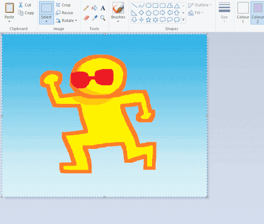
ms paint. you know her. u used her age 8 to make loads of rainbow ovals all over the canvas and then scramble it with selection tool. now u will know her true powers with my handyrandy tips under the readmore. some will be pretty basic and others are very special.
this post has 8 cool trix to learn for you. enjoy and i may do another in the future if i remember/learn more stuff
some of it might be common knowledge. but its got some deep cuts. all tips have gifs to show process easily.
🙂 enjoy and i hope this encourages you to fuck around in mspaint more
soundtrack for this post (loop it while you learn for advanced learning experience)
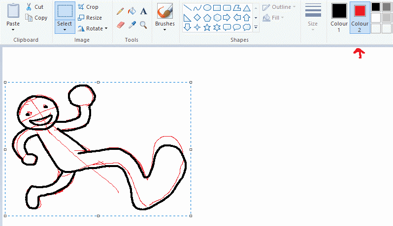
TIP 1) the right click trick
left and right mouse click correspond to col1 and col2 respectively, which u can see in the top bar. this applies to all brushes and the fill tool like above. when using shapes col2 will be the fill colour (if you have solid fill selected). right clicking with shape maker will reverse the colours use on the shape.
TIP 2) right click eraser
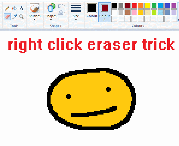
this one is extremely helpful for lineart or add shading. the eraser always uses col2. so your eraser can technically be any colour. but here's where you get powers: right clicking with eraser will only erase onto col1, with col2.
TIP 3) transparent selection change a guy destination
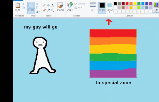
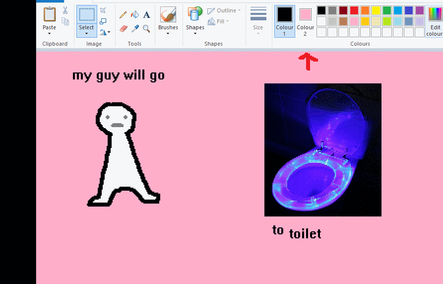
the beloved transparent selection tool works based on what is selected as col2. so long as you have the correct colour as col2 you can make any image transparent and put it on top of anything else. and yes this works with photo bg as you can see.
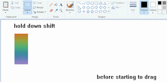
TIP 4) the gradience
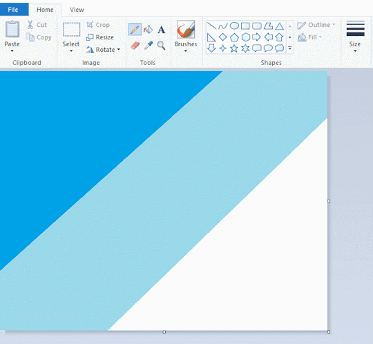
this one is a little more complex. you want to start off with any canvas size, and make as many diagonal coloured bands as you want. (protip: holding down shift makes a perfectly diagonal line with line tool)
then you need to resize the canvas to a width of 1px (make sure you resize by pixels, and do not maintain aspect ratio). then resize again back to its original width (or a different width i cant stop you). you will have your lovely gradience.
TIP 5) superimposter

so. you got a cool gradient and wanna put a guy on it. heres what i do:
i open a 2nd mspaint with same canvas size and draw whatever i want on there. i then pick a completely unrelated colour to my entire piece, and set that as the bg. you could use white, pink, geen, whatever you want as long as it doesnt appear somewhere else in ur drawing. copy the guy.
go back to your gradient tab. ensure that col2 is set as that bg colour you picked (lilac for me). have "transparent selection" enabled. paste your guy in. cue fanfare
TIP 6) advanced superimposter
the great thing about this method is u can put multiple gradients in multiple areas of the image. this is where it gets all japanese printmaking type of shit. ukiyo-esque
all you need to do is make another canvas with a new gradient, ensure col2 is set as the colour you want to replace, then paste your original piece onto the new gradient. now my guy has a soft fade. you can do this as much as you want. (you could even make a canvas with a texture or photo and paste your drawing onto there)
TIP 7) "sketch layer"
so as you now know, col2 is what is removed when you click "transparent selection". which means you can also remove any instance of a colour from ur drawing. which means you can have a unique colour for sketch layer and remove it from the drawing later. i admittedly dont do this but it is a great trick to have.
now combine this with lowering your dpi for smoother lines. may seem obvious but it helps. its like a free stabiliser whenever u want.
TIP 8) rainbow art
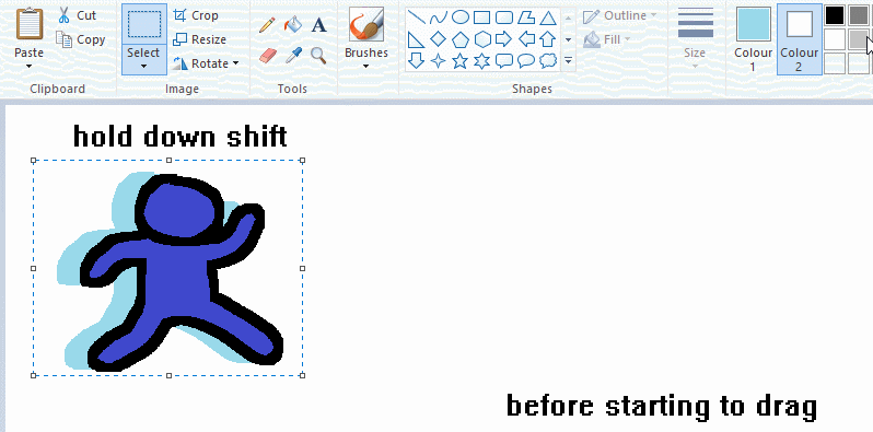
now this is where you can get dizzee rascal "bonkers". check out my small and shitty rainbow trick. you can select anything and hold down shift, then drag with left mouse, to turn that selection into its own brush. i even did it with a guy. and you can of course do this with a photo as well.
🙂well that it for now. hope you liked it thanks for reading now back to your regularly scheduled tgcg programming
2K notes
·
View notes
Text

Hello and welcome to "Icon Making With Killian: An Intro to the 'Lost' Art of LiveJournal Icons"
aka, I'm still making them and I'd like to teach you how to do it, too!
This tutorial was written in Photoshop 2020, but you can probably recreate it in as far back as CS2-ish (since I still use the same sort of techniques I've been using since then, lmao). It also assumes basic understanding of the software, though I've tried to be as clear as possible throughout.
With that out of the way, let's get this tutorial on the road!!!!!!
I started with the bloomed art of Hiiro from the White Lilies scout box (image courtesy of the Ensemble Stars!! English Wiki).

I basically always start with a blank 100x100 canvas and paste the image into it. I try to go into icon making with a vague idea of what I want to do, and I knew from the beginning that my vision for this icon would have the top 1/4-1/3 of the image covered by a solid band of color. To make positioning the image of Hiiro easier, I made a rough version of the band with temporary colors (though they're pretty close to what I ended up using in the end).

With that in place, I could start working with the actual image for the icon. After pasting it in and adjusting the layers so it was under the band, I resized it and moved it around a bunch until I was happy with the position. Once I liked how it looked, I used an Unsharp Mask on the base.

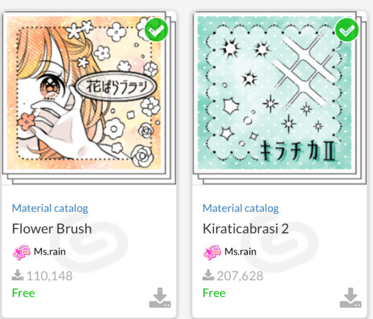
Next up, I used a texture from lookslikerain. However, purple is all wrong for the color scheme I had in mind, so I went to Image > Adjustments > Hue/Saturation... to change it up to better suit my needs. Never be afraid to mess around with textures!

Here's how I adjusted this specific texture, but each one is unique- both the texture and the icon you're creating, so it's best to play with it until you get good results.

I then pasted this into the icon, making sure it was under the layers making up the top bands of color (because I was only trying to affect the base for now), and set this layer to Darken.

Now it's time to mess with the colors of the top band. They sorta matched before I did anything to the base, but now...not quite. I used a layer style for each part of it, but using the paint bucket tool would work just as well. I went to Layer > Layer Styles > Color Overlay... for each, changing the colors as necessary. The thickest band is #85d0bf, the middle band is #086371, and the thinnest, lightest one is #fcfcd8.

Time to start putting stuff on top of everything!! I took this light texture from ianthinae, rotated it, and set it to Lighten. I decided I wanted it to be a little bit brighter, so I duplicated the layer, set it to Screen, and dropped the Opacity to 20%.

I then used a texture from Sarah-Dipity and set it to Lighten as well.

Okay, now that's what I'm talkin' about!!! It's time to throw some text on this~ I went for something simple to go with the theme of the story this card is from: Princely. The font is Georgia, 10pt, in #086371, set to all caps. I decided it didn't stand out enough, so I duplicated it, changed the color to #8b4235, dragged it under the first text layer, and moved it 1 pixel to the right.

I wanted a bit more embellishment around it, so I used this simple tiny text brush from colorfilter in #06444d. I also erased part of it to make it fit the space better.

Finally, I used a texture from shiruji, set to Darken to get a bit more color variation in it, and called it done! :D

If you have any questions, please feel free to ask, and I'll answer as best I can- as long as it's not about making icons in other software D: I only know Photoshop (and Paint Shop Pro, but I don't think anyone uses that anymore). If there are any other icons of mine you're interested in seeing tutorials for - or even just specific techniques! - just lemme know. I love helping :D
Also, I'm happy to share where I get icon resources from. I have a whole post dedicated to that on my DW graphics journal, though tbh that's the best place to talk to me about making graphics in general. But I will absolutely answer asks/replies/etc about icons here on tumblr, don't worry!!!!
#livejournal#icons#icon tutorial#graphics#graphic tutorial#photoshop#LJ icons#100x100 icons#100x100#tutorial#tutorials#reference#what do I even tag this as XD
91 notes
·
View notes
Text
Coloring tutorial I guess
That's my most default shading style, a hybrid of line drawing and painted shadows, and I'll tell you exactly how to get this look. But before we start, you need a weapon This is my main brush for basically anything, including line art on days when I don't feel like switching to something actually intended for inking. It's a lightly textured square brush with color variation on every stamp. Intended for Procreate but you can always just rip the alpha texture out of the file and use it for a brush in any drawing program. That out of the way, let's go. I'll use the same line art as the one in fluff tutorial. Set the line layer to ~60 or so opacity and get to blocking in the base colors of your character. The jitter brush will introduce some color variation on it's own, but changing the color occasionally will add more visual interest.
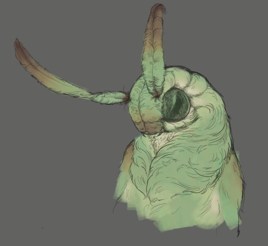
After this I add a multiply layer on top and dab orange or red in places where we might be able to see the base of the hairs or peek at the carapace underneath.
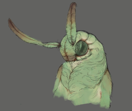
It's places where hair parts and where it's shorter. This accent color works great on joints as well. Example of the thing I'm going for in real life:
Especially visible behind the head. It's not present on every moth to be fair, but I like to add these accents even where it wouldn't make sense, just because it looks nice. Even on insects without hair. Block in the eyes and mandibles now, best if it's on separate layer.
Now, the actual funny tricks begin. If you're one of the people who only use multiply or add blend modes, stop it, get some help Understanding the math behind blend modes is gonna get you a long way. My lineart is set to subtract more often than not. I find it produces juicier and more colorful results than multiply. I want to give this picture a warm orange feeling, so the color of my lines should be the opposite - blue.
And, subtract.
Perfect, but not quite. We can push the lines to an even softer feeling. Take the line layer, copy it, invert the color and set to multiply. I then throw gaussian blur on the resulting copy and reduce opacity until the lines bleed into the surroundings just a little bit.
On to actual shading. People who shade without getting in some background first scare me, so let me throw something together real quick.
A simple gradient will also suffice for this use. We just need some information on which colors are present in the surroundings. Copy your background, bring it on top of your character layers and gaussian blur it real hard. Set it to multiply, remove all parts of the layer that go beyond the pixels of the base color layer. Adjust opacity until the character fits in the background.
Let's identify the light sources. In this case it's only the sky, but it produces two distinct colors - soft blue lighting comes from the top, slightly stronger red comes from behind. The blue light I set to exclusion blend mode because it felt most appropriate in this case. Both add and screen looked too strong to be the light coming from such dark sky.
In this lighting context the lower part of the body will receive less light that the upper part. I use the green of the bushes set to multiply to darken the bottom.
The character is surrounded by all kinds of soft light, but it can't get everywhere. It's time to add ambient occlusion, or contact shadows, for those without a 3d background. Anywhere where there is a crevice or surfaces almost touch, a soft shadow will form.
I do it on a multiply layer with a neutral gray-green color. Gray because any color light isn't really getting in there and green because the fluff is somewhat transparent and whatever light does pass through it gains a greenish hue.
Last step, red rim light from the fading sunset behind the character.
Since it's rim light I just work with normal blending mode. Setting it to add or something of the sort would make the rim light brighter than the source of the light. And it'd be odd.
And that's it. I usually throw on some post processing in Snapseed. Pull some curves, throw on a bit of grain, etc. But it's a topic for another time.
In conclusion, try to think about the environment more when shading. What route does light go through to reach where you're coloring? Did it reflect off of any colored surface? Did it pass through something transparent to gain a different hue? What color shadow would this ambient lighting produce? Go have fun with your colors now.
254 notes
·
View notes
Note
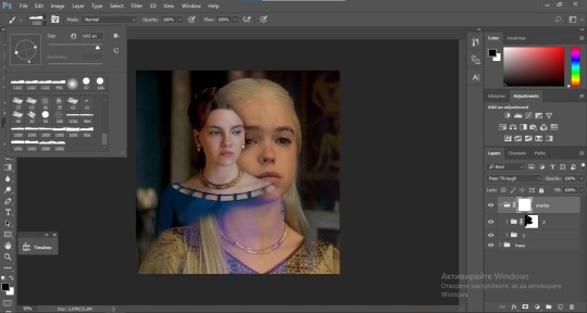
could you please do a tutorial of your game of thrones 'so much for stardust' gifs where it has the ripped paper textures? it's so pretty, and i'd like to learn how to do one with just the texture in the middle and two gifs on either side, like half and half and just having a rip in the middle. it's so cool how you did a gif in the middle though so i wanted to ask as well! all of them are so cool looking. you are extremely talented. if you don't want to though i understand :) thank you
TORN PAPER EFFECT + BLENDING TUTORIAL
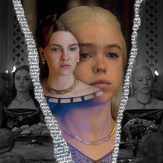
thank you so much for your sweet words, dearest anon and i'm sorry it took so long to answer but it's here now so i'll try my best to explain <3 disclamer: this is the first tutorial i ever made, it's very screenshot heavy and it assumes the basic knowledge of ps and gifmaking. if there's something you don't understand, don't hesitate to ask <3 so, let's get to it!
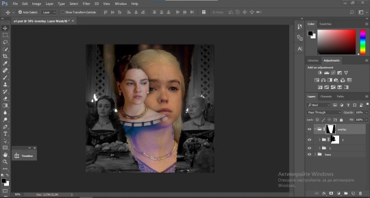
1. PREPARING THE BASE As you can see in this shot there's a lot of space between Rhaenyra and Alicent and that makes it perfect for the ripped paper overlay without hiding much of the base gif. So the first thing i did was to crop it like this:
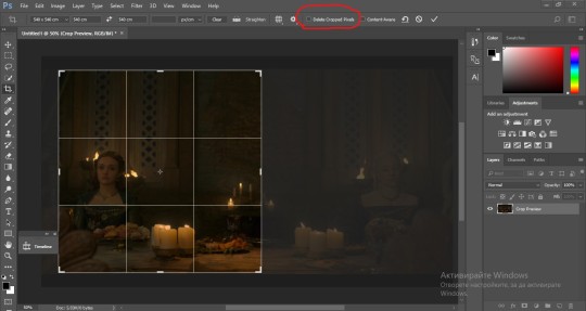
Also you want to make sure that the highlighted box (delete cropped pixels) is unchecked! After taking the usual steps for the animation (creating frames from layers, reversing the frames, setting frame delay) you continue with the video timeline and convert your frames into a smart object. psa: if you don't have the motivation or the time to play around with coloring here are some psds i recommend: 1, 2; as for the sharpening i think this one is the best.
now that you have your smart object sharpened and colored what you want to do next is drag it to the end of the canvas and duplicate it. after that you move the copy on the other end like the original and make sure it's under the coloring layers, like this:
After that you have to create layer masks (the highlighted icon above) for both smart object and the copy and change the blending option of the copy to screen or lighten (whatever looks best!). So this is how it looks now:
pls ignore that there are no layer masks on the smart objects i just added them after changing the blending rip </3 Now, as you see both gifs are like fighting eachother for their rightful place on the canvas. (fgfgfdf) To fix that you have to use a soft round brush to delete the parts you don't want. (feel free to play around with the brush however you want to get the result you want!) Here's my result:
2. THE OVERLAY
Now for the both gifs you want to use for the ripped paper effect you pretty much apply the same steps as the ones you did with the gifs for the base. Here are the two gifs i chose:
Before blending both gifs however you want to create a clipping mask for each of the smart objects coloring layers, like this:
And now you're ready to blend both gifs together! You choose the group with one of the gifs and change the blending again to screen or lighten and place the said group on top of the other. So this is how it looks now:
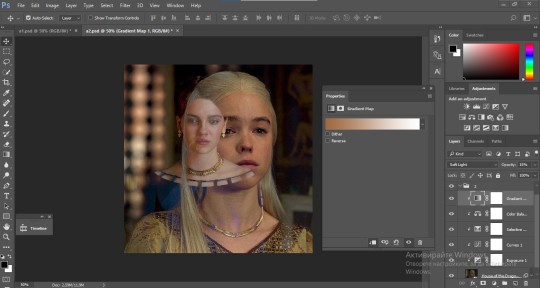
optional: if you feel like the base gif doesn't pop out enough you can always add a gradient map on one of both gifs and play around with the opacity and the color you think fits best.
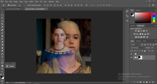
Then you add a layer mask on the overlay gif group and again play around with the brush to delete what you don't want. So this is the final result:
ps - don't repeat my mistake by placing the group with the layer mask under the other group. it should be on top and the blending option should be lighten or screen.
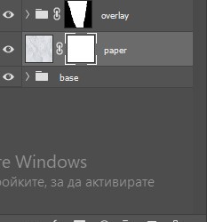
After blending both gifs together, you're ready to place them on the base. So first thing you want to do first is place both groups of each gif in one single group together. Then you duplicate the said group in the psd of the base gif and create a layer mask. This is how it should looks:
Now, in order to create the ripped paper effect, you'll have to download a ripped paper brush pack. This is the one i use. After loading the brushes in ps (if you don't know how here is explained) you're ready to begin! Change the size and angle however you'd like to make it look how you want. And if you want you can move the overlay gif by choosing both groups in case you aren't happy with the adjustment. This is how it looks like so far:
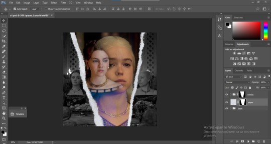
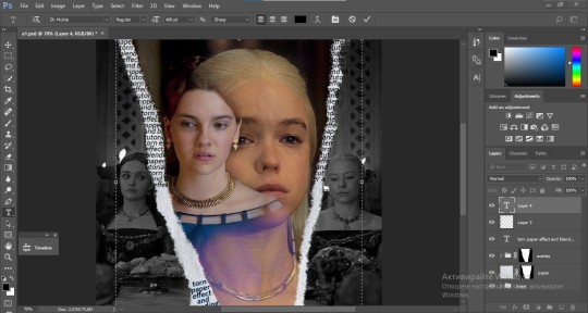
We're almost done! Now you have to find a paper texture, (i got mine from google) place it between both groups of your gifs and create a layer mask, like so:
What you have to do here is pretty much the same thing you did with the overlay gifs. Still, make sure there's enough space for the text you want to write in. However, if you think that the space isn't enough you can just delete a bit more of the overlay gifs. Here's mine:
3. THE TEXT
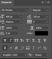
You're finally ready to type out the text you want! If you're having troubles with choosing the right font and size, here are my text settings:
You can always play around with the angle and if your text is too small, zoom in so you can place it just how you like it. And since i'm a bit lazy to deal with it later, i choose to add the highlight color while it's still zoomed. You just have to add an layer above the text and use a soft round brush with opacity from 70-75% and flow from 15-18%.
For the repeated text you want to make sure you create a big space for writing so it can contain the whole space of the torn paper. Also, write where the text will be seen only and use the tab button to skip the space where the gif is. This is how it looks:
Once you're done with writing the repeated text, you want to select all the character layers and the highlight layer and move them under the overlay gif and on top of the paper, like this:
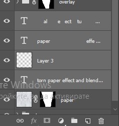
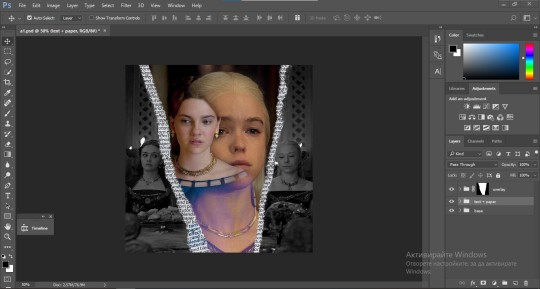
With the layers still selected and in order to contain the text within the paper the last thing you want to do is create a clipping mask. And that's It. You're done! This is the final result:
#allresources#dailyresources#usergif#chaoticresources#gifmakerresource#hisources#onlyresources#alielook#usermaguire#userrobin#usernik#userpat#userbells#gif tutorial#ps help
171 notes
·
View notes
Note
I love the map you made for broken horizon! I've always wanted to make maps for my own worldbuildling, but Ive never figured out how. Did you draw that by hand, or use some kind of map generator, or some other option? im excited to see what else you have in store :)
Thank you!! And I'm flattered people think its done using a generator but its all done by hand!!
Also, I only recently figured out how to make maps that look decent myself recently so I want to share the techniques that helped me because it made making maps sooo fun fr. So here's kind of a walkthrough?
First off I blocked out the rough shapes of the continents, settled on what kind of biomes more or less would be in the different areas

If you want inspiration, or if you need help placing biomes, THIS SITE is super helpful for this stuff!! It can generate landmasses for you, and give you some misc biome info as well. I drew the continents on it and set parameters to get the types of biomes I liked and used it as an inspiration.
After the first block in, you just have to work hard un-refining the edges, and making them rough. Looking at real maps or at google earth helps for reference :] follow ur heart!!
Here's a screenshot of somewhere with less refined borders, this was me going over all the edges with a rough texture brush and making it look more natural. It just takes a lot of work to go in and refine stuff bit by bit but personally I find it really cathartic -w-

I did all of mine in black over white so I could see the silhouette of the coast easily

If you have any textured brushes that have rly rough edges, this is the time to use them, just make sure you aren't using any transparency!
Something that I found helped me a lot, if you are using a program like clip studio paint (the one I used) is use the edge feature. Maybe if you don't have csp you will have a similar feature on it? What it does is it creates an edge of the color of your choosing around everything on that layer. (This layer setting also negates any transparency that I mentioned earlier)
If you look here you can see it around the whole coast:

Here is how it looks like without the edge:

it's a lot different isnt it? This is up to personal preference but I think the edge helps a lot with the vibe of the map being hand drawn.
If you look close you can see that all of the edges are very jagged and pixelled, I think this helps a lot with realism as well since coasts are usually jagged (and they needed to be especially so for my headworld)
After doing this you just need to color in the biomes (or not! you can always do an old timey map and just write cities and stuff on there)
What's most important is that you go Out There and make maps and have fun!!! If you make any feel free to tag me in them 👍 I hope this helps!
83 notes
·
View notes
Note
Any advice on drawing dragons? I really wanna ms paintify my boy
Sure! I don't usually draw dragons but I can try :D
LINEART

Here's the design I'm using. It's a character I made for this small tutorial owo
It's essential to use a pixel art brush for the lineart. Usually it's best to leave it black but you can add other colors too if it fits better.
I'd suggest avoiding round edges when possible, and keep the design pointy. This is because mspaint drawings are usually inspired by old anime from the 90-2000s.
I chose a more complex design, but a simpler one works too.
COLOR

As for color, my advice is to use strong colors more than pastel tones. I chose red, grey, black and white mainly because my character is an emo one, but you can use any you want. You can also use plenty of colorful choices to make it vibrant.
Another advice is to choose similar tones as the mspaint colors. Here's a reference:

Something very common in mspaint style is also adding lights to show texture. Choose a lighter tone for it. The brighter it is, the more reflective is the texture (for example in wings). The inside of the wings can have a slight brightness added.
I don't really add shadows but that's an artistic choice so you can add them if it fits your style better :3
BACKGROUND
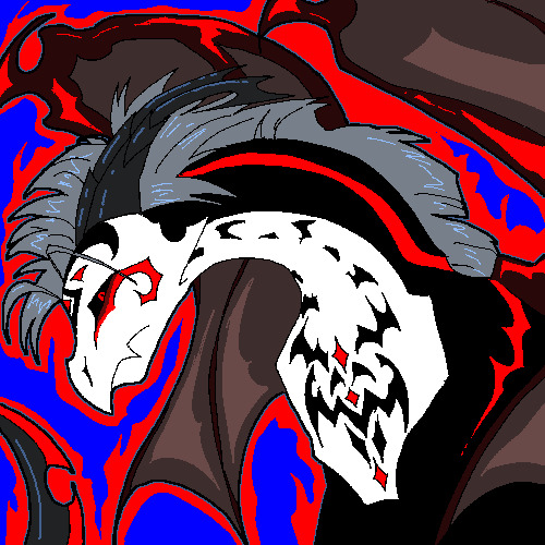
As for the background, most mspaint styles keep it very simple. This is because there is only one single layer in the program. While I did this drawing in Clip Studio Paint and used several layers, it gives the same vibe.
I added some flame details because it's very common in edgy characters. But you can leave it plain or add patterns like stars or circles.
And... I think that's all ^^
Hope it helps!
70 notes
·
View notes
Note
For your 3D art:
What are your influences?
What is your process for creating and texturing the models?
What software do you use?
Other than that, I will be keeping an eye out for more of your models as you are what I aspire to be as a hobbyist 3D artist.
Thanks for asking! I'll apologize ahead of time I'm not the best a writing but I hope my answers will be helpful and fun to read
1: I'm really inspired by arcane and into the spider verse! I love the way they can make 3d look like paintings or comic books I love to stylize 3d and I hope with more practice I can make my 3d art come off as different 2d styles. I'm also a big fan of the old low poly games look with the silly pixel texture it's kinda a funny balance between wanting my art to look nothing like 3d and wanting it embrace the sillies of the art form.
2a modeling: I start with cubes for almost everything I make. I started my 3d art journey with texturing Minecraft skins so I kinda like cubes, it also makes unwrapping it onto a flat plane for texturing just a bit easier for me. Here's an image with the geometry of my silly mailbox model highlighted.

3: I use Blender to make all my models although I just learned a little bit of 3ds Max in my first 3d animation class, I'm mostly self taught though that being the one semester of a 3d animation class under my belt but youtube has been a gold mine for every question I have about 3d and I've practically learned everything I know about using Blender of youtube tutorials.
2b texturing: I use an add-on called uv pack master in blender to speed up my uv unwrapping process so I can make my texture look nicer faster. As for painting I use the tools in blender to texture my models with a couple extra brushes from another add-on it's outdated though and I should probably find some new brushes lol. This is what my texture looks like btw! It's a little messy but I hope you can find it helpful!

I'm really passionate about 3d animation and almost everything involving it I love talking about it thank you for asking!
101 notes
·
View notes
Note
hiii milkyyyy! u’ve been popping out so many manga pages and i’m just so amazed?? i’ve been wanting to get back to manga drawing so can i ask for some tips? like what’s your process and how do you decide the screen tones/sfx/effects/speechbubbles to use? the latter is something i’m struggling with 😭
tyyy 💕
Hi Yudi, thanks for dropping by!
General note: One thing I’ve learned about trying to go for a more manga-esque style is that there’s really no particular way to do it, and EVERY artist does it differently. Everything I do here is a blend of my own style and things from JP artists I admire! However, the most important thing is that panels aren’t meant to be masterpieces but to convey information and get the dialogue going.
This process will be CSP oriented. I’ve made a mini screen tone tutorial (and how to turn on Layer Property) but I did not talk about my own settings ^^ You’re free to do any resolution you want, though I stick to drawing on a B4 template for fun (and imagine that one day my stuff can get published /j). I hope this helps, as I’m still trying to figure my own style and set limits on the details too.
[Process]
Script + Thumbnail
I used to wing stuff for one-pagers, but now I’ve found that scripting and thumbnailing has made my process so much faster. (Omg it’s almost like people make drafts for a reason- @ me cause I hate planning)
There’s no standards of a comic script, and each publisher has their own format. My usual scripts don’t separate pages, since I leave that to the thumbnailing once I do dialogue placement. If trying to imagine panels without seeing them overwhelming, at least get the dialogue down.
The B4 thumbnail template I use is pretty darn big, so it also doubles as the sketching stage. Once the thumbnails are done, I transfer them (screenshot) to a comic file on CSP. Once the set up is done, I do speech bubbles + dialogue first, insert the frames, then get to the line art. Since I don’t think anyone is actually gonna print their works, you’re free to trim your canvas however you want to post online 🫡
Speech Bubbles
Any speech bubble can work and will eventually blend in as the viewer is reading, but I have a vendetta against super flat/digital-looking ones. I made a custom brush for a textured speech bubble pen with line width by adjusting its taper and changing the brush shape. Published manga are a different story, but I like the more organic polygonal bubble shapes from indie artists-
For different shapes and situation… Squares - Narration, Flash/Urchin - Character thoughts/internal monologue, Hexagon - Phone call/text (not a concrete rule but a common pattern)
You can also add emanata (sparkles/symbols) on the bubbles for flairs as you see fit.
Screen tone (Please read the linked mini-tutorial above)
I split my tones into two folders. One specifically for black, and greys.
I first fill in all black areas, the duplicate them. The top layer will be the shadows (remains pure black), and the bottom layer is set to [Opacity 75%] and turned into a screen tone layer with a [frequency of 45-50] (It must always be at a lower frequency than the greys). To add texture, I use a grainy brush to erase bits of pure black on a mask. To show light on the screen tone layer, I use gradient erase on a mask.
For the greys, I split them into three tones (dark grey, medium grey, light grey) all in the same folder so they don’t overlap and it’s easier to fix. I use a [frequency of 75] or any number higher than the screen tone in the black layer. Overall, tones can be as simple and complex as you want, but it’s best to save more detailed tones for important panels. (Planning to change this as I’ve realized how big the B4 canvas actually is, and the frequency doesn’t need to be so high- The size of screen tone is a preference. This example was done on a smaller canvas, so higher frequencies still look less pixelated/small.)
Emanata/SFX
Special effects is whatever the situation calls for! It can to make a blank canvas feel more dynamic, to evoke certain emotions, hint/foreshadow. It’s best used sparingly on important panels you think would be the most important… but how do you get those effects?
THE CLIP STUDIO ASSETS STORE- Or draw/download your own depending on the program (You have no idea- ever since I downloaded too, I can’t unsee them in other works of artists I like 😭) Not used in the example but these are my essentials- You can also find a lot of gems if you straight up search “manga” and see the most popular assets.
Another good place to find comic fonts in general is blambot.com (?). They have quite a bit of free, personal use fonts if you ever need flavour text when italics or bold isn’t enough. (Current font used is Anime Ace 3 Regular BB).
Happy creating and feel free to ask if anything was unclear ^^
28 notes
·
View notes
Text
Texting it out down here cause in video would go by to fast. Also the video for the sketch layer didn't save so it picks up at me starting on Cross's face. Not too much missed, I only rough out some shapes and copy/paste them where I want them from frame to frame.
It takes me about 2 hours or so to make one of these. I'm using a mouse rather than a tablet so you'll notice my style is more like carving with lines rather than drawing.
I fill my background and put down a very rough sketch. I keep it rough mostly do to impatience. The line work does turn out better if I do a more detailed sketch but that doesn't matter. None of this matters.
Things I always do that I know to correct in my line work as I go: "That head too big! Always too big! Eyes too! Shrink erything."
I do the line art in a free program called ProMotion. It's for animation but I don't care, I'm looking for clean sharp lines and tools that let me copy/paste and instantly make brushes of pieces that I highlight. Its a pixel based program and I would normally use it to make sprites for my RPG maker games.
IMPORTANT STEP: ZOOM IN AND OUT OVER AND OVER AND OVER TILL YOU DONT CARE IF IT LOOKS RIGHT ANYMORE.
Then we take that line art and shove it into Photopea for coloring. This is another free program that's a clone of Adobe because I like photoshop tools but hate Adobe as a company with a fiery passion.
Yes I just kind of choose whatever color. I could make a reference sheet with saved colors but TRUST ME. I wont use it. I almost never use references, i forget, okay. Mostly drawing from memory.
Each color gets a layer essentially and then I "paint" them with the burn tool. (Midtones 20%) Cross's armor gets highlights on the ridges with the dodge tool. (Also Midtones 20%)
Add Blush to the skin! Thin points like face, shoulders, finger tips. Blur Blur Blur till it looks right.
Also, remember how I said I was looking for clean clean lines with no blur? That's cause I just clean up the "paint" by selecting with the magic wand and deleting it.
I make my backgrounds out of stock textures mostly. Though this usually takes a little bit more collage work this strip is simple so I just used the gritty/tech wall texture. Blur that bitch. (Gaussian Blur under the filter tab, whatever looks right but the default 7 pixels is usually good for the BG)
To add motion I copy the bits I want to seem like they're moving and use the "Motion Blur" filter, then I put that copied color over the background line art.
Add shadows! Under the coloring layers, that handy gaussian blur again.
Add Lighting! I usually have the overlayer set to "Soft Light" and then I use the gradient tool to filter everything to look cohesive. (You might notice I keep their skin tone pretty dark but it might look different when I change the lighting.)
Warp the action words... just...whatever feels appropriate at the time and set that layer to "Color Burn"
I just use the Oval select tool with the feather set between 3-5 pixels to make word bubbles. Paint it in voila. Add Text. All done!
Cross x Tahny: +A Summary+

My philosophy : Style matters more than skill and you should cheat and cut corners as much as possible. Peace and Love.
-++-++-++-++-++-++-++-++-++-++-++-++-++-++-++-++-++-++-++-
Tags:
@feral-ferrule @eobe @ghostymarni
#Time lapse#drawing time lapse#art time lapse#the bad batch#sw oc: tah'nyem ra#sw oc#tbb#crosshair x f!oc#drawing comics
34 notes
·
View notes
Note
I was wondering how achieve such a wonderful textured finish on your pieces? They are wonderful and I love their resemblance to aged photographs and the speckles of colors in the backgrounds. Your art is mesmerizing :)
you can see some of the texture brush sets i use in my #info_asks tag but i have some more (procreate) tips aside from just brushes
also hi i made this whole thing and then stupidly hit ctrl z to erase ONE word and i lost the entire bottom half of the post and all my image descriptions so fuck you tumblr i had to make this twice
to get a faded photo or old digital screen look, consider duplicating the canvas (once all the layers are merged) and using a gaussian blur tool on the new duplicated layer. then set that to low opacity to add a misty sort of look. looks nice in combination with some chromatic abberation and a small bloom effect. then a subtle noise filter on top:
for faded print effects, it's really worthwhile to learn how to use layer masks. you can use a layer mask to non-destructively 'weather' blocks of colour or lineart, without erasing the layer itself. the weathered ink/block print effect here was made using layer masks which means that if i just hide the mask, the lineart becomes solid black again and easy to alter or colour in:

for old paper effects you can just set a paper texture on multiply over the art sure, but you can also combine it with the blur & bloom thing, a really subtle drop shadow and canvas tilt, and highlights to make it look like an aged photograph of a card. this originally had a transparent bg but i'll post it here with a white bg so that the drop shadow is more obvious. the scuffed edges of the card (left) were hand drawn, simple white stucco brush. the bigger patch of scuffed ink (top right) was a texture stamp.

for block print looks you can move the colour layer out of alignment by a few pixels - but only after you're absolutely sure you're done with it, otherwise you'll get something like this -

i forgot to erase out her eye before i moved the red layer so now her eye defeats the 'look' of a misaligned print. the black lineart and red layer were also given the same layer mask treatment as described above to make them look faded or like the ink didn't stick down right to the paper
you can do this with multiple colour layers too. if the colour layers are separated and set to multiply (as in this cmyk example), it'll leave halos and edges around each shape which mimic old comic book print
just to show what you can do WITHOUT any special brushes, here's a piece of one of my mez tarot cards from before i got any extra brushsets at all. for this one, i added a green tint over everything to mimic a sun-bleached or faded print (my actual goal wasn't 'medieval illustration' but actually 'trading card from the 60s that got left on someone's windowsill for decades'). the background texture is the procreate noise brush. the texture under the green lion drawing is the procreate concrete brush (to make it look painted onto a wall). the lettering and lineart is procreate's 6B pencil. but to properly aim for The Look of it being a printed physical object, i also used a perspective blur so that the edges are out of focus, and metallic gold highlights which don't match the lighting of the actual illustration and appear to be catching some other external light. that texture was made from the procreate noise brush
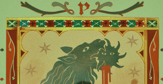
it's pretty simple compared to my later stuff but i still really like the effect
in terms of colours, you need to keep them unified so that they all appear to be acting under the same external light source, like if someone is holding up a torch to a painting then the painting colours will be glazed with firelight even if there's no painted fire. a really easy way to do this is to slap a multiply layer over everything in one shade - grey-yellow for a weathered paper look, or greenish blue for sunbleached photos. this unifies all the colours of the drawing. or you can apply a gradient map at a low opacity so that there's only a subtle change. or just do it by hand - if you want everything to be slightly tinted yellow, just pick the colours you normally would, but move the colour wheel towards yellow to get a yellowfied version of the base colour. easy
it's really important to consider how fading and weathering can affect printed colour. white paper yellows, black fades. you will rarely see pure black or pure white. which means you can use pure black or pure white to add external effects like the white scuff marks on the hierophant card. if the whole drawing is yellowed from age but there's some white somewhere, it's an easy shorthand to show that the scuff mark or whatever was not originally part of the drawing (great way to add some nasty stains lol)
#info asks#i don't have like a specific set of steps i follow i kind of freestyle it every time#obviously i have favourites i like to use but like that sphinx drawing? don't ask me how i did it because i don't remember#i just played with it until it looked nice. the blue dots are ... some sort of effect layer i don't remember which
651 notes
·
View notes