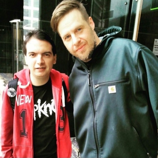
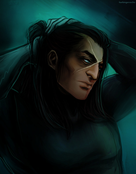
#i HATE his short hair
Text
my blog isn't very versatile, oops
#chris fehn#unmasked#slipknot#i HATE his short hair#fuck that hair era#atleast he looks somewhat happy
15 notes
·
View notes
Text
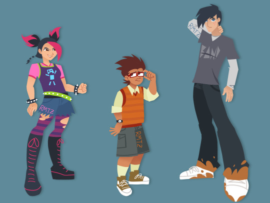
Slight redesign
#gave raf shorts cus yeah#its 2012 he probably has an older brother that had a cholo phase and gave him those baggy ass shorts once he grew out of it#also no more giant anime hair. i hated drawing it#mikos design is already perfect i just added some rips in her tights and shorts#jack is... um... there...#hes sooo boring im sorry i love him but hes BORING. i dirtied his jeans & shoes cus he likes to go off roading w arcee#(idk if her alt mode is capable of that but i dont care)#and i added some pimples cus why not#we need more pimple representation in media#pimple pride 2024#tfp#transformers prime#transformers#jack darby#rafael esquivel#miko nakadai#maccadams#maccadam#art by rico
661 notes
·
View notes
Text
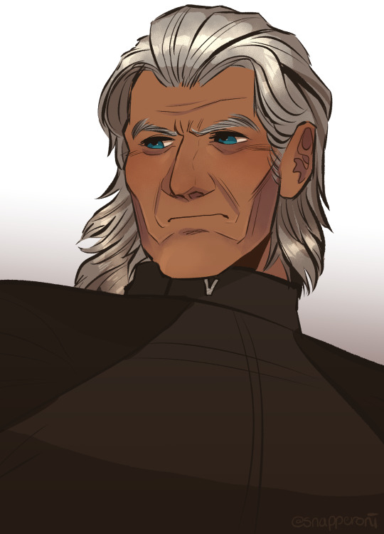
chat if i may speak
#marvel cinematic universe#mcu#xmen#x2 xmen united#xmen the last stand#xmen dofp#magneto#erik lehnsherr#snap sketches#i love the old people !!!!!!#highkey though old people are prob my fave subjects to draw ..#theres just so much line definition- i feel more confident drawing them and saying 'yeah that looks like them'#tho i also feel this way with people/characters who have really defined features and shapes ..... most curious !!!#anyways. i gave him extensions vjalkjlkaejAELJ#long-hair erik is important to me and i simply Had To See with ian mckellens face#at the same time something isnt right ... i cant explain it... im not gonna sit on this any longer tho this just a quick thing vjlkalk#when i inevitably draw older movie erik again ill prob go back to his short hair but i may be subjected to a treat. just this once#i dont wanna drive. totally unrelated. im going home for the weekend and i live so FAR from my dorm i hate it here (no i dont)#i just hate driving VJELAVJAE#whatever its the weekend which means more time for xmen brainrot#i just started S3 of 92 !!!!! in theory im halfway done with the series but S3 is also 26 episodes compared to the previous 13 vjeALVKEJ#OH WELL. im gonna go now i have to start driving at some point i GUESS#i just wanted to leave the people with a silly thing </3 ok bye bye#i have a silly comic planned with younger cherik so heres to hoping i do that !!! it's stupid but funny. i hope#ok bye bye now Truly
187 notes
·
View notes
Text
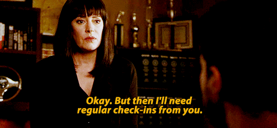
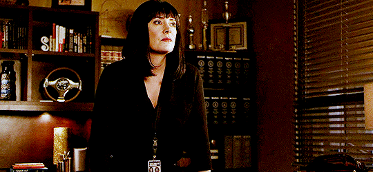

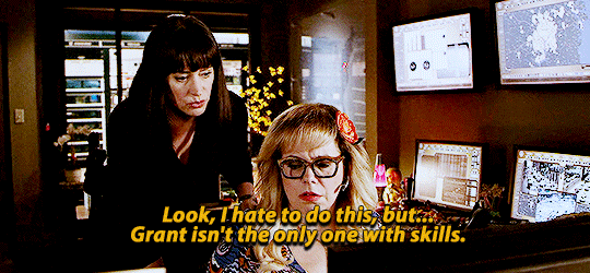
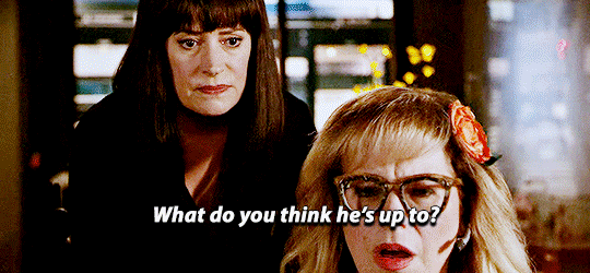
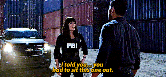
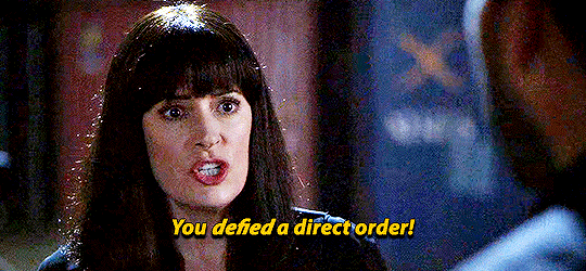
Criminal Minds 14x06 - Luke
People use covert/spy techniques and Emily Prentiss immediately notices. Parts 1, 2, 3
(Don't con a conman -- don't use covert tactics around a former spy)
#tv: criminal minds#emily prentiss#luke alvez#penelope garcia#my edit#cmedit#criminalmindsedit#people trying to pull suave covert tactics around emily#and backfiring because#she knows most of them#luke tries to go off alone to avenge his best friend#but emily knew that playbook#because lbr emily would probably do the same thing#we saw in lauren that emily also has some stash house#with new cover identities and weapons#i hate the cleopatra wig so much#we could have had short haired graying prentiss here#but no she wasn’t allowed
110 notes
·
View notes
Photo
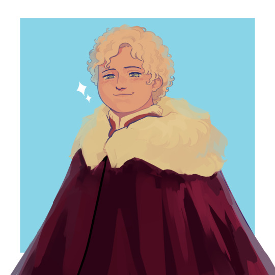
older tommen with short hair bc idk it’s kinda growing on me
#asoiaf#a song of ice and fire#valyrianscrolls#tommen baratheon#my art#ngl part of the reason i like the short hair is bc i get to draw 2 eyes lol. no i am NOT giving up the emo fringe its my brand ok -_-#idk how much older exactly like uh. 12?#idk why hes in winter clothes either i just did it bc i was lazy uhhhh maybe he's visiting his bestie bran :)#tried something with this. i dont like it lol#something=rendering with untextured brushes only+low contrast shading kind of#i hate it its too smooth idk. final result is. fine tho
579 notes
·
View notes
Text
mission prep
#rvb#locus#red vs blue#samuel ortez#sam ortez#rvb locus#mine#*23#voted prettiest man in rvb with a face reveal BTW! lets not ever forget that#i saw that short hair locus thing and now im thinking abt it. i have a whole Thing abt locus cutting his hair yada yada but now i kinda#wanna draw smth abt it. its infesting me. but before i do that i have to draw locs with long hair 1 more time.#also eww i hate going into the locus tag and seeing all my art there. embarrassing. oh well.
185 notes
·
View notes
Text


i forgot to take a picture at the lineart stage 😭

#tengen uzui#but short hair#idk i like fucking them up 💀🙏#idk why he looks like that i js hate drawing his hair#kny#my art#artwork#kny tengen#kimetsu no yaiba#hashira#demon slayer
27 notes
·
View notes
Text
wasnt going to put it in the tags of that person's post but i fully believe clark kent will have the angriest hatefuck of his life with santa claus btw
#theres panels justifying this on my phone somewhere but just trust me#like clark is FIRM in believing everyone deserves privacy and he doesnt abuse his powers vs santa's mass surveillance and judgement#also i can imagine a bitter 'i can do this better' thing from both of them in the going around the world thing and power/capabilities#the hatefuck is because it's funny when people hate each other and fuck. also fat man with grey hair and a beard can be hot if it wasnt for#the whole christmas thing santa is associated and tied into#i remember a santa bowling game where he wore hawaiian shirts and shorts and how as a kid i was a lil 👀#<- unrelated to this i just like oversharing <3#ransom note
141 notes
·
View notes
Text
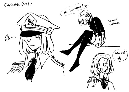
potential clarinette design?
(the girl lime dated for a short time during the timeskip to try and get over mochi. shes currently trying to get him to go out with her again)
#the cat witchs guild#the misc adventures of mochi and lime#tcwg#tmaomal#clarinette#art#ocs#original#beta#i know i want her to have short-ish hair#she actually is quite sweet personality wise#and a bit silly and light hearted#the happy type#but made the unfortunate mistake of not being born as mochi#and is actually a bit too persistant which annoys lime post breakup#he didnt think she was bad he just still loved mochi and thought it wasnt fair to her (was his original break-up reason)#and then she started being too persistant which was the official turn-off#tries to hate mochi but has a hard time because mochi is wonderful#clarinette to herself (so this is her huh....i hate her)#mochi: we have some leftover muffins...do you want them?#clarinette: (shit!! its delicious!!!! damn you mochi for being so nice!!!)
128 notes
·
View notes
Text
Orym growing his hair out while Dorians gone because he's not really taking care of himself makes for an EXCELLENT gay hair cutting fic
#silver sending stones#dorym#orym of the air ashari#dorian storm#the thought is#theyre reunited and dorian#because orym is roughly hand height#dorian runs his hands through oryms hair “without thinking”#and says “youre letting it grow? i thought you liked it short?”#and dorian wraps it in a fist and pulls a little bit#again “without thinking” (no for real dorian like playing with hair hense the long ass hair and he does not realize hes making oryn go RED)#and orym. through his blush. goes “i actually hate it. i just havent felt ... its been really ... it gets in my eyes? hard to look around”#“oh? im sorry i wouldnt have-” “no its okay. i didnt say anything”#“...do you want ne to cut it? im pretty good with a pair of sheers” “oh i ... normally just go at it until its short enough”#“oyrm. i mean this as kindly as i can. we can all tell. youre a handsome man. let me give you something thatll compliment your face”#lots of blushing. a lot of touching of the neck and throught the scalp#and depending on how I'm feeling#theyre probably not together#so orym is just sitting there radiating red while dorian is doing his best not to fuck up his hair#maybe a kiss at the end#maybe not#we'll see how desperate i am at episode 98#we're just on e32 rn
30 notes
·
View notes
Text
"My cat won't let me get anything done"
And then it's just a picture of Ganke sleeping on Miles's chest while he's struggling to use him as a table for his sketchbook.


^^^
#across the spiderverse#miles 42#prowler party#clawcode#ganke lee#miles morales#milesganke#prowler miles#slur gallery#doodles#traditional art#i like to think that Ganke is touch starved as FUCK and needs bf cuddles#constantly#hes an absoluuuuute sucker for being pet#hands in his hair? please.#kiss on his shoulder? god yes.#he cannot fall asleep unless he is besides Miles (he often waits for him at night when hes out as the Prowler totally because he loves him-#-and not because hes an insomiac#who drinks 8 energy drinks a day...#and stays up all night on his computer.....#Miles acts like he hates it but he really genuinely loves being needed#at lunch Miles is seen with Ganke behind him leaning over his shoulders and playing with his hair#theyre caught sleeping on a couch in the library and Miles is the little spoon#they hold hands everywhere they go and people stare because why the hell is this short angry gremlin being affectionate-#with this giant nerd that acts like hes a teddybear#sometimes they switch up and Miles is the one needing love#he spots Ganke sitting on a table and comes over#forces his way into the seat in front of Ganke and puts his head in his lap#and Ganke doesnt miss a beat and continues talking and everyones just like#...what the hell
49 notes
·
View notes
Text
apocalypse patty (wip)
#woke up with the sudden motivation to actually work on the mbz story so#that's what i'm doing#i'm working on red's origin story first since i have a clear vision of where i want to take it#the first pic is actually her pre-apocalypse (she's ~13 or so there i think) & the second is ofc her during the apocalypse (~19ish)#kel's life before the apocalypse actually plays a pretty big role in his origin story#so that's why i made two versions of pat. i gotta make a pre-apocalypse version of kel too#which means giving kel a very short hair cut :-) he will hate it :-)#also! pat does have a nickname in the AU. it's sis lol#very creative ik. but i imagine that's what everyone in their group calls her#ok back to work#rainyrambles
43 notes
·
View notes
Text
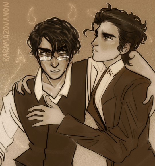
you cannot exhume a soul
— "Either he will rise up in the light of truth, or … perish in hatred, taking vengeance on himself and on everyone else for his having served that in which he does not believe" (The Brothers Karamazov, Dostoevsky tr. McDuff, p. 837)
#the brothers karamazov#ivan fyodorovich karamazov#alyosha fyodorovich karamazov#aleksey fyodorovich karamazov#first line is a lyric from god is dead? by black sabbath bc if im gonna inflict my art on yall then im also gonna inflict my music taste#sorry i keep drawing ivan sweaty and miserable it will happen again#his w/ill g/raham arc just goes too hard i cant help it#also i hate that alyosha cut his hair short and took off the cassock bc now i have to choose between textual accuracy and his objectively#cooler fit from the beginning of the book#the cassock and long hair solos sorry!!!#anonart#ivan#alyosha#also i bought a copy of c&p bc tbk is the first dostoevsky ive read so expect me to be annoying about that soon probably#also also i want to draw ivan w horns and a tail and alyosha w wings and a halo but im scared of fandomificating them.#plus idk what id draw dmitry with#anyway lmk if u want to see that bc i am incredibly susceptible to peer pressure#GODDAMN I TALK A LOT TAGS OVER SORRY
76 notes
·
View notes
Text
Doris be like, "what's easier here:
boarding a ship in the dead of night to escort two crazy kids to a hideaway in a foreign country
or
having a serious conversation with my son?
...anyway yeah the boat leaves at midnight"
#Doris McGarrett#H50#watch Kono and Adam be the only couple still together at the end of this show lmao#oh and I still HATE Steve's short hair ugggghhh it looks awful. all his cuteness has immediately evaporated somehow. sad!
11 notes
·
View notes
Note
You said don't get you started on Ice's helmet or you'll be mean... please be mean. Please be mean to him. What is so disastrous about his helmet design?
my time has come. i will be mean to him. (thank you for getting me started on this. it bothers me every time I watch top gun.) this is also gonna be so long. yippee!
stopthatfool's issues with Tom "Iceman" Kazansky's helmet! aka this bad boy right below. (I'm sorry if anyone loves Ice's helmet, it's just not for me)
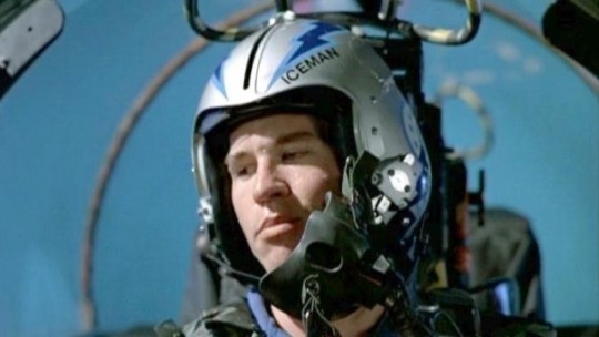
The placement of his name. WHY is it on the side? Both him and Slider have their names on the side. That makes me think it's a squadron thing? (the VF-213s) but regardless i don't care cuz i think it's stupid. (again sorry if someone thinks its genius. ok i'll stop apologizing)
My biggest issue with the fact it's on the side is that it creates this uneven weight distribution. The side with his name feels considerably "heavier" than the side without.
And the thing i don't understand is that Ice's name is evenly numbered!! He could fit 3 letters on either side of the line that comes down the helmet! the letters wouldn't be unevenly distributed, so I don't know why he felt the need to put it there!!
Here, I have "annotated" his helmet and provided other viewpoints of his helmet!

The font/typeface! Ice.. is that ARIAL?? and it's not even bolded??? so not only is his name to one side and weirdly small... it's skinny and unbolded. (like you're THE Iceman. Don't you want your name big and bolded? I shouldn't be searching for your name when you're Mr. Iceman!)
Looking at his helmet head-on, part of his name isn't even visible.. like ok ICEM!
And then! There's this weird switch up in the shapes and line types that he used-- the angular and sharp points of the lightning bolts and the half circles surrounding the squadron logo (is it a logo?? idk im gonna call it a logo)
What i think Ice is trying to do here is create a "connection" between the circular part of the logo and the lightning bolts as the bolts go all the way to the back of the helmet... but in my opinion... it's not working. like at all.
The comparison between the harsh lines of the bolts and then the curves is just kind of hard on the eyes (for me anyway). I just don't know where to look. Should i be following the leading lines of the lightning bolts? Or the curves of the half-circle things? Or should I be following the line of the lightning bolt in the logo?
And all throughout that... i barely end up seeing the name on the helmet.
Continuing off the logo... for Top Gun 1986, Ice and Slider are in the VF-213 squadron, but the movie switched the logo to the VFA-25s that looks like this on their flight suits-
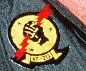
(yes that is the best quality image i could find from the movie my bad) So why does the logo on his helmet look like this???
WHY do the fingers look like that. they look like hotdogs im so sorry. (logistically it was probably easier for the decals to be printed and then applied like this. but. we're not talking about technicalities here. right now i'm tearing apart the entire composition of Ice's helmet.)
I like version of the logo on their flight suits soooo much better! It's got more "rhythm" and flow to it that the lightning bolts lack! Plus no hotdog fingers.
Ok ok, now on the colour scheme. The harsh and bright blues I don't mind. Like yeah, you're The Iceman, punch me in the face with blue. I can forgive that. The thing that really bothers me.. is the silver/grey base of the helmet.
It's this really harsh grey that really doesn't help with the already harsh blues. I think he should've continued with the blue he has going. cuz this grey ain't working, king.
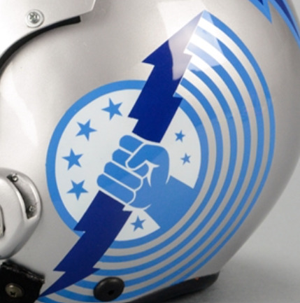
Ok, anyway. Since I should be studying, I'm obviously doing anything but studying. So i redesigned ice's helmet. ya idk.

it's kind of wonky.. but whatevs (ignore how the lightning bolt on the side view doesn't line up with the front view) (and ignore the inconsistences in the lettering. i was lazy and did it by hand)
I also didn't want to completely change/get rid of the aspects of Ice's helmet. So the changes aren't huge (except for maybe the name placement/"font")
ok I changed the background colour (finally, it's less all up in your face now) I continued with the blues and lessened the intensity just a little bit. I really wanted his name to be front and center!
Now the colour scheme is also consistent. No random black lettering (again, in arial???) there's now black in both his name, the outline of the lightning bolts and the logo!
Now his name is evenly distributed! See how it fits on either side of the line that comes down the center of the helmets from '86? See how you can actually see his whole name? See how it's heavier and fits the whole "iceman" theme better? (at least in my opinion)
Come on, Ice! You should've used the leading lines provided by the lightning bolts to guide people to your name! There's now a fun little overlapping moment!
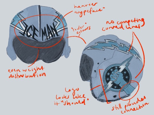
(ignore how i forgot to dot one of the i's in distribution whoops)
No more weird half circle things! No more conflicting leading lines! But! I decided to extend the arm of the squadron logo to continue the line of the lightning bolt as it moves backward. I think this makes the circle of the logo fit better, while simultaneously creating that "connection" he was trying to get in his actual design.
The lack of half-circle things also allow for the logo and lightning bolts to just "be." There's no distraction. it's not overly "busy" anymore (like maverick's helmet). It's simple, but he's The Iceman! He doesn't need it to say/have more!
And the use of the "actual" logo seen on Slider and Ice's flight suits creates that sense of movement that was absent before! Plus no hotdog hands!
Is this new proposed design perfect? Absolutely not! The logo and the lightning bolts still create a weird point of almost intersection that still bothers me. But I think fundamentally, there's always going to be issues with these two components: the circle will never quite fit in, and the lightning bolt the hand is holding will always "cut" the whole thing in half, creating a weird separation in the helmet, that will always bother me.
Anyway, this was a lot of fun! (I love being mean to these guys. they need their egos brought down a couple pegs!)
#now if only i put this much effort into my actual assignments regarding composition breakdowns....#looking at it now. i think i just spelt distribution wrong. blegh. whatever.#ICEMAN! big bold letters! like oh yeah! that guy!#long story short! i hate his helmet!#i hate hate HATE your hair and makeup today#like that clip from rupauls drag race u know?#top gun#top gun 1986#iceman#tom iceman kazansky#stopthatfool goes crazy and explodes#stopthatfool draws
59 notes
·
View notes
Note
Do ya think he could handle it tho? Would he do alright..? /brainrotsorrynotsorry
I dunno, how does he look like he's handling it to you?

#i did my best#hes definitely not in my area of expertise but i like stepping outside my comfort zone#hate drawing his hair tho i suck at short hair#mpreg#what hath i wrought#roboprog
22 notes
·
View notes
Last Seen Blogs

eiran-eye
Eiran

poetrylover749
Scripturient

pockyniel
POCKYNIEL

raiden-ikari
雷電 怒り

things-to-do-bakersfield-ca
Things-To-Do-Bakersfield-CA