#ICEMAN! big bold letters! like oh yeah! that guy!
Explore tagged Tumblr posts
Note
You said don't get you started on Ice's helmet or you'll be mean... please be mean. Please be mean to him. What is so disastrous about his helmet design?
my time has come. i will be mean to him. (thank you for getting me started on this. it bothers me every time I watch top gun.) this is also gonna be so long. yippee!
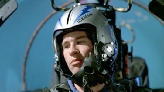
stopthatfool's issues with Tom "Iceman" Kazansky's helmet! aka this bad boy right below. (I'm sorry if anyone loves Ice's helmet, it's just not for me)

The placement of his name. WHY is it on the side? Both him and Slider have their names on the side. That makes me think it's a squadron thing? (the VF-213s) but regardless i don't care cuz i think it's stupid. (again sorry if someone thinks its genius. ok i'll stop apologizing)
My biggest issue with the fact it's on the side is that it creates this uneven weight distribution. The side with his name feels considerably "heavier" than the side without.
And the thing i don't understand is that Ice's name is evenly numbered!! He could fit 3 letters on either side of the line that comes down the helmet! the letters wouldn't be unevenly distributed, so I don't know why he felt the need to put it there!!
Here, I have "annotated" his helmet and provided other viewpoints of his helmet!

The font/typeface! Ice.. is that ARIAL?? and it's not even bolded??? so not only is his name to one side and weirdly small... it's skinny and unbolded. (like you're THE Iceman. Don't you want your name big and bolded? I shouldn't be searching for your name when you're Mr. Iceman!)
Looking at his helmet head-on, part of his name isn't even visible.. like ok ICEM!
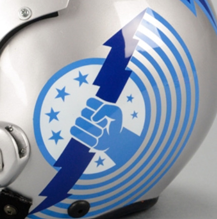
And then! There's this weird switch up in the shapes and line types that he used-- the angular and sharp points of the lightning bolts and the half circles surrounding the squadron logo (is it a logo?? idk im gonna call it a logo)
What i think Ice is trying to do here is create a "connection" between the circular part of the logo and the lightning bolts as the bolts go all the way to the back of the helmet... but in my opinion... it's not working. like at all.
The comparison between the harsh lines of the bolts and then the curves is just kind of hard on the eyes (for me anyway). I just don't know where to look. Should i be following the leading lines of the lightning bolts? Or the curves of the half-circle things? Or should I be following the line of the lightning bolt in the logo?
And all throughout that... i barely end up seeing the name on the helmet.
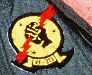
Continuing off the logo... for Top Gun 1986, Ice and Slider are in the VF-213 squadron, but the movie switched the logo to the VFA-25s that looks like this on their flight suits-

(yes that is the best quality image i could find from the movie my bad) So why does the logo on his helmet look like this???

WHY do the fingers look like that. they look like hotdogs im so sorry. (logistically it was probably easier for the decals to be printed and then applied like this. but. we're not talking about technicalities here. right now i'm tearing apart the entire composition of Ice's helmet.)
I like version of the logo on their flight suits soooo much better! It's got more "rhythm" and flow to it that the lightning bolts lack! Plus no hotdog fingers.
Ok ok, now on the colour scheme. The harsh and bright blues I don't mind. Like yeah, you're The Iceman, punch me in the face with blue. I can forgive that. The thing that really bothers me.. is the silver/grey base of the helmet.
It's this really harsh grey that really doesn't help with the already harsh blues. I think he should've continued with the blue he has going. cuz this grey ain't working, king.
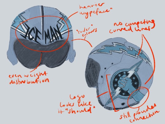
Ok, anyway. Since I should be studying, I'm obviously doing anything but studying. So i redesigned ice's helmet. ya idk.

it's kind of wonky.. but whatevs (ignore how the lightning bolt on the side view doesn't line up with the front view) (and ignore the inconsistences in the lettering. i was lazy and did it by hand)
I also didn't want to completely change/get rid of the aspects of Ice's helmet. So the changes aren't huge (except for maybe the name placement/"font")
ok I changed the background colour (finally, it's less all up in your face now) I continued with the blues and lessened the intensity just a little bit. I really wanted his name to be front and center!
Now the colour scheme is also consistent. No random black lettering (again, in arial???) there's now black in both his name, the outline of the lightning bolts and the logo!
Now his name is evenly distributed! See how it fits on either side of the line that comes down the center of the helmets from '86? See how you can actually see his whole name? See how it's heavier and fits the whole "iceman" theme better? (at least in my opinion)
Come on, Ice! You should've used the leading lines provided by the lightning bolts to guide people to your name! There's now a fun little overlapping moment!

(ignore how i forgot to dot one of the i's in distribution whoops)
No more weird half circle things! No more conflicting leading lines! But! I decided to extend the arm of the squadron logo to continue the line of the lightning bolt as it moves backward. I think this makes the circle of the logo fit better, while simultaneously creating that "connection" he was trying to get in his actual design.
The lack of half-circle things also allow for the logo and lightning bolts to just "be." There's no distraction. it's not overly "busy" anymore (like maverick's helmet). It's simple, but he's The Iceman! He doesn't need it to say/have more!
And the use of the "actual" logo seen on Slider and Ice's flight suits creates that sense of movement that was absent before! Plus no hotdog hands!
Is this new proposed design perfect? Absolutely not! The logo and the lightning bolts still create a weird point of almost intersection that still bothers me. But I think fundamentally, there's always going to be issues with these two components: the circle will never quite fit in, and the lightning bolt the hand is holding will always "cut" the whole thing in half, creating a weird separation in the helmet, that will always bother me.
Anyway, this was a lot of fun! (I love being mean to these guys. they need their egos brought down a couple pegs!)
#now if only i put this much effort into my actual assignments regarding composition breakdowns....#looking at it now. i think i just spelt distribution wrong. blegh. whatever.#ICEMAN! big bold letters! like oh yeah! that guy!#long story short! i hate his helmet!#i hate hate HATE your hair and makeup today#like that clip from rupauls drag race u know?#top gun#top gun 1986#iceman#tom iceman kazansky#stopthatfool goes crazy and explodes#stopthatfool draws
59 notes
·
View notes