#honestly the lasso tool is my friend .
Explore tagged Tumblr posts
Note
how long does it take you to draw your sketches/doodles? also do you have any tips to draw faster? 🙇♀️
I generally take 30 - 60 minutes a sketch,,,, but honestly really depends on how detailed it is.
Like a Chibi will be done in 20 - 25 minutes (Counting in the extra time I spend on minute details like a perfectionist 😭)
I for some reason really like spending egregious amounts of time on random objects too??? Unless it’s the in the background, I’ll spend 40 minutes refining it.
Random characters that are fully colored and rendered with take like 80 minutes.
The comics take usually take an hour or two per page. (If I decide to cross hatch it, my entire day will be gone with 4 pages… so I’ve been trying to find shortcuts. But not without sacrificing the quality for time lol)
I don’t think there’s any trick or magic to drawing faster. It’s really about weaponizing your artistic knowledge, and finding what’s comfortable or convenient for you!
There was a period of time where I would spend 11 or 12 hours on an illustration, and it wASS UGLYYYYY. (Some of these artworks are still available on my tumblr,,, but it’s SO LONG AGO, AND IT WAS MY 1ST OR 2ND YEAR GETTING INTO DIGITAL ART)
Overtime I learned what worked best for me, and practiced till I felt more comfortable with what I was drawing. Eventually I managed to shorten the time to 4 hours or less! Ambition was my biggest enemy but at the same time my biggest motivator. (And it still is LMFAO) 😭
EDIT (bit more to my way too long tangent): ALSO??? BRO DON’T BE AFRAID TO USE YOUR MESSY SKETCH AS LINEART OR DRAW ON TOP OF IT. I’VE DONE IT FOR YEARS NOW AND IT ADDS SUCH A GOOD EXTRA BIT OF TEXTURE,, AT THIS POINT I DON’T EVEN USE LINE-ART ANY MORE UNLESS IT’S A COMMISSION,, (IT’LL ADD LIKE AN 2-4 HOURS TO MY WORK)

#mushyrt#asks#that word minute bothers me so much#I look at it and want to refer to it as the time minute#this sketch took about 3 minutes when it should’ve been 1 minute#BUT I WAS SO HYPERFIXATED ON THE EYESSS#i say these pretty words#but THE REAL TIP IS HONESTLY THE LASSO TOOL#LASSO TOOL IS THE BEST#IT’S MY FAVORITE TOOL FOR MAKING BACKGROUNDS OR QUICK SHADING OR COLORING#OR ALSO THE MASK TOOL#TAKE ADVANTAGE OF THEM#THEY’RE SO GOOD#Procreate mask tool kinda sucksss#SO USE ALPHA LOCK IF YOU ARE A CONFIDENT PERSON#OR NOT AFRAID TO F**K UP#Bro I sometimes draw on 1 layer and use alpha lock and my friends look at me like I’m a menace#BUT IT!S USEFULLLL AND SO EASY#This little tangent definitely should’ve been my answer for the ‘how much do you draw’ question#but I’ve been thinking about it for a long time#AND I’M A MANIAC WHEN IT COMES TO DRAWING 😭😭#even if you rob me of a paper or pencil I WILL FIND A WAY TO DRAW#I WILL SCRATCH INTO YOUR SHIRT AND ROCKS AND MAKE AN ARTWORK OUT OF WATER OR CAT FUR#YOU WILL NOT DEPRIVE ME OF MY CREATIVE ENDEAVORS#This didn’t stick out to me until one of my friends said ‘omg ofc she’s drawing’ under her breath#like I spend every second of free time I have drawing unless I find something else interesting#The only time I’m not drawing is when I’m on the toilet or doing random everyday stuff#I forgot to talk about this but greyscale to color is insanely useful too; it teaches you different values while also being super fast#i tend to use greyscale to color when I do a BW sketch I end up liking#TL;DR - Lasso Tool + Layer Mask + Alpha Lock + Sketch as lineart
59 notes
·
View notes
Text
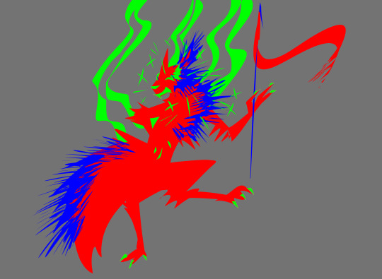
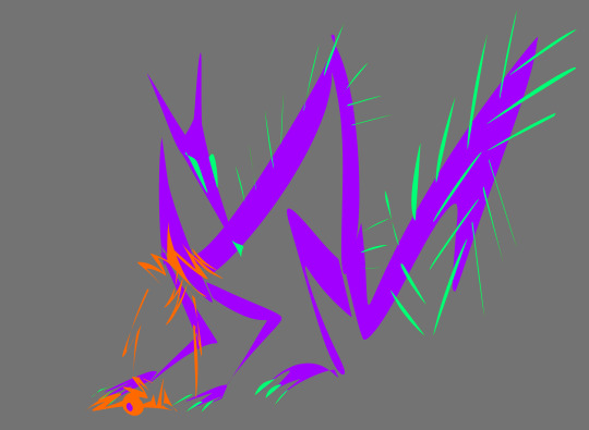
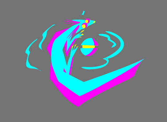
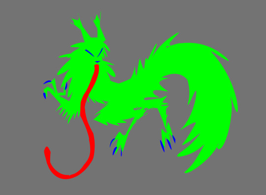
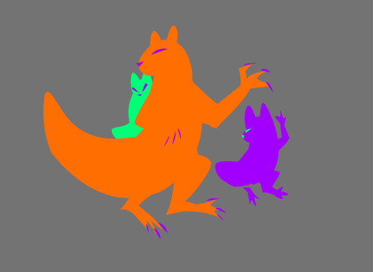
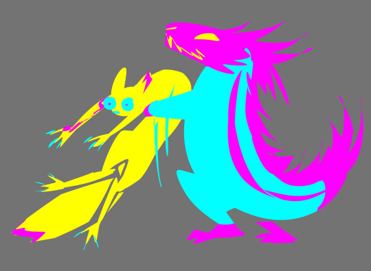
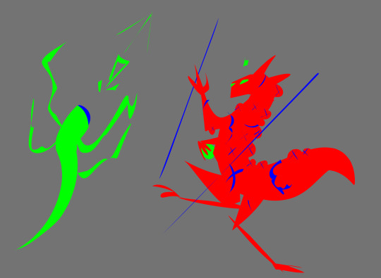
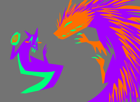
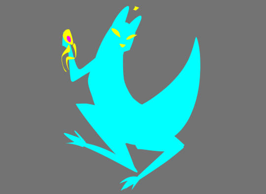
the slugs as shapes and colors
#pinemartart#eyestrain#bright colors#rain world#rain world downpour#rw artificer#rw spearmaster#rw rivulet#rw saint#rw gourmand#rw monk#rw hunter#rw inv#rw enot#rw survivor#i didn't really put much effort into these. very quickly made#honestly the lasso tool is my friend .#also these are in palettes of 3 colors so like. rgb. cym. and whatever the one for orange/purple/teal is#friend told me to post it
183 notes
·
View notes
Text

[ * I tried out a whiteboard thingy (my friend watched some of the process as I drew) ]
[ * Honestly it was very fun working with just a few colors, one brush, a crappy eraser, no select tool or lasso fill or bucket fill or anything like that ]
#corv draws#ink sans#ink sans fanart#inksans#ink!sans#inktale#inktale sans#[ * i sigh every time i put the inktale tags ]#inktale fanart#utmv#utmv ink#utmv art#utmv fanart#undertale multiverse#undertale au#undertale au fanart#sans au#sans au fanart#[ * will boost in the morning ]
334 notes
·
View notes
Text


I like great god grove heheh
The inspektas are christmas gifts i made for my friends !! Im honestly kinda proud of them so i wanna post them here
The third one is a bad whiteboard doodle of Click Clack LOLOL I just felt like including it here
The last one is a kinsona!! It’s my Click Clack kinsona and it was also my first time actually using the lasso fill tool on ibispaintx bleghh
44 notes
·
View notes
Note
So, what method do you use when drawing to keep going?
I personally always seem to struggle to finish an art piece and can never get myself to fully focus on learning the entirety of anatomy, etc.
I crave to finish an art piece again, I miss the feeling, but I haven't been able to do it in a long long while, I'm just hoping for a little advice, not sure who else to go to cause I don't have any friends but I look up to you a crazy amount so I figured I'd give this a shot, this isn't forced to answer by the way!
I don't want you to feel like you have to answer this.
If you do or you don't, you're still really cool, your art is awesome and inspiring and your aus are as well.
Heck, you're a pretty damn cool person too, art really does reflect artist sometimes huh?
Anyway, I'll get out of your hair, keep up the amazing work <3/p
When it comes to finishing an art piece that you know you want to finish but suddenly lose the motivation to
What I usually do (this might not work for everyone but it somewhat helps me so it helps you as well then that's awesome) is when I'm in the middle of drawing a piece and I suddenly lose interest or motivation, or something isn't going well which is making me lose patience. I just put the pencil down, and go do something else for a while until I get the urge to continue or try again. Example I go play video games for a while or maybe watch a movie or youtube for a bit, just giving yourself a small break from drawing until that motivation to draw comes back and then you go back to that piece and try again. And basically how ever often that happens (aka losing motivation, patience, etc), you just repeat the cycle until you're slowly getting closer and closer to finishing that piece (You can also doodle on the side as a refresher but I don't recommend starting a whole new piece when you want to finish your first one, usually for me I just end up forgetting the last drawing completely because I accidentally started a new project 😭 but that might be a me problem if it doesn't happen to you then it's a-okay) This is mostly what was helping me finish projects since I have a short attention span and often lose motivation and what not so I constantly do this FDSFDSDSF.
Now for anatomy, I'm not the best at anatomy myself but my first advice is don't immediately give up if your anatomy isn't perfect on the first try, it won't always look good on the first attempt which is why it's okay to go through a few trial and errors before you get it to a point you like it enough to continue. Also I'm not a professional and I suck at explaining things and honestly I know jackshit about anatomy I just wing it most of the time. But I can give you small tips that come in handy when drawing poses!!
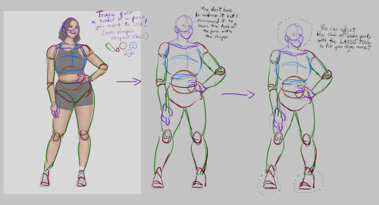
We're gonna use a reference for this, when you have a reference for a pose you want to use. A good way to get a hang of the pose is by tracing over it with simple shapes (such as cylinders, circles, triangles, etc) and then redrawing it with those same shapes to again get the hang of the pose, you don't have to really do it but it's a good practice so I recommend it. Then, after you have your pose, you can take the lasso tool (or selection tool) and then just resize body parts to your liking so they fit your style more!!! And ofc now you can draw over it and use it as a base for the character you want to use it for.
Now that's the first method, but I have a second one which is fun, I call it "frankesteining", which is where you grab 2 or more images and then take body parts and paste them onto the main reference picture you want to use.

Like here, you like the pose of the first reference, but wish both of the models arms were on the hips? Fear not! Just grab another image of a model who's arm IS on their hip
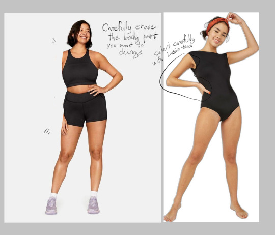
Then carefully erase the arm/body part on your main reference that you want to replace with another. Select the arm/body part of the second reference with lasso tool, and slowly trace over it so you can copy/cut it out and then paste it onto your main ref
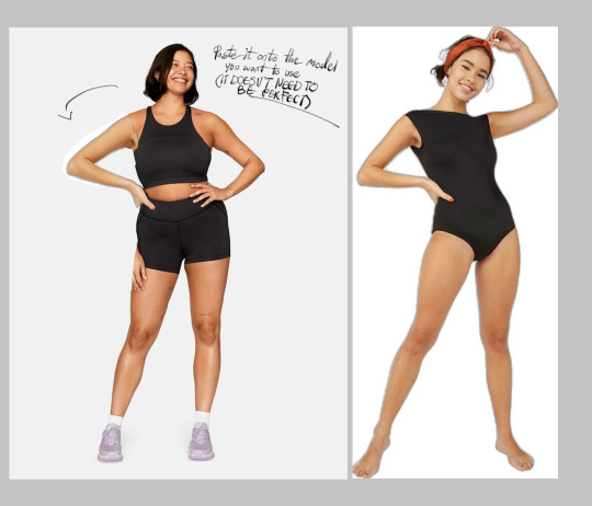
Like this! Now remember, the reference doesn't need to look aesthetically pleasing, after all you're just using it as a reference, so it's okay if it doesn't look perfect!! You can do this with many body parts as you want btw, just keep cutting and pasting until you get the pose you wanted!!

And finally just draw over it! Using the same methods as the first one, shapes, redraw and all! No one will ever know you were playing pretend dr frankenstein with the reference pictures before this!
Now these are the methods I use when posing characters, they might not always come out right the first time but if you keep trying you'll eventually get something you like a lil more than your last ones!! You can also just use a 3d model posing website/app and then screenshot the pose and redraw it from there. But this is if you're one of those people who for some reason just can't get the hang of those damn 3d model posers (aka me)
GUHH THIS POST IS SO LONG IM SORRY, I hope my rambles helped you out at least a lil bit and I hope you continue your journey in making art, believe in yourself and eventually everything will turn out alright in the end stay strong fellow artist 💜
#Also I'm sorry if there are misspells and such it's 2am#I'll edit the post later for misspells (I wont)#mono ask#Also if anyone else has any advice or tips as well please feel free to leave them in the replies tyvm
14 notes
·
View notes
Note
Hey, I really love your art and it’s honestly among some art pieces of the Minecraft YouTube fandom I was wondering as someone who is beginning in procreate what is your art process like? And do you got any tips on how to use procreate?
IT’S SO SWEET THANK YOUUU
about my art process, maybe I’ll post something later about it in form of timelapse or screenshots, not sure is there something interesting and special tho
about any tips for using procreate:
I remember my first impression of procreate was like “it’s too difficult, why are so many functions hidden behind a few clicks of different buttons”, so as a tip for beginning I would recommend learning all the functions through your own practice and use, purely experiment with different buttons, effects, etc. over time, you get used to it and the work becomes much faster and more comfortable
experiment with all the brushes available in the program, and if there is a feeling that nothing fits, then there are a lot of custom brush sets that can be downloaded for free from various resources. personally, I liked the downloaded sets more than the default brushes, and this affects the drawing process very much :D
sorting your gallery by folders is also very useful for active work in this program
the lasso tool can become a very good friend at work if you adapt to use it, especially at the paint stage
maybe I’ll add smth later on, but this is the first things that came to my mind rn
43 notes
·
View notes
Text

Well guess who went into an unexpected crafting spree and made two Yarnies? ^^
Yesterday I had a deep feeling of 'how hard can it be' and so thanks to some encouragement from @nighttimepatrons 💜 I just decided to give it a go. A quick search led me to this Yarny crafting guide made by one of the guys working on the games, which I followed more or less.


My process is under the cut!
Since this was very much freestyled, I just worked with what I could find at home:
wire (diameter: 0.6 mm, 1 mm, and some thicker wire I still had lying around)
dyed felting wool (which honestly surprised me, totally forget I still had that)
wool yarn
Tools (idk what some of these are actually called but I hope you'll know what I mean):
pliers (1 you can use for cutting, 1 with a pointed end, 1 with a flat end)
scissors
felting needle and sponge
Red Yarny

Following the guide, I started with the wire skeleton or more specifically the legs and body as one part. Then I made the arms as a second part and connected the two.


The head is directly attached to that. Since I was going for a four-horned Yarny, I added some more wire. Later on I added more wire to make the middle horns longer but I don't have a photo of that.


I added wire to stabilise the body and to separate it from the legs. The guide I followed just recommends to use some wire to stabilise the body; I also used unspun wool to make it easier to wrap the yarn around (and hopefully meaning I had to use less yarn). This I added to the body with the help of the thin (0.6 mm) wire.


The next steps are just wrapping the wire skeleton in yarn. I started with the right foot and completed the legs first before I worked my way towards the head. I used additional unspun wool at the ends of the feet, hands and horns to make it easier to hide the wire. Getting the yarn around those points is a bit tricky but if you got a felting needle, you'll be able to keep the yarn in place.


Now as you can see, I got a bit of a weird pattern going on on the body. That's because I tried to get some loose loops around the hips to give the Yarny a longer 'shirt' while still being able to move the legs. Here I tried to keep those loops in place by pinning them down with more yarn. For the next Yarny I found an easier method: make some loose, parallel loops and then just pin the upper part of the loops to the body by stabbing them repeatedly with the felting needle.
The eyes are made out of yarn too, but I didn't have white yarn so instead I used white unspun wool and felted it into eyes, using a sponge as felting surface. I fastened the eyes to the head with the felting needle. Takes some time but they should stay on now. I also gave the Yarny a long lasso.


Blue Yarny
Essentially the same steps as for the red one. Just didn't have any more of the thick wire and the blue Yarny also has a different head shape. This Yarny also showed me why it's easier to use thicker yarn, or at least that it's faster.


Two-coloured lassos
The blue Yarny is for the friend I played Unravel 2 with. I wanted them both to have a lasso in the colour of the other Yarny, for that I cut off the lassos and felted them to the other one.


Step 12: Go on an Adventure!
The last step of the guide is to go on an adventure so I used the time before it started raining again.


47 notes
·
View notes
Note
Uuu what brushes do you use? I love your art to, have a nice day!

ty!
i use a bunch of different bunches from an assortment of packs and honestly i switch it up a ton depending on what im feeling. i really like doing lineart though so i usually use a soft/low opacity hb pencily brush for sketches or soft art, then most of the other lineart brushes come from Kyle’s megapack ? (my brother sent it to me). the brushpens are supposed to emulate irl brushpens so i can get a nice dynamic weight to lines. i use drawing brush these days (idk where this brush originated from my friend sent it to me) and its the grainy one i used in the last few drawings. it lets me draw fast and loose. then the brushes in the red shape are a mix of coloring brushes and i adjust opacity/flow throughout a drawing. i also use lasso tool + gradient or bucket fill a lot of the times too for shading/lighting. im not the best at coloring though so my brushes are pretty basic. hope this sort of helped!
78 notes
·
View notes
Note
hi!! i really love your stranger things posters and would love to give it a shot myself. i was wondering how you went about making yours? if there were any psds or something that you used to get them looking so nice and natural?
Hi, thank you!! And honestly I just threw myself at it and went about, there was a lot of stress and I had some feedback from friends. The only template sort of thing was from @stanshollaand and idk if she’d be willing to give it out or do a tutorial or something.
I used the lasso tool then content aware fill to get rid of the people on the poster already then positioned my png in a way that covered anything weird. As for coloring, I watched a lot of YouTube videos, mainly about color grading. There are a few for Stranger Things Three posters specifically than the rest I had to learn from general videos.
Also a lot of messing around painting, clipping masks, and opacity messing (as in color, hue, light, darker color, etc.). Sorry I couldn’t be of more help! Maybe one day I’ll figure out how to explain better lol.
2 notes
·
View notes
Note
Can I ask how you usually go about your TTS edits? Particularly how much you edit pre-existing frames together vs. drawing new elements in.
I will preface this by saying I suck at explaining but I will Do My Best™
For the record, I use photoshop, but I will crack open SAI if I absolutely need to.
So! It does really depend on what you want to be doing. Are we mashing two characters together? Putting them in a new background? Both?
We’ll go with both.
SO what I usually do first is go through the catalogue of screenshots I have; I’ve usually got a bunch of PSD files that have screencaps that I pick out myself, so I’ll scrub through those, particularly if I KNOW there’s a frame in mind that I want to use. A lot of the time I make edits off the cuff, or I’ll only have a vague idea of what I want it to KINDA look like, and then do my best. A lot of the time I end up going UGH and i have to scrub through certain episodes again if I need a particular pose/expression/what have you. It’s really best to make sure you have EVERYTHING you need, otherwise you’ll waste more time in the middle of your edit, trying to hunt something down, and it’ll be a huge pain.
ONTO THE STARTING POINT.
We’ll start with the actually Super Important Part: Background.
They’re usually the easiest part to work with, too, and if you need a particular background, you can frankenstein it. Do you like a particular background but there’s always a character somewhere on it? Wait until they move. Sew the two halves together. Bam.
I do recommend a background where at least one of the characters already matches the lighting!! It’ll save you some trouble later, so you won’t have to tweak both characters.
Example a: Hector was already in this scene, just in a different shot. His lighting is juuuust fine.
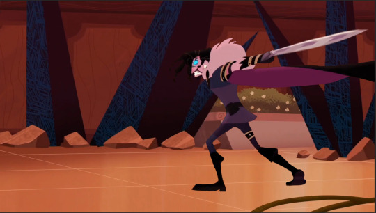
I cut him out from one of the screenshots I got, and just. Plapped him onto the background. He’s on his own layer, so he can be moved and size adjusted if I need him to be.
Cutting them out is... Easy? If not tedious. The magic wand and magnetic lasso tool are the best for it, but don’t forget to hit ‘select and mask’ (if using PS) so you can clean up the edges a bit more before hand. It’ll help smooth out jagged edges too so I really can’t suggest it enough.
After that, it’s really just cleaning up edges and the bits you couldn’t select with the eraser tool, your brush of choice, and color picker.
Also, try to get both characters in the same kind of shot (I.E fullbody and fullbody, or bust shot and bust shot.) That stuff does matter, and no amount of resizing will be able to help you make it look like it’s meant to be that way. Unless, of course, you’re doing a sort of ehh stacked??? shot, like so.
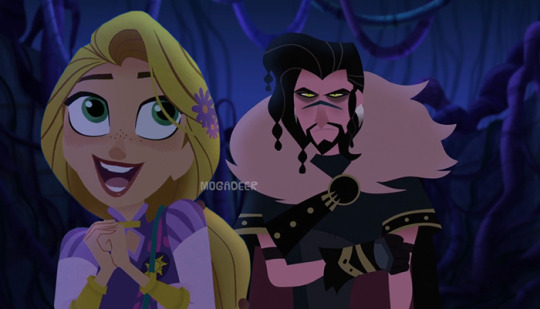
Also keep the horizon line in mind, because that’ll also stop it from looking funny, even if a character is shorter than the other, no matter what kind of shot it is.
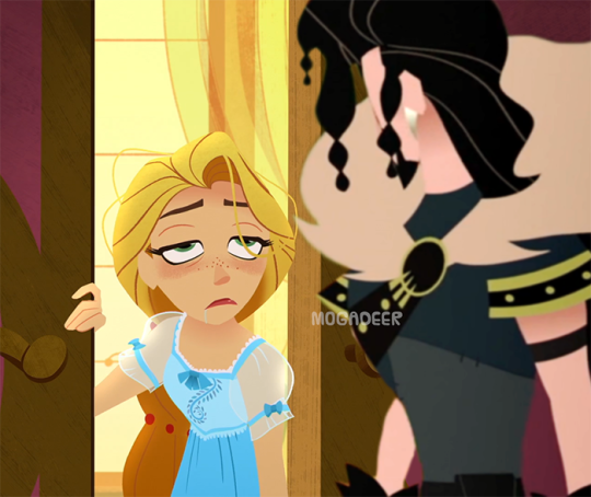
Rapunzel is on her own layer too, and she’s the one with the biggest amount of editing.
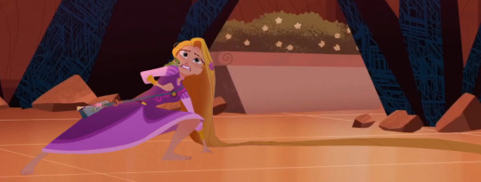
The edit
vs the screenshot(s) she was taken from
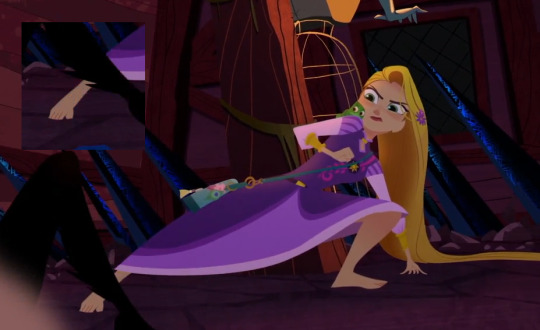
I merged all the parts I added to her, so I can’t show you all of those individually, but her mouth and eyes were taken from another episode all together, from a bigger screenshot. With expression changing, it’s really just better to get a clearer image and then size it down to where you need it. Also, I DO recommend you keep everything on it’s own separate layer for as long as possible, including each eyeball on it’s own.
The only parts I really drew in myself was her hair, for this. I fluffed it out on the right side of her head a bit and then added more length to what was on the floor so the edit wouldn’t be really boxed in and tight. I try to NOT draw in a whole lot, and keep drawing in my own elements for when I absolutely need to. If I can get what I need from another screenshot, I will.
For drawing it in, I do have a tablet and it is honestly my best friend. TTS thankfully doesn’t really have any outlines, so adding more to something or taking something away is generally pretty easy and doesn’t look weird as long as you keep your lines and edges relatively clean.
I color pick the item I’m adding onto and, on it’s own layer, start adding and erasing as needed. If something has a gradient or slight shadows, as TTS often does, I’ll color pick more than once, try to line them up right, and just blur the crap out of it.
It’s also super handy for softening edges that MAYBE look a BIT too hard and clean as opposed to the rest if the edit.
The blur tool is your friend. Love it. Embrace it. Marry it.
To me the most finicky part is adjusting the lighting and tones on a character. This one is a little trickier for me to explain, since I pretty much play around with brightness, contrast, and different colored filters until I feel like I’ve got a match for the other character.
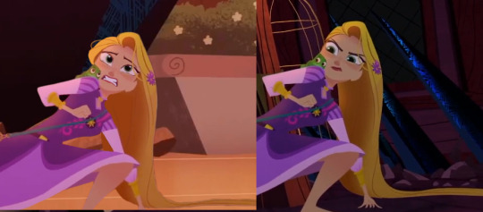
Once I’ve got all that done, and I’ve made sure they’re sized about right, everything looks homogeneous... BAM I’m done. I usually save it as a smaller resolution than what I worked with it as, to hide any “seams” or the like i couldn’t fix.
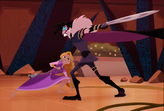
I HOPE THIS EXPLAINS A LITTLE??? I’m really more of a show person than a tell person, but I hope it helped a little.
13 notes
·
View notes
Note
have you ever done a header tutorial? i've seen a few of yours around the phandom and they're really nice, if you haven't would you be willing to?
hey there, dear! i have not made a header tutorial but i’d be more than happy to for you! since all of my headers are vastly different, there is no real ‘specific’ way i make headers since i do so many different things for all of them!
in this tutorial, i’ll show you how to make this:

*warning* this will be very image heavy and probably very long winded, since i am a very long winded human! sorry if that’s not your cup of tea !!!
step 1:
open up your photoshop and go to file, new and put in these settings:

step 2:
excellent! you have your header canvas ready to go! i decided i wanted something real fuckin bright, so i decided to add a neon gradient. to add a gradient of your two chosen colours, make your brush and eraser colours the two shades you want to make a gradient from! if you’re confused, change these two boxes to whatever you’d like:

now go to your gradient tool and drag it across whichever way you like best to create your gradient!
step 3:
cool! we have our background shade! now we’re gonna add our little bottom bit of our header to make it seamlessly blend with our blog colour! you know what time talking about, the rip effect!
only……i’m not doing a rip effect for this header. if you ever want me to do a tut on that, just let me know! it’s real easy though!………literally, it’s just downloading a brush and using it hjesdxvhfdbj
i’m going to add a diagonal line across the bottom of my header. to do this, grab your polygonal lasso tool and draw where you want your bottom bit to be like shown:

now im going to colour that section in with white! you can colour it whatever colour the background of your blog is though! (also, remember to make a new layer for this bit, so that your bottom is on a whole new layer!)
to deselect your marching ants (the moving dotti bois), simply press command + d (or ctrl + d for windows!)
you should now have this:

step 4:
right!! now i like to add whoever i’m adding to the header. in this case, im adding a pic of dnp. place your pic wherever you’d like it to be on the header and cut it out however you like! after you’ve done this, your header should look like this:

i want to colour dnp and make them match the header a lot more, so i’ll turn their layer into a smart object and press edit contents. i colour them there and then press save, which automatically changes them on the header. you dont have to colour them but if you’re familiar with ps and would like to, go for it! i won’t detail this part though because it’s crazy long and honestly unnecessary to add to this tut!
step 5:
alrighty so!! here’s where my header’s at right now:

next, we’re gonna add a basic texture to the background of our header to give it a wee bit of depth! i added three and changed their opacity and filter layers to what i like best, so change yours to your own liking

okay so here’s my header currently! (also excuse how ugly everthing looks, tumblr eats quality for breakfast smh i swear it actually looks decent)
step 6:
okay, so now i’m gonna add a shadow behind dnp for more depth! basically i just duplicate the layer with dan and phil by pressing command + j (or ctrl + j for windows uwu) and selecting the entire layer with the quick selection tool, which selects dnp in their entirety. grab your brush tool and colour the selection black, like so:

drag that layer down and out a bit to the right and change the opacity to 24%. however, shadows are all dependent on your image, so do what looks best to you! here’s what my header looks like now:

step 7:
okay, now i’m gonna add a white outline of dnp!!
once again, duplicate your original dnp layer. now go to layer styles and press styles. there should be a style that looks like a thin black line, like so:

select that and go to stroke, changing the colour from black to white. i also changed the thickness to 2px but you can keep it at one or change it to however you like it! i placed this layer over my original dnp image and moved it to where i liked it. my header now looks like this:

step 8:
text time! write your url out in all caps using the font ‘DIN condensed’. place it wherever you would like on the header. i chose here:

step 9:
now!! duplicate that text layer and go to layer styles. remember our good friend ‘line style’? she’s about to become our best friend! press that style and chnage the stroke colour to white. move the text to the left and you should have this:

yay!! now we’re going to duplicate the line style text we just made. go to layer styles and change the stroke colour again. for this header, i changed it to pink but change it to whatever matches your header best! move that text even more to the left aaaaaaand this should be your result:

okay!! last line text style! duplicate the pink text and make the stroke colour black. move it over to the left. i thought the black was a bit too intense, so i chnaged to opacity of the text to 86%. this should be your final result:

last bit of editing for your text! go to your original url text, the one that’s at the front and bold. go to layer styles, inner shadow and drop shadow and add these settings in:

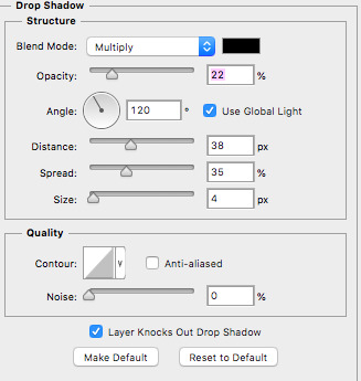
your text should look like this now:

aaaaaaaaand that’s it!! you’ve made your very own header!! well done, you should be proud of yourself!!
this header is kind of different to my other stuff, so if there’s a header you’ve seen me make that you’d like to know how to make, just let me know and i’ll see what i can do about making a tutorial on it!
i hope i wasn’t too long winded and i hope this is helpful to someone!
if you have any other things you’d like me to make a tutorial on or if you’d like an in depth tutorial on something specific, just let me know!
#hopefully this was helpful and not confusing as fuck!!#yeahps#completeresources#photoshopshit#itsphotoshop#header tutorial#my edit#my tutorials#photoshop#graphic
381 notes
·
View notes
Note
hey! howd u make ur pfp ☺️?
Hi!! I use Photoshop CS6 I believe, and I wish I could explain how I did it, but honestly, most if not all of what I do is experimenting 🤣 The select tool, polygonal lasso tool and refine Edge were my best friends in the process, but that's pretty much it....I'm sorry I couldn't go in depth but maybe message me if you'd like and I could try to show you more details there :)
6 notes
·
View notes
Note
Tell us about a mission that our Golden Girl, Seraphim, failed
once upon a time, two old friends stood side-by-side, looking out from a window on a snowy new york city.

i—have no had a very good month. and a lot of that negativity got channeled into this. there are details of child death, explicit violence, gore, forced self-harm and gun violence below the cut. proceed with caution.
writing music sampler is over here if you’re curious.
seraphim glanced back over her shoulder in time to to see whiskey poking his head through the conference room door. the familiar smell of bourbon, polished wood and old paper hit him right in the face. “… oh.” she watched one of his arms drop, relaxed. “morgan, uh. hey.”
“were you going to attack me?” she sounded exhausted. if the rumors whiskey had heard were true, then he wasn’t surprised.
his lasso stayed faithfully coiled on his belt as he came in, closing the door behind him. “i didn’t think anyone was up here. especially not you. did ginger clear you already?”
seraphim had her arms crossed her chest. he could see cotton bandages still wrapped around her forearms as they dove under the sleeves of her white button-up, one pad taped up next to her left eye. but her hair was down, over—
“yeah. as soon as they were sure i wasn’t going to die and the gel had worked.”
“and they did the uh—the test?”
seraphim turned away from him, sighing. he stepped closer to her as she answered, softly: “yes. ging—had a picture of merlin and i. did the trick.” she laughed. it was a joyless sound. “better than doing the sound test with that sword, i guess. don’t get me wrong, still traumatizing even with the picture. but i guess traumatizing in a way that i was… better equipped to handle, at the time.”
“that was your first time with the gel. does the quartermaster know that—you—?”
“no.” whiskey was careful to keep his gaze forward as seraphim’s voice cracked. he knew her well enough. instead, he focused on the snow. it wasn’t the first one of the season, but it was the thickest they’d seen so far. the flakes were huge, falling from a sky that was a single shade of slate grey. “but i’ll have to eventually.”
but that was when she lifted her hair. there was a medium-sized scar, running behind her ear. ginger had shaved a portion of her head but left enough to cover it, like a sheet. the mark was still raw, red, angry. and he winced as he realized that there was a slight dent. they would’ve had to have reconstructed part of her skull. seraphim swallowed. she still didn’t look at him. “i don’t think i’ll be able to hide this.”
“jesus, morgan.”
“it’s—it’s fine. it’s fine.” a hand went to her mouth and he could hear her shaky inhales and exhales. “i’m okay.”
“you sure?”
“mhmm.”
“… morgan.”
“yes, jack.”
“… what happened.”
she let out a sob and he felt the blood leave his face. the regret was immediate and acute, but then, she began, “i—i lost someone. in the worst way. the youngest i ever have.”
“how ol—“
“ten months.”
whiskey breath out a sharp breath. okay. so the rumors weren’t true. the real story was much worse.
“look, i’m sure it wasn’t yo—“
“it was.” her answer was so firm it startled him, and when he looked at her, her expression was… there was just a sheer veneer over barely-contained grief. one tear escaped her eye and she rubbed it away roughly, her hand shaking.
“walk me through it, then. talk to me.”
for a moment, she said nothing, but then she nodded. “it—it was a normal resident call. normal as can be, anyway. something had gotten inside of the hensons’ daughter. her name—“ a cough covering up a much sadder sound. “—her name was olivia. olivia kate henson.”
whiskey could barely standing to listen to her speak. he knew seraphim’s field record wasn’t perfect—no agent could boast of a hundred percent success rate, not in roanoke, not in statesman, and not in kingsman. but when it was a roanoke-flavored failure, the consequences tended to be a bit more horrific.
“i… underestimated the entity that i was dealing with. it’s very, very unusual for people that young to become hosts. demons generally want a body that can y’know, walk. form complete sentences. all that shit. something they can use. so my initial impression was that it was just an low-class imp. something that maybe had done it on accident, even. so those were the tools i brought with me. that was… that was my mindset.”
seraphim opened her mouth to speak and then convulsed. he couldn’t tell if she’d choked back a cry or was trying not to be sick. whiskey reached out and put one hand on her shoulder, but he didn’t take a step closer. seraphim, likewise, stayed where she was.
that wasn’t who they were anymore.
the next part came slowly, measured. “it was a soldier demon. the ones that were john’s specialty.” she started shaking her head, her brows knit together, “we never see those in children, in babies, jack, not ever. this seemed like it was supposed to be part of a bigger trap or something. i’ll have a lot of research to do when i get—when i go home. something else was at play here.”
seraphim sniffed. “but that doesn’t take away the fact that that demon still had to be taken out and deported. that doesn't take away from the fact that i was unprepared, and so when i… when i had to…” hands in her hair. whiskey felt pops as she bent forward, her spine curving underneath an invisible weight. “… her body was too small.” that was all she said.
whiskey brushed his thumb in one reassuring stroke before taking his hand away. “you aren’t a medium. there was no way you could have known.”
she snorted. “… that should have been the end of it.” her tone was a resigned anger. “i should have simply done a circle there, sent that thing back into whatever dark pit it crawled out of. but instead.” she pursed her lips together, jaw clenching. “i was too busy being mortified, mrs. henson wouldn’t stop screaming, mr. henson had fainted in a corner, and before i had a chance to do anything actually useful—it manifested onto this plane.”
seraphim uncrossed her arms, lifting them. whiskey could see red flecks in jagged patterns. “it launched itself at me. tried to turn my forearms into spaghetti noodles. get me to bleed out while i was still standing. it would’ve been deserved.”
“morgan—“
“i fought with it through the house.” she continued. turning her hands over to look at her knuckles. they were bruised and scabbed. “and it shoved me through their front door and onto the street. at high noon. in a busy brownstone neighborhood.”
she laced her fingers together, putting them behind her head. “so of course i had a lovely message from lilith on my specs when ginger finally let me have them. how i’d come so close to compromising our organization, how they had to send a retcon group and warp the memories of over thirty people, half of which weren’t even fourteen yet.” a heavy sigh. she let her arms flop to her sides. “… she didn’t even mention the baby. not once.”
whiskey watched her step up closer to the window. she put one palm up against the glass, and a silhouette of fog blossomed around her fingers. “i forget how fragile it all is. you and i are standing right here, routinely between them—“ she tapped on the glass “—and everything they don’t know that wants to kill them. or control them. or some godawful third thing. the nature of our work is both necessary and damned to exist in the weird grey area of internet conspiracy material.”
“do you ever wish you could go back?” he asked gently. “y’know, take the blue pill?”
“… sometimes.” seraphim answered honestly. “but i don’t think i could now. after everything. could you?”
whiskey thought of jenny—then lauren. the blur of bullets, trauma and blood that had led him to where he was standing. it hadn’t been an easy path. but it’d been the one he walked. he’d never want those steps wasted. “… no. no i don’t think i could either.”
seraphim didn’t start when he went to move her hair, staring at her scar. “so a demon… did this?”
she leaned away from his touch. “no.” she smiled, brokenly. “i did.”
“… what?”
“as soon as i got some solid footing, i pinned it down in the middle of the street. i had it right where i wanted it. but it—it called out.”
“called out? like—in english?”
“no, it was more like a—not a distress call, more like it saw something else and was trying to call it closer. and seventh strike of the day—i glanced up to try to see if there was something else i needed to take care of.”
whiskey felt his mouth go dry. “when you turned back around…”
“i had my own gun pointing straight at my face.” she met his eyes. he’d never seen her look so haunted. “i tried to get out of the way, but—“ she wiped at her eyes, her nose. “it went off. i don’t—i don’t remember anything after that. the next thing i knew i was waking up in medical with ginger over me. said i’d been out for a solid day.” she tried to grin. “bet they worked that into the cover. some poor methed-out woman finally snapped and tried to blow her brains out in broad daylight where everyone could see…”
“morgan, i’m—“
“jack i killed someone’s daughter.”
“you are not a murderer.”
“i was a proxy.”
“look at me.” he grabbed her by the biceps, turning her. she didn’t fight him, and it dawned on him that if she was still recovering from a bullet to the brain, she probably wasn’t strong enough to do much.
and her face crumpled as he spoke. “you fucked up. and you know what that means? it means you’re a hundred percent, certified bonafide human. which means that you are always going to have the potential for mistakes, and for failure, and when it happens it sucks. it will always suck. and you can let it stop you, or you can learn from it. this is just—how it is. for the people like us.” his grip loosened. “our fuck-ups tend to be on a more viscous scale.”
he brushed her hair back, as he had before, long ago. but it was different now. her eyes dropped to the floor. “i know… i know. i sent a message to lilith, asking her to send lady to the henson house. not sure if it’ll actually do anything if i don’t have a job.”
“i think we both know that if lilith wanted to fire you—she wouldn’t have called us.”
“true.” seraphim shivered as whiskey let her go, bringing her arms up in an x over her chest. “she would’ve let me die.”
“look… things look a little bleak right now. just take it easy for a few days. ging’ll probably want to keep you around for at least a little bit, make sure you don’t have any side effects from the gel. and when you get home, then lilith, well—”
seraphim lifted a hand to press on a temple. “god, i don’t know how i’m going to handle this debriefing… i don’t know how i’m going to tell hamish…”
“he worked with recruits for kingsman, right? i don’t think you’ll be the first or last person that has to come to him with a mistake. he’ll understand.”
“i’m glad one of us is sure.”
“what, you think he’ll leave you when he finds out?”
she answered without skipping a beat. “i always think he’ll leave me.”
“well, that sounds healthy.”
seraphim lightly touched at the pink forming around her eyes. “i’m not a hundred percent sure you’re the right person i should be talking about this with, but i am a hundred percent sure i’ve heard you tell me multiple times that you don’t deserve lauren and if she had any sense she’d find someone better.”
whiskey—didn’t immediately have a response to that.
“that’s what i thought.” seraphim turned away from the window, walking up to the conference table. her eyes flickered to champ’s liquor and decanter once, but she left it. drinking so soon after being exposed to alpha-gel was probably not the best idea. she leaned back, letting the hard edge of the table press into her back. the pain was grounding.
seraphim buried her face in her hands. “… this wouldn’t have happened if john was there. he’d be so disappointed if he knew.”
“john can go eat satan’s dick for all i care.”
“don’t say things like that.“
“you’re telling me merlin didn’t have that same reaction when you talked to him about that son of a bitch?”
seraphim stayed silent. just looking at him. it took him a second, and then: “… he doesn’t know.”
“i—am working on it.”
whiskey opened his mouth, but when he saw her face all his anger left him.
this wasn’t the time.
instead, he strode over to the decanter, pouring two glasses of the statesman trademark bourbon. seraphim watched him. “i don’t know if ginger would want me to—“
“do you want to?”
her shoulders sagged. “… yeah.”
“alright then.”
seraphim took the glass he offered with a grip that was still a little unsteady, looking at the liquid amber. “should we toast? that’s what you’re supposed to do, right?”
“sure. always something to celebrate.” whiskey answered, lifting his drink. “to life after failure?”
and seraphim smiled. it was thin, but it was genuine. her voice was thick when she spoke again: “to olivia.”
clink.
once upon a time, two old friends stood side-by-side, looking out from a window on a snowy new york city.
“so—have you proposed yet?”
“… you could say i’m working on it.”
#agent seraphim#agent whiskey#(background lies & lessons.)#(and background hymns & holograms.)#the things we carry#once upon a time in new york
7 notes
·
View notes
Text
Hey, so a little bit ago someone asked me if i would do a tutorial type thing on how to achieve realistic drawings and although this would probably fair better as a video my voice is shit and i can make sure i get everything down if i type it out.
I think the best way to do this is take you through one of my drawings? My latest Brian drawing i saved a decent amount throughout it so i can kind of comment on each process of the drawing. For the this drawing i drew it on Photoshop CS5 which is important bc i do utilise a lot of the tools there so if you use smth different then im sorry but im sure there are alternatives! I’m going to talk you through this drawing:
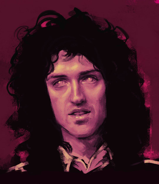
Because i dont use natural skin colours in my drawings i start drawings in black and white because i find that easier to control the tones? and then i can colour the drawing afterwards in whatever colour and play about with it instead of sticking with a colour from the get go.
I start with painting the entire background a light ish grey because 1) its nice to work highlights and shade into a mid tone and 2) having pure white as a background can be a bit uninspiring? even with my sketchbooks i always make backgrounds before i do anything on them.
I then take a large brush, i use a mid-dark toned grey for this, i don’t like going in super dark super fast, and kind of mark out where everything goes super loosely, precision and proportions really don’t matter at this point, it will probably look bad but that’s fine! you’ll refine it as you go on! the brush i use for this stage is usually just a soft non textured brush, but i don’t think the brush you use at this point really matters. My drawing will kind of look like this at this point:

I then go in with a smaller brush with a darker colour and kind of refine the face a little bit, i really take in the shapes of the face i’m drawing and try and get a good base to then really work on the shading/highlighting. Again, although this is your base to work on the proportions aren’t super important, it may still look bad but whatever is wrong with it you can just draw right over it to correct it! This is why i try and not give up on drawings even if they aren’t going the way i’d like it to because you can always correct it! my drawings never look amazing when i start them but i like to work into them as much as i can and i usually end up with something i’m proud of! anyways lmao, this is what my drawing will look like at this point:

This is when i start the proper like working into the drawing with highlighting and shading and things. I also change my brush at this point! Honestly any brush will do but i really like the aesthetic of having a super textured brush, I do sometimes change up my brush every so often but the brush ive been using more often than not is this brush:

Also at this point i try and not use pure black or pure white, if you’re trying to go for a realistic look then i feel pure white n black really don’t factor into a face.I also think if you use more mid tone colours then there’s more of a natural gradient? which looks more realistic i feel. Of course if you like the aesthetic of having a high contrast then go for it! this is just how i personally like to do it.
I know a lot of people work by gradually working the whole face, like do loose highlights and dark tones on the whole face and then refining it but i like to do each part of the face one by one and i usually always start with the nose, this isn’t important lmao i just enjoy drawing noses so it’s what i start with. i think the use of highlight is super important to utilise when drawing the nose because its what suggests form,, this is my drawing will look like at this point:

I do end up darkening the shadow on the right side of his nose and the bottom of his nose but i usually get to this point and then move on and then once i do more ill go back and try and bring more dimension to the drawing.
Also! one of the best tools on photoshop that you can utilise and in some of my drawings it’s my saving grace is the liquify tool. Basically if you do the drawing and get to a point it would be hard to paint over then u can use liquify, as i was doing other parts of the face i realised that the nose was supposed to be a little to the left and the eyebrows had to be lower down so you if you open up liquify you can just click and drag the nose to where you want it to be so:
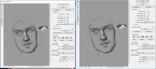
it’s a super helpful tool that really helps you get the facial features exactly where you need it, i used it a couple times throughout this drawing. I don’t think sai has it but you can use the lasso tool and rotate it or whatever and just draw over the little break it makes in the canvas:
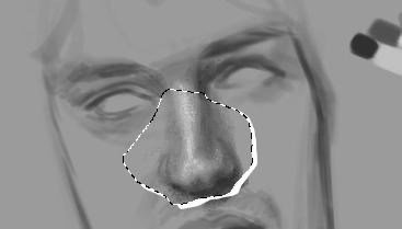
so the next thing i do is the eyes and eyebrows. I’m usually not the greatest at getting the exact eye shape but again, liquify is your best friend. An important thing to note is the angle of the eyebrows in relation to the middle of the nose, Brian’s eyebrows are quite straight so i tried to keep them that way. I also started darkening up the drawing, i didn’t quite go full black, the darkest colour i used is like just off black. This is what i have so far:
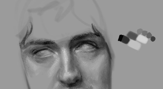
Also another important thing to remember is the lighting of the image, in the image the right side of his face is more shadowed so the shadow on the left side of his nose wont be as intense as the right side and things like the bags under his eye on the right side would be slightly more prominent. Also because of the brow bone, theres more highlight on top of the brows and usually a shadow underneath because the brows are more elevated and the eyes are sunken in a lil bit. There will be a lil bit of highlight on the inner corner of the eyes though.
In the next part of the drawing i just add a little bit to the forehead and cheeks :

I think by this time i had adjusted a couple of things like the angle his face was at was a little bit too tiled in my original draw so i just free transformed it and fixed the angle and the face i think was a little bit too wide so i just pulled it in a little bit. I think another thing to remember that places like the cheeks and forehead wont be pure highlight, especially with like men and older faces there will be more subtleties, with Brian he has highlight on the top of his cheekbones but the highlight is kind of broken up with the line that comes down under his eye and the forehead isnt a smooth bump above the eyebrows, especially with the lighting of the image the highlights get broken up a little bit.
The next drawing is a little fast forward, i forgot to save in between but ill try and talk through everything:

When finishing up I realised the left eye/eyebrow was a little too high so i liquified that baby up to bring it down just a little bit. Another thing i sometimes struggle with is getting the exact shape of the face and angle of the jaw but you can just keep on drawing on top of it until it looks vaguely right.
For the lips and mouth i think its kind of just a matter of trying to get a sense of the shape, look at the cupids bow and the length between the top lip and the bottom of the nose and how far the lips come out in relation to the nose as well, i think as well the shadow underneath the bottom lip is usually all you need to suggest the shape of the lip, it doesnt look all too natural if theres like a solid like to show the shape of the lip, the top lip though, because of the way the light is sitting on his face is almost completely shadowed, so the highlight on the cupids bow that goes down to the edge of the mouth is what helps give the mouth form. With teeth because they’re in his mouth so they’re not going to be super bright so i didnt add any highlight to them and just used a dark tone to outline the shape of them at the bottom and used a little bit of shading in between them to differentiate between them.
For the eyes i usually just leave them without the pupils because it’s my brand but it wasnt looking quite right to me so i added a little outline of the pupils, i didnt want to do the full pupil because i like adding a lil smth interesting in the eyes but i like the way they turned out!
The jaw you can usually bring out with the shadow of the neck. I didnt really feel like drawing the outfit so i kind of just did a couple of lines so show that he was wearing a shirt with a collar.
Also for brian because he has so much hair i more often than not just use flat colour for his hair and because his hair is so dark it usually works fine but with people like Roger who has lighter hair is doesnt usually work out well? especially with a more realistically drawn face. I was originally going to keep the entire background that colour but it wasnt looking quite how i wanted to. I coloured first though, and tbh my colouring process really doesnt take me that long, the longest part is just working out what colours id like to use and what looks good with the drawing I've made.
So for colouring i use the gradient tool, you have have a gradient thats two colours that will make your drawings look like this
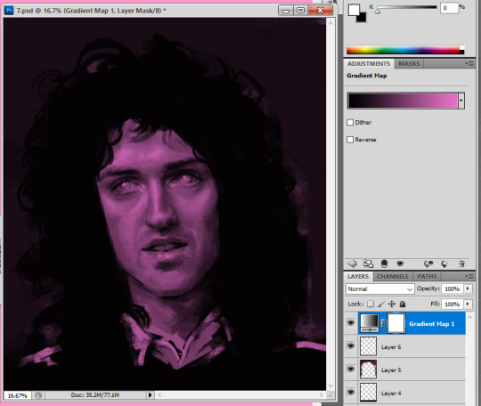
but recently ive started using the gradients with three colours so the highlighted sections will be a different colour to the base colour, i really like the way this comes out, without any other editing itll look smth like this:
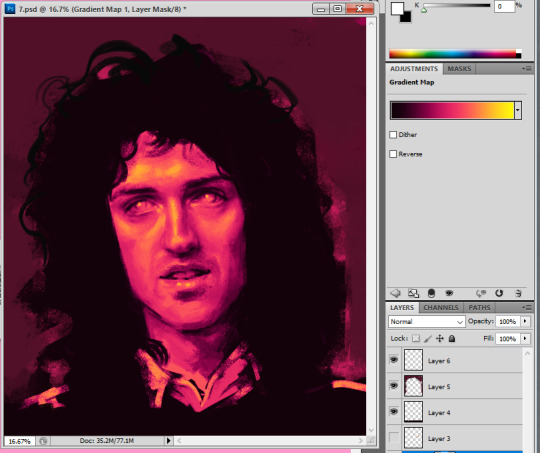
I like to play about with the settings a little bit because i do enjoy the way this looks but it’s kind of a bit overpowering and i think sometimes the details of the drawing can get lost when you overdo it a bit?
If you go through this itll give you many different versions of that gradient and i like to go through it and see which i feel compliments the drawing

heres a couple examples

The one i ended up going for was dissolve but it was a bit too intense so i turned the opacity down to 57%

which gave it a kind of static feel which i was in to, to finish it up i added a tiny bit to show some shoulders and then i wanted to add a tiny bit of a background so i used a flat pinky colour and put that around his hair and then on top of the background i added a little bit more into the hair.

and added so more vibrant pink into it as well just to spice her up a little bit.
124 notes
·
View notes
Text
The Making of Wonder Woman
Okay so we’re gonna take a quick break from medical content so I can talk to y’all about what I’ve been busy with for the past few weeks outside of applying to residency.
My halloween costume.
I’ve known since last halloween that I would be Wonder Woman this halloween. And then the movie came out and everyone told me I looked like her again and so the deal was sealed. Unfortunately, all of the store bought Wonder Woman costumes are.... pretty inaccurate looking. When I do Halloween, I do it big. And when it comes to my favorite super hero... well, let’s just say I wasn’t going to settle for something crammed into a bag. After scanning the internet, it was clear that I couldn’t shell $500-$1000 dollars on a professionally made WW costume... so to save some money and get the costume I wanted, I decided to do it myself. Here was the result:

NOT BAD, RIGHT?? I had never done anything like this before, so I’m pretty proud of myself. (also sorry the picture quality is meh. I’m getting the iPhone X this week and then DEFINITELY re-take pics. Honestly, I might do a photoshoot. I don’t know)
People have been asking like crazy, so I’m going to breakdown how I made the costume a little bit here to cover the basics. For the most part, all of this can be found on youtube, but I’m going to post my pics here just to take y’all through my process.
First: Making the mold. You’re gonna need help. Wrap yourself in Saran Wrap and get someone to put duct tape all over you to get a pattern the shape of your body. I had my brother help.

Draw markings where you want to cut the tape off and to help you line up the edges, then take those pieces, make notches in them so they will lay flat, and trace the patterns onto EVA floor mat foam. Then, cut out the foam, heat it with a heat gun and hold it against your body to make it curve correctly, then use liquid cement to glue everything together.

So once that was done, it was time to make the pattern on the armor like Wonder Woman’s armor. For this, I used a soldering tool that’s shaped like a pen. First I freehanded the pattern from her armor onto the foam with a pen. There has to be a better way to do this, but I don’t know what it is. When I started, it was kinda rough because I didn’t let it heat up all the way before I started carving and that made my lines kinda scraggly at the start. Luckily, I got the hang of it.


Now for the REALLY hard part... making the gold top of the armor. Holy cow. This part took me a day and a half. So I drew it on heavy poster board paper and cut it out, taped it to the armor, redid it again... and again... and again...


Once the paper was perfect, I cut the foam out and again glued it all together and taped it to the rest of the armor to make sure it looked right.

This was on the Tuesday before Halloweekend. I only had about 4 days to finish the whole rest of the costume... At this point I pretty much had all the supplies I needed, I just needed to really start putting everything together.
Next came the belt. Which sits flush with the bottom of the armor. To accomplish this, I took thin paper and drew the shape of the belt I needed on top and then transferred that onto the foam. I cut the belt out of the EVA foam I used for the armor and dremeled down the back of the belt and the bottom of the armor in the shape of the belt so that they fit together. Then... it was painting time.
First I covered all the foam in black plastidip, which is a rubber spray coating. It seals the foam for painting.
The gold metallic spray paint was very easy to find. Any Walmart is gonna have it. The red metallic spray paint.... not as easy. Hobby Lobby, Walmart, Michaels... they all failed me. What didn’t fail me? O’Reilly Auto Parts. Grabbed a can of metallic car paint and HOLY COW. Man that stuff works wonders. I only needed one small can, which was good since it was the only can they had in stock. It’s great stuff.

I’ll be honest... I had to be convinced to weather my costume. I wanted it to look all brand new and shiny and like Diana had just stepped off the island... I’m glad my friend told me to not do that. I cut notches into the armor with a razor blade and held my heat gun over it, causing the foam to open up. Then I went over it with black paint and wiped it away so it stayed mostly in the cut. And get this- that little pink tube? Old mascara. The brush gave me the perfect worn metal texture I needed. On the bodice of the armor I also filled in the grooves with black paint to give them more dimension, and I did a little shading work, which I didn’t photograph. I’m sorry. But here’s what the bodice looked like after I finished painting.

HUGE difference, right? I actually went and weathered the top even more after this picture was taken. I attached the belt with velcro (honestly, don’t do this. Just use super glue. Use all the super glue) and the top with liquid cement.
So what was left at this point? Skirt, gauntlets, arm band, lasso? For the record, I bought the boots and the tiara. I’ll link them at the bottom.
For the skirt, I bought some kids XL volleyball shorts from Academy, brown leather from Hobby Lobby that was some kind of furniture fabric, a gold paint pen, and blue spray paint. I bought high gloss. I should have bought matte. Hindsight. I had to wait to do the skirt until the belt was done, because that’s how I based my measurement of how wide the front flaps needed to be. The middle one is just wider than the bottom of the W. I patterned the pieces looking at a reference picture of Wonder Woman, and I tried to staple them onto the shorts, which did not work because staples are not stretchy and the shorts are. I ended up whip stitching some pieces and glueing others literally while the shorts were on my body. I wish I had pictures of this process, but I’ll post the youtube video I used for guidance down at the bottom. Anyway, then spray paint, then gold paint pen to do the gold details on the bottom of the skirt.
Ugh. Gauntlets. So hard. Went back to the 3mm craft foam. wrapped it around my wrists to get the size they needed to be. Again, while looking at reference pics, I drew them by hand.

I should have plastidipped these, but then I’d lose my markings. I ended up just painting straight onto the foam. Probably should have mod podged them first, but whatever. Gold and black paint pens are your best friend for this.

Arm band. I looked up a reference image, enlarged it on my computer screen, turned up the brightness, and traced it onto paper and then transferred it to the foam. Sprayed the foam with metallic spray paint, then weathered pretty much as before. With black paint and mascara.

The gauntlets and arm band were held together with velcro. I just made them overlap at the back. I took the easy way out. I admit that. I used a shortcut. TAKE THAT ORTA PHONE INTERVIEW. YES I BELIEVE IN SHORTCUTS. Still turned out great.

For the lasso of truth, I just bought rope and spray painted it gold, and bought 2XL brown belts from Walmart and super glued them together to get the rope holster.
To get the armor on, I cut it down the back and laced it up with more gold rope. make sure you put the holes far enough apart that the foam won’t tear.
And then I just... put it all together! Skirt went on first, then a tube top under the armor, then the boots, then the armor (because you basically can’t bend over in the armor to put on the boots), then all the arm stuff and the tiara.
I’m blonde right now, so to get dark hair I used a black rinse from Sally’s beauty supply to darken my base, and then that black powder hair spray from Party City. Please do this BEFORE you do your makeup and maybe do it outside so the black powder doesn’t get all over your bathroom. and cover your shoulders and arms and face because it gets EVERYWHERE. Or buy a wig. Up to you. I also tried to contour my face to look more like Gal Gadot. Whether or not that was successful.... who knows?

(taken from a friend’s snap story)
So that’s that. That’s how I did the thing. Below are all the links I promised.
Breastplate: https://www.youtube.com/watch?v=rlmLchJcT7A
Skirt: https://www.youtube.com/watch?v=z2GFmSqg7V0&t=229s
Gauntlets: https://www.youtube.com/watch?v=c25sKA2LpLc
Click for Tiara Click for Boots Click for Plastidip Click for Red paint
#cosplay#wonder woman#halloweekend#wonder woman cosplay#Wonder Woman costume#DIY#WW#DC#Justice League#batman vs superman
53 notes
·
View notes
Text
Lasso Tool Tutorial
Howdy! (you now, cause, lasso? lmao im so sorry)
this is a beginner’s guide to using the Lasso Tool in GIMP2, in order to cut out people/players for use in wallpapers, icons, etc! i am not an expert by any means so this is definitely not professional, just the way i’ve found is easiest to use the Lasso Tool.
full tutorial under the cut!
1. Choose your image! (HQ, high resolution images are ideal, but work with what you’ve got!

open your image and let’s jump in:
2. Add an Alpha Channel to your image. This will help you get rid of the background!

right clicking on the image in the Layers box will show you the option to Add Alpha Channel. Now we can move on the actually Lassoing
3. Use the Lasso to remove any background that’s fully enclosed by your subject. For example:

This triangle of background between his arm, side, and stick has got to go. Removing it now saves you time later on, though you could leave it in and remove the space after you’ve already lassoed the rest of him. I prefer not to, but that’s more of a personal choice.
The red arrow points to my first click with the lasso. Now it’s a matter of clicking along his outline in order to remove the parts of the image i don’t want (the background).

As you can see i’m clicking along to create points along his body outline. You can also click and hold the lasso to draw a line as your edge, but that’s honestly not reliable and not easily fixable if you make a mistake, so i recommend clicking in small increments to make your boundary instead.
Hovering over a point will highlight it yellow. A yellow dot can be clicked on to move it if you’ve misplaced it, without undoing all of the clicks you’ve done before.
4. Close the lasso:

as you can see i need to join my last two dots to complete the lasso. By clicking on the first dot i made, i complete the enclosure and give the program an area to select for removal

it will now show you a blinking/moving dotted line. your area is now selected!
5. Remove the part you don’t need, in this case your triangle of background, by using CTRL+X

because you added an Alpha Channel earlier, this piece of the picture is now transparent! hooray!
6. Now we need to lasso the rest of him in order to copy the image over to our new canvas to make wallpapers or icons or edits:

start at any point and follow the lines of his body/equipment around the entire outside edge, then join the first dot with the last just like before:

once i join the two dots near his thigh/stick, it will look like this:

dotted and moving, indicating that he’s been selected! now just CTRL+C to copy the selected area, then open your window with your New canvas:

and CTRL+V to paste your image on! It will show up as a Floating Selection, but all you need to do to fix that is right click on the Floating Selection in the Layers box, and select To New Layer:

now your picture is ready to be edited! you can resize, move, recolor, or edit your picture in any way you’d like, as you can see below! This is one of the final versions using this picture:

if this was confusing in any way please let me know! (You can also use the lasso to remove the background of photos instead of removing the subject from the background, so please let me know if that’s a tutorial anyone would be interested in.)
make sure to check out my other tutorial on How to Make Wallpapers, as well as my friend Elina’s on how to make icons, if you’re looking for more tips/tricks to using GIMP.
thanks for reading/reblogging! :)
9 notes
·
View notes