#honestly I love the brush I did the lineart with :]
Explore tagged Tumblr posts
Text
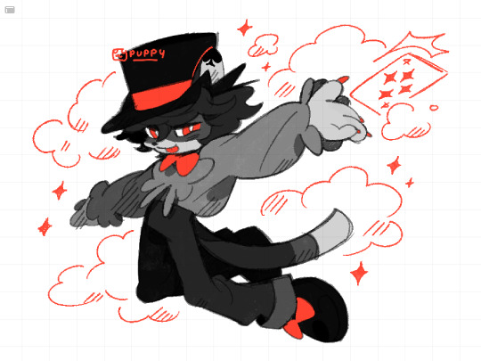
is this your card? ♦️♣️♥️♠️ it isnt but you dont wanna hurt his feelings
#this was supposed to be a warmup but i got carried away.... i havent drawn in so long that its been hard to focus orz#im testing a new brush for fun. again.. i think i can use this for clean lineart..?? im surprised i went as long as i did with the#narinder brush honestly... but i wanna try something new so here we are again#if i could get my shit together id love to draw a model of his van because i have smth really cool in mind..i was looking at pictures#of old wooden caravans like the horse drawn ones and i wonder if i could combine that with the shape of an RV#i like the ones with a door at the rear bc it kinda lookslike a train caboose.. maybe he'd get someone to weld him a custom ride!!#idk how intricate and detailed i can design it without making it a pain in the ass to draw every time BUT i have a general idea#it would probably have a door on the side but idk if itd flip down to make a stage or upwards to make a roof?? and then theres a#curtain behind it where he would come out and do his show methinks.. ive been looking at pictures of camping vans on pinterest for ideas#i dont think he LIVES in the van since i mentioned his home is an old run down theatre when he isnt on the road. i wanna draw that too#but the RV should have enough for long travels like a bed and cabinets..? maybe a net hanging on the ceiling where all his props go#id like to think of ideas for a hometown.. toronto has a huge entertainment district so it would make sense for him to live there#although id also love to base parts of it from vancouver since id love to go back and visit </3#..would there be furth names for those places?? nyancouver... clawronto... whinnypeg (like a horse whinny)...#pawson creek.... purrlington... otterwa.. i love coming up with names lol#my art#myart#my oc#oc#sleight#laikas comet oc#fan character#fur#furry art
369 notes
·
View notes
Text
Seared like a songbird flying to the sun

A belated birthday gift for @misty-wisp ! Tried to combine references for both Swan Lake and Cendrillon >:3 (Linked the English cover I took the lyrics from for the title!)
#ariart#isat#isat spoilers#gemtale#friends oc#i unlocked the ability to draw two characters and decided to just kept at it but tbf this one has 4 in all honesty and boi...#the Perspective... the one for the mirrored version was harder than i thought but aaayyyeee!!! AM SO PROUD AND HAPPY THO!#let it be known that this piece was only meant to have the mirror for the background but i was like: hm... too empty-- oh whoops--#also a lil sad that odile and odettes arms are blocking the design for front of odettes outfit. she also has a diamond by the center#of it! and its also meant to take on the shape of a star with three beads at the bottom! tried to give her an outfit combining#kabue (diamonds) vaugarde (circles) and the island (star) meanwhile odile gets diamonds and circles#and yeeeeeess!!! their outfits are mirrored in a way! i only wanted to give the mirrored effect of spiky and round#but somehow managed to pull off an actual mirrored fit like with the open and closed wings and the shape of the top#i also designed the outfit as like-- a ballet outfit thats also like just a fancy dress for the swan lake and cendrillon themes#the red part on mirrordiles leg lookin like a gaping wound. i love that part honestly cuz its so last minute#i was meant to blend that to soften the edges but my brushes wont cooperate and i noticed it looked reaaaally nice as is so i kept it!#also odile has gloves that has fake nails outside it so she gets sharp pointy nails privileges. i could write a whole ass theory bout that#smth smth odile making sure to cautiously and gently handle odette so as not to hurt her but as a result keeps her at arms length#did i thought bout that explanation when i gave her the gloves? no. i was actually just too lazy to get rid of her nails when givin#her the gloves cuz i did everything in one layer for the lineart so i was like: hey arent there gloves with fake nails? yea thatll work--#LET IT BE KNOWN THAT TUMBLR MF LOGGED ME OUT AGAIN FOR NO REASON WHILE MAKING THIS POST BUT IM SMARTER!!!#LOGGED IN A DIFFERENT TAB. WENT BACK TO THIS TAB. SAVE AS DRAFT! MY TAGS ARE SAAAFFEE!!! GODDAMMIT TUMBLR!
31 notes
·
View notes
Text
he's still just a voluntary victim and I still love him for it :]
Day 5 of Jashtober: Angel!!!

bonus under the cut- wait how do I add cuts in pc HOW DO I ADD CUTS IN PC-
-oh there we go
ahem
version with uncolored lines + background + timelapse!!!


#similarly to the d1 drawing I knew I had to draw Mr Heart but I didn't know what to draw lmao#and then I remembered that one Mad IQs Heart I drew once and thought ''hey I should redraw hat for the funsies''#and then this came out#honestly I love the brush I did the lineart with :]#it was so fun to use :]#and who knew I could get better at the artstyle I've had for like a year lmao#I think this one is more expressive :]#talking about expressions the expression I was going for was kinda ''inoffensive'' + smug + kinda nervous#I wanted to give sorta a feeling that the inoffensive look Heart had was actually not genuine and was just him pretending so he can be-#-more likeable so he can have a little more control#(he does mean well tho he just does what he thinks is right in a really not so nice way (manipulation n stuff))#ily morally gray characters <333333 /p#anyways time to tag!!!#AJV Heart#cj heart#heart chonny jash#chonny jash fanart#jashtober 2024
11 notes
·
View notes
Text
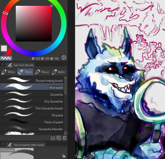
work in progress (im tired) (its 3am) (actually i just checked and its 4 now whoops)
bonus:

bonus 2:

#my art#shoku.scribbles#wip#shoku.wips#do people tag what theyre drawing in wips or do they add those when its like. done only#fuck it ill tag it for organizations sake#death puss in boots#puss in boots#anywho i love this brush#on an unrelated note the uhhh whats it called? muzzle? is too short and im too lazy to change the lineart so im just carving the face-#around it to look better lmao#anywho anywho#im not surprised if someone did this drawing exactly already lmao#i was not active on social media around the time the movie came out jdfskfjds#and honestly i didnt even plan for this pose and overall drawing idea lmao. i just got the sketch done and like. hes taking a selfie.#theres a big gap that the composition in begging you to look at. i need to add something there.#and thats what i added lmao
8 notes
·
View notes
Text

it was suggested I post this to the tags as well >:D
fuck it ima tag @transcendence-au as well because tbh I'm very proud of my silly little animation
some me being a nerd under the cut!
okay so this all started when I read the original post this was inspired by and though 'wouldn't it be silly to add some art to this 3 year old post?' but then I decided to animate it for funsies!
and gosh I sure do love animating!
So I got the base sketch and then got into the lineart animation for each component!
i don't have the sketches/wips saved at all sense this wasn't really a project and it took less than a day to complete. but here's a peak at the timeline
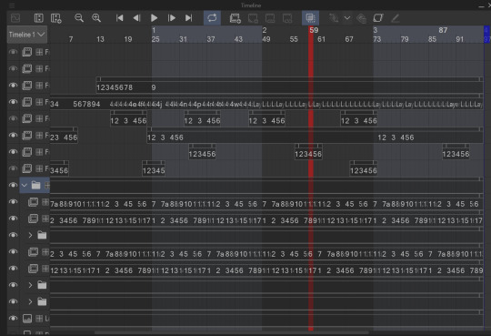
I animate entirely in my ususal drawing software: clip studio paint. It's just what's easiest for me.

all of these layers outside that folder are just the sparkles! after I finished I added some sparkles for fun! there's a lot of them because it involved a lot of copy and pasting sparkle layers
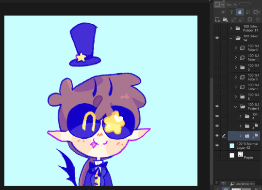
the bottom folders here are the wings body and facial expression! for everything like the wings arms and flags I was able to just copy paste, reverse, and then align the timing correctly in the timeline
one thing unique about this animation is that the lineart and colors are in separate layers! I tend to do line and colors on the same layer but this time I was using a brush that doesn't have the same lack of anti-aliasing and sense it's a small animation I wasn't as worried about keeping a minimum of layers like usual.
also the movement of the body is only 4 frames! and one one of those is just the hat shifting position
initially I wasn't going to have the second facial expression but when I got stuck on animating the flags I added the second facial expression while taking a break.
the arm animation is just 8 frames! honestly the only tricky part in this is the flags, everything else was pretty simple, which made it super fun to work on because I got both a challenge and mindless therapeutic drawing out of it.
NOW THE FLAGS there was 3 throw away attempts before I got it: you see the thing that made this tricky is finding the balance between believability and visual appeal. a big part of animation is creating the illusion of physics, this is the 'believability' part, I need these to look like flags that are moving and made of flat fabric, HOWEVER if I animate these one-to-one with realistic physics: it won't look good! I can't apply wind to the whole drawing because then the hair would have to react, and wind goes one way, and I wan't the flags to be pointing opposite directions. so without wind the flags would be laying down flat, but that won't look good at all! and furthermore realistic physics would have the flag not being all nice and front facing most of the time. so the trick here was figuring out how much physics to apply to make it look believable, while still making it look good.
one trick I did to help me animate the flags is I actually made a plan rectangle flag as a guide so that the general mass/volume of the flag would stay consistent, this is something i highly recommend when animating! like having a circle guide along a characters head to keep their height and proportions consistent.
after I finally found the balance with the flag lineart coloring wasn't too hard! sense I just had to follow the lines, and THANK GOODNESS the trans and aroace flag have the same number of stripes: saving me time!
and then it all comes together to make a satisfying perfectly looping bundle of cuteness >:DDD I feel like the tau fandom doesn't have as many artists with particularly cartoony/chibi art styles so I've gotta play my part in spreading the joy-whimsy-adorable-sillys >:D
anyway! hope you get to see a cool beetle today :D
#kyukyudraws#animation#alcor the dreambender#tau#transcendence au#the transcendence au#gravity falls
112 notes
·
View notes
Text
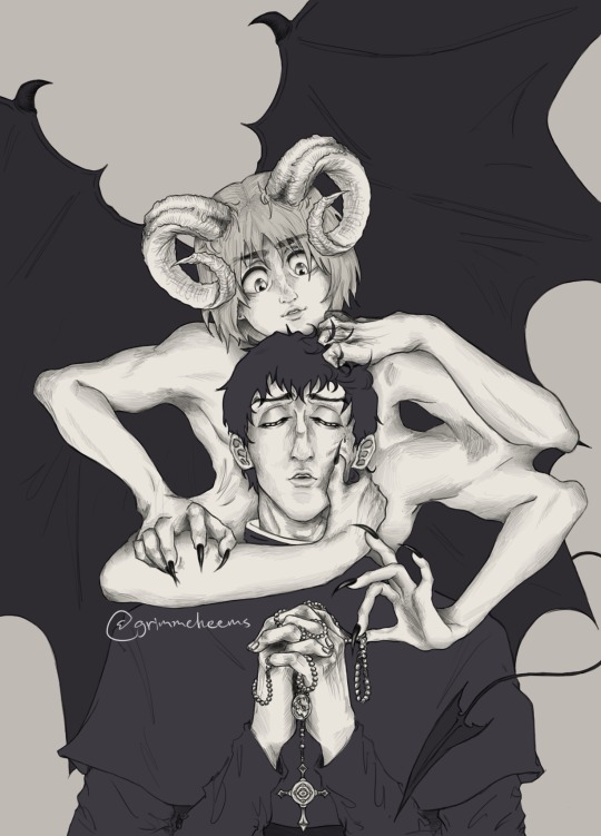
Yall this took forever to finish. So glad I actually decided to continue it instead of abandoning it in my drafts🎀🗿 I love this brush so much and have been using it for a while now, I might make more arts like this occasionally bc they take forever.
Other than that, pray for me yall🙏🏽or help me manifest bc things have not been going well for me for a while. I just have not had any luck this past yr. Anyways I love berumin and the handful of us berumin truthers out here (🤭you know who you are🗣️)
😭 berumin yapping below⬇️🗣️‼️⚠️
I think this is my first actual Berumin art, wherein it’s obvious💀 all of the other ones I’ve made of these two are so all over the place and parts of aus I made, but this one is just something I did for fun a yr ago and left the sketch alone(it was so close to being abandoned fr) until I got back to it two weeks ago and decided to pull through. At first I was just gonna do a simple lineart and got carried away and then had to go all out to make everything match and make sense. It rly was a process doing the limbs and having to change a lot of the posing.
Idk what it was but I added those nails to armin on one hand and had to do it for ALL of them, it just rly played into the demon aspect so well I couldn’t resist. This originally didn’t have all the smaller details and I rly just made a lot of it along the way.
I rly liked thinking of this dynamic where Bert is more gentle/pure? And Armin is more deceptive and controlling? Idrk how to describe how I imagined it in my mind when I first made this but that’s the gist of it. Armin at first had a curious expression than the sly one he has here in the old sketches, and there was even a very rough sketch version where he’s an angel instead but I didn’t find it that appealing as a concept and I remember that sketch being so frustrating to get the wings right and I think that’s why I dropped this drawing at first.
Anyways 🗣️🗣️I LOVE BERT and MIN🗣️🗣️🎀🐢🐚
I actually like how ambiguous I left the context of this because there rly is a lot of possibilities this could go story-wise. Like, does Armin appear to Bertolt physically and everyone can see him but he’s only befriending Bert for demonic(?) purposes or is Armin manifested by Bertolt subconsciously. Is Armin a representation of Bert’s corruption? Who knows? I honestly couldn’t tell you but that’s probably why I was happy to make this more detailed than my usual stuff.
Other than that I do like the idea that perhaps Armin was a fallen angel that was casted out and became a demon? Something like that. Maybe Bert became a man of the cloth as a result of shame and guilt over something he did and that mirrors Armin’s fall from grace in how they both have to mask who they used to be???? Maybe none of this is real and this is Bert’s divine punishment in purgatory? What if there was a universe in which Bert wronged Armin in someway and Bert’s psyche takes a hit because of it?
It’s possible this isn’t even Armin but who knows?
Yall maybe I’m cooking with this actually.🤭👀👩🏽🦯🗿
What do you perceive this as and what is your take from just this alone? I kinda wanna know how everyone else would interpret them in this👁️👁️😳🥺🙏🏽🎀
Should I do another version of this but with concepts around demonology or something? Idk.
Btw I plan on finishing another berumin drawing I started last yr ,but based on a rly good berumin fic I read, I just haven’t gotten back to it.
#fanart#aot#attack on titan#drawing#artists on tumblr#religious horror#armin arlert#bertolt hoover#bertolt aot#berumin is real#berumin#bertholdt hoover#bertolt fubar#armin attack on titan#snk armin#maybe this is purgatory#but idk#i love them 😭#they deserved so much better#singeki no kyojin#is this an au?#fallen angel#berumin you have my heart#they despise each other but it’s complicated
52 notes
·
View notes
Note
have u ever talked anywhere about your coloring or composition processes? u are honestly one of my favorite artists and i would love to hear any insight on how you make pieces 💓
wahh thank you TTT !!! I did sorta give a very simplistic answer here but it was more of my simpler sketchy style so lemme redo that, ill try to be consise and make this understandable ?? its a bit hard cuz it honest to god depends on what Kind of piece im even drawing, cuz for some i go the whole length of doing lineart flats and all that, others i just just fuck around untill it looks right?
i do usually start with a rough sketch or colour draft, especially with more compley pieces this helps with figuring out the feel, honestly i should spend more time drafting properly, figuring out poses and such but im so lazy i just go w the first thing that looks good
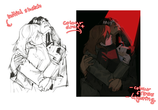
then just lines over the colour draft, fixing lots of anatomy and proportion stuff, and depending on how i wanna do the colours ill either keep the colour layers or merge them together and have the edited colours as the base colour (this might not even make sense help)
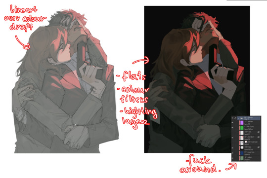
see this piece at the time gave me an insane ammount of trouble with lighting and colours, so after trying to render i ended up merging everything together....which i dont USUALLY do but the rendering is pretty similar except usually i have colours be seperated by layer,
ANYWAYS sadly i dont have a process on how it got from flats to this specific render for this piece...but i still followed my initial drafts/plans with vibe and colours and just painted over it, its why i make it after all!
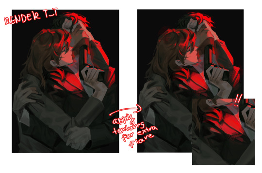
but honestly a lot of times its just very simple colours and just trying to mainting good contrast and values !!!! and THEN fucking around with colours and rextures, for other pieces i kinda just paint as i go? i have this timelapse of my justice piece that may be a bit more help!
it includes the initial colour draft, the cleanup/lining process, flats, rendering, and all that so its probs the most accurate timelapse of my morecomplex work processes, with stuff that doesnt include heavier backgrounds, which is a whole OTHER topic honestly
im sorry if i cant explain it more cohesively, i genuinely barely know what im doing most times and go by muscle memory and stuff i Know but cant. Explain? like i know how light and folds work since i observed and studied them but i cannot put it into words at all )--)0
my brushes also contribute a lot to how i render and colour, depending on what i use, you can find the swatches for them here !
152 notes
·
View notes
Text

(Click the image for better quality)
Yipeeee that Keiki and Mayumi fanart I posted the WIP of is finally done woooo- This piece was a very experimental one that I'm kind of OK on. Maybe because I've just gone insane looking at it for so long and I'm my own worst critic lol.
Artist's Notes;
So I've once again been playing around with my rendering style, mainly because I have been wanting to improve my lighting for a while now and as I was just scrolling through Tumblr, I saw some of the official art for that one webcomic-turned-animated-TV-Show Lackadaisy and was immediately inspired. I also have seen a technique a few times in the past where the lineart and shading are merged together, so I've been meaning to try that for a little while.

I did some experimentation on this one sketch of Keiki I posted in my sketch dump and I really liked the results of it, so I carried those over to this piece.
I ended up scaling up Keiki and Mayumi from the original WIP because I felt like they were both getting lost in the composition, and I'm glad for that because I think it works a lot better. I'm not a fan of how Mayumi's sword turned out at all, but it's not really meant to be the focus of the piece so eh. Overall, I think I could do better with my colours, probably because with Keiki and Mayumi's colours, I did them flat in greyscale and then used a brush on the overlay blend mode to colour all of them over, after which I changed the base layer for their colours from white to yellow and then lowered the opacity so it all went together better. I also decided to use gradient maps for a lot of the background elements, mainly to experiment with getting in my values first to make them pop out more. I ended up finding a really nice sky gradient on Clip Studio Paint that I really liked, and that kinda helped to establish the colour scheme of the background a lot. I think the whole "start in greyscale then colour" thing really works better with painterly styles rather than more illustrative ones, and while it is good at making sure your values are more readable, I honestly don't think I have the skill level to pull that off yet. Honestly, I think I've been looking at this drawing too long or maybe I added too much to it, but I wish I could've made the colours less monochromatic, but I'll just save that for the next piece I do.
I do love how the flame (...well it's more of a weird space rift than anything in this piece) and the lighting turned out, those were fun to do. I was initially struggling with the flame and how Mayumi is positioned in front of it before realizing "Oh wait! This is a weird abstraction of a weird creature! I don't have to follow the laws of anatomy!" and just dislocated it's flamey bottom jaw from the main body. I also changed the colours of it since I was really not liking how incredibly bright it was when it had lighter colours. Again, the gradient maps served the more painterly style of the flames well.
I also love how Mayumi turned out. I could do her sleeves better but that's more of just me needing to study how those types of sleeves fold in that position more. I'm also very happy with the posing, the technique I used for that was taking photos of myself in the positions I wanted, blocking in the silhouette and then modifying that by adjusting it to my lines of action that I drew on top of the original photos, and then sketching over the silhouettes and drawing in the shapes of the hands overtop of the photo if I needed to get the fine details right. As for what I do to take the pictures myself, I use a tall chair I have, prop up my phone with a phone stand, put on a ten second timer and scramble to get in position. Yes, I did have to use a bunch of thin markers I had to try and get the hand positioning on Keiki's pose right, yes I do have a fake sword that I used to get the positioning of Mayumi's arms and hand right, the sword was for an old Halloween costume from several years ago. I really like how both Keiki and Mayumi turned out in this drawing, I'll have to play around with these designs for them more in future drawings.
Also, if you wanna know why I draw buildings like that, when I watched Fantasia 2000 as a kid (One of the Disney movies where they make really beautiful animations to classical music) the way they drew the buildings in the first few sections Rhapsody in Blue segment (the jazz one with the cities) changed my brain chemistry and now whenever I need to draw buildings really quickly, I refer back to that. Since the buildings aren't really the main subject, I didn't put much thought into them.
As you can tell I am very tired of this piece, mainly because I made things harder for myself by overcomplicating the process compared to what I usually do, mainly with the whole "starting in grayscale then adding colour." I'd honestly just prefer having a black layer set to colour that I can just toggle on and off when I need to see the values, but it was good to experiment. And that was mainly the point of this whole drawing, to experiment. I'm definitely going to have to play around with this new style I'm going for, mainly because I liked how it turned out a lot in the augmented Keiki sketch, and also because I want to find ways of making it suit my style more. I also really want to keep experimenting with my lighting like this, it's very fun. Last but not least I am never starting in greyscale again because dear god I do not like the workflow it forced me into. I don't have a problem with the method itself it's mainly just a skill issue lol.
If you wanna read my headcanons for these two, I put them in my WIP post, so you can read them there if you want to. The more I look at this the more I prefer the simplicity of my WIP. I might go back to this and just take away the fancy colours and effects to see what it looks like without all of that stuff and reblog this post with that drawing, but for now, I don't think I can look at this drawing again for a while.
#touhou project#art#fanart#touhou fanart#touhou 17#wily beast and weakest creature#keiki haniyasushin#mayumi joutougu#haniyasushin keiki
116 notes
·
View notes
Note
What are your art inspirations?
Disclaimer: A LOT of RAMBLING
Honestly hard to answer, nowadays I don't really look at a lot of art anymore but mostly just movies.
Biggest inspiration over the years (from 2020 to 2022) would have to be Kan Liu. His painting style with mostly just the round brush and hard edges really spoke to me, especially when it came to lineart I was a massive fucking copycat lmao.
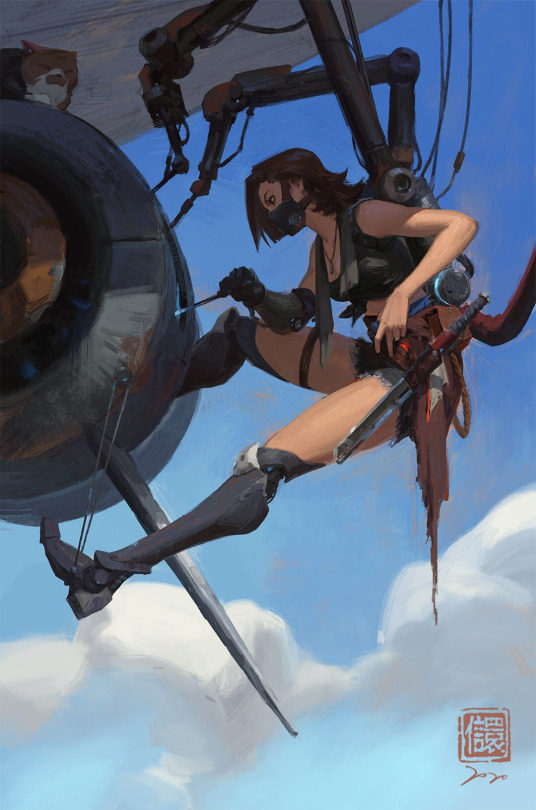
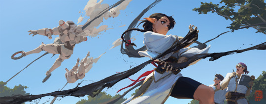
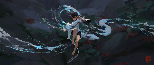
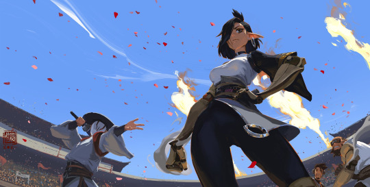
Around 2022 I also began falling in love with Sungmoo Heo. The perspectives and overall style just fucks so hard.
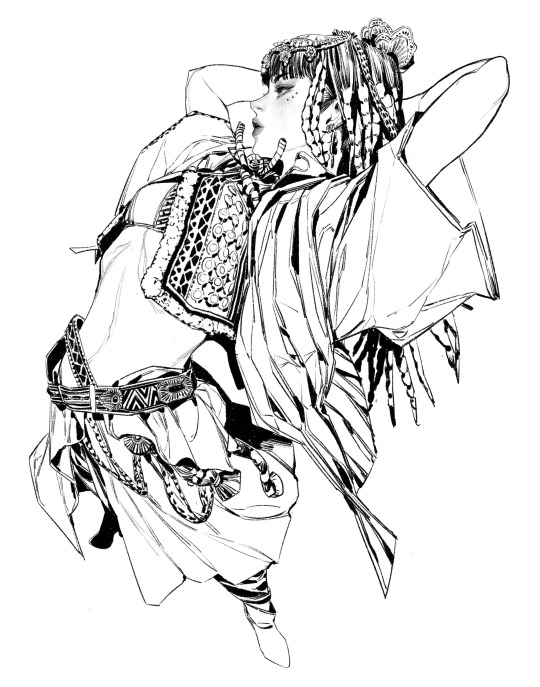
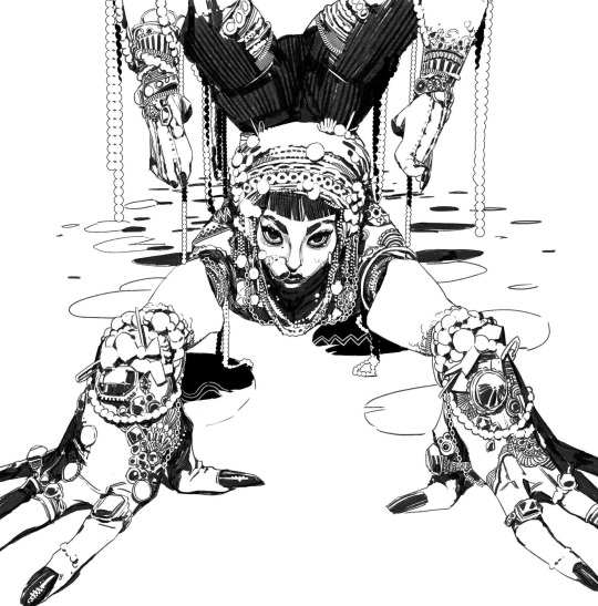
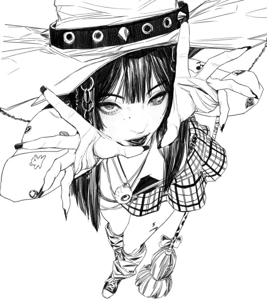
The most obvious inspo would have to be Seonhyeok Jeon though, who I still rip off blatantly.
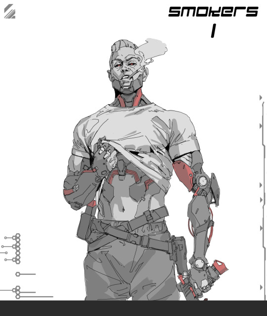
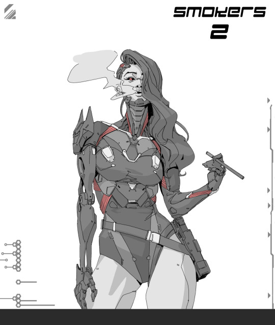
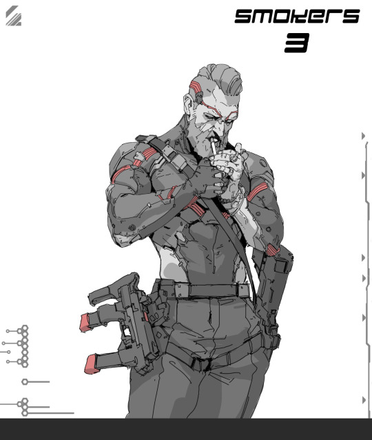
In general I began taking art seriously around 2020, when I found Kan Liu, because I began training to compete in bodybuilding, which I did the next year. I began getting super interested in how the body and muscles work so I just drew those a fuck ton, and those anatomy studies ended up really helping my art skills in general.
Anyway! For animation... Hiroto Nagata and Q Kawa are big inspos.
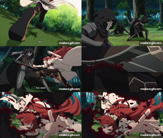
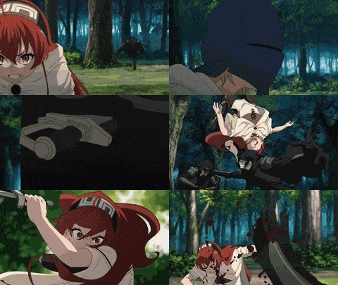
This shit is so fucking RAW and HOLY SHIT when I look at how the perspective gets just in your face I always just think "what am I even doing man I have to PRACTICE". It's like watching a Zyzz or Ronny Coleman clip before doing a lift at the gym but for art, shit's motivational.
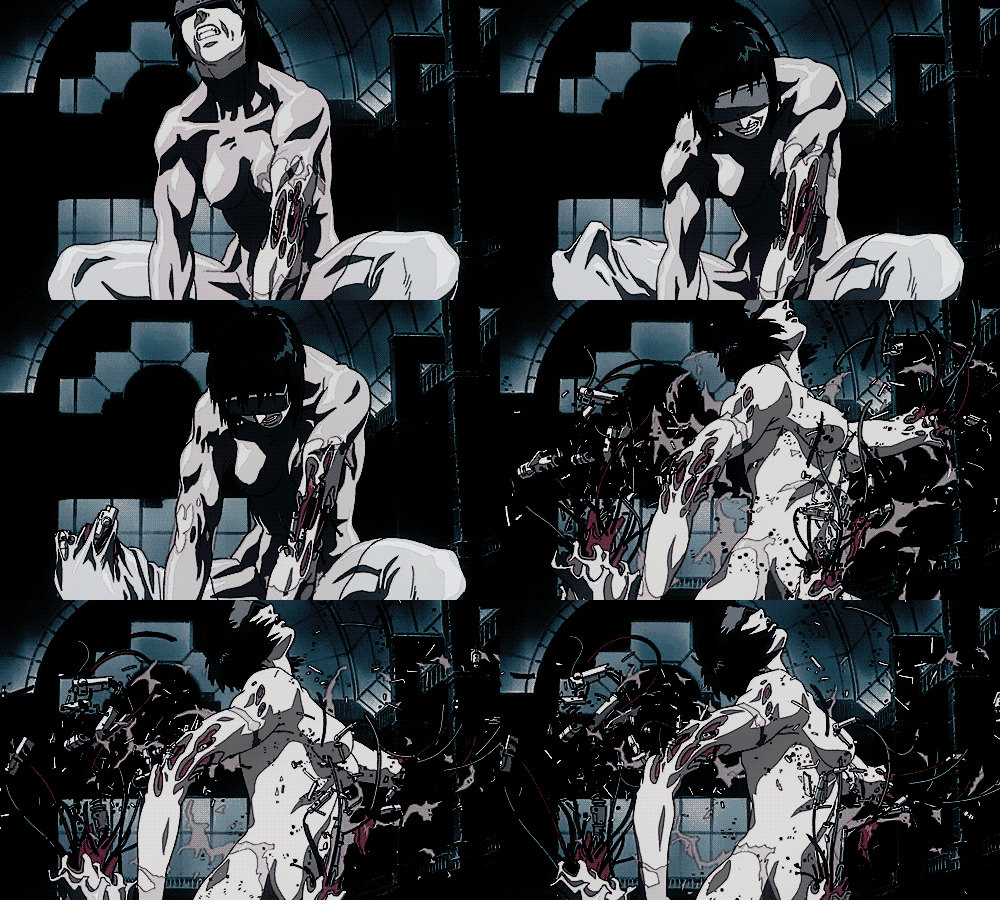
This cut in Ghost In the Shell as well is WOW, I think what speaks a lot to me is when an animation doesn't conform to what's standard in the medium and tries to push boundaries/be unique. Be it in this case through insane details, in the case of Mushoku Tensei through bg animation mixed with extreme foreshortening or just a crazy perspective and punchy movements in the Madoka clip.
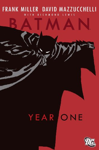
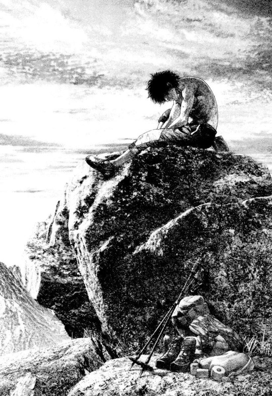
Overall it's hard to say what else my inspirations are though. When it comes to manga and comics I can think of Batman Year One, The Climber by Shin-ichi Sakamoto, Ultra Heaven by Keichi Koike, Solo Leveling (big inspo in 2021) and Homunculus.
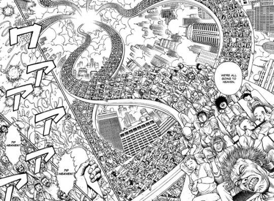
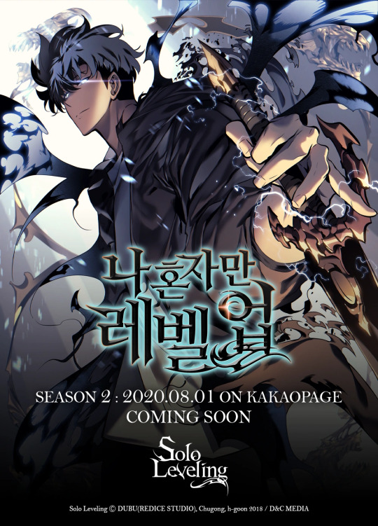
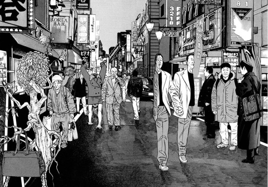
Also, even though everyone assumes it, I haven't played Cyberpunk 2077 or am that big a fan of the Blame! manga, I guess I just have a fairly similar artistic vision to both of those.
For animated fiction it'd be Spiderverse recently, Millennium Actress, Silent Voice and a million other anime I've forgotten the name of. Naoko Yamada's directing for Silent Voice or other anime like Hibike Euphonium and the Liz movie has always been amazing to me because she is able to express characters personalities through their body language, like they way they walk or stand, in a way I have never seen done before. Extremely recognizable and iconic style imo. A long time ago I used to be really into watching anime, but I don't care much for it anymore.
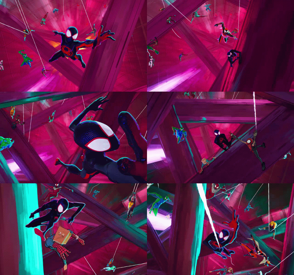
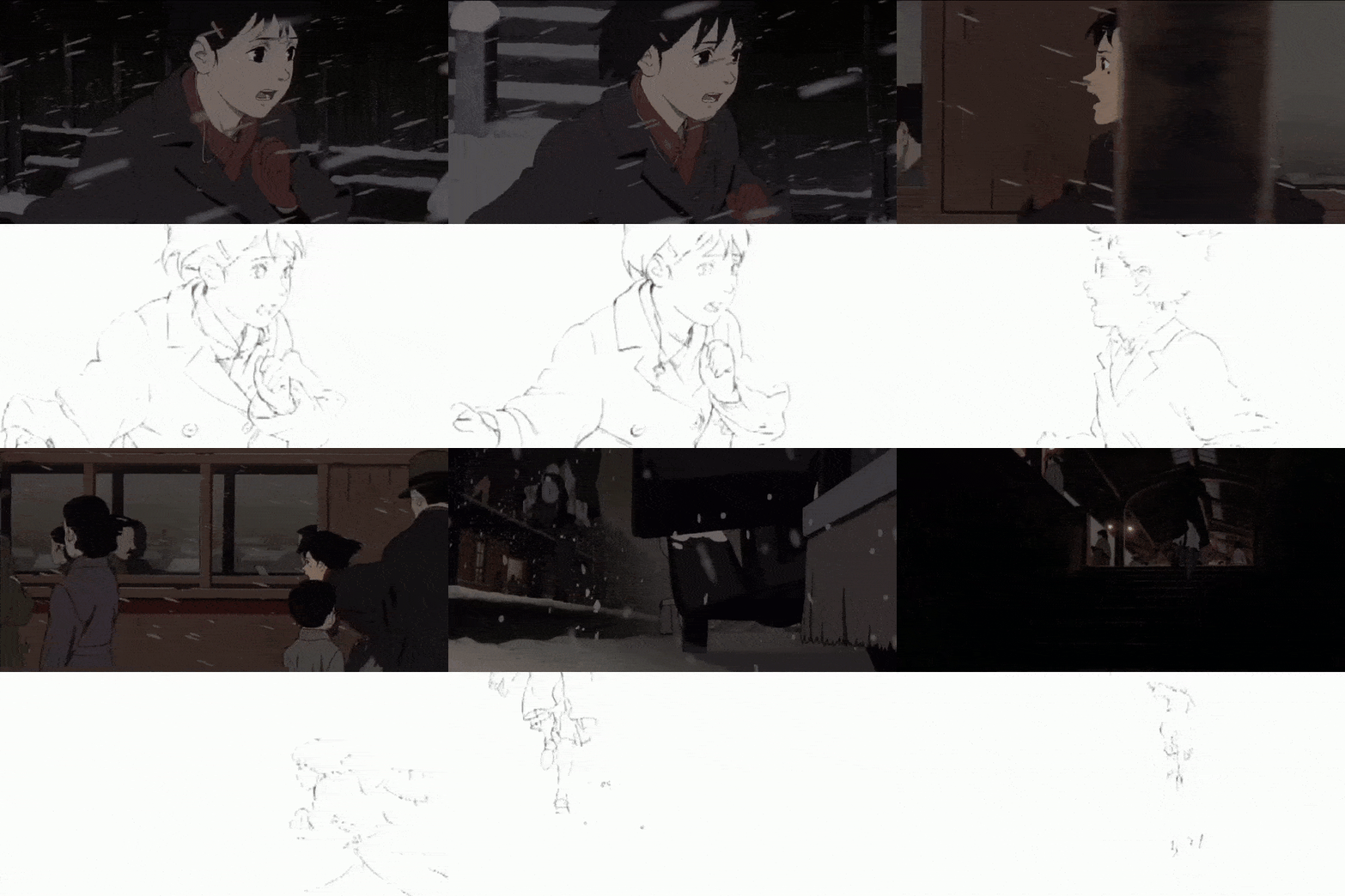
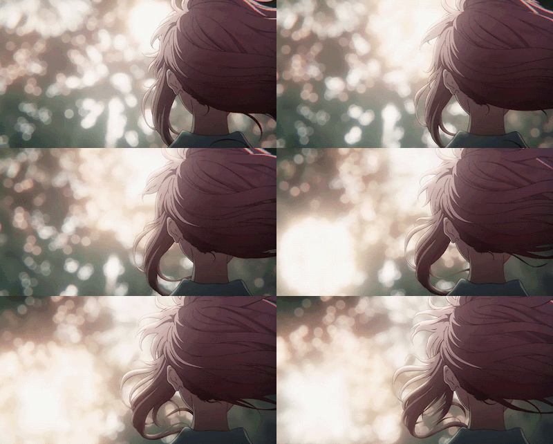
Other inspo would be this guy on twitter, his stuff is insanely cool https://twitter.com/be_myvu/status/1725069515107533178?s=46
It's like that Ralph Waldo Emerson quote - “I cannot remember the books I've read any more than the meals I have eaten; even so, they have made me.” I think throughout the years I've been so obsessed with all kinds of artists that I've taken in inspiration from everywhere. I cannot recall them all anymore, but they have made me the artist I am today.
Currently, like I said, I would consider movies to be my biggest inspiration because I find it interesting how cinematographers are able to stylize real life, which I'm trying to get closer to. If I could direct a movie, I would probably stop making art right then and there, but I'm not really working towards that goal anyway lmao. One day, being able to make a short film in animation would be something I would like to do though.
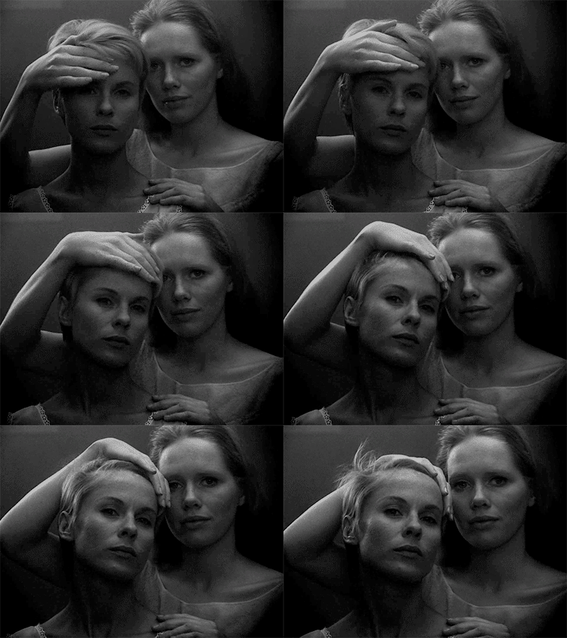
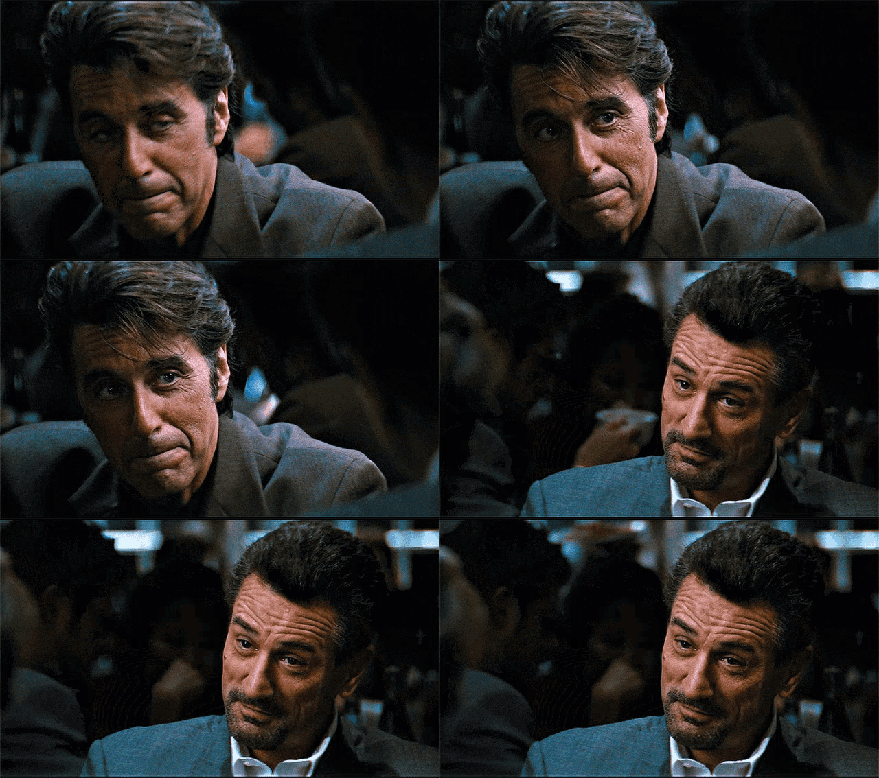
I'm not deep enough into the movie scene to get the street cred of being called an expert but I love them a lot. Fallen Angels made me fall in love with fisheye back then for example. Fight Club and The Batman have a grit to them visually that I find inspiring, and movies like Persona and Heat also come to mind when I think of movies I just love. I could look up my letterboxd for a more thorough answer but I feel I've already been writing way too long.
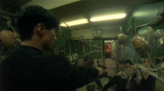
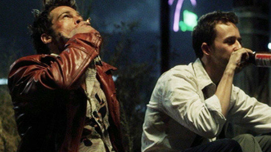
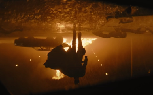
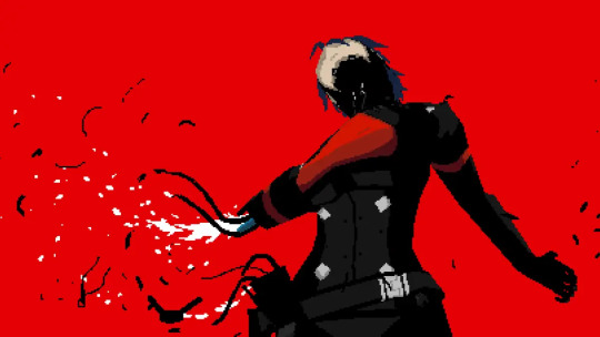
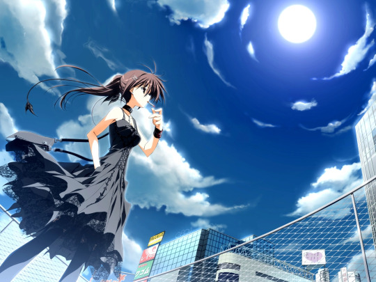
For video games, I guess you can imagine that I would say Signalis lmao. Besides that I can think of Subahibi (vn), Muramasa (vn), and Va-11 Hall-a for inspirations
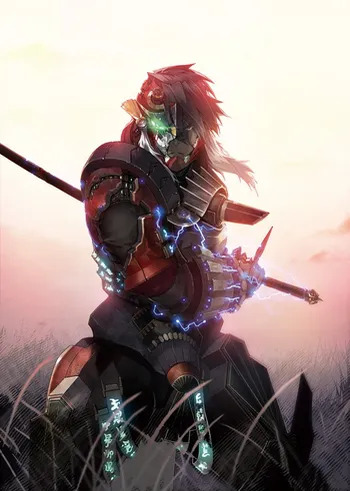
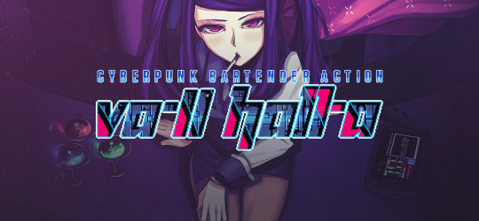
Lastly, I guess huge inspirations are also a fuck ton of music. I mostly listen to either metal or hard techno, but I think I'll refrain from any more yapping.
I feel that this isn't really a great answer to the question, but it's the one I consider the most correct, because it's never as simple as just mentioning one artist. With a lot of these you wouldn't see a visual resemblence to my art, but in all of these I recognize a feeling that I also find in my own art.
Thank you for the question!
81 notes
·
View notes
Note
dy have any tips to make your art look less lifeless? I stare at my rendered digital art and everytime without fail i start to rot from the lack of soul in it
ok first of all, I think you might be judging your art too harshly. The only quite literal soulless art is AI art so as long as you create something, there's soul in it. But I understand what you mean. Honestly, I'm not sure if I'm best suited to answer this since it's something I struggle with myself, but since you asked me, here are my two cents on the matter
A lifeless look in your art may come from two places: a lack of skills or a lack of message/delivery
Skill-wise, there's a looot you can do and improve on : gesture, dynamic poses, more expressive faces, better color language, strategic line expression, shape language, using color theory to better express a certain mood of a piece etc.
i could go into detail for each point but it would take too long so I'll leave it up to you to google and research things on your own ( or you can shoot me another ask if you want me to yap about a certain technical approach and I'll gladly do so)
but honestly, these are just skills and tools that you master in time. A first step is to at least acknowledge their existence. I want to talk more about the second aspect of this issue: intention. The intention behind your art is more valuable than you think. Art can feel soulless if it doesn't send any message, if it's generic, if there's no emotion behind it or if there's nothing to be interpreted. I'm not saying all art should be super deep or profound to hold value of course, but i often feel like this is a rather neglected part when discussing art. We sometimes get so tied up in the technical aspects like rendering or anatomy but the truth is, a general audience (aka the people who will see your art) doesn't give a crap about the technicalities. They judge something at face value and the first thing they look for is the /message/. What is this painting about? Who or what did you draw? The second thing they will look for is connection. When they can relate to the emotion conveyed or the subject matter, the experience becomes more rewarding and engaging. The same applies to the artist. Creating something meaningful and personal often leads to a greater sense of accomplishment. Honestly, skill comes second.
Case in point: why does hyperrealistic art get shit on? It's very impressive technique-wise, yes, you can't deny the artist isn't skilled, but does it express something? Nope, they do the job of a printer which again,. it is impressive but not from an ~artistic pov, just from a skill pov. On the flip side, why do poorly drawn sob stories get so much attention and praise? Because the art triggered a certain emotion (that has overwritten an already untrained eye) and emotions are extremely powerful for humans as we all very well know and it basically makes them ignore or neglect the execution
So, my piece of advice is to draw something that has personal meaning /to you/, that ignites a certain feeling you can't shake ( it doesn't have to be something #deep or sad, laughter and joy are equally valuable so keep that in mind), a certain situation or scenario and I can guarantee your art won't feel as lifeless to you as before. To better express this idea of yours that you now possess, you can now think about the technical side of how you'd express it. For example:
~deliberately messy brushstrokes and textures -> create chaos.
~maybe you're feeling something lovely dovey and soft -> warm colors to express that + brushes with lost edges
~maybe you want to tell a story in a comic format -> focus on calligraphy; shaky lineart gives off the impression of vulnerability; leave whitespaces etc
~something funny? -> goofy facial expressions or lowkey downgrading the quality usually makes something funnier
~Colors ! colors ! colors !!! pretty self-explanatory blues and grays for depression pinks and rainbows for the happy ( or NOT if you're feeling adventurous winkwink)
BONUS TIP: hiding/blocking out/blurring the face of your subject makes the painting feel more immersive. The viewer can relate to the person you're drawing ( "oh he's just like me fr")
There are artists who are insanely skilled but make kinda "boring" art and then there are artists with cool ideas but with maybe an underwhelming execution.
Ultimately, it's a combination of BOTH awesome skills and intentions. Those are my favourite artists. When i find someone who draws something that makes me stare and wonder how tf they drew that while also appreciating how cool the concept is I knoww I hit jackpot. And if they draw fanart of my fave?? bonus points
okkkkkkkkk i yapped for too long sorttyyyyy hope it helped maybe idk
!!!!DISCLAIMER!!!! this is all my personal interpretation and how i view things I'm self taught I've never been to art school or taken any art classes so i might be completely wrong !! take everything with a grain of salt !!
#long post#ask iztea#art advice#eveything was pretty obv idt i said anything useful or new#tl;dr draw something that has meaning and use certain techniques to express that message wow#ask iztea: art talk
44 notes
·
View notes
Text
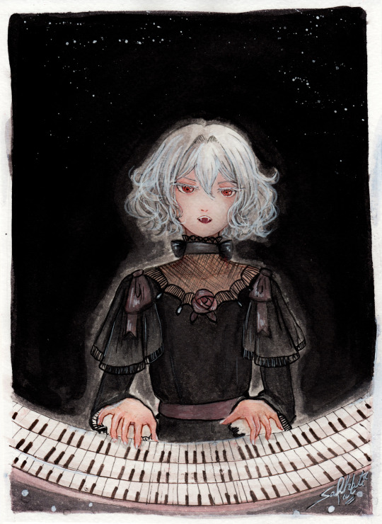
"Noble d'Apchier"
A little watercolor painting of Chloe,with the Zorn palette! I found out about this palette a while ago and I really wanted to try it out! (More on that below )
Chloe's hair is something I adore, it's gotta be one of my absolute favourite character designs ever,I love how swirly and fluffy it is,very fun to draw. I've drawn her normally before,I wanted to do one with her vampire eyes and fangs too. I decided to try to draw a white fuzzy rim around the foreground against the plain background,for a change,like in some of the VnC panels.
The Zorn palette,or Apelles Palette was a colour scheme used by Anders Zorn in the late Victorian/Early Edwardian era. It ,or something similar,might have been used by artists of old civilizations too, because it avoids the use of blue and green entirely: which would eliminate the need for rare pigments . It's essentially a colour mixing challenge,to draw the entire paintings with 4 pigments,2 basic colours: Ochre yellow, Vermillion,and Black and white,which can be mixed into different shades. It can be an excellent exercise and means for portrait painting
Modern artists use red instead of vermillion,but the essence is the same. So that's what I did too. I considered using vermillion,but I realised that it would introduce a lot of yellow tint, making the picture very warm. Which is usually something I prefer honestly,but not what I was going for here. Also,I need to consider the fact that I'm a watercolour artist,which is very different from the original intended palette. Zorn used oil paints,but other artists use it fine for gouache and acrylic too, however,that too is different from watercolor, because instead of mixing with white, I'll be diluting with water,which changes the composition of the palette considerably. So I went with these supplies: ochre yellow and red watercolor pencils (for me, basically watercolor pigments,I don't use them to draw,I grind and dissolve them in water),white and black watercolor tubes,and white ink. In addition: lineart with sepia,grey and black brush pens,which are well within the bounds of the palette
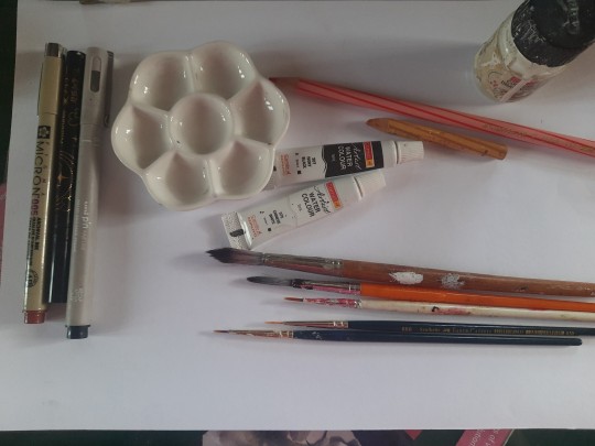
To be honest,I ended up not using the white paint tube at all,water makes more sense to me. I didn't use anything else though,and stuck with the original materials.And the results:
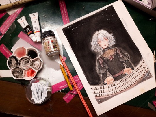
Does it work? Hell yeah. It's not perfect,but I'm happy with how she turned out
Was it restricting? That's kind of the point,to paint with some limitations
Was it hard? Honestly? No. Not at all. It's definitely very different from what I'm used to,I use a lot of colours both as is and mixed,but this was surprisingly easy. Perhaps because of my subject,which didn't have much colour to begin with
Do I recommend it? If you want a small challenge,or to experiment or practice colour mixing,definitely
Will I do it again ? Absolutely. I feel like I haven't utilised much of the potential of this palette. I ended up using mainly red and black, hardly any yellow at all. So I'd like to do something more colourful with this palette, perhaps a sunny painting of a gingerhead girl with flowers,and for this I'll probably use vermillion,not red
Anyways, that's all! If you read all this,thank you for your time!!
#chloe d'apchier#the case study of vanitas#vanitas no carte#VnC#my art#traditional art#zorn palette#vnc fanart#vanitas no shuki#jun mochizuki#case study of vanitas
291 notes
·
View notes
Note
can you pretty pretty please with extra sprinkles on top drop the speedpaint for your most recent rookvil art? i wanna see how you did vils pretty dress and everything else cause its all so beautiful
I am so happy you like how it looks!! I would love to make a speedpaint, but unfortunately, I didn’t record it + the base for the drawing was actually done traditionally with a pencil. A lot of my drawings are done this way, actually…
Even though I can’t drop the speedpaint, I’ll do the next best thing and explain my process for this specific drawing step-by-step. It’s actually not that complicated!
Here is how the sketch looked initially. As you can see, I shaded the dress very crudely; in fact I was kind of upset with how the dress looked at this stage. Ironically, I ended up not doing much to the pencil shading, and it still turned out okay somehow?? Anyways, the first thing I did was to prep the sketch for the colouring stage: I adjusted the contrast, fixed Vil’s face, and erased some dirt and imperfections.

Then I create a new layer, set it to Multiply (this way I can colour the sketch without disturbing it, as if I was just colouring a digitally done lineart) and do a base colour layer. There is a gradient in Vil’s hair and Rook’s belt buckle, but other than that, all the colours are flat at this stage.

Before doing all the shading needed for this sketch, I add details such as makeup and tights. If you want to know how I did these, let me know, but I basically looked at a tutorial once and then simplified it lol

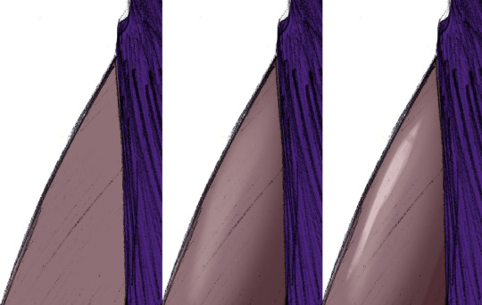
Now, the dress.
To be completely honest, there isn’t any proper technique to what I did, everything is always just trial and error and an hour of me going “does that look good? NO IT DOESN’T >:(“ until both Katsu and I are satisfied. This time I was lucky, because it didn’t take very long, and the “solution” was pretty simple.
Starting with the base colour. I turned off the sketch layer to show that it is indeed completely purple. And it looks kind of bright at this point, almost too bright even, especially considering that the dress is supposed to be mostly black, or at least dark purple. But bear with me.
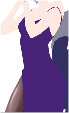
Next I added some highlights (new layer, set on Overlay or Screen, depending on what looks best). Usually I would add the shades first, but I wanted to make the fabric look more “shiny”, you know, the type of fabric that would reflect the floor and make this highlight under the boob lol.
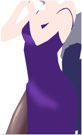
And after that I just went ahead and added black gradient (on a new Layer) from the bottom of the dress to make it look darker, silkier and a little bit more interesting for the eye. I erased some parts of the gradients as you can see, because it looked too dark on the highlighted parts… could’ve just placed the black gradient layer under the highlights layer and saved myself a headache, but hey, where is the adventure in that.

Finally, it turned out looking like this. It looks better than it used to look like initially, but there is one more thing to do. We don’t get to do this one too often, so it always excited both Katsu and me: THE SPARKLES!! Somehow, making the dress sparkly makes everything much better.

How do I do the sparkles: I use the star brush… or was it a snow brush? I use this brush when I draw both of these things lol + when I draw anything sparkly. I would’ve given you this specific one, but I don’t really remember where I got it from, and I honestly think that any starry or snowy brush would work wonderfully as long as the specs are small enough.
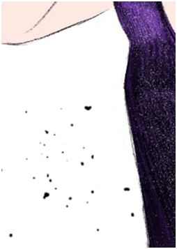
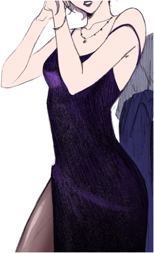
After that is done, I just shade the rest of the drawing. Nnew layer set on Multiply, the shading is done with darker purple/red + darker blue, whatever looks better on any particular material: the skin really likes warmer colours, but Rook’s suit looked bad with red shades, so I adjusted it to blue.
And here is the post where I talk about how I colour hair! Good thing I already wrote that one, this post is getting long lol
And the last step is to add details. The original sketch was done in a rather small (smaller than A6) sketchbook, so I couldn’t draw all the details like Vil’s earrings and stuff properly. Basically I just paint on a separate layer on top of everything.
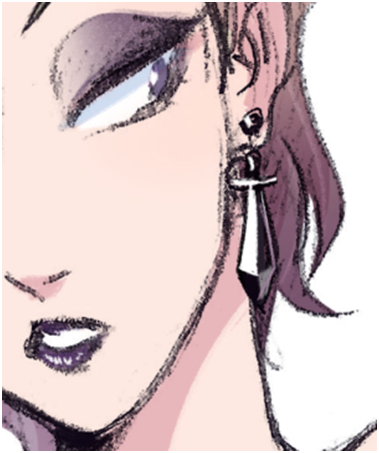
And there you have it! I hope it makes sense, please let me know if you have questions.
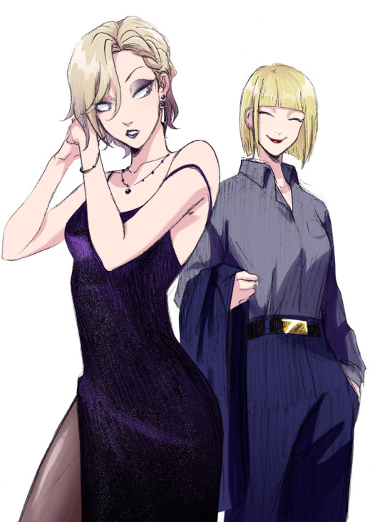
106 notes
·
View notes
Note
Sorry if you’ve been asked this before, could you share what brushes you use? I just love your art and have been trying to learn about that more textured style in digital art. Not just your line art, but the big texture shading you use too AHHH so scrumptious! 🫵🔥 you are a dream machine
okayyy i need to start this by saying im a brush hoarder. i literally have so many brushsets imported because every now and then i download new ones for fresh air but i boiled it down to the ones i love the most so here u go. more info on how i use them below <3

starting with my beloved brush flat rough which i use for sketching, this comes in a paid brushset however if you’re willing to spend $ on brushes i’d say it’s def worth it, the whole set is very yummy. i found this one while i was looking for a marker brush that mimicked the one csp brush i used all the time 🥲

it’s perfect for setting up proportions and establishing interesting shapes from the get go. however its not good for lineart and small details so i mostly use it when i have the intention of covering it up with colors later. my comfort brush fr
and now my versatile queen gloaming (default brush) the only brush that doesn’t make me hate myself whenever i attempt to do lineart. when its used in a tiny size it’s very sharp and has an ink look to it, in medium size it’s perfect for sketching and maximum size it’s great for a watercolor-ish shading style. i also have a modified version where i just changed the brush tip to a round shape and made it more opaque (i used in for the lines in her coat here)

grain is a brush from tasia ms’ set. its gets opaque very fast so its great for doing the larger shadows of a drawing. it has a nice little texture to it and its free (they ask you to log in to the site for you to download it though :()
and theres this one from fatima mandouh which is meant to mimic colored pencils and its literally perfect. it genuinely looks like trad art and it feels so soft while you’re drawing its just 😘👌 no words. and its free!!! i mostly use it for the last steps of a painting but its good for anything honestly, here’s a sketch i did using it:

overall i feel like the real secret to make your art feel more textured is just shading in a hatching style tbh. like seriously just slap the flat colors and build up with a pencil brush trust me. also add a little texture on top of the finished artwork. and add sharpness and noise too. go whack.
#asks#also thank youuu <3<3<3#my whole blog is just asks now because i decided to stop being lazy lol
7 notes
·
View notes
Text
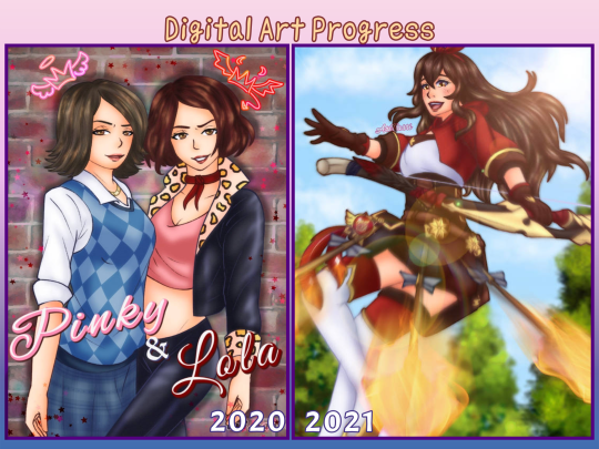
Digital Art Progress
Went through my digital art to see how much I’ve improved through the years. You all don’t know how badly I cringed at the older ones. I mostly wanted to see just how much my coloring and line work improved.
I don’t really want to talk about 2014 since it was only one or two pieces, 2015 was when I really started doing digital art and yeah my coloring was AWFUL. My shading especially. And don’t get me started on my lazy ass refusing to draw backgrounds. 2016-2017 wasn’t any better with the backgrounds. 2017 was when I started making use of the effects for the shading. I also had art as an elective during those years so my teacher was a real help in improving it. Oh and I did have more artist friends to learn from too.


2018-2019, my coloring was getting better. At least the coloring for hair and eyes mostly, I noticed I went really soft with the shading. I also noticed a bit of a drawing regression through 2019-2020 but I was forcing myself to draw between those years. 2020 was the year I started coloring my linearts xD It was also when I started adding more effects and layers to make the shading better. And then 2021 is when I started doing a base layer for all the coloring so I didn’t have to worry about erasing any colors that went past the lines.

2022-2023 had a lot of my favorite art. My coloring and shading has improved greatly. I was experimenting more with different brushes for better lineart and coloring. I’m still in love with that drawing of Coby, it’s my favorite art for HPHM xD but yea, more effects more layers. I used to stick with about 15 layers but it moved up to 25 layers. 47 on a good day. As for colors, I kind of improved on that especially for shading xD At least characters with blond hair don’t look weird anymore when I shade and highlight them. I’m still working on coloring leather though.

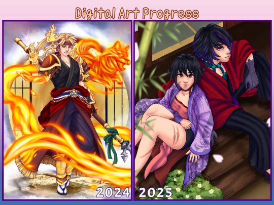
And then there’s 2024/2025. I learned another way to color lineart without having to directly color on it. Just set it to purple and set the layer to hardlight and it’s done. Though it really depends on the kind of drawing, I still had to color in some areas so it blends better. But that’s how I colored Thoma's mystic skin in the image here. And my fire effect is getting better ( ̄▽ ̄) I used to cheat and just use IbisPaint's fire materials. Also I no longer need to do three layers of shading to get the desired effect. I’ve also switched to a more simpler method to color hair, which is honestly fine. I think I prefer it this way now over the previous method. And once again I’m learning more on color theory because I still struggle. I’ve also been desaturating my art more now, especially with the latest ones. It honestly make them look so much more nicer to just stare at.
#just ari things#I’ve only ever shared art from 2014 on facebook never anywhere else#art improvement#art progress#digital art#digital art improvement
9 notes
·
View notes
Text
SOOO... Guess who is slowly starting to get into Phighting !! Honestly all the characters are so cool in their own ways. But Vine Staff definitely caught my eye the most... So i decided to make a design for her !
This is the first doodle i did of her to kinda get used to the new style and to think about her design.
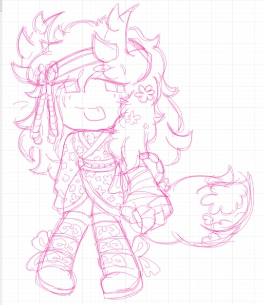
Then i decided to doodle a nother ! Since i knew i could improve it, at least a bit.
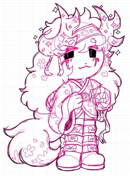
I loved how this one turned out ! I wanted to color it since i was proud of how it looked. Honestly not gonna lie i did struggle a bit getting used to actually using a brush to do lineart. I got so used to using the laso tool for lineart or just doing messy sketches. Though here it is !! Personally i love how it came out. <3

She is a fox !! Thought it fit her the most. Something about her being a fox whos a support stuck to my head :3
23 notes
·
View notes
Text
ask dump #3!
rch
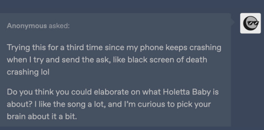
Yes and no! Holetta Baby is a character song for a story I wrote in high school with some friends I've since fallen out of touch with --- because of that (esp. since some of the characters were based on ourselves), and because it's frankly bizarre, I don't know if I'll ever share too much about it.
All you really need to know is that it's from the perspective of a man whose wife flew away as he gradually realizes that she's never coming back. IIRC she was just fleeing for a while because their love was forbidden, hence "Loving you's so good I fear it's wrong." In reality, she got trapped on an island somewhere and he was too heartbroken to consider the possibility that she might need rescuing.
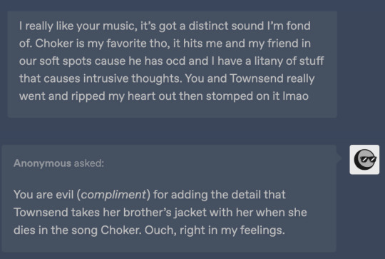
Thank you!!! I really can't overstate how happy I am that Townsend resonates with other people who have intrusive thoughts. It's something I still have trouble talking about but she's been a good outlet for that. Also quite happy that the angst is hitting right ehehe
art

Honestly no, I have so much trouble with that too OTL. Occasionally I use the warp tool on a sketch to help put an interesting line of action before I actually do lineart? I recently started experimenting with drawing in fisheye perspective too, and that definitely shakes things up.
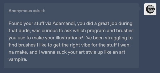
Thank you so much!!
I almost always draw in Procreate (with an iPad + apple pen). I have 2 sets of favorite brushes on there - these are what I usually use:
6B Pencil (found in the "sketching" category). I use this for EVERYTHING from lines to rendering.
Studio Pen ("inking")
Medium Hard Airbrush aka the most generic brush on earth
Inka ("inking")
Spectra ("painting") - annoying because it can alter colors by pressure though
Then I have this set I call 'ink kit' which I use when I want to change things up without actually switching mediums lol
Blackburn ("drawing") - Really thick brush that makes me think a little harder about lines. I also have a duplicate modified to make it a little smoother and smaller & I switch between those two when doing lineart on these pieces
Gesinski Ink ("inking") - one of those pens that's flat so it's really thin or wide depending on the angle
Oil Paint ("painting")
Watercolor ("painting") -- just for coloring stuff in when it doesn't have to be precise
Also these niche uses:
Driven Snow ("elements") for freckles
Nikko Rull ("painting") for skin texture
adamandi

It was just a fairly thick curling iron (curled upwards all over my head) and then a lot of hairspray. If I remember correctly, the first night it was done by our costume designer Hahnji Jang (@/hahnjij on insta!) and then I did it myself the rest of the nights. It was definitely their idea at least - my hair is naturally pretty flat and up til then I assumed Vincent's would be too, lol.
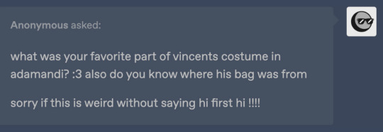
No idea where the bag (or really any of it) is from, sorry. I really liked walking around in his swooshy jacket, and I ended up buying it afterwards. As far as normal people clothes I would actually wear, I really really liked his pants, which I was unfortunately not able to keep.
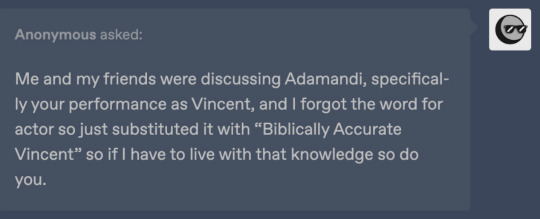
There actually exists in my mind a completely different "biblically accurate Vincent," which is the Vincent I had been picturing all the way up until the actual performances. I always pictured him with long black hair and freckles, and I considered drawing on freckles for the show because of that.
12 notes
·
View notes