#here’s hoping this exports properly
Explore tagged Tumblr posts
Text
“Oh, Mango,” my imaginary audience cries, “Where have you been this week?” And the answer, my friends, is simple: I couldn’t get these stupid gay men out of my head so I made my first ever animatic about it. No-Eyed Girl is SO Billford coded don’t fight me on this.
Also I drew a companion piece to this post, so go check it out if you want <3
#gravity falls#billford#stanford pines#bill cipher#fiddleford mcgucket#animatic#animation#sorry for the jank I edited this on imovie#also this is pretty tame billford tbh but LISTEN I just had to make something about it#might draw an art piece related to this if I have the energy#this is my first animatic so Be Nice#yeah it’s 2 fps. and I still had to split it into four (!!!) parts so I didn’t blow up my computer#lemon demon#no eyed girl#spirit phone#here’s hoping this exports properly
122 notes
·
View notes
Text
I've finally finished my Danganronpa AU personal project! I personally call it
DANGANRONPA: DEMIX

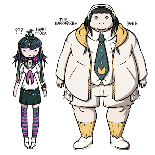
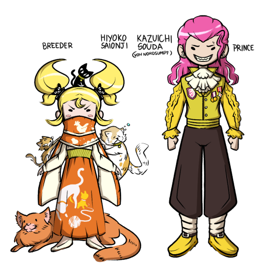
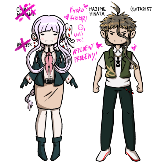
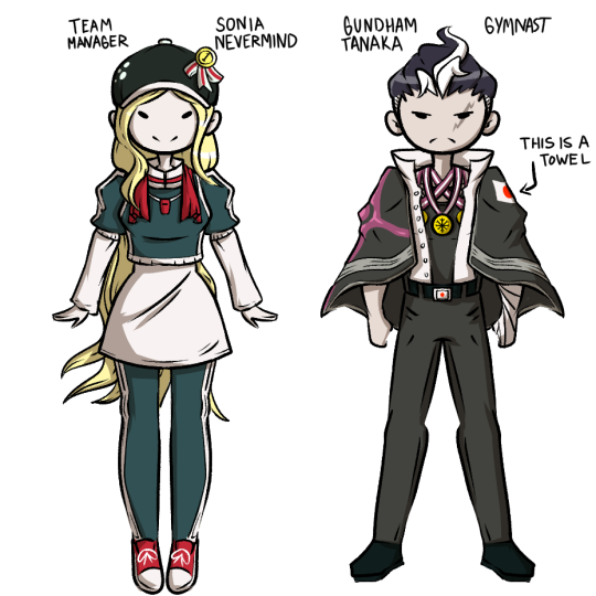

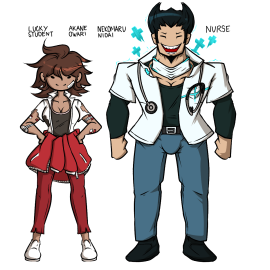

See Demix 1 here
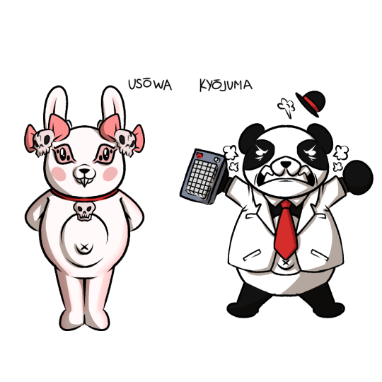
And yeah, all the swaps as you can see above, and these guys in the middle are the replacements for Monokuma and Usami respectively:
Check out under the cut for some design insights on my take AND closer pictures of each pair:
Finally finished my personal AU project. I hope it's to everyone's liking!
I can go on forever about these designs but I'll limit myself to one-two sentences on some facts about the designs.

Mikan: Mikan's face tattoo was commissioned on her against her will so that she can never hide her nature as a Yakuza, but her leg tattoo was done on purpose, and she and Nagito have matching tattoos on their legs, his is just hidden most the time.
Nagito: He is usually seen with a spear and prefers the weapon over the sword, but he is more famous for his natural skill with the blade. That said, he resents the blade and wishes he could be recognized for the things he actually works hard to do, like throwing spears or protecting Mikan and her family.

Ibuki: I kept her design very similar to her base design because she pretty much just looks like a student, and I don't want to change anyone's personality so there's no reason for her to not get highlights. But I gave her some more symmetry in this design and gave her a cute little semi ahoge I guess with a hair tie, bc she doesn't naturally have one.
Imposter/Gamemaster: Yeah I made the big brain choice to keep him with his colors as "Byakuya" because it made for a more striking visual, and more recognizeable as the impostor. Also I made him too tall because I wanted to give him big legs lol.

Hiyoko: Her four cats are named Heart (scraggly cat), Mr. Pearls (sleepy cat), Big Red (Giant cat), and BB (black cat) bc canonically the four dark devas are named after shonen manga, I named her cats after pokemon games, which she canonically likes playing. Also chickens are her favorite animal, despite her love of cats.
Kazuichi: Kazuichi's not a natural born prince, through shenanigans it turns out he's extremely distantly related to some royal line in a microstate north of germany called "Nordsumpf." Their main exports are cars and Kazuichi is still new to being a prince.

"Kyoko": She'd try her best to act like Kyoko, but she's a little too meek and openy affectionate to pull it off properly. Also her knockers are way bigger than Kyoko's, so there's an immediate discrepancy to the trained eye.
Also in my au of DR1, Kyoko is the ultimate affluent progeny and Makoto is author/serial killer.
Hajime: His hair is actually extremely long back there, he just keeps it tied up. On shows he lets it all out and a wears red contacts, his stage name is "Izuru."

Sonia: Sonia became a team manager because she was escaping an assasination attempt, strolled into a junior laegue soccer game, took over for the coach and started just barking orders and the team won. They were the worst team in the whole league and after that she just sorta stuck around them and won them the championships.
Gundham: Gundham was orginally meant to wear the japanese flag… but there was too much white in his design so I cut it. He has names for all of his gymnast moves and he announces them very loudly when he does any of them.

Peko: I tried to give Peko a unique sort of "zombie survivor" kinda vibe so while she's clearly a mechanic first she can also just fucking kill you by braining you with that monkey wrench. Most of the time she's cool though, she's just like horribly dependent on other people to tell her what to do, so she attaches to Kazuichi because he's the most immediately available authority figure.
Fuyuhiko: He's got that sort of machismo that makes him not like to admit he loves dancing, but the moment he's complimented on it he'll really appreciate it. Also he's still part of a crime family, but it's just not as strong as Mikan's.

Akane: She really looks sporty still, but don't worry she's definitely "lucky," she's just much more focused on the future than her bad luck in the moment… which can be very bad, actually, and can make her come across as kind of aloof.
Nekomaru: Why is nurse Nekomaru not as common a thing. Just think about it, it's perfect. Nekomaru here got inspired by the bravery and hard work of the nurses that treated him and boom he became a nurse, nobody tougher than healthcare professionals after all.

Mahiru: Mahiru as a nurse is honestly a really really really fun concept but I feel like I wasn't very ambitious here, and I can't really show it through the drawing but one of my early drafts had her look more like a european chef a la gordon ramsey bc I headcanon her as a scot.
Teruteru: Decided to give him a raincoat which my sister pointed out to me could also be a trenchcoat, which is just PERFECT for a creep like him. It just writes itself man, though seriously he's mostly a landscape photographer who specializes in pics of the countryside. Still a huge perv tho.

Usowa: Name is a combo of Usagi and Chowa, the word for Harmony. She's less like a chaotic force of nature like Monokuma and more a manipulative and hardline teacher who coaxes the students into doing awful things by playing into their insecuritoies with motives, and which then causes them to kill, allowing her to punish them, "weeding out the weak and undisciplined among their ranks." She replaces Monokuma.
Kyojuma: Name is a combo of Kyoju (professor) and Kuma. He's a pretty silly guy with an easy temper to poke at, but he's good at heart and tries his best to be a more sort of "fun" teacher than the rules lawyer Usami kinda was. He just wants to help his students, too bad Usowa showed up and decidedly does NOT like his approach.
#danganronpa#talentswap au#talentswap#danganronpa 2#danganronpa talentswap#fanart#hajime hinata#chiaki nanami#nagito komaeda#mikan tsumiki#hiyoko saionji#kazuichi soda#sonia nevermind#gundham tanaka#peko pekoyama#fuyuhiko kuzuryu#akane owari#nekomaru nidai#teruteru hanamura#mahiru koizumi#komamiki#soudaionji#twobuki#akanidai#fuyupeko#sondham#mani e.#danganronpa demix#monokuma#usami
473 notes
·
View notes
Note
i hope that i'm not making any terrible cultural assumptions here, but i'm curious about your experiences as aro/ace in france in particular. the states are often very culturally conservative but especially when it comes to sex in particular. i don't know if it's just an incorrect cultural assumption on our part but the french are stereotyped as being a lot more open and in your face (?) about sex. is that true? does it make it harder for you to deal with people pushing the expectation of sex on you?
OK, so, I'm not sure I can 100% answer this one accurately because... Well, I've never properly LIVED in the States, only visited for a while each time, so I don't have a proper point of reference.
What I WILL say though is that most of our modern culture comes from us from the US. Movies, series, musicals, songs, social media conversations and stuff... And those ABSOLUTELY push the expectation of sex on people regardless of how conservative the States probably are on a daily basis.
I think it's like... The way I experience it, it kinda feels like the large majority of people regardless of the country or culture ARE kinda obsessed with sex anyway, so it's more about how overtly it's admitted in society or not. French people WILL definitely bring up sex in random conversations including at work or with people they've just literally met from the first time. (Depends on personality of course but... Yeah.) But I dunno. Maybe people in the US do that too. In terms of what I see in the exported culture though? The omnipresence of sex is definitely still felt. Heck, look at fandoms that are for a big part comprised of US people and how quickly they'll gravitate to shipping and sexual shipping or thirsting for a character too. That's definitely not just a thing I've observed in France.
The main difference I see is that most conversations of this type seem to start in the US and my country tends to "behind" in lots of ways, so it's definitely harder to talk about how you're an asexual in France still, at least I'd assume. Here we're still at the point where the odd mainstream media will write an article introducing asexuality as a revolutionary concept in a "can you believe this exists?" and "🫴🦋 is this a new trend?" kinda way. It's... A bit embarrassing, though it's way better than nothing at this point, progress is progress.
PS: The obsession with romance kinda seems to be everywhere in both cultures, so that at least doesn't make much of a difference. Except that I guess France being stereotyped as "the country of love" (read: ROMANTIC love ONLY) doesn't really help at all but meh.
#anon#asexual#france#usa#cultural differences#that was a very interesting question tbh thank you#it most likely affects one's experience widely even in pretty open cultures on such topics huh
75 notes
·
View notes
Text
I figured out how to rip DOTDD Models and now I'm teaching you! (plus uploading mine)
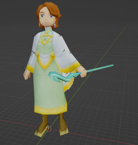

^ download these things onto your computer devices anytime!
Last summer I spiraled into insanity trying to figure out and eventually gave up so now that I know I'm saving you the trouble! I've also put all of my rips into a drive folder here that contains most of the notable npcs + playable characters but I'm planning on submitting them to modeler's resource when I have the time.
Final disclaimer: i also don't know much about ripping / romhacking / blender / computers in general but I thought it would be nice to put up what I've figured out anyway. I've also never actually written a guide to anything before so uh. i hope this is clear enough. Now finally onto the tutorial itself!
You'll need: tinke / apicula / a dotdd rom (not important if its in english or not but if you want like some of the translated ui elements / fonts you might wanna use a ver w the fantranslation patch) / and (optionally) blender or whatever other 3d modeling software that can read .dae files so you can actually do stuff with these.
First is to launch Tinke and load in your dotdd rom, you'll then be met with this menu. the models are contained under the "mdl" tab
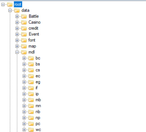
each of these have different things but you'll probably care about mb (major npcs) and pc (player characters) and also mn (familiars). also using this to say that tinke is a. very finnicky program so sometimes stuff will just Not Work. sorry about that. anyway.
Once you're in you can start looking for whatever model (.n3d file) you want, unfortunately the models aren't named clearly so you'll have to open them to see what they are. You can do this by selecting the .n3d file and clicking "unpack" which will open a .bmd0 file with a yellow box icon, you'll need to unpack that file one more time to actually be able to open the file it gives you after that in the viewer / export it
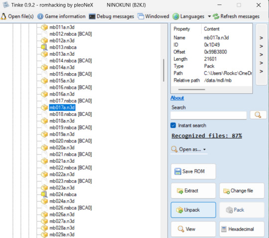
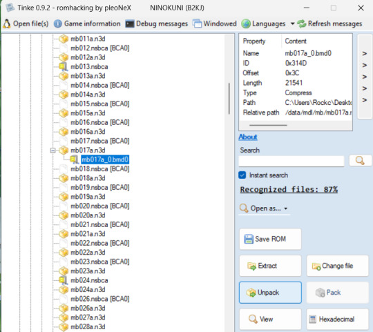
When you get the second unpacking (which should be a .bmd0 file with a mostly green drawing for the icon), you can open it in the viewer and it'll look like this!
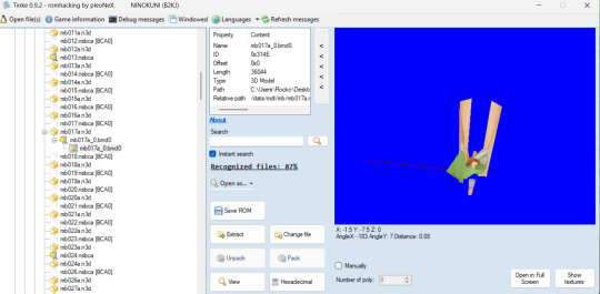
sorry any file you open that has a skeleton will look like that. I have been informed that sometimes ds games just store their models like this and it has no affect on the model when its exported so. lets just move on. Also sometimes tinke will give you an error that will stop you from opening the viewer properly but it will (most of the time) let you see the textures fine so you can double check (and even if it doesn't we have a workaround coming up soon)
Next big step is to set up apicula! When you download it, the program can't run by itself. You will need to create two text files, one named "apicula view nsbxx_files" and "apicula convert nsbxx_files -o dae_files" (no quotation marks) to put in the same folder as the apicula exe. You will then rename these .txt files into .bat files and you'll use these to actually "run" the program. You'll also make a folder alongisde those called nsbxx_files. It should look like this at the end

Back to tinke, you'll take the viewable .bmd0 model you want to export and click "extract" and I usually put mine directly into the nsbxx folder in my apicula folder for convenience sake. double clicking the "view" .bat will put the models into a viewer that I like to use as a final double check (and also what you can use if tinke's preview is giving you trouble). Its WASD to move and Q and E to lower / raise the camera
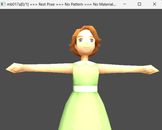
to actually convert the file, double click the "convert" .bat file and it will create a new folder named "dae_files" and inside will be your model and its textures in a .dae folder that you can read in blender and contains its skeleton!

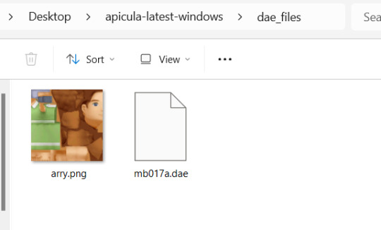
PLEASE NOTE!!!! that apicula can only read / convert one file at a time! this means that it will just use the topmost file in the nsbxx folder and if you'll have to delete the dae folder every time once your done with it so it can run properly again. so just make sure you move your converted files somewhere else before you do. but now you'll have a model to put into blender!
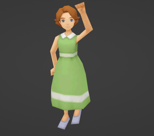
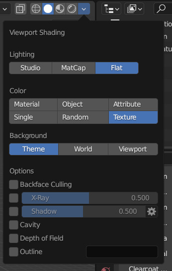
the tutorial is technically "done" now but I'm gonna share how to set up these models in blender (which for the sake of explaining i'm gonna assume you don't know much about). When you first load in the models you'll have to "turn on" their textures using the drop down arrow in the menu on the top right corner of the 3d viewport and turn on these settings (while still selecting the solid circle tab)
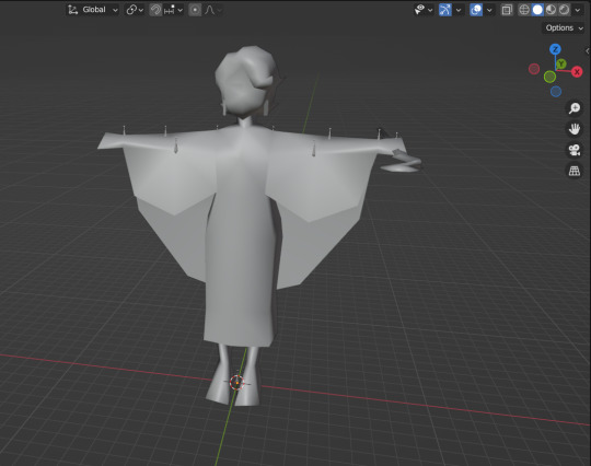
Secondly, Many of them use transparent elements in their textures that blender doesn't like to load without some help
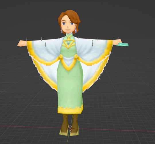
you can fix this by expanding the menu on the bottom of the screen and clicking the clock icon to turn it into the "shader editor" tab

Then, you'll select your model and go to the "base color" node in the shader editor, go down to the "alpha" tab and set it to "pre-mutliply" and it should remove the white lines around the transparent elements!
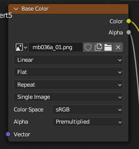

That's all from me! if you have any questions you can reply to this post / send me an ask or dm or whatever and I'll try my best to help! happy ripping!
#tomes#ni no kuni#ni no kuni wrath of the white witch#uhh not sure what else to tag this#ni no kuni alicia#yeah sure why not shes here#mine
29 notes
·
View notes
Note
Firstly, I would like to say that I simply love your renders, they are incredible!!!
Secondly, I don't know if you answer this type of question, but how do you make your sims' clothes fit so well? Normally mine always get stuck inside the Sim and I have no idea how to fix it.
(btw my English isn't the best so sorry for any mistakes :/)
Hi, sorry it took me so long to reply to this! Thank youuu, I appreciate it so much. 🤍
So, I sculpt all of my sims clothes onto them! When I was exporting fully clothed sims, I ran into that issue a lot when the clothes would just clip into their bodies. I don't know if there's a solution to that if that's the way you export your sims. But if you're somewhat of a sculptor like myself (😏), this should be an easy fix.
Here's a video of me sculpting a shirt onto Johnny in real time:
If you're familiar with sculpting or just dgaf about it, skip to the last 40 secs which is where I parent the shirt to Johnny's body with empty groups (Ctrl + P). I select his shirt THEN his body, transfer the mesh data (Ctrl + L) and change the Data Type to Vertex Group(s) and Source Layers to All Layers. This is how you get the clothes to move with the body. If you noticed at the end when I was moving his arm, a lil bit of his shoulder poked through. To fix that, I can delete the vertices of his arm that the shirt is hiding or just sculpt his shirt to fit properly after I'm done posing him. Hope this helped!
46 notes
·
View notes
Text
I Can Access My Account Again 💖

Hey guys! I can finally access this account again! Thankfully, the Tumblr Support actually moved fast this time and I got an email response from them saying that it was a glitch on their end and that it has been fixed.
And sure enough, I tried logging in to my old account again this afternoon and I'm in! I have exported and backed up the content of this blog and I'll continue doing so regularly from now on.
So, I'll be back answering asks and posting updates here. I'm so glad and relieved. I thought I might lose all the awesome fanarts and asks in this blog.
As for the @jscwrites blog, I'll keep it around as an account where I can blog about stuff that might not be related to Vendetta, such as talking about writing or stuff I love or enjoy. And it might be useful for when I have more than one writing projects in the future. I'll also still use it to reblog the more important posts from this blog and if anything happened again to this main account (God forbids), I’ll also be posting updates there. So, please, still drop it a follow 🥰
Also, it has been brought to my attention that my @jscwrites blog might be shadowbanned for some reason, despite it being created just last night. I saw you guys sending in asks in the new blog, but I can't see them in my inbox.
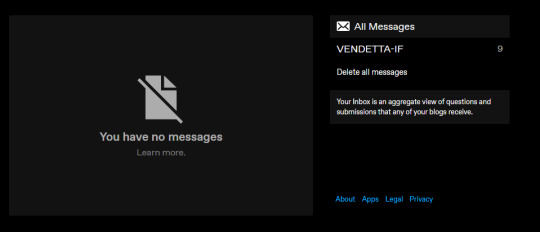
It seems I also can't message or be messaged in my jscwrites blog, and searching it on the search bar won't show my account. I have sent a support ticket to Tumblr Support regarding that, so I hope they can once again fix it swiftly. But for now, I'll be closing that blog's asks soon because I can't see all the lovely asks you guys were sending me 😭
I'll let you guys know again in an update when @jscwrites is all set up properly and I'll open the asks there. Feel free to ask me about writing process or other non-Vendetta related stuff there! Some of you guys who are in my Discord server might be aware how much I enjoy talking about other stuff with my readers as well 😊💖
Well, that's all the update I have for now. And it feels great to be able to return to this blog and start answering some asks again. Love you guys, and thank you all for the support! 🥰
#writing updates#if: vendetta#vendetta if#if vendetta#if game#if wip#dashingdon#choicescript#choice of games#hosted games#cyoa#cyoa game#interactive fiction#interactive story#interactive novel#interactive games
264 notes
·
View notes
Text
Stuck at making mirrors? A tiptorial..
I discovered something while pulling my hair out of frustration in creating a custom mirror in TS3.
So the usual flow in creating mirrors is to clone a mirror (preferably a base game one), replace the mesh with your self-made or converted mesh while keeping the mirror group, resize the mirror group accordingly, assign bones if needed, import your mesh, edit textures and catalog info, then export and test in game.
Usually having the w values (more info here) untouched results in mirrors reflecting the backside and is usually resolved by setting the w value with negative values or just zero. The reflection will show up just fine.

However...
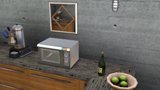
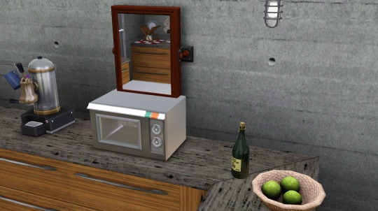
Once you rotate to a certain angle, some reflected objects disappear from view (example in left, right one is the vanilla base game mirror showing reflected objects normally).
It seems that the 1x1 base game mirrors are the culprit! Cloning any of them will produce the same result.

Avoid cloning them at all costs, and clone the 2x1 ones instead:

I cloned the 'mirror wall contemporary' and followed the same procedure. If you want your mirror as a single tile object you can just adjust the footprint to 1x1 (tutorial here, go instead for the predefined width x depth section and select 1x1). This will result in a mirror showing the correct reflections without even touching the w values!
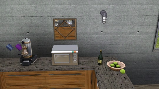
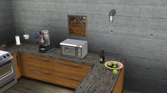
I hope this helps!
ADDENDUM 28 OCT: Some EA mirror meshes have visible faces on both the front and back sides, that will most likely cause the "backside reflection" error ingame. Below is an example of how the mirror mesh is shown in Milkshape:

It will be resolved by removing the faces on the back side of the mesh (illustrated above, the back side is selected in red), so that only the front face will be rendered. So in other words, make sure the mirror mesh faces only the front side so that it will render properly ingame.
58 notes
·
View notes
Text
Chapter 1 - Who is Min Yoongi?
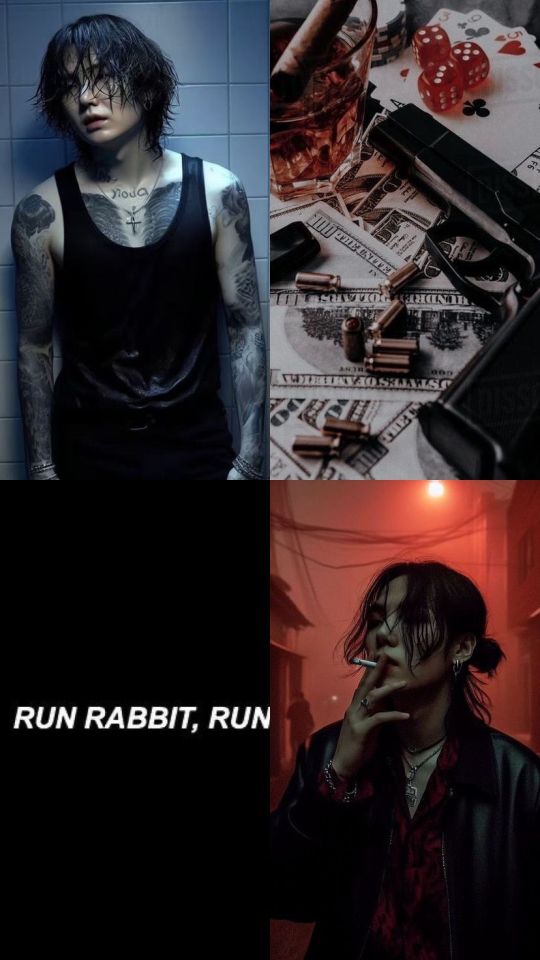
1019 words | mainlist
"People often say that the eyes are the mirror of the soul. Perhaps that's why my iris is black." — Héctor Ridel.
Min Yoongi
January 1998
— Never forget your weapon, boy. You need that damn thing always close... In this line of work, it's essential. If you're caught without it, I guarantee you won't like what happens.
At five years old, Min Yoongi watched curiously as his father cleaned the shiny gun.
— What line of work, Dad? — he asked.
Yeong-su smiled. — Jeongyeon-pa, boy. This damn thing we're in.
— Oh.
Yoongi didn't fully understand what his father meant, not yet, at least. But he liked the weapon, just as he liked the red pocketknife his father had given him that morning.
— And remember to always follow the rules, Yoongi. Always.
August 2024
The Jeongyeon-pa has existed for many years, passed down from generation to generation. I assumed the responsibility of Don when I was eighteen, after my father was killed in an ambush by members of the Jopok, a rival mafia. Losing my father was an unbearable pain, especially after the loss of my mother to cancer. My father was my mentor; he taught me everything about how to be a good Don, to be fair, and earn the respect of everyone. I am known as Jeoseung Saja, the Death's Grim Reaper, not because I'm a psychopath or anything shit like that, but because I am deeply feared. And I'm proud of that because I know I'm fulfilling my role as Don.
My mafia offers protection in exchange for money to smaller mafias and is involved in arms smuggling, slot machines, and gambling houses spread across various parts of the world. I hate traitors, and those who dare betray me pay with their lives. For this reason, within my mafia, there are few whom I would risk my life to save. Despite mentioning at some point that I trust everyone, not all are worthy of my trust. I have six brothers who I consider true brothers because I know they would die for me, just as I would die for them. It may sound clichéd, but it's the plain truth.
New York is a decaying void, a vast dump where the defeated abandon their shattered dreams and try to move on. The sparkling lights that once shone have lost their luster, and that atmosphere of novelty and hope that once filled the air has long since disappeared. I can hardly remember the last time I was in New York, and honestly, since then, nothing has changed. Curiously, it used to be my favorite city, but Daegu is my home, and nothing and no one can change that.
My reason for being in New York isn't for fun, but for business. And, honestly, things here have been giving me a lot of headaches and irritation. Two months ago, Jung Hoseok, my financial manager responsible for overseeing the gang's money and ensuring that resources are available for our illegal operations, discovered a substantial diversion in our profits, especially from New York. At first, we thought it was an error from one of my men operating here, but Hoseok swore he had no idea what was happening. I trust the people around me, as everyone who enters the mafia earns my trust, which is not easy to achieve. However, the problem worsened when I was informed that some of my associates weren't receiving their shipments properly.
When Hoseok revealed who was behind the diversion, I was shocked. The Lexingtons had been serving my family for generations; my father always trusted Mr. Lexington to handle our transactions for our material in America. Knowing they were deceiving us behind our backs was an unforgivable betrayal, especially since my father had saved the Lexingtons from seeing their export and import empire destroyed on several occasions. I had to deal with this personally and clean up the mess in New York, as I knew many of my associates were turning against me.
Now, we're in the SUV. Namjoon is beside me, and Seokjin is in front, next to the driver, as we head to the building where we'll be staying during our time in New York. Namjoon is second-in-command, my right hand. He oversees the daily operations and has the authority to make important decisions on my behalf. I trust him completely. His father was also my father's underboss and was killed by the same people who killed mine. Seokjin, on the other hand, is a Caporegime and also a doctor, responsible for leading small groups within the mafia. He commands the soldiers and ensures my orders are carried out. His father was my father's Caporegime, but he's too old to continue in that role.
— Ross Lexington died in 2015. — Namjoon comments, looking at the tablet in his hands. I stop drinking my whiskey and stare at him.
— Why didn't I know about this? — I ask, with a harsh tone.
— Nobody knew. — He responds, looking back at me. — I had to investigate. There's a lot of strange stuff in this story, and whoever hid it did a great job.
I knew Ross had an heir, but I remember he never mentioned whether it was a man or a woman. Over time, our relationship became strictly professional, especially after my father's death. Ross handled his responsibilities flawlessly, without raising any questions. No one who worked for the Lexingtons, not even my informant, warned me about Mr. Ross's death.
— Who's in charge of Lexington Corporation now? — Namjoon looks back at the tablet.
— Lauren Lexington, Ross's only daughter.
Namjoon tilts the tablet in my direction, and I see a picture of a redhead with medium curly hair, eyes as green as leaves, flashing a radiant smile while holding two cats: a white Angora and a gray, black, and white American Wirehair. I admit, the image of this woman, who might be stealing my money and turning my associates into enemies, sent a strange chill down my spine.
I smiled, because it was hard to believe that a cat lover was deceiving me.
— It's going to be a pleasure to meet her.
#fanfic#fanfiction#min yoongi#yoongi#english language#bts suga#bts#bts fanfic#bts imagine#bts yoongi#bts jungkook#bts v#bts hoseok#bts jin#bts namjoon#bts jimin#bangtan#bts x oc#yoongi x oc#imagine yoongi#suga imagine
8 notes
·
View notes
Note
Hi Arsuf!
First, I want to thank you for all your incredible work over the years making beautiful and exquisitely colored gifsets. I've been a huge fan of your stuff and it's inspired me to make my own gifs here and there... which leads me to my main question. How do you make multiple gifs out of a single scene for a post, like these? (https://www.tumblr.com/reblog/arsuf/718040586056269824) Do you create each gif separately, using guides and rulers to make sure they line up properly when you post them in the gifset, or is it something else? Thanks for taking the time to read my message, and I hope you're having a good one! 💙💙💙
Hi there! It's actually pretty simple, I drag the video I wanna use into PS, at first I make the size full, so in that gif's case it was 500px wide, do the coloring, sharpening, etc. After I export it, I open it again in PS, prepare it for export again (usually have to adjust the frame delay and remove the very first frame as it's always janky). Then I make a copy of the file, basically duplicate it like this:

After that, I use the cropping tool to make the smaller 245px wide versions like this:

So basically do one side on the original, and the other on the copy. Then just export both and that's it! Hope this makes sense! Have fun giffing! <3
11 notes
·
View notes
Note
Hi! I love your cc!! I've been trying to find a tutorial for how to make something take on the texture of a sims body, like your tails do, and vice versa how to make a piece of cc that does that have different swatches instead. Haven't been able to find anything and I was wondering if you might know of one? No worries if not, thank you!
Hi! Thank you so much! So sorry for the delay with this, my internet died last week and I’ve been busy since then. I honestly can’t remember when I learnt how to make it take the texture from the skin but iirc it was me just asking someone else how to rather than an actual tutorial. The process is super simple so I’ll do a lil tutorial here for it

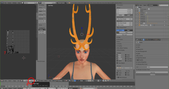
Depending on how you have your blender set up you might not have the extra window like I do, so go up to where the red circle is, click and drag those 3 diagonal lines and it’ll open a new viewpoint.
Click on the icon at the bottom of the viewpoint.
Select UV/Image Editor, the window will then look like the one on the left with the pixel grid.

4. Click this box and change the mode from Object Mode to Edit Mode. 5. Press A on the keyboard to select the entire mesh. 6. Press U on the keyboard and select Unwrap. (There are different ways to unwrap an object, but considering how tiny the UV will end up and it not needing a "proper" texture, there’s not really any point in doing any fancy unwrapping here)
7. After unwrapping you will see the UV map of your mesh in the UV editor 8. Click Open and find the UV image (Linked Here)

9. Click in the UV Editor window so it is active, press A to select the object's UV and then press S and scale it down (Move the mouse to scale it). Then press G and move it to where you want the object to take the skin colour from. For horns I tend to go for mid forehead, for my tails I go near the ear because the back skin is slightly darker/shaded so it blends better.

10. Now, the texture won’t immediately take note of the skin colour, so to fix that click the Material icon and then click New.

11. Click the icon next to Material and choose BaseTexture. This will apply the texture to the horns.

12. (Edited two screenshots together to show the uv placement, it won’t show it when you’re in object mode) Now back in object mode on the mesh viewpoint you can see that the mesh is now taking the colour or skin from the sim's forehead! You can move it around if you want to see if there's any other area you prefer, but be mindful of where other objects and textures will interact. With my tails and horns any hairs that have shadows or cover the ears will have issues with darkening the horns' colour. It's kinda inevitable honestly.
13. Now it’s just a case of importing it into Sims 4 Studio like other cc, for my horns I used earrings, but for the children and younger I used the blank body mesh (Because there's literally no base game accessories for any of them which don't have additional issues? I tried a bracelet but with long sleeve the horns would disappear, and I didn't have the patience to figure out exactly how to stop that lol). I replace the existing texture in Sims 4 Studio with a completely blank image (That’s the same size as the UV map)
The process for regular texturing is very similar, but I used a regular blender tutorial for that. There is also This Tutorial which goes over how to properly divide up your mesh for a cleaner UV map.

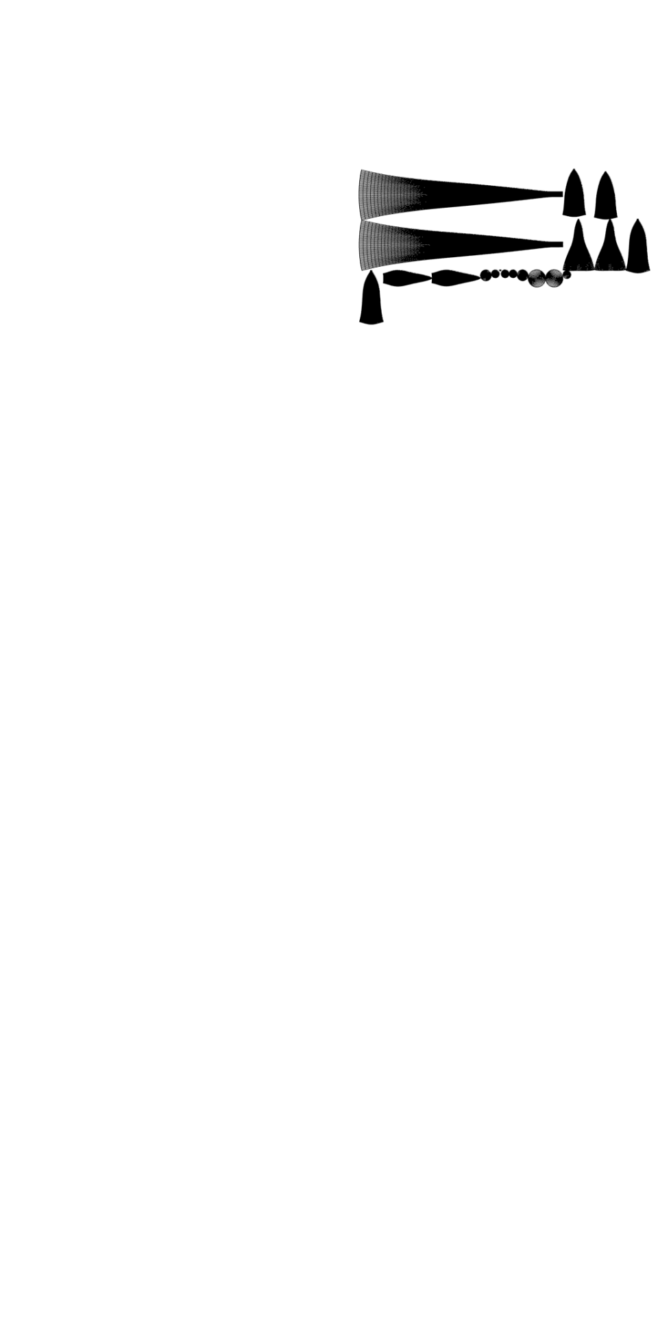
To get a image you can use to apply an actual texture, whilst in edit mode, click A to select the UV map, then click UV at the bottom and then Export UV Layout. This will save an image that just shows where your UV is, you can then use this as a guide when painting/applying a texture.
This is how my UV map looks after exporting and after painting it the texture I want. You can then reimport your textured image back into blender to see how it looks. Also if you've already imported your file into S4S you can simply just import the texture and it should apply.

I hope this all makes sense! Any questions I'll try to answer!
#sims 4#simblr#ts4#sims tutorial#cc tutorial#sims 4 tutorial#most of this is muscle memory at this point I almost forgot you had to apply the material for it to actually show lol#my regular methods of doing things is fucking around and finding out honestly lol
9 notes
·
View notes
Note
Hi! If i’m not mistaken, you use Otis camera mod and his DOF addon, right? Do you have any tips for getting the eyes (when you take a screenshot) really sharp and really focused? I think it’s hard getting the eyes sharp even though I set the magnifier on the eyes, but they often come out blurry anyway and my tav’s skin texture doesnt etc. Hope you understand my question! Maybe i have the wrong setting or something so just wondering if you’ve had the same problem or have a good solution (: thank you!
Hello! Yes, that is what I use, but I don’t really use any special setting to do that.
What I do use, is a lot of sharpening filters with reshade, and then with photoshop is just select the eye area, copy it onto a new layer, add sharpen filter and then export as PNG. It usually will help with any blurriness, but it is pretty subtle.
Here is what I do:
difference:
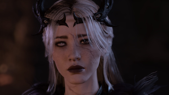
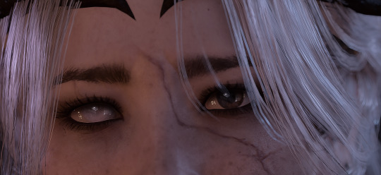
sharpened in PS

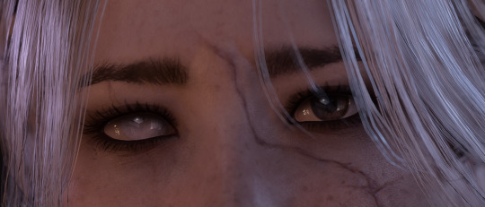
no edits made (difference doesn’t really show on mobile 😭 better on pc…)
You can use any editing app that does this kind of stuff.
Also, make sure that you don’t have the Max Bokeh Size as too large, because it make make it more blurry, especially the more you zoom in. If you are doing an up close shot, I recommend using 10-16 if it is shoulder and up, 25 being max if it’s a chest and up. Also make sure you are setting the Focus Delta X properly, so that you can clearly see the eyes (or whichever part you want in focus).
20 notes
·
View notes
Note
Hi! I replied this to my previous question, but in case it's better for you to view it this way I thought I'd do this as well (don't mean to spam you). I was able to get everything working from your helpful tip last time (about the deco sim process), but when I went to do a third deco sim I ran into another issue. I attach the mesh to the rig and export it as an object, but when I open the blender file with the succulent/typewriter and import the object it turns pink. The first time this happened I just restarted the rigging process and it went through (this happened the second time I made a deco sim), but this time nothing seems to work.

I've meticulously followed each step of your document a multitude of times to no avail and don't feel like I'm doing anything differently than when I made it work. Do you think this is a blender issue?
it's a blender issue but it's not a big one. the item turns pink as it's looking for a texture to link. OBJ files don't link materials properly (it's the format unfortunately) so you have to manually do it.
to get rid of the link, follow these steps.
(long post below)
in your outliner, expand this menu and head to blender file.
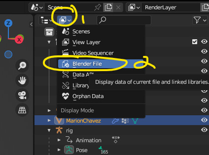
2. from here go to images and right click delete all images
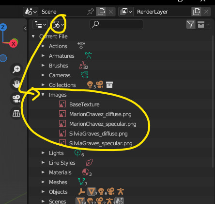
3. your mesh should turn black (or white depending on your settings) at this point which is fine and you can re-link your texture as you normally would.
4. relinking your texture - once that's complete, head back up to that menu and select view layers. that should take you back to the outliner
5. scroll down to the bottom, hit the globe (1), select the material (just make sure it's highlighted as it is in my screenshot). while that's selected, we're going to go to BASE COLOUR and expand that menu.
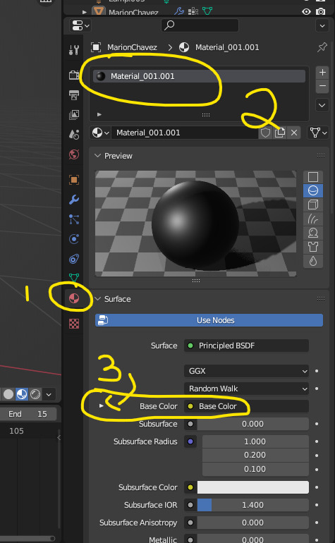
6. hit the triangle and you should be met with this selection
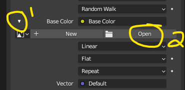
a dialog window will open up, find your texture and select it. it should re-apply the correct texture onto your deco sim.
i'll update my tutorial with a video soon but hope this helps.
5 notes
·
View notes
Note
hi art! i saw your tutorial for hd gifs so thank you! im starting my giffing journey and i wanna know what you mean with resizing the gif to 1080p? can you show me how you crop 540px and 268px gifs and then resizing them back to the 1080p height? i couldn’t seem to do it properly when i tried myself 🥹 tysm!!
Hello, anon! Were you the one who sent the previous ASK? If so, then I'm glad that you saw my reply. ^^
Sorry if my explanation about the resizing part was a bit confusing. Here's a more detailed explanation. ( ̄▽ ̄*)ゞ
Sample Image:

Dimensions: Width: 1920px, Height: 1080px

As you can see, the original height of the image is 1080p.
And then, I will crop this image to 540 x 268. I will only use these as ratios and not the actual resolution. This means the actual dimension will not be 540px by 268px so as not to make the image smaller in terms of size. Like I explained before, it's better to preserve the actual size of the image you're using and just reduce the size when you are already exporting the GIF.


After cropping, the dimensions of this image are now 1920 x 952 (originally 1920 x 1080).

Since the height changed from 1080 to 952, I will revert the height back to 1080. Preserving the dimension by keeping the aspect ratio locked, I will change the height from 952 to 1080.

Then click OK. The width doesn't matter. Just focus on the height of 1080px.

Final dimension of the image: 2178px by 1080px. When I say final, this only applies to the editing stage. Once you export the GIF, you can just change the width to 540px then the height will automatically change to 268.

Hope this helps! Also, just a reminder that this is just my preference and something that I am very particular about.
Of course, you can just retain the previous dimension (1920px by 952px). Since 952px is not that far with 1080px. I guess I would be more particular if there was a drastic change in the height.
If you will be following my sharpening style, then it's best to stick with this practice as well. You did mention that you are still starting your giffing journey so feel free to experiment with the dimensions and the values when sharpening your images. My style is, of course, just one of the many ways you can make your edits look more HD. There are gif makers out there who are using different techniques and probably better ways.
Feel free to use mine as a guideline of some sort. Because to be honest, the sharpening style I explained is just me exploring whatever the hell I can explore in Adobe PS. In other words, I am just winging it. XD So feel free not to follow my suggestions to a tee.
4 notes
·
View notes
Text
I don't post a lot of my life here but things are a bit stressful right now, and so I thought I could try to get it off my chest over here
So I live in france, as I (almost) always have since birth lmao. But, yeah, I'm moving to Japan next month for a long time (for ever, even, i hope)
We already signed for our apartment, we have the plane tickets, I'm almost done packing everything, our cats have passed the health and vaccines check-up and requirement for Japan... Not much could go wrong now in term of moving
I'm still so scared and anxious lol
oh and I have a promise of employment from a Japanese company as a customer support in an export japanese company
I am absolutely terrified
The big part of the job is in english, I'm part of the customer support english team, but still, japanese is used a lot in the company, one of the recruiter even commented on it during my interview. I couldn't speak properly during the interview (in japanese) and like, I think they think it was due to stress????? it WASN'T, I don't know how to speak japanese lol
like, I understand most of the things I hear and read in japanese, it's quite ok, but I cannot, for the love of god, SPEAK IT???? I don't know why, the words don't come, my grammar is bad, it's a nightmare????? I'm still waiting for the result of my JLPT N2, but honestly I think I didn't pass, so yeah, fuck me.
I'm supposed to start next month (9/18), it's going to be my first office job also (I only worked in customer service before) so it's really a lot
I lived in Japan for a year(2022-2023) for my studies, but I was in a pretty small/mid city, and now I'm moving to Tokyo??? And I have an office job??? It's really not the same. Uni in japan was a bit chill (except the exams, some where hell-ish) but office jobs? I am so scared I can't even put words on it lmao
It's really like a dream coming true. I worked my ass off for 4 years to get the best grades, I got selected by the Japanese ministry of education to got to my Japanese Uni with a scholarship. Only 6 french students got that scholarship that year and I was one of them. I felt so much pride, and recognition, but my japanese level didn't really move? Even tho all my classes were in japanese, and almost no one in my city spoke english, I went to the hospital, the dentist, the doctors, the movies, everything in japanese, and I still can't align 3 sentences without hesitation about grammar, and not finding the right words??? I sound like a kid when I speak japanese, that's not appropriate in an office....
The anxiety and stress is killing it for me, i'm really sad and don't feel too good. My husband is trying to be supportive, but he doesn't know japanese, so he will rely on me in the beginning for administrations and shit, and he still hasn't really begun job hunting, so I still feel so much responsabilities on my shoulders.
He have money on the side (I don't) so he's telling that I don't need to stress too much, that if the job doesn't work out we still have some months to get back on our feet, but I don't want us to be in that situation? It's bad enough one of them will be unemployed for some time, we can't really afford to take our time? like-
I can't afford to lose this job, and I honestly doesn't want to. I want to do this job. I'm just scared i'm going to be bad at it, or not as good as my employer thought I'd be.
I don't want them to regret hiring me. It's scary.
But yeah. Tokyo. Here I come. In 24 days.
3 notes
·
View notes
Text
The Shuddering Releasing Later Tonight (hopefully x3) - then I will go cry myself to sleep T_T
Sooo, I'm gonna do my best to still release my O2A2 project later tonight like I'd hoped to, buuuut, my PC is now defunct AGAIN >.< Firstly, *puts on happy face* meet Styx! Voiced by the incredible - Vivian Reed :D

Styx may have a feminine appearance with an androgynous (but feminine-leaning) voice, but, being non-human, doesn't actually have a gender!
Styx is the only entity you'll encounter in The Shuddering, and is almost a little too pleased to see you!
*reverts back to sad face*
Sooo, yeah, I currently don't have a working PC again T_T Thankfully, I was able to export builds of The Shuddering prior to it becoming unusable, but if there are any bugs, I won't have a way of fixing them :(
I'm now attempting to finish off the itch page & draft posts on the old potato laptop once again!
This is the 2nd new PC that's been sent to me after the 1st one was faulty and had to be returned, and as of yesterday morning, it is stuck in an endless cycle of BSODs with all different error codes. During troubleshooting, the memory diagnostics tool also flags critical errors with the RAM. The 2nd PC has been kinda dodgy since day 1 with it randomly failing to boot some days + audio crashing randomly and then refusing to play any media files with sound. It also hangs randomly when just browsing Windows Explorer.
I did contact customer support to try and get help with the issues, but they just told me to do a CMOS reset, which sounded terrifying >.< I don't wanna touch any of the components inside the PC cos I worry I would break them!
Since I was in the middle of otome/josei jam, I just left things as they were and did my best to put up with the weird crap going on with the PC, making backups each night out of paranoia. My hope was that I would make it through the jam okay and that maybe the issues would improve somehow. But nope, they just got worse >.< Now I'm stuck with a PC I can't even use. Sometimes it refuses to boot entirely, others, it boots, but then only stays on for 5-20 minutes before it dies again. I spent most of the day (and night) troubleshooting, but nothing helps.
Customer support says it's probably gonna be a case of sending it back again for repair... but I would really just prefer to have a refund at this point :( They've sent out 2 now that don't work properly. Why would I have any faith left that a 3rd would be better?
I just want my money back so I can buy a PC from somewhere else that might actually send one that works. Actually getting the company to refund me is going to be a battle though I imagine. One that I'm really too tired to fight :( I don't have a choice though because the stupid thing took me years to save up for, so I don't have the luxury of just letting it go.
I swear I should have just demanded a refund right away when the first one they sent me sounded like a goblin revving up a chainsaw was living inside the case as soon as you powered it on >.<"
Anyways, sorry, just needed to vent because I'm stressed and devastated at the moment by it all. It took so long to transfer all my files and stuff over, and I've lost a small amount of project data for both LOVESTARVED & The Shuddering :( My paranoia backups mean most stuff is safe for now, but it's still frustrating to lose anything.
Here's to hoping the poor potato can at least hold out to launch The Shuddering later! x3 But first, I need a big break because I feel sick at this point, haha.
#visual novel#indie dev#indie game#game jam#o2a2 vn jam#yandere#liminal#stress#killmenow#allhailthepotato
6 notes
·
View notes
Text
Scrivener 3 to AO3 – expanded export format (with download link) P2
I hope you find this guide and the provided export format to download useful! To enable me to make more such resources, and make them available for everyone, please consider supporting me via KoFi! I love sharing my stuff freely and don't want to paywall anything, but I also have to eat – every contribution helps and is greatly appreciated!
Hello friends! This is a continuation of this post here, for people who use more complex formatting than just italics, and still want to export their fics into AO3 directly from Scrivener without losing that formatting.
Now, it should be said first that there are levels to this, and depending on what kind of formatting you are using, you'll need to go through more or fewer steps.
You only want italics and a horizontal rule between scenes (requires manual line-spacing by using empty lines in your draft)
You want all the above, as well as automatic line-spacing (without having to keep empty lines in your draft)
You want the above, as well as existing paragraph styles such as centered or right-aligned text and blockquotes
You want the above, as well as not predefined paragraph and character styles such as bold or underlined text and strikethrough
The first two can be achieved by following my previous post about this (or by downloading and importing my format – import instructions in the other post). The other two expand the same principle that is used to achieve 2, but are more "sensitive" to inconsistencies. This post here is going to provide the additional steps to achieve the paragraph and character style HTML formatting on compile. It will also include further explanations of certain steps where people often tripped up.
Let's go then. Follow this previous post up to the heading Assign Section Layouts, or download and import the provided .scrformat file that is linked there.
If you import the provided .scrformat file, and you have not deleted/renamed Scrivener's built in text styles, two paragraph styles (Centered Text and Block Quote) should already work for you! I recommend reading the explanation of how to set it up anyway though, in case you want to add a different paragraph style to the format at some point.
Existing (Paragraph) Styles
Alright, so in the last post, we went into the Styles tab of the Format Settings, added a new paragraph style (Regular Text), and defined the Paragraph prefix/suffix. Now, Regular Text wasn't based on any of the existing Project Paragraph Styles, which is also why it didn't matter what you called it. This matters now!
While you're still in the Styles tab, click again on the + in the top right corner to add a new paragraph style. However, unlike with Regular Text, this time you choose one of the existing Project Paragraph Styles and override it. (Don't worry about losing anything, you're in a plain text format anyway.)
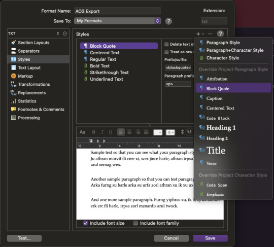
This will create a Style with the same name as the Project Paragraph Style you chose. This is important, if they're not named the same it won't work. If you rename one, you have to rename the other as well.
Anyway, there are four fields again: Prefix/suffix and Paragraph prefix/suffix. Put the HTML code required for your desired style into the Prefix/suffix fields – e.g. the HTML code for block quotes is < blockquote > and < /blockquote >. For Paragraph prefix/suffix, put the same code as you did for Regular Text!
Why isn't the blockquote code the Paragraph prefix/suffix? Well, paragraph styles may span multiple paragraphs, right? You might have a whole letter in block quotes, which contains several line-breaks. We want the style to include all of it, and we want our line-breaks within the style to still function properly. Therefore, we still want every individual paragraph to be surrounded by the p and /p code, whereas the blockquote and /blockquote code should go at the very beginning and at the very end of the whole section in this style.
Prefix/suffix go where the style begins and ends. Paragraph prefix/suffix goes at the beginning and end of every paragraph within this style.
Based on this principle you can now add any paragraph (or character) styles you want that are already defined in Scrivener.
Important: In order for this to work, you need to actually apply these styles within your editor as well. So if you're wanting centered text, do not just hit the center-align button in your format bar! If you do it like that, the style of that paragraph will still be No Style, and it won't add the HTML code you just defined. Instead, select the style Centered Text from the project text styles to center your text.
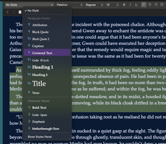
This goes for all styles! If you want it to actually be applied on compile, it must also be applied in the editor. Makes sense I'd say.
New (Paragraph or Character) Styles
"But V, what if I want a style that isn't already defined in Scrivener?"
Yes, let's say you want right-aligned or bold text – but there's no preset Paragraph/Character style for that. The solution is simple enough: We'll define it then!
At the bottom of the drop-down menu for the text styles in the format bar, choose Show Styles Panel. This opens, you guessed it, the Styles Panel with all available styles in this project. To define a new style, format your paragraph as you want it in the editor (e.g. hit the right-align or bold button) and then click the little + at the bottom left in the Styles Panel. This will open a little window where you can define a new style.
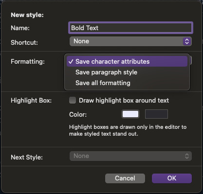

Now, note here that you can choose which attributes are saved, which brings us to a quick explanation of Character vs Paragraph vs Paragraph+Character Styles.
Let's take three examples: Bold text, right-aligned text, and centered italic text (e.g. for a letter).
Bold text is a character style; all relevant attributes (i.e. the boldness of the font) work on a character level. You can make a single letter or word bold without affecting the rest of the paragraph – which is also how bold text is commonly used.
Right-aligned text is a paragraph style; all relevant attributes (i.e. the text alignment) work on a paragraph level. You cannot right-align a single word within a paragraph – it's the whole paragraph or nothing. The font itself is unaffected.
Centered italic text is a paragraph style with specific character attributes; the relevant attributes are on both paragraph and character level.
This distinction is mostly relevant when you're trying to define Character styles, or paragraph styles with specific character attributes. If you save all information on a paragraph style where there's no particular character attributes applied anyway, it'll turn into a normal paragraph style. For Character styles, however, this is important! Let's say you want to define Bold text – if you save all formatting, it'll always apply bold text to the whole paragraph rather than the specific word(s) you want.
Anyway, as you might've figured, you can now define all the styles your heart desires. Bold, strikethrough, underlined, specifically formatted block quotes – if you can achieve it with your editor, you can save it as a style.
"But V, that's just in my editor, I thought this was about the export format?"
Well, technically you already know how to apply the HTML code to these styles – the same way as for the preset styles. Go back to editing your export format, into the Styles tab of the Format Settings. Just like we selected Block Quote to override earlier, we can now also select any of the new styles we created in the project, e.g. Bold Text.

Again, you put the required HTML code for the respective style into the Prefix/suffix fields. Note that Character styles do not allow you to put anything into the Paragraph prefix/suffix fields! This is because the beginning and end of character styles are usually within one paragraph.
Assign Section Layouts
And here we are again, back with the previous post. In order for any of this to actually be applied, you need to assign your section layout to the section types you are exporting.
Since this step apparently caused some confusion for many people, I'll try to explain why we need to do this.
In your draft, you have different files and/or folders. Based on their structure, Scrivener assigns certain Section Types to those files; e.g. folders are Chapter Headings, files within folders are Scenes. When you compile your draft, each Section Type is assigned a specific layout within the compile format you're using. For example, if you compile a Paperback PDF (preset), the folders will create chapter headings based on the folder name, and the files will create the scenes containing the text in the file itself. [Details about this can be found in the Compile Tutorial, here.]
With Scrivener's preset export formats, these section layouts are already assigned. Since we made this format new, our section layouts are not already assigned – we gotta assign them ourselves.
When exporting for AO3, we generally don't need any headers. All that matters is that your Scenes have the Section Layout "Text Section" assigned to them. This is necessary to actually apply all this HTML formatting we defined.
And that's it!
Here's a link to download my updated format that you can import as explained in the first post. It includes the most common paragraph and character styles already added to the export format – note that you will still need to create the text styles for some of them if they are not Scrivener presets!
❗️IMPORTANT: After importing the format, you still have to assign the section layouts!!!
–––
A continuously updated Masterlist with all my Scrivener 3 tutorials can be found here.
Part 1 | Tutorial Masterlist | KoFi
31 notes
·
View notes