#her model looked not great in this particular cutscene
Explore tagged Tumblr posts
Text


CALL OF DUTY MODERN WARFARE III (2023) ㅤ→ㅤ Commander Farah Karim & Lieutenant Simon 'Ghost' Riley
#cod: mwiii#call of duty: modern warfare iii#farah karim#simon riley#simon 'ghost' riley#wish we had more of this#but yanno with farah looking better#her model looked not great in this particular cutscene#my gifs
726 notes
·
View notes
Text
Play Shadow Generations!
I know I’ve said some things about this game already, but I wanted to leave a “review” for the game anyway. So let’s get started!

First off, the story. Major props to Ian Flynn (the man who inspired me to write fan comics), cause like with Sonic Frontiers, he nailed it! While it is short, it had to be in order to coincide with Sonic Generations, so I’m not surprised or upset about that. Despite that, the amount of lore and answered questions that’s thrown into this game is incredible, and it’s good to see that Shadow is allowed to be written in the way that most fans want again. Even with the game focused around Shadow, there’s still plenty of tongue and cheek to be had, which I appreciated.

Visually, it’s probably the best looking Sonic game to date. Officially, at least. All of the familiar locales given an upgraded look was appreciated, and the characters…I could go on, but the two I want to focus on are Gerald & Maria. I don’t know if it was intentional or not, but Gerald looks like Jim Carrey to me! And Maria… she has never looked better (or sounded, but we’ll get to that)… her model in this game even puts her CG model in Shadow The Hedgehog to shame!

Sound -or more specifically, music- is very important in a Sonic game, and Shadow Generations is no exception. Granted, there were a couple tunes that weren’t grabbing me (dubstep’s not my thing), but the rest of the remixes were great. I did notice that most of the music in the cutscenes was taken straight from Shadow & Adventure 2, but do you see me complaining?

The voice acting was top notch, too. I won’t be talking about most of the cast due to spoilers. While Kirk Thornton is not my favourite Shadow, you can tell that he really gave it his all for this game, and he did a really good job. I was so relieved to learn that Mike Pollock was back as Gerald, but it was certainly interesting to hear him providing a calmer take on the brilliant scientist that he last voiced almost 20 years ago. And Stephanie Sheh as Maria… literally the best English VA the girl has ever had. I appreciated how you can hear Maria being affected by her condition in her voice. That’s some good attention to detail. And I’ll be honest, there’s at least one scene Maria has with Shadow that made me emotional, purely because of Stephanie’s delivery of a particular line or two.

Finally, the gameplay. It honestly felt like a mix of Sonic Generations and Sonic Frontiers to me. And I mean that in a good way. I won’t say anything about the Doom Powers (again, trying to avoid spoilers), but being able to throw Chaos Spears freely is appreciated, and I love how Chaos Control in-game actually looks and feels like it does in cutscenes and comics. The boss fights are pretty cool too, with one in particular being very interesting (more because of the dialogue), but the final boss can be a pain if you’re not ready for it…

My entire experience with Shadow Generations comes from the PS5 version. Mel has it on the Switch, but I’m gonna wait until she’s done with it before I try it for myself. As for Sonic’s side of Generations, not much has changed from the original release, but I appreciate what has been changed. All I ask of @sonicthehedgehog is to keep Rings from draining so fast when playing as Super Sonic. Literally my only problem with Sonic Generations, at this point.

In closing, I absolutely love Shadow Generations, and I’m feeling good about the future of both the Blue Blur and the Ultimate Lifeform. I highly recommend any Sonic fan check this game out, especially when the third Sonic movie is just over a month away! - Todd

22 notes
·
View notes
Text
yo i played persona 5 for the first time (I)
(This post is going to be long, and the ones that follow are liable to be even longer)
I started playing Persona 5 Royal on July 4th of this year.
But I did not want to play as this boy.

Why not? I dunno. I didn't want to. I spent far too much time pretending to be a teenage boy in real life, and I felt no particular desire to do it again.
So, what am I to do? Well, seek out a way to play as a girl instead, obviously.
Which is where this comes in:
An in-development mod to let Joker be a girl instead! Exactly the push I needed to convince me to buy Persona 5 Royal.
So, meet Hina Satou, amateur girl and professional assault-charge-haver.
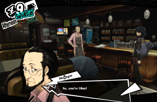
Hina is significantly shorter than regular Joker. Cutscenes are not adjusted to account for this.
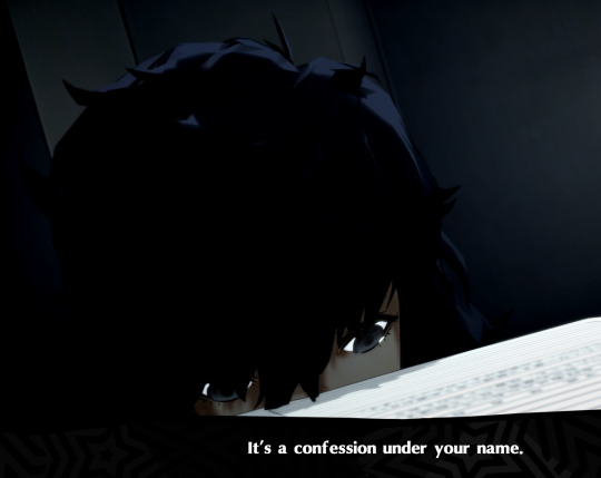
Many animations look really messed up. This is just the price of entry to Hina's beautiful story.
It's at this point, just after the beginning of the game, that we notice...

Much of the script is yet to be changed. So Hina is referred to in masculine terms by a lot of the cast for a lot of the game.
You could take this as just a facet of the incomplete mod and pretend that it isn't happening, or you could do what I did:
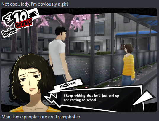
Hina Satou is trans! And it's 2016.
So if she's trans, then the lines that change are reflective of how the characters see her.

Everyone just thinks she's a guy who cross-dresses, I guess? Look, the headcanon takes some work.
Given how she looks, people probably wouldn't have even known she's trans if her record hadn't been released by Mishima on Kamoshida's orders.
Some script changes are implemented, however.
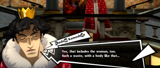

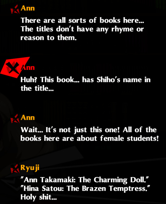
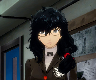
In contrast to regular Joker, it seems pretty obvious that Hina's hair is not like that out of a deliberate stylistic choice, but because it just literally will not behave.
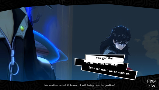
Another instance of Hina being short in a cutscene
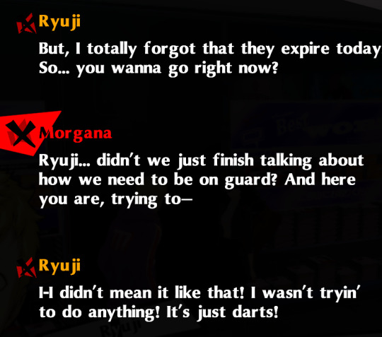
A change to the entire context of a conversation to take into account Joker being a girl. These are, as of now, few and far between.
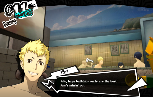
This scene is unchanged, despite Hina normally using the womens' side in the bathhouse, so it looks like Hina was peer pressured into joining the Bros Bathing Time
She has to be, like, neck deep in the water to pull off this ruse.
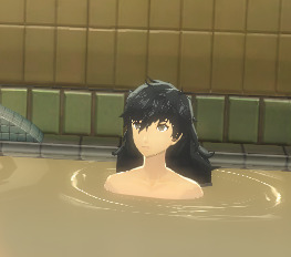
You see how this as-yet-incomplete mod changes the context of so many of the game's lines and events.
It's a well-made mod. The new VA work from Alexa Farron is really good, the models and new outfits look great, and the writing changes, where they exist, are excellent. But its currently in-development state means that my trans headcanon works surprisingly well, and that I got more than a few glimpses through the curtain to the original, unmodded script.
So, now you understand the context. Next time: impressions of the game overall, and my slow descent into madness over this headcanon.
(Next post here, and final post here!)
#persona 5#incoming post series#p5r#persona 5 royal#p5r spoilers#joker persona 5#hina satou#first impressions#modding#trans headcanon#trans joker persona 5#what's his canon name?#uhhhh#akira kurusu#?#ren amamiya#it's one of those? or both?
37 notes
·
View notes
Text
Okay so, now that the situation has settled down a bit, I would like to put my two cents in.
In case you are unaware, some weird Twitter drama went down the other day regarding Lara's sexualisation that resulted in a beloved community member, Nicole Bounxe, who is always positive and seems to only have nice things to say about all eras or the franchise and all versions of Lara, and makes some of the greatest edits and content in the community, being called a "porn addict".
Nicole shared this post on Twitter.
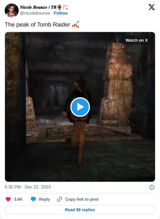
First of all, yes, if Tomb Raider: Underworld had at least one more year in the oven to get polished out it would have been peak Tomb Raider gameplay. Period.
The video in the above tweet is gameplay from the first location of the game, a submerged temple in the bottom of the Mediterranean sea.
Obviously, since this is an underwater level, Lara is wearing a wetsuit. Now, this is arguably a much more sexier wetsuit than the ones she's worn before.
Here are all three Classic wetsuits. The one on the top is from Tomb Raider II, bottom left one is Angel of Darkness and the one on the right is the one featured in the above video.
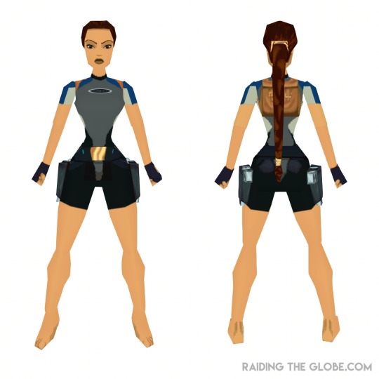
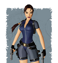
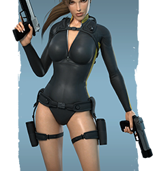
We can all definitely see that, while all three serve the same practical purpose of exploring the games' respective underwater areas, the outfit chosen for the same purpose got sexier and sexier across the years. The second wetsuit is unzipped to reveal her breasts and then Underworld's wetsuit retains this detail and also completely removes the leg part of the outfit. These changes serve zero purpose other than to make Lara look sexier.
And that's fine. I have in the past shared my view on female sexualisation in games. It's perfectly fine to enjoy sexualised female designs if we, at the same time, also accept that there's a huge possibility of over-sexualisation devaluing the brand. Some people, Tomb Raider fans in this case, have a huge problem with even accepting that Lara was ever sexualised. Or, only acknowledge it when it's convenient for them.
Core purists for example insist that it is only Crystal Dynamics who sexualised Lara in-game and that Core never did and that the only sexualisation present during Core's era was in the suggestive pin-up style promotional material that Eidos, the publishers, not the developers, started creating after TR1.
That is false.
Core design gradually deepened Lara's cleavage in her main outfit, first in the TRII redesign and then even more in the Last Revelation redesign (see comparison of TR1, TRII and TLR Lara's in-game models below). Judith Gibbins, the TRII & TRIII voice actress, said that she was instructed to "sound sexy" while recording Lara's death clips. Her crawling animation across Core's games is pretty suggestive and not at all practical, she's just crawling on all fours. An FMV of teenage Lara almost getting topless in Chronicles. A cutscene of Lara being groped all over by Kurtis in Angel of Darkness in the pretext of him disarming her / frisking her for hidden weapons on her very exposed arms and very exposed navel. Angel or Darkness, an unfinished and rushed game, featuring fully functional breast physics both in-game and in cutscene.
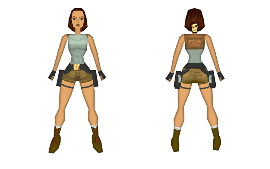
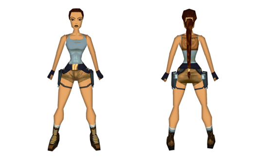
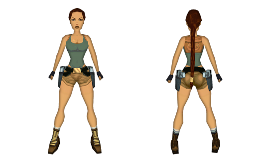
TR1 In-Game Model - TRII Model - Last Revelation
You can also see how they started making her shoulders and waist smaller to make her breasts look bigger. Last Revelation's model even features a "shiny" texture on her right breast and you can see the outlines of her butt cheeks on her shorts.
youtube
Judith Gibbins' interview where she mentions how she was instructed to "sound sexy" while dying. It's a great interview in general, give it a watch!
youtube
The introductory cutscene for Chronicles' Ireland levelset where a teenage Lara almost removes her top.
youtube
The very awkward first interaction between Lara and Kurtis where he gropes her and she, uncharacteristically, does nothing about it.
Worth noting that a lot of Core purists like to point out that these cutscenes were outsourced and that, for the latter in particular, the animators responsible misunderstood the scene and thought they were meant to be lovers (which makes zero sense to me and you can clearly see how uncomfortable Lara looks throughout the whole ordeal). But even if that is the case, at least ONE person in Core Design must have had to inspect them and they either thought that these two scenes were fine (they're not) or, even worse, that Core didn't check the cutscenes that would go in their own game at all. Even if both of these specific titles were made under extreme duress and are the two least critically acclaimed games in the series for very good reasons, saying that Core didn't make the cutscenes is at the same time both not an excuse and also makes them look incredibly stupid for not at least checking them.
Crystal on their part are responsible for Lara's most sexualised main outfit in the form of the Legend outfit (cleavage, midriff exposed, shorts considerably shorter than any other pair she has ever worn), ironically designed by Toby Gard who, allegedly, left Core Design after work on TRII began because he did not agree with Lara's sexualisation, among other reasons... Even though he was also responsible for the size of her breasts in TR1...
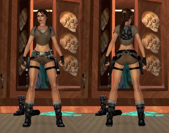
Yeah Toby is a gem 🤣😅😭
They of course also retained breast physics throughout Legend, Anniversary and Underworld, and even included idle animations where Lara stretches and bounces up and down, making her breasts visibly bounce alongside the rest of her body. They included the notorious evening dress in Legend (plunging neckline that goes below her breasts, whole back exposed and she then proceeds to rip it on the sides, fully revealing her see-through laced boxer-style panties), the aforementioned Wetsuit in Underworld and, of course, bikini DLCs for Underworld! In Legend you could only wear two unlockable bikinis in her manor, but in Underworld you can wear them in the Mediterranean, in rainy Mexico, in the Arctic circle etc.
In conclusion, all companies responsible for the development and publishing as well as licensing of the Tomb Raider and Lara Croft IPs from 1997 to 2008, steadily and surely sexualised Lara progressively more, resulting in a very false narrative according to which Classic TR and Lara were nothing but a sexual fantasy created for the male gaze, a narrative which was in the past adopted by certain Crystal Dynamics executives themselves while promoting the Rebooted games and redesigned Lara and often weaponized by Survivor fans to diminish Classic Lara as nothing more than a sexual fantasy.
This is also factually untrue, because although sexualisation was present in the games and not just in the promotional material like many Core and / or Classic purists suggest, it was never the main focus.
Lara is presented at all times as the most clever and capable individual in the room, always bests female and male allies and adversaries alike, both in wit and skills and has never had a sexual partner, male or female. The only form of media where Lara is actually engaging in sexual acts with men is the Top Cow Comics and the Angelina Jolie movies, and while both are a big part of the overall brand, they are non-canon, as far as the games are concerned.
Then there is a whole other subset of Classic fans who refuse any sexualisation ever took place, which, as I've already stated, is not true, either for Core's or Crystal's games.
I think it's also worth pointing out that a huge portion of the hardcore Tomb Raider fanbase is made up of gays and women. So even if we accept that Classic TR and Classic Lara were made with nothing but the male gaze in mind, she sure as hell managed to win tons of loyal fans who love and idolize her and her games in spite of that. Various female fans have also expressed how Lara's classic look and demeanour is very inspiring and empowering to them. Lara can be sexualised and an inspiration at the same time. This is clearly far from a black or white, this or that type of issue.
Now, let's go back to Nicole's clip. Another issue other than the outfit itself, is that whenever Lara starts to climb walls or ladders or even sprint, the camera will zoom right up her butt. This is an issue prevalent in Legend and Anniversary, and even Last Revelation to a smaller extent, but is made extremely obvious in Underworld. Fun fact, the camera work for Underworld? Also Toby "I-Don't-Agree-With-Lara-Being-Sexualised" Gard's work.
Now, I am very grateful for what Toby has done for both Tomb Raider and Lara Croft, but I do feel like he can come off as very entitled sometimes. To me it feels a little bit like he may not be ok with Lara being sexualised... When it's not done by him 👀
Anyways, that's mere speculation on my part.
So, what happened next is that this person quote retweeted Nicole's above video and had this to say
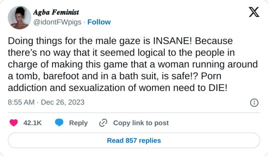
I wanna make this 100% clear, she has EVERY RIGHT to say this and in spirit I do agree with it. Under no circumstances, do not send her any unnecessary hateful comments. That is not the point to be made here.
Once again, my personal belief is that we should acknowledge that female sexualisation is rampant in video games but that it's also ok to enjoy said games and characters. However, I am a gay man. I am not a woman so I will never experience any of the effects of sexualisation of women in games and media in general.
My only issue with this tweet Is that it seems to completely ignore the context of why Lara is in a wetsuit. The fact that she is in a sexy wetsuit and that the camera automatically zoomed in on her butt is nothing but sexualisation. But like I said before she is exploring an underwater temple. So the wetsuit itself as a concept makes perfect sense.
Furthermore, many of the people who replied to this tweet and the ones who proceeded to directly attack Nicole's own seem to have no context at all and make assumptions of this being a modded outfit and that therefore this can only be a horny person putting Lara in ridiculous outfits just to get off. Which Is of course not true.
In conclusion, context matters. In this case, Lara being sexualised is a fact, but at the same time the people who attacked Nicole ignore that she is wearing a wetsuit because she is exploring an underwater area and proceed to make assumptions while continuing to ignore the fact that, if the camerawork wasn't ridiculous and the wetsuit itself was similar to TRII's, practical and not made sexier for the sake of being sexier, this would't count as sexualisation.
Nicole's response to this whole mess was perfect. Couldn't expect Nothing else from her.
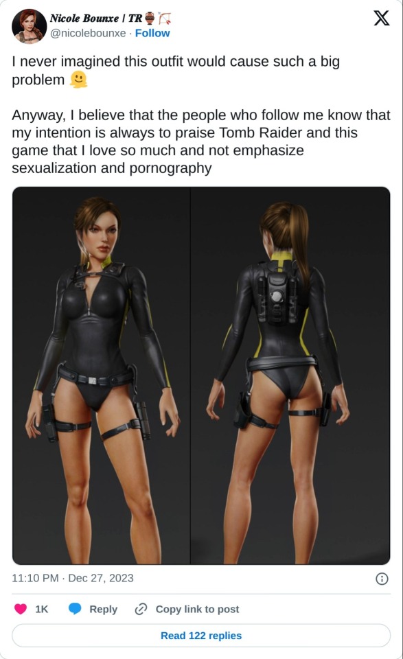
If you made it this far congratulations.
I have nothing more to say other than you should preorder the Tomb Raider I-III Remaster collection that will be released on the 14th of February (Lara's birthday!) for PC, PS4, Xbox One and Switch, and that you should also campaign on the official Tomb Raider social media for a Tomb Raider Legend, Anniversary, Underworld trilogy remaster to follow next!
Thank you and happy new year 🎊🎉
#Tomb Raider#Lara Croft#Lara Croft Tomb Raider#Tomb Raider: Underworld#Twitter#X#Nicole Bounxe#Drama#Feminism#Sexualisation#Objectification#Male Gaze#Sexism#Discourse#Video Games#Gaming#Youtube
1 note
·
View note
Text
Sonic Riders (2006) Story Review

Disclaimer: I will be judging this game by the plot and writing, not the gameplay.
Introduction
Greetings, mortals! For today's review, we'll be looking at the first installment of the Riders trilogy, Sonic Riders.
Since I finished reviewing the main series Sonic game storylines a while back ago, I decided to tackle reviewing storylines from Sonic spinoff titles which are set in an alternate universe, starting with the Sonic Riders trilogy.
This is part of a series of reviews in which I’ll be going into slightly more detail about my thoughts on various Sonic game storylines, and why I think they're either well written and engaging, or an absolute trainwreck (or somewhere in-between). I’ll be giving my stance on the character portrayals, visuals, soundtracks, voice actors, and what themes/messages they had to offer. Keep in mind that these are just my own personal thoughts. Whether you agree or disagree, feel free to share your own thoughts and opinions!
Anyway, let us begin! ^^
Plot
A new team known as the Babylon Rogues, comprised of Jet the Hawk, Wave the Swallow and Storm the Albatross try to find a way to learn of their Babylon origins while racing with Sonic and friends in a grand prix set up by Dr. Eggman.
Characters
Both Sonic and Tails' portrayals have remained quite consistent in the 2000's, and this game is no exception. Sonic is still a cocky but compassionate person, and Tails is still a smart, kind, friendly and helpful younger brother figure to Sonic.
I actually kind of like Knuckles' hot-headed personality in this game. It made him pretty entertaining to watch, but unlike the Meta Era games, it wasn't at the expense of his dignity. I also liked his rivalry with Storm because to me, it was kind of like watching Knuckles fight the Boom version of himself.
I think the Babylon Rogues make pretty good foils to Sonic, Tails and Knuckles. Sonic is cocky in a healthy way, while Jet is so full of himself. Tails is as modest as he is intelligent, while Wave thinks her intellect has earned her the right to talk down to other people. Storm is the muscle, but unlike Knuckles, he's more of a cartoonish henchman and comic relief, but I'll give him some credit: at least he was competent with every task he was given. Find out what Eggman's up to? Done. Get the Ark of the Cosmos? Done. While Sonic, Tails and Knuckles are good friends, the Babylon Rogues are often butting heads with each other, though I would be wrong if I said they didn't have any chemistry. They are pretty entertaining to watch at times.
Ironically enough, what started as dark refections of Team Sonic have retrospectively become glimpses of the future. In the Meta Era, Sonic took notes from Jet and became a hell of a lot more arrogant, to the point where I don't even remotely like Sonic as a character anymore. Tails became conceited like Wave (for instance, in Sonic Lost World, he's at the point where he patronizes ANOTHER TECH GENIUS). And Knuckles has been reduced to a bumbling comic relief that took what Storm started with and cranked it up to eleven. Boom Knuckles in particular is an exaggeration of that. He has Storm's build, but he's a TOTAL DUMBASS. Yes, Storm was a little immature, but when has he ever mistaken left for right or took the phrase "you can say that again" literally?
Visuals
First of all, I LOVE the opening intro. The whole thing just screams "shonen anime". Second, the in-game character models kind of remind me of the character models from Heroes and ShTH. However, these character models have some of the most over the top facial expressions I've seen in any Sonic game, and I find many of them to be quite hilarious. And the CGI cutscenes also look great, especially by 2006 standards.
Soundtrack
Riders has some pretty catchy vocal tracks, including the main theme, Sonic Speed Riders, and Jet's theme, Catch Me If You Can.
Voice Acting
Jason Griffith does an amazing job voicing both Sonic and Jet, Amy Palant did an okay job as Tails, Dan Green nailed both Knuckles and Storm, Bella Hudson makes for a good Wave, Mike Pollock once again nails Eggman, Omochao may be annoying, but Lisa Jacqueline actually does a pretty good job voicing him, and Lisa Ortiz once again does a great job voicing Amy.
Theme/Message
Much like ShTH before it, Riders' central theme revolves around the search for identity. Throughout the story, Jet, Wave and Storm journeyed across different locations to find closure about their Babylonian ancestry and strengthen their pride, and as of Riders: Zero Gravity, they eventually found out they were humanoid bird genies from space.
Fun fact: Babylon is named after a historically important city that had an empire and it was where writing and civilization was invented.
Conclusion
Overall, I find Sonic Riders' story to be a highly enjoyable watch. I like how both this game and Riders: Zero Gravity tell the tale of an ancient society in a futuristic setting. It's very interesting to me, and it makes for a neat contribution to the Sonic franchise's lore.
My final score:
4.8/5 (Good)
19 notes
·
View notes
Text
What’s Going On with the Ears in Hyrule?

(Or: A Needlessly Comprehensive Deep-Dive into the Myst-EAR-ious Duality of Round-Eared Humans and Long-Eared Hylians, a Very S-EAR-ious Write-Up)
As some of you may remember from a few months back, I made an off-hand comment about my ideas surrounding the disparities between the different types of ears we see in Hyrule’s human citizens, and my desire to further expand on that at a later date. No, that was not a joke, and yes, I am finally Doing the Dang Thing. So! Let’s get started.
Long-time fans of the series will know that Hylians are a race of humans in the world of The Legend of Zelda with long, elf-like ears. Hylians most always dominate the land of Hyrule in nearly every installment in the series, with round-eared humans only making their first appearance in Link’s Awakening, a game that - spoiler alert - was all a dream in the first place. And though plain old humans again appear in the lands of Holodrum and Labrynna in the follow-up Oracle games, it is very in keeping with the theme of this blog that their most notable appearance happens to be in Twilight Princess.
Though it is never remarked upon in-game, Link is the only Hylian in a village filled with humans, such as Ilia and Rusl, leading the player to assume that he was not Ordon-born. Other notable examples include Ashei, who hails from the mountains, and even the inhabitants of (New) Kakariko (though only three in number) are all mere humans. The Hylians of this game seem to be centralized around Castle Town, with notable members including Telma, Shad, and Auru of the Resistance, and naturally, Zelda herself. Yet as I’ve already stated, the fact that there are two different sets of ears among the humans is never even a topic of conversation; it makes you wonder why the developers bothered to make the distinction at all, and indeed, plenty of fans have never even noticed that such a disparity exists. I certainly didn’t notice when I was ten years old, playing through Twilight Princess for the very first time - but we’ve come a long way since then, and I am delighted to finally be able to tell everyone why I think this disparity exists, and how it has bled into other aspects of the series. Let’s back away from Twilight Princess for a moment; all good theories have a beginning, and this one is no different. To understand where this all began, we must look thousands of years into the past, to Skyward Sword. More specifically, this all started...
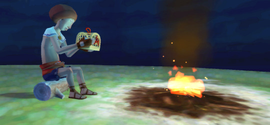
...with this guy.
Yes, Beedle. That Beedle. But before we can even jump into how he relates to any of this, we must travel further back still, to the very opening cutscene of Skyward Sword.
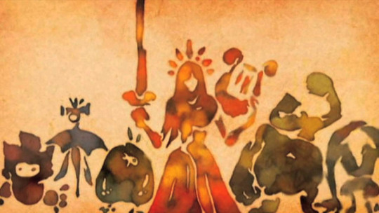
In this cutscene, we hear a very dumbed-down tale of how Demise invaded the surface world that was ruled over by the Goddess Hylia; to protect the sacred relic placed into her care by the Golden Goddesses, Hylia rends a piece of land from the earth and sends it skyward, leaving the Goddess Sword and the Triforce with it. Together with the remaining peoples of the Surface, she seals Demise away, and millennia later the events of Skyward Sword transpire. The entirety of this cutscene is not in and of itself very important, but I would like to draw everyone’s attention to one particular line uttered by the narrator during this sequence:
“To prevent this great power from falling into the hands of the evil swarming the lands… The goddess gathered the surviving humans on an outcropping of earth.”
It is worth noting here that - though the word “Hylian” itself only appears in reference to the shield which bears its name - Skyloft is comprised entirely of people with long ears. Keeping these things in mind, let’s go back to Beedle.
Beedle is, by all intents and purposes, a fairly unremarkable character in Skyward Sword. That is to say, outside of providing Link with goods throughout his adventure, he bears no significance on the plot in any capacity, having only a single sidequest that involves retrieving a pet beetle (snickers) of his, for which the player’s reward is a small sum of Gratitude Crystals. But there is one, throwaway line of completely optional dialogue you can trigger towards the beginning of this sidequest, and it is upon this line that the entire basis for this theory has been built. When meeting Beedle on his home island apart from Skyloft for the very first time, the player is given the option...
...to comment on his accent.
[after selecting “Your accent!”] “Hmmm? The mellifluous timbre of my voice sounds different to you?
...Perhaps a touch, I suppose... But pray, what does it matter, hmm?”
What’s important to understand about accents is how they come about to begin with: namely, slight differences in pronunciation and rhythm of speech evolve over time as the language (in this case, some form of ancient Hylian) spreads to different locations. And of course, everyone who uses spoken language has an accent, but Link’s remarking upon Beedle’s is an indication that his pattern of speech is different from his own. In most other games, this would be unextraordinary - but in the context of Skyward Sword, where humanity has been isolated to a (relatively speaking) small outcropping of earth in the sky, it becomes extremely noteworthy. No one in Skyloft should have “an accent,” because theirs is a society and culture so small in scale that they should all have the same accent. Beedle having an accent makes sense if, and only if...
...he’s not from Skyloft.
And if he’s not from Skyloft, the logical conclusion would be that he must be from the Surface. In almost any other circumstance, this assertion would be smashed to smithereens by the sheer fact that getting to Skyloft without a Loftwing - companions blessed only to those who live in the sky - should be an unattainable feat. And yet, of all the people in Skyloft, Beedle is the only one who could have achieved such a thing...
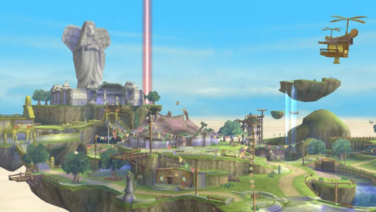
...because his shop - which conveniently doubles as his house - is an electricity-powered flying machine. Within the context of the game, such a contraption seems almost nonsensical; if he were from Skyloft, why would he not just set up shop in a permanent location? Even if he wanted to live on a smaller island by himself, the people of Skyloft could simply use their Loftwings to reach him (which they still need to do, anyway!). Indeed, the existence of Beedle’s Shop makes far more sense...if it already existed by the time he arrived there.
Which brings us back to that introductory cutscene. The narrator states that Hylia gathered up all of the surviving humans (notice the use of the word humans here) onto an outcropping of earth and sent them skyward, and on a surface level, this seems straight-forward enough - but with the revelation that Beedle is very likely from the Surface himself, it’s very obvious that this is nothing more than a bold-faced lie. Some humans were left behind - they couldn’t all possibly have fit on such a small piece of land - and those humans were the ancestors of Beedle, in some way, shape, or form. What became of those humans is another matter altogether (one I will address briefly), as the Surface we explore in Skyward Sword is perfectly devoid of human life, barring Impa.
Now, let’s bring it back home: remember how I said that all Skyloftians have long ears? That was a bit of a white lie, though only if you count Beedle among that number. In truth, Beedle’s ears are obscured by the bowl cut of his hair - but this is true for every game he appears in, and the general consensus is that they’re round. This would make Beedle the only round-eared human in the entire game...and he, coincidentally, happens to be from the Surface.
Before I go any further, I’d like to establish a very base reasoning for the existence of long-eared qualities in the human races of Hyrule. Hylians are far from the only ones to bear long ears, what with the trait also presenting themselves in the likes of the Sheikah and, by the era of Breath of the Wild, even the Gerudo - though it is exceptionally notable that in Ocarina of Time, the Gerudo have round ears, and Ganondorf is no exception...at least, at first.
Y’see, what’s especially notable about Ganondorf is that he is the same exact character is each title he appears in, and in The Wind Waker and Twilight Princess, his ears are long. This was actually something I only noticed quite recently, upon which I then fervently began scouring for information about his appearance in Ocarina of Time to try and make sense of it all, and the results are...very intriguing, to say the least. Below is a comparison of Ganondorf pre-timeskip vs. post-timeskip from the original Nintendo 64 version of the game:

As you can see, his model has changed in a number of ways, but... Well, I’m sure you can see where I’m going with this.
Amazingly, his ears got longer, which is...an interesting choice from a design perspective. Of course, it leads one to wonder why - and far and above the most significant thing to happen to him in the seven years between these two appearances is his procuring of the Triforce of Power from the Sacred Realm, a relic of the old gods. Evil or no, Ganondorf had forged a bond with a god unlike any had before him, and for some reason, this elongated his ears - so much so that by the time of Twilight Princess and The Wind Waker, they are indistinguishable from your typical Hylian’s. It is notable, too, that the Sheikah (who have always had long ears) also bear a special connection to the gods, living to serve Hylia and, later, her reincarnation as the princess in the Royal Family of Hyrule.
“They say we Hylians have big ears in order to hear the voices of the gods.”
So now, keeping everything I’ve talked about here in mind, I think it appropriate to go over the series of events that likely transpired, beginning from Demise’s invasion of the surface world:
In a bid to keep the Triforce out of evil’s grasp, Hylia formulates a plan to send both it and the Goddess Sword out of harm’s way. She selects - perhaps by chance, perhaps by choice - a not insignificant number of humans to live on this skyward isle, but naturally not all of them can make the cut. These chosen humans would go on to found Skyloft, a land whose culture revolves heavily around the reverence of the very goddess who saved them and enabled them to live in prosperity (the existence of the Wing Ceremony, the Statue of the Goddess, etc.), while the humans who remained on the surface, left in a world scarred by war and ravaged by monsters, sought new lands, becoming the ancestors of people who would found Holodrum and Labrynna, to name a couple. In their reverence of Hylia, the people of Skyloft would develop long ears, as even the Sheikah had - but the humans left on the surface world...would not.
That is to say, the Hylians we see in almost every major installment of the series are the direct descendants of the people of Skyloft, and round-eared humans are the descendants of the people Hylia left behind.
Of course, not all humans fled from their homeland - though we see none in-game, it’s important to remember that we also see no Sheikah aside from Impa, though we know they are great in number. Beedle was, undoubtedly, one of these very few stragglers, and with stories of a land beyond the clouds on his mind - legends that have been passed down over countless generations - he sought to find this paradise by any means, through sheer blood, sweat, and tears (but mostly sweat, if that cycling is any indication) if necessary. In the end, he was successful, and he lives among the people of Skyloft fairly unassumingly - yet he also lives apart from them, on his own island because, at his core, he is not one of them, and never will be. He doesn’t get all of this Hylia stuff, and frankly, he doesn’t care - so long as he can chill on his own little crop of land with a full belly, a full wallet, and his pet beetle, that’s really all that matters.
And speaking of Hylia - the reason they are called Hylians is because they are the descendants of those chosen by Hylia, even if the knowledge of Hylia’s existence has largely been lost to history by the events of Ocarina of Time and beyond. (In a very similar vein, it is my belief that Lake Hylia also gets its name from her because the crater that would later become that very lake was formed...when she lifted a gargantuan outcropping of earth into the sky.) Hylians largely dominate Hyrule for so much of its history because the people of Skyloft were the ones who founded it - yet by the era of Twilight Princess, we see that a great many of the humans who had moved onto different lands have slowly but surely made their way back towards the place they once called home.
But I would be remiss to neglect to go back to Breath of the Wild; this game is a much more peculiar case, taking place in an era many millennia after any game that came before it, where reverence for Hylia is once again commonplace - so much so that statues bearing her resemblance have been erected in every town, village, and city across the country. Humans are once again practically nowhere to be seen (except, again, perhaps for Beedle), and even the Gerudo, who have now long intermingled with Hylians for the sake of having children, have inherited the trait (perhaps in part due to the fact that some of their own may worship Hylia, if the statue in Gerudo Town is any indication). In every single instance, no matter where you turn, these long ears seem to be a direct correlation to the people’s connection to the gods of Hyrule - but rather than their ears being a predetermined factor in how strong this connection may be, it seems that their faith is what influences this trait to rise to the surface, over how ever many generations or centuries that just might take. (Ganondorf Dragmire, who lives in a castle and inherited a relic of pure godly power, is an outlier and should not be counted.) As Shad so eloquently states in Twilight Princess:
“Hyrule was made by the Hylians, who, as we all know, are the closest race to the gods.”

And as long as we’re talking about Shad, I’d love to begin wrapping up this post by bringing things round to Twilight Princess once more - specifically the context in which Shad says the above quote, which is far and away one of the most peculiar instances of casual lore-dumping in the entire series. The quote in its entirety from the North American version of the game reads thusly:
“At the moment I'm absolutely entranced by the sky beings known as the Oocca. Yes, according to legend, Hyrule was made by the Hylians [...] But also according to legend, long ago there was a race even closer to the gods, and some say these creatures made the Hylians. When they created the people of Hylia, they simultaneously created a new capital, a city that floated in the heavens.”
What Shad is saying here is extremely farfetched, particularly for those of us who are familiar with the Oocca. But in truth, this was a minor mistranslation on Nintendo of America’s part; the original text from the Japanese version of the game clears actually reads much more like this, when translated correctly:
“The common opinion is that Hyrule was created by the Hylia people, the race closest to the gods, but...truth be told, there's also a theory saying that in ancient times, there was a race even closer to the gods than the Hylia people, and THEY created it [Hyrule]. And they, simultaneously with the birth of the Hylia people, created a new capital, a capital that floated in the heavens.”
So the Oocca - the bizarre, Cucco-like creatures who inhabit the City in the Sky - did not create the Hylians, but rather established the kingdom of Hyrule itself in the world that the goddesses created. But even with this mistranslation squared away, that still sounds incredibly odd, especially taking the events of Skyward Sword into account; we know that the people of Skyloft are the ones who inevitably found Hyrule, because we see the beginnings of this happening at the end of the game. Funnily enough, it seems that the very line that was mistranslated in the North American version of the game...was the result of mistranslation itself.
In-universe mistranslation, that is. Millennia of history being told, written, lost, and found, translated again and again and again, until it barely resembles its original state. What likely happened was that the Oocca, who live in the sky, were wrongly credited with the creation of Hyrule because the Hylian people who would go on the found Hyrule also came from the sky, as they were the people of Skyloft. Shad’s claim that the Oocca were “a race even closer to the gods" than the Hylians may not be entirely unfounded, however, as it is incredibly likely like the City in the Sky we see in Twilight Princess is what remained of Skyloft after its human inhabitants abandoned it; the Loftwings that the people of Skyloft had for so long relied on would go on to evolve into more sentient beings, suspending the city above the clouds long after Hylia’s magic had worn off - and Loftwings were, as the people of Skyloft believed, beings bestowed upon them as a symbol of the goddess’s divine blessing. In this sense, it is somewhat true that the City in the Sky and the Hylians were created at the same time; when the Skyloftians abandoned their home to live in a new land where they were not long after christened the Hylians, the skyward isle that they had left behind found a new purpose, and a new “city” was born.
Of course, maybe Shad was off his marbles (even if the Oocca are evolved Loftwings, there is still much about them and their connection to the Sheikah that remains shrouded in mystery), but the crux of this entire narrative is that the people of Hylia, the Hylians - at least, up until Breath of the Wild is concerned - were the descendants of the people of Skyloft, and Beedle’s eccentricities in the context of Skyward Sword are rather convincing pieces of evidence that this did not comprise all people of the formerly-known-as “Land of Hylia.” It is therefore only natural that a conclusion could be drawn about where the distinction between the two peoples comes from.
But in the end, even if this can answer the question of why there are round-eared humans alongside long-eared ones, it does not answer the ultimate question of what this distinction means. Why does a connection with and a faith in the gods elongate the ears of the people it touches? The Zelda Encyclopedia states that “in the past, Hylians were able to wield magic of considerable might,” a trait that could possibly distinguish them from your typical human being - but the canon nature of the Encyclopedia is...shaky*, at best, and downright disrespectful at worst. Link and Zelda are two Hylians we see wielding abnormal abilities, but their power can be explained with their respective pieces of the Triforce, not to mention the countless magic users in Hyrule and beyond who aren’t Hylian. Even if there was a time when the Hylians had special abilities, those abilities have long since faded. They are no no taller, no smaller, live no longer than their round-eared counterparts; they are, in every aspect aside from the length of their ears, in every way identical. To finish the quote by the unnamed Hylian man who speaks to a young Link in the Castle Town Market in Ocarina of Time:
“They say we Hylians have big ears in order to hear the voices of the gods...but I've never heard them!”
So...there you have it. I must admit that it is entirely possible that the people of Skyloft had developed long ears before their ancestors had been sent to the heavens - after all, the Sealed Temple was, in millennia past, a temple erected in her honor. Yet this would also make the story of Hylia gathering the “surviving humans” in order to save them all the more grim; could the gods be so callous as to save only those who respect their divine might? One cannot help but think of the Great Sea in The Wind Waker - for in a world populated by the descendants of those who were chosen by the gods to survive the coming floods, it is difficult not to notice that ears of the round variety are once again nowhere to be found.
And yet, when you get right down to it - though some Hylians seem to rely on their lineage as “the closest race to the gods” to maintain an image of self-importance - the difference between a long-eared Hylian and a round-eared human appears to be, ultimately...only that. And unless we see our round-eared friends return in a potentially future title, and the difference remarked upon, that will likely be how things remain.
Until that time, I will continue to do my best to fill the gaps with which we have been left - even if, at the end of the day, I’ve written nothing more than a meaningless, nine-page word jumble...about ears.
EDIT (5/9/2020): It has been brought to my attention (courtesy of @heartenvy) that there is a mild inconsistency with the narrative that Beedle could be from the Surface: namely, the “unbreachable” Cloud Barrier, something Hylia herself created to divide Skyloft from the Surface and keep its inhabitants and the Triforce safe. However, I would argue that the Cloud Barrier is not a physical barrier so much as it is a mystical one, meant to both keep its location secret (the barrier itself is completely invisible from the Surface) and to ensure the people of Skyloft remain complacent in their isolation (believing Skyloft is all there is, they remain there, and in so doing their long-forgotten secrets are kept safe). Zelda is pulled through it long before any proper portals are actually opened, and I would argue that the portals (that is, the pillars of light that appear when we place the corresponding tablets) are largely a gameplay mechanic meant to keep the story linear, as in a real setting Link would have simply ridden his Loftwing to and from the Surface and would have been able to fly anywhere he chose. It’s possible the barrier acts to keep out evildoers, specifically (which would explain why Ghirahim had to summon a vortex to pull Zelda through it, where he could reach her), or, not unlike the Isla de Muerta in Pirates of the Caribbean, Skyloft could very well be “an island that cannot be found except by those who already know where it is” - which, to me, makes the narrative of Beedle finding his way there all the more entertaining (the dude must have been, like, super determined). In any case, I stand by what I’ve stated before: that Beedle is from the Surface, as his accent and the peculiarities of his shop make too strong a case to ignore.
* * * * *
*The Zelda Encyclopedia states that Termina is a Dream World, despite Link’s Awakening having already done this and in a much more satisfying way. I can’t take anything it says seriously.
(Special thanks to @ghiirahiims for the high-res screenshot of Beedle, and shoutout to @gaybellatrix for in no small part convincing me to finally sit down and write this all up.)
#twilight princess#skyward sword#legend of zelda#tloz#loz#with honorable mentions of#ganondorf#beedle#shad#ocarina of time#loz meta#boy howdy writing this was quite a trip#if the read more doesn't work on mobile i am so sorry#here it is. the Great Hyrulean Ear Lore.#if anyone actually reads this please for the love of god at least leave a like#gaybellatrix#ghiirahiims#long post#bezu#analysis#mywriteups*#myposts*
2K notes
·
View notes
Text
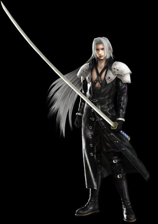
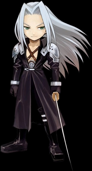
Sephiroth’s true eye color (among other things)
Ever since I got into FF7 stuff I’ve wondered about Sephiroth’s rather inconsistent eye color over the media he’s appeared in (which is a lot), and I think I finally have an answer for it, as well as answers for other slightly unexplained phenomena. Warning you now, this will be fairly long and full of spoilers for multiple games in the series, yet hopefully informative.
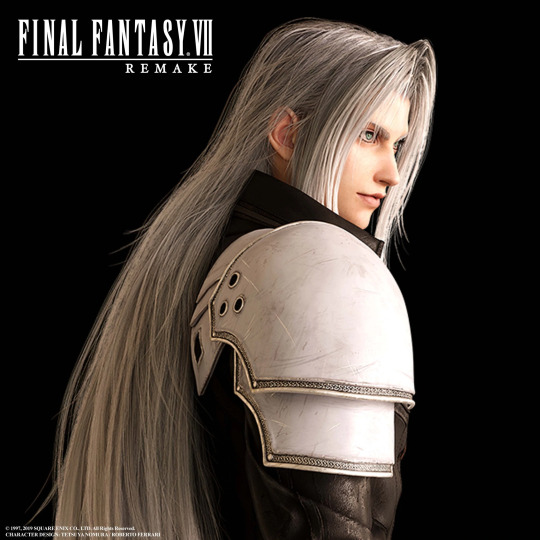
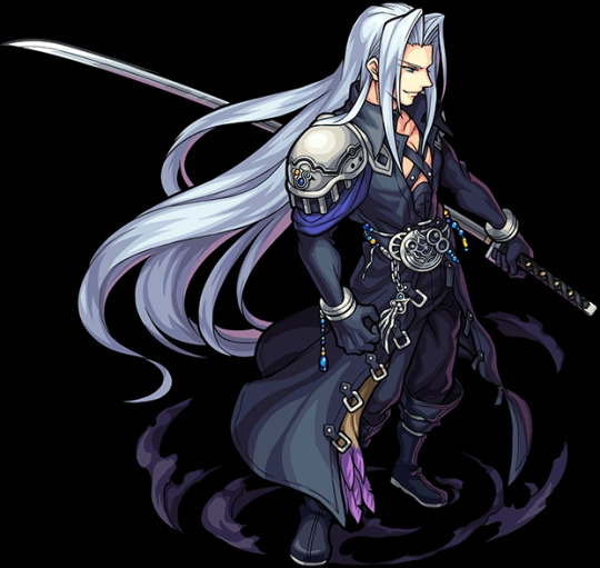
Sephiroth is best known for his green, cat-pupiled eyes, among other things, and that’s generally the accepted eye color for him in fan works and such. But his eyes are actually light blue, and not just mainly in spinoffs. There will be a TL;DR in about the middle of the post for one interesting point, and another at the end for the whole post in general.
Disclaimer: This isn't intended to be a "this is the right way to portray Sephiroth's eye color" gatekeeping thing, this is just an analysis of an element of character design that went way too deep and is breaking Tumblr as we speak hfsdgyfudgfsd
Evidence, theories and such under cut-- all 63 images (yes, you heard me, be warned) either come from various wikis as official art/screenshots/etc. or are my own screenshots:
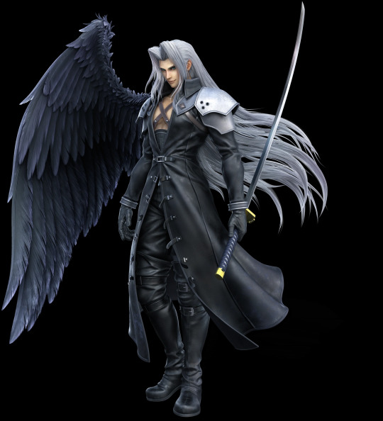
In Final Fantasy 7, where this mess all started, his iconic official art has green eyes:

But in all other art, models, etc. for the game, even the Ultimania scan, his eyes are light blue (or some sort of blue in general):

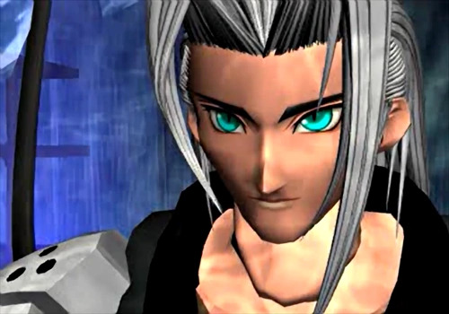
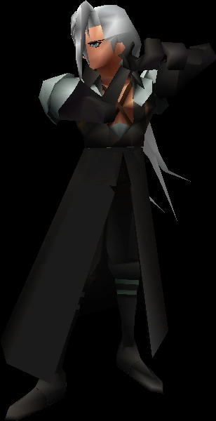
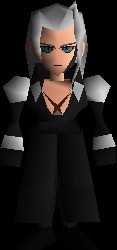
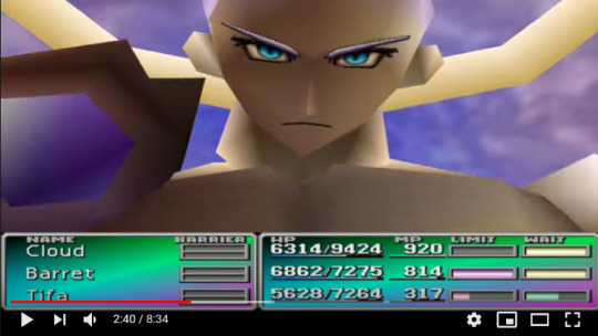
Of course, you could argue that Sephiroth’s official art also has blue eyes if you stare at it hard enough, but at first glance it’s more green than blue, and with the amount of green-eyed art I’ve seen, I’m sure many people have just accepted that his eyes are green and nothing more.
Several other games in the main series also portray Sephiroth’s eyes as light blue, sometimes borderline colorless depending on the lighting:
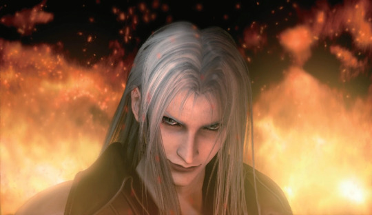
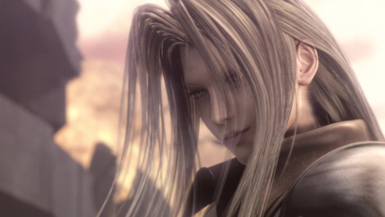
I particularly curse Advent Children for it’s washed-out aesthetic because in the darker scenes it completely masks Sephiroth’s real eye color. Thank the gods for HD screenshots.
However, there is a very interesting phenomenon that only seems to happen in Last Order, the 25-minute animated retelling of the Nibelheim Incident and Zack and Cloud’s escape 5 years after. No one seems to have noticed this yet, to my knowledge, so I’ll go through this as clearly as I can.
When Zack confronts Sephiroth in the reactor, the latter’s eyes are light blue:

It isn’t very obvious due to the mako glow tint and his face being in shadow, but I’d think green eyes would look different here, so they are light blue. They stay light blue for a while after this, until Zack begins to fight him and parries him onto the ceiling (anime physics...), resulting in this peculiar scene:
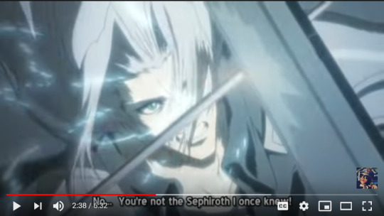

Light blue into green. Literally, you can see it happening in the actual video. This happens a second time when Sephiroth has Cloud skewed on Masamune, just more subtly:
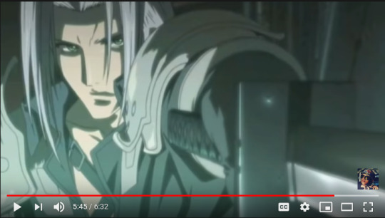
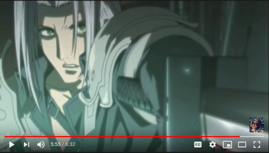
Again, light blue into green(er). Definitely something funky going on here. It goes back to light blue when Cloud tosses him away, though:

And speaking of Cloud... he, too, shows very obvious eye color change directly after this scene, as seen below:
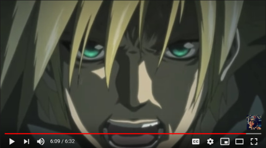
In the video they are visibly, animatedly glowing, it’s not just me discerning between two different flat shades of color. Keep in mind this is before he gets mako poisoned and Jenova-celled and whatnot, so this isn’t due to SOLDIER enhancements. What gives?
Here’s my take: it’s the Lifestream. People are made of Lifestream like everything else in in the FF7 universe, and it’s common knowledge that Lifestream/mako can do some pretty weird shenanigans. SOLDIERs are literally pumped full of the stuff and have seemingly superhuman abilities, and that’s just the lower-ranking ones. But the series has also placed a lot of emphasis on willpower, which Cloud post-experimentation struggles with due to the J-cells and stuff. A lot of people with particularly bright or “glowing” eyes have expressed an incredible amount of willpower, some of which include Cloud, Sephiroth (unsurprising), and Aerith:
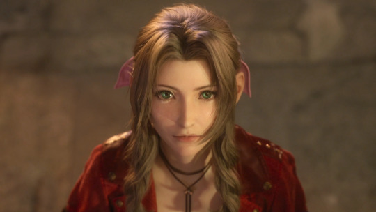
Aerith’s eyes have always been incredibly bright in the series, regardless of which game you reference. Remake especially makes this obvious, as it seems like every close-up shot of her makes her eyes the centerpiece regardless of lighting, setting, etc.:

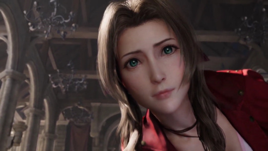
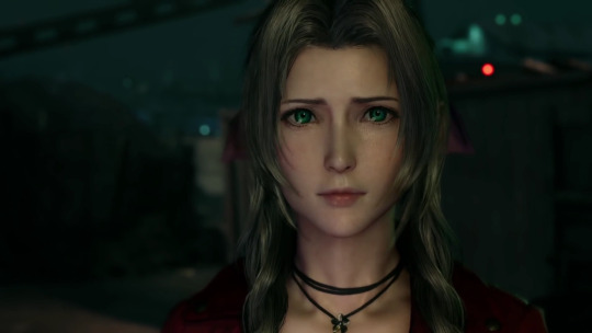
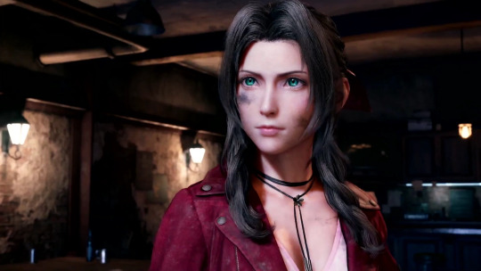
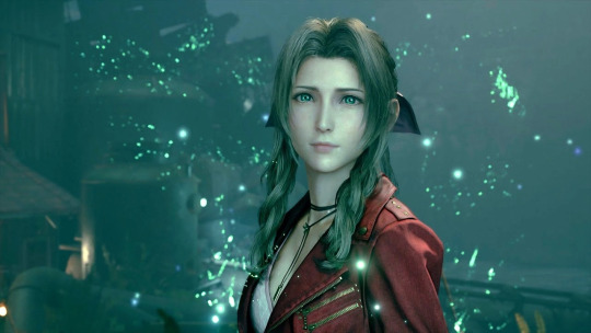
Like, seriously, they almost seem to glow they’re so bright. But here’s the kicker: Aerith is a Cetra, and the Cetra, obviously, communicate with the Planet... or, in other words, have an incredibly strong willpower that influences things. It’s been stated before by various people and media that Sephiroth and Aerith are two sides of the same coin, but not quite like this, I think. Cloud shows a similar phenomenon in his close-up shots as well, though the artificial SOLDIER glow is most likely contributing to most of it:
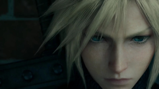
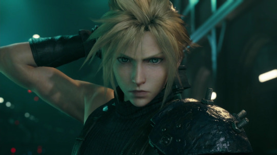
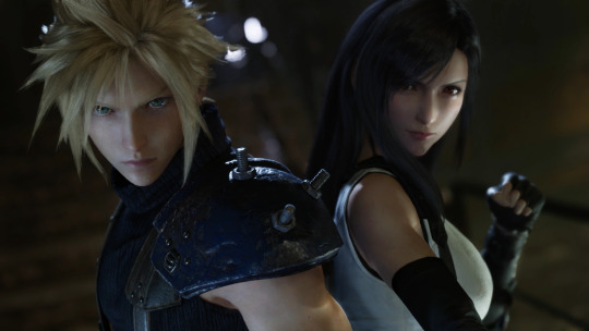


Compare these to younger Cloud in the Nibelheim flashback, when he was more innocent and had no need for incredible willpower, artificial or not:

Going back to Cloud in Last Order, the point we can make about him in particular is that when he was stabbed, literally at death’s door, he drew on his inner Lifestream for the strength to toss Sephiroth away. People have wondered for years about how this moment was even possible besides Protagonist Syndrome, and this may be the answer.
If this is the case, then this could apply to anyone: Aerith, Sephiroth, Zack, hell even Tifa seems to have slightly glowing eyes in the Remake sometimes-- and sure, it may be just the game engine making sure we can actually see their eyes in key cutscenes... but it ties into canon lore and actually makes sense, so I’m sticking with that. It’s also not a coincidence that Aerith specifically has green eyes, too, since the Lifestream in general is green-colored and whatnot.
Midpoint TL;DR: people with lots of inner willpower can call on their own Lifestream to give them strength, resulting in “glowing” or even color-changing eyes depending on how much Lifestream/mako they have in them. SOLDIERs, for example, would fall in the latter category... the most extreme being Sephiroth.
Now that's we're back at Sephiroth, another interesting point is that his eye color in Remake is consistently light blue, or some blue variation depending on the lighting, with green centers, as seen below:
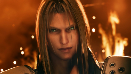
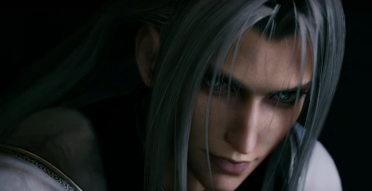
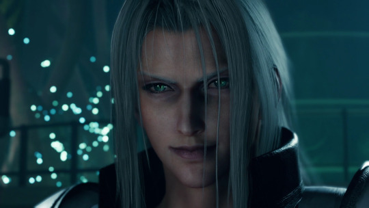
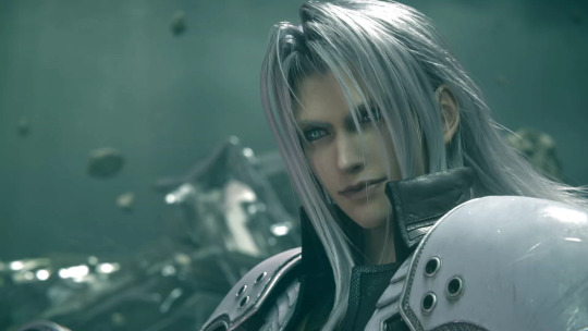

Cloud obviously shares the same eye color pattern by this point because it's implied that he has the same if not slightly more mako in him than Sephiroth, which very conveniently also equates to him having the same if not slightly more willpower than Sephiroth.
An honorable mention goes to the Remnants, since they, too, follow the light blue with green centers pattern, appearing to fluctuate between the two colors at certain times:
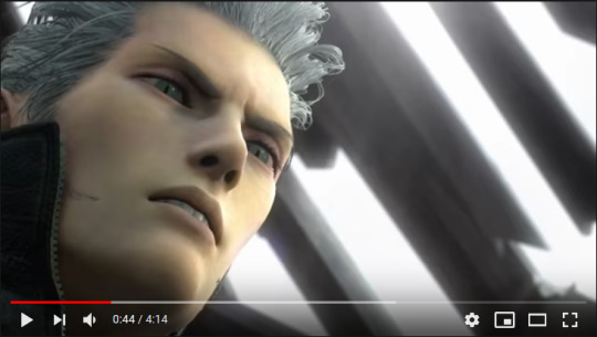
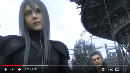

With all of that said and done, I’ll wrap this up by going through Sephiroth’s appearances in side games and other franchises as quickly as I can:
1) The Dissidia series (Dissidia, 012/Duodecim, NT, Opera Omnia) almost always portrays Sephiroth with light blue eyes in art, renders, and models, occasionally with a hint of green in them:
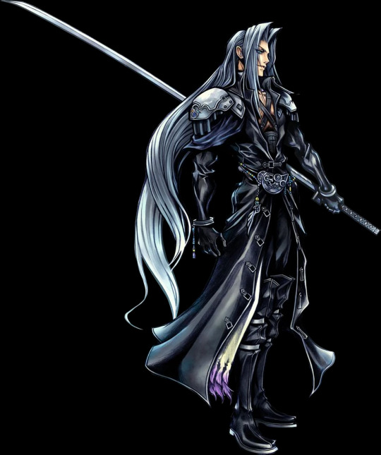
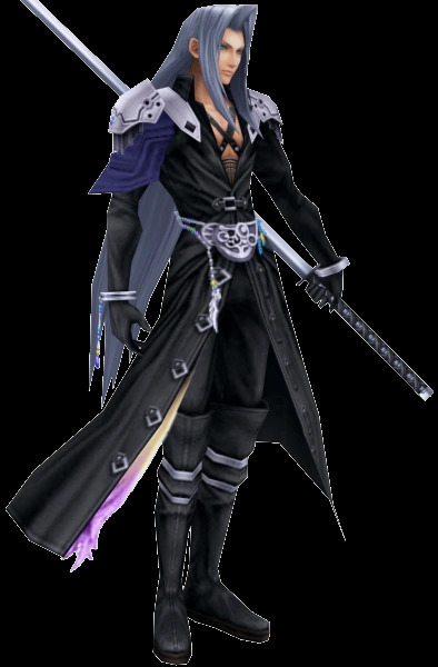


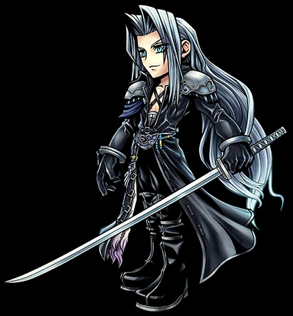

A very interesting exception is NT Sephiroth's Safer Sephiroth costume, which has completely white eyes in all three of its alts. Yes, it's basically just a cosmetic costume, but it's still worthy to note for comprehensive purposes:

2) World of Final Fantasy’s Sephiroth has light blue eyes:
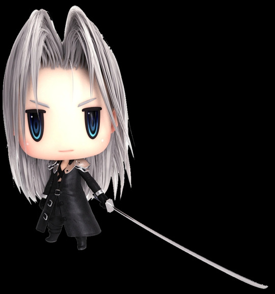
3) Record Keeper Sephiroth’s sprites are very obviously based on the original FF7 official art where he has green eyes (yes, I checked the colors by hand, they're all in the greener sections of the color wheel):


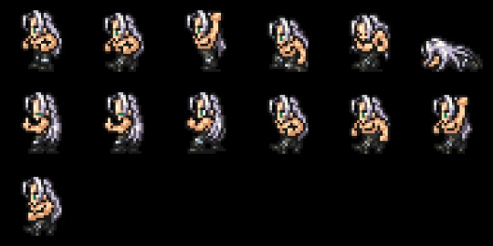
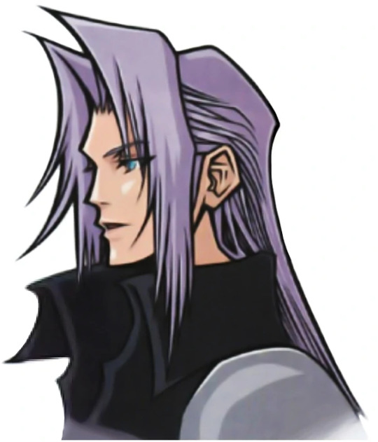
4) The Kingdom Hearts series is particularly unique because it features a blue-eyed Sephiroth but with an explicit reason for it. Kingdom Hearts 1 simply says that Sephiroth is part of Cloud’s past, but Kingdom Hearts 2 literally has Cloud saying “I'll get him. This time we settle it. Me, and the one who embodies all the darkness in me.”, and then explicitly clarifying that it’s Sephiroth he’s talking about. Sephiroth even shares Cloud’s facial shape, which is particularly obvious in KH2 renders:


All other Sephiroth appearances in the KH series also feature him with blue eyes, except for any usage of material from other media.
5) Itadaki Street games feature Sephiroth with green eyes:

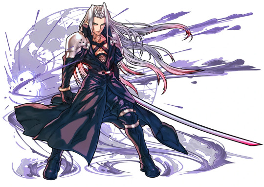
6) Puzzles and Dragons features a rare teal-eyed Sephiroth:
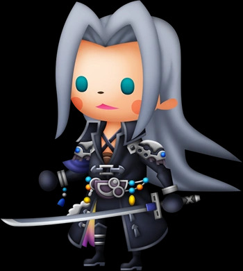
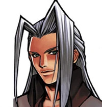
And finally 7) All other Sephiroth appearances in spinoffs and other media feature him with light blue, blue, or rare teal eyes, except for sprites, which are (most likely) reused from Record Keeper:


And that’s FINALLY a wrap. All my evidence for Sephiroth’s actual eye color in one place, and even a theory on why it can potentially fluctuate between that and the iconic green.
Actual TL;DR: Sephiroth’s eyes are actually light blue in 90% of his appearances, and the remaining 10% either comes from temporary green-ness or partial green-ness thanks to mako/Lifestream stuff, or spinoffs.
There is one small point I’d like to make at the end of this, and that is the remaining mystery of why Sephiroth’s pupils are even slitted and cat-like in the first place. That... is far more ambiguous in terms of evidence than the eye color. Some series, particularly the Kingdom Hearts series, have them as regular round pupils, while others sometimes if not most of the time give him the cat-like ones. I may make another in-depth analysis post trying to figure it all out, but for now I’ll say that it may just simply be a result of the Jenova cells he has or something along those lines.
If you made it this far down and didn’t just instantly scroll past my massive log of images and sundry, thank you so much for reading all of this! If you did just instantly scroll past, I don't blame you. I guess I'm in proper Sephiroth hell now, lol.
I hope you have a great day and that things turn out well for you fhjksdgfyhughuhyudfs
#final fantasy 7#ff7#if I tried to tag everything I mention in this post tumblr would probably die SO I'm only tagging the biggest and most relevant groups#final fantasy 7: advent children#last order: final fantasy 7#crisis core: final fantasy 7#before crisis: final fantasy 7#final fantasy 7 remake#dissidia final fantasy#world of final fantasy#final fantasy record keeper#kingdom hearts#itadaki street special#puzzles and dragons#sephiroth#cloud strife#aerith gainsborough#kadaj#yazoo#loz#sephiroth's eye colors#my text#can't believe how freaking LONG this is jfc#this is the most productive I've been in ages in terms of fandom
104 notes
·
View notes
Text
they ran over the seals
More Replicant playthrough observations and general nonsense under the cut. For reference, up to the keystone quest; completed the Forest of Myth and Junk Heap.
This fucking game I swear to god.
A vaguely coherent ramble about sidequests An observation about sidequests in general in this game -- and I don't recall if I ever voiced this somewhere public or it was just a personal observation from my time with the original -- is that the quests in the first half of the game are all relatively easy to complete. There's that one asshat who wants 10 goat hides, but other than him, most of the sidequests are either very much based on finding characters, or gathering a sensible number of items that are either relatively common, purchasable, or given a guaranteed spawn for the duration of that quest.
The sidequests everybody remembers having to do are in the second half, where everybody is demanding and awful and I'm sorry ten MACHINE OILS do you know how goddamn rare those are? They're goddamn rare.
(We'll not discuss Life in the Sands.)
This is generally agreed to, in the technical vernacular, 'suck'. And it's always funny that the most interesting sidequests are the ones with very minimal requirements (Yonah's cooking, getting Popola drunk, the Lighthouse Ladoh my god everything's gone blurry I'm not crying you're crying who am I kidding we're both crying). That particular aspect of the design also feels intentional, not really gating your ability to progress the really meaningful or funny sidequests behind an unreasonable number of rare items. The other aspect of the design is that these quests are not meant to be completed in a single playthrough; most of them are single-stage and just absolutely unreasonable, but if you're going through the game four times you have a... reasonable chance of getting everything you need more or less naturally.
Nobody does that but I think that was the intended design. I think it's a good idea, although the execution of expectation is flawed so I don't really blame people for saying those sidequests suck. (Although I will in turn blame people for saying the sidequests suck as a blanket statement. Yeah getting that guy who burned his kitchen down a billion Broken Motors is aggravating but did you not find that old man's dog? Speak to Ursula on her death bed? Solve a murder? Then again I think tracking down that rotten son who's trying to get away from The Family Business only to learn his father is a con-artist and get literally no reward is the height of comedy so maybe I'm not the greatest point of reference.)
But that asshole in Facade can get bent. I can't exploit my garden properly, jackass! I am no longer a god of time. (I kid, of course.) (This guys sucks even when you can fix your clock.)
Forest of Myth It didn't even occur to me to wonder how they would incorporate the comprehensive voice acting into the Forest of Myth. I like how it plays out, although I wish the voices maybe had a fade as you went deeper into the dream instead of just cutting out at some point, especially for the lines where the characters are being ascribed actions by the narrator that they themselves aren't doing near the start of the Deathdream. But it's just delightful to go back to it. The second half of the game really sticks in your mind both for emotional reasons and because you play it at least three times per full playthrough of the game, but the first half is just so much fun.
Protip: Talk to everybody after you've finished the dream sidequest. Weiss tries to dissuade you. Don't let him dissuade you. I'm still delighted by the Mayor; "We're building a statue of you, made of solid gold. I know you don't own a horse, but we're going to put you on a horse."
I forgot about Yonah being a disaster chef Papa Nier's reaction to the stew is better. Brother is still funny but Papa Nier just expecting to die is comedy gold.
For anybody curious, the joke about the cakes is that Yonah made 'fruit cake' using some of the worst possible fruits for cake-making. If only she'd thrown a tomato into the mix, too.
Lighthouse Lady Every time. what the fuck is a canal I'm aware of the addition of the new-old content but it didn't occur to me until Popola suddenly starts nattering on about fixing the canal when I'm expecting Yonah to talk about a penpal that oh, yeah, I guess Seafront would have had something going on the first half that would play into the second half? (I assume it does. Be weird to introduce these characters just to have groundwork for an added sidequest. ...but it was a cute sidequest.) But look Popola my boy is supposed to be in the next area I visit could we-- I mean he's on the way could we just-- no-- fiiiiiiiiiine. (It was short and sweet, though, and I appreciate that the couple's love is exemplified by them both calling Weiss a floating magazine in tandem.) On a related note but was I the only person suddenly concerned when the sidequest completion maxed out at 50% and not 51%? I had to double-check with a guide just to make sure, since I've spent the last decade telling people to make sure you hit 51% before going on to Part II.
MY BOY I love that nowadays, Emil is everybody's son. But I really wish I could go find somebody only familiar with Automata and just watch their reaction. (I'm guessing there are streams out there that fulfill this but man I'd love to get it in-person.) If you're only familiar with him from Automata this has to be a mindfuck.
Personal anecdote, but I've had the privilege of playing NIER with somebody else almost every time I've gone through it. I had a wonderful experience of doing a replay some years back with somebody who had experienced it with me before but didn't have the most solid memory of the beginning (and had actually missed the entire weapon's lab the first time through). I get to the boy at the piano introducing himself and the 'Wait, what?' was a thing of beauty.
MY ANDROID This was a welcome mindfuck for me; finding Sebastian and having him 'reactivate' in such an unnatural, mechanical way. I don't recall if it was ever officially confirmed that Sebastian is an android (I know that it's just understood that this is the case but I'm not I can't recall a specific one) but the little flair they added to his animation caught me completely off guard. I liked it!
Destroying the food source A lot of people will cite a major inciting incident for the game as being when the protagonist heading back into the village and killing the child Shades just outside the entrance. This moment is such a great bit of subtle foreshadowing that's so easy to miss... but kind of joining that, just before the Knave of Hearts attacks, I realized that the Shades out on the Northern Plains are clearly ramping up for an assault of their own by murdering the sheep. The sheep population at this point is decimated (which is great when you realize you haven't gotten the Sheepslayer trophy and you're about to enter Part II and you don't know if the boar drifting minigame got carried forward with the inclusion of 15 Nightmares). You go out onto the Plains and you will find not only small clusters of sheep left behind instead of the vast, terrifying herds from the start of the game, but until you get their attention the Shades are prioritizing killing the sheep. (Also annoying because that doesn't count toward my sheep murder number.) The Shades will be out there also killing sheep earlier on, but since the whole map is in Overcast mode after talking to Yonah it's especially prevalent to go out to the Northern Plains and seeing the slaughter. And I realized-- they're cutting the Village off from a primary food source. Shades don't eat and they don't have any beef with the local ungulates (at least, no more so than anybody else does), so why are they hunting down the sheep? To deprive their enemies of resources. Sheep are extinct by the timeskip. It's actually really clever of them, and a really clever indication of their sentience and intelligence before it's fully verified.
"Let's get these shit-hogs!" Everything about the way Kaine and Emil interact across the entire game is perfect I will brook no argument this is objective fact.
Emotive Rectangles I wrote an essay about this before but it really bears repeating that the job the original animators did with this scene is just phenomenal. The way Weiss drifts, flits, flips, fans his pages, drunkenly swerves, shoots around the room in defiance... He's a goddamn rectangle, but there is so much emotion and personality in this scene just based on the movements conveyed through a what is effectively just a box. Ten years later and triple-A titles with full facial capture don't have this much seething personality. I really have to give props to the cavia animators, wherever they wound up. That studio could really put some subtle love and care into their titles, utterly unnecessary and easy to miss but you can tell that whoever was working on it was giving it their all. The books are probably the exemplification of this, but every time I go into Seafront and visit the seals I can tell that the guy on seal duty was having just the best day. They made Emil so pretty There's an FMV cutscene right smack in the middle of the original game after the battle against Noir. I understand why it was a necessity on a technical level, but it always looked pretty out of place and a little uncanny valley compared to the rest of the graphical fidelity. That's no longer a necessity so this cutscene is rendered in-engine. I admit I was actually curious to see it redone this way and it looks fantastic. I single out Emil since he is the focal point of cutscene and because his particular high-poly model had some pretty weird difference from his in-engine model, but he and Kaine both look great. But, like, it's almost mean how pretty he is.
They made Brother Nier so pretty Yeah okay you got me he's kind of hot. Kaine's expression when she wakes up and looks him over is... significantly easier to read now. Good voice, too. (Ancient rumors tell that one of the issues with international releases of RepliCant was that they couldn't find an English VA with a voice that 'fit' Brother Nier. He sounded good out the gate but hearing him growl "Let's go TAKE CARE of those KIDS" during the thief sidequest-- I got chills. It sounds so silly but there's a kind of percolating fury to that delivery. Papa Nier was like frustrated but mostly disappointed dad; I felt like Brother was going to take care of those kids, and nobody was going to find the bodies. Younger Brother Nier just never stops looking goofy to me but Older Brother just looks great in motion, between the alterations they made to the movement and just the entire weaponry system. The distinction between the two halves of the game was always a little odd in the Gestalt version-- not odd enough to really raise eyebrows if you didn't know about RepliCant, but of course you can tell that this age gape between the optimistic doe-eyed dogooder and a man largely ruled by his fury and calloused by tragedy is what the timeskip was going for. Swab me down and call me Ishmael, it works. Younger Brother wasn't quite clicking with me-- not because of any writing or voicework issues, but I've got Papa Nier on the back of my mind and it's impossible not to compare and contrast the delivery and dialogue between the two. I know that this is intentional, too; Younger Brother is supposed to be that happy-go-lucky video game protagonist, always doing the right thing and helping people, in order to contrast against the man he becomes. Even just edging into Part II the effect is dramatic and it recontextualizes Younger Brother into a much more effective overall character. And let me reiterate, I enjoyed my time with Younger Brother just fine, I have no issues with him. But he's up against Well Meaning Big Dummy Part I Papa Nier. No contest. And I'm excited to see where Older Brother goes from here.
Speaking of voices I mentioned this before but the delivery on the character's lines is different. The entire game was re-recorded and quite a few lines are still pretty similar to the original, but there are some that are... definitely different. Part of this is a difference in the relationship between characters based on their life experience and ages-- Weiss is much more of an ass to Younger Brother but has a much more even respect for Older Brother (neither of which are like the rapport he established with Father). Some of Kaine's lines feel more aloof, dismissive, and almost tired in the front half of the game. I haven't really gotten to a point to dig into Emil's rapport with the other characters, but the delivery feels more hesitant and uncertain (which I think is more in line with his Japanese VO, but I'm prefacing that on an untrained ear and a presumption rather than recent memory). It's been interesting to see not just where hey adjusted dialogue (and how-- there are some lines that didn't need to be rewritten), but also how they adjust tone and delivery. Dealing with Younger Brother is one thing, but as I said, I'm very excited to see what's different in the second half, especially being much more familiar with that part of the game. Speaking of Voices! Halua got dialogue! I... preferred when it was inferred (and the implications of "I'll always be watching over you" are borderline malicious given the results of their fusion dance, yeah THANK YOU HALUA this is GREAT). Halua's delivery also felt a little too innocent and upbeat both for the situation and when compared to her narrative voice in The Stone Flower, where she comes across as much more cynical and cold. But given what she's been through and the nightmare she's finally escaping I guess she's allowed express happiness. She's certainly earned the right to having a spoken line. No matter what. Every fuckin' time.
"Here we go." This was always a great line to kind of ease in to the officially-official start of Part II-- every time you start up a New Game+ you're greeted with Emil musing about his conflation of Halua to Kaine, and then the phrase "Here we go". There's a lot in that one line. On a personal level he's grounding his thoughts in the moment and steeling himself for what comes next and pushing through his pain and sadness and fear. Whatever Nier told him in the facility he's still terrified, desperately terrified, that Kaine -- who was the one who told him his life had meaning -- is going to reject him. And why wouldn't she? Ultimately they don't know each other, not really. He understands at that moment that his relationship with Kaine is based on confused memories of his sister, that maybe the bond he thought they established isn't actually real. As soon as he frees Kaine he's going to have to confront her, like this, and how could she ever-- she won't-- but he can't just leave her. Whatever happens next. Doesn't matter. Doesn't matter. (God it matters.) "Here we go." On a meta level, that's our introduction into the second half of the game. The first half is all prologue. This is where we'll be spending the rest of our time, even to the point that 'New Game+' skips straight ahead to this moment. Now that we've finished the establishment, this is where it all builds and where it all matters. Here we go, audience. The ride starts now. You get up to this point now in Replicant. You get the same lead-in. My dumb ass even whispered "Here we go", because I can't help myself. And he says, of course he says--! "Anyway." ... ...a-anyway? What the hell kind of line is that? "Here's some deeply personal musings that are also an indication of my own discomfort as I babble to myself just to fill the void so I can stave off thinking for just a few more seconds. ANYWAY." What a... bizarre decision. Just bizarre.
Upgraded melee combat The introduction to the armored Shades always feel kind of rough-- the defenses on those Shades are significantly higher than anything you've faced and the new weapons you're given to combat them just aren't that good. (If you got lucky you could have a fully-upgraded Faith by now, which is nearly three times as powerful as the 'heavy' two-handed sword you're given; if you downloaded the 4 YoRHa pack for Replicant you've probably been able to upgrade one of those weapons once, which are also a really nice strength boost that leaves the freebie heavy swords and spears in the dust). As an introduction to the new weapon types it always feels like rough going. But then you get a chance to get decent weapons and the combat system truly opens up, and compared to the first game you really feel it. At this juncture I would always just bustle off to Facade and grab the Phoenix Spear and never look back-- the raw power compared to the rest of your arsenal coupled with the triangle dash is basically the bread and butter of the rest of the game. It's not exciting, but it's effective. No more triangle dashing, which was deeply disappointing... but both weapons definitely feel good. I am also somewhat ashamed to admit that it wasn't until now that I realized attacks weren't just about rhythmic input-- you can hold the attacks down to do different charged hits and combos depending on when you execute them in your combo, similar to Automata. I, uh... I felt a bit dumb. But hey, wow, it's a welcome adjustment and it makes all of the weapon types feel equally valuable for different purposes. I never liked using the heavy blades in the original release because they just felt too slow for the damage output they did, even if their 'point' was mostly to sheer off armor (and they definitely felt too slow for use in crowd control). Now they're still heavy and slower, but not to the point that you're basically leaving yourself open just trying to attack. Spears now do crazy sweeping combos and multi-hits. Both of these properties were borrowed from Automata and I find myself prioritizing melee combat and almost forgetting I have magic because honestly it just feels intuitive and fun. I feel like Kaine and Emil might have gotten a power boost as well? Not that I can really confirm this but going into some of the Junk Heap rooms I'd focus on killing a few robots in the corner and then turn around and just see a field of item drops and no more robots. Don't take my word on that, of course, but they felt a little more effective, and a placebo effect is still an effect. "You're staging a protest? That's fun!" Emil. Rebel without a cause. Will not hesitate to kill you if you trespass on his property. (Might explain the statues in the courtyard, actually.) I'll have to double-check this dialogue because I definitely remember more of a melancholia before we get to roasting marshmallows. I think Papa Nier actually offers to talk to/implicitly threaten the villagers to let them in the Village whereas Brother offers to sleep outside with them... which is actually kind of funny. In the former it comes off as Emil and Kaine maybe kinda-sorta not wanting to be allowed in the Village for their own reasons (they're not happy reasons but they're reasons nonetheless) and reassuring Father that no, it's okay, it's fun! The latter is almost telling Brother to stay inside because he'll ruin their sleepover.
(They're absolutely having giggly girl talk about him outside the gates, 100%.) they ran over the seals All I want in Seafront is to enjoy the music and run out to the big beach and hang out with the last living seals and they put a fucking pirate ship on top of them. Oh, wow. Gideon. Wow. OG Nier featured a Gideon that tried to keep himself together and then had fits of mania. You'd be concerned about him during some of the dialogue but generally speaking he came across as... functional. The delivery on all of his lines is now so insanely murder bonkers, like every line he's addressing you like you're already chained to the wall of his serial killer dungeon and it's glorious. I don't know if the distinction between the games is deliberate (in that Gideon in Gestalt was just more even-keeled between his 'rip 'em apart' snarlings and was always just totally nutso in RepliCant) but I do appreciate it. It's a good mirror to Brother Nier's own anger, which only ever seems to be mollified when he's talking to his friends (even kindly accepting sidequests there's a pretty consistent -- not universal, but consistent -- air of barely-bridled frustration). The other characters that Brother encounters are various reflections of himself if things had just been a little different-- Gideon was a representation of the kind of obsessive madness that would have eaten Brother alive if he hadn't had his network of support. Gideon's constant fury and bloodlust even bleeds into him just saying "What can I do for you?" He has no anchor to keep himself sane, nobody to stay human for; he's all mania, all anger, and he only takes any real interest in Brother on his return because he sees an opportunity to act out his vengeance. After defeating Beepy and Kalil he even goes so far as to not only blame Beepy for killing Jakob, but for also killing their mother, which is patently insane but really speaks to how far his justifications and fury have taken him. Papa Nier responds to his anger toward Beepy by basically backing away slowly and saying "Oookay then". Brother, however, actually commiserates; "That's enough. [...] We get it. We really do." This is definitely one of those moments where Brother's context works better than Father's; he absolutely sees himself in Gideon. He completely understands him and sympathizes. He recognizes the madness of his own quest, he sees where it could take him, and there's a resignation when he speaks to Weiss: "Revenge is a fool's errand." "...yeah." Papa Nier has a similar delivery and similarly implies that he understands how terrible his quest is, but there's something decidedly haunting in Brother's sympathy. Also just verifying something on the wiki and this bit of 'Trivia' really jumped at me:
Gideon is the only character to only cause the deaths of other characters. In his case, he caused a platform to crush Jakob and ordered the deaths of P-33 and Kalil, with P-33 surviving.
Metal AF.
#NieR#NieR Replicant#Rambling#He will always say 'here we go' in my heart#And that's probably a serious medical condition
26 notes
·
View notes
Text
Watched a stream of ME:LE last night (ME1)
Textures look good. Added details like metal edge wear and pebbling to skin. Some minor inconsistencies and weirdness on some models. Clothing patterns were added to increase look variety in npcs. Overall a definite upgrade from the classic games.
Particularly liked Tali's look, with the different materials on her outfit (metal and fabric). Some characters like Udina looked very weird in some lighting scenarios (he looked like a half deceased person when first introduced). Not a fan of Tevos' thick eyeshadow either. Keep a look out for the elcor, their form is a lot more defined. Volus were my favorites.
Character models are hit and miss. Was most bothered by the same weird lower lip problem we saw with fShep. Seems that they didn't update the animations, so characters still look like they're mumbling, and jerky movements are still there. A bit of a jarring disconnect from all other upgraded assets.
Lighting is beautiful, although I think the Normandy in particular is missing some stuff. Outdoor and cutscenes look great. God rays, sss, ao, all those juicy things. Colors are a lot more vibrant due to the addition of said aspects. May not be for everyone.
Particle fx looked great. Combat looks a lot more satisfying. Overload fx looked cool too.
Eden Prime was def the highlight. Pretty sure I was sold the moment I saw it.
The Citadel introduction also looks fantastic.
Excited for everyone getting the LE. I'm even more excited for my friends who are picking it up for the first time.
23 notes
·
View notes
Note
Just curious what're your issues with P4Anime's art style? Like animation wise it definitely has problems but I don't see just about anyone in the fandom talking about anime artstyles
It’s just preference tbh. I just don’t like the way the faces are shaped. If I find an art style appealing I’ll read/watch it even if it’s trash (but if the trash becomes too bad then I drop it fkljdsakfja). I actually got into P4 because I saw the art style with the anime cutscenes and was like “ummmm yessssss?????” and thinking Soejima might not be the main artist any more makes me really sad DX
Post is under the cut cause of comparison shots (I love comparing things tbh soooo sdkfja;), it’s not really much beyond “this art gives me the serotonin and this one does not give me the serotonin.” Like I’ll try to explain why it feels off, but again this is 100% personal preference, I’m not saying the art style is shit (it’s not), it’s just no one that I care for personally. But it’s fun to look at the diff in art styles so I’d click below to just look at the pretty pictures akfldjsalfjajf;a;
Like these two aren’t the same person (one is Soejima box art for the anime, the other is whoever the lead artist is for the anime, and that’s P4tA’s at it’s best model wise):

(game vs what the anime USUALLY looks like, well Yu doesn’t look that bad but Yosuke....8U, don’t get me wrong it has some nicer shots but as you can see it fluctuates in quality, no that’s not an in between shot with Yosuke btw, I’m not cheap, that was where he paused on a reaction for a sec):


These are different men in my eyes, the biggest issue is the anime is the inconsistency with face shape, eye shape, eye size, nose shape and size (one ep Yosuke/Chie could’ve been mistaken for pinocchio, it had Kou/Daisuke iirc so it was probs around the time of the school festival probs either getting ready or whatever), hair as well. Maybe even the way stuff is colored Or just how it all comes together. I just don’t like the style (that being said there are SOME shots from the OG anime that I like, won’t list them here kfsdjaf;a but they exist)
But let’s look at the in Game (Vanilla vs P4tA vs P4GA)


All look vastly different, P4GA has it’s share of weird stuff that stands out to me, weird as in it bothers me in particular, and it’s usually that the eyes get really small and spread apart, and the mouth gets twisted weird/and it has distinct shadows at times not so bad when it’s for comedic effect but when it’s just them chilling it’s weird). I feel like P4GA is closer, by a little bit, to Soejima’s work......more so his newest/P4G/Spinoff/P5 stuff than his PS2!P4, but it’s probs cause the same animators of the P4GA series worked on the new P4G cutscenes (which are different but still blend in well with the PS2 artstyle)


There are shots where it’s pleasing still but still very different (it’s weird they don’t just........copy what they did with the game tbh), that being said Yosuke is a cutie in both (Yu is eh but P4MC is pleasing for me)


The girls just.....look weird at times....you know what I think the anime moe-d their faces (they look more lumpy), also yeah gonna actually given them some respect unlike the anime and censor it (game did a good job but there was a little back/side boob from Rise)

(left: it’s a bby boi, right: wtf animators???) No seriously P4MC actually looks like a puppy he was literally made to be. But as you can see, this pic def shocases the strange smaller eyes that P4GA tends to have.
Tbh even tho Soejima can vary how he draws his chars, with P4MC sometimes he’s puppy baby and sometimes he’s Leader/Bancho with a more mature face. And P3MC is def different between is OG art and his art nowadays, but it still feels like Soejima it’s just he’s evolved. And the in-game cutscenes reflect this too. But you can def see that there’s a diff artist in charge of the art direction for the P4 animes (and they vary wildly in quality/models, and that’s not for in between or background stuff, I give anime’s a pass with that tbh, I’m talking about upfront stuff). Is it off model when the models tend to change at times?
Sorry long post with stupid rambles. It’s not that it’s horrible they did this, it’s just something that personally irks me. But it gives me a reason to share comparisons because....I really like comparison shots (and sorry for the limited ones, I wanted to be fair and try to get them all within the same scene being represented rather than cherry pick them. And sorry I’m not exactly eloquent with this, I’m not an artist and all I can really say is “this looks different it’s hard to put my finger on it but I think it’s cause this?”
And I know it’s funny that I’m basically saying it’s weird cause of how different from Soejima’s art it is (I mean I have issues with some of their choices and the way things are modeled too), but yet I like the P3 movies.....but the P3 movies’ quality in art is VERY consistent and they feel more like upgraded redesigns of characters. I dunno, they don’t look Moe, but the way they tweaked Yukari’s design is very good (really proud of her hair TT^TT they got it’s act together). But it really comes down to if I like the art style. I like Soejima (old and new) which means I like the in-game cutscenes and Trinity Soul. I like P3′s cause it just pleases me too. Same with Sogabe! Saito’s is great too (even tho it took a bit to get used too, they love duck lips too much kfdljsadfja). But I don’t really like either P4′s styles much (P4GA over P4ta, more pleasing, has better art direction from what I remember) esp cause of their quality (they aren’t bad I just feel eh towards them), P5tA and Day Breakers can be eh too from what I’ve seen but not enough to form a more solid opinion like P4′s (BUUUUUUT P5ta can kiss my fudgemonkey ass over changing the damn gym clothes, it’s your fault P5R changed them! ;w; I WANT MY ARROWS BACK! THE ARROWS MADE IT!
1 note
·
View note
Text
My thoughts on... Mirror’s Edge

Released by EA in 2008 for PS3 and Xbox 360, and 2009 for PC, Mirror's Edge tells the story of Faith, a Runner who relies on her honed parkour skills to run errands for her clients, people who'd rather keep their deals hidden from the preying eyes of the ruling elite of this totalitarian world. The City Protection Force (CPF), the city’s equivalent to a police force, tends to ignore these Runners as the two parties have an unspoken agreement to stay out of each other's way, but everything changes when Faith's sister and one of CPF’s own, Kate, is framed for the murder of Robert Pope, a friend of their father's and running candidate against the current Mayor Callaghan. So starts an adrenaline-packed ride to find out who framed Kate and why, with CPF and other private security firms hot on Faith's tail.
While a fairly standard setup, so much so you’ve probably already figured out all the twists and turns of the plot from my short description, it could’ve been executed better, or tighter, than it was. By the time you finish playing and look back on it, the plot's many inconsistencies become apparent, in particular its single-minded obsession with framing Kate, going so far as to keep her alive throughout the entire game. I get it, Faith needs a motivation, you need a motivation, and a dead sister is probably not a very good one, but it makes little sense that the bad guys wouldn't have gotten rid of her as soon as she served her purpose. The first thing that occurred to me the moment Faith met up with her sister at the beginning was, "This is an ideal situation to set up Faith as the fall gal and accuse Kate of trying to help Faith through her connections in the CPF." Indeed, given the "evil master plan" revealed later in the game, it would've been the better plan. Alas, the bad guys are not as good as Faith at improvising, nor are the writers apparently. The introduction of the Pursuit Cops later in the game also doesn't add up plot-wise, to my mind, for unless they trained in the field, and by field I mean on the city's rooftops, like Faith and the other Runners (and if they had I'm certain the Runner community would've known about it), there's no way in hell they'd be nearly as good as Faith, yet they are, what leads me to gameplay.
youtube
This is what Mirror’s Edge is really all about.
You could easily make the case that I suck at melee combat, in this game anyway, because Faith was made out of glass (ironically) every time I encountered an enemy. I remember having an easier time of it in Catalyst; Faith was certainly not a tank but she could pull more moves to neutralize her opponents and far more smoothly. Maybe it helped that you didn't have people wearing full body armor firing machine guns at you. I never used a gun in Catalyst, but I practically turned this game into Battlefield: Faith, what's not easy seeing as shooting, while functional, is as bare-bones as can be. This at least makes sense from a narrative standpoint, as Faith is a Runner, not a soldier, but what a fine soldier did I turn her into! Perhaps combat's worst sin for me was how it interrupted the flow.
As in Catalyst, the sensation you get from running and jumping and parkouring is the franchise's strongest selling point, especially when you nail every jump, roll smoothly every time, and find the fastest route to your destination. The usual appearance of enemies coupled with the linearity of the levels hindered the flow more often than not. Catalyst fixed this, in my opinion, by making the world larger and Faith a better fighter. However, its open-world nature ironically amplified the "beautiful emptiness" of the original, highlighting the absence of people, both Runners and others, in their day to day life. While I noticed this during my playthrough, the levels are usually short enough that you don't give it a lot of thought. Indeed, it took me around 8 hours to complete, though I'm missing around half the Runners’ bags.
youtube
Another strength of the franchise that I have failed to mention is how damned gorgeous the game looks, and it's more than a decade old! You could argue it looks as good or even better than Catalyst at times, and Catalyst looks fantastic! Everything from the architecture, through the colours and textures, to the lighting, feels real, hyper-real perhaps, according to the above video that explains how and why Mirror's Edge is able to retain its good looks, comparing it to similar games released in that year, as well as Assassin's Creed: Odyssey and Mirror's Edge: Catalyst. I thoroughly recommend you give it a watch. Some character models, like Faith and Kate, could've been better, while others, like Celeste, actually look pretty great. In this context, the choice to complement the game's hyper-realistic visuals with animated cutscenes may seem odd or even wrong for some, but I think it was the right one given the limitations at the time and I enjoyed the animation style. It’s a shame they didn't follow it up with a short animated movie.
If I didn't mention at this point the franchise's great soundtrack by Solar Fields, I'd be doing them a disservice, as it complements the game's aesthetic to great effect, and these guys doubled down with Catalyst, releasing a soundtrack that's over 5 hours long! "Still Alive," the game's main theme, sang by Lisa Miskovsky, is just perfect, and it's still number one in my heart above CHVRCHES' "Warning Call." I mean, just listen to the bloody thing...
youtube
I tend to favour story over gameplay in most of my games, meaning I can get through some bad or just plain gameplay loop if the story's captivating enough. However, Mirror's Edge is one of those rare games where I appreciated the core gameplay loop in spite of a rather lackluster story. When you're running and jumping through the city's rooftops, pushing the boundaries of your freedom, becoming one with the flow and the music, that's when Mirror's Edge truly shines. But those moments exist, as Faith puts it, "on the edge between the gloss and the reality - The Mirror's Edge." Maybe that's the way it should be.
6 notes
·
View notes
Text
Weekend Top Ten #432
Top Ten Games to Remaster
As we continue June’s videogame-themed series of Tops Ten – during what would normally have been E3, but is still something of a prolonged Videogame Announcement Season – I turn my attention once again to great games past. This has been exacerbated by the release of Command & Conquer Remastered Collection, a hi-def spit-and-polish re-do of two of the greatest PC games of the nineties. I have very fond teenage memories of both C&C and its pseudo-sequel, but Red Alert in particular strikes an important chord as one of “the” games that deepened and broadened by love of gaming as an art form. In the way that really only happens when you’re a kid, I absorbed Red Alert, not just completing the campaign and playing hours and hours of skirmish, but also talking about it extensively with friends, designing my own levels, and even going so far as to modify the source files to create my own super-units (nuclear tanks ahoy!). As such, it utterly delights me to declare that C&C Remastered is a phenomenal undertaking, the graphics painstakingly remade to fit modern displays, the interface masterfully tweaked to appease modern sensibilities. But at the same time it offers so many pleasing, knowing, considerate hat-tips to fans, such as a re-imagining of the classic DOS installation prompts. All in all, it’s a must-buy, bringing a 25-year-old series of games more-or-less bang up to date and preserving their legacy for a new generation.
Anyway, all this got me thinking of other classic games, and how it’s so difficult to play them nowadays. Maybe they’re mired in rights issues. Maybe it’s a technological minefield to get them to run on modern systems. Maybe elements of modern gaming – be it graphics or design – have simply passed them by, making them a far more difficult and frustrating experience than they would have seemed Back in the Day. Whatever the reason, these are games that – like classic films from the 40s and 50s – should be celebrated and enjoyed by the young’uns, not left to gather digital dust on forgotten floppies the world over.
So, with no further ado, here are ten games that I would love to see given a bit of digital TLC, renewed and revigorated for the ultra-wide monitors and liquid-cooled systems of tomorrow. In most cases these are just one game that I’d like to see spruced up and re-released, but there are a few “collections” here too, whether it’s a C&C-style pairing of a great double act, or a celebration of a series, a la Halo: The Master Chief Collection.
Oh, and I’m on about remasters here: not a full-on remake or reboot. Stuff like Perfect Dark on the Xbox 360, not Doom 2016. Old games made good on modern hardware, not a reimagining of the property.
Regardless: have at it, games industry.

Lemmings (1991) and Lemmings 2: The Tribes (1993): I definitely think they should be a double-pack, because whilst the first is a well-regarded classic, the second refines the formula, makes it more user-friendly, offers skirmish-style training modes, and amps up the comedy. But they’re both ancient by now, and despite mobile do-overs in recent years, the originals are very difficult to play. Upping the resolution whilst still keeping the character of the scantily-pixelated sprites would be difficult, but it’d be worth it to once again sample one of the gods of gaming.
Sam & Max Hit the Road (1993): other LucasArts classic adventures have had a spruce – most notably the first two seminal Monkey Island games – but it’d be good to see this cult comedy classic come back to life. I don’t know if the backgrounds ever existed in higher resolution, but I’d love to see the sprites re-drawn to more closely resemble a cartoon version of Steve Purcell’s artwork.
The Jedi Knight Series (1995-2003): I’m bundling all four Jedi Knight games in together – that’s the original Dark Forces, plus Jedi Knight, Jedi Outcast, and Jedi Academy – but let’s be honest, it’s the first two we’re really after. DF gave us a compelling mission-based “Doom Clone” (back when Doom was a genre), and one which would be amazing to see tarted up to 4K with texture filtering a-go-go; but it was its 1997 sequel, Jedi Knight: Dark Forces II, that struck serious beskar. Huge, expansive levels, in “true 3D” (as we used to call it), full-motion video cutscenes, finally getting a lightsaber and Force powers, but most of all the Light/Dark Side dynamic offering (very basic) morality and a branching storyline. Again, giving it a glossy hi-def sheen would do wonders to preserve the legacy of one of the greatest Star Wars games of all time.
The Quake Collection (1996-2005): really it should be called The Quake Qollection, no? Encompassing all four mainline Quakes. Although, again, let’s be honest: there’s something deeply iconic about the first three, so no one would complain if we just forgot about part 4, yeah? Anyway: Quake was a stunner, a gorgeous 3D technical juggernaut, offering sumptuous lighting effects and gorgeous architecture. Part II came a year later and offered us coloured lighting and a coherent sci-fi story, whereas Quake III Arena in 1999 gave us a sublimely crafted multiplayer shooter and a character that was an eyeball doing a handstand. Despite being graphical powerhouses in their day, getting them to run can be a drag, so it’d be lovely to see them dragged into the 21st Century, especially if they could offer us ray-tracing on next-gen consoles, a la Quake II RTX.
Tomb Raider (1996): we’ve seen the series rebooted in (generally) excellent fashion, but at the same time it feels it lost a little of the majesty, mythos, and merriment of OG Lara. One of the first truly successful 3D games, it was like nothing before it. A subtle update to increase its resolution, filter the rough edges, maybe offer the option to move beyond the rigid grid-based movement structure, and possibly up the poly count so blocky Lara more closely resembles her rendered box-art cousin, would be terrific. Imagine the dinosaur in 4K…!
Descent (1994): one of those games that’s slipped from public consciousness, this was a full-3D shooter a couple of years before Quake shambled onto our screens. Piloting a craft in zero gravity, it offered full freedom of movement as well as a tense shooter dynamic coupled with some mild, X-Wing-style space sim elements. It was funky, fast, gorgeous, and messed with your head. I’d love a remake that kept the levels as-is, simplified the often-complex controls for modern sensibilities, and just in general made it look prettier. I worry that a contemporary “re-imagining” might lose too many of its crazy rough edges, though.
Syndicate (1993): there have been a number of efforts to re-do Syndicate over the years, but apart from its excellent sequel Syndicate Wars in 1996, none have matched the dark joys of the original. rather than try to go all modern and 3D, I’d rather see the artwork redone, redrawn at a higher resolution, perhaps offering subtle 3D touches such as dynamic light, shadow, and ray-tracing. The fiddlier aspects (getting into cars?!) could be tidied up, but the look and feel should remain the same. I honestly think this could be a big deal.
Total Annihilation (1997): if C&C can get remastered, why not the game that was arguably the first real challenger to its sci-fi RTS dominance? TA had 3D graphics, a new and refined model of base construction, and tactical touches such as line-of-sight and elevated terrain. But the comparatively low resolution of late-nineties machines meant that the robotic units could often appear slightly indistinct, turning into a grey melange; boosting the res and the poly count would do wonders, but – like C&C – the gameplay itself should be kept as authentic as possible.
Warcraft I & II (1994-95): I know, I know; they just did a remaster of Warcraft III that wasn’t well received and got everybody’s backs up. But I barely played Warcraft III (I barely played Warcraft I for that matter). Warcraft II: Tides of Darkness was the fantasy yin to C&C’s sci-fi yang, and it was great; clear, bright, fast, fun. The cartoony graphics were gorgeous and the units had bags of character (reinforced by the humorous soundbites when you kept clicking on them). I’d want to see the sprites re-drawn in hi-res, with the units given some gorgeous new animations to match their character. Other than that? Keep it broadly the same. It worked 25 years ago, it’ll work now.
Fantasy World Dizzy (1989): I nearly didn’t have a game this old on the list. For one thing, I thought pre-16-bit games would require far more retooling for modern audiences, becoming essentially the sort of reboot I said I wanted to avoid; I can’t imagine a new Skool Daze being too similar to its original. Also which Dizzy do you choose? The one I played the most was probably Spellbound (1991). But I think Fantasy World may be the most iconic. Its Amiga port was almost a remaster anyway, giving it gorgeous colour graphics. A modern version would up the resolution with all-new art assets, obviously, and perhaps could offer a more user-friendly jumping dynamic (and maybe – maybe – I’ll allow scrolling). This could be a lovely way to re-introduce audiences to the character of Dizzy, who should really be held up more as a British gaming mascot, without having to go all-in on a brand new title. Egg-cellent (sorry).
So there we are. There are a couple missing here, obviously; Simon the Sorcerer was nearly there until I realised they did do a gentle remaster in 2018. The Settlers would have made the list, except they are remaking that, although in my opinion it looks like a full-on reboot rather than the upgraded version of the original that I crave. Fade to Black just dropped off the bottom on the grounds that I barely played it in its original form, but a third-person 3D Flashback is still on my Most Wanted list (Flashback itself, sadly, has already had a disappointing remake). And the best Star Wars game of all time, Knights of the Old Republic, I decided not to include as – again – I think we’re going to see that reimagined and folded into the new official Disney canon in some form. Maybe that should preclude me imagining the original game in 4K with updated character models, dynamic shadows, and ray-tracing, but – hey – that’s just me. At least that is one game that I’ll still be able to play fairly easily on an Xbox Series X, even without whistles and bells. Here’s to dead old games!
#top ten#games#gaming#remasters#old games#retro games#command & conquer#lemmings#star wars#dizzy#warcraft#quake
2 notes
·
View notes
Text
// I’ve been wanting to write about Hubert’s complicated relationship with his appearance for a while now, along with some general HCs I have. All below the cut. Consulted with Kisa beforehand about the parts involving Edelgard.
I mentioned in an earlier headcanon that Hubert looks mostly like his father, but inherited his eye color from his mother. However, his father never had quite the reputation his son did growing up. Marquis Vestra, while still tall, thin, and generally spooky, also had a brighter complexion (think: Lorenz and Linhardt), a carefully manicured beard, and striking, stern eyebrows, all of which gave him a more human appearance. On the other hand, Hubert wound up with an ashen pallor and a condition that caused his eyebrows and eyelashes to fall out at a young age (Fódlan’s fantasy version of alopecia). This actually concerned him a great deal, and while the servants and nurses that Hubert spent most of his childhood around (as both of his parents were busy and/or distant) rarely, if ever, made comments about it, he was sensitive to their startle responses. Of course, he was also a quiet child with staring eyes, who would stand silently in the hall to watch them carry out their tasks. He frightened them frequently, whether he meant to or not.
By the time he met Edelgard, he was already beginning to grow his hair out to hide his face. He was quiet and distant with her as well, but as he spent more time with her (partly for his father’s threats, partly because she fascinated him), he began to thaw a little. However, it was a comment she made to him once, about how she was glad to have him around because the people she didn’t like stayed away, that set in motion a change. He began to scare others on purpose, cultivating a certain persona that, in some ways, resembled his father and his shadows. He didn’t walk, but crept through the corridors. He practiced glaring at the other children in town. He didn’t often laugh, but when he did, it was to unsettle someone. He found a great deal of enjoyment in this, partly because it meant he had some control over the frightened looks, but mostly because it served Edelgard in some way. It was his own, unique talent.
Even so, he doesn’t like his reflection. He revels in scaring and intimidating others, but only when it’s intentional. Otherwise, close, intimate settings make him uncomfortable, as does being stared at up close. When his “talent” isn’t required, he would much rather fade into the background where no one will see him. No one, not even Edelgard, will hear him mention this particular insecurity except in passing though, as a wry joke. It isn’t important, and he’s ashamed that something so shallow even bothers him.
Some additional HCs:
Even though his in-game portrait, 3D model, 2D cutscenes, and concept art all look different, I prefer his in-game portraits for my HCs.
He does look older at a glance than he really is (30s to early 40s), and characters in TOA are welcome to notice and comment on this (guessing a character’s age is one of his Tea Time topics...).
During academy phase, his hair is the longest it’s ever been, but he cuts it after the timeskip to avoid looking like his father, whose hair was long. Low maintenance is his preferred style, and he does very little to care for it (it’s an achievement if he even runs a comb through it).
Developing stabler self-confidence through the connections he made at the academy (before which, only Edelgard had been his friend) also made him more comfortable with showing more of his face, but not comfortable enough to show his whole forehead, which is the part he hates the most.
His best features are probably his cheekbones.
He always shields his genuine smiles with his hand. Most people assume it’s because he’s hiding fangs.
He’s unbothered by and generally loves the rumors about him being a vampire or some other sinister creature, and does intentionally stir these rumors up.
While he can grow facial hair, it’s patchy and uneven (and even if it wasn’t he’ll do anything not to look like his father after the Insurrection). He shaves every morning, although it doesn’t grow fast enough to be that noticeable.
#out of character#headcanons#// I told myself to stay off the blog until the weekend but clearly I have no self-control#// anyway I finally put these thoughts I've had for months into a coherent post
7 notes
·
View notes
Text
Southern* Eorzea NPC count

After making an exhaustive count of all Ishgardian NPCs in FFXIV for my Ishgard lore compilation, I started counting NPCs in the other city-states of Eorzea too, just for fun. Here’s my findings as of February 2019.
(* This count currently excludes Ishgard for reasons I’ll get to in a moment.)
“Methods”, such as they are
This is a count and analysis of “targetable NPCs” -- NPC mobs -- in Final Fantasy XIV: A Realm Reborn and expansions.
As I play, I go through zones and add every NPC I can find to a spreadsheet, noting the race, clan and gender they use for their model, plus their national affiliation and their profession (if I’m able to judge what these are). I can easily include all the NPCs that are always present in a zone just by going from one end of the zone to the other. I also add NPCs who only appear during quests, duties, and FATEs as I see that content.
Unselectable NPCs who appear in the background as flavor aren’t included. NPCs given generic names (e.g. “Chocobokeep”) were counted. Infinitely respawning NPCs from FATEs and duties aren’t included (since it’s hard to judge how many “there really are”). Speaking-role NPCs who only appear in cutscenes are included. Really important, named historical figures who don’t appear in-game were included in the Ishgard count, so they’ll probably be included here too, but I haven’t entered any yet.
This count currently includes 1247 NPCs of Gridanian, Ul’dahn, Lominsan, and Ala Mhigan nationality. The first three city-states have about 350 NPCs each, and Ala Mhigo about 200.
Ishgard is currently excluded because my Ishgardian count included 650+ NPCs, and the unique demographics of Ishgard would throw off the totals. When/if I reach 500+ NPCs for the main three city states, I’ll add the Ishgard count to this spreadsheet.
Currently, independent or semi-independent tribes within Eorzea -- such as the U tribe in Southern Thanalan -- are not included in this count, but I’d like to add them soon.
Limitations
Because NPCs are hand-counted, you should keep in mind that there’s a possibility of selection bias. For the total numbers, I’ve tried to mitigate this as much as possible by entering all NPCs of a zone or quest at the same time.
Selection bias is potentially even more of a problem when I assign nationalities and professions to NPCs. I feel I do a pretty accurate job judging NPCs by their dialogue and outfits, but it’s possible for me to have missed characters or incorrectly assigned them.
And, of course, these are not exhaustive, unlike the Ishgard count. It’s possible that as I count more NPCs, the trends will change. But, when I went from about 150 NPCs per nation to the current 350 NPCs, the ratios really didn’t change much, so I’m fairly confident we can call these numbers representative.
For the gender analysis, I put all characters with “female” models and/or she/her pronouns into “female”, and all characters with “male” models and/or he/him pronouns into “male” (and characters with ambiguous models and unspecified pronouns into “other”). This is a capitulation to the limitations of the game, which uses unisex models for “beast tribes” and two binary gender models for PC races. In “reality”, just as there must certainly be mixed-clan and mixed-race Eorzeans, there must also be a varied spectrum of genders among Eorzeans -- but this can’t be easily represented with the models available in the game. So what I’m analyzing here is “what the game shows us”.
All that out of the way, let’s look at some nation-specific numbers!
Gridania
Encyclopedia Eorzea vol. 1 numbers: 40% Midlander Hyur, 30% Wildwood Elezen, 10% Duskwight Elezen, 10% Keeper of the Moon Miqo’te, 10% Other
I did include the adventurers at Buscarron’s Druthers in this count, since they seem to live semi-permanently in an area under Gridanian sovereignty, but I’m not totally sure about that call.
Not shown here: of the 26 conjurers I've counted so far, 61.5% use female models. “Conjurers” is one of the few professional categories where female model characters outnumber male ones. The other categories are “arcanist”, “culinarian”, “server”, and “skywatcher”.
Ul’dah

Encyclopedia Eorzea vol. 1 numbers: 30% Midlander Hyur, 10% Highlander Hyur, 40% Dunesfolk Lalafell, 10% Hellsguard Roegadyn, 10% Other
EE1 does not include [Ala Mhigan] refugees. I did include refugees living in the capital -- some of them have been living in Ul’dah for more than 20 years -- though Little Ala Mhigo’s residents (not Blades/Flames) I put in the Ala Mhigan category.
As mentioned, I did not include independent tribes in the region, such as the U.
In the count, Ul’dah’s military tends more male than any other Eorzean city-state other than Ishgard (which is currently sitting at 79.6% male). Some of the missing women are in Longhaft’s unit and appear in the Attack on Highbridge FATE chain -- I didn’t count them because they’re infinitely respawning.
Limsa Lominsa

Encyclopedia Eorzea vol. 1 numbers: 40% Sea Wolf Roegadyn, 20% Plainsfolk Lalafell, 20% Seeker of the Sun Miqo’te, 10% Midlander Hyur, 10% Other
Limsa Lominsa is the most racially diverse nation in the count. It also comes the closest to equal gender representation -- my theory is that this is because the high number of Miqo’te (almost all female model) balances out the other races, where male-model NPCs predominate.
Most of the “other” gender slice there are Qiqirn of gender indeterminate to me.
Ala Mhigo
Encyclopedia Eorzea vol. 1 numbers (repeated in vol. 2 with no change): 60% Highlander Hyur, 10% Hellsguard Roegadyn, 10% Midlander Hyur, 10% Seeker of the Sun Miqo’te, 10% Other
Something that I find interesting is that the gender ratios are really close for both overall and the Resistance specifically (at the moment, the Resistance is even slightly nearer equal!) I thought that this was because so many of the Ala Mhigans we meet are part of the Resistance, but it’s actually “just” 44%.
I didn’t count the M, Qalyana, or Vira.
Discussion
While the race numbers are interesting, I think the gender numbers really draw your eye. Like I rambled in my last post, there are a couple different reasons male-model NPCs might outnumber female-model NPCs.
Perhaps it is unintentional -- that is, the devs intend to be adding male and female NPCs in roughly equal numbers, but for some reason, they haven’t. If this is the case, I’d guess the most likely culprit is the tendency for people (especially men) to perceive a mixed-gender group as “equal” when men substantially outnumber the women and as “female-dominated” when the actual numbers begin to approach equality. In an interview with NPR, Geena Davis said she read a study that found "if there's 17 percent women, the men in the group think it's 50-50. And if there's 33 percent women, the men perceive that as there being more women in the room than men." I haven't been able to figure out what study this is (I REALLY WANNA READ IT! -- but in the meantime this and this also talk about the phenomenon) but if we consider its assertion reasonable, you can totally imagine the zone designers looking at a 1:3 female:male ratio and think “we’re doing GREAT!”
And I mean, I don’t have competitor games’ numbers in front of me, but I’d bet that FFXIV is a lot closer to equal gender representation than most of them. Under-representation of women in video game worlds is by FAR the norm.
But it could very well be that the FFXIV devs are intentionally putting more male NPCs into the world. One possibility is that Eorzean culture is somewhat patriarchal (and that this is more or less pronounced depending on the particular nation-state). Public-facing roles, such as those of merchant, tradesman, and especially warrior, more frequently belong to men than women, while women are more frequently in roles that the Warrior of Light doesn’t encounter in-game (housewives, farmers, etc.). Male dominance of these roles may at times be overtly enforced, but subtle enforcement seems more likely to me, in the form of stereotyping, discouragement, covert discrimination, etc. And the devs/writers are communicating this aspect of the world to us through the NPCs they choose to show us. I feel you can find evidence of Eorzean patriarchy elsewhere in the writing, too -- and it’s not portrayed positively, though there’s room to criticize how skillfully or unskillfully the writers/localizers have handled these themes.
And of course, both these things could be true at the same time: the devs could be intentionally trying to convey something about Eorzean patriarchy to us while simultaneously underestimating how much their own biases, inherited from real-world patriarchy, might affect their perception and choices.
And there could well be other explanations, too.
If you’re interested in Ishgard, the most recent numbers are available in my lore compilation -- if you like the pie charts for visualization, you can take a peek at this older post.
26 notes
·
View notes
Text
Biscuit Reviews Final Fantasy VIII Remastered

Final Fantasy VIII has finally received the remaster treatment. This was the last entry from the PS1 and PS2 era that had yet to receive a remaster. The reason it was constantly left out was because during the PS1 and PS2 era, Square didn’t have much of an archiving policy. This meant that the source code for Final Fantasy VIII no longer existed. If this story sounds familiar then it does as the original Kingdom Hearts also suffered the same fate.
Final Fantasy VIII was my entry point into the series and seeing that remastered announcement trailer gave me alot of feelings and a lot of joy that the gaming community would give this game another look.
Now, I’ve already reviewed Final Fantasy VIII for this blog already. This review is mostly going to focus on the remastered edition as well as cover some points I didn’t address in the previous review. I’ll be talking about what changed as well as what improved and what didn’t improve.
Let’s get the obvious change out of the way first and talk about the character models. These new models are absolutely gorgeous. They look like they belong on PS2 game. The details on the new models show more than the original PS1 models. For example, you can now see the Garden Insignia on the Garden student uniforms and you can see Squall’s necklace, both which weren’t as prominent previously. These models go to not only the main characters, but some side characters, NPCs, monsters, and bosses. Almost everything got a nice new coat of paint and pop out more than ever before. Even the weapons that each character wields have more fidelity to them making them stand out in their own way.
One drawback is that the environments look blurry at times. It gives a weird feeling that the models are just running in a background set piece rather than their actual environment. It sort of reminded me of the first Uncharted how the characters looked way out of place from the environment. The world map also looks really rough. Textures look patchy at places and the road is just a big gray line with details popping in and out.
As for battle maps, it’s sort of hit or miss with the remaster. Some battle maps, such as the Galbadian Garden battle map, Edea’s float battle map, and D-Prison battle map, look like they got a nice touch up. Other battle maps such as the battle maps from the world map look incredibly ugly like they got no sort of treatment at all.
One thing I do want to address is the “censorship” issue some people seem to have regarding Rinoa and Siren’s new models. Honestly, I don’t have an issue with their new models. In fact, Rinoa’s new model is actually more closer to the FMV model which gives her more consistency throughout the game. As for Siren, her changes really didn’t bother me. I wish I could add more for Siren’s case, but I don’t have anything, I don’t feel one way or another. The only feeling I do have is if you are a person that has an issue with it then just stick with the PS1 version or the original PC version.
Speaking of FMV’s, they’re a bit on the blurry side. Most of them are not that bad and perform well but is a bit disappointing that they weren’t fully smoothed out. The intro FMV is probably the worst performing one as it’s incredibly slow and does suffer from frame rate issues in a few areas in that particular FMV. At least that seemed to be the case for the Steam version, I’m not sure how the scene plays on consoles. It’s something I hope Square does patch at a later time because this was the main shining point for Final Fantasy VIII which were these very cutscenes, especially with the very first scene having performance issues.
I think some new dialogue might have got added in as well as I ran into a line that I know wasn’t in the original version, particularly the Dollet SeeD field exam where Galbadia soldiers will make a comment that they’re fighting kids. Now the original Final Fantasy VIII did make references to this further in the story, particularly the Timber section. But, to have a new line that has these soldiers questioning and even state outloud that they’re fighting kids does make it more prominent that Squall and the gang are trained child soldiers which further amplifies an interesting subject matter that there is an organization actively training child soldiers with some areas of the world seeming ok with that!
Like the Final Fantasy VII and IX remasters, cheats have been included. These cheats include turning off random encounters, maxing out your health (which for some reason is only available in the Steam version), having limit breaks always available, acquire all cards, and speeding up the game. Now, those cheats might sound like they’ll make the game easier and they can, but turning off random encounters could also be challenging with how Final Fantasy VIII’s Junction/Draw progression system works.
I have to say, speeding up the game cheat was a great addition to this one as Draw farming can be a very mundane task. Now instead of spending 20+ minutes on a single encounter to Draw magic, you can just turn on the faster speed cut your farming by a significant amount. This goes for GF summons as well, no more having to sit there watching the long animation over and over again when you can just click the speed up button and get right back into the battle.
As for random encounters, I never turned them off. I can see how this cheat might actually be more challenging than helpful under the right conditions with how Final Fantasy VIII’s progression work. I can see this being an added layer of difficulty to no EXP challenge runs. This could make it to where you have to play Triple Triad and go to Draw Points to get the spells you need. This could also have your GFs learn abilities at a much slower pace causing you to be a bit more creative with some of the game’s Junction exploits to still fight effectively.
That’s another thing I wanted to discuss, now this isn’t bad, but it was something that I did hope that Square would address for this remaster which was retooling the Junction/Draw progression system. They didn’t change anything which isn’t bad as it maintains the system, but also bad because you can still heavily exploit it. This can be done by having your GFs learn item refinement abilities early and playing a lot of Triple Triad to where you can have what is traditionally late mid-game stats within the first five hours of the game.
Enemies are also still dependent on Squall’s level. This means you can stay at a low level to just kill enemies and even some bosses in one hit with how you can increase stats with the Junction system. That was another thing I hoped Square would address also to make leveling up Squall more meaningful.
I also wished that Square fixed it to where the game didn’t un-Junction your characters at specific points in the story. I get it, make sure you’re equipped and prepared to go, but damn it, why do I still have to double check to make sure the game didn’t decide to be a dick right before a boss fight to un-Junction everything.
You might be wondering with the pros and cons that I listed if the game is worth it. Honestly, yeah I think it is. For $20 USD, it’s a pretty good price for some updates and having the speed up cheat a very welcome addition for the GF summons and Draw farming.
Yes the game still has a somewhat rushed romance, the second half of the story falls apart, and the Ultimecia still feels disconnected to the story as a villain. But to me, that’s part of Final Fantasy VIII’s charm and this is a game that I still love to bits to this day.
In my review for the game a couple years ago. I didn’t give it a review score as I didn’t think I could be objective enough to give it one due to how much this game means to me and what it did for my educational development. However, looking back now I think I can be objective enough to show the differences between the original Final Fantasy VIII on its own and the remastered version. So for this I’ll score Final Fantasy VIII the game as is as well as a separate score for the remastered version.
Final Fantasy VIII receives a 4 out of 5
Final Fantasy VIII Remastered receives a 3 out of 5
This one I’ll admit was tough but I feel the Remastered version could have done a bit more to give it a remastered feel. There were issues in the original that were ripe for Square to fix this go around and they didn’t take that opportunity to fix them. However, despite me giving the remastered version a 3, it’s still a fantastic game and worth the $20 price tag. I’m glad that this game finally got some attention and even opened the door for new Final Fantasy fans to finally take a look at this game.
However, if you’ve been curious about the Final Fantasy series and is someone that is possibly looking for an entry point, Final Fantasy VIII is not a good entry point. Take it from someone whose entry point was this game. Yes, the Junction system is easy to exploit, but it does take time to understand the system to make it easily exploitable. You have to know how to properly train your GFs to get what you need at certain points in the game, know how to make skills you learn from GFs help you with progression, mastering a card game to help you get cards that can lead to items to make you stronger, learn what spells are good to Junction to which stat, and tinkering with Elemental and Status Junctions to better fight enemies with elemental weaknesses. This is better to play when you’ve had a few other Final Fantasy titles under your belt.
If you want recommendations on a good entry point, Final Fantasy XV serves a good entry point as it has all the modern conveniences of games today. Final Fantasy VI and VII also serve as good entry points as both have compelling stories and fun combat. Final Fantasy X is also a great entry point as it has a good mix of both modern and classic and one that I personally recommended as being a good “first Final Fantasy.” Then again that could also be my bias showing as it is my favorite Final Fantasy.
#Final Fantasy VIII#Final Fantasy VIII Remastered#FF8#FFVIII#video games#video game review#game review#gaming review#gaming#Biscuit reviews#Square Enix
1 note
·
View note
Text
Rei’ann’s Inspirations in 5 gifs

1. Lauren Bacall
The prime inspiration for mannerisms, facial expression, manner of speech and even the smoking, Rei’ann’s default demeanour in my mind, whenever I bring her in character, consists of the dispassionate side glance, the sly, subtle smirk, the dry tone that the late great actress trademarked in her films. Aloof yet not afraid to socialise when she has to, Lauren Bacall is the closest to the persona Rei’ann shows to the world.

2. Fei Xue/Flying Snow (Red version), Hero (portrayed by Maggie Cheung)
Rei’ann is multifaceted. As much as she has a face that she shows to others, there is a deeper, darker side to her that is as much sadness and grief, as ruthlessness, the moment she turns her back. The melancholy and fatigue show, as well as a general disdain for those she deems beneath her attention. Maggie Cheung in this particular scene of the falling leaves, displays this attitude with graceful perfection, even in melée combat.

3. Claire Farron aka Lightning, FFXIII
Perhaps a first faceclaim of sorts, the moment I saw Lightning and the cutscenes of her in the game, I knew that she’s sort-of the FF version of Rei’ann. From the hairstyle to the cold, piercing eyes, to the way that she does not smile much, and from her determined posture, yet with a soft affectionate side who’d treasure her family before herself, Rei’ann rises and faces adversity in the same way that Lightning does, and it became not just her physical appearance that inspired the way she turned out.

4. Nimue Smit
Unfortunately there are not many videos or even good quality gifs of this Dutch model. This is Rei’ann’s subsequent real life face claim and has been so since 2013. There is something about her ‘look’: the elegance, the air of tired youth, and her bright red hair in some photographs, that doesn’t just scream of ‘elf’, but also Rei’ann. She is a versatile model, able to carry most looks and styles, and in that sense, reflects Rei’ann’s versatility to adapt to any given environment not only socially, but visually, while not losing the essence of the person she is.

5. Ciri, the Witcher series
To be perfectly honest, this is more of a retrospective choice for inspiration. I can look for any warmage, or wizard/sorcerer/mage or battle mage type as a source of inspiration for Rei’ann and the sort of caster that she is, but when I saw Ciri, there is again something about her. Once more the pale, penetrating stare, the grim smirk, the determination and stubbornness, and the fact that she fights like how I have always pictured Rei’ann in battle: a teleporting, constantly blinking terror of a melée fighter who is less like a warrior or a mage, and more like a rogue with the subtlety of an assassin, even when she is taking on a large group of enemies. Rei’ann has never been the type to stand in the back line if she is to utilise her full skillset. Like Flying Snow, a sword is as much an extension of herself as is her staff, and Rei’ann is not afraid to demonstrate how lethal a dual-wielding caster can be, without the need for magic.
Tagged by: @safrona-shadowsun via @ask-windblaze --- I’m sorry I didn’t do it on the respective blog, but I had a really hard time trying to come up with five discrete inspirations for Narindiel and Taryane, as they’re characters who were made in response to other characters. Whereas Rei’ann is the Original™ OC ^^’’ Tagging: @silvertonguedaggermaw @vagrant-souls @rykhafirehand @anierous-sunblade @irelia-ad @doryanw @caladhel-iarian @echoesofthelight @nesuna-nightwinter @hunterrokamo @nixalegos and anyone who is reading this and wants to do it!
7 notes
·
View notes