#having more fun with screentones
Explore tagged Tumblr posts
Text
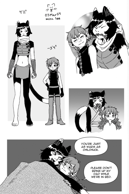
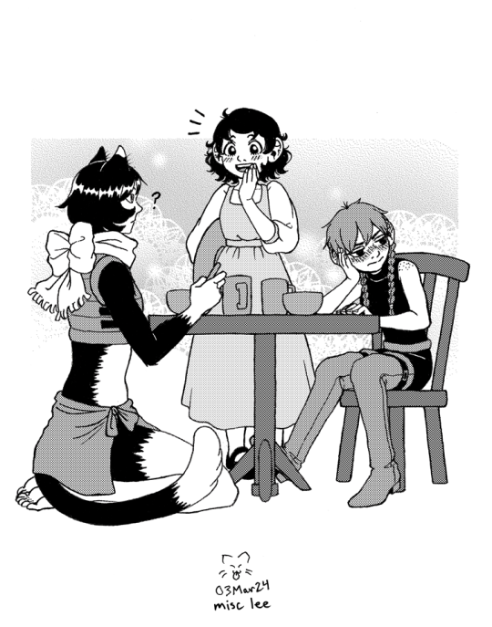
#izutsumei#dungeon meshi#delicious in dungeon#izutsumi#meijack chils#meijack#flertom chils#flertom#I imagine they started dating because Izutsumi was freeloading at Meijack's place and she just decided to stick around lmao#*proceeds to eat your hair*#my head-canon is Meijack's hair has Chilchuck's color but her mom's texture#so it ends up wavy/curly when out of braids#art#having more fun with screentones
14K notes
·
View notes
Text
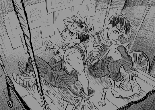
💜 Doppel & Glass 💜
Finally got round to doodling some of the Heartless crew again - been juggling some very intensive work and life stuff lately so it was therapeutic to get lost for a lil' while drawing this one. (Thanks again to everybody who voted in those polls a bit ago - The results were very interesting so I'm looking forward to drawing more of the most-voted characters sometime soon)
[DO NOT EDIT OR REPOST TO OTHER SITES / ACCOUNTS] ♻️reblogs are lovely tho!♻️
#artists on tumblr#abd illustrates#heartless#Doppel & Glass#Doppel#Glass#ik i already said so but those polls were very fun to see#and very unexpected in places!#startin' off what i hope will be a more-than-intermittent doodle series with the dark horse(s) comptetitors here lol#good for Doppel & Glass though they deserve a win#Doppel is the type to chomp on his tools when he needs his hands free or when hes thinking#Glass is the same but in less of a aggressive way and more of a nervous-thoughtful chew on his pencil kinda way#this was a very quick one so i have no idea how the screentones will looks at different resolutions sgdfksfs
2K notes
·
View notes
Text

the dog that weeps after it kills is no better than the dog that doesn't. my guilt will not purify me. (x)
#was going to call this a redesign but its not really i think i could make him more... dreadful next time ;)#i dont love the datv form... he looks like one of those raw chicken cats :/#dragon age#dragon age the veilguard#datv#solas dragon age#solas#dread wolf#fen harel#da fanart#min draws#please look at my lil guy for scale <3 hes having so much fun :)#first time using a screentone and also was trying to go for a linocut print style so that was fun !
528 notes
·
View notes
Text
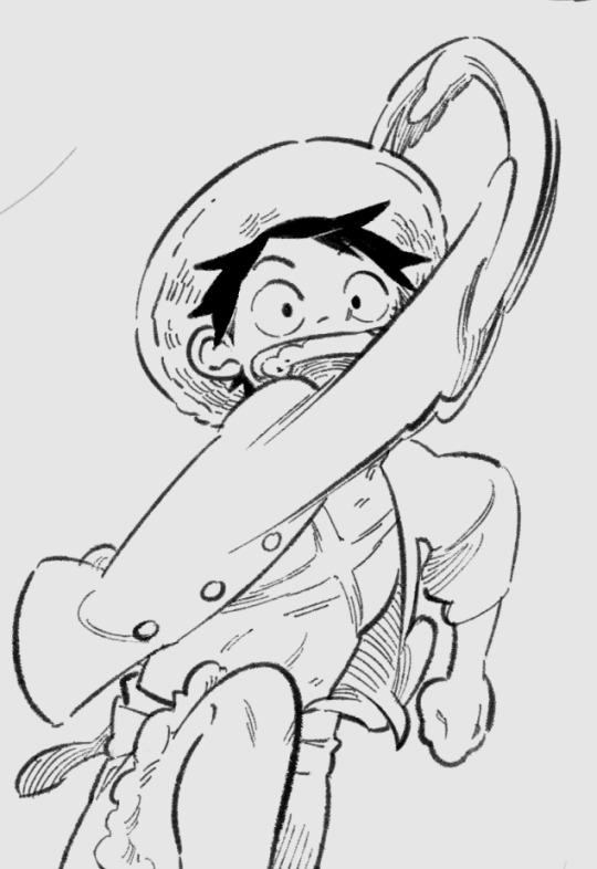
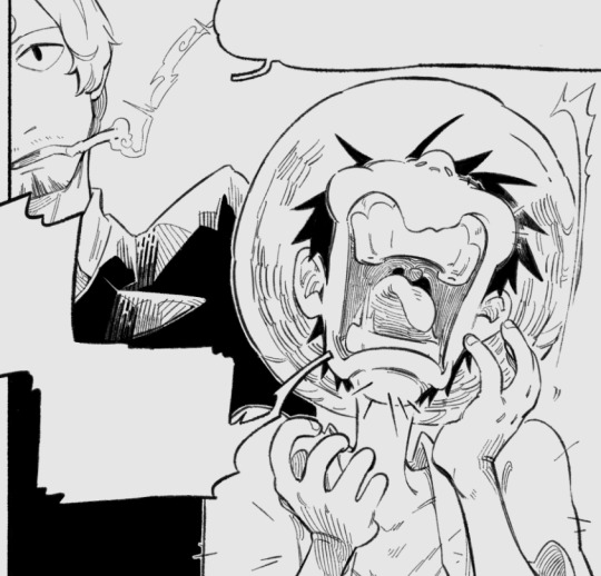
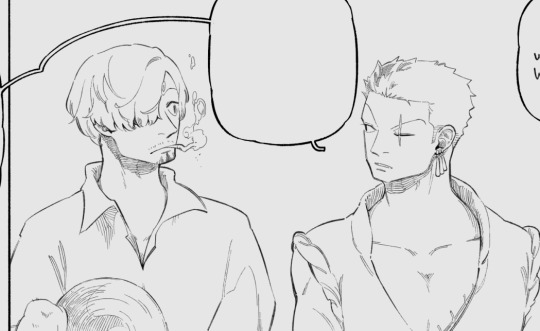
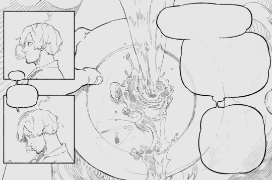
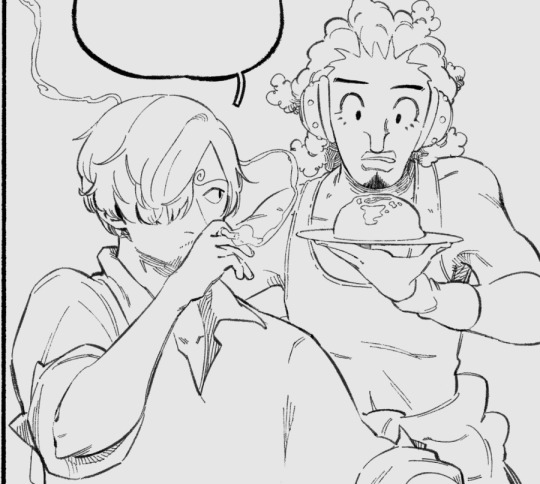
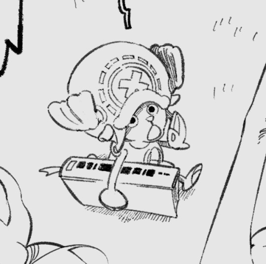
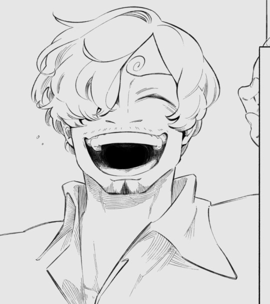
caps from comic Im doing
#not art yet. sorta#yeah that's one piece#outing myself this year as a sanji enjoyer#idk what compelled me to come back here (that's a lie I know 100% and it's haterism) but I did finally sit down and put down#this idea I've sat on for a Long time. bc I think I just. finally feel ready for it#or rather. both it and myself have been worn down and moulded enough by just. time passing. to be able to sit with each other in peace#but yeah I'm now neck deep in this (almost halfway thru inking!!) and Im learning a Lot#whatever u say abt one piece oda is a Phenomenal comic artist. one piece art-wise is dense on a level that makes me feel insane#like you barely see more than one type of screentone used and it's mostly to separate planes. its Just Ink. its fucked up#and drawing this comic is forcing me to show up on my a-game on a craft level as well. I love so much a Large part of it so far#comic is good guys. did u guys know that has anyone said this before#but yeah this one will! probably get posted to my main blog when the posting version is done. which is why I said in the prev ask#that the spheres might intersect soon lol#Im aware this is a stupid way to go about it if u look at it from a marketing/advertising angle. but thats not what Im here for#Im showing u cool bugs I made basically. and when the exhibit happens its gonna have mostly nothing to do with this#but yeah. if u see a comic with these caps in it in the future u will Know#otherwise we keep up kayfabe yeah? for fun. for comfort
65 notes
·
View notes
Text
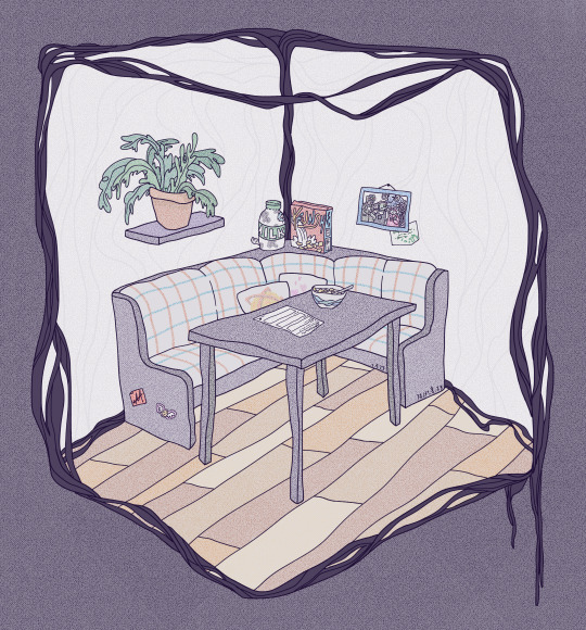
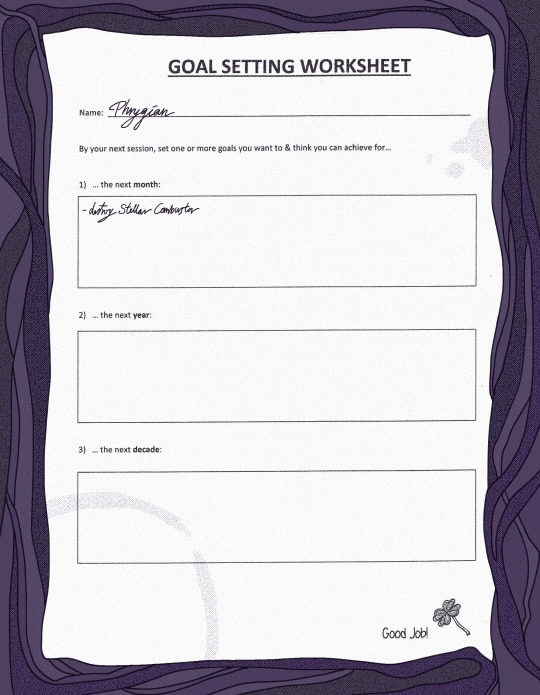
therapy, huh
#phrygian#palisade#friends at the table#fatt#rosa art#palisade 20#the worksheet. is also phrygian to be clear like i have to believe that a twilight mirage trained therapist would give out better material#than something i made in 10 minutes.#the branched....... the branched. branched concept of mental health care? who even knows. but it also has to be better.#and they definitly dont have worksheets. phrygian can make a bad one & then not really fill it out. it makes sense to me#i relistened to the therapy session to get the. timeframes saffron mentioned right and its like.wow this got even more depressing#in retrospect.#i tried really hard to make the worksheet look worse by scanning & printing & scanning it again but we JUST got a new printer at work#alas. it works too well.#btw can you tell im having fun with screentones? because i am.#its a nice solution for 'i dont want this in monotone but i ALSO dont want to color'#id in alt text#i hope its fine.#palisade spoilers#but from like 4 episodes ago.im just careful.#i havent listened to the new ep yet idk if ill get to it tomorrow?#MAN............... phrygian : (
348 notes
·
View notes
Text
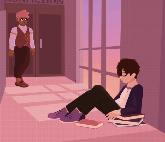
a friend who'd wait :)
#im posting this very late because i was sort of weary of how it came out and ended up messing w it until it was like 4am oops.#and i have plans tmrw so... oh well! i did my best and ill put it out while i can!#and i tried to make the scene match barnard's colors lol#finn's ocs#finn's art#i know i said id do more sillay stuff with the simpler screentone only style but i had a couple more of these in me#and this is the first piece im making thats like an actual part of the story too rather than just setting stuff for fun#i wanna write something to go with it too but for now ill just sort of briefly explain the context in the tags here:#barnard has a pretty bad case of OCD and his compulsions have made it difficult to make friends in the past#he was never outright bullied or anything but people just didnt really have the patience to deal with it#he has compulsions that include stuff like walking through doors until it feels right and needing things to be perfectly aligned#which in group settings has lead to people having to wait for him to finish his rituals and join them#they might find it tolerable at first but eventually they grow impatient and hes just... not invited to stuff anymore#but juno is a newer member of the guild who ends up frequenting the same library. hes also kinda a little weird#and they dont become fast friends or anything but just sort of naturally spend time in the same place#though they never plan meetups they eventually fall into a routine. around the same time theyd just both be at the library#and read next to each other. and maybe talk a bit. and eventually they end up walking back to the guildhall together#since theyre going to the same place after all. and juno always waits for barnard outside the door#eventually barnard asks if this bothers him. juno kinda just tells him 'of course it does' without any malice or anything. just a statement#barnard is surprised and apologizes and juno says not to. but the next day juno doesnt show up at the usual time.#barnard assumes hes committed somekinda more by bringing it up. he ends up staying there late reading to get his mind off it & not ruminate#but when he leaves juno is in fact still waiting for him down the hall (see pic) having collected a bunch of books literally abt ocd#he fell asleep bc barnard stayed later than expected. and hes an eepy guy generally. and also one very bad at expressing himself#but now barnard gets that juno's 'of course it [bothers me]' had the implication of 'but its worth it' which no friend has previously done.#and from the interaction juno was also able to understand that this isn't something barnard just does for the hell of it so. he studies.#and checks a bunch of stuff out because he thinks it could help his friend too (theres ocd workbooks and such- i remember working w them)#and thats the point where they became more ''friends'' than ''pleasant library acquaintances''#from there on they also do get into juno's problems. whole other bag of worms. but this specific scene is more about bernard from his pov#sorry about when i said briefly explain. i lied </3#but compared to the whole sequence im picturing its brief so shhh
25 notes
·
View notes
Text

Pg. 184!
Thank you wind, that would have lasted for hours!
24 notes
·
View notes
Note
Good afternoon, I have a couple of ideas if you're still looking for suggestions. If you're not averse to adding to the ocean that is the Temenos fandom, it would be nice to see him interacting with Partitio. They seem like they would be fun together [either platonic or romantic]. If you are averse to said flood then Caits. Caits are fun and adorable. Thank you for considering.

Why let Castti have all the fun in bullying our favorite merchant hehe
I'm always up for drawing Temmy, he's my favorite as well ;D
If you want to send in a request, please read here
#octopath traveler 2#octopath traveler#temenos mistral#partitio yellowil#Didn't have the energy to do more than a sketch haha#I should do more stuff with medibang's screentones lol#sorry parti you're fun to tease#Kelbunn's art
44 notes
·
View notes
Text
Art style breakdown /tutorial(??)

Some friends asked so here we go : disclaimer im bad at explaining (so feel free to send an ask or smth)
Final art (long read so theres a timelapse at the end)


If its not for something important (commissions), i dont usually make a lineart for a drawing but just clean up the sketch , it wont be used anyway

I usually separate them by colors , mostly so i can Alpha lock them and not worry about coloring over parts
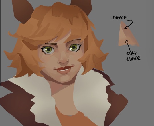
When coloring i use a soft airbrush to have gradients within the shading , so its not one solid color . How i shade is very blocky , lots of triangles lol (if im using CSP i love using the lasso fill tool ) but there are parts especially in the skin where I keep it smooth and blended, usually nose and cheek area . Using an asaro head is usually a good start to learning how to shade faces with planes in mind

Depends on the character, but I like adding shadows on the lashes/brows itself , make it look solid and 3d , it makes the eyes pop more imo

Using multiply layer to make the shadows darker for more contrast
At some point I’d merge everything together so i can just paint in one layer, easier to fix things with liquify too ; if im in CSP i keep the separate layers in one folder just in case i need em later but i cant really do that in Procreate cos of layer limits

This is the part where i make the shading more painterly .,To make the shading look sharper , i like adding lines on the edges .
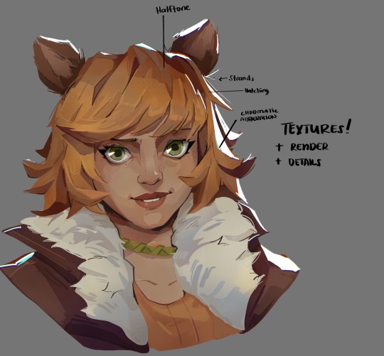
The fun part : adding the ✨
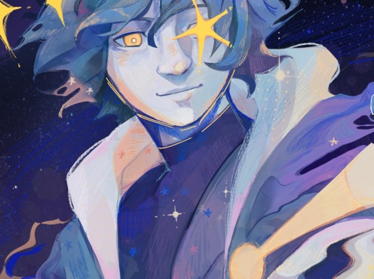
This is the part where I add textures , either from texture images or with screentone/hatching brushes. This is also around the part where i add the character’s accessories and stuff like scars and freckles (its just easier to add smaller things near the end than having them accidentally painted over at the start)
Whenever I feel like the drawing looks too much of a similar shade / temperature , I use a gradient map+layer effects (masked) on parts to give it variety . Technically you can do this by just having a layer effect on and manually adding colors but gradient maps make me go “ooooh didnt think of that color there “
CSP also has a posterization filter that i like using when i feel like some part looks too smooth to me.
I sometimes add in sketchy lines , and seeing how cool it looks in Marvel Rivals art ive been adding it more lol
Artists that influenced me are : Nesskain, Toni Infante , Valorant’s 2d art(their main artist is Suke) ,Arcane , Spiderverse and the most recent one ive been obsessing over is Marvel Rivals ( its got everything i want my art to be when it grows older lmao )
543 notes
·
View notes
Text
Interview to celebrate the opening of the Ryoko Kui Exhibition
About Delicious in Dungeon: Story making
Q1. Your first long-running series has lasted for about 9 and a half years. Has it been different from your previous experience drawing short stories?
A1. Compared to short stories, the series has been easier because the same characters appear each time. But I was surprised to find that I got tired of drawing the same characters too many times.
Q2. You have said before that the overall structure of the story was decided before serialization began, but how much of that had you communicated to your editor? Also, what kind of communication did you have during the series production?
A2. The goal was something we discussed and had decided on from the beginning. The goal itself was simple, but the path to get there was more difficult and took longer than imagined.
Q3. Regarding the overall story concept and development, did you write out or put anything down in writing (such as the plot)?
A3. I did, but it was simple.
Q4. Did you come up with the dishes based on the monsters you wanted in the story? Or did you come up with the monsters based on the dishes?
A4. It depended on the story, but usually the story came first followed by the monsters or food. I feel like that was most often the order.
Q5. As you progressed in drawing the series, what elements of the characters, story, or world expanded or grew in the most unexpected way?
A5. Nothing particularly unexpected perhaps. When I used to draw web manga, I tended to think up inconsequential settings. So, from the beginning I tried to restrain myself as much as possible and not expand too much. I was surprised when my editor said "Let's expand it more," in the second half of the series.
Q6. "Delicious in Dungeon" starts with a relatively simple setting, but as the series and the labyrinth exploration continues, the map slowly expands little by little in the readers' minds. It becomes more three-dimensional, revealing the secrets of the world, and taking on a multilayered structure. Are there any sources that you used as a reference, or which influenced you in creating this multilayered structure?
A6. A long time ago, when I was working on my personal web manga (fantasy), I drew it however I wanted, thinking that "Only people who can read this will read it," but I regularly received feedback that it was "unreadable", so I tried to make it as easily. accessible as possible.
Q7. The series combines many elements, including "fantasy", "gourmet", "battles", and "puzzle solving", but I think it's also important that it is a "comedy" which makes people laugh. Could you let us know if you have a creative commitment towards depicting humor?
A7. My hopes are that I can make it fun for people to read.
[page 5]
About Delicious in Dungeon: Drawing manga
Q1. Please tell us about the drawing tools you currently use, both digital and analogue.
A1. In terms of analogue tools, I use a light box, a G pen, a round pen, and a brush pen. And for digital, I use CLIP STUDIO PAINT and a Wacom LCD tablet. Screentone pasting is always done on the computer, so ultimately it all ends up as a digital manuscript.
Q2. Do you have any rules or reasons for using digital and analog separately?
A2. I'm always looking for ways to draw better and save time, so the exact approach is probably different for almost every chapter. Personally, I feel that analogue methods create more appealing lines, but I feel like digital saves time, so maybe I'll do a digital rough sketch and do the inking by hand… I might have been using a G pen, and maybe I'll try out a turnip pen, or this time I'm short on time so I'll draw it entirely digitally, but with digital I can redo it over and over, so maybe analogue is still faster, and so on and so forth. I'm indecisive in this way and so haven't developed a consistent process.
Q3. I understand that you prepare 3D data for your assistants to draw the backgrounds. What kind of data did you make for "Delicious in Dungeon" ?
A3. You could call it 3D, but it's not a proper model, just something to help with the rough sketching. I line up cubes to share the perspective and sense of scale, and they use it as a reference.
Q4. At the beginning of the series, the characters and backgrounds were somewhat simply drawn, and it seems like they became richly detailed over the progression of the story. What was your intention behind using these different styles?
A4. It's simply that my technique isn't stable. I thought I'd put a lot of effort in at the start. I remember being confused when my editor asked me to add more in to the drawing, and I wondered "Where…?"
Q5. Thinking about the food, were there any menu illustrations that you were particularly satisfied with, or which you struggled with?
A5. I've never liked my own food illustrations. But the times when I read other people's manga and thought "That looks delicious," I think it's been more an influence of the movement, the staging, and the situation than the drawings.
Q6. For the world maps and the terrain of each continent, did you refer to any maps of the real world? I feel like the shape of the 'island' is similar to the shape of Fukuoka Prefecture or Kyushu.
A6. I didn't reference any specific geography, but I did try to put thought into things like whether a developed city would be near a river or the sea, and what the coastline would look like. I'm pleased if it feels similar to a real place, because it means my interpretation was pretty accurate.
About Delicious in Dungeon: Other
Q1. Which is your favorite monster?
A1. Nightmare.
Q2. I'm sure you have received a lot of feedback from readers in countries and regions outside of Japan. Please tell us if there was anything from them that made you happy, was unexpected, or which made a lasting impression on you.
A2. When you play foreign games, there are times when you think "Why did they translate it into Japanese like that?" But having been on the side of having something translated, I've realized some things are unavoidable, or endless, and there are many things that don't matter either way from the author's perspective, so it was interesting.
About Ryoko Kui's short story collections and herself
Q1. Dragons are a consistent and important motif in your work. Was there any particular work or experience which inspired this? Also, are there points about drawing dragons which you find interesting or have had to work hard on?
A1. It's less about liking dragons, and more that I'm interested in the worlds in which dragons exist. When I draw dragons, the depiction in itself has a sweet feeling to it. I have never had a pet reptile, so I don't have a very good understanding of them.
Q2. Unomiya University in your story "The dragon's school is on top of the mountain" has a Faculty of Dragons, Department of Environmental Studies, and Department of Technology Studies, and a Faculty of Veterinary Medicine. If you were to enroll in the university, which department or faculty would you like to enter?
A2. I probably wouldn't be accepted….
Q3. The collection includes a short story staged as an essay manga. Are you a fan of essay manga? Please tell us about any genres of essay manga that you like.
A3. I love all kinds of essay manga. I read them often.
Q4. If you were to make your own game, what kind of game would you like to make?
A4. I prefer being a player when it comes to games.
Q5. When did you first start drawing illustrations (doodles)?
A5. I don't exactly remember when I first drew a picture, but I think I started drawing manga around the fourth or fifth grade of elementary school. in my notebooks and had my friends read them.
Q6. What is the most fun part about drawing manga?
A6. Every part is fun and hard in its own way.
Q7. Please tell us if there is anything you "just can't stop no matter what".
A7. My procrastination habit.
Q8. Could you please tell us if there's something you want to draw now?
A8. I've been working continuously since the serialization, so I'd like to take about 2 to 3 months to just draw whatever I want.
#Dungeon Meshi#qna#Ryoko Kui#longpost#long post#ryoko kui exhibition#delicious in dungeon exhibition#interview#delicious in dungeon#dunmeshi#exhibition
280 notes
·
View notes
Text


What is this, a crossover episode?
Here are the ink scans without the screentones cause I feel like I went kinda ham with them ahskds
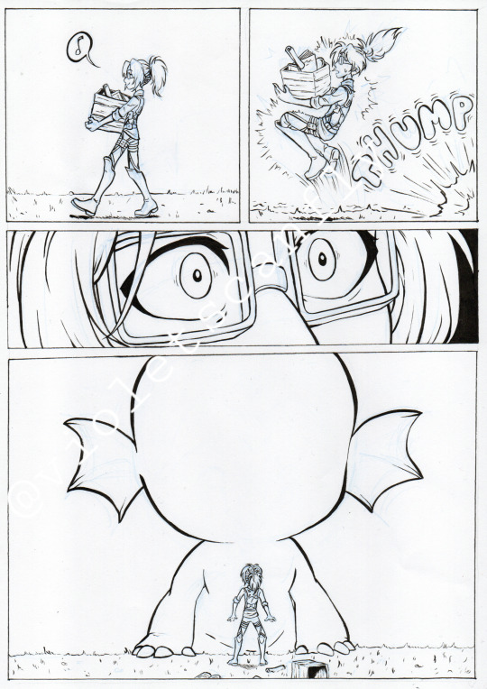
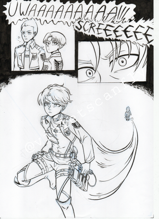
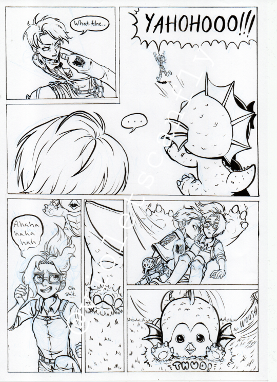
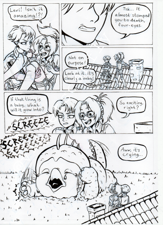
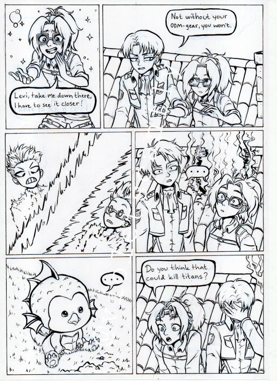
I actually drew these way back in september but I never posted it cause it was originally supposed to have two more pages... Oh well, I think it's still fun like this and they wouldn't have added much aside from a joke about Erwin finding out Hange secretly used a LOT of the scouts' budget to feed Emi XD
Emi is such a cutie but also very hard to make cute in 2D form, at least for me, but I tried. After seeing Ultraman Rising for the first time my aot brainrot immediately went like "ooh big creature? Hange would love!" and then I committed weirdly hard to the bit only to not post it lmaooo
Also don't ask me where this is on the aot timeline or how Emi got here skdkfksk
#this has been haunting my aot drawing folder for too long#i also wasn't super happy with the speech bubbles but too lazy to fix them digitally lmao it is what it is#but I am pretty proud of myself for inking five whole pages traditionally cause I haven't done that since like 2021#I did have a pic of some of the sketches too but the picture limit is kicking my ass#attack on titan#shingeki no kyojin#ultraman rising#hange zoe#hanji zoe#levi ackerman#levihan#aot fanart#comic#fan comic#hange zoe fanart#levi ackerman fanart#emi ultraman#artists on tumblr#violetscanfly#also I have to add this to the tags cause I forgot but my friend said Hange would dissect Emi if they crossed paths and I'm-#I mean... maybe? XDDD For science#but fr I don't think they'd want to kill her if it wasn't strictly necessary
92 notes
·
View notes
Text
i keep the warmest truth.
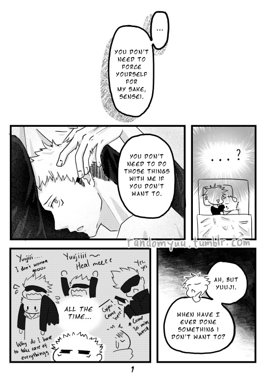
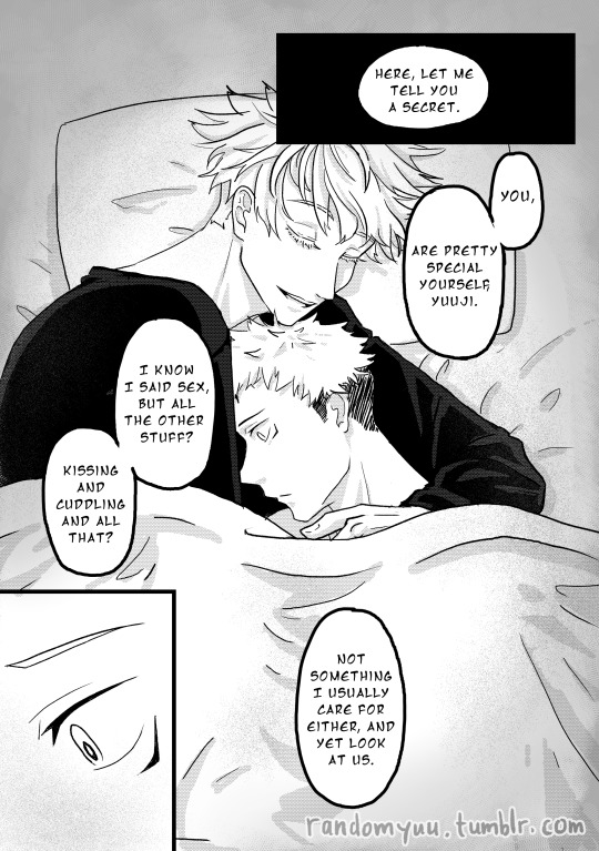
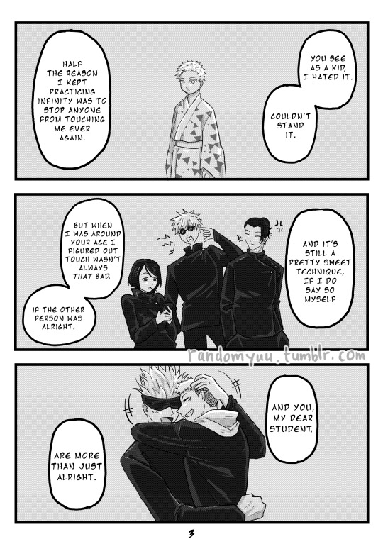
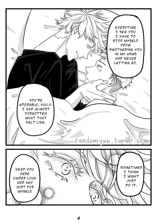
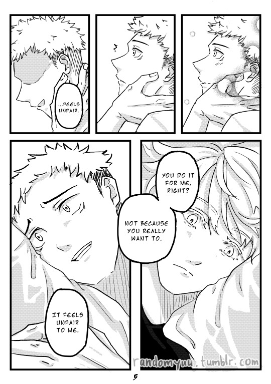
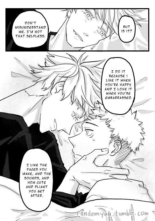
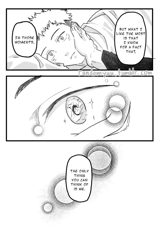
Well you look at that. Another comic hahahaha why did I do this to myself—
But I do enjoy drawing this comic! It was a different kind of challenge, where this one focuses a lot on close-ups, so I need to learn about the subtlety of expressions. Can’t say I learn a lot (I use lots of copy-pasting of the same position lmao), but I still learn... something!
This beautiful one-shot fic is titled i keep the warmest truth by Dehawny. If I have to summarise the fic, it’s basically Ace!Gojou and Adorable!Yuuji. It's more like gray ace but better keep the “A” going, haha. And as usual, the fic is NSFW, so please do read the tags before you decide to give it a read.
Ace!Gojou is something I don’t know I need. I think I love almost every kind of Gojou headcanons, but Ace!Gojou holds a special place in my heart. I could be biased as someone in the ace spectrum, but the way Dehawny wrote Gojou and Yuuji’s interaction is truly heartwarming. And also a bit possessive, but I wouldn’t have it any other way. Possessive Gojou is my jam.
And Yuuji. Oh, dear lord where do I even start with this boy. I don’t have enough vocabularies to express how much I adore Yuuji. Him being his horny teen-self and constantly worrying about making the pleasure mutual is too much for my heart. And he’s still understanding of Gojou’s sexuality. Yuuji is kind, like that. Don’t mind me as I’m crying out happy tears in the corner.
Alrighty, below are my thoughts as I drew this, as usual haha:
After I got a taste with comic-making from my previous GoYuu comic, this one is a bit easier to plan once I narrowed down the scene I want to draw. I wanted the comic to start with Gojou positioning himself and Yuuji in the futon, bringing up Yuuji’s question weeks ago, but that means I have to draw 10+ pages and I was like, “haha nope”. I still love my hands, thank you very much. So I start with Yuuji’s reaction after Gojou explains a bit about his sexuality.
Panelling is still a struggle. In a way that I still feel that the layout can be improved, but I can’t for the life of me figured out what needs to be improved. I guess this kind of thing will come eventually, but not now.
During the sketching, I must say I got super hyped drawing Gojou’s eyes. That eye close-up? I really want to try making it as ethereal as possible in an achromatic setting. It’s intimidating, don’t get me wrong, but I have always loved drawing eyes since I was a kid and this is a fun thing to test my love for eyes.
If I have to complain… it would be the intimate position of them laying on the futon. I never really try drawing “couple-like” positions before, but it was really hard! Like, holy shit, can you guys stop being so awkward looking? Where the hell did I draw it wrong??? Thankfully references have helped me a lot with positioning.
The line art took sooo much time because I realise I want to make Gojou and Yuuji more… buff (kinda) so I need to re-sketch a bit :(( but the result is better than the previous one, so I’ll take what I can get haha. And I start to really like using screentones for shading—once I properly learn how to do manga layout, I think I might fall in love with drawing mangas!
But overall, this is a fun process to do, and I hope you enjoy the comic and this rambling of mine! :D
#Yuu's art#jjk-fic-fanart#jjk-ship#jjk ship#五悠#goyuu#goyu#5u#gojou x yuuji#gojo x yuji#gojo x itadori#tumblr's UI changed quite a bit huh#I hope there's no problem with the uploaded images
703 notes
·
View notes
Text


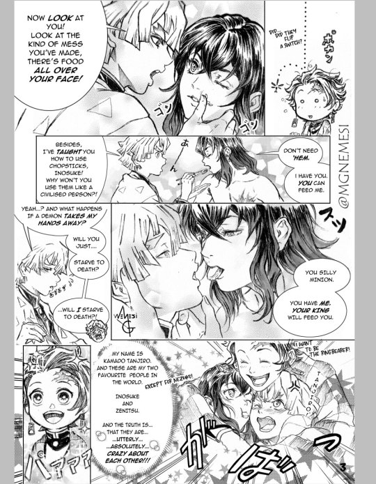
This took me FOREVER, and I might've... exaggerated a bit (with the mood, with Zenitsu's sudden unexplainable fear for his hands, to the amount to sfx, dialogue, screentones...), but I feel like I'm improving as I go, and it was fun, so I'm happy with myself ♥
I still don't have a set style/definite/immediately recognizable way to draw Inosuke and Zenitsu, and I've been experimenting with different ways to ink Inosuke's hair. I don't know if I like this version more, please let me know your preference if you can. :D
This is a response to the 120th prompt on the 週刊伊善 weekly inozen Twitter Account 「かまど炭じろうから見たふたり」. Thank you @inozen2020 for planting this seed into my brain ♥.
There's an almost kiss there, but I don't think it merits the r-18 tag. Please do let me know, though.
Once more, this is a western-style doujinshi, so please read it from left →to→ right. Thank you. available on both Pixiv and Twitter if you prefer those platforms ♥ Also will post it shortly on my FB.
#inozen#inosuke x zenitsu#zenitsu x inosuke#doujinshi#nemeart#inosuke hashibira#zenitsu agatsuma#tanjiro kamado#週刊伊善#伊善#善伊#weekly izen#kny fanart
232 notes
·
View notes
Text
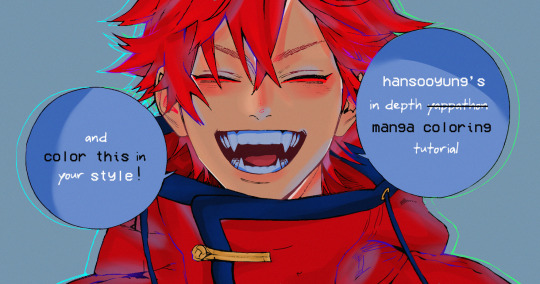
hansooyung's coloring tutorial & ctiys: alma time! 🍒
hello everyone! though i've been meaning to for a while, i've finally gotten around to making my first manga coloring tutorial! i'll be going over cleaning panels and screentones, choosing base colors, and finally shading and lighting.
this will also be a color this in your style challenge, so if you're willing, feel free to post your colored panel and tag me in it!! i'd love to see all the results :)
find details under the cut! 🦋
DISCLAIMERS:
this is just how i personally color! i know for a fact that some of my other friends follow other methods and have such beautiful colorings <33
for colors specifically, i play around a LOT. if you don't like your color scheme for the time being, mess around with it! i don't use psds since i like to mess around by hand with color palettes, but maybe i'll look into it for the future.
i explain a lot just bear with me gang 🙏
TECHNICAL STUFF:
software: ibis paint x (on iphone). i use ibis since it is FREE for all phones and it worked on my chromebook as well.
while this tutorial is made for ibis paint x, everything works on other softwares except the brushes, which i've provided alternatives for below.
brushes: i will be using dip pen (hard) which is automatically included with ibis, and two other brushes i made myself which you can find here and here. for more brushes, @/bkdkdh was incredibly helpful and posted her awesome set here!
for other softwares, you can use similar brushes. dip pen (hard) can just be the default brush, while wet edges is just the default brush on lowered opacity (and more of a rectangle/marker shape?). watercolor pencil is a watercolor brush in the rectangle/marker shape as well. if you can't get the shape, you can always smudge your lines into shape as well, so don't fret too much! a bunch of people only use one brush for coloring everything (which is insane to me, personally, they are so talented!)
fun fact: the first brush listed that i made was originally called "aki tao watercolor smooth" 👍
ok here we go guys!!
STEP ONE: CLEANING THE PANEL
i think of this part as setting up the panel for coloring! usually it's pretty exhausting cuz it's all b&w but it's all worth it i swear. the panel i'll be coloring is this beautiful one of alma from chapter 2:
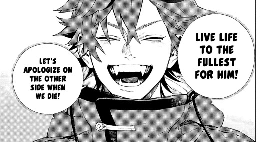
imgur link here (x)
a lot of people redraw their lines to avoid screentones, which is extremely helpful. however, i work on a phone and my fingers are not steady even with the stabilizer turned all the way up T~T. i do it this way, but a different (possibly easier) way may work for you!!!
your first step will be to remove all the white, giving us a transparent background to work with. THIS IS THE NUMBER ONE REASON WHY I USE IBIS PAINT X.
when you upload the image to ibis, a popup comes asking if you would like to "extract line drawing". this creates a lineart of your image. click yes, and your work is like 90% done.
if you're not on ibis, you can redraw your panel, put lineart layer on screen, etc. or you can just extract line drawing from ibis and upload to software of your choice
for those of you not on ibis, i've included the line drawing here (x) if it looks black, don't worry and set your background to white.
omg i was not kidding when i said i explained a lot. ok now onto the three main steps of cleaning the panel:
cleaning background
removing screentones
repainting black lines
for cleaning the background, we're going to clear off all the extraneous stuff. this includes the text in the speech bubble, the gradient screentones behind alma, and the panel line on the left side. just use your eraser tool and go crazy! (i forgot to save the panel at this point of the coloring OTL)
for removing screentones, we're going to remove all those "dots" that mangakas use for shading. these are used to show value for b&w art, but since we're coloring we don't need them—a lot of people have really cool ways of incorporating screentones in their colorings though, and it looks amazing! i used it on nana's hand in my bnha coloring.
remove the screentones from alma's hair and jacket with your eraser tool. this will take time, but it's worth it in the end!
for portions with a bunch of lines, you can create A NEW LAYER and redraw some of the lines. that way, you can erase indiscriminately from the original layer but the lines you drew are still there. again, like i said, my hand is really shaky so i don't do it a lot, but it's extremely helpful for smaller parts where i have control! i used this on alma's jacket, and here's a screenshot of the process:

(i made his jacket purple so i could distinguish between layers easily).
it should look like this when you're done:
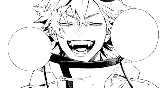
for the final step of cleaning, i like to erase all the things colored black (the collar and strings of the jacket, along with the back part of his hair). that way, i can color them in with dark colors and it adds to the whole look of the coloring.
i've circled the parts i'm going to erase below:

and it should look like this when you're done!
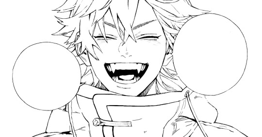
ok everyone cheer we're ready to color now!!!!
STEP TWO: BASE COLORS
CROWD CHEERS ok lets go!
this part is the most important to me, because it sets the tone for the whole coloring. i like to use three-four main colors in my colorings, and it's usually background, skintone, hair, and the secret fourth color. the secret fourth color is usually whatever color fits the character's vibe, or if the character's color is the bg, it'll be an accent color.
for example, with my nagi coloring, i used white for the hair, i had my skintone, i had blue as the main coloring vibe (as nagi's color), and black as the accent color.
for alma, i chose his main color to be red! it's the color of his hair and his jacket, so i wanted it to be vibrant and stand out. since blue contrasts red, i went for a greyish-blue shade for the background. (i went for grey rather than solely blue because then it would clash rather than complement).
disclaimer please please please take your device off night mode warm mode f.lux whatever you have. this has screwed me over more times than you may think :(
i like to make my vibrant colors closer to the right end of the color square. for alma's hair, i chose this color:

i dragged it down from the corner a bit but kept the saturation since his hair is kind of dark. we can use vibrant colors to shade it though, so don't worry!
here's his hair and the background together:
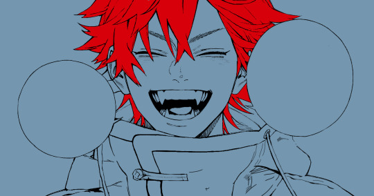
now from here, play around with skintones until you find one that matches the hair!
i usually drag around the wheel to the orange-red intersection, and have it on the lighter, more saturated side. here's the color i chose for alma's skintone.
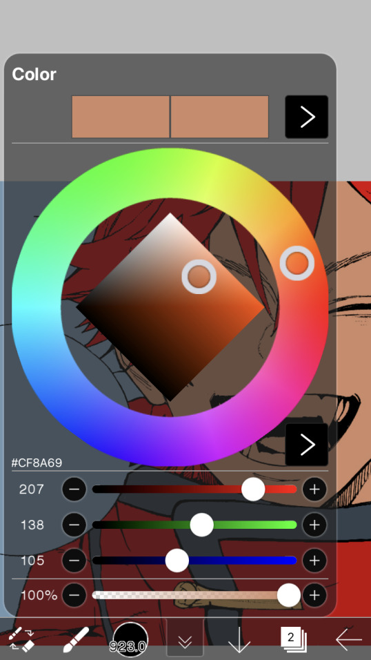
i thought his original skintone looked a bit too orange, so i pulled the saturation back a little bit (moved closer to the left side of the square).
after that, color in his jacket with a bit darker red than hair, choose a gold color for the accents on his jacket, and color in the black parts with a grey-ish color (we will change that later).
here's the base colors!
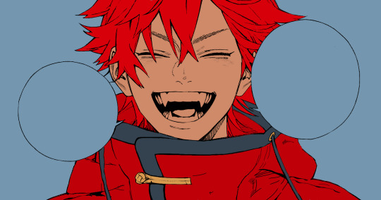
if it looks a bit bright, don't worry! we can change that with shading. or you might just have to. accept the light.
STEP THREE: SHADING AND LIGHTING
wooo we made it!!!!!!! ok now i lied, we have a bit more of base colors to go. on a layer above the skin, color in your teeth and tongue. for pieces that have a more red feel (like this one), i like to make the teeth and the shading a more vibrant blue color. (for blue pieces, i make it a purple!).
IMPORTANT NOTE: ALL SHADING AND ALL COLORS SHOULD BE DONE ON NEW, CLIPPED LAYER.

i'll then go in and do some light shading with my wet edges brush. i'll use a darker color for hard shadows and then a lighter, more vibrant color to accentuate it.
next up we have blush! a lot of people do this in very different ways but i like to do it directly under the eyes, in a vibrant red shade. make a new layer above the skin and clip it on. color pick alma's hair and drag it to the most saturated shade (red corner). then using the watercolor pencil brush, lower the opacity of the brush and drag a line under the eyes on both sides.
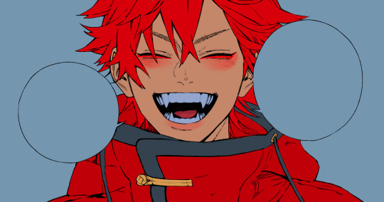
make sure to erase the portion of blush that goes above the eyeline. i also added some lips for alma as you can see, and then added a red line under the eyes! this was back to the regular dip pen (hard) brush on 100% opacity. it may take a few tries to get your blush to the way you want it, so don't worry too much.
now we can start our actual shading!
i break this part up into three steps: skin shading, blue shading, and light shading (highlights?)
for all of them, think about where the light is falling and how it will look on alma.
quick interlude about brushes: i use the watercolor pencil brush for softer, bouncy looks (like blush and noses) and i use the wet edges brush for more hard lines in shading.
again, make a new layer above the skin and clip it on. (i like to have it below the blush, so it doesn't cover it). for skin shading, i take the vibrant red and lower the opacity of the wet edges brush by a significant amount (specifics don't really matter, as long as you're happy with it). i'll trace his neck, from the shadow of his face, shadows of his hair falling on his face, ears, and nose. (for the nose i used the watercolor pencil brush for a softer look).

this is what i have once i'm done!
next we have skin shading part two, where we basically make a new layer on top of our first shading, lower the opacity further, and trace outside whatever we just did to blend it in more.

i used the watercolor pencil brush since it's more softer shading meant for blending! i also added it around the eyebrows for depth.
next up we have our blue shading! this is a technique that i learned from @/bkdkdh's colorings, but adding blue as a shadow really adds to the whole coloring. using the watercolor pencil brush, select a light-ish blue shade (a bit more saturated than background color) and use it to shadow a few more areas than your skin shading. i always make sure to hit the underside of the nose, cuz i think it adds depth!
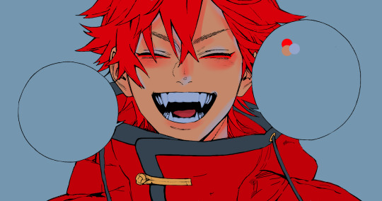
finally, to wrap up our skin shading we have our lights. i use an orange-ish yellow color, which i set pretty light to not blend into the skin. using the watercolor pencil brush, i'll basically highlight any areas opposite to where the blue was, and highlight different parts. i always highlight one side of the nose as well.
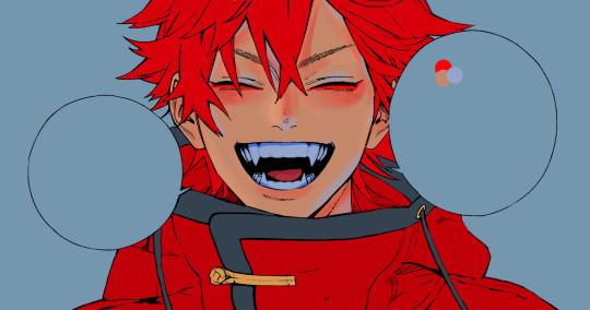
i erased the line around the nose since we now have shading there, and added a darker shade to the teeth since i felt it wasn't shaded enough.
now onto the hair!!! (guys we're almost done bear with me, skin and hair are the two main things and then you can half-ass the clothes)
color pick alma's hair color, then drag the red a bit further down to get a darker yet still saturated color. here's mine:

then, using the wet edges brush, draw lines of shadow wherever clumps of his hair fall or overlap with each other. you can have the opacity set to whatever level you want, i just went with around 90. just try to follow the natural lines and patterns of the original line drawing, and everything should work out fine.

here's how mine looks! then, just like we did for skin shading, place a layer on top and lower the opacity to around 50%. place some more shading to blend it in. you can also shade more parts with this shade for some softer shading. i actually forgot to take a screenshot of this step but you'll see it in the next one!
for our (almost) last part of hair shading, take a layer and place it below both of your shading layers. this is going to be our highlight layer! you can see it below, labeled 49%.

remember how we set alma's hair a bit darker from the corner color? now select that corner color and draw highlights in the center of each hair clump.

lightly visible but it's there!
now here i skipped around a bit bc i was having fun and forgot i was doing a tutorial, but repeat the shading (not highlighting) steps with darker colors for alma's jacket. you should have your base layer, a dark shading, and a softer shading for blending.
we're almost there guys!!!
for the pretty much final step of shading, select a light blue color and do some blue shading with the watercolor pencil brush opposite to wherever your darker shading falls (just like we did on the face). make sure to do it to both your hair and your jacket! here's mine:
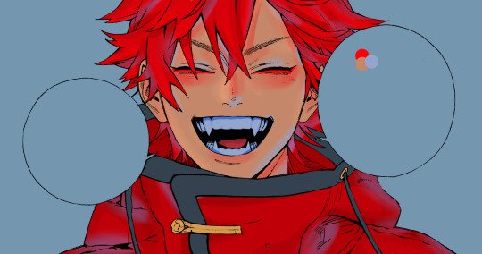
now for the black portions, we're going to color the whole thing in a dark blue color. just alpha lock your layer and make a big stroke of dark blue, almost black. for our black shading, we're actually going to go lighter.
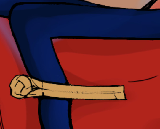
select a lighter (but still dark) color and place highlights on the base layer, then take an even more vibrant, lighter blue and place it on the very outside for highlights. a better example of this would be nagi's legs in his blue lock uniform here. then, choose a shade to apply shading to the gold accents on alma's jacket and we're done!
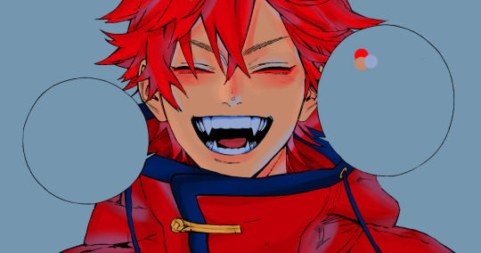
CROWD CHEERS!!!!!
STEP FOUR: FINISHING TOUCHES

we made it guys!!!! for finishing touches, i'll usually do background effects or text or that kind of stuff.
step one is coloring your lines. you can add a new layer and clip it to your lineart, or simply alpha lock your lineart and color directly on top. for hair i like to add vibrant blue/purple lines, along with a few red ones. for skin lines i try to do dark brownish purples, but leaving some black is good too bc it adds flavor!
i colored in the text boxes and added shadows using the wet edge feature, then added some text. for the glitch effect, i duplicated the lineart, dragged the layer below all of my colors (including speech bubbles) and then used the glitch effect with height full from ibis. if you don't have ibis, you can look into features on your software, or you can also just drag your lineart layer a bit to either side and color it in. i also applied just the tiniest bit of noise on top of everything
and there we go!!!!! we made it to the end :)
if you've read all the way til here, thank you so much! if you decide to color this panel of alma (or any other panels!) don't be afraid to post them and tag me for a color this in your style type of thing! (you can also put it in my tracked tag, #user.roy) i'd love to see everyone's works :)
here's the full timelapse: (it stalls for a bit at some times but hey we can't have everything)
#roy colors#tutorials#manga coloring tutorial#useraki#usergojoana#usermica#usernikiforova#tagging some friends <3#alma#gokurakugai
100 notes
·
View notes
Text
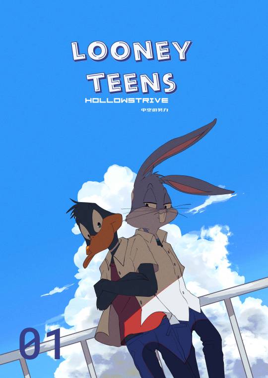
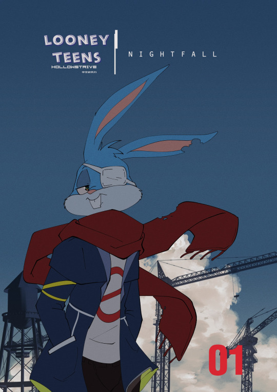

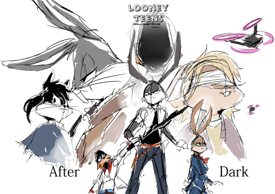
DISCLAIMER:this all are a fiction works and not any of em based on real deals,i use other pop cultures fictional medias as references so...maybe a little bit talk about this kinda...random au that i made yeah all of em are connected each others and also an expansion lore of my other LT AU:divided horizon and yes the main characters are....different in each of em,and also they kinda...have different stuffs to dealt with and to solve,and each shits that happened onto them was caused by different factors like bugs's problems was caused by his encounter with cecil which made him become aliven't,ace dealt with losing both of his parents,and other shits,yakko and his insecurities beneath his fun and easy going attitude and buster with...a lot of terrifying shits happened to him which i refuse to elaborate more because...graphics so yeah ....angst here n there lmao but yeah don't worry,every stage of grieves has redemption arcs and solving problem times and they eventually would got it somewhere in the middle of their stories
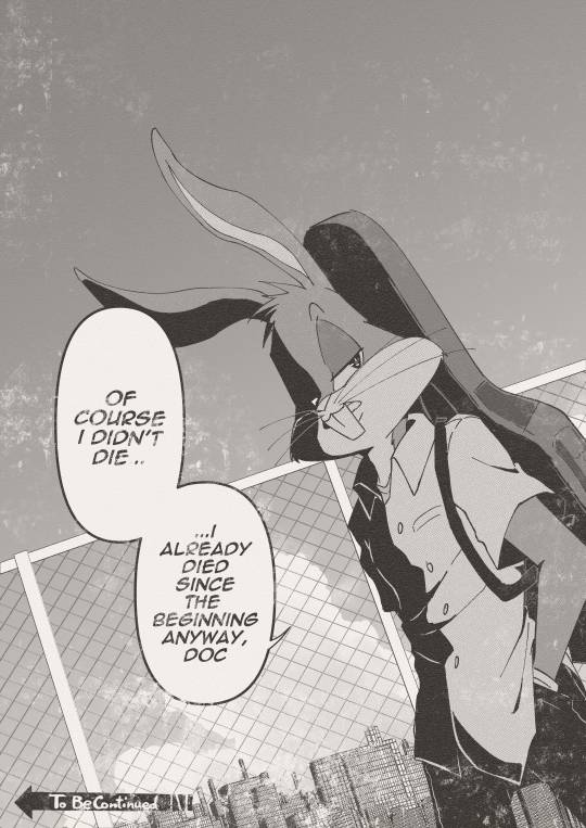
also a test page of the first arc because....i need to dealt wit moires on the screentone oTL
#fanart#my artwork#bugs bunny#daffy duck#looney tunes#baffy#buster bunny#ace bunny#lola bunny#penelope pussycat#lexi bunny#danger duck#the warner siblings#dodles#wip#alternate universe#rambles#moar angst#angst
253 notes
·
View notes
Text
My Creative Process.(W/o the thinking.)
I do not have a very stable and consistent creative process, but I will try to explain the general things I can see from all the artworks I have made.
References for this post V


---
Ignoring my inconsistent artstyle, I start off by picking a pose and use it as a starting point.(Note: This is very unreliable, I have deleted way too many W.I.P's just because of this.)
In picking a pose, I choose between two things: Search through Pinterest or making up a pose using my imagination. (First image were poses mushed from Pinterest and the second image was entirely by me ditching it and trusting the process.)
I've recently been starting to make more grounded and "fun" illustrations like the characters-inside-these-boxes and things, so while I do the poses, I sometimes make the "composition" as well.
The first image was me using the sketches themselves as for the final piece, the second image was me doing the lineart, so yes, that explains the absurd amount of artstyles I have, because even when I choose one from both, the brushes also changes the way I draw characters. Strange, am I right?
I use color palettes sometimes if I have the chance(I used one in both our ref), but if I get too tired, bored, insane, etc. I just ditch it.
(Never ditch it, you can literally see it between the differences of my illustrations on whether I use a color palette or not💀.)
Is there more to add here?
...
Oh!
I used screentones! Lolz. Here's the ones I used from the two piece:


I like the Japanese texts, why? Because I vibe with them. (I listen to J-pop in a concerning amount of time).
---
Again, not very reliable, not very good, but that's the fun part! Show me YOUR creative process and let's have fun together:).
#ADA#arthur talks#my rambles#sbg#school bus graveyard#school bus graveyard webtoon#ben clark#taylor hernandez#how to#creative process#illustration#digital drawing#drawing#digital illustration#art#art work#digital art#screen tones
14 notes
·
View notes