#has a lot more details than i thought but i think this showcases my personality pretty well! probably? <3< /div>
Explore tagged Tumblr posts
Text
Hi!!!! ʕ •̀ o •́ ʔ
welcome to my pinned post I honestly still dont know what to do with my blog like ever but still :) nice stuff. This blog contains whatever the fuck I reblog, including fandom and 18+ stuff - I do not tag my porn reblogs so if you're following me for fandom things, this is an all in one blog bc i do what i want <3 you are warned! leave if you dislike my beloved freak blog
|・ω・)
just be nice and kind babygirls, that's all i ask of <3 human decency lets go!!!! (ღ˘⌣˘ღ)
my ao3 account is https://archiveofourown.org/users/Daimashiko :) I like writing porn, my brain is constantly on khr mode :) I also never have any consistent name for my accounts, so thats also why my names are different. Hi to any discord friends who know me from well, discord <3 im sure u guys are familiar with my socials in this case
TAGS. ─=≡Σ((( つ><)つ /(>×<)\
#my art (very self explanatory I am not a creative person with names?? sorryyyyy - i also considered making my art tag into artvidaraku but like. thats too much effort jklsjgkldKJDF:SJ:JKL:JK:LDG ;;)
#khr (that is my main fandom ofc <333 - overlaps with my art but also other people's khr stuff so haha... its a mess but oh well)
#poll (i like answering them! or just reblogging polls i wanted to volunteer in but its too late </3)
#lotta tags (i tend to comment a lot in tags but these are the ones where i usually write like. a lot of commentary to the point im like ohhhh i should tag this right? curious if anyone's ever went through them but also i've never talked abt these things so. oopsssss <3 - lot of it is kinda sad / depressing but usually i am pretty reflective. kinda?)
#animals (self explanatory. i love me some fucking creatures. respect nature babygirls i adore them fellas <3)
#tumblr classic (i love getting to see the classics / things i'd personally consider a classic on my feed)
#fandom (this one's pretty commonly used! yadda yadda, talks abt fanfic and stuff / sometimes i get disappointed with fandom but that's not new lol)
#fashion (i don't use this as much as I should be?? but if you want to check out what i think is fun / a vibe <3)
#avidarecs (****i literally just made this on impulse so there's not much rn but i want to share more of my recs for things in general! fandom / songs / whatever other thing comes to mind?***// will probably be rarely used? but you never know~)
there might be more tags I haven't included but from the top of my head this is it?? Might add more, i have no clue. But anyways back to my other interests and what I'm into!
media i like: khr (its number one bc i am unable to pry reborn's hands on my stupid silly little soul so i cannot escape even if i wanted to), slay the princess + scarlet hollow (games made by the same studio. i love the art and vibes sooo much and also the fanart is sooo beautiful), Jenna Marbles (i've been obsessed w her stuff recently and I hope she's having a good time w her dogs and Julien :), kpop (honestly its only just loona bc im tired and feel old as fuck despite only being in my 20s so i am not gonna get into another thing lol), and sanrio!!! i love my melody she's a cutie patootie <3
-probably more stuff I like but this post would be a lot longer
I'm certain its obvious but I am a proshipper (also i am always in rarepair hell girl HELP. but also i will chain myself to that random mix of characters without prompting. ah....), if you don't like proshippers, leave my page and block me <3
But anyways my fav tropes (i definitely have more i just cant think of them but in general im chill with lots of stuff!)
incest (i am so fr when i say somehow i always revolve around incest ships they're just soooo good. my brain is absolutely destroyed in favor of tasty fucking food. shout out to incest shippers you guys rock luv yall :3)
age gap / size difference (these tropes are lovers and they're already fucking each other within one yard of each other. good fucking food yk?)
any toxic/problematic food (necro + lolisho rights!!!) in general. i am just. yeahhhhhhhhhhh MMMM LOAD THAT SHIT UP. i also have very little memory but still whatever
genderbend - i know it's a dwindling trope in popularity but there is nothing better than mindlessly turning a guy chara into a girl like wow..... so hot.... <3 this has also been a long time trope i've adored and i'll probably never stop using it bc its just that good for me <3 mmm. girls. cute.
monsterfucker stuff is great! (does this include animal hybrids? im going to include it with that soooo)
i think this is enough, but also before you go explore whatever maze my blog is in bc i cant be bothered enough by my blog, i will also reblog things in tandem to politics / real world things (I support Palestine <3). Am American. Am Mess. But I hope the world is kinder even just a little bit more. This world is cruel, but I hope we can continue to offer each other support and love, even when times are harrowing as always.
(っ ᵔ◡ᵔ)っ have a hug/kiss!!!! (i like gifs hehe)


#get to know me#it feels weird updating this post bc i originally made this pinned post on a whim just to tell ppl abt my ao3 lol#has a lot more details than i thought but i think this showcases my personality pretty well! probably? <3#i do whatever the fuck on this blog. if u follow me i dont know why you're here but i appreciate u anyways
4 notes
·
View notes
Text
ᕼᑌᔕK ᗩᑎᗪ ᑎIᖴᖴTY ᖇEᗪEᔕIGᑎ
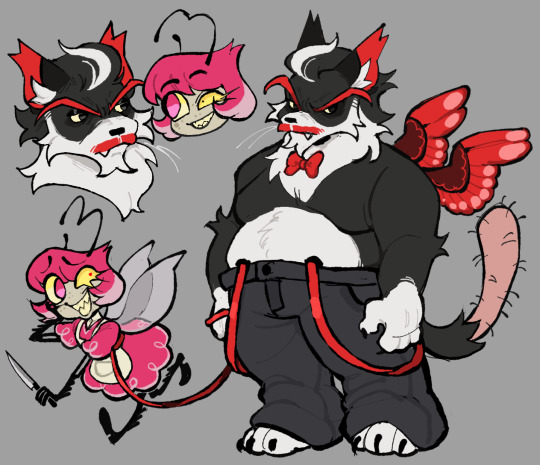
Deadbeat father with his baby-leashed daughter.
I believe these are the last of the designs that will try to follow the original design as best as it can because looking at my sketches right now, Alastor, Cherri Bomb, and Pentious (and Crymini) goes a different direction than their counterparts.
You know how this works, thoughts below:
My issues with their Original designs:
Niffty:
Man, I only have two things to critique about this one since she's also a solid design:
What is the purpose of the scarf? It comes out of nowhere for the design, what is the connection/purpose of having it? Genuinely asking since it does bother me a bit.
She barely is a bug, there is no feature in the design that gives us any idea that she might be a bug (Or even an alien since apparently Cyclops are just a normal sinner type in this hell). Looking at the Wiki, I think the only reason for the alien aspect is that it came from a song? Either way, she doesn't showcase any of either in her design.
Husk:
GOD THE WINGS. DEAR GOD THE WINGS. IT'S SO UGLY AND CLUTTERED AND THE PATTERNS BARELY MAKE ANY SENSE. It's so awful ewwww. Every scene that didn't have them closed looked extremely rushed and ugly. It could've benefitted from just copying how actual feathered wing patterns naturally are.
His eyebrows are not a problem for me (It's my favourite part of him) but the unnecessary two black stripes are.
He's probably supposed to be a tuxedo cat, but he legitamately looks like the cat in the hat with his entire face being white.
The thought process for these two:
Niffty:
Personally was not into the whole Cyclops thing, especially when there are no hellborns (that I can recall at least) in Helluva Boss that posess a singular eye. She's got 2 eyes now because.... reasons.
The mismatched eyes was my solution to removing the Cyclops sinners of this world. Plus it's a neat little character detail that her insecurity of some kind of eye defect manifests as this odd eye shape.
Her hair is a bit neater because as much as I enjoyed how her original hair looks, It's kind of silly to think a person who's obsessed with cleanliness would have such an unkempt haircut? (Specifically talking about that scene kid-esque bangs she has.)
While I kept the maid aspect with her clothes, I made it a lot more flowery so that it reads more like a child's outfit mimicing a maid's.
I gave her one fucked up antennae since in the rewrite ill be doing, she's very easily lost and thus became homeless, drifting to any place that would allow her to stay for a little while long until they kick her out.
Bug wings and the spurs on her arms and legs are just to sell the bug aspect a bit more.
Hopefully, it was clear enough. But her arms are made of two arms conjoined together to create a singular arm.
Admittedly, I did not choose a specific bug for Niffty. Insects are not something I'm interested in and I got lazy with this aspect.
Husk:
MADE HIM A LOT FATTER AHAHAHAHHA. Husk feels like he could've ended up as a bara if Vivzie's twinkif-y ray didn't hit him.
Specific fluff areas as well as a red mustache make him look older and do more to make you understand he's much more aged than the rest of the cast.
Genuinely enjoyed the hair that they gave Husk in his flashback, it looked handsome on him. Why Vivzie didn't put that in his actual redesign is beyond me, but here it is on him now
Since his wings barely play any role in the story, I shrunk it and de-cluttered the poor thing.
The red suspenders are there to simply put a pop of color on his already muted colors.
Despite the running joke that Vivzie's characters all have a bowtie, kept it on Husk since I think it would be cute that he probably keeps it on because Niffty made it herself for him.
This is just personal, but I wanted to give him an actual cat's pattern because I saw Husk from the headcanon voices video and thought that he was a sloth for some reason.
#deadbeat motel redesign#hazbin hotel criticism#hazbin hotel redesign#deadbeat motel niffty#deadbeat motel husk#hazbin hotel critical#vivziepop critical
366 notes
·
View notes
Text

August 30th is my birthday!
🤍 Platinum Jacket Erica 🤍

When summoned: "We're going to some fancy museum? Wow! So cool! Bring out the free champagne and hors d'oeuvres! ...they don't do that here? Damn..."
Summon line: "I'm just glad for the opportunity to wear something truly beautiful. I used to love to dress up in my home world. Thank The Seven Crowley didn't 'accidentally' leave me on campus this time."
Groooovy!!: "When I was a kid, I was never one of those girls who wanted to grow up to be a Princess, because I thought all they did was sit around and do nothing. Here in Twisted Wonderland, I've come to realize there's a lot more to being royalty than I initially thought. Unless you're Leona."
Home: "100 year anniversary? *Squints eyes* Does that mean... Twisted Wonderland experiences a similar passage of time to my home world?"
Home Idle 1: "If Grim does something to mess up one of these paintings, or if he knocks something over, I don't think I'll ever live it down..."
Home Idle 2: "I love just following Riddle around... he's so knowledgeable about everything, it's like having my own personal tour guide!"
Home Idle 3: "Every time I see a painting of Maleficent I have to stop myself from saying, 'Mommy? Sorry. Mommy? Sorry.' Would that get me smited on the spot? Or do you think she'd take me in as her daughter like in the live action movie? ...what live action movie? Oh, nevermind..."
Home Idle - Login: "So this is The Land of Dawning. I'm always so excited to visit new locations outside of Sage Island! I hope I can travel this entire world before I have to go back to my home world."
Home Idle - Groovy: "Where's Malleus? I think he'd really like this painting! Don't tell me... oh, no... he's trying to get some champagne and hors d'oeuvres..."
Home Tap 1: "I'm trying not to let this fancy outfit get to my head, but damn, I look good... this must be how Vil feels on the red carpet!"
Home Tap 2: "The Queen of Hearts is really scar– I mean, cool. Really cool. Utmost respect. I'm bowing down. Please, don't take my head."
Home Tap 3: "Tweedledee and Tweedledum, I mean Ace and Deuce, are actually being pretty respectful in here. For once."
Home Tap 4: "If The King of Beasts could earn respect in Twisted Wonderland, I hope that means that Leona can, too. I want him to realize he has what it takes to make a difference in this world."
Home Tap 5: "Whoever painted these is really talented. I love looking at the fine details. It's amazing what people can accomplish with only their hands. It makes me feel a bit better about being magicless."
Home Tap - Groovy: "Since this is a museum, they gotta have a gift shop, right? I love looking at the gift shop! Can we go, please?"
Duo: [ERICA]: A battle?! Aaaa, I'm so unprepared for this! *Fists in the air even though she has no idea how to fight* Let's fuck shit up! [LEONA]: Grrr... Quit your whining and just get behind me already! You're doin' more harm than good, Sweetheart.

For the paintings, I wanted to showcase two of my favorite locations in my home world ;) When I think of what Disney represents to me, these are the two places I think of!
Yuusona art is from @hhyeart, template is from @thoselethalarts here.
#twst#twisted wonderland#twst oc#twisted wonderland oc#twst yuu#twisted wonderland yuu#twisted wonderland mc#twst mc#yuusona#platinum jacket birthday
113 notes
·
View notes
Text
No Pain
My thoughts and opinions on IWTV s02e03: No Pain
Talamasca
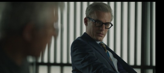
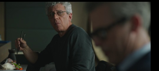
This whole scene with the Talamasca agent did confuse me for a bit. It threw me off when he began acting as if he were talking on the phone, but I was definitely locked into it. He's the RJ sending Daniel things as he's talking with Armand and I want to know what he knows and how Daniel will use it in this situation. I need to know what his role will be in unpacking all of whatever is going to come out in the end.
Lestat & Armand's Relationship
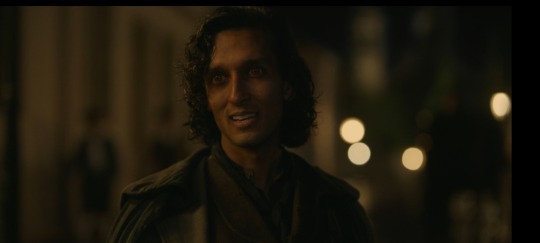
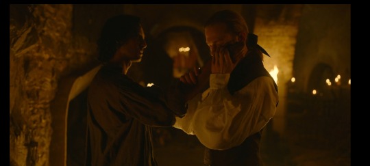
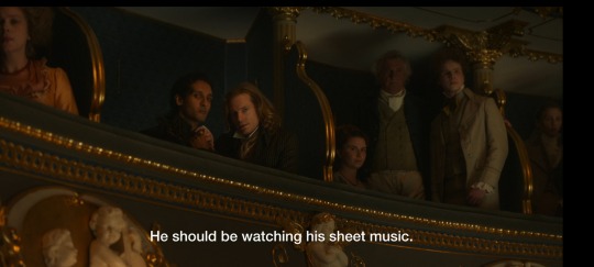
Dumpster fire, just as I thought. I can see the appeal of it and the way Armand showcased his power was everything to me. Him knocking and turning Lestat every way but loose was hilarious, but I always love seeing Lestat lose. I called it a dumpster fire because you could kind of tell that it wasn't anything deeper than the lust they had for each other, at least in the way Armand told it. There seems to be a lot of omission on Armand's part and I wish I could search his brain to see exactly what it was he left out. Maybe as the season goes on, we'll see more of what's inside that head and underneath that mysterious exterior.
Louis and Armand's First Dates
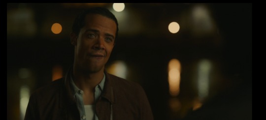
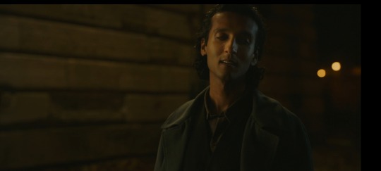
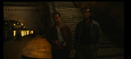
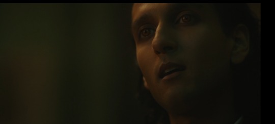
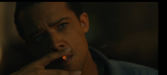
In the words of Johnny Gill: My. My. My. The way this date took so many twists and turns I could hardly keep up. Firstly, it was fun to see their little banter about the blocking of thoughts. Even when it got a bit intense with Armand clocking every time Louis thought about that man, it wasn't too crazy and we were able to see them reel it back in. Louis mentions letting Armand in instead of allowing his thoughts to spill and I want to know if Louis even trusts Armand that much to allow that if he could block his thoughts. But, the real kicker was when the two stopped to talk by the river. Flirty Louis is one of my favorite facets of the man and he was laying it on thick. Everything from the way the words rolled off of his tongue to the head movements to the accent was pure perfection. And the way he walked up into Armand's space as if he were going to kiss him...chef's kiss on everyone's part. I loved the way Armand was taken aback, yet intrigued, with Louis' responses as well.
Now, the intensity of the date in the little bar was through the roof. I'm still wondering why Louis is calling himself a whore for being out with other men. I know there's a reason, but I can't get my thoughts together on it. Maybe someone can help me out with that. Is it him still feeling attached to this man as his first real love? Is it the pain and brokenness coming through? Is it guilt for killing his love and leaving him back home? And the way Armand picks his brain apart and gets him to confess his relationship with Lestat was really something. It's pretty sad to see Louis' thoughts, feelings, and pain affect him like this. He deserves some happiness.
Claudia Talking About Bruce
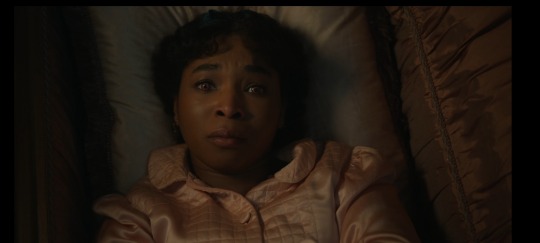
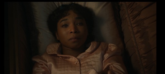
Wow. This woman has been through so damn much in her life it's baffling. In season one, we see Louis omit the details of her assault so we didn't know the severity of it. Here, we still don't have gruesome detail (thank God) but to just think about the fact that she was not only assaulted once, but multiple times and kept under the floorboards by him. Do you know how insane that is? To not know when it'll ever stop. When they'll get tired of your "gloomy faces"? Every person Claudia has encountered has done her wrong. Every. Single. One. And that including Louis as well because he didn't even have to have her turned in the first place. I know the coven is going to put her through it even more than they already have, but I'll save that for later. Oh how I wish she could live her life the way she wants with no one in her way or trying to put her in a box.
Armand Choosing Love
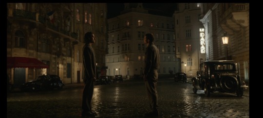
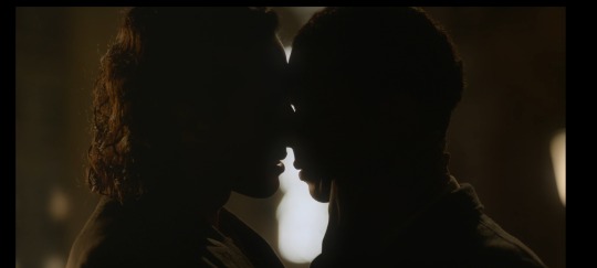
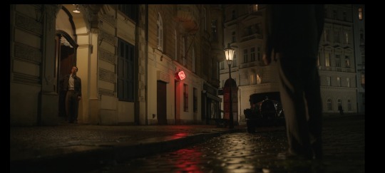
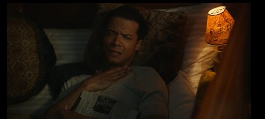
Oh these two. THESE TWO. Every scene with them has my stomach doing flips. Firstly, can we talk about that tunnel scene? It's a scene that should put fear in your heart for Louis, but it's simply a build up for their first kiss in my opinion. Louis is ready to die and he's preparing himself for it while Armand stands behind him like an ominous being running his fingers through his curls and down the back of his neck. It just sends shivers down your spine in the best way. "You walked me home?" "Did I?" Please! The little moment the two share before Armand walks up to him...whew. I don't know if Armand is telling the truth about being hurt (I have an inclination that he is), I'd like to think he is, but the wavering in both of their voices hit me in the chest. The kiss?! Resuscitate me, immediately! The caresses on the face and the way Armand pulls him back in each time! I had to fan myself each time I watched it (yes, I watched it numerous times and no, it's not weird.) Just when you think it's over, Louis invites the man upstairs and I need to see the tape! But, Armand choosing love and choosing something for himself definitely opens the door for the coven to do as they please with Claudia since Maitre isn't doing his job and this frightens me.
Claudia and Her Role in the Coven
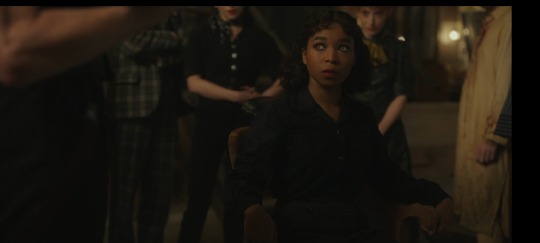
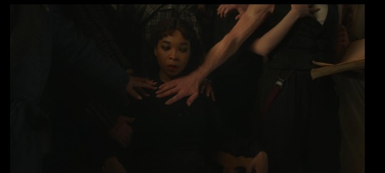
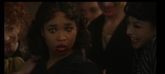
Were they hazing my girl in this episode?! All this for a speck of a spot in this coven? Electric chair just for that. And as soon as Claudia thinks she's in and has met her people, they betray her by making her play a little girl...and for 50 years at that. She's been trying to get out of this "little girl" role for the longest and now she's stuck. I can't imagine the way she's feeling about this. And we also see Armand getting involved with her physically, which...oh boy. It's just a hot mess all around. I now see what Armand meant when he said his name was in those pages and why he wouldn't want them seen. Some part of me is still being delusional about her fate. Maybe she will survive and live her life the way she planned (yes, I know this is not reality.)
#interview with the vampire#amc interview with the vampire#vampterview#louis de pointe du lac#claudia iwtv#the vampire armand#lestat de lioncourt#daniel molloy#talamasca#the vampire claudia#the vampire louis#iwtv
40 notes
·
View notes
Text
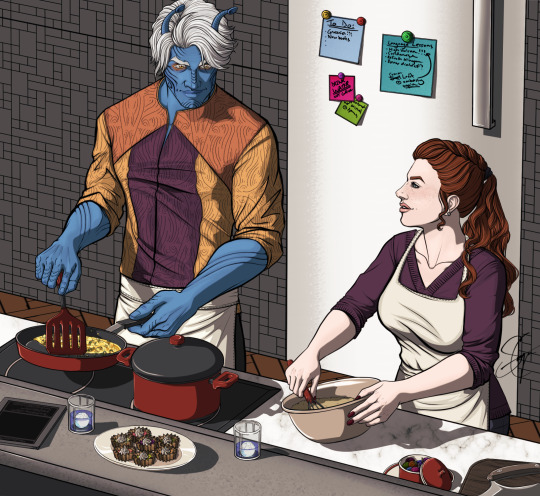
Hello lovelies! Who wants a nice, cozy kitchen scene? I'm not back up to snuff, but as part of my physiotherapy I've been encouraged to draw and write and generally give my arm and hand a good work out with all kinds of horrible contortions and exercises. I'm far from at my previous level, and I can't tolerate the kind of shading I preferred before my injury, so for this piece I experimented with a more cell-shading like style this time. I think it turned out alright! A bit rough, sure, but not bad for a first attempt!
I still can't draw a smooth lines without leaning pretty heavily on stabilizers, but I am improving a little more every day. While I'm not completely happy with parts of the overall piece, I think I managed to more or less hit the target!
Detail shot and rambling below the cut, as per usual!
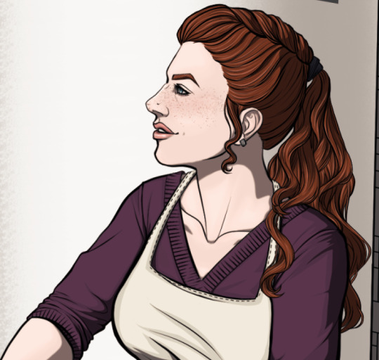
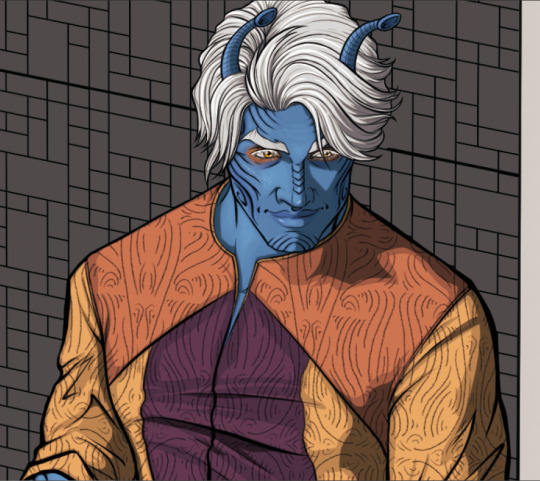
So the main idea behind all of this was a series of slice of life snapshots that felt cozy and comfortable, focusing heavily on the interactions between characters over drama and big scenes. I didn't have a particular location in mind with this one, but I have always thought that Dagmar's Andoria apartment would be conspicuously corporate-bland, the way a lot of common spaces are in Star Trek - and probably the most common examples Andorian architects would draw from without knowing any better.
In the background, we have Dagmar's little notes and reminders, as she's always struck me as the sort of person who uses her fridge like a personal calendar and organizer rather than a showcase for sentimental things.
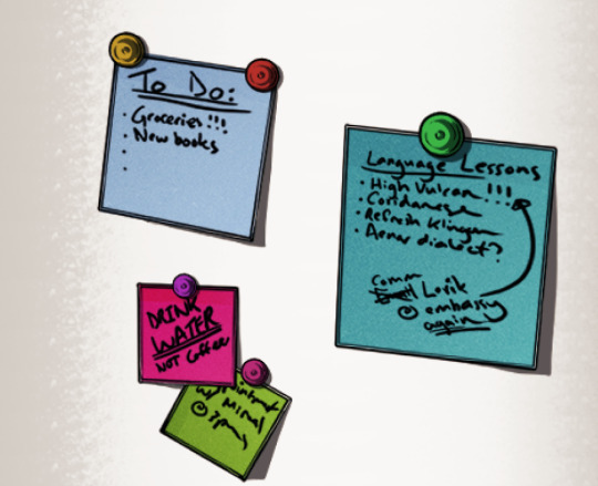
Transcribed, they read:
[To Do: - Groceries!!! - New books ] [Language Lessons - High Vulcan!!! (<-Email Comm Lorik @ embassy again) - Coridanese - Refresh Klingon - Aenar dialect?] [DRINK WATER - NOT coffee] [Appointment w/ Miraal @ [indecipherable]]
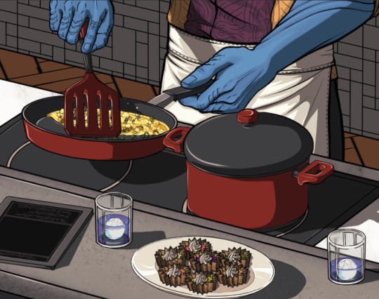
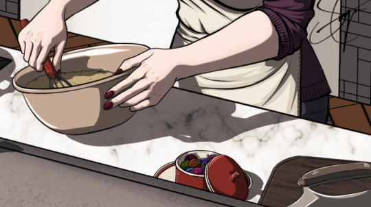
Food in all its varieties has been a big part of Emigre from the very beginning, and I thought in particular that it would be nice to capture a scene with Dagmar and Thelen focused around that point. After all, if Thelen can teach Dagmar the ins and outs of Andorian cooking, why can't Dagmar return the favour?
So, working off of that, I wanted to try for a scene that feels mostly familiar. As much as I wanted to feature familiar objects and tools, owing to Dagmar's past origins and preferences, I also wanted to add little things that are just a tiny bit alien, too. We have the half-drunk drinks of familiar blue ale; the datapad, forgotten, going into screen-saver mode; the cream tarts in unusual shades; and even some odd little fruits that look like cherry tomatoes and come in dull Skittle colours, for example. Then, there's the ulu-style knife just at the edge of the frame. It's an unusual choice over a standard santoku knife or any other perfectly serviceable kitchen knife, but given its resemblance to a ushaan-tor it feels oddly appropriate. Providing my recovery continues to go well, I'm hoping to do a few more cozy scenes, but I can't promise anything just yet!
#star trek#emigre by indignantlemur#digital art#andorian#andorians#dagmar gunnarssen#thelen of clan sannev
29 notes
·
View notes
Text
ok here's my collected JW thoughts in general. obviously this is spoilers
OK.................................... so i think anet is Back. its not quite "we are SO back" levels but it COULD be "we are SO back" levels depending on what they do in the next installment
they did good, though, and i think the most obvious jump in quality is actually in the maps themselves. they feel so much better than soto maps just to run around in and explore. theres a LOT more detail and they actually feel pretty intriguing and immersive with a lot of fun easter eggs and surprises!
the story didnt always hit for me but it was still overall Better than soto. the first instance alone grabbed me more than all of soto had tbh. the bears don't personally interest me but the mursaat do, and we're getting somewhere with all the bloodstone and titan stuff
i DO enjoy the angle of the commander starting to go kind of lie-lie man acting in personal interests. isgarren is a bitch but we can also be rude to waiting sorrow for no reason oops sorry nice again haha oh man how'd this bear teleport here that's craaazy.. there were points at which i actively lost track of who we had lied to about what and when, and while the confusion grated me a bit it was also funny in a way? like yeah if i was the commander i'd lose track of this shit too right
the commander doesn't have much of a personality technically, beyond "person who does good(TM) things", and what we make of our canon commander's personality is mostly just our own notions and conceptions and interpretations being placed on them, BUT that said it felt like the story did take the commander in some interesting directions for me.
i felt like i got the sense that the commander really is sort of a "free agent" now, which is fun. when you've already killed all the dragons and your life's purpose is TECHNICALLLLYYY over but you're still around and you're still many things to many people, what do you do with your life? this, apparently.
i like us being kind of a mirror of isgarren in the sense that the comm is an ultra powerful guy, with a lot of worldly+scholarly experience at this point, who a lot of other very powerful figures respect and Need, but that not everyone necessarily Likes. yeah this is our free-range deployable killing machine politician who's kind of strange interpersonally.
my favorite instance in the whole story was the one with the bloodstone ghosts btw. i thought they did a really good job imbuing each with a fair amount of personality and showcasing a wide array of perspectives on what happened in gavril-- a thing which i was prepared to not be particularly interested in tbh, and yet...
ALSO, the voice actor for the gavril citizen ghost was SUPER good! i'm pretty sure they were a new VA but i'd really love to hear more voicework from them. in general i felt a lot of the VA work in this xpac banged-- it feels like they got a decent amount of new/fresh talent?? it's been nice, i hadn't realized how stale the world was starting to feel only hearing the same 3-5 voices constantly (no shade towards the longer-standing VAs who DO do a good job, i just wished for more variety)
REALLY liking the amount of unique voice lines and racial dialogue also
features wise its also been pretty good! i like the repeat renown heart thing plus the return of the hearts. as a revenant with a condi set i cant say ive got any issues with the spears LOL. and warclaw is super fun once you get the hang of it-- i like that it has a learning curve and some nuance like most older mounts do, as opposed to skyscale's fairly 'flat' mobility. have NOT really tried out decorating my homestead yet and ive heard mixed opinions on it, so we'll see how i feel there!
21 notes
·
View notes
Text

Well, well, well. Would you look at what the cat dragged in. (it's me, Lou!)
The time is here, and oh man, do I have a lot to say! Ever since this post was posted on my personal tumblr, on the fifth of may, I have been working like a machine on all things OUROBOROS. I had originally planned for this to just be a progress report/ announcement on what I will be working on now that I am free of the shackles of work, but, somehow, I managed to finish all bullet points, and more. So, let's get into it!
First off, the title. Ouroboros becomes all capitalized OUROBOROS. Idk. It's neat. Next!
Art. Whew. I didn't think I could draw like this anymore- drawing has been more of a struggle than writing has been, forever, always- it was something I really strived to become good at, for a time. And I gave up. Only to pick it up again when I started ouro, and ever since I released that pressure, something just clicked and I have been churning out art like never before. I don't know if this is a fluke, a stroke of luck or if all that hard work I once did slaving away with menial art practice… but I'm grateful nonetheless. (A note on official RO art: I lost my ipad pencil somewhere on the lawn, lmao. I haven't been able to get a new one yet, so there is a slight delay here.) I am hoping that I get to make some commissions too, in the near future. Visit the forum to see some works in progress (amongst them, Yor's RO portrait!)
Onto the hellscape that is coding! I have been growing more proficient with CSS and html with the help of the ones that run so that we can walk; I have studied and researched and tested and tinkered until my eyes crossed, finding my way into this medium with the incredible guidance of the giants of whose shoulders I stand on. I will talk about this in detail on a later date. So I think it's finally time to reveal that yes, I am working on a twine version of ouro. I will develop it in tandem with choicescript; the porting over from one to the other isn't the herculean task I thought it would be.
Why am I doing this? Because I need to have a save system. I am continuing to write the whole alpha draft in choicescript in hopes that CoG will announce the ability to have a native save/checkpoint system, but if that doesn’t happen, I can’t publish this story without one. Unfortunately, I am not willing to code in a savesystem in choicescript myself, because this will be a large game, with far too many variables for that to be sustainable. Trust me, no one is more disappointed by that fact than me. If it comes to the point that twine publishing will be what I do, I will set my sights on writing a smaller game for hosted games.
Now the meatier announcements!
New Socials!
Tumblr: You are looking at it! This is the new, exclusively OUROBOROS blog where I will share all announcements and sneak-peeks, and future updates. I worked together with the dev of the theme and made it oh, so pretty and functional. Please check out their portfolio here, if you are ever in the market for sprucing up your (desktop version) of tumblr. They were a pleasure to work with. Amongst other things, it has a gorgeous header (again, only if you visit on web and not mobile) where I am showcasing fanart and official art. Go check it out! This month, I am showcasing a truly breathtaking art from KAIRELART, and you can find the full art here, or follow the links in the “FEATURED ARTIST” tab in the top bar.
I hope you enjoy this new haven for OUROBOROS! I will be answering questions once a week (saturday) and ramping up as I adapt to this new schedule, more on that further below.
My old tumblr, honeypeabrain, will revert back to being my personal blog. Feel free to keep following me there, but know that it will be inundated with shitposts, crass humor and the occasional poetry dump and personal post. You’ve been warned!
Discord!
By the good graces, this was ROUGH to set up. Working with discord bots is akin to wrangling code, and it was well and truly, a war. But with the help of many, it is finally all done and ready for anyone to join and talk to me and others about OUROBOROS and anything else between heaven and earth.
I will also greatly appreciate if any future bugs and feedback are submitted through here, so I can keep easier track of it. Come join us! (18+ ONLY.)
Patreon & Ko-Fi
Yep! Ko-fi is just a place to toss me a coin if you wish to help me towards the goal of new PC parts to make testing easier, or to just show appreciation for those that have it to spare. Patreon however, already has a multitude of posts and will be a hub for exclusive NSFW sidestories that you get to vote on, loredives and extensive sneak peeks, Q&A’s, polls and weekly dev logs.
Right now, there are only two tiers, but I expect it to grow as my story does. I have many plans, but I am going at a steady pace.
Amongst tiered content, there is a (free) NSFW story with female MC and Idren to read there right now, if you want to check it out! I am mgoing to post it on tumblr and the adult thread here over the weekend.
NOTE: I stupidly didn't realize that patreon had a review process after I pressed launch, which I did just a few minutes ago. Sigh. I am going to post the short on tumblr and the adult forum thread as soon as I get to it.
It is not mandatory by any means, so if you do choose to support me, you have my eternal gratitude as these places will be the sole source of income for me.
Onto writing:
The best news out of this whole bunch is that I have worked so hard on editing and writing, that in the past month I have all but finished a two chapter update! I have a chunk of about 5-6 thousand words left to write, and I am going to buckle down over the weekend to see it through. I wanted to have it done so badly for today, but I lost three days of writing time last week due to still being weighed down with work. I hope it isn’t too disappointing to have to wait until monday for the demo update! I am going to post a link to an as-I-write updated demo on Patreon and Discord, if you want to see the ugly face of raw wip drafts. Otherwise I will post the demo update here on Monday with a comprehensive post!
And now! the biggest news is… from now on, I am writing full time!
This is what I have been tossing and turning about every night ever since Easter. It started as a silly idea while talking to some friends and family about how I was looking for a change in career. And then, little by little, that idea whittled down to a plan, carefully carved by my partner and his whispers of a happy future, a finished dream project, and something to be proud of until the day I wither and die.
Somewhere between then and now, I grasped a tiny sliver of bravery and held on for dear life.
I quit my job as a teacher, and instead of accepting a cushy office job, I started behaving as if OUROBOROS and writing was my work (for all the moments I could afford). I have researched and tried different methods from week to week, and although I was still tired from work, I felt like I was onto something that could build into a sustainable future.
I have no doubts that this journey will be bumpy and long, but sometimes all it takes is to take that first step, and do it with determination. It might all crash and burn and fail in a spectacular way, or with a whimper, but then I will know that I have tried. I will know that I gave myself the chance to be who I want to be, work on what means so much to me.
And that’s it. I think the hardest part of formulating this post (I’ve written about 50 versions of it!) is getting to the point; the kernel of what makes it so special to me. So, in my heart of hearts, what I'm trying to tell you is that I'm gonna give it my all- and while I know the road to having a sustainable career in writing is rough and ever winding, I do know for sure that I am ready for a challenge, to pour my heart and soul into it until the day I rush out of the office screaming IT IS DONE. IT IS DOOOOONE!!!
If you decide to join me, I will treasure your company like a lantern in the dark. Hand in lovable hand, let’s fucking go.

#OUROBOROS#ouroboros-if#interactive fiction#hosted games#CYOA#twine#dev log#progress update#honeypeabrain#smacking tags on this post like they're skittles im aiming into a beasts mouth#I DIDN'T REALIZE PATREON WAS GOING TO REVIEW MY PAGE (literally cried about it because I planned everything so meticulously) SOB#anyway :') but a small stepping stone on the long journey ahead#I am going to take the dog for a long walk and then upload the demo/spicy short as I say hello to anyone joining the disc#I hope to see you there :>
264 notes
·
View notes
Text
ECSMP Lore BTS:
Wither's character before and during the V33 Arc. (Part 1)
Usually in other fandoms, I'm the person who makes the very long analysis posts about characters. I was at my peak with the MCRP cubitos analysis last year.
Now, there's not many people who can catch the kind of subtle, for attentive people, lore that I do (inspired by certain other streamers who also manage lore this way, since I found that kind of lore the most fun I had with theorizing and following). With clues layed out, not in the form of ciphers or enigmas, but character actions, character reactions/choices, character dialogue, the way the character physically looks, even songs attached to the character.
I also work with flower language, as I'm obsessed with it.
Note: If I mention something and it looks irrelevant. It's not, it will make sense later, even during lore that has not happened yet.
With my methods now clear, let's dive in.
First of all, we have the skins, people may need the side by side comparisons, so here you go:


This series of skins had the purpose to showcase Wither's slow mental decline. By the third one, the pupils are slightly more blueish, which it is an important indicator of not only mental decline, but of her powers starting to take over.
I will divide the happenstances and details with these very same skins.
Arrival / Regular Skin
The skin she had up until Day 29.
The first ever lore drop Wither did was to Bluebell all the way back in Day 2.

It wasn't the only small little detail about her past she shared that day even.

There were also very veeery small details, like Wither immediately asking if the new people who showed up were friendly, or that she wasn't that concerned at first about the C.A.T Bluebell spotted, since she already had the impresion that cats were friendly.
Day 3, the day when Rox arrived, was the first time Wither mentioned her trauma with endermen, but it wasn't much explained as trauma at first. It was also hinted that there were certain kind of endermen she never saw before.


This was also the day when Bluebell got the name reveal of the person who Wither mentioned before, and not only that, she got to read a letter that Wither would send to him after that very same conversation.


That bit of not knowing about their past? Keep this in mind for later.
With this letter, Bluebell also learned about Soul and Fire's names and that they have conscience of their own, but they have more trust issues than Wither herself and how she thinks it's nice to find the right people to trust. Another detail to consider.
No more lore drops happened during Day 4, but in Day 5, exploring the Nether was mentioned and Wither said that she would not be able to go with Bluebell in that case.

Day 6 was when the Soul Lantern was brought to the house.


During that conversation, Wither revealed to Bluebell that soulfire was the bright blue thing on her armor.
She also had a thought about the lantern before they went to sleep, though.

The very next day, Wither had a dream related to soulfire, and woke up extremely startled.


Her hands were getting covered slowly by soulfire in the dream. But she did not mention any of that to Bluebell upon waking up, and Bluebell also didn't ask.
This day was also when they heard the Ancient City's disk for the first time. Wither heard a lot of roars, screams, fire, fighting on it, and it caused her to immediately run away to try to get air. It was a panic attack.
This was also the first time we saw her habit of clawing on the floor/ground when distressed.
Day 9 was the accident when Bluebell fell into lava in the Nether.
Wither clawed the floor while Bluebell was writing on her journal, showing her distress.


That day, Bluebell went to sleep before Wither. She said she would be awake for a little bit.
And it was Day 10, Wither wasn't back home.
Day 10 was when Rox and Bluebell found the decimated village, and turned out, Wither was the one responsible.

Over the village they found soulsand, soulfire, wither roses, explosion craters, corpses and blood, along with the burnt down houses.

Once Rox and Bluebell found her, Rox did leave them be, so only Bluebell got the information that Wither didn't mean to do this and no matter how much she cares, she can't prevent this from happening.
Later, Bluebell asked how she felt, Wither said that the injuries hurt and that she should be able to heal eventually.
And to be continued in part 2, this will have lots of reblogs lmao.
10 notes
·
View notes
Text
Okay so because I’m gay and mentally ill I have decided to take it upon myself to go through Kafka’s demo frame by frame and overanalyze the shit out of anything I find interesting
It’s insanely packed with blink or you’ll miss it details so buckle up folks- this is gonna be a ride
Right off the bat she starts off with the same coin she also ends the demo with. This isn’t something that’s been part of her character so far nor do I think it has any real significance, so she just brought it to be extra and torment the poor souls she’s planning to slaughter anyway. Annoying dramatic bitch

Also just to get this out of the way now, this is indeed the Belobog museum, or at least its assets. The floor of some of the inner rooms, the staircases, the chandelier and the big golden clock thingy are the same, and in one of the shots you can clearly see the portraits of the former supreme guardians which is. Makes you wonder if they just picked the museum for grand dramatic interior or if she actually had reasons to have business there.
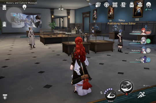
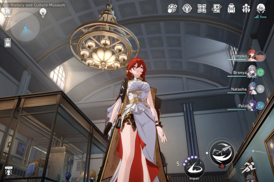
This. This fucking part is probably no longer than 5 seconds and yet, even with the video on 0.25 speed I had to constantly rewind and pause to catch everything and it still probably isn’t 100% accurate. Also I had to cut out a lot things because Tumblr only allows 30 images per post but like, you get the picture





“What do you see” over and over again as images of Rorschach tests flash across the screen so fast you barely have a chance *to* see. Personally I mainly see spider like things and butterflies. Among them are images are some flashes of the robo guards, which to me give the feeling of them getting caught in her web, losing themselves and their control to her mind games and technique.
Something else worth nothing is that this sequence is kickstarted by her throwing the coin and ends with it still in her hand, just thought that was an interesting choice


Before moving on to the next point, however, I want to point out the obvious irony of her telling the guards “don’t be afraid”. Truly words to hear from the woman who is incapable of feeling fear. And what is the name of the demo? Dramatic irony. We’ll get back to that.
Anyway, after that we see the camera pan away from her and over the guards as she uses spirit whisper. The camera movement is accompanied by a single rose petal that starts from Kafka and flies over the guards, which kinda feels like the visual representation of spirit whisper, a gentle rose petal innocently brushing across them as if carried by an invisible breeze

I wanted to make a joke about how her bounty is as large as her strap but seeing as I’m restricted in the number of images I can put I’ll just state the obvious and say she has the largest known bounty of the Stellaron hunters. I’m going to guess the only one higher than hers is Elio’s.
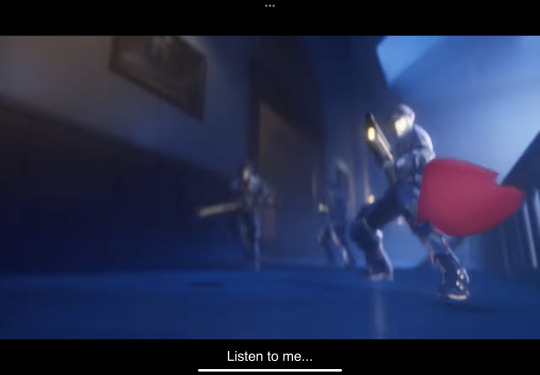
can’t be 100% sure this is what’s going on here, but the imagery makes it look like she’s taking a nice calming stroll and playing Vivaldi in her head while letting the guards slaughter each other, either by controlling them with her strings or with spirit whisper

Dozens of hands reaching out for her, trying to grab her as she’s cocooned in a vulnerable state, pupils visible. I’m sure we’ll eventually get an ingame explanation as to what’s actually going on with her eyes, but for now I do think this is a VERY interesting time to show them. She’s in a compromising position, she’s cornered and vulnerable, but she’s confident and cocky and always, always in control. To anyone else this would be horrifying, but she can’t feel fear, why should she care. Like genuinely this is terrifying imagery that in media is more often than not used to showcase or symbolize sexual violence of sorts and personally makes my skin crawl. I don’t want to get too much into it here I think it needs its own separate post, so for now I’ll keep it short and say that up until now, her pupils have only been shown in situations where she’s at a physical disadvantage (held prisoner at the divination commission, whatever this is etc)
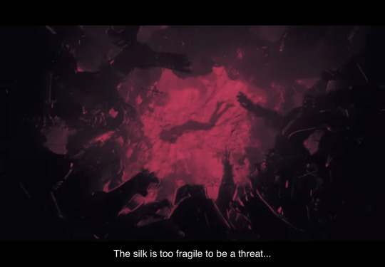

Something a bit lighter to focus on is what she’s saying; “the silk is too fragile to be a treat… unless you’re more fragile than the silk.” Symbolism aside she always seems to refer to silk when talking about fragile things, which we know are, in her opinion, the most beautiful. I really don’t think she’s referring to herself here seeing as the next scene demonstrates she’s far from fragile, so I think she does mean it in a much more literal way and is talking about a spider web; too fragile to capture humans, strong enough to capture its intended prey, this being weaker bugs. All in all she’s probably insulting them by comparing them to bugs weaker than a fragile silk web.
Nothing much to say about the fight scene other than that it’s incredibly choreographed and confirms that Kafka is strong enough to roundhouse kick a guy in the head (god I wish that were me) and do backflips in midair while firing her guns. Also the elevator counting down the survivors as their forces dwindle is fucking rad.
“Destiny has thousands of faces, why does it choose to wear this one?” In the context of the scene this reads to me as her mockingly lamenting the guards’ fate as she beautifully takes them down one by one, but it’s also one hell of a peculiar sentence from someone working for a guy who supposedly sees destiny and directs his followers according to that. She’s a nihilist, everything is predetermined in her eyes, she’s one of destiny’s slaves, but destiny also has thousands of faces? Is she really so nihilistic that even her own worldviews are contrasting in her eyes? As I’m writing this it makes me think of dadaism more than anything else. To quote from wikipedia: “an early 20th-century international movement in art, literature, music, and film, repudiating and mocking artistic and social conventions and emphasizing the illogical and absurd.” Kafka herself in an artist in many ways; she’s an actress first and foremost, always dramatic and theatrical, following a script to a T. But she’s also a musician, everything about her steeped in classical music and references. Anyway, dada is an absurdist nihilistic movement, and you know which real life author known for his absurdism lived and wrote parallel to the Dada? Franz Kafka.
Genuinely Idk where I was going with this I just thought it was worth sharing, MOVING ON-
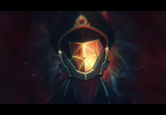

Neat way of visualizing what I’m assuming is supposed to be her spirit whisper. Also I’m extremely stingy with images (thanks Tumblr), but if you slow down the video around 1:17 you could see that the shot of her katana very quickly flashes into another spider, just wanted to mention that.

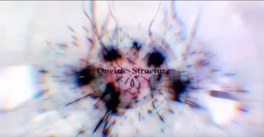
These are all narrative screenplay terms that flash by in like a millisecond each after the big ult (that, btw, has a similar shot saying ‘intermission’ right before she casts it but it flashes by so fast and with such bright colors that I couldn’t take a proper screenshot of it) and shown on the Belobog Museum’s projector. The most interesting one here imo is Oneiric Structure; “a cinematic story using dream like visuals, exploring the structure of dreams, memories, and human consciousness”, very fitting considering how much of her abilitieseing how dramatic irony is yet another narrative device.
All these movie terms and framings, however, feel to me more like a wink to Kafka’s roots than anything else. This is the third time she’s been tied to movies somehow (the web event, one of her leaked messages that actually mentions how she’d hate for her life to be turned into a movie), and this is one time too many for me to stop denying that the inspiration for her character was at least in part Makima from Chainsaw Man. I won’t elaborate too much not to spoil the 3 people unfamiliar with csm, but this whole thing feels like a homage, a love letter to Fujimoto’s own love letter for cinema.
Also she *is* an actress following a script, so there’s that as well.

The demo ends with her taunting the one remaining guard with the very same coin from the beginning, flipping it in her palm and asking the guard to guess the ending with heads or tails, prefacing it by saying “sooner or later, the curtain has to fall”. To me this indicates that she sees life as kind of a one gigantic play, with no fear and no value for human life everything is a performance to her, it doesn’t matter beyond what’s happening on the stage in the presence. But also the way this is all framed makes it very easy to assume she’s actually talking about the end of the guard’s life, and asking him how he thinks this encounter between them will end, lol.
Another thing about the coin that Meadows mentioned “her flipping the coin over and over is both like, play with fate, a distraction (like, think in movies, you see someone flipping a coin your eyes are drawn to it and not the sleight of hand happening elsewhere), and ofc her clear obsession with vintage shit”
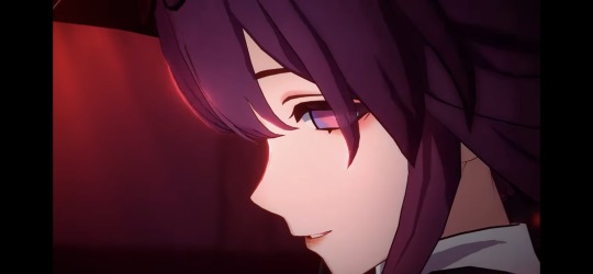
This has been it from me for now, too dead to properly edit through this rn so I’ll probably go back and add some details once I’m feeling better. Would also love for anyone to chime in with their own conclusions since this is just one person’s interpretation. Especially if you have more knowledge than me about classical music and have ideas regarding the use of Vivaldi’s winter

#honkai star rail#kafka#character analysis#More like demo analysis but whatever#And good luck to everyone pulling tomorrow!!!
46 notes
·
View notes
Text
Shade World by coffe is a low-intermediate map published in March of 2021. It is one of the definitive experiences of the Celeste modding community, immediately going down as an instant classic on launch and being one of the all-time most popular mods to date. It is my personal comfort mod, something I can always come back to and enjoy when I can't pick up anything else. All that praise, and it's coffe's first published mod!
Do you want to know what I thought about this map when it first released? Back in those days, I was still a fledgeling modder, without a lot of the skills and experiences I have today. I watched an iamdadbod video, I heard him talk about it, but I was skeptical.
'Is Shade World really that good? This looks like something that I could make. It seems a bit much to call this the Map Of The Year.'
It took me a while to actually play it myself. Well, here we are. Now I'm here about to tell you in no small amount of words why Shade World really is 'that good'.
I. Gameplay
Shade World starts off with two central mechanics: jump refills and swap blocks. The very first room shows off the jump refills as a way to stall, waiting for the swap block to return. The player is then allowed to stand and think before doing the swap block part of the room. The next room adds springs (an excellent addition to all maps) and uses the jump refills in almost exactly the same way. To reinforce the learning, the same setup of using two jump refills to wait for a swap block to move is used, this time using the swap block as a hazard rather than a platform. From here, gameplay is allowed to become more fluid, with a focus on swap blocks. coffe has more or less established jump refills as a "standard" mechanic, on par with regular refills or springs. There is now space for more mechanics to fill in the spotlight.
And that is exactly what comes next, in the form of wall boosters. The "intro" room is again split into two different sections: a standard wall booster walljumping section collecting touch switches, then a showcase of attached wall boosters. Wall boosters don't attach to entities in vanilla; this is actually a case of another custom mechanic introduction! The wall boosters are attached to falling blocks, with placement in a way that guides you in the right direction even if you don't know what to expect. The next room uses the attachment even more clearly: placing it on a swap block at the very beginning of the room. The block has the wall booster on the left and springs on the right, which acts as both an addition of familiarity (the player already knows springs can be attached and understands this behavior) and a clever re-use of the swap block in the gameplay.
The final room of this checkpoint brings jump refills back into the spotlight, where the player must smuggle four jump refills to the very end of the room through some platforming. This is the first instance of preserving jumps like this; with only one exception so far, jump refills are used immediately after they're collected up until this point. The way that the level is constructed has an interesting callback to hint at this solution. That one exception was on the first screen of this checkpoint, where an extra jump is held through a dash and a wall climb over a wall booster. That room and this room both end like this:

The first with two jumps, the last with four. The spinner gaps are familiar and tell the player how many jumps are required (the same as the number of refills in the room). It's a helpful detail, but if that's not enough this room also comes with another hint I'll get into later.
Checkpoint 3 changes scenery with a dive into the temple, introducing dream blocks as another mechanic. Following this is an introduction to dreamgrabs, complete with bird tutorial. Here, dream grabs are followed by a wall booster. This pattern actually continues through the entire map; every required dream grab is on a wall booster! This is a great pattern for several reasons. One, it adds a distinct visual cue to each instance, as an inexperienced player might not be able to read them when "naked". Two, it gets the player moving again, keeping the gameplay fluid and interesting.
Next comes dream swap blocks. This is the spiciest mechanic of the map, and is introduced in a fairly sterile environment. The player is immediately shown how you can get pushed while in the dream state, and that it spits you out somewhere that doesn't really feel expected. The next room kind of uses dream swap blocks in a way that would feel basic for its component mechanics, as a way to ease the player in. After that the setup from the "sterile" introduction is used to kick off gameplay, where the gameplay after this setup is back to familiar territory. It's a good way of taking a complex mechanic and showing it off step-by-step.
The next step is mixing dream grabs into the dream swap blocks and showing off the momentum that they can give, which more or less completes the library of tech this map uses and brings it all full circle. With that, the final few rooms show off everything that coffe has been building up to. The last room (almost) starts off with a recap of each mechanic in order, then after some more gameplay ends with a triumphant launch to the end of the map.
Let's not forget that, underneath this all, the gameplay is built upon base swap blocks. And that works really well because swap blocks are fun! It's one of everyone's favorite mechanics, so I know I don't need to explain in detail why they're so great. I just want to point out that, with all the thought I've given the mechanics, that I haven't forgotten that the core of what makes good gameplay is that it's fun.
All in all, it's a great progression of mechanics with introductions built on familiarity. More complex ideas are given more time and explanation than others, meaning time and space is well used. Each mechanic is given its space in the spotlight and on the sidelines, avoiding a clutter of too many mechanics too soon. Everything is kept within the same realm of difficulty, with the map's ending using presentation and a combination of all mechanics instead of spiking difficulty for content.
II. Strawberries
Shade World has a few different kind of strawberries in the map, which I think is notable enough to briefly cover in its own section. Usually in custom maps, I think of strawberries as extra challenge rooms, with gameplay a step up from the any% route or sometimes using a silly mechanic or interaction. Shade World, with its 14 berries, only uses 5 in this format. What does it do differently?
Three more berries are in offshoot rooms as well, but with no gameplay inside of them. Instead, the challenge (usually a very light challenge) is to get to the room in the first place. Inside is the berry, as well as some "lore", in the form of dialogue with statues.
The rest of the berries are in the main gameplay rooms, usually at the end, requiring just a little bit of extra gameplay to get. I feel like these berries work the best. Rather than requiring more knowledge or technical skill, it just needs a bit of confidence. They're more appetizing to try and get when they're placed in the main rooms, but juuust out of the way, compared to placed in a side room almost as an afterthought. The style fits an easier map as well, where difficulty is not a defining feature of the map, making difficult side rooms feel out of place.
Of course, the best thing about the berries is that there's variety between them. Each type of placement has its ups and downs, and Shade World capitalizes on this by using all of them in decent quantities.
What Shade World doesn't have are winged berries and seeded berries. If you're using the map as an example, don't forget about these options to make your berries even more interesting.
III. Atmosphere
Shade World has a very distinct and unique visual style, but nearly exclusively uses vanilla assets and recolors.
To start off, foreground tiles are summit and temple, summit being a recolor and temple being vanilla. The "summit" background tiles are actually custom, although I always thought it was an edit of bgSummit or bgLostLevels. bgTemple is also used (not sure if A or B). Most decals are farewell plants, reflection crystals, or temple decals, usually recolored as well. The first styleground is an edit of the chapter 6 plateau styleground that loops, plus some summit mountains; the second styleground is a temple recolor. Most of the few custom things are decals, with some extra ferns, hint markers, and secrets.
The entire deco is built around the same color scheme: purple and green. Tiles and backgrounds are the duller but more comforting purple, and hazards and highlights are a very punctual green. Even jump refills, normally blue, are green like dash refills to fit in the color scheme. It is always very easy to see what needs to be seen.
There are layers and layers of detail poured into the deco, each of them small and simple but compounding to mean a lot more. Plant decals wave in the wind (something they don't normally do in vanilla). A foreground dust styleground starts blowing leftward in checkpoint 2. Bird entities are present at the beginning of checkpoint 2. Vine decals are used in both the foreground and background. Spinners are slightly rainbow-ified, and I think the colors slightly change between some checkpoints. The plateau styleground has two animated frames instead of being static. I'm sure there are more details I've missed.
The three "lore" berry rooms also add to the atmosphere with the small bits of dialogue. They're vague and sometimes a bit silly, but they add charm to the map. At the very least, it shows that coffe did not forget about the dialogue cutscene features of Celeste, which many standard gameplay mods don't have!
And the music, oh the music. SO good. Phenomenal. It begins as mostly ambient synth, some basic chords. It layers in piano, bass, and a lead once gameplay starts. These layers will come in and out depending on where you are in the map, instead of merely always building up. Once you reach the temple, the halfway turning point of the map, the music fades before coming in with a new pattern. Layers continue to come in and out as appropriate, before the music fades once again and comes in with its final progression for the last room. I love the music so much. Listen to it here and follow the composer at @neozoid. :)
I will also briefly mention the overworld colorgrade and custom heart UI in the chapter complete screen, as well as the endscreen being a combination of custom art and a vanilla endscreen layer.
The Shade World atmosphere is built off of a lot of small, reasonable edits to what is already given by the base game. The deco is based around a clear and high-contrast color scheme, which makes gameplay easy to read. Any screenshot from the map is easily recognizable as being from Shade World. Details in decals, in entity deco, in stylegrounds, and in dialogue all compound to add a lot of depth to the presentation. All while an absolutely banger track plays in the background.
IV. Hints
Shade World uses a few different visual indicators for different reasons, but they all offer an unintrusive way of leading the player in the right direction without explicitly saying anything (most of the time).
First off, lightbeams indicating side rooms. In custom maps, sometimes lightbeams are used for side rooms and sometimes they're used for main rooms, which can cause confusion. Shade World's first branching room has the lightbeams on the harder to reach transition, which is the berry. Even if the player goes on the main room first, they are given the option to go backwards, and both rooms have watchtowers so it can be seen whether the room ends with a berry or with more rooms. This is immediately built upon as this next main room has a hidden side room, the first statue berry. The lightbeams come out of the fake wall, but it's still out of the way enough to not be overly obvious. It's a great reinforcement of the standard the map uses and a pleasant reward to those who pay attention.
Checkpoint 2's final room, the extra jump smuggle room, has a hint dialogue option in addition to the passive hint in its structuring, as previously discussed. The first interaction explains that this is a hint to use if you get stuck, preventing the player from accidentally spoiling themselves the solution if they don't want to. When the hint is actually read, it is worded in a way that isn't just the solution. "Save [extra jumps] until you really need them" is a more elegant way of saying "Save all four extra jumps until the end of the room".
The dream swap blocks become relatively more complex in routing, and temple decals help point the player in the right direction in various forms. Symbols always path the player's trajectory. Arrows are placed in helpful spots, but subtly. Here are a few examples:
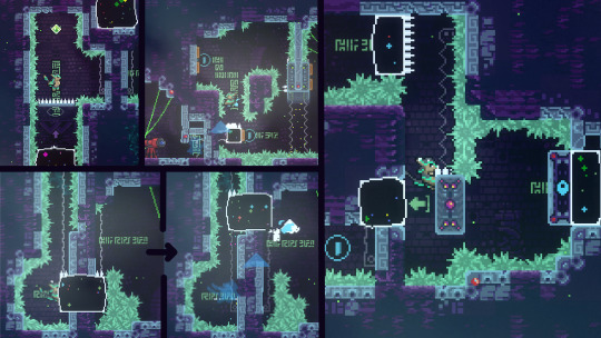
All of these instances make the playing experience easier without being intrusive. It works really well in this style of map that's built to be approachable but uses a complex and nuanced mechanic. It also goes to show that hints aren't always explicit and separate from the rest of the map.
V. Conclusion
Why go through this map in such detail in the first place? Well, I want to show that, when I said 'this looks like something that I could make', I was right. I can make this, and almost anyone can. By breaking down the map into its component parts, I hope that I revealed that its just a collection of very simple and very achievable design elements. Gameplay is built upon a straightforward introduction of several mechanics, which all have intuitive ties to vanilla mechanics. Decoration is almost all vanilla recolors, centered around a visual identity in purple and green. Level design is fun because it's friendly, not because it's over-the-top.
I should also state here that Shade World was not a one person project. The music was made by neozoid as I said earlier, and the bgtiles were an edit of Nikko's, the overworld stuff was two more people, neozoid and one other did some art, and playtesting feedback was received from several people before and after the map released. Anyone can ask for help! Know your strengths and play to them, and never be afraid to reach out to others to fill in for things that you can't do yourself.
This isn't a complete tutorial on how to make a map, or how to do level design, or how to deco, or whatever. I'm just going off this one piece of material, and I can't say it does absolutely everything perfectly. But good maps succeed for a reason, so if you're a mapmaker I definitely encourage you to play the maps you like over and over again to try and spot what makes it tick.
Basically, I like Shade World a lot.
Remember to leave a like on the GameBanana page if you enjoyed! It really, really helps.
24 notes
·
View notes
Text
I love that post that's going around that's pointing out the inconsistencies in the writing of Rosalie's character, and I like how it inspires us to explore more of the dissonance in her behavior. Naturally, this all leads back to the context of who wrote her. I've said this before in a past, long buried post that I can't find in my search, but I'll repeat it because it at least influences why Rosalie was written to be a fierce protector of Bella's choice to have Nessie (as long as it went with her agenda, of course). Conservative women, who are overwhelmingly pro-life and pro-birth-regardless-of-circumstance, actually propogandize their anti-abortion agenda by framing themselves as the defenders of women who want to have children (and the unborn ofc) against the liberal pro-choice crazed feminists who supposedly want to force these aspiring mothers to undergo abortions and destroy the Godly nuclear family. To people not raised in a conservative environment, I'm aware this must sound nuts, but it is the way these people think. Notice how they themselves flip the labels on their head, so that they seem to embody the right of choice (revealing that they think it is the duty but also the desire of all women to want to be moms) even when they are in fact taking away any choice in choosing to terminate a pregnancy.
*Naturally, when I go to try to look that post up, I can't find it, so if anyone sees it again, feel free to send it over and I'll add a hyperlink.*
The post mentioned also talks about more aspects of her character than just what happened in Breaking Dawn - I cherry picked a specific detail above - but I really do like how it reveals Stephenie's own bias and warring purposes for her characters. Rosalie is meant to be the Mean Girl Bombshell Blonde type, so naturally she has to chafe with Bella and be against her life choices (but also be jealous of her) which manifests as Rosalie wanting Bella to stay human and acting cold to her most of the time. Rosalie is also being punished (twilight saga expert panlight has discussed many a time how SMeyer unconsciously punishes the characters who stand in the way of Edward and Bella's happily ever after within the narrative), so she can't have what all women SHOULD want in the eyes of women like Stephenie - children. A traditional, nuclear family. When Bella gets pregnant, Rosalie's emphasis on choice becomes her redemption - sure her motives are selfish - because now she's on the same side as what Bella desires, so she's going to get what she wants, which is a child in her life. Renesmee.
Rosalie is well known for preaching about the importance of choice, but that doesn't mean that she supports whatever others - in this case, Bella - decide. Rose defending Bella's decision in keeping the fetus and protecting her from a forced abortion (there's so much to be talked about with Bella's whole "I don't want just any baby, I want this baby" thought process but that's for another day), while also pushing Bella to stay human ("You have a choice. I didn't. None of us did. But you're choosing wrong.") showcases this.
That post was right, all in all. There is a LOT of cognitive dissonance with regards to the way Rose is written on Stephenie's side of things. People and their personal ideals don't always align with the behavior that they exhibit, but Rose is a character written by a not-all-that-self-aware author. Rosalie wasn't meant to be that complex of a character, she just had a role to fill. Her complexity was accidental, and now she illustrates a dissonant character that brings more enrichment to the story than the main character herself.
Anyways, I just wanted to ramble a bit about a great post that got me thinking. Send it to me if anyone happens on it again, please!
39 notes
·
View notes
Text
Kindness, Strength, and Morals

This is probably going to be a very messy post since my thoughts and feelings towards the topic are kinda all over the place and I don't think I have the necessary amount of maturity and insight towards the subject to provide a satisfying conclusion... But I still wanna try talking about it anyway cause I feel this could be interesting to discuss.
So, basically, I've been thinking about how certain pieces of different media try to showcase depictions of bullying, abusers, victims, misuse of power, the consequences of one's actions on others, and so on, and all the different ways they each try to offer a, quote on quote, solution to the problem, and which of these solutions I, an outsider who really hasn't suffered THAT much abuse through life, like more or like less and why.
Naturally, my perspective is probably not gonna be as helpful as that of an actual victim or someone who closely studies these things as part of their job, but I still would like to take a moment to go "This is what the media I'm consuming is making me think about" and wonder if they're doing an actual good job and talking about these things.
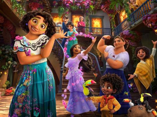
So the first thing that kinda sparked my desire to discuss this was the movie Encanto.
For those who never saw it, Encanto is a movie about this one teen, Mirabel, who's the only member of her super-powered family who doesn't have powers, and due to that, her and certain members of her family tend to make her feel like she has less value than them.
Through some shenanigans, personal journey, and magic events revolving around helping their magic house that got sick, she ends up accepting that she has as much value as everyone even if she can't do all the stuff they can do, and by the end, she becomes closer than ever with her family.
Now, this is a nice message and all, to teach people who feel like they're less that they are just as much as anyone else, and that even if you feel powerless you are still strong enough to do what matters most for those that need you, be it your loved ones, or even just yourself.
The things is... This story brings up a small problem that I often see a lot for these types of plots, that being, the victim of the situation is usually the one that needs to save themselves.
Mirabel fighting to prove her worth is great, but it kinda bothers me that she has to fight basically alone. There isn't a lot of focus on her family members realizing how destroyed she is inside and how much they're indirectly hurting her. She literally has a whole song around the theme of "I'm not fine."
Red from OSP went into great detail about this in a Twitter thread and addressed how the victims of the situation basically had to do all the work of healing herself while the family basically just stood there watching and going "glad you finally feel good about yourself!" *thumbs up*

Now, the message still works because at the end of the day, you are the only person in your life that you can fully control, so it makes sense that stories will try to show that most of the work to begin self-healing lies in yourself, but not everyone has that inner strength to want to help themselves.
Many people are dealing with a lot of pressure and expectations of real life that are engraved into our minds from an early age, constantly being told "this is how good you need to be if you want to be happy!" and constantly comparing ourselves with others.
It's great that Mirabel decided to go on her journey to save her magic house and that resulted in her happy discoveries, but what if she hadn't? What if the house hadn't gotten sick? Would Mirabel just be miserable forever? Because nobody else was really doing anything to help her.
This made me think that, while I like these stories for addressing the pain of the victims to make us understand and sympathize with them, I would like to also see more stories that show how others could help them in case they can't help themselves.


Two stories that come to my mind on that are the manga "Is It My Fault That I Got Bullied?" and the webtoon "Get Schooled."
The manga tells a story about a former bullying victim that became a teacher in order to help out other victims, and through some twists of fate, ends up becoming the teacher of the daughter of his former bully, and now needs to decide if he will help her or not.
meanwhile, the webtoon tells a story about a government system that tries to directly fight against bullies at school and protect victims of abuse by openly infiltrating problematic schools, finding out who the oppressors are, and basically bodyguarding the victims from the abusers with brute force and lecturing them, and us, the readers, on why their actions can cause so much harm.
I like both series a lot. They both address the struggle of the victims, and what outsiders could to to help them, while also bringing up the fact that sometimes the priority should be in taking away the oppressor's ability to oppress.
In the manga, the main character devises a plan to record the actions of the bullies through multiple hidden cameras in order to expose them in the media and allow everyone to be aware of their actions so that people learn that if they become bullies everyone will know. On the webtoon, the main leads are given authority to punish the bullies as much as they see fit under the notion that they're doing it to protect someone, so if anyone hurts someone, they need to be ready to be hurt too.
The reason I like these is because, quite often in stories the focus is "forgive and forget, being happy is the best revenge, they don't know any better, they're just kids being kids" and so on.
They underplay the harm and lasting damage of being abused, while in these series, the idea is "being abused can scar someone for life, so let's do all we can to make sure the abusers won't want to abuse anyone."
It works under the premise that some people should be given more power and freedom so they can protect the weak and that bullies should have bigger consequences to fear.

That sounds very effective at first, but once you stop to think about it, you notice that a lot of these ideas heavily rely on the goodwill of those in a position of power for it to work.
Even the characters inside each comic point out at some point "Cool idea bro, but that's not exactly a practical solution."
Yeah, I would feel safer if I knew a good person was watching over me all the time and ready to freely beat up some bullies if I was in danger, but what would happen if all this power was given to some prick who's just waiting to use it to take advantage of others? Or what if they make a mistake and think I'm the abuser for some reason?
The liberty to beat up students or the implementation of cameras to invade people's privacy at school... This is just begging to be exploited.
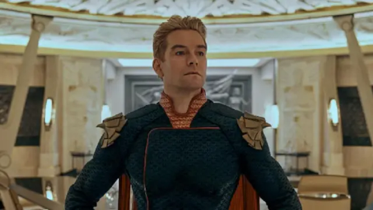
The risk in putting too much power and freedom in the hands of someone to be responsible for our safety is that we might think we have a Superman when in reality we have a Homelander.
Superman works because he's a man with all the strength and all the kindness to safely protect victims from harm. He's a symbol of the best of the best because he can help and he wants to help.
It's not just about the power to help, it's about the sense of ethics and kindness to use that power well. But, again, that's still not a perfect solution to deal with situations of abuse because... How the heck do you make sure that you have a good person behind the wheel making these decisions for us? How do we guarantee our own Superman?
Each one of these stories does a good job of addressing parts of the problem and parts of the solution, but still not the full picture.
Encanto addresses the struggle and pain of the victim and the lasting impact that bad actions, even unintentional bad actions, can have on them;
The two comics address the need of those who are in a position capable of helping to actually help and the need to incapacitate the abusers' ability to abuse;
And Superman addresses the need for kindness behind your actions so you can use all that power responsibly and that maybe too much power isn't always a good thing if it goes to the wrong hands;

While trying to think of what would be a good way to mesh all these things together, I started to think about one of the comments I saw once regarding and Episode of Invincible focused on Atom Eve.
Basically, the comment was talking about a scene where Eve's friend ends up becoming afraid of her after finding out she had powers and starts distancing himself from her, and what they said was pretty much "Wouldn't it be cool if we had some sort of way of teaching civilians that they don't need to fear super-powered people at schools?"
I saw that comment and thought, "Wouldn't it be good to have this anyway, even without the superpower aspect to teach kids how to be morally good people, shouldn't we?"


This brings me to the last two series that kinda encapsulate a good compromise between all these points, "School Back" and "We Now Begin Ethics."
School Back is about a lady janitor who often notices that some of the kids in her school are dealing with a lot of stuff that they can't tell either their parents or teachers, so she talks to them herself... And that's it.
It shows the struggle of the kids, it puts just enough power of action in the hands of someone older and wiser, and it helps nurture the importance of kindness, all by having a story where children have someone to talk to about their problems who can help them, and she talks about these things in very clever ways that makes the kids themselves reach their own conclusions.
We Now Begin Ethics is very similar in that it is about a wise adult in a moderate position of power who simply gives classes about ethics and morals. And again, that's all it needs, just showing that these people in need have someone who can help them.
He gives out lessons for them to think about (all while posing sexily to the camera every now and then because the artist of the manga really wants to drive home how attractive this man is), tells stories and describes situations so at the end he can ask them what to they think, inspires them to communicate with one another and to try to be open to new ideas without forcing his own ideas on them.
Basically going "This is what I think. Do you agree?"
And again, that's all there is to it. Just an adult talking with kids and helping them become better people by teaching them how to think about what really matters and not about what society wants us to think matters.
Now you might ask, "What about preventing the abusers from abusing?"
The idea in these cases is more about preventing these kids from ever becoming abusers to begin with. We get rid of bullies by teaching what's right and wrong from an early age and making so they never consider the idea of hurting others to begin with.
Teaching how to sympathize, how to listen, how to be patient, how to be humble, how to not put your needs above others, how to use your words and think about your actions, how to properly value yourself and how to be honest with your feelings.
It's not a perfect solution, especially for those who are already too far gone, but just being there for someone who needs to talk honestly does wonders to help one another.
A lot of bullies are just people with many negative thoughts who never had someone to help them properly deal with these thoughts, mostly because a lot of adults really struggle to understand kids and teens, and in both these series, the protagonists are great examples of adults who know exactly how to use their words to reach the point they need to reach for those that need to listen to it.

There are a lot of stories about people wanting to help out others, but they kinda make it look easier than it actually is, which is not bad as it motivates you to be more open to the idea of being selfless and more being there for others... But you need to know what you're doing so you won't cause more harm than good.
If I was in Encanto and were to try and talk with Mirabel to convince her she's as special as anyone in her family, what would I say?
If I was one of the teachers fighting bullies in Get Schooled, how would I know when to hold back and stop fighting? How would I know which resources are going too far?
If I was Superman, how would I make people know they can trust me so they can come to me for help?
It's not just about understanding the victim's struggle like in Encanto, it's not just about being strong enough to protect the victim like in Get Schooled, It's not about having enough kindness in your heart to want to help, it is about being mature enough to know what the situation needs, being kind enough to want to offer it, and being good enough to able to offer it.
I'm sure there are a lot more to learn when it comes to abuse and being abused, about offenders and victims, about having power and being powerless, being mature or immature, about helping those in need, and so on... These were just my quick thoughts based on a couple of pieces of media that made me think about each respective case and how much I like the way they tackled it.
Encanto taught about the struggle of the victim
Get Schooled and Is it my Fault taught about the need of empowering those that can help and depowering those that can harm
My Adventures with Superman teaches about the significance of real good intentions when wanting to help
And School Back and We Begin Ethics taught how even something as simple as just knowing how to talk to others can have a great positive effect on others
This is all very surface-level discussion around each topic, of course, but it's still interesting to see how writers try to talk about it at all.
(Edit, these were all feelings I had before learning about the recent events regarding Get Schooled 😓 I'm deeply sorry for having promoted a series that carried so much ill will inside of it. This post literally aged like milk in a matter of days...)
#is it my fault that I got bullied?#get schooled#true education#school back#from now on we begin ethics#homelander#my adventures with superman#encanto
33 notes
·
View notes
Text
Hey y’all, here are some process stages for one of the more recent illustrations I did!
My sketches have never been very detailed. I remember being inspired for a pose while scrolling through pintrest and just threw some lines down on a page. I think more about the general pose and feeling I want more than the worry of anatomical correctness because I know I’ll fix it as I go.
In the next stage I establish stronger more contrasting colors and start to define the form of some shapes. The anatomy is still bad so at this point I’ll start to use the warp tool to move things around and adjust proportions. I also end up using the selection tool to cut various parts of the figure apart in order to put them back together in a way I like (I do not recommend doing this lol the sooner you can establish a solid foundation the better because it’ll save you a lot of work as you go. I just have a really hard time seeing my mistakes until I have something visual to work off of.) I alternate using the warp tool and selection tool and painting again and again until I get something relatively presentable like what I have at stage 3!
At this point all I have left are color adjustments and tweaking some small details. I usually don’t make such drastic color changes at the end of my work because I’ll have found my desired pallet through rendering. However with this one I wasn’t yet sure if I wanted a strong blue bg to contrast the orange of Lucéena’s eye or if I wanted the eye itself to be the main point of color. I knew I wanted the eye to stand out so I thought it was worth trying some things. That’s also why I decided to leave some parts messy in the final piece. I wanted the most well-rendered area to be Lucéena’s face to bring attention to that new shines eye she has.
I hope this was interesting and insightful!
With every illustration, I start off with a loose sketch. At this stage I’m not worried about perfection, my lines are more to serves as composition guides so I know where things will roughly go. If there are parts of the illustration that I know I want to put a lot of detail into (such as the face) I will often give that part more time. Then, I jump into colors by laying down flats behind the lineart and then beginning the process of refinement with a new layer on top. At this stage I would have 4 layers, 1 as the bg color (the blue expanse), 2 as the flats of the character, 3 as the line sketch, and 4 as the rough detailing. After this the number of layers I uses depends on how much of the illustration I want to preserve from itself or how many layer filters I end up using (to tweak color and lighting). Still, my illustrations always start with these 4. Once I get to a rendering point similar to stage 2 I start worrying more about the “correctness” of my structure and how I can make the anatomy more realistic. To do this, I like to duplicate then merge all of my layers, excluding the bg layer. Now I have my character one one whole layer and the expanse of blue on another. I have the individual layers still on hand if I want to refer to my og sketch but at this point having them all as one is easier to work with because to tweak the anatomy of a character I usually cut them up into parts and move/warp them to be more precise. Is this the most effective method? Probably not, but I rely a lot on the warp tool to get the exact shapes that I want. And seeing shapes for me is a lot easier when I have some color and value to work with. (I’m not a very “line visual” person if that makes sense XD) The rest of my process is a combination of rendering and adjusting details with the warp tool. At the very end I did some color adjustments (seen between stages 3 and 4) to see if I could get them closer to the initial feel that I wanted. Because I drew this to showcase Luceena’s new magic eye I wanted that to be the focal point of the illustration. So not only is that the place I put the most detail into, it’s also where I wanted the most color to be. I thought that having a blue bg would contrast nicely with the orange of her eye, but I ended up desaturating the whole piece and let that one note of color stand by itself. Lucéena also received her eye in the Shadowfell so the grey, drab vibes ended up fitting perfectly!
#art#digital art#wip#art process#dnd#dungeons and dragons#I was asking some friends for their thoughts on the desaturated version (never be afraid to ask for a second opinion!)#and we joked that this was Lucéena’s villain look because I don’t usually make her quite so angry#she has a resting bitch face tho so I mean this is prob what she loks like all the time lolo#I think her hair is kinda growing out since I first established her design#it didn’t always cover her face so much I think??#what is consistency let me draw my self-indulgent character traits#which means that all of my characters have to have long hair or at least long bangs so that it can be sexily flung over their face#in the heat of battle#and i love givig luceena in particular messy hair because thats a Vibe
69 notes
·
View notes
Text
Quick update and a love letter to the LBRP
Hello! It's been a while. I had been quite a bit more busy than I thought I would have been when I first made this blog, and naturally my work, both mundane and magical, had to come first. However, I do now have a bit of time on my hands. To update everyone, I have also done work with a Sylph and Gnome, which completes the little series I had started to become more familiar with the elements, those posts are coming soon. I do also still plan on continuing my work on the game Clavis Elementorum, I should have a true "dev log" of that a bit later on.
With that said, I have had a lot of time to think about my initial inspiration as to why I wanted to make this game to begin with: "Why make a game that so accurately (I hope) showcases the personalities of the elemental spirits, and the nature of the elements themselves?" And the answer is to help give others who were starting out the same kind of nudge from words on a page to effective practice. I'm not saying my understanding of these things is anything special, but rather that I simply recognize and have recognized in my conversations with other practitioners and aspiring practitioners that some really seem to understand what's 'really going on' versus not, and that I shudder to think how subtle and easily missable the point of it is, since no author I've seen has really given it the detail it deserves, though a lot of them do hint at it. So with all this pretense out of the way, I will showcase these hidden lessons that help to unlock imagery based magic, through the example of the LBRP, but of course what I say applies to any act of magical imagination.
First are the skills required before you can make use of the formula. A lot of times in writing, these skills are obfuscated behind flowery words or trying to force-fit the skills to correspond to the Powers of the Sphinx or whatever else, but this obscures the supreme simplicity of the skills.
The first skill required is focus. This is not simply paying attention to something, nor is it hyping yourself up. This is the focus of preparedness, letting the world fall from around you, to still the mind toward just the task at hand. Many writers describe the LBRP with the magician making their own "Magical Universe". This is a good description in regards to philosophy, but it obscures the practical action of the magician in the circle. The key is in single-edged focus, focus keeps your eye on the goal, it keeps all your mental and spiritual energy directed on the aims of the work you are doing, and without focus, a lot of what you put into any working will not be effective.
The second skill is imagination, or imagery. It is the syntax used to communicate. The purpose of this is to both give form to your focus, and also to set up a place of communication. This is not just communicating with the forces you are working with, but communicating with the parts of yourself who are doing the actual reaching out, to tell the unconscious what you wish to be done. I say that imagination is communication because while at first the main purpose is to give form to your desire and communicate that *to* your unconscious, Higher Self, and the forces you are reaching out to, the other half is to learn to receive these messages through the same canvas of imagination.
The third skill is reaching out, and must be done on every level of the operation. What I mean by reaching out is acknowledging and striving toward the forces you are working with. You should be actively willing yourself to come into contact with the forces you are contacting.
This is how all of this looks within the context of the LBRP
Before starting, you should be in a state of focused concentration. The first task is to stop thinking about what your day was like, or what you're going to do after this, or whatever is not focusing on the imagery you're about to form. This is clearly something easier said than done, and you should take some time before the ritual to put yourself in a more relaxed and focused state. I have found what is best is to first let your thoughts play themselves out, as you sit in the silence and let them naturally fall to a close, moving toward a state of stillness without fighting against the ideas.
Then, when ready, stand facing the East. The first action of the Qabalistic Cross is actually an act of reaching out. You are reaching out to the Source of All Sources, Hypsistos, God Most High, Ein Soph, The One, The Monad. In short, your first action physically is reaching out with your right hand above your head. Imaginably, you are growing, up out of your room, up above the planets, above the stars, breaching into a realm of pure white Light, Standing within the realm of the Empyrean. Before even the first word, your actions are truly embodying the ethos of the Magician, to aspire toward the Highest, and to stand, not grovel, not kneel, in the Presence of The King. (and yet, the path is open and, dare I say, ideal, for those who yet wish to remain in service, the Parable of the Prodigal Son comes to mind for the full proper mindset as far as my path is concerned. The Son returns, willing to be but a servant of the House, but none the less accepts the hug of his Father, and accepts the freely given Inheritance)
Let us take the next segment in whole, and then discuss it. "Atoh, Malkuth. VeGeburah, VeGedulah, LeOlam, Amen." "For Thine, is the Kingdom, and the Power, and the Glory, World Without End, So Mote It Be." These words alone are very potent, and of course so is the imagery, the simple thing is to simply construct the Cross in Light, and for some added symbolic attachment, you can of course add the colors of the Sephirotic correspondence, Kether, Malkuth, Geburah, and Chesed, in order.
Of course, the most interesting thing to note after the initial Kabbalistic correspondence is the fact that the placement of Geburah and Gedulah are inverted. This is by design, at least as far as the original makers of this ritual are concerned. If you look at the Etz Chaim, the Tree of Life, you would of course see Chesed on your right, and Geburah on your left, but that is exactly opposite of the truth if you imagine the glyph of the Tree of Life as a mirror image, as the founders of the LBRP would imagine. If you 'back into the tree', to see the Tree as a mirror image of the Self, then you see Gedulah (Chesed) as your left, and Geburah as your right. Certainly, this little part of the ritual can in of itself hold great depth, It is the crossing-point of Highest and Lowest, Kether and Malkuth, and of that other great binary, of Mercy and Severity (of course, this bit on "backing into the tree' is rather unique to the Golden Dawn, if you decide to read some more traditional Kabbalah, you won't see this idea at all. Whether you decide to leave the concept for just Golden Dawn work or not is your decision). This midpoint which is the essence of the Rose-Cross is of itself the Heart of another good ritual, the aptly named ritual of the Rose-Cross, which is the essence of the place of meditation and peace, but that is its own conversation piece.
By the end of the QC, you have touched the Highest and united it back with Materiality. You have touched Strength and Mercy, and have united it all within your Heart. Touch is certainly the key word, because to go beyond a simple tap on the shoulder of these Giants is in of itself the realm of an entire life's work. The QC is a stabilizing factor, its presence at the start and end of the LBRP is to make sure the practitioner is in a stable state before and directly after working with the Elements, it bookends the ritual, as if to make a separate space, to separate the mundane from the magical.
If the QC is about leaving the mundane and entering the magical, the initial setting up of the Circle with Divine Names is laying the foundation of this magical world. You are ridding your Sphere of Sensation from the mundane, imbalanced, impure elements, to then in the next part fill your Sphere with the pure element of each Archangel. Stepping forward, around the altar, to the East corner, with the right hand, whether it be with a tool in hand, or the oft cited "sword mudra", or the sign of the benediction, tracing in the air a Banishing Pentagram while also imagining light blue fire (though also cited is simply white fire) tracing along this pentagram, piercing the center (this time either the same color, or also red light as possible images) and vibrating the Divine Name "YHVH" while imagining the letters glowing brightly in golden light, then repeating after going to the South, keeping the arm held out, tracing the circle in fire, this time with the divine name "Adonai", the West with "Ehyieh" and the North with "AGLA" before returning first to the East station, then back to the Center, facing still East. The blue flame of the Pentagram is to correspond it to the "flame of spirit" that is seen as a representation of the Inner Flame, and it as a symbol is used as a symbol of Spirit within the Golden Dawn tradition. White light is an acceptable substitute, because of its correspondence with purity, Kether, etc. It is a useful substitute if you are using blue within your practice for another correspondence. The red piercing ray corresponds to Geburah, utilizing the restricting quality of the Sephira as a way of pushing away the impure elements.
The next segment is more a matter of invoking than banishing, now calling into yourself the form of the Archangels, who rule and represent the Elements in their most pure and balanced form. What I also find interesting is that with our more common imagery, of imagining each Archangel in robes of their color, with flashing colors, and holding a symbol of their element, we see the Wand and Sword flipped from their usual Golden Dawn correspondence(and usual Tarot suit correspondence), where usually we see Wands with Fire and Swords with Air, it is Raphael who holds an airy Caduceus wand/staff, and Michael holding a fiery Sword. We do see another current, examples being the "Practical Magick" series by David Rankine and Sorita d'Este, and the system of Franz Bardon, which does have this flipped correspondence, of Air with the Wand and Fire with the Sword. This I am not entirely sure what to make of in the grander scheme of things, but I would be remiss to not bring it up. With that wrinkle said, there is a lot of potential that lay within having these Archangels invoked, outside of their purpose in the ritual as heralds of their respective elements.
"Around me flame the pentagram, and within me (or 'in the center column') shines the six-ray-star." This line makes more explicit the whole purpose of the operation. The Pentagram is representative of the microcosm, and the Hexagram that of the macrocosm. In this line, they are inverse, the Microcosm displays itself about you, and the Macrocosm is the shining light within. This is the alchemical operation of the LBRP, You take High and bring the light to the low in the QC, you bring balance on all these levels. The version of the line that says the Central Column invokes the idea of the Middle Pillar in the Kabbalah, and the version that says within me invokes the idea that "The Kingdom of God is Within You" (Luke 17:21).
At this point, this is in essence the birth of a new world, the imbalanced structure of how things were is gone, and now you have laid a new, firm foundation from which to start, whether it be a magical operation, or just the start of your day. This is, frankly, only a summary of my thought on the LBRP, there is of course much more that can be said on the topic, but I think this gives enough of a nudge in the right direction on all the different levels that the ritual may be understood, so that other students of the occult may bring their own thoughts to the discussion.
10 notes
·
View notes
Text
Completed - House Flipper 2

All houses are living creatures of chaos, when you get down to it.
There are many arts I'm not great at. Most fiber crafts for one. Watercolor painting, two. Interior design, big time. Like, I'm not going to let my house get filthy, and I'm going to keep everything running to the best of my ability. (Hell, there's something empowering about replacing a toilet's float!) But, by nature? I'm just about keeping things picked up and in general functional order. If you're gonna ask me about what's fashionable when it comes to interior decorating, you're going to get a response that looks like something out of a 1970s Sears catalog. I'm about being functional, economical, and comfy when it comes to my house. Not cool or trendy.
Cool people don't have a wood-paneled basement, oak-laminate particleboard cabinets, or CRT television sets.
Since I'm an aficionado for mid-to-late century American interiors (and the weird vibes they can produce), I tend to follow blogs online that showcase such rooms that still exist in the modern era. Two such blogs include Unteriors and Roomhole. As a response to Unteriors, another blog called Unteriors-In-House-Flipper-2 has crossed my dashboard from time to time. Their skill in rendering such locations is shockingly good. Like, I think you could trick people into thinking these were real-world images. As someone who has dinked around with a few 3D editors, I was fascinated about the tool they were using. What was "House Flipper 2"? How could its users make something that looked so good so fast?
Well, practice is an obvious answer. Familiarity with the tools. A good understanding of lighting, too. But, having the tool be pretty good to begin with also helps!

As the name implies, "House Flipper 2" is a design tool/game that simulates the reconstruction (or straight up construction) of various spaces. You can do this either to your own whims or to those of various clients in the game's story mode. While a person can just dive right into a sandbox and mess around with tools as they see fit, the story mode does give structure and context to how each tool works. The plot there is nothing to write home about, but the houses themselves…man. No shit "Crime Scene Cleaner" is a game that exists. Garbage-based jump scares abound, and I'm not just talking about the awful wallpaper your character's parents keep putting up.
Hmm. Both "House Flipper 2" and "Crime Scene Cleaner" are under the Playway publisher page in Steam. The games have different developers, but I do wonder if their staff members were talking to each other. Perhaps even sharing employees…

If a player is hoping to get something a little deeper than an HGTV television show in terms of plot, they may come away disappointed from "House Flipper 2." I'm not saying that a person can't draw their own conclusions from the details they find around the house they are cleaning. (I'm pretty sure a couple was copulating in the bathroom at one house concert, for one.) You're just not going to deal with anything more complicated than cleaning up a house post-flood. Which, trust me. At the risk of beating a dead horse, I have a lot of empathy for that. But, it's not exactly navigating the factional relationships between Pinnacove town citizens and designer corporation Accenzo, like being in some kind of housing-based "Shin Megami Tensei" RPG. It's just generally trying to make people happier.
I mean, if we're being super honest, most of them pissed me off via jealousy over familial/economic stability and being able to pursue their own dreams. But, I did think it was pretty cool that one of my clients had vitiligo. I mean, I guess all video games with Michael Jackson in them also star someone with vitiligo, but that's a unique and thoughtful design choice.

To complete your jobs, you get (or gain access to) the following options:
Hands (for moving objects around)
Flipper Tool (responsible for selling or duplicating items, as well as changing their appearance post-purchase or copying their style)
Collecting Trash
Cleaning (for stains and windows)
Vacuuming
Demolishing (for wrecking walls)
Building (for building walls)
Edit Wiring (to hook your electronics up to switches)
Surface Finishes (for tiling, wood, and wallpaper)
Painting
Most are intuitive, once you get access to them. The more you use them, the more perks and abilities you can unlock for them. Since there's not a great real-world equivalent for the Flipper Tool, that one may take a little more time to get used to. Just remember that it has a submenu for selecting its various features, and you should be good to go.
Client demands are highlighted on your tool wheel with yellow exclamation points. Getting into your quest menu will also show you an itemized list of tasks to perform. When you have a tool selected, you can hit a Flipper Sense button to have what needs to be acted on highlighted in yellow. Very handy, especially when you can't see what to destroy or clean up.
Usually, you'll have the best luck doing the following in order:
Sell off unwanted stuff.
Bag trash.
Vacuum.
Clean stains.
Clean windows.
Paint.
Resurface walls and floors.
Buy wanted stuff (and arrange as desired.)
Unpack boxes (for stuff the client has already purchased.)
Some of your objectives get hidden behind furniture, so be sure to fling that aside if you get stumped. Might as well spam the Flipper Sense, too. You do get points for it, after all!

The only "threat" you have is your budget. I put that in quotes because, assuming you are following the client's requests, you should never go anywhere near running out of money. Even in your own projects, you can repeat previous jobs to get more cash, should you get in a pinch. Just put in enough attention and elbow grease to max out your job to three stars, then cash out.
You do get into a lull, working through those jobs. At a certain point, you may hit a level of brain fatigue with redesigning whatever items your customers want you to purchase and just give into their requests, regardless of how you feel about the style of the products you are purchasing. The game's just checking that you made the right purchases, not that you placed them well or used a certain style. Perhaps this brain fatigue is what makes coming across a junked-up room all the more shocking. You're just trying your best with making an efficient, pleasant space, and wham! Thirteen pizza boxes chucked across an attic space, complete with grease stains sinking into the hard wood floors. Like, there's worse things to find in a house. I've seen worse in real life. But, it doesn't mean that it didn't make me curse or shudder.

Man, though. I get where real-life house flippers just keep doing the same crap over and over again. White walls and gray laminate floors aren't just the results of creative bankruptcy and penny pinching. It's also mental fatigue and executive dysfunction.
Additionally, the game will occasionally treat you with a furniture assembling mini-game. Successfully getting at least 2 stars on your assembled product will grant you a small discount to purchased items of that class in game (somewhere between 2-6%, depending on the difficulty of the item in question.) They work well enough, despite some arguments I had with the game's camera. Whoever made the time limits to beat on those mini-missions needs to have some kind of intervention for whatever stimulants they are abusing, though. Like hell I'm repeating something that took me 20 minutes to put together just because they think it can be done in 15.
You can also platform across "Floor is Lava" maps, but man. I'm just here to fix up houses.
If you did want to cut out the story and get right to the point, a sandbox mode is available for you. The tools aren't an exact 1 to 1 with the tools you get in the story mode, but there's enough overlap that playing the story mode will help you out here. Additionally, there are tools for assigning quests, jobs, etc. in the event that you want to upload your map to mod.io and have other players play your map. You can also control the lawn growth and punch holes in the map, which man! Would have I liked those options in the main game.
When you are allowed to take full control over a house and exercise your skills, you will likely be happy with the variety of colors, textures, and items to play with. The furniture is somewhat restricted to modern creations akin to something you'd find in IKEA or on Wayfair, with only select deviations made for the occasional appliance to look mid-century modern. (Which, for someone who has a fair amount of CRT television sets around the house, is a bit of a bummer. The one CRT they have in game is just not the vibe I'm going for, either.) Each furniture item and texture set can be dyed in at least three sets of color styles separated by vibrance, sometimes also coming with different pattern, wood, or metal types. In the right circumstances, you can also use photos off your own computer for additional artwork! For someone that remembers the more static days of the original Sims release, it's particularly impressive! Significantly fewer dead people around, too.
I'm always amused when guys discover exactly what gals did in "The Sims" games. Those games were pool-based slaughterhouses. Girls had to get their cool graveyards somehow.

When I had hiccups with the game, I could get around most obstacles by figuring out how to talk to the game in its own logic. Like, once I removed a timber log to paint behind it, then had to resize said log into a sliver to get it back into place, then resize it once more to its original size. Hooking up electrical wiring also wasn't explicitly taught, but I figured it out after messing around with light settings in a ranch house. The only problems I had that couldn't be fixed were being unable to cut triangular shapes out of bricks or placing bricks down in spots where the game arbitrarily said no. Annoying? Sure. But, that's a surprisingly low limitation.
Although, it would have been nice to be able to manually freeze items into a single group. Or, just have a bunch of items for purchase as a group. (Like, I'm talking having a block of books instead of having to arrange one at a time. I suppose you could put them onto a tray, move them, then delete the tray, but man. That feels weird.) Also, it's kind of weird that there are so many toys, but not a generic teddy bear or doll. Like, there's action figures for fake games, but not much in the way for dolls or stuffed animals. I don't know. Just seems like a thing kids would have.
Another weird thing—I ended up having this intermittent input issue with a Nintendo Switch controller that I was using from time to time. For whatever reason, right stick input would lock into a counter-clockwise circle, and I'd have to shake it out of that bad behavior. I doubt many people are using Switch controllers for PC gaming, but hey. Guess I’m weird like that. (I didn't have any issues with an Xbox 360 controller or the standard keyboard and mouse, for what that's worth.)
"House Flipper 2" is an awesome tool that happens to have a decent game mode attached to it. I am wondering how this could be used more as a partner tool or competitor to something like Sketchup more than expanding the boundaries and lore of Pinnacove. I imagine an average interior designer could get a lot of use out of something like "House Flipper 2," even if that's not the exact purpose of it. A person is never going to get exact furniture matches with it, but I imagine you could at least mock up a room relatively quickly with it. To those in the right industry, that might be pretty neat.

The base price for "House Flipper 2" is around $39.99 with a bonus DLC Starter Pack for $9.99. I suspect this price may change depending on how many people they want/need to pull in for co-op playtesting, so watch for any potential sales. I'm not exactly certain how many of my readers would be into building homes and decorating them, so for them, this may be too expensive. But, hey. It's important to engage in non-violent, constructive play, from time to time. This is a good way to do just that.
Although, if an option opens up to smash some digital NIMBY or HOA president's car in with a sledgehammer, I'm all for that, too. Gotta make this housing market more affordable somehow.
3 notes
·
View notes
Text
So you want to listen to Alice Nine? (prt. 1)
...and you don't know where to start? I feel you. I was overwhelmed when I started with them too. There's a lot to try but, I got you.
So like my previous post on this series, I won't go into details about the band, you can look that part up. All you need to know, imo is that it's they are currently on hiatus. Another thing you might wonder is if the members are still active. Tora, Saga and Nao are mostly active behind the scenes. Tora is making music videos for other creators and helps Shou out too (Diawolf are still active too, their duet band) and Nao has been doing live performances with Hiroto recently and supporting his solo project. As for Saga, I don't remember if it was Nao who said it but someone from them, on Saga's birthday said Saga is preparing a project so, I guess he will go solo as well, soon. As for Shou and Hiroto, they both have solo projects, now, Verde and well, simply Hiroto, accordingly. To the music now.
[side note: Some fans might disagree with my choices or think I should add 1-2 more songs, but this is just an opinion. If you wish to make a list of your own go ahead, every person has different criteria on what feels easier to listen to first, or showcases a band's colors best. Oh and btw, the era separation I've used is my personal take, not a commonly accepted categorization in the fandom so, don't get it twisted, I just thought it'd be easier to explain stuff like that.]
Alice Nine is a band with a huge discography and quite a big history, so I think that, suggestions should be separated in eras. Maybe early Alice Nine might not be your thing, or the opposite, their final version might not be your thing. I will distribute them accordingly though, no worries. And because tumblr limits videos to 10 per post, each era will have its own post. Let's start:
Early Alice Nine years (2004-2007 From "Gradation" to "Alpha")
During this era, Shou's singing style had a characteristic turn to a deeper side, like, I dunno how to describe it but it sounds like making a "belly" to me, a curve inwards and some people liked it, others didn't. Take me and my sister for example. I loved it, she hates it. If you are into more early 00s visual kei sounds, you will probably like this one. There is a certain allure to that era for me, stronger visual, more dramatic melodies, it was fun. :3
youtube
I mean Gradation is good and all, but the earliest release of theirs that was grasping enough for my liking was this one. No I didn't meet them with this one, I just think this is one of their strongest songs of that era. It has an anime feeling, a late 90s feeling even, for me. Not 90s visual kei. 90s Japan in general. Even though I became a fan in 2012, this one made me feel like a little girl again, watching anime in my room. Maybe it's just me. But yeah there is something about it. Something from another time. And Tora's solo ugh <3.
youtube
Arguably their most chaotic clip ever but ok xD. That aside, the single of Yami ni Chiru Sakura is amazing as a whole, so you can try Byakuya ni Kuroneko as well. But yeah this is a heavier goodie from their early days and one I would definitely recommend from this era.
youtube
Ok if you're new to Alice Nine, this song might not mean much to you, but it is easy to listen to and easily one of their best from that era. Jdoramas were peaking and the stories of vkei bands claiming they started either together from school or meeting after school and practised were many so, Alice Nine combined both and the rest is history.
youtube
Another harder songs for those of you who like a bit of wildness in your music.
youtube
Oh this? This is bias. This is one of my top 10 Alice Nine songs that's why it's here xD. And this is exactly the type of singing my sister hates from Shou, but I love. :D In this song it's clearer than other songs, to me. Maybe it's just me. Maybe my ears are weird. But in my defence, I've had both a professional musician/vocal instructor and a music producer say good things about my ear for music before. =3=
youtube
I have this thing that, when in a favorite band of mine, a member who happens not to be the singer tries out singing for the first time and does it well, my heart flatters like a little butterfly. xD This was the first time Saga ever sang with Shou like this and I'm glad that years later this became a more frequent thing. I think it's a very lovely song and easy to hear if you're starting up.
youtube
This used to be very popular among foreign fans once, I like it very much too, however I will say this; It took me a while to like it personally. I give it a 50-50 as to whether you will like it now or later. If you don't like it now but you eventually get into Alice Nine, I'd suggest you come back after a few years, cause it's actually very good.
youtube
The Alpha album for me was the transitional point from their baby era to PSC's princes era, again if I am to take this vocally and thematicaly. The band had already changed to a less costumy and over the top outfits to just really fashionable or elegant mixes of clothes, and Shou's characteristic vocal curve I mentioned, earlier, turnt from his main style to just one of the many hues in his voice. Why I focus so much on his vocals? Because a) some people might enjoy the following era more than this one I've been showing you thus far cause of it and b) cause if you choose to stay in the fandom, sooner or later you might come across the bullshit from "fans" who kept barking he can't sing. Shou has had some pitfalls in his career but if we are talking skill, he does have it, but some voices just aren't for everyone. Don't confuse personal preference with someone's skill. But we'll talk specifically about that in a specific song of the next era. About 9th revolver now, it is soft, easy to the ear and something that perhaps most people starting out won't find easily, as it has no mv, it's not talked about a lot, you get it. Very much worth a listen imo.
That's all about this post, guys. I'd have loved to do it all in one go, but tumblr limits me. Next era in part 2.
I hope you find sth you like, if not, it's ok, you might enjoy sth from other eras. But well, if you still don't find sth, we all like different things, it's alright, but yeah, this was an attempt to entice more people listen to one of my favorite bands, Alice Nine (their earliest releases at least).

6 notes
·
View notes