Statistics
We looked inside some of the posts by blacclotusss and here's what we found interesting.
Average Info
Notes Per Post
100K
Likes Per Post
48K
Reblog Per Post
52K
Reply Per Post
24
Time Between Posts
3 days
Number of Posts By Type
Text
14
Photo
3
Last Seen Tumblr Blogs


Fun Fact
Tumblr was attacked by a cross-site scripting worm deployed by the Internet troll group GNAA on Dec 3, 2012.


Photo


BIGGER IN TEXAS Megan Thee Stallion | October 24, 2024
431 notes
·
View notes
Text
Was inspired to post by @notthebear after discussing carmy, and how his headspace in each season influences the tone and feel of the show. I think the cinematography is used to convey Carmy's inner emotions, since we know how little he actually talks about them.
Season 1: Blue/green/ beige = How Carmy sees Chicago since returning under terrible circumstances + him seeing the griminess of the beef everywhere he looks. He’s under immense stress and refuses to slow down and allow himself to process anything, and this is reflected in how he sees his surroundings. His world is reduced to his dead brother's moldy old restaurant, and that's how he sees everything and everyone.

In season 2, everything is sharp, and all colors sort of enhanced = Carmy happy (as much as he is capable) and optimistic about his future restaurant and growing relationship with Syd, (and others). His dreams are staring to become realized. The colors this season are extremely vibrant, and make everything look sharp, new, and exciting. Even "boring" colors get this treatment. This is Carmy, realizing that he can “build something new”, and “start from a good place”. Carmy wasn’t all smiles all the time this season, but there was much more room for happiness than the first season, and it is shown in the color grading.

Season 3 is overwhelmingly saturated in blue. This is not a happy season. Carmy spends the entire season reserved, unstable, and noticeably unhappy. Mentally, he is still in the freezer, and believes the only way to come out of it, is to devolve into who he was while he worked under Chef Fields. This gives most shots of the restaurant have a cold, sterile, feel to them.This feeling looms over the staff as well. Almost all subplots have a negative tone to them, and very little happiness is felt from the characters. Everyone is in their own, personal refrigerator. The only real exceptions to this, are flashback scenes (3x06) (3x07) that are shown with a sepia filter.

Season 4 was a mesh of all seasons before it. It was brighter, but not quite ultra sharp like season 2. It retains the blues seen in season 3, but they don't overwhelm the brighter tones. As Carmy opens himself up to change and communication, his world becomes brighter. The soft, white, light found in most scenes is almost unnatural at first; showing Carmy at first has to actively force himself to think positively, which is something he isn't used to. Later on, this soft white light feels more organic, and blends naturally with scenes as Carmy starts to feel contentment and warmth more often. This, is mixed in with the vibrancy of season 2, the slight dinginess and greens from season 1, mix to show Carmy is both working through his issues, and making an effort to be present and aware. The blue of season 3 is still present, but contained. It no longer overwhelms his mind.

The tone of "Goodbye" however is an exception. The episode keeps the visual themes from season 4, but sucks the light out of them. The entire episode is visually dark, but not unhappy, and blue, which is unprecedented. This shows how absolutely devastated Carmy feels about hurting people he loves. He is actively in pain, and allowing himself to feel it, AND allowing himself to express it. It shows him not completely drowning in unhappiness, or trying to bottle it either. It's difficult, and it hurts, but he sticks to his new, healthier mindset. He's trying.

I think the music is also used to show Carmy's inner world as well, a literal soundtrack to his life. That's why we hear lots of R.E.M, Raidohead, etc. Music he most likely listened to as a teen growing up or picked up from Mikey.
Also! Slowly, as we learn more about Sydney's inner world and subconscious, her view of things is being integrated into the tone like Carmy. Most likely, the more Carmy learns about her, the more her worldview will meld with his. Here's hoping next seasons visual journey is as good as all the others!
95 notes
·
View notes


Photo
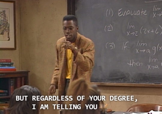
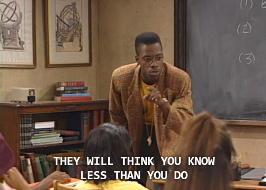
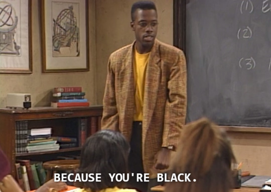
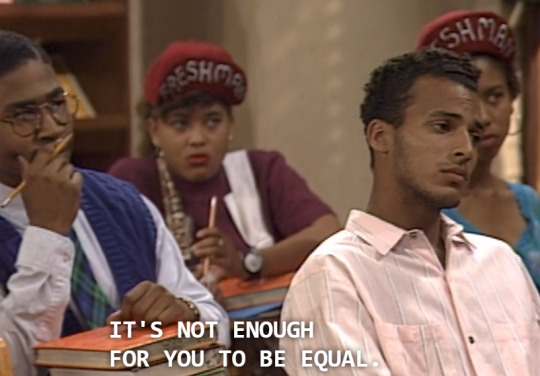
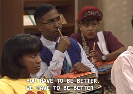
A Different World, 1991
But what’s crazy is that it’s really not a different world at all. Many of us are still dealing with the same problems our parents dealt with over twenty years ago. And this is why we still need shows like this; because they really spoke the truth.
84K notes
·
View notes
Photo


Toni Braxton & Babyface - “After Midnight” Broadway Opening Night (March 18, 2014)
191 notes
·
View notes
Text
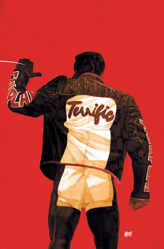
Mr. Terrific #1 (DC, May 2025) variant cover by Mitch Gerads
306 notes
·
View notes


Text

Two Women in Harlem, New York, July 1970 ♡ Photographed by Jack Garofalo
1K notes
·
View notes
Text


Lovie Simone for Schön! Magazine
📸: Jess Brohier
550 notes
·
View notes


