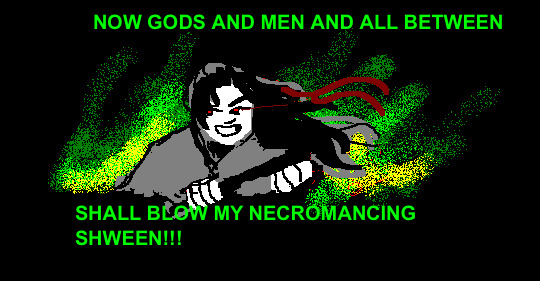
#good colors in my opinion
Explore tagged Tumblr posts
Visit Tumblr Blog
Explore Tumblr blogs with no restrictions, modern design and the best experience.
Last Seen Tumblr Blogs


Fun Fact
In 2020, 27% of US Tumblr users had an annual household income of over $100,000.
Note
What are your favorite colors?

6 notes
·
View notes
Text

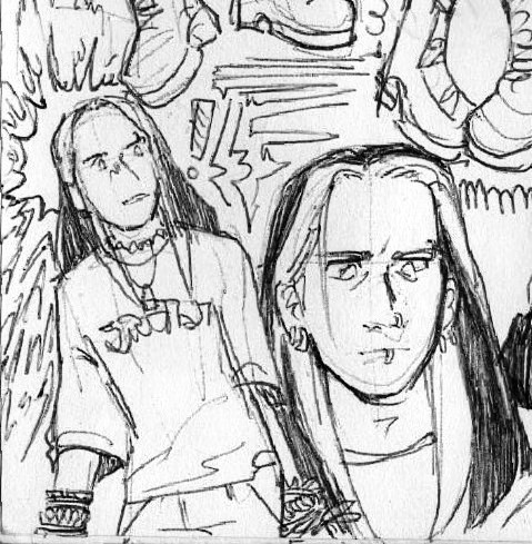
The only correct form of caltam, as far as i am concerned
#tw: opinions#at times whenever the topic of caltam comes up i am left wondering if i played the same game as others#i don't think enough ppl dig in to Cal's and Tammy's characters to realize just how horribly uncompatible they are as a couple#“they're perfect for each other”#bitch where#if their relationship wouldn't be so unwritten they would be having screaming matches from 15 onwards#Tammy is married to a fairytale view of love and princesses and princes and if you looked for atleast a minute at Cal's character you'd#realize he's NOT that type of person#they bud heads on a lot of significant things that play a major role to their characters such as Tammy's protectiveness over the creche kid#and her future family and desire to be protected and stood up for and Cal unyileding view of radical pacifism and hypocritism#i am not trying to be funny when i say i could seriously write a whole ass 10+ page essay on why they're not good for each other#ppl don't realize they look at each other through rose-colored glasses and that they like the IDEA of each other not the actual them#bc of how they grew up and used to see each other. But theyre just another example of how the adults failed their generation#Tammy deserves better than Cal and i am saying this as Cal's number 1 fan please free my girl from the shackles of hypocritical men#she should go make out with Nemmie instead that would do her some good since Nem actually protects her loved ones#i think if i WERE to like caltam is if they were radioactive toxic to one another#anyways i think the solution to caltam is a horrible teen divorce bonus points if cal has an ego death then they stick to being besties#y'all have no idea how good it feels to rant abt these two LMAO#i've been saying this and i'll continue to be saying this Cal and Tammy are better as friends no you cannot change my mind#theres so much more wrong with them but if id list everything we'd be here till next week#i was a teenage exocolonist#iwatex#exocolonist#meme#my meme#been dealing with a nasty sinus infection and a cold that just won't go away for the past 2 weeks but art is still gretting worked on#prolly posting some art in a few hours
69 notes
·
View notes
Text


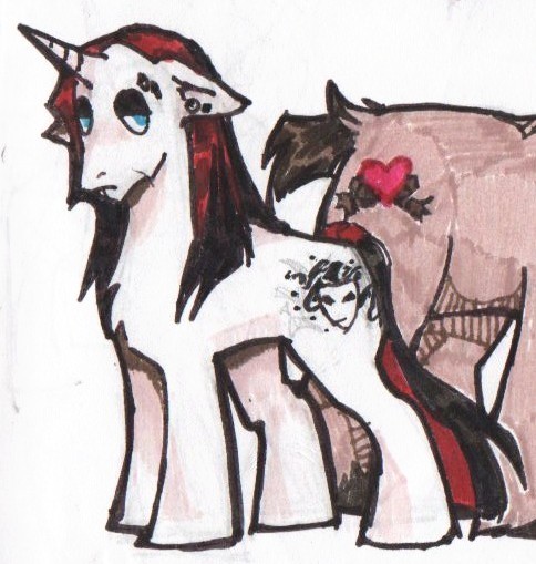
Old SSJ4 F. Zamasu design thing I never finished + Vegito
#my art#dbs#Zamasu#Fusion Zamasu#vegito#i really should revisit this cause the vision was there but i abandoned it#also i thought about giving his his kai cape but it didn't really look good in my personal opinion#also vegito is short cause vegeta is really short and thats that. He shrinks the fusion as a whole#also i based this in gt hence why Vegito looks like that#wanted to give him a silly color scheme that felt gt-ish
115 notes
·
View notes
Text
My actual only request and probably unpopular opinion for season 3 is that they tone down the color grading. I think season 1 looked a lot better. Season 2 was way to saturated. Crowley’s skin looked orange.
#unpopular good omens opinion#it feels hypocritical because I use very saturated colors in my art#and I mean it looks good in the show in an isolated frame#but when it’s the whole thing constantly it looks sort of fake.#also makes everything darker which messes slightly with the value scale#I can’t stop thinking about it cause like I feel like I’m one of the only artists#who is not usually a fan of color grading like this#I prefer just like…regular film footage#or edits that are not particularly noticeable#good omens#I love cool colors I think that’s pretty obvious in my work#and I love it in animation#but idk in film#I sort of analyzed it for my friend (shout out to u mumb) and as I did I noticed how the greyscale contrast of a lot of the scenes are#not nearly as pleasing to the eye#saturation has the tendency to darken colors for the most part#so the background and Crowley would be rather dark while Aziraphale would be rather light. the background needed to be a more even#in between value#sometimes it is but sometimes it’s not#like some scenes look pretty great™ with the color grading#but arggggggg idk#obviously this is my subjective opinion#I understand a lot of people liked it#I actually also think this is why I much prefer ginger Crowley over red hair Crowley#I think the red looks fine when applied without the intense color grading but with it it looks#I mean it looks fine I’m complaining about nothing#me when I complain about the things I love 🥺
57 notes
·
View notes
Text
I made a post a while back about how I wish Mickey and Minnie’s official designs had their faces look more pale instead of peach because the latter makes it look like they have hairless, fleshy faces while the rest of them is covered in fur, while if they had paler faces you could see them as having black fur on their bodies and white fur on their faces.
Well thinking back on that post just reminded me of how much I hate Goofy’s redesign in his George Greg shorts


For those who don’t know, Goofy had a series of shorts in the late 40s and 50s where he was portrayed as an everyman character named George Geef. A common belief about why this happened is that Walt Disney supposedly didn’t like Goofy and thought his shorts were just a bunch of gags lacking any story, but apparently some animation historians question wether or not it’s true that Walt didn’t like Goofy…but I guess that’s all speculation for another day.
Goofy’s George Greg design just makes me uncomfortable af…his appealing goofy posture is gone and he’s now more human shaped, and to make matters worse, his ENTIRE BODY is peach-colored except for his head (and since his appearance in these shorts is clearly meant to be more humanized, I’m pretty sure his peach coloring here IS flesh *shudders*). He’s also missing his ears sometimes (???) and for some reason he sometimes has big buck teeth that make him look like a weird rodent…
I admit I do think Goofy Jr. is cute (although I do wish he had droopy dog ears like Goofy’s normal design…). Funny enough he looks like he could be Max and Roxanne’s son.

In Goof Troop Goofy does have more peach coloring around his face than his normal design, but I still think he looks cute and appealing here, especially since he’s back to being the Goody we all know and love.


But out of all his designs I think he looks cutest and most appealing with his official design where he has black coloring around his eyes.

#sorry for rambling about mickey and friends’s color palettes but I thought this would be a good place to finally get these pointless#opinions off my chest lol#yes I’m putting too much thought into this but whatever#disney#goofy#george geef#I blame my autism for these posts
28 notes
·
View notes
Text
question!! if tumblr does go down, where are you guys going to? or at least where are u most active outside tumblr?
#ive stopped using everything except tumblr and so i do need to think of where to go in case it's gone. so i guess i'd like opinions on where#f.txt#the reality is i know that if tumblr does disappear overnight i'll go and show signs of life on twitter#but idk twitter's life expectancy isn't looking very good vdfshfjf#i mean. it'll keep going but i know it's just going to keep getting worse#i know a lot of people have gone to bsky and if u have what's ur opinion on it? is it good? and do u like it#personally i never really got too interested bc it just feels like twitter 2.0#like interface and all that wise. it's just a copy of twitter from what i've seen. and i suppose it'll still be like short text post based#? havent actually used it so idk#at the end of the day i just wish there was smth else like tumblr. with the same posting and personaliztion capabilities#there's just nothing like tumblr 😭😭 i love the way it works a LOTTTTT. it's good it's honestly really good.#the people in charge just keep fucking it up for no reason 😭#the personalization options!!!! the incredible tagging system. being able to make sideblogs.#i want to make 2k posts about the thematic significance of gojo being a bottom. i wanna post 30 gojo images in the same post#i love having a desktop theme!! i love being able to change my blog's colors and everything. i love the countless post editing abilities.#I LOVE!!!!! THE TAGGING SYSTEM!!!!!!!!!!#i know a lot of people say that tumblr search doesn't work and while i do think it has its issues i think t's a sentiment born of not reall#understanding how it works. bc if u do. it's so easy to find what u're looking for#i guess the little issues earlier today made me realize that uh. yeah this site might actually be dying#and that fuck i should really export my blog OTL#but from what ive seen the export will take. a while.#and also think of where to go but.....nothing is tumblr 😭
27 notes
·
View notes
Text

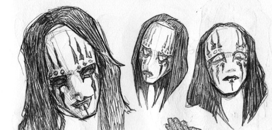
fun fact about me: for about a year (2019-2020) i did all of my digital art in mspaint with a laptop mouse and i got really good at it. i planned to do something nice but school said otherwise so i ended up using mspaint as god intended. i bring assorted mxtx doodles.
(^my scene wwx and goth lwj designs that i've been drawing for months but never posted)
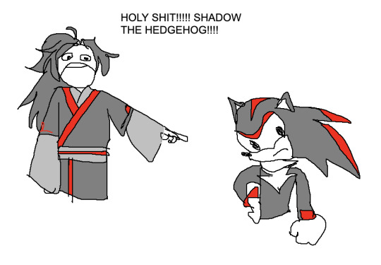
#i COULD have used a custom brush and a small canvas in procreate to make it easier on myself but :)#its my opinion that limitations make better art (<- copium for some of her best work being in mspaint)#i used jspaint which is an online replica of mspaint because i have a mac now#its very good except it doesnt do *the eraser trick* which i'm sad about#iykyk#(when you set certain colors in actual mspaint and right click w the eraser you can set it to erase only one color)#(this can removed sketches from under lineart for example)#niche online communities will make you SO knowledgeable about the flags of states of the holy roman empire. or the intricacies of mspaint.#my art#art#mdzs#tgcf#mo dao zu shi#tian guan ci fu#the grandmaster of diabolism#heaven official's blessing#hob#wei wuxian#shadow the hedgehog#lan wangji#wangxian#jiang cheng#jin ling#hua cheng#cringetober 2023#cringetober#lmao
245 notes
·
View notes
Text
sketchbook dump
#slipknot#joey jordison#whenever i draw older joey i gotta think ''mick. but hes tiny now'' and then im good to go#as yall can tell im in my joey feels today. the pictures of him with his kitties are doing me in#he was a FATHER to those cats#metal's most beloved old cat lady. in my opinion anyway#artings#joey#i hope yall enjoy these lol. the more i draw in my sketchbook the more im like oh yeah i could probably post that. and then i forget#ORIGINALLY it was just gonna be older joey but i figured#since when am i the type of person to not be extra? joey posting is a full time job and i gotta clock in#also you can tell that references are not my friend </3 i have yet to fully stylize slipknot but with faith trust and pixie dust#i may one day. make somethin good#one thing is for certain i got slipkneight locked and loaded to be posted when. i find the will to color them
76 notes
·
View notes
Text
✂️saw these fits and it reminded me of a certain group✂️
#the acclaimed#aew#wrestling#max caster#anthony bowens#daddy ass#ive realised way to late how much effort i put into this why did i even color ittt#caster turned out really good in my humble opinion#also still dont know how to color my art sooo#billy gunn#i know Anthony and max arent middle-aged but the clothes fit them okay?!#max looks mentally checked out idk maybe hes thinking about mjf#i think most of the aew wrestlers could have cuter outfits so ill make it a reality!!#inviting everybody to zoom in on casters arm bc i think it looks hot#im sick of pink now the next thing ill draw will NOT be pink#eggon
102 notes
·
View notes
Text
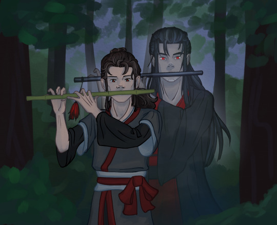
#it's apparently been sitting finished for a week now#which probably means it's time to post it#mdzs#mdzs fanart#wei wuxian#wei ying#wwx#mxy!wwx#I am still having my fun with trying to draw them as differently as possible#and yes I ended up going with clothing from the donghua#except for the colors of yllz's. I enjoy the design but not the colors there#The idea of black outer robe with blood red underneath does something to me#there's some symbolism in it. I felt it when drawing. I felt it xD#also I am of the opinion that yllz era wwx is skeletally thin#But! he also hides it with some good clothing choices so nobody really notices#except for those who care to look#but I am also sure that mxy's body is in just as awful a state by the time of his death#have you seen what the boy got fed?! it's awful. terrible. it's not gonna let him look healthy afterwards#I headcanon that wwx doesn't notice it because he's so used to what his body was like in the end that it doesn't really register for him#but Lan Zhan sees it and is going to fix with regular meals from now on!#anyway!#my art
47 notes
·
View notes
Text
"Wait, you're ADOPTED?" -my (15 year old, WHITE) cousin to me (who is Asian)
#i have included her age because she is too old to not have realized that in my opinion#the only person who truly does not see color is my cousin i guess#good for her??
73 notes
·
View notes
Text
Ranking World link cards in pjsekai:
5. Leo need. Sorry for that... Their cards are really cute but somehow it's empty? Like the untrained cards are just so much better. I expected their cards to be Stars and cosmos related or smt. Well...kinda sad (Maybe Saki one is my favorite)
4. More More Jump. They're better than Leo need imo. I like the atmosphere they give, but at the same time, not the best imo. (I especially love how Shizuku card reminds of her commission song Hug)
3. Vivid Bad Squad. I actually like the split cards (Kohane and Akito)(An and Toya), like the artstyle for Kohane and Akito, comic type and suits for their team, as for An and Toya tho... they're not bad at all, love the shading of neon lights, but they could have been better...(Kohane I like more I think)
2. Nightcord at 25:00. Their cards are pretty af. I definitely like Mizuki one more. I personally don't understand why people don't like these cards help😭. (Either Mafuyu or Mizuki is my fave)
Wonderland x showtime. The best world link cards imo. Love how they resemble the cards and learnings their symbolism by their different flowers on them. I love them all. (Literally I can't choose my favorite)
#I talk#They're all my opinions#I don't hate any of these cards#Just different taste#Project sekai#Pjsekai#Proseka#Pj sekai#pjsk#Prsk#hatsune miku colorful stage#project sekai colorful stage#colorful palette#colorful stage#leoneed#more more jump#vivid bad squad#wonderland x showtime#nightcord at 25:00#Hopefully Vocaloids world link cards will be good :')
22 notes
·
View notes
Text

A drawing I like :O
#tinyorangepotato#digital art#my art#oc art#my oc#Westley#westley oc#i will admit i copied a pose i likes#which is proably partly ehy it turned out pretty good in my opinion#but i also tried out another coloring style#and idk how i feel but i like it riggt now ao
9 notes
·
View notes
Text
You know it is funny how they decided to make it that Descole, this mysterious cool guy, is in reality, this loser archaeology nerd who thinks he’s cool but isn’t really
Like he’s just some guy. I find that funny
#it’s been a good while since I’ve seen the Azran Legacy cutscenes#I like Desmond and he is secretly a badass#but come on#I was just thinking about Professor Layton#probably because I stumbled upon a Layton shitpost post involving him#that might be coloring my opinion#but still at least some of Desmond’s loser personality has to be real#anyways#professor layton#azran legacy spoilers#azran legacy#jean descole#desmond sycamore#random stuff
36 notes
·
View notes
Note
Do you have a fav blush? Do you like cream, powder, or liquid blushes?
ok so my favorite right now is the colorpop blush stick in cottage life it is a wonderful like. terracotta orange that looks super natural on me. so awesome. also super super blendable it blends out so easy... also used the elf putty blushes and those are good, i have two of the like. orangey shades (<— orange blush enjoyer) (checked. i have bahamas and one that doesn't have a shade name but i'm p sure is turks and caicos) and they're rlly nicely blendable and buildable with good color payoff :) other than that i have the nyx sweet cheeks one that's like. a tube. in coralicious and that's also a good one that's rlly colorful! i have to put that one on the back of my hand before i use a brush to apply it though which Is a little more of an inconvenience so. y'know. it also looks like my sunburn shade in the summer so i have mixed feelings on wearing it then haha. i would say a cream blush is probably my fave? powder blushes are delightful obvi but in terms of what i actually wear day to day the cream ones (i think the elf ones are cream to powder. but y'know) are more realistic. liquid ones are cool but they are often just too pigmented for me... would never use the rare beauty ones cause i just don't need that much color and if i did i would just layer up more of the ones that i can use for more natural looks
#also cause they're spemsive and i don't spend money on makeup but like the principle of the thing#my major blush opinions though. orange and purple and red blushes are going to save the world#pinks are cool but have you considered... colors that work on other skin tones...#my skin is like. olive and barely tan. and pink manages to look clownish on me so easily but wearing oranges was Such a change#and there is obviously such a dearth of products actually meant to suit dark skin tones in the makeup industry...#see also recent dior blush fiasco. tried those in a sephora yesterday and they are genuinely like chalk#my point was. purples and oranges look so fucking gorgeous on darker skin tones and i wish that there was more conversation#about using different colors that Suit you and like. Complement you rather than whatever shade is viral#anywayyyyyyyyy#forever thinking about the fenty trophy wife highlighter from way back when. i feel like that never got enough hype#saw someone white making a video back then like 'it just doesn't work for me' yeah obviously not. i think we could have guessed#that straight up gold was going to look strange on your cheeks. wasn't made for you#stepping off the soapbox. wasn't made for me either. it looked so so so good on dark skin though that was so fun to see#we should bring back highlighter... i am thinking this all the time...#maybe it's just cause i was like. becoming a person for real when 2016 makeup was happening. but i still love it#'why were we doing a full beat to go to the grocery store' uh. for fun? listen....#impractical. over the top. yes. and i think we should do that when we feel like it#the natural makeup that's been popular lately is cute!! and also. i fucking miss nikkietutorials 'i want to look like a lightbulb' era#over the top ridiculous highlighter come back baby i miss you...#valentine notes
8 notes
·
View notes
Note
Why aren't the other alters as anti-capitalist as you?
What? We are, we just don't want all of our blogs to be super political because it's a bummer. Joker specifically holds trauma about capitalism and its sort of his 'alter theme' so its also his blog theme. We are all extremely anti capitalist. Most of the posts here are actually reblogged by other alters since joker is not awake that often tbh
- Vox (Sorry Joker's not awake rn to contact to answer this)
#joker joking#beep boop#ask#anon#I am a bit amused and befuddled by this conclusion and i would love to know how you came to it genuinely#anyways you can assume for major things like polotics all alters in my system share the same opinion#we only have different like. taste in kinks. and cheeses#there is a weird cheese debate where the same cheese tastes good or not depending on who is fronting#this is very confusing to us#why is the cheese different#edit: and oh god hair color#hair color is the biggest war#valentino tried to dye pink on top of green#octavia tried to bleach it out but it still has streaks of weird color#octavia was trying to do a compromise iwht half black hair and hald blonde#iwbr our head looks like a child colored on a blonde barbie with crayon and sharpie
7 notes
·
View notes