#gonna be working on the designs/redesigns for the others
Explore tagged Tumblr posts
Text
Redesign concepts of Webmaster and Feathers
After a year


WEBMASTER
My biggest problem with the Webmaster design is how cluttered it seems; there's just a lot going on here. So I tried to calm it down a bit; I took away one pair of legs to make him less cluttered but keep (more or less) original body lenght. And I know that in his episode Jun says “if something has eight legs, she doesn't like it,” refering to spiders, but I think eight limbs works too.
I also played around a bit with his colors and markings. As well as body structure and proportions, noting this dragon's show-off skill - spinning webs.
When he puffs up his “cheeks” just before he spits, you can hear a sticky, mushy sound - you know that something is going on inside. The muscles are moving and pushing something with a sticky, gluey consistency. I would like it to be somewhat repulsive.
When he spits silk in attack it does not come out as big ball of burning web. It's more like net in "V" shape, in form of many separate threads of silk shooted at the same time. Similar to actual spiders, but on the bigger scale. His webs also don't burn; I feel like it's an overkill.
I changed the arrangement of his forelegs slightly. I know it's not quite in line with the style of HTTYD (see Speed Spingers' front limbs) but in his case I think arranging his hands in a similar way to therizinosaurus gives him a more menacing look.
Deadly Spinners are dragons that give a very unpleasant first impression. They are not the most beautiful dragons around (at least not by the standard) and their behavior can be repulsive to some. The type of dragon that people are willing to pin an unfriendly, sometimes unfair patch on more easily than on other dragons - as many people do with spiders or snakes and other similiar animals.
Deadly Spinners don't live in large groups - either small groups or solo. But when they are in a group they have very close bonds and spend a lot of time socializing among themselves.
FEATHERS
She is a challenge to me, not gonna lie. She definitely is the most changed among my redesigns so far. She just seems very basic to me.
The most bothering thing to me about her are those "feathers". Because, Alex in s1ep3 calls these "feathers", as well as Olivia in s5ep2, wiki calls these "feathers-like scales", but they can move and are thick what implies they are more like Furies'/Night Light's head numbs? I absolutely can pass the crowns as feathers, but Queen's horns and holes in her meaty tail were here the last straw to not to
And yes, I made a shitty video because I'm really confused and wanted that confusion express lmao. I hope Tumblr won't take it down.
So idk, I wanted to clarify what the frick those things are and go from there. I had two main ideas - either give her actual feathers or quills similiar to those of Bewilderbeast. When drawning I wasn't sure about either idea but finally decided for the latter one. Feels more HTTYD-like I think? And very flammable feathers don't seem like the best survival choice when almost every other animal around can spit fire.
I reimagine Featherhides as way more nervous and skittish dragons. Changewings were mysterious but usually seemed calm and strategical. Featherhides' nature is more in type of "flee" than "fight" (tho they can get so smoke when needed, they are not defensless or smth). They are very easy to spook and sometimes will flee in panic from something very trival just to return seconds later when they realise there was no danger at all, or are curious of whatever scared them. They often make rapid little movements, much like birds - especially if something catches their eye and they are not sure what it is.
Featherhides also live in large flocks without a complex hierarchy. If they can - they run, if any of them can't - at least some of them also stay behind.
Once Feathers bonds with Alex she would be very protective of her little human.
When Featherhides mimic sounds they do not do weird things with their faces like in the show. It looks much more like like some birds do that. But that's just a sidenote.
#I think I did fine job with them#Maybe it's just my ego#but I feel like these designs with some quips could be something we see as background dragons in movies#httyd#dragons the nine realms#tnr#httyd tnr#fan redesign#tnr webmaster#deadly spinner#tnr feathers#Featherhide#my art#doodles#httyd alex#alex gonzalez#httyd Eugene#Eugene Wong#Jun Wong#I mean she IS here
26 notes
·
View notes
Text
Here’s y’all’s food— eat up

Closeups


#my art#centaur au#tsams#tsams au#sun and moon show#tsams eclipse#sun and moon show eclipse#sun and moon show au#eaps eclipse#eclipse and puppet show#gonna be working on the designs/redesigns for the others#and on revising the lore for this au#not that there was much to begin with but still-#I’m thinking of making it not that different from canon and they are just centaurs instead of robots?#idk I’ll figure it out as I go
51 notes
·
View notes
Text

I noticed from the Ninjago movie concept arts that garmadon is taller than wu 😋
#also the hagemen brothers worked on the ninjago movie before lloyd and the other ninjas had a redesign#so does that mean this was gonna be a canon design in the show too..#i kinda like garmadons design in the Spinjitzu brothers novel though cause hes a spitting image of lloyd with his bandana#and you know i love my “like father like son” shenanigans#ninjago#ninjago fandom#the ninjago movie#garmadon#master wu#ninjago garmadon#master wu ninjago#ninjago lord garmadon#lord garmadon ninjago#ninjago master wu#ninjago lego
132 notes
·
View notes
Text
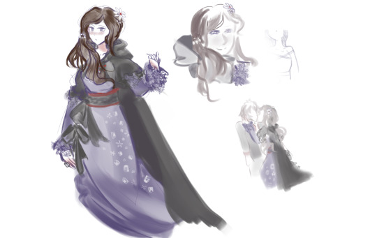
Hmm... Akane witch design courtesy of Umineko brainrot anyone? 😳
#look at that tiny junepei sketch I think it's cute#I really want to make a full drawing of her? but you know needed to lay down the design like this first so I know it well before posing#and well wips I have to finish other wips first I have one of Santa and one of Clover taking me forever to finish#but they're turning out pretty slay it's gonna be worth it 😤#and haha what's that? a thousand other ideas I have no clue the order in which I'll work on hmmmm......#including like wanting to redesign my zwg redesigns#oh well qwq#silly doodle tag#also it's hard to tell with umineko witches but I feel like I overworked this one and there's too much going on? tried to bring aspects of#allll of her canon designs while giving her a hermit witch of the forest vibe as well it might have been too much?#hm what would she be the witch of I wonder#akane kurashiki#zero escape spoilers
134 notes
·
View notes
Text
oc designs i will be tweaking entirely be upon ye
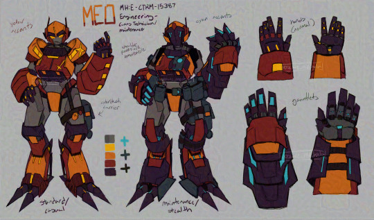
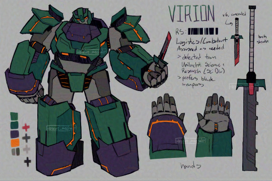
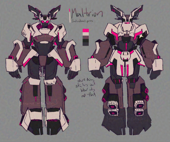
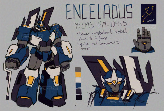
four of the main ensemble and there's still more to go, these guys take up a lot of my brain's bandwidth
bex tries to explain the lore under the cut bc this post is kinda on the long side ? idk
so this story takes place on a rather isolated mining planetoid named Melien, under the jurisdiction of an offworld company, Unilacht Co. Excavation Division, hailing from a planet inhabited by sentient robots called mechala. Due to [circumstances kept vague to uninformed personnel], this branch of Unilacht operations has also been tasked with the mission to build a substantial army--using whatever means necessary.
However, the reclusiveness and secrecy of the Unilacht Co. Excavation Division's overseers has frustrated a good amount of their personnel. Currently a substantial number of their mechanicized soldiers and personnel have joined a rebellion effort started by the former Unilachti Command Administrator (who has since been recaptured, but the movement continues in his absence).
Enceladus, Maltrion, and Meo were all part of the same defection cohort (joined the rebellion at the same time). Virion joined them a bit later under some interesting circumstances. All of them are not fond of the Unilacht for vastly different reasons, but all have their own deeply personal reasons to resist the rule of the Unilacht.
ok now im motivated to do a lot more drawing/stuff with these guys while i revamp the plot for the 45th time be prepared for more oc shenanigans *looks at smudged ink on wrist* all 5 people who voted on the poll. appreciate you :thumbsup:
#NOT transformers ocs#they're for my own project#i did take inspo from tranformers and i love it but this group of ocs are not part of it#ill share my tf ocs one day i just need to redesign them bc i didn't know how to draw robots back then#project name TRaToR#oc tag#they're all gonna change designwise and these arent all of my guys#still working on more designs#but yeah out of all of them im still not satisfied with enceladus#if you know me on other places you'll probably see the updated design elsewhere first#did most of the polished refs for artfight just to burn out halfway through after doing 4 drawings#feel free to send asks and stuff about them i'd love to ramble about them#bex OC posting#i got more art i will post eventually#but writing this has been kinda motivating even if like 3 people are gonna see this#bex draws
6 notes
·
View notes
Text


Old vs new
#all of these characters needed redesigns but for various reasons#mostly being that its old art and my design senses and skill has changed since#rain may fall was picked because compared to the other characters in her story they just felt very plain#i also planned on only giving them a brown skintone and i wasnt gonna change their hair or anything#but than while i was microwaving food i randomly thought of them with darker skin and curly pink hair and i thought it was really cute#so i did it lol#salem is a design i was never happy with even when i originally drew him i was not happy with his design#particularly cause he looked very christmas-y#so i changed his palette making the green more yellowish and the red more orangeish and i think that worked out better#delta needed a redesign for the obvious reason of being art from 2019 also i felt they didnt seem vaporwave enough#and the way the umbrella cuts off in the art i did of them looksbadman#alastair and earlene also from 2019 but also i chose them specifically because i... i needed seperate images of them#its awkward to crop that old art for their character pages#bell taurus also just old art from 2019 doesnt even have arms cause i used to not always put arms on stickman drawings#elmo primarily cause i wanted to change his colors and make him look older as well as get rid of his horns and give him a skintone#his story (and salems) had some lore development since i drew him in 2019 so this better fits the lore#belat is another design i was never happy i spent a long time on his old design fiddling with it back and forth and hated it#i decided to make him a catboy and now he looks better#and esteem. my god esteem. i got lazy with their old design and i hated it. they needed the redesign the most#anyways done rambling
4 notes
·
View notes
Text
I’m still surprised that the catholic church’s attempt to be hip with the kids worked
#We’re giving the Vatican free fanart this is CRAZY#not saying this in a /neg way btw. I think this is funny#like usually when something tries to be hip with the kids with anime and memes it doesn’t work and the thing that successfully#gets it right is. The Vatican#and ig with a cute character design it makes sense no one can resist a cute character design#speaking of the characters please stop making inappropriate art of Luce in an attempt to show you’re against it cuz. That doesn’t rlly work#If you’re against her existence then like ignore her existence. Don’t draw her. Don’t potentially sexualize a religion and a character who#looks like she’s 7#There’s no official age for her as far as I know but she looks like a toddler bro 😭 she should be at preschool not acting as a missionary#i think that’s the lore at least correct me if I’m wrong please!#catholics and artists of tumblr go reclaim her or something idk LMAO#I’ve seen a redesign of her that looked neat + had angel features which I think is awesome#I also saw art of her as a cleric but it wasn’t meant to be a redesign like the other artwork I just mentioned#oh my god I love Tumblr tags I can just yap all I want here. Is anyone even gonna read this idk#hi to whoever is reading this. Hiiiii :3#but yea that’s all I wanted to say I think. One of the funniest things that’s come out of 2024 this year has been rlly interesting for me#In a good way#danny speaks#delete later#<- Maybe. Idk yet
1 note
·
View note
Text
VOID STATE EXPLAINED: HOW TO GET THE LIFE YOU DREAM OF ᥫ᭡
A TELL-ALL GUIDE TO THE METHOD EVERYONE IS TALKING ABOUT

so in my asks i have alot of people going “sai, you always go on and on and on and on about the void and different problems people may have, but you never explain what it is and how to get there”And to be honest with you, most of my posts were meant to be that way because i knew of other blogs explaining the void and my blog was just meant to be follow up posts for those who already knew about the void. Although, now i feel more confident and equipped to explain the void in its entirety.
so strap in for this long ass post because this is a gonna be THE guide (if you can’t tell i’m very excited for this post)
i just wanna say that this post is an inspiration and a remix of all those that have inspired me
1. What is the void?
so as you can see yourself and life right now is you in the physical plane (the notorious 3D) you are experiencing the world as *your name* *your lastname*, and your experience is confined by the way that you initially came into the world, being y/n y/ln . The void, originally known as the “I AM” state is when you leave that experience behind, you leave the physical world behind and become nothing and everything at the exact same time. And doing so you can create and destroy absolutely anything in your experience = your reality which is why people call their destination after the void their “dr”=“desired reality”.
2. Why the void?
This method is seen as very effective and efficient once you know how to do it right because it’s a “method” in which your subconscious mind is in full control, which means you can do absolutely anything and that’s not some conspiracy or belief, it is a fact that when entering this subconscious-based meditation state that you can do absolutely anything, which is why i said that you have the power to create and destroy anything in the physical plane, altering your experience. You can change your genetics, your family and friends, your wealth, gender, where you live and much more. You can also redesign things, like a country for you to live in, your age, your s/o’s age, your memories and just your life in general. Just one trip to the void and all that you dream of is yours.
The void doesn’t have to be pitch black you can design it anyway you like, i see alot of people in my dms and asks, saying that the pitch black scares them, but your void can look anyway you want.
personally i’m not scared but i just wanted my void to look cute so i added pink stars to the pitch black
3. How do i get to the void?
There are many ways to get into the void, you can follow a guided many meditation, you can listen to subliminals or waves, you can simply affirm, you can visualise, or you can simply do none of these and go into the void with just the intent, KNOWING that it’s apart of you. You don’t need any method to tap into the void, all you need is yourself and the intent, knowing it’s apart of you and not some magical fairyland. You can enter at anytime of day, because you’re a god and don’t need to be confined to “time”. “Time” is a malleable concept and i’ll be dammed if you guys waste your days because you only believe that you can tap in at night.
4. Problems people have with the void
3 things: wavering, laziness and putting the void on a damn pedestal
a lot of you guys fail to enter the void simply because you try to enter. all the things i have said about the void make it almost impossible to believe, a golden ticket to your dream life with one trip to the void. And because of the fact that we have been conditioned to believe that we have to work for everything we have, this just seems to good to be true. and you see the void as some magical place when it’s YOU, the void is YOU, why do you think you affirm “I Am”? well it’s because the void is literally the state of you being everything but nothing, it is not a place it is a state, hence the void STATE, the “I Am” STATE. it’s a meditative state and that’s it.
When you enter the "I AM" state, why do you affirm phrases like "I am, I am pure consciousness, I am the void, I am unattached to any reality, I am faceless and formless"? It's because these affirmations align you with your divine essence, your true God Self. However, this practice is often short-lived. You enter this state briefly, and when you don't experience any immediate changes or wake up in the same shitty reality, you begin to doubt. You think, "Why hasn't it worked? I must be doing something wrong. I'll try again tonight." This is what wavering looks like. You declare yourself to be in the "I AM" state, but when it doesn’t immediately manifest, you believe it hasn't worked and attempt to re-enter it repeatedly. This endless cycle of trying can confuse your subconscious mind. Instead of truly embodying the state, you're constantly oscillating, creating inconsistency and doubt.
STOP TRYING AND START BEING, OR YOU WILL GET NOWHERE
the void is the easiest thing ever and it is owed to you, because it is you
you can literally enter right now and have every single thing you’ve ever wanted, with just a meditation state, the void isn’t the one with the power it’s you. The void is inside of you and it is lifeless, the only time it gains any power is when YOU step into the equation. As i once said, the void is your bitch not the other way around.
5. Unhealthy relationships
Although the void is one of the best methods i know, i would hate for anyone to accumulate an unhealthy, toxic relationship with the void. The void is as easy as breathing, i know, but it can be alot for some of us to wrap our heads around due to the way we have been conditioned to think (which hurts my heart more than you know). I see people spend months and years trying to get into the void going through an emotionally taxing experience with it. Although i tell people it doesn’t matter how much time you’ve “wasted” and not to let that discourage you because you could really enter now if you put your mind to it (no pun intended) , if you know that it has been eating you up trying for the void going around a constant cycle, please take a break or use other methods.
now with that i say go, go and redesign yourself, deconstruct yourself and create the new you, start from scratch and make your dream self, go to the void and get your dream life.
don’t try, just be 🌊💋
i really hope you loved this as much as i do, now go get your dream life -salem ᥫ᭡
#salemlunaa#shiftblr#permashifting#reality shifting#law of assumption#loa#shifting#success story#void state#the void#void concept#desired reality#respawning#manifesting#manifestation#master manifestor#shifting community#the void state#voidstate#void state tips#shifters
2K notes
·
View notes
Text
me and my mom were watching one of those house shows the other day, the one where its abt ppl who won the lottery finding houses, and it got us talking abt what WE would buy if we won. and ofc i feel like most ppls standard answer is house + car + pay off debts. like. obviously. boring answers tho tbh. the real first thing that popped in my head after those generic answers was 'omg id buy SO much art of my ocs' JAKDSFHKJD
#sure im an artist and can draw them myself!#but! having other ppl do it in their own good styles ......ough#also the idea of being rich enough 2 support my fav artists is rly a nice thought. like i love u. take a quarter million dollars and draw#draw me my ocs...........in silly situations. in cute clothes. holding hands. hehe#ive been rotating my ocs so fast in the ole noggin lately im gonna redesign 2 of them i think (esp the monster/chimera designs)#ive read books on bug anatomy since making them. i can do better......we can make them weirder/cooler i think#>:3c#sanchoyorambles#ive done a lot of doodles i cant even share bc they are spoilers for the story!!#that i want to post in full at some point when i work up the nerve TwT#if i clean them up i will show my besties and my sister probably . and then forget to post them later when the story is being posted#i know myself
1 note
·
View note
Text
Faye's other childhood friend, Elias! (Or Eli, or Els to Faye and Wes)
They don't have to look that Creature, they simply choose to
#uploading this on mobile at work bcuz i forgot to last night so what happens to this post and tags is up to god#kee draws#oc#elias#werewolf#kinda. not officially/in lore. but like. theyre a werewolf with spice.#Beast god out here like 'i specifically tailored my gift to allow you to appear seemlessly as a human when not in beast form#- so you have as little disruption to your life as possibly'#elias immediately: oh i am going to be So Gender#love them for that#im FINALLY done w/ the main designs i needed for. something.#the others arent gonna get all polished up since i dont need them to be rn#but someday!#incredibly potent oc brainrot lately#man my heroes sure do keep looking rather villainous huh#(with Faye and Brom it's intentional! but here i was just being self indulgent. oop.)#'kee dont you already have a werewolf oc named -' i will redesign and repurpose my ocs as many times as necessary until im satisfied
1 note
·
View note
Note
Wonderland tadc designs ramble maybe? :³ (ofc, it's okay if you don't want to)
don’t mind if I do 😈

Zooble’s design was a little tricky when I tried drawing her first hand. Before I was trying to see how she would work as a caterpillar, and I wanted to avoid making her look too much like one and to close to her original design. It wasn’t until I remembered the Frankenstein-toys from Toy Story and used their mismatched designs for inspiration. The Barbie doll arm is the biggest hint.

Before gangle played the role as tweedle Dee and tweedle dum. But later changed after sun and moon filled the role. The design actually worked out very well when I thought how I can clearly tie the ribbons. The wings for the gryphon is no brainer, but I'm more proud of myself on giving the mock-turtle a bun-like ribbon. The mask for the mock-turtle is actually based on Japanese dragon heads.

Moon and sun filled the role perfectly and both played off each-other well comedically. But their first designs aren’t my favorite because of their torso half. They originally were gonna have those spin top toys for dresses, making them looking goofy. But it became difficult to draw multiple times, so I decided to drop it and redesign. It wasn’t until after looking for refs, I found a little Victorian lad in a sailor uniform. It was cute and it made me think that these two would be placed near the shore or docks telling nonsensical rhymes and stories.
I’ll explain more later on once the master post is complete, so stay tuned too.
#the amazing digital circus#tadc#digital wonderland#tadc au#tadc fanart#alice in wonderland#tadc sun and moon#tweedle dee#tweedle dum#twinkle moon and twinkle star
337 notes
·
View notes
Text


Back at it with some more Obey Me redesigns! This time it's the angels <33


I bet you thought I was only gonna do the three that show up, huh? WRONG. Lilith and Michael deserve designs too, yk?
Here's the part where I ramble about my design philosophy when it comes to the angles. Generally I wanted to use the same palette on all of them save for the hair and eyes. I've been generally keeping the same eye color as base game does for each character, idk why all the angels have the blue eyes but I kept it going for Lilith.
You might Notice that Simeon is still vv similar to his original design, that's intentional. It kinda serves as a little hint to his future in seasons 3 and 4, and also I actually quite enjoy his og design lmao. Also gave him long hair because uhh.. pretty :3
I don't really have much to say about Luke other than his hat gave me trouble lmao, he and Simeon were def the easiest to do fr.
Raphael Raphael, oh the man you are. I'm gonna be so real when I say that I really don't enjoy his og design that much. Bro is supposed to be intimidating but I'm sorry, when your shirt is only low enough to cover your nipples I'm not gonna be intimidated LMAO. You might notice that his colors are kinda reversed in that his cloak is black instead of white, that's not only to raise his intimidation factor but also a throwback to priests dressing in black.
Lilith gave me some trouble in trynna figure out how and where to put the colors down but I think I got it? I'll likely revisit her in the future. All I had it my brain was to make her cute and pretty and to make her pose playful so uhh kaboom, goal achieved ig??
MICHAEL was kind of annoying to do ngl. You may have noticed that I switched my line brush for him, that's because a. I MISSED MY USUAL BRUSH THIS ENTIRE EXPERIENCE HAS BEEN SO PAINFUL DOING ACTUAL LINE WORK and b. his hair looked like SHIT in the line brush I'd been using for the previous redesigns. Ngl I kinda hate the way I did his face up, I had so much trouble for some reason. Gonna need to revisit it fr
If you read all of this then uhh slay I guess. If you haven't seen my redesigns for the brothers then check them out. Next batch will be the rest of the characters (so Dia, Barbatos, Solomon, Thirteen, and Mephisto).
#obey me#omswd#obey me shall we date#fanart#obey me fanart#obey me simeon#om simeon#obey me luke#om luke#obey me raphael#om raphael#obey me lilith#obey me michael#om michael#obey me redesign#obey me!
246 notes
·
View notes
Text
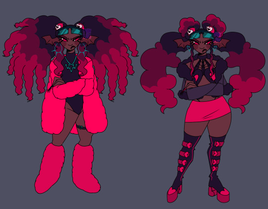
Velvette if she served cunt
Design breakdown below 👇🏾(BEWARE IT'S VERY LONG)


Alright going into detail about my gripes and edits. Like Velvette but her design is just. Not good to me. None of her (main) outfit details look like they fit to me— pinstripe pants + long fur coat paired with black crop top and scene sleeves? Skull earrings? TINKERBELL HEELS????? Tell me how any of that meshes well or even makes SENSE for the social media influencer persona she's supposed to have going on. Now that I think about it I'm pretty sure she's supposed to be clown themed... But I'm just gonna toss that idea out bc being a revered social media influencer and a clown at the same time just seems a bit oxymoronic to me, and the "clown" details aren't adding shit for me.
And don't think I forgot about her features. Pale ash grey skin and wavy hair at best. If she was supposed to be some type of creature where a nonhuman skin tone would make sense then maybe I could let it go?? But as far as I can tell she doesn't have an object or creature or animal theme like the other V's and if she does I shouldn't need to do detective work to figure it out. There is no reason for *any* of these poc characters to have grey skin, especially since they don't have any other poc features at all.
Sorry that shit gets me heated anyways. Onto my redesign. Gave her a more obviously black skin tone and textured hair bc I love a 30 inch buss down as much as the next girl but considering how there are no significant poc cast members with visibly textured hair I think she deserves to flaunt some coils if no one else will.
Ngl I'm not. A fashion girlie. Idk what's trendy idk what screams "influencer" so a lot of this was just throwing shit at the wall that I've seen around recently but it looks cute enough to me. And there was a bit of inspiration taken from Aliyahcore and ghetto fabulous fashion ❤️
If you can't tell this is shamefully inspired by lovesart23's Velvette reimagining because imo they had some outstanding ideas for Vel. I low-key stole their idea for those floating eyes in her hair that follow her around and help her keep tabs on shit it was just a superb idea for a social media overlord to me. I also took some inspo from @furbtasticworksofart 's redesign because vampire influencer sucking up the souls of her followers in exchange for content??? Too good (also the eyes were supposed to have bat/vamp wings I just forgot 😭) So yeah she's a vampire demon now. Without the features she was looking too human anyhow. Maybe she also feeds off of the energy of her followers through tech like after Vox mind controls them or whatever... Idk idk is that anything
Speaking of Vox, the screen glasses are meant to connect her to him w/ their color and shape while serving the purpose of being like a second phone she can post and check the web with. Like lovesart said in their reimagining vid, Vel doesn't really do more than pose for selfies and scroll on her phone when it comes to social media so in my head she's constantly flipping her shades on and off, using them to scroll and stay active, and they can show when she's not paying attention or respect to something/someone bc scrolling is more worth her time in the moment.
The hearts everywhere are also supposed to kinda represent social media likes + connect her back to Val w/ his heart patterns. That might've been what the hearts in her og design were for but. I just didn't like their placement bc I'm a nitpicker and a hater❕
I have so much more I could say about possible ideas for Velvette because I love evil black girls and I only want them to succeed in my media and I could treat her so much BETTER but I'll refrain bc this is way too long anyway.
Alright for reading/scrolling through all that rambling I offer you the sketches + some alt hair ideas I had
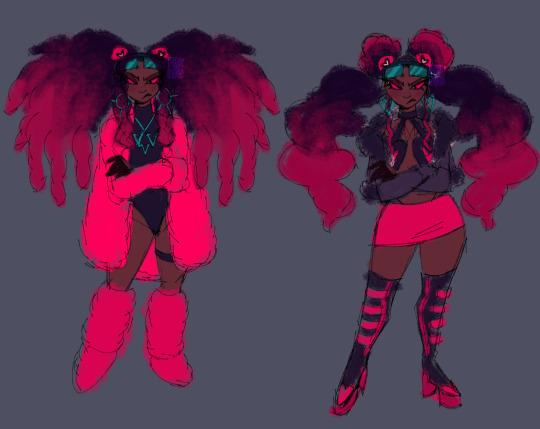
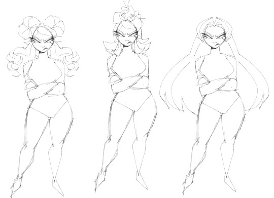
P.S. I'm very open to constructive criticism but if I see anyone just dick riding in my replies or rb's I'm just blocking you on sight ✌🏾
#hazbin hotel#velvette#velvette hazbin hotel#velvette redesign#hazbin hotel redesign#my art#digital art#character design
843 notes
·
View notes
Text


(me getting into a new fandom) oh yeah. you could make classpects out of this
phew i've had this in the works for a lil over a week!! ava/m characters as homestuck godtiers! had to get the drawings out there yanno.
i will put more thoughts and the titles for everyone under the cut, because i did some minor redesigning to the outfits + you probably won't care about the classpect thoughts if you're less insane than i am lmao
Orange: Heir of Hope (a case could be made for them being a muse as well, i just liked how heir looked a lot better and it fits neatly i think)
Green: Witch of Light
Yellow: Maid of Mind
Blue: Maid of Void (maid bros! this is the title i'm least sure about though, it was a 5 minute pick based on vibes + matching class with yellow is a cute idea)
Red: Rogue of Life
Purple: Bard of Breath (obviously wasn't gonna use the canon outfit, i'm pretty ok with this redesign i think. purple as passive destructive class <3 could see them being a prince too)
Chosen & Dark: matching Lords of Space and Time (tbh i think dark fits better as a lord of rage, but passing up the opportunity to give them aspect duality of the two most reality-based aspects that MATCH THEIR COLORS? you think i'm NOT gonna go for that???)
this is also my first time drawing, uh, most of these characters, so i had to nail down designs right here (...and by designs i mean hairstyles)
bonus: i also put down king as a prince of doom and victim as a thief of void, but i was drawing So Many Guys already so i opted out of drawing em. i think in an actual au scenario they wouldn't be players anyway so it fits it's okay i have an excuse here guys. and i think king wouldn't look great in a prince of doom outfit lol
if you read all this, i hope you enjoyed the brainrot!! this may flop but if one other person sees+enjoys this then that's a success to me :D
#oh god tag time...#ava#avm#avam#alan becker#animator vs animation#ava the chosen one#ava tco#ava the dark lord#ava tdl#ava the second coming#ava blue#ava green#ava yellow#ava red#avm purple#v's post#v's art#none of these intended as shipping but you can interpret as such if you like ig
249 notes
·
View notes
Text

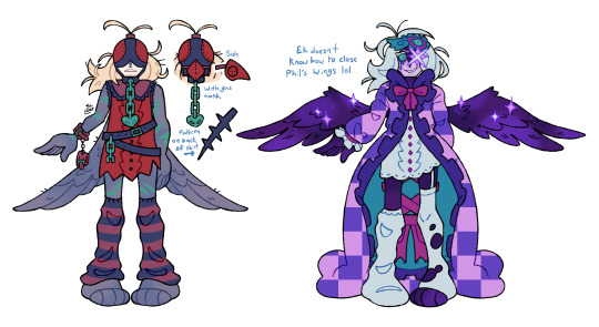
FINALLY FINISHED MY QPHIL 3.0 DESIGN HOORAY (cant wait to. redesign it again in like 3 months.) (CHECK UNDER THE CUT FOR MY SILLY DESIGN NOTES!!)
I think I said this before but i so. SO BADLY wanted him to have a sleep theme since I always loved how his presence on the island was kinda up in the air. Is it a dream? Is it not? When he goes between the island and hardcore is that change really happening? Who knows.
The idea of making his usual outfit more like a housecoat was super appealing to me, so I opted for this open housecoat look with really heavy frills which were super fun to figure out, and I knew from pretty early on that I wanted to give him a quilt pattern SOMEWHERE on his design, so I thought the inside of the coat would do nicely for a sorta "default state". It also meant I could attribute meaning to the symbols and colours I used. wink nudge.
He has a more subtle angel theme, like with the mobile on his walking stick being a halo with the wing placement further emphasizing this, as well as just his generally lighter colour scheme. When I say sleep was his theme I almost more-so imagine it as like. The feeling of waking up in the morning where you're mostly refreshed but still a LITTLE drowsy. Lots of very spring-y, morning colours.
Just some other quick notes, I always really liked the mod in the server where you could have the crows perch on your shoulder and follow cuz of the lantern, so I thought it'd be fun if I made it so brian just straight up WAS the lantern. So I made him look like one of those wall outlet nightlights!! The backpack being kinda cat shaped was COMPLETELY unintentional but a very welcome result. Missa backpack is real.
As for the alternate outfits, I have a bolas one, as well as an ender king one since I deemed those two the most important. For the ender king I weirdly don't have many notes, like it's fairly straightforward (Save for the elephant in the room but now I'm gonna keep my secrets on why that's a thing). The Quilt design is supposed to be a lighter, easier-on-the-eyes version of the no texture pattern, and I imagine that all the goop and gunk on Phil is hidden under the coat. I imagine it'd look fairly similar to canon so just like. imagine it for now. Might draw it one day. MAYBE. There's some tiny additional colour symbolism but I'll hold my tongue on that and let you guys draw your own conclusions there. I WILL say, however, that instead of his theme being sleep, his theme is "nightmare" (and also kinda sleepwalking since both fit).
The Bolas design was SUPER fun to work with. For starters I wanted the three designs to be in three different states. One with the coat, one with the coat reversed, and one without the coat entirely. Since I wanted to do the checker pattern thing with the possession design, having the sleeveless bolas design worked really well for the shape I landed on, even if it wasn't conventional. and SPEAKING of non-conventional design choices, I decided to go against the usual plague doctor + gas mask fusion design. Which might be controversial... But god. The moment I thought of his mask being a falconry hood, the idea just wouldn't leave my mind. Because of this, the full mask is kinda separated into two parts. The eye mask which kinda also mirrors his usual sleep mask, and the gas mask itself (I kept it in a beak shape since it'd feel odd if i made it any other shape for phil, lol). When designing the whole thing I kept thinking about more apocalypse setting clothing. Like mad max. Or the one gag from that one spongebob movie. Lots of leather. And of course, to match the other sleep themes, the Bolas outfit's theme is "fever dream", although its a bit more subtle. It's easily the weirdest design, The pops of green were simultaneously in reference to the friendship emerald... As well as... Well, the green chain right below the chain on the sickness themed design was probably the most tasteful way I could've chosen to get across vomit without it being too on the nose. (also sidenote, I had a few friends compare bolas phil to... a fly. Which wasn't intentional but it's kinda funny that the guy designed after fever dreams looks a little bit like a bug.) Ok thats it for design commentary I'm gonna go to bedge nyow.
#syd spiels qsmp#my art#qsmp#syd's art#q!philza#philza#qsmp ender king#im so sleepy guys i gotta be up early tomorrow
176 notes
·
View notes
Note
Your Uriel is AMAZING! Yours is the first design that also captured what I think he'd look like! And him with Adam..new ship unlocked, apparently! Your art is gorgeous please continue the great work!
ASUHBWU thank you so much but um,,, I did redesign him just a bit since I last posted him so yeah….

I’m still on the fence abt it cuz I also liked the wavy flame design. Also might give him some melanin in the future
A little on Uriel and Adam tho
Uriel did not accept Adam at all when he entered heaven. Uriel wasn’t too fond of the humans in the first place, he had prophetic visions of them and knew that something bad was gonna come, proved him right and he did not like them afterwards. They also remind him of his failure to protect Eden from sin, not being able to catch Lucifer before stuff happened bcz he was the main guard of Eden. And Adam was like, kinda unstable when he entered heaven but to Uriel he was just a major inconvenience who needed to suck it up- didn’t like the way his other 3 brother babied him. He’s incredibly snappy and backhanded when he talked to Adam. Nothing too bad to push someone toward the edge of a breakdown but would make someone fume for a good hot few hours.
But each archangel was assigned to help him assimilate into heaven so they slapped uri on it to teach him heaven history and some other knowledge angels must know. Not a fan of it. Uriel’s temper can run as quick as he burns. He had many arguments and bickering sessions with Adam. But he softens over time when he reluctantly realizes that Adam is pretty competent and can easily grasp the contents of stuff he’s really interested in. When they start falling into some intellectual conversation about life on earth, Uriel really warms up to him. Adam is grounded in the stuff he knew. Uri found it pretty enlightening when Adam talked about how he farmed and how he adapted to the weather and conditions on earth to provide or how he parented. Uriel was eager to listen because it was stuff angels didn’t experience so it was engaging to him.
He starts falling after a bit, a bit of a tsundere tho so he’s a bit uhhh… reluctant ig

Anyways that’s my Pookie
94 notes
·
View notes