#giving out my photoshop for free
Explore tagged Tumblr posts
Text
!!NO ADOBE SUBSCRIPTION NEEDED!! Free Photoshop - Complete With Serial Key
Everyone, I’ve had this for YEARS in my MediaFire account and I think it’s time I help some of you out of the Adobe mess.
I actually have Photoshop Elements 7, complete with the serial key, as a file to download.
It does NOT require having an Adobe account, or Subscription. I purchased this LONG back in 2009 before any of that subscription stuff happened.
Here’s the MediaFire Download
And here’s to show it actually works 👇👇👇
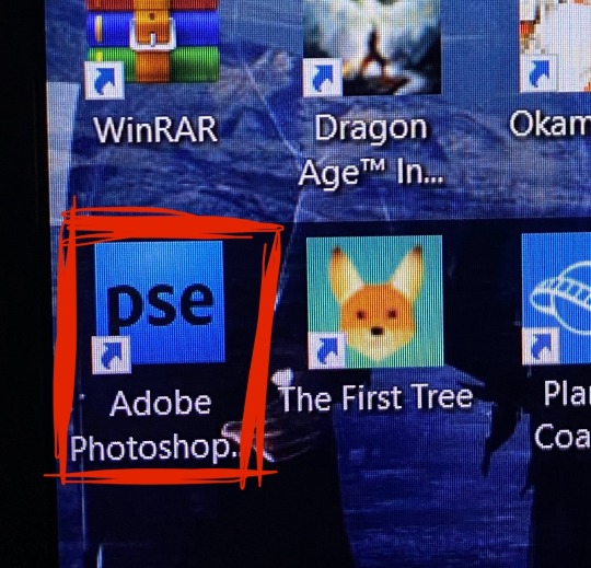
I also made a small video of me opening the program
#photoshop#adobe photoshop#adobe#download#free photoshop#photoshop elements 7#PSe7#reblogs appreciated#no subscription#reblog#giving out my photoshop for free
13 notes
·
View notes
Text
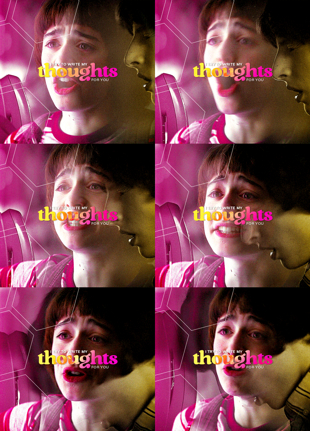
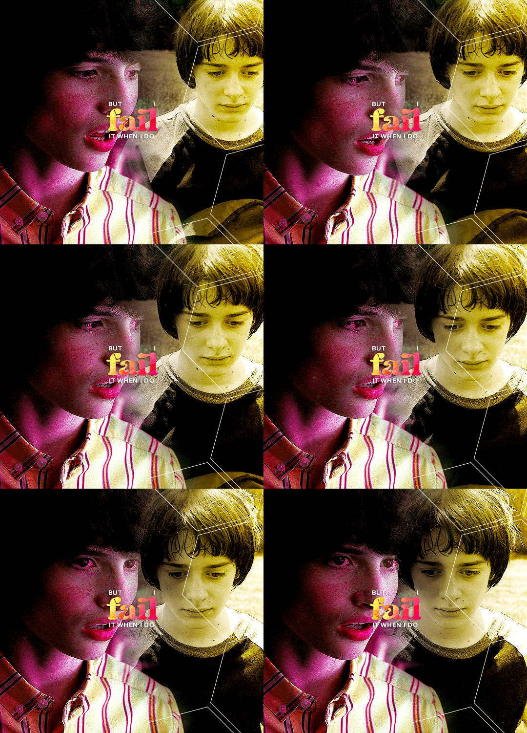
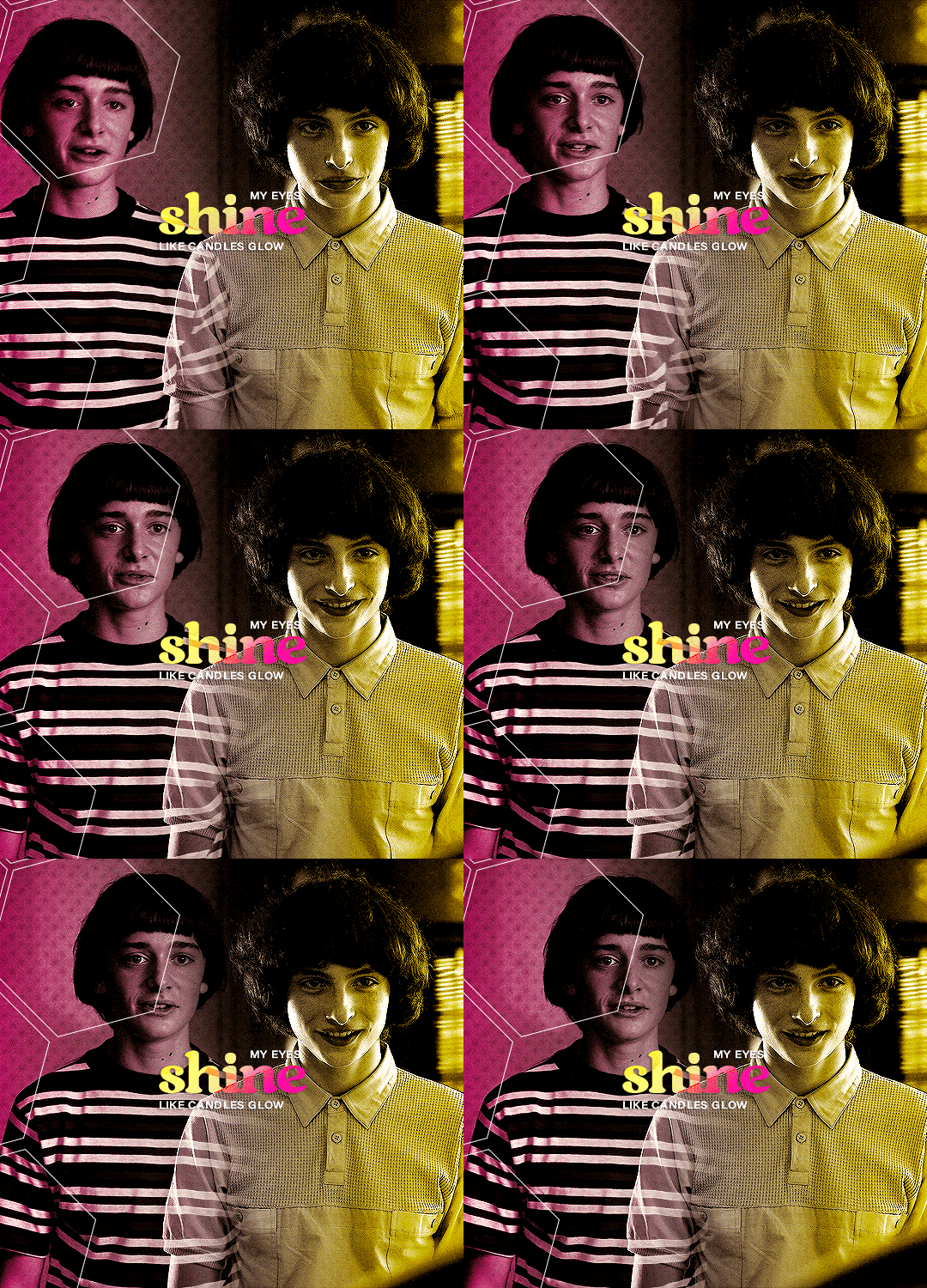

summer 1985, hawkins.
byler week 2023 | day iv: summer love song used
#byler#bylerweek2023#Day 4 Summer Love#byler edit#byler gifs#mine#mine:gif#to get a more summer-esque vibe you should listen to the song!#creative process: i never have a creative process when it comes to gifsets. i tend to start my infamous laptop and run photoshop and see#what comes out of it. this time i really wanted to put some extra effort. when i make a gifset the first thing is finding out the vibes#i want to give to it. since it's summer love i wanted to have bright warm colors that recall summertime and i decided to use of course#footages from S3 - since it's the only season set in summertime - but of course it wouldn't be a gifset of mine if i didn't add a “gloomy”#vibe to it. that is why i spent an entire afternoon finding out a song that would give me summertime sadness kinda vibes and i found#“free with you” which is an incredible song with an incredible mv that i ofc linked in the post description. so#this gifset is all about summer love and it's meant to make you feel the love; the summer vibes; but at the same time i wanted it to be#a little angsty because 1st that's what S3 is about and 2nd - this is how i picture summer loves#i love to put this dualtity in my gifsets: vibrant colors and a really melancholic undertone that you can perceive just if you look twice
137 notes
·
View notes
Text
Just a bunch of Useful websites - Updated for 2023
Removed/checked all links to make sure everything is working (03/03/23). Hope they help!
Sejda - Free online PDF editor.
Supercook - Have ingredients but no idea what to make? Put them in here and it'll give you recipe ideas.
Still Tasty - Trying the above but unsure about whether that sauce in the fridge is still edible? Check here first.
Archive.ph - Paywall bypass. Like 12ft below but appears to work far better and across more sites in my testing. I'd recommend trying this one first as I had more success with it.
12ft – Hate paywalls? Try this site out.
Where Is This - Want to know where a picture was taken, this site can help.
TOS/DR - Terms of service, didn't read. Gives you a summary of terms of service plus gives each site a privacy rating.
OneLook - Reverse dictionary for when you know the description of the word but can't for the life of you remember the actual word.
My Abandonware - Brilliant site for free, legal games. Has games from 1978 up to present day across pc and console. You'll be surprised by some of the games on there, some absolute gems.
Project Gutenberg – Always ends up on these type of lists and for very good reason. All works that are copyright free in one place.
Ninite – New PC? Install all of your programs in one go with no bloat or unnecessary crap.
PatchMyPC - Alternative to ninite with over 300 app options to keep upto date. Free for home users.
Unchecky – Tired of software trying to install additional unwanted programs? This will stop it completely by unchecking the necessary boxes when you install.
Sci-Hub – Research papers galore! Check here before shelling out money. And if it’s not here, try the next link in our list.
LibGen – Lots of free PDFs relate primarily to the sciences.
Zotero – A free and easy to use program to collect, organize, cite and share research.
Car Complaints – Buying a used car? Check out what other owners of the same model have to say about it first.
CamelCamelCamel – Check the historical prices of items on Amazon and set alerts for when prices drop.
Have I Been Pawned – Still the king when it comes to checking if your online accounts have been released in a data breach. Also able to sign up for email alerts if you’ve ever a victim of a breach.
I Have No TV - A collection of documentaries for you to while away the time. Completely free.
Radio Garden – Think Google Earth but wherever you zoom, you get the radio station of that place.
Just The Recipe – Paste in the url and get just the recipe as a result. No life story or adverts.
Tineye – An Amazing reverse image search tool.
My 90s TV – Simulates 90’s TV using YouTube videos. Also has My80sTV, My70sTV, My60sTV and for the younger ones out there, My00sTV. Lose yourself in nostalgia.
Foto Forensics – Free image analysis tools.
Old Games Download – A repository of games from the 90’s and early 2000’s. Get your fix of nostalgia here.
Online OCR – Convert pictures of text into actual text and output it in the format you need.
Remove Background – An amazingly quick and accurate way to remove backgrounds from your pictures.
Twoseven – Allows you to sync videos from providers such as Netflix, Youtube, Disney+ etc and watch them with your friends. Ad free and also has the ability to do real time video and text chat.
Terms of Service, Didn’t Read – Get a quick summary of Terms of service plus a privacy rating.
Coolors – Struggling to get a good combination of colors? This site will generate color palettes for you.
This To That – Need to glue two things together? This’ll help.
Photopea – A free online alternative to Adobe Photoshop. Does everything in your browser.
BitWarden – Free open source password manager.
Just Beam It - Peer to peer file transfer. Drop the file in on one end, click create link and send to whoever. Leave your pc on that page while they download. Because of how it works there are no file limits. It's genuinely amazing. Best file transfer system I have ever used.
Atlas Obscura – Travelling to a new place? Find out the hidden treasures you should go to with Atlas Obscura.
ID Ransomware – Ever get ransomware on your computer? Use this to see if the virus infecting your pc has been cracked yet or not. Potentially saving you money. You can also sign up for email notifications if your particular problem hasn’t been cracked yet.
Way Back Machine – The Internet Archive is a non-profit library of millions of free books, movies, software, music, websites and loads more.
Rome2Rio – Directions from anywhere to anywhere by bus, train, plane, car and ferry.
Splitter – Seperate different audio tracks audio. Allowing you to split out music from the words for example.
myNoise – Gives you beautiful noises to match your mood. Increase your productivity, calm down and need help sleeping? All here for you.
DeepL – Best language translation tool on the web.
Forvo – Alternatively, if you need to hear a local speaking a word, this is the site for you.
For even more useful sites, there is an expanded list that can be found here.
80K notes
·
View notes
Text

MASTER POST
The Experimental Monster Laboratory, or Monster Labs, is a TADC AU where the cast is in the physical world! Sorta..
C&A Research Facilities is one of the cornerstones of the science and medical worlds! They do everything; funding research, manufacturing equipment, and research into the known and unknown in an effort to understand everything. To the public, that is.
They experiment heavily in everything, from hiring literal Gods on earth to manage the more ..sensitive divisions; mixing machine and magic, technology and the supernatural, genetic experimentation, you name it, they’ve probably done it! The world outside may not know anything of the advancements they’re researching but there is little C&A Labs won’t allow in the name of progress in understanding and cataloging everything in their universe. Our story takes place in one of the more private residencies deep in C&A, belonging to Caine; a minor God with mysterious origins, unknown limitations, and boundless enthusiasm for learning everything he can about his little science friends.

╰┈➤ Content
╚═ Unnamed fic (Coming soon...) ╚═ Bubble can cook?? .
╰┈➤ Asks
╚═ Does Pomni act like a zombie? ╚═ Is Zooble's Demon Snake Leg happy? ╚═ Gangle is in a Situation.png ╚═ Gangle's temperament ╚═ Has Ragatha ever shocked anyone? ╚═ Gangle love RAAAH ╚═ Do Caine and Ragatha fight over Pomni? ╚═ Why did Gangle summon a demon? ╚═ Why does Pomni wear a bell collar? ╚═ Kinger's eye ╚═ What if there was a baby crying? ╚═ Death trauma [Gangle and Pomni] ╚═ Kinger has ONE hobby outside of Bugs ╚═ Is Zooble protective of Gangle? ╚═ What happens when you touch Pomni's brain? ╚═ JAX DATED SOMEONE?? ╚═ What does Jax do? .
╰┈➤ References
╚═ Intro Cards ╚═ Height Chart Lineup ╚═ Zooble Demon Snake Leg Intro Card /j ╚═ Queenie ╚═ Gummigoo ╚═ The Sun Room ╚═ Logo .
╰┈➤ Arts
╚═ First ML AU Post ╚═ Second, exploring outfits ╚═ Design sketches part 2 ╚═ Pomni + flower language ╚═ Showtime + Ragapom doodles ╚═ Jax not practicing lab safety ╚═ Abstragedy cuddles ╚═ Raga doodle ╚═ Ragapom doodle ╚═ Jax and Meadowsweet ╚═ Pomni staring out a fake window.png ╚═ [Gives pomni flowers] ╚═ more doodles ig
.
╰┈➤ Misc.
╚═ Caine Lemon Rant [Animatic] ╚═ Zodiac signs?? ╚═ Caine gets called a Tumblr Sexyman and cries ╚═ Bubble Looksmaxxing ╚═ Jax wants to take ketamine with you (Romantically) ╚═ Caine eats a lemon [Animatic] ╚═ BUNNYSUITSSS ╚═ Magma doodles ╚═ Magma doodles part 2
.
╰┈➤ Pomniverse
╚═ Wonderland and Zombni are friends :D
.
╰┈➤ Boundaries / Q&A
╚═ Any story plans? I'm not sure yet, currently writing a fic and several comics on the way.
╚═ Any boundaries? None, so go crazy! I am OK with gore, NSFW, angst, violence, etc, just be sure it is tagged/TW'd appropriately as not everyone is OK with that content. I'd also like to see please LOL
╚═ Can we create fanart/fics/content? Can we dub or fancam? Yes of course!! Please tag me, I'd love to see all of it! I'm tracking the tag #TADC Monster Labs AU for other's content
╚═ Is NSFW allowed? Yes, both art and fic, so long as it's marked appropriately I'd very much love to see!
╚═ Can I ship the characters, self-ships, or OC x Canon? Yes, ship away! Just be aware the only au-canon ships are Caine/Pomni, Ragatha/Pomni, Gangle/Zooble, and PAST Ragatha/Jax.
╚═ Can we make OCs? Go on ahead! Here is a PSD file for the blank template and the PNG can be found here.
╚═ Who are you?
✦✧ Hi I'm Audi! 26, she/they. Full-time office worker, I do art in my free time. ✦ My current interests are TADC, RWBY, Looney Tunes, and Trolls. ✧ I draw using a custom PC, a Huion Kamvas 16 (2.5K), and Adobe Photoshop. Currently learning to use Procreate. ✦ I do not RP and this isn't an ask blog, asks interacting directly with characters will probably not be answered. ✧ Asks are not guaranteed to be answered, sorry if yours isn't but please don't spam/send multiple times! ✦ Commissions and requests are not open at this time, thank you. ✧ My main tumblr is Audi-art. My Twitter is Hammerspaced.
463 notes
·
View notes
Text
light a flame | jeon wonwoo | masterlist

☆ synopsis
when your roommate quits his job at the coffee shop you frequent you never imagined the new guy would be hot or even your type. to make matters worse you both study law at the same university.
your friends to try to convince you to get together with him. you try to convince them you just find him really nice... but are you able to convince yourself?

☆ pairing: jeon wonwoo x fem!reader
☆ genre: smau, university au, coffee shop au
☆ warnings: swearing, drinking, implied 18+ content
☆ status: ongoing, updates every thursday and sunday
☆ started: 07.09.23
☆ ended: 21.03.24
main masterlist
☆ fill out this form to be added to the taglist

profiles: 1 | 2
chapters:
001: stop thirsting on main
002: i’m not a fucking rat
003: please yn it was for the vine
004: not asking for a friend, i’m asking for me
005: you’re forced to come even if minghao drops of the face of the earth
006: HE’S TALL AND HE GOT A NICE ANGLE SHUT UP
007: you can’t recognize drip even if it’s staring right in your face
008: are you trying to limit my artistic expression?
009: step aside! if anyone’s playing wingman it’s me
010: like slaying monsters?
011: “me as a baby”
012: you obviously know the worth of cancelling
013: is that seungcheol photoshopped as aang from avatar?
014: playing league of legends does not qualify as “having a life”
015: he made me stand outside the coffee shop with a “free hugs” sign
016: good luck, daredevil
017: well, i honestly think you’re both in the wrong
018: then i say spider-man is within the realms of possibility
019: i just wanted the public opinion
020: digital footprint
021: i have faith in the tiger
022: last selfie before we die and i didn’t even look good
023: vernon’s sock drawer isn’t a good hiding place
024: i’m thinking of hanging it in our shared bathroom so seungkwan can be reminded of his good deed
025: oh don’t bring judy into this!
026: staging a storm just so someone can experience the forced proximity trope
027: entering private property in 3... 2... 1
028: i’m not helping a traitor
029: all of my midnight entertainment... gone in seconds
030: yes i will be sharing... / the juices?!
031: uh oh / the ominous period
032: i will go just to prove i’m right
033: oh my god... that woman
034: it means you’re annoying /next
035: i know i’m giving zero context here, but bear with me
036: that guy only has feelings for his right arm
037: how can i dump someone i never even dated?
038: joshua says you can come if you take 10 penalty shots and do a strip tease
039: i can never look any of them in the eyes again... well, except johnny
040: ohh so he’s your super smart study buddy?
041: i didn’t know we had chan’s biggest fan right here
042:i didn’t know you were sending all that, chan. sorry.
043: just a peck
044: as real as spider-man
045: so arguably, it wasn’t even my fault
046: shut up and make out with wonwoo instead
047: special deal only for my boyfriend
048: i’m literally throwing rocks at your window as we speak
049: i’m just training you to be wonwoo’s little pet
050: i’m not having a dog ruin the ambiance
051: epilogue
bonus chapter
#jeon wonwoo#wonwoo#seventeen au#wonwoo au#wonwoo seventeen scenarios#wonwoo scenarios#wonwoo scenario#seventeen#jeon wonwoo imagines#wonwoo imagines#seventeen imagines#seventeen wonwoo imagines#seventeen fluff#wonwoo fluff#seventeen social media au#wonwoo x reader#seventeen smau#wonwoo social media au#wonwoo smau#seventeen smau college#seventeen college social media au#seventeen wonwoo barista au#seventeen x reader#svt#svt x reader#wonwoo svt scenarios
2K notes
·
View notes
Text
MEETCUTE . . .

❥ in which you go on a horrible date, but meetcute the waiter
pairing. rintaro suna x f!reader
wc. 578
a/n. i wrote thisbto distract the factthat i havebt updated ggez even though this is a totallydifderent fabdom :p enjoy

your heels clacked against the cemented pavement. you were currently about to be late to meet up with your tinder date for the first time. you’ve never downloaded tinder before last tuesday and you pray to the ones above that you don’t get surprised by an undercover seventy-something year old.
finally, you reach the fancy restaurant with a nicely decorated exterior your date told you to meet him at. it was definitely out of your tax bracket; you are definitely going to make a second dinner after this.
upon entering the restaurant, a woman with a slick-back bun who looked like she was in her thirties, probably, immediately walked up to you.
“how many?” she asked, with a stoic expression.
“uh-“ you were honestly terrified of the woman staring you down. “i have a reserved table with um — kosei tsuburaba?”
the woman nodded her head and started walking away, queuing you to follow right behind. you pass by multiple seemingly happy couples until you reach a table with a free seat at the end of the hall. you slightly nod and smile at the woman who leaves the menu on top of the table whilst walking away.
you look over to your date. he was definitely cute; he looked just like his profile, if not better. you take your seat, looking at the apathetic man. “yn right?” his voice was flat and seemed much less ecstatic than the texts he would send days prior. you nod, not wanting to seem rude. upon sitting down, you were caught off guard with the comment made by the man. “you, uh, look a lot different from your pictures. do you photoshop them?”
your jaw physically dropped and you were too much in disbelief to speak. your expression probably stunned your date too because neither of you noticed the waiter who was already there. “excuse me? are you two ready to order?” you turn your head to face the waiter – whose name tag spelt out rintaro suna, but before you could utter a word, kosei spoke up.
“i actually already ate before this.” he stands up, leaving an even more shocked look on your face. with a smile on his face he says, “enjoy your meal yn!” and leaves you on your own.
“what the fuck.” you mutter, cursing him for being absolutely unbelievable and yourself for wasting your time by downloading tinder in the first place. it was when you lean back into your chair where you realize that the waiter was still standing next to your table.
you take a good look at him — he had a nonchalant expression to his flawless face – he takes a good look at you. the brain fog wears off after that humiliating experience. “oh my god. i’m so sorry.” you grab your purse and stand up.
he looked awfully calm, as if he goes through the scene everyday. “it’s totally okay,” he gave a small smirk. “that guy’s a total asshole.”
you smile and nod before you turn around and start heading towards the exit. “wait,” you hear the same voice come from behind you. turning around, hoping you wouldn’t be charged for wasting his time, you were met with the sweet eyes of the suna. “i’ll give you my number.”
you were confused and tilted your head to express it. suna understood this gesture and blurted out, “so i can take you on a proper date.”

#𐙚 ‧₊˚ ⋅ blurbs#suna x reader#haikyuu x reader#haikyuu#suna rintaro x reader#haikyuu fluff#suna fluff#suna rintaro fluff#suna x you
336 notes
·
View notes
Note
Do you think that it'll ever become fashionable for cis girls to pack their panties to give themselves the sexy girlbulge they sadly lack?
Not exactly what you're asking about, but like...
There's this movie from a few years ago about a cis girl (hard to say what's irony when it comes to the real person being like a non transitioning trans dude, but the character is a cis girl) who decides to compensate for no longer being underage (and thus no longer desirable to men on the internet) by packing and pretending to be the only other thing that men what to fuck (a tgirl).
It's like full disclaimer the most 4chan brained thing I've ever seen. Like wildly aggressively racist (on top of being obv transphobic etc).
It's like interesting that it exists (easily the only movie I've ever seen with an unsimulated cum tribute montage), but I don't recommend it.
In any case, it was immediately followed by an unrelated uptick in irl fake internet tgirls.
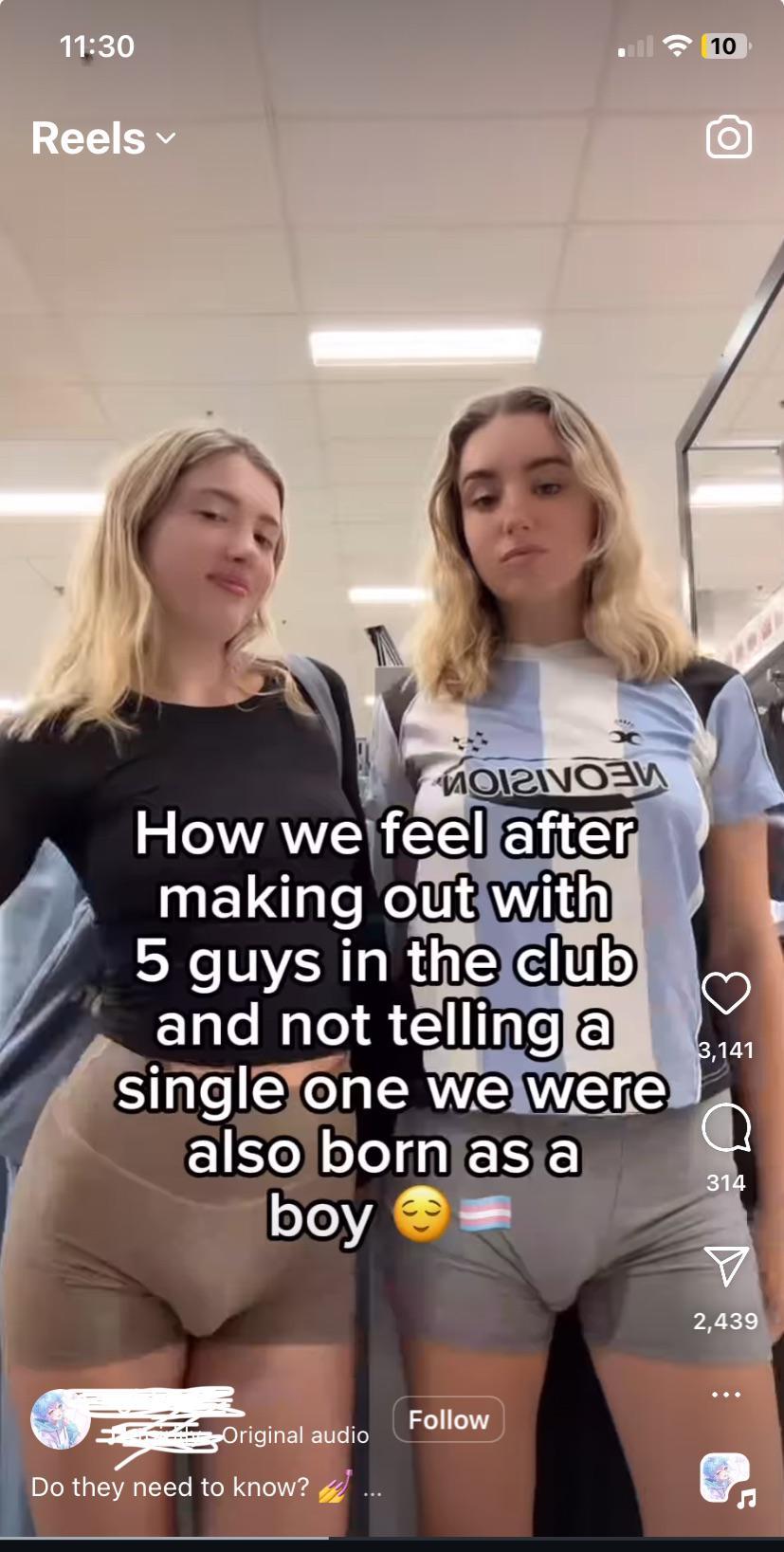
That one account getting so much attention has made it impossible to google around for other examples, but I've definitely seen other cis women packing and pretending to be trans for attention and OnlyFans subscribers.
Not to mention all the non transitioning ~cis~ boys who (rather than accepting the time tested femboy route of wearing a face mask) use heavy face filters and photoshop and pretend they're out and transitioning trans girls on hrt etc (again often for OnlyFans subscribers). Which I consider a different thing. That's more of an extension of standard sissy egg behaviour.
I'm also constantly thinking about that cis girl model that pretended to be a trans woman a few years ago after getting criticized for being transphobic (no packing involved that time).
No shortage of real world gender swapped Adam (2019)'s.
And then there's all the discourse (that seems extra inescapable lately for some reason) about openly AFAB self identified "trans women."
Edit: One late addition: I think I was angsty at some point about Lady Gaga always leaning into stuff about her having a dick, but I've come around to thinking that was fun actually lol.
109 notes
·
View notes
Text

🤎 MALAYA . PSD
merry christmas eve , pookies ! in celebration of today's holiday , i'm sharing a psd with you all . this photoshop colouring brings out the brown shades & gives an overall dark vibe to your photos . of course , all my psds are poc friendly but feel free to adjust some layers to fit your personal aesthetic . i hope you find this psd useful & as always , a like + reblog would be greatly appreciated .
click the source link to download this free psd .
108 notes
·
View notes
Text


I was inspired by this image on Pinterest, but I didn't want to use an IRL image for the background and I knew the sims backdrops were a little ... lackluster so I tried taking multiple screenshots of SanMy and piecing them together to make the city look more dense and lively. And ... it worked! Now I want to do it with all the different worlds! lol
I'm a slut for good Photoshop brushes so here are what I used:
I used these free city brushes for the lights, which are phenomenal!
I used these free moon and star brushes for the moon (really love the glow of this moon in this set, it saves me a lot of time not having to do it myself).
If you like really faint starry skies, I highly recommend these free starry night brushes. So quietly beautiful!
These are some of my favorite free cloud brushes! I've used them for many edits (including this one) and I love that they are already in cloud shapes.
My pro tip from watching many many cloud painting videos. Start with a darker color and layer a light color on top like 5px smaller than your previous brush size (press your [ key in Photoshop to do that quickly). Do that for like 3-4 colors. The darker colors will slowly peak out from behind the brighter clouds giving it that depth that can be hard to paint. That is how I painted this!
#Show Us Your Sims#Sims 4 Edit#TS4 Edit#intramoon#B&A#Resources: Photoshop Brushes#Queue: Sunfall ☀ ⋆˙⟡
69 notes
·
View notes
Note
Your backgrounds are so impressive and I always really struggle with them. Do you have any tips?
Hey!
I gotta be completely honest cos I honestly don't know what I'm doing most of the time, especially when it comes to backgrounds, haha. It's still something I try to improve at. I'm happy to hear that you like them tho!
When I do draw backgrounds, I like to stay simple. I'm mostly focused on drawing characters, so when I do draw backgrounds, I add them to compliment the characters, rather than to distract from them.
I'm not the right person to give tips on this though, but I'd like to redirect you to some great resources:
I'm currently taking a class over on schoolism. It's a class by Airi Pan on Foolproof Concept Art, it's been super helpful so far! The subscription is 30€ a month, which I know is a LOT for many people. For me as well, but I'm just paying this one month for this class and then I'll cancel it until I'm done with art school, cos I'm planning to take more classes afterwards. But if you can afford it, I can really recommend checking it out!
But there's of course also amazing free tutorials, for example:
Tips for Drawing Backgrounds! by BaM Animation
Perspective Drawing in Photoshop! Grids and Tips by BaM Animation
How to Paint Envirenment Concept Art by Victor Staris
How To Draw Figures in Perpsective by David Finch
YouTube is PACKED with incredible art tutorials!
I also made this PDF with art resources for my fellow art school students a while back, so maybe it's helpful for you guys as well! Feel free to download it. It's in german, but it's mostly just links anyways! :)
216 notes
·
View notes
Text

HOW TO: Make an iPhone Layout + Downloadable Template
Hi! I've gotten a few messages asking for a tutorial on my iPhone gifsets — but instead of only doing a tutorial (that would probably be triple the length this one already is), I decided to turn my layout into a template with all the bits and bobs! In the "tutorial" under the cut, I'll share everything you'll need, a free template download, and quickly go over how to use this template. :)
Disclaimer: This template uses Video Timeline and this tutorial assumes you have a basic to intermediate understanding of Photoshop.

PHASE 1: THE ASSETS
1.1 – Download fonts. These are the fonts used for all assets I've included in my template: – SF Pro or SF Pro Display (Regular, Medium, Bold): Either version works, they look nearly identical. You can download directly from https://developer.apple.com/fonts/ or easily find it via Google – Bebas Neue: Free on Google Fonts, Adobe Fonts, and dafont – Times New Roman (Bold): Should be a default font in Photoshop

Make sure to download and install any of the fonts you don't already have before opening my template. That way, once you open the template file, all the settings (font size, weight, spacing, color, opacity, etc.) are as intended.
1.2 – Download my template. Before you use my template, all I ask is that you don't claim or redistribute it as your own and that you give me proper credit in the caption of your post. Making these iPhone gifsets takes me a longgg time and turning this layout into a template took several hours too.
DOWNLOAD TEMPLATE VIA KO-FI ← This template is completely free to download (just enter $0), but if you feel inclined to tip me, I appreciate you! 💖
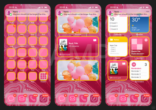

BTW this template also includes some of my frequently used icons!
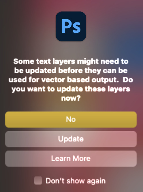
NOTE: If, for some reason, you open the template and see the pop-up shown below, click "NO" — otherwise, the fonts will be all messed up:
And if you see this triangle with an exclamation point by a text layer, don't double-click it — it'll mess up the font as well:

PHASE 2: THE GIFS
I'm just going to briefly go over gif sizes and my recommendations. Also, keep in mind when grabbing your scenes, you'll want all of these gifs to be the same amount of frames.
2.1 – Background Gif: 540 x 540 px. I recommend this size so you have a good amount of visibility for the gif behind the iPhone wallpaper. I also recommend making this black and white (or in my case, black and white with a slight blue tint — idk I just like the way it looks) so the wallpaper coloring can stand out.
2.2 – Wallpaper Gif: 230 (w) x 500 (h) px. Keep in mind the very narrow dimensions of the wallpaper! And also keep in mind that you'll have a bunch of apps and widgets covering the image. I try to use wide shots (or layer my clips into looking like wide shots). Also, keep in mind your color scheme for your set and your character's aesthetic! I tend to focus on one or two colors for the wallpaper.
I usually position the wallpaper to the side with 20px bumpers, so there's lots of space to see the background:
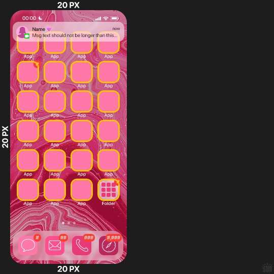
2.3 – Large Photo Widget Gif: 201 (w) x 96 (h) px.
2.4 – Small Photo Widget Gif: 94 x 94 px.
PHASE 3: THE TEMPLATE – "IPHONE" FOLDER
In this section, I'll try to quickly walk you through how to use this template and some bits that may require extra instructions. I'll be going through each folder from top to bottom.
3.1 – Status Bar. Time, Service, and WiFi are pretty self-explanatory. In the Battery folder, you can use the shape tool to adjust the shape layers labeled "Fill (Adjustable Shape!)" to customize the battery level.
3.2 – Message Notification. Again, these are pretty self-explanatory. I've already masked the circle for the contact photo, so you can simply import any photo and use the transform tool to shrink it down. The circle is 24x24 px. If you don't want to use a photo, there's another folder called Default Initials.
If your message text can't fit the text box, the message should end with ellipses which is how iOS caps off long texts.
3.3 – Blurred Banner (IMPORTANT) This folder is easy to miss because there's only one placeholder layer in there. On iPhones, the area behind a banner notification and the dock get blurred (including the wallpaper and any apps).
What to do: Make a duplicate of the apps in Row 1 and/or widgets that intersect the message banner, convert them all into one smart object, apply a Gaussian Blur filter (Radius: 3.0 pixels) on the smart object, and move the smart object into this masked folder!
(There's another masked folder in the Wallpaper folder for the dock which I'll go over in that section.)
3.4 – Apps Turn off the yellow guide if you don't need it to keep things aligned and turn off layers you don't need by clicking the eye icon. Replace the "App" placeholder text with your app name, change the color or gradient of the square to compliment your color scheme, and add your custom app icon overlay!
If you can't find an app icon you need from the ones I provided, flaticon.com is a great resource. Also, if you can only find the filled version of an icon, check out this tutorial for how to make any text or shape into an outline.
Also, each app folder has 4 notification bubble options (1-4 digits). Again, you can toggle these on and off as you need!
3.5 – Big Widgets I like using these when my wallpaper has A LOT of negative space to fill. I included the Photos and Books widgets in my template, but there are lots of widgets available on iPhones. You can check some of the other ones I've done here, or if you have an iPhone, simply try adding some widgets to your phone!
There are also widgets bigger than these, but they would take up half of the phone screen which is why I don't use them for these edits.
3.6 – Small Widgets The only thing I'll say about these — because they're pretty straight forward — is there are a lot more weather themes than I included in my template. Also, if you set your character's phone to evening, the weather widget will show a dark background (sometimes with stars), so keep that in mind.
Speaking of, I've included Light Modes and Dark Modes for, I think, every applicable widget.
3.7 – Page Dots These barely perceptible dots indicate that your character has more pages of apps than shown in your gifset (so if an anon tries to come at you, you can just say "it's on the next page of apps" /j /lh)
3.8 – Dock Again, the dock has notification bubble options and I've included the default app designs, custom filled designs, and custom outlined designs for iMessage, Phone, Email, and Safari (there's also a FaceTime alternative if that's how your character rolls). These are usually the apps people keep in their Dock, but this is fully customizable too. So, if your character is, like, super obsessed with Candy Crush or something and needs it in thumb's reach — you can put it in the dock.
3.9 – Wallpaper This whole folder is masked already to a 230x500 px rounded rectangle.
Inside, you'll find another "Blurred Portion" folder for the area behind the message banner notification and the dock.
What to do: Duplicate your gif layer and place it in this folder, remove any sharpening filters, and apply a Gaussian Blur filter (Radius: 3.0 px). Be sure to add any coloring/adjustment layers ABOVE this folder and your original sharpened gif layer.
PHASE 4: EXPORT
We made it!
I hope this template makes it super easy for you to recreate this layout! If you decide to try it out, feel free to tag me with #usernik.
If you notice anything wonky about the template, kindly let me know so I can fix it! And if you have any questions about how to use this template, please don't hesitate to send me a message! I just ask that you try to be specific in your question so I'm able to answer you the best I can!
#gif tutorial#completeresources#userpickles#usersmia#userabs#usertreena#alielook#userkosmos#usershreyu#userzaynab#tuserabbie#useryoshi#usersalty#tuserlucie#usernanda#userelio#userhella#usercats#gfx*#resource*
928 notes
·
View notes
Text
My 𝐓𝐨𝐩 24 𝐒𝐜𝐫𝐞𝐞𝐧𝐬𝐡𝐨𝐭𝐬 from 2024🎉
Thank you to @surely-sims and @lostinsixam for tagging me 🥰
This was a bit of a wild year, so there were gaps in my simming activities, but I still got up to the usual chaos!
Tagging @obigem, @simmingnate, @eljeebee, @gilded-ghosts, @melbrewer367 and anyone else who wants to take part!
January
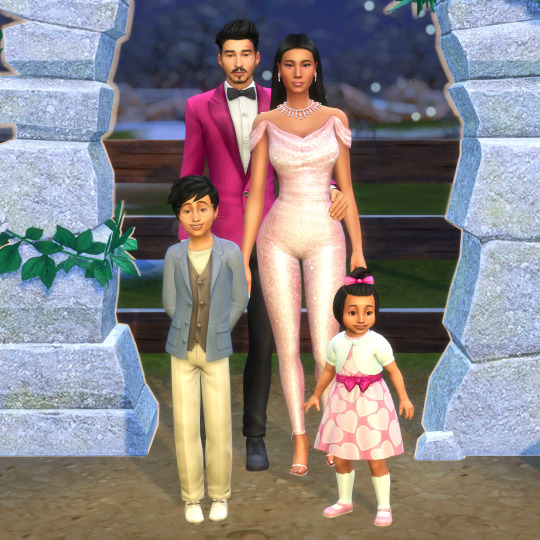
Starting off with Aria and Ryozo's wedding. It wasn't meant to happen, but every time I had plans to throw a spanner in the works, his little face stopped me. Of course Aria wore a pink, sequin jumpsuit.
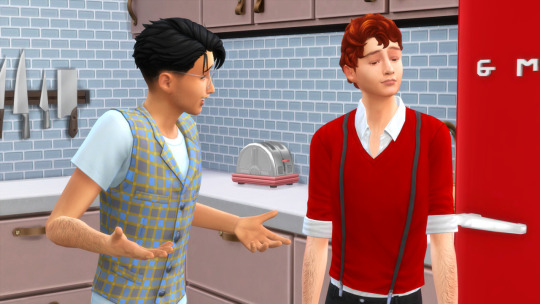
When Elio met Allan. Aria, ever the social climber, invited Allan and his mum over to be neighbourly/nosey and Allan's first impression of Elio was less than enthusiastic. They later bonded over being scouts weirdos.
February
I started a BACC challenge and absolutely loved it, then my ADHD brain kicked in and I got very confused and it became too stressful to follow the rules 🤣 I may revisit it at some point.
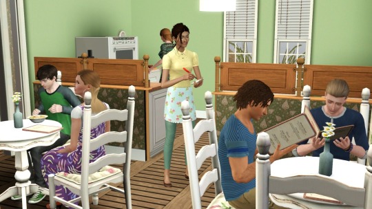
As a direct result of my BACC confusion, I started playing my very old, and very loved Enekjaer rotational save in TS3. There's something lovely about time just standing still, even as the years hurtle past.
March
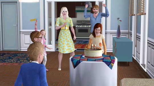
The Crumplebottoms celebrate Gaia's birthday. I love this save. There's no set story, only chaos.
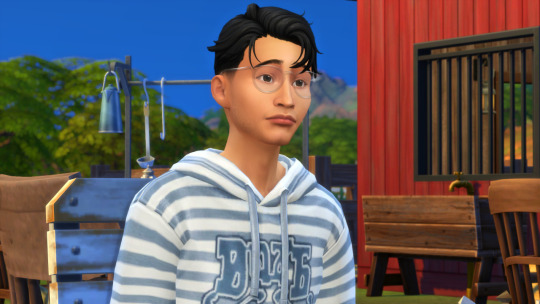
The penny drops for Elio, who was oblivious in his scouting weirdness. I love his vacant little face.
April
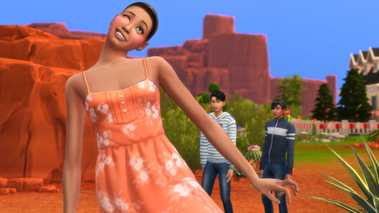
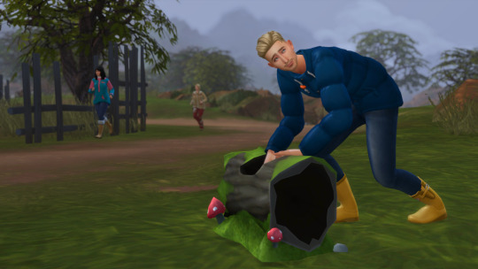
The wig snatching motherplant makes itself known to Elio, and unknown to him, sets him on a path that will shape the rest of his life.
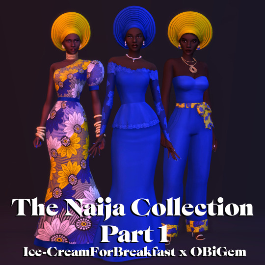
Not a screenshot as such, but one of the CC sets I'm most proud of. I was so honoured that my bestie @obigem trusted me to work with her on this collection and very happy with how it turned out.
May
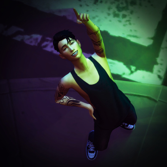
I had jaw surgery and the drugs were good. I don't remember doing this, but I guess this is when I downloaded Re-Light.
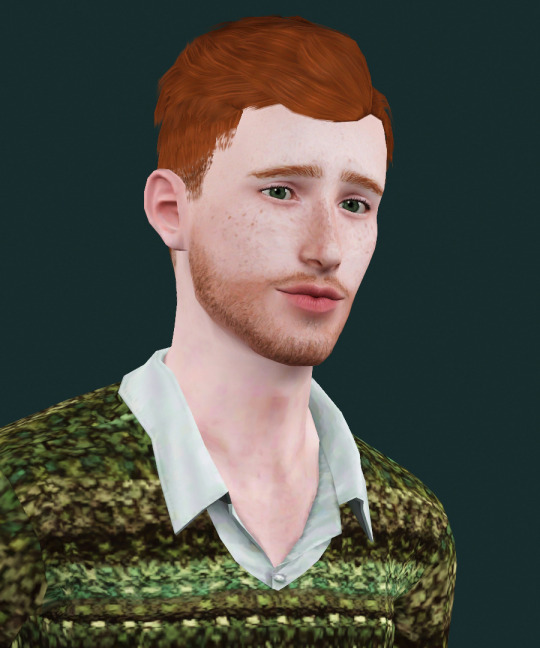
My bebe Caleb in the TS3verse. He was one of the first sims I created (if not the first) when I got the TS4 CAS demo, so it felt right that he got to be in other versions of the game.
June
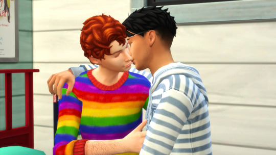
Elio fucked around and found out. Sure it all worked out in the end, but I did enjoy the mess.
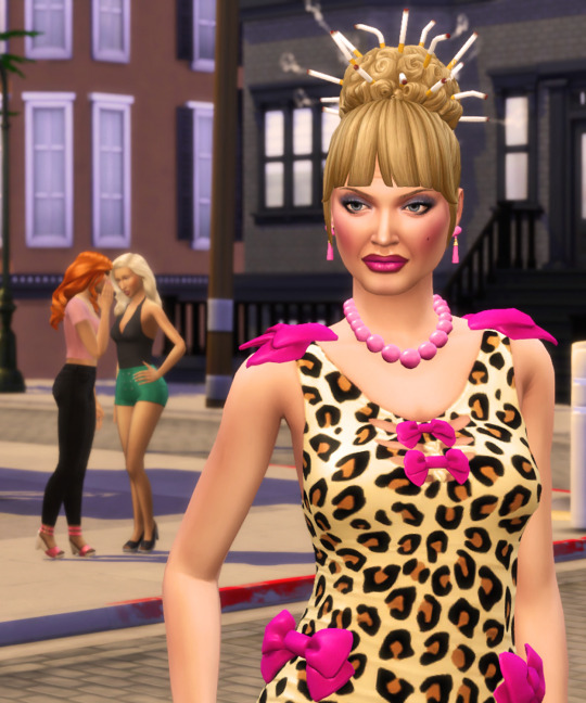
Trashleen coming in hot with the good advice. "Let them chat shit behind your back. Rent is expensive." She's correct. Live rent-free in the heads of your enemies.
July
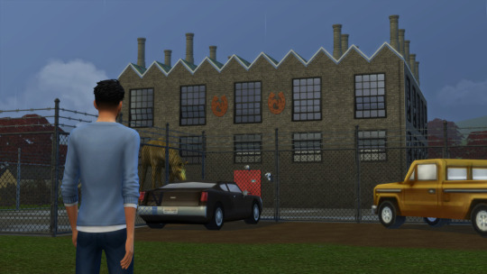
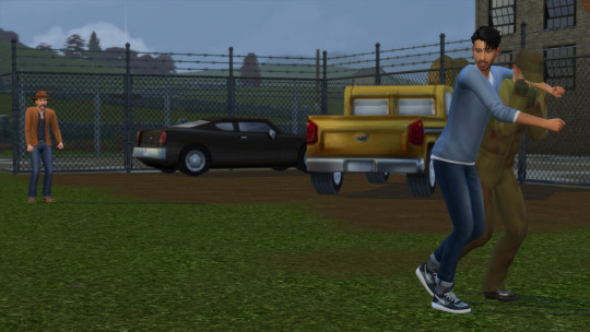
I spent way too much time building Evil Pappy's Glue factory for a few photos of Alan's post-school fate and subsequent rescue. It made sense in my head for an evil cowboy to have a glue factory.
August
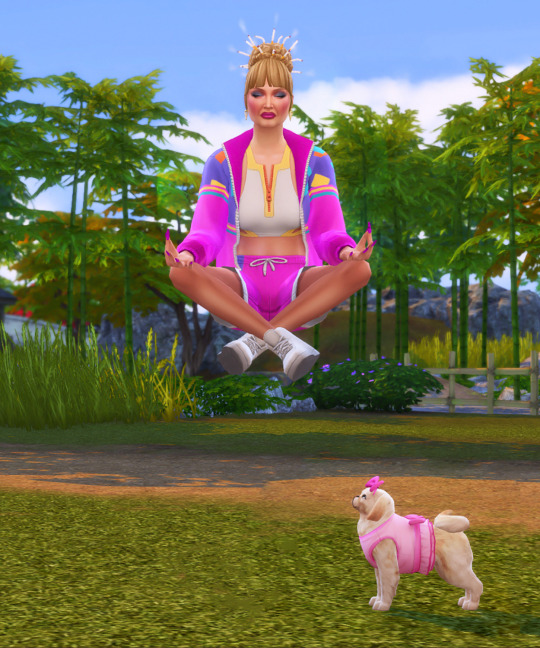
Trashleen and Mitzipuff lead the pack when it comes to style, but they just had to jump on the 'demure and mindful' trend for this shot.
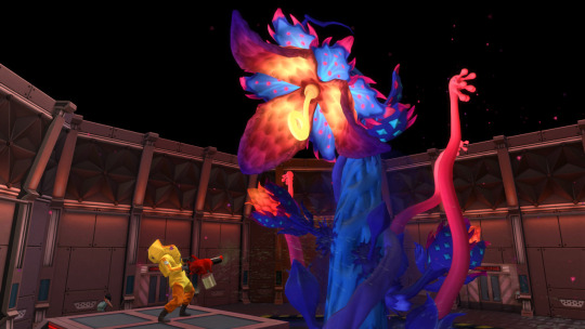
The Motherplant battle always gives amazing shots. Elio and his friends beat the Motherplant and managed to rescue Miguel.
September
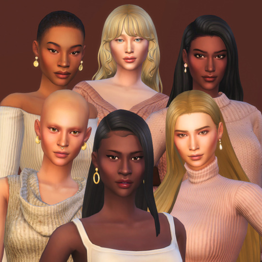
I update my models subtly every so often, but this time, quite a few of them visited the CAS surgeon for some minor adjustments.
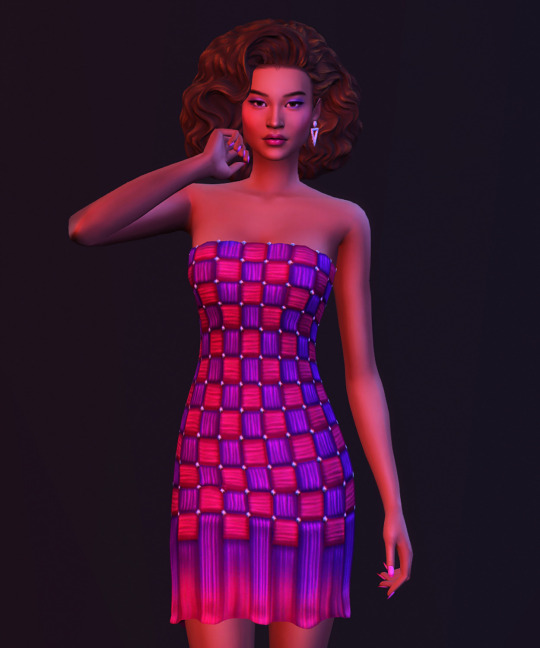
I love the entire Poppy Collection I made with @surely-sims, but this dress is my standout and I'm so pleased with what I was able to achieve with it! Izumi serves as an 80s goddess.
October
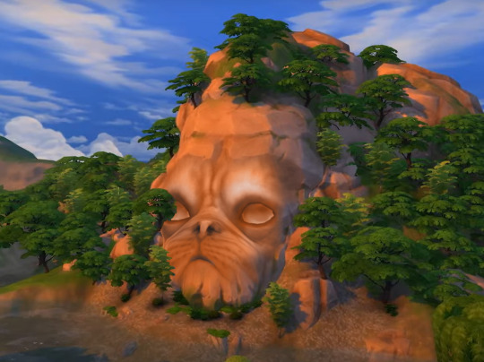
October brought us Life and Death, and of course the big face mountain deserved a Cabbagepatch photoshop edit!
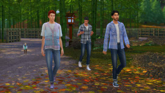
And then we have three! Elio, Allan and Miguel sorted their drama and decided to try being a throuple...it just so happened that the game allowed it now.
November
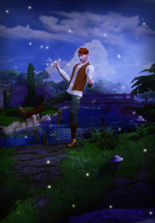
I was inspired by Ravenwood, and decided to do a little elven edit. No storyline, only elves and fireflies.
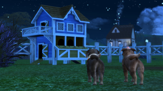
November marked the return of the Smyths, and a huge change in Cabbagepatch's relationship with her arch enemy Figgyduff. The sisters joined forces to conquer the Clucking Cosa Nostra once and for all.
December
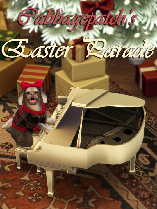
Cabbagepatch formally invites you to attend a beautiful Easter concert with some definitely Easter themed CC that will be released most generously and totally on time for the Easter season in which they are meant to be used.
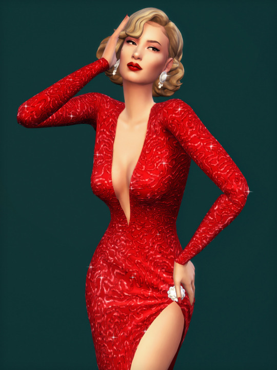
@joliebean and I were on our Christmas bullshit again with our latest Christmas collab! Esther got added back into the model rotation for this Marilyn moment.
#what a long fecking year#but also a short year#top 24 screenshots from 2024#ts3#the sims 3#ts4#the sims 4
97 notes
·
View notes
Text

"This event ends the moment you write us a check, and it better not bounce, or you're a dead motherfucker" -- Big Bill Hell
There was a time when you'd see little old ladies paying for the groceries with a hand-written personal check, holding up the line, causing an immediately-forgiven slight sense of annoyance with those behind her. Buddy. Those days are over. They've been over. What, did you think you were going to just pop a couple extra zeroes on the end of your paycheck there? Maybe scan your paycheck, open it in photoshop, make a template, print em out all nice? You think you're the first to think of that, dipshit?
It takes the law a long time to catch up with the state of the art. You're reading this on the internet, which means you never use checks. The law has caught up. Your ass will be going to prison immediately and you will see zero return.
You can't even kite checks anymore, and hell, nobody under 40 will even know what that means, due to the blazing fast, two day settlement on all ACH transactions. Let me paint you a picture.
You get paid on Friday, but it is Monday, and bills are due on Tuesday. And you're broke: $0 in the bank. Goose egg. Pop open your checkbook, go to a store, "buy" some things, write a check for the amount. The cashier takes it!
Now take those things you "bought", across town, to another store location, and return them for cold hard cash. Sweet. Bills paid. Friday rolls around, and you just make it to the bank to deposit your paycheck before it closes. After the weekend, the checks you wrote finally post, and they don't bounce! You've kited a check. You've surreptitiously taken a zero-interest loan. And we know your broke ass. The interest rate on that short-term payday loan should have been straight up usurious. We're talking 29%. That makes predatory fuckers like us horny for sex. We're so mad. Now you are going to Federal Prison. For a good minute. Fuckface.
COST: $0.10 (With banks offering free checking accounts + Bic pen)

"Neither snow nor rain nor heat nor sleet, if you fuck with the mail, we'll rip your nuts off" -- Ronald Mail (Inventor of Mail)
Many people have this misnomer that the most powerful people in politics are democratically elected. The president, of the United States, of America, is a stupid cartoon hotdog. All of them, I don't care. Way less clout than you'd think. Brilliantly, it is the people that the hotdog president appoints who are actually doing anything significant. The director of the CIA. The fucking chairman of the Federal Reserve. Probably the, like, most senior, uh, general of the military, and shit too. I don't know, we don't "do" army here at Bloomberg. You probably don't even know their names! I don't! These are the ones you should be seeing in your sleep.
There's another position like that. Appointed directly by the hotdog. The Postmaster General. That's a real title. He's the CEO of the mail, and buddy, what he may lack in political power relative to the director of the CEO, he makes up in raw sexual energy. Total Tom Selleck energy. Like an airline pilot. We're talking Donald Sutherland in Invasion of the Body Snatchers. I'm tentpoling in my black business slacks just writing this, and all my Bloomberg newsroom bros are peering over my shoulder and also tent-poling. We're not gay though, and especially me, I'm probably the least gay, but sometimes I just lay awake for hours at night what that mustache would feel like pressed against my lips, the unbelievable and utter, total sense of security I'd feel burying my head into his hard chest.
You get it. He's your dad. And if you fuck with the mail, you've fucked with the tools in your dad's garage. And dad's been drinking. You're in for it, bucko, you are in trouble. Do you think the United States Postal Service actually makes any money? Hell no. It costs like five bucks to mail a box basically anywhere I can think of and they give you the boxes for free. You can just walk in the post office and take them. I do that, and then just throw them away, I don't know why, some kind of compulsion. Being able to move shit around like this, quickly, cheaply -- Jesus H, I've got a huge amount of money in my bank account, probably tens of trillions of dollars (due to financial knowledge gained from reading Bloomberg articles) and I could probably mail every single person ever something and still come out in the black.
No way pal. They've thought of that already. The Postmaster General is going to know every time, and he's going to grab you by the shirt collar, wearing his cool as fuck hat, and you're going to get your pants pulled down, and your bare ass spanke...I need to go use the restroom real quick.
We rely on the mail system to get important shit done. It's not something to be taken lightly, and it isn't. Trust me. This is why, like almost every other person who receives mail in this year 2023, I just fucking put a wastebasket under my mail slot. I don't even shred that shit anymore. I just burn it. Takes less time.
COST: $0.63 (Postal stamp)

"Can call all you want, but there's no one home // And you're not gonna reach my telephone // Out in the club, and I'm sipping that bubb // And you're not gonna reach my telephone" -- Lady Gaga
I read something wild that the children of today do not know what a dial tone is, because of how fucked up and stupid they are. Isn't that super fucked up?
While it's not really our style, allow me to fill you in on some ancient, arcane knowledge about the telephone. You can turn it on, and then you can punch in numbers. Any numbers. Random ones, or maybe not random ones. If the ten numbers you punch in are the same as the numbers in someone else's telephone number, their phone will ring, and then you are talking to them. This is called "Phreaking".
Here's the kicker: You can tell that jackass anything you want. "Oh, Hi, Yes, I am Reginald Sumpter calling from Avalon Consulting LLC, we are just following up on the invoice we sent you. Please remit to ###### routing ###### account."
BOOM! Your name isn't Reginald whatever and that company doesn't exist, but you just received a deposit. It's fucking beautiful. What have you done wrong? It isn't your responsibility to handle who your business' clients/etc are, it's their's. If they want to just pay you money for no real reason, well, that's kind of on them, isn't it? I haven't stuck a pistol in your face and demanded everything in the register.
Well, it's too clever. It's too slick. This is the United States of America. It's one thing to commit a felony like armed robbery, it's another thing to piss off someone in charge of the accounting division who uses a special bathroom you need a key to get into.
You can do it on the computer too, I use a PC Computer at work and send email, so you can see how it'd work there. You can make a document that is indifferentiable from a real invoice and, straight up, 1/3 of the time they will pay that shit. Lmfao.
It's called wire fraud because, uhh, duhhhh, there's wires. What do you think that thing is strung between the telephone receiver and the dialer? And computers? Give me a break. There's so many wires with those.
COST: $0.25 (Coin for payphone)

"People calculate too much and think too little." -- Charlie Munger
It is insane how dumb the common man can be when it comes to our world of expertise. I hear this same sentiment, like, ALL THE TIME:
"Durr hurr I will buy an insurance policy for my car or house or whatever so that in case something happens to it I will get money". And then that same person proceeds to drive safely or not burn their house down. Dumbest crap imaginable.
Let me break it down for you. Insurance is a two player competitive game. There is a winner and there is a loser. Go take out an expensive insurance policy on your American sports car. Buy a neck brace, a football helmet, and pack that bitch with throw pillows. Then get in the left lane of a major highway at like noonish, let it rip and then SLAM on your brakes. Hit from behind! Your fault! Congratulations. You have won insurance. How this gets past people is beyond me.
You can only do this once or twice before the insurance companies catch on. Then they don't want to fuck with you. It is also..I don't know man...something feels off about taking a car or a house, which like, some guy had to build and just destroying it, but that is only a weird emotional thing, since you're making money, more than whatever the destroyed thing is worth, so in reality you've built that house plus some extra. You've contributed.
COST: $106.00 (Average monthly car insurance payment)
~ ~ ~ ~ ~ ~ ~ ~ ~ ~ ~
SUBSCRIBE TO MY WHATEVER FOR PART TWO, COMING SOON. i'll post it later today probably. whatever time frame will juice the numbers. have a sneaky peaky
disclaimer | private policy | unsubscribe

1K notes
·
View notes
Text
Tutorial: Manga Banners
Basic Manga Text Change/Coloring/GIF creation in PS
Hey, so as promised making a very basic tutorial for making banner gifs in photoshop for fics/drabbles/layouts, etc.
I'm going to keep things super simple here for beginners.
END RESULTS↴

(NOTE: This gif I made will be used for an unreleased story of mine so please don't use this exact gif/images but you are free to follow the tutorial to create your own).
All I ask is if you find this helpful to REBLOG! :) No need to credit me.
For this tutorial you will need ↴
Photoshop
At least 2 manga panel images (non-transparent*)
Optional: Manga fonts. I mostly use CC Wild words (speech bubbles) & Manga Temple (narrator boxes)
Basic knowledge of photoshop layout/where tools are.
*this tutorial is essentially the same if working with transparency but if you do work with transparency you will need to have knowledge of clipping masks which i do not cover here.
Tutorial ↴
(optional) Prepwork: so i didn't think to include this do this but you are going to need to crop and resize your image. make sure the width is either 540 or 1080px. This is the recommended width for pictures in tumblr. Height can be what you want it to be. This is done image > image size (make sure the link-chain is pressed for aspect ratio)
Step 1
This is what you want your setup to look similar to. Delete locked background layer.

Steps 2 & 3
Make a new layer. It might be helpful for beginners to re-name all their layers so instead of "Layer 2" you might name this ⇢ "White fill layer or Text cover up". (doubletap layer name to change it).
Use rectangular marquee to select text you want to change. If you are just replacing a word or two you dont need to white out everything. But you could choose to cover up all if you wish. I just wanted to remove "senpai".

Steps 4 & 5
Use Paint Bucket Tool to fill in selection area with white (make sure the new layer you made is selected when you do this).
Select Text Tool. There is no need to make a new layer as once you are done typing it will become a text layer. I used CC Wild Words bold font for this for emphasis. If you do multiple lines of text use a new text layer for each line.

Step 6 - Optional Step - Highly recommended if you did multiple lines of text.
Rasterize Type by right clicking the layer. This is an optional step. I tend to do it out of habit and rasterizing lets you use the move tool to give you exact px distances between other rasterized elements but nothing we are doing requires this tbh and if you do decide to do it you can't go back and edit text.
If you did multiple text layers you cause space them out evenly using the move tool (zoom into 200%-400% if necessary to get exact pixel distances). Tip: Manga text is centered in the bubble and leaves a good distance away from the edge.
When you are done ctrl/cmd to select all text layers then right click and merge the layers. This is so incase you have to move the text layer for whatever reason they are all on one layer now, evenly spaced and you won't accidentally mess that up.

Step 7
Create an exposure layer (half filled in circle in layer bar for menu). This is important as it can lighten/darken image to make the colors we will add later pop by playing with the sliders for each setting.

Step 8
Apply exposure settings. On the right-hand side there will be 3 slider bars. The screenshot shows my settings but your settings will vary depending on the image. The one that gives the biggest benefit for manga is Gamma Correction which affects the midtones to make them lighter/darker and adds better contrast to the image so it doesn't look as muddy, often in black and white images it is easy for midtones to look muddy. Offset affects mid to dark tones of an image. Exposure affects midtones to highlights to make brighter or darker, overall use this the least. TIP: If you want to make an image brighter or darker you usually want this to apply equally to the overall image so then you would create a brightness/contrast layer instead. most manga images skew muddy and need a midtone and dark adjustment rather than highlights. the better the manga scan images the less adjustments you will need.

Step 9 - Optional
Apply a gradient map (half filled in circle in layer bar for menu). This is optional. a Gradient map adds gradient but preserves the shading in the image so essentially adds a gradient to the shading. I do this in black and white. But if you are happy with how it came out in the exposure phase you don't need to.

Step 10 & 11 -
Apply a gradient (half filled in circle in layer bar for menu). So when you add a gradient there are a ton of preset color combos you can use or you can create your own. I think this one is a preset but can't remember. I like a diagonal gradient from light to dark depending on where the light source on the image is but it is completely up to you. I tend to set the gradient angles near these 4 settings: -145, -45, 45, 145 depending on what corner I want the lighter part in.
One thing to note is brighter colors work better with a darker background. Lighter backgrounds can get washed out. One you add this as you can see it will be solid color.
*note* once this layer is applied any edits such as moving text, etc. around you want to do to the lower layers beneath it click the "eye" button to hide the gradient (same for the map) or there's a good chance it will move the gradient layers around and not the layer you want.
Change layer blending mode. By default it's set to "normal". You can play around with these. Depending on the effect you want and whether the image has darker or lighter colors will decide the blending mode. My typical blending modes are screen, overlay, hard light, vivid light or pin light. You can duplicate this gradient layer and play around with multiple settings and opacities to create something you like.

Step 12 - Optional
Add a Brightness/Contrast layer (half filled in circle in layer bar for menu). Brightness/Contrast on this step will look wildly different than if you added it right after the exposure step. It's not necessary but if you want more overall contrast or brightness then you can add it.
You can see my settings below on the sliders on the right-hand side.

Step 13
Create new layer for highlights. (also good check point to see how your layers are organized).

Step 14
Select the brush tool and ensure brush settings are a soft round brush with a hardness of 0% for the highlight effect. (if you click the brush image you can see my settings better)


Step 15
Select the dropper tool and pick a color from the gradient image. I usually pick the darkest colors available as it will have the best dodge effect for highlights. Since this is pink/redish I only have one highlight color but if you were doing a green/blue gradient you would pick the darkest from both. (ignore the purple here its not being used)


Step 16
Create highlights with brush tool. Do a few tests placements randomly around the image for positioning and then swap the blend mode to either color dodge or linear dodge. I usually do color dodge. You will get awesome highlights like below. You can play with the sizing of the brushes and opacity to decrease the effect.

Step 17 & 18
Export as PNG. Do this even if you want to make a gif as I always recommend a clean canvas for gif making. If you want to be done here and don't want a gif thats fine too. File > Export > Quick Export as PNG (do not save as jpeg/gif you will lose image quality).
Repeat for second image. You don't need to open a new file unless it helps you to not get confused. You can just make a new layer and paste your new image into that layer (if you just right click copy the file in the window/finder folder you can directly paste it into a layer in PS) and use the transform tool to resize. However you can totally just open the image in PS. The benefit of same canvas is you save yourself some time as you can just duplicate gradient layers/adjustment layers and move them. But this is kinda more advanced so if you aren't comfortable with photoshop just make a new image.

Step 18-19
Create new file/open one of the PNG in PS (more advanced can just create new layer, select image, then copy > copy merged and paste on new file for each. Otherwise open one file, create a new layer then copy the other file. The bottom later will be the first image in the gif.
Create Frame Animation on the timeline window. (if the timeline window does not appear then window > timeline) *note* if this is your first time working with the window it may be set to "create video timeline", if that's the case create it then from the frame menu (in step 23 theres an example of where this is) select "convert to frame animation".
If done correctly your setup should look like the below with two images. One for each layer and one for each frame.
MAKE SURE PROPAGATE FRAME ONE BOX IS CHECKED IN THE LAYERS WINDOW.
lmao, not to be dramatic but this ensures most effects you would add to frame 1 (which corresponds to layer 1) is applied to all frames. I'm not too sure its super vital for this super basic gif I'm showing you but its better to get in the habit of always having it checked. otherwise it will fuck you over later down the line in my next tutorial where I show how to add frames to gifs.

Step 20
Select both layers, then select both frames (ctrl/cmd) and finally select tween from the timeline window. It is the multi-faded dot option on the bar below.

Step 21
Add Frames to Tween. Tween is the fading effect adding more frames is the longer the fading effect is. I added 20 for this step, you can play around and add more or less.
Once you do that you can see 20 new frames being added onto the timeline. This will not automatically add new layers, this is fine. Frames and layers don't need to be a 1-to-1. (Another reason why propagate frame 1 needs to be checked as you can still adjust those layerless frames by adjusting frame 1's layer)

Step 22
Adding delays. Automatically the delay on every frame is at zero. But especially if you have text you want people to be able to read that so you need to add in a delay. Your delays can be in increments of 1/10th of a second. I add a 1 second delay to the first frame only.

Step 23
Select and Copy the first frame and then select the last frame and Paste. A paste window will appear in this case we want to paste after selection. I circled where the menu for frames are. (sorry used a different gif as an example so ignore everything but the circled menu)


Step 24
Adding additional delays. I add a 1 second delay to the last two frames.

Step 25
Add more Tween I added 5 frames this time as we want the transition to be much quicker to reset the image. You can see frame 23 in the previous step are now frame 28.
You can add more images in than 2 and follow these steps to add tweening.

DONE! Now to save.
Step 26
Export your gif. File > Export > Save for Web (Legacy) and the screen below should pop up. Here are the settings I use for gifs. You can play around with it but I really wouldn't lol. (again ignore image size, this is from a different gif) it will also tell you how big in file weight your gif is. This isn't something you have to worry about for something simple but the bigger the image size and the more transitions/images you use the more frames you will have. Reducing image size (make sure chain link is on like in the below) will take off more sizing then removing frames will and I would recommend that. But tumblr allows 10MB MAX per gif so just something to keep in mind.

Let me know how this was! If you have questions just drop me an ask. ❤
#✩𝓀𝒾𝓏𝓏𝒶𝓉•𝔱𝔲𝔱𝔬𝔯𝔦𝔞𝔩𝔰#✩𝓀𝒾𝓏𝓏𝒶𝓉•𝕘𝕗𝕩#gfx#fic banners#tutorials#resources#photoshop tutorial#manga edit#edits#fan fic writing#fic writing#anime edits#manga edits
121 notes
·
View notes
Text
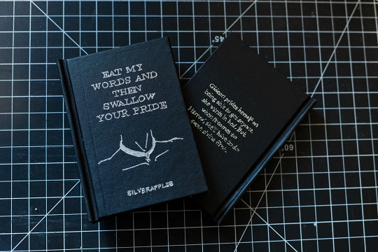
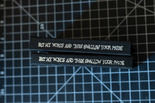
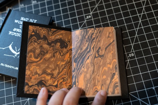
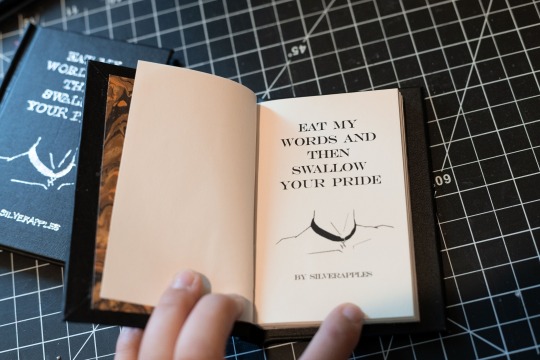
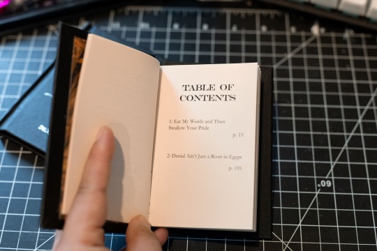
Eat My Words and Then Swallow your Pride by silverapples (18+)
+ its sequel fic, Denial Ain't Just a River in Egypt (18+)
Gideon prides herself on being able to get anyone she wants in bed. But when it comes to Harrow, she’ll have to do some giving first.
I'm SO excited to have bound this series as part of @renegadeguild's Fanfic Writer's Appreciation Day (August 21) event, it is one of my absolute favorite fics and such a love letter to butch subs/bottoms everywhere.
Fandom: The Locked Tomb
Pairing: Gideon Nav/Harrowhark Nonagesimus
Title font: Engravers MT
Body font: Garamond
Pages: 128
Size: Octavo letter
Case: Arrestox Bookcloth Black with hand-embossed silver foil, featuring cover art by me!
some rambling under the cut
i forgot to take good progress pics here because besides cutting the pages/the octavo size, this bind felt very standard/nothing much new was tried, construction wise -- but I DID draw the cover art with my mouse in photoshop because i couldn't find good royalty free art that fit the Vibe and this fic deserves a bangin cover.
I went with Gideon being collared by Harrow for the design because like, yeah. Of course I did. She deserves this.
I think one of the main artistic things I would change in the future (besides photographing it against a more contrasting background OOPS) is I think I'd want a thinner tip for the foiling, I think the summary on the back turned out okay but the spine text was a bit small for the tip I had, so it is a bit hard to read.
I really like the octavo size for shorter fics, especially for fics in the 5k-15k range depending on font size/art/etc. I wouldn't want to do a standard folio or even quarto with something this short just due to like... it would turn out magazine thin, but it looks cute as hell when turned pocket sized so I'm excited to have opened up a new realm of fics to bind!
#renegadelovesfic#renegade loves fic#fanbinding#bookbinding#the locked tomb#raxhiem binds#trb.txt#YAYYYYYYYY im so excited to finally post abt these ive been working on them for months#ffwad#queue
105 notes
·
View notes
Text

Never give up
long story short, I have a new pc, so far so good, was very lucky to get it. Bad news, a program I've had since 2014, ten years, and still own but cannot have is my adobe photoshop cs6. Adobe won't let me have it because I guess it's on two dead pc's (one being my laptop) and even though they know this, they said they can't reset it, they can't give me access to it, and just said, "here is six free months of this program, go suck lemons" and I refuse to accept any offer but what I bought. It's not the fault of the employees they are doing the best they can, but if I can help it, I will never use Adobe ever again and I recommend anyone of you who wishes to do so to be careful, and those who have yet to try it, don't bother, there are better programs out there it just has a learning curve, industry standard or not its time they understood that they can't own you. You deserve better. That being said some files were saved, and these two were the last I had worked on before the crash. I managed to recover both by the skin of my teeth and most of the rest. The moon aka Philip had gotten corrupted, and I believed it was a lost cause, that I would have to redraw him, start over from scratch as his whole face was cut up to glitchy pieces. However, in an ironic twist of fate, if you can call it that, the sun card Caleb saved it, it had managed to reconstruct it from nothing, lurking on the file, as I had drawn Philip first and Caleb over him for the sun.
So in lieu of that, I decided to add the Gravesfield portal to their backgrounds, I was going to make them center stage like the star/collector, but this... this is good for them... Never give up.
sincerely Dove
#my art#magic#philip wittebane#the owl house#toh#wittober#caleb wittebane#emperor belos#halloween#moon#sun#tarot#tarot cards#tarotblr#tarot deck#tarot reading#tarot witch#tarotcommunity#eda the owl lady#eda clawthorne#toh eda#edalyn clawthorne#toh edalyn#toh raine#raine whispers#raeda#luz noceda#toh luz#toh fanart#amity
126 notes
·
View notes