#futura free
Explore tagged Tumblr posts
Visit Tumblr Blog
Explore Tumblr blogs with no restrictions, modern design and the best experience.
Last Seen Tumblr Blogs


Fun Fact
The “We are the 99%” Tumblr blog became the slogan for the Occupy Wall Street movement.
Text


I think Futura Free's final lines have the best Genius annotation in the whole album
12 notes
·
View notes
Text

5 notes
·
View notes
Text
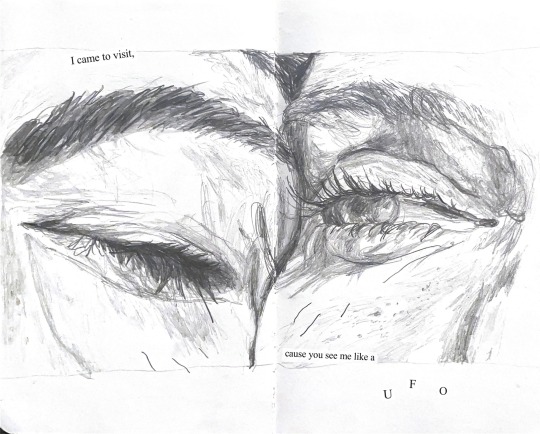
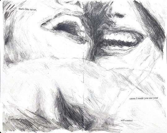
self control by frank ocean
#art#drawing#sketchbook#sketch#my art <3#my art#painting#illustration#original art#art scan#artists on tumblr#frank ocean#frank ocean art#blonde#self control#self control by frank ocean#frank ocean drawing#channel orange#ivy#futura free#white ferrari#thinkin bout you#frank#music#music art#collage#collage art#text collage#frank ocean fan art#aesthetic
88 notes
·
View notes
Text
:(
1 note
·
View note
Text
SilvesterV1 (mastered)
an silvester schmelze ich
#silvester#neujahr#neujahrskonzert#feuerwerk#raketenverfehlenmich#soundtrack#soundcloud#music#newcomer#frank ocean#georg friedrich händel#kanye west#futura free#SoundCloud
1 note
·
View note


Text
Made these for @tinfoil-jones's Jerk Ford AU. XD It's like if the Jerk Ford Hate club gave out business cards, but you were allowed a tiny bit of customization. Jerk Ford and Anti-Ford like to frequently act/dress like regular Fords and sneak into the JFHC, so I figured they'd hand out their business cards to newbies and other Fords, which would piss off the Fords to no end. Jerk Ford would have 4 different versions of his to maximize trolling. The QR codes are scannable, but two of them are NSFW (NOT porn. A song about dicks and the other teaches you how to swear. XD) You've been warned. XD
According to Tinfoil Jones, the other Fords refuse to call Jerk Ford anything but Jerk Ford and have forgotten he actually has a dimension designation, so he just walks around with his designation on his badge and cards and whatnot, and no one sees anything amiss. XD
Oh, and the phone number says "GO 2 HELL" in calculator speak. The email is another huge troll. Basically a jab at how most of the other Fords aren't tech savvy enough to have a more updated email server.

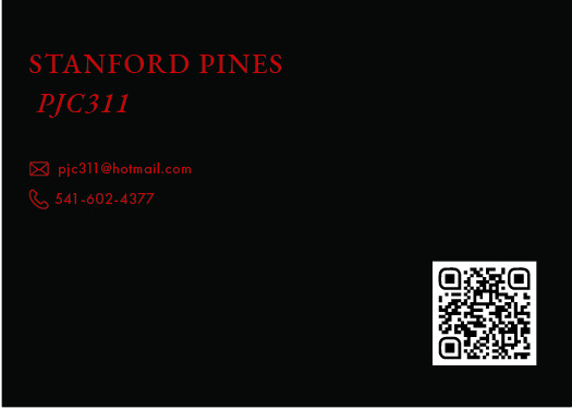
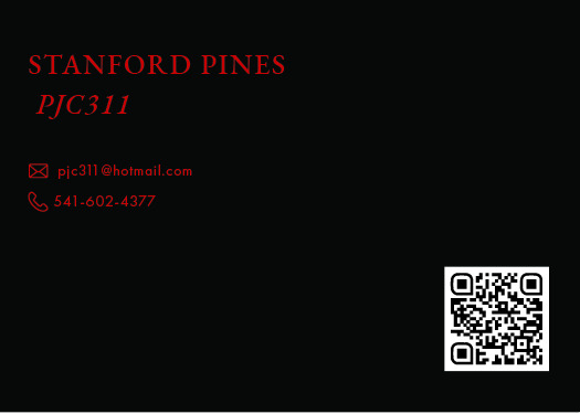
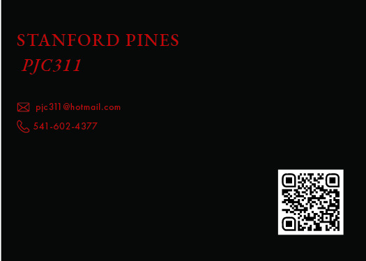
#gravityfalls#stanfordpines#jerk ford au#gravity falls au#business cards#jerk ford hate club#design#graphic design#Jerk Ford chose a Serif Font to mimic the other Fords but it's a basic ass bitch serif#freakin Garamond.#I love me some Garamond#but it's along the same vein as Helvetica#he also used Futura for the sans on the back#another basic ass bitch font that every design teacher will tell you is timeless#THERE ARE BETTER SANS SERIFS!#We need to break free of this chokehold Futura has on us!#art#gravity falls ford#artists on tumblr#designers on tumblr#the gold on the front would be gold foil#because gold foil fuckin rules
45 notes
·
View notes
Text

She was designed as a contribution to an affordable housing project in 1927, and named for an optimism for the future. She's been in the movies and went to the moon. Avante garde but approachable, the perfect combination of form and function, the typeface of today and tomorrow, the queen of sans serifs - vote Futura.
https://www.tumblr.com/typefacetournament/737081453203079168/round-2-yellow-group?source=share @typefacetournament
#my art#I guess#type#tumblr polls#would you believe my hype for type started as a bit. now im making propaganda in my free time.#anyways. love you futura.
21 notes
·
View notes
Text
frank ocean at coachella tonight and i’m not i hope i die
#woof#yesterday futura free came on while i was driving back home at midnight so i turned my car’s sound system off for the rest of the ride#im gonna go block tyler on twitter for good measure
7 notes
·
View notes
Text
i haven't listened to palisade 01 quite yet (will either be tomorrow or like... next week, haven't quite decided whether i'm gonna finish tm first), but every new detail i see makes me go ZOOP and i am so fucking ready
#i did go peek at the wiki page#and glimpsed a bit of fanart#EXCITING. I'M EXCITED#fatt#hello world#also uhhhhhhhh opinions on whether i should finish tm before starting pal?? i only have futura free left#but i don't want to rush that so i might actually leave it for my road trip next week#and listen to pal01 tomorrow#hmmm#palisade
2 notes
·
View notes
Text
truly insane how good Blonde by Frank Ocean (2016) is
how the fuck is Self Control on the same album as Ivy
#or Nikes or Nights or Solo#or Solo (Reprise) or Pink + White or White Ferrari#or Siegfried or Godspeed or Futura Free#10 years old next year!
0 notes
Text
"I'm on, mama, I'm on."
- Frank Ocean
#Frank Ocean Coachella 2023 Futura Free#Call my momma like “Momma”#I used to work on my feet for 7 dollars a hour
0 notes
Text
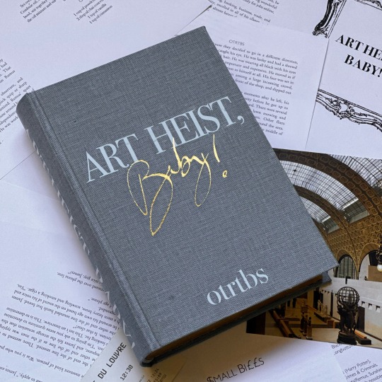
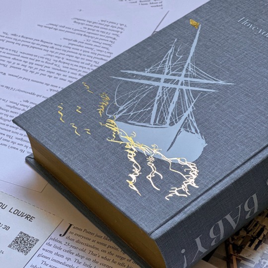
Art Heist, Baby! by otrtbs (@otrtbs)
When James Potter answers a mysterious ad in his local coffee shop, the last thing he expects is to be thrown into a world of white collar crime, but how can he resist when the mastermind behind the operation has dark hair and brooding eyes and promises wealth beyond James' wildest imagination? He would do anything for that boy named after a star, including stealing millions of dollars of fine art.
Pairing: Regulus Black/James Potter, Sirius Black/Remus Lupin, Marlene McKinnon/Dorcas Meadowes, Alice Longbottom/Frank Longbottom Fandom: Harry Potter
Disclaimer: otrtbs no longer allows binds of Art Heist, Baby!. This edition was first typeset and bound in May of 2023. Please do not use this post as a permission to bind Art Heist, Baby!.
Art Heist, Baby! was one of the very first jegulus fics I read, and eventually became my second-ever bind. The original binding for this fic was done over the course of a single weekend, which makes me cringe a little now—but I am still so proud of this typeset and the bind itself, despite its flaws.
Half-Letter | 219,117 words | 609 pages
Title and Drop Cap Font: Bodoni 72 Body: Adobe Garamond Pro Accent(s): Gill Sans, Futura Condensed
Typset by me in Word.
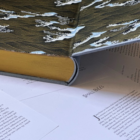
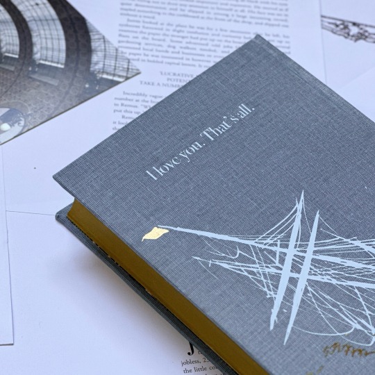
Designed by me in Illustrator.
Materials
Cover Bookcloth: Duo in Blue Jean HTV: Siser Brand in Gold Metal and Powder Blue Endbands: Mettler Silk Finish Thread Endpapers: Chiyogami Paper
Eventually, I found that the structure of my previous binding was less-than-ideal, and I decided to rebind my copy. Given that I couldn't change the typeset, I spent a lot of time deciding on a cover design, and eventually settled on using Ivan Aivazovsky's Ship on Stormy Seas (a painting synonymous with this fic) as inspiration.
The process of turning the boat from this painting into something that could be used with a single shade of HTV was difficult, but I eventually settled upon a design I was happy with after messing around in Illustrator for a couple weeks.
When I removed the cover from this bind, I also trimmed and painted the edges, sewed double-core french endbands (two-tone, to match the bookcloth), and reinforced the spine (though I couldn't do much for the pre-existing swell). Overall, I am thrilled with how it looks, and with how my original typeset fits with my more developed design style.
Thank you to Nat, for writing such a beautiful (and heart-wrenching) story. Art Heist, Baby! is free to read on ao3, here.
#jegulus#wolfstar#bookbinding#fanbinding#my books#marauders#ficbinding#james potter#regulus black#marauders era#sirius black#renegade bindery#art heist baby
306 notes
·
View notes
Text
navigation : the eclipse secret track main masterlist


Hey queen you dropped your crown, you are now listening to the Jujutsu Kaisen secret track!
── .✦ TRACK 1. GOJO SATORU / pink + white
"THE LINES WE CROSS" — smut, one shot
── .✦ TRACK 2. GETO SUGURU / nights
tbw
── .✦ TRACK 3. FUSHIGURO MEGUMI / ivy
tbw
── .✦ TRACK 4. NANAMI KENTO / seigfried
tbw
── .✦ TRACK 5. ITADORI YUJI / lost
tbw
── .✦ TRACK 6. ZEN'IN MAKI / provider
tbw
── .✦ TRACK 7. KAMO CHOSO / futura free
tbw
── .✦ TRACK 8. FUSHIGURO TOJI / white ferrari
tbw
── .✦ TRACK 9. RYOMEN SUKUNA / pyramids
tbw
── .✦ TRACK 10. IEIRI SHOKO / godspeed
tbw
2025 © NANASRKIVES. / do not copy, repost, edit, plagiarize, or translate any of my works on any platforms, including ai.
Taglist (OPEN). / @cherrysurf
#jjk gojo#jjk x reader#gojo satoru#megumi fushiguro#jjk megumi#nanami kento#jjk nanami#nanami x reader#geto suguru#geto smut#jjk smut#shoko ieiri#toji fushiguro#jjk toji#yuji itadori#jjk yuji#megumi#nanasrkives
40 notes
·
View notes
Text
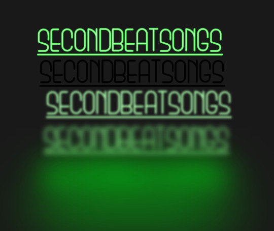
how to make neon signs in inkscape!
I lost my mind and spent a large amount of hours yesterday perfecting my methods and figuring out how to do this, so if you're interested in making something like this:

here's how to do that!
step 1: cover your workspace in a dark grey rectangle, and lock that layer down.
I've been using 80% or 90% grey - you want this so you can see your neon effect, but you don't want it entirely black at this stage, or you won't be able to see your shadow layer.

step 2: create some text!
pro tip: rounder sans-serif fonts look the best for this, because think about what a neon sign is made of - it's tubes, bent into shapes! so if your font or design looks too sharp and pointy, it'll feel unrealistic when you make it neon.
(this is, of course, a perfectionism thing on my end, so feel free to ignore any and all rules in order to make the thing that you want to make. as with all art, you can do whatever you want forever!)
bonus pro tip: if you, like me, have over 1400 fonts installed and programs tend to lag when you browse through all of them, nexusfont is a great free software that lets you sort your fonts into categories, search them, and preview what any text looks like in different fonts! I love it. it is my best friend
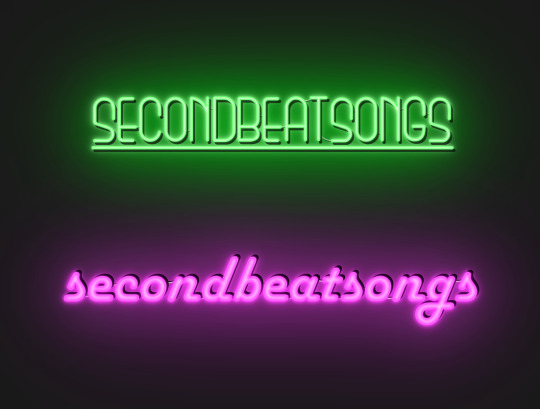
now I'm going to do this with a few different fonts, so that you can see how it works with them. so today, I'm picking Futura Round, Harlow Solid Italic, and then to challenge myself, Beauty School Dropout and Block

make the text white, and also select the text and go to Paths -> Object to Path, because some things don't work right if they're not paths.
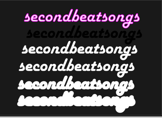
let's start off easy with Futura Round!
Step 3: duplicate your text layer
now bear with me here. but you need to take the text you're working with, and either right-click duplicate or copy/paste the layer until you have seven total copies of the text you're working with.

arrange them like this, making sure the top one is the first layer on the list (and so on), and then in the layers tab, label them like so:
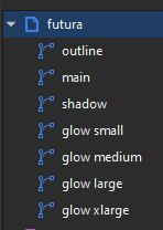
pro tip: if you don't have the layers tab open, go to Objects -> Objects and Layers, and that'll pop it right up
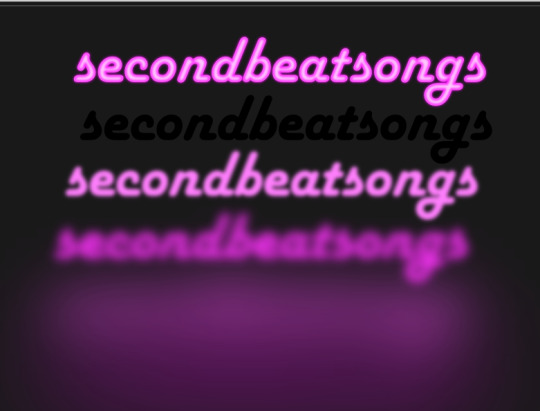
Step 4: blur time!
switch to the Fill and Stroke tab, and make these changes to the paths:
glow small: 15% blur, 100% opacity
glow medium: 20% blur, 90% opacity
glow large: 50% blur, 70% opacity
glow xlarge: 70% blur, 70% opacity
your workspace should now look like this:

this is good!
pro tip: these numbers are just loose guidelines! at the end, mess around with everything to make sure that the glow looks right to you! nothing is an exact science
Step 5: shadow and outline
for the shadow layer, make it solid black, and then change the opacity to 50%
for the outline layer, we're doing something fun and weird. so right now it's a fill object, but we want it to be an outline instead! so let's hit the X in the lower left to make it empty, and then shift-click on...for the sake of this, let's say blue. to make our nice blue outline.
now's the weird part
now. use the align tool (Objects -> Align and Distribute), select the outline layer and the main layer, and align them so the outline text is exactly centered on the main one.
then go to Paths -> Path Effects, and when the tab opens, select just the outline layer, then click the drop-down arrow in the Path Effects tab and select Offset
here's our goal right now:
we want to offset the outline until it fits inside the text underneath it, and also mess with the stroke layer settings until you have a nice thick outline that doesn't overlap itself.
mess around with the plus and minus buttons. there are no exact numbers here; you just have to know when it looks good! but for me, the settings were a -0.34mm offset, with a stroke width of 0.700mm
this is roughly what you want it to look like:
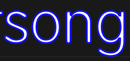
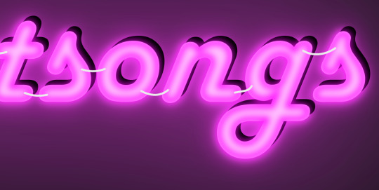
now, with the outline layer still selected, blur it out just a bit until it looks fuzzy, and like the white center is a highlight rather than a separate layer. for me, the right number was about 8.3% of blur, to get a result like this:

Step 6: layering and changing colors
okay! at this point your work should look something like this:

you now want to select every layer except the shadow layer, and use Align to center them all on top of each other.
pro tip: make sure to untoggle "move/align selection as a group", otherwise this will not work.
you should now have something that looks like this, with the shadow layer sitting all by itself somewhere off to the side

now's the fun part: colors!
since we've decided that this neon light is going to be blue, it's time to change the glow to reflect that!
here's what it looks like when you change all of the glow layers to be that same, #0000FF blue as the outline layer

and here's what it looks like when you take the glow small layer and make it just a bit lighter (#4343FF) using the stroke and fill tab

in general, mess around with the layer colors until you like how they look! I find that it generally looks better if the glow small layer is a bit lighter, and the glow medium layer is as dark as the original color. everything else is fair game.
also the main layer can stay white (if you want it to seem very bright), or you can make it a very very light blue if you want it to be a bit more subdued.
Step 7: final steps
take your sad, neglected shadow layer, and move it slightly up and to the right of your main layer, so that it works...well, basically like a drop shadow.
then take your original rectangle, and switch it to 100% black.
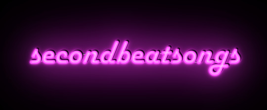
now. gaze upon your masterpiece

that's a good neon sign if I've ever seen one.
but now. now's when we lose our minds
Steps 8-??: perfectionism and nonsense
so let's move the Futura one aside (and hide it! inkscape lags if there are too many blurry layers visible at once, so hide anything you're not using!), set the rectangle back to grey, and move on to Harlow Solid Italic.
I've sped through a few of the steps here (out of order) so you can see what I'm doing. I've added outlines to the large glow and xlarge glow, and bumped them up a bit so they'll have a larger glow area in general
this time I've made the large glow a little bit lighter than the xlarge glow and medium glow, and made the main layer a very pale pink instead of just white. I also blurred the outline layer just a bit more, because this font needed a bit more fuzz to make it look good.

hell yeah. this rocks.
now, one detail for perfectionism: in neon signs IRL, if you look closely, there are wires attaching them in the back, often connecting each letter to the next. so...let's do that!
get your pen tool, set it to spiro path, and then make little droopy lines connecting each letter.
make these thin, 100% opacity, and a very light (almost white) grey color. then group all of them together, and move this group under the small glow layer
pro tip: some of the cords might go mostly through the shadow layer. if this is the case, just put the cord group one layer above the shadow layer instead, and then it'll be fine. but you might make the cord color a pale-greyish pink to make it look like there's glow hitting it.
ultra advanced technique: duplicate the cord group, make it black and 50% opacity, position it slightly up and to the right of the original, and then move it one layer below it. you've got cord shadows babey!
lookit that. stare at that beautiful perfection. I love it. this brings me joy.
and now: the one that will be the most work
let's gooo Beauty School Dropout!
this one I'm using as an example for what to do with a font that's a bit too pointy to look realistic

this font is really fun and bendy, but the ends of the letters are flat instead of rounded, and the corners are a bit too sharp. so...let's fix that!
now, there are several ways we can do this (after doing Object to Path ofc).
one way is to edit the path yourself, going slowly, and making sure everything is perfect, editing the nodes individually.
or, you could select the text layer using the node tool, then click the button in the top bar labeled Add Corners LPE, and then drag the little circles and triangles around to smooth out the corners
I've decided to do the LPE method, but the problem here is that if you apply the LPE effect before making sure all of the corners look good nodes-wise, it's hell to try and fix it. so before LPE-ing, look at all the spots that you're going to apply the effect, and make sure each has one point at each sharp corner, with no weird overlapping bits. okay? okay.
also for the line beneath the text, it looks like it's made up of a bunch of different segments

and since I want to keep this line because I think it looks cool, we're going to have to deal with that, and make sure that it's all one solid piece, otherwise the outlining won't work. so I've gotta delete all the extra segments, and then move the points on just one of those segments until it's the full original line width, before rounding those corners as well.
basically I've got my work cut out for me here, this will all take a bit.
...aaand an episode and a half of Supernatural later, here's this!

look at how nice and round that is! perfect for the rest of the neon process
and with cords, shadows, layering, etc

hell yeah.
more things: it's block font time
let's make an outline-style neon sign!
my seven layers:

for all but the last two, I've not used the fill option with them at all - I have simply used the stroke outline.
now don't be worried! the stroke-to-path still works just the same way even using an outline to begin with! so it's easy to get an outline of an outline, and do the offset thing just like you did before
however, because this font is more complex-looking, there will probably be some errors when you offset it

for example, it didn't fully outline the second half of the Os, so I just copied the left halves, mirrored them, and replaced the right half with the complete left half
pro tip: keep in mind that you have to re-apply the offset to any bits that you add to the outline layer!
doing the same steps as last time, editing the glow blurs as I see fit, once again we end up with beauty and perfection.

another thing you can do: turn off the lights!
I'm going to use Beauty School Dropout and Harlow for this, but after making your beautiful neon signs, here's how to make it look like a turned-off sign, for if you want to make...idk, a gif of a light turning on and off, or a burned-out sign, or something like that.
so start with (ideally, duplicated copies of) your neon signs:
and then simply delete every glow layer, change the outline layer to 90% grey and your main layer to 70% grey, change the cords' color to a darker shade of grey than whatever it already is, and lower the opacity of the shadows by about 10-15%.
doing that, you end up with this

bam! lights turned off!
last thing: logos and other stuff
you can make neon signs with images as well as with text! the steps are essentially the same, though you may have to do more editing to make it look good, and use simplify on the path if it's too detailed.
and if you're using anything besides an .svg, you first go to Paths -> Trace Bitmap to turn your image into a vector! but unfortunately I've already used 29 images in this post, so here, just look at this Keith Haring thing I made as an example:

is it messier than the text? yeah for sure. does it have some pointy bits I could smooth out more? definitely. but, I've watched three episodes of Supernatural today, and that is more than enough time spent on this. so this is what you get.
but yeah, that's how I make neon signs in inkscape! I used to do it in GIMP, but this works much better, and looks so nice and clean! <3
(man, graphic design really is my passion)
#tutorials#inkscape#reference#neon#graphic design#tbh this is definitely for my own reference too because I know I will eventually forget this process#but I want it to also be useful to other people#so here!#inkscape tutorial#enjoy#graphic design is my passion#tutorial
136 notes
·
View notes