#fundamentals of logo design
Explore tagged Tumblr posts
Visit Tumblr Blog
Explore Tumblr blogs with no restrictions, modern design and the best experience.
Last Seen Tumblr Blogs


Fun Fact
Users from the US are the majority of Tumblr visitors.
Text
Master the Art of Logo Design! ✨ Unlock the secrets of world-class logo creation in this FREE online course. Learn the fundamentals of graphic design, the psychology of colors, and the difference between fonts and typefaces. 🚀 Start your creative journey today and craft logos that leave a lasting impression.
🖌️ Enroll now and turn your ideas into iconic designs!
#logo design#free courses#creative journey#fundamentals of logo design#graphic design basics#psychology of colors#craft logos#typography#learn now#design inspiration#creative#creative skills#logo design tips#new opportunities#improve now#art challenge#challenge yourself
0 notes
Text

always forget i can drop off my messy wips and behind the scenes prep work on this blog right here.....until now
#my art#wip#so much of my process is making pure garbage and being in denial about it until it starts to take shape#maybe this is a universal feeling but also a lot of people have nice-looking sketch stages and can sketch well. not me baby.#1000 horrible doodles where i question whether i understand any fundamentals. five good concepts. one good concept that makes it out alive#but also sometimes i butcher it and start devolving into an upset ape#also graphic design is not my passion but coming up with fake adverts and horrible diy band logos and unsettling conspiracy graffiti is
65 notes
·
View notes
Text
https://redcircle.com/shows/d462cbc8-3fe9-41f5-97b1-f1cbc8306fb6/episodes/50c3bb37-fb48-45aa-a17a-65afcbabcfeb
Welcome to Wonderful World of Darklords! In this episode, we're looking at a property that Disney has adapted for both Mickey Mouse and the Muppets: A Christmas Carol. At its heart, A Christmas Carol is a story of redemption--so how do we square that with darklords, who are fundamentally irredeemable? By sending your PCs into a trippy journey through the past, present, and future of a character who isn't the darklord, that's how. Topics discussed include:
Why we didn't choose Scrooge as our darklord, instead opting for another miser whose prison comes with hate;
Concrete examples of past, present, and future visions for Scrooge, a beloved canon NPC, and two PC archetypes;
Ways for your non-Charisma PCs to help Scrooge be a better person (because even the Ghost of Christmas Future had an astronomical Intimidation bonus);
Various levels of dreamscape weirdness, from "we're literally just doing A Christmas Carol" to "we just cited the last two episodes of Neon Genesis Evangelion;"
And more!
The full write-up for Scrooge and Marley is available for free on DM's Guild: https://www.dmsguild.com/product/504721/Scrooge-and-Marley-A-Ravenloft-Domain-of-Dread?view_as_pub=1
The Verge Games Christmas Carol adventure that we "borrowed" much of this domain from is available on their website: https://vergegames.org/all-products/p/christmas-carol-adventure-book
The Nightmare Lands, which we "borrowed"...pretty much the rest of this domain from, is available on DM's Guild: The Nightmare Lands (2e) - Wizards of the Coast | Ravenloft | AD&D 2nd Ed. | AD&D 2nd Ed. | Ravenloft | Dungeon Masters Guild You
Timestamps
0:00 Introduction
08:27 The Lord
31:33 The Land
40:36 Dread Possibilities
1:27:42 Parting Thoughts
1:50:51 D’s Parting Thoughts
All music recordings are in the public domain (mark 1.0) and are licensed through https://musopen.org:
Chopin Nocturne in B-Flat Minor, Op. 9 No.1 (main theme), performed by Eduardo Vinuela
Chopin Etude Op. 25, No. 12 in C Minor: “Ocean” (darklord theme), performed by Edward Neeman
Chopin Nocturne in F Minor, Op. 55 No. 1 (land theme), performed by Luke Faulkner
Rachmaninoff Morceaux de Fantaisie, Op. 3 - 2. Prélude in C sharp minor (Dread Possibilities), performed by Sergei Rachmaninoff
Chopin Nocturne in E Minor, Op. 72 No. 1 (parting thoughts), performed by Luke Faulkner
Dialog for Yensid was written by Azalin Rex himself @darklordazalin
The Wonderful World of Darklords logo was designed by Halite Jones, whom you can find @halite-jones or on Instagram at http://www.instagram.com/insta_halite
Contact us on:
Gmail: [email protected]
Facebook: @wonderfulworldofdarklords
Tumblr: @wonderfulworldofdarklords
Patreon: www.patreon.com/WonderfulWorldofDarklords
YouTube: @wonderfulworldofdarklord
#wonderful world of darklords#ravenloft#dnd#podcast#curse of strahd#disney movies#dms guild#a christmas carol#marley and marley#ripping off the nightmare lands lock shock and barrel
10 notes
·
View notes
Text
T-Shirt: Let's Go Meds!
Hey, do you know who the New York Mets are? Me neither, but they’re a great meme just because everyone I know who _does _know them has _amazing _opinions on them. My favourite so far is ‘imagine spending half a billion dollars on a team and getting the mets.’
Anyway, I thought it sounded like ‘meds’ and made a joke about reminding people to take their meds over on Cohost. That chost went so wide that my notifications didn’t work for a day. Then I thought I’d rechost it again because it made me laugh to remember it, and again, my notifications weren’t useful.
Anyway, the result is that this has been on my mind for a month or two and then I looked up the actual Mets logo, and, like, Uranium Orange and Something Blue is pretty cool as contrasting pairs to work with and anyway, this wound up happening.

It’s a brain! In a sea of serotonin! Seen through a pill! Because sometimes you need a reminder to take ya meds! Love (what aspects of yourself you can access readily and more conveniently thanks to) tha meds, baybee!
Maybe you want a version with a bit more of an _affirmative action _vibe? Well, here:
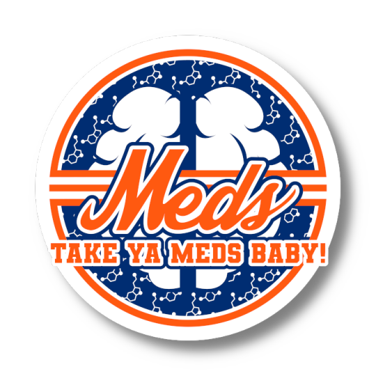
You can get them on stickers, you can get them on bathmats, you can get them on pet bandannas. If I know one thing about Da Mets it’s that they’re fundamentally designed to be comically obnoxious, and damnit, I don’t want you missing your meds.
You can get them here, without or with the shouty bit!
Check it out on PRESS.exe to see it with images and links!
15 notes
·
View notes
Text
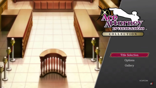
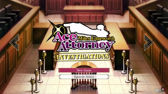
AAIC Gameplay Video (Switch)
This is the 56th post in the Ace Attorney Investigations Collection Countdown: 25 days left until release!
Today's topic: some Gameplay footage from the Switch version of the collection!
youtube
Along with all the new information and previews there have also been two gameplay videos of the Investigations Collection released, one for the Switch (which today's post focuses on) and one for PS5, showing some initial parts of the first cases of both games in the collection. Of course, the gameplay is the same as it was for the DS versions, it's still fundamentally the same games after all, but there are some neat things to be discovered in these videos anyway.
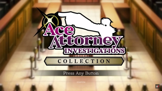
First of all, we get a look at the title screen and main menu of the collection and - WOW! - is that main menu music aka the Investigations Collection theme an absolute banger! I love it! Especially the initial few seconds when it kicks in, so hype! It's gonna feel so amazing just to start up this game every time!
The title screen and main menu look amazing as well, of course. The design is so fancy and elegant! I especially love the prominent logo, the courtroom background (taken from Investigations 1) and the way the selected option is highlighted. That burgundy-coloured box with the gold framing is peak Miles Edgeworth!
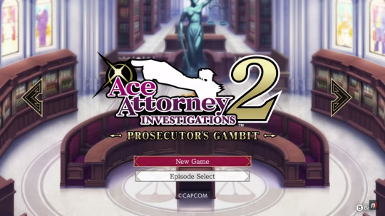
Continuing to the title selection screen we see that the fanciness doesn't stop there. The two screens for the two games have similarly prominent logos and also specific backgrounds to them. The courtroom background, viewed from a little bit higher up, for Investigations 1 and the PIC meeting room background for Investigations 2. Very fancy and gives the two games a very different atmosphere already only from the title screens. I also love the arrows for switching between titles, they're black with a similar gold framing to the highlighted boxes and it fits perfectly! They really just went and coloured everything after Miles' own outfit and preference 😄 So not complaining, it's brilliant!
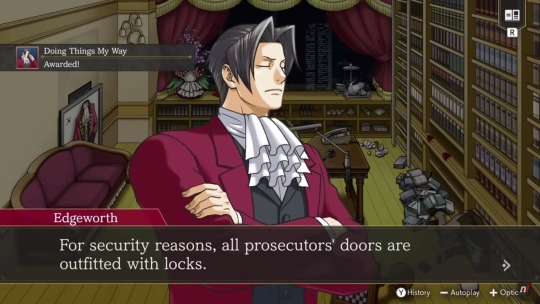
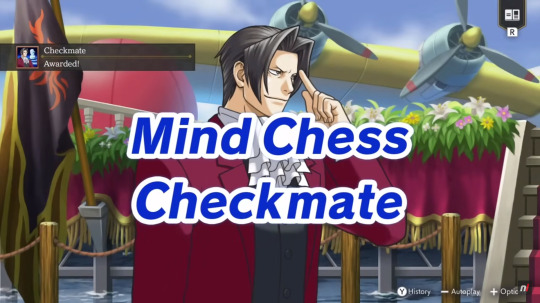
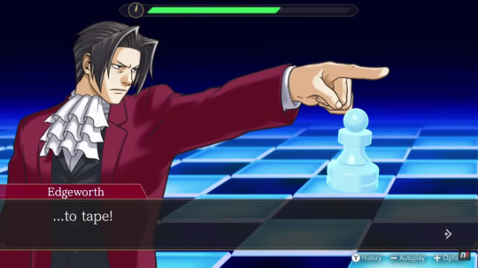
During the shown gameplay we also already get to see two of the many accolades that are in the game: "Doing Things My Way" (awesome name) for using Logic for the first time and "Checkmate" (very fitting) for successfully completing the first Mind Chess segment. Here you can also see that the phrase appearing on screen when finishing Mind Chess is "Checkmate" (instead of "Complete" like in the fan translation). I really like this change, it's much more specific and fancy this way.
Speaking of translation changes, since we see some gameplay from Investigations 2's first case we also get a more continuous impression of how the official translation compares to the fan translation. I don't have many screenshots of this part of the game with the fan translation on hand and don't remember all the lines specifically so I'm not going to do a direct line-to-line comparison between the two versions but I can definitely say that I like what I see from the official translation! The lines and dialogues flow naturally and there are already some wonderfully phrased moments from just this short amount of story alone! As you can see from the screenshot above, they definitely carried over how hilarious some of the wrong answers in Mind Chess could be 😄 Maybe they even added unique dialogue when picking them? I doubt it but I still hope.


One phrase that stood out to me in particular was this one for when Miles finally checkmates Nicole (Tabby Lloyd). It sounds so badass and poetic! 200% how Miles would phrase this and I love it. I don't remember how the fan translation did this line but I doubt they beat this one. This makes me even more excited to see how the rest of the official translation stacks up! Maybe we'll lose some amazing lines, and I'll be sad about that, but, judging from this, we'll definitely get some new ones, too.
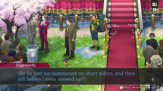
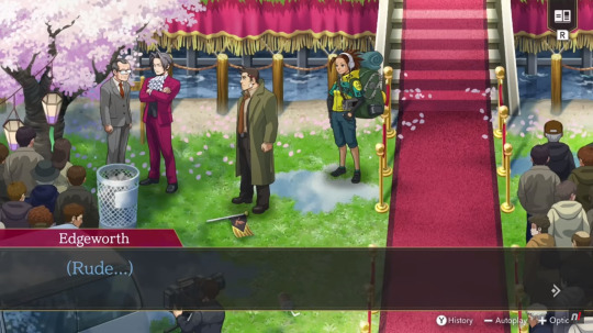
Another moment I loved, and actually laughed out loud at, is this one for when Miles talks to Payne about the chief prosecutor (who he's referring to in his thoughts). Just that singular little "Rude..." at the end there is a-ma-zing especially coming from Miles! 😄 Gah, I'm so excited to play this already!!
#ace attorney#ace attorney investigations#ace attorney investigations collection#aai collection#ace attorney investigations collection countdown#25 days left
14 notes
·
View notes
Text
That dumb poster
Okay, I have had more time to think about the Jimin exhibition poster controversy, and now I'm more pissed than ever. I see that other bloggers on this site (whose opinions I respect, btw), don't think the poster is a big deal. That was sort of my first thought, too. Sometimes Jimin's Korean fans seems to pick up on small transgressions that don't seem like a big deal to us non-Koreans. Why does the poster matter?
It matters for a few reasons.
DESIGN
Jimin has an enormous global fanbase. His name trends on X/Twitter almost daily. He's had six songs chart on the Billboard Hot 100 during this short solo phase. This poster is in no way befitting of a global star. It looks more like an announcement for a pottery show at the local senior center, but even a poster like that would likely include a few photos of pinch pots and mugs. I'm sorry, but it's just ridiculously unprofessional.
Let's talk about contrast. Contrast, especially black and white or complementary colors, attracts our eyes and pulls our attention. Choosing muted pastel pink and yellow achieves the opposite effect. It's nearly invisible to the eye, and therefore the brain. This poster is meant to be subconsciously unimpactful. I took the original poster image (I think BH actually touched it up a bit and made the pink hotter and brighter) and made it black and white just so you can see how little contrast there is.

Some of the most relevant information on the poster - who, what, and where - is absurdly small. The title of an old BTS song and a random date range is the main focus. Jimin is an afterthought.
BRANDING
I talked about this yesterday, so I won't belabor it further, but where is Jimin's branding and cohesive design strategy? The poster has nothing do with either album whatsoever. Again, this is a way to make the announcement invisible because our brains don't associate any of the design elements with Jimin's albums. This is intentional ineptitude. There is no way a company the size of HYBE doesn't know the fundamentals of branding. Look no further than Jungkook's trademarked logo. His announcement poster was full color and full of his face. They know what to do, they just won't do it.
PATTERN
A single poster for an exhibition isn't worth raising your blood pressure over, but it is indicative of a pattern of intentional neglect by HYBE/BigHit. All these small failures cumulatively add up to real damage to Jimin's career and earning potential. It's no big deal, it's just this one oversight/mishandling/mistake. Here's just a tiny fraction of the ways they diminish him on a regular basis -
No Billboard Music Award because the company didn't restock Like Crazy CD singles.
Little to no award nominations. The VMA's 2024 Song of the Summer category being the latest.
Service WHO to radio, but only to Top 40 and not Adult Contemporary or other suitable station platforms, and then do nothing to support it, leaving the burden on fans to request.
Little to no playlisting on Spotify and Apple Music. This is just an egregious fumbling of WHO. Unforgiveable!


All these little transgressions are meant to wear down the fandom over time and subtly minimize Jimin’s popularity. Today's drop to the very bottom of TTH should elicit outrage. It should be trending on Twitter, but it's not, because his fans have now been conditioned to accept the mistreatment and stay quiet. WHO isn't even on K-Pop On! anymore.
HYBE can't go out of business soon enough.
But, it's just a poster.
14 notes
·
View notes
Note
i hope you're excited because palworld is not getting sued for stolen designs, but for the game mechanics patent! so copied pokemon designs will be totally fine, but not monster catching games, that's what they're actually getting sued for. the only thing this lawsuit will do is actually the inverse of what anyone wanted! if this goes through we'll have to watch out for cassette beasts next!
You’re a coward for hiding behind an anonymous ask.
If Nintendo wanted to sue Cassette Beasts, they would have done so already. If Nintendo wanted to sue Yokai Watch, they would have done so already. If Nintendo wanted to sue Digimon, a series that has been plagued by comparisons to Pokémon since the 90s, they would have done so already.
As my buddy @simpingforcreamsoda pointed out, the patent infringement is almost certainly that Palworld’s capture mechanic is functionally and visually identical to using Pokéballs. Persona 5 is another game with a “monster catching” mechanic, but it’s done through negotiation instead of throwing a little ball at the thing to store it in. In Cassette Beasts, you record your monsters with tapes. These are all very different from Pokéballs. Why couldn’t Palworld do something new as well?
I’d still argue that while this Pokéball theft is the smoking gun that’s gonna lose Palworld the lawsuit, it’s the character designs that Nintendo really cares about. The last thing they want is Palworld profiting off of these Frankensteined versions of not only their character designs, but likely their exact models as well. They might not be confident that they can prove that in a court of law with millions of dollars on the line, but blatant rip-offs of Pokéballs? Arguably the most famous iconography in the whole series, down to it being their logo? That’ll do it. Like I said, this is like them getting Capone on tax evasion and not murder.
I know I’m harsh on Palworld. But it’s because I want the gaming industry to do better. The core appeal of Palworld is giving Pikachu an AK-47. That’s it. It’s as fundamental as “haunted Chuck E. Cheese” is for Five Nights at Freddy’s and “rubberhose Gunstar Heroes” is for Cuphead. But both of those, despite their obvious inspirations, do something new. They do something different. Freddy Fazbear is not an expy of Chuck E. Cheese. It’s impossible for a layperson to mistake Cuphead for Mickey Mouse or any of his numerous clones from back in the day. They are not strictly derivative of the source material that inspired them. Besides the guns (which is probably a factor in Nintendo’s aggression here), I don’t think Palworld does anything new, at least visually speaking.
10 notes
·
View notes
Text
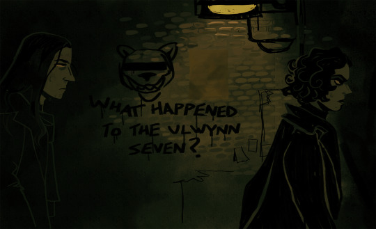
Inconsistências & incoerências na marca NCT

Olá, meus caros NCTzens! Hoje, estou aqui para escrever sobre um fato que me causa certa indignação, principalmente como NCTzen, mas também como artista e como alguém que aprecia as artes num todo.
Analisando, nesses quase 10 anos que acompanho o NCT, consigo pontuar certas coisas que o fizeram se tornar uma marca com potencial desperdiçado {para não dizer, uma marca fraca}. Por mais que eu ame esse grupo, não posso fingir que isso não acontece.
Nesse texto, pretendo falar sobre porque a SM só dá tiro no pé quando o assunto é o grupo. Tudo isso poderia ser resumido a uma única palavra: branding.
Não vou entrar em detalhes de polêmicas envolvendo o nome dos membros e da empresa, mas saibam que isso também contribui para esses ruídos na imagem do NCT. Essa é uma continuação desse post sobre a identidade visual do grupo.
A primeira inconsistência maior que gostaria de pontuar, é de que o NCT foi vendido como um grupo inovador e isso consta em seu próprio nome: Neo Culture Technology. Dito isso, seu marketing foi maiormente feito em cima do conceito de um sistema ilimitado de membros, de um sistema de graduação de uma das unidades, e também do fato de que cada unidade representaria algo diferente, além de uma região. Essa foi a propaganda que sustentou o NCT por anos. Porém, a longo prazo não foi possível sustentar.

Quando houve esse rompimento, seria necessário ter feito um rebranding do NCT, pois, quando uma marca perde um pilar importante é fácil para ela se tornar irreconhecível no mercado em seguida. Imagine esse exemplo prático: se a Apple deixasse de usar a maçã para representá-la, a credibilidade da marca seria duramente afetada, pois foram anos e anos sustentando aquela imagem como peça fundamental.
Segundo ponto: o NCT não possui uma logomarca forte. Sei que eles debutaram em uma época em que o design se tornava bastante minimalista, mas para mim é um erro amador vindo de uma empresa do porte da SM. Pode até ser que na época fosse visto como um movimento datado, mas infelizmente uma logomarca é um ponto importante para reconhecer uma marca antes de ela se apresentar propriamente.
Dentro de sua logo, ao menos um singelo símbolo, o NCT precisaria ter... Pois uma marca é principalmente construída a partir de conceitos visuais e estéticos. O público a quem uma marca atende, precisa sentir que faz parte de algo, quase como se fosse um clubinho.
Outro ponto: resistência no uso da cor verde nos materiais relacionados ao grupo. O NCT 127, por exemplo, começou a utilizar o "verde neo" em Regular; já era o terceiro comeback do grupo. Hoje em dia, venhamos e convenhamos, o verde do NCT é a única coisa que os identifica. Imagine se esse artifício fosse bem aproveitado desde o início do grupo? O verde neo, além de identificar o grupo, não é uma cor tão comum, é uma cor geralmente associada a extraterrestres, então chama a atenção para esse lado dos caras serem "diferentes", algo novo posto à mesa.

Próximo ponto: resistência a conceitos fixos. Sei que esse ponto é o que mais vai gerar discordâncias, mas é minha opinião pessoal. Vejo que grupos de empresas não tão conhecidas acabaram fazendo seu nome no meio dessa forma. Repetindo conceitos para o público entender a proposta, e depois de terem se estabelecido, puderam começar a ousar. Para um público se identificar com um artista, é essencial ter algo com o que se identificar. Se você tenta se identificar com todo mundo, então você não se identifica com ninguém. O conteúdo se torna genérico.
Por último, mas não menos importante, e como mencionei não vou adentrar em polêmicas, mas a associação a marcas que não tem tanto a ver com o NCT, nem com os membros. Para um nome ser crível no mercado, tudo aquilo que se associa a ele também precisa seguir a mesma linha. Dificilmente essa narrativa será construída com marcas e feats com artistas desconhecidos para quem consome Kpop, ou que nenhuma relação tem com o que o grupo produz. Acaba se criando aquele efeito de quando vemos a Fátima Bernardes fazendo publicidade para a Seara. Sabemos que ela não come Seara, nem a pau.
Quais seriam as soluções?
O NCT precisa urgentemente de um rebranding, alguém que pense isoladamente em soluções para erguer esse nome que está sempre à beira de se tornar algo, mas continua somente a tocar a superfície.
A peça fundamental seria a repetição de conceitos até que o grupo se tornasse uma marca identificável novamente. Se antes reconhecíamos o NCT pelo seu conceito de número ilimitado de membros, que não existe mais, agora iremos conhecê-lo por suas unidades focadas em públicos diferentes, de verdade.
A unidade que melhor tem feito isso é o Wish, pois eles pegaram um nicho de conceitos fantasiosos e estão trabalhando muito bem em cima deles, tal qual o Dream no início da carreira. O 127 e o Wayv nunca tiveram esse tipo de cuidado sobre eles. Alguns comebacks são bem melhor trabalhados que outros, o que cria um desequilíbrio em sua imagem. A unidade para comebacks aleatórios sempre foi o NCT U, então, não entendo a necessidade que a SM tem de querer agradar todos os públicos utilizando as demais unidades, contribuindo apenas para a perda da identidade dos seus grupos.
Não acho que seja por acaso o fato de Kick It ter sido um grande sucesso {o maior do NCT até agora}, sendo esse o primeiro comeback construído em torno de um conceito e um universo próprio, com a primeira logomarca com um símbolo. O mesmo podendo ser dito a respeito dos grandes projetos do NCT. A primeira música realmente estourada do grupo, Boss, fazia parte de um grande projeto conceitual. E falando nisso, ao meu ver, esses projetos deveriam ser o carro chefe do grupo, para reforçar o seu diferencial, que são suas unidades diversas. Ainda nessa vibe, poderia citar Glitch Mode. Poderíamos ainda fazer vários comebacks usando somente a cor verde como principal, criarmos uma ou algumas logomarcas para cada unidade, um mascote e um lightstick que fizesse sentido com toda essa história.

A próxima sugestão tem a ver com suas associações. Publicidade que tenha relação com os membros e/ou o grupo, para atender o público que já o consome. Por exemplo, ao invés de investir numa colaboração com uma marca de café genérica, porque não usar o Jaemin ou o Johnny e criar uma linha de café para eles? Nem que seja limitada, vendida somente pela loja da SM. Não apenas atrairia lucro, como ajudaria a criar um universo de marca mais crível. Vale lembrar que o melhor marketing ainda é aquele feito boca a boca, então, a partir do momento em que a marca atinge um público fiel, ele mesmo irá se encarregar de atrair mais público, e público que queira consumir constantemente. Porque não aproveitar a exposição de fotos do Jaemin e fazer uma colaboração com a Kodak ou a Fujifilm? Isso traria mais coerência para marca NCT do que um patrocínio da Prada traz, por exemplo.
Algumas publicidades que a SM acertou foram o jogo de celular NCT Zone, porque combina com o conceito tecnológico, além de que os kpopers geralmente estão inseridos no mundo Geek e acabam se interessando por esse universo. Da mesma forma com a Sanrio e agora Pokemon. É mais fácil ver um kpoper consumindo algo da Hello Kitty do que da Ferragamo, por exemplo. Associações não condizentes prejudicam a imagem da marca. Carregam uma ilusão de visibilidade e lucro, que na verdade tem pouca duração e termina de enterrar a credibilidade tanto do NCT quanto da SM como empresa.
Do que uma marca de sucesso é feita? Eu respondo: um universo de símbolos críveis. A ideia de que você precisa consumir aquele produto para fazer parte de algo. E essa ideia é sustentada por símbolos e ações que identificam seu público alvo. Para um fandom isso é muito mais do que necessário, isso é imprescindível. Então, até o Wish {essa unidade tem uma identidade visual forte} chegar, o NCT não tinha nenhum tipo de símbolo visual, nenhum tipo de logomarca ou mascote, algo que ajudasse a identificar o grupo e as pessoas que o acompanham. O fato das fãs terem criado esses símbolos, como por exemplo, os bichinhos de pelúcia que identificam os membros e, em seguida, a empresa ter copiado a ideia, demonstra amadorismo. Como pode um fã pensar numa necessidade do público, antes de uma empresa que está há anos no mercado?
O que ocorre é que, a longo prazo, é cada vez mais difícil se identificar com algo genérico e feito somente no intuito de vender. Por mais fútil que seja o motivo para agregar, ele deve existir. É terrível concluir que o início do fim do NCT como marca, infelizmente, começou logo após seu debut, com os caminhos tortos que a empresa decidiu tomar demonstrando amadorismo muitas vezes, além de falta de planejamento e posicionamento. Salva de vaias para uma empresa que, a cada ano que passa, demonstra cada vez mais desconexão com a maioria do público que ainda busca seus produtos, num misto de desinteresse a falta de autoridade.
Penso em fazer outros posts nessa mesma linha, analisando antigos comebacks do grupo, bem como alterando aqueles que não são do meu agrado. Comente se você gostaria de ver alguma análise específica envolvendo o NCT!
7 notes
·
View notes
Text
hi i’m salty i like fashion so i want to talk about the ferrari suit painting endeavour courtesy of @ joshuavides ig story
it’s not gonna be detailed or anything just a general overview but alr let’s get started
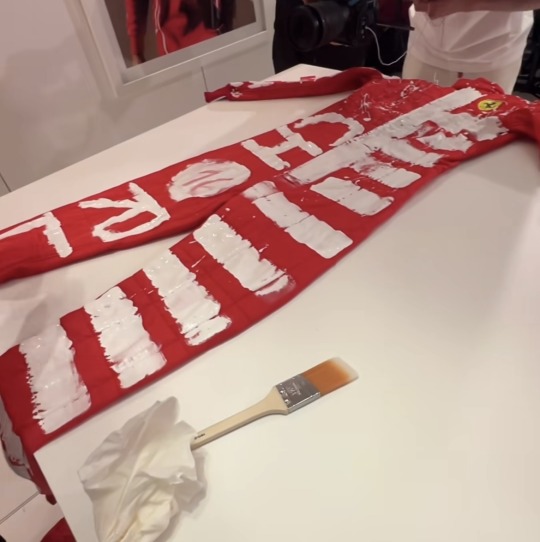


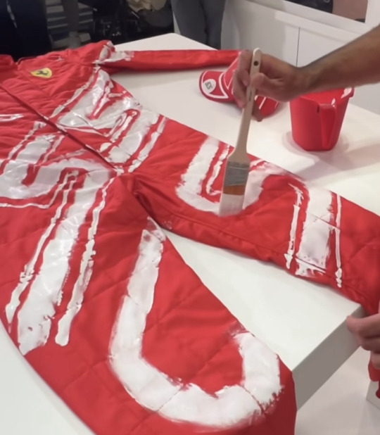
so i rlly love the idea of letting the guys design their own race suits they took two rather opposing approaches to the design of their suits providing an insight to their perspective on their personal aestheticism, branding and mandated media activity
so let’s start w Carlos . For someone who isn’t actively involved in fashion design or marketing this is impressive . like it sent me down a rabbit hole of trying to figure out carlos’ involvement in his merch design process but dead ends if anyone has anything on that lmk .
carlos’ design is centred on his branding it’s something he would wear during a race to represent not only himself personally through the chilli motif but his career and his achievement as CS55 .
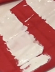
the placement of the logo is phenomenal . ik it’s just a copy of the diagonal placement of all his merch but this could’ve easily been something that stretched simply across the bodice portion. carlos’ design made good use of the space whilst keeping the design simple and recognisable not to mention how challenging it is to maintain freehand lines across separations in the fabric like

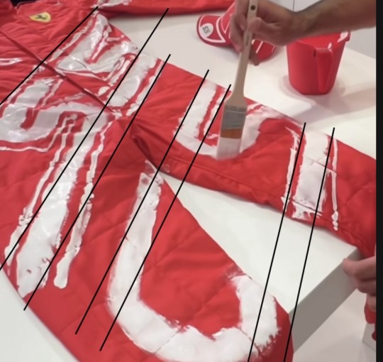
i’ve tried my best to apply some guidelines on top of the suit (with a grain of salt- photo perspective and wearability will change line placements) but the precision particularly is super impressive considering i don’t believe he’s painted on fabric before and is doing so without any straight line edge for guidance .
although it’s just a result of no practise the messiness of the painting works with the design it’s refined enough to be recognisable but the imperfection brings through a sense of modern high fashion reminiscent of the haute mess situation in 2022 or mimicking the street art aesthetic not unlike the imperfect perfection of vivienne Westwood . it’s just a good well executed garment i think encapsulating who he is a driver
charles on the other hand is a lot more emotionally driven. the front of the garment seems to be more inclined to imagery that is personal to charles

the spelling of his name separates him from CL16 he’s charles, it’s more personal closer to who he is rather than his brand with his number included to allude to the importance of racing in his life - and also to keep it relevant to the task at hand which was centred around ferrari.
i’ve been seeing a lot of criticism of on this striped section of charles suit but yall just don’t get it . this is his country man . this is his way or representing his country his identity as a monegasque person is dear to him this is his national pride manifested on his uniform . the front is what charles wants people to perceive of him what he fundamentally wants to represent and who he is in his career
as for the back
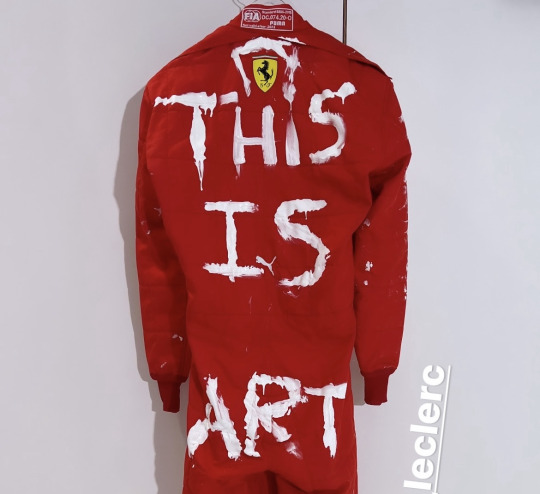
this is art . it absolutely is . it’s entirely up to the viewers discretion what that art is. the art could be the wearer. it couldn’t be the sport . the race. it could be none of that and just be a funny attempt at trying to justify the decision on the front of the garment . or as the strategic placement would suggest, it could be his ass that’s the art.
i do love this though it’s giving rich its giving runway . it’s giving designer . i’m telling you keep an eye on louis vuitton and vivienne westwood this kind of mildly thought provoking vaguely political commentary handwritten aesthetic dominates modern ready to wear high end fashion. this is the kind of thing you’d see an instgram model take some gorgeous aesthetically pleasing photos in before it ends up in someone’s rebellious girl aesthetic pinterest board . and it’s a serve .
generally i do really love the idea behind this whole task tho it’s fun and expressive and i love the callback to the marlboro day with the red and white suit aesthetic of the 80s and the last vegas grand prix at the caesar’s palace track in 1982 it’s truly iconic and i hope we get to see the boys in their creations
27 notes
·
View notes
Text
Chapter 218 Trivia (Part 1)
The final crafting project already!? :( (I know it's only for the moon mission groundwork, but… The end is nigh.)

Gen's excited for Twitter to come back, but I think Senku is too. It was a major source of data for him before the first petrification happened.


The oysters are here because Hiroshima is Japan's largest oyster-producing region. They're most well-known for their pacific oysters (Crassostrea gigas), specifically the Hiroshima variety.


Eucommia ulmiodes, commonly known as the hardy rubber tree, is native to China and features as one of the 50 fundamental herbs in Chinese herbology. It does well in a wide range of environments, & can handle colder weather than other rubber trees, but is nigh-extinct in the wild.


As Chelsea says, the tree is resistant to pests and disease, and fossils of Eucommia have been found in Europe and North America.
Unfortunately, the oldest fossils of Eucommia are from the Cenozoic period, the era after dinosaurs.


Unlike the rubber trees the KoS found in South America and Indonesia, most of the latex in Eucommia is found in the leaves, not the trunk. This makes it harder to harvest, and is probably why Senku needed to travel elsewhere for a better source.
The cables are a simplified version of current submarine cables, though there's many versions of them.
The modern boats are also designed the same, with large spools of cable getting unwound off the back. The buoys on the cable are only necessary in shallow waters.


We have the beginnings of a coffee shop turf war: Xenobucks versus Francoisbucks.
(If anyone draws mermaid Francois please share!)
Also, Francois' gorgeous filigree table travels with them!


Coffee isn't native to Hawaii, but it was brought over in the early 19th century to create Kona coffee, one of the most expensive coffees in the world.
A coffee market crash in 1899 brought Japanese workers over to Hawaii to work on the plantations.


For the last several chapters, Senku's been talking about how difficult it is to make a semiconductor, and how it'll take at least 5-10 years to do, so they have to use parametrons instead.
Well he's here holding a transistor, which needs semiconductors. Congratulations?


Modern transistors, if they're reliable enough, are used on submarine cables to boost the signal. Since everything in Dr. Stone so far has been remarkably reliable, it's fair to assume they used them.
This logo is a parody of General Electric (Xeno Electric?), a very large American conglomerate that primarily focuses on aviation, power, renewable energy, and digital industry.


(Next part)
17 notes
·
View notes
Text
No. 28 - A Further Explanation of the Star Alliance Test
This is a main-series post, despite not being a review of a specific airline. I just think it's something that belongs in the series, that should be read. Don't worry. Today's airline is going to come later. This is a necessary preamble to get out of the way first, and it's also me making things right with an airline I've covered already.
Stick around and I promise it'll make sense. I had to rewrite this entire post from scratch, so if I could have changed this fact I would have, but fundamentally before I talk about today's true subject I need to talk about the Star Alliance Test (SAT for the remainder of this post).
So let's begin with a question. You don't have to get this right. Just take a brief look at these pictures, don't try to examine them closely or anything, just a look-over, and tell me which one of these planes - we'll call them 1, 2, and 3, left from right - flies for an airline we’ve touched on briefly before, Avianca.
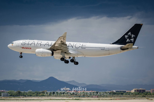

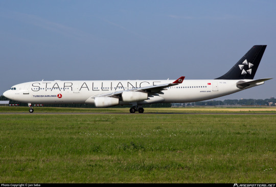
Got your answer locked in? Hit the readmore and let me tell you why I asked you this!
That's right! The answer was No. 1. You can tell because it says Avianca on it, if you look closer. But...why? Why would we want to be put in a situation where 'which of these three airlines with completely different liveries, identities, and brands does this plane fly for' is a question that could feasibly come up?
I don't know. I didn't make that choice and I was probably on some other wall during that meeting. Oh, and to the best of my knowledge I also hadn't been born yet. But it's a thing airline alliances do. And Star Alliance is the subject of the Star Alliance Test - one of my metrics for determining if an airline deserves a grade of F.
The Star Alliance test has been used precisely once - in my SAS post, regarding the 1998-2019 livery (henceforth referred to as red engine SAS or RESAS).
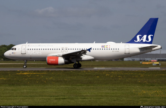
This monstrosity, for those blessed enough to not remember.
Here are the rules of the test.
The Star Alliance Test has exactly one question. Would I prefer that all this airline’s planes were forcibly repainted into Star Alliance liveries instead of allowed to remain in their current state?
If the answer is 'yes', the airline automatically gets a grade of F.
Why Star Alliance? After all, it could be better but I don't think it's that bad. Well, I choose it because the Star Alliance test isn't really about being aesthetically pleasing - at least, not exclusively. Let me explain.
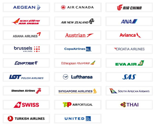
Star Alliance is the largest airline alliance in the world. Flightradar24 estimates there are 106 planes flying in a Star Alliance livery. It has 26 member airlines, shown above. Note the variance in color scheme, in logo, in origin. 26 is so many airlines. These carriers span every continent except Antarctica and basically only share three features: being international, being full-service, and being members of Star Alliance. I think it's safe to say that in any other context, nobody would ever associate THAI and Avianca, or Shenzhen Airlines and TAP Air Portugal, or Aegean Airlines and EVA Air.
Each of these airlines has a livery of their own, except for Copa. I've covered Lufthansa and SAS already. Croatia Airlines and Air New Zealand are on my request list. Another several are on my own private 'short' list. (It is 50 airlines long. You don't want to know how long my longlist is.) 26 airlines comes out to at minimum 26 reviews, but actually more because you saw me squeeze four out of SAS. I will say up front, Star Alliance runs the gamut of liveries. There are a couple I like, a couple I think are very bad, and most I think are middling. But each of them, except Copa, is its own. Some of their designs are minimal, disappointing, ugly, but they are all designs made in an attempt to reflect the airline's identity and distinguish it from the rest of the tarmac, even if they create something ugly or boring or cowardly or all three.
A livery can be very, very bad indeed. But in my own mind an F, an outright failure, is the inverse of an A+ in a sort of cosmically symmetric ontology, and these are not the inverse of an A+ livery. They do not embody a transcendent bad to balance the scales against transcendent good. To reach this point you must be not only ugly but a gnawing void eating away at your own self. A livery worthy of the grade F do not fail to execute a good concept, or even fail to execute a bad concept. They have no concept and they fail to justify their existence.
One of the worst liveries I've covered vs one of the best.
The SAT is a litmus test for this astronomical, pernicious state of utter failure. It takes more to fail the SAT than to just be uglier than the default Star Alliance livery. Plenty of liveries are uglier than Star Alliance's and they pass by light-years. To fail the SAT requires more than bad design, blandness, or anything else of that nature. It is monumentally difficult to fail the SAT. It’s like stalling an Airbus. You can do it. We know this. People have managed to do it, when the perfect storm arises and the world enters that uncanny state where luck and circumstance conspire to make the absurd a reality. But it’s really not something you can do, broadly speaking. Just pulling the nose up too far or forgetting to keep track of your airspeed isn’t going to do the trick. Icing on the wings won’t either. Even forgetting to extend your flaps on takeoff probably won’t be enough. It’s rare enough that it straddles the border of being an urban legend. It seems so easy to do thoughtlessly but it’s only happened a couple of times. Even doing it intentionally is harder than just designing a good livery. I'm not even sure it's possible to do it intentionally.
To fail the SAT, you must fail so comprehensively that you should no longer be allowed to design your own livery. You should, in a paternalistic manner, have your entire fleet forcibly repainted into the Star Alliance colors.
A livery is meant to distinguish and represent an airline. Even a bad design is still a design. The reason that RESAS fails the SAT, in my mind, is that it doesn't feel like a design. It's not coherent. It's not intentional. It doesn't feel like improperly integrated parts, or even multiple liveries stapled together. It feels like it was designed by random number generator. It utterly fails to represent the airline, utterly fails to look good, and utterly fails to even seem like thought was put into it.
To fail the SAT is to get to the point where I genuinely think it is so shameful to paint this on your planes, so inept on every level, that it would be better to just not have a livery. It would be an act of mercy to become indistinguishable from other airlines instead of staying as it is, a thing you could only ever pity and never truly love. Never respect. The most wretched sort of creature. If your shirt is stained too badly, you just can't keep going on like that. People will point and laugh at you, and that's never fun. They'll say 'that guy's shirt is covered in mysterious substances', and you have to just put on a jacket and cover it up until you get home and fumigate it with kerosene. From 1998 to 2019, SAS would have been better off just not having a livery than they were flying that...thing.
It doesn't have to be Star Alliance in particular. Just something which renders the airplane mostly generic. They can keep a little logo on there but they don't get their own design. It could just as easily be, say, forcible repainting into the default manufacturer liveries Airbus and Boeing use for prototype aircraft.
Not the end of the world, right? These are surely not unbearable liveries. I don't think it's any worse giving up your identity to say you're part of Star Alliance than it is to subdue it in favor of the model of plane. If you're SAS pre-2019, this may be a decent option for you. If you're literally anyone else, the mere concept should be philosophically repugnant.
I am actually being kind, though. If I were to be even harsher, I could have easily made this the SmartLynx Test.
I asked you all about SmartLynx. To begin with, not a single person believed they could recall seeing one of their planes, or that they had flown with them. I didn't think they'd be able to. That's not a question I can really answer about myself either, at least not with any confidence. But what is SmartLynx?
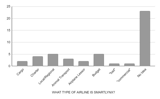
The vast majority of responses just expressed bewilderment. I got 50 total replies to the questionnaire itself. Keep in mind that some people declined to answer, and I didn't include them, and even still the number of people who actively expressed that they did not know is nearly half of all responses. Few of the answers were especially confident, either. I'm fairly sure the ones about transporting animals were all jokes, and nearly everyone expressed that their answer was a guess. Someone just said 'bad', which I thought was pretty funny. I liked that answer.
I got two people who said that SmartLynx are airplane lessors. Actually, one said 'private airplane sharing company', but I've interpreted that as meaning lessor. Anyway, they're right. The people who said charter also aren't wrong.
SmartLynx are a Latvian airline which specializes in wet leases. For those unaware, a wet lease (very bad term) in aviation is a lease of an airplane that comes with a crew to operate it. Generally everything else, like fuel and various operating fees, is on the airline leasing the plane, and they're also the ones who market and sell the tickets. Basically, you could get on a flight, your ticket says, for example, Oceanic Airlines Flight 1, you bought it from the Oceanic Airlines website using your Oceanic Airlines miles, and be none the wiser that SmartLynx owns the airplane and pays the pilots flying it. These vary a little, but generally a wet lease provides ACMI (aircraft, crew, maintenance, and insurance), and if you ever see the term 'damp' or 'moist' lease that means the cabin crew is provided by the lessee rather than the lessor, but apparently neither sees much use. Which is a shame, because I think this is one of the few situations where more categories actually might make this easier to parse.
If all of that is sort of confusing and a lot of information upfront, you are not alone in feeling like this! I'm still pretty shaky in my own understanding of it. I'm a history person, not a business person. You can think of it as codesharing but never mentioning that's what you're doing, if that's any easier. It's also similar to regional brands of larger carriers, like Delta Connection flights being flown by Endeavor Air or SkyWest, though these carriers aren't going as far as to lease and are still on the hook for their own operating costs.
Every time I explain this to someone for the first time they think it's pretty deranged, and I don't completely disagree, but it's very normal. There are plenty of reasons airlines might wet lease, generally involving them not having the capacity to fulfill demand. All sorts of airlines provide wet leases, and all sorts of airlines hire them. It can create weird legal loopholes regarding who is allowed to fly in whose airspace, but typically it's just one airline not having enough planes for the holiday peak. They usually last for a few weeks or months, rather than the many years of a 'dry' lease which includes a plane only.
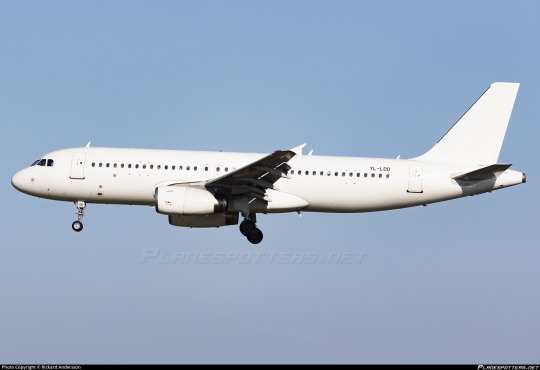
SmartLynx fly basically everything you can think of - passenger, cargo, holiday charter. Some airlines they've leased for are EasyJet, DHL, Finnair, and victim of the blog condor. Because they never operate flights under their own name, there is absolutely no reason for them to have their own livery. Indeed, it makes more sense not to, since it would be easier to leave their planes blank in case they want to repaint them into another airline's livery for a longer-term lease.
If you fail the Star Alliance Test, I think you would be better off painting your entire plane white.
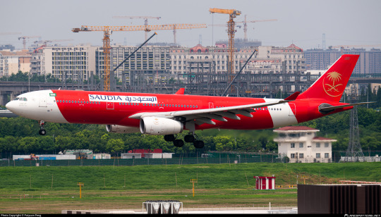
SmartLynx has no identity because their entire point is to assume that of others. They basically do the airline equivalent of paying somebody to take an exam for you. This is a SmartLynx plane with Saudia logos on airasia color-blocking. It's a bit weird-looking, sure, but it betrays nothing about SmartLynx because their entire job is to not have a brand. Nobody has ever seen a SmartLynx plane because they exist literally but not philosophically - the job of a SmartLynx plane is to fly for a different airline. They are the stagehands of aviation, scurrying around in all black to stand out as little as possible.
But SAS isn't SmartLynx. SAS is a big airline, a flag carrier, and to say that they fail the SAT means that I would prefer their planes all be wiped from existence in an apocalyptic flood of liquid paper. I do not think the 1998-2019 SAS livery deserves to exist. I keep repeating myself because I need to stress how profoundly difficult it is to get me to this point. I would rather a livery be clumsy, bare-bones, poorly executed, cowardly, genuinely ugly, absolutely dismal, than it be non-existent. It takes something absolutely tremendous to bring me to the point RESAS has, where there is nothing, no vision, no meaning, no direction, no design, that justifies its existence.
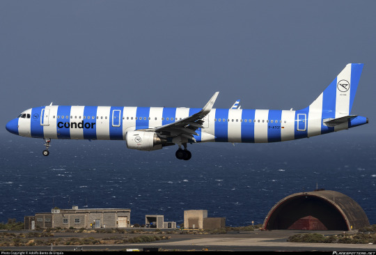
...so what about condor?
condor was the first airline to get a grade of F. The second was the aforementioned red engined SAS livery, now mercifully retired and thus reduced to a footnote in a post about how far SAS has come. The reason I brought up the SAT in SAS's post and didn't in condor's is that condor emphatically passes the SAT.
I began with the assumption that the SAT was a good measure of if a livery deserves an F, and maybe it still is, but it's definitely not all there is to it. condor is different from Copa and RESAS, it just is. And I think the best evidence of this is that, of all the reviews I've posted, condor is the only one where a significant portion of people who reblogged it disagreed with me. I do understand that at the end of the day everything I say is subjective, and I don't mind when people have opposing views on something, but combined with my own thoughts on the livery, and the process of researching and writing my BWIA post, it pushed me to an epiphany about what makes a truly great and truly terrible livery. And, partly out of curiosity and partly to follow this new path of personal evolution, I asked survey-takers what they think of the condor livery. Maybe I should have left it as a free-response question, but I wanted figures, numbers. So here's what I got. (Free responses have been merged into whichever category they match closest for the sake of simplicity.)
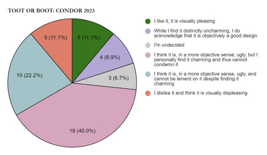
These results are fascinating. First, you may notice that this is missing two options. Not a single person said that this livery was boring, or that they felt neutrally towards it. Even people who are still making up their minds are a dramatic minority.
Second, people who had a clear-cut opinion of the livery, positive or negative, made up just over a fifth of respondents. Most people were at least to some extent conflicted, although which specific variant of conflict varied. There are people who appreciate the idea but do not like the appearance of the livery, and then there are people who find some charm in it. Around 2/3 of these people cannot force themselves to fully insult what they see as a sort of goofy creature, while the other third cannot allow their emotions to sway their rating. If my post on the matter didn't fully convey it, this is probably the closest to my own opinion.
If I was condor, and I saw these results from a focus group (replicated on a scale far larger than my survey, of course) I would probably say to go ahead with this livery. All press is good press, as they say. You're going to end up with a livery that sticks with people, and they're going to respect that even if they think it's hideous. At the very least, they're going to notice you.
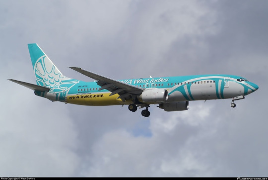
Condor's livery is ugly. I will not change my stance; it does not look good. It is unpleasing to my eyes. But it is not the opposite of an A+ livery. In fact, it has a lot in common with them. The reason I love PSA, BWIA, and Amakusa Airlines so much isn't just that they make good use of the plane's shape, have pleasing colors, and generally look nice, but because they are built on the bedrock of a concept which goes beyond designing an airplane. In BWIA's review in particular I discussed the fact that it takes the approach of building a livery around an idea rather than an idea around the concept of what a livery should be; this is what distinguishes an A+ from an A, and the gulf is far larger than the gulf between any two other grades. The difference between 'it's on the better side of okay' and 'I somewhat tepidly like it' can be rather small compared to the difference between 'it's very good' and 'it's genius'.
In the 2022 film "Nope", protagonist OJ asks if there is such a thing as a 'bad miracle'. To me, condor is something similar: bad genius. condor takes a once-in-a-decade great concept and executes it incomprehensibly poorly, and now they're the infamous ugly stripe planes. It has failed spectacularly but it has failed in perfect harmony with itself. It is unlikely that someone attempting to make an ugly livery as a joke or a parody could come up with something quite this sad. I've struggled for a little bit to think of a way to convey what it means to me, and I think I might have finally found it.
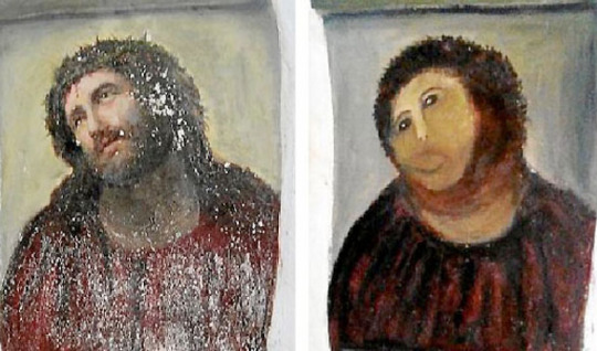
The town of Borja, Spain has a population of under 5,000. Although it was largely unremarkable as far as this sort of work goes, they were quite fond of a fresco painted on their church wall around 1930 by the artist Elías García Martínez. All art begins to deteriorate over time, and frescoes are notoriously difficult to conserve. In 2012, an octogenarian with no relevant training had a vision of a gorgeous restored painting. She definitely should have thought before acting. Just because you see something in your mind's eye doesn't mean you can make it real. And if you rush into it you might make...well, you see the picture on the right.
This picture is hideous. And it has brought in crowds of tourists hundreds of times the size of the town's actual population. Their money has funded pensions and built infrastructure. It has become a cultural icon. Nearly everyone with an internet connection has seen it. It's by far the most memorable thing about this tiny town. It is a work of bad genius.
Say what you will about condor's planes - and I myself have said many mean things about them. They are ugly and they are iconic. They are condor's grand statement, and no matter how ugly I think they are the world would be losing something if they were assimilated into identical Star Alliance liveries.
This striped livery is terrible, and it is great. It is worse than many liveries are good. And it does not fail as a livery. It is fundamentally condor's, and there is nothing like it. Distinctive, coherent, unique...and also ugly.
I've realized that condor belongs as a fundamental landmark in my understanding of liveries, just like Lufthansa or BWIA or PSA. Now that I've said all of what I've said in this post, I think giving condor an F just doesn't work. It doesn't belong in the same category as liveries which fail the Star Alliance Test. It doesn't deserve a better grade though. Something so bombastically, almost elegantly hideous requires a rethinking of the scale I've been using.
condor gets Runway Runway's first ever Z rating.
It does a tremendously poor job at being good, but a fantastic job of being a livery. In order for the Star Alliance Test to retain its meaning and the F tier to retain its coherence, condor needs to be reclassified. It is awful, hideous, sloppy, a waste of potential, but it is potential, and 'awful' originally referred to something which inspired awe.
36 notes
·
View notes
Text
CLH X Blue Archive collab
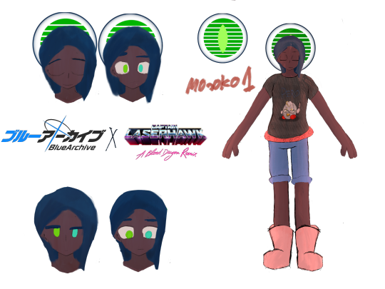
DOLPH LAZERHAWK STRIKER MIDDLE SONIC SPECIAL ARMOR limited 3 star collab student Hello everyone, This is the first artwork I've posted here since like 2021 or 2022, and as you can see, it is basically a little collaboration thing I cooked up with a game called Blue Archive, which, if you don't know dw, you can watch this video about it (its only 7 minutes long and yes this is the short version)
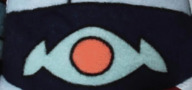
The downside is that the fanbase is really fucking weird; I would suggest staying the fuck away from it if you were to get into the game cause the game is good, just that the people around it are suspicious, or at least watch the anime. After all, the anime so far is decent. Why is the slanted stuff in the halo

So for dolphs design, what I did since there was no fundamental motif for him, unlike the others, which we will get into in a bit, I decided I would just make it look like one of those old 80s cars, you know, where the windows instead of having tinting it would be slanted plastic, in the back yeah those, Apparently, they were called louvers and it was meant to make the car cooler inside while making the car more stable to drive, neat why the eye in the middle of the halo
The reason why I gave the eye in the middle for his halo is that he was being used by Eden as a military operative, so who to say when he got transported to Kivotos that Eden wasn't secretly gathering details about that place and planning on raiding soon to grab their tech, and also grabbing some kivotos students as test subjects for their military testing.
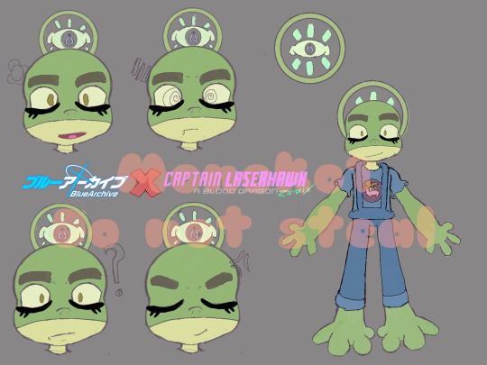
bullfrog striker front penetration light
limited 2 star collab character
finding his halo design
Oh boy, I had another hard time making his Halo design, too, since, let's just say that most of the game's designs are unique to the character's personality. All I could think of is Assassin's Creed and the Apple of Eden, that's apparently a weapon skin in Brawlhalla; god damn you, orb skins/lighthearted.
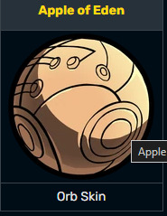
so what i did instead was just look at the plushie that Netflix made very intensely til I found what I was looking for
this fucking thing here, his belt, I could easily use it as a base for the halo, and I could get on with colors, and that's what I did. I used the brotherhood logo in the middle, colored it light green, and made it layered with the inner circle layer upon by the eyes with the brotherhood logo on top of it and the outer circle covering the outer rim.
This is the best example I can give of what he would've looked like halo-wise now, let's talk about why I gave him that design Why did you give him the design that you did?

The reason is that it mostly calmed down in this universe. There's no violence; if there is, they are immune to it to some extent. (they won't get hurt by bullets, but if they get hurt really bad [i.e., life-threatening injuries], they can die), because of the halos they wear, they are immune to some extent, but since some factions want to take out the students altogether (i.e., Gematria, Kaiser corp), they do have to be on guard, though it is mostly the general student counsels, the three big school student counsels, and senseis, besides no one really hates each other (well besides gehenna, and trinity) It's not as bad as Eden is, so the clothing choices reflect that chill but on guard.
bullfrogs halo design Even though Bullfrogs Halo shows the Brotherhood logo, most just write it off as some sort of band logo he likes. Bullfrog still has memories of his old world, still remembers Eden, and the day he met that old TV man, but no one would believe him, not even his fellow prisoners who were with him when they were transported to Kivotos. I hope you like this post, I'll get on the Genshin collab drawing as soon as I get rested up see ya
#captain laserhawk#clh#bullfrog captain laserhawk#dolph laserhawk#rayfrog#clh bullfrog#bullfrog#young dolph#blue archive#ブルーアーカイブ#ブルアカ#블루 아카이브#蔚蓝档案#collaboration#what if#what if scenario#art collab
16 notes
·
View notes
Text
Another nice interview I found, where J.A. Laraque talks with Chris Tremmel about his time working on Boogerman and his fond memories of making games in the 90s.
I've made a copy of the interview below the divider in case the original page ever goes down! There seems to be a bit of an editing goof in the original transcript as well, so I've fixed that in my version.
There are thousands of great games across all platforms that we as gamers have enjoyed for many years of our lives, but what about the people behind them. Just as there are fans of games there are the game makers themselves who weave a concept into code to be displayed on your system of choice. Many times the idea that became the mega-hit game of the year came to the developer or designer in the middle of the night, but from there it was many sleepless nights to turn that vision into reality.
One of Obsolete Gamer’s main purposes is to get the story behind the game and we do this by speaking with the designers, developers and publishers who helped bring us oh so many hours of enjoyment. Sometimes it begins with a gamer profile where we just find out a game they like and from there a dialog starts and soon you find out all kinds of wonderful information.
This is what happened with our gamer profile of Chris Tremmel. I discovered him through his clothing store, Gamer Cultoure and when he submitted his gamer profile with the game BoogerMan I wanted to find out why he liked that game and what I found out was he was one of the main creators of it. After that I had to learn more and Chris was very accommodating in answering our questions.Gamer Cultoure logo
Obsolete Gamer: Let’s start with a little history, what was it that got you into gaming and working in the gaming industry?
Chris Tremmel: When I was a kid, my parents hooked me up with a Texas Instruments\99-4A computer. I was already a gamer thanks to PONG, and the AT2600, but the TI-99 allowed me to begin making my own games! I think I started with “porting” my choose your own adventure books into interactive form.
Obsolete Gamer: When did you begin working at Interplay?
Chris Tremmel: I officially started working at Interplay in 1992 I believe. It’s funny because I first interviewed for a tester spot. I didn’t get the job because my “autoexec.bat, and config.sys” knowledge was a bit rusty. I went home, studied up, and returned for a 2nd interview a month or two later. This time I got the job. The 1st games I tested were the original Alone in the Dark on PC, and the Lost Vikings on the Amiga.
Obsolete Gamer: Who else did you work with primarily at Interplay?
Chris Tremmel: I initially worked in the testing department but quickly made friends with a couple of designers and producers, primarily Mike Stragey and Alan Pavlish.
Obsolete Gamer: What was it like working for them?
Chris Tremmel: I hate to sound really cliche’, but working at Interplay in 1992\1993 was “magical”. I was in awe of everything being made and was thrown right in to working with some of the brightest people I have ever had the pleasure of meeting and working with. It was an amazing time as I was being taught my core design fundamentals by great guys like Mike and Alan. I knew this is what I wanted to do forever.
Obsolete Gamer: When did you first start working on Boogerman?
Chris Tremmel: I believe we started Boogerman in early 1993? It’s hard to remember exactly.
Obsolete Gamer: Who else worked with you on Boogerman?
Chris Tremmel: My boss, and the man that hired me out of test Michael Stragey. Also Alan Pavlish was the executive producer who we would run stuff by on a regular basis. We also worked with an external animation house called Little Gangster, as well as some in-house artists, and additional programming support, but primarily it was Mike and myself.
Obsolete Gamer: How did you come up with the concept and story behind Boogerman?
Chris Tremmel: Interplay came to Mike and said “we want to make a gross-out game that appeals to the Garbage Pail Kids demographic.” Interplay logo
Obsolete Gamer: Can you tell us a little bit about the development process?
Chris Tremmel: Conceptually we knew we wanted to make a “gross” game. Mike came up with the idea of a gross Superhero and off we went! The ideas just starting pouring out from Michael and myself, I would say we were never short of ideas for characters, locations, etc.
As for the design of the characters, we worked very closely with Little Gangster and went through dozens of designs until we finally settled on what you see today. Funny enough, several of the bosses in the game including the main boss BoogerMiester were originally design concepts for Boogerman himself.
Obsolete Gamer: When Boogerman was ready to launch did you believe you had a hit on your hands?
Chris Tremmel: Ya know, this is a weird thing… I was so new to the industry and so excited and stoked every day to be making games that I never really thought about “hits”. We knew we had something fun, and we knew people responded to the content the way we wanted, so that was enough for me. I still remember our very 1st magazine preview EVER. It was in Diehard Gamefan, they dubbed it an “instant classic”, we were happy.
Obsolete Gamer: Now some gaming sites and magazines game you high marks while others gave you more middle of the road scores. Do you think they just didn’t get it or what was the disconnect?
I think we were pretty happy with the reviews. We had some serious competition that year with Earthworm Jim being released at the same time. I think Boogerman got the scores it deserved, it was a good game, just not everyones cup of tea.
Obsolete Gamer: What was your feeling about winning the grossest character of 1994 award from Electronic Gaming monthly?
Chris Tremmel: Honored for sure. The entire Boogerman universe is still very close to our hearts to this day (Mike and myself). I still believe the franchise has a lot of potential.
Obsolete Gamer: Was there a plan to make more Boogerman related games?
Chris Tremmel: Yes, absolutely. AND a cartoon. The cartoon was actually started, at least script writing, character design, etc. but I believe in the end Universal went with the Earthworm Jim cartoon that was in development at the same time. Which btw, I am a massive EWJ fan and I loved loved loved the cartoon.
There were clocks made, t-shirts, and even a Boogerman phone. In addition we DID start the sequel on the Sega Saturn. We had a basic design document done and had contracted some amazing matte painters to start working on backgrounds. Unfortunately, it never came to fruition. Michael and myself left Interplay to pursue work with another company, I think we both wish Boogerman 2 could have been made. We had some really fun ideas.
Obsolete Gamer: How was it to see Boogerman released for the virtual console in 2008?
Chris Tremmel: Neither Mike or myself were involved in this. I believe this happened after Interplay changed hands. We were incredibly happy to see it up there though, downloaded it immediately!
Obsolete Gamer: Did you play Boogerman a lot yourself and do you still play it today?
Chris Tremmel: Absolutely! Mike and I both played all the time while making the game, AND after the game was released. Out of all the games I have made, this one probably got played the most. I definitely still bust it out once or twice a year. I like looking back and try to figure out what the heck I was thinking with a particular layout, or just to laugh at some of the character designs. Lot’s of laughing during the development.
Obsolete Gamer: After Boogerman what came next for you?
Chris Tremmel: Mike and I left Interplay to make a game for EA based on a Saturday morning TV show called “Bump in the Night”. Unfortunately this game was never finished\released, although we did have a rad demo running on the Saturn. I ended up at Virgin Interactive after that working on the N64.Gamer Cultoure dog tag
Obsolete Gamer: Can you tell us a little about Gamer Cultoure?
Chris Tremmel: Sure! Gamer Cultoure is a side project I have started that is clothing centric. It’s really a basic line of T-shirts, hoodies, etc. that are gaming themed. The line is really small right now, but I intend to continue to grow it over the next year or two. After leaving Activision early in the year I decided to take a little time off and try something different for a little while. It has been a fun, rewarding process for sure.
Obsolete Gamer: What do you think of gaming today in comparison to gaming back in the early to mid nineties?
Chris Tremmel: Oh no, this is a loaded question. It is definitely different. The process has become more complicated, usually requiring a large number of people to make something significant. The money involved in some of the triple A games is staggering with some budgets now reaching 100 million dollars. That naturally changes everything in terms of peoples priorities, and agendas. Sometimes for better, sometimes for worse. One of the nice things though as of late is seeing the rise of the “indie” studios, small teams executing on great ideas. It is very easy to get distracted now a days when making something. The bar has been raised so high, and with so much money involved it takes some serious planet-aligning powers to take something killer to market. All of that being said, I hope the younger guys and girls that are in the industry today feel the same sense of magic that I felt in 1992.
Obsolete Gamer: Are you working on any video games at the moment?
Chris Tremmel: As of right this second, no. Expect that to change very soon. I will definitely keep you posted any news.
I quickly wanted to give a shout out to all the people I worked with at Interplay. Thanks Mike, Alan, Brian, Rusty, Tim, Burger, Kerry, and way too many more to list. All of you guys helped me get started on this amazing journey and I appreciate it to this day.
Obsolete Gamer would like to thank Chris Tremmel for taking the time to answer our questions.
#obsolete gamer#Chris Tremmel#video game history#interview#J.A. Laraque#game design#game dev#boogerman#game development#a pick and flick adventure#interplay#90s#video games#boogerman a pick and flick adventure
3 notes
·
View notes
Text
I know Donnie works in IT or tech support in some iterations, and I find that super funny (and not necessarily smth I would see rottmnt Donnie doing but...) I keep trying to come up with ways to project the monotony and burn out of turning your passion into a full time job onto Donnie lmao
I could see him getting into contract work when he's older and just fuming over incompetent clients, having to force himself to make a project that is fundamentally stupid and inefficient because his dumb dumb client wouldn't know good engineering if it hit them over the head. but he has to do it, the money is too good to say no to, no matter how awful it feels putting his logo on such a terrible design XD Donnie just not even bothering to slap it on some things out of spite
#aide screams#donatello rottmnt#rottmnt donnie#rise donnie#can you tell I'm a jaded graphic designer or what#clients from hell smfh#no I don't want my name on that cover design bc you chose a HORRIBLE font#why even hire me if you're going to stomp all over my expertise jfc lmao#the problem is I don't know enough about engineering to write this for Donnie lol
18 notes
·
View notes
Text
What Is a White Label Product and How Does It Work?
It's possible that products offered by some of the most well-known corporations in the world are not as uncommon as you might think. The company that actually produces their branded products is an outsider that markets the same things under different labels. White labelling is a well-known commercial strategy that is applied to numerous consumer product categories.

What does white label mean?
The practice of producing goods and marketing them under several brand names is known as "white labelling." Although white label products may differ in terms of branding, packaging, logos, and even prices, but their fundamental architecture remains the same. Limited product customization options, such as adding a brand logo or design on a product's exterior, may be available from white label manufacturers. In exchange for large orders, they might also give retailers discounts. After a purchase, products from other white label services, such print-on-demand businesses, are shipped straight to customers.
What are white label products?
White label products are produced by a different company than the one that markets or even sells them. The benefit is that multiple businesses can handle different aspects of the product development and sales process. Depending on their area of competence and inclination, three firms can concentrate on different aspects of the product: producing, marketing, and selling. The main advantages of white label branding for businesses are the time, energy, and financial savings on production and marketing expenses.
Another significant benefit of private label brands is that if a supermarket has an exclusive agreement with a manufacturer, the company may have cheaper average transportation costs and distributional economies of scale. The shop was able to offer the product for less and still make a larger profit margin due to decreased delivery expenses.
The rise in popularity of private label products indicates that customers are becoming less devoted to their preferred established brands and more price-conscious. The rise of private label brands in several nations is negatively impacting the market share of national brands or manufacturers.
White Label Branding Examples-
Electronics Industry:
Electronics manufacturers frequently white label their goods under different brand names. For example, a manufacturer may make tablets or smartphones for businesses that rebrand and sell the products under their own name.
Beauty and Personal Care:
The beauty and personal care industries are big on white labeling. A large number of private label cosmetic firms’ contract with other manufacturers to make their goods; these manufacturers create white label products and package them under the private label brands' names.
Grocery and Retail:
Frequently found in supermarkets and big-box stores, white label products are produced by outside vendors and marketed under the supermarket's own name. These consumer goods include everything from food products like snacks and canned foods to cleaning supplies and household goods.
Payment Processing:
White label payment processing solutions are frequently provided by payment gateway providers. This makes it possible for companies to seamlessly integrate the payment gateway into their operations and provide their clients payment processing services under their own identity.
Software:
Numerous web hosting providers provide best white label solutions that can be altered and rebranded by other enterprises. Email marketing platforms offer white-label software alternatives that enable agencies to sell email marketing services under their own brand.
Financial Services:
Financial institutions sell financial services and goods to other businesses under a white label. White labeling branded credit cards, prepaid cards, and even banking solutions are examples of this, in which the partner company's branding and client experience are tailored.
Web Hosting:
White label hosting is a service that many web hosting providers provide. Because of this, resellers are able to offer web hosting packages under their own brands, with the main web hosting provider handling the setup and maintenance for the web hosting.
A huge number of people have discovered their calling in the web hosting industry, which has grown to be quite large. With over 126 million web hosting companies based there, its valuation is predicted to reach over $83 billion by 2021. White label hosting is a component of that sector. Reseller hosting is directly related to it.
It becomes an affordable option for small businesses to enter the web hosting industry and launch their own web hosting company when paired with white label reseller hosting. In order to help you resale hosting and launch your business, we will go over the steps and information you need to know in this post.
White Label Reseller Hosting: What Is It?
Finding a parent provider to purchase resources from and selling their servers, bandwidth, RAM, and other components are examples of this. You should not handle the technical specifications, server management, or maintenance on your own. It essentially lets you run your own web hosting company without having to deal with all the difficult technical aspects. Many providers also have their own reseller programs because it has become a popular choice among users.
Working of white label reseller hosting?
You need to first find a parent provider and buy a reseller plan in order to receive web hosting services if you want to engage in the white label web hosting industry and operate a reseller hosting website. Once you've selected a parent company, you can launch your hosting company.
With white label web hosting, you want to charge your clients more than you did when you bought the reseller plan and acquired the required resources from your parent provider. By doing this, you avoid having to spend any time or money on your own server setup or other resource purchases.
What does White label Reseller Hosting include?
User-Friendly Control Panel
An essential tool for managing websites is a user-friendly control panel. You can make backend changes and, if required, provide the client access via control panel access.
Scalable
If your clientele is growing or you're in charge of a website that needs more server power, reseller hosting should allow you to increase server resources.
Integrated Billing
WHM billing software, which enables you to bill your clients and oversee their payment schedules, is included in the majority of reseller accounts. Thanks to this, making sure your clients pay you on time is no longer a burden.
Integration of Domain and Email
With reseller accounts, you can sell domain names and email account upgrades. These can elevate your services when included in your hosting packages.
Private Name Servers
Thanks to private name servers, your brand and the hosting provider whose servers you're using will become more distinct.
Website hosting always remains in demand. White label hosting allows you to give your clients the choice of operating their server without requiring you to handle any of the expensive or challenging aspects of it.
Make sure to conduct thorough research before deciding on the ideal reseller plan for your company. Locate a reputable host that can provide the ideal server environment for you and your clients.
How White Label Solution Is Better?
There are a number of reasons why white label products might be the best option for your company as a business.
No risk
There is always some risk involved in starting your own business, but part of that danger can be reduced by white labelling your products. Because you're not spending as much money on creating a new product, risk is reduced.
Therefore, you won't lose as much money if the product doesn't work out in the market as you would if you had started from begin with its development. Select a white label product from a reliable supplier to further reduce your risk.
Improved quality assurance
Lastly, you may be confident that white label products will have superior quality control than those that you would make yourself. This is because, compared to you, the white label manufacturer is probably going to have a stronger quality control procedure.
Furthermore, since the white label manufacturer probably produces labels for other businesses, it usually has a group of quality control specialists on staff who can guarantee that the product fulfills your requirements.
Quicker to launch
White label products are also preferred since it can be considerably quicker to bring a product to market with them than it is to design one from the ground up. Once more, this is because you're just rebranding an already-existing product—the production process isn't being started from scratch. Hence, white labelling can be a fantastic choice if you want to launch a product rapidly.
The time to market is the largest advantage of white labelling. It can take months, or even years, to develop a product from scratch, find a manufacturer, and bring it to market. White labelling allows you to expedite that procedure and get your goods onto the market much faster.
More adaptability
Additionally, white label products provide more freedom than creating your own product. For instance, you still have control over the product's logo, packaging, and marketing if you white label it.
This implies that you can design a special product for your brand and customize it to your target market. Furthermore, even if you have less control over the production process, you still have a great deal of influence on how your customers are shown the goods.
Affordable
White label products are popular because they are an affordable means of launching a business. Best White labelling can be a big benefit, especially for small businesses, as it eliminates the upfront expenditures associated with product development, production, and marketing.
The largest financial benefit of white labelling, is that there are no expenses associated with product development or marketing. Rather, you're simply capitalizing on the success of another company's product, allowing you to launch your firm with less overhead and more swiftly."
Lower requirements for minimum orders
also typically have lower minimum order quantities than if you were to produce the product yourself. This is so that the white label manufacturer won't have to start a new production line just to fill your little request because they already have the product in stock.
Therefore, white label products can be a terrific choice if you're just getting started and don't need many products.
Conclusion-
White label products are produced by a same business, then packaged and marketed by other businesses under different brand names. It has been profitable for big-box stores to provide white label products with their own branding.
Since the late 1990s, private label branding has become a global phenomenon that has grown gradually. White label branding offers businesses a number of advantages, including reduced production and marketing expenses, time, and energy expenditures.

Dollar2host Dollar2host.com We provide expert Webhosting services for your desired needs Facebook Twitter Instagram YouTube
4 notes
·
View notes
Text
Hello! My name is JT and I suck at drawing. Lol. But I’m not beating myself up about it. I’ve done that for years already and I’m over that. So, just to bring you up to speed. I am in my late 20s and I’ve been drawing since I was about 19, so nearly ten years now of drawing almost every day. There’s just one problem, I leveled up in skill at around 22, or 23 and stopped. I haven’t gotten any better in any noticeable way since I was in my early 20s and I’ve finally become mature enough to admit why I still suck. I. Did. Not. Practice. Correctly. They say that practice makes perfect, but the reality is that perfect practice makes perfect. If you practice to do something the wrong way, you won’t learn how to do that thing correctly. It’s just as plain as that.
For the longest time, I felt like drawing was a magical thing, a gift bestowed upon the gods chosen few to be able to put pencil to paper and create worlds, objectify nature, tell stories, and just generally wow the socks off people. This is not the way it works, but for years I thought that to be the case. So although I’ve always wanted to be an artist and tell super cool stories, I never practiced drawing because when I was a kid I drew a picture as part of a school project and everyone laughed at it because it was so bad. (It was a picture of Pikachu from Pokemon and it was so awful the good artist in the class drew a picture of pikachu right next to mine just to show how much better she was than me). Anywho, mild childhood trauma aside, I didn’t try to draw seriously again until I was 19 and in college. I was getting a graphic design degree, and for those who don’t know, you don’t need drawing skills to do graphic design. Making logos and whatnot requires a good eye for design, color theory, etc., but not drawing skills. That said, some of the students in my class were extremely good at drawing and it reminded me how much I wanted to be good at something like that, so I bought a sketchbook and started drawing.
The problem was that I felt behind. I was 19 and most of the good artists in the class had been drawing since they were little kids, so I felt like I needed to find shortcuts to get gud quick! Basically I skipped right over the fundamentals and tried to use every shortcut imaginable to get to where I “wanted to be and should have been already”. I didn’t draw shapes, or work on perspective, or anatomy, or any of that crap. I didn’t have time! I needed to get good ASAP! So I brute forced that shit and skipped all the introductory stuff and went straight into characters, and architecture, and animals and animation….and I absolutely sucked. It wasn’t all bad, like I said before I got “better”, but never good, never to a level that would be considered professional by any means of the word. So I woke up with a rapidly approaching birthday realizing that I only had a short time before I was no longer a 20 something and became a 30 something. An existential crisis ensued.
My best friend in the whole world is an amazing artist. They are a 3D animator, and they can draw the most badass shit you can imagine as well. Meanwhile, I drew like a ten year old after a couple art classes. Not that I am comparing myself to anyone else, but my friend is proof that studying art the right way is the best way. So I swallowed my pride, looked myself in the mirror, and said “JT, you aren’t getting better at art. You have to change the way you do things or one day you’ll be 50, 60, 70 not drawing any better than you are now!” So I decided to empty my cup, admit I was a rank amateur, and needed proper study. I am back to square one. I accept that. I am taking on the mindset that today is the first day that I am learning how to draw. It will be years before I get to a professional level, but practicing in a professional manner will actually get me there, as long as I persevere. So here today I am at the wax on wax off stage of art. I’m drawing basic shapes. Hundreds, and hundreds of basic shapes, every single day for at least the next 14 days. I aim to at least do ten pages of shapes a day. Once I can do this with confidence, I will move on to volume and practice drawing 3D shapes like spheres and cubes.
I am writing this as a journal to not only motivate myself, but to hopefully motivate others to see someone go from zero to hero! I’m gonna be training like the main character from a shonen anime from now on until I get as strong at art as I can! My goal in life is to tell the one story I’ve always wanted to tell, and by jove I’m gonna do it. If you want to follow my journal and journey please stop by each week for new progress updates. I will be journaling this entire thing so that I can prove that with the right practice and effort ANYONE can become a good artist. Wish me luck!
2 notes
·
View notes