#grade: z
Explore tagged Tumblr posts
Text
No. 54 - Ryanair

You are watching a video on a popular video sharing service. It is a full episode of a popular and long-running show, generously uploaded for free. It is narrated by a calm man with a BBC accent of the sort which belongs exclusively in documentaries.
The narrator names a date between 1903 and the current year. It is accompanied by a location - an airport. An airplane is on approach. It has a certain number of people on board, and it flies for some airline. There are pilots, most likely two of them. They make some sort of mistake, and maybe there's an issue with the weather, or the ILS is down, or the instruments are giving misleading information, or some other thing has gone tailcone over teakettle in an alarmingly short timespan and now their approach is tremendously unstable. They aren't on the glideslope. They're too fast or too slow. They really need to declare a missed approach, but for whatever reason they don't.
The plane lands, or 'lands' - finds itself on the ground, regardless - either on or short of the runway. It bounces, or flips over, or just pancakes into the ground. The fuselage cracks, or splits, or peels open, or horribly catches fire. There is an evacuation. It's all very stressful at minimum, and an unmitigated tragedy at worst.
You scroll down to the comments for some reason. "Average Ryanair landing," says one near the top.

Ryanair (not to be confused with Ryan Air, a real but unrelated airline) is Europe's largest air carrier. It has over 550 airplanes and serves over 200 destinations. It is difficult to imagine an airline with a worse reputation - their CEO is a literal troll, their customer service is legendarily poor, and their ultra-low-cost model is one in which you inevitably get what you pay for. They are memetically despised, and their rough landings are the stuff of legend.

And yet their livery is understated, with a certain head-held-high gravitas. It is difficult to describe the legitimate cognitive dissonance which arises from Ryanair's aerosartorial choices, an effect that seems to touch more people than just me. On another airline, I wouldn't find this livery particularly thought-provoking. Enough substance to write a post about, but not something which lurks in my mind and draws my attention. But on Ryanair, it's downright fascinating.
I've said what I've said, but I'm actually a defender of Ryanair. Look, it's like getting a ticket on a bus or the metro. It's cheap (at least in theory - they seem to be getting pricier lately) and it gets you where you need to go and it's probably not going to be that long of a flight anyway so, I mean, whatever. I've flown some pretty long flights before in-flight entertainment was standard, Ryanair is fine. I never even noticed the hard landings until I saw people talking about them, and to be perfectly honest I didn't notice them afterward either. Maybe I'm just not bothered by hard landings, the same way I'm not bothered by turbulence. Who really knows? My point is that I'm something of a Ryanair apologist. I live in the US, where you just don't get dirt cheap flights like that and getting anywhere outside of your home metropolitan area by train (and even sometimes bus) costs even more than flying. Ryanair could make me board the plane by abseiling up it myself to save money on airstairs and I'd be fine with it if the price was right. I'm not a millionaire. I haven't got the money to go jetsetting around Europe on a real airline. So I mean this when I say it: thank goodness for Ryanair.
I mean, I'm not saying this because Ryanair is good, don't get me wrong. They are the Big Bill Hell's of airlines. They are the closest thing we have to John Mulaney's version of Delta. Ryanair is not just no-frills, it's hot-glued fabric scraps in the vague shape of a garment. They are legitimately comical in their commitment to service so Kafkaesquely bad that you almost wish you'd travelled by trebuchet instead! And all this for the low, low price of...well, I mean, they do get pretty low.
When I released my first questionnaire I added a question about Ryanair specifically because of its reputation and my own feelings about the airline. Multiple people did agree with me - well, it's definitely not comfortable at all, you won't enjoy yourself, but it's so obscenely cheap that this isn't really objectionable. You are getting exactly what you pay for. And, well, if you do want some semblance of the full-service experience you can pay an extra fee. Or a lot of extra fees. That's how they get you. The ULCC model relies on stripping out everything possible and then charging you extra for it. That does mean that if you need things like printed boarding passes or the ability to pay by credit card that come standard with literally any other airline you could end up paying a decent amount for your miserable cramped flight, but if you truly want the bare minimum they will charge you appropriately, and that is so important to me, because I have too little money to insist on being comfortable.
I do feel...particularly sorry for one respondent.
It isn't bad press they are legitimately a nightmare. A attendant once lied to me and told me that type of plane just didn't have toilets (it did. There was a working toilet on board) then proceeded to lecture me about 'not planning ahead and going in the airport'
This is kind of hilarious in a sad way and I'm very sorry that this happened to you. Ryanair is infamous for its bad customer service but it's rare you'll hear about cabin crew behaving this poorly at any airline. While this particular incident was a one-off, you probably will have a pretty miserable time if you need to call the airline about literally anything.
One person just answered 'bitches'.

Well, that answers the question "what is Ryanair", but why is Ryanair?
The world is full of low-cost carriers. Wizz Air, EasyJet, airasia, Allegiant, Jetstar, FlySafair, Volaris, T'Way, Azul, Nok Air, Frontier, Lion Air, jetBlue, and SpiceJet are just some of the dozens which fill the skies. They are often colourful, frequently grumbled about, and essential.
Low-cost carriers, and especially ULCCs, are a relatively recent phenomenon. They only sprung into being after aviation stopped being by necessity a luxury product. It's generally agreed that PSA (Pacific Southwest Airlines), an intrastate carrier from California colloquially known as the Poor Sailor's Airline, was the first low-cost carrier. While the large interstate carriers of the time had a sort of detached gravitas to both their services and their prices, and were often prevented from lowering said prices anyway due to federal taxes that didn't apply to intrastate carriers like PSA, a ticket on "The World's Friendliest Airline" was cheap and the service was casual and personable. The low-cost model is built on being an option for a normal person. If you don't have the money to fly TWA, you can fly on an airline which is made for normal people and charges you accordingly.
The model didn't really catch on immediately, though. I couldn't exactly say why - it might have to do with the lack of demand for air travel that wasn't either commuter flights or long-haul. There was some activity in the market, with Loftleiðir (a precursor to Icelandair) offering cheap-as-dirt transatlantic flights in the 60s and Laker Airways having a three-year tenure in the late 70s serving a similar market from a Western European base. Even today the long-haul low-cost market they served is notoriously difficult to make anything work in.
What is generally thought to be the next major player in low-cost airlines, Southwest, emerged in 1971. David Neeleman further refined the model, first with innovations in cost-cutting at Morris Air and later by raising the bar for customer experience at jetBlue. David Neeleman, though, was active right at the turn of the millennium. Low-cost carriers only really began to emerge in real numbers in the 80s and 90s, with examples that are long-gone, like the infamous ValuJet, existing alongside ones US residents have probably seen at their local airport, like Spirit.
Spirit is different from jetBlue and Southwest. Spirit Airlines is not just a low-cost carrier but an ultra low-cost carrier. As the name suggests, the difference is one of scale. A low-cost carrier provides less comprehensive and less ritzy service than a full-service airline, but they do so in the tradition of PSA, trying to provide a comfortable experience that makes people want to choose their airline. The ULCC model, on the other hand, guts out literally every possible feature and then dangles it in front of you on a string, telling you to pay extra if you want it. These airlines do not provide a good experience. There will be no baggage allowances, no extra legroom, and no priority boarding. The base fare, however, is almost absurdly low relative to even low-cost carriers, and as air travel becomes a fact of life more and more the humble ULCC becomes a necessary part of the ecosystem as the only way many people can afford to travel.
Ryanair is technically 38 years old, but it's only been a low-cost carrier since 1990. This pivot is the brainchild of then-CFO, now CEO (and ouster of the eponymous Ryan) Michael O'Leary, one of the wealthiest and most unpleasant men in Ireland.

image: Associated Press Yes, this is actually a real image of the CEO of Ryanair. I imagine this may clear up a thing or two.
Why is Ryanair? Because Michael O'Leary, is the simple answer. Michael O'Leary is - and there is genuinely no better way to describe the man - a troll. If you take David Neeleman's image during his tenure at jetBlue, a sweet everyman trying to improve the experience by sitting in on flights and giving up his salary to employee medical funds, Michael O'Leary is the literal exact opposite of him on every point. A self-described "gobshite" and "obnoxious little bollocks" who has admitted to "not liking" aeroplanes, Michael O'Leary is a cruel, selfish, belligerent, publicity-seeking freakazoid on a mission to piss off everyone in Europe which has so far been largely successful.
I don't want anything I say about the man to come off as positive. Michael O'Leary is a wealthy ghoul (and, yes, he was born wealthy, no rags in his tale) who publicly berates, mistreats, and underpays his staff. He has expressed prejudice against racial and religious minorities, fat and disabled passengers, women, and just about anyone who expects to be treated with some measure of dignity. He has committed legitimate crimes, like impersonating journalists. He denies climate change and has accumulated his massive wealth by abusing the pilots and cabin crew who keep Ryanair adequate. In 2010 Ryanair was named one of the least ethical companies in the world. The fact that he is so absurd as to be hilarious isn't an endorsement or a defense of him.
That said, here is a short, curated list of Michael O'Leary's, and Ryanair's broadly (as their public image is really an extension of his and vice versa) most Ryanair shenanigans:
O'Leary installed a hackney plate on his luxury car and drove it in the bus lane to avoid traffic.
Advertisements have taken open and somewhat sneering shots at other major European airlines, like Lufthansa ('bye by Late-hansa'), British Airways ('expensive BAstards'), and the now-defunct Sabena (using a reference to the famous Manneken Pis statue). These have not been simple comparisons but outright name-calling.
One time they advertised sales to 'sunny' vacation destinations, like Norway.
Generally, their advertisements push so many boundaries that they were once found to have committed seven violations of advertising law in just two years, and I'm shocked they didn't begin an ad campaign centring around this dubious achievement.
They frequently misbrand airports way outside of major cities as being in that major city, with the most insane example being "Vienna Bratislava" - yes, Bratislava, the one in Slovakia.
Pilots are forced to pay for simulator checks while cabin crew are forced to pay for uniforms and training. Employees are even forbidden from charging their phones from office sockets, apparently.
Sometimes passengers are forced to carry their own luggage to the planes! Not carryons, luggage.
O'Leary, in a bold move, outright denied that the 2010 eruption of Eyjafjallajökull had created a massive cloud of volcanic ash hazardous to airplanes (it very obviously had).
He also said he would like for there to be a recession, since it would let Ryanair keep costs low. He said this in 2008.
One time he said travel agents ("fuckers") should be shot.
O'Leary claimed that Ryanair would begin offering business class, featuring "beds and blowjobs". I'm personally not sure I would want a Ryanair blowjob. That sounds really horrible.
Also, bold coming from an airline with no seatback pockets.
Apparently they tried to get planes delivered with no window shades (though they weren't able to because of regulations).
They've floated the idea of standing seats. I don't believe this will or indeed could ever happen but it definitely is truly dystopian.
Ryanair keeps trying to buy Aer Lingus. They keep failing, and they keep trying. Obviously, everyone in Ireland has a vested interest in making sure this does not happen.
Fundamentally, Ryanair doesn't care. They can and will essentially throw tantrums to get airports to charge them lower operating fees and if they can't get an airport to do this they just won't operate there. It's like negotiating with a seven-year-old. Except that seven-year-old is Europe's largest airline.
They wanted to buy the C919. This isn't, like, a bad thing, it's just really strange for a hardcore Boeing loyalist airline and I can't imagine how it would save them money.
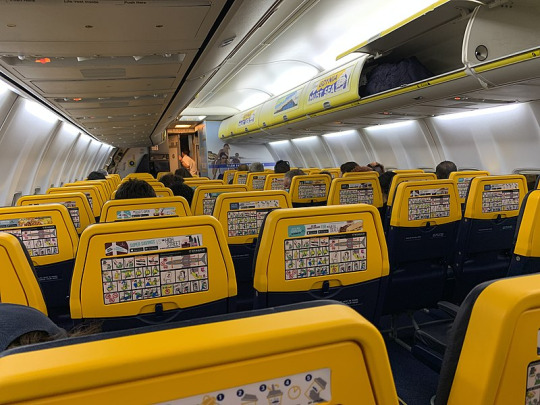
image: Robot8A This is the interior of a Ryanair plane. Note the safety cards attached to the seatbacks due to the lack of pockets, plus additional adverts on the seatbacks and overhead bins like this is a sports match in a massive stadium. It's also just quite ugly.
Fundamentally, Ryanair is just perpetually doing Ryanair things. Why is Ryanair? Because Ryanair is one giant publicity stunt. A couple of people answered my question by referencing the CEO saying he'd like to charge people to use the toilet, and that's sort of true in the sense that he's said he'd like to do this, but he's always been pretty clear that it's a publicity stunt:
Short of committing murder, negative publicity sells more seats than positive publicity.
Like, it's a bit. He's doing a bit. He's 100% in on the joke. For every one of the more particularly insane claims, like charging to use the toilets, he's outright denied it. Even some claims that are pretty borderline are ones he's contradicted at other points. He's a legitimate bigot who's created one of the most nightmarish work environments out there and just wants to suck money out of people by any means necessary, and he's indefensible, but that's not really what people talk about when they talk about Ryanair. They talk about charging for toilets.
Charging for toilets continues to be the number one story that resurfaces in the press and it’s the gift that keeps on giving. We’ve never done it, but it keeps coming up on social networks every three or four months, the media picks up on it and then someone writes a story on it.
Which I think is misplaced effort when he's also, for instance, a climate change denier who forces disabled passengers to pay for wheelchairs. And I don't believe for a second his climate change denial is based on legitimate convictions - he just doesn't want to have to spend more money. He would absolutely knowingly feed the world into an incinerator if it lowered costs.
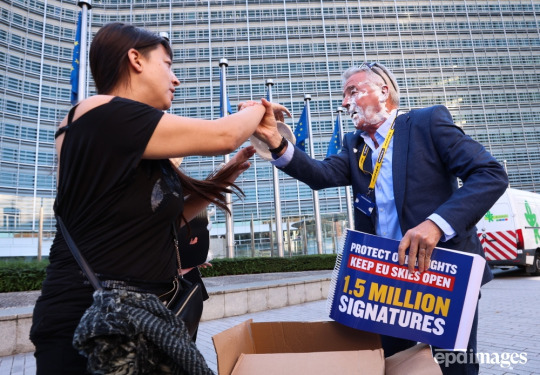
Anyway, here is a picture of him having his face violently introduced to a pie.
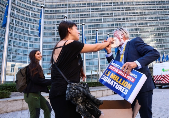
image: Olivier Hoslet
All of this said, there's no such thing as an ethical airline - he's just playing it up to the extreme for essentially business clickbait.
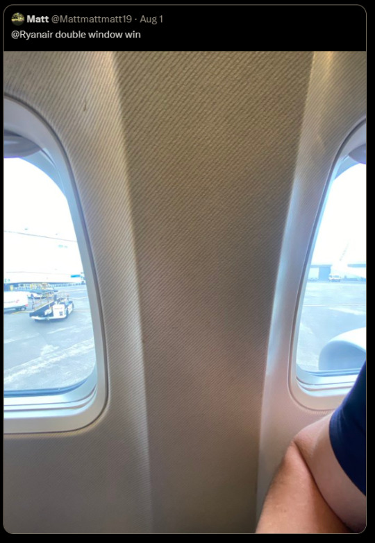
I feel like the best example of Ryanair's general...Ryanairness is their Twitter account, which I have a sneaking suspicion Michael O'Leary runs himself to save money. It's mostly composed of firing back at complaining customers, Formula 1 opinions, and jabs at everyone from Boris Johnson to the British Museum. (Heartbreaking: the worst person you know just made a great point.) Their description, 'we sell seats, not windows', references the frequent complaints about seat 11A, which does not have a window. (To be fair, their website does warn you about this.) Their weird window situation actually generated my all-time favourite Ryanair tweet.
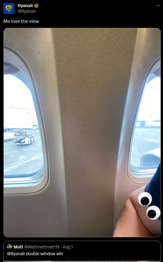
Here are some other winners.
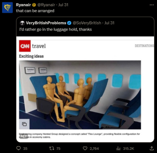
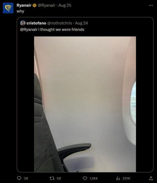


No, seriously, I think Michael O'Leary might be writing these. I also really don't know how to feel about the fact that it appears someone at the airline - potentially O'Leary himself - has made an edit of a yassified Ryanair plane.
But at the end of the day, it's Ryanair. O'Leary himself has described aeroplanes as "a bus with wings on". As one individual tweeted,
THANK YOU to [Ryanair], for letting me see Europe for Feck All
and that's why I do think I genuinely have primarily positive feelings about Ryanair as a product rather than a company - you truly do see Europe for Feck All. (O'Leary has claimed both that he would introduce $10 transatlantic tickets to the US, and that he would make tickets literally free and make all profits from ancillary fees - while neither has yet happened, it takes one hell of an airline to claim that it's on the table.)
Ryanair isn't affordable, it's dime store. It's an airline you bought from Wish.com. It's the free pen you stole from a cup of identical pens at the bank which stops working within days. You're not just in steerage, you're on a tramp steamer. You get exactly the misery you pay for, and you go from one place to a different place.

And it's worth noting that Ryanair has at least one positive feature - safety.
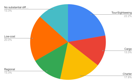
When I ran my first questionnaire I asked respondents what type of airline they thought was most dangerous. Other than what's shown there was also an option for mainline full service carriers; unsurprisingly, nobody chose this. There were 50 respondents but 5 declined to answer this particular question, so the sample size isn't really significant enough to draw any conclusions from, but it's what I have. (I kind of wish I could stop to re-run this with my current follower count, but this post is actually a request. No, not for my wonderful beloved followers - for my dentist. Not joking. Thank you for making my teeth not have holes in them.)
20% of respondents indicated that low-cost or ultra-low-cost airlines probably had the worst safety records and practices. It's completely understandable why someone would think this, but without going into the actual statistics of plane crashes this simply isn't true, and in fact they're the safest category on here. While it obviously depends on the specific airline, low-cost carriers as a category are no less safe than mainline carriers. This is despite the fact that they tend to fly shorter flights and thus they operate more takeoffs and landings, which are the points in a flight where the majority of crashes occur.
How does that make sense? Well, part of it is that the airline industry has gotten very close to eliminating accidental crashes via innovations in technology and an incredible safety culture built on years of hard lessons. The world has paid in blood for crew resource management and GPWS, but it has paid, and now the sorts of crashes that would have been unremarkable just 20 years ago are completely unthinkable. Actually, in the 2010s it's quite possible more people were killed by planes brought down deliberately than accidents. But beyond that, the costs low-cost airlines cut tend to be ones that aren't safety-critical. They tend to operate shiny new fleets (better fuel efficiency, purchased in bulk) with large maintenance teams (shorter turnaround and less planes grounded for long periods of time) at less congested airports (lower operating fees) and indeed when I think about famous accidents that involve massive cutting of corners it's nearly always full-service airlines, save for egregious examples of low-cost industry pariahs out of business within a few years. Focusing on eliminating operating costs by making the passenger experience cramped and miserable allows for pouring all your budget into running a smooth and well-oiled operation.
The axiom "if you think safety is expensive, try a crash" is often attributed to EasyJet founder Stelios Haji-Ioannou. And it's true. Beyond the cost of writing off a plane, of financial compensation to survivors and families, of lawyers and PR, of having to update your operation to make sure it never happens again...as O'Leary himself said, all press is good press...short of murder. A heinous, clearly negligent crash, on the other hand, can kill an airline as easily as it can kill people. It has done in the past and that threat will never stop being there. Airlines go out of business all the time for any number of mundane financial reasons. In many cases margins simply do not allow for something like a crash. Crashes have even ended the lives of deeply historic, beloved, well-established nationalized flag carriers, so this particular sword of Damocles could cut Ryanair's control cables just as easily. And they've managed to avoid this fate, with zero passenger fatalities and only one written-off airplane - the 2008 crash of flight 4102, caused by a birdstrike during landing.
And I'll be honest, "miserable and safe but a tenth the price of a train ticket from Boston to New York" (I am unfortunately not exaggerating) is a pretty appealing package to my non-millionaire self.

...so why do their planes look like this? I'm dead serious, it vexes me. I don't know what to make of this. Hey, did you remember I'm an airline livery review blog? Look, I can't help myself. Low-cost carriers as a topic, and how they're viewed, is probably the most interesting facet of the aviation industry to me. I feel like if I had infinite time and resources I might genuinely sit down, hit the databases and archives, run a few studies, and write a book about it - it's fascinating, and low-cost carriers are something that only economists and businesspeople seem to want to talk about. I think it's about time someone approached them through a lens of history and social psychology. There's not really academic value to what I do here, on Runway Runway, my tumblr blog where I call Lufthansa planes ugly, but if something doesn't exist I will create it even if my sample size is 50.
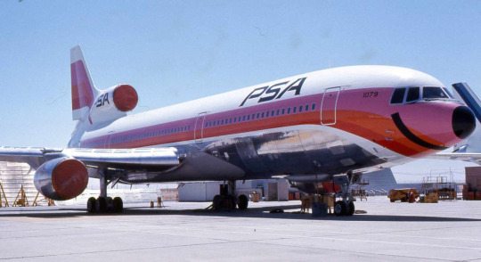
So how about how they're literally viewed - like, what their planes look like? Well, here are some low cost carriers I've reviewed. Notice something? They're bright and eye-catching. They don't take themselves too seriously. They're fun. The original low-cost carrier literally painted big smiles on their bright pink and orange planes.

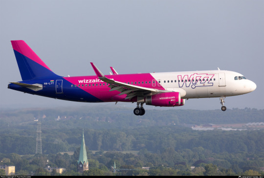

Okay, yes, they don't all look like this. WestJet and IndiGo, for example, are fairly normal-looking. And there are full-service carriers like TAP Air Portugal (and condor. Absolutely condor.) that I would say have a pretty low-costy look to them. There is nothing wrong with that. Low-cost liveries are frequently colourful and exciting, with much more thought put into distinctiveness and charm instead of a passionless appeal to dignity. Indeed a lot of my most highly esteemed liveries, including all the ones pictured above, are low-cost airlines. GOL, for example, is a snappy, eye-catchy design in bright colours that's clearly not meant to look expensive. The same goes for Breeze Airways. There's even more examples out there I've yet to touch on, like EasyJet; ValuJet; Scoot; Spirit Airlines; Frontier Airlines; PLAY (and the late WOW air); Volotea; airasia, so on - to be dignified or clean is not the goal here. Even the names of low-cost carriers frequently are very hastily stapled together and generic, like EasyJet or Super Air Jet or Wings Air; JetSmart; SkyUp; Smartwings; FastJet; Sky Airline (just one!); MYAirlines; the classic ValuJet; flyadeal; and the legendary jet2.com, making no attempt at all to seem as if they have a legacy to fall back on. And there's even more out-there specimens, like Mango or even Nok Air. Many of them have specific themes, like Batik Air, Tigerair, or Buzz, which isn't something you see on full-service carriers, which brand themselves on national identity and the promise of luxury and good service - which is boring. Low-cost airlines, if they want to succeed, have to do something to make people remember they exist.
This is the fundamental shape taken by the low-cost product, which operates with few laurels to rest on and a mission of getting people to remember their website at any cost. Much like a can of Arizona iced "tea" guaranteed to cost ninety-nine cents, literally cheaper than a bottle of water, the package it comes in makes no attempt to look classy. And I am a heavy tea drinker who considers myself fairly discerning, whose favourite type of tea is gyokuro yamashiro (which is absurdly expensive), but you literally can't beat Arizona! It's potable and it's ninety-nine cents and it sort of resembles tea if you don't think too much about it and Massachusetts summers are surprisingly hot and the can is pretty and colourful. Sure, I'd rather have Ito En, but that costs normal money and Arizona costs 99 cents, and sometimes that's all I really have, and it gets the job done even if my teeth aren't enjoying the experience. A Wizz Air plane is a can of Arizona iced tea. It is ninety-nine cents and potable.
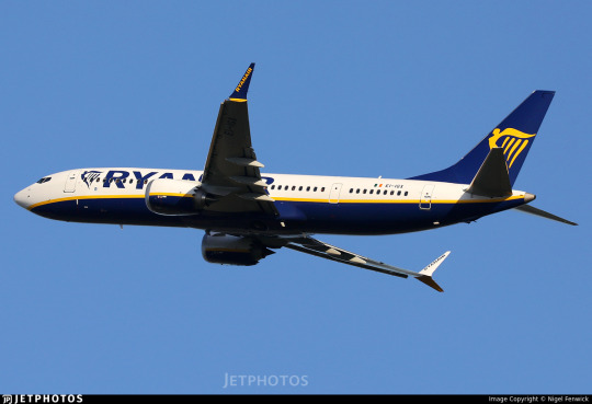
This isn't Arizona, this is a box of Darjeeling from Harrods. Ryanair outfits their fleet in handsome navy blue and gold. Their logo, an outline of a woman with harp-like wings taking flight, is simple yet elegant, and that feels so very wrong. I actually asked in my questionnaire what the colours of the Ryanair livery were, because I had seen people expressing casually that they weren't sure they could recognize so much as a Ryanair logo, and the results aren't worth showing in a chart because they're basically as good as random. I do want to specifically appreciate the person who answered "I don't remember but it must be whatever the cheapest colour of airplane paint is", though.
But the truth is that they have such a rich palette, and I do mean that in the sense of 'wealthy'. A deep royal blue paired with a saturated gold used as a sparing trim, these are the colours of an overstuffed plush armchair, not a budget airline. Aside from the name on the winglets and the giant billboard wordmark there is nothing, and I mean nothing, that is typical for a low-cost airline. This is not garish advertising, this is stately.
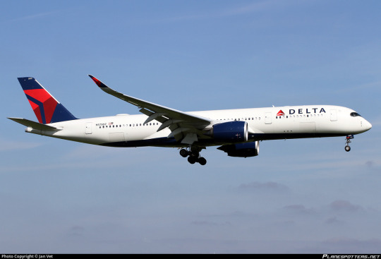
The layout itself is what I call "Deltalike". Delta certainly did not invent this style of livery but they are the carrier I associate most with it, likely due to the fact that I live right by one of their hubs. The Deltalike is a white plane with a painted tail unconnected to the main fuselage body, painted winglets, painted engines, and a painted underbelly large enough still be visible when viewed directly from the side. While a 'true' Deltalike uses a consistent palette for the engines, tail, and underbelly, there is significant variation. The detached tail is, in my opinion, the harbinger of the Deltalike, and I call liveries with an incomplete presentation of Deltalike features Deltalites.
This scheme is not as common as the Lufthansa Line variants but it is still very common, with its popularity probably peaking in the 2010s. Some examples of the true Deltalike include Air Canada, 2006 Icelandair, Azul, the old GOL livery, and jetBlue. Some colour-varied Deltalikes are the old Flair livery, the SAS red engine livery, and British Airways. An example Deltalite is the old Croatia Airlines scheme, which has a painted tail and belly and engines that are sort of painted. Sure, the engines are just grey and a bit of the tail extends onto the body, but it's got the colour concentrated in the right place and it has the painted belly, it's a Deltalite. A lot of liveries have painted engines and detached tails but no painted bellies, and I do consider these to be on the far end of the Deltalike spectrum, but they aren't what I mean when I refer to a Deltalike. They're what brown dwarves are to actual stars - related but not really the same.
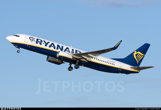
Ryanair is a true Deltalike, but I would even call it an elevated Deltalike. The gold trim, like the cord adorning the hems a of a thick brocade smoking jacket, has an effortlessly shallow curve as it trims the rich blue underbelly, larger than that of a typical Deltalike and with a very deliberate shape to it which at the rearmost point covers half the fuselage by height but fades away to a sort of goatee at the front. This is not a plane which sat in a puddle of blue but an intentional cloak impeccably positioned, visible not just from the side but from the front. The engines, instead of being plain or just one colour with a website printed on, large and garish, are the same white and blue with yellow trim, the last traces of the setting sun melting into a glassy deep blue ocean below a stark white sky with which it inexplicably coexists. Sure, the detached tail still looks bad, it always does, but you can ignore it at most angles.

From below the dark blue creates that distinct cetacean effect, a certain brightness-inverted countershading effect, similar to what you see on airlines like KLM and other blue-side-up liveries. The underside doesn't have a huge, legible logo, visible even from the ground on final approach. One of the defining features of the low-cost livery, in my mind, is a large, prominent website. It's tacky and a little pointless (I mean, surely they can Google your airline's name if your wordmark is large enough) but it is downright ubiquitous. Even full-service carriers frequently heavily feature their website, but it's nowhere on a Ryanair plane. That's so, so incredibly weird.
Just...think about it. Their entire identity is outrage marketing. They are the xQc of airlines - bigoted, constantly in the news, and obnoxious. And nobody remembers what their livery looks like because it doesn't look obnoxious. This is like if MrBeast's thumbnails were lovingly curated aesthetically pleasing shots of scenery that could pass for screenshots from an actual film. It's not tacky and cheap and it's not generic and cheap, it's elegant and cheap. And of all airlines to look like this...Ryanair? Seriously? Ryanair?
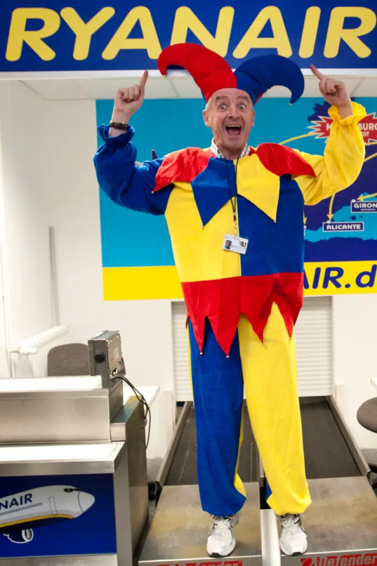
image: Associated Press
The CEO.

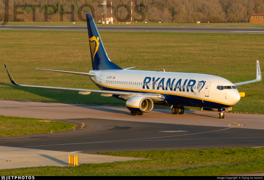
The airplanes.
Do you see what I mean? Do you see why I find this deeply strange? This is not a clickbait plane. This plane is downright unclickable. It has never been clicked. I bet if I covered the name up and showed it to people (again, I wish I'd had the time to do this) I could fool people into thinking this is like United. Hell, I've learned from my other survey that the average person clearly knows less about liveries than I, the Joker of liveries, do, and can't identify basically any from memory. I could probably fool at least one or two people into thinking this is Singapore Airlines. I may try this on a few co-workers and then get back to you.
How did we get here? I have no clue. While Ryanair did start out as a charter carrier rather than a low-cost airline, and they always had blue and yellow as their colours, their very early liveries were just white planes with wordmarks.

This livery seems to have appeared very early in the history of low-cost Ryanair. Unfortunately, I can't date it precisely - the only thing I can say is that the earliest photograph I could find in this livery was from 1994. Based on the fact that their planes were photographed in different liveries right up to then, including this very brief TAM-like BAC 1-11 livery, I think 1994 is most likely the point they committed to it.

Oh, Adam Rowden, what a different world you lived in.
Even for 1994 this is a pretty conservative livery. Sure, this was before the real boom of bright and venomous flying billboards, but it's still strange. And Ryanair is no stranger to literal flying billboards in the form of logojets for such companies as Vodafone and Hertz, often sort of hideous ones, though I imagine these days nobody would ever want to associate with them like that.
And they never changed it, except that they did - to the modern, softer curve. This I can pinpoint with much more accuracy. It was changed in mid-2003 as new aircraft were delivered, while the older livery was phased out together with the secondhand airframes which wore it. I do not understand this at all. If any airline were to just make the decision to go full circus tent and be as garish as possible it should be Ryanair, right? Ryanair is a brand incapable of cowardly behavior. But they look far more sober than even the average modern flag carrier livery. I guess they don't think they need an eye-catching livery, but I just don't buy that as a full explanation. Imagine the news they'd make for introducing something truly heinous. I think their genuine best move would just be to put a huge picture of Michael O'Leary's face, blown up massively and poorly aligned with visible JPEG artefacts, all over their fuselages. All of Europe would be furious. So why? Why is this the situation?
So what's the verdict? This may be the hardest decision I've made so far. The options here range widely. I'll lay them out.
If I were rating this based on pure visual appeal, I would give it a B-. I am dead serious - this is a visually pleasing, well-balanced livery, simple yet elegant. The detached tail is my only major complaint. But I think Saudia's planes are quite pretty and I graded them low because I think they fail at representing their airline or having a distinct identity, so this cannot be my sole criterion.
I almost want to give them an F because of just how un-Ryanair they are, like how Copa's livery is literally not the Copa livery, but that feels wrong because that's still the Ryanair livery, it's not just a refusal to design a livery at all.
Do I marry these two into a tepid union destined for either divorce or a dramatic act of arson after a seeming eternity of languishing in mutual dysfunction in Tallahassee? I really don't want to do that, because attempting to balance these factors betrays the fact of their contradiction, the mental strain I've been afflicted with over this simple, pointless choice with zero consequences except maybe one of my followers disagreeing with me, which is fine. Unlike certain individuals I will not call you swear words and say you're an idiot.
The final option is maybe my least favourite of them all, because it's capitulation. It's admitting Ryanair is special, just the most annoying golf-ball-sized hailstone in the blizzard of absurd and comical frustrations which is the airline industry. But I just don't know what to make of this miserable little pest, this plague on the patience and knees of the traveling public.
Z. FUCK YOU IT'S RYANAIR.
It defies categories by being good, but being Ryanair. I hate that. I hate it, I hate their beastly little CEO, and I dislike that their planes are sleek, elegant, and could easily pass for an airline that doesn't instruct stewardesses to kick their passengers' shins as they walk down the aisles. If I am buying a ten-euro plane ticket I do not think the plane should look like this, teleologically speaking. At the end of the day I just have no better way to quantify my feelings.
Prick.
#tarmac fashion week#grade: z#era: 1990s#era: 2000s#era: 2010s#era: 2020s#region: europe#ryanair#low cost carriers#ulccs#deltalike#cabin fever#long haul#questionnaire 1#questionnaires#double sunrise#yeah I guess. it goes in that tag sure#ryanair group
141 notes
·
View notes
Text
#poll#polls#politics#millennials#gen z#gen x#for me the first one i remember is 1996#clinton vs dole#i remember doing a mock election in my 2nd grade class
8K notes
·
View notes
Text
Still I can't let you go
"So this is it?"
The words are unfamiliar on his tongue, thick and bitter, dangerously close to gluing his mouth shut if he doesn't let them out. It's strange, to ask this question. He's sure he used this particular phrase many times before, both on cases and in their free time. And yet, when they finally pass his lips, they're clumsy, foreign, as if he's only now learning how to speak. Maybe he is.
Edwin is not looking at him, head turned a little to the side, his eyes a little dazed, staring far into the distance. Charles wonders if their look each other directly in the face ever again. He has the strangest feeling they might not. He can't remember the last time they did.
"I believe so, yes," Edwin finally says, and Charles has to look away. He hates how much it feels like talking to a stranger.
In the silence that falls around them, he tries to run back through his memories, to figure out when things started going wrong. He thinks it might have been around the time that Crystal died, but he's not sure. The time surrounding that day is dark and blurring together, and stretching too far into then-future. Neither of them were ever good at dealing with the difficult feelings, and so the weight of that grief crushed them entirely for a while. He thought they were getting better, though. It seems that they weren't.
"Had a good run, though, right?" he says, trying for some levity in his tone, feathers hitting against brick wall. It falls flat against his ears, more desperate than light, and that much closer to the truth for it.
"That we did," Edwin replies. Charles sees him moving in the corner of his eye, and from the sound of his voice, he thinks the other boy might be smiling a little. He can't be sure, though, because he's not looking at him. It's pathetic.
"Shame to let it go," he chokes out, voice cracking around the sentence. He feels heavy, as if he's back in his corporeal body, gravity pulling him deeper and deeper into the center of the Earth.
Edwin moves, and he can't feel the hands on his shoulders, but he shivers in surprise anyway. He looks up on instinct, and he wishes he didn't. Edwin's eyes are sad, but determined, a combination he's seen before many a time, but never directed at himself so intimately. It's intoxicating in all the possible ways.
"We need to grow up, Charles," Edwin whispers, a plea, "And this is getting us nowhere." And oh doesn't the truth hurt. He barely remembers his actual life, too entwined with Edwin for over a century, and at this point he doesn't remember when he ends and the other boy begins. He never thought it might be a bad thing.
Ghosts cry in a strange way -- there's no real tears, just pale paths appearing slowly on their face, like cracks on a porcelain doll. They never stay too long, glimmering and glistening as if they are actual streams of water. It's unfairly beautiful, he thinks as he watches the silver lines appearing and disappearing on Edwin's face. He's crying too, he knows, cheeks tingling under something that isn't there.
"It's not a goodbye," Edwin finally says, one corner of his lips quirking up higher than the other, "Just see you later," he explains, but he doesn't sound too sure. Neither of them can be sure what's going to happen from here, really, being alone for the first time in so many years. He won't move on, that's for sure, and Edwin definitely won't be doing that either. They might bump into each other here and there, right? It's not the end of the road.
Edwin takes a step back, and Charles does the same thing, his body overriding his mind. He takes a shaky, unnecessary break, trying to push back down the non-existent bile. "See you later?" he asks, trying one last time to catch something long gone. Edwin just nods, in that prim and proper way of his that's soon going to be entirely foreign. In some ways, it already is.
Charles turns around, when his whole essence begs him to stay, and starts walking without another word. He doesn't know where he's going, but he can't turn back.
_____________________
The statement that ghosts can't sleep isn't true -- ghosts can sleep, they just choose not to. In part because they don't need it, and partially because although they don't dream, they do have nightmares.
He comes to with a start, sitting up violently. The office is dark and empty, and for a second he thinks that he's alone; but then Edwin phases through the wall, holding some book or other in his hands, entirely engrossed in its contents. The moment Charles lays his eyes on the other boy, everything else disappears. His heart would've slowed down to normal pace, if he had a heart to begin with. Some of his distress must be still showing on his face, though, because Edwin's face morhps into concern as soon as he looks at him.
"Are you alright, Charles?" he asks, shutting the book without checking a page. Save it for Edwin not to care about bookmarks - he'll just start the book again.
"Yeah," Charles breathes our, shaking away the last bits of the nightmare. He doesn't really remember what it was about; he knows it felt lonely. "Just a bad dream I think," he adds as an afterthought, hoping that the context with placate his best mate.
Edwin humms in response, and takes a seat on the couch next to him. "Do you fancy a read?" he inquires, and Charles can't help but cheer up a little. "Yeah, I could use a pick-me-up," he replies, nodding, and Edwin smiles softly, placing the book on his lap.
He doesn't get a chance to open it, though, because Charles leans in and kisses him softly. It's sweet and gentle, and still tastes new. He savours it as long as he can without floating away, and when he leans away, Edwin is staring at him with a dazed smile. He shakes it away, but he's still blushing when he finally opens the book.
"What are we reading?" Charles asks, snuggling into Edwin's side and laying his head on his shoulder. He tries not to laugh as Edwin clears his throat before answering,
"I was thinking Peter Pan."
#dead boy detectives#charles rowland#edwin payne#payneland#my writing#dead boy detective agency#edwin x charles#z yapps#and this is why i shouldn't be allowed to listen to music#alexa play end of the road by boyz ii men#i was soooooo tempted to make it gay up angst#but i know people don't like it much#so i tried to soften the blow#can i get at least a passing grade for the effort?
59 notes
·
View notes
Text

#VIZ#DBZ Chapter 185#Dragon Ball#Dragon Ball Z#DBZ#Vegeta#Prince Vegeta#DBZ Vegeta#Super Saiyan#SSJ#Super Saiyan Second Grade#Super Saiyan Stage 2#Super Vegeta#Cell#Semi-Perfect Cell
80 notes
·
View notes
Text
I don't know if this learning style is universal or American-centric, but when I was a kid we had these guides on how to write letters that often included little numbered arrow guides to indicate stroke order and direction like these:

and I wonder if there's one out there for Eorzean script. Considering making one myself at some point but I have no idea about stroke order or direction for any of the letters.
#Z speaks#My desire to be able to easily handwrite in Eorzean...#give me grade school Eorzean learning tools pls SE!
20 notes
·
View notes
Text

So the designs for the upcoming winx club reboot has been flooding my twitter for DAYS and I immediately fell in love with Musa's 😍💕
#i don't think I've talked about this before but winx club shaped my entire grade school days the same time powerpuff girls z did#if only i could find all my winx club art from my childhood#bc while ppgz was what got me into fandoms and such#winx was what sparked my interest to draw#winx club#winx reboot#winx musa#winx club musa#musa#winx club fanart#my art#art#my illustration#digital art
574 notes
·
View notes
Text
Please reblog for a larger sample size I'm really curious about this
(I meant *in school btw but I can't edit)
#oc#I'm curious because we were talking about teaching 9/11 to kids in one of my teacher preparation classes and I was talking about how they#showed us videos of people jumping out of the towers in second grade and it was pretty traumatic#and a lot of my classmates who are around my age (older gen z) had the same experience
75 notes
·
View notes
Text
Oh ok Julius is Zeus's half-brother, so Zeus IS still the son of Kronos in this
#dimension 20#titan takedown#in that case hmm#I have my doubts now that julius isnt being used#and that his wholesome desire to see his father freed isnt misguided#because while big z is a grade A turd the mythological zeus DID have his reasons for overthrowing kronos
23 notes
·
View notes
Text

I didnt do inktober so I had to make up for it by drawing kid buu in a silly witch costume again
#my art#art#dbz#dragon ball z#dragon ball#majin buu#kid buu#buu saga#halloween#happy halloween yipppeeeee#im gonna be jesse pinkman for halloween#witch#i keep drawing instead of doing my homework#my grades are going to fail because of this drawing
25 notes
·
View notes
Text
you know i watched atla in russian because it was on the tv, and i thought Ozai’s name was Azai, because that’s how they pronounce it, so for some time, baby me thought that in this family there was a correlation between a name starting with Az (Azai, Azula, and Azulon) and being evil, and having Iroh (who i thought was Airo and in russian it was indeed Airo) and Zuko not be evil seemed to prove me right
#i also thought that because Iroh’s (Airo) name starts with A and Zuko’s name starts with Z both of them could have gone evil#like Iroh being a war general and Zuko’s behaviour in the beginning of the series#all of this happened before i started school because i remember explaining this to my parents#and i needed to write it out to show them#and i wrote in print letters because that was all i knew#and we start learning cursiv in first grade so it was before the fall i started elementary school
12 notes
·
View notes
Text
No. 28 - A Further Explanation of the Star Alliance Test
This is a main-series post, despite not being a review of a specific airline. I just think it's something that belongs in the series, that should be read. Don't worry. Today's airline is going to come later. This is a necessary preamble to get out of the way first, and it's also me making things right with an airline I've covered already.
Stick around and I promise it'll make sense. I had to rewrite this entire post from scratch, so if I could have changed this fact I would have, but fundamentally before I talk about today's true subject I need to talk about the Star Alliance Test (SAT for the remainder of this post).
So let's begin with a question. You don't have to get this right. Just take a brief look at these pictures, don't try to examine them closely or anything, just a look-over, and tell me which one of these planes - we'll call them 1, 2, and 3, left from right - flies for an airline we’ve touched on briefly before, Avianca.
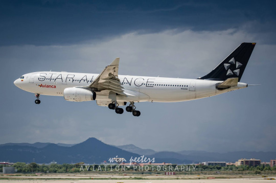
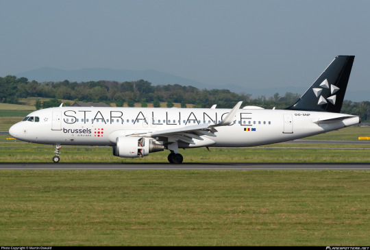
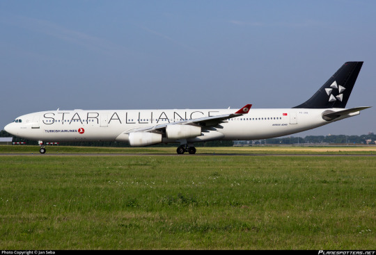
Got your answer locked in? Hit the readmore and let me tell you why I asked you this!

That's right! The answer was No. 1. You can tell because it says Avianca on it, if you look closer. But...why? Why would we want to be put in a situation where 'which of these three airlines with completely different liveries, identities, and brands does this plane fly for' is a question that could feasibly come up?
I don't know. I didn't make that choice and I was probably on some other wall during that meeting. Oh, and to the best of my knowledge I also hadn't been born yet. But it's a thing airline alliances do. And Star Alliance is the subject of the Star Alliance Test - one of my metrics for determining if an airline deserves a grade of F.
The Star Alliance test has been used precisely once - in my SAS post, regarding the 1998-2019 livery (henceforth referred to as red engine SAS or RESAS).
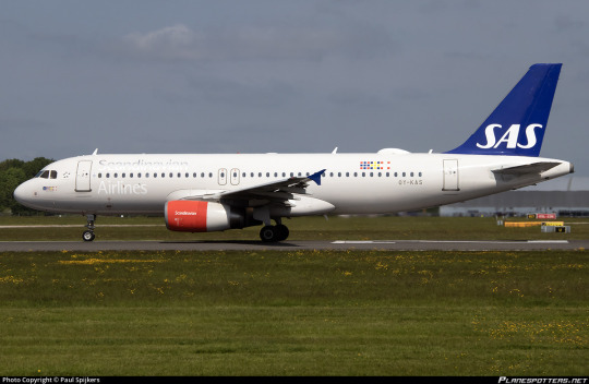
This monstrosity, for those blessed enough to not remember.
Here are the rules of the test.
The Star Alliance Test has exactly one question. Would I prefer that all this airline’s planes were forcibly repainted into Star Alliance liveries instead of allowed to remain in their current state?
If the answer is 'yes', the airline automatically gets a grade of F.
Why Star Alliance? After all, it could be better but I don't think it's that bad. Well, I choose it because the Star Alliance test isn't really about being aesthetically pleasing - at least, not exclusively. Let me explain.
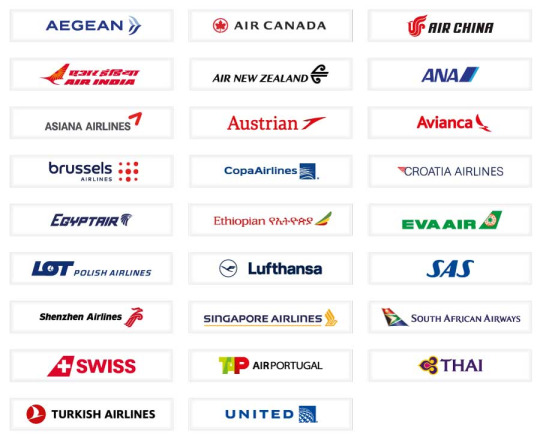
Star Alliance is the largest airline alliance in the world. Flightradar24 estimates there are 106 planes flying in a Star Alliance livery. It has 26 member airlines, shown above. Note the variance in color scheme, in logo, in origin. 26 is so many airlines. These carriers span every continent except Antarctica and basically only share three features: being international, being full-service, and being members of Star Alliance. I think it's safe to say that in any other context, nobody would ever associate THAI and Avianca, or Shenzhen Airlines and TAP Air Portugal, or Aegean Airlines and EVA Air.
Each of these airlines has a livery of their own, except for Copa. I've covered Lufthansa and SAS already. Croatia Airlines and Air New Zealand are on my request list. Another several are on my own private 'short' list. (It is 50 airlines long. You don't want to know how long my longlist is.) 26 airlines comes out to at minimum 26 reviews, but actually more because you saw me squeeze four out of SAS. I will say up front, Star Alliance runs the gamut of liveries. There are a couple I like, a couple I think are very bad, and most I think are middling. But each of them, except Copa, is its own. Some of their designs are minimal, disappointing, ugly, but they are all designs made in an attempt to reflect the airline's identity and distinguish it from the rest of the tarmac, even if they create something ugly or boring or cowardly or all three.
A livery can be very, very bad indeed. But in my own mind an F, an outright failure, is the inverse of an A+ in a sort of cosmically symmetric ontology, and these are not the inverse of an A+ livery. They do not embody a transcendent bad to balance the scales against transcendent good. To reach this point you must be not only ugly but a gnawing void eating away at your own self. A livery worthy of the grade F do not fail to execute a good concept, or even fail to execute a bad concept. They have no concept and they fail to justify their existence.
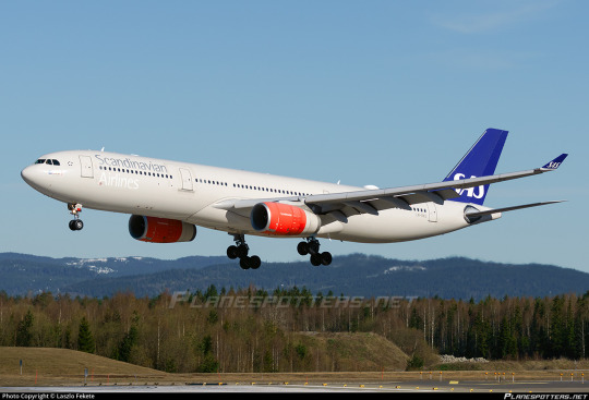
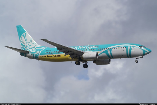
One of the worst liveries I've covered vs one of the best.
The SAT is a litmus test for this astronomical, pernicious state of utter failure. It takes more to fail the SAT than to just be uglier than the default Star Alliance livery. Plenty of liveries are uglier than Star Alliance's and they pass by light-years. To fail the SAT requires more than bad design, blandness, or anything else of that nature. It is monumentally difficult to fail the SAT. It’s like stalling an Airbus. You can do it. We know this. People have managed to do it, when the perfect storm arises and the world enters that uncanny state where luck and circumstance conspire to make the absurd a reality. But it’s really not something you can do, broadly speaking. Just pulling the nose up too far or forgetting to keep track of your airspeed isn’t going to do the trick. Icing on the wings won’t either. Even forgetting to extend your flaps on takeoff probably won’t be enough. It’s rare enough that it straddles the border of being an urban legend. It seems so easy to do thoughtlessly but it’s only happened a couple of times. Even doing it intentionally is harder than just designing a good livery. I'm not even sure it's possible to do it intentionally.
To fail the SAT, you must fail so comprehensively that you should no longer be allowed to design your own livery. You should, in a paternalistic manner, have your entire fleet forcibly repainted into the Star Alliance colors.
A livery is meant to distinguish and represent an airline. Even a bad design is still a design. The reason that RESAS fails the SAT, in my mind, is that it doesn't feel like a design. It's not coherent. It's not intentional. It doesn't feel like improperly integrated parts, or even multiple liveries stapled together. It feels like it was designed by random number generator. It utterly fails to represent the airline, utterly fails to look good, and utterly fails to even seem like thought was put into it.
To fail the SAT is to get to the point where I genuinely think it is so shameful to paint this on your planes, so inept on every level, that it would be better to just not have a livery. It would be an act of mercy to become indistinguishable from other airlines instead of staying as it is, a thing you could only ever pity and never truly love. Never respect. The most wretched sort of creature. If your shirt is stained too badly, you just can't keep going on like that. People will point and laugh at you, and that's never fun. They'll say 'that guy's shirt is covered in mysterious substances', and you have to just put on a jacket and cover it up until you get home and fumigate it with kerosene. From 1998 to 2019, SAS would have been better off just not having a livery than they were flying that...thing.
It doesn't have to be Star Alliance in particular. Just something which renders the airplane mostly generic. They can keep a little logo on there but they don't get their own design. It could just as easily be, say, forcible repainting into the default manufacturer liveries Airbus and Boeing use for prototype aircraft.
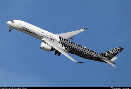
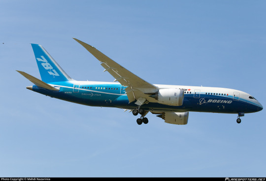
Not the end of the world, right? These are surely not unbearable liveries. I don't think it's any worse giving up your identity to say you're part of Star Alliance than it is to subdue it in favor of the model of plane. If you're SAS pre-2019, this may be a decent option for you. If you're literally anyone else, the mere concept should be philosophically repugnant.
I am actually being kind, though. If I were to be even harsher, I could have easily made this the SmartLynx Test.
I asked you all about SmartLynx. To begin with, not a single person believed they could recall seeing one of their planes, or that they had flown with them. I didn't think they'd be able to. That's not a question I can really answer about myself either, at least not with any confidence. But what is SmartLynx?
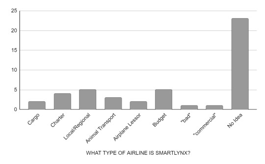
The vast majority of responses just expressed bewilderment. I got 50 total replies to the questionnaire itself. Keep in mind that some people declined to answer, and I didn't include them, and even still the number of people who actively expressed that they did not know is nearly half of all responses. Few of the answers were especially confident, either. I'm fairly sure the ones about transporting animals were all jokes, and nearly everyone expressed that their answer was a guess. Someone just said 'bad', which I thought was pretty funny. I liked that answer.
I got two people who said that SmartLynx are airplane lessors. Actually, one said 'private airplane sharing company', but I've interpreted that as meaning lessor. Anyway, they're right. The people who said charter also aren't wrong.

SmartLynx are a Latvian airline which specializes in wet leases. For those unaware, a wet lease (very bad term) in aviation is a lease of an airplane that comes with a crew to operate it. Generally everything else, like fuel and various operating fees, is on the airline leasing the plane, and they're also the ones who market and sell the tickets. Basically, you could get on a flight, your ticket says, for example, Oceanic Airlines Flight 1, you bought it from the Oceanic Airlines website using your Oceanic Airlines miles, and be none the wiser that SmartLynx owns the airplane and pays the pilots flying it. These vary a little, but generally a wet lease provides ACMI (aircraft, crew, maintenance, and insurance), and if you ever see the term 'damp' or 'moist' lease that means the cabin crew is provided by the lessee rather than the lessor, but apparently neither sees much use. Which is a shame, because I think this is one of the few situations where more categories actually might make this easier to parse.
If all of that is sort of confusing and a lot of information upfront, you are not alone in feeling like this! I'm still pretty shaky in my own understanding of it. I'm a history person, not a business person. You can think of it as codesharing but never mentioning that's what you're doing, if that's any easier. It's also similar to regional brands of larger carriers, like Delta Connection flights being flown by Endeavor Air or SkyWest, though these carriers aren't going as far as to lease and are still on the hook for their own operating costs.
Every time I explain this to someone for the first time they think it's pretty deranged, and I don't completely disagree, but it's very normal. There are plenty of reasons airlines might wet lease, generally involving them not having the capacity to fulfill demand. All sorts of airlines provide wet leases, and all sorts of airlines hire them. It can create weird legal loopholes regarding who is allowed to fly in whose airspace, but typically it's just one airline not having enough planes for the holiday peak. They usually last for a few weeks or months, rather than the many years of a 'dry' lease which includes a plane only.
SmartLynx fly basically everything you can think of - passenger, cargo, holiday charter. Some airlines they've leased for are EasyJet, DHL, Finnair, and victim of the blog condor. Because they never operate flights under their own name, there is absolutely no reason for them to have their own livery. Indeed, it makes more sense not to, since it would be easier to leave their planes blank in case they want to repaint them into another airline's livery for a longer-term lease.
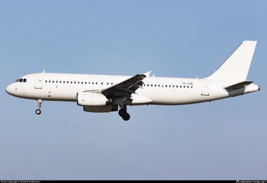
If you fail the Star Alliance Test, I think you would be better off painting your entire plane white.
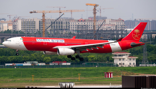
SmartLynx has no identity because their entire point is to assume that of others. They basically do the airline equivalent of paying somebody to take an exam for you. This is a SmartLynx plane with Saudia logos on airasia color-blocking. It's a bit weird-looking, sure, but it betrays nothing about SmartLynx because their entire job is to not have a brand. Nobody has ever seen a SmartLynx plane because they exist literally but not philosophically - the job of a SmartLynx plane is to fly for a different airline. They are the stagehands of aviation, scurrying around in all black to stand out as little as possible.
But SAS isn't SmartLynx. SAS is a big airline, a flag carrier, and to say that they fail the SAT means that I would prefer their planes all be wiped from existence in an apocalyptic flood of liquid paper. I do not think the 1998-2019 SAS livery deserves to exist. I keep repeating myself because I need to stress how profoundly difficult it is to get me to this point. I would rather a livery be clumsy, bare-bones, poorly executed, cowardly, genuinely ugly, absolutely dismal, than it be non-existent. It takes something absolutely tremendous to bring me to the point RESAS has, where there is nothing, no vision, no meaning, no direction, no design, that justifies its existence.
...so what about condor?

condor was the first airline to get a grade of F. The second was the aforementioned red engined SAS livery, now mercifully retired and thus reduced to a footnote in a post about how far SAS has come. The reason I brought up the SAT in SAS's post and didn't in condor's is that condor emphatically passes the SAT.
I began with the assumption that the SAT was a good measure of if a livery deserves an F, and maybe it still is, but it's definitely not all there is to it. condor is different from Copa and RESAS, it just is. And I think the best evidence of this is that, of all the reviews I've posted, condor is the only one where a significant portion of people who reblogged it disagreed with me. I do understand that at the end of the day everything I say is subjective, and I don't mind when people have opposing views on something, but combined with my own thoughts on the livery, and the process of researching and writing my BWIA post, it pushed me to an epiphany about what makes a truly great and truly terrible livery. And, partly out of curiosity and partly to follow this new path of personal evolution, I asked survey-takers what they think of the condor livery. Maybe I should have left it as a free-response question, but I wanted figures, numbers. So here's what I got. (Free responses have been merged into whichever category they match closest for the sake of simplicity.)
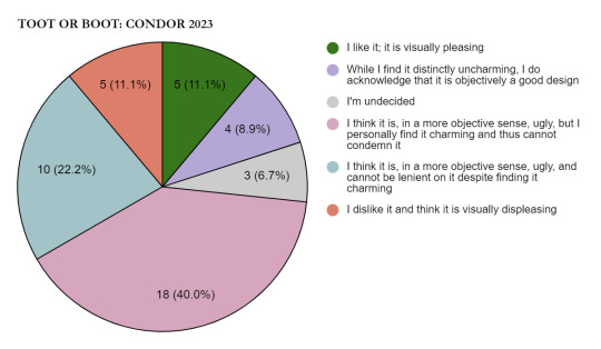
These results are fascinating. First, you may notice that this is missing two options. Not a single person said that this livery was boring, or that they felt neutrally towards it. Even people who are still making up their minds are a dramatic minority.
Second, people who had a clear-cut opinion of the livery, positive or negative, made up just over a fifth of respondents. Most people were at least to some extent conflicted, although which specific variant of conflict varied. There are people who appreciate the idea but do not like the appearance of the livery, and then there are people who find some charm in it. Around 2/3 of these people cannot force themselves to fully insult what they see as a sort of goofy creature, while the other third cannot allow their emotions to sway their rating. If my post on the matter didn't fully convey it, this is probably the closest to my own opinion.
If I was condor, and I saw these results from a focus group (replicated on a scale far larger than my survey, of course) I would probably say to go ahead with this livery. All press is good press, as they say. You're going to end up with a livery that sticks with people, and they're going to respect that even if they think it's hideous. At the very least, they're going to notice you.
Condor's livery is ugly. I will not change my stance; it does not look good. It is unpleasing to my eyes. But it is not the opposite of an A+ livery. In fact, it has a lot in common with them. The reason I love PSA, BWIA, and Amakusa Airlines so much isn't just that they make good use of the plane's shape, have pleasing colors, and generally look nice, but because they are built on the bedrock of a concept which goes beyond designing an airplane. In BWIA's review in particular I discussed the fact that it takes the approach of building a livery around an idea rather than an idea around the concept of what a livery should be; this is what distinguishes an A+ from an A, and the gulf is far larger than the gulf between any two other grades. The difference between 'it's on the better side of okay' and 'I somewhat tepidly like it' can be rather small compared to the difference between 'it's very good' and 'it's genius'.
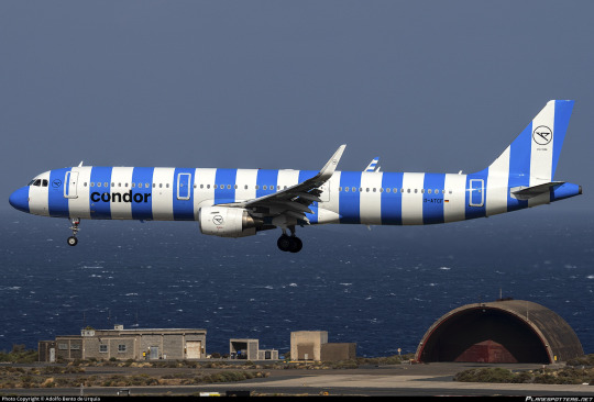
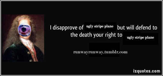
In the 2022 film "Nope", protagonist OJ asks if there is such a thing as a 'bad miracle'. To me, condor is something similar: bad genius. condor takes a once-in-a-decade great concept and executes it incomprehensibly poorly, and now they're the infamous ugly stripe planes. It has failed spectacularly but it has failed in perfect harmony with itself. It is unlikely that someone attempting to make an ugly livery as a joke or a parody could come up with something quite this sad. I've struggled for a little bit to think of a way to convey what it means to me, and I think I might have finally found it.

The town of Borja, Spain has a population of under 5,000. Although it was largely unremarkable as far as this sort of work goes, they were quite fond of a fresco painted on their church wall around 1930 by the artist Elías García Martínez. All art begins to deteriorate over time, and frescoes are notoriously difficult to conserve. In 2012, an octogenarian with no relevant training had a vision of a gorgeous restored painting. She definitely should have thought before acting. Just because you see something in your mind's eye doesn't mean you can make it real. And if you rush into it you might make...well, you see the picture on the right.
This picture is hideous. And it has brought in crowds of tourists hundreds of times the size of the town's actual population. Their money has funded pensions and built infrastructure. It has become a cultural icon. Nearly everyone with an internet connection has seen it. It's by far the most memorable thing about this tiny town. It is a work of bad genius.
Say what you will about condor's planes - and I myself have said many mean things about them. They are ugly and they are iconic. They are condor's grand statement, and no matter how ugly I think they are the world would be losing something if they were assimilated into identical Star Alliance liveries.
This striped livery is terrible, and it is great. It is worse than many liveries are good. And it does not fail as a livery. It is fundamentally condor's, and there is nothing like it. Distinctive, coherent, unique...and also ugly.
I've realized that condor belongs as a fundamental landmark in my understanding of liveries, just like Lufthansa or BWIA or PSA. Now that I've said all of what I've said in this post, I think giving condor an F just doesn't work. It doesn't belong in the same category as liveries which fail the Star Alliance Test. It doesn't deserve a better grade though. Something so bombastically, almost elegantly hideous requires a rethinking of the scale I've been using.
condor gets Runway Runway's first ever Z rating.
It does a tremendously poor job at being good, but a fantastic job of being a livery. In order for the Star Alliance Test to retain its meaning and the F tier to retain its coherence, condor needs to be reclassified. It is awful, hideous, sloppy, a waste of potential, but it is potential, and 'awful' originally referred to something which inspired awe.
36 notes
·
View notes
Text

#VIZ#DBZ Chapter 191#Dragon Ball#Dragon Ball Z#DBZ#Vegeta#Prince Vegeta#DBZ Vegeta#Super Saiyan#SSJ#Super Saiyan Second Grade#Super Saiyan Stage 2#Super Vegeta#Cell#Perfect Cell
48 notes
·
View notes
Text
da2 secondary characters better than none
5 notes
·
View notes
Text
Goofy Wild Kratts Doodles from my sketchbook part 1
(Click some for full image)


#wild kratts#kratt brothers#kratt bros#chris kratt#martin kratt#aviva corcovado#Koki Wild Kratts#Jimmy z#Koviva#Aviva x Koki x Jimmy#wild Kratts art#doodles#sketchbook#latte’s art#also 6th image is Aviva and koki in An and Kohane’s Beat Eater outfits from Project Sekai#Tw/ slight vent#aahhjahajaja#school is starting in like not even 2 days now#I have a business presentation for diploma of business on Tuesday#on the FIRST WEEK BACK#and I only done not even half the script#and I can’t even bring myself to do the work I always feel so dreadful trying to do the work but also feel guilty for not doing shit#plus we’re gonna get our grades back 😭#sorry for the vent btw#anyways enjoy silly Wild Kratts#w
36 notes
·
View notes
Text
#I need to go back and re-watch some these actually#I watched these shows from like 6th to 9th grade#personal poll#polls#random polls#tumblr polls#poll time#hell poll#my polls#poll#fun polls#polls polls polls#anime poll#anime posting#anime#old fandom#panty and stocking#angels of death#hunter x hunter#servamp#powerpuff girls z#michiko to hatchin#promised neverland#assassination classroom#devilman crybaby#kakegurui#hetalia#tumblr
23 notes
·
View notes
Text
every time a 4:3 aspect ratio show or movie or what have you is cropped to 16:9 it kills me inside
#juney.txt#good fucking luck finding any illicit streaming sites for any show you want to watch that has ever gotten this treatment#every online streaming site has the orange brick versions of dragon ball z. horrible colour grading and awful cropping and all#there will never be a good rip of the show online again#same goes for the simpsons and just#every fucking show ever#i am traveling back in time to kill the first person who ever complained about black bars on the side of a widescreen tv#they have wrought a horrible future and we are all suffering the consequences
12 notes
·
View notes