#font: arial rounded
Explore tagged Tumblr posts
Visit Tumblr Blog
Explore Tumblr blogs with no restrictions, modern design and the best experience.
Last Seen Tumblr Blogs


Fun Fact
In 2020, 27% of US Tumblr users had an annual household income of over $100,000.
Text

#lesbian tops in your area#gif#foldmorepaper#wordart#transparent#word art#text gif#aurora3danimation#wlw nsft#lesbian nsft#sapphic nsft#wlw nstf#nblw nsft#lgbt nsft#nsft lesbian#dyke nsft#wlw ns/fw#lesbian#font: arial rounded
97 notes
·
View notes
Text
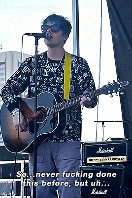
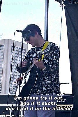


CALL ME, BEEP ME || live debut (Cleveland, Ohio)
#melone.gif#**#waterparks#waterparks band#awsten knight#bandedit#musicedit#userjake#userasterion#parx#usermusic#I was today years old when I found out that the arial rounded mt bold font doesn't support the music emoji apparently rip
69 notes
·
View notes
Text

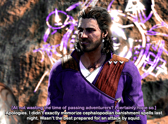
GALE in BALDUR’S GATE 3 (2023) - [14/∞]
#bg3edit#gamingedit#vgedit#dailygaming#userfray#gale#bg3#baldur's gate 3#gale dekarios#gale of waterdeep#gale bg3#bg3 gale#yes i changed the font. i'll just make do again w/o italics i just like arial rounded so much better#mine
207 notes
·
View notes
Text
what did they do to the ui
#me whenever a website changes: stop this madness#ramblings#STOP PUTTING THE BUTTONS IN LITTLE ROUNDED RECTANGLES#stop this madness take me back to arial font tumblr..........
8 notes
·
View notes
Text

These r my two favorite fonts to draft with btw :) abadi and ebrima. abadi comes out looking very bold at small sizes so it's not great for final works but it's soooo gentle and easy for me to work with.
#ebrima i use less but its just bc my work computer doesnt have abadi#and it's the closest match#myaa#and then like. arial and verdana mostly for presentations#ESPECIALLYYYY im always treating myself to arial rounded mt bold <3#just a cute little bubbly font!#simple and professional but still gentle and chunky
2 notes
·
View notes
Text
font detected: Arial Rounded Bold font detected: Century Schoolbook

#2 for 1 deal#arial rounded bold#century schoolbook#theres a chance im wrong on that last one#the origin of this meme is like blatantly antisemitic.#font detected
9K notes
·
View notes
Note
hi!! would you mind doing a tutorial on how you add subtitles to your gifs?
hey, sure! :)
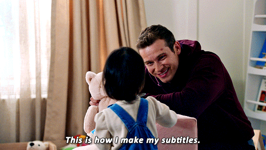
with the text tool selected, i will draw a box that is as wide as the gif and type my text. i created an action that selects all the right settings for me so it's faster and my subtitles always look the same.
arial rounded bold is a very popular choice for subtitles, and it looks awesome, but i' always've been using the font calibri bold italic for years now. here are my usual settings for a 540px wide gif:

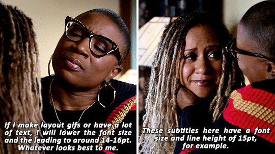
i usually keep the font size and leading value the same, if i change it from 18 pt. and sometimes i'll play around with the anti-aliasing method, whatever looks best for this particular gif. this will help make your text look less crispy or soft, depending on which filtering method you use. the other settings i pretty much always leave like that for subtitles.
as for colors, i always go with white first, and if there's another character talking, i will give their subtitles a different color. i usually try to pick a bright pastel color found in the gif, or even on the character's clothing (just because i like to match things haha).
it's also important to leave a bit of a gap on the sides and bottom, so the text doesn't go all the way to the edges (as shown in the next example). it's definitely harder to read text if it's too close together, or goes from edge to edge. you can push words on another line if it becomes too close to the edge, and you can nudge the text from the bottom with the arrow keys.
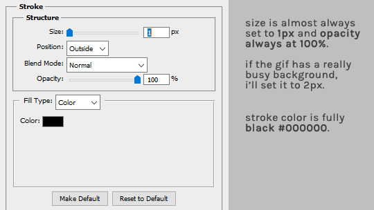
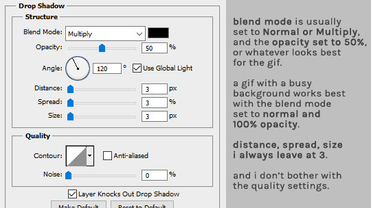
as for the layer style, i'm adding a black stroke and black drop shadow (by double clicking the text layer). the stroke almost never changes, but i'll edit the drop shadow accordingly with the gif. if it's a very busy gif, the drop shadow should be thicker to help with visibility.
and that's it! :D
#alie replies#Anonymous#tutorial#photoshop#resource#*ps help#subtitles#giffing#resourcemarket#completeresources#allresources#usercats#userabs#idk who else to tag
332 notes
·
View notes
Text
I can’t draw to save my life, but I *can* write silly little taglines, so here are some fan-made print ads I made for Dropout.tv!
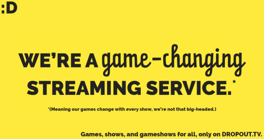
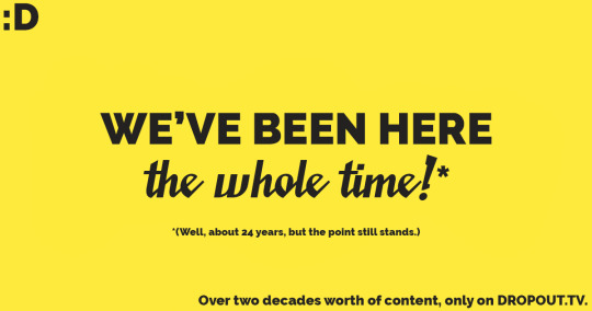


Was this an excuse to make puns out of the different show names? Yes, yes it was. My creative writing degree is being put to good use I swear…
The overall style was inspired by Dropout's logo, and I tried to incorporate each show’s logo text into the ads too just to add some variety to the minimal colour scheme.
Also, here’s video proof that I did in fact drive myself insane making these (in a good way ofc, this was so much fun and I’m so happy with how these came out :))
All the fonts I used are below the read more line if you're interested because I don’t wanna make this post any longer than it already is!
@dropoutdottv @samreich @gamechangershow
Font list! (So others don’t have to go through the same pain I did.)
Dropout.tv font: Raleway Black
Game changer font: Pater Script Pro Regular
Collegehumor font: Saucy Millionaire Regular
Um, Actually font: Jolly Angel Regular
Dirty Laundry font: Arial Rounded MT Bold
#dropout#dropout tv#sam reich#game changer#dirty laundry#um actually#college humor#copywriting#advertising
59 notes
·
View notes
Note
For the gif asks 8, 12, 28?
8. Your favorite gif created by yourself
I really can't pick favorites, so I'm going to cheat and throw in a bunch of them.
Here's some of my favorite regular/non-edit gifs:


And here's some of my favorite edit gifs:
(shoutout to @tumblerislovetumblerislife and @dont-offend-the-bees for writing the lovely words on two of these)


12. Font(s) you like using
For captions, I only ever use Arial Rounded MT Bold, which is built in with Photoshop. I like how it looks, and it's almost become a standard for gifmaking across tumblr.
For edits, I have a lot of fonts that use. Here's some favorites:
Elephant
Ranfgih
Philadelphian Gothic
Annonce (I don't see a free download link, but I don't remember ever purchasing this one, maybe it's just been on my computer or part of Photoshop?)
Linux Libertine
Gentium Book Plus/Gentium Plus (as a former linguistics student, I have this for linguistics and language purposes, but it's also nice for gifs. However, I do have to also mention that this font is made by SIL, who I have very complicated feelings about)
LEMON MILK
Vollkorn
28. Advice for any beginner gifmakers?
I would say experiment lots!
Make the same gif 3 different ways. If you're using photoshop (or lots of other platforms), there's layers that you can turn on and off and delete if you don't like it; nothing is permanent, so try stuff out. Find something you like in someone else's gifs, and try to do it yourself. I often see a cool edit from another fandom and then try to do the same effect for dbd, sometimes it works out, sometimes it doesnt. Basically, figure out what you like (and what you don't). Chances are, if you like something, other people will too!
gifmaker ask game 💛
39 notes
·
View notes
Text
ROUND 1 - GREEN GROUP

Propaganda under the cut.
Anxiety: "anxiety", "it scares me your honor"
Shanti: "like a normal sans serif, but just a lil funky with it. arial's gay cousin"
77 notes
·
View notes
Text


Stupid little edit I made. Plus one to add your own text. The font is Arial Rounded MT Bold
#mlp#equestria girls#applejack#rarity#stupid fucking edit why did I make this#I was compelled to that’s why#my post
8 notes
·
View notes
Text


#who's up doing some friendly yearning?#friends#friend#lesbian#sapphic#gif#foldmorepaper#wordart#xara3dmaker#transparent#word art#lesbian flag#lgbt#lgbtq#lgbtqia#queer#font: arial rounded
98 notes
·
View notes
Text


My version of the Halloween to Christmas season meme.
FIGURES: Nendoroid Halloween Miku, using Onodera Kosaki faceplate. Nendoroid Snow Miku 2014, using Nendoroid More Christmas female outfit.
SUBJECT(S): My version of meme "October 31 vs November 1", where people express how their celebration of Halloween immediately ends, to make room for celebrating Christmas/Xmas as soon as possible. Personally, I refuse to let go of Halloween. I go into Halloween withdrawal on November 1, instead of immediately celebrating Christmas season. (In fact, I think we should at least celebrate Thanksgiving season instead of jumping straight to Christmas.)
PROPS: red yarn. Halloween Miku's jackolantern. Scrapbook paper backdrop. Glitter foam sheet grounding. Artificial autumn leaves. Black artificial flowers. DIY trickortreat bag.
DATE OF PHOTOSHOOT: 11/15/2023
FONT: Arial Rounded MT Bold, size 250, white. Stroke: size 21px, opacity 100%, black.
20 notes
·
View notes
Note
what font do you use for your gifs? thanks in advance !
hi! I use Arial Rounded Mt font, with bold and itallics on. I normally use size 14-16 depending on the Gif size, but for bigger gifs I use size 18.

9 notes
·
View notes
Note
What font do you use for subtitle gifs now? I saw people used to use Myriad Pro for subtitles. But now it looks like people are using a different font for subtitles now.
idk about other gifmakers but i use Arial Rounded MT Bold and these are my standard subtitle settings:

13 notes
·
View notes
Note
https://www.tumblr.com/nataliescatorccio/766234198508961792/the-giver-by-chappell-roan-favourite-lyrics?source=share
what font did you use for the text? i love your gifsets :)
thank you! it's arial rounded MT bold :)
2 notes
·
View notes