#foil quill
Explore tagged Tumblr posts
Text


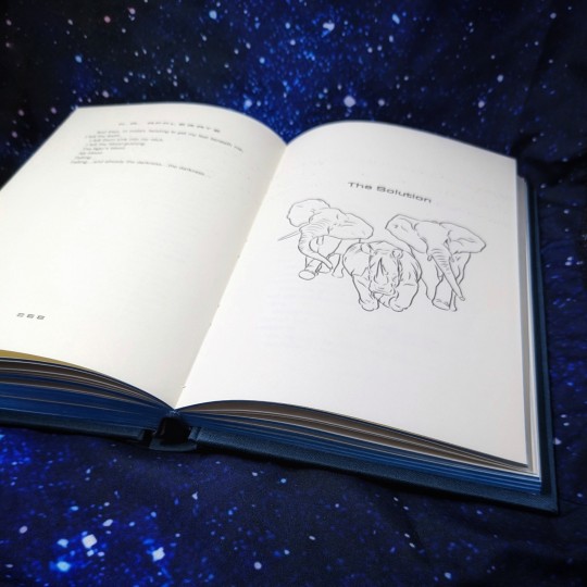
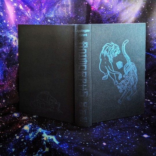
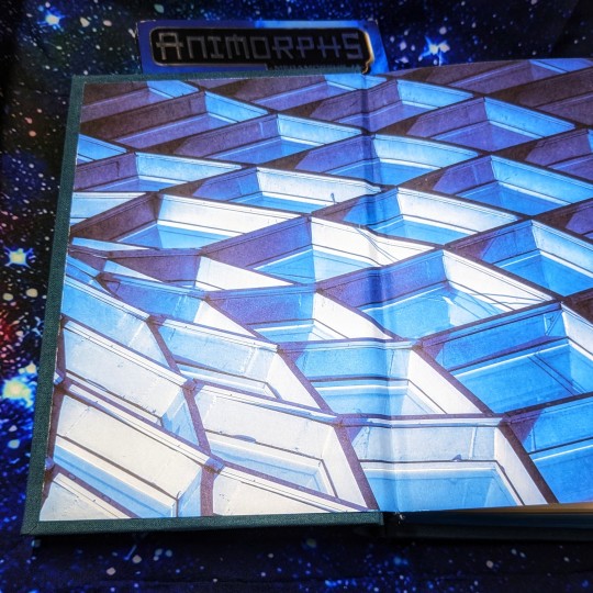
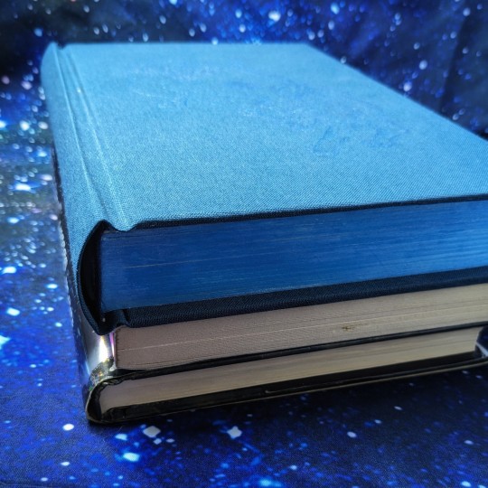
Animorphs #20-22 by @kaaauthor
This is a remake of a book I made almost exactly two years ago. That was the 11th book I ever made and this one is the 50th (!) I asked K.A. Applegate to sign the book while it was still in sheets, so I only had one chance to get it right.
🐅 Animorphs 20-22 was the first serialized arc in the 90s book series.
🐅 The heroes recruit a new kid to their guerilla team and grant him morphing powers, only for his selfish and sociopathic tendencies to jeopardize their fight against the alien invasion.
🐅 Young readers were challenged by this subversion of the "new kid" trope and the moral dilemma that developed. Do they kill a fellow teammate? How else can they neutralize him?
🐅 ALSO: Can these middle schoolers crash the G7 Summit and save Boris Yeltsin, Bill Clinton, and other heads of state from infestation?

Foil Quill on Verona bookcloth, with iridescent calligraphy ink edges. I wanted to give this trilogy the special edition it deserves.
226 notes
·
View notes
Text
I just tested out a foil quill for the first time and it's glorious. (The illegal We R Memory Keepers version for Cricut -- tried the Cricut one first and it's dogshit.) Cannot wait to inflict foiled covers on all of you in the near future.
9 notes
·
View notes
Note
Hello! Your binds are gorgeous! If you don't mind my asking, how do you get the foil to stick to cloth so well? What foil quill do you use?
Thank you for sharing your work!
Why, thank you!
I use the abominably-named We R Memory Keepers foil quill. Mostly the fine-point tip, sometimes the medium-point if I'm doing a really big fill.
So far I've only used it on commercial bookcloth, to varying results. I have a couple cloths of unknown brand to which some foils don't stick particularly well. So I do make sure to test on a small snippet of the fabric before committing to a design.
For best success, I use a piece of printer paper or tracing vellum with my tracing stencil on it. I find that having a piece of paper between foil and quill tip actually yields a more satisfying result anyway. Slow, steady pressure transfers the foil best ime. I do press rather hard with the quill.
Take as many breaks as you need to in order to not hurt yourself! I have chronic pain, so I have to be careful with that.
1 note
·
View note
Note
the godawful hels-mirror of helsknight being a growing force, fighting with vigor and pale hair and freckles to EB's slowly dimming star. a frustrating reminder that hels would continue once EB did not. a fresh face full of poetry and naive notions of honor. desperate to prove himself in the way of children longing to be taken seriously.
and EB watching, now sure of himself and his place in the world, no longer vying for life, helpless to do any more than return the favor as helsknight's hair dulled and his poetic faded into raging impotence. a burning need to prove himself in the way of dying men clawing at the world desperate to leave a mark of their existence.
And the universe said: I feel nothing for you, for you came from nothing
#quilldesignz#rns asks#you understood the assignment quill#For reasons unspecified EB will be featuring more in upcoming chapters#tanguish had his foil with Martyn#it is now Helsknight's turn
51 notes
·
View notes
Text


for my siblings birthday I bound a copy of The Lost and Forgotten by @litcraz
I typeset this fic awhile ago and then printed it at the start of the year to slowly work on over a few months. It was also my first time using a foil quill, which was certainly an adventure and something I’m hoping to get more practice with in my next bind (you can see the spiderweb is a little dodgy in places haha)
In the future, for works of this size I may experiment with larger signatures for less swell. I did 24 for this one but I might try 32 at some point.
Overall I learnt a lot through this bind and I’m so excited to do more. Thinking of trying to make a dust cover to go with it but that depends on my printer behaving (it hates me)
#also thank you to everyone at#renegade bindery#for their help with wrangling word and advise on the foil quill#having a community of fanbinders make this hobby so amazing#my binds#fanbinding#bookbinding#spiderman fanfic#the lost and forgotten#litcraz
32 notes
·
View notes
Text
YES! I have always thought of Holly's color being red! (with variations of pink but that's besides the point. I'm actually really surprised people peg her as yellow, that was never the feeling I got from her). And I love the little note that her being red would make Skull and Holly direct opposites because yes.
I never even considered what Quill's color could be but you make a very good case for purple. He's described as wearing a black turtle neck (I belive) the first time Lockwood and Co. sees him after he steps down from Fittes, but now I can almost see it as a being a kind of midnight purple and I'm not mad.
I recently finished reading all the Lockwood & Co books, and my god they were good, but it got me thinking. If the show continued, like it deserved too, would Holly and Kipps have gotten a signature color the same way the trio did? If so what would they be? Well I was looking at twitter and I saw that most people agree that Holly's color would be yellow, and Kipps' would be white, and I'll be honest I disagree so badly I'm about to write an essay. It's funny because I distinctly remember finishing the books and thinking, "ah watch everyone put their colors as yellow and white cause it's easy". LOUD INCORRECT BUZZER. Y'all just don't get color theory OR the characters the way I do so listen up.
Holly is many things. She's positive, and compassionate, and kind, but she is so much more than that. She's not just a "yellow", yes maybe she is the sunshine of the group, but honestly? Not really, and that's ok. She's fierce and sometimes she has a short temper, she pretends to let everything slide off her shoulder, when really she's just keeping it inside. That's why her and Lucy are constantly budding heads in the beginning of their friendship, they are so similar. I think her color should be red. She's constantly described as wearing it, and I think it really fits her. Red represents passion, energy, confidence, and excitement to name a few. Holly is always described as having a presence, and her energy and enthusiasm comes off her in waves. Red is usually described as the color of love, and I still think that fits. She has such love for the entire crew, and it's so clear she would go to the ends of the earth for them. I also think this would blend in with the others very well. Despite it not actually being blue's real opposite, blue and red are often seen as polar opposites, which really fits for Lucy and Holly's dynamic. It also works because red and orange are both warm colors and George and Holly have always gotten along. They are similar in their methodical and sometimes odd ways of life. I also think it's fun cause Skully's color is green, and green are red are direct color wheel opposites. I'm pretty sure he hates her the most, but Kipps is also competing hard for that title. And lastly black is kinda the color in between, now more on that in a second.
I see what twitter was going for, Lucy and George are blue and orange, direct color wheel opposites, because they are quite literally direct opposites. So it makes sense for Kipps to be white since he's the direct opposite of Lockwood? LOUD INCORRECT BUZZER AGAIN. Tell me y'all didn't understand their dynamic without telling me. Lockwood and Kipps didn't get along cause they were so different, they butted heads so hard because of how similar they are. It's exactly what happened with Lucy and Holly. Plus white represents a lot of things that are definitely not Kipps. My proposed color for him is purple, I know that's a little odd, but walk with me. Although it's never explicitly stated, one can assume that Kipps was an absolute prodigy when he had his talents. I only bring this up, because purple often represents royalty and luxury, and he practically became a fallen king when he lost the only thing he was ever good at it. But purple is much more than that, it also represents bravery, uniqueness. ambition, and justice. I think Kipps' original color is grey, and not just because of the uniform. Grey represents seriousness, sadness, and boredom. That's how Kipps was before, but when he remeets the crew during book 3 and 4, we begin to see the shift. The group helps him gain his ambition back, and with all of their love and support we even begin to see how brave he really is. He has a unique way of going through life, and even when all the odds are stacked against them, he still seeks justice. Purple fits with the general color scheme as well. It's very close to black, which represents how similar him and Lockwood are, and it's also a cooler color like blue. Kipps and Lucy certainly got along the easiest out of the crew.
Overall it just makes sense. George and Holly are the warmer colors, Lucy and Kipps the cooler, and Lockwood as the mediator between them. I feel like red might be a little hard to incorporate without being overpowering, and I know that purple isn't a super masculine color, but hell if those costume designer made full orange outfits look good they can literally do anything. Anyways I know this isn't that important, but ugh I love color theory so much, and I love how much thought the costume designers put in the first time. I feel like having Holly and Kipps color being yellow and white is just a cheap easy shot, and doesn't take into account the characters and their growth enough. I rest my case.
#Thank you thank you thank you for pointing out that as Holly is Lucy's foil Quill is Lockwood's#I love over analyzing characters#save lockwood & co#save lockwood and co#bring back lockwood and co#lockwood and co#anthony lockwood#lucy carlyle#george karim#holly munro#quill kipps#renew lockwood and co
242 notes
·
View notes
Text
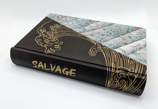
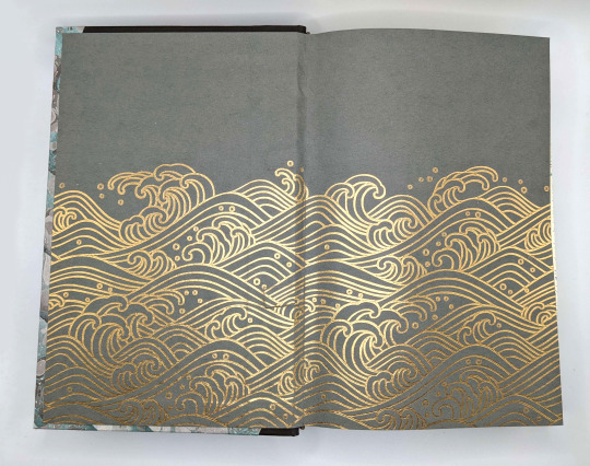
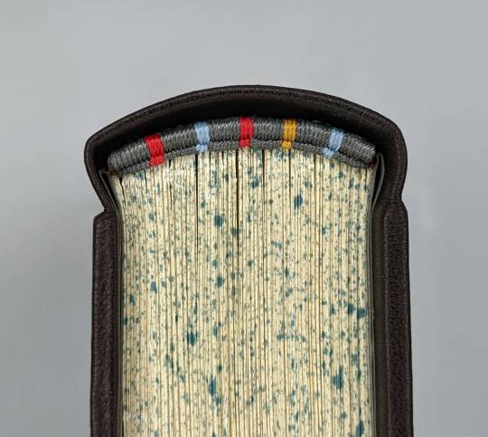
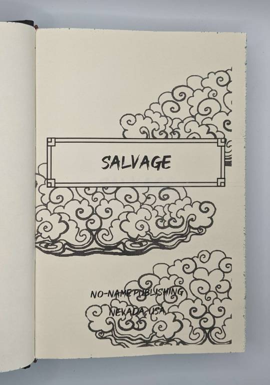
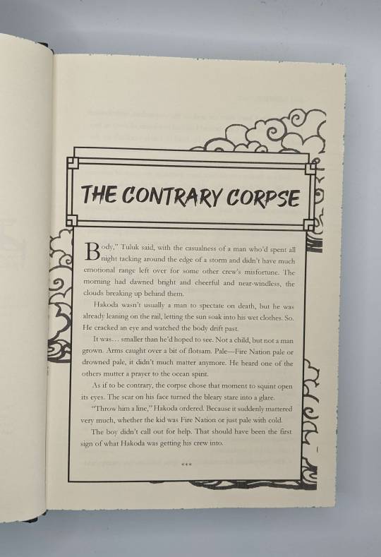

Ficbinding: Salvage by @muffinlance (typeset by @no-name-publishing)
I've recently been getting back into AtLA fic as my kids are watching the series. I was already thinking about binding Salvage when I realized that @no-name-publishing had already typeset it; thank you for letting me use your work!
The marbled paper on the cover is a piece I made myself a few months ago, but unfortunately I only had one letter-sized sheet and couldn't do a standard paper w/leather spine cover. But restriction breeds creativity as the saying goes, so I cut the paper on the diagonal, and built the rest of the cover around that.
I decided that a wave pattern would look cool to fill the remaining space, so I cut a stencil with my Silhouette and painted the design with Angelus leather paint, which I used for the first time here and can't recommend enough for applying titles/designs on leather covers. The endpapers were done with the foil quill attachment; both designs are from this artist.
I have told my eldest that she can read this if she's very careful with it :D
1K notes
·
View notes
Text
A Chabad synagogue in Pomona, New York, burned to the ground on April 17th, along with its three Torah scrolls.
Torah scrolls are hand-written, hand-made, and kept in elaborately decorated cases or wrappings.
Many of them have long histories; my synagogue has two, I think, that were smuggled out of villages being destroyed in pogroms or in Nazi attacks. One of them is the only remaining piece of that village on earth.
Sometimes, the Torah scroll doesn't even belong to the synagogue, but is on loan from a place like the Memorial Scrolls Trust:
There's an entire Jewish holiday just for taking them out and dancing with them: Simchat Torah, "The Joy of Torah."
In fact, that was the holiday on which Hamas's invasion took place.
instagram
So it's a particular tragedy when a Torah is destroyed.
Chabad itself has a page about what goes into making just one Torah scroll:
"An authentic Torah scroll is a mind-boggling masterpiece of labor and skill. Comprising between 62 and 84 sheets of parchment -- cured, tanned, scraped and prepared according to exacting Torah law specifications -- and containing exactly 304,805 letters, the resulting handwritten scroll takes many months to complete.
"An expert pious scribe carefully inks each letter with a feather quill, under the intricate calligraphic guidelines of Ktav Ashurit (Ashurite Script). The sheets of parchment are then sewn together with sinews to form one long scroll. While most Torah scrolls stand around two feet in height and weigh 20-25 pounds, some are huge and quite heavy, while others are doll-sized and lightweight."
I learned all of this on Tumblr.
Once upon time, in people's "punch Nazis" days, I would've been able to find some mention on Tumblr of this synagogue burning.
There is none, so I'm posting about it.
And I'm going to quote Daniel Weiner, Rabbi of Temple de Hirsch Sinai in Bellevue, Washington, when his own synagogue was vandalized last November:
"It’s horrific and heartbreaking.... [Taking out your feelings about] what's going on in the Middle East by defacing a sacred space of a synagogue -- that’s the very definition of antisemitism."
I'm also posting about the Kehillat Shaarei Torah Synagogue in Toronto, whose windows were broken on Friday, April 19th, by someone who also tried to break the front door down.
And the April 15 graffiti outside a Bangor, Maine synagogue that said, "Nazi Israel 30K murdered," next to a crossed-out Star of David. The same synagogue faced pro-Hamas flyers plastered around it in November.
I was going to include all the synagogues vandalized over the past six months. But there are way too many. Several every week. Lots are swastikas.
I'll go back to just doing attacks on and near synagogues.
Someone has to talk about the 1-year-old who was stabbed outside Temple Beth Zion-Beth Israel (BZBI) synagogue, in Philadelphia, on April 13th.
The foiled terrorist attack on a Moscow synagogue on April 11th.
The man who, on April 9th, screamed at the rabbi at Moldova's Great Synagogue, "What are you doing here? How come no one has finished you off for everything you are doing to the Palestinians?" Just one week after people had vandalized a Holocaust memorial in nearby Soroka, and sprayed "Free Palestine" on it.
The Oldenburg, Germany synagogue that was firebombed on April 5th.
The Florida Las Olas Chabad Jewish Center, which on March 16 burned, but not to the ground. The Torah scrolls were safe, and no one was hurt, but the back of the building was severely damaged.
The planned-but-thwarted-on-March-7th ISIS massacre in a Moscow synagogue.
The stabbing of an Orthodox Jew in Switzerland on March 5th. (He was badly injured, but expected to survive.)
A man leaving a synagogue in Paris was beaten on March 3rd.
People set the courtyard of a synagogue in Sfax, Tunisia on fire on February 27th. Firefighters managed to put the fire out before it consumed the inside of the building.
The synagogue is no longer used; there are no Jews left in its area, and fewer than 1,000 Jews left in Tunisia overall.
(Thousands of Tunisian Jews were sent to work camps during the Holocaust. Antisemitism across the Middle East continued to increase rapidly for decades. By the 1970s, 90% of Tunisian Jews had fled to France or Israel.)
On February 18, an Orthodox Jew leaving Synagogue of Inverrary-Chabad in Lauderhill, Florida, was beaten by an attacker yelling racial slurs.
Someone deliberately chose International Holocaust Remembrance Day, January 27, to smash all the windows in the front of Sgoolai Israel Synagogue in downtown Fredericton, New Brunswick.
On December 29, Turkey arrested 32 people linked to ISIS who were planning attacks on synagogues and churches.
On December 17, a man drove a U-Haul truck up onto the sidewalk between a barrier and the front door of the Kesher Israel Congregation in Washington D.C., got out, and started yelling "Gas the Jews." He also sprayed a foul-smelling substance on two people leaving the synagogue.
December 17 also saw 400 synagogues across the United States receive bomb threats.
On December 11, a man attacked an elderly couple on their way into a synagogue in Los Angeles, screaming, "Give me your earrings, Jew!!" and beating one of them bloody with a belt. (Happily, he chased the guy down the street, and caught him when his pants fell down.)
On December 10, a 16-year-old was arrested in Vienna for planning an attack on a synagogue.
On December 8, on the first night of Hanukkah, 15 synagogues in New York State received bomb threats. And someone screamed, "Free Palestine," and fired shots outside of Temple Israel in Albany, NY. Which has a preschool that was in session.
Meanwhile, the five Jews left in Egypt were canceling public Hanukkah candle-lighting at their synagogue out of fear of reprisals. Particularly after two Israelis in Alexandria had been gunned down by terrorists on October 8. (While Israel was still fighting Hamas in Israel.)
On November 15, a terrorist group set the only synagogue in Armenia on fire.
Armenian Secret Army for the Liberation of Armenia (ASALA) has a history of working with the Popular Front for the Liberation of Palestine (PFLP).
(PFLP is part of Hamas's network of groups. Samidoun is their nonprofit arm - which is why Germany banned Samidoun last year, although it's still active in many other countries.
PFLP is also actively supported by the Palestinian Youth Movement (PYM), a diaspora nonprofit group, and Within Our Lifetime (WOL), an SJP spinoff in NYC.)
On November 11, halfway through Shabbat services, police asked Central Shul in Melbourne, Australia to evacuate "as a precaution" due to a "pro-Palestinian" protest that had chosen the neighboring park as its gathering place. Australia has seen some very outspoken antisemitism at protests, including the march shortly after October 7 that chanted "Gas the Jews."
Also on November 11, protesters targeted a synagogue along a march route. They sat in their cars, spraying green smoke and shouting at people leaving the synagogue. The march itself featured a record number of horrifying signs and chants.
On November 7th, Congregation Beth Tikvah in Montreal was firebombed, and the back door of the Jewish organization across the street (Federation CJA) was set on fire.
On November 4, protesters chanted "Bomb Israel," and burned an Israeli flag outside the only synagogue in Malmo, Sweden.
During October, there were 501 antisemitic acts under investigation in France in just three weeks, including groups gathering in front of synagogues shouting threats, and graffiti such as the words “killing Jews is a duty” sprayed outside a stadium.
On October 18, people firebombed a synagogue in Berlin after homes all over the neighborhood were graffitied with stars of David.
And also on October 18, hundreds of "pro-Palestine" rioters attacked the Or Zaruah Synagogue, in the Spanish enclave of Melilla in North Africa, while worshippers were inside.
Based on the video, they seem to have blocked the synagogue entrance completely, while screaming "Murderous Israel" and waving Palestinian flags. (Melilla is an autonomous zone belonging to Spain. It borders Morocco.)
On October 17, during pro-Palestinian protests, hundreds of rioters set fire to Al Hammah synagogue, an abandoned house of prayer in central Tunisia. They hammered down the building’s walls and raised a Palestinian flag on the building. Police did not intervene.
The Facebook page "Tunigate", which has around 88 thousand followers, published a video of the assault. So did "Radio Bousalem”, with 83 thousand users. The vast majority of comments on these videos welcome these acts. The building was severely damaged and almost completely razed to the ground.
On October 15, bomb threats were sent to many East Coast synagogues. Attleboro synagogue Congregation Agudas-Achim received one of the emails, which read, "The bombs will blow up in a few hours. A lot of people will die. You all deserve to die."
On October 8 -- again, while Hamas was still in Israel -- Madrid’s main synagogue was defaced with graffiti that read “Free Palestine” next to a crossed-out Star of David.
And on October 7, an assailant in Rockland, NY fired a BB gun at two women entering a synagogue. Later in the month, a banner at the Stephen Wise Free Synagogue in the area was vandalized with the words, “Fuckin kikes."
#if you have used “Free Palestine” as if it's a sort of verbal assault you can shout in comments or scribble over flyers#if you are unwilling to hear what the Jewish term Zionism means to the people who use it#if you cannot name one Palestinian human rights activist#and most of all if you don't know how Hamas abuses Palestinians and you still think it's The Resistance#then you. are. the. problem.#if you don't know people in gaza have been protesting Hamas and blaming it for deliberately instigating a war they don't want#if you don't know how often they've spoken out about Hamas stealing aid and selling it to them#and especially if you don't want to believe me much less find Palestinians in Gaza to listen to#also if you didn't know about any of the stuff in this post BUT you have taken it upon yourself to tell Jews that “it's not antisemitism”#like seriously everyone deal with your learned distrust of Jews challenge#wall of words#fire tw#guns tw#violence tw#Instagram
782 notes
·
View notes
Text
Salvage by MuffinLance
I completed this baby back in October early November it was painfully fun, lol. Shoutout to @no-name-publishing for sharing their typeset with me!


Below the line, there is more information and photos on this bind!
The foiling took about 8-9 hours or so. There was a lot of trial and error, and I ruined about 3 books worth of bookcloth. I ran through all my heat reactive silver foil (neverforget✊️)before I was able to compelte it. I used foil I got from a bindery that is closing down, I used my new cameo, and the memory keepers heat foil quills.
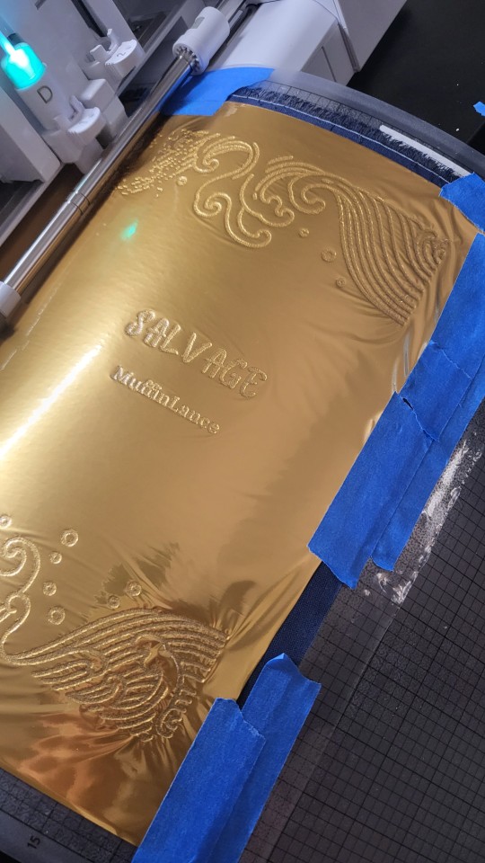
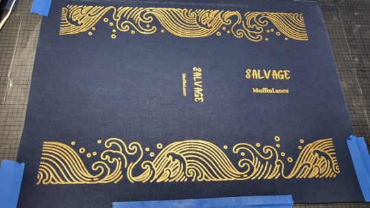
I was originally going to use The Great Wave off Kanagawa as my cover art, but my friends talked me out of it, and I'm glad since, had I not listened, it may have taken longer. The sound of the cameo working will haunt my nightmares. My spouse was dreading their life choices. "Why did I buy her the machine from hell?" Cause you love me, my sweet honeybooboo, that's why.
I used 28lb paper for this puppy, my printer was such a good boy and printed it out without a single issue (bless you babe I will thank you first when I get a trophy one of these days) but after I folded it it was like 3 inches wide and I got so scared for my life.

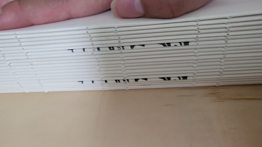

I used remie band and linen thread (only the best for you, my precious), I made headbands with the bookcloth and l2mm leather core, and I used glue and kozo paper to strengthen the rounded spine.
Rounding and backing almost made me cry, but I had DAS there with me. Also, shoutout to my friend's cousin for the backing and routing boards and Jim with ABE for the wonderful laying press.
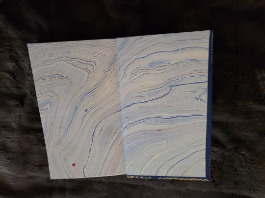
The endpapers are from De Milo Design. They are handmade, and I got them at a local faire. They are beautiful!
The bookcloth is from BookcraftSupplyCo in CA!
If you would like to learn more about bookbinding, consider joining @renegadepublishing

#bookbinding#handmade#renegadepub#atla zuko#atla#avatar the last airbender#fanfic#fanbinding#zuko#prince zuko#salvage#muffinlance#salvage by MuffinLance#ao3 fanfic
970 notes
·
View notes
Text
Another year, another Fanfiction Writers Appreciation Day!!!! If you are a writer of fanfic, please know just how appreciated you are!! Fandom would be such a different space without your creativity and labors of love. 💜
Holidays are all about making traditions, and the bookbinding friends with @renegadeguild once again came together to bind copies of fics for their authors as a show of our appreciation. This year I had the absolute joy of binding Emergency Help Wanted by the wonderful @piyo-13 and even got to collaborate with her on some of the design elements! It's a Modern AU Jiang Cheng/Lan Xichen fic that starts with a "help wanted" ad.
EMERGENCY HELP WANTED
I lied when I got my job. I told them I had a kid so I could leave early from work to pick him up from daycare, take him to doctor's appointments, and occasionally miss a day when he's sick. Long story short, I'm in too deep. I didn't think it through. Looking to rent a kid for bring your child to work day. Must be a boy ages four to six, longish dark hair, likes soccer. Must also be artistic as the macaroni noodle paintings I made seem a little advanced for his age. Also, I will pay extra for someone willing to play the role of husband when dropping him off. He's a prosecuting attorney who often brings his work home. Message me for further details. Serious inquiries only.
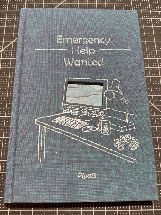
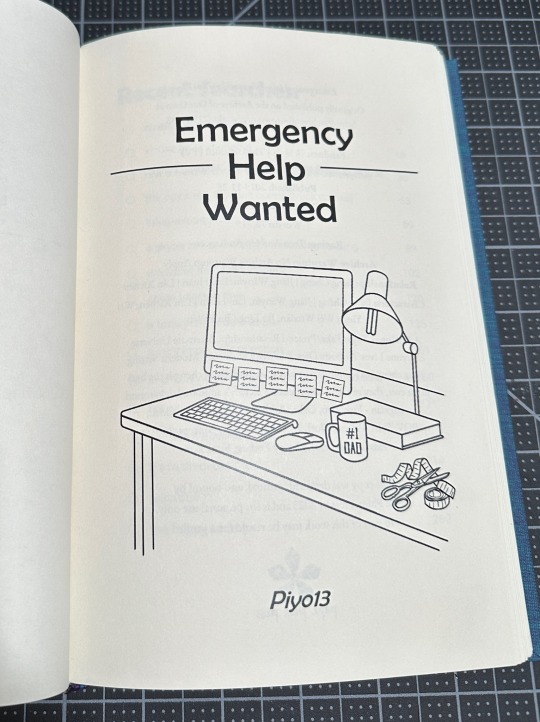
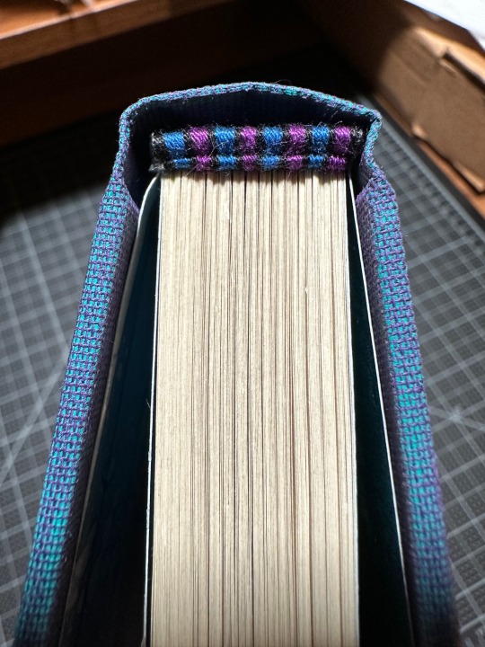
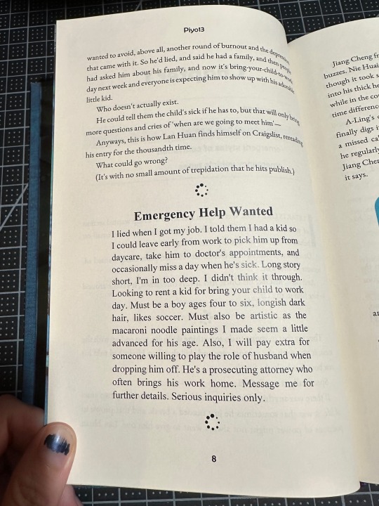
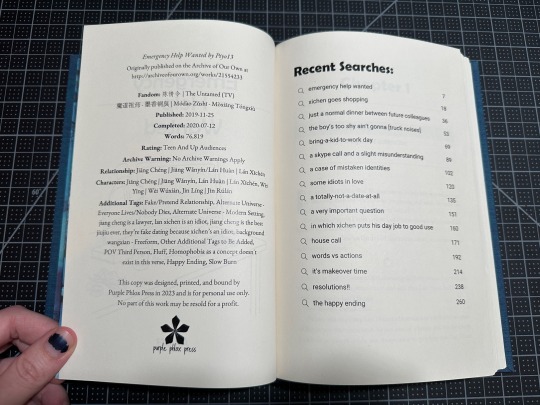
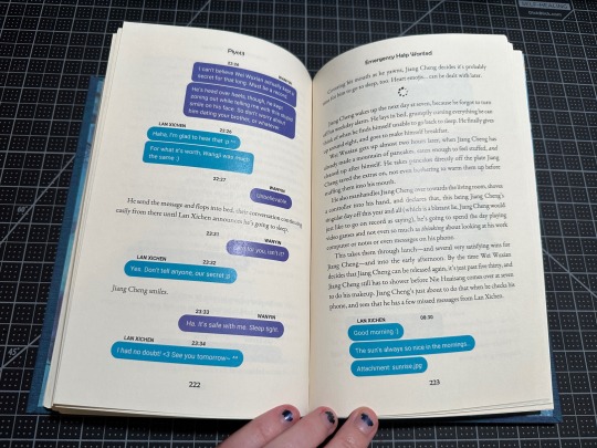
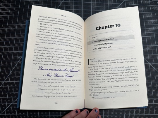
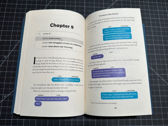
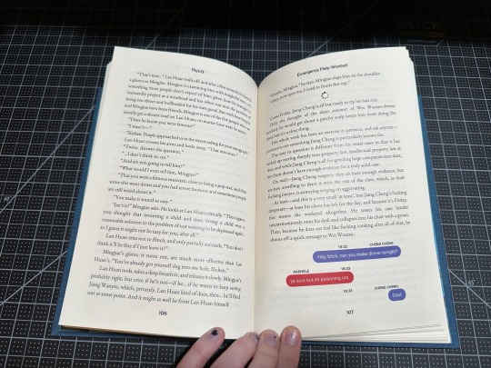
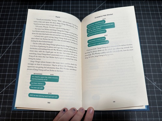
Ok. So. I may have gone a little feral with this one. Online "help wanted" ad spiraled into loading wheel scene dividers, spiraled into fake Google search result headers, spiraled into FULLY committing to those authentic looking text messages. In full color. (There are so many. I typeset in MS Word. It was SO worth it, but god what a struggle at some points.) And don't forget the "recent searches" title page! Or the computer cutout on the cover! (It's bluescreening, just like Lan Xichen through this entire fic!) Also that cover/title page image that I just kept adding details to. (It's supposed to be Lan Xichen's desk, so it simply didn't feel right until it had sticky notes on the computer, #1 dad on the mug, scissors and measuring tape, scribbles on the sticky notes) Did I have a ton of fun designing this one? Perhaps. Couldn't say. Maybe just a tad. (This is a lie I had an ABSOLUTE BLAST!)
Historically, I've waited until I finish at least the typeset before reaching out to the author, but not so with this one! I got the idea for the fake google search results from Piyo's authors notes, teasing the contents of the next chapter. But! Those didn't start until about chapter 4! So I reached out and asked if we could collaborate and I'm forever glad I did! Not only does this have teasers for each chapter, I also got to bounce design ideas off of her, including what shade of blue and purple for the text messages. Because my friends, that is a serious matter and changed SEVERAL times throughout the process.
Also shoutout to all my Renegade friends who gave input and encouragement over the past year while I worked on this (what endpages to use? how to make this shade of green perfectly Nie Huaisang? how do we feel about this text message design? or how about this one?) - I love you all dearly and appreciate you so much for putting up with my nonsense at all times.
Binding details below the cut!
Fandom: The Untamed/Mo Dao Zu Shi
Pairing: Jiang Cheng | Jiang Wanyin / Lan Huan | Lan Xichen
Bookcloth: Aqua/Purple Dubletta from Colophon Book Arts
Endpapers: Craft Consortium Ink Drops - Ocean pack
Textblock paper: short grain cream from Church Paper
Titling: We R Memory Keepers foil quill
Endbands: leather cording core, DMC embroidery floss for the bands
Body Font: EB Garamond
Title Font: Berlin Sans FB
Text Messages: Roboto
Additional fonts: Times New Roman, Kunstler Script, Magis Authentic
Title page image from Rawpixel and designed in Canva
Various computer graphics from The Noun Project
Tumblr insists on eating and doubling text in this section at its own whim, so if there's something missing that you're curious about, feel free to DM me an ask!
#purplephloxpress#adventures in bookbinding#renegadelovesfic24#ficbinding#fanbinding#bookbinding#renegade bindery#ffwad#the untamed#mdzs#xicheng#jiang cheng#lan xichen#emergency help wanted#piyo13#fanfiction writers appreciation day#did I stay up until midnight just to post this as soon as possible? yes I did. yes I am aware there is a queue button.
293 notes
·
View notes
Text


Bound: All Our Gifts at Once, or, the Young Sea-Man by @tiltedsyllogism
This was a bind for one of my Fandom Trumps Hate auctions. It's a wonderful Sherlock fic/Little Mermaid AU. It's really quite beautiful and moody and atmospheric.
It's set in Victorian England, so I went pretty old-fashioned with my design, and I'm quite pleased with how it turned out. Each chapter opening page has a map of the area in the chapter title. I love the subtle "mermaid scale" detail of the end papers too.
I’m kind of obsessed with the fonts. For the body, I wanted something a bit old-fashioned. I have no idea if the one I chose, Schoolbook, is era-appropriate, but it just feels right. And I have used the cover/chapter title font, Roman Antique, on another bind, and I just really love it, particularly in italic. It has these wonderful alternate glyphs for many of the letters, and it lends itself to making a simple but beautiful design.
I don't often include the author notes in a bind, but these added so much to the story that I opted to leave them in.
More details:
Bookcloth is (I believe) Verona in Blueberry (bought from Hollander's)
Endbands are made from the bookcloth, I drew gold lines on it with my foil quill for funsies
Maps came from Etsy
The charm on the ribbon is a shell
The endpapers are from Joann's
Thanks again to @tiltedsyllogism for bidding on my auction!
188 notes
·
View notes
Text


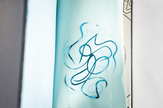
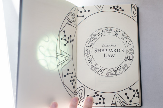

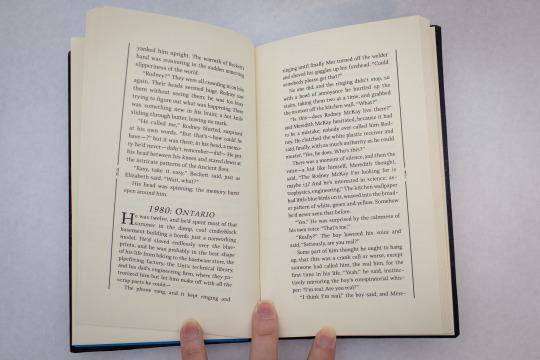
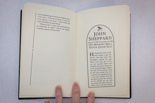
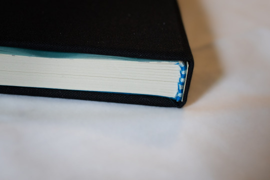
Sheppard's Law, by @cesperanza
Version 3 of the fic I bound for the Renegade Bindery gift exchange! (you can see speranza and @gempothospress's versions here)
I had a lot of fun typesetting this--I took the epitaph motif from the section titles and ran with it. I have never seen any form of Stargate, so thanks to cesperanza and @annerbhp for consulting. Other things I hadn't done before making these three books: cover cutouts, or foil.
"I don't know much about Stargate," said I, "so I'll just put a Stargate on the cover. Should be pretty straightforward." I then proceeded to learn that foil quills were not my friend, that the cricut foil head was finicky as hell (it works beautifully on bookcloth-- but not on leather or buckram,) and in the case of this particular edition, remember too late that unlike leather and buckram, you cannot wipe glue off bookcloth with water. I think I might start taping wax paper over my covers when I'm casing in so that I stop having this problem.
That being said, both the foil and the cutouts were kind of addicting. So I might end up sneaking them into more books where they may or may not belong.
#fanbinding#ficbinding#bookbinding#sheppard's law#stargate atlantis#sga#speranza#mcshep#handbinding#op#fic printing#eratta
481 notes
·
View notes
Text


A Bright Ray of Darkness by Ethan Hawke is definitely one of my favorite books this year and one of my all time favorite audiobooks.
It took me a while to decide on a design for the rebind though. I think I made 8 designs in total until I finally settled on this one. I wanted to incorporate the burnt match, as well as the smoke from the original cover but filling the empty space around that alone proved difficult.
To fill that empty space, I added the title and finally, as I was trying to figure out a design for the back cover and watching this production of Henry IV on YouTube, another idea came to me.
A central plot point is a production of Shakespeare’s Henry IV, so I designed a little playbill for the back. And to tie both the front and the back design together I put some of Hotspur’s (our protagonist’s role in the play) dialogue on some scrap book cloth with a hot foil quill and added a "burnt edge" in gold vinyl.


I’m totally in love with it, not just because I love shiny things.
#book binding#bookbinding#bookshelf#book#bookblr#books and reading#bookworm#book review#books#reading#short reads#audiobooks#rebinding#literature#shakespeare#cricut#diy#diy ideas#diy projects#diy craft#crafts#fall aesthetic#fall vibes
96 notes
·
View notes
Text
thinking about what makes a man holding a beer sexy…


this is just a silly drabble, i thought of logan and joel while writing so choose your own adventure ;) reader is referred to as bub/darlin’ and girl 💕
the firelight flickers in his eyes, illuminating their depth, as it does on the droplets of condensation rolling down the foiled label. his hand molds to the glass curves, his thumb rubbing up and down the slope of the bottleneck in subconscious cycles. the condensation leaves his fingertips cool and wet, doing little to extinguish the molten desire surging through his veins as his eyes land on you.
maybe it’s the way his lips form around the top when he takes an unapologetic sip, his tongue caressing the underside of the rim as he tips it back. fuck that bottle, you think, that should be me. or maybe it’s the way his eyes look over the bottle, downcast in a tunnel toward you.
maybe it’s the way his throat works as he drinks the sweet liquid down, that masculine bulge in the center of his throat bobbing with each swallow. it’s an even better sight when he hasn’t shaved in a while and his beard has gone all prickly, the stubble splaying like quills whose poison only you are immune to as his skin stretches.
maybe it’s the way when he catches you staring mid-drink and the skin around his eyes tightens with a knowing smirk, his eyes glistening with a light buzz underneath his thick lashes. maybe it’s the way the corner of his lip quirks up around the mouth of the bottle, a soft sound of amusement breathed out through his nose.
or maybe it’s the way his tongue darts out to lick the taste from his upper lip, grazing the tip of his mustache that you yearn to feel the bristle of between your thighs…
“ya see somethin’ you like, bub/darlin’?” he mutters in a gravelly, deep voice. he takes delight in the flustered way you squirm and press your thighs together. he can practically feel the innocent heat of desire radiating off of you. “c’mere,” he rasps, jutting his chin toward you, spreading his thighs and resting his arm on the back of the seat.
you take a seat in the empty space between his thighs daintily, but he leans forward and wraps his arms around you so that your back presses against his chest. maybe it’s the way he holds the bottle like a possession and he holds you with the same ownership. something he wants, something of his.
he hooks his chin over your shoulder and noses the tender spot right before your ear, the warmth of his soft, contented sigh tickling your peach fuzz. you can smell the malted yeast on his breath, and while sometimes you can’t stand it and the stickiness it conjures, in this moment it’s equally intoxicating to you on his tongue as it is to him in his bloodstream.
“good girl. my girl,” he whispers possessively.
join my taglist! | main masterlist
#joel miller#logan howlett#joel miller x reader#logan howlett x reader#joel miller x f!reader#logan howlett x f!reader#wolverine x f!reader#wolverine fanfic#joel miller fanfic#wolverine x you#joel miller x you#logan howlett x you#pedro pascal#hugh jackman
100 notes
·
View notes
Text


A much belated post:
I bound A Measurement of Wands by oliversnape for MedRen in the Renegade PNW server's fic binding exchange earlier this year. This book is my first legal quarto size and features my first sewn endbands. Bookcloth is from the Kater Crafts auction last winter, with foil quill decorations. I had fun pulling this one together.
A Measurement of Wands is free to read on Ao3.
#bookbinding#ficbinding#renegade bindery#renegade bookbinding guild#my binds#snarry#feral stitch press#fanbinding
93 notes
·
View notes
Text

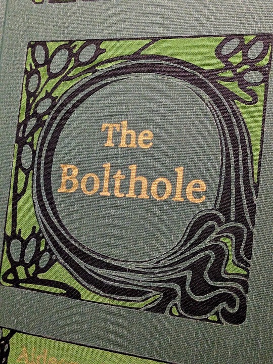
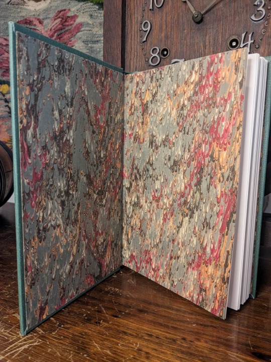
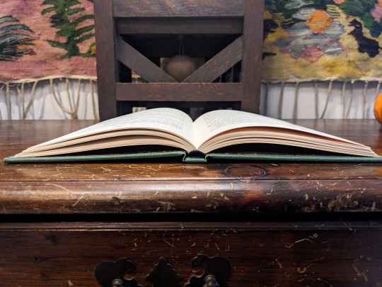
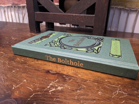
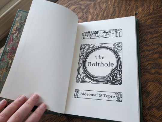
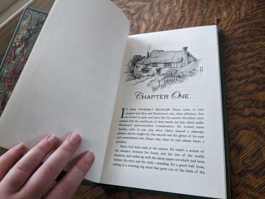
The Bolthole by aideomai, Tepre, and GallaPlacidia
I'm absolutely thrilled to finally share my first fic bind here on Tumblr! I completed this bind back in November, and it introduced me to so many wonderful people.
You can find pictures and detailed explanations of my process under the cut.
This is "The Bolthole" by Aideomai, Tepre, and (formerly) GallaPlacidia on Ao3. The cover design is adapted from "The Little Brother" (1902) by Josiah Flynt. The typeset is my own.

I fell in love with this cover the moment I saw it, and wanted to try to recreate it with book cloth. As a hobbyist book binder, I like to try to revitalize older designs from the public domain. There are so few copies of this book left in the world, so I thought it would be fun to give it new life as the cover of a contemporary story.
The cover is made out of three different colors of book cloth from the Allure and Verona lines. The book cloth and endpapers were bought from Hollander's.
I used my Cameo 4 and a strong tack mat to cut the design out of each color of book cloth. I then assembled the pattern like a puzzle. It was MUCH harder than it sounds! Some of the pieces were incredibly thin and fragile, and they were difficult to keep track of.


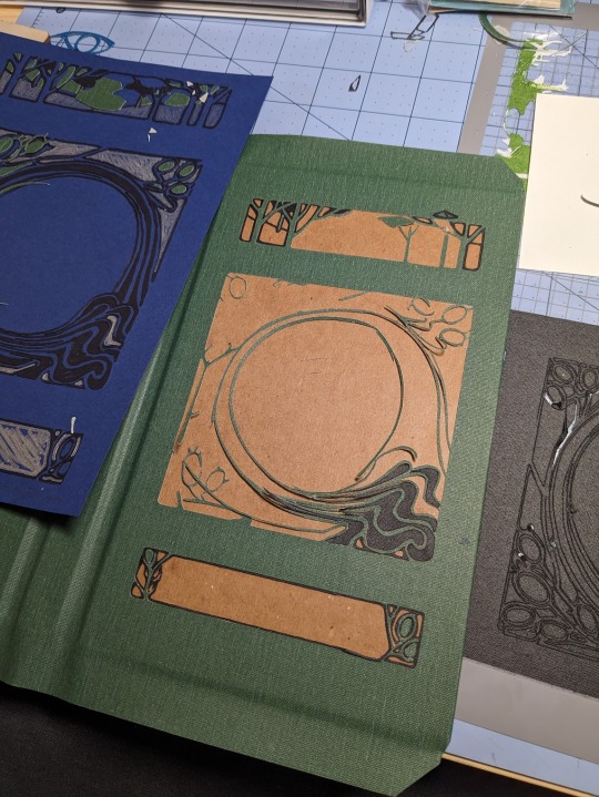

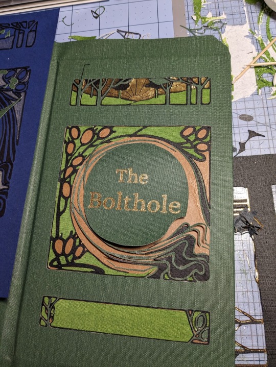
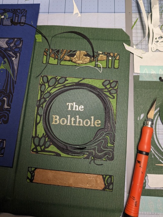
For the foiling, I used my Cameo 4 and the We R Memory Keepers fine tip foil quill for everything but the spine, which I did by hand. I foiled immediately after I cut, without removing my mat from the machine. This helped me line everything up. It did not, however, prevent me from sweating bullets as my machine worked.


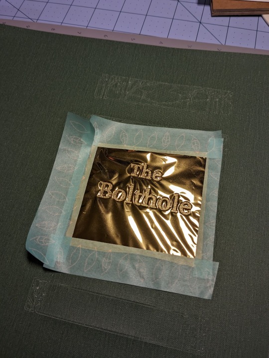
This method was, frankly, torture, but I'm really glad that I tried it. Now that I've had a nice long break, I'd like to try it again soon. I love running my hands over this book, and the texture of the book cloth feels wonderful under my fingertips. I do, however, have a few words of caution. Do not try this out unless you have book cloth to burn! Here are some pictures of just a few of my failures.

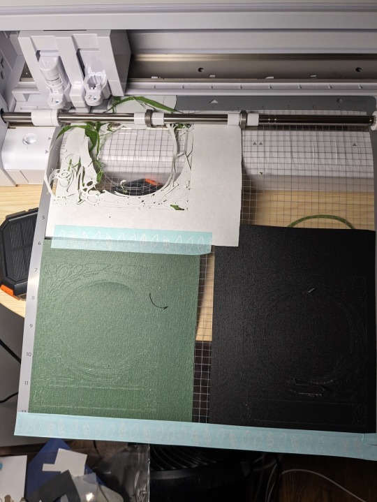

The Cameo 4 is not your friend. Your cut-outs can and will get fucked up for no reason. If the mat isn't sticky enough, or the blade isn't sharp enough, or the fabric doesn't adhere properly, your design could get completely shredded. I strongly recommend that you avoid Verona book cloth, or anything with a paper backing and loose fibers. It was absolute hell to work with. When it wasn't shredded by the machine, it was fraying like crazy. Acrylic coated cloth is the way to go if you want clean lines. And, you know, your sanity intact.
This was my most challenging bind to date, but I learned a lot! Aside from experimenting with book cloth, automated foiling, and my Cameo 4, it was also my first time formatting, printing, and sewing a text block. I'm incredibly grateful for all of the online tutorials and wonderful people who helped me make this bind a reality!
#book binding#ficbinding#fanbinding#fanfic binding#drarry#the bolthole#harry x draco#my binds#haxkattpress
318 notes
·
View notes