#first time trying a full gradient lmao
Explore tagged Tumblr posts
Text
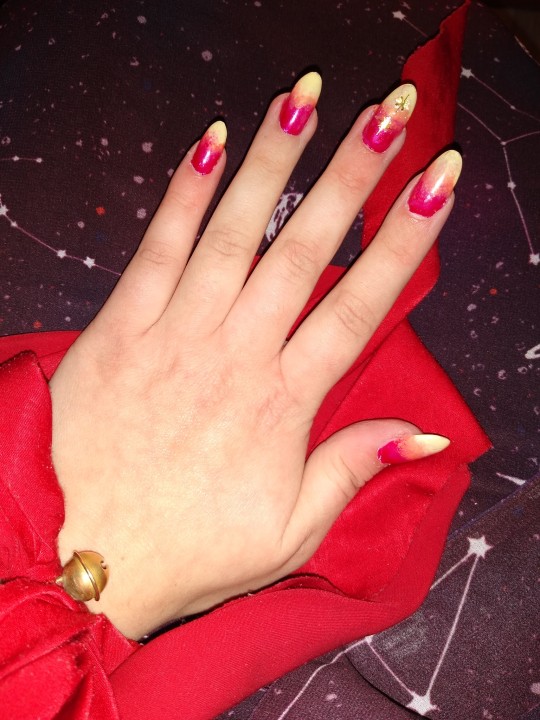

Woe blorbo colored nails be upon you
#post let luce#hi i actually really like the colors#first time trying a full gradient lmao#room for improvement but the kitchen sponge did well <3#bonus: my staple accessories <3#bunny eared scrunchie i sewed a lindt bell on#and my very worn sky disc of nebra ring#i really am just like this#i am so not a nail artist I just like experimenting so these arent like. super elaborate or anything#just. I Know. and that's enough <3#and well now you know too
24 notes
·
View notes
Text
beloveds @khaotunq, @pranink & @alexshenry tagged me to do:
every month of 2023! list your favorite/most popular gifset for each month.
i started making gifs in march this year, so january/february are off the table for this. it's funny that it hasn't even been a full year yet. it seems both somehow a lot longer and also like i remain some kind of photoshop baby at the same time. the images in this post will remain undescribed until i have some energy in my failing body, unfortunately
in any case:
march: midnight museum invades all 2 of my braincells. i download photoshop. the end is nigh
most popular: msp/eclipse pool parallel set
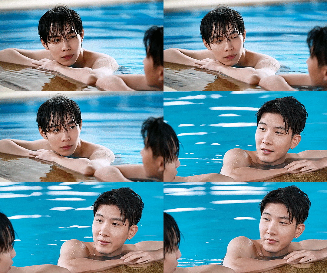
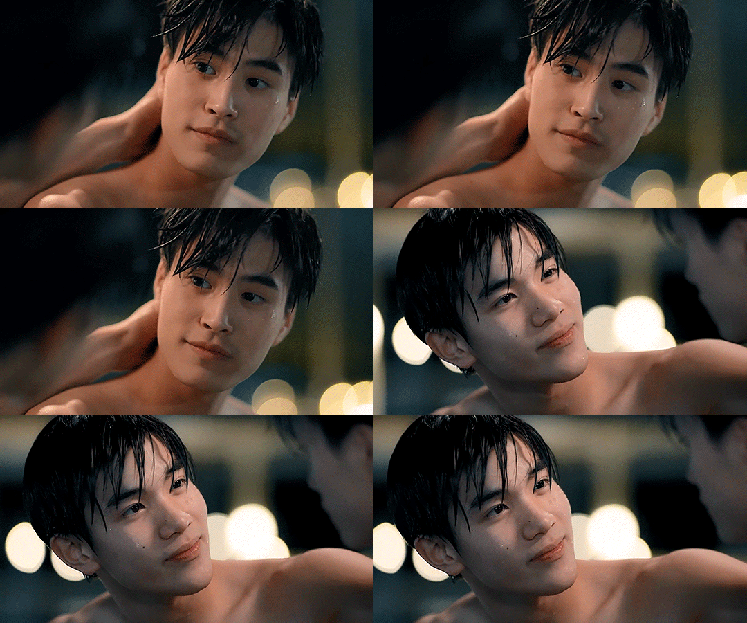
favorite: the bams i made for sof
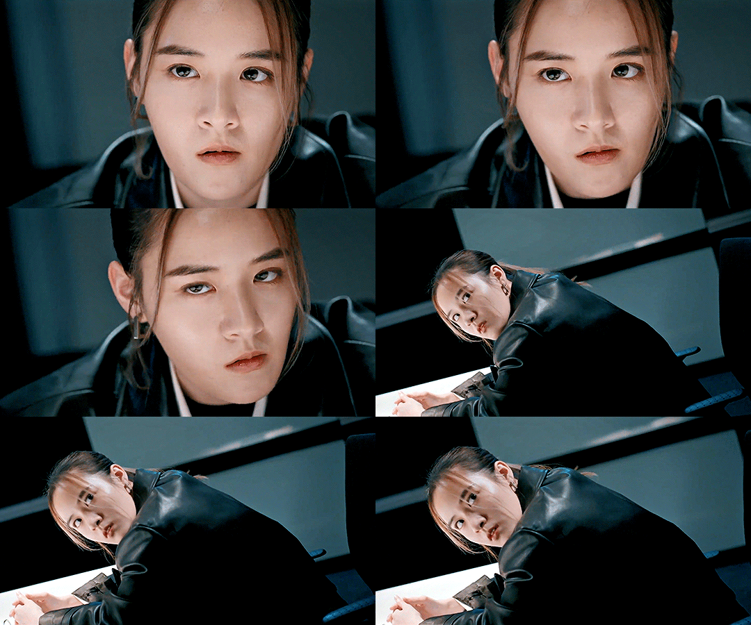
(notes: it's hard to look back at these lmao. what is coloring and why don't i know her. why is everything so dark. who told me to use noise dithering and why did i ever think that was a good idea. anyway)
april: the eighth sense is airing! i meet many mutuals and friends. i figure out about the curves tool (thank god)
most popular: taehyung getting dunked on
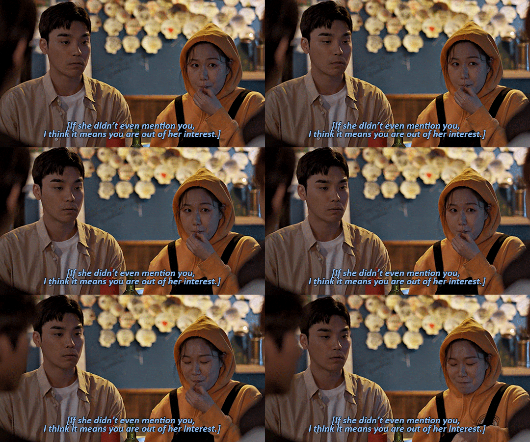
(very deserved dunk; very bad set. the coloring of this scene was extremely questionable and i did nothing to fix it it looks so dull and gray. augh)
favorite: feet lining up / jihyun & jaewon on the beach

i really like this coloring actually. it's bright enough to actually see them, their skin doesn't look as weird, and i like the soft pink i made the beach. a win for baby photoshop user rowan
may: the purple is in full swing now
most popular: purple yok

first set to cross 1k! the purple is still very good but in hindsight there are things i now know i couldve done to help his skin. in any case. a banger. beloved
favorite: pink our skyy 2 hands set
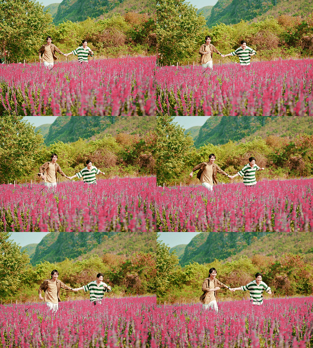
[through tears] you're my space. also my first try at typography
june: i lose the will to gif some in the back half of this month, but i also learn to do a Lot of new things, like gradient maps & more complicated typography and transitions and such
most popular: puzzle piece hugs!
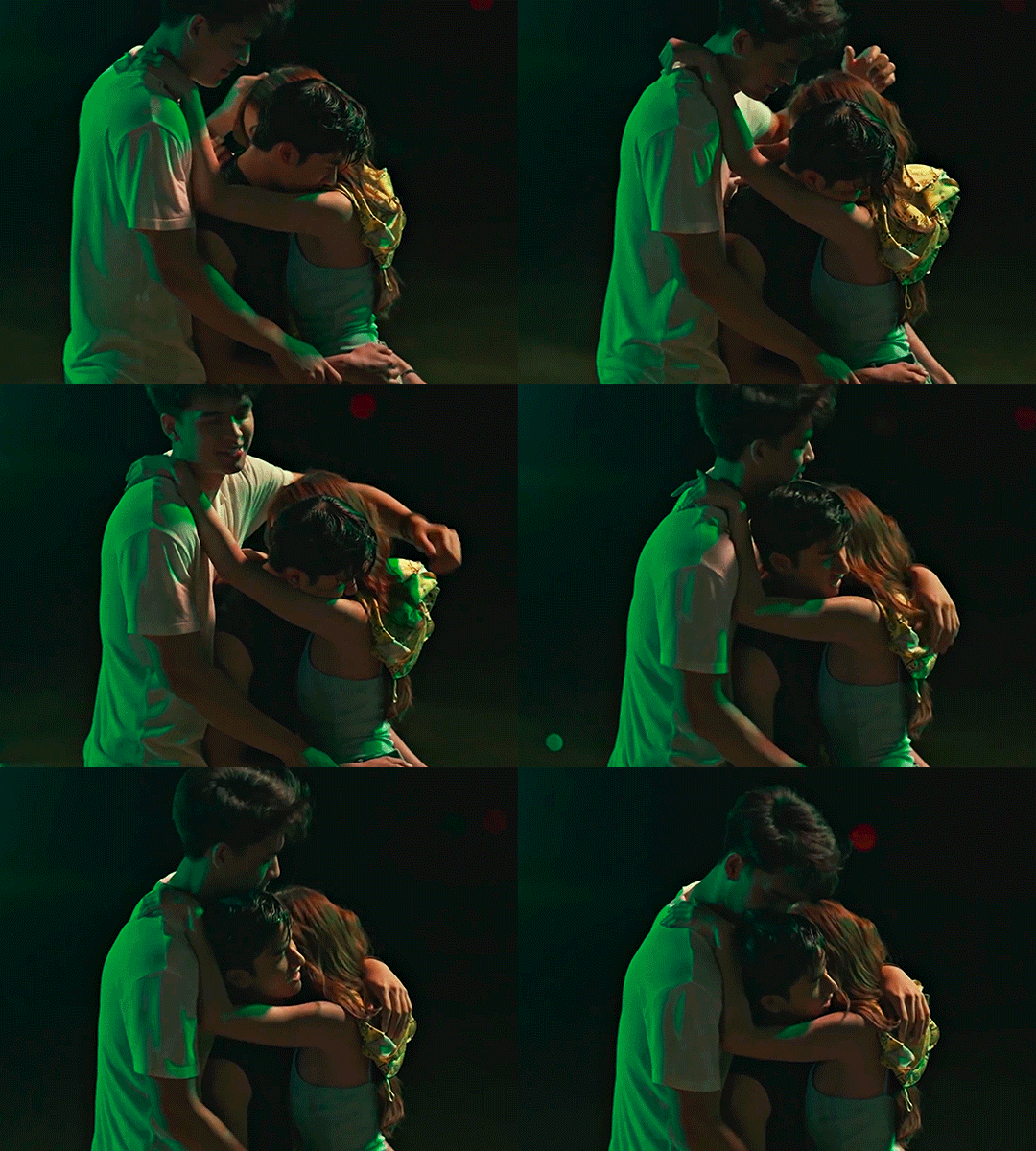
deserved! hard to gif and fun to look at
favorite: i think it might be the heartliming i made for vi now! but i still like khathadome from eden too.
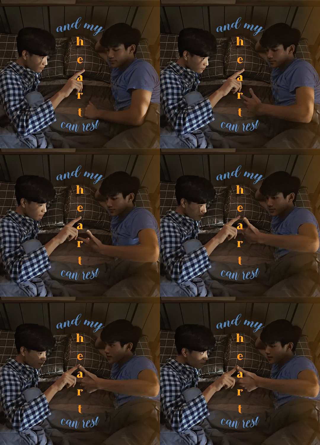
july: i try giffing a few different shows. the only friends trailer comes out on the last day and i enter some kind of terrifying fugue state
most popular: sand and ray fighting / crying in the ofts trailer
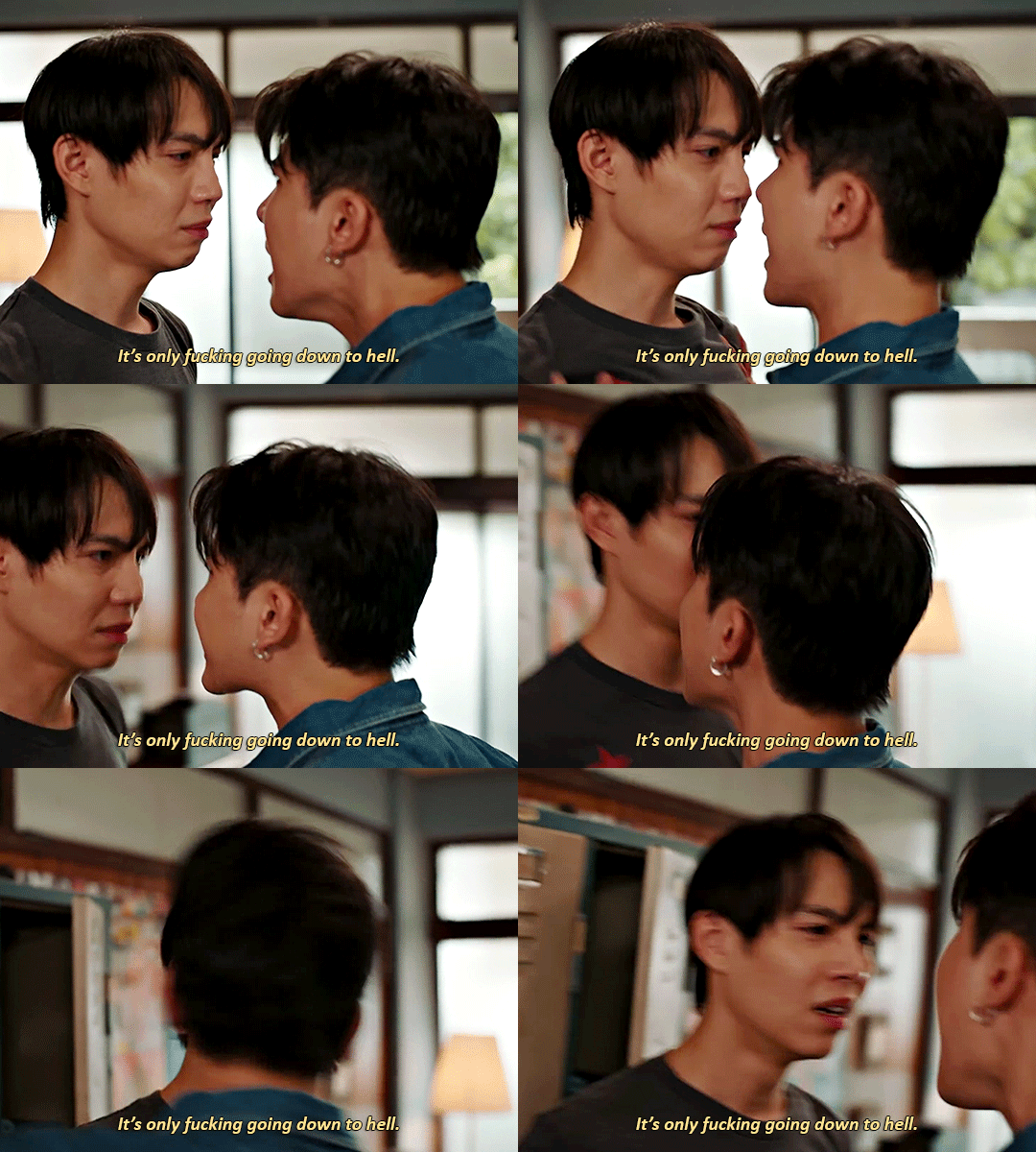
do you guys remember the trailer 1080p? life was so good
favorite: nobody appreciates my ride enough
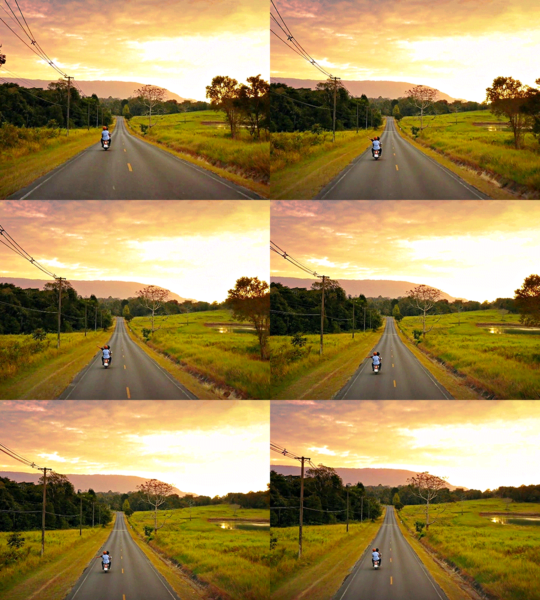
august: only friends airs, eclipse anniversary is concurrent, i lose my mind. i also learn to use the method of brightening that i still use & several other fundamental gif tricks
most popular: sandray car makeout

good for them! i start using significant grain on my ofts gifs from here on out and can never decide how i feel about that
favorite: orange/blue eclipse episode seven set

september: the madness continues
most popular: sand cooking for ray / special
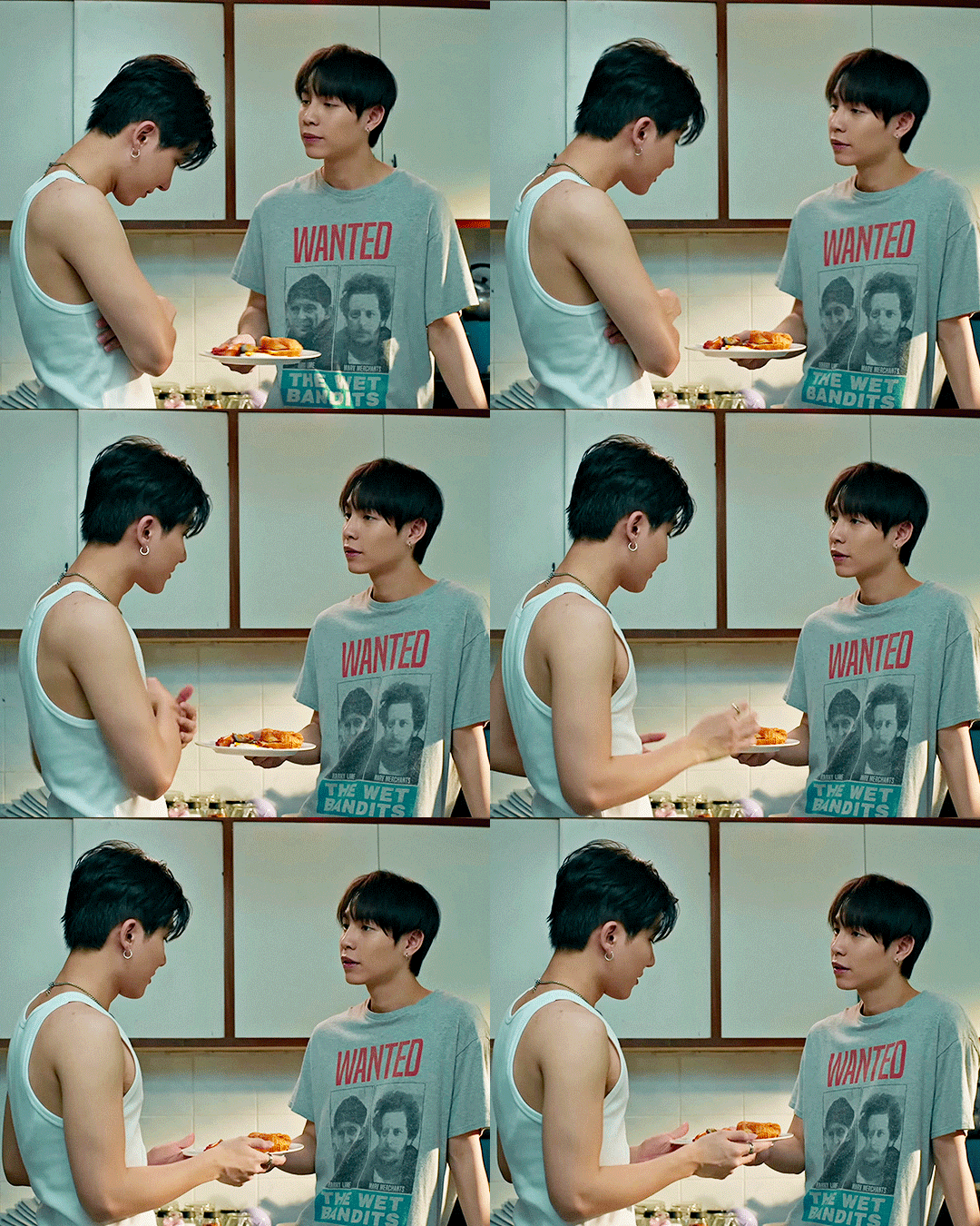
ive giffed this scene three times and this is my least favorite coloring but what can you do. this is my third post to cross 1k
favorite: new rules set! i had mixed feelings when i posted it but it's really grown on me.
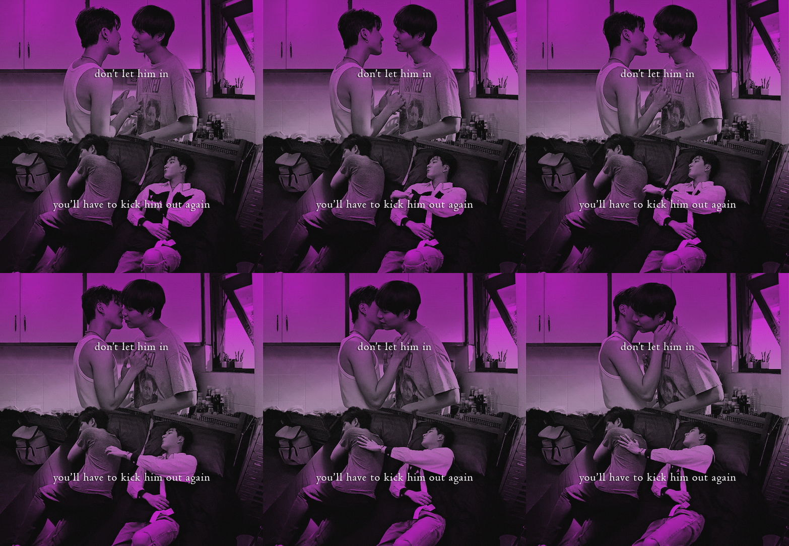
october: the madness is so much worse. only friends ends and i am left near-catatonic immediately, apparently. also, i learn to blend and use overlays and some other cool things. i join userdramas :'>
most popular: raysand afterglow. as it should be. cheek kissie
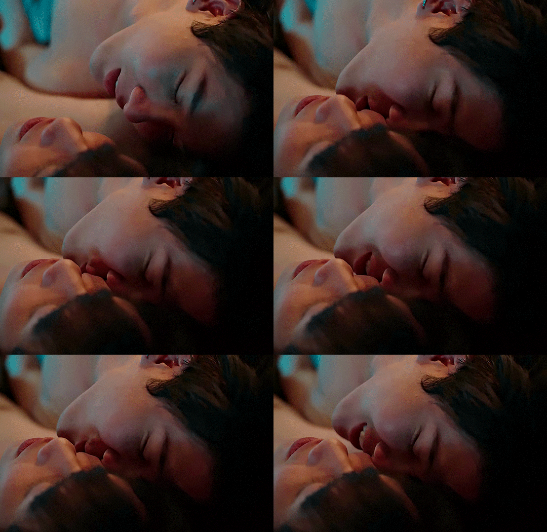
favorite: space girl!! show me the stars!!!
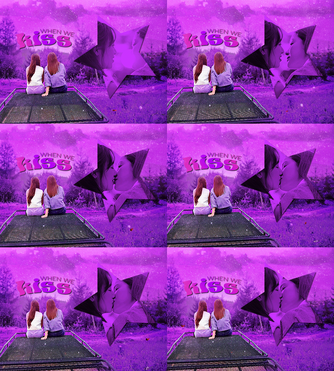
loved making this. purple and sparkly and gay. still super proud. that said other runner-up favorites in october are ray's o-face & the boyfriend shirt & akkaye's thumb thing collection
november: i am left cavernously empty after ofts ends and i fill the void with namtan
most popular: last twilight episode one porjai
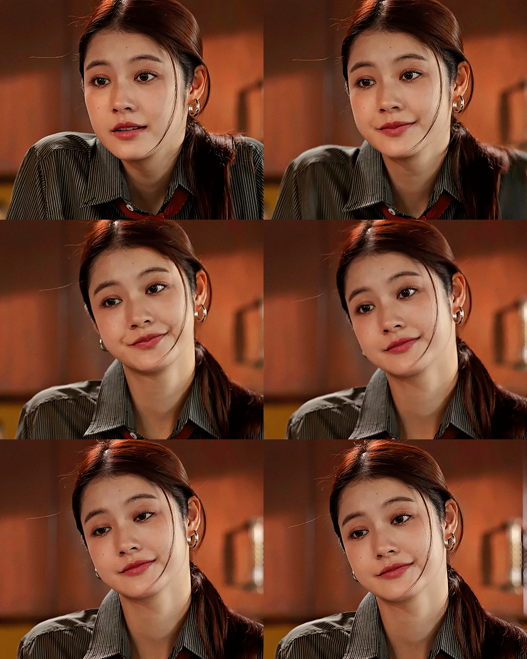
she <3
favorite: gaipa userdramas set
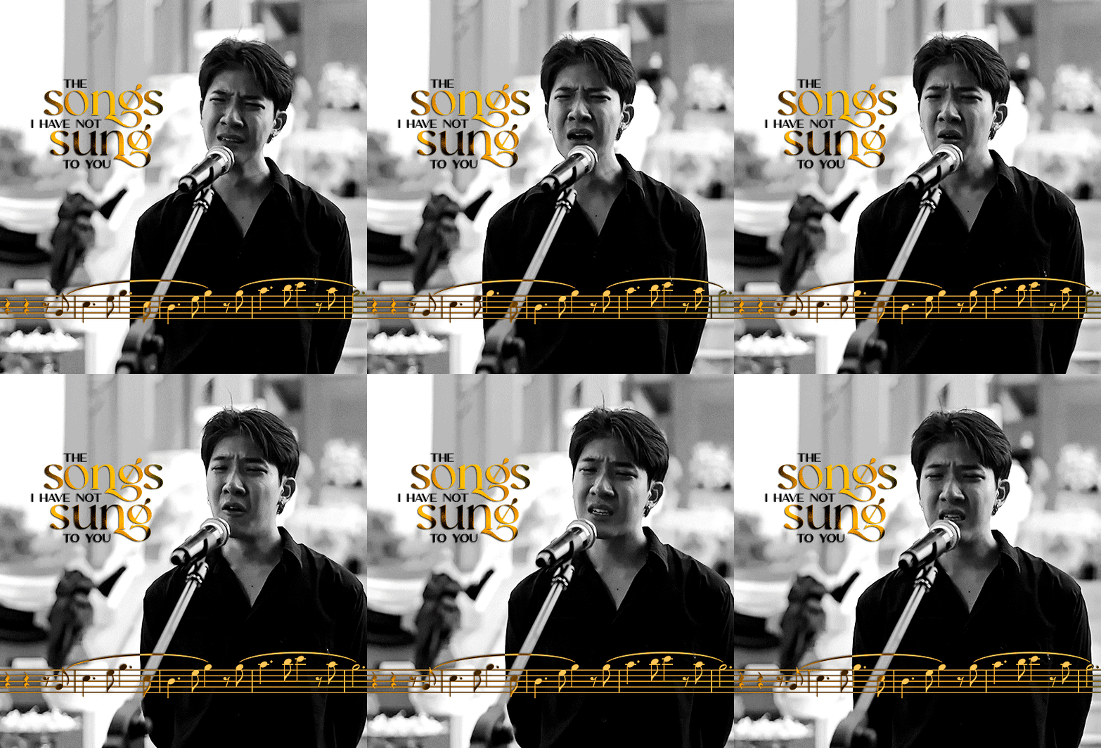
again, i learned to use musescore for this set just so i could have those pretty notes. :')
december: i am punched in the face by seasonal depression. all is not well. i made just one gifset this month, but at least it was good? :')
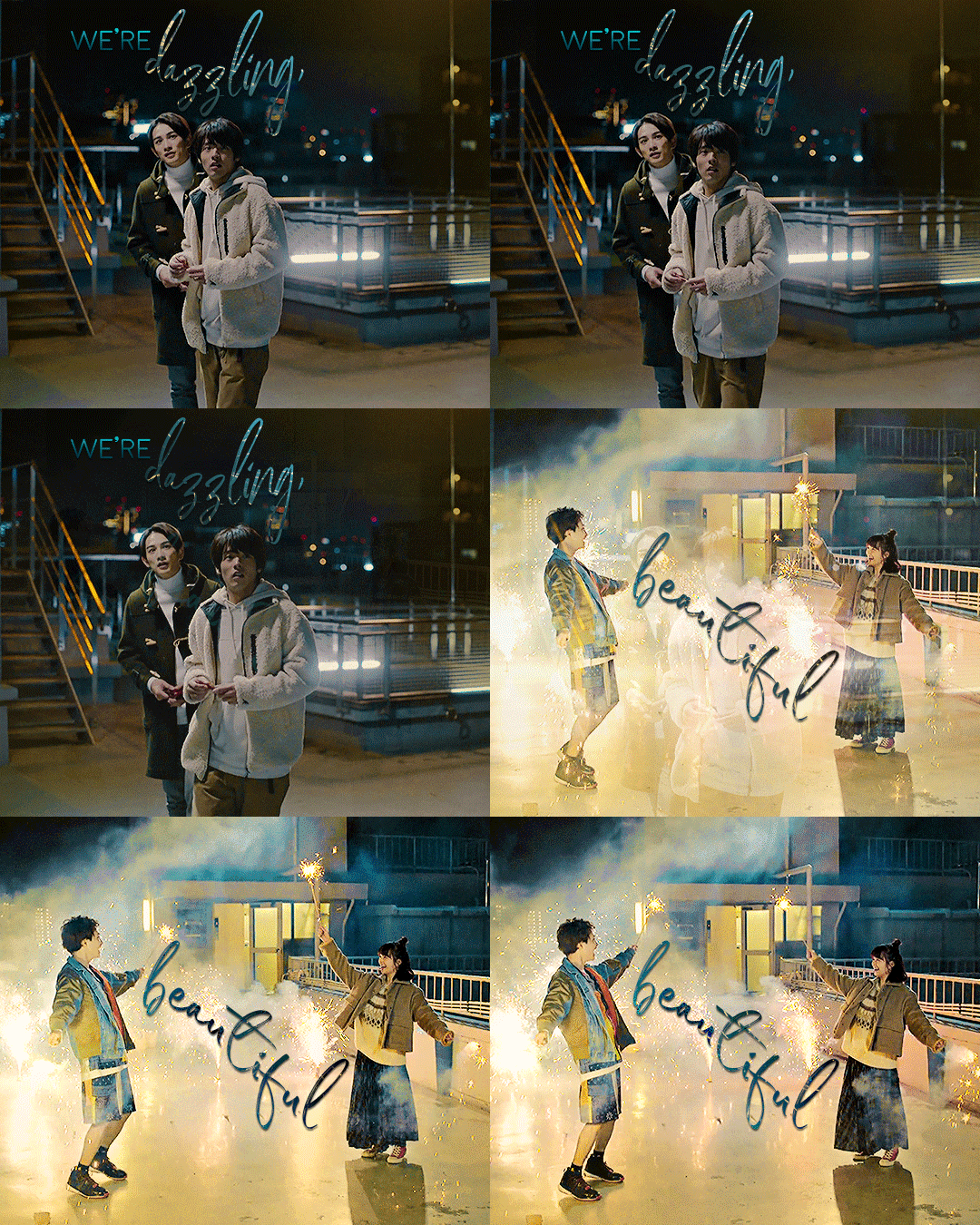
and here we are today !! it was very fun to look over everything; thanks so much for playing and have a happy new year everyone
21 notes
·
View notes
Text

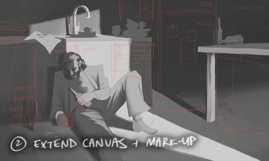


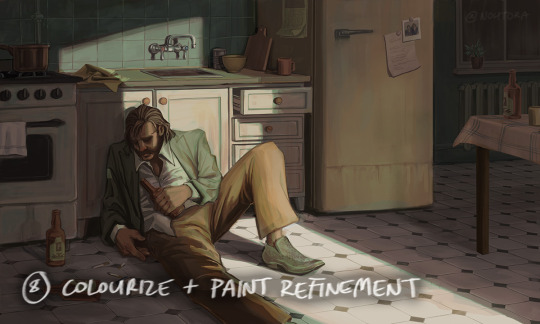

process stages & comments below
( original painting )
process: i did 70% of this (up to img #6) on my samsung tablet, on my train commutes, battling motion sickness & neck pain lmao
drawing on my tablet is still a lot harder & feels more restrictive for me bc i'm limited by unfamiliar software (still learning CSP) and lack of keyboard shortcuts (my digital art workflow for years). i also struggle with starting / continuing artworks on my tablet unless i've already planned / sketched most of the composition on my PC. likely because 90% of the time when i'm drawing on the tablet, it's on the train. hard to get in the zone as it turns out lol
this is the first full painting i've started and made substantial progress on purely with my samsung tab, so i'm happy it's starting to feel a bit more natural.
also first time i've tried doing a funky gradient map as a colour base. then applied colour on top with multiply blending mode. 10/10 would use fun gradient maps again - helped me introduce more colour variation bc i feel like my colours are usually quite flat by comparison
given the nature of the fucking bumpy melbourne trains & my broken commutes, i can still only do so much rendering on my tablet. the more refined painting will probably always happen using photoshop on my PC bc that's where i feel i have the most control
i tried not to overwork / overpaint it too much as i often tend to do, and kept the brush strokes rough and loose as much as possible. made sure my brush wasn't set smaller than a certain size so i wasn't tempted to go into fine detail. you can see i didn't refine harry's form/clothes much beyond img #4 because i didn't want to lose the soft/loose quality of the clothing folds. pretty damn proud of that shoe though. but then i posted it before i realised i forgot to paint in his fucking tie lmaoooo
but yeah, i got my tablet as a secondary drawing device to help me draw more often so i'm gonna keep trying to get the hang of it !!
composition/concept: the pose was referenced from this shot of arthur in peaky blinders and i had a vision of HDB slumped over in his kitchen like this

the composition was built around that, and i had the idea of framing it him in shadow and having a strip of light from a doorway illuminating his body. evidence of his drinking and smoking are kept in the shadows.
the original idea was to have a silhouette of someone standing in the doorway (likely jean finding him), but it didn't work with the overall balance & i felt like it interrupted the shape of the light too much / wasn't very legible at that angle. kitchen design was inspired by soviet & post-soviet era style kitchens.
*** feel free to send in an ask if you actually want me to explain how i did things in more detail. these are mostly thoughts for my personal reference
#disco elysium#harry du bois#art process#nohtora art#nohtora wip#sorry my notes aren't comphrensive/intelligible - it's more for me to remember & not a tutorial#always welcome to ask further though <3
60 notes
·
View notes
Note
Hey fern, what if you dropped a top 10 favorite cats the musical characters list
omg 😳😳😳 maybe we could find out 😳😳😳
1: Alonzo
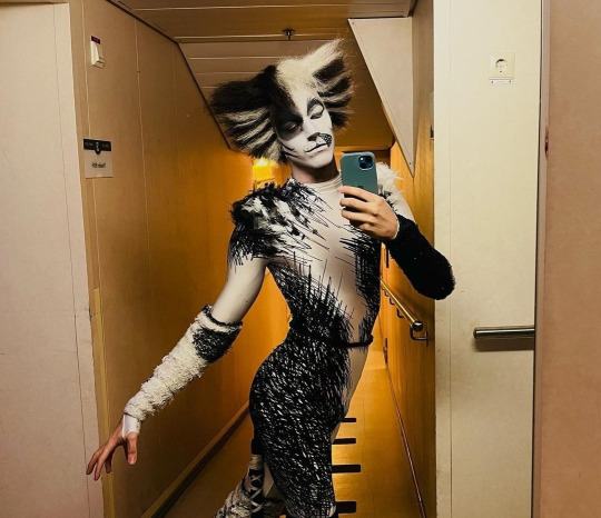
Surprise, surprise, I know. Silly little vain/uncertain/bravado guy. What is he doing. I just know he's so full of anxiety but he's also probably emotionally illiterate. He's SUCH a big bro figure in my brain in a number of ways, but mostly because I think he'd be the kind of guy to try and fix problems, fail, and dejectedly call for mom's help after the fact.
There's not much I can say about Alonzo that I haven't already said:
Here's where I ranted about his adjectives.
Here's where I ranted about his design for the Egg Cracker Bracket.
Goodness knows I've probably ranted across many many many tags as well. Idk man he's just so Gender to me and I think he's really funny and I love that he's a bit of a loser depending on how much the actor plays up the "uncertain" part of his character (the one that prominently comes to mind is here during Grizabella, the Mac scares, the end of M&R, and the IMMEDIATE change in demeanor during the Song of the Jellicles). I LOVEEEE that he's often shown to despise Tugger; it's such a funny dynamic. I love that different productions have him looking to Munkustrap, Skimbleshanks, and Cassandra for guidance. I love that fics make him a bit of an ass sometimes. For whatever gripes I have with Broadway revival choreo, I also love that it gave him some more character moments than he used to :D.
Every depiction of Alonzo I see gives me a new, interesting look at the character. I have yet to find one I dislike.
Aghhhh we've reached the point where this ranking gets really hard 😭😭😭 LMAO
2: Demeter
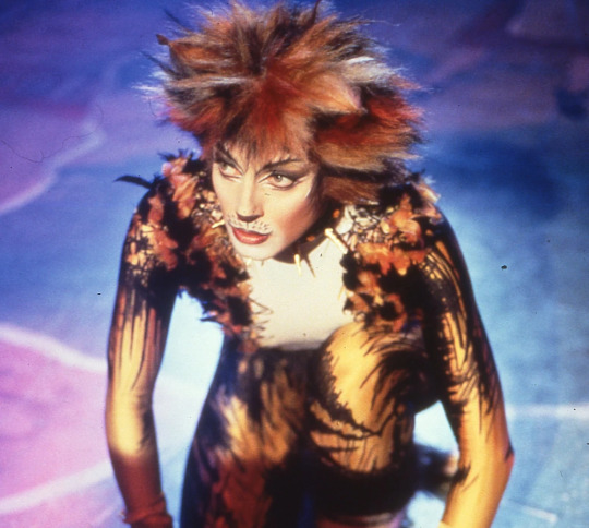
She was my favorite when I first got Really into cats circa 13 years old. I'll forever be bitter that she had no presence in 2019. She's LITERALLY the second most important character for the sake of the plot and they just LEFT HER OUT??? Just because she's hard to recognize after only a single watch or two??? hhhhhhhhhhhhh
The way actors portray her is ALWAYS entrancing. If cats is Subtext: The Musical, Demeter is Subtext: The Character. The Macavity number??? Come ON. The fact that she opens the show? Her reactions to literally everything??? Oughhhh sometimes she makes me want to chew on concrete.
Sometimes, there are portrayals of Demeter that I dislike, though. I guess it makes sense for a character whose words are skittish/cautious/paranoid, but sometimes, those traits seem to supercede her personality, which is always a shame. I particularly enjoy her interactions with Munkustrap and Bombalurina, of course, so when those are overshadowed by just how scared she is, I think it tends to weaken stuff overall. After all, those relationships thrive on how they interact and curb that fear.
I don't spend nearly enough time thinking about Demeter and it's an absolute travesty. Ma'am you are the heart and soul of the show to me. You keep everything thematically linked together. I love you
3: Munkustrap
I think that Munkustrap might be the definition of a comfort character for me. His mental health is rock solid. He's so dad-coded it's unreal. I desperately need to watch a production of Cats and only focus on Munkustrap, because his interactions with everybody are spectacular. There is so much character fit into this guy. He's also entertaining to me because I would NOT guess his adjectives, ever; they always come across as a characterization secondary to his role, and I like that quite a lot.
And oh my gosh, his DESIGN!!! I think Munkustrap has some of the prettiest makeup in the show, and his whole look is pleasingly cohesive. There's so much happening on his face, but when it's good, it's PHENOMENAL.
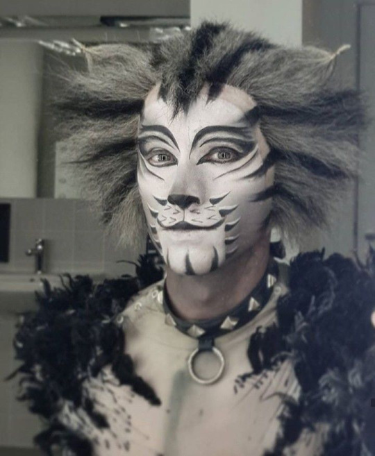
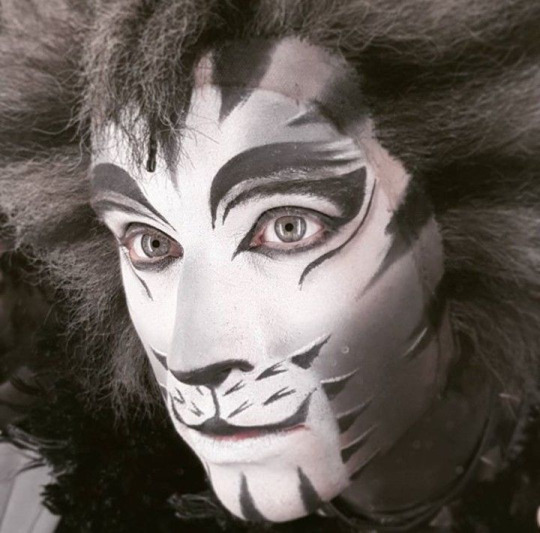
COME ONNNNNNNN, the HIGHLIGHTS on those WHISKERS??? The gradients on the cheeks and nose??? oooohhhhhhh it pleases me IMMENSELY. I also really like how the makeup blends into the wig, and the shape of the wig is also one of my favorites in the show - especially when it's a bit droopy, like Michael Gruber's in '98.
let's not forget about the collar
Anyway YEAH!!! He's one of my favorites to see actually moving onstage, consistently has a beautiful voice, and has some of my favorite relationships in the whole show :D
4: Admetus
This is a bit of a cheat listing. I really don't think about Admetus that much, but I would REALLY like to think about him more. I want to know what his deal is. Like Munkustrap, I think he has some fascinating relationships onstage that all present very differently - his time spent with Tumble/Pounce, Victoria, and Alonzo come to mind.
But also
THE MAKEUP
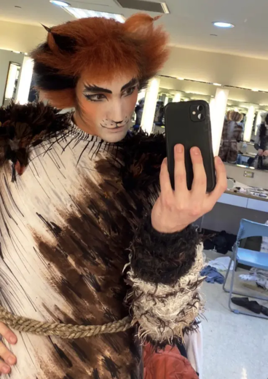
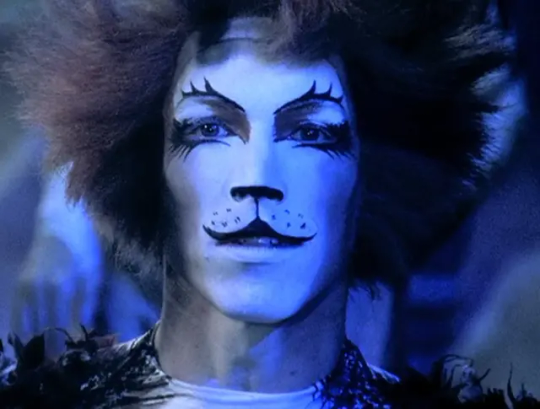
THIS LOOK WITH THE BIG LOWER LASHES??? GIRL HELP YOUR CAT IS GNC AS HELL. EASILY my favorite cats makeup look EVER. I know it's just because they have to slather on Mac's stuff later but I love that most of the face is left plain so they went absolutely ham with the eyes. It's the opposite of Munkustrap's. Brilliant.
anyway yeah he looks cool and I think his role in the tribe is in a really interesting flux stage
5&6: Pouncival and Tumblebrutus
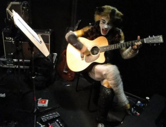
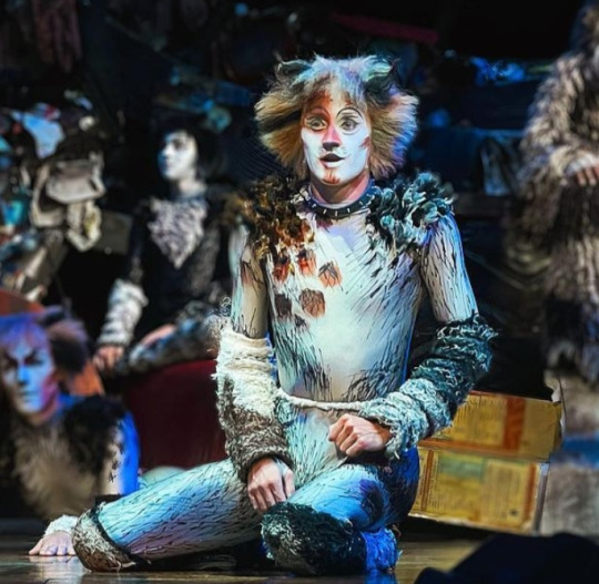
They are a pair... do not separate
okay okay OKAY I know I often talk about my favorite characters in terms of how funny they are, and these guys??? Absolute clowns. The product is exactly what's written on the tin; they sure do pounce and tumble!!! Even a few weeks ago, they probably wouldn't have been so high on the list, but writing CFP and forcing myself to learn more about their characters as a result has skyrocketed the amount of love in my heart for them. If I had to choose, I'd probably say that I like Pouncival just a tiiiiny bit more since I think he's more memorable and I prefer his design, but the way they both look up to almost everybody else in the show is intoxicating to watch.
My favorite moments of these two are, of course, Pounce here (2:35 onward) and Tumble here (2:14:25 onward). I just think they're neat.
7: John Partridge The Rum Tum Tugger
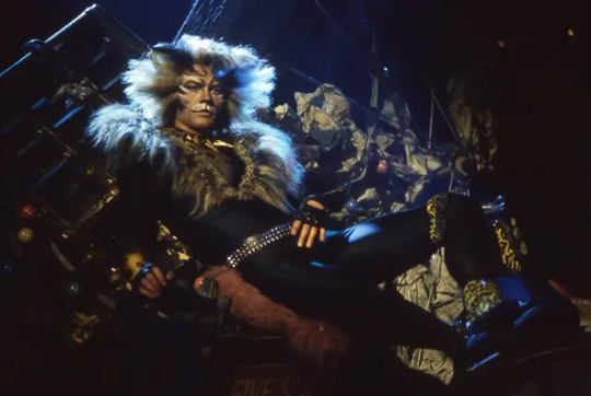
(Okay, but, like, John Partridge is the ultimate here. My second favorite is probably Zach Bravo since his take on the character is so different, but there might never be a Tugger as suave as Partridge ever again.)
Going back to his antagonistic relationship with Alonzo, I think it's interesting that they share "vain" as a descriptor. I also think that Tugger's relationships are interesting in that a lot of them aren't necessarily dissimilar with one another (they're all quite teasing, whether romantic or platonic), but they are unique to him. The dynamism of his character is probably what makes me like him the most; I love how he code switches between his own number, Old Deuteronomy, and Mr. Mistoffelees.
Aside from all that, come on. The swagger is magnetic. (I'd write more but my fingers are starting to hurt)
8: Bombalurina
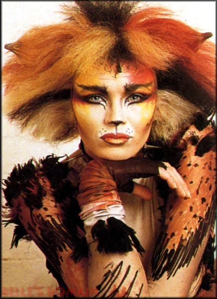
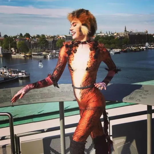
women <3
(I do have additional thoughts about her character! She's intelligent, generous, and flirtatious, and though she's always seeking romantic/sexual attention, those interactions are always secondary to her relationship with Demeter, which is something that I really like. Depending on the performer, she can easily come across as one of the strongest characters.
...but yeah. women <3)
9: Skimbleshanks
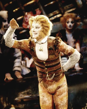
(swings microphone around) I am once again answering on the basis of "I just think they're funny"
Seriously though, at this point, there are so many characters that could make it onto this list. I think Skimble juuuuust made it here because EVERYBODY loves him, and that just makes me love him more. He and Mistoffelees definitely seem like the most popular choices for fanart from folks outside of the fandom, 2019 or otherwise.
Also, whenever I need an answer in Quiplash and can't think of anything, I put in Skimbleshanks, and without fail, somebody always votes for it, even if they have no idea who (or, in their mind, what) Skimbleshanks is.
There's not a single thing I dislike about this cat or his number; I couldn't possibly begin to list everything here. I just haven't thought particularly hard about him as a character yet.
10: Electra
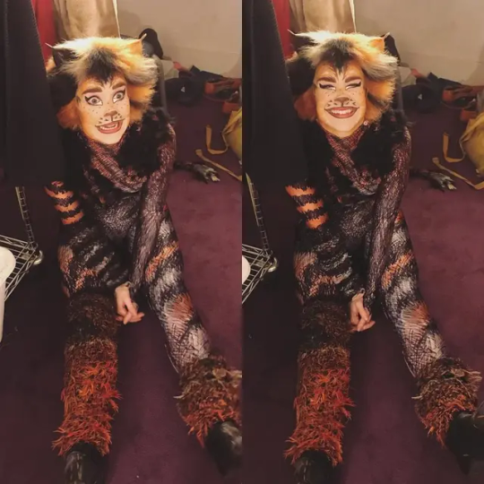
I must admit that I've barely spent any time at all thinking about Electra. HOWEVER, her interactions with Munkustrap are adorable, and the single father alonzo fic has irreparably changed my brain chemistry, and for those reasons alone, she's earned her place here. I also think the unitard design is really unique and beautiful :D
Honorable Mention: Tantomile. She was my favorite when I watched Cats '98 as a young'in :).
#ask#thank you friend :D#I'm going to hold off on maintagging this for now haha. I dare not let my opinions seep into the void on the first page of the tag
8 notes
·
View notes
Text
THRA Phase 1 reread with potential full spoilers for absolutely everything
Part 1: Collision Course


aren't Bibs and Rardal also present? i know they're kinda irrelevant but where are they lol
also Lula what do you mean you are number one in meditation. how does that work.


PARALLELS!! in the narration mostly but i also love the planet/ship, black/white contrast.
and i love Krix constantly reaching for and grabbing Zeen! symbolism!!

WHO ARE ALL THESE PEOPLE. how much support staff does an academic cruiser for a couple kids need. are some of these additional irrelevant students lmao

Bibs, the accidental he/they pronouns user, makes their appearance!!

first Cham Cham sighting! with the previous issue in mind i am now reminded of Uttersond lmao

why are their speeders so uglyyyy


spotlighting these pages because i love the Nihil designs. also Krix is unsurprisingly fucking stupid. a bunch of strangers with massive guns roll up in these outfits and you wanna make friends? jeez kid
we already know the Nihil are cartoonishly evil of course. yeah dude tell these children to have fun dying to this giant disaster caused by your boss.

baby Zeen!! i still don't completely get Marchion's thing with Tromak - is the implication that the Nihil have been after the Path for a long time? are they fleeing just general religious persecution of their cult? are they fleeing child protective services??
is Trymant IV just the first planet without space google that didn't look up what happened on Dalna and let them stay?

😭😭😭


THE GIRLS ARE IN THE SAME PLACE AND DOING THE SAME THING!! TRYING TO CONVINCE THE NIHIL FUCKS TO LET THEM EVACUATE PEOPLE!!

first meeting!!!

badass Farzala moment!!

our first gradient narration!! parallels!!!

oh my god.

what an excellent panel. but I have to highlight Qort's face, which I didn't notice before lol


the reactions!! Farzala and Qort i love you!

the girrrrrls!!!! "we got you"!!!!!

lol Tromak is still on the planet. If it wasn't for Zeen and Jedi helping out Marchion would be so fucked

6 notes
·
View notes
Note
Hi! So I'm really liking your LO AU so far, but I do have a few critiques. For one thing, the art is inconsistent in some places (ex: Hades has a long nose in the first panel, but then every appearance after, it's ordinary; ironically, I've heard this be said as a critique about the original too), and when Hermes explains why he got a job in the Underworld, the text is really hard to see when the red text is set against a black speech bubble, even when zooming in. This might also just be a Tumblr thing, but some panels also appear slightly blurry compared to others.
Aw I'm glad you like it! And thanks for the pointers! I am going to respond to them in my own defense a lil' if you don't mind (but rest assured I do recognize them as issues):
1.) That first episode was my first time drawing a Rekindled episode in full color (before I had even decided I wanted to stick with color, back then I was planning on just doing black and grey with color gradients) and it was more of a tribute to S1 LO/a coloring test that doubled as a potential opening for Rekindled (due to how it does diverge slightly from LO and is still relevant to Rekindled's plot). So that was before I realized looking back on old LO material that Hades' nose is, in fact, normal in the original pilot version of the comic! So I decided "Yeah, I'm gonna give him his normal hooked nose back" and it wasn't until I was on episode 2 or 3 that I realized that meant Episode 1 still had Pinocchio nose Hades 🤣 So that's something I may go back and fix later on but that's just like, the context of what happened there LMAO
2.) Yes, I've had someone else also point out to me that text issue and I've been neglecting going back and fixing it, that will be something I try to get to tonight!
3.) That's unfortunately a Tumblr thing, my way around it is just to crop each panel individually as much as I can to ensure they show up clearly in the feed, but not every panel will show up equally (despite all being drawn and exported in the same resolution). So my best recommendation for the user end is to either click it open on mobile or on desktop, click it open then right click "Open Image in New Tab". Tumblr doesn't display images vertically quite as cleanly as WT does but I have no plans to upload to WT (as I would get crucified by RS, WT, and the LO fanbase) so this is the only workaround for now until I find some kind of alternative. Sorry about that 😅
Thank you for taking the time to leave those points! Regarding #1 and #2, those are just things I can find time at some point to go back and tweak, #2 is easier than #1 but I'm sure I can still find a way LMAO In the meantime, I hope those responses clear up your questions or concerns!
#lore olympus au#lore rekindled#lore rekindled comic#lore rekindled crit#ama#ask me anything#anon ask me anything#anon ama
25 notes
·
View notes
Text
Grwm post-swamp edition lmao 🤪 ⬇️
(The following update is posted in the form of a video)
[ID: A vertically-oriented video depicting a white tiefling with long-spiraling horns and silver hair. His bangs are pushed back by a headband, showing a face full of dark freckles and black marks that radiate from their eyes and fade to a gradient. They're wearing a black, silk bathrobe that's slipped off one shoulder. In front of them but mostly out of frame is a large selection of makeup and a personal mirror. Behind them is what looks to be a bedroom. Throughout the video, they are doing a makeup tutorial and showing off different products while they talk. The caption reads: "Grwm post-swamp edition lmao @FauntasticPartyTime #fyp #grwm #Strixhaven #Warlock #makeuptutorial #lgbtq #pepsihalftimeshow"]
Transcript:
Get ready with me for a celebratory dinner after I almost died in a swamp!
For those of you who don't know, I'm a freshman at a magic university. I try not to talk much about school because I know that's not why most of you follow me, but I thought I'd do a story time while I do my makeup since I've been on a bit of a hiatus from socials the past month. We just finished our first field exam in a lit-er-al swamp, so I am freshly showered and getting ready to go out with my party for a well-earned dinner.
[Cut to a makeup product being held aloft] First, I'm going in with some primer from Tasha's Cauldron- it's super moisturizing, I love it.
So, like, before I get into the story of how my exam went, I just want to address why I went on hiatus real quick. I had some personal issues with a friend group here at college and... I don't really know if I want to, or even can say too much, but it looked really bad for a while. All I'm gonna say is keep in mind that adventuring can be really dangerous, and this was, like, worst-case-scenario levels at first. Things have kind of settled down now and everyone is [they pause to make a face and gesture vaguely with their hands before shrugging]...fine. Yeah, everyone is fine now. But I'm sorry for just going MIA for a while and I know I have soooo many DMs and comments and stuff that I left unanswered. I'm trying to make my way through them, I prommie!
[Cut to a makeup product being held aloft] Concealer and Foundation are both from Marvelous Pigments in their shade Wight. It's seriously the only thing I've found that matches my skin. If they ever discontinue it, I'm gonna have to unalive myself for real.
Anyways, since things have settled we're all back in our classes and stuff now. I've been working over time to memorize the new cheer routines the squad ran through while I was gone. I'm working on class work too, I guess, but I think I might just find some nerd who's willing to help me with, um... private tutoring lessons, if you catch my drift [they wink].
Back to what I really wanna talk about, though, which is the practical exam we just had! There's this overgrown swamp outside of the school that I think the Witherbloom students use a lot- it's great for growing herbs and brewing potions and stuff, but it's soooo terrible for my hair and clothes. We get out there and I guess there's this spring of wild magic that's been messing up the ecosystem and bringing in all sorts of monsters from out of town. Our job was to basically help the professors cast a spell to close it off, and they graded us on how well we did.
[Cut to a makeup product being held aloft] For my eyes I usually just like to emphasize my natural features with some glitter or holo, so I'm going in with the color Abyssal from the Chromatic palette by Color Spray.
So we're in the swamp, we gather all the material components for the spell, and then we have to hunt down the spring itself. Luckily we didn't have to wade around in swamp water because a couple of my classmates can fly, including this cute owlin who plays on the team I cheer for [laughs, dismissive] I don't think he follows my socials, it's fine.
But when I tell you things got crazy so fast once we started up this ritual spell, oh my queen. Like, my party's already faced a lot of monsters but this was, like, a lot of monsters. There were these awful little bat-mosquito things that would stick their teeth in you and start sucking blood, it was super gross. And my friends told me there was also some kind of ghost or spirit or something that kept going inside them? Talk about invasive. Oh and not to mention the two giant scorpions, but we'll talk about those guys later.
[Continues talking while curling their eyelashes] The craziest of all was this big, blue...toad? It was like a bipedal toad with big fuck-off claws. My classmate Sersh kept screaming about how its claws can apparently turn you into one of them, too, if it hits you. Which, like, yuck. [Slightly sarcastic] What a loss to the entire world it would've been if I'd been turned into some ugly monster, y'know?
[Cut to a makeup product being held aloft] Eyeliner and mascara from Dark E.L.F., just tightlining my eyes today.
So, back to the giant scorpions- we for real would've been fucked if our friend Mire hadn't been able to charm them. But they're a druid, so this is kind of their whole thing and it worked great. Me, my other friend Willow, and Sersh got to focus on helping the teachers close the spring while the big toad guy and the scorpions had their beef. So fun to watch.
Willow's a bard, bee-tee-dubs, and you should definitely go check her shit out. She plays the cutest little pan pipes and is sooo funny and sweet. I'll drop her @ in the caption!
[Cut to a makeup product being held aloft] I'm finishing up with [making air quotations] "bronzer" in the shade Shadowfell and highlighter in the shade Lurue from Marvelous Pigments again.
I'm not gonna lie, it was looking pretty rough for a bit, but we managed to close off the portal without any of us dying! Or, like, passing out. Okay, well, that's not totally true. John- oh, the scorpions were named John and Charlotte by the way- did unfortunately die in battle, but Charlotte made it out. We gave John a little swamp burial to commemorate his sacrifice.
Once all the monsters were killed, Mettie and Puppet- that's his familiar; she's cheeky and we love her- even helped me clean up the caltrops I'd set as a trap (which totally failed, ugh, but whatever). I was gonna just leave 'em there but Mire seemed mad about it for some reason. Metal's technically biodegradable, isn't it? But Puppet liked picking them up 'cause they were shiny and she's a raven, so it was a win-win. I let her keep one.
[Cut to a makeup product being held aloft] And I'll be using a setting spray from Cleric's Formula to seal the look!
I'm excited we passed our first field exam, I can't believe how great school is going. I totally thought I'd be flunking but this shit is easy. Sure, I almost died...[counting on their fingers] four or five times? in the past few months and a bunch of my friends keep almost dying too, but otherwise I feel like we're killing it! I mean, I guess it's killing us, but you know.
Here's the finished look [pause] I gotta go, I'm late [video cuts off].
1 note
·
View note
Text
LITTLE MUSE FACTS.

Instructions: fill out the questions about your muse, repost, and tag as many people as you want!
1) What does your muse smell like?:
Stardust spends most of his time outside, and even when he's inside his house is so full of plants he may as well be outside! So needless to say he smells like plants, and a large variety of them. Mixed with soil, the scent of a clear freshwater stream or pond, and tropical flowers.
If he's showered recently he'll usually smell like strawberries, watermelon and cucumber, pumpkin spice during the fall, and snicker doodles during the holiday season.
If he's just had a soak in the tub he smells like lots of herbs, medicinal plants, and minerals, things that help relax him and ease the pain of the scars on his back.
2) How often does your muse bathe/shower?:
When Stardust is doing well mentally he will shower either every other day or more frequently if he's doing a lot of work outside. If he's in a slump, the frequency will dip down, and he often needs a third party encouraging him to shower or have a soak in the tub [it helps him feel a lot better!]
Romantic partners may even be asked to accompany Stardust to help him feel more secure, since the worse his mental health is, the worse his fear of water becomes.
3) Does your muse have any tattoos or piercings?:
Yes! Stardust has a distinct star cluster tattoo on his upper right arm that's a gradient of purple and pink! He got it when Tails explained tattoos to him, liking the idea of marking something that was important to him on his body. A way to express himself without words, and remind himself of his ultimate goal.
4) Any body movement quirks? (EX: tapping heel, shaking knee)”
This dude MOVES. Tapping, bouncing, swaying, frequently changing positions if he's bored or uncomfortable, twitching tail and ears, sometimes dancing. If he's really antsy but can't Leave for some reason he might run and jump around if the space is available.
Stardust not moving around much can mean one of two extremes: total comfort and contentment, or not feeling well at all.
5) What do they sleep in?:
Whatever he falls asleep in, but if he can help it Stardust likes to sleep in either nothing at all, a sweatshirt and light pj pants, or a t-shirt and shorts. Depends on how his anxiety is doing and who's around.
6) What’s their favorite piece of clothing?:
It's SO hard for him to pick, but he absolutely loves his galaxy sweaters. In any given ship, if his partner gives him a galaxy sweater, that becomes his favorite.
He also has a pair of werehog slippers that he absolutely loves.
7) What do they do when they wake up?:
Try not to. LMAO. Stardust almost never gets up right away when he first awakens, often fighting to go back to sleep. With a partner, that's a little easier to do, as he stays close and watches them for a moment before snuggling in close to them again and falling back asleep.
When he FINALLY gets up it's straight to the bathroom and he does his morning routine, shower if he needs it, preen, and then throw on whatever baggy clothes he's going to wear around the house. If he's going out he'll put on more form fitting clothes.
Stardust has a high metabolism so he only misses breakfast if he's in some kind of Big Time Rush.
8) How do they sleep? Position?:
All. You've seen the way cats twist themselves? Stardust does that. He'll also sprawl out to take up as much space as possible. With a partner he's a little better, and likes to cling to them a lot, burying his face in their fur wherever he can.
9) What do their hands feel like?:
Soft, with a few bumps and ridges here and there- scars. Not too many of them, but the ones that are there are pretty noticeable, either by sight or touch. Otherwise his paw pads are smooth and very soft, while his fur is like slightly thicker peach fuzz and silky. Sharp, hook shaped claws adorn each digit, but they are semi-retractable and Stardust takes care to keep them clipped [or chewed].
The temperature of his hands can vary, sometimes his paw pads feel cool to the touch, but they warm up easily, it all just depends on his current body temperature or the temp of the air.
tagged by: @omniversentertwined
tagging: same as the last one and YOU!!!!!!
2 notes
·
View notes
Text
OK FIRST OF ALL This made my heart SO full like. Just so happy to see it. Floored, slammed, thrown down!!!
Tumblr tags are THE EVIL INCARNATE because they won't let me put in the fucking ODE this deserves so I'll try my best here itself🫡( salute emoji)
The lining is SO good I could eat it, its just so fucking. LUSCIOUS and SILKY. Man, it really looks like a printed coloring page in your inking!! Really nice clean up.
I love how different it looks from how it would if I'd have colored it too! It's fascinating to see the sorts of styles we do at work. I'm VERY flattered that the coloring implies you've referenced some other works of mine, like Habit having the red ruffles I didn't add but usually do, his two toned hair, Kamal's gold earrings etc....WAH!!!!! But it still stands strongly and distinctly as your coloring!! The colors are rich and mostly flat, and that is balanced out by the gradients you've put in. I especially like the ones with the butterflies.
And your own touches! The wasps stripes...the birds having a nest...the generally much more defined look everything has...
While retaining individuality, it keeps the spirit of the original at the same time. Just two nasty kids goofing around LMAO This is So Good that I am adding it to my official series of pictures I'm still doing(and have finished some!) of them as kids. The season looks like summer...!!!🥺❤( pleading emoji with heart) Most beautiful thing I saw and felt today YEAHHHHH
AND as for your commentary and stuff OUGHHH GROSS SOBBING I can't believe you thought my drawing was good enough to put up for others to color if they want to?!?!? /pos I feel like Papyrus getting double digit followers on the Undernet HSNJSKS
AND PUPPET HABIT TRUTH SPREADS YES
(Plaintext: and Puppet Habit truth spreads yes)

[ GIF ID: An Elmo spreads his arms out and looks on while fire rages against the black background behind him. End ID]
MY FRIENDS PUHLEES REBLOG!!!! /srs /lh
(Plaintext: my friends please reblog /srs /lh)
Avengers Assemble /j
@prrusten
@adaptive-radiation
@h-atsofftoyou

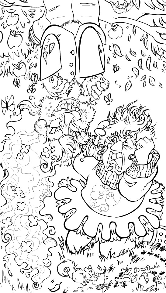
Smile for Me collab with @ennaku-sirri-da! Okay I am head over heels in LOVE with this AU, giant living puppet Habit might now be my own headcanon for what he even is as well :') There's also the inks on the side in case you feel like coloring it too!!
31 notes
·
View notes
Text
HTML GRADIENTS

Hello hello!! Come check out the secrets to HTML text gradients!!
You might ask, why are you sharing all your secrets, why not let the masses suffer — and why is all the text in blinding pink and blue?! Well, because I like it, and I wanted to. This website will be much better if it's all full of colour anyways!!
Honestly, I’m more than happy to help! Trust me when I say I spent HOURS trying to figure it out. (Where was this post when I was learning!!!) Even when I thought I got it perfect, I didn’t. LMAO.
We can all thank Daddy Bee (@.nectarous) for holding my hand and walking me through the very basics!
Also, before we get started, when you code — STORE EVERYTHING IN A GOOGLE/WORD DOC before saving (as a draft). There’s no guarantee your code will 100% always stay, and tumblr might be a b-word and take you out of HTML!!!
Don’t spend hours working on it without having a backup!!!

So, that being said, the first thing you have to do is make sure you’re on desktop in HTML — and STAY on desktop, in HTML!
DO NOT, I repeat DO NOT CROSS PLATFORMS!
As in, if you see a mistake or want to edit — make sure you do not edit on mobile!! Only desktop, and DO NOT SWITCH TO RICH TEXT, at any point in time. stay in HTML!
Once you’re in HTML, which you can find in the top right hand corner when you chick the little gear, you can add your basic text and coding.

Ex. This Code...
<h2><b> TITLE IN BOLD </b><h2>
<p> wow look at this cool <i>italicized</i> text. </p>

Will look like this...
TITLE IN BOLD
wow look at this cool italicized text.
(You can save this as a draft and see how it looks to make sure it’s formatted right!! Don’t forget to save in a google/word doc as well!!!)

Once you have your post formatted the way you want, you can then decide which words you want coloured. So, I usually go balls to the wall and make everything blindingly colourful, HAHAHA, but you absolutely can do whatever you want!! The easiest way I can show you how to this is with some sample code.
Before you do anything though, you need to choose your colours!! You can either do this by hand and decide your own gradient, colour by colour, OR pick your start and your end colour, and plug it into THIS* handy generator.
***** MAKE SURE YOU REMOVE THE SEMICOLON AT THE END!!! IT WILL STILL BE GRADIENT COLOURS AND LOOK NICE - UNTIL YOU TRY AND REBLOG!!!!! ( this is where daddy bee saved my life.)

So my code, without any links, looks like this...
(The thing in gradient is the title, and the paragraph is one solid colour.)
<h2><b> <span style="color:#3091FF">T</span><span style="color:#3896FF">I</span><span style="color:#419BFF">T</span><span style="color:#4AA0FF">L</span><span style="color:#53A5FF">E</span><span style="color:#53A5FF"> </span><span style="color:#65AFFF">I</span><span style="color:#6DB5FF">N</span><span style="colour:35a5FF"> <span style="color:#7FBFFF">B</span><span style="color:#88C4FF">O</span><span style="color:#91C9FF">L</span><span style="color:#9ACEFF">D</span> </span></b></h2>
<p><span style="color:#3091FF"> wow look at this cool <i>italicized</i> text. </span></p></p>
** IF YOU HAVE ANY SPACES IN YOUR TITLE OR THE WORDS YOU WANT IN GRADIENT, MAKE SURE YOU PUT SPAN STYLE OVER THAT SPACE. (I bolded this in my text). Otherwise, it WILL be an ugly BLACK/WHITE line IF you try to add a link over top.

And here is the result!
TITLE IN BOLD
wow look at this cool italicized text.
so there you go!!! That’s how I do the basic text gradients!!!
(If you haven’t already, save all your code to a google/word doc!!!)
It’s a little more complicated when you move into adding links, and I’m pretty sure I’m not doing it right, but hey - it looks good on the front end, and no one’s doing an inspect elements search - HAHAHA.
If you’re interested in figuring out how I do the links, you can keep reading, and if not, I hope his helped!!

ADDING LINKS

So again, to reiterate, I am not at all doing this right, and there’s way too many span styles in succession, but it looks nice on the outside soooooooo.... oh well, lol. If you can find a nicer, easier way to do this (daddy bee probably knows how) THEN GO FOR IT!!!!!
Otherwise, here’s what my code would look like to include a link.
Your website code is the same as always, for the sake of this example, I’m choosing google. This is what the website link HTML code looks like...
<a href=‘www.google.com’>whatever text you want to be linked goes in here</a>

Here is my example code...
<h2><b><span style='color:#3091FF'><a href=‘www.google.com’>
<span style='color:#3091FF'><span style='color:#3091FF'>T</span></span><span style='color:#3896FF'>I</span><span style='color:#419BFF'>T</span><span style='color:#4AA0FF'L</span><span style='color:#53A5FF'>E</span><span style='color:#53A5FF'> </span><span style='color:#65AFFF'>I</span><span style='color:#6DB5FF'>N</span><span style=‘color:#6DB5FF'> </span> <span style='color:#7FBFFF'>B</span><span style='color:#88C4FF'>O</span><span style='color:#91C9FF'>L</span><span style='color:#9ACEFF'>D</span> </b><h2>
<span style='colour:#3091FF'><p>
wow look at this cool <i>italicized</i> text. </span></p>

Here is the result!
TITLE IN BOLD
wow look at this cool italicized text.
(The title might not appear to have a gradient on desktop mode, but I promise you, it’s there!!)

TADA!!!!I hope this helped!!! Again, this example above, is a mess. But I really did try my best!!! If I don’t do it like this, the front letter in my text underline DOES NOT show the gradient. IT IS AN UGLY BLACK/WHITE.
Are there better ways to fix that, PROBABLY!!! But this is what you get lol.
I HOPE THIS HELPED!!! Shoot me another ask if you need anything cleared up!!
I kid you not, this took me HOURS to make... LMAO, I hate it here... Again, I hope this was helfpful!
Please, ignore any and all spelling mistakes, I'm dying.
#html text gradient help#(un)helpful lee#Lee AA#does AA stand for alcoholics anonymous or answering asks - maybe both#I really do hope this helps!#i spent a SUPER long time trying to gather up all my braincells in order to come up with this post#too long...#hours...#LOL#again - please try and ignore all my spelling and grammar mistakes
224 notes
·
View notes
Photo


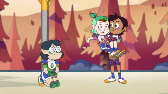

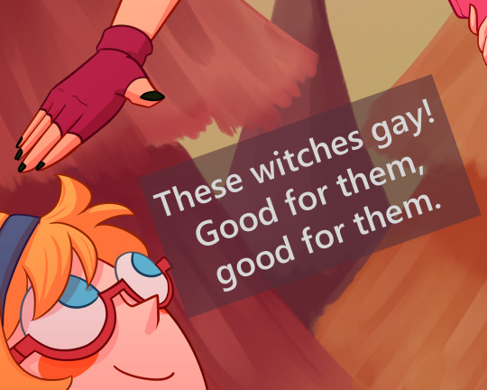
wassup wlws and treasured allies. heres the wilw redraw that i started/dropped back in august, freshly polished for @diakkoday :^)
elapsed time: 15 hours? 17?? i lost my sense of time in the lining process
(click on the images for higher quality!)
LOTS of notes and bonus art (including old drafts :o) under the cut!
most important business is up first! this is the last intensive lwa piece that i intend to produce for the foreseeable future. i burned myself out on drawing the girls way back in dianakko week, and then again last month.
while i (accidentally,,) paced myself for this one, i’m not quite feeling it anymore. i don’t know when i will be next, or frankly if at all. rebounding back into the fandom at all was a big quarantine induced surprise in itself. which is all to say- sorry if you were looking forward to more lwa from me :(
for the moment, i’m posting a whole lotta love live, personal pieces, and likely some other fandoms. please hang around for that if you’re interested!
NOTES:
i am aware that accidentally made diana’s face too ikemen >>; i intended to redraw it every time i popped open the doc, and forgot every single time.
i opted not to use a harsh lighting layer for this! just a gradient overlay (specific layer effect: add). i felt like hard lighting would take away from the cartoony vibe.
the lining took so long. every couple of weeks i’d just pop open the doc, slog through a couple lines, and close it indefinitely. i wanted so badly to not have to deal with the anatomy but we managed it ok bros
a lot of time was also dedicated to cleaning the lines. i’d taken so long to finish it that i figured i might as well make it just, way too polished
i wasn’t sure whether or not to keep the colored lines! i like the version with black lineart just about equally. colored lines feel more polished to me, but maybe it could use the extra contrast haha.
i was very tempted to change the color palettes- particularly in switching diana’s shirt to a blue, like i did with the face paint.
the last image is a reference to a meme that circulated back when the toh episode aired! i’d love to give credit to the original creator, but have completely lost track of it. if anyone recalls the link and can shoot it over that’d be very appreciated :)
lotte is a national treasure and i love her to bits
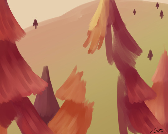
this is what the bg looks like! i rendered it just enough for it to look full with all the layers up. this was the quickest part of the process hands down- completed it start to finish in ~1.5 hours. because i rendered diakko+lotte in harsh solid lines and shading, i wanted the bg to be soft and fuzzy. ideally the contrast between the foreground and background coloring would be stronger, but i gave up trying to figure that out lol.
the og sketch!! when i was putting together this post, i did a handful of screencap redraws and saw what stuck.
more of those sketches! i liked how diana turned out :^) you can see that i still wasn’t sure how much of the toh style to integrate at this point!
figured i might as well stick the other sketches from diakko week in here as well! the latter two led to this and this respectively. i switched to diana not Doin Too Well with scary movies purely because i thought it was funnier lmao
and that’s it! thanks for reading through if you did. i thought about not doing this at all, but i find others’ artist notes really interesting and figured some of you might as well.
#DiakkoDay2021#Little Witch Academia#lwa#The Owl House#toh#akko kagari#kagari akko#atsuko kagari#kagari atsuko#diana cavendish#lotte jansson#dianakko#diakko#yuri#unsure if i should tag lumity as well lol#i exhausted my commentary in the readmore for once so i don't have much for the tags#sorry for the little announcement#i already post so sporadically i didn't want to lead on anyone interested in following for more lwa#um. stay hydrated and handsome <3#edit: i cant believe i forgot the fucking ship tags jfhdhjdjhdf#they're there now#i Knew something was up-
349 notes
·
View notes
Photo
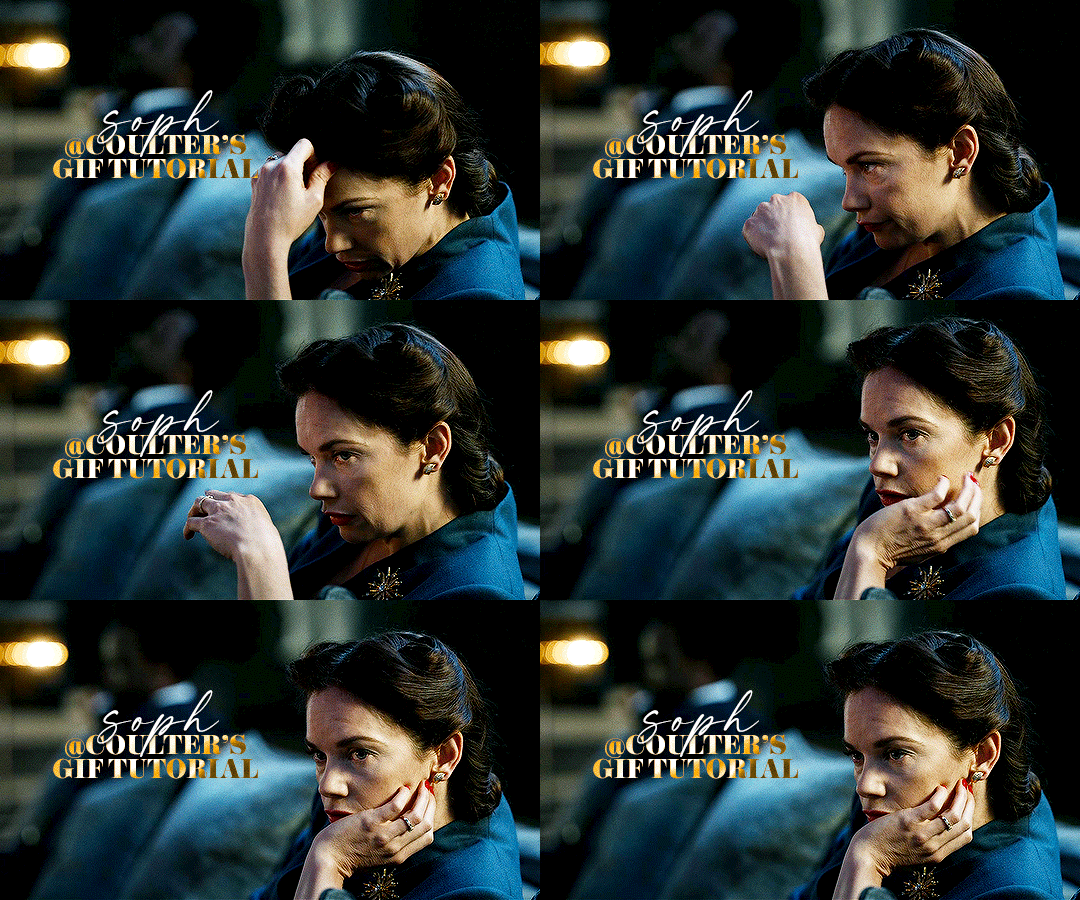
Hello! As requested, here is a tutorial on how I make my gifs. I would like to preface this by saying there are many ways to make gifs, and there’s no right or wrong answer imo. This is just how I personally go about doing so!
I will be using PS CC 2017, but as long as you have the video timeline option, it shouldn’t matter too much; on any version of PS, you should be able to adapt anything I mention here! You will also need some kind of screen recording software. I’ll talk a little more about that under the cut.
To start, you need the source material you will be making the gifs from! I get mine from snahp(.)it (avoiding links so tumblr hopefully doesn’t banish this from the tags lmao) and I always opt for either 1080p or 2160p. Not all laptops will support 2160p as it’s 4K, but either works great! You just want your gifs to be the best quality possible.
Next is where the screen recording comes in. I don’t use the screencapping method to make my gifs (where you use a program to cap a clip and then load those caps into a stack in PS). This isn’t for any particular reason… it’s just how my friends, (who very kindly taught me to gif), had always done it, so it’s now how I do it too. Personally, I find the quality to be just as good as the screencapping method, and have never noticed a difference between the two.
As I have a PC, I use the software built into it for screen-recording. If you go here: theverge(.)com/2020/4/21/21222533/record-screen-pc-windows-laptop-xbox-game-bar-how-to – you can see how to use the XBOX screenrecorder to record from files you have d*wnloaded. This also works on some streaming sites, but I think it depends on what browser you use. Personally, I recommend Firefox, as that seems to bypass a lot of the blocking and ads that occur when trying to do this sort of thing.
For MAC users, I have been told handbrake works well, as it converts MKV files to MP4, which can then be used to make gifs. You only need to convert part of the file to MP4 depending on how much you want to gif, and this also bypasses the screenrecording stage, as you can edit MP4 clips on Quicktime. I am told you can split them into smaller clips by going to edit > trim and it saves the new clip!
I have also used anyvideoconverter for small clips, but I can’t say what it does to the quality of your video, or how big of a file it lets you put in! With the XBOX screenrecorder, it doesn’t matter what type of video files you get, as the recording will save to MP4 anyway.
LOADING YOUR FRAMES
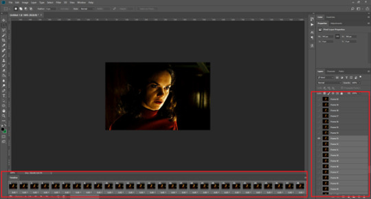
Now, go ahead and record whatever clips you want to gif. Make sure you have the video timeline open, by going to window > timeline. Then, go to file > import > video frames to layers.
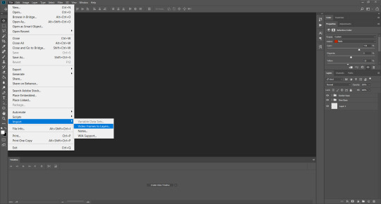
Next, select and open your clip from where it has saved (with the XBOX recorder, it saves in video > captures). You should see a little window pop up, where you can move the sliders back and forth to clip your recording to whichever part(s) you specifically want to gif. I recommend trying not to load a lot of frames into photoshop at once, but I would be a hypocrite to say that, since I do it a lot lmao. Just be patient if you do!
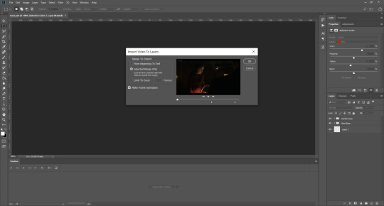
Once you have chosen the length, click okay. Never, EVER, I repeat NEVER click the button that says “limit to every __ frames”. This really ruins the flow and quality of your gif—it’s better to have shorter, but smoother gifs, I promise. And with tumblr’s new 10 MB limit, it shouldn’t be a problem anyway!
Then, your frames should open up. What we want to do is make them into a smart object, so we can edit all the layers at the same time. To do this, click the small button in the left-hand corner. ALWAYS click this first. If you don’t, it will only convert the first frame to a smart object and the gif won’t work.

Give it a second to sort itself out, then, on the right-hand side, select all your frames at once using the shift key.
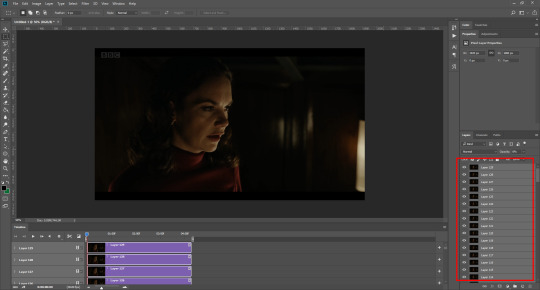
Then, go to filter > convert for smart filters. This might take a minute. Don’t click anything else in case PS gets angry lmao, just leave it for a second and it’ll do its thing. The more frames you have, the longer it takes! Now we have our gif, but it needs to be cropped, sharpened and coloured!
CROPPING
You want to start by selecting the rectangular marquee tool on the left-hand side, then drag it across by clicking and highlighting the area you would like to crop your gif to, like so:
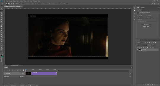
What I tend to do is select everything inside the black lines you sometimes get around your gif (this depends on what file you d*wnload), and also the tiniest bit inside the sides. This is because I’ve found if you crop it right up to the edge, you get a tiny bit of transparency on the sides of your gifs, which I’d rather avoid.
Once you have your desired selection, go to image > crop. Now, the dimensions for tumblr are 540px width, so all your gifs have to be that width. However, the length is up to you. I really like big gifs, so sometimes I even make a full square, or even longer. It’s entirely up to you, and what kind of set you want to make.
For the purposes of this gif, I will stick to what I usually go for, 540px by 350 px. This will mean you’ll have to crop some width off, but that’s okay, since Marisa isn’t central anyway. The cropping is always trial and error for me, as sometimes people move out of the frame within in the gif. The best thing to do is just try it, and then move the slider in the timeline window at the bottom to see if the person stays inside the gif, and if not, adjust accordingly.
Next, go to image > image size:
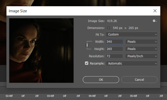
In this box, if I put the width as 540, the gif is a smaller height than I want, as it keeps to the dimensions of the gif when you load it into PS. That’s okay, just put the height you want instead, and we’ll crop off the excess.
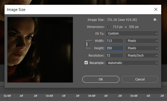
Then click OK. Using the rectangular marquee tool again, we need to remove the excess width. Part of the reason I like this version of PS is that it tells you the width of your selection as you do it, but you can always use the ruler as a guide, and check the size of your image by going to image > image size again.
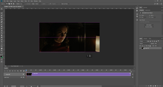

Again, use image > crop, and your gif should now be the correct size!
You can also use the crop tool in the timeline window to crop the length of your gif:
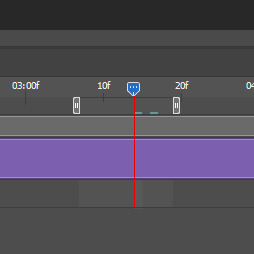
However, I tend to wait until later on to do this (which will be explained further down!)
SHARPENING
Next you want to go to filter > sharpen > smart sharpen.
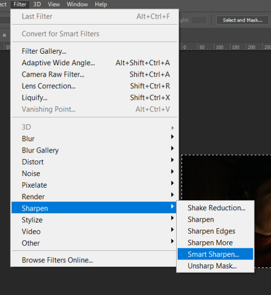
These are my settings. However, 0.4px is very sharp, too much so, but that’s easily fixed.
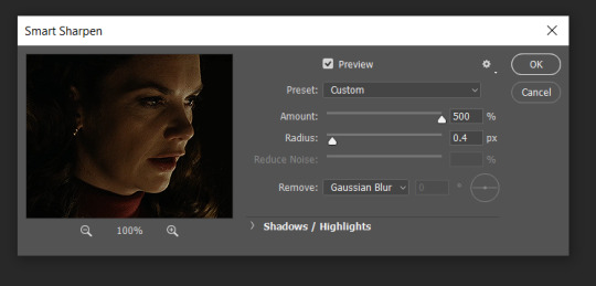
Go to filter > blur > Gaussian blur and then set it to 1.0.
Now on the right-hand side, we need to reduce the blur, so double click the little adjustment button, and change the opacity of the blur. I usually go for 20-30%!

Then click OK, and that’s your sharpening done!
COLOURING
I picked this scene on purpose as it’s dark, so good for showing how to colour a gif. I have a base psd which consists of some very basic adjustments, but it mostly exists so I don’t forget what adjustment layers I like to use. I adjust them every time I make a gif, essentially colouring each gif from scratch.
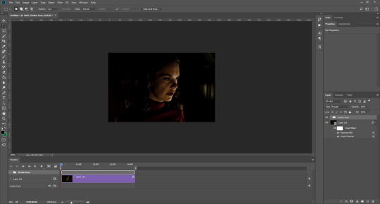
In this case, the psd actually makes it darker. So, what I will do is turn each layer off, and adjust as I go. A lot of people say using lots of adjustment layers ruins the quality of your gif… I have never found this to be true, as long as you are gentle with them. If you whack the brightness right up to the top, it’s going to ruin your gif no matter if you use 1 adjustment layer or 100. I would just say use your common sense, and adjust a little at a time!
I start with a simple black to white gradient map set to soft light, because I think it helps you see depth once you add some brightness to it. I usually do this on about 10%, or more if needed. It’s probably unnecessary, I just like how it looks!
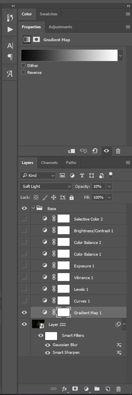
Then, I move onto using curves and levels. This is where things can diverge depending on who you’re colouring. If this person is white, it doesn’t matter too much. If they’re not white, you don’t want to white wash them. My best advice is to play around with it. By adding vibrance and other (usually the red) selective colour settings later, you can ensure you don’t change the person’s skin tone from what it originally was. You can also use layer masks at varying opacities (various shades of grey), on your curves and levels, to remove some brightening so that you’re not changing anyone’s skin colour. Just brighten slowly and check in with yourself honestly about how your gif looks.
Some people don’t like using levels, or curves. It’s completely up to you. I tend to use both because levels are good for bringing depth, even if not brightening (though I like to use them for that as well).
One thing you can do is use the white point of the gif to make PS adjust the curves itself, however I like to drag the sliders myself and see what it looks like. Just make sure it’s not too bright, as we will be using further layers to brighten more, after.
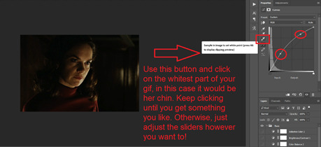
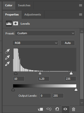
Next is levels. The slider on the left controls the black point, the one in the middle controls the midtones, and the one on the right controls the white points. The black brings depth, the midtones adjust the overall brightness, and the white points produce stronger highlights. Again, you’ll get a feel for how this works as you practice. Just don’t use the white point excessively, especially if your characters are not white.
Then I add vibrance (+20!), because we’ve removed a lot of it when lightening the gif. Next is exposure, which I find brings out the highlight and shadow areas more effectively:

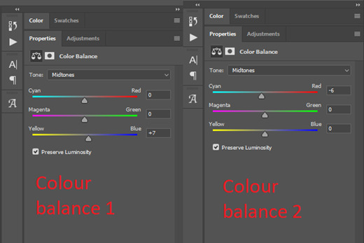
Then colour balance! This helps with scenes that might be a certain colour, i.e. too blue, too green, too red, etc. Moving the sliders in the opposite direction of the colour your gif is will counteract it. The best thing to do when accounting for different colours, is to make a new layer every time you change colour, so that you don’t get confused. I always add a new layer for colour balance and selective colour if I want to change more than one thing. So one for red, one for yellow, one for pink, etc.
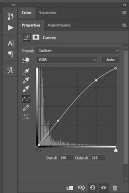
A layer of brightness just to make the gif pop, and because the scene is extra dark, I added a very gentle extra curves layer:
SAVING YOUR GIF
Time to save the gif. You can go ahead and file > export > save for web (legacy) now, but then you’ll have to reopen the gif to reset the frame rate from 0.07, to 0.05. Instead of doing that, I use a modified action. The original was made by the very talented @elenafisher! So I do not take credit for that at all. You can find the original here: elenafisher(.)tumblr(.)com/post/190817437374/gif-sharpening-action-2-preview-download and in my resources tag. Please reblog it if you’re going to use this!
To use an action, first make sure you have actions turned on in window > actions. To load in your action, go to the little lines circled, and then load the action from your downloads:
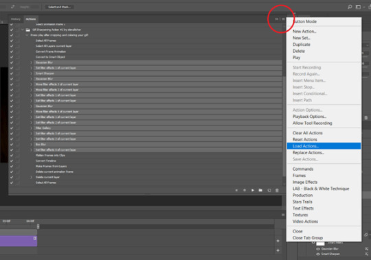
Obviously if you don’t want to sharpen your gifs yourself, you can use the action as it is, and it will give you a beautiful glowing effect. If you’d just like to use it to flatten your gif into frames like I do, make sure to take out all the items I have highlighted:
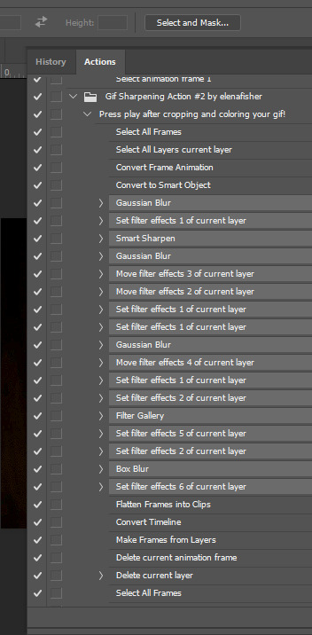
Until it looks like this!
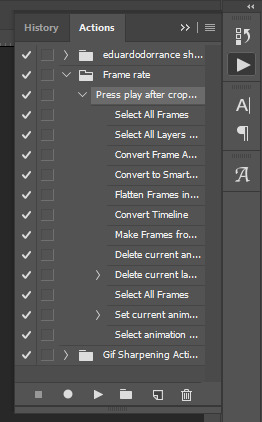
Make sure you have the layer under the file name highlighted, and then click the play button at the bottom! (If you get a screen saying select all frames cannot be found, don’t worry, just click continue!) You can delete the layer that does that if you want, I just keep it in case I realise I’ve forgotten to do something, because you can click cancel and edit your gif before you flatten it. Of course you can undo the steps to get back to the smart object version of your gif, it just takes longer!
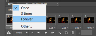
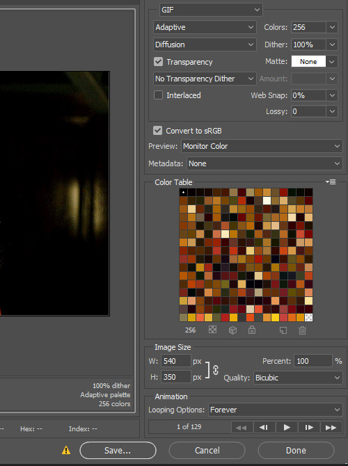
And now your gif is in frames and set to 0.05 already, so you don’t have to change the speed! All you need to do now before saving is change the gif cycle to “forever” in the bottom left-hand corner:
Then to save the gif go to file > export > save for web (legacy). Sometimes, the gif is bigger than the tumblr 10MB limit. You’ll be able to see this in the bottom left-hand corner of the gif save settings. If this is the case, I like to preview the gif, to see whether it would be best to cut frames off of the beginning or the end, or both. When you’ve decided, you can select the frames at the bottom, and in the right-hand side panel, and delete them both using the little bins/trash icons.
I keep checking and deleting frames until I get the gif under 10 MB! Just don’t delete frames from the middle, as then you’ll have the same issue as if you selected “every other frame” when making the gif: it won’t flow!
Lastly, these are my save settings:
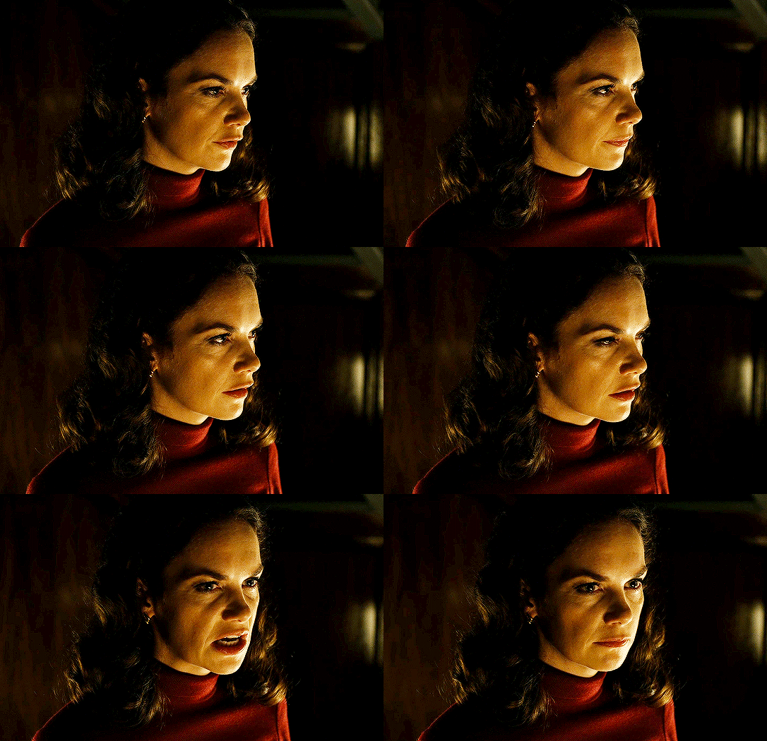
So that’s it! That’s how I make all my gifs. Blending I do when the gifs are in the grouped, smart filter stage, whereas text I add on during the framing section above! Really hope this is helpful, please feel free to ask any questions you may have! 💖
#gif tutorial#tutorial*#completeresources#yeahps#chaoticresources#allresources#mikesmom#usergeo#userava#usertix#usersmile#usertom#if you'd like me to cover anything more advanced just shout#i wanted to show how i add text too but tumblr wouldn't let me add any more pics#but people can let me know if that's something you'd want!
515 notes
·
View notes
Text
I got tagged for this by the delightful @las-lus. ta, dear heart!
1. why did you choose your url?
I fell in love with The Amazing Devil (and have yet to fall out with it) and just... yeah. It’s from one of my favorite of their lyrics:
Day by day oh lord three things I pray That I might understand as best I can How bold I was, could be - will be - still am, by god still am
2. any sideblogs? if you have them, name them and why you have them.
Not really, unless you count my old blog that I abandoned due to some interpersonal fandom wank shit on a totally other website that i just... did not want to potentially have to deal with fielding on tumblr as well, and I’d linked regularly to my tumblr so I knew ppl knew where to find me. (I don’t much care any more, it’s @actuallyclintbarton)
Unfortunately for y’all, I do not give a fuck about restricting my fandom reblogs and shitposting to thematically appropriate blogs, y’all get to deal with ALL OF IT. ;)
3. how long have you been on tumblr?
2012! my original username was bemyselfloudly. (i’ve also been through shit like... whatwouldcapdo, queersuperteens, wrotemyown, actuallyclintbarton, cottoncandydumpass, and ruffboijuliaburnsides. I know I’m missing a few lmao. I don’t change my URL on a whim mostly anymore)
4. do you have a queue tag?
I’ve had quite a few! I think the one I kept longest was “always we will queue as one”, from the Avengers Assemble theme song? Mostly bc I forgot to change it for a while. currently, it’s “i promise queue i’m not broken”, from TAD’s “Farewell Wanderlust”.
Other entries: “i’ve got red in my queue”, “to queue the monsters we created monsters”, “i am not queueing away my shot”, “were queueing it man. were making it happen.”, and “abracafuqueue”.
5. why did you start your blog in the first place?
I randomly found a trans guy’s blog who was... like he wore stockings and heels and makeup and dressed really feminine but was still A TRANS GUY. And that spoke to my lil not-out-as-trans-to-anyone-at-all heart, and so the first handful of posts were probably introspective shit. And then I started reblogging MCU stuff. And then birdie got a blog and I was lost.
6. why did you choose your icon/pfp?
Oh! My icon is currently art of one of my many DnD characters, a gnomish warlock named Cricket! My wife got a commish of her and her halfling girlfriend Ambria on Flight Rising from a particularly delightful artist, and I love it dearly.
Here’s the full piece, btw (with a gradient on it bc the original is transparent):

Cricket’s whole “starting concept” is basically just “Party Girl-era Ke$ha, but a gnome, a lesbian, and bound to a warlock patron”, she has fully helped win a cage match by hitting a guy in the dick with a folding chair, and I love her constantly drunk or hungover lil ass DEARLY.
7. why did you choose your header?
It’s Joey Batey, who sang the line my url/header text is from, but also it’s fuckin HAWT.
8. what’s your post with the most notes?
AHAHAHAHAHAHAH *sob* It’s a post from February with like 63k notes about Quibi doing a quarantine home video version of The Princess Bride.
9. how many mutuals do you have?
I have no earthly idea and I have no way to check. PROBABLY AROUND 200?
10. how many followers do you have?
5,109. Gods bless you all, why are you HERE????
11. how many people do you follow?
392. I am very picky, clearly XD
12. have you ever made a shitpost?
I mean, hasn’t EVERYONE?
13. how often do you use tumblr each day?
anywhere from “no times” to “essentially constantly”. It really depends on the day and where my brain is.
14. did you have a fight/argument with another blog once? who won?
Not with any particular blog. I’ve got particular arguments I feel strongly about and will fight any time I see it on my dash, but it’s not a particular FEUD or anything. Possibly the closest is the artist formerly known as zarabitha bc I had serious issues with their headcanons/fandom policing, but that’s ancient news and I’m p sure she never recognized me as a unique individual.
15. how do you feel about “you need to reblog this” posts?
i resent them and generally actively AVOID reblogging them. Don’t fuckin try to guilt me into shit motherfuckers, I’m not here for that.
16. do you like tag games?
Yes!!! I don’t always respond as promptly as I’d like, but I adore them!!!!
17. do you like ask games?
Ditto above. LOVE ‘EM. Not always timely.
18. which of your mutuals do you think is tumblr famous?
Probably @seananmcguire and @thebibliosphere are the closest to tumblr famous amongst my mutuals.
19. do you have a crush on a mutual?
....I mean, YEAH? it’s kinda a foregone conclusion, I crush easy.
20. tags?
WHOEVER WANTS TO. I mean this. Pls tag me as having tagged you. I just can’t CHOOSE. So fuck that. I guess specifically @jackironsides and @persony-pepper but specifically pls JUST IF YOU WANNA DO THIS, DO IT.
10 notes
·
View notes
Text
Story Process Tag by @herpixels
I was tagged by @dynastiasimss - Thank you so much for tagging me!! 😊💖💗 This will most definitely get a bit wordy because I’m terrible at explaining things concisely! 😂 Also, I’ll mostly be talking about my process for 2.B.A Grandmaster but I’ll touch on my process for Erin in San Myshuno too!
I’m also going to get tags out of the way up here so that no one has to scroll all the way through this ... absolute novel that is under the cut LMAO so I tag: @cyansimblr @x-simss @matchacake and any other simblrs who wanna do this!! and feel free to skip if you want!
1. Your writing process My writing process is very, very chaotic, and changes with the wind... Erin in San Myshuno doesn’t really have a process, I just play the game and then put in some dialogue based on the events. None of it is guided by my hand at all though! 2.B.A Grandmaster on the other hand is written in part based on what happens in game and in part by my own creative vision. Most of the time, I let stuff happen, and then fill in the blanks in between events. I go in game, play Sims as I normally would (skill build, take care of needs, go out to venues, etc.) and then watch what weird and interesting things happen. For example, Augusta’s meeting with Xavier in the beginning was completely the game’s doing! He was the only one to show up for the Welcome Wagon event, so I rolled with that. Scenes like Kaitlin’s meeting with Maverick and those sort of things are planned by me, as they’re necessary to create a more full narrative! It’s like collaborative storytelling, but my “partner” is a game that is weird and random and crazy. 😂 After stuff happens in game and I get screenshots, I then actually write for it. I chose to write novel style for the series because - as some of my long-term followers may remember - I had another story that was just screenshots with dialogue on them? And it was very hard, LOL, it didn’t suit my workflow very well and I ended up dropping it after a month or so. I wanted 2.B.A Grandmaster to be something I could post consistently, and so I opted for a style that I was more familiar and experienced with!
2. Scene building For the most part, I just work with what sims gives me, but as I mentioned above, some scenes I actually go to the trouble of setting up. For those, I still use the sims animations mostly (I’ve used poses about 3 times in 2.B.A Grandmaster so far) but I do usher my sims around the "set” as I see fit. I build a lot of my own lots and locations for 2.B.A GM because I tend to get a vision in my mind of what I want and refuse to settle for less. 😂 One such case is the scene where Maverick meets up with Octavia--
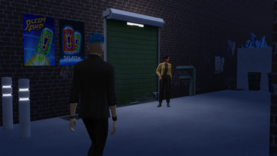
I made the alleyway we see here - it’s two entirely empty buildings sandwiched side by side on an otherwise empty lot in Oasis Springs. The only part I bothered to decorate was the alley itself because I knew I wasn’t going to use the rest of the area, but maybe we’ll revisit it sometime and I’ll finish the two buildings! I actually loved making this set and like how it turned out, LOL~
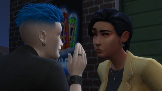
Then I just have whatever sims are involved in a scene interact with each other for ages until I feel like I have enough screenshots to make a scene. I usually have a vague idea of what’s going to be said in any given scene - especially the ones I actually planned out beforehand - but I get some excess screenshots to be safe. I try lots of different interactions and pause like every few frames to get interesting expressions and stuff, LOL. Lots of “Complain about Cold Weather” and “Give fake bad news” ...
3. CC/Pose making I don’t actually make my own CC for 2.B.A GM specifically (I’ve made a couple eyeshadows but I don’t use them super frequently) but there is a scene coming up in the future that I plan to make poses for. I have a very clear image in my mind that includes a lot of subtle expressions and very specific things that I doubt I could find poses for, so I’m gonna have to brave the terrifying landscape of blender in order to make it a reality. 😧
4. Getting in the zone I don’t have any sort of “ok, show time” ritual like some people do but I wish I did, because my motivation waxes and wanes so unpredictably. Some days I just don’t feel like doing anything, and other days I edit and write for 5 posts in a row! I am always listening to something though, usually music, every once in a blue moon a video with lots of talking. 5. Screenshot folder
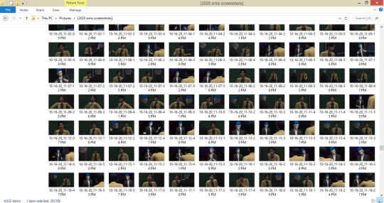
UGH...
6. Captions I don’t do captions on 2.B.A GM posts, but for my city living gameplay I do! I keep them simple, because I don’t want to make it too much work for myself. Erin in San Myshuno’s style of editing is 100% based around ease, because I wanted something to post often that didn’t put too much of a strain on me. Verdana in white, typically 35-40 px, with a gradient border. Each sim we encounter has a different gradient color, usually based on their outfit or just the ~vibe~ I get from them. Erin’s gradient is Hot pink to ... gee, what would you call it. Sonic the Hedgehog Blue LMAO-- I chose that gradient because that’s the color of the overlay, which I’ll talk more about in the next section!
7. Editing My two ‘series’ - and I use that term loosely LMAO - have different editing processes, so I’ll try to summarize them both. Basically, for 2.B.A Grandmaster, I touch up the saturation and brightness depending on the scene. If it’s evening in the shots, I usually won’t touch brightness, and if it’s night, I might even lower it a bit for more accurate lighting! Once that’s done, I blur everything but relevant elements of a scene, usually the character we’re following or who is speaking. I have to select the character from the background manually which takes a bit, but other than that it’s very minimal.
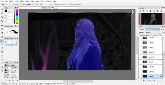
My shots aren’t super glamorous, but I prefer simple screenshots and actually being able to keep up with a story schedule as opposed to what happened with my last story. 😬 As for Erin in San Myshuno, barring captions which I only do when I feel it’s necessary, it’s literally just an overlay on otherwise untouched screenshots. 😭 I would do more, but again, it’s supposed to be an easy downtime sort of series for me so~
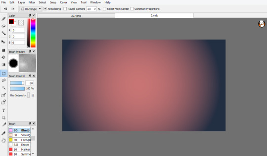
This goes over top all screenshots on the “Add” setting at 20% opacity. It brightens things up and softens them, as well as making the colors slightly more harmonious! If anyone wants me to go more in depth on editing, or maybe captions, please let me know! I’m happy to talk about it if it’ll help anyone, and I know that a lot of tutorials cover how to do stuff in Photoshop, whereas I use FireAlpaca (which is 100% free btw! It’s more of an art program, but not bad for editing) 8. Throwback!
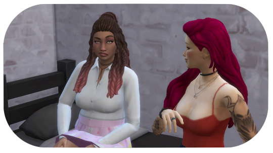
Oh boy, so this is one of my first posts on simblr. For starters, I didn’t know about camera mode at the time, so that’s the first thing I would change obviously LOL. 😬 The framing I did at the time was ... cute, but it makes the pictures feel kind of cramped and small in my opinion, so I did away with that for all of my later stories. Also, Amy and Gemma aren’t very well centered in this picture! Other than that, this isn’t actually terrible I don’t think, so aside from maybe blurring the background as I do on 2.B.A GM now, I wouldn’t change too much! Thankfully, I had observed other people’s stories before making my own on here for a little bit, so I wasn’t starting with absolutely no idea what to do, but I still think I’ve improved since I made these. 😊
This was a ton of fun!! If anyone has questions or wants more info on anything I covered in here, absolutely feel free to ask, and thank you so much if you actually read through all of this - I know I rambled for quite a while!! 🙏
20 notes
·
View notes
Text
termiinallycapriiciiou2 replied to your post “What software and tech do you use to make your art? And can you show...”
Idk about the asker but I very much would like to see your comic making process
Welll without further a-do, lemme start! >:3c
Most, if not all, of my comics idea come to me on a whim, I don’t ever write it out or try to think too hard about it beforehand. Like the thought of “of hey what if this and this happened, that would be funny” and then I start loosely sketching the panels that are in my head at that moment. I usually start with the middle leading up to the main event and once I have that figured out, I add in the beginning, end, and any other panels that would help with flow.
I feel like a lot of ppl have great ideas for comics but get preoccupied with how a comic should start or end, so starting with that’s on your mind first (what excites you) and then filling out the rest once you have the initial idea out of your system is a good way to go about comic making. So like with my Raph and Mikey comic, I started out with the sketches in the red box and I added the build up and punchline/ending after.
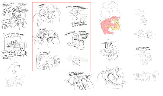
General rules i try to follow whenever I make comics is 1) Keeping the characters in their same side of the panel for consistency 2) Change up the compositions so I’m not using one too many times in a row and finally 3) Avoid adding too little information to panel to the point where you could throw it out and the comic would stay the same, BUT also avoid putting too much information where the reader is going to stay on that panel for too long and break their flow.
((This post starts to get long when I show more examples so I’m putting the rest under a cut!))
That’s why i don’t really like my Dr. A Noel comic now. I used the same two compositions throughout the comic and there’s too much build up for a single punchline, I could of knocked out one or two panels and the joke would of stayed the same :/

These two examples above show pretty detailed sketches, that’s just the way I like to sketch personally, but making very simplified sketches is something I try to utilize or else I’ll find my lineart looking worse than my sketch pffft. So with my Mikey Swapped Au comic, I made the sketches really really quick cause I knew i wanted to lineart itself to be sketchy as well, so there wouldn’t be a point in sketching how i normally do. :0

Now for coloring; I like to finish my drawings in one sitting cause if I don’t, 80% of the time I won’t finish it the next day. So i always like to use a gradient map or simple color blocking when it comes to comics.
For gradient maps I color the comic in black and white and choose the best ones that fit the comic. For the Mikey swapped au comic choosing something with a lot of contrast and rich colors helps push the serious tone. I colored it with messy brush strokes to amplify how Mikey is feeling and I had the comic get darker from the beginning to the end, wrow how Edgy. (the split down the middle shows how it looks with and without the gradient map)

But for my Raph and Mikey ghostsweats one I focus more on simple color combos and just blocking/silhouetting the characters in one shade since it’s more dialogue heavy and light hearted. Only putting in major contrast when Raph gets offended to show there’s a big change in his mood. Same thing with the Dr. A Noel comic and my Draxum and Mikey comic, the colors are kept light and simple cause it has a light hearted tone!

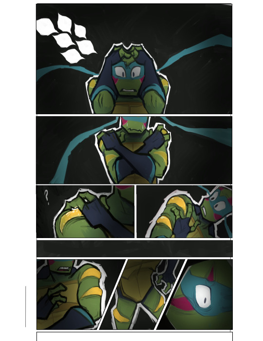
Coloring comics, especially longer ones, is really intimidating but you don’t have to do full completely colored comics to get your tone across. Sometimes simplifying the colors down helps elevate the tone more. Of course not I’m saying to not fully color your comics, but if you’re like me and find coloring really time consuming, but you still want color on your comics, slapping down simple colors can also do to the trick! This is a scrapped comic of Leo having a nightmare I made awhile ago, and the reason I scrapped it was cause it took me too long to color lmao.
Soooo yeah! I think that’s about everything! Of course whatever I said isn’t end all of comic making, but I hope it’s insightful and maybe even a lil helpful for someone!! ^^ Thanks for reading all the way through too! ✌
83 notes
·
View notes
Note
1, 4, 19, 34, 36 for the GIF ask :dorime:
1. What are your top 3 favorite sets you’ve made
(in no particular order)
- Charles + name meanings: mostly because it’s just such a fun concept, I always love those etymology type gifsets and I got to play around with fonts and gradients here too which was fun. I struggled with this gifset for a long time (or rather it’s previous iteration) and then changed up the concept entirely and went with a black and white + grain and colourful text approach and I think that works much better
- Sebastian teaching Charles German phrases at the German Grand Prix 2019: This one was hell to make, between the text and constantly referring back to the video to make sure I was getting the subtitles right and then also some pixilation issues I had but I’m ultimately happy with how it turned out and oddly proud of myself for bringing that moment back into the spotlight for one night. Watching the dash freak out over this was pretty fun lmao
- Sebchal + Stacie Cassarino’s Summer Solstice: Again the font work was quite fun and I got to use some scenes I haven’t used before (Sauber Chal looking over at Seb in his Ferrari, the Singapore pit stop shenanigans, post-qualy moment from Japan.) Discovering the poem and having that connection was also fun. If I had to re-do it I would try to have a more neutral type coloring though because I feel like colourful edits/gifsets are generally hit or miss and most people seem to prefer more natural-looking colourings. But I couldn’t resist when this PSD looked so good across scenes *cries*. Maybe one day.
Also this makes me realise that I actually haven’t posted that many gifsets, lmao, I should probably do something about that...
4. A set that flopped but deserved better
I’m not sure that it deserved better, lmao, but I guess this one. I mean, I understand why --- the concept’s kinda niche and again the colouring issue (see above) so I get it. But damn it if I’m not proud of putting those garage scenes together. The ✨tension✨
19. What is your gifting process like
It’s just me having a string of mental breakdowns while Photoshop crashes on me.
Hm. Here’s the thing: I have two versions of Photoshop --- one is older but portable, meaning it takes up less space because it doesn’t have to be installed, and it works fine and is generally more efficient and less RAM-consuming but it’s missing some of my most-used features (or rather, they don’t work for me for ??? reasons???: Import Video Frames To Layers and the whole... thing where the text snaps to where you want it to be which is nice. There’s probably a manual option for that but I’m stupid and haven’t discovered it if it does exist. The second version of it is newer and has those features but it’s evil and RAM-consuming as all hell, meaning minimal background apps and a lot of interrupted giffing sessions because when you go to Sharpen it’ll tell you you can’t because he’s ran out of memory. Which... he hasn’t. it’s stupid. Anyway...
Step 1/2. VLC is a life saver, honestly one of my favourite programs. I use it to record shorter segments of the video I want to use --- say, only one particular scene from a DTS episode or a SkyF1 feature. The shorter the clip is the easier it is to manage once you open up Import Video Frames To Layers and get that little popup where you select the parts of the video you want to use. It’s easy to misjudge and miscalculate on a longer clip, select something that looks like a small segment and then end up with... 263 frames and a Photoshop on the verge of crashing.
3. I tend to crop and change the size of the imported frames first before doing anything else. Trying to play back a gif with like 60 layers in its full original size... see above. Then I’d play it back and decide where and if I want to chop some layers off. You ideally want to make the gif flow as naturally as possible. This is especially tricky when you’re doing subtitle gifs and you sort of have to do a bit of lip reading and/or referring back to the original clip and decide how much of the speaking part you want in there, again trying to make it seem as natural and seamless as possible.
4. Colouring. I’m lazy and untalented so I generally rely on the PSDs provided by the kind creative souls of Tumblr and Deviantart. Obviously I’d tweak them accordingly and add my own layers if need be --- usually Curves, Color Balance and Selective Color. Those can be life savers when trying to adjust the colouring, getting too-yellow or too-red scenes to look more neutral and natural.
5. Over that I put the text (if I’m using it.)
6. From there it’s Convert To Video Timeline (I hate using the Timeline but it has to be done) -> Select all your layers -> Convert for Smart Filters -> Smart Sharpen. Sometimes Add Noise and/or Grain for a bit more spice
7. Save for Web..., then possibly cry if the gif size is too big, chop some layers off, go again, etc.
8. Unfortunately PS is bwoken and you need to open your finished .gif and change the Delay to anywhere between 0.03-0.05, depending on what looks good/natural on the gif (0.05 for “normal” gifs, less if the footage is in slow-mo)
That’s... probably it. I learned almost everything from Tumblr tutorials, so ajsdkfg
34. A set that took you a long time/was really hard but you’re really proud of how it came out
A cop-out but I’m gonna say Sebastian teaching Charles German phrases at the German Grand Prix 2019 again for this one because it legit took about two days, unexpectedly.
36. Do you gif with something specific in mind or do you just wing it
I usually have an idea of what I want to do or at least which scenes I want to use, but the ~creative vision~ definitely changes. Sometimes things just don’t work out the way I wanted them to (the clip is infuriatingly short when transformed into layers, or the colouring just doesn’t want to work no matter what you do, or something else entirely) and then you try doing it a different way and maybe that works better
3 notes
·
View notes