#especially in terms of overall silhouette
Explore tagged Tumblr posts
Text

People asked me to do Roy so I thought, why not try Dot too? 💙💖💜
Their designs were definitely more difficult to adapt to the OS style since they're almost 100% modern elements, but I did what I could while trying to keep them recognizable! Hope you like the result. :>
[Original Liko post]
#Pokemon Anime#Anipoke#Pokeani#Pokemon Horizons#Liko#Roy#Pokemon Roy#Dot#Pokemon Dot#pkmnart#my art#Anipoke art style swap#// I did a first pass for both of them that looked more authentic to OS but they were basically different people so I had to compromise#just to keep them recognizable haha#especially in terms of overall silhouette#Roy is the one who looks the most different but the reddish pink hair looked so out of place... ;; so I added it to the hat instead!
803 notes
·
View notes
Text
OK– so this is gonna be the last time I have to do a full line up to my guys, right? Right?
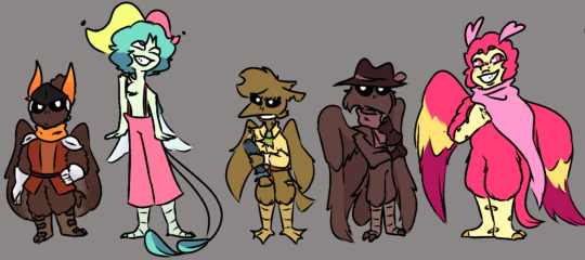
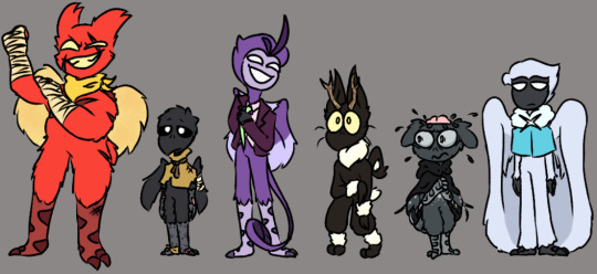
seriously tho, very proud of this piece and how far my designs have come, and this will probably be the main look I'll settle with for all my voices.
Full line up and some design notes + headcanons under the cut:


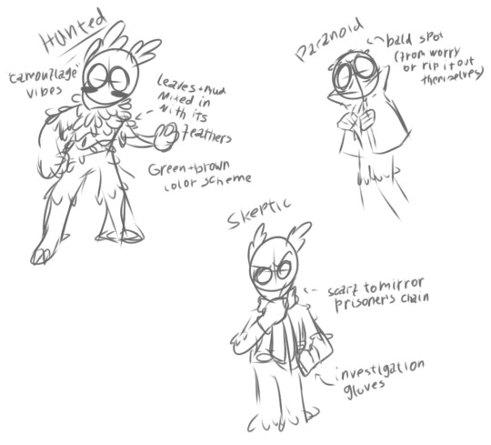
and here's the first ever sketches for comparison:
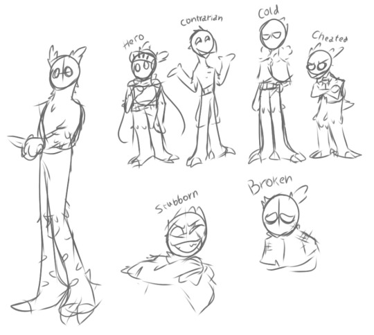
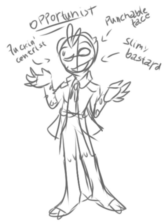
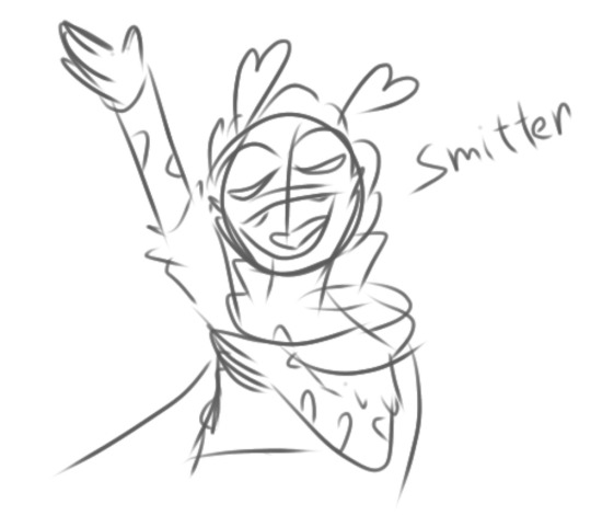
Hero: didn't change much from my original sketch, but I certainly got a lot better at drawing his body type. Sparrow; general shape is a square with rounded edges. Reliable and strong, but still soft. He wears that red shirt I sometimes draw him in under the leather armor, and the feathers on his helmet are fake, his real ones is brown like the rest of him (how does it stay perfectly hidden in the helmet? ✨Magic✨). He/Him.
Contrarian: Changed a LOT from the original sketch, and got details added to him a lot as I drew him. Hummingbird; tall and lanky silhouette, mainly broken by their hair and wings. They start off with a different color palette in the construct, that becomes faded out in Strange Beginnings, and finally, gets a lot more colorful as they develop outside. They/He.
Cheated: also changed a lot, as I struggled a bit with properly conveying his shape language. Seagull; sharp lines with lots of pointed bits in his design (mainly triangles and losangles); overall look is somewhat asymmetrical to add to the 'patched up' feel. Detachable arm, and more limbs could be too, but she's trying to be careful with her own body. She/He.
Skeptic: the general vibe of his final look was there in the initial sketch, but how I decided to convey it changed a lot. Hawk; the only things his wears is his hat, gloves, scarf (and sometimes a waist purse), with the feathers around his chest and tail giving the impression of a suit/coat. The feather on his hat is one of his own, he has a similar feather poking out of his head that gets hidden by the hat (*points* bald). He/Him
Smitten: design didn't technically change from how I initially drew him, just the way I draw it that evolved. Macaw (pink macaws don't exist?They do with the power of belief!!); all round edges and soft lines, giving him an approachable and harmless appearance despite his size. Has the most human face out of everyone here. He/Him, but won't complain if you use other pronouns too (especially she/her, it's a lovely pronoun set <3)
Stubborn: almost didn't change at all from my earlier designs. Mainly exaggerated his features and shapes a bit more. Ostritch. Big and bold lines for a large square as the general shape. Ear tufts looking more like horns, and his fluffy wings help break the pattern a lil bit. Gave him a cat face cuz I thought it'd be cute and the shape works well with his ear tufts. He/Him (but in a lesbian way).
Broken: Also didn't change all that much. Small and unobtrusive, their general shape is smth of a slouched square, and the head is shaped like a teardrop. Pigeon; takes the most from The Long Quiet in terms of general traits, tho much more worn down. The sack-as-cloak is supposed to invoke the look of an abandoned pet. Some of their feathers grow back with time, and they forgone the sack to get some actual clothes, but it's a long way till then. They/Them.
Opportunist: Gave me the most trouble designing, but once I had the initial doodle down, designing him went a lot smoother lol. Magpie; car salesman attire. The always-loose tie is supposed to look like a snake's tongue, and his head shape is kinda like that of a scorpion's tail. He does have an actual scorpion tail, but that remains hidden in case of emergency. Face looks like a porcelain mask despite being an actual face. He/Him (also occasionally use Ey/Em too).
Hunted: Changed the most out of all my designs, getting a full rework at some point. A hybrid between hare, deer, and quail; prey animals, while Beast has more predator traits. Has no depth perception like a lot of prey, and its stance makes it look smaller than it is (it's about as tall as Cold). It/Its.
Paranoid: The initial sketch is pretty incomplete, but the general idea is there. Loon; big eyes and uneven feathers to give her a 'frazzled' look. Feathers always falling out looking like she's always sweating bullets. Cloak covers overpreened wings and most of her markings. Fun fact: the exposed brain was initially visualized as just a bald spot, but since it looked like a brain, I just rolled with it. She/Her.
Cold: Pretty much had the general idea for his design nailed down since the initial sketch lol. Owl; another lanky and tall dude, tho more retangular with almost nothing to break the pattern but the little hair strand. Head also shaped after water, but while broken is a teardrop, for him I visualized raindrops. Has an X scar on the chest just under the X pendant on the cloak. Any pronouns.
#slay the princess#voice of the hero#voice of the contrarian#voice of the cheated#voice of the skeptic#voice of the smitten#voice of the stubborn#voice of the broken#voice of the opportunist#voice of the hunted#voice of the paranoid#voice of the cold#stp voices#voices design#finished drawing#sal draws#sal rambles
100 notes
·
View notes
Text
Let's Talk About Girly-Kei Substyle Names!

Since this style has been gaining some popularity in j-fashion communities, I wanted to do a small lesson on how to refer to different styles of girly-kei. I've noticed some strange names being assigned to this style, and I want to clear up any misunderstandings people may have about these terms.
There are many labels people put on this fashion style, but for some reason it's anything but girly. It's understandable how some terms could be mistaken for the name of the fashion, especially since some stereotypes associated with these styles have heavily contributed to the wrong terminology being used. Examples of terms that have been associated with girly-kei are... Ryousangata: (meaning a "mass-produced" type of person, who's heavily involved in wota culture) J*rai-kei: (a stereotype referring to an emotionally unstable person who "explodes like a landmine".) Subcul: (It used to have the meaning of "poser" in Japan, but nowadays it is used to refer to any type of alternative fashion. While this one is more harmless, it doesn't do any good to refer to a style that already has a name as just "subcul fashion")
In the girly-kei community, we label these colour combos a bit similarly to lolita substyles. So, let's name some some girly styles that have been getting popular! Sweet Girly: This style consists of sweeter elements, such as ruffles, bows, hearts, and cute prints. Sometimes, you can find sweet girly sweaters with plushie embroidery! Bijou details are also popular with this style, as the jewels seem to compliment the overall cuteness of these outfits!
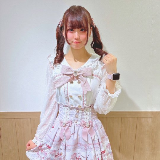
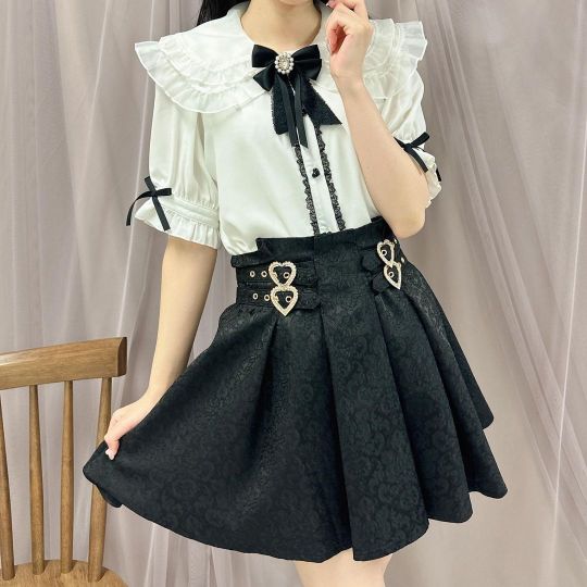
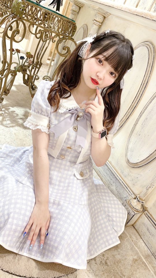
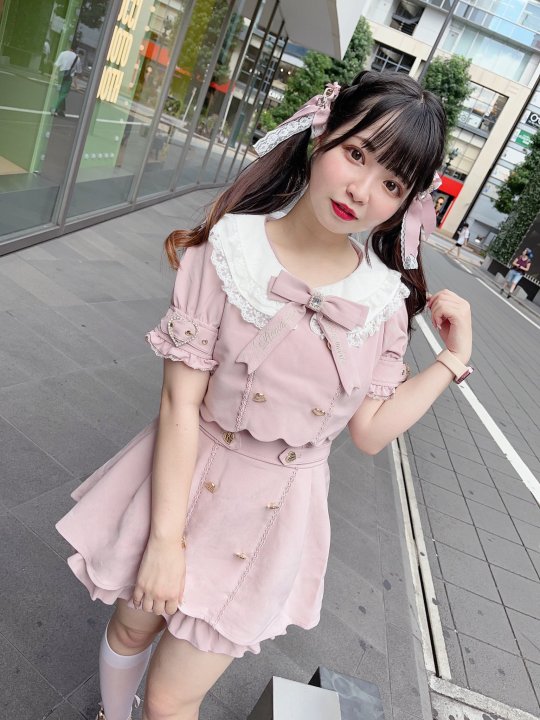
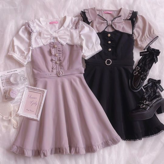
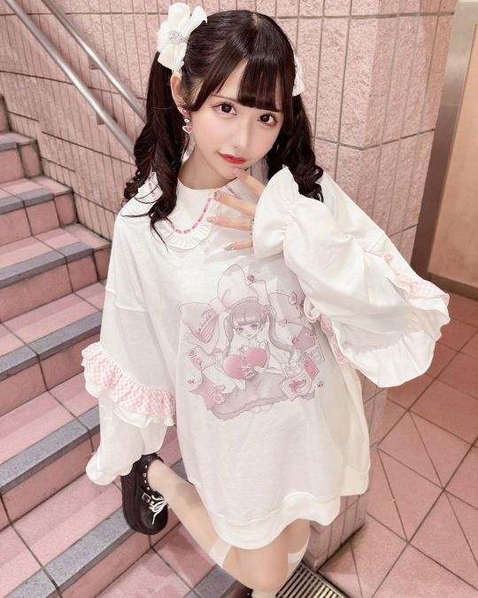
Dark Girly: This style focuses on more darker/edgier elements, and these outfits seem to have a more gothic look to it. Characteristics such as chains, leather, and religious imagery can be found in this substyle. Despite the name of this substyle, the clothes don't need to have a dark colour palette. Just as long as they fit the criteria!
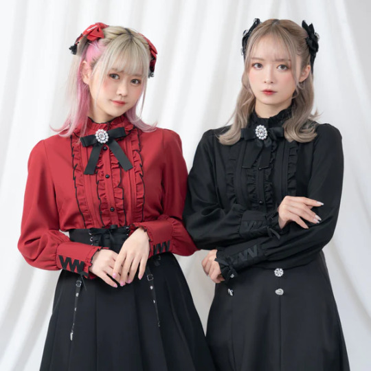
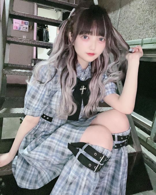
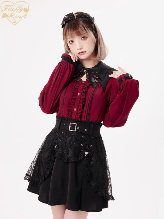
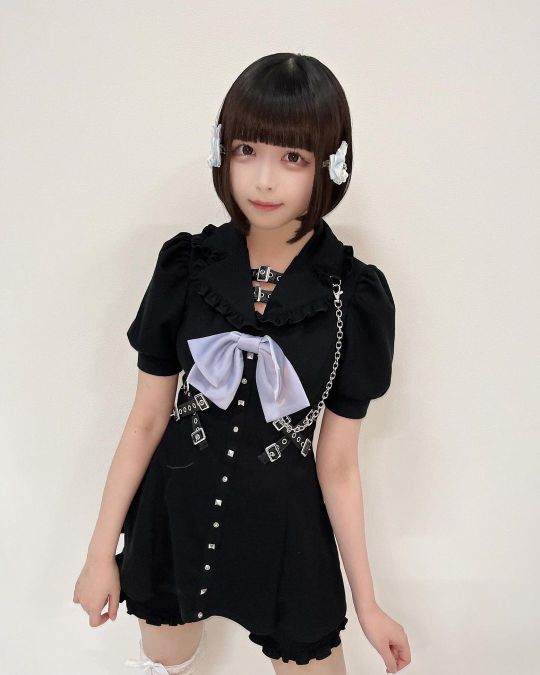
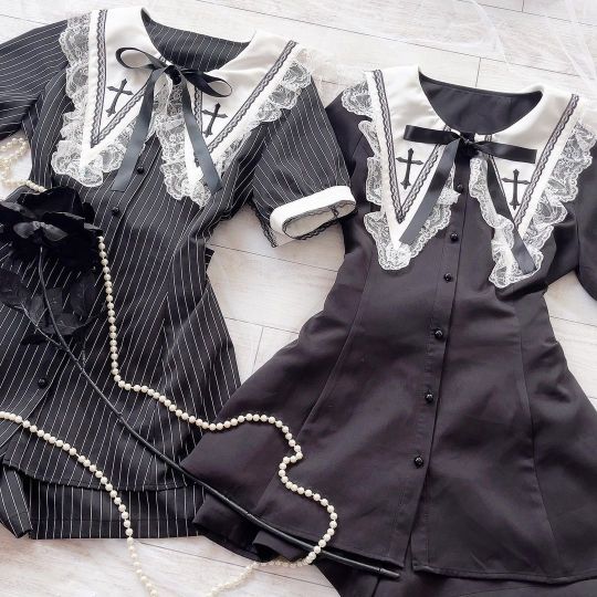
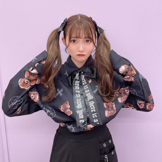
French Girly: This style is meant to resemble a more European style of fashion! This elegant style also maintains a sense of simplicity, as their silhouettes and designs tend to be neat. As you can see, berets are especially popular in this substyle, but other accessories such as pearls, gold jewelry, and hairbands are also used in these outfits.

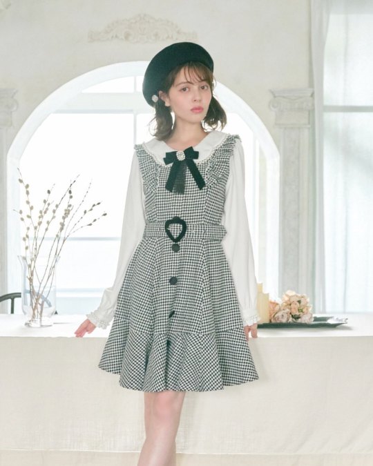
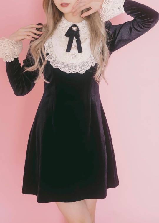
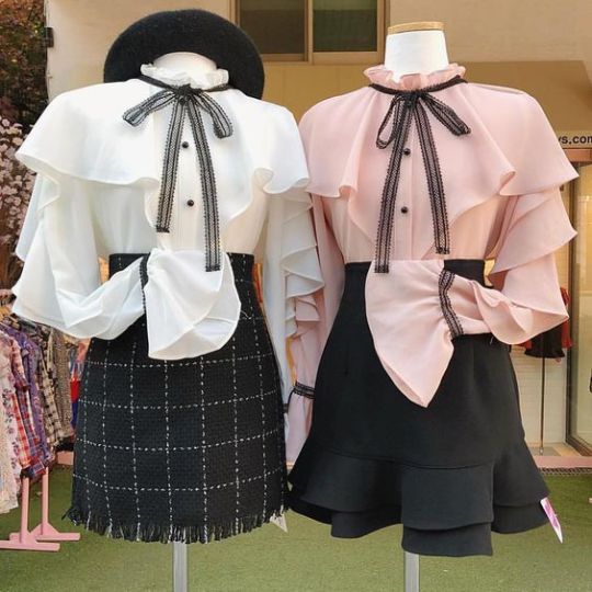
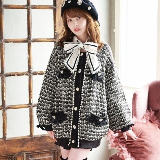
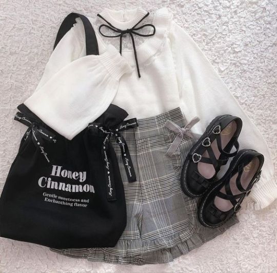
I find that among girly discourse, some argue that "girly-kei" is way too broad of a term, but that's where you can have fun with your outfits! It's not a requirement to specifically adhere to a certain substyle when wearing girly-kei fashion, and honestly just wear what makes you happy! A lot of these substyles can overlap as a result, which can create pretty cool outfits!
Referring to these substyles by their proper name not only sounds nicer, but it can help erase stigma around wearing girly fashion as a whole.
If you wish to read about more substyles such as otona girly, retro girly, himekaji (yes, even the gyaru substyle can be considered girly!) and casual girly, there is a more detailed list of all the different substyles in their aesthetics section! Thank you for reading <3
#girly kei#terminology lesson#sweet girly#dark girly#the graphic was very fun to make and maybe I'll start making these types of illustrations more :)#girly discourse#retro girly#french girly#girly fashion#me posting after 100000 years
855 notes
·
View notes
Note
iirc I think you said you don’t like Trey and Malleus’s hair but somehow excuse Rollo’s hair 😨 so where does everyone else stand if you were judging them based only on physical appearance?
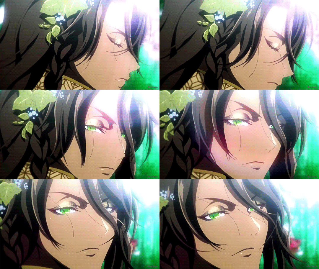
Disclaimers: I'm not including any Yuus (like, from the manga), mob students, reused assets (ie ghosts and pixies), or characters that we've only gotten the silhouettes for (that means no Mrs. Rosehearts, no Farena/Falena, no Zigvolt parents, etc.). I am only giving my thoughts on the looks of named characters with fully realized designs. If there is a significant variation of their hairstyle I like, I'll make note of it. Additionally, I will be commenting on general style rather than on individual outfits. This also involves official in-game artwork only; it is NOT inclusive of merch artwork or fan art since those can vary widely.
These are my opinions, please don't take them too seriously. I think all the designs work as is to convey the background and personality of each character, but everyone will have different tastes and preferences in terms of visual design; these are just mine! (And remember, just because I may like how a character looks doesn’t mean I like the character overall!!)
***PLEASE NOTE: This post contains spoilers for the main story and events that have yet to be released in EN!!***
Pretty
Jade - I'll admit that it took me a while to get used to his haircut (I typically don't go for the super short bangs), but it grew on me! I really like his face in particular; it can be very calm and pleasant but also mischievous and sinister. When he's angry or upset, it's much more subtle and hard to read in his face. That's something I can really appreciate. It all works very well with his neat, tidy, and unassuming appearance.
Jamil, Najma - THE VIPER FAMILY HAS SUCH GOOD GENES, just look at their luscious hair and mysterious, dark eyes... They dress so well too, I love all the hair accessories and flowy fabrics the Viper siblings have.
Meleanor - Malleus's mom has got it goin' on 🙃 She really kills the warrior princess look! Very imposing, yet elegant. I can totally understand why Lilia used to crush on her.
Fellow - Not usually a fan of gingers (and nor do I simp for fox man), but there's just something so charming about Fellow's face. I think it's the eyes and his self-assured, fun-loving smile. His outfit's snazzy and he makes it work so well! I especially like the cravat, spats, and the cape hanging off one shoulder.
Cool
Leona - OKAY FINE I'LL ADMIT HE'S HANDSOME, ARE YOU HAPPY NOW????? 😭 As much as I want to wrestle Leona, I have to admit that he has a very striking face (especially when he smirks) and powerful presence. He knows how to command a room (and he’s just about the threshold of muscle I’m willing to accept). I'm not really into hair past shoulder length or how he usually dresses, but what I think is the coolest about him are his eyes. It feels like they'll follow you everywhere. Ponytail Leona is the best Leona, in my opinion.
Ortho - I was debating between putting Ortho in "Cool" or "Cute", but ultimately went with "Cool" because he by far has the most unique look of the entire cast. I love learning about his different Gears and their functions, each one different than the last. I don't find the pale skin and blue hair as off-putting on Ortho as I do on Idia, and I think that's because Ortho's more child-like.
Crowley - His aesthetic is nice! I find the bird mask really goofy and his hair a literal rat's nest (DON'T @ ME, IT LOOKS LIKE LIMP SEAWEED), but his suit and cape are so dapper! All the keys and mirrors would look gaudy on any other character, but they fit so well for Crowley. The extra shiny details give him an air of mystery, like threads of light peeking through the dark.
Trein- Trein's robes and cravat make him look so classy and regal! The colors also remind me of Edgeworth from Ace Attorney-- He looks very stern at first glance, but when he gives his little smiles you can tell how much he really cares.
Sam - He's way overdressed for running an on-campus school general store but hey, it works for him. There's lots of little details I enjoy in his design, from the stitching on his top hat to the locs he sports.
Cute
Lucius, Grim - LIL' KITTY CATS 🥺 I especially think Grim is adorable whenever he gets a new themed bow or a whole ass outfit like in the Halloween events!
Chenya - His haircut is so uneven but I commend his style. Chenya's look isn't too busy; his jewelry and decorative patches are spread out so they don't crowd for your attention. Gotta love those callbacks to Alice in Wonderland! This might sound weird, but there's power in his plain white shirt half-buttoned and loosely tucked into his pants; it gives the right amount of casualness to feel "accidentally stylish". There's also just something really whimsical about how cat-like his facial expressions and gestures are. It's quite endearing!
Ruggie - His hair looks perfect for ruffling! The fact that he often dresses in hand-me-downs and Leona's oversized clothing makes him appear "small" and even cuter. Pair that with Ruggie's crooked little smile, and it's perfect. I like that his build is lankier than those of the other Savanaclaw students; it makes him appear less intimidating on an initial evaluation.
Cheka - Have you SEEN Cheka?????? How does your heart not melt at the sight of him 😭 I adore his little :3 face and how he shines when he's innocently asking Ojitan to hang out with him...
Floyd - I feel like I kind of have to put Floyd in "Cute" since he's Jade's twin. Floyd just places lower because I find his eye shape less cute and his personal style doesn't really align with my tastes.
Kalim - This type of hair isn't usually my jam, but Kalim dresses it up well with a headband/scarf (?) and jewerly. When he moves, I imagine that the jewelry is jingling its own song. Kalim always seems to be smiling, so just looking at him puts me in a good mood too. His fashion choices tend to be extravagant and not very viable for everyday wear, but it's fine as long as Jamil stops him from making impulsive decisions.
Rook - I actually don't like his bob (I prefer it in an awkward little ponytail), but his face--especially the mouth--is beautiful. I BEG OF YOU, LOOK AT HIS CEREMONIAL ROBES GROOVY. Rook can be so expressive, it's like he's a one-man play. Alas... He looks naked without a hat :(( but I appreciate the mystery of covering up his limbs for the most part so we can’t see how truly muscular he is.
Lilia - Peepaw really stands out from the rest of Diasomnia; he doesn't come off as scary right away, he just relished in how adorable he is and is confident in that. Lilia's shorter stature and more experimental style certainly plays into that uniqueness too. It's fun to see what he comes up with! I especially love that he wears more traditionally feminine things like tulle skirts and gathered fabrics, and even dyes his hair and paints his nails in various colors. The cut itself is a bit of a clusterfuck when I first saw it, but I've really grown fond of it over time. It's such a bright expression of who Lilia is. I can't say if I prefer his long ponytail or the shorter trim; both are good!
Sebek - Like Jade, Sebek is also very well-put together. I like him with both his hair up and down; each has its unique appeal! With his hair up, Sebek appears much fiercer. With his hair down, he reminds me more of a puppy drenched from the rain. I feel like even though his face can be menacing, his smile overpowers how scary he can be. It feels so pure, clashing with his usual attitude... (His pathetic/sad expressions are also cute, but don't let him know I said that.)
Marja - Sweet granny... She looks so kind and cozy, I just wanna give her a hug.
Rollo - I’m a bowl cut apologist, what of it 😭 I like how he's so straight-laced and proper in his dress. It goes together with his face very well. Moreover, the dark eye bags and pinched, stern mouth only add to his charm. Rollo can go from neutral to devious smirk to a flash of anger--it's so interesting to observe how his face contorts.
Gidel - He looks like a mix of Ruggie and Cheka, so by default Gidel goes in "Cute". His oversized sleeves, patchwork pants, and mismatched socks give him such character!
Dylla - ANOTHER ATTRACTIVE MOM!!! Her clothing is more on the tomboyish side, but she still wears them well. Dylla's face in particular is really stunning; I get a mature big sis vibe from her.
Mid
Ace, Deuce- The most generic hair styles of the entire cast. I don’t have much else to remark on. What I will say is that I prefer Deuce’s hair slicked back (which happens in a lot of gan arts) more than his standard hair.
Azul - I don't know how else to say this, but I think Azul is handsome but in heavily regulated manner... to the point where it doesn't feel natural?? Like yes, he obviously cares about his appearance, it just feels "too" controlled of a narrative to me. The same goes for his smiles. Like Eliza says, he does it too much, so it feels fake.
Crewel - His hair and mostly monochromatic color scheme with splashes of crimson is cool, but I'm not into his clothing. It's very jarring to see his hair and vest color blocked, and I don't find his big flashy fur coat appealing.
Neige - He's wearing such an ugly sweater, but the innocence of his face evens things out. I find Neige cute in that generically sweet way, and for that I cannot place him higher than "Mid".
Epel- Same "generically sweet" cuteness as Neige. I do like his colors though.
Silver - Also has very generic hair. Silver just looks like Some Guy to me (although I will say his lopsided smile is cute). I’m slightly put off by the super muscular arms in his PE uniform too.
Eliza - I think Eliza could be a lot more appealing if they hadn't presented her to us in such a different style. Like the generic ghost NPCs, she's drawn more like a western cartoon rather than like an anime so she feels "off" from the rest of the named cast. Because there isn't unity between her and the characters she is shown with, Eliza sticks out like a sore thumb. I gotta hand it to her though, she still slays in that tattered wedding dress.
Fairy Queen - Love how the buns in her hair resemble roses, and how her entire body looks like it's golden and glowing from within. I wish her dress was more detailed though, more fitting for a queen.
Don't Like, but Could be Worse
Riddle - ROACH ANTENNAE........ . .. ... . . .... . ...... . .. . . . .. .... . .. Oh, and he looks so funky when he gets all red in the face.
Vil - For as much as we're told he's beautiful, I don't find Vil's brand of beauty to be digestible. He comes off too strongly, if that makes sense??? 20 cm heels, face beat to the gods with makeup, carrying himself at all times like there's a camera pointed at him and he has to pose 24/7 (look at most of his groovies)... It's hard for me to get behind that, it feels too overwhelming.
Eric Venue - My guy has the same sort of severe-ish facial structure as his son. Also not a fan of facial hair.
Seven Dwarves - I find most of the dwarves way too cartoonish, and not in a cute way. I think the only design I genuinely find okayish is Timmy (the timid dwarf).
Ambrose - He's an older gentleman in his wizard Halloween costume. I find his design sort of... generic??? But I'm knocking him down a little because I also find his overall appearance to be goofy and unflattering.
Idia - I DON'T CARE WHAT THE MAGICAL ARCHIVES OR ELIZA SAY, MAN LOOKS LIKE A WALKING CORPSE AND THAT AIN'T CUTE 😭
Shroud parents - Cool helmets, but I wish we actually got to see their faces.
Baul - I find Sebek's hair color more pleasing to the eye. Baul has a lot of other elements that Sebek doesn't (due to Baul being full fae and Sebek being half), and I find that they overcomplicate his design. It's hard for me to focus on his face because there's just so much to take in, from the scaley beard and more voluminous hair to the fangs and pointed ears.
Dawn Knight - This is the "bro, can I copy your homework" / "sure, but be sure to change it a little so the teacher doesn't notice" meme. I wish the Dawn Knight wasn't just long-haired, recolored Silver (with the exact same voice actor too). I would place the Dawn Knight in "Mid", but that armor is not doing him any favors. It's way too excessive with all the wings.
Kifaji - The big brows and the really long goatee make me go "???"
Actively Dislike
Trey - His hair reminds me of a freshly mowed lawn. Trey's design is otherwise inoffensive to me, but that hair color and cut are bringing him down so much. The only memorable thing about how he presents are those rare moments when he whips out his one brow raised smirks, and even then I think he looks slightly silly and it's hard to take him seriously.
Cater - Again, it's the hair for me. I like it better when it's all down (like in his Club Wear card). In his usual hairdo, there's a middle segment that's weirdly pulled back from the rest of his face in a... scruffy ponytail??? That really bothers me. I don't vibe with his usual style of dress or how he presents himself either, it's a bit too... lax?? (I know I said the same thing about Floyd, but he looks similar to Jade and therefore gets a pass).
BURN WITH FIRE
Jack - He commits the sin of having a confusingly styled mullet and has a muscular physique which don't bode well for my tastes. I guess he does have those "looks intimidating, but is actually a softie at heart" vibes going for him, but I just cannot look past the haircut I'M SORRY.
Malleus - I'm not into super pale emo/goth guys, and Malleus somehow presents as even more of that than Idia. He dresses in mostly black (and while there is a lore reason for this, that doesn't make me like the color any more or less), has a sort of mopey face (I guess it's supposed to be elegant, but I don't perceive it as that), and dear god that haircut and the ashy grey lips… It doesn’t help that the expressions he makes (particularly on his birthday cards) give really strong “are u lost bby ghorl” energy and that weirds me out 💀 So many things about him just don't work for me.
Vargas - Too muscular. Also not a fan of facial hair or athletic wear. Vargas doesn't seem to have a very keen fashion sense either, judging by the outfits he put together for his camp events.
Heinrich - His face is very grotesque and twists into making some of the most comedically evil and smug expressions I've ever witnessed in all of TWST.
#twst#twisted wonderland#Octavinelle#Heartslabyul#Diasomnia#Savanaclaw#Scarabia#Ignihyde#Pomefiore#NRC Staff#Grim#Chenya#Che'nya#Neige LeBlanche#Rollo Flamme#Gidel#Fellow Honest#Najma Viper#Dylla Spade#Kifaji#Cheka Kingscholar#Marja Felmier#Papa Shroud#Mama Shroud#Meleanor Draconia#Baul Zigvolt#Baal Zigvolt#Bal Zigvolt#disney twisted wonderland#disney twst
116 notes
·
View notes
Text
If I’m honest, I actually really like Helluva Boss’s “Beelzebub” design in terms of like. A fun sparkledog character. I think what makes the design really clash for me is the color palette they chose for her, and all the smaller details she has. (Design review below cut—not criticizing to be mean or attack—talking about my personal opinion on the design)
The times when she’s got a different palette make her much more visually pleasing to look at—I like the following color schemes waaay more than I like her general color scheme:
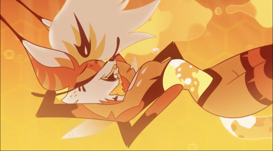

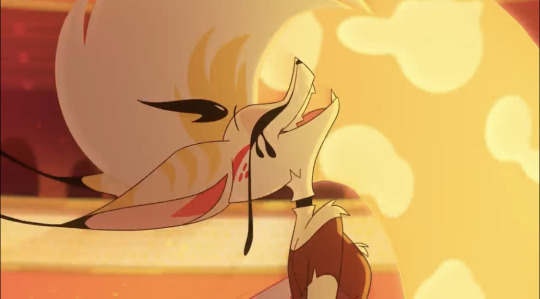

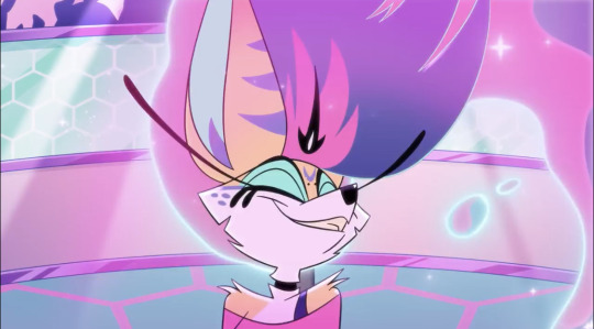


I think I really like the top two color palettes more because the stripes are more subdued—they mesh better with her base fur color, and because they’re lighter more subtle in those color schemes-it really makes her facial markings pop, especially with the second color scheme.
Overall though, I think the BIGGEST issue with her design is not the general silhouette—a dog/fox girl with four arms isn’t that crazy. What really really hinders her design is just HOW cluttered it is.
There are stripes, spots, that forehead mark, her clothes have little tears and marks that don’t actually add much to the design. I don’t really. Understand how her bra works??? Or her? Arm? Strap? I guess? I can’t tell if it’s a bra or not…Her heart window on her shirt is so big that it only showing her chest doesn’t make a lot of sense.
Like. Where her bra go? 🤔❔
I also don’t really like her black crown thing. It doesn’t add anything to the design imho and I assume it was added to distinguish Bee as a Deadly Sin. But I think it’s just an extra detail that clutters the design further.
The main problem with the design really boils down to just how over-detailed and cluttered it is. The lava lamp/honey idea is cool, and I like it, but I think if you’re going to have that, then you have to really simplify the rest of the design.
Bee has SO. MANY. constantly moving parts to her character that it makes it hard to focus on her. The animators did an insanely good job having to animate all of those parts-it couldn’t have been easy.
I still love her tho. Mostly b/c she’s voiced by Kesha, whomst I love dearly, and also b/c she is the only woman character in HB I can think of whose character doesn’t completely revolve around her boyfriend/husband/a man. And she gets to be happy and isn’t just mean and terrible to everyone for some reason? Woof.
#funhouse convo#media criticism#media critique#helluva boss critical#helluva boss critique#character design#character design critique#helluva boss beelzebub
71 notes
·
View notes
Text
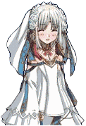
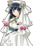
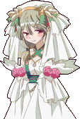
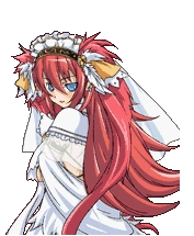
Rating Rune Factory Wedding Dresses (Because I have some opinions)
Rune Factory (1)
10/10
I honestly think this dress is top tier in terms of design. The snowy white with pops of color, the scalloped flowy sleeves, the barely exposed shoulders, that lovely subtle headdress and veil, it's all so pretty and elegant to me. I believe it suits all the girls in RF1 beautifully, though I do feel like Tabatha (center) and Rosetta (right) are standouts~
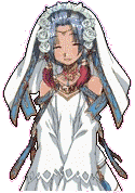
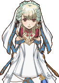
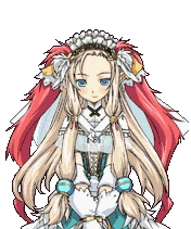
Rune Factory 2
6/10
It's a very lovely design overall though I do think it creates a bit of an odd silhouette. There are still many elements to appreciate, like the lacey detailed edges and the bold but uncommon use of green. I also give them bonus points for containing a dress sprite of he/him character Ray (right) in the game's data (Trans RF character confirmed?) I think the dress best suits curvier girls like Yue (left) but it's also a real treat to finally see Dorothy's (center) lovely eyes~
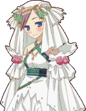
Rune Factory Frontier
2/10
This dress really doesn't do it for me. I can tell they were going for more of a ceremonial robes vibe rather than a traditional wedding dress and from a distance it almost works but the outfit up close is just bulky and unflattering. Maybe if they fixed the headdress or gave the robe some really pretty accents or beading it could work, but as it is, it's probably the last thing I'd wanna be virtually married in. The one thing I do like is that it gives most of the girls a unique updo for their wedding day.

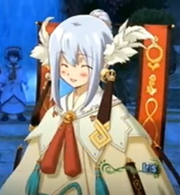
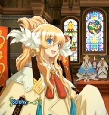
Rune Factory 3/RF3 Special
3/10
This used to be my least favorite RF wedding dress before that honor went to Frontier. The more I look at it, the more I realize that most of my disdain lies with the headdress and not the dress itself. The actual dress is fine, in fact there are some parts I really like, the sheer material on the upper arms for one, or the shawl, I just don't think it particularly looks like a wedding dress. That headdress though...oh boy, it looks like someone just glued a bunch of random sh*t they found to a headband and called it a day. It's just very cluttered and doesn't scream 'wedding' at all. If I have to pick a stand out it would probably be Raven (center) since her pose and hair color hide many of the design fails. Also Daria (right) because it seems like the sort of chaotic outfit she, herself would design.
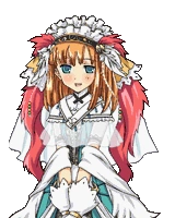
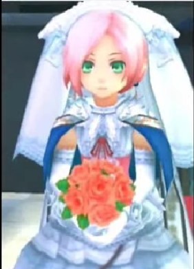
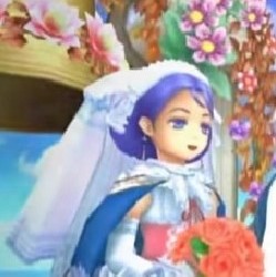
Rune Factory Tides of Destiny/Oceans
5/10
This game didn't get the usual character portraits so the images aren't great, but my opinion on these dresses was very so-so, I definitely wouldn't call them ugly, and I do love the colors and rare use of a real bouquet, they just didn't seem to stand out all that much. Especially in terms of RF costumes. They seem a little bulky on the models but I honestly think they could have fixed that by just having character portraits. Not bad. Not great. Just middle of the road dresses. As standouts I'd pick Sonja and Electra (left and center). Their hair colors complement the dress and Electra is already suited to the poofy ballgown look anyway.
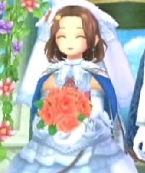
Rune Factory 4/RF4 Special
8/10
RF4's dress has a very ethereal, almost fairy-like look to it, which I personally find very gorgeous. It's pretty busy like many of the previous dresses, but unlike those, I feel like the elements here actually work together. The long flowy veil and blue rose accents are just beautiful, as is the detailed corset and neckpiece making up the torso. I'm not personally a huge fan of the flower petal looking design on the hips, but it does fit well with the whole aesthetic. As for standouts, It looks tailor made for Frey (left), but I definitely think taller, long haired girls like Dolce and Margaret (center and right) look amazing in it as well.
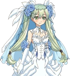
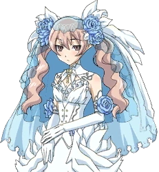
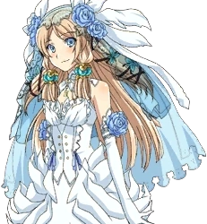
Rune Factory 5
9/10
I think this dress is beautiful as a whole, a bit more traditional and subdued than previous wedding outfits but personally I love it. The silhouette is flattering on everyone and the color scheme is unique among the other dresses by sticking with only warmer colors as opposed to the cool blues and greens of past games. I also love how the tint of the roses changes slightly depending on who's wearing the dress. All in all it reminds me a lot of the subtle elegance of RF1's dress and that makes it a win for me. For standouts I think Fukka's (center) complexion and hair go beautifully with the dresses colors. Ludmilla (right) also looks divine with the rosy aesthetic~
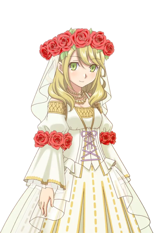
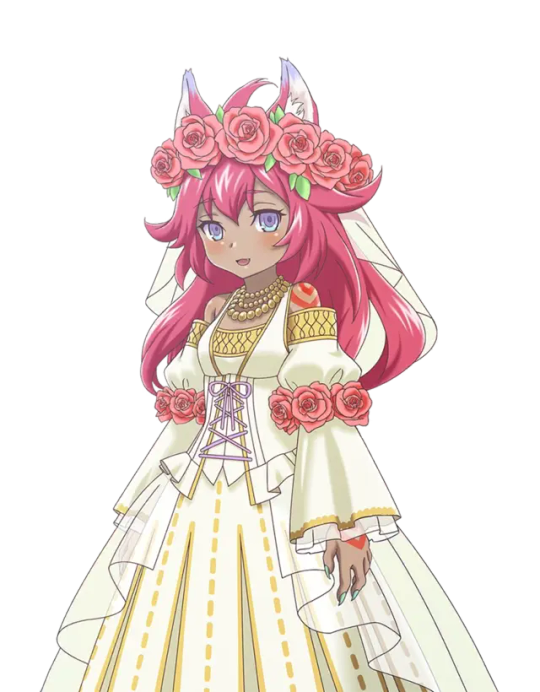
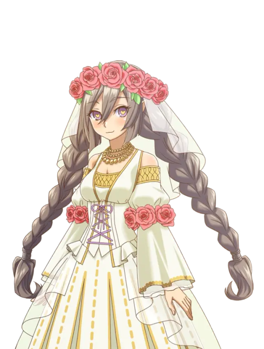
What's your favorite wedding look from the RF series? Who wore it best? Comment or tag if you feel like dishing some opinions of your own (Or just answer my poll ;)
#rune factory#rune factory 2#rune factory 3#rune factory frontier#rune factory tides of destiny#rune factory oceans#rune factory 4#rune factory 4 special#rune factory 3 special#rune factory 5
94 notes
·
View notes
Text
DAI Companion Styles: Sera
Dragon Age Companion Styles series
The fashion in the Dragon Age universe (in keeping with the overall aesthetics of the games) has undergone an interesting kind of evolution over the course of the three games, various side media, and fourteen real-world years this franchise has been around. And disjointed as some of it may be, it’s something that interests me, both in terms of its real-world influences and in terms of the in-universe implications for worldbuilding and characters. It’s an element for which I would love to see even more discussion and analysis, I thought it would be fun to dive into it by taking a look at the different base outfits companions wear in Inquisition, and talking about how they fit with the characters and the world they inhabit. I don't know how many of these I will end up doing, but I'd like to do some and I think it will be fun.
Disclaimer: I am not a fashion expert, dress historian, or professional designer! I'm just a gamer who likes to sew and has a casual interest in historical fashion, and a great interest in fantasy worldbuilding and the implications thereof, and that's where I'm coming from on these posts. I'd also love to hear thoughts from fans who have a more in-depth background in historical dress, textiles, etc. Also I'm going to be talking about clothing and not armor because I know a lot less about armor.
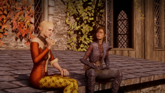
I’m going to start with Sera, of course, because it's me. ;)
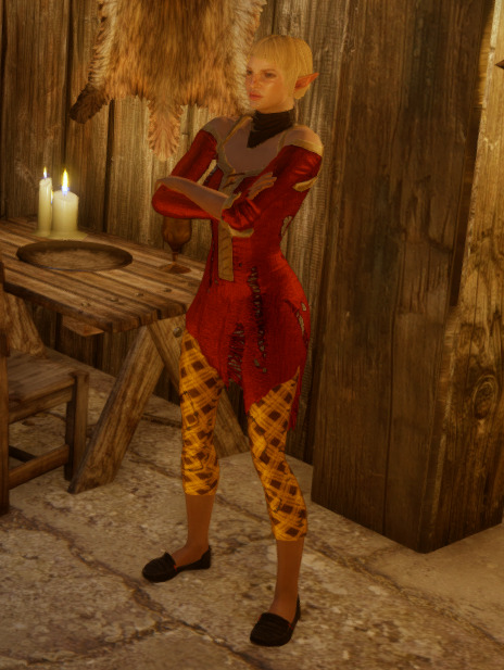
So I've mentioned before that I really like the concept of Sera's outfit. The upper silhouette in particular seems directly drawn from the Fereldan commoner fashions of Dragon Age: Origins, the styles of Sera's youth in Denerim. For example, here's Kaitlyn in Origins, wearing some typical commoner clothing:
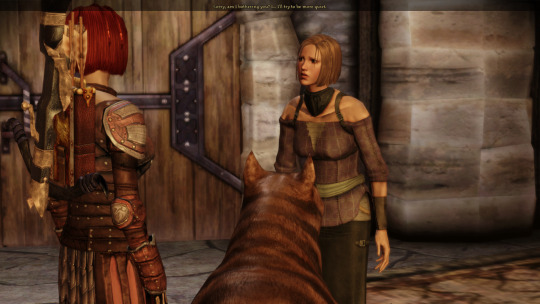
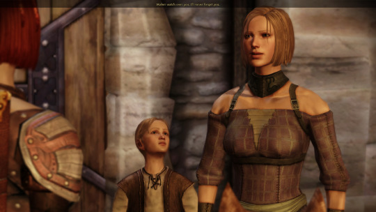
Note the plaid, the bare shoulders, the underarm straps (which have always looked incredibly uncomfortable to me)! We see several variations on this style in Origins, including leather vests and even some floral fabrics, but the off-the-shoulder look is nearly ubiquitous on commoner women:

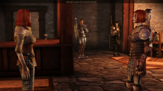
Noble-born women in Origins seem to forego the cold shoulders, but we still see similar shapes in the upper silhouette, including those dang shoulder straps that go under the arms:

The commoner styles of Ferelden in 9:30 Dragon even reappear a decade later in Inquisition! Which doesn’t surprise me much, as trends move a lot more slowly for rural commoners than for wealthy aristocrats.
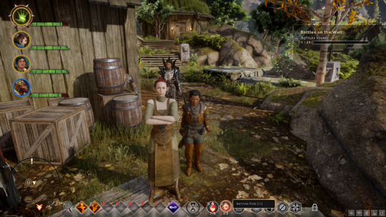
We even have the weird leather neckerchief thing, a staple of the early 9:30s in Ferelden (and convenient way to hide the neck seams on those character models)! Like the collars in Origins, Sera's does not tie at the back, and a close-up view of hers reveals side seams and presumably a closure of some sort.


So let’s talk about the breeches!

I'm going to call these "breeches" both because it's a word Sera uses and it's what I think they most closely resemble, especially given that they end below the knee but do not extend to the ankle. (Trousers or pants would be full-length.) First of all, it's notable that Sera is wearing breeches because it's a break with the Fereldan silhouettes we saw above, which are pretty universally long straight skirts hitting about mid-calf.
The waist of Sera's breeches is covered by her tunic, but I would guess that they might close with lacing (which can be seen on some of the Inquisitor’s Skyhold outfits) or a buttoned fall (a front panel with buttons on each side, which I think I've seen in some Orlesian noble concept art).

My guess is that Sera's breeches are newer than her tunic, because of the slim cut; they more closely resemble the Orlesian men's fashions of the present in Inquisition than the sort of looser trousers we see in Ferelden circa 9:31 Dragon. Going by the plaid alone I would have called them Fereldan, but based on the cut I have to call these breeches Orlesian, and possibly a more recent acquisition for Sera. While plaideweave does not appear to be currently on trend in Inquisition, Val Royeaux is a center of high fashion and constantly-changing trends among the upper classes and I don't have trouble believing that plaideweave might have been fashionable sometime in the years Sera has lived there.
A detail I love about these breeches is that they are cut on the bias! Synthetic elastic fabrics and machine-knits don't exist in the non-industrialized south of Thedas so far as we know, but woven fabrics have a bit of stretch and give when cut diagonally across the weave, and this would be appropriate for a pair of snug-fitting woven breeches, for someone of means. (They would have been expensive, because diagonally into a bolt of cloth means you need more fabric to start with.) We also see plenty of wrinkles and bunches in Sera's breeches, especially where her knees bend, demonstrating that this isn't a perfectly smooth, skintight fabric like a pair of synthetic leggings.
Notably, Sera's breeches have been patched—and patched skillfully, using the same fabric and with perfect pattern-matching. I think the patching had to have been done by a previous owner; Sera might have the skill (she does mention sewing in her journal), but she likely wouldn't have had access to a matching fabric or the patience or desire to pattern-match. This suggests to me that these breeches were owned by someone of lesser means; a noble would not wear visibly-patched clothing however skillfully done, but based on the bright colors I think this garment could have belonged to a noble at one point, before being cast aside. The servants we see in the Winter Palace wear neutral, muted colors in order to draw little attention, so I don't think this is part of a servant's uniform, but it could have been worn by a servant on their off time or by a member of their family. My guess is that these breeches were a once-fashionable garment, discarded by their high-class owner and taken by someone in their employ (maybe even their own tailor, who might still have access to scraps of the original fabric) to be repaired and reused by themselves or a friend or family member. I judge the large, visible stitching on both the patches and the side seams to have been added later, likely by Sera herself when the original stitching began to give out, further extending the life of this garment.
So, the breeches are great. We love the breeches.
I do have some issues with the tunic, but let's start with what's good about it.
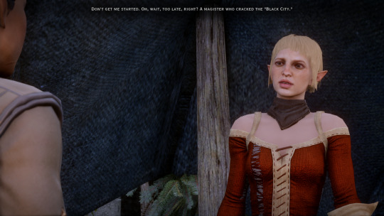
I've already mentioned how it's consistent with Fereldan fashions a decade out of date. Based on the style and the fabric, I would say this garment was originally owned by someone in Ferelden of decent but not extravagant means, and Sera either stole it outright or swiped it from a rubbish heap. The wear on the tunic is consistent with its age: it's much more visibly tattered and falling apart than the breeches. However its construction also appears high-quality to me. If we look at the large tatters, we aren't seeing Sera's skin through them, and at the cuff where Sera has rolled up one sleeve we see the same contrasting fabric as the shoulder straps and trim. This tunic has a lining, and this also explains how it's still holding together on Sera's body with so much damage to its outer layer. The asymmetry at the bottom is jagged in a way that suggests part of it was torn off, rather than the garment being intentionally constructed that way.
My big problem with the tunic is its tightness and drape. This is a woven fabric (Highever Weave), and we can see the directionality of the weave very clearly because of the tatters; this garment was not cut on the bias. Even with the spiral-laced closure (love that they used spiral lacing instead of cross-lacing, by the way, just because it's a form of historical lacing that's often overlooked in media), this garment simply would not hang on Sera's figure the way it does in the game. (To be fair, neither would some of the Origins tunics. I have no idea what those are doing.) The form-fitting cut overall just doesn't make sense for a woven fabric, and it doesn't drape like one either—something that I'm sure has frustrated many a cosplayer trying to make this tunic with a comparable material. Without some stretch in the fabric, it's not happening. Even a moderately looser cut would make a lot more sense—compare with how Varric's tunic of the same weave hangs on him. Bottom line, Sera's tunic fits and drapes like a modern machine-knit, and if I wanted to make a cosplay that actually creates the same silhouette, that's what I'd use. Though personally I'd probably discard the silhouette and try to make something with a woven fabric that simply fits more realistically, and if I were to redesign Sera's base look, this is the one change I'd make.
The shape of the tunic is what really gives away the contemporary influence on Sera's outfit design. Leggings and skinny jeans came into fashion in a big way in the mid-2000s, often paired with a longer drapey top, and they hung on through the mid-2010s when Dragon Age: Inquisition was released, and were an obvious influence on the design of all the female companions as well as the female Inquisitor armor styles. Cold-shoulder tops were also a popular trend in the early 2010s. (I guess Dragon Age: Origins was on the cutting edge there.) Asymmetry and shredded clothing were also 2010s trends.
I also want to take a moment to look at Sera's shoes! Her base outfit includes what appears to be some kind of black slip-on shoe. These shoes are interesting to me because I think that like the breeches, they might be men's shoes. There's a similarity to the shoes in this concept art:
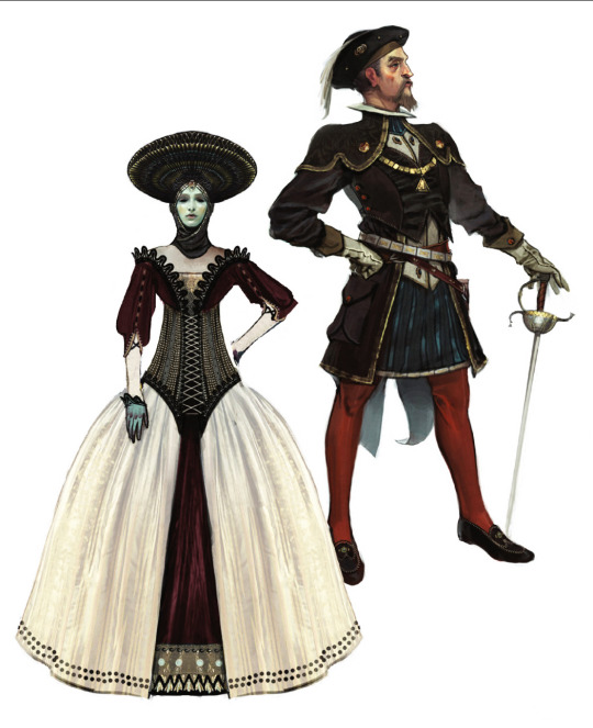
I think this is pretty neat because while the real-world influences on Sera's look can be clearly tied to trends in women's fashion, in-universe her clothing is probably two-thirds menswear. I think that's pretty cool and maybe something to consider with regard to Sera's personal gender presentation as a lesbian in the context of the society she lives in.
I suspect Sera's shoes to be a bit older and out of fashion, since they bear a distinctly rounded toe and the Orlesian high fashion of the moment favors a pointed toe. Like the rest of her clothing, I would guess the shoes to be salvaged or stolen.
So overall, despite a few quibbles, I think Sera's base style is pretty great and very appropriate to her character. Her look is proudly lower-class in a highly-stratified society, visibly Fereldan while living in the Orlesian capital, and gender-non-conforming amidst a highly-gendered aristocratic culture.
It's pretty cool! I like it a lot.
#sera dragon age#dragon age sera#sera#dragon age inquisition#dragon age#thedas fashion#dragon age companion styles#blunders of thedas
155 notes
·
View notes
Text
I think an important conversation on how we view celebrities, particularly by beauty standards has been started.
There are pictures of Jenna floating around where there have been less than charitable opinions of how she looks. The term “mandrake” has been floated.
I don’t personally agree with this, but I also know that mandrake is in the eye of the beholder.
I make a concentrated effort not to attack looks, even with celebrities. I have no idea what people are going through when I’m not looking. People mocked Chadwick Boseman’s weight loss and it turned out that he was battling cancer that he eventually died of. I just don’t want to do it. lol I understand when others do it as gossip or personal opinion, it’s natural and I’m not offended by it.
I am also not a Jenna dickrider, I’m more of a dick ambler. I ride her dick at a leisurely pace, really here just for the scenery and vibe. I’m not trying to win an Olympic gold for dick dressage.
So, I’m not going to say anyone is wrong for thinking she looks for a mandrake, and I’m also not here to say “OMG, she looks beautiful no matter what, such a perfect angel queen!” I am not the type of insufferable twat who not only needs to believe the celebrity is beautiful regardless of the situation or what I see, but also takes offense if anyone dares to suggest they’re human and have bad days.
I think the meat of the situation is that all people boil down to “we’re all just some guy.” Even celebrities, they’re really just some guy.
As an actress, part of Jenna’s job besides showing up to set and acting, is to be good looking. As with models, she is literally professionally good looking. She wouldn’t have made it far or have any endorsements if she was actually ugly by any conventional metric.
When it comes to being professionally good looking, I think Jenna is killin’ it.
Having to be professionally good looking is true for a lot of public facing, high paying careers. Most lucrative jobs have higher expectations in terms of presentability. I certainly have to show up to court in a suit, freshly showered, groomed, and overall have to appear that I have my life together and am worth my billable hours.
Pretty privilege is real, and good looking people win more cases and generally get ahead in life. Justice Isn’t Blind: Attorney Attractiveness and Success in US Federal Court (last visited 02 Jan 2025)
It isn’t enough to know the law or to be a good actress. Looks matter at every level. That’s the reality and unspoken rule of these types of careers.
This absolutely applies to Jenna.
In her case, she has a whole team to help her be good looking. She has a dedicated stylist, a make up artist, and I wouldn’t be surprised if she at least had a nutritionist if not a personal chef. As she gets more famous and has more money, a personal trainer might be added to the mix.
She also has the time and money to dedicate to being good looking. She goes to fittings, they get to see well in advanced how something fits and flows on her. I wouldn’t be surprised if Enrique was familiar with colour theory, silhouette theory, and all other professional fashion skills to make her look her best.
The pics were of her going to the spa, I bet she gets to go regularly. This not only helps with maintaining clear, smooth skin, but can be relaxing. I wouldn’t be surprised if she has gotten work done (if she has it’s minimal and not glaring to the average fan), or is starting to do preventative botox (especially if she smokes and drinks regularly).
Again, this is something that a lot of high paying, public facing careers expect and is very normal IMO.
Besides a dedicated team to make sure she looks her best, she also has the advantage of magazines/professional social media using photoshop to clean up any blemishes (real and perceived) etc...She gets a ton of pics taken at events and out of hundreds, they only choose the very best ones.
The hour on the Red Carpet and the handful of pics per event? Weeks if not months of work to get there.
It is not a mistake, accident, or by nature that she appears so “perfect” on the Red Carpet or in magazines/professional social media accounts.
As the great Dolly Parton said as Truvy Jones in Steel Magnolias. “There is no such thing as natural beauty...it takes effort to look this good.”
There is also something I’ve seen floating around Reddit and Tumblr: You’re not ugly, you’re just broke.
All of this is time, money, and effort. It’s literally a job.
And with any job, you get days off.
Was Jenna looking her best in this most recent pic? Of course not. It was a candid pap pic (or perhaps a Wenclair since they do that and are as bad as paps), with bad lighting, bad angle, no make up, and no photoshop/filters.
It was her day off and she chose not to put on a show. It would be the peak of delusion to think she or anyone could live up to the same beauty standards on her off days as her Red Carpet days.
For all the time and effort it takes to be Social Media/Red Carpet Jenna, doesn’t she deserve her mandrake days?
Don’t we all deserve time to simply exist? Her clothes were clean, her hair was brushed, and her face was washed. She was on her way to the spa, so make up would have been a waste of time if she was getting a facial. Maybe she was going to an out of the way spot and hoped paps or fans wouldn’t have been there, and took a gamble to not look like she was ready for IG.
Could her eyebrows be because of bad lighting and/or a shitty camera? Could it be because that’s how they were styled for her most recent film (The Gallerist) and she hasn’t gotten them filled back in/they haven’t grown back out? Could she have developed trichotillomania from stress and pulled them out? Could she be experimenting with a new look that she personally likes?
I’m not going to begrudge her or mock her for having her day off. I think it’s good she doesn’t feel the need to always be “on.”
I wouldn’t even say those pics are indicative of the “real” her. We all get a chance to groom ourselves to our liking to go out in public. We all have a range of looks depending on the situation.
Will everyday be a Red Carpet day? No. Will everyday be a mandrake day? No. Will most days be pretty passable as human, on a scale between Red Carpet and mandrake? Yeah, I think so.
Not only does she deserve her mandrake days where she can go out, she deserves her mandrake days where she feels she can’t. We all have those bad days where we don’t feel fit for public exposure.
She is a cisgender female (as far as I know) and she might go through cycles (depending on if she’s on medication). There are days where she might have hormonal acne, stress acne, bloating, doesn’t feel like brushing her hair or washing her face.
There is the potential for her to look worse.
She has those days too, and she gets to have those days without the pressure of having to be beautiful no matter what.
Again, I think this is an important conversation to have. Putting celebrities on a pedestal and being eager to knock them off that pedestal isn’t good for anyone. And they’re both kind of right and both kind of wrong.
Celebrities can be goddesses and they can be fuck ugly. We all deserve to be either when we need to be.
I like both versions of Jenna.
In the end, celebrities are really just some guy who has good days, bad days, and deserves their boundaries respected.
12 notes
·
View notes
Text
Help me design a dress!
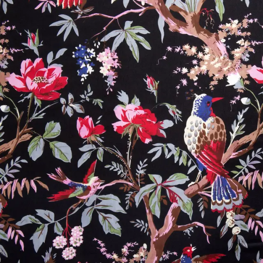

this is our fabric! (left is the product image, right is my actual piece of fabric- ruler on the left is cm, on the right is inches, to give you an idea of print scale) its the black version of the break up robe print, in a lightweight & crisp cotton. i have 4.5m (5y) so it should be enough to make most designs, though some will require consideration in the cutting- we will get to that later though. (the fabric is also narrow, i think its only 110cm wide. (its still folded in the picture))
my goal here is to make a comfy wearable dress, something pretty casual & everyday in silhouette, but i would also like if it was possible to style up for a more formal look. most of my inspiration for this project has come from 1950s dresses, because thats a style i lean towards for myself, though im not aiming for anything "true vintage" or anything. im also fond of lolita dresses, so im more than down to draw inspiration from those also!
also, the print is pretty bold compared to my usual style, so ive considered doing some kind of translucent (chiffon, tulle, mesh) overlay to tone it down so its more wearable in my wardrobe. this will entirely depend on it working with out final design, and even then, ill offer you the decision at the end! ultimately, i still want to be able to appreciate the fabric. (for sewing people: id intend to do it as a flat lining, so it sits right up against the fabric underneath, not as a complete separate layer. i find this makes it block out the design slightly less) doing this could also help with adding structure to the dress, which i already think some designs might need, considering how thin the fabric is.
ok now the brief is out of the way, onto the first decision for the dress: the shape of the skirt. if you want to vote based entirely on vibes, feel free to click away, but i have included some more writing about each option & its ups and downs in this particular project under the cut (also pictures of each style if youre not so familar with what they are!)
& the propaganda for the options:
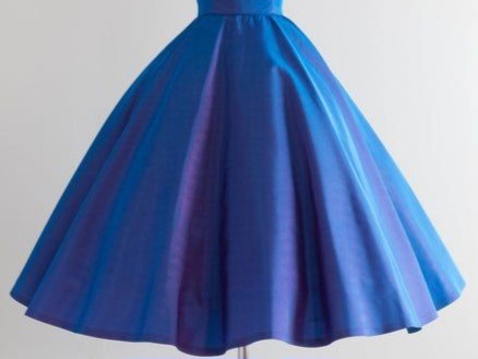
Circle skirt: you can never go wrong with a circle skirt- theyre probably my favourite to wear overall & i especially like the low bulk join to the waist as i sometimes find things with gathers dont sit as nicely on me. the way circle skirts are cut also gives them a movement that the other two methods simply cannot compete with in my eyes.
The main downside is working a circle skirt with this particular fabric. the fabric is not wide enough to cut the entire front as one, so i would either need a centre front seam or to make it a 3/4 circle skirt- something im 100% ok with, i honestly find at midi length a full circle to be too much sometimes. (there is technically the option to have full circle but rotate it so the seams are at side, but that might then mean i have to do some shenanigans with where the fastenings go). also, because the design is directional, each quarter will need to be cut so the seams end up on the bias, which makes for an Incredibly inefficient cutting layout. (again, if theres a CF seam, thatll be on the diagonal of the design, which really defeats the point of putting in the effort in the first place, to me.) i think i would be able to get all the panels i need out of the piece of fabric i have, but i think i would be a bit more limited with top options as i try to make sure to use as many of the small pieces left over as possible.


Gathered skirt: these are by far the easiest to do in terms of sewing. in my research into casual 50's dresses about 90% of all pictures i saw featured a dress with a gathered skirt (or actually, a lot seemed to have tiny pleats that give the effect of gathers, like the coral one. if we vote this way, i would be tempted to go try them as i think it might solve my bothers with gathered skirts in general)
i generally find gathered skirts less flattering on me- they add bulk at the waist and then hang straight down off the hips (when not puffed up with a petticoat) and thats generally not something i like on myself. i could improve that though by bringing more fabric in to increase the hem, and adding horsehair braid to the hem to help it swoop without additional support (again, my goal for this project is causal day dress)
this pattern uses the least fabric i think, depending on how much you put in the skirt- i think i should get a perfectly satisfactorily full skirt from this with less than 2m of fabric used. (honestly might end up too efficient- id like to use up all the fabric i have in this, and i really dont need that much for a bodice. i can see myself adding 4, even 5 widths into the skirt to use up yardage. i dont particularly see that as a problem though)
despite my reservations because of gathered skirts ive made before, for this project it does have one massive point in its favour: the fact that its still a full piece of fabric. all other styles here all cut quite significantly into the design to create their shape, while this be one panel of the fabric from edge to edge. preserving the design of this fabric is pretty high on my priority list, after all, i bought this fabric specifically because it was the OFMD break up robe print. i want whatever design i make to work with that.

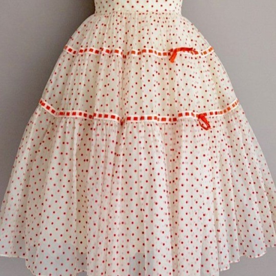

Tiered skirt: for me, tiered skirts are the best of both worlds in terms of the effect they give. the fact each layer doubles means they keep some of the swish a circle skirt gives (and, i find, they tend to have more of the A-Line shape of a circle skirt too) while not being quite so consuming of fabric as you cut. i couldnt find many examples of 50's dresses with them (though i did find some) so i do feel like this style pulls more towards the style of lolita dresses & that might be reflected in the options i offer in subsequent rounds.
if you know anything about petticoats, then youll notice that this style of skirt is essentially the same construction as them (though petticoats often introduce extra layers and ruffles and.....) when ive made this style of skirt in the past i have found that it holds volume much like a petticoat does, without the need for an extra undergarment- something thats great for a casual dress!
I was thinking three tiers is the ideal number for this dress, though i could make it only two. i dont think i would make it more as, if i keep them even (which was my intention, though i am also fond of the styles that increase with each tier like my example images) then each tier will probably be 20cm wide, which is already looking like itll cut into the features of the design. i think that is the single biggest downside for this style- i wont reasonably be able to do much 'fussy cutting' either to work with the print, its simply not practical to do on this scale.
At a rough estimate, i think this is gonna use 3m of fabric in the skirt, which puts it slap bang in the middle in terms of fabric efficiency. i should have plenty enough to do it, maybe even to increase it if i want to, while still being pretty unlimited about what i do with the rest of the design.
one last thing- trim! one unique feature of this design is the opportunity to play with trim on the skirt itself. i do have some bodice ideas that play around with trim, and it would be really nice to introduce it into the skirt too, if we go that way. it could even be a fun nod to the piping on the original break up robe!!!!

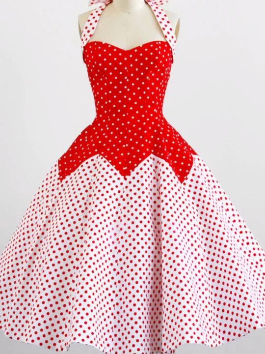
Something else (comment): while doing my research i came across SO MANY design ideas that i could play around with. for this poll i picked the three i thought would probably work the best for this project, but i wanted an opportunity for you to yell at me if you want something different entirely. feel free to suggest anything you like, but ive included a couple images as examples of styles i saw a lot. i especially saw a lot like on the left, with gathering or ruffles off to the side, but the front panel being pretty flat. this might be real fun for some designs like shirtdresses, but im not super confident on how itd look on me. either way, feel free to form a coalition in the replies to tell me how i totally should have offered you this one particular option.
(if you vote for this but dont comment, im discounting it from the overall stats as i have no idea what design you mean! your welcome to send it in on anon if that bothers you, but either way, ill need a description :P )
#i promise the rest of the posts for this wont be nearly this long#i just had a lot to say about the project over all#and i have a lot of thoughts about the skirt shape. i think itll set the tone for the rest of the project so i wanna make sure yall are#informed about my thoughts into all of this#also i just. have a lot i sit there at work and think about this all day long and so i think of a lot of things i want to make note of#but i think i have a lot less to say in future polls. i do not prommy that they will be SHORT tho this is my happy zone#this is 1500 words btw. that is too many for sewing posting. even for me. (i could have written more)#im not reading it over again you can take it as it is and we will both hope its ok#sewing#design#crafting#dress making#pattern making#polls#vintage fashion#sewist#all images sourced from pinterest & most seem to be originally vintage reselling images#you spend long enough staring at these for research n you pick up the style pretty quick#(1 day poll is intended btw)
11 notes
·
View notes
Text
Part One (Astral Express
Random post ideas I got, but I'm just listing my opinions on aspects of the HSR designs, including things I may dislike or would at least change about certain playable HSR design, because I am currently planning some of my own designs/redesigns to use for future art
Disclaimer!! I am not a professional character designer, I am not saying any of my ideas for them are objectively better, and I am not bashing any of these designs. I actually like most if not literally all of the playable designs so far! This is just my lil opinions of how I would change them
The List part 1:
Stelle: I actually like the turquoise band around her thigh, I just don't like how they didn't take the opportunity to sprinkle in some more of that color into her design. She had a lot of little details in her outfit, especially the back of her coat, so there's a lot of places where a few splashes of turquoise could be added whether in those little details or in some of her other adornments just so that the band stands out less . I think I would change more than just that ofc, but that's one of the things about her that stood out the most to me. Also honestly? Maybe I would scale down the sheer amount of detail she has on her back (which as someone who has tried to draw her from the back view o h my g o d), and add some more detail on her sides like her arms and her legs maybe? I dunno, I think her design is really really nice, but there are places the amount of details could be more evenly spread to.
March 7th: While I don't mind her design that is especially center around her top half, March definitely has a clutter design particularly around her waist when you look at her full body in detail. Clutter that manages to mix in some odd color choices too/ I'd probably clean it up, or better place the little bits of clutter to feel like it matches more and change up the colors in order to at least go with the rest of her outfit. Like the gold makes sense, not only with her details of golden buttons throughout her design but also the golden ticket she holds showing she is passenger of the Astral Express, but why the black fabric? How is it supposed to work in terms of construction with the rest of her outfit, I'd keep her black to only the little accented bands on her thigh and neck rather than anything big on her waist. Why is the thing holding her camera orange, why does she have this random bright green button, why does she have seemingly two different belts?? I think March would have a better sense of what goes together than that. Overall, still an adorable design.
Dan Heng: He is very nicely designed, and I think a lot of his personality comes through in it, way better than any alternative for him. I feel like I can get a better sense of his nature and overall how he feels and who he is in it. The one unfortunate aspect of his design for me though is that it feels a bit... bland? for a lack of better word. Not that he's devoid of details or anything, very nice to see him not having a particularly busy design, but a lot of those meaningful details tend to be pushed to his back or his arms. I would probably bring a few more of the details that can be to the front or maybe add more? It just feels as though there is something lacking in the design, maybe more on a coloration front than construction. Speaking of coloration, I'd likely change the way the details around his waist are colored, all the same hue and yet different shades also getting an ombre? It's a little messy, but not a big issue to be honest. That's just my view of it though, still love his design for how much it really lets his character shine through unlike Another One which I will eventually get into and explain my thoughts on in the Luofu post.
Himeko: Listen, she's beautiful, she's gorgeous. I absolutely adore her and her color palette especially, it's such a nice blend of elements with the gold all mixed in. However, her silhouette is awful like it's so messy, and I really dislike how weighed down she feels. I wish she looked just a bit different, wish her clothes looked a bit lighter. She's a Nameless, she's their navigator, she's the one who repaired the Astral Express herself!! I wish she had more details to reflect all of that, and I already have ideas for how it could be done that would end up alleviating some of the weight placed on her with all of those heavy, layered fabrics. Additionally, I think there's a better way to highlight those elements while still making her look elegant, gorgeous, and ornate. Yeah, I love Himeko, I do like her currently design a lot, but I think more could be done to show off more sides of her. She's the one I probably have the clearest image for so far. Like I can imagine her in a nice set of slacks, a deep brown tone that goes well with her coat, and either on the sides or the front of the bottom, they have slits revealing these ruffles showing through similar to the ruffles of her coat sleeves. They have golden adornments along them, very sleek and fitting her figure well to keep with a very elegant appearance. Perhaps she has suspenders as well, maybe only one side to fit with their habit of asymmetrical designs. All with a nice white blouse or even some kind of button up, buttons popped open and collar folded in a more fashionable style. Even more hammering on the asymmetry, maybe for side where she actually wears her coat, the sleeve is much shorter to not interfere with the jacket's ruffles. I don't know, that's just a little idea of changing up the construction of her outfit that I had, but I'll see how it looks on paper when I draw it.
Welt: Okay listen, I need to look up more about his lore before I can truly say anything about him. Looking at his design, and with what I do know about him, I do adore it. His color palette here with the grey tones making up the majority of it for his upper body with the accents of an almost like cool toned brown and the darker shades of grey and black coming in. It's so nicely balanced, I don't feel like he had too many elements or too many overlapping fabrics that complicate the shape. It's a competent design, and while I think someone with more knowledge on him could find more places to add details, with what I know about him, I do really like the way he looks. If I were to change one thing... I would give him more wrinkles. I know why his physical appearance doesn't match what his true age is, but I still think he deserves a few more wrinkles PLEASE that's the only way I can think to truly elevate him at the moment, give him a few more wrinkles he'd look so good with them. Whenever I see art of people giving him more wrinkles I ascend... Okay well, I can think of something I would do color wise, but I'm still on the fence about it.
I think I'll leave things there for now. I don't have as much to say on these designs in particular. I think generally they're pretty solid, and even with the ones I can think of more changes for like Himeko's, I still greatly adore a lot of elements from it. The Astral Express' base designs definitely aren't the ones I have a lot of gripes with or things to say aside from suggestions for Himeko, we'll get to those eventually (those ones in particular are Serval and DH IL, both for primarily character reasons rather than aesthetic reasons like some other opinions I have.) But yeah, the next post will be for the Stellaron Hunters since I couldn't fit them into this so look out for that!
#sorry again about welt's part being weaker#I really need to redownload honkai and get back into it#but yeah uh#when i get my hands on talking about dh il I will have a lot to say#His standard 4 star design is sm better character wise than his dh il design and I will DIE on that hill#the only way you can take me off of it is with my head on a stick im so serious#and i'll get into why later I promise#it's very very character focused not like aesthetics#bc honestly? love the aesthetics and ornate details of it I like the meaningful things hidden within it#but uh... lots of problems with how dan hengs character doesnt shine through AT ALL in that design esp in one of the most important aspects#like this design connects to a big reveal about dh and his past and how he feels about certain things#and yet the design doesnt convey anything more than the bare minimum and its such wasted potential to me#anyways#enough of that#i will be drawing these eventually#so stayed turned#hsr#honkai star rail#hsr stelle#hsr trailblazer#hsr march 7th#dan heng#hsr welt yang#hsr himeko#jaxie rambles#<- gonna start organizing posts with that tag to more easily find stuff or even to mute it if people want me to shut up XD
14 notes
·
View notes
Note
Are you a professional pumpkin artist? I just saw the Miles one and holy shit. How did you do that?
Nope, just an amateur who really enjoys this art form and has been practicing it for years. 🤣 Thank you--that's very flattering!
The short(ish) version of how:
Plan out your design in advance, paying attention to how each shape that isn't fully cut out will be supported--it's a very specific art form. Tracing is good for getting a recognizable silhouette, and expect to spend a lot of time tweaking until you get it to both look good and be carvable. (Or use a proven design from someone else.)
Big pumpkins let you do more intricate designs without the pieces getting too fragile. (But they also take longer to scrape/carve.)
Scrape the pumpkin shell out pretty thin, especially if you have any peeled sections that need to shine through. I like to see the glow of the light source through the entire pumpkin shell, and it makes carving easier due to less material to saw through.
Have one full-size copy of the pattern to transfer onto the pumpkin (it will be destroyed) and another copy to look at. To transfer your pattern, tape the paper onto the pumpkin at a couple of places (e.g., top and bottom or left and right) and make cuts in the paper and overlap/tape the pieces down until the pattern conforms to the curvature of the pumpkin. Check that the design still looks right and supports are intact. Then use something like a thumbtack to punch through the paper and into the pumpkin rind along the cut lines to mark them as a series of little punctures.
Use the right carving tools--you want something like a pumpkin saw you get in pumpkin carving kits, not just a kitchen knife. Something like small wood carving chisels work for removing sections of rind.
Leave yourself plenty of time--scraping and carving always take longer than I think it will (multi-hour process at minimum), and you don't want to accidentally cut the wrong thing piece (or yourself!) because you were rushing.
More elaboration below the cut, because you activated special-interest mode I love this art form and hope more people will have fun with it!
Patterns:
The key constraints are that you only get 2 or 3 colors (depending if you're going to peel sections of the rind) and any shape that's not a full cutout has to be supported (not just connected, but connected by pieces study enough to hold it). That makes the the art form both tricky and really satisfying when you figure it out.
Nowadays I usually draft mine on the computer in black for intact peel, orange (for parts where I'm going to peel just the rind off), and yellow for cutouts, to make it easy to envision what the final product will look like. Then I flip the colors to something that won't use up all my printer toner to print it out (black to white, orange to light gray, yellow to medium gray). (E.g., my Sandman design)
Don't hesitate to trace stuff to get recognizable silhouettes! Miles was traced directly from an official image (I think a promotional image?). So were Dream from The Sandman design and Andy from The Old Guard (below). If you're using a computer program that supports image layers, keeping stuff on different layers is really useful for tweaking relative sizes and positions to get the silhouettes to work. For Miles, I had his traced image and the spiderweb on different layers and adjusted them independently to make sure his silhouette was clearly recognizable (e.g., his elbows/heels/etc. are visible against cutouts so that you can easily recognize how his body is positioned).
In terms of supports, a good example is my The Old Guard design (below). I tweaked the axe position and the overall sizing of the silhouette vs. the circle a lot before getting here. The axe just connects to the edge of the circle at the handle and one tip of the blade, and the other side of the blade touches her shoulder. That means the axe, which has the narrowest/most fragile pieces of pumpkin, is very well supported even though it reads as a distinct, separate shape. (Having it diagonal instead of horizontal also made the image more dynamic, which is a bonus. 😉)

Pumpkin prep:
Put something down to protect your work surface and catch the pumpkin scraps (multiple layers of big sheets of paper/newspaper work well--the moisture from pumpkin innards will soak through a single layer). I wash the outside of my pumpkin before cutting, both because I use some of the pumpkin for cooking and in hopes of delaying my hard work rotting away.
I prefer to cut the opening (with a kitchen knife) at the bottom of the pumpkin and display on a plate instead of cutting a "lid" around the stem. This means 1) no need to worry about the lid getting damaged or not sitting right, 2) you can somewhat adjust the angle at which your pumpkin sits based on how you cut it, and 3) your candle/light can sit on a flat surface and be lit before you set the pumpkin down on top instead of it sitting on uneven pumpkin interior and having to reach down from the top to place/light it.
Once you get most of the stringy "pumpkin guts" and seeds out, you can scrape down the pumpkin flesh to thin out the shell. My favorite tool for this is the edge of a round cookie/biscuit cutter about the size of my palm--I hold it on one side from the dull/folded-over edge and scrape with the cutting edge. The scraped pumpkin flesh comes off as sort of "fluffy" scrapings, which I use as-is in pumpkin bread (it also freezes well for later use--I usually get multiple pounds from scraping a large jack-o-lantern pumpkin).
Carving:
When you transfer your pattern onto the pumpkin with a thumbtack, the lines appear as a series of small punctures in the rind. For areas with intricate details, corners/sharp curves, or lines running close together, keep the spacing small; for long gentle curves or straight lines, you can space them farther apart. Keep an intact copy of the pattern close by to reference when interpreting the punctures later, and if you're having trouble seeing the marks, you can rub a little bit of flour over the surface to highlight the holes.
My pumpkin-carving saws are just from one of these kits, like the two saws on the right with the straight handles. They're held like a pencil and go straight in-and-out like a sewing-machine needle. The saws are really the only thing I use from the kits--IMO big metal spoons and my cookie cutter work much better than the plastic scoops and I prefer a thumbtack to the "poker" (I have no idea what the crayon is intended for).

When starting to carve, you'll be pushing/pulling on the area you're cutting, and everything you cut out weakens the shell of the pumpkin in that area, so be strategic--you don't want to be carving a section that's already tenuously supported. I generally start with peeled sections (which only remove the outer layer of rind and don't significantly weaken it) and small, finicky cutouts, and then I typically move from the center of the design outward. So for Miles, his (peeled) chest design and eyes probably came first, then the tiny spiderweb sections framing his body and the area between his legs, then the larger spiderweb sections working outward.
To peel, I use what I think were originally wood-carving tools. I use a sharp tool to slice just through the outer rind along the marked edges of the area, and then work a small chisel under the rind to peel it up in small chunks. (Thin lines are peeled with a little trough-shaped blade.) For cutouts, I generally try to saw either straight in (perpendicular to the surface) or angle the blade slightly away from the piece to be removed to the cutout piece will easily push into the interior of the pumpkin and there will be fewer interior edges impinging into the cut out area. In thin sections, err on the side of leaving them well-supported in the initial cut and adjust afterwards.
Finally, if you are using a candle, do cut some kind of vents at the top of the pumpkin to let the heat/smoke escape. I usually cut some small triangles on the back side of the pumpkin top. For the Spiderverse pumpkin, I think the spider cutout to project on the wall served as my vent.
Timing:
As I mentioned, jack-o-lanterns always take longer to complete than I expect. However, once you carve and expose all those little pumpkin pieces, the clock starts ticking down to your jack-o-lantern drying out (making pieces start to shrivel and distort) and/or starting to rot/getting attacked by bugs. 🤷 This is an inherently transitory and perishable art form.
I prefer to carve the day-of so it looks its best, but since Halloween is not a work holiday, schedules do not always support that! Prepping/scraping the pumpkin the day before and then carving the next is one option for squeezing in a freshly carved design.
In my experience, my jack-o-lanterns usually look good for more than one day, so carving in advance can work, but it will depend on pattern/weather conditions/etc. Small pieces that stick out unsupported (e.g., the two unsupported pieces of the axe head above) are the most vulnerable to dryout/shriveling; designs like the Spider-Man one are less vulnerable because most of the pieces are anchored at both ends and thus can't collapse in a way that significantly alters the silhouette. A design that uses only peeling or has cutouts but no thin/delicate pieces of pumpkin (e.g., the classic simple jack-o-lantern face) will hold up best.
12 notes
·
View notes
Note
how do you take such good screenshots? I've always struggled with taking good ones myself
The short answer is - practice, persistence, in my case some photoshop, and a healthy dose of luck when it comes to timing things haha. Combat screens especially are very hit or miss (pun intended) in games like SWTOR where there's no pause button, so I just spam the screenshot key and hope for the best. I promise, for every screenshot that I post, there are 10-40 others that did not work xD
But for a more practical look, let's take one of the Ibis ones I just posted. Here is the original screenshot vs the final version:
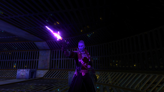
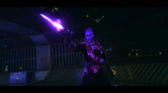
In terms of in game setup, paying attention to the camera angle and where the ambient lighting falls is very helpful. You get a feel for what angles look best on a character, and you decide what your focus is - do you want their face/model to be centre stage, or is it more of an overall composition, maybe with a dramatic back silhouette? (I love back shots honestly, maybe because I'm usually looking at their backs as I play).
Make sure your character isn't lost in the background, some environments can be way too busy for character-focused shots. Sometimes you'll need to move/rotate, sometimes it just takes choosing a more contrasting outfit if you've got one.
Also, play around with emotes/expressions if that's a feature of the game you're in! I have some staple emotes I'll fall back on, and again, you'll get a feel for how to time them if you do it often enough.
As you can see, I do a fair bit of post-processing on my screenshots. I know a few folks use reshade in game for shaders and depth of field - I found it wonky when I installed it, so instead I do all of that after the fact in photoshop.
Typically, I'll crop a screenshot, especially for more zoomed out shots, and sometimes rotate the angle for a more dramatic effect like the above. I love adding depth of field with the lens blur filter, though it can be finicky to make sure just the character is selected, requires a lot of patience haha. And then I'll play around with things like contrast and colour grading. For the above, I actually didn't do a lot of colour tweaks, and I just made sure to enhance the highlights a bit to make things pop. I also added a motion blur effect on the blaster shot. Sometimes for landscape style shots I'll add the black cinema bars, like here, for that extra oomph, other times a shot's fine without them.
So yeah, there's a lot more that goes on here than just hitting the screenshot key - a lot of time spent posing, adjusting, re-doing, and then going in and editing after. As with any art form, patience and practice are truly your friends!
#kem answers#kem screenshots#virtual photography#i hope that helps anon!#i am very passionate about my virtual photography
20 notes
·
View notes
Text
"Cartoon" Book Covers - What's with them?
These are just some musings of mine. Just thoughts kinda organized with some things linked. Lately, there have been discussions about the recent trend of "cartoon" covers for books that have been coming out. As like any discussion of art, a lot of it depends on subjective opinion on how the covers look, the feel they evoke, and if it encourages people to read the book. Before I continue, I think it's important to define some terms and scopes and all that. Ready? (Also this is very long)
"Cartoon" covers seem to be the most prevalent in recent romance releases, however, cartoon covers exist in any genre and are not just a recent thing. (Recent here being loosely defined as within the last 10 year) Romance as a genre is derided, pretty much all throughout history until now which is awful. By talking about this, I am not trying to say that romance is a worthless genre that has nothing to say, in fact, I think the opposite! Romance is extremely important and worthwhile, from brain candy romance to literary romance. It is not a genre I read a lot, just because of my interests and such, but I do read them because I believe in reading a wide variety of books and that exposing yourself to different things is extremely important. But, since many romance books have cartoon covers nowadays, a lot of the books I'll be talking about are romance. Also, I am talking about the covers, not the books. Cover does not indicate book quality, but covers do serve as a sort of "appetizer" for them. I also will only be talking about books, as in novels and such (I am not sure how best to put this, I mean books mostly composed of words alone), not comics or other different types of books.
There's also the issue of how you would define a "cartoon". I will be using the definition of "Cartoon" given by the Oxford Learner's Dictionary, with a bit of modification.
Cartoon - a simple drawing showing the features of its subjects in a humorously exaggerated way, especially a satirical one in a newspaper or magazine. (X)
The modification being that humor/satire is not required to be considered a cartoon. Thus, the definition becomes this:
Cartoon - a simple drawing showing the features of its subjects in an exaggerated way.
Regarding Cartoon Covers, the recent prevalent opinion seems to be negative, with a variety of reasons as to why readers dislike these covers, which line up with my own reasons I dislike *some* of them.
For me, personally, they do not have enough thought or effort put into them. The compositions are not very creative and tend to be static, which is quite boring. They are generally quite simple, but not in a good way. Generally cartoon covers look cheap. However, Being simple does not equate to looking cheap. And yes, while there is something to be said here about how cartoon covers are cheaper for publishers and thus that is a reason they have become prominent, this is a separate (though related) issue. Figures rarely have actual eyes or features, and are not really anchored within the "scene" and they look stiff. Limited (if any) shading means these covers lack depth. The backgrounds are often silhouettes that are a slightly different cover than the overall background color. Honestly, they tend to have very limited color palettes in general. Since I am from the U.S, the covers will probably be U.S Versions.
However, there is a distinction to be made I think between the types of cartoon covers drawing ire and cartoon covers that are not. IE "Good" covers and "Bad" covers. Of course, this is subjective and many love cartoon covers I would consider "bad", and inversely many that would dislike covers I love. In order to illustrate my point, I would like to present to you this cover of the Hate U Give, by Angie Thomas.
By the definition above, this is a cartoon cover. (This book is a YA Contemporary bildungsroman) It also matches some of the characteristics of covers I dislike. The composition is simple and the figure is not traditionally "anchored". But, I LOVE this cover. The symbolism of the title being on a protest sign is amazing and extremely fitting for the work. The sign itself serves to anchor the the young girl, and the contrast between the figure and the background, interrupted by the sign adds visual interest and makes the figure and title stand out. To me, it this cover feels "cared for" if you know what I mean.
In contrast, there is this cover of The Hating Game, by Sally Thorne:
This cover is so awful. My first issue is the woman is so undefined that her pose looks unnatural. Her torso looks unnaturally twisted, as if she's both facing the reader and has her back to them. The man looks like a poorly done papercraft (No hate on papercraft itself) blob with his floating hand and the amalgamation of simple "layered" shapes. (Though there's not a lot there) The figures just float, and the composition is boring. This is a nitpick, but I dislike that the words overlap with the woman. Word placement and font are extremely important to book covers.
Some more examples of covers that I think are unappealing and that I think are the types of covers contributing to the dissatisfaction with covers that are "lazy, cheap, and hollow". Some are more unappealing than others.



While I find these covers to be bad, the thing is that a lot of them actually have aspects that "could have been good." For instance, I like the Idea of the Covers for "Happy Place" and "The Heir Affair." "The Charm Offensive" Has a boring cover, yes, but I like the spotlights separating the figures. But overall, these covers seem poorly done, and "corporate." It's especially sad, I think because it discourages people from reading books they may enjoy and creates a negative association with cartoon art. There is also a metric FUCKTON of these types of covers. They're ubiquitous. In contrast, I want to highlight some cartoon covers that I think are good (Though not without flaws), and are not the same type as those above.



For me, all of these covers are leagues better than those above. They are visually interesting and dynamic. The figures don't look lifeless and stiff, and they all look unique to their own book. Arguments about if I should be comparing books of different genres and aimed at different audiences might unfold, but I think that's reductive. Cartoon covers exist in all genres for all audiences. Case in point:




Some of these I like and some I don't. I actually do think that *poorly done* cartoon covers are a legitimate problem. Since the genre most plagued by these covers is romance, it can encourage further dismissal and invalidation of the genre. If romance covers are largely perceived as cheap, hollow and insipid, those perceptions further color the perception of romance as a whole. I do not think that romance is any of those things, or that the covers should cater to people who hate romance. But, romance being generally a feminine interest is, like a lot of things considered feminine, mocked and considered inferior. I worry that prolific bad cartoon covers only serve to reinforce this horrible association. Additionally, the saturation of these covers begins to homogenize the romance genre covers making it hard to identify the type of story the book holds. Romance readers (AND AUTHORS) deserve book covers with effort and thought put into them, that match up with the type of book it is. Silly fun books should get silly, fun covers! More serious books should get more serious covers to match. (Of course, cartoon covers can be both but when silly cartoon covers are the only thing being created it's bad and leads into stuff I mentioned) And I know book covers, like most things, have trends. But still.
Book covers looking similar is not a crime, and it generally doesn't bother me. And I'm not trying to be mean or attack the designers of the covers I don't like, I'm just trying to critique and distinguish certain types of covers. I know a lot of this is subjective, and this is by no means anything definitive. This is just my thoughts on something I noticed. This is not -serious- analysis! I did not do any *in-depth* research. And I'm not even touching on AI images. It's just. This trend of simple, flat, blobby, cheap art in covers worries me. I know the publishing industry is beyond fucked and tiktok is NOT helping. Cartoon Covers can be quite lovely and amazing! That Cover for "The Picture of Dorian Gray" is one of my favorite book covers of all time. But the push for cheap mass appeal is creating/exacerbating problems. There's not even really anything wrong with going for mass appeal, (especially since book covers are supposed to draw the audience in) but when it becomes the ONLY aim, instead of being a fun/creative way to enhance the book/add to the experience through visual means as WELL as to appeal to readers, something very important is lost.
#eta#books#book covers#cartoon book covers#booklr#reading#romance books#romance genre#cover art#booktok#book cover art
7 notes
·
View notes
Text
@mushoki's Sapphic Witch!Jimmy and Maid!Timmy post gave me life and my imagination burst so here's another AU
For starters, Jimmy's name is Judelyn Inge Neutron, and her nickname being Jully. The name "Judelyn" implies that you are a natural born leader, highly focused, and achievment oriented. I took the name "Inge" from Inge Lehmann, a female scientist that discovered the Earth's core. The name also originated from old Norse meaning Hero's daughter, and Ing's protecting (Ing was the Norse God of peace and fertility.) The name/nickname "Jully" means a tendency to exhibit extremes in terms of material success.
Timmy's name is Theodosia Teresa Turner (Timantha Turner is overrated and that's an actual character from FOP:TNG), and her nickname being Tracy. Theodosia means "God's gift" and I wanted to add a tad bit of Hamilton. Teresa is associated with free-spirit (Fun fact: apparently, people named Teresa often make quick and reckless decisions especially on dangerous sittuations and I find it hilarious because Timmy does the same thing). Tracy means "War-like" "Fighter" and "Brave Warrior".
OKAY! Now that's out of the way, here's a WARNING: My idea is ENTIRELY different from Mushoki's based on the captions and tags. Just a heads up <333
Tracy is a runaway Sorceress from her homeland and works as the Royal family's Royal spy and is disguised as their Vice-Head Maid. Jully is a well-know witch that is somehow seen as a threat to the people of Dimmsdale and the Royal family's eyes. She travels from land-to-land and Island-to-Island with her Great wolf Goddard who's normally disguised as a normal looking wolf.
Jully and Tracy met when The King of Dimmsdale ordered Tracy to spy and guard Mythico Forest at midnight near Dimmsdale due to the rumors they've heard from the people of Dimmsdale. Few days passed and Tracy didn't get any proper rest. She didn't have the energy to fight back when a Black Bear appeared and attacked her. Luckily for Tracy, a person in a silhouette of red appeared in front of her. The last thing she saw was magic being cast before Tracy completely passed out.
Then she woke up and the first thing she saw was an unfamiliar ceiling that looked like it's made out of Mystic Wood based on the purple color. Tracy heard a feminine voice and was absolutely flushed when she saw the girl.
I mean, how can you not when this random woman in a non-typical witch costume leaned towards you and rested a hand on your cheek to your forehead and asked if you're alright if you're feeling nauseous if you feel pain anywhere.
Bonus point because she wears glasses. Fucking glasses.
Tracy introduced herself in a not-so semi-formal way due to her stutters and shaking. The witch laughed it off lowly and introduced herself as Jully.
And dear God, oh my God is Tracy panicking.
Tracy tried her best to not burst when Jully lied her back down to the bed and tuck her in to keep her warm and cozy. And the warm wet towel???? She put on her head???? Oh my God????
Tracy almost combusted.
Now rewind 30 minutes ago and imgaine you're Jully and you found a random cloaked woman near your house near passing out while getting attacked by a Black Bear so you have no choice but to scare away said Black Bear and decide if you should bring a random girl to your house or leave her be to rot.
Jully hear a thud and looked at the now passed out girl behind her. Out of curiosity, she took of said girl's cloak oh is she awestruck.
Said passed out girl had brown hair tied in a ponytail, and her bucktooth is shown. Her skin a frail but beautiful satin color and an unnoticable scar on her cheek. Overall, she looked peacful if you ignore the dark eyebags and her warm flushed red face and her heavy breathing.
Wait shit.
Miss girl got too mesmerized that she didn't notice that she's sick lmao. So without any further hesitations, Jully scooped her up and flew to her house with her staff.
30 minutes passed and finally said girl was awake. Said girl introduced herself and claimed that her name is Tracy, Jully introduced herself back with a calm expression but in reality, she's fucking screaming.
WHY IS SHE SO CUTE!? that's what she's thinking. God these bitches are gay as fuck.
Tracy learned that Jully is the so-called "threat" but considering that the witch bassically saved her life, she let her off and promised not to turn her in or snitch on her which Jully is very grateful for.
Tracy continued to guard Mythico forest while visiting Jully along with it. Then they kiss then the kingdom found out then they made a public execution for Jully but Tracy stopped them and proved her innocence then the kingdom stopped seeing Jully as a threat then Jully and Tracy kissed again then they got married then adopted kids htenkajshfkjahfkjshkdgk
I FUCKING LOVE TJEM‼️‼️‼️❗‼️ SAPPHIC JULLYTRACY FOR THE WIN❗❗
#nicktoons unite#timmy turner#jimmy neutron#JimmyTimmy#genderbend#genderswap#mich fics#this turned into another rant#Jimmy Timmy#Tied Souls of an Everflame Lantern#<- The OFFICAL name of the AU!#TSOAEL
29 notes
·
View notes
Text
Recollections of Liverpool School of Art 1957 - Pat Jourdan
We all gathered at the front hall that September morning and John Lennon, Tony Carricker and Jeff Mohammed were sitting together on the marble steps. John and Terry were wearing their old school blazers with the pocket-badge removed, while Jeff, already about 25 years old, was wearing a speckled tweed jacket. The office window had the register for us to sign, and a small selection of art materials to buy.
We were never taught how to draw, how to create or handle a line, construct shapes via pencil, pen and ink or charcoal or the dreaded Conte crayon which we bought every Monday from the office by the front door. Two colours of Conte - black or terra cotta. Everyone preferred the terra cotta as it made any scratch look as though it was something by Leonardo da Vinci.
We were plunged into the Life Room, Room 73, with no preparation, just with half-imperial sized paper, 2B pencils or crayons. I conscientiously went round the outline of the model (Mrs Dornan or June Furlong?). We were all skating on thin ice, unassisted, only criticised by the lecturer, Phillip Burton, a small Welshman. Most of the lads were embarrassed, they said later.
So I went carefully round the model's edges and produced something like pale tramlines, week after week. Phillip Burton eventually brought me some of John Lennon's drawings, bold black simple lines. "Look at these definite statements. This is what you should be aiming at. See, here and here." He pointed out how one dashing line completed the top of an arm or the slope of a hip - all in one flow, finished. I looked at them and saw the difference. John was not present, he may have finished and gone down to the canteen.
Mr Wiffen's weekly subjects started off with a cup and saucer, then a teapot, a humpback bridge, painted in black and white special poster colour. We were out drawing the Protestant Cathedral on Friday 4th October 1957 (the Catholic one was not yet built). Thursday 17th October we were in Princes Park, hugging trees, to learn that trees - especially winter trees - were not just flat silhouettes. We each had to put our arms around a tree. It was hilarious. It looked like something from the Goon Show. This was 'Elements of Drawing' with Mr Wiffen, who always wore a white overall like a scientist.
One painter, Tony Byrne, had been to the Tate Gallery show of American abstract painters. He bought sheets of hardboard and decorators' paint, and started painting on the floor. John Lennon made fun of him (as he did of many people) and watched Tony painting on the floor. The next evening, John did one perfect floor-based painting and left it at that. He was quick to absorb whatever was new, and then move on.
When we returned in the autumn term, John was wearing a smart black corduroy jacket and I remarked how good it looked. "I'm wearing it because of my mother, the daft git walked between a tram and a car and got squashed," he said sharply. I did not know if he was being his usual sarcastic self, or if it could possibly be true - no one else had mentioned her death. So, I said, 'What a pity, that was really awful' and other sympathetic remarks, being puzzled about what he meant. It was never discussed again at all.
The college suddenly had also had a sort of investigation about our productivity, and John gave me his more outlandish drawings to hide in my locker on the top corridor. "They won't find them here, I've got to show them all my sketchbooks," John said. They turned out to be the foundation of his book, In His Own Write, in 1964.
12 notes
·
View notes
Text
So, I’ve been thinking about my OCs quite a lot recently, so I’ve decided to make another “how my characters look like” post. I’ve introduced a few new characters plus some of the old ones have appeared more than once, so I’ve thought it would make sense to visualize them (this is actually super helpful when writing, too, because writing characters when you know how they look like is somehow easier). The first post is here.
I used the same picrews as before because I like them and it’s quite simple to create character designs with them. For most of them - this one, and this one for Ángel’s dad.
Ximena Robledo.
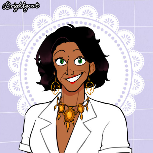
Ximena has dark brown hair, green eyes, and dark skin. She has a protruding chin, wide cheekbones, aquiline nose, so her facial features are kinda large. She’s in her forties and has wrinkles, specifically around the corners of her mouth and on a forehead (I just can’t use two different types of wrinkles at the same time in this picrew akjdjfk).
She’s plump and fairly short (~162 cm). She also has relatively wide shoulders, which makes her an inverted triangle.
Once again I’m not sure about the clothes preferences but I can imagine her being quite stylish. She also loves jewelry, especially some big items.
Imelda Hierro.
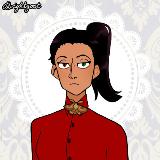
Imelda has dark brown hair and olive skin. She also has heterochromia: her right eye is brown and her left eye is green (I mentioned it in the seventeenth chapter, and to be honest, there’s not reason why I made it, I just thought it was cool). She has a square jaw, a humped nose, so her features are kinda sharp. She also prefers having her hair in a ponytail.
Her height is average (~165 cm). I have no idea if this term exists in English but she also has broad bones (big boned?), so you wouldn’t call her either thin nor plump, she’s rather athletic and large if I can say so if any of you is familiar with Kibbe, she resembles Flamboyant Natural
In clothes she probably prefers minimalism and of course she can’t wear it when she fences but she also has a butterfly brooch (which is such an important detail aaaaaaaaa).
Marta Expósito.
Marta has brown wavy hair (this is the perfect hairstyle, just 100% how I imagined it), brown eyes, and dark skin. Overall she has thin and delicate facial features (which makes her similar to Emilio aksjmdkf I swear it happened unintentionally, they’re not related in any way).
Marta is shorter than Imelda (~163 cm), but she still looks taller because, unlike Imelda, she always wears high heels. She has a thin straight silhouette (narrow shoulders, no super visible curves).
When it comes to clothes, she prefers something feminine but you know without being too “girly” - rather elegant and classy.
(I know I barely described her, but really, this picrew is perfect, I don’t have anything more to add).
Hendrik Aakster.
Hendrik (for absolutely no reason I feel awkward referring to my “parent characters” by their names, but okay I’ll try to overcome it) has black hair, green eyes, and light skin.
His height is a bit under the average (~168 cm), his silhouette is straight, and since I already started using this phrase here, he’s big boned as he has a wide straight silhouette (I heard some people calling men like him “a wardrobe” in my language but I don’t think I can say it in English x))
In clothes he’s classy and elegant.
Cornelia Aakster.
Cornelia has dark blue eyes, brown hair, and light skin. Frida generally takes a lot after her mom, just her features are sharper due to her age (she has high cheekbones, a humped nose, and a more prominent chin).
She’s a bit taller than her husband (170 cm; and she wears heels) and has a thin straight silhouette (at this point Frida looks a bit larger, as her bones are wider. Father’s genes after all).
She’s a fashion designer, so she’s clearly stylish and I can imagine her loving jewelry and wearing make-up.
Lucas Suarez.
Lucas has dark brown eyes, brown hair, and dark skin as for more details, just look at him, akhandkjf I really don’t know what to say about him, he’s just some man and I created his design on the spot :’)
Anyway, the thing I’ll add is that he’s tall and slim (~184 cm; Ángel takes after him at this point, but generally he resembles his mother a lot more just don’t tell Lucas). When it comes to clothes, he’s pretty traditional, although he actually was a lot more flashy in his youth.
Maximiliano Enríquez.
First of all, ignore what he and other boys of Gabe’s patrol wear. I tried to make it look similar to the scout uniform but I obviously didn’t succeed.
Second of all, all characters’ appearances below (and Max as well) were born as a result of me playing around in this picrew, so their descriptions are even more brief than the previous ones. I’ll just make little notes on their body types, so you can understand how tall they are in comparison to (adult) Gabe.
Max is shorter than Gabe (~178 cm) and has pretty average body type, not muscular nor skinny, as he’s never been into sports that much. He’s just some healthy (mentally and physically) guy.
Alberto Franco.
Alberto is the tallest among the guys in his patrol (~186 cm), and he’s skinny. He’s a guy of culture after all, he’ll faint after like three minutes of carrying something heavy (might or might not be joking).
And he 100% wears some jewelry items, including ring(s), that clearly prevents him from making a fire or anything, and he might use it as an excuse for not doing the dirty work (but he doesn’t really have a choice because Max will never let him loaf around).
Samuel Cisneros.
Samu is shorter than Gabe (~176 cm), big boned, and plump (so he can give the warmest and tightest hugs :3)
Oscar Téllez.
Oscar is the shortest in his patrol (~170 cm), and just kill me, I don’t know how to describe body types he’s kinda similar to Frida’s dad when it comes to the build: he’s not plump, like Samuel, but he is big-boned and looks wider than Max and Alberto (and kinda Gabe as well, but we all know that Gabe is athletic, so it’s hard to compare them).
Jaime Bernal.
(yes, his first name is Jaime. Yes, I know I still haven’t stated it in my fic, but there’s gonna be a character calling him Jaime someday, I swear)
First of all, I want to make a little note: Jaime is 58 years old and according to the Internet, people of this age are considered “middle-aged”, which I stated in the latest chapter when I introduced him. I’m saying it just in order to avoid confusion, like “why is his hair grey if he’s middle-aged” because he’s had a hard life
Jaime’s height is pretty average (~180 cm; he was taller when he was younger) and due to the military lifestyle, he’s athletic which he’s kept up to his current age (he’s actually quite similar to Gabe, to our Gabe we see in the show)
He wears an emerald brooch that he’s gotten from someone dear to him in the past, and yes, his left arm is prosthetic.
That’s it!
#Was Born To Lead#My OCs#Ximena Robledo#Imelda Hierro#Marta Expósito#Hendrik Aakster#Cornelia Aakster#Lucas Suarez#Maximiliano Enríquez#Alberto Franco#Samuel Cisneros#Oscar Téllez#Jaime Bernal
6 notes
·
View notes