#enable the custom theme on blog settings!!
Explore tagged Tumblr posts
Text
This might not work if your blog is dash-only and/or set with "use custom theme" off (i.e. if in dash mode for that blog you only see @citrusella-flugpucker under the avatar for instance, as opposed to what you WILL see if you visit my blog in dash view, which has @citrusella-flugpucker / citrusella-flugpucker.tumblr.com because I have a custom theme--I come from the days when everyone on the site had that, and I've never disabled it).
I say this mostly because I just tried with your blog and neither https://www.tumblr.com/gracechoreography/page/2 (for an easy bet that the page exists) nor https://gracechoreography.tumblr.com/page/2 worked (the former acted like a 404 and the latter redirected to your blog's main page in dash form since you don't have custom theme (AKA non-dash version of the blog, the one that's its own mini website) enabled).
It's possible it's just doing something funky on my end but I wanted to note it since I wondered and tried and got that result.
Time for a Blast from the Past
please go to your browser and type in https:// [insert your url here] .tumblr.com/page/1000
Look at the first 5 posts that come up
10K notes
·
View notes
Note
WHAT THE FUCK Y’ALL GET ALL THAT ON DESKTOP HELLO????????
😖 I miss when it was the norm. It was SO chaotic, so beautiful!!
I was going to add some things in the tags, but I please you need to know, because the one thing I remembered I HATED about it was music players! YOU COULD ADD MUSIC TO YOUR BLOG! And some evil souls would add their playlists on auto play which was a huge hilarious problem bc - story time - back then when we wanted reblog things, tumblr would open a new tab and, scrolling down the dash you wouldn't want to miss where you were, we'd open tabs and more tabs of posts to reblog, to then reblog one by one in one go and here things get tricky, because once you rebloged the post, instead of switching back to the dash, tumblr would direct you to the person's blog. Imagine you have 20 tabs open and suddenly 5 of them start playing different songs at the same time, many times on top of whatever YOU were already listening to :)
It worked as tumblr works. To be fair there were some terrible themes, people would make it nearly impossible to navigate their pages "for the aesthetic", but I miss the variety of it so much I wouldn't mind some bad designs. AND ALSO I believe users nowadays would know how to behave with this tool lol I wish Tumblr would bring it back in a way it could work with the app 😔
32 notes
·
View notes
Note
hiii i love ur blog but i just wanna ask if you could turn on the web version on it? i am stuck in a time loop trying to get to the earliest posts and ik theres a way that could b done on the web version. also turning on the web version lets anyone even those without tumblr to see the posts which im always tempted to send to my timeloop lover friends but can only send via screenshots HASDJFDH tyy
It should be working now! Sorry for not getting it sooner, we just had no clue how to turn it on lol
#not a time loop post#asks#(we thought you had to purchase a custom domain from tumblr to turn that on)#(turns out you can just go to blog settings > enable custom theme & it lets you use the web version :)
61 notes
·
View notes
Text
been learning a lot lately that most ppl actually do not have custom themes enabled on their blogs anymore and use essentially the mobile layout only. ppl aren't digging thru theme codes and spending hours picking the right sidebar + bg + transparent anime girl to decorate their blogs anymore...
#anyways reminder u have to enable custom themes on ur settings now on every blog u make#i completely forgot abt this until i couldnt figure out why the rick poll didnt have the theme i gave it n then went#oh duh. custom themes off by default#which is stupid this site is so stupid ur the only site left w custom themes be srs
13 notes
·
View notes
Text
hey y'all here's a good tip: if you're an artist or want an ACTUAL blog you have THIS option right here in your blog settings

it enables your blog to have its blog url (blog.tumblr.com) in addition of your user url (tumblr.com/user)
you now have an archive! everyone can access it and search posts from any given time, tags, types, etc.
you CAN buy a domain for you
your blog is accessible for people who don't have a tumblr account
you can now customize it with pre-made themes, OR EVEN make your own theme with HTML and CSS!!
of course it therefore makes it "more public" but i think it's worth it!

877 notes
·
View notes
Text
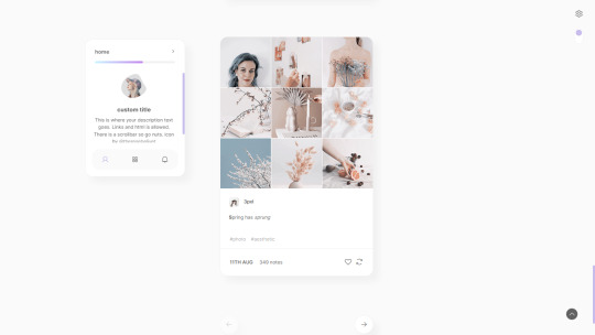
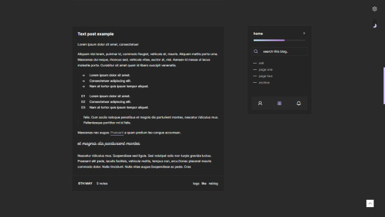
Bloomy— a responsive, single-column theme with a sidebar
Static previews: - Preview: left sidebar - Preview: right sidebar
Download code: GitHub
This is a single-column Tumblr theme with an option between a left or right sidebar, with a Google font of your choosing. Full support of npf posts. Optional dark/light mode toggle available. With 3 tabs included in the sidebar - show info, navigation and updates tab.
Read features and notes below the cut
Customize colours for dark and light mode Customize 2 gradient colours (home button in the sidebar)
Customizable post margin
Custom title + description field boxes
Select font-size (11-18px)
Select Post-width (350-540px)
Select photoset gutter (1-4px)
Select displayed tags or upon a toggle
Select post info displayed as text or icons
Toggle between shadows or no shadows
Toggle between sharp or round corners on content
Toggle between displaying or hiding Tumblr controls behind an icon.
Toggle to center post column
Navigation: An unlimited display of native Tumblr pages within a dropdown. Learn how they work in my FAQ here. Custom home archive + ask titles.
Search bar: The search bar will automatically be hidden if you have the option to discourage searching your blog from search results enabled. Go to your blog’s settings to do so.
Sidebar Image: 60x60px. Choose a size between shapes square, rounded, circle or blob. Separate icons for light and dark mode! But If you want the same icon, simply upload it twice.
Dark Mode: If you decide to offer dark mode, it detects if visitor’s operating system is on dark mode, and displays that choice at the first visit - of course with the option to toggle the other mode on/off.
Tabs in sidebar: to hide a tab in the tab sidebar, delete the text in the corresponding field. Example: "Tab 3 Title" for the update tab. Learn about how to change icons further down under icon change.
Icon change: To change the icons in the tabs sidebar or in the update tab, go to phosphoricons.com and simply copy the name of the icon like so:
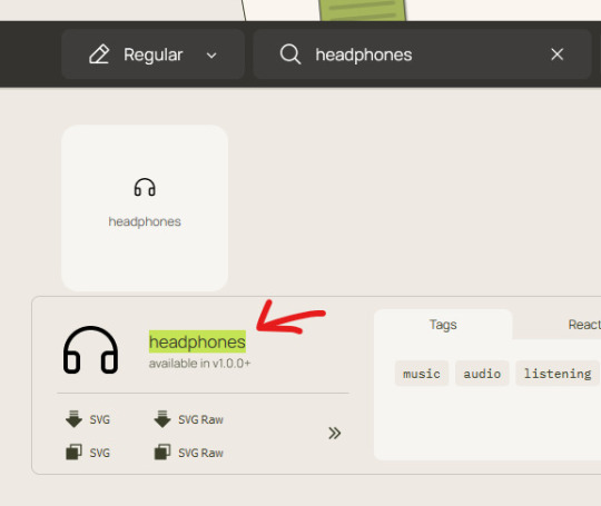
Into the corresponding field:
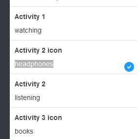
Notes:
Via/source links are on permalink pages
to hide the archive link, simply delete the text in the field.
Submit-link and ask-link only shows if toggled on in your blog settings.
Credits
#theme hunter#themehunter#dailythemes#themes#tumblr themes#resourcemarket#supportcontentcreators#whew#this is a mix of *3* different old themes never released lol#with updated features of course#codes by me
658 notes
·
View notes
Text
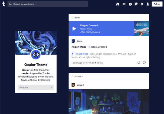


Ocular — Version 3
Preview // User Guide // More Info & Install
your favorite sidebar theme just got an upgrade, babeyyy
I went to update Ocular to make it NPF post-compliant and then my hand slipped and I redesigned the whole thing lmao. here's a brief update about Ocular 3; if you're looking for a full list of changes between versions 2 and 3, click the "Read More" below)
Ocular comes with the following features:
Colors: easily change the color scheme of your sidebar and posts using any colors you want
Post sizes: 400px, 500px, 540px, 600px, 700px
Sidebar: can be on the left, right, or above the posts. pick from a list of sidebar sizes, header image heights, and avatar shapes
Fonts: 20 different fonts, sizes 13px to 18px
Background: solid, gradient, full-size image or repeating image
Links: choose either regular navigation or drop-down navigation. unlimited custom links (visit the help desk FAQ for a tutorial) and ability to rename home, ask, submit, and archive links
Endless scroll, custom ask box text, Tumblr's full-width controls and search bar, optional header, avatar, and favicon images
if you already have Ocular installed, version 3 should be coming at you as soon as the update passes the theme garden. if you installed this theme with GitHub, you'll have to re-install manually.
now let's get to the fun stuff. what's new in version 3?
wow, do I have some updates for you!
1. goodbye color schemes, hello post background and text colors
you can now directly control the color of the posts rather than relying on color schemes to do it. want your posts to be a very specific shade of navy? all yours, buddy. go wild (make sure it's readable tho)
2. hello, color schemes! wait I thought we got rid of that guy
a lot of the color schemes I made became redundant now that the new post background/text color options exist. if you were married to the old color schemes, all of them can be recreated using those options. so the new color scheme options are as follows:
"My colors" — uses the colors you picked for post background/text
"Light preset" and "dark preset" — sets the posts to white with black text, or off-black with white text
"Translucent" — uses the colors you choose for post background/text, but makes the post backgrounds semi-transparent. there are NINE different translucent color schemes, ranging from 90% (only slightly see-through) to 10% (VERY see through)
3. navigation dropdown option
you can either use the sidebar links like they were before, or you can turn them into a cute little dropdown (helpful if you have lots of links or links with long titles!) you can enable this using the "use dropdown navigation" setting. you can also customize the label for the dropdown using the "dropdown menu label" setting. for instance, the dropdown on my blog currently says "oooh you wanna click me"
4. RIP google fonts I always hated your load times
decided to stop using Google Fonts and instead I'm providing the font files directly in the code. this will help speed up load times drastically when using custom fonts, plus I don't have to use Google. win-win! there's quite a bit of coverage overlap with the old fonts, but some of them that were too similar to each other got the ax. I also added all of the system fonts as options (hit classics like Arial, Georgia, and Comic Sans MS are now available TO YOU!)
5. more layout, sizing, and spacing options
the sidebar used to be either on the center-left, center-right, or above the posts; now it can go in the top-left or top-right! you can now control the border radius on the posts and sidebar. the header height, sidebar width, and post spacing all have additional options.
6. some options have been renamed for additional clarity
"background color 1" -> "background color"
"background color 2" -> "gradient background color"
"background" -> "background style"
"font override" -> "use body font everywhere"
"title" -> "sidebar title"
"description" -> "sidebar description"
"ask box text" -> "custom HTML above ask box"
7. removed some options
you win some, you lose some. I removed the uppercase sidebar links, theme credit, and inline media spacing options, mostly for redundancy reasons or because they produced unclear results.
8. as previously stated, now NPF-compliant
Ocular was ALMOST compliant with Tumblr's new post format, but had a few tweaks that needed to be ironed out. they're now ironed.
9: now user-friendly right out of the box
I updated the default color and content options, so new users installing this theme will have a much easier time using and customizing it immediately. no more ugly ass green background!
10. and finally, new JS
I had to rewrite some of the javascript for this theme, which turned into me rewriting ALL of the javascript. doing so meant that I could eliminate dependencies on third-party JS libraries and run the whole thing on plain JS. that should improve load times!!
bonus: custom CSS can do some nifty stuff now
want to change the size of your avatar? you can do that now! just do this to your Advanced > Add custom CSS section
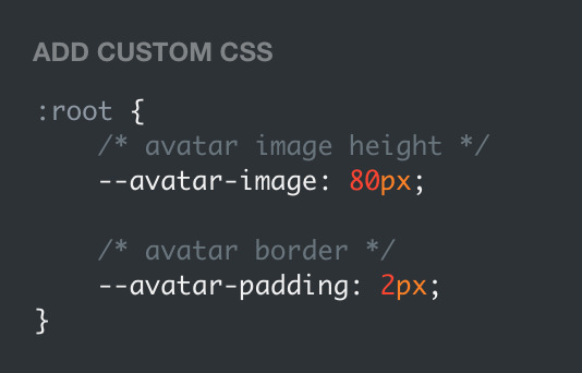

super helpful if you're using the Avatar shape: Uncropped setting and you need your image to be a specific size (like a pixelated GIF)
for more info, check out the Ocular user guide. thanks for reading my updates!! hope you all have a fantastic start to your 2024 ❤️
#tumblr theme#tumblr themes#themes by rachael#codingcabin#ocular#blog#you should've seen me writing the JS for the audio posts lmfao I was on my hands and knees begging it to work
548 notes
·
View notes
Text

I rushed to make the update post last night because I was tired. But I'll make a better one now to include all the minor and not-so-minor changes I made, as well as explain why it took me a millennium to get this chapter out. Note: Some of these changes are game-breaking, and require you to start a new game. There's a reason I urged people to read the devlog!

Dead by Daylight: Unraveled Changelog:
Added Chapter 4.
Added more flavor text to previous chapters.
Added additional dialogues and interactions with Bastion in previous chapters.
Replaced BG art and theme of the Status Page.
Experimenting with Emoticons on certain choices.
PLEASE do not load a previously saved game!! Because of the changes I've made behind the scenes, those saves will NOT function correctly moving forward. You MUST create a new character.

Chapter 4 contains some fan service with—you guessed it—Bastion. Remember that you can enable or disable this mature content via a setting on the Customize Page!
I am aware of a formatting issue on certain mobile resolutions; I'm fixing this pronto!

Finally, here's an explanation regarding the huge hiatus. Warning: I get personal here.
I've been in and out of a deep depression for the past something or so years, as well as having gone through a number of wild, traumatic events during that period! Now, I won't get too in depth regarding those events, but they certainly made matters worse.
When I had energy to work on something, it didn't last for long. But if there's one thing that makes me happy, it's writing! :D So, I decided to put my personal problems aside and finally deliver the chapter update I promised a long time ago! Wrapping it up certainly gave me a lil' serotonin boost! (❁´◡`❁) And I hope to keep this up so I can get another chapter out soon.

Anyway, thank you for reading! <3
I know I should probably make an entirely new blog to devote to this specific project, but I honestly don't even have the energy to manage this one… I hope you don't mind the disorganized mess! 〒▽〒
If you have any issues with the new chapter, let me know!
Play the game here.

#dead by daylight#dbd#fan game#interactive fiction#if game#twine game#fanfiction#Dead by Daylight: Unraveled
113 notes
·
View notes
Text

✧ the foundation for your coquette tumblr presence: the ultimate guide by mindy (1/15)✧



hello darlings~ mindyyy here
i see so many amazing little blogs on tumblr, so many that inspire me and motivate me to post more here on tumblr, so i decided to make a little series helping you to create the most ethereal corner of tumblr you've ever dreamed of for yourself. i'm going to guide you through every delicate step of establishing your presence, ensuring your blog becomes a soft haven that attracts kindred spirits!!!
important note:
all the tips, advice and steps i give you in this series are the exactly what i use for my blog, this is what helped grow my blog to 1.1k followers, while befriending some of the most amazing people i've met, tumblr is an important place for me, and i've been using it for years, i've helped multiple other people grow their own tumblr blog, and i've use these exact steps. this series is superrr important to me and very well-thought out and planned, please don't steal my content ideas, or plagiarize my content or series ideas, they are super time-consuming to create and i put all my hard work into it. this series is to help you all create and build a sustainable coquette blog. keep in mind these tips i give in the series can be used for any type of tumblr blog, it doesn't just have to be coquette, however everything i say in this series is more tailored to creating a coquette blog, so just make sure to know if you aren't creating a coquette blog, that's totally fine and you can still use these effective tips! <3
let me begin with the essential elements that will form the foundation of your digital sanctuary:
choosing your perfect username
your username is like a whispered introduction, so choose carefully. consider these elements:
incorporate soft, romantic words (pearl, rose, moth, sage)
avoid numbers unless they're meaningful dates
keep it easily typeable and memorable
check availability across platforms
consider future branding possibilities
make it very short to keep it neat
pro tip: before settling on a name, write it in different fonts and styles to ensure it maintains its beauty in various forms.
example:

crafting your blog description
your description should feel like an embrace to whoever reads it. (this is both for the pinned post of your profile/blog and the description of your blog) include:
a brief, poetic introduction
your main content themes
posting schedule if you have one
any specific content warnings
languages you speak
your timezone for mutuals
special interests using soft bullets (✧)
developing your signature aesthetic
this is where the magic truly happens. your aesthetic should flow through every element:
color palette selection:
choose 3 primary colors and 2 accent colors
maintain consistent hex codes
save your palette for easy reference
consider seasonal variations
test colors against white and black backgrounds
visual elements to consider:
custom cursor designs
carefully selected fonts (maximum of 2-3)
consistent border styles
signature dividers and bullets
background patterns or textures
sidebar images and icons
essential technical setup
while maintaining our dreamy aesthetic, we mustn't forget the practical:
enable infinite scroll
set up custom links
organize your tags systematically
create navigation buttons
establish post width preferences
configure ask box settings
set up queue parameters
your blog is another part of you. every element should work in harmony to create an atmosphere that feels both intentional and effortlessly beautiful.

before you go:
✧ save your color codes in a pretty document ✧ create a moodboard for visual reference ✧ test your layout on different devices ✧ prepare a tag system ✧ gather inspiration images
with love, mindy xo
if you don't already know, i have my own newsletter here: GlowetteeMindy

#tumblr tips#blog aesthetic#coquette#blog guide#digital sanctuary#part 1#blogging advice#dream girl#that girl#girlblogger#girl blogger#becoming that girl#pink#self improvement#it girl energy#glowettee#helpful#useful#life tips#resources#good to know#for future reference#selfcarevibes#wellness#wellbeing#selflove#self care#gloomy coquette#coquette dollete#dollette
55 notes
·
View notes
Text
Complete-ish Guide To Settings You Might Want to Change
These instructions will be for desktop, because the settings are easier to find there. You can do the same on mobile, but it might be in different places.
Dash settings

Your dashboard is broken down into several feeds, including "Following" and "For You".
"Following" is primarily the posts of people you follow, "For You" is algorithmic.
If you just joined, "For You" is default, if you're a longtime user it's "Following". You can change this in the settings on the right
A lot of longtime users will tell you that the Following feed is where we spend most of our time. But try out all the feeds, and see what you like most.
The settings that are settings:
To start, click the settings gear under the account icon (the abstract person head).

This should take you to the General tab. Key settings:
Community Labels: By default anything NSFW is silently hidden. You can change how each subtype is handled.
Hide Additional Mature Content: If you have an iPhone disable this or it'll hide every post from you on the off-chance it contains porn.
If you're under 18 as determined by the birthdate you entered on signup, you can't change these. (If you want them on, you'll have to make a new account and lie)
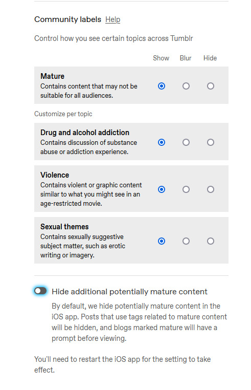
Under the "Dashboard" tab, you can enable timestamps, which is mostly just nice information to have. sometimes a post is from 2010 and you can be like wow.

The next four probably have the biggest impact on your tumblr experience, so I'm gonna do a breakdown.
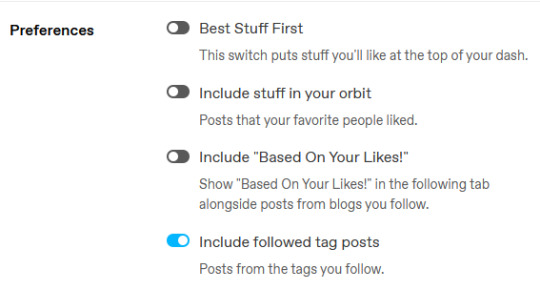
Best Stuff First reorders your "Following" to have popular posts at the top. Disabling it makes your feed chronological. I like it off, but up to you.
Include Stuff In Your Orbit and Based On Your Likes put various content from "For You" into "Following". Personally, I disable them to keep "Following" purely posts by people I follow, and then switch between feeds to get what I want.
Followed Tag Posts will put content from the "Your Tags" feed into your "Following" feed. Since you can go to the separate tags feed, I usually turn this off (it tends to show me a lot of duplicate posts), but up to you.
Under the "Notifications" tab you can tell Tumblr to stop sending you emails.


I'd recommend disabling all the emails--if you get a bunch of replies, Tumblr will happily send you dozens of emails, and you don't need that.
Notifications is the push-notifications in-app/in-website. The mobile app, for some reason, has a much better interface for controlling these, including the option to only get activity-notifications for mutuals. You can leave these on, or turn them off if you find the flood of notifications is distracting.
Tumblr News is a newsletter, it usually just has content from @fandom and the other staff-run recap blogs.
Conversational notifications sends you more emails.
Under the "Tumblr Labs" tab you can enable a bunch of cool beta tests.

I particularly suggest Reblog Graphs, What you Missed tab, & Popular Reblogs tab, but they're all fun to try out. A lot of these are honestly better than the For You dashboard.
For each blog you have, you can customize it's Blog Settings. Beyond things like setting an avatar or description, there's a few settings that are fun.

Custom Theme gives you your own subdomain at [blogurl].tumblr.com.
This makes your blog easier to search, and a lot of 3rd party tools depend on you enabling it. It also makes it easier to link your posts to people who don't have tumblr accounts.
You can completely customize the CSS/HTML/Javascript. you can go legitimately crazy. It's not a requirement, but if you want unlimited flexibility, go wild.
On the contrary, if you wanna run a more private blog, you can disable this and then hide your blog from search results/non-registered users.

Likes and Following are public by default. I like to turn these off so I don't have to worry about like, "what will people think if they see i'm following [...] or liking [...]". But it's also fair to keep them public if you'd like.
The other Blog Settings are important but pretty self-explanatory I think.
Finally, there's some useful tools I like:
XKit Rewritten - A bunch of scripts (like RES for Reddit). The one I really like is "mutual checker", which shows at a glance which blogs you are in mutuals with. Which is such a good feature it's included in the mobile apps by default i think.
siikr.tumblr.com - Tumblr search is bad, and google's indexing of tumblr blogs is worse. Siikr will find any post you've made on your blog. Because disk space is limited, only use it to search your blog, and if you're tech savvy consider running a local copy from source.
988 notes
·
View notes
Photo
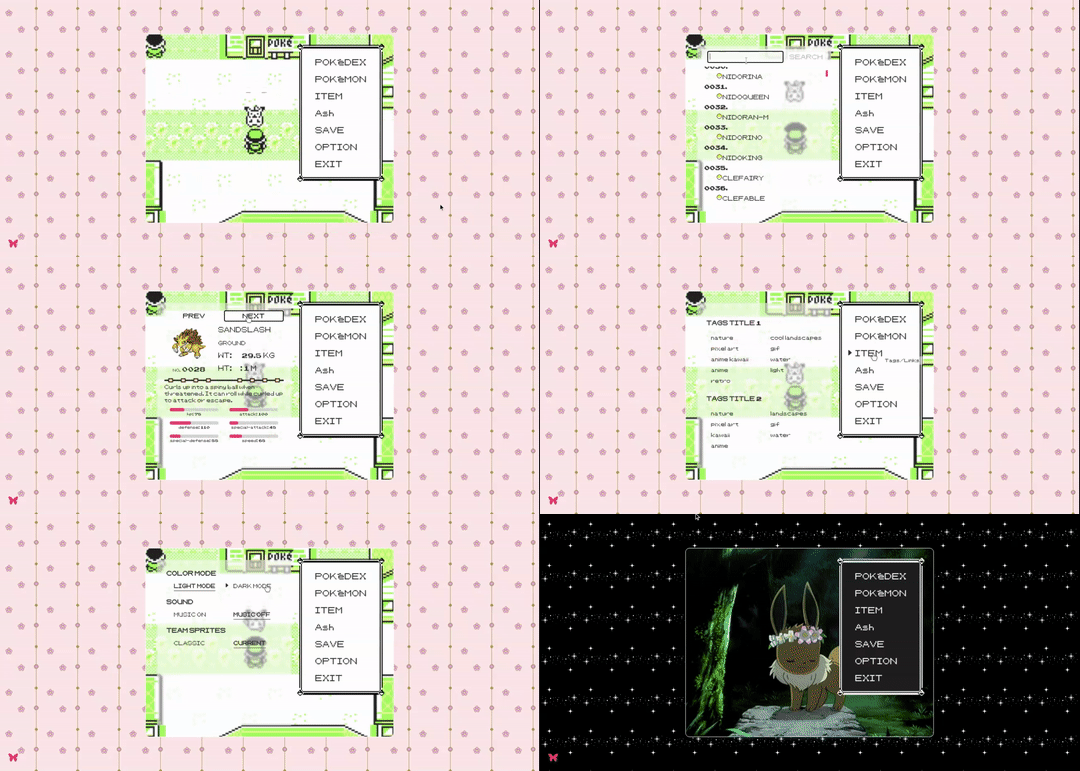
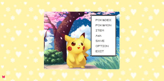

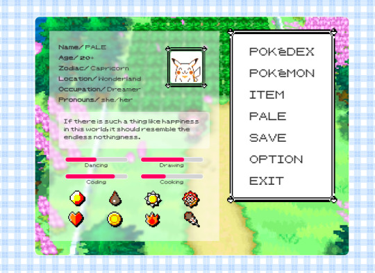
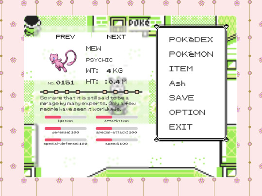
Page 04: POKÉDEX 98
Preview | Code
An about page that is also a Pokédex mini web application, based on the Pokémon Yellow interface design. Why? Because is having a Pokédex in your blog is cool! (。◕‿‿◕。)
Read the customization guide here.
Features:
A full functional Pokédex. You can search any of the current 1000+ existing pokémon.
Set your dream team easily.
Change the language of the Pokédex.
About section.
Tags/Links section.
Extra section that can be used for more information, terms of use, FAQ, etc.
Toggle Light/Dark Mode and customize it, too.
Add background music and switch on/off.
Select between ultra retro or modern sprites for your team.
Responsive on mobile.
More info:
This page retrieves all the pokémon information through the services of the Poke API. The Poke API is a full RESTful API linked to an extensive database detailing everything about the Pokémon main game series. This means this page does not have coded any information of the pokémon, instead every time you search a pokémon the app connects to the API and gets the information back.
Notes:
This is the first version of the page, but in the future I will add more functionalities! Recommendations are always welcome.
The Pokémon nformation is dependant of the Poke API database, so if there is some information missing or wrong the Pokédex page can’t control that.
Make sure you have Javascript enabled on your blog.
Credits on code.
Inspiration came from Pokémon first generation games and also the page was inspired by @nyctothemes beautiful first generations themes! Check them out!
Please reblog/like if using! :3
#themes#theme hunter#coding cabin#pages#free pages#pokemon#pokedex#pokemon yell#retro page#retro aesthetic#90s
791 notes
·
View notes
Note
Im asking u this cos I don't have enough followers to get my post noticed if I post it on my blog lol, but do you know why the fuck tumblr won't let me make a sideblog that has the existence of [url].tumblr.com and the new side blog i just made only exists as tumblr.com/[url]???
You need to go into the settings of the sideblog and turn on the option for "use custom theme" - the default now is the tumblr.com/url, enabling a custom theme gives you url.tumblr.com. You don't have to make changes to the theme or anything, just enable it.
87 notes
·
View notes
Note
How old does your blog have to be to see the desktop blog view thing?
You can just make it happen whenever you want!
In your browser, set it to desktop mode (available in the dropdown dots menu) and then just type in a user's name first, then tumblr.com
Example:
Fangirltothefullest.tumblr.com
If they have set up a desktop version it'll show
Users older than when mobile became a thing will have desktop versions as they are more customizable. You could even add music if you had the html code for a player.
If you wsnt one yourself, you have to enable custom themes.
Log into tumblr on your browser either on desktop or on mobile. I suggest logging in through desktop mode on your phone's web browser and opening the log in in a new tab so it stops trying to pop up the app.
Once logged in you can disable desktop mode in your browsers drop down to see things easier.
It'll probably up like this otherwise and be a formating nightmare.
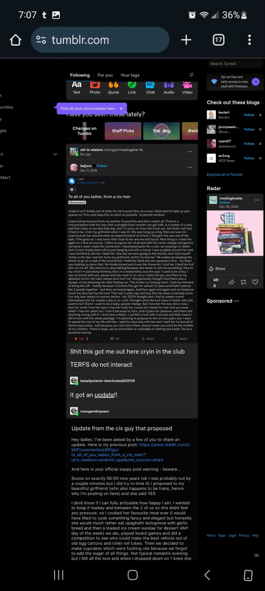
Now.... once it's OFF desktop mode,
Go to the blog you want and hit blog settings in the drop down.
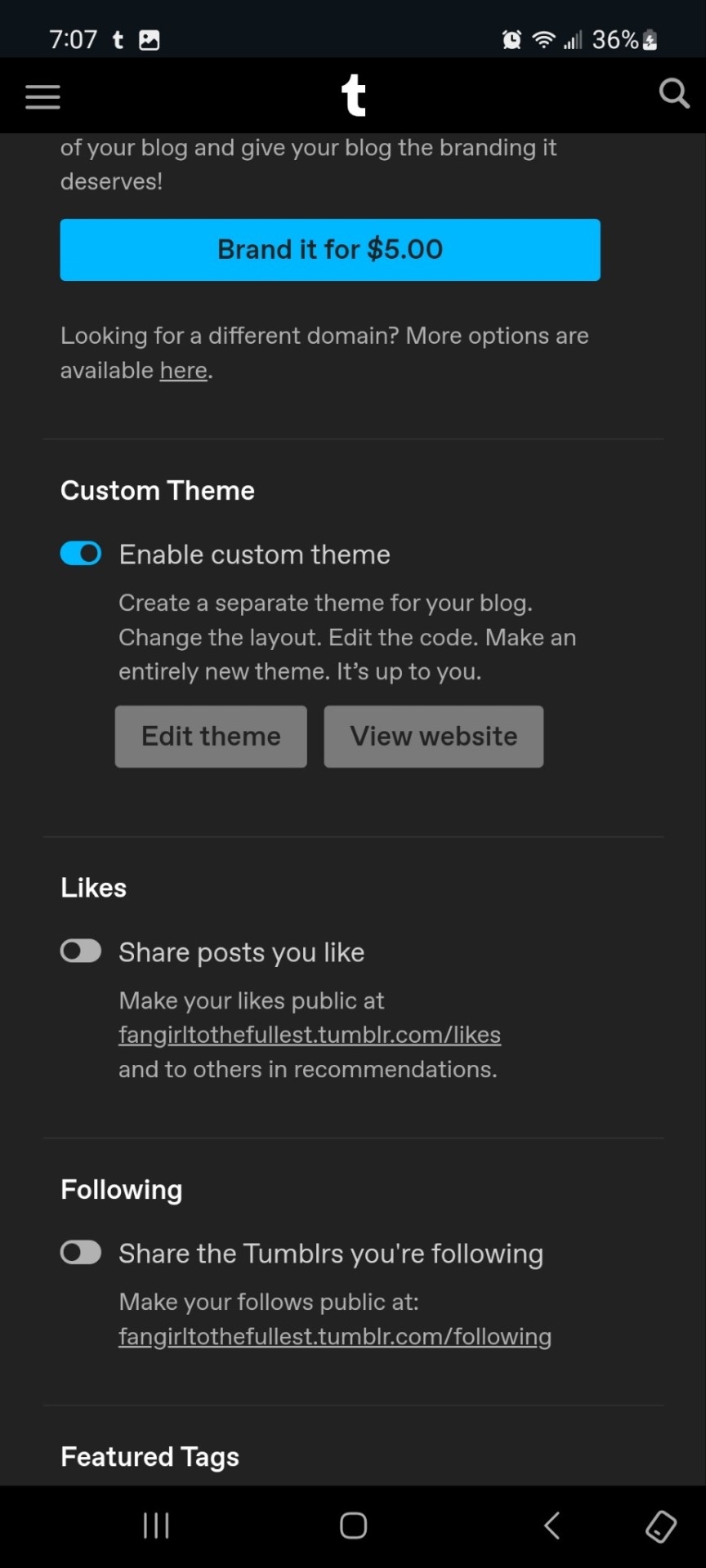
Enable the custom theme and hit the edit theme button. You'll be taken to a place that looks likethis:
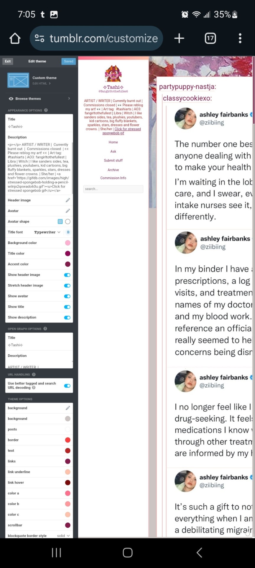
You can zoom in to hit the browse themes button:
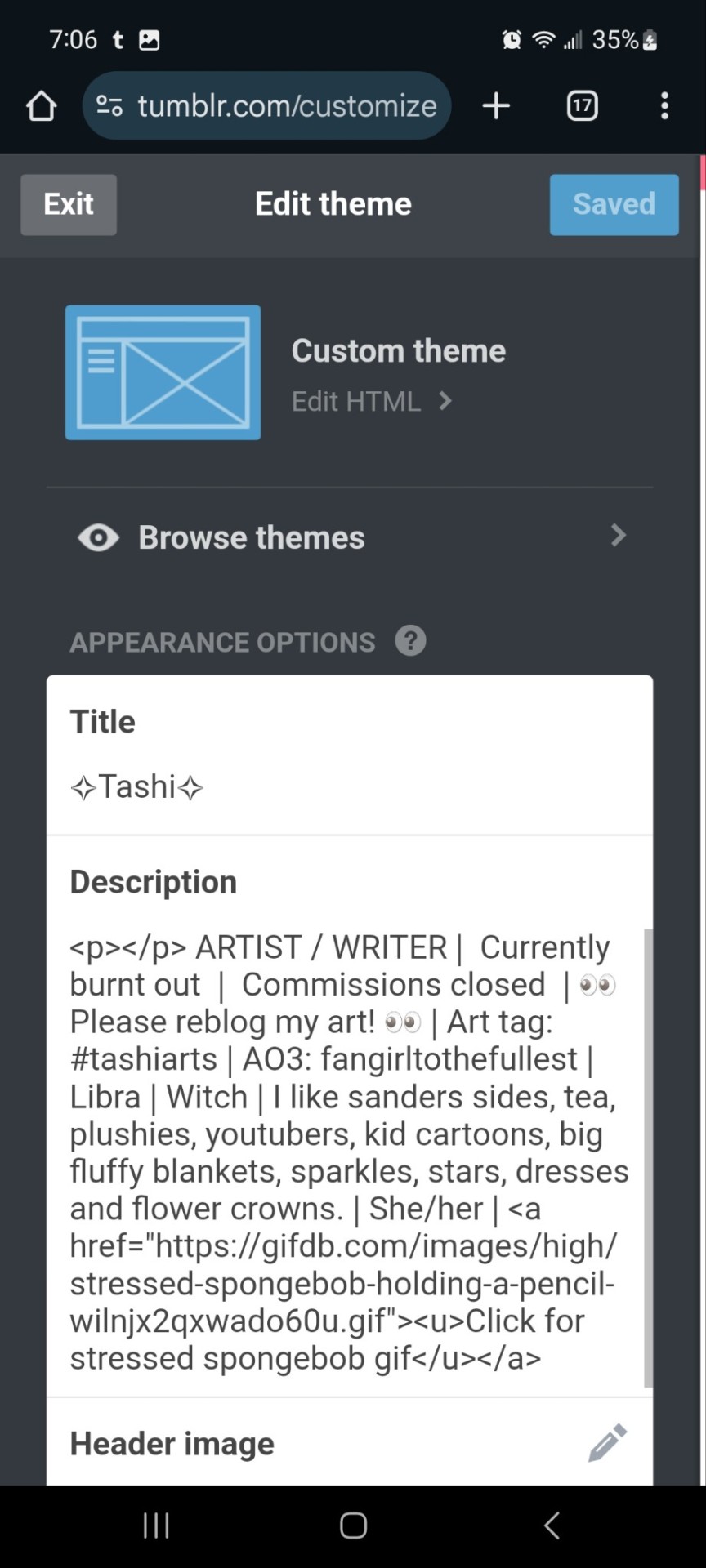
It'll bring you here:
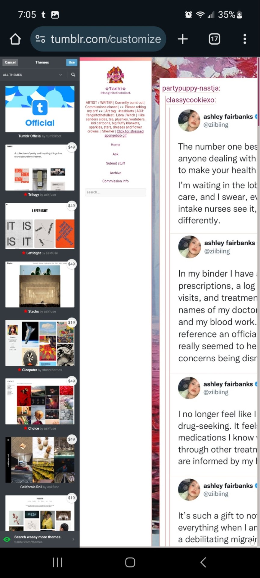
And you can choose what style you want! Hit save and you'll notice it gives you options to play around- choose a background, colour scheme. Fonts etc. Play with the html!
On a regular desktop this is easier to see so I suggest doing this on a laptop or pc.
Also fun fact you can hide secret messages in the html coding and if someone pops open the page source they'll see the surprise message in the code. XD just a fun thing if anyone wants to... say... make their own arg or send out secrets etc.
You CAN create whole pages with this feature too but they are unreliable and after this long it might be broken? So... yeah.
NOW REMEMBER: TO ACCESS THE DESKTOP PAGES YOU HAVE TO CHANGE THE LINK!
Forfeature. As a said above, my desktop link is fangirltothefullest.tumblr.com
I believe the mobile version has it as tumblr.com/fangirltothefullest.
Only people who have made a desktop version will have their blog show up if you'd like to test this festure.
Also this is how you access everyone's blog archive! Because blog archives exist!
Mine would be:
Fangirltothefullest.tumblr.com/archive and you can't open it in mobile or it'll just pop up the mobile version which doesn't exist.
You wsnt this page which let's you find the earliest things a blog has posted. So I created this blog in june 2012 lol.
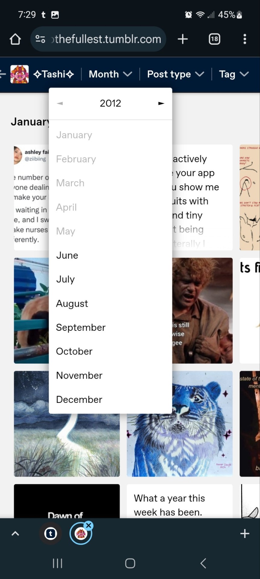
It works for tags too to show you ONLY the contents of that specific tag
Fangirltothefullest.tumblr.com/tagged/tashiarts/
And if you want a tag in order you add /chrono to the end to get it chronologically sorted from the earliest posts in the tag.
Fangirltothefullest.tumblr.com/tagged/tashiarts/chrono
I hope this helps!
NOW EVERYOE GO HAVE FUN MAKING COOL DESKTOP VERSIONS OF YOUR BLOGS!
30 notes
·
View notes
Text
For people who dont actually have blogs but just accounts and dashboard view pages. It really doesnt take very long to actually make a blog on the site
just go into your blog settings

Switch on “enable custom theme” and click “edit theme”

Use the default theme if you want. It’s easy to navigate and edit
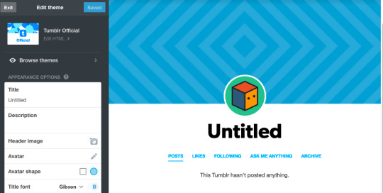
Add some images on there to the header and the icon, and maybe and a title to fix things up real nice. Maybe play with the accent colors too
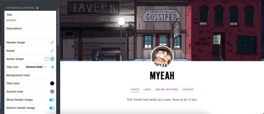
i’m gonna talk about adding links in your description and adding blog pages, still very easy but slightly more advanced customize type stuff, under the cut if anyone doesnt know how to do those but wants to
When you do your description, you can use HTML to give you more options than just straight text
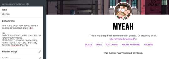
my example text is: This is my blog! Feel free to send in gossip. Or anything at all. <br>
<a href="https://static.wikia.nocookie.net/gravityfalls/images/9/99/S1e17_shandra.png/revision/latest?cb=20130412121840">My Favorite Shandra Pic</a>
<br> is a line break, which is what lets me start a new line
<a href=“url”>Title</a> lets you link somewhere else from your blog, and displays whatever you put for “title” with a hyperlink.
the one i used just links to this

you’d get sent to it on the gravity falls wiki if you clicked that part of my description. You can link people wherever you want. Tags on your blog, your other social media, your Carrd, a certain catchy 80s youtube song. Whatever
-
You can also add pages to your blog when you scroll all the way down the options
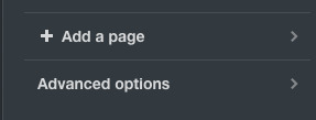
You can give a page a url relating to your blog, and you can have a link to it show up on your page with the other standard links
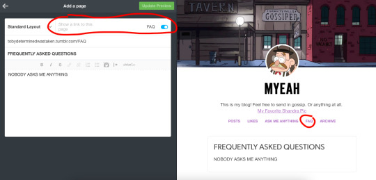
So then whenever anyone clicked “FAQ” they would get linked to a newly created FAQ page.
Though you can also use it to redirect people to specific tags already on your blog
I do that on my blog with a few of my tags.
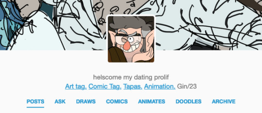
if you were to go on my blog and click “DRAWS” you’d get sent to “https://gin-juice-tonic.tumblr.com/tagged/Pbbth“, which is my art tag
In the editor it wont display your tag, it will just display whatever page you create (like below)

but in practice when you click the button on the blog it will take you to the tag you want
638 notes
·
View notes
Text


Everlong — a responsive, single-column theme
This is a single-column Tumblr theme with a sidebar (left/right option), and a body font family + a custom title font family (Google font) of your choosing. Optional dark mode, search bar, and update tab included. Full support of npf/text post photosets. You agree to my terms of use by using this theme.
Static previews: left sidebar right sidebar
Download code: GitHub
Read features and notes below the cut
Features:
Customize colours for dark and light mode.
Font-size (11-18px)
Post-width (350-540px)
Customizable post margin
Custom title box (with custom font family + font size)
Custom description box
Photoset gutter (1-4px)
Toggle between sharp or round corners on content
Toggle on center post column
Toggle between displaying or hiding Tumblr controls behind an icon
Choose between displayed tags or upon a toggle
Choose to display post info as text or icons (reblog + like)
Optional box-shadow on content
Optional sidebar icon image
Optional update tab
Optional dark/light mode
Search bar: The search bar will automatically be hidden if you have the option to hide your blog from search results enabled. Go to your blog's settings to do so.
Navigation: Custom home + ask + archive link titles. An unlimited display of native Tumblr pages. Learn how they work here.
Sidebar Icon: Choose a size between 100px/150px/200px, with shapes square, rounded, circle or blob. Separate icons for light and dark mode! But If you want the same icon, simply upload it twice.
Dark Mode: If you decide to offer dark mode, it detects if visitor’s operating system is on dark mode, and displays that choice at the first visit - of course with the option to toggle the other mode on/off.
Via/source links are on permalink pages
to hide the archive link, simply delete the text in the field.
Submit-link and ask-link only shows if toggled on in your blog settings.
Credits
Basecode (that's been heavily edited) by @eggdesign ❤️
694 notes
·
View notes
Note
I love your tumblr theme esp the red sparkles that move with the mouse and how your info is on the side. I want to do something similar to it but I could only manage to change my accent + bg colour before everything got too confusing (;´д`)ゞ┭┮﹏┭┮ can you give advice on how you did yours?
THANK UUUU im glad u like it !! :3 its p easy honestly just enable 'Custom Theme' in the Blog Settings then 'Edit theme'

then itll take u to like smth like this (itll be blank for u or just plain bg color and whatnot)

go here and click on 'Browse Themes' and just scroll to what you want! for me, i chose 'Stereo by nonspace'


BUTTTT!! most of the customization is in this section so just have fun with it;

for the cursor sparkle things, i followed this thing; its just copy pasting a whole lotta code lol
https://1dceffects.tumblr.com/
I HOPE THIS WAS EASY TO UNDERSTAND AAAA HAVE FUN
71 notes
·
View notes