#editing!! sfx/graphics/sound design!!!
Explore tagged Tumblr posts
Visit Tumblr Blog
Explore Tumblr blogs with no restrictions, modern design and the best experience.
Last Seen Tumblr Blogs


Fun Fact
Tumblr was created by web developers David Karp and Marco Arment.
Text
I'm not saying the Watcher streaming thing is their best idea but man some of you really don't know how much money a production on that scale can take
#'how does making a ghost files episode cost THAT much'#equipment!!! crew pay!! crew travel!! catering!!!#independent access to the locations they film in for an extended number of hours- ESPECIALLY if theyre already regularly open to tourists#editing!! sfx/graphics/sound design!!!#research!!!#all of it!!!!#you really dont know how much money goes into even the smallest of productions#much less something on the scale that theyve been trying to push for
2 notes
·
View notes
Note
cactus, sage & aloe vera for the asks pls! <3
cactus ⇢ something you’re currently learning (about)?
ever since i started testosterone and my hunger and appetite went UPPPP i've gotten way more into cooking and baking and food science and it is all so interesting to me! and it's not even from a health/diet pov at all it's just thinking about how food works and how i respond to it and as someone with stomach problems and also autism food sensitivities who basically ate Nothing for the first 20 years of my life it is all very healing!
and bc this is a writeblr a writing thing i'm learning and thinking about a lot is taking inspo form other writers and what that actually means. i've talked about it before but i used to read prose i love and not know what to do with that. i'd get frustrated because i did not understand how the writer was just able to conjure a line like that. and then i was so focused on wanting to reflect that writer that i did not consider where in the reflection my writing would go. i've noticed as i grow more confident in my style i've also grown more confident in how to emulate. sometimes i like to do exercises where i intentionally try to write a Passage That Sounds Like This Writer but it's more of a learning process as to the how of that style, which i then mix with my own writing. now whenever i take inspo from other styles it feels more like a love letter to those writers rather than a sensed need that to be Good at writing i need to Write Like This Person, when not only could i not truly write like that person but that person also could not write like me! that's the beauty of it! i actually reread a short story i loved last year recently and found some of the prose, not bad but i was like hmm not for me anymore! overall i still loved the prose but it showed me how i was able to love a style but still pick out what elements of it i liked and would want to incorporate it on my own vs what i wouldn't do myself (which again, does not make that particular element bad), rather than trying to make a perfect replication
sage ⇢ what ‘medium’ of art (poetry, music, fiction, paintings, statues etc.) is the most touching to you? why do you think that is?
ohhh my god okay sorry i have to be that guy who just says All of them. my brain simply refuses to see one type of art as more touching than the other!! it is just not true they all serve different purposes and the same purposes in different ways!! even the ones that are most touching to me personally is so dependent on the time and era. lately i find something that touches me in everything. like fiction will always have a special space in my heart because my creativity is driven by the fact that i can create fully fleshed people in my head where for me everything about them feels real - their emotions, their fears, their joy - and that is something that never fails to amaze me. on the other hand, poetry was the only medium after my mom died where i felt i could process my emotions about that at a time when they didn't make sense yet, because of poetry's space for abstractness. it became like a necessity. and then on another hand i'm amazed by painting and how brushstrokes and style can convey so much it's magic to me. recently when i listen to music i notice different instruments and sounds and how they work together at once and i'm obsessed with it, the ecosystem of it all. every day i become more and more of a cinephile because i'm just obsessed with all the elements of creation in movies - from performance to writing to visuals to soundtracking to sfx to editing - especially in all the 60s-80s films i've been watching for lover boy and how the effects don't always look "realistic" but they are earnest. and statues and embroidery and crotchet and pottery and makeup and nail art and gender expression and graphic design and cooking and i can go on every art medium is storytelling to me. AND CAN WE TALK ABOUT CAVE PAINTINGS??? ROCK PAINTINGS?? EVEN AT OUR MOST PRIMAL WE WERE CREATING! all of it is touching to me!!
aloe vera ⇢ what’s something (mundane) you really want to experience in life?
i want to see the sunrise more often especially coming out of summer where it rises at like 4am i now feel a yearning to get up at like 6am and see it. unfortunately i have Far Too Many sleep problems to be getting out of bed at a time like that
get to know me asks
#the oversharing ramble in the middle of this is so funny to me but it had to be said!#long answers for the first two but i had fun talking about it!
3 notes
·
View notes
Video
The Voice Actress from Anna J. Takayama on Vimeo.
Kingyo, a veteran voice actress working in Tokyo, possesses a unique ability to see the soul in all things, living and inanimate. The voice acting world is changing and she must find a way to reconcile her way of living with the modern industry.
東京で働くベテラン声優の金魚は、全てのものに魂を見出す少し変わった能力を持っている。変わりつつある声優業界で彼女は自らの生き方を考え直さなければならない。
Written, Directed and Edited by: Anna J. Takayama 作・演出・編集:高山杏奈 ------
"With its impeccable compositions and captivating lead performance, The Voice Actress offers a sensitive peek behind the scenes of an ever-changing industry. This patient study of imagination and aging achieves extraordinary depth thanks to Anna J. Takayama’s soulful direction, and we are delighted to support the career of such a remarkable talent." - SXSW Mailchimp Support the Shorts Award Jury
"A visually stunning and moving portrait of an aging actress competing against the younger generation, which also seamlessly deals with grief and sexism, while ultimately embracing the courage to be different and to honor one’s true self." - Palm Springs ShortFest, Best of the Festival Jury
"Bold and delightfully original. A playful, tender and universal story about remaining unapologetically yourself in a relentless world, from a director with a refreshingly unique cinematic language. From the pacing to the use of colour, from the framing to the lead performance, Anna J. Takayama's 'The Voice Actress' is a vibrant, feminist gem of a film." - Leeds International Short Film Competition Jury
CAST Urara Takano - Kingyo
Daisaku Hokura - Director Otome - Idol Ujisuke - Producer Itsuki - Sound Mixer Ryuji Takahashi - Screenwriter Michiko Nonaka - Assistant Michael Aaron Stone - Executive
Masayuki Ishibashi - Salaryman Kiri Halebale - Mother Taishi Nagamatsu - Father Gajumaru Nagamatsu - Son Noriko Hokura - Woman Yuki Iwaka - Friend Yuki Okuda - Friend Ariyo - Young Voice Actress Ayane Hayakawa - Young Voice actress Nonoka Mamiya - Young Voice actress Rui Egawa - Young Voice actress Taichi Shimizu - Young Voice Actor Taishi Hamamoto - Young Voice Actor Takuya Umeda - Young Voice Actor Yuto Ohashi - Young Voice Actor Aoi Maeda - High School Student Kaoru Togashi - College Student Mizuho Kanai - College Student Shunya Nitta - Salaryman Hararyo - Pachinko Player Kenichi Kawata - Boyfriend Mio Komura - Girlfriend Yukio Arai - College Student Asatte - Asatte the Goldfish
CREW Anna J. Takayama - Writer, Director, Editor Joe Skinner - Producer Conor Murphy - Director of Photography Kumi Nemoto - Co-Producer Jackson K. Segars - Co-Producer Natsuki Kato - Associate Producer, Graphics Design, SFX Artist Kyo Yaoya - Associate Producer, Graphics Design Sunnie Kim - Assistant Camera Andrew Yip - Production Sound Mixer Jun Endo - Graphics Design Kiri Halebale - Script Supervisor Julien Pinault - Production Assistant Chaka - Recording Studio Consultant Marcy Robinson - Colorist Lucas Greenwood Andrei - Workflow Supervisor Rachael Black - Online Editor Myahdellese Jones - D.I. Assist Rebecca Conner - D.I. Assist Megan Rumph - D.I. Producer Tiffany Gale - D.I. Production Coordinator Ariyan Hashemi - VFX Martin Anderson - VFX Ryan Billia - Sound Designer and Re-Recording Mixer
FESTIVALS & AWARDS SXSW Film Festival 2022 - "Special Jury Award Winner" The Martha's Vineyard Film Festival 2022 Lighthouse International Film Festival 2022 Short Shorts Film Festival & Asia 2022 - "Audience Award Winner, Japan Competition" Palm Springs ShortFest 2022 - "Jury Special Mention, Best of the Festival Award" DC Asian Pacific American Film Festival 2022 - "Jury Award Winner, Best Performance for Urara Takano" L.A. Shorts International Film Festival 2022 Asian American International Film Festival 2022 Flickers' Rhode Island International Film Festival 2022 HollyShorts Film Festival 2022 - "Best International Film Award Winner" Edinburgh International Film Festival 2022 Nevada City Film Festival 2022 - "Best Narrative Short Award Winner & Best Director Award Winner" Nara International Film Festival 2022 Woodstock Film Festival 2022 Nashville Film Festival 2022 Mill Valley Film Festival 2022 New Hampshire Film Festival 2022 Hamptons International Film Festival 2022 Raleigh Film & Art Festival 2022 Raindance Film Festival 2022 Urbanworld Film Festival 2022 New Orleans Film Festival 2022 San Diego Asian Film Festival 2022 Leeds International Film Festival 2022 - "International Short Film Competition Winner" Hawai‘i International Film Festival 2022 Izmir Short Film Festival 2022 New York Japan CineFest 2022 Fargo Film Festival 2023 - "Best Narrative Short Film Competition Winner"
thevoiceactressfilm.com/
2 notes
·
View notes
Text


Singtel NarrAItive – An AI driven storytelling experience for SG60
16x9 YouTube
Motion Graphics Animation + AV Editing (Sound design / Music and SFX)
0 notes
Text
Here, I'll copypaste my original review. Just so you get an idea of how much I enjoyed this game: It got me out of a massive burnout when I was completely done with reviews (and putting up with my editor)
I'mma be honest. This review doesn't do it justice. This game gave me pure joy. It was incredibly fun to play. It made me buy the collector's edition. Me, the cheapskate who'd rather wait years to buy games he loves at 75% off.
Story
Dungeon Munchies’ story is surprisingly good. While not especially deep or a literary masterpiece, it is a pretty fun take on a post-apocalypse filled with eldritch horrors, talking plants and cooking ghosts. Mostly going for a tongue-in-cheek humorous tone, most of the jokes land pretty well thanks to the visual humor and straight deliveries that don’t disrupt the flow of the actual plot.
Said plot mainly involves the player, a recently resurrected zombie, as he helps the ghostly chef Simmer escape the dungeon they’re all living in by using stargates built before the demise of humanity. However, while attempting to locate and power on the remaining gate, a biohazard entity manages to escape containment, forcing the player to find and destroy it before it thwarts the plan.
Graphics
The game’s graphics consist of both pixelart during gameplay and static images a-la visual novel for dialogues and cutscenes. Both of the styles are consistently high quality, with the cutscene sprites being particularly praiseworthy for their ability to convey physical humor. The only letdown in the game comes with its areas, which despite featuring varied and plentiful environments, tend to be a bit repetitive or rather run too long while only using a handful of assets.
Sound
Dungeon Munchies’ sound design is the most questionable part of the game. Although it seemingly features a full soundtrack, the tendency the music has to stop playing and never come back makes it rather hard to notice. Besides this, there is no voice acting and, while sufficient, the SFX are nothing to write home about.
Gameplay
Dungeon Munchie’s is a linear hack-n’-slash game with some metroidvania mechanics, such as introducing movement options, double jumps and more. That said, those mechanics are only necessary for the areas they’re obtained in and those after, not the ones before. Instead of making players backtrack, any optional pickups can be obtained by exploring a bit. This, combined with the smooth controls and fun combat with ample room for different builds, makes the game a breeze to play.
The main gimmick of the game is that players will be able to create dishes with enemy parts. Said dishes will grant special abilities and bonuses to the player, such as mana regeneration, sword combos or simply more health. As the game progresses, more dishes and upgrades for the old ones are unlocked as new enemies are introduced. From these dishes, players will be able to select a handful to make their loadout, alongside a main and secondary weapon.
Said weapons also offer a wide variety of options, including straightforward swords, damage over time or even magical weapons that consume mana. Depending on how players form their loadout, incredibly powerful synergies can be formed. However, this does require unlocking all of the blueprints and recipes, tying neatly with the aforementioned exploration, which is always rewarded with a new tool. It should also be mentioned that in order to craft any recipe players will need “Insight”, obtained from exploring and killing enemies, although its plentiful nature makes being short on it rare.
Besides this, the game is relatively simple, players will be tasked with going through the linear areas while wiping out the enemies and surviving the platforming challenges. The game itself is not particularly hard thanks to the plentiful respawn points and the possibility of simply ignoring enemies and making a run for it. While this will leave the players missing some resources, it is offset by the also common fast travel points which make bracktracking for missed items or monster pieces rather comfortable.
At the end of each story segment, players will also encounter bosses. These are not too common, with only a handful for the whole game. During bossfights, players will mainly have to whittle down the bosses until their health runs out (obviously), after which a bullet hell phase will start. Said phases last for as long as the timer that replaces the boss’ health lasts, although the time can be reduced by continuing to hit the enemy. However, that is easier said than done, since the bullet hell phase tends to be much harder than the rest of the fight.
Conclusion
Dungeon Munchies is a rather enjoyable hack-n’-slash title with a fun story and entertaining gameplay. Although perhaps not as good as an indie darling or an AAA title, it is still a rather enjoyable experience. Sold for €16,79/$19,99/£15,49, the title is not particularly expensive and offers a decent enough amount of content to be worth it at around 8+ hours.
Personal Opinion
“I honestly had a lot of fun with Dungeon Munchies, the story is bonkers (in a good way) and would carry everything by itself. That said, it’s not like it needs to, since the gameplay itself is also pretty fun. Although some areas can run on for a bit too long, the build possibilities make blowing up enemies pretty fun. While I started with a sword and poison build and tried working around all the combo dishes, I ultimately ended with an absurdly broken build that let me spam the most powerful magic weapon at no cost while having regenerating health. That kind of freedom is always welcome and makes things more fun. There is not a moment where you go ‘Oh I’ll stick with this’ for too long until endgame, since the new weapons and dishes make you want to try stuff out.”
Hey.
Go play Dungeon Munchies
No, it's not related to Dungeon Meshi, but how fantastic is it that there are two pieces of media about eating monsters in a dungeon with the same initials and both are fantastic?
8 notes
·
View notes
Text
Get the most out of SFX Xpress: A tutorial on using Editpointindia's special effects software
SFX Xpress is a powerful special effects software program from Editpointindia that allows users to add professional-grade effects to their videos. Whether you are a professional video editor or a beginner looking to enhance the visual appeal of your videos, SFX Xpress offers a range of features and tools to help you get the most out of your special effects.
One of the main benefits of using SFX Xpress is the wide range of special effects it offers. This software includes a wide range of pre-designed effects, as well as the ability to create custom effects using the software's powerful tools and features. Some of the types of effects that you can create with SFX Xpress include:
Visual effects: SFX Xpress includes a wide range of visual effects, including explosions, lightning, fire, and more. These effects can be used to add impact and drama to your videos, or simply to enhance the overall visual appeal of your footage.
Audio effects: In addition to visual effects, SFX Xpress also includes a range of audio effects that can help you enhance the sound quality of your videos. This includes options for adding sound effects, music, and voiceovers to your footage.
Titles and graphics: SFX Xpress includes a range of options for adding titles and graphics to your videos. This includes support for a variety of fonts, colors, and styles, as well as the ability to create custom graphics and animations.
To use SFX Xpress, you will need to have a basic understanding of video editing principles and techniques. This includes understanding how to import and export video files, as well as how to use basic video editing tools such as trimming and cutting. Once you have a basic understanding of these principles, you can begin using SFX Xpress to add special effects to your videos.
To get started with SFX Xpress
EditPoint India
2 notes
·
View notes
Note
Forgive me Father, I have no awful headcanons for you, only a general question on comic making. How do you do it, writing-wise/how do you decide what points go where, how do you plot it out (or do you have any resources on the writing aspect that you find useful?) Not to get too bogged down in details, but I attended a writer’s workshop and the author in residence suggested I transfer my wordy sci-fi WIP into graphic novel script, as it might work better. (I do draw, but I don’t know if I have it in me to draw a whole comic—characters in motion? Doing things? With backgrounds? How dare, why can’t everyone just stand around looking pretty)
I was interested but it quickly turned into a lot of internal screaming as I tried to figure out how to compress the hell out of it, since novels are free to do a lot more internal monologuing and such compared to a comic format (to say nothing of trying to write a script without seeing how the panels lay out—just for my own sake, I might have to do both concurrently.)
As an aside, to get a feel for graphic novels I was rereading 99RM and was reminded of how great it was—tightly plotted, intriguing, and anything to do with Ashmedai was just beautifully drawn. I need more Monsignor Tiefer and something something there are parallels between Jehan and Daniel in my head and I don’t know if they make sense but it works for me. (As an aside, I liked the emphasis on atonement being more than just the word sorry, but acknowledgment you did wrong and an attempt to remedy it—I don’t know why that spoke to me the way that it did.)
I thought Tumblr had a word count limit for asks but so far it has offered zero resistance, oh well. I don’t have much else to say but on the topic of 99RM, Adam getting under Monsignor’s skin is amazing, 10/10 (about the Pride picture earlier)
wow tumblr got rid of the markdown editor! or at least in asks which means the new editor probably has no markdown....god i hate this site! anyway...
Totally! So first, giant thank you for the compliments! Second, I have a few questions in turn for you before I dive into a sort of answer, since I can give some advice to your questions in general but it also sounds like you have a specific conundrum on your hands.
My questions to your specific situation are:
did the author give any reason for recommending a, in your words, "wordy" story be turned into a graphic novel?
is the story you're writing more, like you said, "internal monologuing"? action packed? where do the visuals come from?
do you WANT it to be a comic? furthermore, do you want it to be a comic you then must turn around and draw? or would you be interested in writing for comics as a comic writer to have your words turned into art?
With those questions in mind, let me jump into the questions you posed me!
Let me start with a confession...
I've said this before but let me say it again: Ninety-Nine Righteous Men was not originally a comic — it was a feature-length screenplay! And furthermore, it was written for a class so it got workshopped again and again to tighten the plot by a classroom of other nerds — so as kind as your compliments are, I'm giving credit where credit is due as that was not just a solo ship sailing on the sea. On top of that, it got adapted (by me) into a comic for my thesis, so my advisor also helped me make it translate or "read" well given I was director, actor, set designer, writer, editor, SFX guy, etc. all in one. And it was a huge help to have someone say "there is no way you can go blow by blow from script to comic: you need to make edits!" For instance, two scenes got compressed to simple dialogue overlaid on the splashpage of Ashmedai raping Caleb (with an insert panel of Adam and Daniel talking the next day.) What had been probably at least 5 pages became 1.
Additionally, I don't consider myself a strong plotter. That said, I found learning to write for film made the plotting process finally make some damn sense since the old plot diagram we all got taught in grammar school English never made sense as a reader and definitely made 0 sense as a writer — for me, for some reason, the breakdown of 25-50-25 (approx. 25 pages for act 1, 50 for act 2 split into 2 parts of 25 each, 25 pages for act 3) and the breaking down of the beats (the act turning points, the mid points, the low point) helped give me a structure that just "draw a mountain, rising action, climax is there, figure it out" never did. Maybe the plot diagram is visually too linear when stories have ebb and flow? I don't know. But it never clicked until screenwriting. So that's where I am coming from. YMMV.
I should also state that there's Official Ways To Write Comic Scripts to Be Drawn By An Artist (Especially If You Work For A Real Publisher As a Writer) and there's What Works For You/Your Team. I don't give a rat's ass about the former (and as an artist, I kind of hate panel by panel breakdowns like you see there) so I'm pretty much entirely writing on the latter here. I don't give a good god damn about official ways of doing anything: what works for you to get it done is what matters.
What Goes Where?
Like I said, 99RM was a screenplay so it follows, beat-wise, the 3-act screenplay structure (hell, it's probably more accurate to say it follows the act 1/act 2A/act 2B/act 3 structure.) So there was the story idea or concept that then got applied to those story beats associated with the structure, and from there came the Scene-by-scene Breakdown (or Expanded Scene Breakdown) which basically is an outline of beats broken down into individual scenes in short prose form so you get an overview of what happens, can see pacing, etc. In the resources at the end I put some links that give information on the whole story beat thing.
(As an aside: for all my short comics, I don't bother with all that, frankly. I usually have an image or a concept or a bit of writing — usually dialogue or monologue, sometimes a concrete scene — that I pick at and pick at in a little sketchbook, going back and forth between writing and thumbnail sketches of the page. Or I just go by the seat of my pants and bullshit my way through. Either or. Those in many ways are a bit more like poems, in my mind: they are images, they are snapshots, they are feelings that I'm capturing in a few panels. Think doing mental math rather than writing out geometric proofs, yanno?)
Personally, I tend to lean on dialogue as it comes easier for me (it's probably why I'm so drawn to screenwriting!) so for me, if I were to do another longform GN, I'd probably take my general "uhhhhhh I have an idea and some beats maybe so I guess this should happen this way?" outline and start breaking it down scene by scene (I tend to write down scenes or scene sketches in that "uhhhh?" outline anyway LOL) and then figure out basic dialogue and action beats — in short, I'd kind of do the work of writing a screenplay without necessarily going full screenplay format (though I did find the format gave me an idea of timing/pacing, as 1 page of formatted script is about equal to 1 minute of screentime, and gave me room to sketch thumbnails or make edits on the large margins!) If you're not a monologue/soliloque/dialogue/speech person and more an image and description person, you may lean more into visuals and scenes that cut to each other.
Either way this of course introduces the elephant in the panel: art! How do you choose what to draw?
The answer is, well, it depends! The freedom of comics is if you can imagine it, you can make it happen. You have the freedoms (and audio limitations) of a truly silent film with none of the physical limitations. Your words can move in real time with the images or they can be a narrative related to the scene or they could be nonsequitors entirely! The better question is how do you think? Do you need all the words and action written first before you break down the visuals? Do you need a panel by panel breakdown to be happy, or can you freewheel and translate from word and general outlines to thumbnails? What suits you? I really cannot answer this because I think when it comes to what goes where with regard to art, it's a bit of "how do you process visuals" and also a bit of "who's drawing this?" — effectively, who is the interpreter for the exact thing you are writing? Is it you or someone else? If it's you, would you benefit from a barebones script alongside thumbnailed paneling? Would you be served by a barebones script, then thumbnails, then a new script that includes panel and page breakdowns? What frees you up to do what you need to do to tell your story?
If I'm being honest, I don't necessarily worry about panels or what something will look like necessarily until I'm done writing. I may have an image that I clearly state needs to happen. I may even have a sequence of panels that I want to see and I do indeed sketch that out and make note of it in my script. But exactly how things will be laid out, paneled, situated? That could change up until I've sketched my final pencils in CSP (but I am writer and artist so admittedly I get that luxury.)
How do I compress from novel to comic?
Honest answer? You don't. Not really. You adapt from one to another. It's more a translation. Something that would take forever to write may take 1 page in a comic or may take a whole issue.
I'm going to pick on Victor Hugo. Victor Hugo spent a whole-ass book in Notre-Dame de Paris talking about a bird's eye view of Paris and other medieval architecture boring stuff, with I guess some foreshadowing with Montfaucon. Who cares. Not me. I like story. Anyway. When we translate that book to a movie any of the billion times someone's done that, we don't spend a billion years talking at length about medieval Paris. There's no great monologuing about the gibbet or whatever: you get to have some establishing shots, maybe a musical number, and then you move tf on. Because it's a movie, right? Your visuals are right there. We can see medieval Paris. We can see the cathedral. We can see the gibbet. We don't need a whole book: it's visually right there. Same with a comic: you may need many paragraphs to describe, say, a space station off of Sirius and one panel to show it.
On the flip side, you may take one line, maybe two, to say a character keyed in the special code to activate the holodeck; depending on the visual pacing, that could be a whole page of panels (are we trying to stretch time? slow it down? what are we emphasizing?) A character gives a sigh of relief — one line of text, yeah? That could be a frozen panel while a conversation continues on or that could be two (or more!) panels, similar to the direction [a beat] in screenwriting.
Sorry there's not a super easy answer there to the question of compression: it's a lot more of a tug, a push-pull, that depends on what you're conveying.
So Do I Have It In Me to Write & Draw a GN?
The only way you'll know is by doing. Scary, right? The thing is, you don't necessarily need to be an animation king or God's gift to background artists to draw a comic.
Hell, I hate backgrounds. I still remember sitting across from my friend who said "Claude you really need to draw an establishing exterior of the church at some point" and me being like "why do you hate me specifically" because drawing architecture? Again? I already drew the interior of the church altar ONCE, that should be enough, right? But I did draw an exterior of the church. Sorta. More like the top steeple. Enough to suggest what I needed to suggest to give the audience a better sense of place without me absolutely losing my gourd trying to render something out of my wheelhouse at the time.
And that's kinda the ticket, I think. Not everyone's a master draftsman. Not everyone has all the skills in every area. And regardless, from page one to page one hundred, your skills will improve. That's all part of it — and in the meantime, you should lean into your strengths and cheat where you can.
Do you need to lovingly render a background every single panel? Christ no! Does every little detail need to be drawn out? Sure if you want your hand to fall off. Cheat! Use Sketchup to build models! Use Blender to sculpt forms to paint over! Use CSP Assets for prebuilt models and brushes if you use CSP! Take photographs and manip them! Cheat! Do what you need to do to convey what you need to convey!
For instance, a tip/axiom/"rule" I've seen is one establishing shot per scene minimum and a corollary to that has been include a background once per page minimum as grounding (no we cannot all have eternal floating heads and characters in the void. Unless your comic is set in the void. In which case, you do you.) People ain't out here drawing hyper detailed backgrounds per each tiny panel. The people who DO do that are insane. Or stupid. Or both. Or have no deadline? Either way, someone's gonna have a repetitive stress injury... Save yourself the pain and the headache. Take shortcuts. Save your punches for the big K.O. moments.
Start small. Make an 8-page zine. Tell a beginning, a middle, an end in comic form. Bring a scene to life in a few pages. See what you're comfortable drawing and where you struggle. See where you can lean heavily into your comfort zones. Learn how to lean out of your comfort zone. Learn when it's worth it to do the latter.
Or start large. Technically my first finished comic (that wasn't "a dumb pencil thing I drew in elementary school" or "that 13 volume manga I outlined and only penciled, what, 7 pages of in sixth grade" or "random one page things I draw about my characters on throw up on the interwebz") was 99RM so what do I know. I'm just some guy on the internet.
(That's not self-deprecating, I literally am some guy on the internet talking about my path. A lot of this is gonna come down to you and what vibes with you.)
Resources on writing
Some of these are things that help me and some are things that I crowd-sourced from others. Some of these are going to be screenwriting based, some will be comic based.
Making Comics by Scott McCloud: I think everyone recommends this but I think it is a useful book if you're like "ahh!!! christ!! where do I start!!!???" It very much breaks down the elements of comics and the world they exist in and the principles involved, with the caveat that there are no rules! In fact, I need to re-read it.
Comic Book Design: I picked this up at B&N on a whim and in terms of just getting a bird's eye view of varied ways to tackle layout and paneling? It's such a great resource and reference! I personally recommend it as a way to really get a feel for what can be done.
the screenwriter's bible: this is a book that was used in my class. we also used another book that's escaping me but to be honest, I never read anything in school and that's why I'm so stupid. anyway, I'd say check it out if you want, especially if you start googling screenwriting stuff and it's like 20 billion pieces of advice that make 0 sense -- get the core advice from one place and then go from there.
Drawing Words & Writing Pictures: many people I know recommended this. I think I have it? It may be in storage. So frankly, I'd already read a bunch of books on comics before grabbing this that it kind of felt like a rehash. Which isn't shade on the authors — I personally was just a sort of "girl, I don't need comics 101!!!"
Invisible Ink: A Practical Guide to Building Stories that Resonate: this has been recommended so many times to me. I cannot personally speak on it but I can say I do trust those who rec'd it to me so I am passing it along
the story circle: this is pretty much the hero's journey. a useful way to think of journeys! a homie pretty much swears by it
a primer on beats: quick google search got me this that outlines storybeats
save the cat!: what the above refers to, this gives a more genre-specific breakdown. also wants to sell you on the software but you don't need that.
I hope this helps and please feel free to touch base with more info about your specific situation and hopefully I'll have more applicable answers.
82 notes
·
View notes
Text
Chernobyl nominated 14 times in the TV BAFTAs 2020!
Winners of the 2020 British Academy Television Craft Awards will be revealed on Friday 17 July and the Virgin Media British Academy Television Awards on Friday 31 July.
LEADING ACTOR
CALLUM TURNER The Capture - Heyday Television, NBC Universal/BBC One
JARED HARRIS Chernobyl – Sister Pictures, The Mighty Mint, Word Games, HBO/Sky Atlantic
STEPHEN GRAHAM The Virtues - Warp Films, Big Arty Productions/Channel 4
TAKEHIRO HIRA Giri/Haji – Sister Pictures/BBC Two
MINISSERIES
A CONFESSION Jeff Pope, Paul Andrew Williams, Tom Dunbar, Johnny Capps - ITV Studios, Urban Myth Films/ITV
CHERNOBYL Production Team – Sister Pictures, The Mighty Mint, Word Games, HBO/Sky Atlantic
THE VICTIM Rob Williams, Niall MacCormick, Sarah Brown, Jenny Frayn – STV Productions/BBC One
THE VIRTUES Shane Meadows, Jack Thorne, Mark Herbert, Nickie Sault - Warp Films, Big Arty Productions/Channel 4
SUPPORTING ACTOR
JOE ABSOLOM A Confession - ITV Studios, Urban Myth Films/ITV
JOSH O’CONNOR The Crown - Left Bank Pictures, Sony Pictures Television/Netflix
STELLAN SKARSGARD Chernobyl – Sister Pictures, The Mighty Mint, Word Games, HBO/Sky Atlantic
WILL SHARPE Giri/Haji – Sister Pictures/BBC Two
COSTUME DESIGN
CAROLINE MCCALL His Dark Materials - Bad Wolf/BBC One
JOANNA EATWELL Beecham House – Bend It TV/ITV
MICHELE CLAPTON Game of Thrones - Bighead, Littlehead, Television 360, Startling Television/HBO/Sky Atlantic
ODILE DICKS-MIREAUX Chernobyl – Sister Pictures, The Mighty Mint, Word Games/Sky Atlantic
DIRECTOR: FICTION sponsored by 3 Mills Studios
HARRY BRADBEER Fleabag – Two Brothers Pictures/BBC Three
JOHAN RENCK Chernobyl – Sister Pictures, The Mighty Mint, Word Games/Sky Atlantic
SHANE MEADOWS The Virtues – Warp Films, Big Arty Productions/Channel 4
TOBY HAYNES Brexit: The Uncivil War – House Productions/Channel 4
EDITING: FICTION
DAN CRINNION Killing Eve (Episode 4) - Sid Gentle Films/BBC One
ELEN PIERCE LEWIS Giri/Haji – Sister Pictures/BBC Two
GARY DOLLNER Fleabag - Two Brothers Pictures/BBC Three
JINX GODFREY, SIMON SMITH Chernobyl – Sister Pictures, The Mighty Mint, Word Games/Sky Atlantic
MAKE UP & HAIR DESIGN sponsored by MAC Cosmetics
DANIEL PARKER, BARRIE GOWER Chernobyl – Sister Pictures, The Mighty Mint, Word Games/Sky Atlantic
INMA AZORIN The Trial of Christine Keeler - Ecosse Films, Great Meadow Productions/BBC One
KIRSTIN CHALMERS Catherine the Great - New Pictures, Origin Pictures/Sky Atlantic
LOZ SCHIAVO Peaky Blinders - Caryn Mandabach Productions, Tiger Aspect/BBC One
ORIGINAL MUSIC
ADRIAN JOHNSTON Giri/Haji – Sister Pictures/BBC Two
ANDREW PHILLIPS War in the Blood – Minnow Films/BBC Two
DAVID HOLMES, KEEFUS CIANCIA Killing Eve – Sid Gentle Films/BBC One
HILDUR GUDNADOTTIR Chernobyl- Sister Pictures, The Mighty Mint, Word Games/Sky Atlantic
PHOTOGRAPHY & LIGHTING: FICTION sponsored by ScreenSkills
ADRIANO GOLDMAN The Crown - Left Bank Pictures, Sony Pictures Television/Netflix
JAKOB IHRE Chernobyl - Sister Pictures, The Mighty Mint, Word Games/Sky Atlantic
JOE ANDERSON Top Boy - Cowboy Films, Easter Partisan Films, Dream Crew, SpringHill Entertainment/Netflix
SUZIE LAVELLE His Dark Materials (Episode 3) – Bad Wolf, BBC Studios, HBO/BBC One
PRODUCTION DESIGN sponsored by Microsoft
LAURENCE DORMAN Killing Eve - Sid Gentle Films/BBC One
LUKE HULL, CLAIRE LEVINSON-GENDLER Chernobyl – Sister Pictures, The Mighty Mint, Word Games/Sky Atlantic
MARTIN CHILDS, ALISON HARVEY The Crown – Left Bank Pictures, Sony Pictures Television/Netflix
SAMANTHA HARLEY, MIRI KATZ Sex Education – Eleven Film/Netflix
SCRIPTED CASTING sponsored by Spotlight
DES HAMILTON Top Boy – Cowboy Films, Easter Partisan Films, Dream Crew, SpringHill Entertainment/Netflix
LAUREN EVANS Sex Education – Eleven Film/Netflix
NINA GOLD, ROBERT STERNE Chernobyl – Sister Pictures, The Mighty Mint, Word Games/Sky Atlantic
YOKO NARAHASHI, SHAHEEN BAIG, LAYLA MERRICK-WOLF Giri/Haji – Sister/BBC Two
SOUND: FICTION
DILLON BENNETT, JON THOMAS, GARETH BULL, JAMES RIDGEWAY His Dark Materials – Bad Wolf, BBC Studios, HBO/BBC One
IAN WILKINSON, LEE WALPOLE, FRASER BARBER, STUART HILLIKER A Christmas Carol – FX Productions in association with the BBC, Minim UK Productions, Scott Free, and Hardy Son & Baker/BBC One
SOUND TEAM Chernobyl – Sister Pictures, The Mighty Mint, Word Games/Sky Atlantic
SOUND TEAM The Crown – Left Bank Pictures, Sony Pictures Television/Netflix
SPECIAL, VISUAL & GRAPHIC EFFECTS
BEN TURNER, CHRIS REYNOLDS, ASA SHOUL The Crown – Left Bank Pictures, Sony Pictures Television/Netflix
FRAMESTORE, PAINTING PRACTICE, REAL SFX, RUSSELL DODGSON His Dark Materials – Bad Wolf, BBC Studios/HBO/BBC One
LINDSAY MCFARLANE, CLAUDIUS CHRISTIAN RAUCH, JEAN-CLÉMENT SORET, DNEG Chernobyl – Sister Pictures, The Mighty Mint, Word Games/Sky Atlantic
MILK VISUAL EFFECTS, GARETH SPENSLEY, REAL SFX Good Omens – Amazon Studios, BBC Studios, Narrativia, The Blank Corporation/Amazon Prime Video
WRITER: DRAMA
CHARLIE COVELL The End of the F***ing World – Clerkenwell Films, Dominic Buchanan Productions/Channel 4
CRAIG MAZIN Chernobyl – Sister Pictures, The Mighty Mint, Word Games/Sky Atlantic
JESSE ARMSTRONG Succession – HBO Entertainment, Project Zeus, Hyperobject Industries, Gary Sanchez Productions/Sky Atlantic
SHANE MEADOWS, JACK THORNE The Virtues – Warp Films, Big Arty Productions/Channel 4
Good luck to team Chernobyl!
[x]
16 notes
·
View notes
Text
RocketBook Flip - a rare review and it’s not a game!
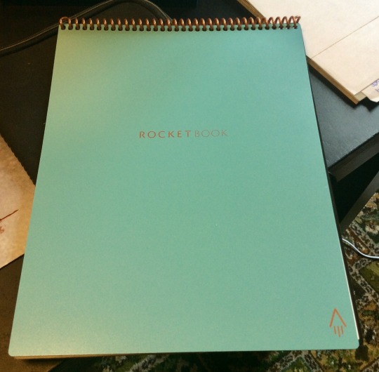
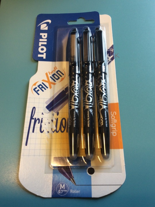
Before I go any further, I feel I must point out that I don’t have any financial connection to RocketBook whatsoever – this isn’t a piece that was requested or courted by RocketBook or affiliates and I’m not receiving any reward or sponsorship either in product or direct payment for this article. I just like the damn thing and love it when an innovative piece of tech (in this case quite low key) just works. Hi I’m Paul, and I have a bit of a problem with notebooks – A4 lined, sketch, reporters, Black & Reds (ohhhh the sheer number of B&Rs), goofy ones, serious work ones, battered ones, pristine ‘for best only’ ones – and they all fill at an alarming rate. I make notes on everything. Working as a sound engineer and designer, there’s always mix notes, soundscape plots, ideas, VO notes and scripts, SFX ideas etc etc. At home it’s a very different story – it’s much worse. Game notes; blog notes; hurriedly scribbled quiz questions spurred by watching another episode of Mental Floss’ 500 facts about cheese; RPG notes and story ideas; my own script writing; world building; sketches; other creative ideas; song/music notes and ideas; and that’s before we get to to-do lists; and the dreaded ‘things I must remember’. So my journal life is many, varied and plenty. The usual issue is… ‘what frakking journal did I put that amazing idea in????’, and that’s way before we get to the utter horror that is possibly losing a whole journal or forgetting to bring one home from work. I’m 53, I forget more than I recall, and journals help bring some semblance of order to a massively chaotic and fertile brain. What I’ve needed for a long time is some way of organising all this info or centralising it in some way. Sure I’ve looked at apps – I used Things, Evernote, Notes, and One Note for years, and they are really, really good, but they relied on either having a charged device exactly when I need it (yeah – me too) or net access, which for a new-ish theatre, is surprisingly a bit of an issue at work. And the most important part – I actually enjoy the physical act of handwriting long-hand. I still write actual physical letters to people, it’s adorable and a bit creepy in this age, but I call it charming and leave it at that. Handwriting, for me, allows me time to think and process in a way that typing just doesn’t. Handwriting is slower, I rarely cross anything out, and so I always have the whole of the thought. So what I’ve ideally wanted for years, was a reliable way of organising all my notes and storing them electronically so I have access even without the actual journal, with OCR so they’re editable, and still being a tactile handwritten experience. I’m naturally a sceptic (I actually subscribe to Fortean Times – yeah – I card carry!) and so online ads and particularly FaceAche ads are a field day for critical thinking triggers. I don’t think I’ve ever received from Wish, exactly what I ordered from Wish. And so when an ad from RocketBook constantly kept popping up on my timeline a few weeks ago, I was naturally “it’ll never work” But their website looked legit enough – they had a dedicated UK shop, it was relatively steep to buy in but not so wild that if it didn’t work I wouldn’t be crying too much about the money wasted, and at the end of the day it was a 10th the price of a ReMarkable 2 which is actually what I thought would solve my problem. I’m furloughed at the mo and though I could argue the case for £300+ notebook (test me, I could), I just couldn’t justify it now. And RocketBook had a good summer intro offer. I ordered on the Wednesday, and the impressively glitzy and graphic-design-playbook poly package was dropped on my doorstep just 2 days later by my cheery postie who yelled up the drive “Package for ya, looks very exciting!!!!” I like that our postal service is still invested in the hopes and dreams of their customers. It was exciting. All the instructions for getting started with my new Teal RocketBook A4 Flip were right there before you even open it. The main body houses the pad and a cleaning cloth, and a clever little side pocket houses the supplied Pilot Frixion pen.
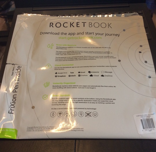
RocketBooks come in several models, all configured slightly differently. I have the Flip which is a top spiral-bound softback pad with 21 double sided ‘pages’ giving 42 pages in total. The Flip has lined paper one side, and dot paper on the reverse (great for D&D maps, impromptu tables, mixer channel plots etc)
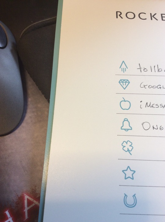
DELIVERY & FIRST IMPRESSIONS The pads are nicely made, with sturdy covers (available in some really nice colours too) and a solid, thick plastic ring binding. Initially, The RocketBook does feel a bit odd. Its ‘pages’ are actually a synthetic polyester blend and feel quite shiny to the touch. The sort of surface you just instantly feel is not going to be great for ink! Each page is edge-to-edge lined or dotted with a heavy black border. At the bottom is a prominent QR code used for scanning and some very feint icons. These 7 icons are the key to the ease of use of the RocketBook series. But more later.
THE APP
The pads work with a companion app, that is absolutely free and available for Apple & Android. In fact, RB even do downloadable printable pages so you can try the whole system absolutely free before you buy – I didn’t, I just bought one, y’know. The app allows you to set up your destination locations, your preferences and does the actual scanning. Just one quick note, I have the app on both my phone and iPad and had to set-up the app the same for both, there appears to be no way of swapping preference settings between devices, though I can see why this may be intentional.
Currently, the RocketBook allows you to choose from the following locations to send files to: GoogleDrive, box, EverNote, DropBox, slack, OneNote, iCloud, OneDrive as well as simply to an email (or multiple) addresses and iMessage. Impressively, these are not fixed either, so you could choose your 7 destinations to be 7 email addresses of team members. These 7 locations are the icons at the bottom of each page. To select a destination for your file, you just make a mark in that icon box (tick, circle, something unsavoury) and that page will be sent to whichever you select. This makes the system very flexible indeed as not every page is necessarily sent to every destination. You always decide every time you fill a page. Change your mind on a second revision? No problem, add or change icons at any time and re-upload.
There’s a really handy table on the inside front cover for you to note what icon sends what where. This is also wipeable, so can be changed anytime.
I have mine set by default to:
Rocket > main email address (either as PDF, JPG, OCR embedded or as separate txt file)
Diamond > GoogleDrive (you can specify exactly what folder too)
Apple > iMessage
Bell > OneNote
That actually still leaves me 3 spare: shamrock; star; and horseshoe.
The app took me maybe 20mins to set-up, that included decision time for destinations and setting up a few target folders. It also included a few ‘test firings’. I didn’t get everything right first time and a few things didn’t send, but crucially, a tiny bit of digging revealed very simple troubleshooting (including the aforementioned issue with no sync’ing of phone and iPad), and all in I was finding the files in all the right destinations within about 30 mins. The website, FAQs and community are immensely helpful with any other issues as well. I had a tiny issue with OneNote seeming to take ages to sync, but I think that’s an issue with my OneNote settings, everything else was almost instantaneous. You can also handily set the app to auto-send as soon as it scans, or allow for manual review.

CLEAN UP ON AISLE ROCKETPAD The main reason I wanted to look at the RocketBook was the issue of reusability. My journal shenanigans are by no means the biggest ecological disaster on the planet, but if we are to believe Tesco (who probably issue as many receipts at our local Tesco Express in a day as journals I’ve ever used), every little helps. If I could find an ecologically better solution, I should at least take a look. The RocketPads work by partnering with Pilot pens called Frixion. The really clever bit is RB’s paper technology and how it works with the Frixion ink. At present, the pads only work with the Frixion pens – except the RB Colour which works with Crayola’s dry-erase crayons. When you write on the ‘paper’ with a Frixion pen, it remains wet for a few seconds and then dries pretty quickly. There’s no smudging whatsoever in transit, which is pretty cool. From then on, it may as well be permanent, until you have transmitted your page and decide you don’t want the text anymore. To wipe the page clean, you can dampen the supplied cloth and just wipe the surface clean, it’s weird but it works! But then damp cloth in your bag? So I use kitchen roll to dampen, then wipe dry with theirs. Others even have an adorably kitsch spray bottle in their kit. RB reckon if you are not going to use the pad for a few months, to clean the pages as the ink can get trickier to shift after a long time, but for day-to-day use, I’ve tried writing and wiping well over 20x and the page hasn’t become discoloured or tarnished at all. The only pad different in the range is the Wave which cleans by microwaving! Do NOT do this with any of the others, bad things will happen. The ink doesn’t take scrubbing or any time to come up, I clean my pages in about 10-15s. The page can feel a little tacky when it’s damp, but leave a minute or so and the page will be back to normal. RB do say that odd things can happen if the book is left near a heatsource or in a hot car, vis-à-vis, the ink can completely disappear horrifyingly enough. They say that putting the pen or the pad in the freezer for a little while will actually restore the ink, but I’ve not tried it yet so can’t confirm or deny how that goes. Handy for spies in hot countries though, so there’s another target market. If you are always going to send your pages to the same places, then don’t erase the marked icons, and the page is ready for new notes straight away, otherwise, scrub them too.
I CAN’T READ YOUR WRITING – ARE YOU A DOCTOR? Initially, the RB pads send their files as scans of the pages in high contrast monochrome (colour is available) when you snap the page in the app (which auto-frames for you and takes maybe 10s to capture). The formats are either as images or PDF. If that had been it, I would have been quite happy, but the RB pads have another trick up their sleeve. Firstly, they have a function called ‘Smart Titles’ which allows you to name your files directly from the page by writing a filename between double hashtags ie ## this is my scrawl 24/8/20 ## and the file will pop up in your destinations with the filename “this is my scrawl 24/08/20” – this is insanely handy – there’s no protocol except your own and the hashtags, and it makes your files super easy to search. You can even send groups of pages as a single PDF. But the notebooks go even further. They actually offer full searchable OCR which the app can be set to send embedded in the PDF or image, or more usefully, as a companion separate .txt file. Now, my handwriting isn’t the neatest, but it’s not bad so I was prepared for some editing to be necessary, but impressively again, the OCR was about 90-95% accurate. In a page of text it missed maybe 3 or 4 words and even those not badly. This is all considering their full OCR is still only in beta! It gets confused with diagrams on the page, but that’s to be expected.
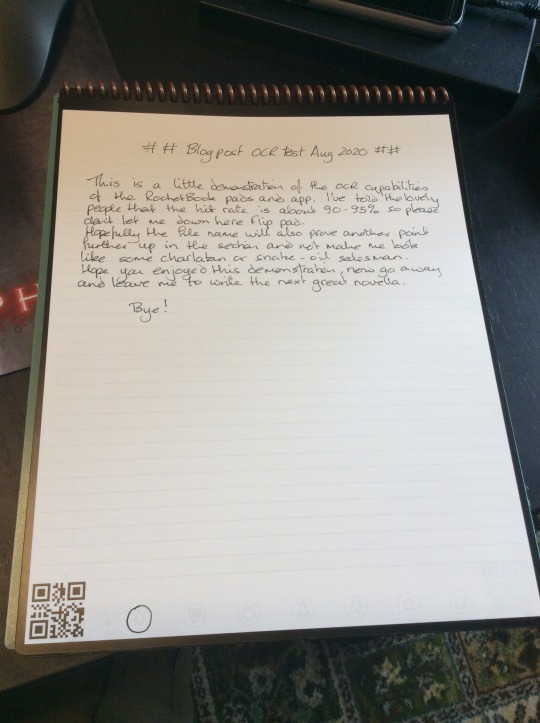

Text Generated by OCR: ## Blog post och test Aug 2020 ## This is a little demonstration of the OCR capabilities of the Rocket Book pads and app. I've told the lovely people that the hit rate is about 90-95% so please dant let me down here flip pad. Hopefully the file name will also prove another point further up in the section and not make me look like some charlatan or snake-oil salesman.Hope you enjoyed this demonstrahen, now go away and leave me to write the next great novella.Bye!
HOW MUCH? On average, I pay anywhere from £4-8 for a decent A4 notebook/journal, so at £30-37 (dependent on model), the RocketBook pads are not a whim purchase. That said, I get through a lot of journals in a year, and given that I would expect to easily get 2-3 years out of a RocketBook pad, then I’ve saved money. Will it replace all my notebooks? No. You need to be thinking of carrying this round as a kit: pad, Frixion pen (at least 2), and cloth. RB do a series of portfolio sleeves for the pads but it does push the price up a bit still, but for a rep, engineer or salesperson, this still makes sense. They’re less bulky than a normal A4 pad too. What I would say is Tesco and Sainsbury’s currently stock Frixion pens and at much better prices than buying them from RB directly, I just paid £3 for 3 pens on offer at Tesco compared to £10 from RB. You get one pen with the pad, but you’re going to want more soon, so stock up next time you’re shopping for truffle oil crisps. If you use whiteboards a lot, RB also have you covered. Instead of the pad, £16 will get you a 4 pack of ‘beacons’ – little self-adhesive triangles that effectively do the same thing as the QR code in the pad. You don’t have the icon options obviously, but if you’re looking to distribute quick meeting or group notes, this would be a boon. CONCLUSION Considering this was a fairly speculative purchase on my part, my early experiences with the RocketBook Flip have been really impressive. The flexibility, the ability to store every page in a different location if you really wanted to make it fantastic for organising my notes, which can save me hours of finding the right ^^$&^$&$ notebook in the first place, then scouring that for the one paragraph I was looking for etc etc. The searchable text facility, in-app history for re-sending etc and last but no way least, functional handwriting OCR, makes the RocketBook not only novel, but actually useable! Would I buy another? As a second notebook – yes. I look forward to seeing what the actual longevity of the product is once I come off furlough and start cramming my day bag with all my junk and a notepad again, but yes, I’d probably just have one at home, and one for work, but make the last 5 mins of each day, scanning and sending work notes so I have them with me wherever. Impressively, the RocketBook Flip just works and it works well. ‘Er Across The Table has already sold several folk at her work on the idea and she doesn’t even have one herself yet! I love it. It’s taking a little adjusting to, but it’s all good. The most important thing though is the writing experience, and I have to say, the combination of the Frixion pen/ink and the polymer technology of the Flip, again, just works. It’s smooth, doesn’t skip or smudge for me (I know some right to left users and left handers have reported some issues) and feels great to write on. If anything I have to slow down a bit as the contact is so smooth that your writing can get a bit ahead of you! RocketBook have produced a cracker of a product. It might not seem like much, but if practical working journals are your thing (ie not create and keep things) then I can highly recommend the RocketBook series.
2 notes
·
View notes
Text
On Writing My First Audio-Drama Podcast
A daring solo adventure with a big love for audio-drama (Welcome to NightVale. What’s the Frequency. The Enoch Saga. Raising the Dead (Again), The Byron Chronicles. Harlem Queen and more!) and absolutely zero idea how to work a proper editing program except for iMovie.
A recipe for disaster, you say? Or is it a daring adventure?
I decided it was a little bit of both, mixed with a chaotic storm of utter, well, chaos. But, I went with it anyway.
And what did I learn from producing? (Producing solo. Yes, that includes but is not limited to: writing the 200 pages for a first season, recording different voices like I’m Gollum, finding copyright free music, producing an original song cover even if I’ve never sang before, editing recaps, theme songs, setting up Twitter accounts, Instagram, YouTube channels. Email addresses. Websites. Blog tours.)
And on top of that, still waiting on getting approved by podcasting hosts? (Cries in impatience).
I have a little screensaver on my phone that says: write, finish things, keep writing from fave emo author Neil Gaiman. @neil-gaiman (the inside home screen says something about managing anxiety and is super sweet.)
So, I listened to virtual motivator Neil Gaiman and got to writing the audio drama.
I am an indie producer who’s really new at this, so take my word with a whole lot of NaCl grains, but here goes...

AUDIO-DRAMA PODCAST TIPS FROM SOMEONE WHO’S STILL LEARNING THE ROPES
1. It is a non-universally acknowledged fact that a podcast episode goes for 20 minutes- 1 hour. My episodes hit the 20 minute mark. 9 Episodes = approximately 180+ minutes of footage.
2. In script speak, a single page of a script runs for approximately 2 minutes of edited dialogue (leaving room for adding SFX and music). One episode for me (20 minutes), meant writing 10 pages of a very non-formatted script. (But it worked for me. What works for me might not work for you, vice-versa)
3. Music makes a podcast sound professional. I used FreeMusicArchive for a lot of my music. When I needed to produce an OG song for my season finale, I went with “House of New Orleans” and made it sound, you know, ghostly. It’s a horror podcast, it fit my theme
3.5. SFX also make your podcast sound so good. Yes, laugh at my for iMovie editing, but the SFX are free for use (iMovie encourages this). Aside from good dialogue, sound design really helps you build your world. (Outside of music, of course). Think of it like watching a movie. That sound of someone creeping along wooden floors in a horror movie, the background noise of traffic on a busy NYC street, even knocking on a door. These elements bring your audio-drama to life. I favored SoundBible and FreeSounds.
4. Speaking of themes! Pick a genre for your audio-drama. You can mix genres too, within general reason (this is for marketing purposes, you understand. And social media loves to limit how many characters you get to type. Twitter, I’m looking atcha). Comedic drama. Horror mystery. Romantic necromancy, whatever. Just find a branding theme and stay there. This will help you build a podcasting family! For example, I have a horror/paranormal podcast family. We’re tight knit. Lots of goth clothing.
5. Reach out to other podcasting peoples. You’re family, not dueling rivals. When I was starting out (heck, I’m still a pod-baby), I asked so many questions. I tweeted out into the void with my #PodernFamily #AudioDrama hashtags and asked about marketing yourself, sound design, podcast hosting etc.
6. Speaking of which, you’re going to need a HOST before you get your Podcast released onto iTunes, Google Play etc. I used Anchor, but I know others who used SoundCloud etc etc.
7. The host might automatically publish your show onto podcast providers (iTunes/Google Play etc), or you might need to manually submit your RSS feed. You can find it from your podcast host (Anchor you access settings, I believe), but this RSS is your ticket to distributing said podcast TO THE WORLD.
8. Set up a Ko-Fi or Patreon so you can have a lil nudge into buying equipment/funding your art. (Mine is https://www.ko-fi.com/sophiefae , what’s up? *winks*)
9. Make things. You’re the number one marketer on your team. Make trailers. Make graphics. Make a kickass cover for your audio-drama so people want to click on that badass-looking icon. I find this fun, some people might find this irritating. I’m just living my best life with PhotoShop even if I have no idea what I’m doing. What’s up?)
10. Learn how to do sound design. Okay, I’ll admit, I’ve been using iMovie up until now because I’m a coward. But a very lovely podcasting community helped me learn how to use Audacity. We’re getting there, fellow new-programs-are-scary-and-have-demons learners. We’re getting there.
Edit together bloopers/ a highlight reel/ a behind-the-scenes interview, or a little season trailer to play before your episodes so people can just dive right into your drama of the audio.
My trailer for Grimm and Glitter, by the way: (sup *winks*)
youtube
Have any other tips for budding podcasters or audio drama makers? Leave them below!
Social media for Grimm and Glitter Podcast if anybody’s curious...
Twitter: @GrimmGlitter @Fae_Sophie (like cheeky horror movie GIFs, me too)
Instagram @FirstAmongFae (fun if you’re into goth cosplay)
YouTube: Sophie Fae (trailers and episodes)
Website if you wanna listen to an audio-drama about goth and prep girlfriends battling demons together in a small beach town:
https://firstamongfae.wixsite.com/grimm/grimm-glitter

Meet Grimm & Glitter- two superpowered teens who fight evil in an isolated beach town. Just don't look behind the red door...
In the middle of butt-nowhere called “Calamity Beach”, 16-year old Grim and 17-year old Glitter find a hole in the abandoned amusement park just outside the town. The tunnel leads to a locked red door that not even light can get through. Things would all be fine and dandy (no questions asked) except for the strange noises seeping out of it.
That, and ever since going down there, Grim and Glitter suddenly gain mysterious powers. Grim can’t stop hearing people’s thoughts, and Glitter can see the ghosts of the dead.
Can these two teenagers discover the secrets lying beneath Calamity Beach? Or will time run out before the summer ends?
#audiodrama#podernfamily#audio drama#audiophile#podcast#horror podcast#mystery podcast#paranormal podcast#LGBT podcast#lgbt creator#script writer#horror#mystery#paranormal#thriller#thriller podcast#solocast#podcast producer#blog#podcast blog#advice#inspiration#podcasting#blogging#audiobook#horror series#indie producer#indie artist
25 notes
·
View notes
Text
Best of 2019 Future Funk Release 1/4: Toyama’s Love Island by Skule Toyama
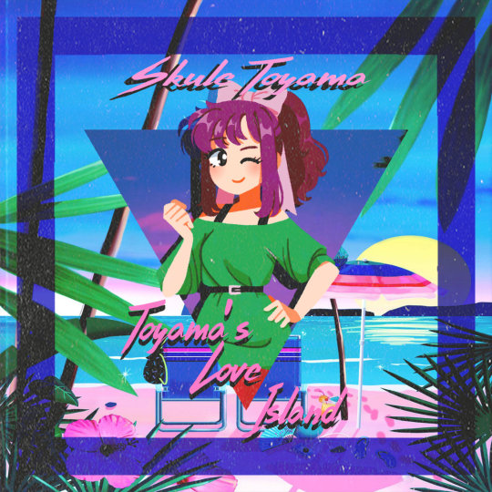
A common argument I get into on audiophile and vinyl forums — that by virtue of interest and venue tend to skew boomer (who isn’t on discord now? Answer: Your grandpa.) — often revolves around the raison d’être of pressing future funk. In an earlier piece, I gave my opinion on the subject — but I didn’t really evidence the critique by many opposing audiophiles. As far as they’re concerned, I might as well be collecting Funko Pops — that is to say that these presses aren’t worthy of serious hi-fi consideration and are merely collector’s items. To their credit, when posting about my experiences with the genre, most of these aged audiophiles scratch their head not at the anime art on the box nor at the picture disks (usually reviled by the old-heads)— but at the oft-digital source itself. These guys are the ostensibly cool uncles with the dope music collection, after all.
While they often are a wealth of information on the analog format, and voracious consumers of early City Pop — a genre beloved by audiophiles, — forums like this tend to create feedback loops of retrograde understanding. Their enjoyment of all things analog turns them into intense luddites, often to the point where I question why they are interfacing with a computer in the first place, that dreaded source for the perceived decline of their hi-fi culture.
I’ve more or less given up on the prospect of turning them around on the subject of future funk. However, this summer, on a thread where we review recent vinyl purchases and upload lossless rips, I made a rather pedestrian post about how much I enjoyed Skule Toyama’s latest release — Toyama’s Love Island. And to my complete and utter surprise, my vinyl-to-digital rip of “Sunset Hasn’t Come Yet” brought all the boys to the yard. While I got my usual peanut gallery of “lol future funk, lol vaporwave, buy jazz” posts, its turns out more than a few Joe Boomers with vintage, $10k-valued Sansui stereo sets could vibe with this too. You know, the purely purists of the pure.
This caused me to consider for a time precisely why Toyama Love Island whispered to these boomers I share a particular corner of internet space with. What about it warmed the heart of these old men so cold to cold media? It obviously had to be something more than the mastering or the press itself. Most of these guys had been engaged in serious listening to absolute titans in their craft for forty plus years now. Many had studio experience themselves. Even now, I don’t have a really good answer. The best one I can supply is this: the warmth that emanates from Toyama Love Island can melt even the iciest heart. Cliche? No doubt. Apropos? Of course.
PART 1: THE MUSIC
Intro warms us up with a minute-long evergreen bit. By whom and what from— I genuinely don’t know (perhaps that’s the appeal for me personally, the mystery but also the universality)— but the punch line certainly feels nostalgic, and the horns do too.
Have a Good Time fronts the funk after a minute-long intro track. It’s an absolutely fantastic true open because of its principal horn loop that absolutely claws into your cerebral cortex and takes root there. Between listens, I found myself humming it while brewing a pot of coffee. While it’s not my favorite of the tracks on the album, its pure energy and catchiness is a master class on how future funk albums should inject you with an uncut hit of unapologetic brass funk within the first couple minutes.
Electricity takes the initial energy of Have a Good Time and subtly ratchets up the vibe with clever layering and a sweet progression. While my initial take on my first listen was that the bass was too muted (a slight boost from the hi-fi set of your choice can obviously erase that distinction quickly!) — I warmed to the mix after hearing how well it meshed with the following track.
Love Island serves as a sort of kinetic climax to the first quarter of the album and a great midpoint for the A-side, but the treble feels just slightly compressed and off-balance on the wax here. After fiddling with EQ and my pre-amp settings on the second listen, the track came through vastly better. My suggestion is to subtract here and there if you have a Japanese-built set that tends to run bright. After doing so on the 2nd listen, Love Island began to shine — and the distorted loops that seemed discordant on my initial listen were brought back into a more complimentary role with the rest of the piece.
Midnight Mall is my absolute favorite of the album because it just unabashedly brings the boogie with a pure, slap-worthy bass, crisp midrange from the intermittent horn flares, and absolutely atmospheric vocal compliments. Although Love Island is a strong title track, so to speak — I really do think Midnight Mall is the true baby-maker banger of 2019. For peak enjoyment, boost the bass a little on your stereo, add mood lighting and engage in the wholesome romantic activity (impassioned stares, hand-holding) of your choice.
Sunset Hasn’t Come Yet is the boomer whisperer. My guess regarding what makes this track appeal so authentically to the boomer crowd is the strength of its arrangement. You get a comfy arrangement throughout, a bass twang that sounds like its straight outta Miami Vice coupled with very moody Japanese vocals. For a future funk record, this feels like the track most in sync with its roots, creating a very authentic, fun sound.
Marsala’s effortless sonic transition from Sunset Hasn’t Come Yet’s stage is definitely a highlight of this album’s pretty flawless composition and arrangement. It feels very much like a palette cleanser for the album’s first half, and is perfect for an LP format — as you feel this transition writ large by the very nature of the format. The blaring synths feel like they would meld into place effortlessly with a Michael Mann-directed denouement to a period action-psych drama.
Flying Star is a soft reset to the album from a vibe standpoint, and is competent at what it does in the overall scope of the album. My only significant criticism of Skule Toyama’s output — which is somewhat present here — is that they don’t really let the vocals carry enough water. While exquisitely layered in relation to the rest of the piece, I want to hear the vocals take up a sort of primary mantle in the soundstage in a track like this. We get it in Flying Star’s middle third, but it does feel like a sort of pointless delay in gratification. A track like this has a chance to capture the listener and bring them into the sonic space. It comes just short of doing that.
Sailor Moon Rock manages to decimate that previous criticism by running at me and grabbing the tempo by the collar with an absolutely fire set of loops and immediately accelerate. I love it for that, and is definitely the B-side’s strongest composition. We get some no-doubt nasty guitar riffs and some iconic SFX that really bring this track together and make a B-side banger exemplar, reason enough to flip the wax.
Keep On Going brings us closest to a synth-wave composition that we get in the entire album on the track’s first third, but finds its funk at the ideal moment. It definitely succeeds in fleshing out of the B-side, and creates its niche on the project subtly but at the same time, at the risk of seeming hyperbolic — brilliantly.
Do Me definitely feels the most “Nu-Disco” of both the side and the overall album. It’s definitely one of those tracks that you can both happily wait for in the queue and then just revel in — knowing that while the record nears its conclusion, you get a track that just would not at all be out of place in a Shibuya nightclub circa 1979 or weave its way into a Haruki Murakami novel.
Outro is a perfect closing for the album, but I question the utility of making it the penultimate track instead with the inclusion of the bonus track. That said, it’s impossible not to vibe with the arrangement and layering of this piece. My hope is that when I die and arrive at the pearly gates (admission pending), St. Peter (recently taking up a hobby in DJing to pass eternity) will have a special edition pressing of that will have this as the final track on the wax.
Live Now! is definitely the track I feel coolest about. A good piece on the whole, just feels a bit out of step with the rest of the project. But I’m never going to look the gift horse in the mouth when it comes to the prospect of additional music, so a welcome addition nonetheless.
PART 2: VINYL EXPERIENCE
I really like the Toyama Love Island purple wax. This seemingly benign statement is no doubt going to incur a chorus of audiophiles in that forum criticizing me for this. Vinyl is not designed — as much as some will tell you, to be a perfectly neutral hi-res medium. There is natural warmth, scratchiness, minor distortion — et cetera. It also features natural imperfections that develop over time — like any piece of physical media. What’s more, some perceived hiccups on the overall master might actually be caused by a slight offset or error in the press, a common and natural occurrence when dealing with physical media like this. That’s why graphic equalizers were so prominent in vinyl hi-fi set in its late 1970s/early 1980s heyday. This is just an aspect of the vinyl experience.
Toyama’s Love Island features, in my view, a few of these imperfections. But these imperfections are nothing major — a quick re-equalization (oxymoronic, but I’m sure you know what I’m getting at here) a little fiddling around with the pre-amp here and there — these are natural to any experience and remind me why I became fascinated with the hobby in the first place — to maximize an audio experience. If every indie press gave that to me out of the box, well, what’s the point of the system that I own? It exists to provide a platform for a rich, diverse, and vibrant sonic experience. But the platter is just decorative without real warmth coming from the music, and Toyama’s Love Island brings that in droves.
My Pet Flamingo has a long (in vaporwave measurements, obviously) history of putting out quality physicals. Toyama’s Love Island builds upon this with a big’ol brick and a heaping slab of mortar. I’m also a big fan of MFP’s visuals. I’m not sure who they use to make the sleeves, but I think they’re generally constructed well, and the cover images that grace them never feel compressed or feature much in the way of artifacts. When you become deeply intimate with a vinyl sleeve, you start to notice these things — and I’ve never had this inkling when fingering a Flamingo release, so kudos to the label’s curation.
The mix feels exceptionally bright on my current system, and that has been a consistent point of curiosity with My Pet Flamingo releases. My guess is whatever they test their masters on is engineered by a British/American company not named “KEF” — think Cambridge, Wharfedale, McIntosh, etc — or a damper sounding Japanese unit like Technics or Yamaha. Again — I don’t see this as a problem, just a note to those running more traditional Japanese (80s Harman, Sansui, TEAC) or Nordic systems (B&O, Blaupunkt) that tend towards that end of the spectrum.
With obvious digital and analog appeal, Toyama’s Love Island is the closest thing to a “holistic” future funk release that I can think of — which makes me wonder why Skule Toyama’s hasn’t blown up yet. Only a matter of time, I’d guess — especially after earning a nod from this little outfit, I’d hope.
4 notes
·
View notes
Text
The Future of Star Butterfly... or The End?
The end of @disneyanimation‘s/@disneyxd‘s finest franchise yet, @daronnefcy‘s Star vs. the Forces of Evil, is a time of great lamentation for me, as I love Star Butterfly to an insane extent (and thus the respective franchise).
I love Season 3 more than Season 4 (and in Season 3 is the most important reason why I love Star), but the show’s been little different since Season 2. The show changed very much after Season 1 (my favorite season) in character design, animation and the storyboard artists involved. SvTFOE is a really great show, but I personally see room for improvement, if Disney chooses to produce any future content, whatever media that is. Before we act on petitions for new content (try not to push Disney Television Animation too hard on this. It’s up to them, NOT Daron Nefcy, and Disney’s probably really busy with other shows at the moment), let’s consider some aspects of the show...
First, I note some specific things that I dislike about SvTFOE in general.
Mostly “Traditional” Animation: What happened to the animation? The animation started out in Season 1 (and the pilot) as what I call “model-rigged” animation (some call it “flash”), animated by @littledigits at Mercury Filmworks (The Powerpuff Girls Movie, Mickey Mouse, Wander Over Yonder). The visual approach appeared to be very cartoon-y, like WOY, and the attention to detail in not only character design but also the effects design, multi-layered background panning and camera de-focusing was present only in 13 individual (11-minute) season 1 episodes, and also in the 2017 “Interdimensional Scavenger Hunt”. Such things of those episodes are not in later episodes as they are only traditionally animated. Toon City’s animation seemed slow-paced and a little jerky to convey quick movements at times, which didn’t feel like that of Mercury. Now, I came to love model-rigged animation because of SvTFOE, but generally I prefer traditional animation, which is fairly fitting for the more dramatic, intense episodes of the series. The first Toon City episode, “Mewberty”, had a number of design/animation mistakes (i.e. the shots of the “My turn” moment). Of the 2 animation companies that were involved, Rough Draft Korea (which also worked on the Season 1 episode “Blood Moon Ball”) and Sugarcube, though Rough Draft does animation for some of the best in American animation, yet I prefer the visual approach of Sugarcube as the designs are much cleaner and look a little more on-model. The lines in Rough Draft episodes aren’t as smooth and the models kind of look more different (perhaps off-model) per shot and/or movement, but the animation Rough Draft did on Samurai Jack EPISODE XCVIII, namely Ashi’s fight scene, looks amazing. rwinger24 pointed some important elements lacking in the 2016-2019 episodes out: “Absent from the Mercury and Toon City animation (are) these animation principles- Anticipation- Follow through and overlapping action- Slow in and slow out (the Rough Draft Korea episodes miss this principle as the animation appears jarring/unnatural)- Secondary action(And notable absence of motion smears)... (and, like) 80s /90s cartoons sometimes (the picture bobbing/weaving from the telecine transfer, and not the constant use of 24 drawings like SVTFOE does (mostly from Rough Draft Korea).
Different, Less-Detailed Character Design?: The character design never looked more graphic and detailed than in Season 1, done by @cheyennecurtisart and @lynnvwang as well as @cunch. This’s particularly noticeable in the Mercury Filmworks episodes. The designs in the Toon City episodes aren’t as smooth and, the way the episodes are, not necessarily as exaggerated in cartoon-y fashion as the Mercury Filmworks episodes. The change in character design, which I noticed, is so drastic, that my follower rwinger24 suggested that I should make a post about the changes. As for the rest of the series, @aniramiart became the main designer along with @beckyandfrank / @tinykittenteeth. They do some good designs, given what Star endured or how she reacted at certain times, but most of them aren’t as detailed as Cheyenne’s. What I dislike most about this design change is that, regarding mostly Stephanie Ramirez’s designs (plus storyboard artists and Rough Draft’s animation), the character design of at least Star begins to resemble Gravity Falls a bit much, which detracts from the unique designs of SvTFOE in its first Season. Relatively, one of young Star’s designs in “Marco Grows a Beard” (Tyler Chen’s first episode) also resembled the character design of Gravity Falls, but that was still Cheyenne & Lynn Wang on the episode. On the other hand, the Season 2-4 designs look more on-model and smoother in the Sugarcube episodes. Otherwise, in potentially cartoon-y designs, it just doesn’t stretch as far as those of Season 1/Mercury episodes, though that wouldn’t exactly be fitting for the more dramatic episodes. The designs, of course, depend somewhat on storyboards. Perhaps the wackiest storyboards are by Ian Wasseluk (who rwinger24 references in the cartoon-y looking approach on the series), as well as Dave Stone (from Teen Titans GO!) on “Match Maker”.
Quiet (and typical) Sound Design: Throughout the show, the sound design’s style was very quiet. It’s more foley than SFX. The sound effects designed by both music score composer @brianwithanh and Advantage Audio’s Robert Poole (Season 1) and Heather Olsen (Seasons 2-4) are unique to the series and absolutely nothing I criticize. What I dislike of the sound design is that, given the very cartoon-y visuals (particularly Seasons 1-2), the sound design is more realistic than cartoon-y (save for very rare cases like the opening scene to Bon Bon the Birthday Clown, which was very deliberate as I imagine). Usually, Advantage seems to sound either too cartoon-y (i.e. The Fairly OddParents) or too quiet. In the case of more dramatic episodes, the cartoon-y sound shouldn’t be pushed. If Jesse Aruda, Roy Braverman, and/or Rich Danhakl did the sound design (Danhakl did the sound design of The Tom and Jerry Show at Advantage and edited sound on “Mathmagic” & “The Bounce Lounge”), their array of cartoon sounds would be better than the usual, very specific designs of Michael Warner, Robert Duran, Poole II and Olsen. The other main critique I give is that, like most sound services, the action-y sound effects (explosions, crashes, etc.) depend more on typical Hollywood Edge/Sound Ideas (that is “stock” sound effects) than the unique sounds of Joel Valentine and Skywalker Sound; there’re also the common, if applicable, use of “Cats Two Angry Yowls”, “Medium Exterior” Crowds and other cliche vocal recordings that are overused, particularly by Advantage Audio. Recording walla as well as other animals (or at least using lesser-used animal and crowd vocals) would be an improvement. Even the horse sounds used (rarely using one from the Sound Ideas Lucasfilm Sound Library) are mostly the typical, pitched-up if necessary. Compare that to an entire SFX library of horse sounds that Skywalker’s Nia Hansen (sound design assistant of Big Hero 6′s movie but not the show) recorded just for War Horse--and she was credited as only an apprentice [sound] editor!
“Controversial” Content: The last thing I dislike, from more or less a Christian point-of-view, is that there are a few episodes that have material and/or images that I, for one, among many, would view as “controversial” or “polarizing”. I’m a little suspicious of some situations that may regard controversial subjects in a few other episodes as well, though no dialogue explicitly states such things. I can not say what that material is or what episodes have it, but I mean the best in concern for the sake of the series’ reputation. The least that we can do (and I certainly do), in all situations, is to pray for the salvation and sake of Daron Nefcy and her amazing team.
(BRIEF SPOILER!) Second, before we can give influence to anyone to contribute to the Star vs. the Forces of Evil franchise, we need an answer to this very important question:
Is this really the end of Star vs. the Forces of Evil?: It was always on my mind as to whether or not “Cleaved!” was more than the end of the main story linked throughout Seasons 1-4 (though the last villain, in Season 4, is Mina, from Season 2). Does Disney claim that it’s the series finale because they had to move on to other projects, or is the story of Star Butterfly, the Underestimated, at the true end that Daron Nefcy wanted? Think about Wander Over Yonder: it was cancelled after season 2, but, although that season wrapped up a story throughout that season (and began at the very end of Season 1), still there are more stories that could be told... if Disney wanted to produced new WOY content, with or without Craig McCracken. Also, (spoiler) Star is not gone; worlds collided, and there can be more adventures for the franchise (perhaps Hope Hadley or Charlie Booth/“Gustav” could get a spin-off?). Whatever more we want of SvTFOE or WOY, we must speak to Disney Television Animation about this and let them to know, NOT the show creators. Don’t ask Daron Nefcy about new SvTFOE content in the future; ask Disney TVA about that.
Third, in response to what I personally dislike about major changes in the series since SvTFOE Season 2, and as a devote fan of Star Butterfly / Star vs. the Forces of Evil, I wish to propose, to all of those at Disney Television Animation, suggestions of creatives who deserve to contribute their amazing talent to the future content of Disney’s most beautiful franchise yet.
Who should run the show?: As far as I know, creator Daron Nefcy suggested that she left Disney after SvTFOE (“I’ve been slowly cleaning out my office (I know, sad!)”) to do a voice on Nico Colaleo’s Ollie and Scoops, so, if Disney intends to produce any new content, then it may happen with Daron out. Who would I suggest to help run the show? Dave Wasson, Season 1 Co-Executive Producer/Supervising Director, could return. I strongly believe that Lynne Naylor-Reccardi (Samurai Jack, The Ren & Stimpy Show, The Shnookums and Meat Funny Cartoon Show) would be a very good choice in running the show, in addition to storyboarding, writing, directing, character design, and/or art direction; she produced Hercules and Xena: The Battle for Mount Olympus and was a major part of that film. Then, of course, for the sake of detail and action, Genndy Tartakovsky would be a great choice; he’s currently with Sony on a few projects and CN for Primal, so at least people from his team, like Paul Rudish of Mickey Mouse and Bryan Andrews and/or Mark Andrews of Sym-Bionic Titan, would be really good for directing. I certainly trust how good they are at both action and heart, on shows like Samurai Jack. As for really wacky, cartoon-y styles, I also would recommend Kyle A. Carrozza, @tvskyle from CN’s Mighty Magiswords, who is currently at Warner Bros. on Animaniacs, and Bob Camp from The Ren & Stimpy Show (also a storyboard artist for Sym-Bionic Titan and Suburban Daredevil), to contribute directing/producing and storyboarding. I would recommend @crackmccraigen, who "wanted to make Star when back when @daronnefcy pitched it to us at The Cartoonstitute. CN said no though.” However, so far, Craig left Disney; he currently produces Kid Cosmic for Netflix.
Who should write and storyboard the stories?: First, I suggest Tim Hodge (@baldmelon, The Tom and Jerry Show, Jonah: A VeggieTales Movie, Aladdin, Mulan), who also worked for Disney, as well as @gadworks, @kalikazoo, @mikepelensky, Darrick Bachman (Samurai Jack, Mickey Mouse) and Richard D. Pursel (Tom and Jerry Tales, Mighty Magiswords, The Ren & Stimpy Show). For more action-y sequences, I’d look to Genndy Tartakovsky, Bryan Andrews and/or Paul Rudish; they sure know their action stuff. Lastly, I note Charlie Bean, David Krentz, Kyle A. Carrozza, Lynne Naylor-Reccardi, Will Finn, Stephen DeStefano, Jeremy Polgar (Samurai Jack Season 5, Teen Titans Go!) and Bob Camp, among others. Former writers/storyboarders Mike Mullen, @ianwasseluk, Scott O’Brien, Kyle Neswald, Kat Ketchum, @brettvaron, @giancarlovolpe and Dave Stone should return. A newer storyboard artist for Spongebob, April “Pinkie” Davis, has some humorous potential too and I’d highly recommend her. Josh “Zeurel” Palmer and @akron-squirrel are also very talented artists/animators who deserve a show.
Who should contribute visual design?: Luckily, Cheyenne Curtis returned for a few episodes after Season 2; she currently works at Nickelodeon but might like to help on the designs. In point of fact, she should be “Lead Character Design”. I’m not sure if it was Cheyenne or Lynn Wang who did the really graphic character designs (Match Maker, Brittney’s Party, The Other Exchange Student, etc.), though hopefully Lynn Wang could occasionally contribute to future SvTFOE content, with or without Cheyenne. Among the 2 (and perhaps Jennifer Goldberg as well), the new character designers I’d suggest to contribute would include Jeremiah Alcorn (@alcornstudios, Teen Titans Go!, Wander Over Yonder), Lynne Naylor-Reccardi (The Ren & Stimpy Show, Samurai Jack), Carey Yost (The Powerpuff Girls, The Ren & Stimpy Show), and April “Pinkie” Davis (Spongebob Squarepants). I’d also recommend Bryan Arnett (Wander Over Yonder, The Mighty B!), Adam Rosette (who did designs for the original test pilot or something in 2014, according to the IMDb), Craig Kellman (The Powerpuff Girls Movie, Dexter’s Laboratory), and Kyle A. Carrozza and Lindsay Smith-Carrozza (Mighty Magiswords), among others. As for the location design, it changed little, but I’d still refer to The Parpan Brothers, Season 1 art directors @joshparpan & @justinparpan (currently art directors at CN for @victorandvalentino) and perhaps their assistant Jason Stebbings. David A. Dunnet and Larry Murphy are very good cartoon location designers. Certainly, Stephen DeStefano (@stephendestefano, Samurai Jack, Mickey Mouse, The Ren & Stimpy Show) would serve as a swiss army knife of visual design in storyboards, character design and location design! I’m not concerned about most of the prop designs either, though Dustin d’Arnault is a rising talent in cartoon props/effects design, like Chris Battle. I’m not too concerned about effects design, referring to the original one, Tony Unser, and the last one, Eric Gonzalez, but contributions from Dustin d’Arnault and the amazing MIchel Gagne would do wonders for the show. As for newer, fresher talent, @akron-squirrel, Josh “Zeurel” Palmer and Scott Forester are some excellent choices for new creatives visual development.
Should the show/new content onward be in a “Scope” aspect ratio, like 2.40:1? Star Wars: The Clone Wars, Tigtone and Genndy Tartakovsky’s Primal are in a “letterbox” widescreen format, and it’d look more cinematic to do the shots in a director-envisioned “CinemaScope” format.
Who should direct the animation?: The main timing supervisor Shaun Cashman was a part of The Powerpuff Girls and Sym-Bionic Titan, so that’s good for the *traditional* animation (not to mention timing director Patrick Gleeson, who animated the works of Don Bluth), but personally timing/animation directors and supervisors should include Genndy Tartakovsky, Tony Fucile (perhaps a stretch, but he’s really good), and Robert Alvarez. Rough Draft’s designs should look a little smoother IMO, though I generally prefer Rough Draft over Sugarcube. Of course, for the more comedic SvTFOE content in the future (but not limited to cartoon-y scenes), I want Megan Ferguson to return, preferably with Mercury Filmworks. Mercury could at least help animate background layouts and visual effects for the traditionally animated episodes. Still, I learned from Final Space and namely the Rapunzel’s Tangled Adventure episode “Cassandra’s Revenge” that “puppeted” animation can work very well in more serious, cinematic scenes that aren’t as “cartoonish”. Additional animation contributions from Gabe del Valle and Josh “Zeurel” Palmer would be good to reference too.
Who should contribute sound design?: First and foremost, if I had to pick one and only one sound designer, I’d look to Joel Valentine, a private contractor who generally did cartoon sound for only Cartoon Network Studios until Craig McCracken got him to contribute to Wander Over Yonder Season 2, perhaps leading Joel to work currently on Disney’s Big City Greens (still also on Genndy Tartakovsky’s Primal). He does both cartoon and action sound on a very unique level, and he proved to be very realistic with vocal sfx (babies, crowds, animals) in Samurai Jack Season 5, making very scarce use of Hollywood Edge SFX. I also really like that castanet sound he uses for characters shaking for any reason. With or without Joel, my devote follower @rwinger24 prefers Spongebob sound designer Jeff Hutchins to contribute; Jeff has a hilarious sense of cartoon sound design, and not only did he learn from Joel, but he also received from Joel The Producer’s Sound Effects Library AND Joel’s ADAP library, with which Jeff could replicate the unique sound styles of Joel, like he did before. Jeff also tends to work at Hacienda Post, where founder and supervisor Timothy J. Borquez could contribute and consult sound design just as his team did at Horta Editorial on The Ren & Stimpy Show, which also has its own stylized array of SFX--and this would work very well for a show with design and animation as detailed in comedic fashion as Ren & Stimpy (think “Brittney’s Party”). It was rumored on IMDb that Warner Bros. Sound (division Audio Circus) worked on SvTFOE; Jeff worked there too, and I guess that they could contribute. Then, of course, the show deserves contributions from Skywalker Sound, namely designers like Tom Myers, Steve Boeddeker, David Acord, Frank Eulner and Al Nelson, as well as Chris Scarabosio, Kyrsten Mate and Nia Hansen; Matthew Wood & David Acord are also a good team in voices (I’d even go so far as to suggest Ben Burtt to contribute). With Skywalker, there’d be better selections for action sfx (like explosions or ricochets) and other SFX in general, plus more realistic vocal sfx and walla. I also like the works of Robert Hargreaves (DigiPost.TV) and Glenn Oyabe. Among Joel, Hacienda and Skywalker, still, I intend not to cut Advantage Audio out; the series’ sfx and Brian H. Kim’s sounds are probably there, as are the series’ foley artist John Lampinen, but I would want Jesse Aruda and Rich Danhakl to be in place of Poole II or Olsen. (as of September 10th, 2019 A.D., Danhakl replied to me in an e-mail, “Count me in for the toonie Star spinoff (I’ll pass the message along to Jesse [Aruda] and Roy [Braverman])!”) A main proposition to approach the series’ sound as a whole, as Ben Burtt suggested in an article, is this: “You don’t achieve the final cut of your movie the first time that you cut it. [(Picture) Editing is] too big of a job. You assemble the first cut based upon all of your best available knowledge. You’re finding your way through the story. You’re checking notes, a script, and seeing what the material might dictate. Then you build each successive cut, and you see what’s wrong and what’s right. It takes time and a series of developmental steps. No director want to rush through it. The same process should hold true for sound design. There needs to be a development phase where you have the same type of time to experiment, fail, and nurture the sound design to full bloom in all its beauty.” Speaking of Ben Burtt, he might as well contribute since it seems that he does little sound design for projects these days. Previously I made a post about the important emphasis of the series’ sound design.
I pray every day of my life that Star vs. the Forces of Evil as a franchise of Disney will be blessed with creative talents who I really admire, and I hope for the best. Speaking of Hope, I find supportive/background character Hope Hadley, created by character designer Cheyenne Curtis, to be an interesting and attractive character, so I wonder if Cheyenne (who works at Disney) and Disney (who owns the rights to Hope) would create something out of her, as I said before--and Cheyenne thinks about this possibility: “If I ever get a cartoon show it’s my goal to have multiple episodes throughout the season with rain.” Either way, my devote follower @rwinger24 would agree with some of my choices (particularly of sound and Jeff Hutchins).
If you’re a devote SvTFOE fan and you agree with any of these decisions, then SHARE THE POST! Let Disney know, and see what Daron Nefcy also thinks of this too (even if she can not return). I also encourage you to share IMDb lists of Creatives for Future SvTFOE Content and the same for Cheyenne Curtis’s cartoon show and/or this Tumblr post summarizing names of those to join and return on SvTFOE, so that we--and the amazing creatives whom we admire--can be a part of the unique franchise of SvTFOE! I love Star Butterfly enough to want to spark an influence, however we can.
Besides that, Samurai Jack seemed to end after Season 4, but it returned after 12 years, 5 months and 14 days with Season 5. God knows what new content/media Disney could produce (with or without Daron Nefcy) in the future!
Tweet version here. Share that too!
Finally, forget not to share also this complimentary post listing some of the most important creatives for Disney TVA to recruit for new SvTFOE content!
I thank you for sharing, noticing and/or reading the post.
If you wonder why I love Star much, see this post (spoiler if you saw not Season 3 yet)
BTW, if you like The Powerpuff Girls and/or relative team members, check this post out too (and share it if you agree)!
#star vs. the forces of evil#star vs the forces of evil#walt disney television animation#disney television animation#disney animation#daron nefcy#cheyenne curtis#megan ferguson#mercury filmworks#dave wasson#genndy tartakovsky#bob camp#kyle a. carrozza#lynne naylor#lynne naylor-reccardi#gabe del valle#jeremiah alcorn#lynn v. wang#lynn wang#animation#art direction#josh parpan#justin parpan#joshua parpan#future media#future content#new content#disney#skywalker sound#savesvtfoe
15 notes
·
View notes
Video
Glitch Transitions for Premiere Pro Motion Design from Antony Parker on Vimeo.
✔️ Download here: templatesbravo.com/vh/item/glitch-transitions-for-premiere-pro/37261469
Glitch Transitions for Premiere Pro – [information on project page] is Available Now! Glitch Transitions with Sound FX, Titles, Graphics, VHS Effects, Viewfinders, Scenes and [information on project page] – Pack contains 500 transition presets in 11 unique categories and over 100 various assets. Step up your editing game and easily glitch up the cut between your videos! Once you purchase the project, you get all the future updates for free.
MYFX [information on project page] Extension
500 Glitch Transitions with SFX
10 Full Scenes
30 Titles
12 VHS Effects
11 Backgrounds
11 Viewfinders
7 Graphic Frames
6 Camera Overlays
All Preset Previews Easy to Use (One-Click Method) Color & Effects Controls MOGRT Based Created with AE Effects Help Center Customer Support Free Lifetime Updates
0 notes
Text


Always MORE for you with the all-new Singtel TV.
Full videos here:
16x9 YouTube
9x16 Instagram
Motion Graphics Animation + AV Editing (Sound design / Music and SFX)
0 notes
Text

25 sitios de archivo de video gratuitos
ACTUALIZADO: DICIEMBRE 2019
Royalty free adventure sports and travel stock footage. One time fee allows use of footage for multiple projects. Free download of preview videos
https://www.naturefootage.com/stock-video/adventure-royalty-free-video
Free High Resolution Images and Stock Photos · CC0 · PLiXS
PLiXS is an online photo community for creative peoples who wants to share their fantastic impressions with other enthusiasm artists. All uploaded works licensed with the creative commons attribution – that means, the photos can be use with the corresponding license.
plixs.com
Free Stock Photos & Videos - SplitShire
In the course of almost ten years of photography I have accumulated many photos, thousands, who were in the hard disk gathering dust. So I began to upload them as free stock photos that you can freely download and use for personal an commercial purposes.
www.splitshire.com
Openfootage
footage blog for textures, timelapse footage, HDRI panoramas and alpha elements mostly under creative commons license free to download
www.openfootage.net
Free HD stock footage on Vimeo
all clips you find in this group I give away for free use in your productions! I hope you find useful stuff in here. feedback & tipjar welcome :-)
vimeo.com
OrangeHD | Free Stock Footages
OrangeHD Stock offers hundreds of Full HD and HD footages and videos. All footages are free, both for commercial and non-commercial purposes. There are no hidden costs or need to sign-up.
www.orangehd.com
Mazwai
Download free creative commons HD video clips & footages.
mazwai.com
Free Motion Backgrounds | MP4, MOV video backgrounds for FREE!
Free motion backgrounds, free for commercial or personal use! all videos are High Definition, motion backgrounds to use in your video editing projects.
www.ignitemotion.com
Stunning Free Images · Pixabay
Pixabay · Stunning Free Images Over 1.5 million royalty free stock photos and videos shared by our generous community.
pixabay.com
Free Stock Footage by Clipcanvas Producers - Clipcanvas
Free stock footage and video clips by Clipcanvas Producers. Instant download any of these high definition stock video!
www.clipcanvas.com
Totally Free Stock Video Footage - Vidsplay.com
Download Free stock video footage in high definition (HD). Completely Free No Cost Video Footage.
www.vidsplay.com
Stock Footage For Free - Stock Footage For Free
Download hundreds of professional-quality free stock footage video clips. Be sure to visit our site for the latest free content.
www.stockfootageforfree.com
Videezy
Free HD Stock Video Footage! - Videezy is a community of Videographers who download and share free HD stock video!
www.videezy.com
Free Videos, Clips & Loops
Free videos for personal & commercial uses. New videos added weekly! High-resolution videos for free for U on our VIMEO. For Designers, Web Creatives & more
www.lifeofvids.com
Free Stock Video Footage HD & 4K Clips Royalty-Free Videos - Royalty Free Stock Video Footage Motion Graphics Music & Sound Effects
Download free stock video footage with over 20,000 videos in 4k and HD clips available. We also offer a wide selection of music and sound effect files with over 100,000 clips available. Click here to download royalty-free licensing videos, motion graphics, music and sound effects from Videvo today.
www.videvo.net
Free stock videos – Pexels Videos
Pexels Videos makes it easy to find free stock footage for your website, promo video or anything else. All videos are free for personal and commercial use.
videos.pexels.com
Beautiful, free stock video footage for your homepage
Download royalty free (for personal and commercial use), unique and beautiful video footage for your website or any project. No attribution required.
www.coverr.co
Mitch Martinez – Director of Photography | Free 4K Stock Footage
Free 4K Stock Footage Shot on RED Epic Dragon - RED Epic MX - and RED One MX
mitchmartinez.com
Little Cloud Cinema
Little Cloud Cinema is a local production company based in Lawrence Kansas. We focus on advertising and marketing for small businesses and local institutions such as the University of Kansas.
www.littlecloudcinema.com
Download Free Stock Video, Sound Effects, Photos, Textures - cutestockfootage.com
CuteStockFootage.com - free footage, vfx, overlays, light leaks, backgrounds, textures, sfx
www.cutestockfootage.com
Free Animated Video Backgrounds For Your Homepage | Vidlery
Vidlery offers free animated video backgrounds for your homepage. No signups. No cost. No copyright. Download your favorite video and you are all set.
vidlery.com
Stock Footage For Free - Stock Footage For Free
Download hundreds of professional-quality free stock footage video clips. Be sure to visit our site for the latest free content.
www.stockfootageforfree.com
Beachfront B-Roll
Free HD stock video footage, time lapse and animated backgrounds for personal and commercial use. The library is royalty free and free to download.
www.beachfrontbroll.com
Cinema-quality footage for creative projects of every size - Welcome - Fancy Footage Club
Cinema-quality footage for creative projects of every size
fancyfootage.com
Vídeos de archivo ~ Vídeos de archivo | Pond5 libres de derechos
Access millions of royalty-free videos in the world’s largest stock footage library. Download high quality 4K and HD clips.
www.pond5.com
#video#free footage video#clase#edición narrativa digital#edición de video#edición digital#gratis#archivo de video gratuito
2 notes
·
View notes
Text
Project Update #6
Hi everyone!
It’s been a while since I’ve posted one of these, so I thought it best to cover what’s been done and what’s on the horizon.
So, a lot of the sound work is done, which is exciting. I’m really glad that I managed to finish the SFX and ambient noise. Both of those were great warm ups and re-introductions into sound design. I used to make music years ago (I believe I mentioned that already...) but I’m pretty out of practice, so having a warm-up like this was appropriate.
My plan for the soundtrack is small-scale so far. I want to have four songs ready for the initial build of the game, and one song for a crowdfunding video. The four songs will each by faction specific, and will test my adaptive music system as a concept. My intention is that the songs shift and change measures depending on what kind of action is occurring in-game. The more pitched the battle, the more intense the music, to put it bluntly. The crowdfunding song isn’t just for a trailer, but I hope that it will also serve as a theme for this game and communicate the emotional message I feel when I imagine what SALVE could look like.
Another smaller but equally important component is a design document, something I’ve mentioned before in prior posts. As I near the point where I’ll need to enlist other people to help with animation and programming, the need to communicate exactly what the game needs to look and feel like becomes paramount.
The document is nearly ready. A few chapters need to be finished up, the doc needs to be proofread and edited for clarity, and I want to add a few diagrams and graphics to really flesh it out.
As always, if you’re a programmer or animator and you are interested in participating in this project, I’d love to hear from you!
I’m planning on starting the music this weekend, but don’t expect too many updates on it until I have something to share. I’ll try not to be too quiet on here though. Until then!
3 notes
·
View notes