#editable clothing mockups
Explore tagged Tumblr posts
Text
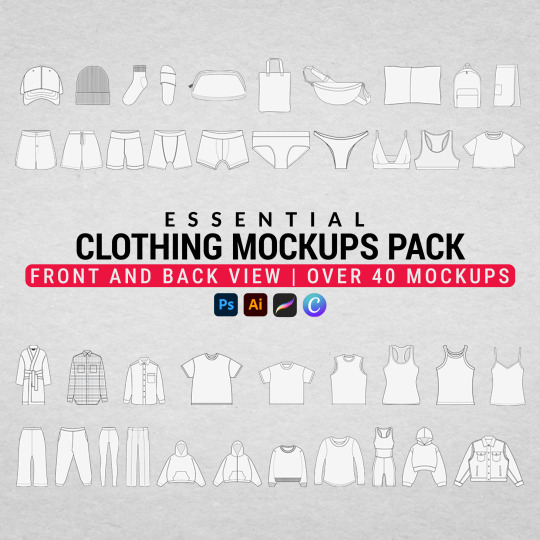
Elevate your designs effortlessly with the Essential Clothing Mockups Pack – your go-to toolkit for stunning, high-quality apparel mockups.
Download now!
#Clothing mockups#essential mockups#fashion mockups#apparel mockups#mockup pack#t-shirt mockups#hoodie mockups#jacket mockups#sweatshirt mockups#polo mockups#high-quality mockups#professional mockups#garment mockup templates#fashion design tools#PSD clothing mockups#editable clothing mockups#custom apparel mockups#printable clothing mockups#fashion branding mockups#mockup essentials#digital clothing mockups#mockups for designers#mockup bundle#fashion templates#athleisure mockups#crewneck mockups#leggings mockup#tote mockups#pillowcase mockups#bralette mockup
1 note
·
View note
Text


Now that I'm finished with the story And the book edit, it's time to put these half scale mockups into action.
Side note: my plan was to make my own book cloth for this one but, as previous posts may indicate, I was having some trouble with such. So I bought some fancy book cloth to ameliorate my fainting couch feelings. But the stuff is TOO fancy. Much thicker than the cloth from Amazon. Thus it doesn't hold a crease or a divot as well. Mockups, while useful for this Deeply complicated build, didn't prepare me for that. It's caused Fucking Problems.
Anyways, I sprayed the edges of my POD text block. POD always yields subpar results but it does allow a lot A LOT more leeway regarding experimentation. I was thinking of just painting the edges but I saw a technique Four Keys Book Arts did with his edges- which was a fucking spray bottle of highly diluted acrylics. It goes against my instincts to add that much moisture but He didn't have page bleed so I thought- It's POD; why not?
No bleed, cousin. Watercolor variation and softness and No Bleed. Fuck. It looks good.
12 notes
·
View notes
Text
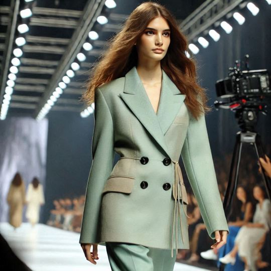
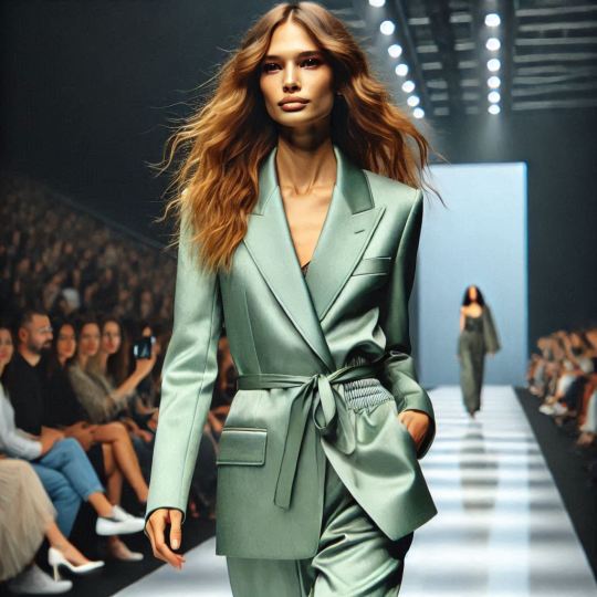
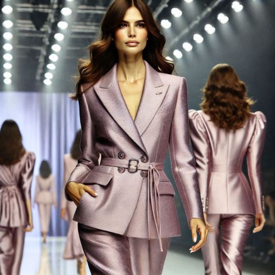
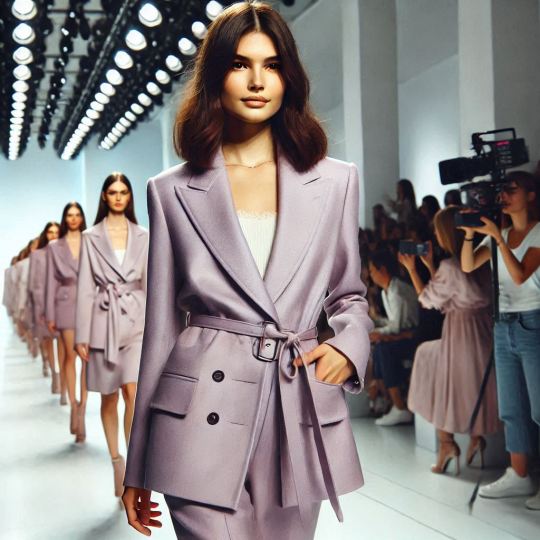
Fashion Runway Styles
Discover the art of clothing mockup, graphic design, photo editing, and image creation with this striking visual masterpiece! From enhancing details to crafting imaginative compositions, this project showcases a seamless blend of creativity and technical expertise. Whether it’s bringing a vision to life, elevating brand aesthetics, or creating visuals that captivate, this work represents the power of design in transforming ordinary images into extraordinary art. Perfect for campaigns, branding, or storytelling, it’s a celebration of innovation and style. Let us help you turn your ideas into stunning visuals! #PhotoManipulation #GraphicDesign #ImageCreation #PhotoEditing #PrintDesign #FloralDesign #DigitalPrints #CreativeDesign #coat #apparel #fashion #mockup
#artificial intelligence#branding#artists on tumblr#fashion#fashion model#high fashion#runway#fashion show#couture#haute couture#coat
4 notes
·
View notes
Text
Recently watched Superman: The Movie (1978) for the first time in well over a decade and it really is a great movie so I got some thoughts that I want to put somewhere before I forget.
The cold open of theater curtains showing a mockup of an old Superman serial featuring Action Comics is a great nod to the character's past. Then the title flying out of the old theater screen is a fantastic visual as well as a good transition to kickstart the credits sequence accompanied by the iconic music
The set design of Krypton is phenomenal; the glowing clothes, the crystalline look, and the streamlined technology feel alien and futuristic in a unique way, although it is a little odd that everything is so white except for Kal-El's baby blanket.
The trial of Zod, Ursa, and Non has the striking combination of visuals that are the trio being held in a spotlight by spinning rings and the stern Kryptonian judges' faces being projected onto the otherwise dark dome surrounding them
Marlon Brando keeps pronouncing it "Kryptin" for some reason. Like when I'm joking about watching "The Batmins"
Genuinely very sad goodbye scene from Kal's parents
Pretty much every wide shot in Kansas is super beautiful
As is the custom, Ma and Pa Kent bring Clark up right. I appreciate the moment where Clark tells Pa about how he gets so mad at bullies that he wants to tear them apart because first off, you can tell from how he says it that he knows it'd be wrong to do that. And second, Pa doesn't yell at him for having those feelings, he tries to help him deal with them.
Clark doesn't just bail on Martha to go find himself, and he makes sure she'll have help on the farm while he's gone
The sequence of the Fortress forming itself has amazing practical effects and editing
Maybe it was because I was watching the Blu Ray version with extra scenes but the abstract montage of crystal Jor-El teaching Clark about the universe and his abilities and giving life lessons ran a little long but it was cool
Clark is very much playing up his meek, clumsy identity but him being Reporter Clark Kent as a person is not totally an act. He makes sure half his paycheck goes to Ma back home because he wants to make sure she's taken care of and he tries to be polite and helpful around the office, which tracks with who he is at his core
I think Lex being a business tycoon/scientist is pretty integral to the character but I don't mind this version's "Napoleon of crime" shtick. I like that Gene Hackman's hair being a wig in-story is hinted at when Otis is poking around the spa and he finds a spare hairpiece
I know everyone knows this already but Christopher Reeves is a perfect casting choice and he does an amazing job at making Clark and Superman superficially different but obviously the same person at heart. Even when he says something a little corny as either one, there's so much sincerity to it
Clark feeling a little guilty about enjoying being a hero is on-brand. I like that Jor-El reflects Johnathan Kent by encouraging him but also giving guidance so he doesn't lose who he is.
The moment of Jor-El saying "I've sent them you. My only son." is veering very close to the common Superman-as-a-Jesus-allegory mistake but it's the only time in the entire movie I remember it doing that, so I can't harp on it too much
Lois is just a force of nature and the only reason Clark can keep up with her as Superman is because she's starstruck
This version of Superman and Lois are down just HORRENDOUS for each other
The flying date scene is great and I think the poorly-aged flying effect is countered by the nighttime background and the chemistry between the characters. That being said, the "can you read my mind" poem is just. What. Why is this
The scene of Lex, Ms. Teschmacher, and Otis attempting to tamper with the nukes and then having to do it again because Otis screwed up is so goofy I forgot they were villains
Great moment when Superman shows he can be intimidating by just staring down Otis.
I like that Superman is saved by Ms Teschmacher because she believes in him which is a surprise to Lex because he only believes in himself
Really great effects in the scenes of the destruction from the San Andreas fault
This shot is underrated

The moments of Superman realizing Lois is dead have so much weight to them and are amazingly shot
I kind of wish they explored the consequences of him "interfering in history" because otherwise it is sort of just a convenient deus ex machina
Everything ends tied up very nicely (except the Zod squad but after two hours, nobody's thinking about that) and sometimes that's all a movie needs
It's astonishing really how much they manage to fit in this movie considering they give a lot of scenes more time than you'd expect
Overall, movie good.
16 notes
·
View notes
Text
How to create a mockup?

Creating a mockup is an essential step in visualizing your designs before they go into production. Whether you're designing t-shirts, posters, websites, or products, mockups help you present your ideas in a realistic and professional way. In this guide, we will walk you through the process of creating stunning mockups that will impress clients and customers alike.
What is a Mockup?
A mockup is a high-fidelity, static representation of a product or design. It gives a realistic preview of how the final product will look in real life. Mockups are commonly used in:
Apparel Design: T-shirt and clothing mockups.
Product Packaging: Boxes, bottles, and labels.
Digital Design: Websites, apps, and social media posts.
Print Design: Posters, business cards, and brochures.
Mockups are an excellent way to visualize designs, gather feedback, and showcase products to clients or on online stores.
Why Use Mockups?
Using mockups offers several benefits, including:
Realistic Presentation: Helps visualize the end product more realistically than flat designs.
Enhanced Marketing: Effective for promoting products on websites and social media.
Client Approval: Makes it easier for clients to understand and approve designs.
Cost-Effective Testing: Allows you to test different designs without incurring production costs.
Types of Mockups
There are various types of mockups, depending on the product you're designing:
Apparel Mockups: T-shirts, hoodies, hats, and other clothing items.
Product Mockups: Mugs, packaging, gadgets, and accessories.
Digital Mockups: Websites, mobile apps, and social media posts.
Print Mockups: Business cards, flyers, posters, and brochures.
For this guide, we will focus on t-shirt mockups, as they are one of the most popular types of product mockups.
How to Create a T-Shirt Mockup?
Creating a t-shirt mockup is easier than you think. Here are the different ways you can do it:
1. Using Online Mockup Generators
Online mockup generators are quick and easy tools for creating professional mockups without the need for advanced design skills. Some popular online mockup generators are:
Placeit
Smartmockups
Media Modifier
Steps:
Choose a Platform: Go to one of the online mockup generators like Placeit or Smartmockups.
Select a T-Shirt Template: Browse through a variety of t-shirt templates, including models, flat-lay, or hanging mockups.
Upload Your Design: Upload your design in PNG format with a transparent background.
Customize: Adjust the color, placement, and size of your design.
Download: Once satisfied, download the mockup in high resolution.
2. Using Graphic Design Software
If you're comfortable using graphic design software, you can create custom mockups with tools like:
Adobe Photoshop
Adobe Illustrator
Affinity Designer
Steps (Using Photoshop):
Download a Mockup Template: Download a PSD mockup template from sites like Freepik, GraphicBurger, or Mockup World.
Open in Photoshop: Open the PSD file in Adobe Photoshop.
Edit Smart Object: Double-click on the Smart Object layer to edit the design.
Insert Your Design: Paste your design into the Smart Object layer and save.
Customize and Export: Adjust the colors, shadows, and lighting for a realistic effect, then export your mockup.
3. Using Canva for Mockups
Canva is an excellent choice for beginners and those who prefer a simpler design process. While Canva doesn’t have built-in mockup tools, you can still create great-looking mockups by:
Using transparent PNGs of your design.
Searching for t-shirt templates or model images on Canva.
Overlaying your design on the t-shirt image.
Steps:
Go to Canva: Open Canva and select a custom canvas size.
Upload Your Design: Upload your transparent PNG design.
Select T-Shirt Template: Search for "T-shirt" or "Apparel" templates in Canva's library.
Overlay and Adjust: Place your design on the t-shirt image and adjust the size and position.
Download: Export the mockup in high resolution.
4. Using Mobile Apps
If you're on the go, you can also create mockups using mobile apps like:
Over (GoDaddy Studio)
PicsArt
Canva Mobile App
These apps provide easy-to-use editing tools, templates, and elements to create quick mockups on your phone.
Tips for Creating Stunning Mockups
High-Resolution Images: Always use high-quality images for realistic results.
Lighting and Shadows: Pay attention to lighting and shadows for a more natural look.
Color Accuracy: Ensure the colors of your design match the final product.
Consistent Branding: Maintain consistent branding elements like logos and colors.
Multiple Angles: Showcase multiple angles for a comprehensive view of the product.
Where to Use Your Mockups?
Once you've created your stunning mockups, you can use them to:
Promote on Social Media: Attract potential buyers on Instagram, Facebook, and Pinterest.
E-commerce Stores: Display realistic product images on Shopify, WooCommerce, or Etsy stores.
Client Presentations: Showcase your designs to clients in a professional manner.
Marketing Materials: Use in ads, lookbooks, and promotional campaigns.
Why Use Mockups for T-Shirt Designs?
Mockups are a game-changer for t-shirt designers because they allow you to:
Visualize Your Design: See how your design looks on different t-shirt styles and colors.
Save Money and Time: Test multiple designs without the cost of physical samples.
Increase Sales: Professional mockups enhance your product presentation, attracting more customers.
Looking for T-Shirt Manufacturers in Chennai?
Ready to bring your t-shirt designs to life? Check out the best T-Shirt Manufacturers in Chennai for premium quality, custom printing, and competitive prices. Whether you're starting your own brand or need custom t-shirts for events, we've got you covered. Contact us today to get started!
Final Thoughts: How to Create a Mockup?
Creating mockups is essential for anyone in the design or retail industry. Whether you're using online tools, professional design software, or mobile apps, mockups help bring your ideas to life in a realistic way.
Choose the method that suits your skill level and needs. Start experimenting today, and take your product presentation to the next level!
0 notes
Text
Custom Baseball Jerseys Made Easy – B1 Apparel’s Seamless Design Process
Introduction: Crafting the Perfect Custom Baseball Jerseys with Ease
Imagine gearing up for a baseball game, your team ready to take on the competition, and everyone is sporting custom jerseys that showcase team spirit, style, and professionalism. Custom jerseys not only create a unified look but also elevate the overall game-day experience. B1 Apparel understands the importance of having high-quality 7v7 football uniforms that reflect your team’s personality and values. Their seamless design process makes it easier than ever for teams to create jerseys that stand out on the field while offering comfort and durability.
In this article, we will explore B1 Apparel’s seamless design process, highlighting how it simplifies the journey from conceptualizing to receiving the perfect custom baseball uniforms. From the first idea to the final product, we’ll guide you through every step to ensure that your jerseys are tailored to meet your team’s specific needs.
The Importance of Custom Baseball Jerseys for Your Team
Custom baseball jerseys are more than just a uniform; they are a statement of team unity, pride, and professionalism. Whether it’s for a little league team, a corporate softball league, or a professional baseball team, having custom jerseys creates a sense of belonging among players. At B1 Apparel, the emphasis is not just on aesthetics but on crafting custom baseball jerseys that combine style, comfort, and durability.
Why Custom Baseball Jerseys Matter
Custom jerseys allow a team to showcase their identity. B1 Apparel offers a range of options to make your jerseys unique, from colors and fonts to logos and team slogans. These jerseys are a canvas for creativity, where every team can express their personality and stand out from the competition. Whether it’s through bold colors or custom designs, your custom baseball jerseys are more than just clothing – they’re a representation of the team’s spirit and dedication.
B1 Apparel’s Seamless Design Process: Making Custom Baseball Jerseys Easy
At B1 Apparel, designing your perfect custom baseball jersey is simple and efficient thanks to their seamless design process. Let’s break it down into the key steps involved in bringing your vision to life:
1. Initial Consultation: Understanding Your Team’s Needs
The process begins with a personalized consultation where B1 Apparel works closely with you to understand your team's needs. Whether you're a coach, team captain, or event organizer, you will discuss the overall vision for your custom baseball jerseys. During this phase, you’ll choose the fabric, color scheme, and style that best represent your team. You’ll also provide any logos, text, or specific design elements that you want to feature on your jerseys.
2. Custom Design Mockups
Once the initial consultation is complete, B1 Apparel’s design team will create detailed mockups of your custom baseball jerseys. These digital mockups give you a visual preview of what your jerseys will look like. You can review the designs, suggest edits, and make adjustments to ensure that the final product matches your vision perfectly. The B1 Apparel team’s goal is to make sure every design choice enhances the jersey’s overall look and functionality.
3. Review and Finalize the Design
After the mockups are ready, you will have the chance to review the designs with your team and make any final adjustments. Whether it’s tweaking the colors, adjusting the placement of the logo, or altering the font style, B1 Apparel is committed to delivering jerseys that match your exact specifications. This stage is about fine-tuning to perfection, ensuring every detail is just right.
4. Quality Material Selection
Once the design is approved, it’s time to choose the materials. B1 Apparel uses premium fabrics that ensure your custom baseball jerseys are not only stylish but also comfortable and durable. The fabric choice is essential for enhancing performance, whether on a hot summer day or during those chilly evening games. Breathable, moisture-wicking fabrics are often selected to help players stay cool and comfortable throughout the game.
5. Production: Bringing Your Custom Baseball Jerseys to Life
With the final design and material selected, B1 Apparel moves to the production phase. Their experienced team takes care of all the details, from cutting and sewing the fabric to adding personalized touches like team names, numbers, and logos. Using state-of-the-art printing and embroidery techniques, B1 Apparel ensures that the designs are flawlessly transferred onto each jersey, resulting in a high-quality finished product.
6. Quality Control and Shipping
Before the jerseys are shipped to you, B1 Apparel performs a thorough quality control check. This ensures that the custom baseball jerseys meet the highest standards of craftsmanship. Once everything is perfect, your jerseys are carefully packaged and shipped directly to you, ready for the big game.
The Benefits of Working with B1 Apparel
Choosing B1 Apparel for your custom baseball jerseys offers a range of benefits, making the design process as smooth as possible:
1. Expert Design Assistance
B1 Apparel’s team of designers is dedicated to helping you create the perfect custom baseball jerseys. Whether you have a clear vision or need some inspiration, they’ll guide you through the design process and ensure that your jerseys are both functional and stylish.
2. High-Quality Materials
The quality of the fabric is paramount, and B1 Apparel uses only the best materials to create custom baseball jerseys that will withstand the wear and tear of the game. Their fabrics are chosen for their durability, comfort, and ability to maintain their shape and color, even after multiple washes.
3. Fast Turnaround Time
With B1 Apparel, you can rest assured that your custom baseball jerseys will be delivered in a timely manner. Their efficient design and production process ensures that you get your jerseys on time, without compromising on quality.
4. Affordable Pricing
Custom jerseys don’t have to break the bank. B1 Apparel offers competitive pricing, ensuring that you get high-quality custom baseball jerseys at an affordable price. With their transparent pricing and no hidden fees, you can budget with confidence.
Why Choose B1 Apparel for Your Custom Baseball Jerseys?
B1 Apparel is the ultimate destination for teams looking to find custom baseball jerseys that are crafted with care, attention to detail, and premium materials. Their seamless design process ensures that every step, from the initial consultation to the final product, is straightforward and stress-free. By working closely with their design team, you can create custom baseball jerseys that perfectly reflect your team’s identity and make you stand out on the field.
Conclusion: Ready to Design Your Custom Baseball Jerseys?
Creating your custom baseball jerseys doesn’t have to be complicated. With B1 Apparel’s seamless design process, you’ll have a high-quality, personalized jersey in no time. Whether you’re looking to boost team morale or stand out in a competitive league, B1 Apparel has you covered. Why wait? Start designing your custom baseball jerseys today and make a statement with your team!
0 notes
Text
craft/textile projects: make reasonable shoe mockups -> knows what i wanna edit and refine but dont know how to start -> wikipedia rabbit hole historical shoes to various kinds of historical clothes -> maybe i should make an easy to finish small winter item like a hood or something-> start looking up pants/overalls patterns instead -> i should make a new phone case actually
drawing projects: drawing wifes fursona -> i want to draw my OCs -> instead of that, start animating danny phantom being summoned in a summoning circle from a fic i am writing but not posting anywhere (lol) -> (contemplate just drawing a comic instead) -> start a different drawing of my wifes fursona
this is how my last and this month been going, but i did finish mending some stuff so thats good
#my life goal is to craft my ideal two or three outfits#and wear those constantly like a cartoon character limited wardrobe
1 note
·
View note
Text
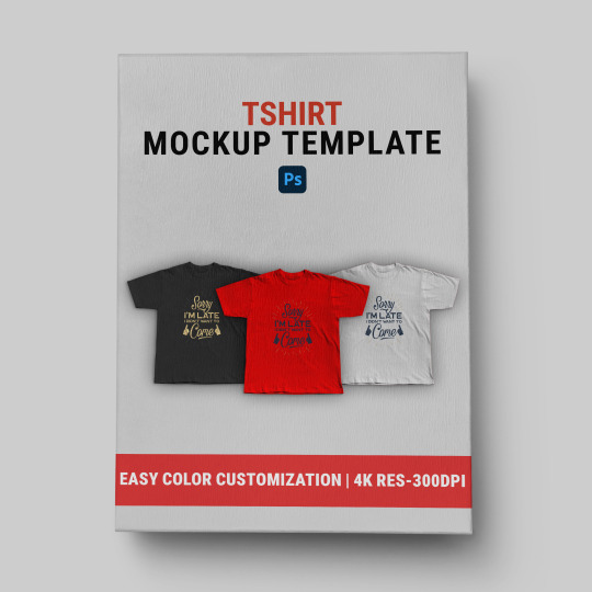
T-Shirt Mockup Template | Tshirt PSD Mockup Design
-
Showcase your T-shirt designs with this premium T-Shirt Mockup Template! This PSD mockup template features high-quality, realistic textures and customizable layers, making it easy to personalize colors, logos, and artwork. Perfect for designers, brands, and marketers looking to present their creations in a professional, polished way.
#Streetwear#T-Shirt#Mockup#Template#PSD#Design#Fashion#Apparel#Clothing#Branding#T-Shirt Mockup#Streetwear Mockup#PSD Mockup Template#Clothing Mockup Design#Apparel Design Template#Custom T-Shirt Mockup#Streetwear T-Shirt Design#Printable T-Shirt Template#Editable PSD Mockup#High-Quality Mockup#Minimal T-Shirt Mockup#Modern Streetwear Template#Oversized T-Shirt Mockup#Blank T-Shirt PSD#Urban Style Mockup#Graphic T-Shirt Template#Trendy Apparel Mockup#White T-Shirt Mockup#Layered PSD Design#Unisex T-Shirt Template.
1 note
·
View note
Text
The Psychology of Caps: What Your Hat Says About You

Caps are more than functional accessories—they’re a canvas for personal expression. Whether it’s a flat-brim snapback or a cozy bucket hat, your choice of headwear reflects aspects of your personality, lifestyle, and identity. In this article, we’ll delve into how different cap styles reveal personality traits and connect these choices to professions, hobbies, and personal branding. Plus, discover how Mockupdaddy’s Cap mockup generator can help you design hats that truly showcase who you are.
The Connection Between Cap Styles and Personality
Flat-Brim Caps: Confident and Trend-Savvy Flat-brim caps are a favorite among urban youth, creatives, and trendsetters. They project confidence and an appreciation for street culture. Those who gravitate toward this style often enjoy expressing individuality through bold patterns and custom designs.Profession and Hobby Insight: Artists, musicians, and gamers often choose flat-brim caps, using them to showcase their personal branding or team affiliations.
Trucker Caps: Down-to-Earth and Adventurous Made iconic by their mesh backs and curved brims, trucker caps often appeal to outdoorsy individuals and hardworking professionals. They suggest a personality that values practicality, comfort, and an authentic connection to nature or community.Profession and Hobby Insight: Farmers, hikers, and small business owners frequently incorporate trucker caps into their attire—sometimes with logos that symbolize their dedication.
Bucket Hats: Playful and Nostalgic Bucket hats have made a comeback, appealing to those with a quirky sense of style. This cap style nods to 90s nostalgia while exuding a carefree and experimental spirit.Profession and Hobby Insight: Popular among festival-goers, photographers, and young fashion enthusiasts, bucket hats are a choice for individuals who embrace spontaneity and fun.

Express Your Identity Through Cap Designs
Caps can transcend style to become powerful tools for self-expression. Personalized designs allow wearers to display their values, affiliations, or creative side. Imagine a flat-brim cap with a bold graffiti-style logo or a trucker cap with a rustic patch that evokes wanderlust.
With Mockupdaddy, you can easily create professional-grade mockups to bring your cap designs to life. Let’s explore how Mockupdaddy empowers designers and brands alike.
Why Mockupdaddy is a Game-Changer for Cap Designers
Custom Cap Mockups for Every Style Whether you’re designing snapbacks, trucker caps, or bucket hats, Mockupdaddy provides a wide range of mockup templates tailored to specific styles. Each template ensures that your design is presented with photorealistic detail, from fabric textures to logo placement.Example: A clothing brand creating a skatewear collection can use Mockupdaddy’s flat-brim cap mockups to visualize their street-style logo in bold colors.
User-Friendly Photoshop Integration Mockupdaddy’s mockups are designed to work seamlessly with Photoshop, enabling quick and easy customization. You can swap colors, add logos, and tweak details without technical hassle, saving time and effort.Example: An apparel designer launching a new line of eco-friendly hats can preview multiple color palettes and design placements before committing to production.
High-Quality Snapback Cap Mockups for Marketing Need a polished look for your e-commerce site or social media campaign? Mockupdaddy’s high-resolution templates ensure your products stand out. Use them to create stunning visuals that resonate with your target audience.Example: A startup can showcase their branded trucker caps in lifestyle settings, enhancing their marketing campaigns with professional-grade imagery.

Why Choose Mockupdaddy?
Variety: From flat brims to bucket hats, find templates for every cap style.
Realism: Mockupdaddy’s attention to detail ensures every mockup feels like the real product.
Efficiency: Streamlined tools for quick edits make it accessible for beginners and pros alike.
Support: Expert resources and customer support help you achieve your design goals effortlessly.
About Mockupdaddy
Mockupdaddy is a leading provider of professional-grade mockup templates for apparel designers and brands. With a mission to simplify the design process and elevate creativity, Mockupdaddy has helped countless individuals and businesses visualize their products before production. Whether you’re creating custom caps for a niche audience or scaling a global fashion brand, Mockupdaddy ensures your designs are always a step ahead.
Ready to Design Your Perfect Cap?
Your cap is your canvas. Use Mockupdaddy’s customizable mockups to create designs that capture your unique style and personality. Start today and bring your creative vision to life!
Explore Mockupdaddy’s vast collection of cap mockups and make your designs stand out.
0 notes
Text
Hoodie Mockup PSD Free Showcase Your Clothing Designs
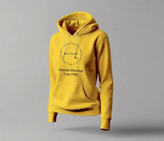
Hoodie mockup PSD free to showcase your clothing designs. Create realistic presentations with easy-to-edit mockup. Perfect for apparel brands.
Click on the link to download this Mockup:
Hoodie Mockup PSD Free Showcase Your Clothing Designs
#HoodieMockup#FreeHoodieMockup#ClothingDesigns#PSDMockup#FreePSDMockup#ApparelMockup#HoodieDesign#MockupFreeDownload#GraphicDesign#FashionMockup#ClothingBrand#MockupTemplate#CustomApparel#DigitalMockup#FreebieMockup#aiimageediting#backgroundremovertool
0 notes
Text


Fashion and Styles Embroidered dress's
Discover the art of clothing mockup, graphic design, photo editing, and image creation with this striking visual masterpiece! From enhancing details to crafting imaginative compositions, this project showcases a seamless blend of creativity and technical expertise. Whether it’s bringing a vision to life, elevating brand aesthetics, or creating visuals that captivate, this work represents the power of design in transforming ordinary images into extraordinary art. Perfect for campaigns, branding, or storytelling, it’s a celebration of innovation and style. Let us help you turn your ideas into stunning visuals! #PhotoManipulation #GraphicDesign #ImageCreation #PhotoEditing #PrintDesign #FloralDesign #DigitalPrints #CreativeDesign #coat #apparel #fashion #mockup
#artificial intelligence#branding#artists on tumblr#fashion#fashion model#high fashion#black fashion#runway#animation#embroidery
4 notes
·
View notes
Text
I Suffer from a Cruise T-Shirt

I Suffer From A Condition Called Obsessive colorful Graphic T-Shirt Design. Cruise T-Shirt Design. Design For T-Shirt, Banner, Poster, Background, Hoodie, Mug, Cap, Sticker, Etc
———— You Will Get: 📁 1 PNG Files (print-ready file 4500×5400-300 dpi) 📁 1 EPS Files 📁 1 SVG Files 📁 1 Mockup ———– All the files are neatly arranged. You can use them easily. Main file description:
– Easy to modify, resize and change color. – Made with 100% vector shapes resizable. – Ready for a printed t-shirt, mug, hoodie, clothing, etc. – Editable Vector Files EPS 10, and SVG. – High-quality PNG transparent file with 300 dpi. ———– ✔️The Design files can be used for:
– T-shirt – Mug – Hoodies – Sticker – Poster Cards – Clothes printing – Phone Cover – Bag – Invitation Design _ Sticker and & anything else you can imagine!
#design#t shirt design#black and white#fashion#fantasy#artwork#digital art#digital printing#digital products
0 notes
Text
How to Select the Best Material for Your Book Cover Project
1. What can I use to cover my schoolbooks?
When considering materials to cover schoolbooks, several options are available that effectively protect and preserve the integrity of the texts. Plastic book covers offer durability and water resistance, making them ideal for everyday use. Brown paper bags can serve as a cost-effective and environmentally friendly alternative, allowing for customization and creativity. For a more polished look, adhesive vinyl or clear contact paper provides a sleek finish while safeguarding against wear and tear. Additionally, fabric covers can be both aesthetically pleasing and functional, providing cushioning and flexibility. Selecting the appropriate covering material ensures the longevity of schoolbooks throughout the academic year.
2. What material should I use for a book cover?
When selecting material for a book cover, consider durability, aesthetic appeal, and the intended market. Common options include cardstock, which provides a sturdy yet flexible surface ideal for paperback covers, and cloth or leather for hardcover editions, imparting a classic and sophisticated look. Laminated finishes enhance durability and resistance to wear, while matte or glossy coatings can influence visual impact. Additionally, consider eco-friendly materials, such as recycled paper, to appeal to environmentally conscious readers. Ultimately, the choice of material should align with the book's genre, target audience, and overall design concept to create an engaging and lasting impression.
3. What is a 3D book mockup?
A 3D book mock-up is a digital representation that showcases a book's design in a three-dimensional format, allowing authors, publishers, and marketers to visualize how the final product will appear. These mock-ups typically feature realistic textures, lighting, and shadows, enhancing the visual appeal and providing a tangible sense of the book's physical presence. By using 3D book mock-ups, creators can effectively present their work for promotional purposes, including social media marketing, website displays, and print advertisements. This tool not only aids in visual storytelling but also helps in gathering feedback and making informed design decisions before the actual printing process.
4. Can you print an eBook?
Printing an eBook is certainly feasible, but it requires careful consideration of several key factors. Foremost among these is the issue of copyright compliance. Many eBooks are protected under intellectual property laws, and unauthorized printing could lead to legal ramifications. Therefore, readers must first verify whether they have the rights to print the content. If permission is granted, users have the option to print individual pages or convert the eBook into a printable format, such as a PDF. However, it is important to note that the conversion process may not always be straightforward; formatting issues can arise, potentially altering the original layout and design of the text. This can detract from the reading experience, especially if the eBook contains intricate formatting, images, or specialized fonts.
Moreover, it is essential to recognize that printing an eBook can strip away many of the interactive features that are integral to the digital experience. For instance, elements such as hyperlinks, multimedia content, and dynamic navigation tools are typically lost in a static print format. This not only limits the reader's engagement with the material but also reduces the potential for a more immersive experience that eBooks can offer. Ultimately, while the option to print an eBook exists, individuals must carefully weigh the advantages of having a physical copy against the inherent limitations of the printed format. In many cases, the value of retaining digital interactivity may outweigh the tangible benefits of printed pages.
5. How do you layout a book cover?
Designing a book cover requires a strategic approach to layout that captures the essence of the content while appealing to the target audience. Begin by establishing a clear hierarchy, placing the title prominently to ensure it is easily readable from a distance. Complement the title with the author's name, typically positioned at the bottom or top, depending on design preferences. Incorporate relevant imagery that resonates with the book’s theme, ensuring it does not overshadow the text. Utilize a cohesive color palette and typography that reflects the genre, while maintaining balance and visual harmony. Lastly, consider the spine and back cover for a complete presentation.
0 notes
Text
Mockup with girl in summer cotton dress, procreate, photoshop , editable, kids clothing, children's wear, child fashion,
You will receive: – 1 x layered .psd file for use in Photoshop – 1 x layered .procreate file for use in Procreate – 1 x PDF with instructions DIGITAL DOWNLOAD ONLY – NO PHYSICAL ITEM WILL BE SHIPPED – Cotton dress mockup – Perfect for listing photos and promotional material TERMS OF USE: – You can use these files for personal or commercial use – promotional material for your shop, social media…

View On WordPress
0 notes
Text
Online Video Editing - 3D Hoodie Video mockups Chipm World exclusive dropship theme
Get ready to stand out with our 3D hoodie featuring animated graphics inspired by the popular Apes movie - perfect for Instagram, Facebook, and TikTok with our text animation and clothing brand design.
#design#digital art#tshirt design#tshirt template#videodesign#dakwah tshirt design#muslim tshirt design#tshirt#templates#videotemplates#video#youtube video#my video#video games
0 notes
Note
Have you played PuyoPuyo 7? If so, what do you think about it?
good timing anon, i actually replayed it pretty recently with a friend of mine (wanted to play the recent re-translation, very much recommend it, its much better than Nexus's halfhearted mess) so my opinions on it are fresh!!
the short answer is. Its so jank. and probably objectively not a very good game, and there are definitely things i would change about it if i could. But i still really like it for what it is. It's got a unique identity in the series and I love that about it!
im gonna talk a lot now so under the readmore this goes ^_^
i love that transformation mode is just if fever rules were an insane mess. why does it go up to 99 seconds. why does mega mode send SO much damage. god bless it<3 they should bring it back. wanna see what hellfire comet festivals shibakazu would cook up in it.
and like the story is.... not. well paced. but ive learned to laugh about it at least. and like suuuuuure ecolo shows up at the end and then hypes up how unstoppably powerful they are and how ringo could NEVER BEAT THEM and then gets defeated in 10 seconds because the final boss is a joke. its fine<3 at least its actually fun to play and doesnt take a million years to trudge through so the bad pacing doesnt feel nearly as awful. (puyo chronicle i am giving you a little glare)
ive grown to love the jank art style but i will say, i wish they redrew everyone. ringo standing next to characters clearly just with sprites edited from 15th anniversary or fever 2 make her stick out quite a bit. it makes me wonder if the game's art was really rushed or something? it just feels a bit off.
another thing, i dont think this game is a Bad introduction to ecolo at all (i Love their design in this game and i think it perfectly introduces how intensely powerful and unhinged they can be), BUT!!! their chain animations are really... disappointing. idk. i Like that they shapeshift into other characters i think thats fun (i actually think its kind of a shame its a trait of theirs rarely brought up anymore) but the fact its mostly just the others' animations recolored black with some extra particle effects is really lame. minor differences like a more ecolo-like facial expression (get silly!! get mischievous!!!) couldve gone a long way to giving them more personality in their chains.
also relating to the past two notes, its really no secret that transformation mode is... Missing. Quite a bit of assets it really should have. considering a decent handful of characters only go through very minor changes (darkle is literally just a clothing color swap) and honestly Ecolo (since all of their chains are borrowed) still only changing to feli for mini and klug for mega is SUCKS i think and it makes me the most upset out of the cast.. ecolo's already transforming when they're not in fever!!!!! lets do something else!!!!!
this is just a reaaally quick mockup scribble of an idea i had that id been discussing with my friend, but i think it'd be really fun if instead of doing a simple character shapeshift, they got real small and silly looking for their mini form and HUGE AND OVERBEARING AND INTIMIDATING for mega. the core would stay the same size, for scale! pp7 is the game that leans the hardest into ecolo being someone who can switch from silly little thang to terrifying cosmic being of sheer force on a dime, and i think itd be fun if their transformations reflected that.
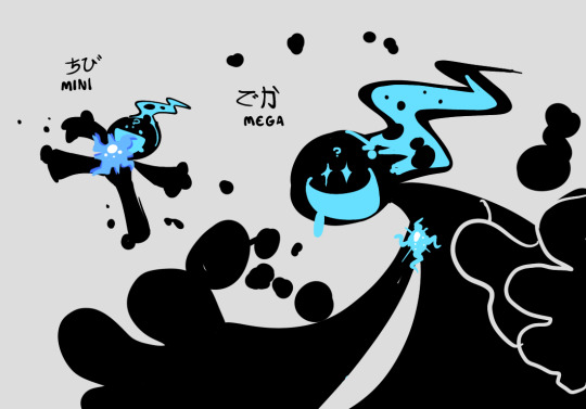
like idk ecolo is the Debut final boss and (imo) one of the coolest characters in the series so i think it sucks that they got the short end of the stick in the battle animations area in this game.
like ive been saying I've grown to love many of Puyo 7's problems but this is one thing i would definitely change if i could.
#i love puyopuyo can you tell by the way i talk about things id change when i talk about it half the time#bri talks#also tasty tunes i did not mention that in the ramble its good music thank you hideki abe as always#transformation theme is one of my favs ever i think#i haventtttt gotten a chance to get my hands on the pp7 ost cd yet BUT SOMEDAY... SOMEDAY........#bri thoughts
7 notes
·
View notes