My name is Dorothy I am a graduate of Full Sail University in Computer Animation and currently attending my masters at Full Sail. In the near future I hope to become an Disney Imagineer. The most I do in a day anymore is work, brush up my art reels, wedding plan, attend college online and get things ready for our first little on coming in July. Personal Brand to come: Currently Under Construction.
Don't wanna be here? Send us removal request.
Text
Month 11 Mastery Journal


Here is my Thesis Site:
https://markhammayhem.wixsite.com/thesis-presentation

0 notes
Photo


(The only reason I did not add photo’s of the projects was due to the fact it would be the same things that were posted last month)
0 notes
Text
Mastery Journal Month 09 part 02
In part 01 of this, I showed you the Northern Lights version. Where I am trying to reach the demographic crowd of those who love the mystic, wonder, and magic that the lights have. The next promo cut was to reach those that have a love for history and not just that Vikings!

I was looking for a mid-evil feel, something ancient to bring to life. I believe the video made is just what I was looking for. I sure know that creating it was fun and it’s far from over I plan on working a few things in it to build it up more.

It starts off blank and a burn effect is taking place.

And as the effect travels on the camera is moving and the sounds grow. Telling a story and connecting with the viewers on another level. Making them feel they too can walk with Vikings.
0 notes
Text
Mastery Journal Month 09
This past month I started out with my re-imaged video with every intent to move forward and create a longer video submission promo cut. But as everyone knows things change. With this change, the idea formed to not just target one audience, but many. So, the longer version got put on the back burner for now.

This is the still image of my opening re-imaged promotional add for Reykjavik, Iceland...and looking at this I know I must go back and correct the spelling. As an artist, we are not perfect, we drive ourselves to the brink of insanity for our work and we overlook things. The only thing that matters is we find them before its complete and put to print.

I wanted to bring to life the effect and felling of the northern lights. Personlly, I feel this amount of magic seeing them, but so do many others i found out through research.

I wanted to bring other attractions about the land to the video.
0 notes
Text
Design Integration MFA


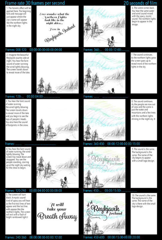
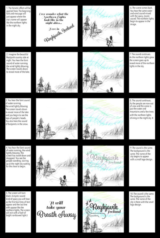
Here are the storyboards that I had designed in the original design that has been changed.

A few classes back this was the MoodBoard that was designed and set the mood. The images below are still shots of my video. Not the original one, but the revised version.


0 notes
Photo

This was the first round of storyboards focusing on the idea of what I was trying to achieve like what the story was going to be. The images start in the top left-hand corner and go down then to the next column.

The next round of storyboards focusing on the idea of what I was trying to achieve in time wise. The design might be down perfect, but if the timing is off the design does not work right. The images start in the top left-hand corner and go down then to the next column.
0 notes
Text
MFA Month 05 (Part 02)
I am still trying to upload the images of my work for MFA Month 05, but it comes up an error.
0 notes
Text
Mastery Journal month 03
I enjoyed this class although I had some personal issues that I had to overcome, which I did. Things are looking better and going more smoothly. Sometimes I forget how fast paced these classes are compared to other colleges.
What projected events on your timeline did you achieve this month?
This month had its challenges, some that I overcame and some that I still struggle with. My writing in APA format proves to be a big challenge for myself still to this day. There are days I feel I do understand it and still get told I am not writing in APA format. Last month I had issues connecting with the writing, finding my passion for the project that I was doing. Eventually, I got the hang of that by changing the topic of interest to something that I can connect with on a daily life.
I believe I am understanding the idea of interactive infographic on a higher level that I believe if giving the chance to let go and create my own on a topic of choice within reason, I just maybe able to accomplish it. Golding, M. (2013) states, “In an infographic your graphics must tell the story for you. It must be clear by looking at it, because you aren't there to explain it to the intended audience. In other words, you have to make sure that your infographic is what's telling the story, not the other way around.” I had to keep this in mind while figuring out my layout for our final project, because I realize there is text but sometimes the viewers just want to look and not read. This is another that stood out to me, “Before you choose colors and fonts, decide what cool charts or graphics to use, the most important part of creating an infographic is deciding what story it will tell. It's also the most difficult part. Why? Well, you've heard the phrase a picture speaks a thousand words. Images and graphics tell a story. The challenge with infographics is that they usually contain multiple images and graphics and you have to make sure that they all work together to tell the same story.” This can be challenging to obtain. When you are first learning design of layout and all, I would suggest you take random pictures and try to meme them. Find a text and placement that works well for the picture and in a few simple words try to get others to understand the story. With both of these quotes in my mind I set forth action and hoped I achieved my final goal for this month’s class.
I mostly enjoyed our first week’s project. I never thought to add a background texture in my main font to blend into the wall semi, until a fellow classmate suggested it to me. I found the quote Saltz says, “Color can also be used to link or connect similar elements” to be something any designer should follow, because it is true. Color does a lot for the human eye and one has to remember that color is represented differently in some cultures. So, when taking into effect where and who the viewer is research the color meanings it will save you a major headache.
Going forward with this yearlong journey, what adjustments could you make to ensure your future success in achieving mastery?
Moving forward, there are definitely things that I need to adjustment that I could do to ensure my future success in achieving mastery. One thing would be, to avoid getting upset when I have to use a program that I really do not understand. I have to learn more than just what my comfort zone is. I doubted myself in many ways when it comes to some programs. I have even come to tell myself a few times I am a fool, but deep down I know this not to be true. I am not a fool for wanting to follow my dreams, because I am than so is every person out there that has dreamed.
I am far from anywhere being a master and truly never believe I will for one simple fact. The term master means to know all in so many words. Well, in my field the job is never complete there is always something that could be changed or done to make the project better. So, if that’s the case how can one classify as a master. In my eyes the answer is never. With that said I will continue to push myself to stop doubting my own work and thinking I am not worthy and push myself to never accept anything but 110%.
The programs that prove to be challenging there can be simple fix. I simple need to learn to take time out of my days to do more research on sites like youtube, Lynda and etc. I maybe an animation student, but I am far from tech savvy. This past month I believe pushed my mind to learn more in the design elements than what I have in the past, but that is what I need I believe something to push my skills to a next level.

This was something from my first weeks project that I am very proud of.

This is a screenshot of a break down step I was doing for the final project.

Here is a screenshot of the program keynote that the final project was created in.

Here is a screenshot of the clips for sound.
Thank you,
Dorothy M.
References
Golding, M. (2013). Creating Infographics with Illustrator. Retrieved March 06, 2017, from https://www.lynda.com/Illustrator-tutorials/Welcome/119011/124737-4.html?org=fullsail.edu
Saltz, I. (2013, October 25).Foundations of typography: color, contrast, and scale[Video file]. Retrieved from https://www.lynda.com/ Design-tutorials/Foundations-Typography-Color-Contrast-Scale/133328-2.html
1 note
·
View note
Text
Learning Engagement Discussion’s
This class…was interesting to say the least. There were moments that I know I should have done better, but programs can be troublesome when not known. Looking at the descriptions of all the classes to come; I cannot even imagine what the entail. I can only hope I pull through hassle free. I thank thins months’ teacher for giving us an assignment with a follow through video, because the program was unknown to me and without I would have been in trouble indeed. However, I had one minor issue…the theme. I am far from someone that knows or has any interest in WW1. With that said I do believe I have the understanding to Adobe Illustrator now.
When I first made my Mastery Journal I said from the start…I did not like it. Tumblr and myself have a past and it’s not a good one. Which is why I choose not to use it for the most part. Aside from the fact I have never held a journal at all in my life, because I do not like writing how I feel about things or just simply never have the time to. I am being 100% honest when I say I am sorry if you want more out of my tumblr and never see it. With that said, I did learn a number of things in this class that will prove to help me in my future… Like I am working on in spare time an infographic style gender revel for next Friday when we find out the sex of our little peanut!
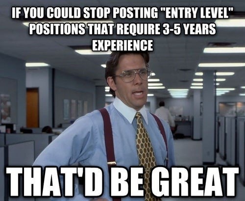
I have to learn to say no to my day job. I am running myself so thin that I can barely focus on anything. I get up early go to work till late and so on. I’ve realized that my brain is so tired. I’m being over worked and underpaid by a landslide. I’m paid the basic hiring price while during a manager’s job. I need to learn to stand up and say what needs to be said at work so I can come home and get my school work done how it needs to be and take care of myself, because of the little one. Stress is not good. This job is also not my future… my degree is. So, this image says what is on my mind….

0 notes
Text
Inspiration
Remember Randy Pausch said in his speech “The Last Lecture” that we should live life every day like a Tiger, fun and filled with joy. Because we never know what the next day holds for us.

0 notes


