#double height window
Explore tagged Tumblr posts
Photo

Siding - Exterior Mid-sized minimalist brown two-story mixed siding exterior home photo with a white roof
#exterior walkway#double height window#flat roof#wrap around deck#modern architecture#modern deck#bay area modern
2 notes
·
View notes
Photo

Modern Exterior - Exterior Idea for a medium-sized, contemporary brown, two-story home with white siding on the roof.
#floor-to-ceiling windows ideas#double height window#siding#board-formed concrete walls#steel guardrail#modern exterior#bay area modern
0 notes
Photo

Open in New York Huge transitional open concept living room photo with beige walls
#living room#double height window#dark wood coffee table#open#beamed ceiling#elegant but comfortable
0 notes
Text

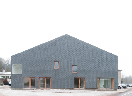
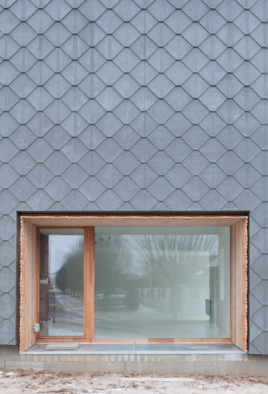
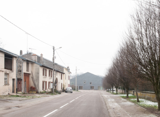
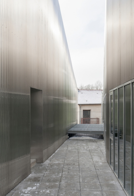

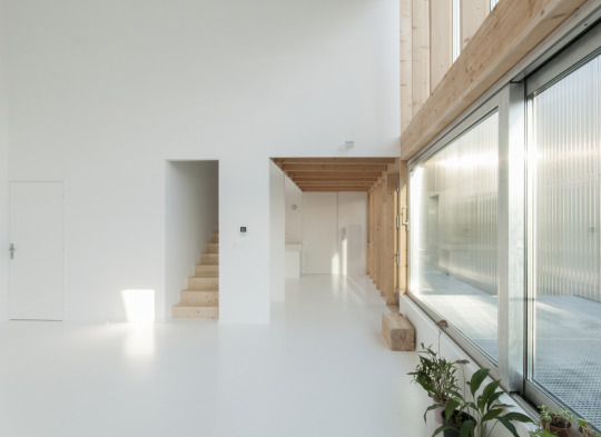
House in Velle-sur-Moselle, France - GENS
#GENS#architecture#design#building#modern architecture#interiors#minimal#house#house design#contemporary home decor#polycarbonate sheets#windows#light#village#france#french architecture#cool homes#living room#balcony#double height
98 notes
·
View notes
Photo
Something about a double height space and filling it with natural light using windows.


Industrial residential kitchen - double height space with black frame window goes well with wood cabinets & white painted brick walls
2K notes
·
View notes
Text
we've found it folks: mcmansion heaven
Hello everyone. It is my pleasure to bring you the greatest house I have ever seen. The house of a true visionary. A real ad-hocist. A genuine pioneer of fenestration. This house is in Alabama. It was built in 1980 and costs around $5 million. It is worth every penny. Perhaps more.
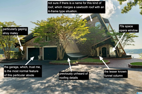
Now, I know what you're thinking: "Come on, Kate, that's a little kooky, but certainly it's not McMansion Heaven. This is very much a house in the earthly realm. Purgatory. McMansion Purgatory." Well, let me now play Beatrice to your Dante, young Pilgrim. Welcome. Welcome, welcome, welcome.
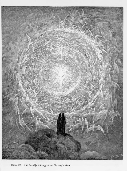
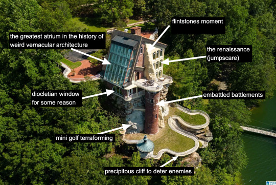
It is rare to find a house that has everything. A house that wills itself into Postmodernism yet remains unable to let go of the kookiest moments of the prior zeitgeist, the Bruce Goffs and Earthships, the commune houses built from car windshields, the seventies moments of psychedelic hippie fracture. It is everything. It has everything. It is theme park, it is High Tech. It is Renaissance (in the San Antonio Riverwalk sense of the word.) It is medieval. It is maybe the greatest pastiche to sucker itself to the side of a mountain, perilously overlooking a large body of water. Look at it. Just look.
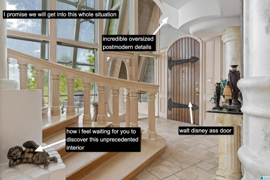
The inside is white. This makes it dreamlike, almost benevolent. It is bright because this is McMansion Heaven and Gray is for McMansion Hell. There is an overbearing sheen of 80s optimism. In this house, the credit default swap has not yet been invented, but could be.
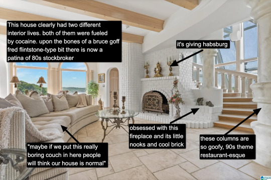
It takes a lot for me to drop the cocaine word because I think it's a cheap joke. But there's something about this example that makes it plausible, not in a derogatory way, but in a liberatory one, a sensuous one. Someone created this house to have a particular experience, a particular feeling. It possesses an element of true fantasy, the thematic. Its rooms are not meant to be one cohesive composition, but rather a series of scenes, of vastly different spatial moments, compressed, expanded, bright, close.
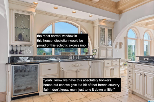
And then there's this kitchen for some reason. Or so you think. Everything the interior design tries to hide, namely how unceasingly peculiar the house is, it is not entirely able to because the choices made here remain decadent, indulgent, albeit in a more familiar way.

Rare is it to discover an interior wherein one truly must wear sunglasses. The environment created in service to transparency has to somewhat prevent the elements from penetrating too deep while retaining their desirable qualities. I don't think an architect designed this house. An architect would have had access to specifically engineered products for this purpose. Whoever built this house had certain access to architectural catalogues but not those used in the highest end or most structurally complex projects. The customization here lies in the assemblage of materials and in doing so stretches them to the height of their imaginative capacity. To borrow from Charles Jencks, ad-hoc is a perfect description. It is an architecture of availability and of adventure.
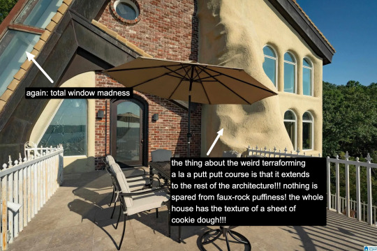
A small interlude. We are outside. There is no rear exterior view of this house because it would be impossible to get one from the scrawny lawn that lies at its depths. This space is intended to serve the same purpose, which is to look upon the house itself as much as gaze from the house to the world beyond.
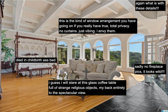
Living in a city, I often think about exhibitionism. Living in a city is inherently exhibitionist. A house is a permeable visible surface; it is entirely possible that someone will catch a glimpse of me they're not supposed to when I rush to the living room in only a t-shirt to turn out the light before bed. But this is a space that is only exhibitionist in the sense that it is an architecture of exposure, and yet this exposure would not be possible without the protection of the site, of the distance from every other pair of eyes. In this respect, a double freedom is secured. The window intimates the potential of seeing. But no one sees.
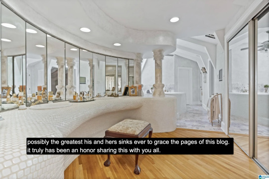
At the heart of this house lies a strange mix of concepts. Postmodern classicist columns of the Disney World set. The unpolished edge of the vernacular. There is also an organicist bent to the whole thing, something more Goff than Gaudí, and here we see some of the house's most organic forms, the monolith- or shell-like vanity mixed with the luminous artifice of mirrors and white. A backlit cave, primitive and performative at the same time, which is, in essence, the dialectic of the luxury bathroom.
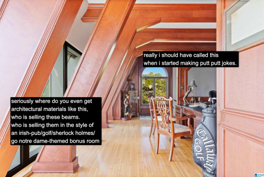
And yet our McMansion Heaven is still a McMansion. It is still an accumulation of deliberate signifiers of wealth, very much a construction with the secondary purpose of invoking envy, a palatial residence designed without much cohesion. The presence of golf, of wood, of masculine and patriarchal symbolism with an undercurrent of luxury drives that point home. The McMansion can aspire to an art form, but there are still many levels to ascend before one gets to where God's sitting.
If you like this post and want more like it, support McMansion Hell on Patreon for as little as $1/month for access to great bonus content including a discord server, extra posts, and livestreams.
Not into recurring payments? Try the tip jar! Student loans just started back up!
43K notes
·
View notes
Text
this game is such an embarrassment from a technical standpoint atp I've probably played less than an hours worth of content but it's taken up my entire day from troubleshooting my way around the crashing that kept happening in the bowling alley after maybe 2 minutes & messing with optimization settings both in game and out game on my computer itself & following youtube tutorials & reading steam forum threads & attempting to power through the lag like "ok the bowling alley wasn't too bad after I got past the crash maybe once I leave the bar it'll improve" only for the scene after that to also be unbearable where I havent even hid the bottle cap yet. like maybe my graphics card isnt as good as it should be idk enough about this shit to know how to compare it to their recommendations but all my other specs are more than good enough & there's no way the graphics card alone could make it be THAT bad when I've literally never had anywhere near this many issues with any other game. it's honestly so pathetic they could release something like this & call it finished & charge so damn much. how the fuck do i get this to be playable girl help??
#i feel so bad for the people from a few days shy of a month ago now in these threads posting about the same crashing & error messages im#getting like hopefully theres a patch soon! like clearly there still isnt bcus the same exact shit is happening. imagining paying extra for#early access & then having all of this shit happen i would be on the news if that happened to me#anyone have ANYTHING that worked for them with this shit ive uninstalled & reinstalled made sure my drivers were updated ive put it into a#window view at a 900px height resolution w all the lowest video settings & it still sucks shit#life is strange#life is strange double exposure#texticles
1 note
·
View note
Text
Simon Riley adopting a stray cat, a lot like him. They co-exist like housemates, the odd scratch on the black cat’s head as Simon fills his pet bowl, but they mostly keep to themselves.
Just calls him Cat. Simon talking to him like he would Johnny.
When he’s on a long tour he’s get the old lady next door to feed him, hands the cat over before he leaves and doesn’t look back knowing the old dear will over indulge him.
But when he comes back from his latest mission, Cat smells different and there’s a little silver collar around its neck. The rough patch of fur by the side of its neck is smoothed out, he doesn’t know how it’s fixed itself.
No the old lady smells of mint and antiseptic, like she swallows tcp on the daily. This is sweet and heady, he’s not quite sure how to explain it. He can’t quite get rid of it, it’s how he finds out that Cat sleeps on his pillow.
It’s not till Simon spots you on the neighbouring balcony stroking the cat on the brick wall. The little traitor. He really needs to get a divider now that the flat has someone living it in now.
A few days later the old lady tells him she had to ask you to look after Cat whilst she was in hospital for five weeks, only just getting out a few days before he returned. She warns him that you’re forever in your night clothes and work from home.
So Simon’s knocking on your door not long after, standing back as you peeked through the gap of the door as you opened it. A sliver of a chain stopping you from opening it wide.
“Simon Riley.” He points to his flat. Your door closing and jingle of the chain sliding off its guard, opening it up for him to enter.
You leave the door wide open, a soft hello leaving your glossy lips.
He enters your small studio flat, looks like the landlord divided the previous one to make two small ones and double their profit. That floral and heady scent hits him as he steps over the threshold, leaving a trail behind you. Your body is shimmery, smooth looking and he tries not to look at your long legs on display. The small silk night dress and matching dress robe not leaving much for his imagination.
A meow pulls him away. Cat, the fucking little traitor, is stretched out on your bed playing with a fuzzy fish toy.
He realises that Cat is totally different around you. Apparently he doesn’t like heights, but he’ll climb all over Simon’s shelves and the top of doors, push stuff off. No the little fucker doesn’t knock off the little piles of girl stuff in bowls or the many trinkets on the sides in your flat. Content to play with the little fuzzy fish toy or nap on the blanket.
“I hope you don’t mind, he’s been visiting me ever since Mrs landry asked me to look after him.” You sit down on the bed, which is right by the patio window and the balcony. Simon thinks how’s his bed is on the other side of that wall.
“Nah, actually gotta proposition for ya.”
You looking after Cat whilst he’s away and him slowly starting to looking after you when he’s home.
[masterlist] > [part two]
#cod x reader#cod fanfic#cod fanfiction#cod mw2 x reader#simon ghost x reader#simon riley x reader#call of duty x reader#simon riley x female reader#simon riley x you#simon ghost riley x you#cod mw2 fanfic#cod x female reader#cod x fem!reader#cod x you#simon riley fanfic#simon ghost riley x reader#simon ghost riley fanfiction#call of duty x female reader#call of duty fic#call of duty x you#call of duty fanfic#cod headcanons#cod fic#cod fluff
4K notes
·
View notes
Text
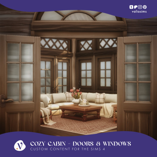
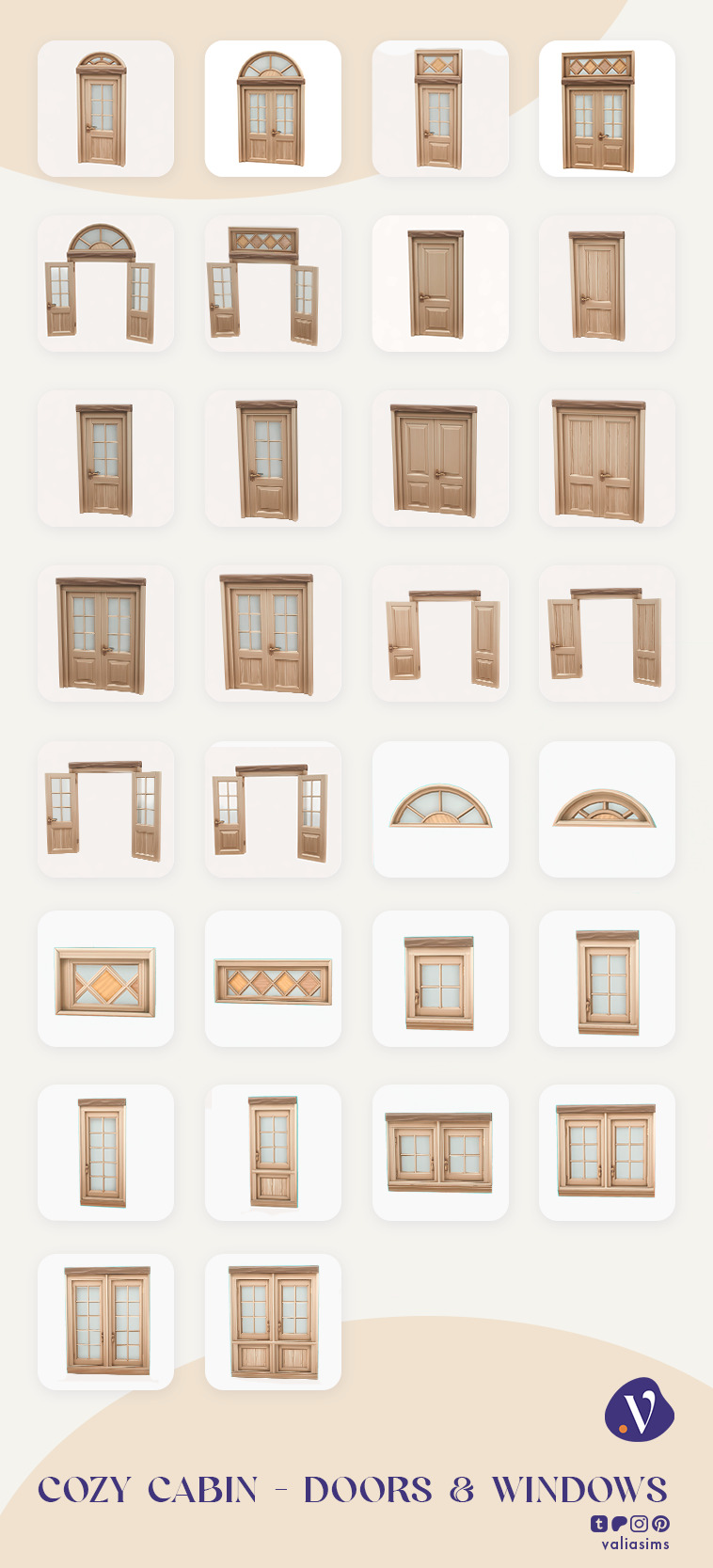
Cozy Cabin Collection - Doors & Windows
Hey everyone!
Here is the next part of the Cozy Cabin Collection which includes windows and doors. I wanted to add some curtains too as you could see in the wip posts but there were some problems I couldn't solve and I had to leave for visit my family so I will add them to the next part which will be the bedroom set. Let me tell you, this set barely came together in time and I pulled an all nighter to finish the objects so if there are any errors with them, please let me know!
Although this set not being that exciting, I wanted the make it to complete the cabin collection because as I was furnishing the rooms for the previous sets I couldn't find the perfect stylish, cabin windows I wanted. For months I was planning to make them but always run out of time. This time they were the priority but don't worry, next time I'm making the bedroom and I want to add some clutter items as well.
This set will come two main designs of doors, they are similar but one is a little more rustic, the other is more elegant. As I said earlier I had to combine the doors with the upper windows because they have a different shader than the windows. This means all glass doors come in short and medium heights.
The windows I separated so you can combine them and use 2 types of accent windows above the regular ones. This way there are a lot of combinations because I made 3 heights and 2 widths of the windows.
I hope you'll like them and again, let me know if you notice any problem, because I was a little tired when I was finishing them. I will be back next week and I'm gonna start on the bedroom set so new wip posts will come soon!
The Set Includes
Rustic Glass Double Door, Medium
Rustic Glass Double Door Medium - Opened
Rustic Glass Door Medium
Rustic Glass Door Short
Rustic Glass Door Short - Opened
Rustic Double Door Short
Rustic Double Door Short - Opened
Rustic Interior Door Short
Glass Double Door Medium
Glass Double Door Medium - Opened
Glass Door Medium
Glass Double Door Short
Glass Double Door Short - Opened
Double Door Short
Double Door Short - Opened
Interior Door Short
Small Window
Small Double Window
Short Window
Short Double Window
Paneled Window
Paneled Double Window
Full Glass Window
Full Double Window
-DOWNLOAD HERE- Public release on the 15th of February 6PM CST
#ts4cc#ts4 maxis match#maxis match#the sims 4 cc#the sims 4 custom content#ts4ccfinds#sims 4 cc#cc#the sims cc#cc finds#sims 4#ts4 cc#ts4 custom objects#valia#valiasims#cc download#sims4 download#ts4 download
3K notes
·
View notes
Text
Enclosed Family Room New York
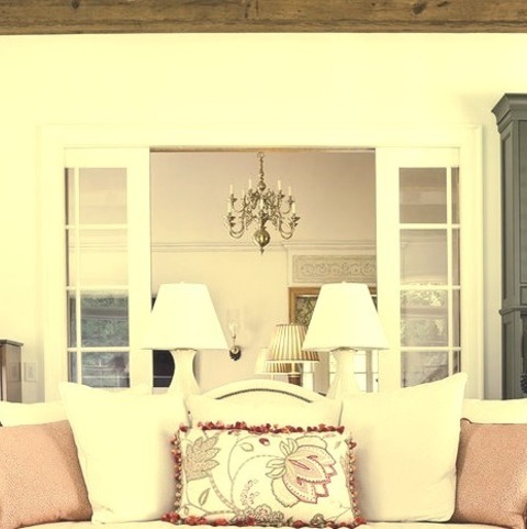
Inspiration for a large, enclosed, country family room remodel with white walls and a gray floor.
0 notes
Text
peristalsis - i.
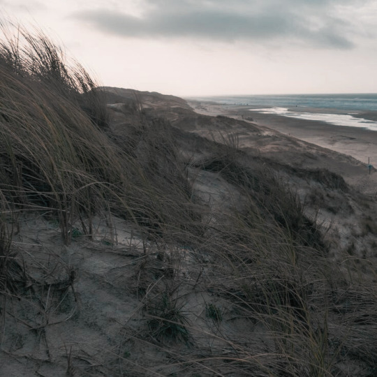

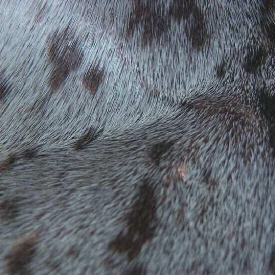
selkie!soap x reader. suicidal ideation. strangers to "lovers." . Running away from life to the Scottish Hebrides, you meet a man who won't leave you alone. . Masterlist. Ao3.

When your mother asks you if you’re planning to kill yourself, you have to lie to her.
To be fair to you, it’s a half-lie. You have no plans. Courage, you find, is as slippery as an eel in gloved palms—you don’t actually think you could do it if you tried. You’re deeply averse to pain of the bloody sort, and doing the deed would take a will and an energy you don’t really have.
But still. You’ve stopped looking both ways when crossing a street. You forget the stove is on, hot oil in the pan popping like the report of a handgun. The sound of shattering glass is the only thing that makes your heart sit calm in your chest, and the only thing that can make you fall asleep anymore is the notion that when you die, the earth will welcome the molecules of your body back into its folds.
So a half-lie is not the truth. You sit in the terminal, the afternoon smell of airport coffee in your nose as you swear to your mother that you’re not looking for a cliff to jump off of, or a convenient wave to pull you under. You’ve always wanted to visit Scotland, remember?
You can’t tell if she believes you. Probably not. People not planning to kill themselves don’t blow their savings on a first class ticket over the Atlantic with no scheduled return flight.
Especially not after quitting their job.
The flight over the Atlantic is uneventful. Quiet as money can buy. You sip champagne at your window seat, recline as far back as you can go, and watch the ocean, far, far below. Its depths exceed, you remember, the heights at which humanity can fly—but you can’t really tell, looking at it from so far above. It looks like nothing less than a thin veneer stretched overtop the crust of the earth. A puddle that could barely cover the soles of your feet.
There’s not a single murmur of turbulence across the fifteen hours you’re in the air. Much that you might’ve welcomed it.
Your connecting trip to the Hebrides is much shorter. The massive sprawl of Glasgow shrinks and recedes as you leave it behind, replaced not long after by a spit of an island chain that, from a distance, hardly looks worth populating.
You land on Barra, on a sandy stretch of beach still wet and compact from the receding tide. There’s a cottage here with your name on the rental agreement for the next month, and your mind is already there ahead of you, thinking about arranging your toothbrush and toothpaste on the bathroom counter and sitting and listening to nothing but cold island wind in the grass. The cottage’s owner has graciously agreed to drive you there.
When you step off the plane, you miss him at first. You’re expecting someone completely different—an older man in cable knit, perhaps more mustache than face, and the morose demeanor of someone for whom sunlight is as common on the island as veins of gold. So your eyes skip over the younger man, even despite the sign he’s holding with your name on it.
But then you look again. Because with a man like him, you can’t not look again.
He’s wearing a sweater, sure. But he also looks like a rugby team maverick—burly and tall, rugged, tattooed, flaunting a dumb haircut because he’s handsome enough to get away with it.
He stands out from the few people in the airport as if the whole world has adjusted its lens to bring him into focus, sharpening his image such that anything in his periphery is too blurry to notice. He does not in the slightest look like he rents out an old fisher’s croft in the least popular place in Scotland.
But then you catch your name. Do a double take. Clutch your suitcase handle a little tighter, because when you approach, the man’s eyes widen, look you up and down, and then crease with a too-confident smile.
“Bonnie!” he exclaims when you introduce yourself. He has a deep, rough voice, burred and low. More still, he’s kilted, plaid hanging at muscular knees, with an odd speckled pelt slung around his hips.
You’ve never seen that before—maybe it’s an islander thing.
“You must be Mr. John MacTavish,” you say. Up close, there’s a weathered look to him, as if buffeted by the salt in the wind.
“Johnny’s fine,” he says, winking. His eyes are a lively, vibrant blue. The color of the ocean in some place much nicer than this one. “Welcome to Scotland!”
Then, incredibly, “Johnny” pulls you into a hug before you even realize what’s happening, brawny arms closing around you like the noose of a snare. You go rigid—what the hell?—but this man, whom you have met only just now, doesn’t seem to notice, compressing you against the blazing pillar of his body in an embrace that flattens your lungs behind your ribs.
“Um,” you manage. He smells like axe body spray and diesel fuel, and cold ocean wind. It wipes the forefront of your mind blank, like sweeping an arm across drawings etched in sand.
After at least five whiplashed beats of your heart, Johnny pats your back several times and lets you go, grinning.
“Sorry, bonnie. Scots are huggers.”
Then without warning, he reaches for the handle of your suitcase, warm hand nudging aside your own. “Let’s get you down there ‘fore the tide comes in. Canny wait t’show you the place, I fixed it up m’self.”
You let him take your luggage and follow; he sets off at an energetic clip that you struggle to keep up with. He gestures with his free hand as he talks, motions rising and falling with the tenor of his voice.
“You know you’re m’first guest? Was startin’ to wonder if I was gonna have to sell the place, no one seemed all that interested. Guess I can see why, no internet, barely any signal. Me, I think that’s a good thing, people spend too much time on their phones, y’know?”
You make a noncommittal noise.
Were you this cold before he let go of you?
“But it’s a great little place to get away, I promise you, nice and quiet, and I updated everything m’self. Radiator in the bedroom and everything!”
Another noise from you.
Thankfully, you reach his car—a small truck, older than the both of you, with only one row of seats and what looks like large spools of rope in the bed. Johnny pauses briefly to secure your suitcase beside them with a couple of bungee cords, and then opens the passenger side door for you to get in.
“It’s not too far from town too,” he continues as he slides into the driver’s seat. You attach your seat belt. He does not. “You got your essentials there. A supermarket—think you call ‘em grocery stores? There’s that and a cafe and a pub. No bank though, so let’s get cash now if you need it.”
“I have some.” You’d exchanged for a few hundred pounds in Glasgow.
“Good! You want to stop by the store? Took the liberty of filling up the fridge too, but if there’s somethin’ you want—”
“No,” you say.
“Alrigh,’” says Johnny.
You feel his eyes on you—when you look at him, he’s smiling again. You are not pleased to find, through the benefit of close proximity, that he has dimples.
“What?” you ask, suddenly self-conscious.
“Nothin,’” he says.
Johnny drives you across the causeway from Barra to Vatersay, the latter of which, he helpfully informs you, is populated by less than a hundred people.
“More wildlife than anything,” he comments, as the ocean outside the window passes by. The water is dull and gray, hidden from the sun by an overcast sky. “That’s what the tourists come for. You here to see the seals?”
“Seals?” you ask.
“Aye,” Johnny says, grinning. “They come here for breeding season.”
You ignore the quirk of his eyebrows.
The cottage stands alone, a ways out from the island’s main village at the top of a modest hillock. Island grasses sway along the dirt road as Johnny directs the truck upwards, coming to a stop a few meters away from the house proper.
It’s quaint. Thatch roof, cobbled walls. A generator hooked up on one side. There are flower boxes flanking the front door, although nothing’s in bloom; it’s the wrong season for it. The window frames are unpainted, and the glass panes, despite looking recently cleaned, are crusted with salt at the corners.
And it’s smaller than it looked in the pictures online. Even close up to it, the blue-grey sky overhead, swimming with dun-colored clouds, swallows it up.
You exit the truck into a cold breeze that tugs at the collar of your fleecy sweater. You’d read online that this time of year was the last gasp of summer into the autumn months in the Hebrides—it hardly feels that way, with the chill that drags its fingers across your hairline.
“It’s on a septic tank so y’ve got alright plumbing,” Johnny goes on, hefting your suitcase over one brawny shoulder. “Canny say much for the water pressure in the shower, but other than tha’ it’s alright. Matters more that it’s hot, ‘f you ask me—and it is! Come on, I’ll give y’the tour.”
The cottage is not big enough to warrant one. Johnny shows you the four rooms—kitchen, sitting room, bathroom, and bedroom—in under five minutes. It ends with him leaned up against the counter, arms folded genially across his plush chest, grinning at you like he knows some embarrassing secret of yours.
“Was thinkin,’” he says, scratching the stubble on his jaw with one thumbnail, “this’d be kind of a honeymoon thing, y’know? That woman with the time travel show, lots a’folks been comin’ here lately ‘cause a’her.”
“Is there anything else to do here besides look at seals?” you ask.
Soap gazes at you through half-lidded eyes, smirking. “I dinnae think you leave the bedroom much on a honeymoon, do you?”
You flush. “I never really thought about it.”
“So you’re no’ married, then?”
“No. Not—not interested.”
Johnny lifts one brow. “In marriage?”
“In anything.”
He keeps fucking smiling. You have a barely controllable urge to smack him; you settle for wringing the hem of your sweater, imagining it could be his neck.
“So what brings y’here, then?” he asks, tilting his head like a cat playing with its food. “If no’ a honeymoon?”
You frown.
The truth is, of course, that nothing brought you here. Vatersay, nor the Hebrides, nor Scotland itself were actually of any consequence. You’re ambivalent about the ocean, and you certainly don’t care about seals.
You just hadn’t been able to think of anything you wanted when you asked yourself that perennial question. You wanted nothing.
You wanted nothing.
So you found as much nothing as you could and bought the soonest first class ticket heading toward it.
Your only stipulation had been no language barrier—so here you are now, cursing the lack of such, because it means this man, who belongs on this island no more than you do, is bothering to try and talk to you.
“Just wanted some peace and quiet,” is what you decide to say.
“Needed a change, aye?” Johnny nods sagely, as if understanding. “I did too, when I came here. Was in the army. Special forces.”
“O-okay,” you say, because you hadn’t asked.
“Didnae plan to stay,” he continues.
He turns his head to look out the kitchen window; on one temple is the ghost of a scar. A starburst-ripple in the shaved side of his dark hair—nothing more.
But something about it suggests that the wound it closed around was a horror to behold.
Then he turns back to you, the corners of his mouth quirked. “But somethin’ about this place is hard to leave.” The quirk turns into another smarmy grin “Bet when your month’s up, you’ll know what I mean.”
It seems rude to say probably not. “Maybe.”
The radiator in the kitchen breathes a swell of warm air through the room, blooming with Johnny’s diesel-and-ocean scent. There’s very little space between you, him against the counter, you across from him at the sink. Johnny’s bulk claims what little room there is to maneuver, and if you tried to move away, it would require first moving closer.
“So,” you begin.
“Here,” he intercedes. “Wanna show you somethin.’”
The only reason you comply is because he leads you outside, which is a step closer to him finally leaving you alone. Johnny circles around the cottage, revealing a footpath that leads down the hill. The ground transitions from soil to sand as you both walk; the wind picks up as the sound of waves grows. Eventually you reach what turns out to be a small cove, hidden by the curve of the island, flanked on both sides by cliffs of only middling height.
The tide is only now making its way in; probably why you hadn’t realized it was here earlier. You think you’ll be able to hear the waves when you go to sleep tonight.
“Oh,” you say, unable to hide that it’s impressed you.
“Yeah,” Johnny replies, smug. “All yours. Come down whenever you like. Dinna recommend skinny dippin’ this time a’year, though.”
You look at him, intending some sort of flat response, but what you see stops your words up in the chamber of your throat.
There’s something…different about him. There’s a sharp glint in his eyes that wasn’t there before. A dangerous cant to the angle of his grin. He suddenly feels very real to you—
Like standing in front of a wild animal.
Realizing, at the same time it does, that there is no barrier between it and you.
He looks you up and down. He doesn’t even try to hide it; too-blue eyes jaunt from yours down to your throat, the span of your shoulders, lingering on your chest before drifting down your stomach and hips. His nostrils flare as he inhales deeply, shoulders lifting as his chest expands, and you get the strange sense that he’s trying to smell you.
The ice that slithers through your veins, drips down the rigid column of your spine, wars with the spike of heat that breaks across your face. You feel here. You feel very present, your heart pumping wet in your chest, electrical wisps zipping to every nerve ending and back up your cerebellum to remind your brain of every part of your existing body.
Suddenly you are in Scotland, thousands of miles away from home, freezing fucking cold, only half of all the money you have in the world left in your bank account. Tomorrow stretching out in front of you. The next day after it.
Panic, which you thought buried, turns over in your belly, grave-dirt too light to keep it down. Hard earth is beneath your feet. A light drizzle is starting overhead. You begin to shiver, your nervous system’s effort to warm your hairless mammal body up, to save you from the cold and the wet and the fucking predator standing two paces away from you while gazing at you like it can’t wait to break your bones open for the marrow inside.
“Okay,” you finally snap, though you’re unable to keep your voice from quivering. “I really appreciate you driving me, Johnny, but—”
His eyes flash. The ocean-depths of them shift with an awareness beyond your ken, the dark edges deepening, the vivid blue swirling. The expression on his face transmutes into something unknowable—like the difference between the look on a pet dog’s face and a wolf’s.
Something isn’t there that should be, and what is in its place is entirely unfamiliar.
What is in its place is something your species evolved long past being able to understand.
Then, as quickly as it appeared, the flash is gone. Johnny is human again, as if he had always been in the first place. The thin crows’ feet at the corners of his eyes crinkle, as he gives you what he probably thinks is a sympathetic smile.
He doesn’t seem able, or perhaps willing to hide how amused he is, though.
“Long flight, I know,” he croons, meeting your gaze again. “Dinna worry, bonnie, I’ll let you get your rest.”
Whatever you were about to say dies. Your mouth hangs open. Johnny backs away from you, hands casually in his pockets.
“I’ll take you to see the seals tomorrow!” he calls to you before he turns away. A sudden gust ruffles the pelt hanging around his hips. “I know all the best spots.”
He throws you a casual wave, and then disappears over the rise.

You do hear the waves that evening, when you lay down to sleep. The covers are soft over you, cozy and warm even as the ocean wind hums outside.
You can’t stop shivering.

next
a/n: last fic of the year (probably)! i'm so into this one tbh. i figured out the ending a while ago and i'm so dang excited to get to it.
#soap x reader#soap x you#john soap mctavish x reader#john soap mctavish x you#john soap x reader#soap mactavish#soap mactavish x reader#soap mctavish#john soap mactavish#how the hell is his last name even spelled#mwritessoap#madi writes
2K notes
·
View notes
Text
Family Room Enclosed

Picture of a modern enclosed family room with a dark wood floor and white walls
0 notes
Text
Living Room in New York

An illustration of a mid-sized, traditionally styled, enclosed living room with a light wood floor, beige walls, a regular fireplace, a stone fireplace, and no television.
#nailhead detail#modern glass coffee table#double height windows#neutral living room#white rug#french side chairs#books on coffee table
0 notes
Text

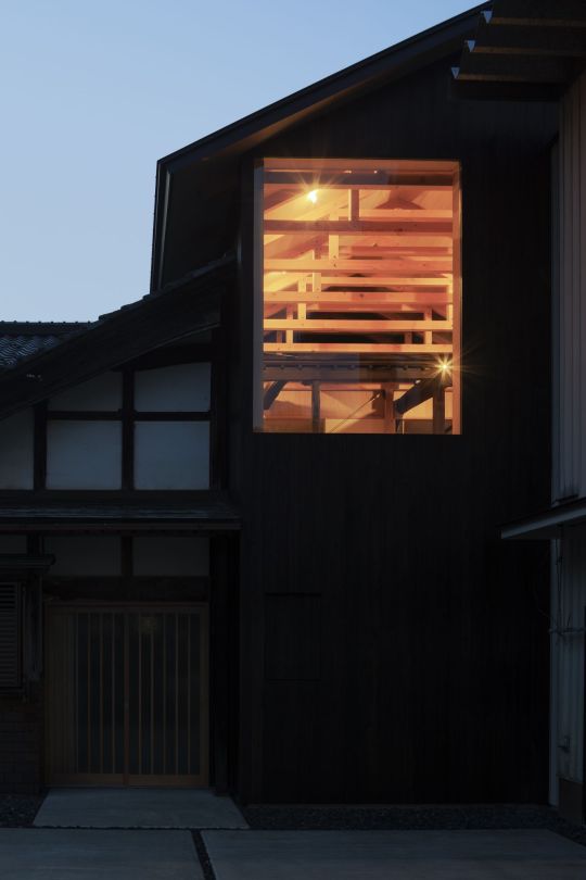
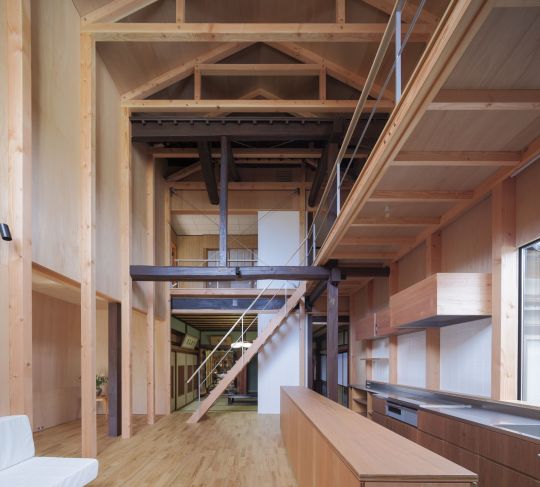


House Renovation, Echizen, Japan - Tetsuya Mizukami
#Tetsuya Mizukami#architecture#design#building#modern architecture#interiors#house#minimal#house design#old and new#home renovation#timber construction#wood interior#timber frame#window#beautiful architecture#light#double height space#japan#japanese architecture
82 notes
·
View notes
Photo

Home Office Ottawa Home office library - huge modern built-in desk concrete floor and gray floor home office library idea with white walls and no fireplace
#antique stained glass#polished concrete#industrial interior#library#double height space#concrete floors#transom window
0 notes
Text
SFX Magazine Issue 372 - Designing Good Omens ❤ 😊
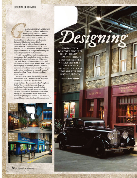
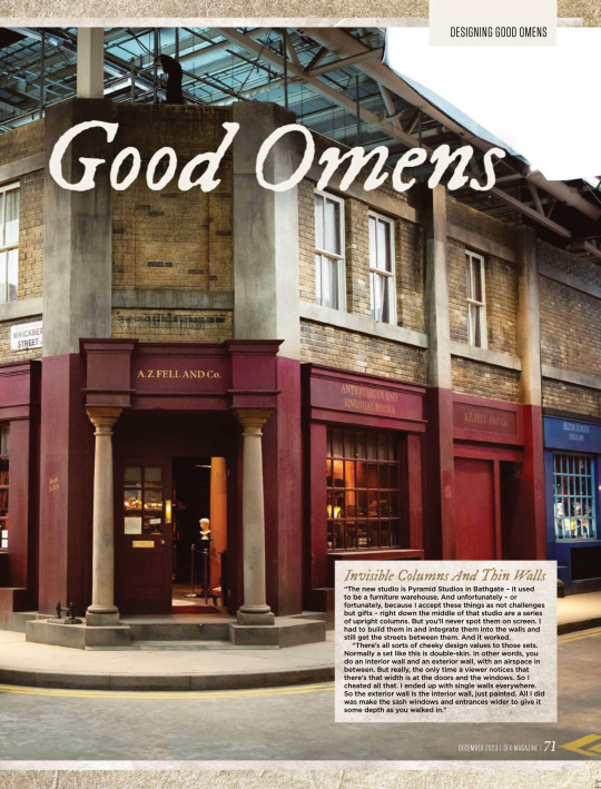

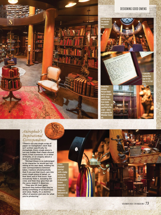
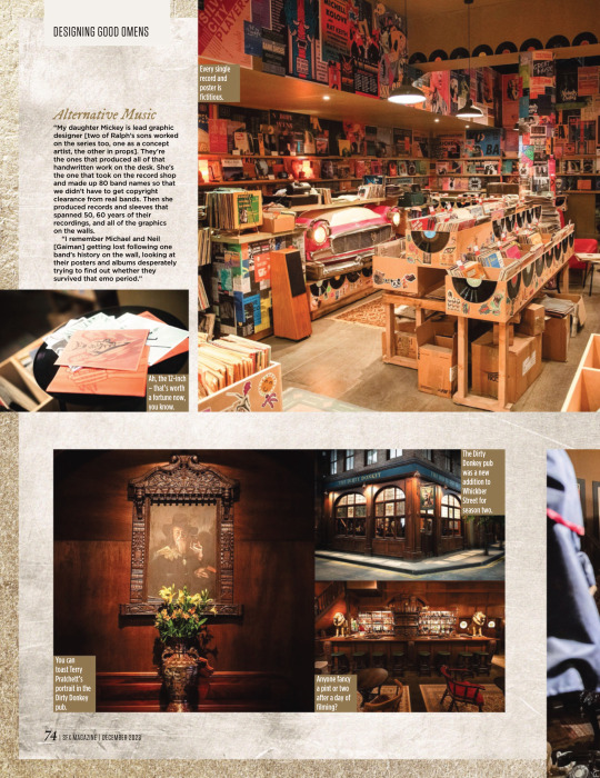

PRODUCTION DESIGNER MICHAEL RALPH REVEALS HOW THE SHOW’S CENTREPIECE SET, WHICKBER STREET, WAS GIVEN A DEVILISHLY CLEVER UPGRADE FOR THE SECOND SEASON
WORDS: DAVE GOLDER
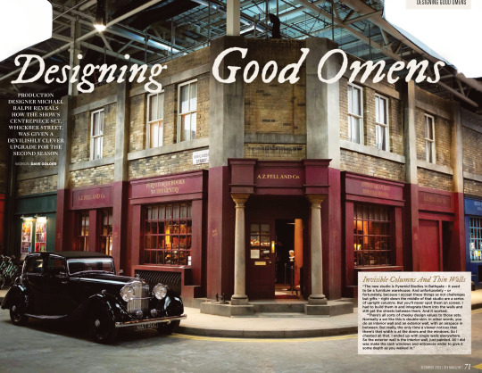
Invisible Columns And Thin Walls “The new studio is Pyramid Studios in Bathgate – it used to be a furniture warehouse. And unfortunately – or fortunately, because I accept these things as not challenges but gifts – right down the middle of that studio are a series of upright columns. But you’ll never spot them on screen. I had to build them in and integrate them into the walls and still get the streets between them. And it worked.
“There’s all sorts of cheeky design values to those sets. Normally a set like this is double-skin. In other words, you do an interior wall and an exterior wall, with an airspace in between. But really, the only time a viewer notices that there’s that width is at the doors and the windows. So I cheated all that. I ended up with single walls everywhere. So the exterior wall is the interior wall, just painted. All I did was make the sash windows and entrances wider to give it some depth as you walked in.”
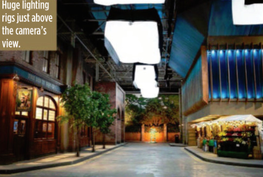
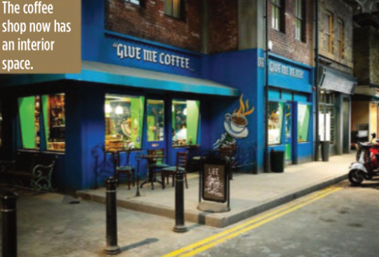
GOOD OMENS HAD A CHANGE of location for its second season, but hopefully you didn’t notice. Because Whickber Street in Soho upped sticks from an airfield in Hertfordshire to a furniture warehouse in Bathgate, Edinburgh. It’s the kind of nonsensical geographical shenanigans that could only make sense in the crazy world of film and TV, and production designer Michael Ralph was the man in charge of rebuilding and expanding the show’s vast central set. “I wish we could have built more in season one than we did,” says Ralph, whose previous work has included Primeval and Dickensian. “We built the ground floor of everything and the facades of all the shops. But we didn’t build anything higher than that, because we were out on an airfield in a very, very difficult terrain and weather conditions, so we really couldn’t go much higher. Visual effects created the upper levels.”
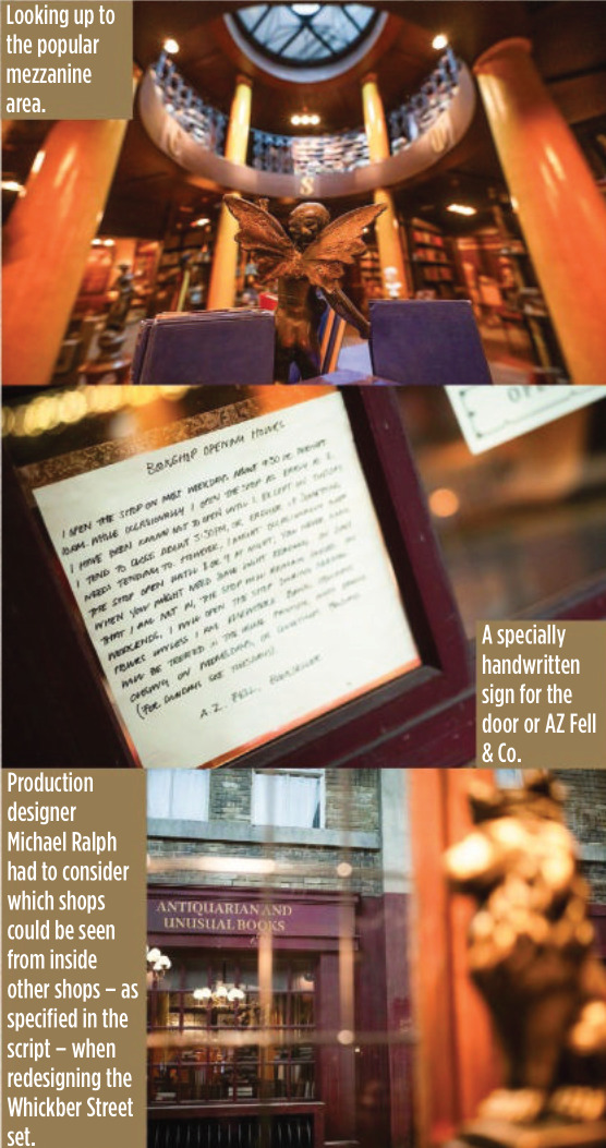
But with season two the set has gone to a whole other level… literally. “What happened was that the rest of the street became integrated into the series’s storyline,” explains Ralph. “So we needed a record shop, we needed a coffee shop that actually had an inside, we needed a magic shop, we needed the pub. To introduce those meant we had to change the street with a layout that works from a storylines point of view. In other words, things like someone standing at the counter in the record shop had to be able to eyeball somebody standing at the counter in the coffee shop. They had to be able to eyeball Aziraphale sitting in his office in the window of the bookshop. But the rest of it was a pleasure to do inside, because we could expand it and I could go up two storeys.”
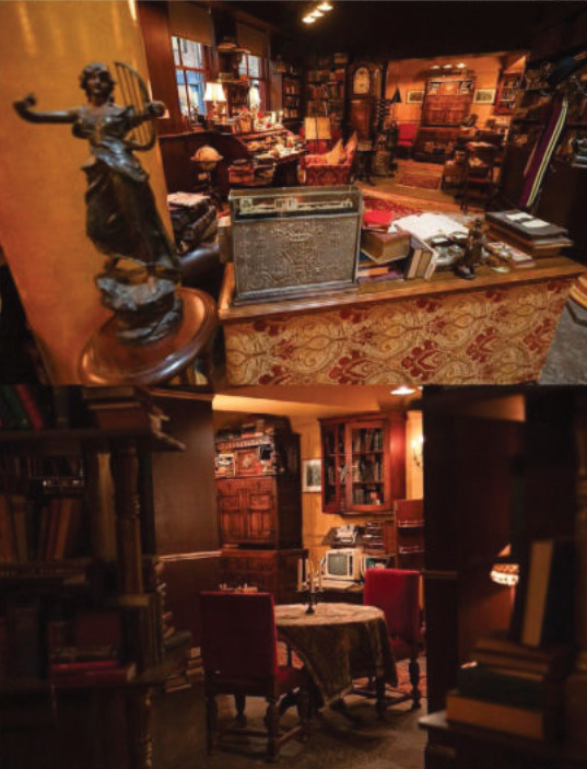
For most of the set, which is around 80 metres long and 60 metres wide, the two storeys only applied to the shop frontages, but in the case of Aziraphale’s bookshop, it allowed Ralph to build the mezzanine level for real this time. According to Ralph it became one of the cast and crews’ favourite places to hang out during down time.
But while AZ Fell & Co has grown in height, it actually has a slightly smaller footprint because of the logistics of adapting it to the new studio.
“Everybody swore to me that no one would notice,” says Ralph wryly. “I walked onto it and instinctively knew there was a difference immediately, and they hated me for that. I have this innate sense about spatial awareness and an eye like a spirit level.
“It’s not a lot, though – I think we’ve lost maybe two and a half feet on the front wall internally. I think that there’s a couple of other smaller areas, but only I’d notice. So I can be really annoying to my guys, but only on those levels. Not on any other. They actually quite like me…”
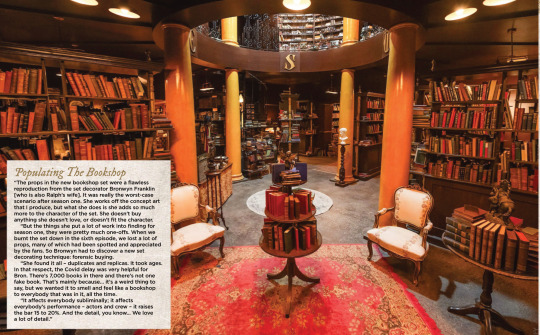
Populating The Bookshop “The props in the new bookshop set were a flawless reproduction from the set decorator Bronwyn Franklin [who is also Ralph’s wife]. It was really the worst-case scenario after season one. She works off the concept art that I produce, but what she does is she adds so much more to the character of the set. She doesn’t buy anything she doesn’t love, or doesn’t fit the character.
“But the things she put a lot of work into finding for season one, they were pretty much one-offs. When we burnt the set down in the sixth episode, we lost a lot of props, many of which had been spotted and appreciated by the fans. So Bronwyn had to discover a new set decorating technique: forensic buying.
“She found it all – duplicates and replicas. It took ages. In that respect, the Covid delay was very helpful for Bron. There’s 7,000 books in there and there’s not one fake book. That’s mainly because… it’s a weird thing to say, but we wanted it to smell and feel like a bookshop to everybody that was in it, all the time.
“It affects everybody subliminally; it affects everybody’s performance – actors and crew – it raises the bar 15 to 20%. And the detail, you know… We love a lot of detail.”
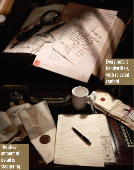
(look at the description under this, they called him 'Azi' hehehehe :D <3)
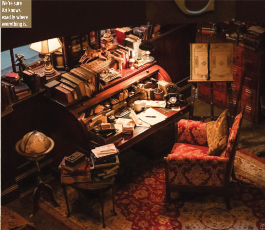

Aziraphale’s Inspirational Correspondence “There’s not one single scrap of paper on Aziraphale’s desk that isn’t written specifically for Aziraphale. Every single piece is not just fodder that’s been shoved there, it has a purpose; it’s a letter of thanks, or an enquiry about a book or something.
“Michael Sheen is so submerged in his character he would get lost sitting at his own desk, reading his own correspondence between takes. I believe wholeheartedly that if you put that much care into every single piece of detail, on that desk and in that room, that everybody feels it, including the crew, and then they give that set the same respect it deserves.
“They also lift their game because they believe that they’re doing something of so much care and value. Really, it’s a domino effect of passion and care for what you’re producing.”

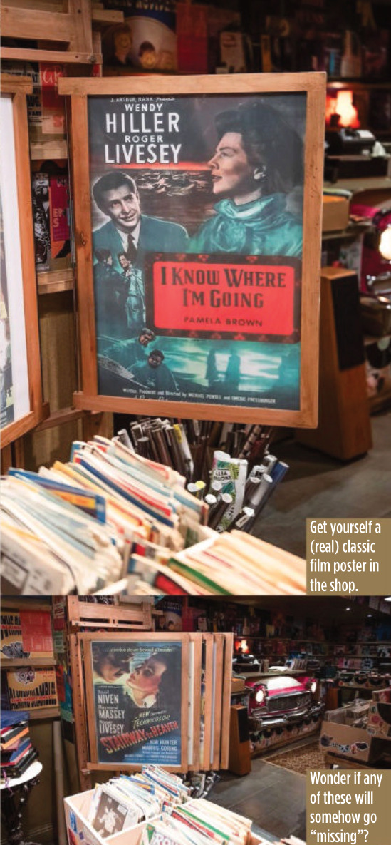
Alternative Music “My daughter Mickey is lead graphic designer [two of Ralph’s sons worked on the series too, one as a concept artist, the other in props]. They’re the ones that produced all of that handwritten work on the desk. She’s the one that took on the record shop and made up 80 band names so that we didn’t have to get copyright clearance from real bands. Then she produced records and sleeves that spanned 50, 60 years of their recordings, and all of the graphics on the walls.
“I remember Michael and Neil [Gaiman] getting lost following one band’s history on the wall, looking at their posters and albums desperately trying to find out whether they survived that emo period.”


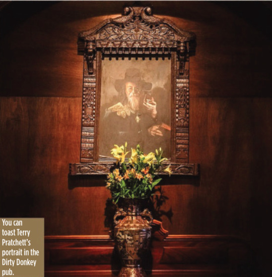

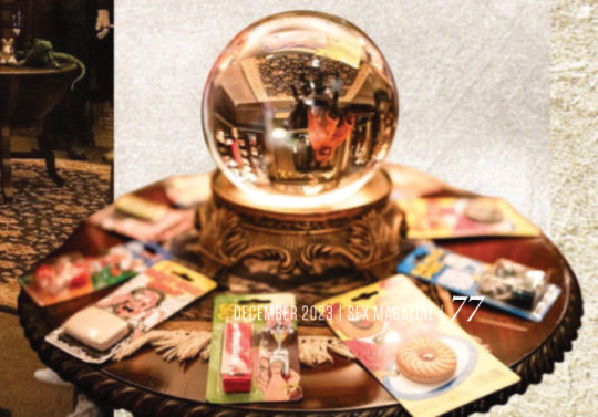
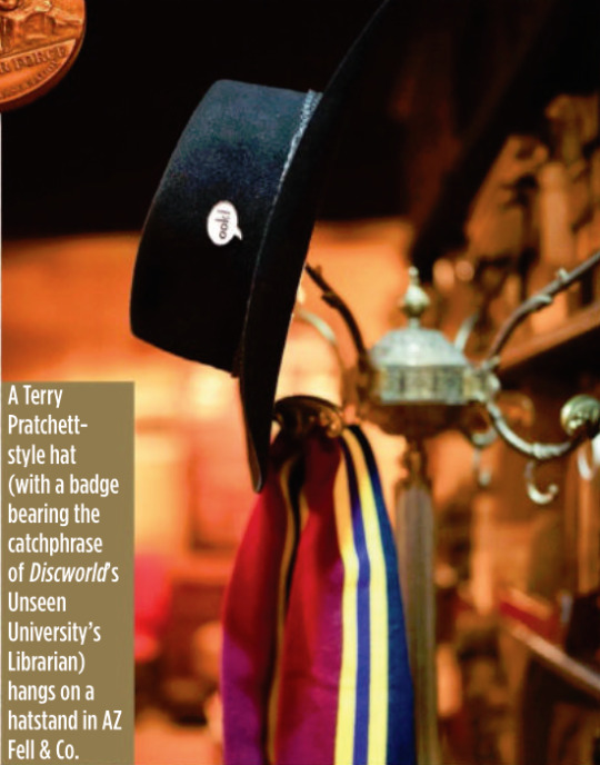
It’s A Kind Of Magic One of the new shops in Whickber Street for season two was Will Goldstone’s Magic Shop, which is full of as many Easter eggs as off-the-shelf conjuring tricks, including a Matt Smith Doctor Who-style fez and a toy orang-utan that’s a nod to Discworld’s The Librarian. Ralph says that while the series is full of references to Gaiman, Pratchett and Doctor Who, Michael Sheen never complained about a lack of Masters Of Sex in-jokes. “He’d be the last person to make that sort of comment!”
Ralph also reveals that the magic shop counter was another one of his wife’s purchases, bought at a Glasgow reclamation yard.

The Anansi Boys Connection Ralph reveals that Good Omens season two used the state-of-the-art special effects tech Volume (famous for its use in The Mandalorian to create virtual backdrops) for just one sequence, but he will be using it extensively elsewhere on another Gaiman TV series being made for Prime Video.
“We used Volume on the opening sequence to create the creation of the universe. I was designing Anansi Boys in duality with this project, which seems an outrageously suicidal thing to do. But it was fantastic and Anansi Boys was all on Volume. So I designed for Volume on one show and not Volume on the other. The complexities and the psychology of both is different.”
#good omens#gos2#season 2#photos#bts#bts photos#interview#sfx magazine#magazines#hq photos#neil gaiman#terry pratchett#michael sheen#david tennant#michael ralph#mickey ralph#bronwyn franklin#anansi boys#the small back room#maggie's record shop#soho#aziraphale's bookshop#dirty donkey#magic shop#aziraphale's correspondence#give me coffee or give me death#fun fact#michael ralph interview#sfx 372 magazine#s2 interview
4K notes
·
View notes