#don't have a screenshot handy though
Explore tagged Tumblr posts
Text
Reminder that there's a moment in the G1 show where they smuggled him into a building in a guitar case and I find that endlessly hilarious
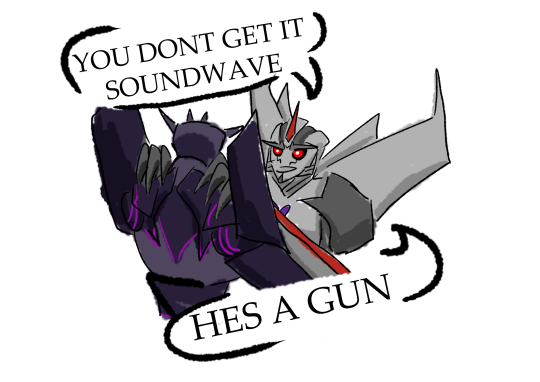

Can't get over the fact that G1 megatron transforms into a literal gun and like needs Starscream to shoot with him bc HES A LITERAL GUN
#don't have a screenshot handy though#but it's definitely one of the highlights of the show to me#right up there with Starscream pouting and Soundwave petting Ravage#and cliffjumper play wrestling with mirage#transformers#transformers g1#transformers prime#starscream#soundwave#megatron
2K notes
·
View notes
Text
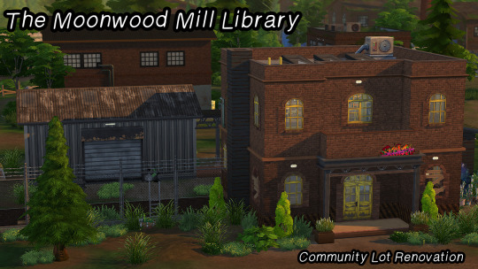
Moonwood Mill's community has repurposed an old logging factory into their very own local library. Its open and airy structure make it the perfect location to curl up with a book or catch a view of the night sky, and out back, the Wildfangs have dragged old workout equipment into the former loading dock for a handy make-shift gym.
I was bored and decided to make some tweaks to improve the function and overall look of The Moonwood Mill Library! I really do love the concept of the Moonwood community taking an abandoned factory and turning it into a makeshift community space, but the original execution left much to be desired. Don't worry though; I did my best to maintain all the grime, damage, DIY features, and disrepair... but without the gaping empty spaces and random wall and ceiling configurations that were giving more "unfinished building" than "abandoned building."
INFORMATION & DOWNLOAD BELOW ↓
Packs I Used:

This lot is completely CC Free and labeled as a “Library” lot type! This reno uses very few packs and the only objects used from Growing Together and Outdoor Retreat are the sleeping bags (GT) in the sewer area, and the shower (OR), so really you could consider this an Eco Lifestyle, Get To Work, and Werewolves build... as long as you have those three, you will be fine!
TOU: All I ask is that 1. you do not reupload and claim the build as your own (yes, even if you tweak it a little…) and 2. you tag me if you use it! I would love to see this in other people’s games and saves, that’s why I’m sharing it! ❤️
Additional screenshots are on my Patreon post. This build has been play-tested, but please let me know if you run into any in-game issues!
DL: Patreon (always free)
+ @publicvanillabuilds, @pancakesrealty
#Moonwood Mill#ts4#simblr#ts4 community lot#ts4 build#ts4 download#the sims 4#sims 4#ts4 lots#ts4 werewolves#ts4 DL#mybuilds#lot renovations
138 notes
·
View notes
Text

Hi everyone! It's been a hot minute since I did a Compendium update, but I promise I'm not dead. For those who don't know, I got a new job! That meant pretty much the entirety of October was spent wrapping up my old job, going to my new site and trying to learn the new one. I'm on break in approximately two weeks, yay! ☃️
These updates will take on a wintery/Starlight theme to celebrate the season, much like All Saints. I hope you enjoy.
Additionally, myself and the lovely folks at SEAFLOOR are having a Catch up (for) Starlight Challenge! You should join us if you're interested. ❄️
However, without further the following communities have been added to Sea's Community Compendium for XIV Creatives.
LARGE SCALE
The Help Lines—We are a community-based discord to be used to play the critically acclaimed MMORPG Final Fantasy XIV. We host almost all content including DRS and BA, Raiding, Deep Dungeons, Blue Mage and more. Our mission is to create a welcoming space for any individual in need of assistance to reach out and accomplish their FFXIV goals in a toxicity-free environment.
The Aether Entertainer—Founded in 2021 on Aether, The Aether Entertainer is player-made virtual magazine covering music, theatre, art, current events, and Eorzean popular culture.
LORE
Final Flowery XIV—Compiled by ann0yance(bsky)/@sa8oteur, this guide explores the various flowers in XIV, comparing them to their real-world equivalents and meanings.
On Elementals, Accountability and Criticism—An essay written by @morgana96 that explores the lore of elementals and their place in Gridania (and beyond)!
MISC
Vanilla Gpose Tips by Winterdeepelegy—A how-to guide on effectively utilising the vanilla gpose tools to create visually stunning screenshots, written by @winterdeepelegy.
WoL Reference Sheet—Created by @coldshrugs, a handy WoL reference sheet you can build in Canva!
NA GPOSE Studio/Themed Housing Directory—A player-made repository of North American Gpose studios and themed houses!
CHANGELOG
The Scholar's of Nym—The link has been modified at the request of the owner.
Skystone Co.—Has been removed at the request of its owner.
UI Macro Menus—The link has been modified to accurately reflect the bookmark.
Have you thought about joining our Tumblr Community? You can find it here!

Want to submit? You can either fill out the google form here or send me an ask with the relevant information!
Is my space suitable for the Compendium? Most of the time, yes! Below the read more is some more information/stipulations. This is all publicly available on the document. 🦌
Below are the following things I do not accept on the Compendium:
Personal/Single-Character LFC ads. (Though these get posted to the SEAFLOOR Tumblr Community when I find them!)
Content intended for or can be used for bullying, harassment and OOC gossip. E.g. ‘Secrets’ blogs, receipts, callout posts, etc. This does not include IC tabloid blogs or other ventures used to generate roleplay.
Communities that do not have an RP/writing element (large-scale exempt).
Anything I find personally distasteful or goes against the spirit of this project.
Common-sense rule applies.
I want to put my community on the Compendium but we have an application process. Is this okay?
Yes! Just note somewhere in your application that's a requirement. The only thing that is mandatory for the Compendium is that you must be open to new members or have a public-facing/accessible facet. There's no point advertising a community if no one can join it in some way!
I want to put my Community on the compendium but I only have x number of members —
Also totally okay! People don't start with large communities. Activity is a must but, whether your server has two or two thousand members, if you're looking for new people to join, I'd love to help you find people.
I want to put my community/resource on the Compendium but I worry its too niche?
Okay, and? If your Eorzean Fishing Alliance has four members but you roleplay every second weekend, I still want to know about it. The same goes for resources; if it's relevant to the game, it'll be useful to someone.
How active does a community need to be?
If you find a community has not been active in about two/three months, send me a message and I'll take a look at it. Communities have ebbs and flows, especially event spaces that may take hiatuses depending on member interest/life events. I'm not strict in my implementation provided a space isn't dead. If a link or anything is broken, contact me asap!
I have [insert a question not stated here]?
No drama! Send me an ask or use the #Compendium channel in my Discord!
#final fantasy xiv#ffxiv#ffxiv community#final fantasy xiv roleplay#ffxiv roleplay#。・゚゚・ — sea speaks#。・゚゚・ — sea's community compendium#i hope i haven't forgotten anyone it's just been a bit!!#care u all kiss
35 notes
·
View notes
Note
Welcome back campers, to this weeks episode of TOTAL, DRAMA, HELLSITE! On this weeks episode, me and my handy Chef Hex will be cooking up a delicious meal of parpy goodness! But the campers will have to roll a single... WITH A PROMPT! The first one to get a proper Roleplay going gets the immunity marshmallow. Now watch out, cuz this ones gonna be a doozy, dudes!
Your September 2nd PARPdate: "Remember that time on TDI where they called god to make it rain? That happened" Edition.
News this month is sorta slow- those of you In The Know already know this, but Hex is being forced to move again. This hasn't impacted Dev TOO much, honestly, and I'm gonna break down WHY in this wonderful little post!
Ok so if you remember the August update, you likely recall us showing off our shiny new mod features and how we can now play funny roleplay police state in order to nail rulebreakers and bandodgers.
If you're also a huge Bubblehead (which is what you're called), you're also likely familiar with this bastard:
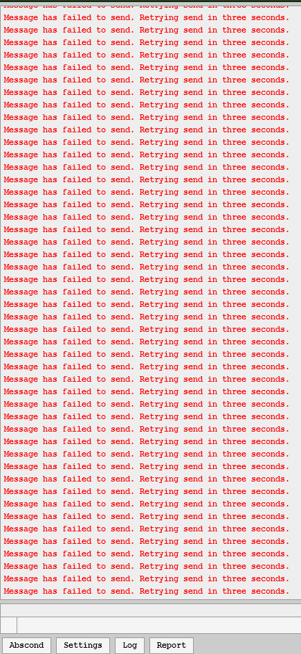
(Image description: The red miles, basically. Its a message failed message repeated like ninety times in a row in red font. Thanks to Alienoid from the server for posting this screenshot for me to steal!)
This is because, somehow, these new mod features almost completely broke Dreambubble in ways that make no sense (the new features use Redis, but for some reason their introduction is making PostGres, a completely different system, go absolutely haywire)
So, Hex decided to move forward with their pet project to rewrite Dreambubble. Normally, this would mean a development delay on Parp2 and I'd feel pretty bad about laying this on yalls feet after two years of parplessness.
But hey wait isn't this literally just how they made parp last time.
The answer is yes! The previous Msparp version was built using what is now Dreambubble as a skeleton, evolving on itself into the rickety but lovable RP site we knew before she tragically passed away last February after choking to death on fresh air. As such, Dev is actually going pretty good! Hex has been COOKING through the bones for Dreambubble 2, getting a ton of barebones stuff working right off the bat:
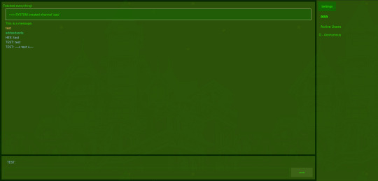
(Image description: A barebones but functional chat window using Felt theme; complete with system connection messages, text preview, and quirking)
Along with our first new feature preview in a while: PUSH NOTIFICATIONS!

(Image description: A felt-theme settings menu showing the ability to turn on and off push notifications, as well as a browser popup in the bottom corner showing that it's been activated)
These are also working on Android! What this does is it pings you when the chat you're in gets a new message, operating on a system level instead of a site level so you don't even need to have the tab, or the browser, open to keep up with your chats! This is gonna be especially useful for mobile users, since this means they can navigate away and use their phone for other things, and their phone'll just ping them when their partners' next message comes through. (These are gonna be off by default, btw. You'll have to turn them on yourself on a per-chat basis in the final release)
It should also be noted that we've Snagged Ourselves A UI Guy recently from the userbase, so we've got a dedicated Make It Look Good person for when things get closer to launch!
That's all for this update, though. Absolutely thrilled to be showing off some progress after the restart. Hopefully we'll have even more to show off next month!
Until then, cheers!
23 notes
·
View notes
Note
I've just discovered your Rolan x Tav comic.
It's SO neat and accurate, in matter of deign and details!
In case you don't mind, of course, I have some questions you maybe have answered before:
What software do you work with? What kind of pencils do you use? How do you manage to set so neat and clean results? Do you need many references for that or is just a gift you have? How many years have you been drawing to achieve those results?
I don't mind at all! And I don't believe I've answered any of these questions before, at least not since I started doing my comics.
For software I mainly use Clip Studio, though I do also use PaintTool Sai (v2) for certain things that I feel it does better. All of my Mass Effect comics are lined in Sai, for example because things like armour have a lot more inorganic shapes and require long, sweeping, unbroken lines, and I like the pen stabilization in Sai far better than CSP's for that sort of thing.
For how long I've been doing art, I've been at it basically nonstop since I was 9 (so 20 years now, jeez). I was in an art program throughout highschool, went to college for art/animation for 4 years, and I'll have been working professionally as an animator for 8 years in May! So there's a lot of practice there for sure.
And yeah, I use a ton of references. Usually a good chunk of the time I'll spend on something is just collecting or making the reference material I need for it.
I'm putting the rest under a read more because it's pretty long:
(Tumblr keeps eating my formatting so sorry if this is a little scuffed)
Because I'm normally working full time and doing this stuff in my free time after hours and on weekends, if I know I'm going to be drawing something a *lot*, I'll usually put together some kind of reference for myself in 3D so I can take some of the brainwork out of it and get more out of my evenings even when I'm feeling fried. It also means I put as little extra strain on my wrist as possible because I injured it a number of years back and it gets angry at me if I go for too many hours in a day.
But to give you an example, for Ember I have a Sculpt of her head that I can use to reference any angle I want, or to draw directly over top of for tricky angles. How I draw her isn't quite 1:1 to the model, but it gives me a base structure and landmarks I can build on top of.

My basic workflow is to take the angle I want, draw over it using the model as a guide (while picking and choosing where to stay true to it and where to say fuck it and do what I want), then I get rid of the 3D and do another pass, tweaking and redrawing anything I'm not totally happy until I'm satisfied with how it looks. I draw Ember with a slightly softer, more rounded face than the model has, for instance. Just because something looks right in 3D doesn't always mean it looks right once translated to 2D and I don't care if something is technically "correct" if it doesn't feel right or isn't conveying what I want it to properly.

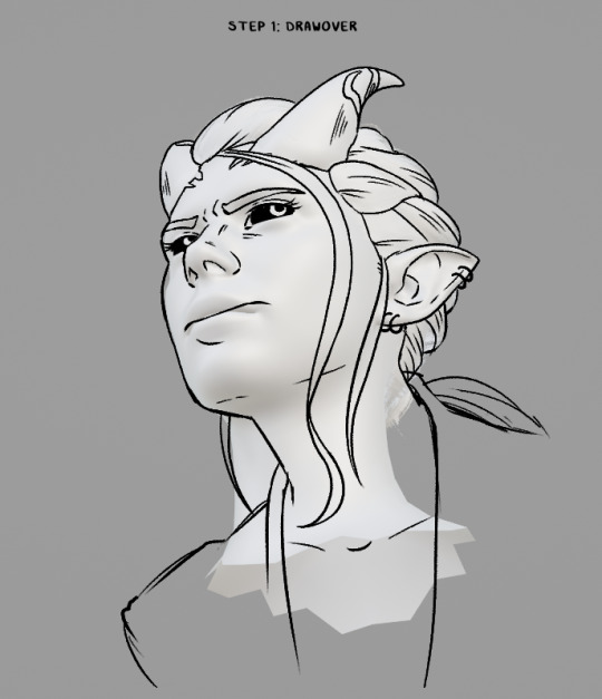
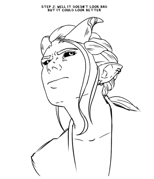
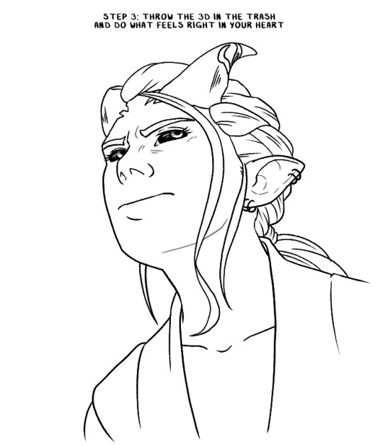
I'm also always checking reference screenshots to make sure I'm in the right ballpark of how something should look. I actually have a wall of photos next to my desk and while I didn't put them up for that purpose, it has come in surprisingly handy for quickly checking face or hair details when needed. I also just have a big folder of screenshots and other saved reference material.

I don't have a problem noooo~ 😅
Additionally, if my art has a background these days, there is a 100% chance that's a 3D set I built in Blender because I hate drawing backgrounds, but I do like building them in 3D.
Here's two examples: the area around Astarion's bed, which I built out of some of the in-game assets like a lego set (this was a pain in the ass, it probably would have been faster to just build it from scratch based on screenshots 😩) and a closet I modelled for something that's still a WIP.
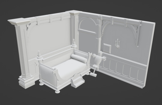
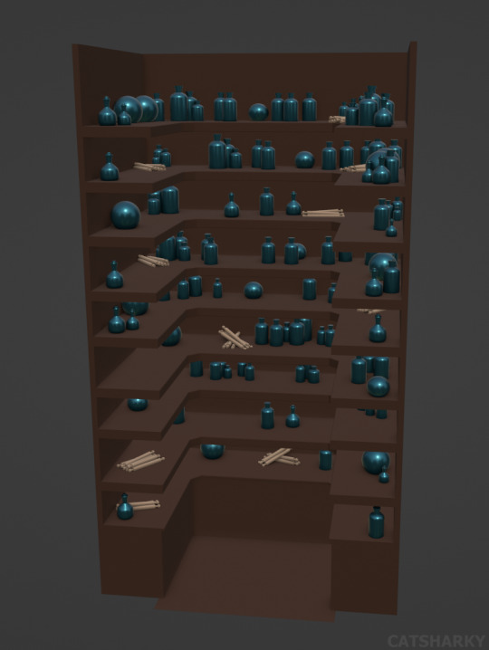
I'll get the angle I want, have Blender generate some linework from it and then grab a basic render of it to slap into CSP so I can draw the characters over top of it.
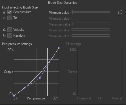
And as for brushes: the main brush I use in CSP is just the default 'Real G-Pen', with opacity effects turned off and these pressure settings: (I like to keep it simple, and I have a bit of a heavy hand so the altered pen pressure just helps me get a smoother taper). I change up the stabilizer settings depending on what I'm doing. Lower for things that need short, quick lines like hair and higher for most other things.
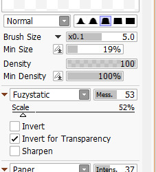
For Sai, I use a 9B pencil I found a number of years ago on Deviantart (I think?) and I wish I could link you to the original post I got the settings from, but Deviantart's search is... bad and I'm unable to find it again.
I hope that answered all your questions! If not, feel free to ask more!
77 notes
·
View notes
Note
Thoughts on Vinnie’s tail? The lps pets tails?
Hear me out, how about I bring back some of my handy dandy screenshots and do a ranking like with their hair? Yes, I think that's a good idea, I really wanna do those so if you have anything else like that I could rank please feel free to send em my way, I love talking about such details. Without further ado, lps pets' tails ranked from worst to best:
7. Russell


0/10, no tail :/. Damn, no hair, no tail, bro really doesn't got nothing. Everything else is 10/10 though :)
6. Penny Ling


My conlusion? That I don't have enought screenshots of her where her tail is visible. My judgement is hmmm 2/10. She has a tail so better than Russell given that it's a tail judging competition, but it's really small, most of the time you can't even see it, especially when she's wearing clothes (hence that last picture to show my point). It's still a good tail, I just prefer longer stuff as you will definitely see as we go.
5. Minka


4/10. I know what you're thinking "You just said you like long tails so wtf", well, yes, but while her tail is great at that, it's also sooo thin, what's the lenght if there's no volume? I really like it, but I would like it more if it were thicker and/or fluffier. Bonus points for making a heart with her tail

(real life footage of me looking at Vinnie)
but minus points for making it so small. Girl, look how long your tail is, that heart could be so much bigger. Who do I even blame for that? Minka whose tail it is or Russell who imagined this story? Either way it could have been better
4. Zoe


5/10 and yet another pet I don't have good screenshots for, I shall resolve that later. So there's really nothing wrong with her tail, and it's so fluffy too, good, good. She's only here because as I said I like longer tails more, but overall a really nice tail.
3. My boy


6/10, good-ass tail and while it is rather short, because he usually walks on two legs it looks just a bit shorter than it is plus he has that like... um curve (?) at the end, it makes it look a bit more interesting. Why is he higher than Zoe then? Because first - Vinnie, second - contrary to her his tail can do this

and I like it when their tails streighten out like that, they're so expressive ^^
also heart tail bonus cause it's cute

(me when I look at Vinnie again)
and I don't have a screenshot for that but sometimes that little curve at the end of his tail unstraightens a bit which makes his whole tail look a bit different which is cool. Another one of my points is that I mentioned it before as far as I understand lizards' tails should be as long as the rest of their body, so technically it's too short and I count that to his benefit.
Worry not however because I did my best at trying to draw him with a longer tail (also slight redesign)

2. Sunil


8/10 now that's a great tail, it's like Vinnie's but longer which as you know is something I like. Not much else to say here, it's just really good and long and also he wags it sometimes and it's adorable
Pepper


10/10 now this is a perfect tail - long I mean it's pretty much a half of her body; fluffy, plus it's the only tail that is two-colored and I love it. Great tail, love it, everyone's tail should be like that.
Bonus shot of Vinnie's (and I suppose Minka's) tail just because

12 notes
·
View notes
Note
Have you seen the 1st two double greetings that are out already?? 👀
Kai & Yul
Ally & Hunter
Still waiting patiently for more, though I know they'll take longer since these cost $180 apparently? And not everybody has that kind of cash.. 😅
But when they do, I'm really hoping to see more fans think outside the box and take to the chance to give us more pairings of characters from seasons 1 & 2 who've never even met! And I don't just mean within All-Stars either. I wanna see Aiden & Dan, Maggy & Drew, Gabby & Karol, Ashley & Rosa, Fiore & Lake, Ally & Dan, Connor & Lill, Alec with Tess, Rosa or Lake- Just- give us something new! Make fans' dreams of seeing their rarepair friendships (or romance ships) come true! Even if only for less than a minute.
gonna combine two of your greeting asks here!

this is a hilarious screenshot to have out of context, ngl.
same with the intro to the greeting-- iconic. i'm glad that Kai is as done with Yul as ever. on one hand, if Kai is living in the woods, i don't know why he needs to tie himself to human conceptions of wealth and status. on the other hand, if he has no job, i could see grabbing a quick buck with which to pick up food or supplies could be very handy.
imagine if these two were on the Cyan team instead of... Tom and Aiden, I guess (as the only two guys on that team). that would be so chaotic. i imagine Kai and Gabby would get along well, while Ellie would absolutely kick Yul's ass. Ellie not making merge robbed us of that.

i can see why they'd make a popular streaming channel, because this clip was cute as hell. i like how quickly they trade (joking) insults with each other. they're always on the same page, no matter how quickly the topic of conversation changes.
kind of confusing that Ally didn't already have sponsors, though...? at least she has her onlyfans ;) (/j) (of course it was ally's onlyfans that requested this greeting lmao)
honestly, having a sort of "speed dating" (not literally) kind of show with most of/all of the contestants would make a really interesting miniseries. i don't know how it would happen, but if ONC made episodes that were basically just like eight of these double greetings back to back (maybe with a bit of plot interconnecting them), i'm sure fans would eat it up.
it would also be really interesting to combine contestants with hosts. like, what would even happen if you got Trevor and Grett in a greeting with just each other...?
youtube
Forgot about this Grett greeting. "Do you know how boring those early episodes would've been if I *wasn't* slaying the competition?? I'm still proud of taking out Drew early on~ 😏" Understandable but still Fuck You Grett! 😤
Grett is such a fun villain character. i love how she does fully step up to the plate as a role, so she's not as serious about being mean as someone like Riya or Yul. plus, if she hadn't stepped up to stop the men's alliance, Miriam probably would have been eliminated, and then who knows who would have won?
(of course, i guess there are decent odds it could have been Alec. uh oh, now i've given you another reason to be mad at Grett /j)
Drew is a cutie, though, so i understand your want for revenge.
youtube
Here's a Will greeting from the same user - Hey it finally came full circle! First it was Ashley with a Will plushie, now Will with an Ashley plushie~ ^_^
moving in immediately with someone you just met on a reality show is craaaaaaaaazy. although, they're clearly very happy with each other, so if they were able to tell that they're just soulmates, then good for them!
the Ashley plushie is very cute. i wonder how much ONC would make if they did sell plushies of their characters. couldn't cost more than buying a greeting, right?
#disventure camp#disventure camp spoilers#yul disventure camp#kai disventure camp#hunter disventure camp#ally disventure camp#grett disventure camp#will disventure camp#ask tag?????
10 notes
·
View notes
Text
Arbitrary plurality resources post for the year
I noticed that a lot of the 'system tracking' resources out there focus heavily on "who's fronting and for how long in a day" rather than "who's generally active in a day". It's seriously been bugging me, especially since non-fronting and rarely-fronting system members are an established plurality experience! So after looking at other people's recommendations of the former for the umpteenth time, in my frustration, I just started looking through clerical apps on my phone for something, anything that could potentially be repurposed for system tracking.
Low and behold, ICloud Numbers has a handy-dandy auto-graphing feature, as well as an easy-to-use checkbox feature. Salvation at last! So in case anyone else might be in similar straits, I decided to make this post about it to show the set-up I drafted up.
Theoretically, other spreadsheet software could do something similar, or one could finagle it via a mishmash of methods. There might even be dedicated graphing software out there too, for all I know. (I didn't really research it. This one worked for me, after all. xP) So feel free to use whatever works best for you, if you make your own.
Also, a quick note: I'm unsure of how well this would work for a larger system. If any folks interested in this for larger systems are reading, this is your fair warning that this might not be best suited to you. But please, feel free to read through anyways and see if I'm wrong, or if you can find a way to adapt anything here to your needs!
Anyways, that said, screenshots and explanations of things:
————————————————————
Blank Monthly Template
————————————————————
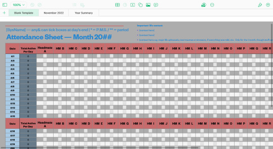
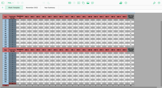

The blank template version of the spreadsheet, because it's so much easier to just copy and paste this than create a whole new spreadsheet page every time.
Going in order of the features...
First off, the color scheme and layout. You can change the colors of the cell backgrounds, all of the text, any shapes you add (like lines), and the page background to any color you like. You can also position elements pretty much anywhere on the sheet that you like. (Personally, I like to keep the spreadsheet in the upper-left because it's faster to access when it's the default loading position of a page.)
Next, the title text elements. Honestly? You don't really need to put anything there if you don't want to. It was just kind of there already with the basic 'school attendance sheet' template I started this from, so I kept it.
If you intend to set it up like I have it, though: “SysName” is for your system (or subsystem, or group of system members') name, though you could use your body name or a specific member's name or whatever-have-you, too.
“Any& can tick boxes at day's end” is a reminder or regulation thing, I guess? I intended it to remind headmates that the job didn't have to fall to just a specific person, and also to invite them to mark their own activity down if they'd like. If other systems have rules on who can and can't do what, though, then maybe it could be helpful to note that here?
The 'one asterisk for P.M.S., two asterisks for period' thing I added because it seemed like it might be useful to the systems that experience it, given hormones can affect mood, dealing with blood or pain can incur various negative reactions, it can involve sensory issues for those with sensory differences, people who don't track days passing very well might be helped by a record of their cycle, etc. For plurals who don't experience it, or who have other things that might be helpful to track like this, you could probably modulate or remove it from your own version?
“Attendance Sheet — Month 20[blank]” is a title to denote the purpose, as well as what month it's specifically for. If you create a different spreadsheet file (not page) for each year, though, you might not need to label the year on the sheets themselves? The file title could suffice in that case.
“Important life context” is to help give future-you context on what was going on in that month, as life happenings can affect who in your collective is active and when. You can pretty much put whatever you find useful here, but make sure to only limit it to what goes on within that month. (Happenings can still span over multiple months, though; just make sure to note it down on all months that it's applicable to.) Also, if you needed more than 3 bullet points for this, you could change the location of the text element to somewhere with more space.
The “Date” column is for every day in the month. I personally keep all 31 rows for dates on the spreadsheet, even in months with less than 31 days, as it's easier to just change the absent days to “N/A” than it is to adjust the spreadsheet template every month. As for the blank cell in the date column... I believe I had to separate it from the “Total” row beneath it due to it messing with something to do with the auto-graphing? But I honestly don't remember, so maybe try to combine that with the row below it in your version.
The “Total Active Per Day” column adds up the total number of checkmarks in the row that each cell inhabits. Thus, basically tallying how many people in the collective are active each day. I added this metric because I was curious about how many of the total member count were active at a given time, and if that fluctuated at different times of the year, or in different circumstances. It can also be a useful insight to how active the system is when life changes occur, like if your physical health is greater or lesser, if you're starting a new medication, etc., so you can see concrete information that doesn't rely on your own internal memory of time or events.
All the columns labeled “Headmate A” and “HM B through S” are for you to put headmate names, monikers, emojis, etc. in. If you don't know who someone is yet, but have evidence or a feeling that someone is there, you can also use temporary monikers such as “Unknown chores-person” or “Rando 1” or whatever works for you. Just make sure you keep their spot in the spreadsheet if you ever update their column header; that way your data stays more consistent and easier to track!
Also, just in general, I don't recommend messing with the places you put system members' columns, as that can make it more difficult to find who is where at a glance. If you need to add someone in the middle of the sheet, make sure to apply that change to your template sheet and your yearly summary!
As for why the headmate names recur in the middle of the spreadsheet's rows... I have trouble visually tracking what column is which when I can't see the headers, so splicing them into the middle of the month fixed that for me. If you don't need such a thing, you can feel free to remove it! It's not necessary for any of the cell coding.
Also related to the headmate columns is the “Max Days Integer” column. This is here specifically for graphing purposes, as things like the bar graphs like to auto-adjust to the highest number input into them, which can make them harder to read. This will have every day in that month checkmarked as to create a benchmark integer.
Lastly, the “Total” row is for tallying-up how many days out of the month that a single system member was active for. The cells are coded to add +1 for each checkmark in the column they inhabit – so make sure you don't accidentally check-off more boxes than there are days in that month!
————————————————————
Filled Monthly Example
————————————————————


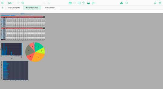
This is a filled example of the monthly template! I tried to emulate believable patterns of activity, but I have no clue if I hit the mark, haha. Anyways, this should give you an example of how one of these looks like when used.
Also included in this example are example graphs! You can graph things however you find most useful, but I'll go over the ones I've used here. (Also, note that ICloud Numbers can't currently copy and paste graph templates, so you'll have to set them up anew every time you create a sheet. However, you can open the spreadsheet in two browser tabs at once and just copy and paste the various data-settings onto your new graphs, so long as you remember what cells you specifically linked them to, so that can help preserve uniformity at least.)
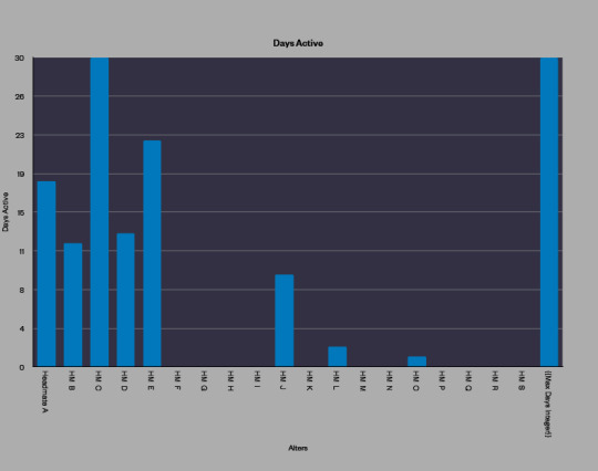
First off, the “Days Active” graph. This uses the data from the “Total” row to visually show you what each system member's activity was for that month. To create it, I selected only the cells in the columns labeled with headmates' names, not the whole row, as the blank space from the “Total Active Per Day” row might mess up the graph. (I don't remember specifically.) I also set the “major steps” to be “8”, a multiple of 40, so the data would be easier to read in relation to the days of the month. You can mess around with it and see what's easiest for you to comprehend, though!

Next, the “Total Active Per Day” graph. As you might be able to see by the empty “Date” and “N/A” entries, this reads the entire “Total Active Per Day” column from the spreadsheet and not just specific cells. This graph compares the numbers of total activity across all of the days in the month, and contrasts them against the total number of members in your collective (which you'd input in the cell that intersects the “HM-Total” row and “Total Active Per Day” column).
The T.A.P.D. graph has a major steps number of “10” and a minor steps number of “1”. I'd try to adjust the major steps number to be a multiple of your system's member count, as that way it should be easier to read.
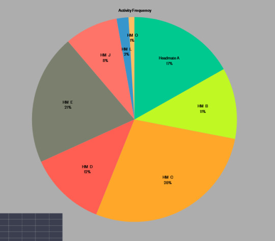
Lastly, the “Activity Frequency” graph. This one also uses the “Total” row for set-up the same way the “Days Active” graph does, but for this one you exclude the Max Days Integer, as this graph is supposed to show you what percentage of the month one headmate was active for compared to the rest of the system. This one admittedly gets harder to read at smaller formatting sizes, as the thinner wedges lose and displace labels, but is also a pain if you make it too big on the page, especially when viewing from smaller screens.
As for the placement of the graphs, you can put them wherever you want on the sheet. I just put them below the spreadsheet, as I find it easier to scroll directly down than the full horizontal length of the spreadsheet.
(Also quick note regarding ICloud Numbers: as far as I know, graphs can only pull data from one spreadsheet at a time, and only from spreadsheets on the same page. So all of your system members will have to be put on the same sheet if you want them all to be on the same graph.)
————————————————————
Yearly Summary, Filled Example
————————————————————
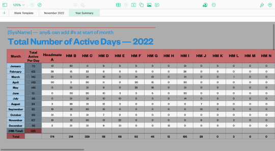
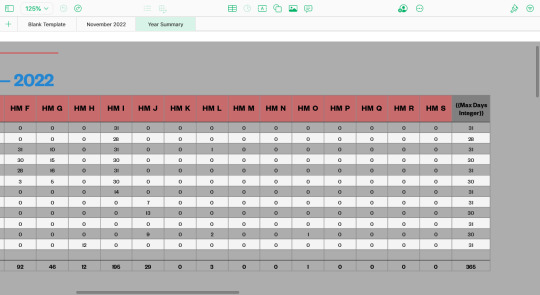
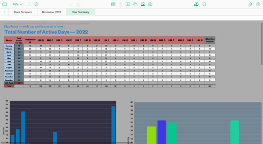
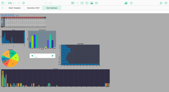
And for our final page, we have the spreadsheet and graphs where you input all the data from the monthly spreadsheets to create a comprehensive, easy-to-review overview of the year. The formatting is pretty much the same as the monthly templates; you just reduce the date rows to '12' for labeling the 12 months in the year and fill the “Max Days Integer” column with the total number of days in each month for that calendar year. (Which means that you'll need to make sure to account for leap years!) Also, the guideline changes to 'adding numbers at the start of each month', and the title of the sheet changes to “Total Number of Active Days — 20[blank]”.
Basically, you update this spreadsheet every time you fill a full monthly spreadsheet. I find that doing it at the start of every new month is the easiest, since the idea of filling out the entire year at once seems too daunting, and this way I get to see the graphs update incrementally instead of having to wait a whole year. But you can do it in whatever way works best for you!
Also, you may notice that there's no “important life context” text element on this sheet. Personally, I think that reviewing that in each individual month would be more informative for me, but if you'd find it useful to have that here, then go for it!
As for the graphs...

The “Total Days Active” is set up the same as the “Days Active” from the monthly spreadsheets, just with 16 major steps instead of 8. It functions the same too; you're just seeing all of the single-month versions of this graph combined into one!
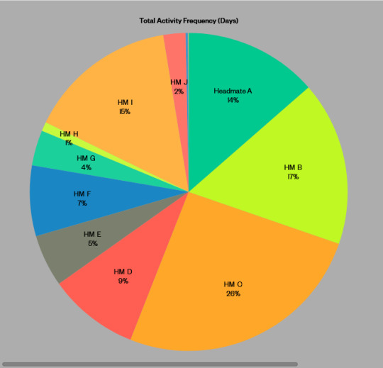
Again, the “Total Activity Frequency (Days)” graph is set up the same as the monthly version, and shows the combination of all of the single-month versions in its data. Pretty cool to see who was around the most and least in a year, in my opinion!

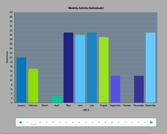

The “Monthly Activity (Individuals)” is specifically an “interactive graph”. This lets you flip through multiple data-sets while using a smaller amount of page space! To set it up like this, you want to create a cell-selection spanning your first headmate's “January” cell all the way to your last headmate's “December” cell, leaving out the “Max Days Integer” cells. The major steps is still set to 8 in this graph, as this graph compares one headmate's number of active days for each month in the year.

The “Total Active Per Month” graph is set up the same as it's monthly counterpart. The only thing is that you now have to do “the total number of members in your system” multiplied by “31” (that being the highest possible number of days in the month) in order to get the benchmark integer for “if every single member of your system was active every single day in a single month”.
This is probably something that would reach ridiculously high numbers for those with higher system counts – after all, it's already at “589” with this example count of “19”. So while it gives an interesting view of the data... it probably could be done in a less clunky way, lol.
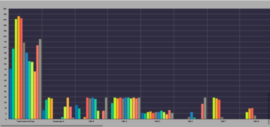
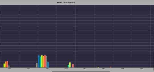
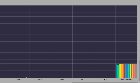
And finally, this behemoth of a graph, another thing that probably doesn't work great at larger system counts, haha. You create this the same way as the “Monthly Activity (Individuals)” graph, but including the “Total Active Per Day” and “Max Days Integer” columns as well. Also, the major steps for this graph are 20, not 8. This graph basically lets you see the same data as the 'Individuals' version, but all at once, and with the ability to compare a single headmate's activity against the collective headmate activity for each month.
You could probably get away with using the 'Individuals' version alone if you wanted to; I just personally find it fun to be able to see them all at once.
...Also, evidently there's a column header typo of “Total Active Per Day” rather than “Total Active Per Month” on this spreadsheet that affects its entry on this graph. Oops!
————————————————————
Additional Notes
————————————————————
And that's a wrap! A very... lengthy... wrap... Lol.
Anyways, for 5 quick additional notes:
1: In hindsight, there should probably be a checkbox column for “Too unclear to tell” or “Bad communication”, as that in and of itself would be valuable data to track. So that could be appended to the start or end of the spreadsheet, perhaps?
2: You can put comments on individual cells in the spreadsheet. So if you want to put more nuanced detail on why or what system members were doing in a day, or note down on a 'date' cell what events were transpiring that day, then that's a thing you could do! Or if you wanted to use it to track plans you have for the month, you could also do that, in theory, though I'm not sure how useful that'd be given that comments aren't immediately visible like the cells' data is.
3: You can password-protect spreadsheet files in ICloud Numbers. It gives you the option to set unique passwords for each file, doesn't stop you from using the same password on multiple files, and has the option to set password hints if you need them. So if you'd find that helpful and not a hindrance, then that's an option!
4: I also drafted a version of this set-up to have two spreadsheets in a single month: one for 'active'-presence and one for 'passive'-presence. I did this while I was trying to combine a fronting-tracker with an activity-tracker, as fronting-trackers do still have their merits.
If you want to set something like that up, you basically have to duplicate everything on the monthly sheets to another section of a single month's sheet (or make a separate page for the same month if you want), and then either duplicate the contents of the yearly summary on the same page (not recommended; it gets long) or split the data up into 2 separate pages.
5: Aside from that, writers and character-creators who want to make super-intricate histories for their plural characters could probably adapt this to their purposes too. You'd just have to adjust the calendar to whatever calendar your setting uses, and anything else to whatever would be more useful for fictional purposes.
And that's it! Happy spreadsheeting, y'all!
#Capri's Plurality Resources#Capri's Writing Resources#multi x multi = multiplicity#ID in alt text#(first time ID'ing images... fair warning)#(If any of the alt text needs improvement please let me know!))#(It's a longer post because there were a lot of details to cover haha))#(This should probably be in the general plural community tags...)#(...But admittedly; throwing my hat into that ring seems a bit...daunting.)#(It's still fine to share this post with other people though! I made this to be a resource for others to use after all.))#(Also if you make any alterations to the set-up feel free to share so others can try it out!))
11 notes
·
View notes
Note
the post about the characters' in universe attractiveness got me curious about something kind of similar; what about the characters' in universe physical strength? the only character that i can think of to have their physical strength actually stated is honami, due to her having muscles from drumming. i believe akito is also stated to be pretty strong? though i can't really remember. and emu has always read to me to be one of the more physically strong characters due to her various stunts where she Jumps From High Places And Is Perfectly Fine. toya, meanwhile, is stated to be one of the weaker characters i believe.
these are the only few that come to mind for me right now but there are probably more that i can't remember right now
You'd be right about Akito. In fact, he is depicted as unnaturally strong, though I'll give a free pass for the fact it's meant to be part of a funny scene.

He's carrying Tsukasa while running a reasonable distance at a high speed. Akito is very athletic and plays a lot of sports, but Tsukasa also has dance training and does stunts so presumably has a reasonable amount of muscle mass on top of being around average weight (he is a big eater as well but he seems to burn a lot of it on excercise so how much his appetite adds to his weight is debatable). I won't bother you with all the physics and sports science to keep this concise but there is a lot of force being exerted onto Akito's knees in this card, and this would genuinely be impossible to accomplish in real life.
Rui is pretty strong. He carries heavy machinery around constantly, and carries a shitload of stuff with him camping in Exciting Picnic, including a weighted training device that Nene struggles to use but he carries about with a whole backpack full of other things no problem. In Island Panic, he carries Tsukasa who already has Emu on his shoulders and Nene on hers, in order to reach some bananas. He ended up taking most of the weight since Tsukasa started to sneeze. In his card story from Pandemonium he also packs way to much stuff in his bag but says that it wouldn't be a struggle to carry. He's probably where Wonderland SEKAI MEIKO gets her strength from.
Adding to that, Emu is pretty strong. She carries Nene on her shoulders in Island Panic as I just mentioned, and she does loads of sports clubs such as gymnastics and swimming, so her overall strength is probably pretty good.
As I mentioned, Tsukasa is probably pretty strong, since he does a lot of training and stunts and was able to lift both Emu and Nene in Island Panic. That said, there is this area conversation:
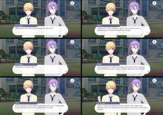
hopefully this is readable, I just screenshot it out my drafts because it's been sitting there in case it ever came in handy. So he might not be that strong? The Island Panic scene is more played for comedy so it may be exaggerating how strong he actually is. At the very least it seems like he has weaker core strength. Though as mentioned, he does do a lot of stunts and already had dance and stage training prior to WxS, so he's probably still above average.
also I want to point out what Rui says in the 5th panel is like. kinda bullshit. not entirely but. kinda. bodybuilding is more for aesthetics and while building muscle = building strength it only works to a certain extent with bodybuilding and if you want to work on strength actual strength training is far more practical. it's a joke i know it's a joke and i shouldn't take it this seriously.
we can assume mafuyu is pretty strong because she's good at everything and is stated to be pretty athletic. not the most reliable claim but the game does like to bring up the fact that she's good at everything. she also does archery which requires a lot of upper body strength.
kanade is not strong at all but that should be self-explanatory.
toya isn't that strong either i don't think. more specifically he's not very athletic but these two things tend to cross over a bit (Kamiyama Sports Fes shows he's terrible at throwing things). he probably has pretty good stamina though.


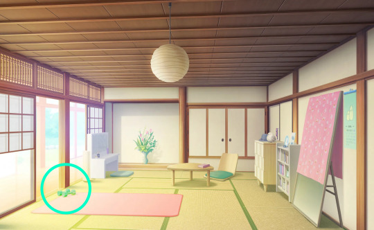
haruka does weight training you can spot some weights in her room. you can also spot some smaller weights in airi and shizuku's rooms. Makes sense because you need to have good fitness for idol work. Shizuku also does archery with Mafuyu so her upper body strength is pretty good.
i think that's everyone there's evidence for.
116 notes
·
View notes
Text
@dandenbo asked me for the art asks: 🎠What is a typical 'workflow' for a piece from idea to finished? It turns out to be a long answer so here's its own post, under the cut to save your dash! How I go from screenshot to painting: (This is not intended to be a 'this is how you do it!' kind of guide. I absolutely don't do an optimal route, this is just how I go about painting and what works for me! I've done a workflow for a screenshot to painting as I do a few different things but this is one I could explain somewhat coherently. My comics tend to be created pretty chaotically lol)
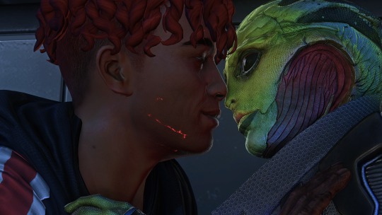
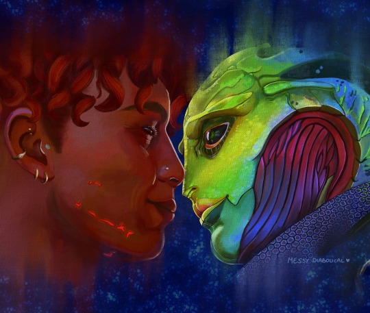
1) I take an ungodly amount of screenshots while playing. Also pester friends for their screenshots or stalk the group discord for interesting shots.
2) Go through all those screenshots cursing why I took so many, looking for those great moments that I want to paint. I’m particularly looking for nice poses/captivating moments, dynamic lighting or interesting expressions, and they don’t need to have all 3 as we can fix some of that in the next step. Here’s the screenshot I chose for my Keahi x Thane piece:

It was a cute, soft moment between them and I liked the highlight at the edge of their profiles. 3) Refine the screenshot. I don’t use anything fancy for this. I game on windows PC, so I open up the screenshot with windows photo editor. I crop the image, play around with saturation, exposure, contrast, just basic editing until it looks tastier. For this piece I wanted it to be hyper colourful and vibrant, leaning towards warmer tones.
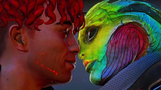
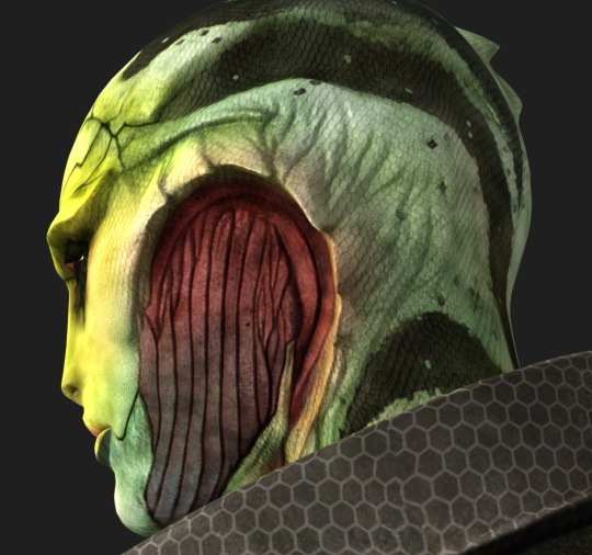
4) Decide what I will change, then gather references for those changes. In this case I was fortunate that not a lot needed changing. I knew I wanted to move Thane’s eye position to looking at Keahi rather than the way he is slightly off focus, do a more realistic ear with earrings for Keahi, make Thane a little more smiley and lower his eyelid and give Keahi nicer eyelashes. I keep a whole bunch of art guides and tutorials on my PC so I grabbed the necessary ones and sent them to my ipad ready to have on hand for the sketch stage. I have Thane’s character model in XNApose, so I can check things like his eyelid specifically in that (this is actually for a different project but shows you what I mean)
If I was going to change up the lighting/shading I would also gather references for that. For example sometimes i’ll take screenshots of lighting schemes I love from films/tv shows (think the strong teal and orange scheme in Mad Max or the neons of Blade Runner). Or for precise shadows, I can again use XNApose. I also have a little 3d printed Thane head I can shine a torch at and take photos of to get shadow ideas. For humans there’s lots of reference to be found with online searches, I find pinterest more useful than google for this. For specific expressions or body parts, i’ll just take photos of myself (hand poses, smiling from the right angle etc.) My camera roll is an interesting place. I have drawn drell frills on my neck and on my chest before to see how the lines would fold at certain angles. 5) Setting up a canvas I work in procreate. For a piece like this I try to go pretty big, say 5000 x 4000 pixels, then i’ll crop down later as needed. 300 DPI. As I work, I’ll make duplicates and continue on the copy each fresh session. When i’m finished I make a backup save of the PNG and .procreate files on an SSD. I immediately turn the background colour down to a more muted colour to not burn my retinas. If i’m using a textured background like an oil board i’ll insert it, and any overlays like canvas effects. Set up my layers from the start basically for easy toggling throughout. I try to be good and label things to make life easier, it doesn’t always happen though. I don't wear a digital glove or use paper effect screens but I do have a bottle of screen cleaner and a microfibre cloth handy at all times. 6) Sketch. I’m still very much learning to draw. I tried for a long time to do the classic ‘ball for a head, draw the planes/lines etc. It was a constant struggle and never clicked for me, the ball especially always made things much worse, turning a circle into a 3d image in my head just does not happen. I find it better to just start drawing and work things out as I go (I use procreates reference window to see my screenshot). So I’ll have my sketch in one canvas, and i’ll also have a second canvas with the photo ref on it at the same size, and if I feel like something is really wonky and off i’ll test my lines over the photo to see what’s gone wrong, then go back to the sketch and correct the areas that revealed. Sometimes I’ll use the grid feature if i’m getting stuck. Here's a few of the sketch stages:


Here I tried out the lines on the photo and noticed that Thane’s frills were a little too far to the left, and Keahi’s eyebrow needed to arch down towards the nose.In the next pass I correct these:

Also, and I know i’m gonna get side eye from some people for this but I really could not care less to be honest. On some pieces i’ll just trace the screenshot. Sometime I just want to get to painting, am not in the mood or mindspace for a learning experience, and this is a hobby. It’s my screenshot, no one is getting ripped off. My latest Javik piece was done this way 🤷♂️ 6) Painting. I’ll start by blocking in the background and the portrait flats, usually on separate layers. I try to have an idea of the background colour from the start as this can effect the whole piece overall, but sometimes you just gotta change it as you go so having it on a different layer makes this much easier.
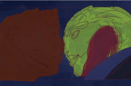
The painting itself I’ll lay down wider areas of colours, then start going in and refining bit by bit, I tend to work on one area at a time, and sometimes I’ll get pretty well rendered on a small area before moving on, other times work on a wider area. It really depends on my mood and what i’m vibing with that day. Like you can see here I’ve done some general messy colouring all over Keahi, but done a lot of refinement on the eyeball:
7) Finshing the piece, uploading and testing: When I’m sick of rendering the painting and don’t think I can add anything more to it without gnawing my own wrist off, it is time to finish up! I make sure I toggle all the layers I want on, add a top signature layer (lol I lie I forget this all the damn time). Then i’ll upload the piece to my google drive and open it up on my big 4k monitor on my PC, and on my phone, and see how it looks (my ipad is a 9.7inch air). I find that once off my ipad, it often looks a little less saturated and contrasting as it does in procreate. So I might go back and change the levels if it’s too big a difference until it looks decent across devices (it’ll never look perfect on them all though, just gotta find that happy medium).

8) Posting online I really don’t have any strict steps for this. I know some people go for optimal posting times, and will make multiple copies of their pieces in different sizes to fit better on different sites (damn you instagram and your need for everything to be square). I… do not do any of this lol. I post when I’m done whatever time or day that is. I do tend to reblog/retweet etc before I go to bed, as I live in the UK and that will at least be getting into evening time in US. I reblog my own stuff a fair bit.
16 notes
·
View notes
Note
Hello ! I've read a lot of the posts you shared or wrote about horror, especially in reaction to "pearl-clutching" discourse against the whole genre.
It was very though provoking (thanks!) but I was wondering if/how you draw the distinction between that and, well, honest and "legitimate" bad review / negative analysis of some individual stories who happen to be horror ?
Oh, for sure. Of course there's legitimate criticisms to be made about individual horror works, or even about horror as a genre on the whole. I'm never going to claim that there isn't. While I do feel like there's a place for the "let people have fun" school of thought around media criticism, I don't think it should be a blanket smothering of all criticism - mostly, as with so many things, it is worth considering your time, place, and audience. For your own sake as well, I find.
I do think that sometimes the language of "criticizing" or "being critical" has become a handy mask for people to say whatever they want in some of the same (though less pernicious) way that people use "I'm just asking questions" to shut down discussion of misinformation and conspiracy theories. Again, #notallcriticism, much of it is good and beneficial and keeps things fresh (and me thinking), even the criticism I ultimately might end up disagreeing with. And at the same time, I do see the tendency popping up sometimes to use the idea of "legitimate criticism" as a way to shield a person from disagreement (the somewhat infamous "think critically about x" translating to "and you'll agree with me" comes to mind.)
As far as the how, well, it's certainly a little your mileage may vary - what I might read as an unfair review of a book I liked, for instance, someone else might read as a well-deserved ripping to shreds of a mediocre work, and it's certainly possible for neither of us to be "right" about which it is. Some of this - maybe even a lot of it - is a matter of perspective.
I guess I would think of two things that shape my perception of how someone is talking about a work or a genre, in general and in particular with horror:
1. Is the writer familiar with the genre? Do they have at least a passing familiarity with the conventions, tropes, and other narrative tics that tend to crop up? If not, are the criticisms they are making marked by that lack of knowledge (ime some of the discourse about the A Song of Ice and Fire falls victim to this, sometimes). I'm not saying that criticism is invalid coming from someone without genre knowledge, but I am saying that I'm more inclined to be skeptical of criticism that comes from someone who clearly dislikes the specific genre they're discussing, because it sometimes feels like a willful lack of curiosity and unwillingness to engage with a text/genre on its own terms.
> Addendum to this: is the writer familiar with the genre as it stands recently? Horror now looks rather different than horror fifty years ago, just for instance.
2. Is the argument or point they're making actually coherent? Is the analysis solid and grounded in at least some kind of evidence or source? (Is the author using screenshots of tweets in lieu of actually writing about the phenomenon they're discussing?) I can't always but I'd say I can usually at least recognize, even if I disagree, when someone is actually taking what they're engaging with seriously and when they're not (in terms of the work put in to convince me what they're saying is true, relevant, and important), and if they're not taking it seriously then why should I?
And one more, I guess, which feels obvious but sometimes on the internet isn't, because people love to have opinions (I get it! so do I!):
3. Has the writer actually read (or watched/played/whatever) what they're talking about? This ties in a little with point one but is slightly divergent, because someone can to an extent be familiar with a genre without having read it. But someone talking authoritatively about the problems with something they haven't actually had direct contact with, based purely on a set of cultural osmosis and related assumptions, is frustratingly common, and people will assume that they know what they're talking about from that alone and are qualified to make a sweeping judgment from that position. And I'm just not going to take criticism made from that perspective very seriously.
That's how I'd draw my lines, anyway. I don't claim to be an authority, certainly; I'm a gal on the internet with a big mouth and a lot of opinions. I think the important things here though are a. I certainly don't think that there's no such thing as legitimate criticism (in the negative sense) of horror works or horror as a genre, and b. I have particular standards for how I judge that criticism based on content and context.
I guess it's also worth noting, with this particular example, that the other question is "how much does this feel like it aligns with the present moral panic around dark or disturbing content in fiction?" and if the answer is "a lot" then I'm significantly more likely to dismiss it.
#conversating#social justice fire mage#actual english major lise#lise has opinions#look an actual post that required brainpower ma#i still have that i guess!#now i'm going to sleep yikes i'm tired
59 notes
·
View notes
Text
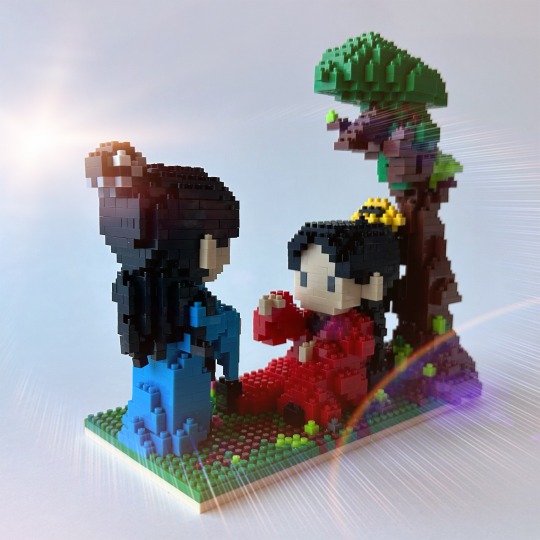
Building Block Figs - Catching Light
Continuing on from the last Building Block Figs - Basking in the Sun and Building Block Figs - Beautiful Fight Scene in the Middle of the Lake, Part 1 and Part 2, we have this wonderful set.
These figs make me laugh - I love them so much! I don't know why, I just find them ridiculously charming.
This building block set is 1,544 pieces, measures 8.4 x 17.6 x 15.6 cm, and is rated 10 hours. I did indeed take all 10 hours to build this, if not a little bit more.
Here is the sales pic of what the finished product is supposed to look like:
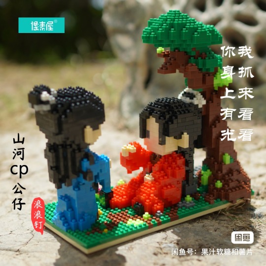
Cute, isn't it? As usual, sellers do a much better job of setting the scene than I do. I will say, though, that I did make two little tweaks to the set to make it a bit more canon compliant. Can you spot them?
It'll be easier to tell as we get better pictures, so I'll get into it!
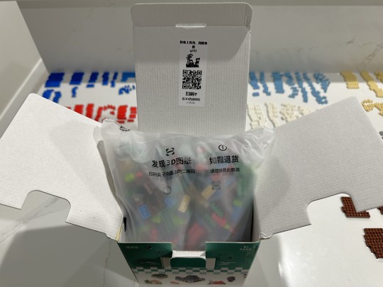
First, here's the box of doom bricks. Like the others, this came in a generic sales box, with a super handy little unsnapping tool, and a sticker with a black and white image of the set and QR code instructions.
Once again, you'll notice my line up of extra bricks from the previous sets hanging out in quasi-neat little rows. Originally I figured I'll leave them all out in case I ran short of any, but in reality, this set maker gives me extras of each color every time. Which is handy, as you will see for later posts, when I make some adjustments to the fig sets to make them a bit more canon compliant.
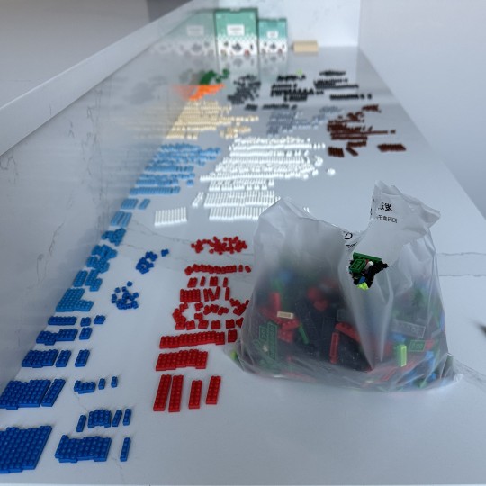
As you can see, there's a LOT of extra bricks left over. To be honest, there shouldn't be so many white bricks - those are from another set that I made a major change to. I'll post about that one tomorrow.

Here's the different order of assembly - I went ahead and started with the base and tree, as they suggest.
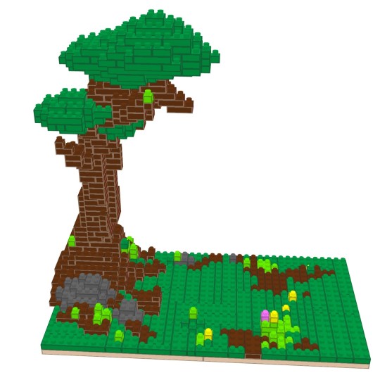
As you can see, this is a very beautiful terrain here. I did not remember this area being so green and flowery from the show - in fact, I remember it being kind of sandy and desolate, but my memory is pretty lousy, there might be a scattered flower or so. Let's check.

HUH. There is not a flower in sight, is there. Hmmm. Well, this is kind of gonna bother me. Maybe I should have looked up the inspiration before putting together the entire 10 hour plus set, huh! Well, the little flowers are easy enough to lever off.
Hmm, anyway, moving on (for now).
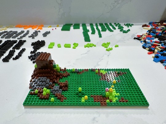
So a couple things here. First, as you can see, there are only two green colors. I mean, one normal color really - the light green here is actually a neon green. It's brighter than it looks here. It looks great here, don't get me wrong, but now all I can see is the very sandy terrain of that screenshot.
Second, I tried something a little different here. It actually takes a long time to sort all the individual bricks, so in an attempt to shave off some time, I decided to experiment with this set. As you can see, I dumped the entire bag out to the right and am just picking out individual pieces as I go.
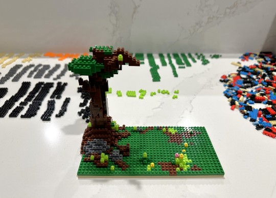
You'll note it's now evening. This tree took a LONG time to build. I actually timed myself up to this point, and to get to this mostly-done state took 2 hours and 58 minutes. I was pushing hard, too, because I really, really wanted to get the whole tree done that evening before I went to bed. But there was no way. I was too tired and was hitting the point where it was less fun and more work. So, despite really not wanting to, I summoned my inner adult and called it a day here.
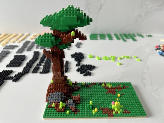
Fast forward through time to the next day, and I'm all bright eyed and ready to bust this tree out. And it's done! I like this tree a whole lot...I think they did a beautiful job modeling it. Imagine if they had the full Lego suite of colors and special pieces! It would be really something. I kind of like it this way though (although I would take more colors, I can't lie). It really has an old-school style charm.
You can see the grey rock there where Lao Wen will be propped up against. And of course, the cheerful greenery and pink and yellow flowers.
Feeling VERY accomplished, I put the tree aside, and moved on to A-Xu.
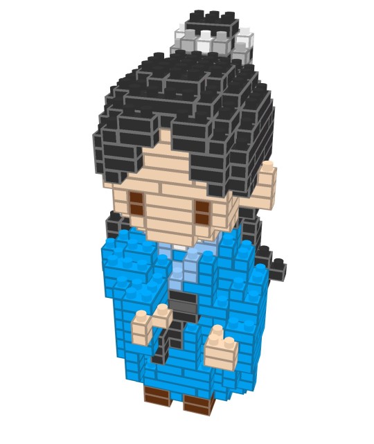
Yep, looks pretty good. I was a little surprised they picked the medium blue color instead of the dark blue color, considering how bright the dark blue color actually is. But this looks fine too.
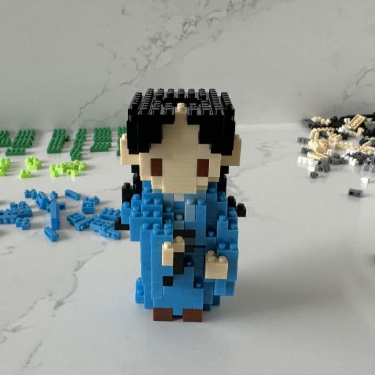
I am going to proudly say that I did, in fact, knock this fig out in record time. I've put together two and a half A-Xu figs by now (the half is going to be explained tomorrow, I promise!), so this third one went like a breeze.
As you can see in the back, I couldn't help myself, I was starting to make a few little piles of the colors I was working on. The big messy pile of bricks was kind of a pain, and I had to keep resisting the urge to sort them out.
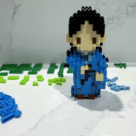
And here he is! All done. He has a very solemn no-expression on his little brick face, which is appropriate. Can you see how there's a little bit of a neck (nothing too saucy or anything), the thin white layer of his under-robe, and then the lighter blue layer? I love it. Very charming. We also have his black belt with a bit of the tails.
It was yet another evening by this time, but since I did manage to finish him before I went to bed, I did indeed sleep the sleep of the righteous.
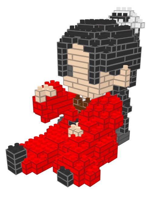
I woke up even brighter eyed and with pep in my step, ready to rock this last fig out. 10 hour assembly time? I don't think so!
I had now made three Wen Kexing brick figures, so the fourth one was gonna be just as quick as A-Xu was, no doubt. I pulled up the instructions on my phone, and got ready to go. 95 steps for our battle-weary Valley Master, huh? Huh. That's kind of a lot. But considering A-Xu was 85, not too bad. The tree was 119, by the way.
As I looked at the picture, however, I noticed that they had Lao Wen's (virtually) omnipresent hair wispies here. Given that this red wedding costume is the one outfit where his hair is pulled back all the way, it kind of bugged me. Which is funny because I've never liked how he doesn't have the wispies with this hair style on the show. It's my least favorite look on him, which is too bad, because I did like how they at least mixed his hairstyles up some. In my defense, I feel like I'm right (so right!) about how much better he looks with the wispies with this hair style, because you could see it at the concert. And he looked spectacular.
Anyway. Warring between my extreme desire for him to have the wispies and the simple fact of it not being canon, I started to build.
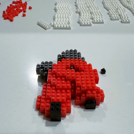
I got the first big chunk done very quickly indeed. Many of these figs are done where you do a big piece, and then set it aside while you work separately on the next piece. This is where I was.
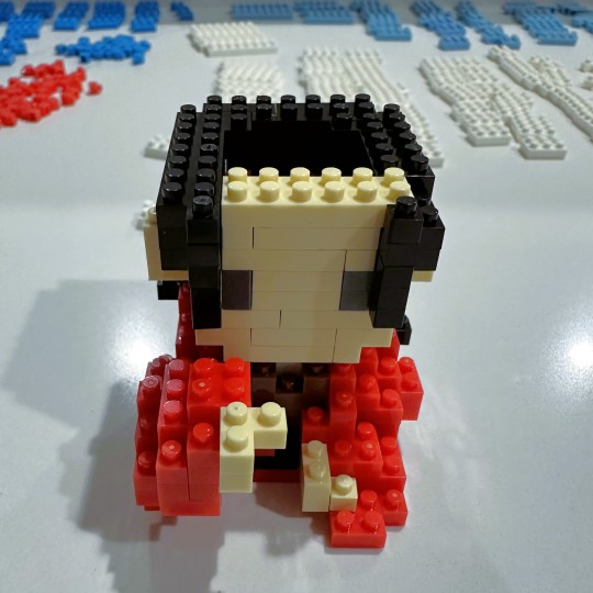
And that's where I stayed, for a long time. I built this piece three times. I had to completely disassemble the entire thing the first time I built it, because I was off on my brick count, and the second time I had to disassemble it down to the first third.
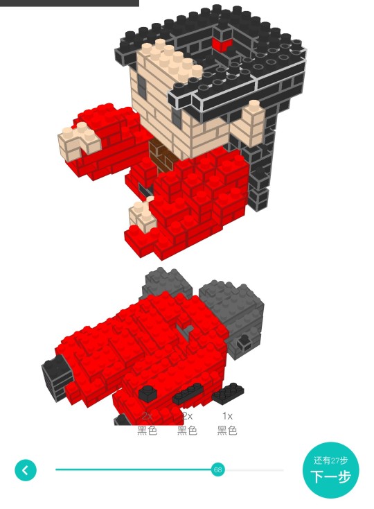
Part of the problem was the way the directions were. As you can see, they still have the first "set it aside" part showing up on the directions directly under the new piece. Unfortunately, all that red blended into each other when I rotated the image around, and it was very easy to accidentally think I needed more or less pieces than I actually did.
I went ahead and built it with the wispies, as directed...and then just couldn't do it. I disassembled half the head and re-built it again without them. I also think that this fig, just like Lao Wen, does not look as good without them, but canon is canon.
Unfortunately, it was so late and I was so tired by the time I finished him (and yet also pretty jubilant), that I forgot to take a pic of the finished fig! Yes, I literally finished this set late last night, despite my best intentions of finishing it up and then triumphantly posting about it on the same day. It did, in fact, take longer than the 10 hours build time.
It took a long time, in general. My finger tips have actually toughened up a bit, so they don't feel sore from snapping the bricks in place, but my neck isn't all that pleased with me from hunching over these various sets for so long. So, I've been taking a few more breaks to stretch and do other things.
But, I woke up early today, and very happily took this set's beauty pics in the clear light of the morning. I love it!
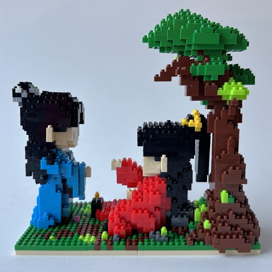
I love how this set all fits together. We have the tree growing over the edge of the base, and Lao Wen there leaning up against the rock. A-Xu is standing with his elegant posture, and their little brick hands are reaching out to each other. Cute cute cute!
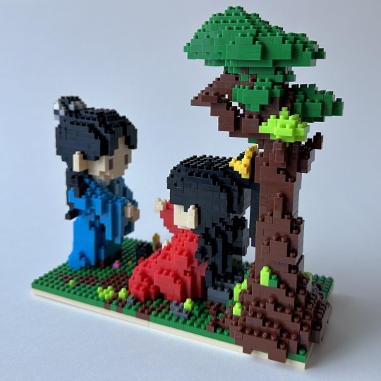
Wow, this light is great. I clearly should get up early to take fig pics more often.
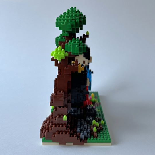
The tree looks great, I think (and not just because I spent hours building it!).
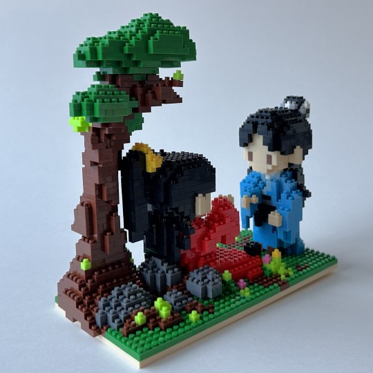
This is a good view of the rocks behind Lao Wen here, and his big ponytail (I do like this part of his hairstyle).
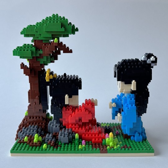
The green doesn't look so bad on the ground, I think. I'll pull off the yellow and pink flowers, and maybe make a brown patch on the corner closest to A-Xu. That'll keep it colorful but make it a bit more like the show.
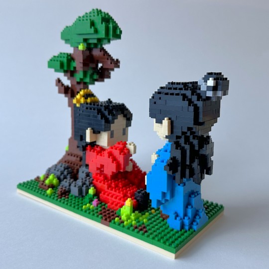
A-Xu's hair looks great, as usual. You can also see how I removed the wispies on Lao Wen's hair. I'll get a close up later so you can see it better.
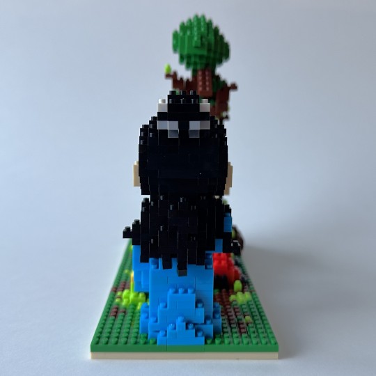
Shoot, not my best pic - can't really see any of the detail on A-Xu's glorious night-black hair.
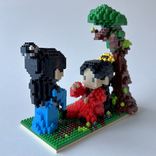
There we go, now you can. Oops, I see I knocked a tiny piece out of kilter on the bottom of his hair, I'll have to fix that. But! Here you can see both changes I made from the instructions - the lack of wispies of course, and then I made Lao Wen's guan gold instead of white. This took a while too, because I didn't have enough yellow pieces. The only yellow I had from any of the sets was literally from the yellow flowers here and the few extra they gave me of it. I actually pulled a few yellow flowers off the base there and replaced them with green or pink, just because I needed them for his guan. I then also carefully checked to see what internal yellow bricks were covered up by the black of his hair, and replaced them with black so I could save the yellow ones for the parts that did show. I'm very happy with how it turned out! It looks just like the white one, except, you know, yellow.
I don't know why they didn't originally design it with yellow, given that it is gold on the show, and they had already included yellow bricks with this kit. Maybe they felt the white stood out more or something. Anyway, it was bothering me it was white, so I'm glad I was able to figure out a way to make it work.
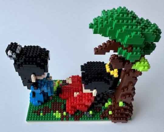
Alright, we're back around! And a bit of a different angle here, so you can see the poses a little bit more clearly.
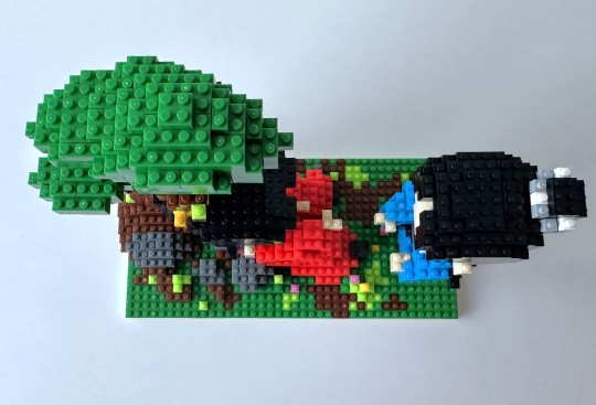
Alright, a true top-down pic here. May I just say one more time how much I like this tree! The detail in A-Xu's guan is really nice too.
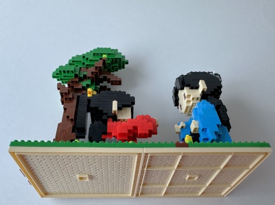
The bottoms-up pics are always tough here with the bases. Not a flattering picture, sorry A-Xu!
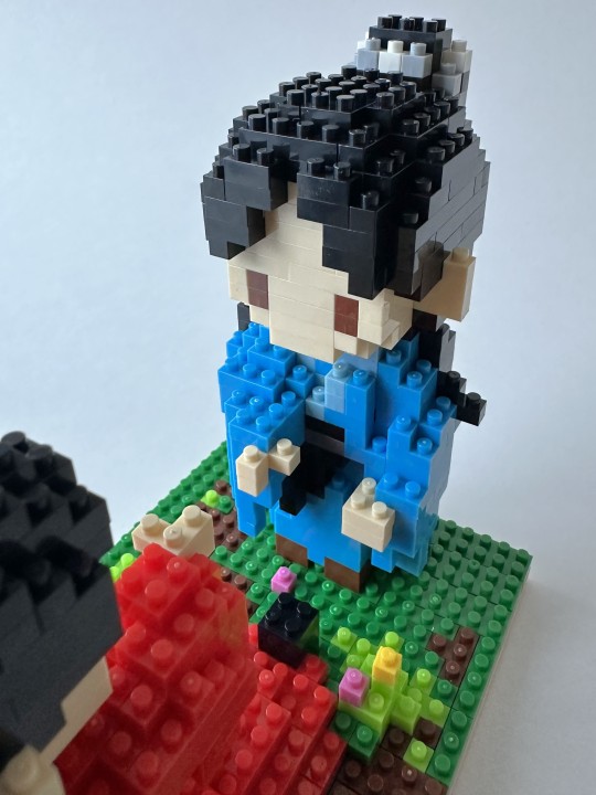
A close up of our noble shixiong with his little hand outstretched...
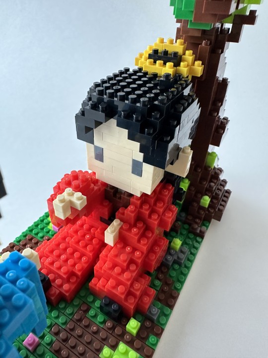
...and our weary shidi. What a great set, I love it! I'm so delighted by it, I can't even tell you.
Alright! come back tomorrow, for the much hinted at next set. And the last one, for a while - I have to wait for the remaining sets to be sent to me.
(Come back tomorrow, she says, as she still has some assembly on the last fig to do! I'll wake up bright and early tomorrow, and hopefully finish up).
Material: Plastic bricks
Fig Count: 506
Scene Count: 35
Rating: They're actually both reaching for their light
[link to the Master Post Index]
15 notes
·
View notes
Text

Hello. I'm Nox (though Tanasha calls me Farhan. And only they can call me that). I go by he/they. I like to read, write and draw. My main is @nox-in-a-box where I post art. Also where most of my fandom stuff is.
So just a couple of disclaimers, I guess?
I vent here quite a bit. Sorry in advance.
I don't share fundraisers here.
I reblog suggestive stuff at times so if you're a minor or uncomfortable with such things, I would advise you keep that in mind before following.
Although I'd rather just get an ask, DMs are...alright. I do find Tumblr DMs a bit annoying due to the lack of certain features, but eh.
If you feel uncomfortable about something I said...please tell me.
Want me to tag posts with a certain content warning? Tell me.
I am trans. I feel like that context may be needed. For. Some posts.
I'M NOT KIDDING ABOUT THE MOOD SWINGS.
I think that's it.
Tags I Use:
#misc
#mecore
#writing — just general writing-related tag, I don't actually post my writing here lol
#writing advice
#writing reference
#art reference
#art advice
#words — vocab stuff
#personal reference — this is just some handy stuff I wanna stash away
#art
#animal art
#fibre arts
#digital art
#fish! — THIS TAG IS NOT JUST FOR FISH IT'S FOR ALL SEA CREATURES
#billi! — cats.
#poday — plants.
#cool shit
#history
#animals — general animal tag
#love — platonic, romantic, whatever
#friendship — self-explanatory
#twitter — either about twitter or a twitter screenshot
#cars
Updated 12/11/2024 to add link to OC Masterlist (THIS LIST IS FOR PERSONAL REFERENCE FYI, I DON'T HAVE AN OFFICIAL LIST FOR OCS ALTHOUGH I SHOULD MAKE ONE)
Updated 16/11/2024 to add tags
Updated 4/12/2024 to remove some stuff
Updated 16/12/2024
6 notes
·
View notes
Text
Ten(ish) People I'd Like to Get to Know Better
Thanks for the tag @tripably - I felt like blabbing about myself so your tag really comes in handy.
Last song: My Spotify says its Kaunis Marjaana by Scandinavian Music Group. A very enjoyable song, I don't usually listen to it intentionally but always glad when the app algorithm decides to play it for me.
Favourite colours: Deep, cold purples (or violets - somehow I have the assumption that "purple" refers to a warm/reddish hues), the ones you'd associate with midnight. I just bought second hand this lovely pinkish purple suit, which ironically will be about the only purple clothing I own.
Last book: I just finished comic book by Hanna Koljonen called Syliinvaellus Intiaan (a Hugrimage to India). It was a pretty fun one. Also very close to finishing the novel Hiljaisuuden mestari by Miki Liukkonen.
Last fic: I prefer not to expose my fic reading tastes too much in detail but my AO3 says it was a smutty How to train your dragon fic...
Last movie: Disney's Tarzan. I think I had seen it before but after the rewatch I'm not too sure??? It was good, though watching it in 2024 is like... They could've done a couple of things differently....
Last TV show: Just finished the eight episode of Only Murders in the Building. The reference to A Few Good Men... iconic.
Sweet, spicy or savoury: I used to be sweet all the way but I'm starting to gravitate towards savoury.
Relationship status: Used to be "happily destined to be a hermit" but nowadays it's more like "destined to be a hermit" in a less joyous tone.
Last thing I googled: "Prisma käsivoide" (Prisma hand cream) because it's dry hands season and Prisma will provide.
Current obsession: This is not the answer my therapist would give but right now it's fragances and poetry by Sirkka Turkka, a Finnish poet. Got my paycheck yesterday and I went to Rituals to buy a body cream of their new Alchemy collection which has me under its spell, and also a mini perfume of their perfume line (though I'd like to have the Alchemy perfumes too...) Now I feel like expanding my fragance collection and also smelling what other people's perfumes smell like on their skin (I think it might be hormonal but I get so many whiffs of perfume that make me go "WOW" when I'm out and about).
As for the poet Turkka, I also got a volume collecting all of her poetry. I read Turkka's Tule takaisin, pikku Sheba (translated as Not You, Not the Rain - not a direct translation of the Finnish title) a while ago, and was absolutely taken by it. I had not previously read anything that would give ashape for the longing I feel deep inside me, and here it was, right in Turkka's poetry. In my darkest hours I sometimes look at the screenshots of her poems on my phone. So, reading through all of her work is my next endeavour.
Looking forward to: Man, I don't even know... There isn't much I've felt like is worth "looking forward to". Maybe finishing the poetry collection. And going back to therapy after my therapist's vacation week.
I'm not tagging anyone this time, but anyone who feels like doing this, please do! I love learning things like this about other people.
#tag games#sorry if some answers got a little bit depressing I try not to be a sad sack on tumbr but the truth is I've been a sad sack most of the yea#I had a pretty weird dream a couple of nights ago and as psychoanalyst my therapist is obsessed with dreams and she will get excited when#I explain it to her#so I guess I'm really looking forward to it
3 notes
·
View notes
Note
hi kevin! what do you do to edit your screenshots? thanks!
Hey there! :) I apologize for the delayed response. Regarding your question: I don't edit my screenshots that much. There are only three things I do atm: resizing the pictures, adding a bit more contrast and sharpen them a little bit. I use PhotoScape to do that. It's a free, easy and handy tool with a lot of features. It also has a very clean, easy and organized interface that isn't too overhelming. Very rarely I use PhotoScape's filters. Though I often find them too strong and/ or unfitting.
Apart from this, what's shown on my screenshots, is what you get. If you wanna learn more about the lighting mod I use, or the other graphic adjustments I made, I'd like to recommend you THIS reply of mine, where I explained it more in detail.
I hope I was able to help you. Thanks for the question and have a great day!
14 notes
·
View notes
Text
some further fallout 4 adventures

uh oh

aBORT MISSION

boy something sure happened in there

accidentally walked in on carrington and his boyfriend

inspiring

what in the jeffrey dahmer

sniffs. i love you strong

for the love of god montressor

your customers are dead, sir
also i briefly confused myself with this screenshot i forgot what was happening here and thought that lamp was like. a mustache. i think there should be mr. handys with mustaches

what a deal

i do love this (mostly) abandoned bowling alley though

this guy loved his nuka stuff so much... i usually collect those but i couldn't bring myself to take that truck away from him

shout out to this cow just. standing on everybody

i think this was. in the asylum? how did this guy die like this. he made it all the way through the wall and then just stayed there forever

love whatever the hell these guys were talking about


these are old now, there's more stuff on them now, but anyway heres some of my Stuff Collections. i collect everything. im completely obsessed with organizing my little things and fallout 4 enables me so hard

this is so DUMB sdgkjgs
i had her wear a face mask bc it seemed ridiculous that no one in goodneighbor would just. immediately recognize her. because she is wearing A Hat. i know this doesn't actually affect characters' ability to recognize you but it made me feel better about it
i dont really remember this bit all that well im going through screenshots fuckign Months later but im pretty sure i hadn't really talked to hancock much/hadn't figured out how to get him as a companion yet so the fact that. this. was one of his first interactions with ruby and then ends up dating her later is Really Funny dsfjlk
though now that i think about it the silver shroud questline is almost a direct parallel to hancock. you find the long abandoned clothes of A Heroic Figure that makes you look kind of ridiculous but also feel really cool and you decide to own that role like it's your own personal calling. i wonder if that was intentional. i don't remember how hancock responds to you in this scenario where he doesn't really know you yet but i remember i felt like the vibe was "what's THIS joker doing" and i found out later doing it again on another file with him as a companion he actually loves it. i remember getting a "hancock loved that" for threatening the big boss guy at the end in the shroud voice. anyway i lost the thread of what i was saying. i think my point is i love hancock

YES
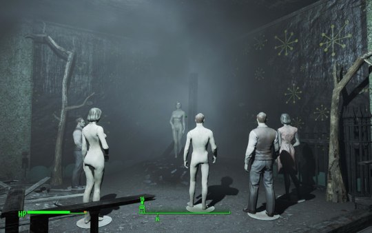
spooky

i feel threatened


yes... YES..........
THIS is what im HERE for THIS is a goddamn nuclear WASTELAND
the glowing sea is so fucking cool. i wish it was even harsher though i feel like just some rad-x is enough to get by pretty easily i wanted it to feel like dragging yourself through hell

i have no IDEA where this was or what the fuck happened here

i love you deacon i would die for you
4 notes
·
View notes