#different types of graphic design
Explore tagged Tumblr posts
Text
Graphic design is the art and practice of visual communication, utilizing imagery, typography, color, and layout to convey messages or ideas. There are various types ofgraphic design each serving unique purposes. Each type requires specific skills and creativity but shares the goal of effective visual communication.
0 notes
Text
Random Thought
So, a while back I posted a pic of all the Pokemon dudes that I like despite knowing basically nothing about Pokemon, and it's become a very shocking fact to me that despite their apparent popularity, the train dudes do basically nothing in their home game.
#how do i know they do nothing if i don't play pokemon?#because i looked through a playilst of an old chugg/a/conroy LP and they weren't in a single thumbnail for that series#that dude covers EVERYTHING in a series. if they were important they would have been there#i guess side characters are capable of getting large fan bases for basically no reason#but i find it very odd regardless#is it a fun mode?#is there a different piece of media that led to their popularity?#because i have minimal interest in pokemon as a series outside of character/creature design#i don't mind looking up spoilers for it#so i know that ingo in particular got a boost after arceus for *Reasons*#and the inherent tragedy of that story was sure to increase the fans of both#but why the heck were they popular before that?#because them being on my personal list is because#i was bombarded with fanart about them for like 2 months so i was basically suckered into caring about them#anyway. i don't think i'm gonna go through the trouble of updating that graphic#but these are the new pokedudes that would be added to it:#gordie. as per forgetting him the first time.#the principal of the school and his alter ego#the dark type leader of team star#the biology. art. and cooking teacher#larry.#and the professor from pokemon sleep#for the record there are pokegals that i like too but that list is much shorter than thus much less interesting#it's hard for me to get into anime girls because i always feel like they're trying to sell me something#and i'm usually not buying
8 notes
·
View notes
Text
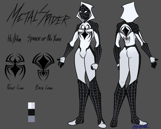
The Spider-brainrot has infected me so I've finally made a Spider-sona
Meet the Spider-Man of Nu York, Metal Spider!
#get it like nu metal#I'm a big metal fan so his series would have a lot of musical influence and references to different music artists/bands and genres#he's the type of character that would come out in the 2000s and years later get a graphic novel and a few cameos#spiderman#spider man#marvel#spidersona#spiderman fanart#digital art#oc#orginal design#character design#super hero#comics#metal#nu metal#flat color#spiderverse#spiderman across the spiderverse#holoartz#my art#artist on tumblr#I've already seen across the spiderverse twice it's so good
34 notes
·
View notes
Text

in an effort to rest my left hand from typing and also my usual exercises in doing random shit I don't have a lot of experience with, I have exported some .bmps and used the auto-tracer in inkscape (which i have done before for other things) so that i can turn this logo into an svg file with consistent angles and, you know, resizeability and sleekness.
The main thing I'm doing here is cleaning it up (fixing the angles in particular) and then I have to figure out how I want to do the shapes for the flame colors, which I'll probably do manually cause the color quantization tracing mode doesn't quite do what I need it to do lol
I don't even know if Seth is going to definitely be called Scratch (have been spitballing a variety of vigilante-friendly names in my notes) so I probably shouldn't be putting the effort into this on the off chance they end up called something like Aetherflame instead (lol) (like actually that's one of the names in my list) but this is the logo I have, so, you know.
anyway, practice, right? :P
#my cyst is actually not really any worse than usual but it seems i've been typing so much that my wrist has started to hurt occasionally#i can't imagine my typing setup (a large full-sized keyboard sitting on top of my laptop) is helping#i mean it's angled up which is inconvenient for other reasons but there's only so much i can do here ergonomically LOL#wipnadiart#arghdesign#scratchverse#scratch#FUN FACT: I was originally planning to go into graphic design in college! I Did Not Do That and i didn't learn anything about it at all#so this is me uhhh learning by doing which is my usual technique (cough spider-man modding)#(i ended up with a language studies focus and an art history subfocus after transferring to a different school and graduating there)#(this was less out of the blue than it seems; my original-original plan was in fact to major in Japanese and iirc minor in graphic design)#(neither of those things happened in part because they cut the number of japanese language programs at my first college lol)#(which led to me taking ancient greek and linguistics 101)#(which then led to me taking more linguistics classes and mandarin and arabic lol)
5 notes
·
View notes
Text
Art major Odile. Is this anything
#rat rambles#stars posting#me fighting for my life to comit to specific odile hcs for the sake of au stuff#but I feel in my bones that she studied the arts in her youth. smth smth her immense knowledge of crafts and proficiency in many types#also she just a lil bit gives graphic designer vibes. sorry.#in all relatity I imagine she probably more so dabbled in many different fields both within and outside the arts#but. I want her to be an art major. to add more pathetic points to her score. because she's silly. shes just such a wet noodle of a woman
1 note
·
View note
Text

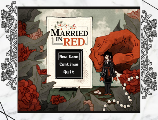
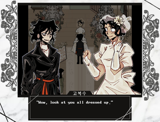

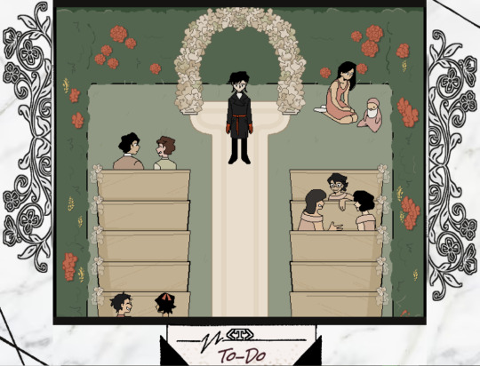
Play for FREE at itch.io
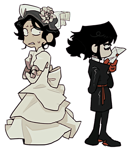
Married in Red is a short 2D RPG thriller-story game with visual novel and point-and-click elements set in South Korea that follows the story of Bok-su Go visiting her old friend from University, Da-jeong Choi, on her wedding day.
👰 Development & Story & Graphics 👰 :: RachelDrawsThis :: @ekrixart
💐 Composer & Sound Designer 💐 :: BellKalengar
🕊️ Features 🕊️ :: Original soundtrack :: 30+ CGs and 8 maps :: Classic RPG Horror type gameplay with to-do list/objective-style puzzles :: Character-driven story with 3.5k+ of dialogue
🍰 Estimated Play Time 🍰 :: About 30 ~ 45 Minutes
🥀 NUMBER OF ENDINGS 🥀 :: 1 (+ Different dialogues and brief game overs)
Reblogs and tips are greatly appreciated!
#indie game#rpg horror#rpg maker horror#visual novel#married in red#studio investigrave#married in red game#racheldrawsthis#ekrixart#bellkalengar
5K notes
·
View notes
Note
So why do you hate the advertising industry?
Hokay so.
Let me preface this with some personal history. It's not relevant to the sins of the advertising industry perse but it illustrates how I started to grow to hate it.
I wanted to be a veterinarian growing up, but to be a vet you basically have to be good enough to get into medical school. I do not have the math chops or discipline to make it in medical school. I went into art instead, and in a desperate attempt to find some commercial viability that didn't involve moving to California, I went into graphic design.
I've been a graphic designer for about seven or eight years now and I've worn a lot of hats. One of them was working in a print shop. Now, the print shop had a lot of corporate customers who had various ad campaigns. One of them was Gate City Bank, which had a bigass stack of postcards ordered every couple months to mail to their customers.
Now, paper comes from Dakota Paper, and they make their paper the usual way. Somewhere far, far from our treeless plain there is a forest of tall trees. These trees are cut down and put on big fossil fuel burning trucks and hauled to a paper mill that turns them into pulp while spewing the most fowl odors imaginable over the neighboring town and loads the pulp up with bleach to give it a nice white color.
Then the paper is put on yet another big truck and hauled off to the local paper depot, then put on another big truck and delivered to my print shop, where I turned the paper into postcards telling people to go even deeper into debt to buy a boat because it's almost summer. The inks used are a type of nasty heat sensitive plastic that is melted to the surface of the paper with heat. Then the postcards are put on yet ANOTHER truck and sent to the bank, which puts them on ANOTHER truck and finally into the hands of their customers, who open their mail and take one look at the post card and immediately discard it.
Heaps and heaps and literal hundreds of pounds of literal garbage created at the whim of the marketing team several times a year. And thats just one bank in one city.
I came to realize very quickly that graphic design was the delicate art of turning trees into junk mail.
And wouldn't you know it there are a TON of companies that basically only do junk mail. Many of them operate under the guise of a "charity," sending you pictures of suffering children or animals and begging for handouts and when they get those handouts the executives take a nice fat cut, give some small token amount to whatever cause they pay lip service to, and then put the rest of the cash right back into making more mailers. "Direct mail marketing" they call it.
Oh but maybe it's not so bad, you can advertise online after all. Now that there's decent ad blocker out there and better anti-virus ads usually don't destroy your computer anymore just by existing.
Except now when I search for the exact business I want on Google it's buried under three or four different "promoted search items" tricking me into clicking on them only to shoot themselves in the foot because I searched for the specific result I wanted for a reason and couldn't use those other websites even if I felt like it.
And now we have advertising on YouTube and on every streaming service, forcing more and more eyes onto the ad for the brand new Buick Envision that parks itself because you're too stupid to do it on your own.
Oh thats ok maybe I'll get Spotify premium and go ad free and listen to some podcasts- SIKE we have the hosts of your show doing the song and dance now. Are you depressed and paranoid from listening to my true crime podcast about murdered and mutilated teenagers? That's ok, my sponsor Better Help can keep you sane enough to stay alive and spend more money.
It's gotten so terrible that now you have content farms, huge hubs of shell companies that crank out video after video to get more and more precious clicks. Which if the videos were innocuous maybe that wouldn't be so awful except now you have cooking hacks that can actually burn your house down and craft hacks that can electrocute you being flung into your eyes at the speed of mach fuck so some slimy internet clickbait jockey doesn't need to get a real job.
It of course goes without saying that animals are also relentlessly exploited by clickbait companies that will put them in compromising situations on purpose to create a fake fishing hack video or even just straight up killing them for sport by feeding small animals to a pufferfish that rips them apart for the camera.
And all of this, ALL of this doesn't even touch how adveritising is the death of art in general. Queer topics, any kind of interesting art, any kind of sex or substance use topics are scrubbed clean and hidden at the behest of advertisers.
Sex education, a nude statue, topics such as racism or sexism or bigotry in general have tags purged or hidden from search, even life saving information about SDTs or drug use, because if someone saw that and complained then Verizon might sell fewer tablets and we can't fucking have that.
Conservative talking heads often bitch and moan that they're being censored on social media. The stupid part is, they're right! They are being censored! But it's not by a woke mob, it's by ATT and Coca Cola not wanting their adspace sharing screen time with their stupid fucking opinions.
However, they won't ever figure that out, because the talking heads they get their marching orders from like Tucker and Jones ALSO rely on the sweet milk flowing from the sponsorship teat and they aren't about to turn on their meal ticket so they have to come up with even stupider shit to say for the train to continue rolling.
I managed to rant this far without even getting into the ads I see for the beauty industry. The other day a botox ad described wrinkles as "moderate to severe crows feet" as if wrinkles are a symptom of a fucking serious disease! Like having a flaw in your skin is a medical problem that you need thousands of dollars of literal botulism toxin to fix! I was incandescent with anger.
Advertising is a polluting, censoring, anti educational and anti art industry at it's very core. It destroys human connections, suppresses human thought and makes us hate our own bodies. It ads no value, actively detracts from value, and serves no real purpose and I believe it should be almost if not entirely banned.
23K notes
·
View notes
Text
Portfolio advice, from a lead who hires Concept Artists
(This was originally a twitter thread I wrote before the site self imolated, hense it's strange structure.) I wrote this after a weekend of portfolio reviews - 1. Like a maths exam, please please show your working. I want to see thumbs options, mid options and of course a final design.
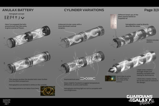
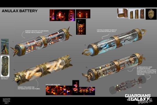
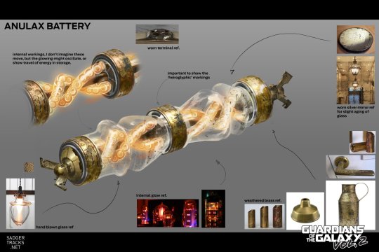
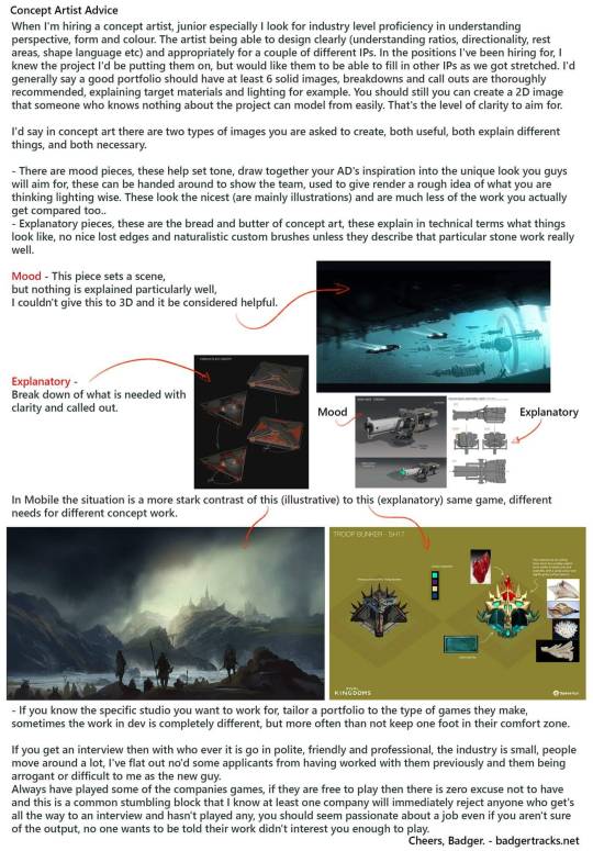
2. Arrange your portfolio, I don't want to bounce about between subject matter and pipeline. Your portfolio's narrative should be as strong as your work... 3. Please make worlds that excite the viewer, make them want to go in and explore them, explain to them the interesting parts of the town, or the way the character's hat unfolds. How will this draw the viewer in? 4. As I've said before the majority of your project work is explanatory not mood, make sure your portfolio contains explanatory work. Explained here -
5. A lot of beautiful post apocolyptic paintings, , but 80% of realistic games and film, we just give the environment artists photo ref, they are capable artists in their own right. Different work in stylised where you do need to create rules for how things can be translated. 6. Production art contains call out sheets, material references and flat graphics. This doesn't have to be your final image, but it should support it.
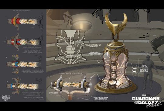
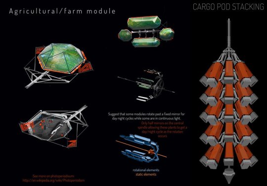
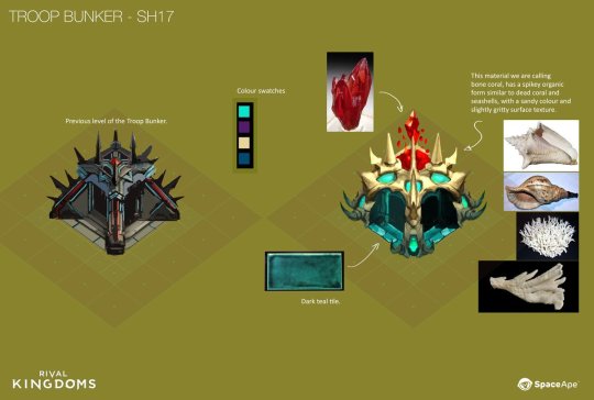
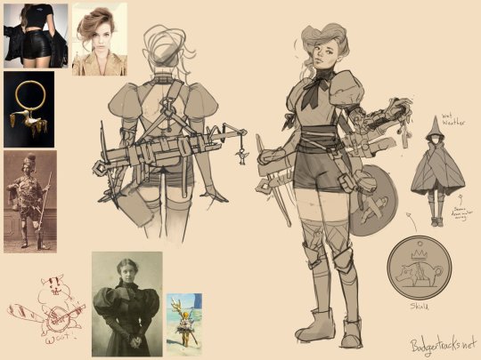
7. Design characters on a swatch(es) of the environment they will be viewed in. Not on white. I make swatch backgrounds from screenshots, it avoids assumptions that damage readability. 8. Reverse of this, put people in your environments, show me the scale.
9. It's not a deal breaker for a review, but if you intend to get a job, please show me your work on a screen larger than a smartphone (print outs probably the cheapest option with the best battery life). 10. Please have your contact details clearly visible, and by that I mean email address, I will not pass your social media contact on, I cannot input your form into my tracking system. EMAIL ADDRESS emblazoned and bake it in, sometimes recruiters do funky stuff to pdfs
11. Your portfolio will never feel done, not to you anyway. You will have learnt from your latest pieces and want to apply it to older work. But we know art is a journey. Send your portfolio anyway. I've been in the industry 10+ years and my portfolio is still not 'finished'. 12. If you are applying to an environment centric Concept Art position then please vary your times of day! Golden hour is cool but show me some happy sunny days, looming overcast days, what about at night? Vary your weather too! Sunny snowy day? Rainy Spring day? Stormy night?
13. If you are applying for a character centric Concept Art role then please ensure your portfolio shows a variety of body types and ethnicities. 14. Designing characters for games? Please show back views and feet (!) Many potfolios contain only front views. This is a problem because:
You haven't shown you are considering the design from all angles.
In many games rear view is the main view.
Stop cropping feet.
15. If you are entry / graduating and looking at Portfolios to compare content and standard of yr own work too, look at hired grad/junior artists as opposed to seniors Seniors and leads often have old or personal work in their portfolio which isnt representative of the day job. 16a. Show clearly the intended use case for your Concept Art. Mention the game type in the description. Are these player character designs for a 3rd person adventure game? Then more back views please. Bonus points for diagetic ways of showing health / equipment / role etc.
16b. Are these designs for an FPS? Then really the player view of the gun needs to sell the player style/ choices, in an FPS your weapons are almost your character. Are these world designs? What's the view distance? For an RTS your shapes need to read from above & a distance. 16c. The lack of clarification means I am judging the design in isolation, which both harms the design (you might be considering the backview of a char as the main adventure character.) Or an NPC, their waist up expressions may be important for conveying exposition and mechanics.
16d. Concept art is not separate from gameplay, great concept art serves the game team before it is a good illustration.
17. Play games. A variety of games. Think about them. IMO to be a good concept artist you need to understand the common language & references used by your peers. Also understand the principles and common language your audience are used to. FPS design rules are v.diff from RTS.
18. There are many skills that are needed in concept art, please show them. For example: Graphic design - logos, liveries, typographic use etc. VFX concepts - Abilities, Ambience, motion concepts. Architectural knowledge - How buildings are built! & more but I'm out of space :O
6K notes
·
View notes
Text
Some of my random pjo headcanons
-piper is a graphic liner girly, you cant convince me otherwise. She will try some creative designs and experiment with colors. If you want to have a perfect liquid eyeliner, shes the one to go to. However, she cannot do eyeshadow.
-jason gifted piper a necklace with a bolt and piper gifted jason a bracelet with a heart. They did this while they were dating so that no matter what happenned to them, they will know that what they have was real and not made up. After jasons death piper refuses to take the necklace off and always wears it in his memory.(this is cheessy as fuck but i did it in my drawing and now this is my thought process)
-if an aphrodite kid is charmspeaking, their eyes will turn sighlty pink, or like have a subtle glint in their eyes.
-thalia also does make up, but very very out there, heavy eyeliner, black eyeshadow, the opposite of subtle. She also is the go to person to give you piercings. She did most of the one she has herself
-percy is the type of guy to have a disposable camera and just take photos of everything(annabeth) and make a photo album
-rachel makes jewelery, mostly rings and charm bracelets
-frank has a very active letterboxd account. He loves wes anderson and his four favorite movies are grand hotel budapest, how to train your dragon, knives out and spiderman into the spiderverse.
-in adition to this he goes on and on about movies and the cinematography and hazel loves to hear him rant about it.
-hazel is the best at finding the perfect seats to a concert. Shes the one fighting for her life in the front lines to get the best seats and somehow she always does.
-grover is an excellent cook. Whatever you want, he can make it. Also, he bakes something for everyone of percys birthdays, trying different things each year.
Thats all for now
#percy jackon and the olympians#percy jackson#pjo#percy jackson tv show#annabeth chase#percabeth#piper mclean#hazel levesque#frank zhang#heroes of olympus#jason grace#thalia grace#riordanverse#rachel dare
2K notes
·
View notes
Text
A collection of Amanda Young’s outfits (PT 1)
As the title states, this is just all the outfits I can source from Amanda Young from the franchise but also any game adaptation too. This will be broken into parts because of the image limit.
1.) The Reverse Bear Trap (RBT) outfit
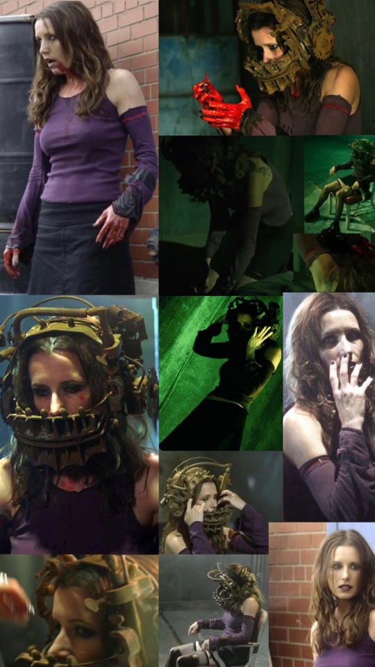
One of her most iconic and recognisable fits. She has a purple tank top with matching sleeves to go alongside, presumably kept in place by the pink bands on her upper arms? Amanda in this wears a black skirt with ripped fish nets and kinda shiny boots- Other things include the eye makeup, nail polish and the only time we ever see her have the clawing panther tattoo on her shoulder.
2.) Rockstar outfit
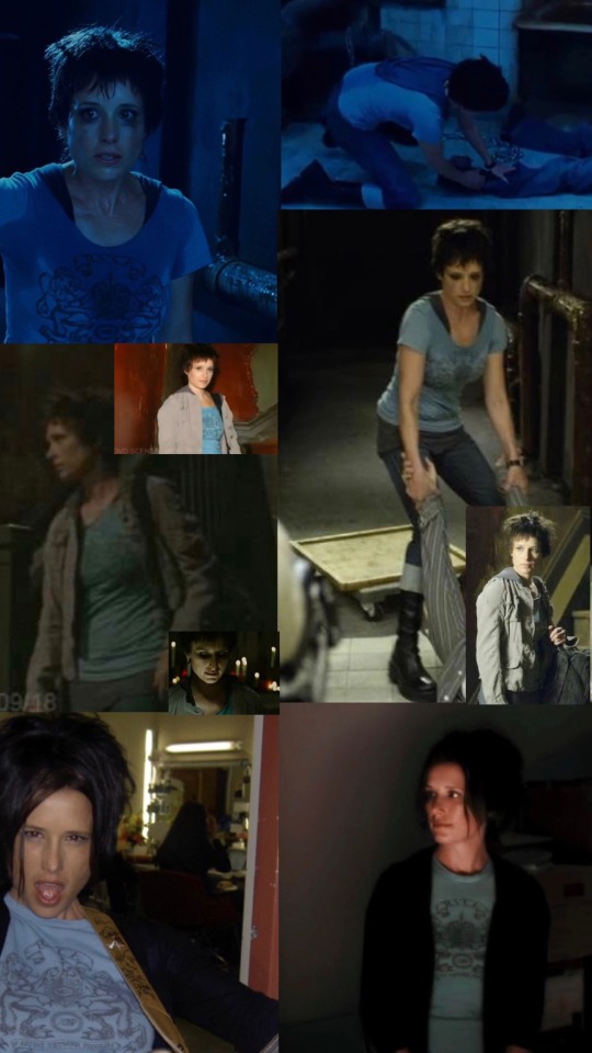
I've generalised this as the ROCKSTAR outfit- Because this specific shirt comes up a few times, not just in that cut scene. It seems there is actually two shirts? The blue graphic one on top and a grey one underneath. Amanda's hair and jackets change! There is the light grey jacket and then the black one and even things like how heavy her makeup is are different... The main place we see this look is when she is setting up Adam for his game. Of course she has boots on as always and I guess I'd call the jeans she has on cuffed? One extra is she has a watch on.
3.) Junkie outfit
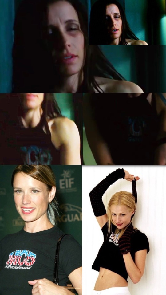
BECAUSE I WAS A FUCKING JUNKIE!!! Anyway, with this I had to brighten the image to see what the design on the tank top was... From there I went, ''I think I've seen this before...'' And yeah, I had- Shawnee Smith has worn this logo a few times, so that's why I've added the last two images for a clearer reference. Amanda here looks quite gaunt and sickly and we can't see the rest of this outfit such as trousers.
4.) Visitor outfit
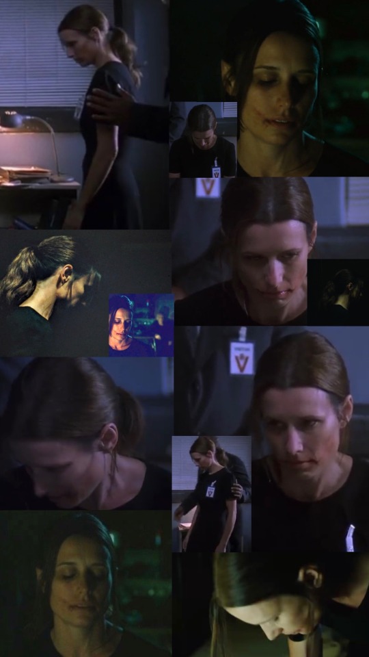
I'll dub this the Visitor outfit because of the badge of course- I would say this likely is Amanda's most simple outfit? Black shirt and skirt. The most striking thing about this look is the RBT scars she has... It's also one of the only times outside of Saw 3 we see Amanda with a ponytail! I can't lie when looking at her hair here, it almost looks two toned in places such as the side burns? Almost grey in parts? (Edit: This may be a dress actually.)
5.) The Red Pig outfit
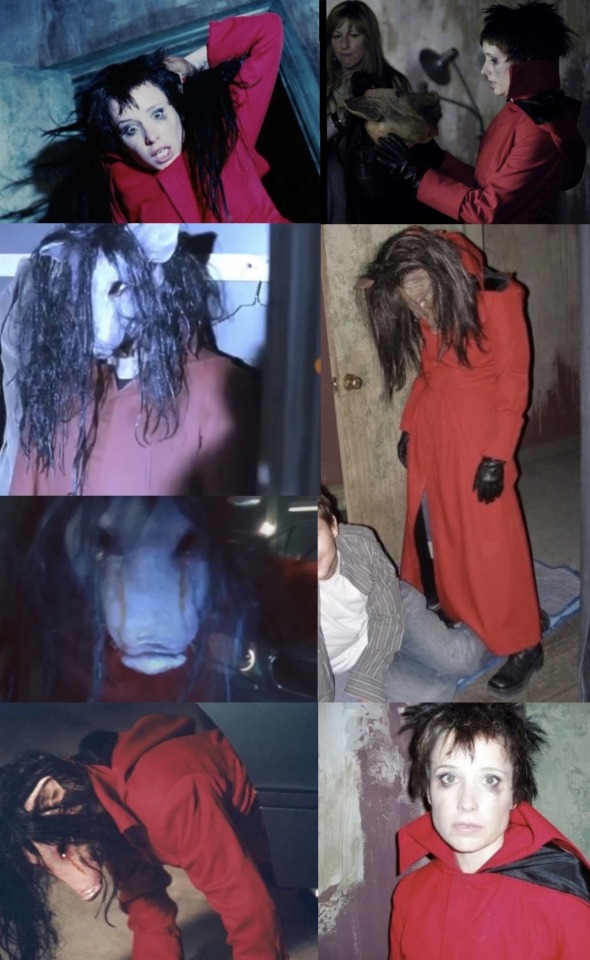
This is my personal favourite when it comes to her in movie pig looks. She has a red coat/cloak which the length goes all the way down to her boots- Looking there I think the lower half from seeing the cuffed like jeans is probably the exact same as her Rockstar outfit. Her eye makeup is heavily smudged and the mask itself in my opinion is one of the best shaped pig masks, with what seems to be ''blood'' coming out of the eye sockets and black slash brunette hair.
6.) Bow Dress/Clinic outfit
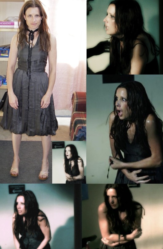
This scene and the follow up is so depressing but she's so cutesy here- It's a simple black dress, but the bow is very Amanda. I have no clue whether the shoes she has on in the first image are actually apart of the outfit or just something Shawnee had on whilst testing it out. 7.) News Report/Scott Tibbs outfit
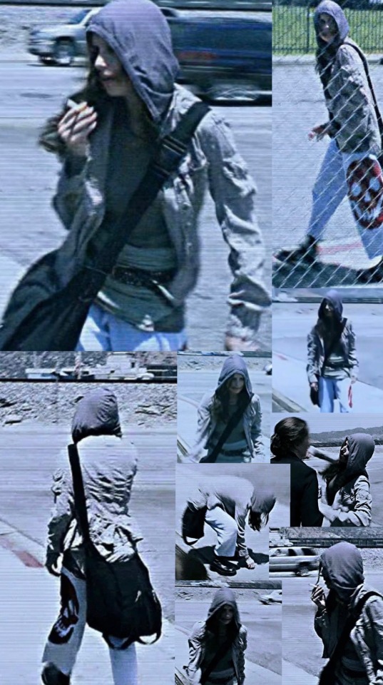
May be my overall favourite Amanda outfit.... She has on a grey hoodie jacket, possibly another article of clothing from her Rockstar outfit? Her iconic skull sweatpants with a belt and then boots that I would say are more akin to her RBT outfit. I can't really tell if the shirt she has got on is layers or just has different materials- Amanda's RBT scars are also very visible in this look.
8.) Suffocation outfit
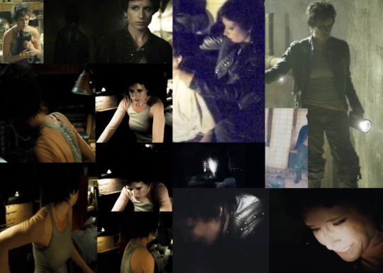
At first I started doing these as two separate outfits? One for when she kills Adam, the other for when she wakes up from her nightmare- However, I'm pretty sure this is the same outfit through and through. Amanda has on a long sleeved orange shirt with a grey tanktop over it. The jacket is leather with noticeable silver studs and she has on cargo type trousers and as always... Boots.
9.) Nightmare outfit
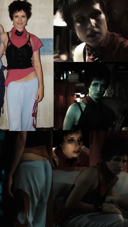
Another personal favourite! Once again we get to see the skull pants and this is how I was able to gage the material a bit better. I honestly have no clue how to describe the specific items of clothing she has on her upper half? A corset type shirt going on? Details I enjoy are the safety pins around the shoulder and bottom half and she has a watch on.
10.) Saw X outfit
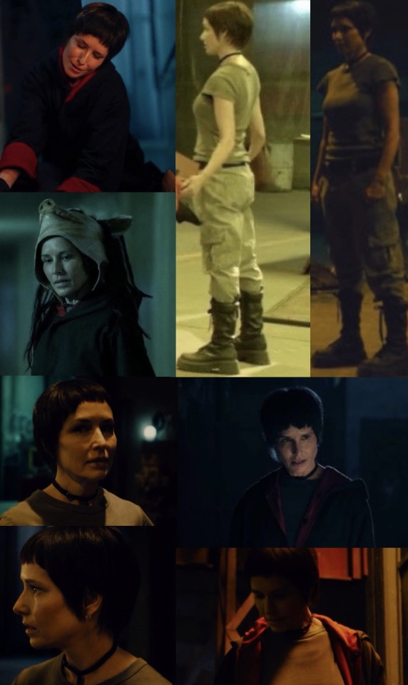
I decided to not have this pig look separate. Anyway! This is Amanda's most recent outfit with Saw X having come out in 2023.... Simple grey t-shirt alongside cargo trousers with a belt. The boots she's got on are very combat/work like and Amanda also has a black choker and earrings here- Her coat/cloak is black with red detailing such as the cuffs and the inner lining.
#amanda young#amanda young outfits#shawnee smith#saw#saw 2004#saw 2#saw 3#saw x#saw franchise#saw movies#sawposting
622 notes
·
View notes
Text
Lancer Tactics dialogue layout crisis of faith
(from this month's backer update)
Every so often, I'll run into something in development that eats away at me until it pushes me to a crisis of faith and I have a breakdown, burn down a bunch of work, and build something better from the ashes. These are moments of transformation and we're almost always able to come out the other side with something much better than what we started with.
This all sounds very dramatic until you take a step back and see the issue in question is just, like, the layout of a menu. But if medieval priests were able to have schisms over angels on pins I can have strong feelings about graphic design, dammit!
This month's episode revolved around how we're doing character dialogue. For reference the plan was to do a standard 4-slot visual-novel talking heads layout. I call it a 4-slot because there's usually four positions that characters can stand; two on the left, two on the right:
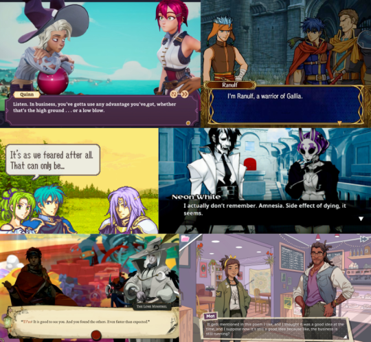
I had it ingame, and it was working. But... something felt off. Do you see the difference between every one of the above examples and this?
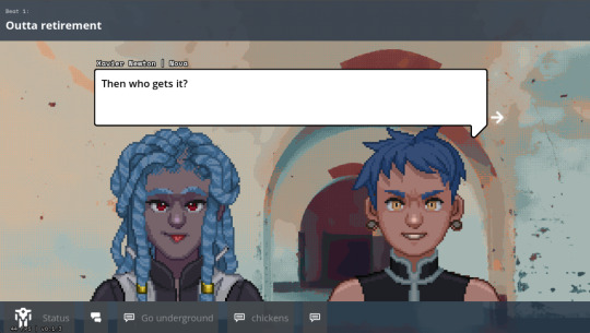
It's all about perspective, baby.
Answer: all the character art in those examples are drawn at a slight angle so they can be flipped back and forth to be made like they're looking at each other.
Trying to do this with the perspective we chose early — straight on — makes for a chorus line of weirdos who are looking directly into your soul as they ostensibly chat with each other. Credulity is strained; the illusion of these puppets interacting in the same space is paper-thin.
(I was skeptical of choosing this perspective for this reason, but we ultimately went with it to make the customizable assets in the portrait maker easier to fit together)
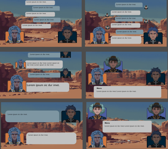
We tried a bunch of different layouts, but they all at least one of these problems:
they'd stare into your soul while ostensibly directing comments elsewhere.
they felt like text messages; this would be fine if that's what we were going for, but we wanted something that could represent face-to-face conversations. (Tactical Breach Wizards was able to pull this style off because they had little 3D dioramas to go along with it)
or, most damning of all, they felt like zoom calls.
So, my heart aflutter and spirit in want, I spent a day doing a research dive into various dialogue layouts (bless the Game UI Database!) to see if any other games had managed to pull this character art perspective off. I ended up with this massive non-chronological taxonomic tree:
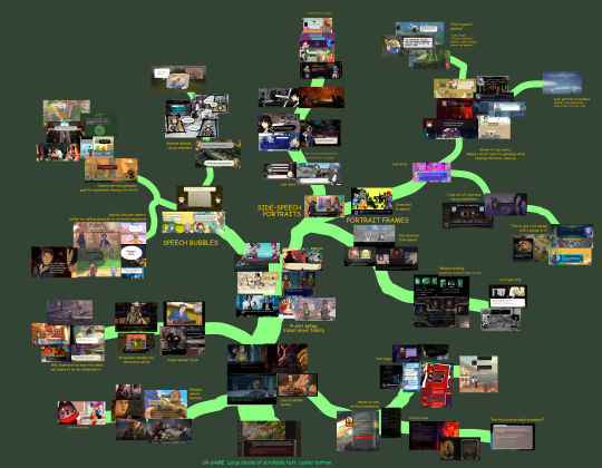
(fullsize here)
The type of layout that particularly caught my eye was this style where each character had their own little box. These layouts borrow a concept from comic books called "closure" where the space and time between characters are left blank. Freed from the constraints of trying to simulate a single space, these layouts allow the reader to fill in the blanks with something that feels more true-to-life than anything we'd be able to render ourselves.
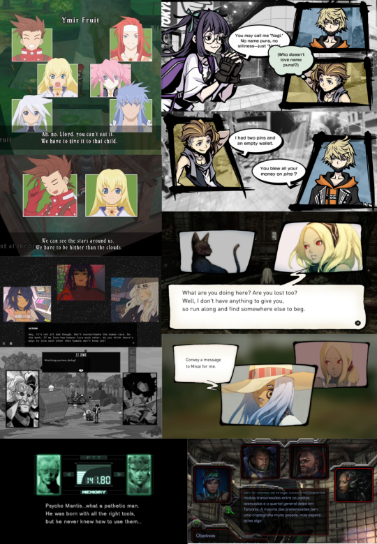
I was especially impressed with the dynamism of Tales of Symphonia and The World Ends With You; rather than sticking to single slots they would animate the entire panels moving around to indicate motion an relative position of characters.
So we threw out the old code and copied them. Here's what we've come up with:
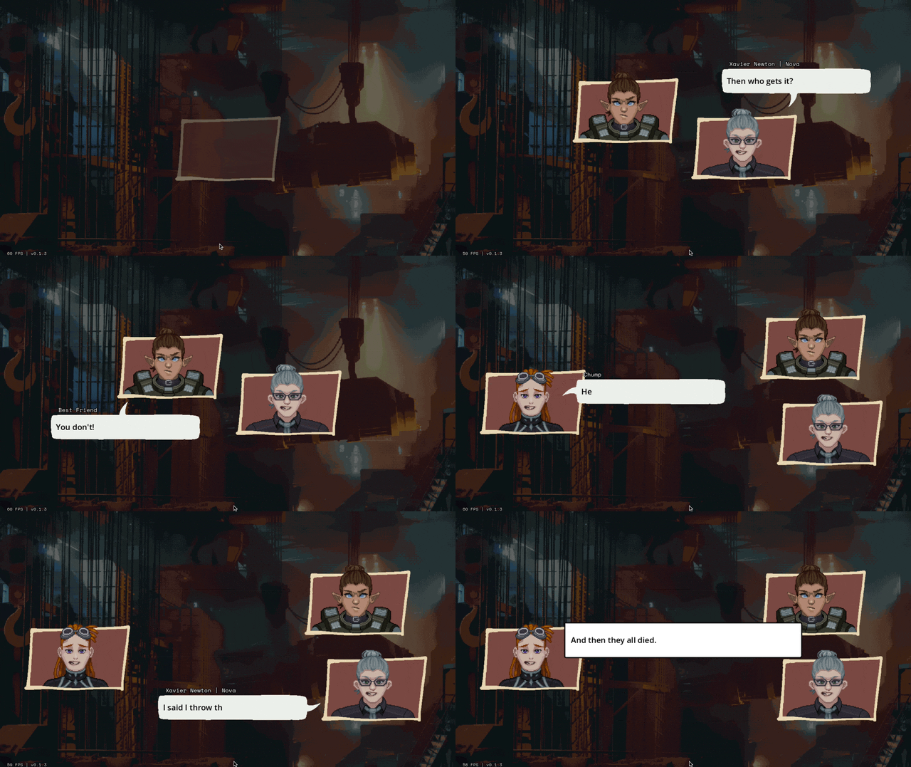
We'll be able to have portraits interact, like smacking each other (I felt like a kid hitting two action figures together, lol)
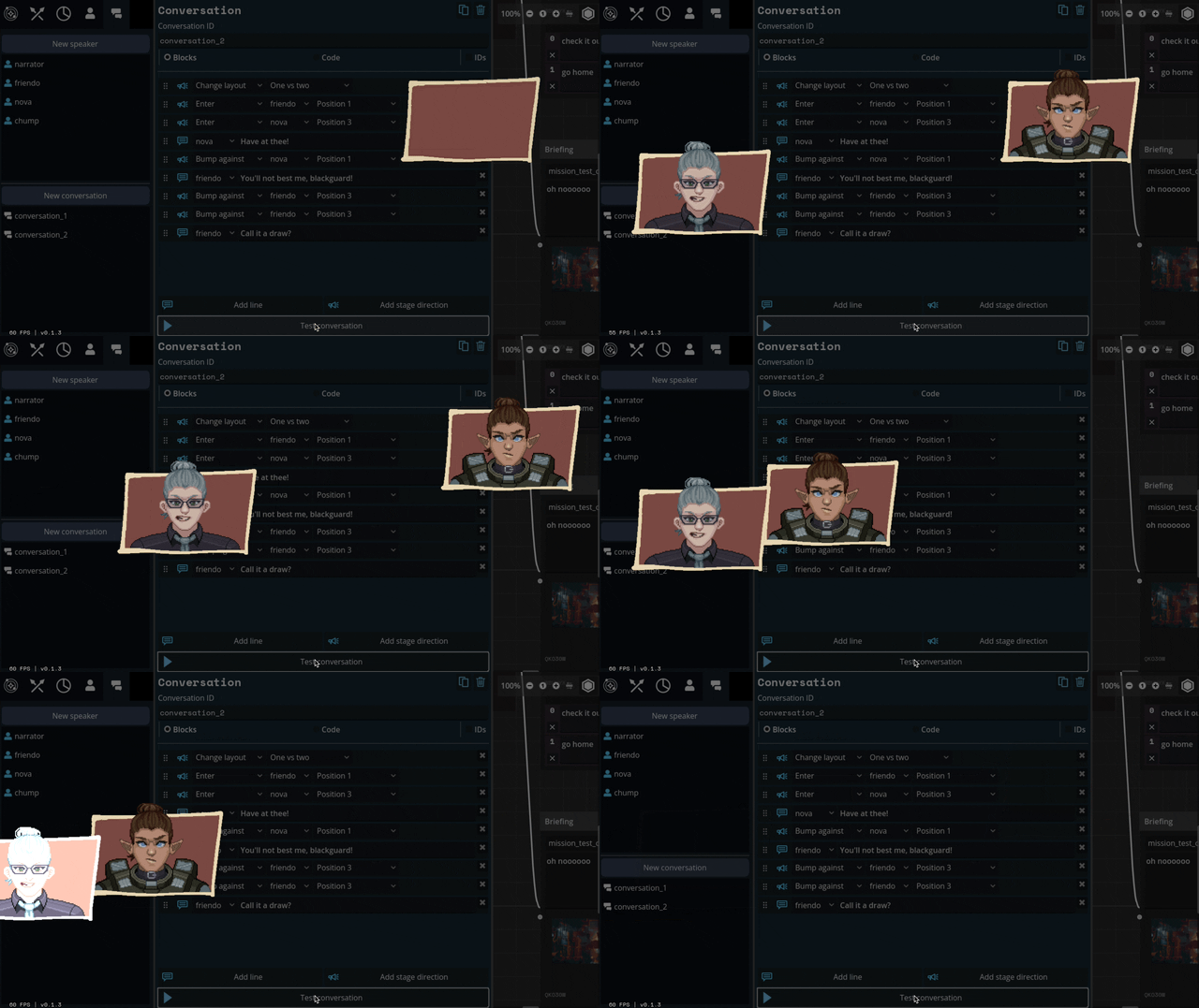
We can also apply effects like princess-leia-holograms and full-screen "lighting" effects like warning banners:
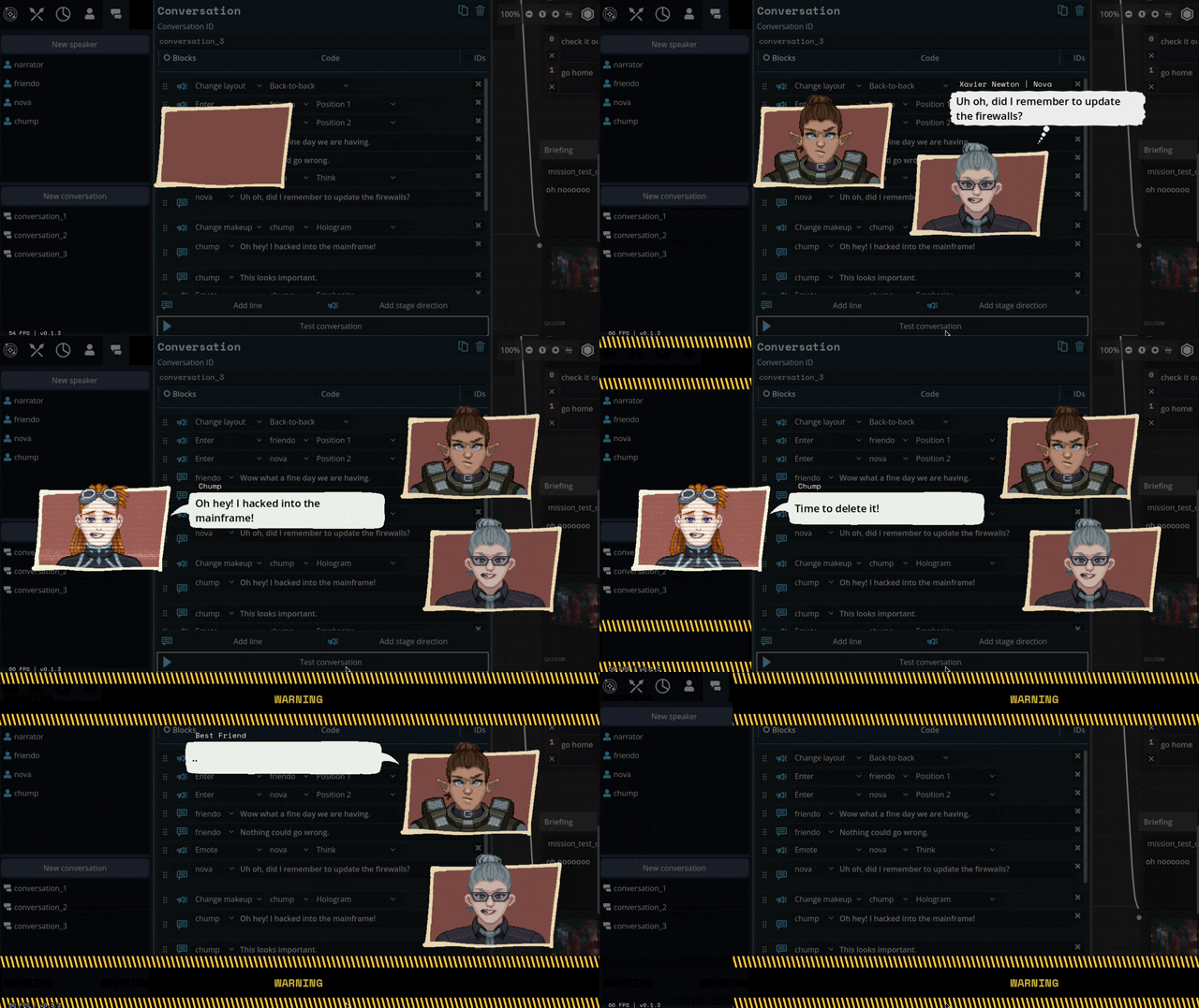
Carpenter and I came up with a number of arrangements that the portraits can smoothly transition between:

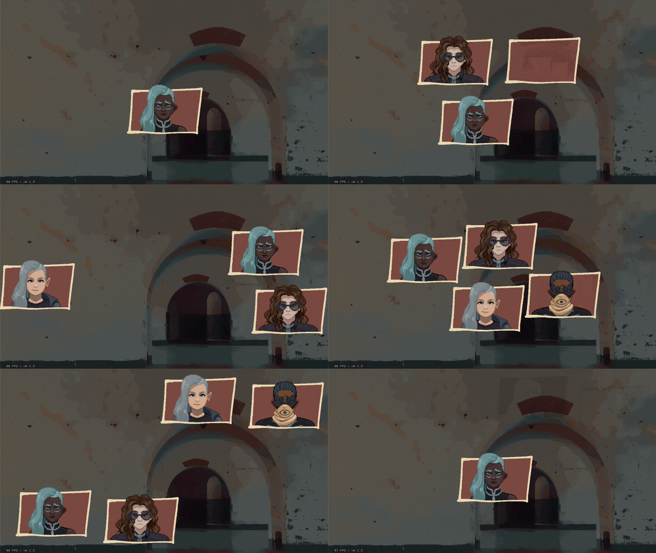
I've also implemented support for choices during a dialogue, potentially leading to branching paths.
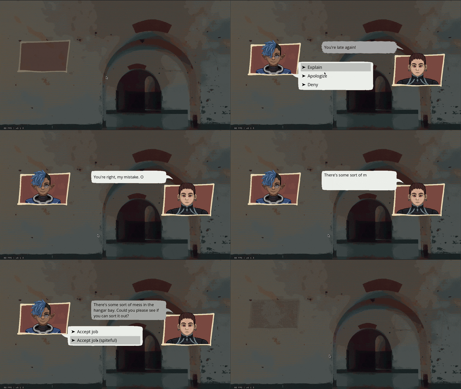
Overall, I feel SO much better about this system than our initial designs. It might feel a little more cartoony, but I think we're making a cartoony game so that's not a problem.
Whew. We bit a lot off to chew with this project. I feel like I just made a second visual novel game engine inside of the first. Fingers crossed that it all ends up worth it.
459 notes
·
View notes
Text

There is Something Seriously Wrong with this Logo..... Chapter Two
So. Lots of you have seen this post by my dear partner ( @lailau7904 ) in which the Williams F1 design team get absolutely torn to bits. In the case you haven't read it yet I highly recommend you do because a) it's really fucking funny and b) it makes what I'm about to tell you even funnier. Though you don't have to, this post touches on entirely different things still regarding this one goddamn logo.
The original post starts like this:

Innocent enough, we made an assumption in good faith that the logo displayed on the Wikipedia page would be the same one as the official version used by Williams. Buckle the fuck up because I'm about to tell you why that was the worst mistake we could have made.
Please. Please I beg of you keep reading this took YEARS off our lifespans. Like the original post was fun and all but it was merely the top of the iceberg. If this were an hbomberguy video this would be the part where he reveals that the background was a greenscreen the whole time. More below the cut!!! :333
The Truth
Already after only a few hours after hitting "post" on the dissection, people started pointing out to us that we'd missed an absolutely crucial detail on the Wikimedia page we got the logo from, pay careful attention:

See THIS?

Yeah this means that that image is not, and never was, the official logo of Williams. All along it had been the work of a Wikipedia user by the name of Juanchocarbonero. Here you can even see the (admittedly painful) history of the file as provided by Wikimedia, this image was uploaded all the way back in 2016, it even underwent an update when the team changed their colour scheme to a lighter blue without getting fucking fixed.

But to me the absolutely most painful part about this page is the "File Usage" section. Which gives you a quick preview of just how deep the goddamn disease that is this piece of graphic design sin really spreads.

And just to clarify: the official version of the logo used by Williams on merch etc is perfectly fine. It's a nice piece of graphic design. I still quite like it. But the story doesn't end there. Not even close.
Consequences
When you look up "williams logo" on Google the image provided by Wikimedia the very first result that pops up, if you're looking for a high-quality .png of this logo that, logically, is what you'll end up using. And I mean, why wouldn't you? What reason do you have not to use it? As long as you don't look to close (oops) it's a perfectly fine, high-definition, clean and transparent image of the logo! No shit people are going to use it!
But this raises a question: Why IS it the most widespread version of the logo? That's fucking weird isn't it? Surely if the actual logo used on ex.: the official Williams F1 website (which, again, is perfectly fucking fine) was available they would've just used that, right?
Now. Small problem. If you want you can go ahead and open whatever search engine you use, if you do that I'm gonna need you to type in "Williams logo" into the search bar, and just try finding a picture that is
of the actual official logo (you can tell the bootleg from the real thing by checking if the middle segment of the W has spiky ends or flat ones. We're looking for flat ones here)
high quality (no pixels or blurring visible to the naked eye)
a transparent png (none of that chequered background bullshit)
NOT a logo with any words (such as: Williams or Racing) visible in it. those don't count.
If you didn't feel like doing any of that, I'll just tell you the answer: you fucking can't. Nothing like that EXISTS. The closest I could get are these two, both of which are mid to ass quality, so they don't count either.


No sensible individual is going to scroll google search results for 5 minutes straight just so they can use a 200x200 image, especially when they think a perfect alternative is right there.
I even found several recoloured versions of the diseased logo, including one as a sticker on Redbubble! Fuck me that's a horrible sight!


The Search
Because I wrote the previous paragrahps after we'd figured out exactly what had happened, you might be under the impression that by this point in trying to answer the question "Why the fuck is that image on Wikipedia instead of, idk, the real fucking thing?" we'd at least established the existence of said "real Williams F1 logo". You'd be wrong, because for somewhere around 24 hours after we'd made the initial, horrifying discovery of just how fucked the Wikipedia version is, we genuinely could not tell if that was the official logo or not.
The ones displayed on their website weren't at all downloadable or even copyable, a non-ass quality of the damn thing just didn't seem to exist anywhere, so we didn't dare draw any conclusions. And we were still foolishly operating on the assumption that Wikipedia wouldn't just lie to us. (this is why your teachers hate it when you use it a source btw. like this is the ONE time it's actually been reasonable)
So, in the hopes of finding the offical Williams Racing logo, the non-scuffed one because clearly it exists, somewhere, we consulted an expert on Intellectual Property: my mother!
What this "consultation" actually roughly looked like was: we went on a walk and I started rambling about the Situation from Last Night before she cut me off and pulled up the website of the World Intellectual Property Organisation, aka the place they store all the Copyright information of like, everything.
BEHOLD:

(pictured; THE ACTUAL FUCKING LOGO I CANNOT BELIEVE IT'S EXISTED THIS WHOLE TIME)
Link to the actual real official legal document because goddamn this rabbithole just kept getting deeper so I like, have that now.
For refence, here is the official copyrighted version and the Wikimedia file overlayed on top of each other. As you can tell, it's disgusting. It's a poor, eyeballed imitation at best.

The copyrighted logo is horrifically low quality because, guess what, that image also isn't downloadable or copyable from the page. I really really cannot blame Juanchocarbonero for uploading his own version to Wikimedia because there legitimately does not exist a version of this logo that is freely available to the public. Like that goddamn abomiation is all we have. It's the effort that counts I guess.
My mother suggested that a possible reason for this could be avoiding the production of knockoff merch, or at least making it recognisable in case it is sold. Think about it, when your logo Doesn't Exist online, no one can use it without a license! It's kind of genius! I'm also about 99% sure they didn't orchestrate it so, it was good luck I guess?
interlude: How the FUCK does Copyright even work
I did immediately think to myself "we should REALLY fix the wikipedia version, like, stat" because I cannot in good conscience have this information available to me and not do anything with it, for the good of the people. However, this poses an issue: was the logo really not scuffed on purpose? Could it be that that version uploaded to Wikipedia isn't a 1:1 of the official logo because of copyrighting issues? To find out I had to look deeper, by comparing the official, website-available logos of various other F1 teams I came to conclusion that: [........................]
Yeah so I wrote that paragraph before actually checking for refences, but even after probably an hour of trying very hard to make sense of the copyright documents and copyright law in general we could not make sense of any of it. According to my mother (again, the closest we have to an expert, like she actually works with copyright in the context of companies but she's not specifically an IP expert. just to clarify) it's actually a lot worse for Wikipedia to have a falsified version of the Williams logo, than it would be to use the copyrighted version. This is because they're spreading misinformation by pretending that's the actual logo. And yet.

According to the Copyright Tag (the one on the top) in the Licensing section of the Wikimedia page for the thing pretending to be the Williams F1 logo, it's fine to use it because just a bunch of shapes. The thing is however, that it says that for pretty much every F1 team's logo, most of which are sourced straight from the official website. So this doesn't really mean anything tbh. According to our local expert (still my mother) it's fucking confusing. So I've decided to leave that at that.
update October 20th: as far as the Wikimedia pages on copyrighting tell me, uploading the official logo could, potentially, get me into serious legal trouble with Williams because of copyright laws. Which is still confusing because as said, every other team's logo is sitting uncontested on their respective Wikipedia pages. So basically we still don't know.
Okay. Backtrack. We forgot to ask something very important:
HOW?
HOW does one fuck up a perfectly fine logo THAT BAD.
WHY does one make their own scuffed tracejob and HOW does it end up like THAT. Clearly something must have gone horrifically wrong for it to end up like that.
I have a theory as to what might have happened:
It was either drawn or painted by hand, for a physical paintjob it's actually sort of impressively precise, but still objectively fucked. For a while I outright refused to believe that it could have been done in a digital program with the types of mistakes that were made, but you'll see this theory (partially) disproven later on so I retract it for now.
Operating on the assumption that it wasn't done digitally, a likely theory could be one involving a picture of scan of the paintjob. If the picture was taken at an angle or the logo itself was on a curved surface that COULD potentially explain the weird sort of slide everything has to it.
From then the picture might have been inserted into a digital art program, and the area of the logo might have been automatically selected using the magic wand tool, which could explain the weird growth at the top and that odd rounded off corner.
We also drew the conclusion that the file itself had been "tampered with" (aka cropped manually) by a human, because no computer would generate a resolution of 3356x2543 (you can that this is the original resolution on the Wikimedia page)
WAIT HOLD ON IS THAT IT?
The question of how the Fuck this guy managed to mess up the logo, and even more specifically why some edges were fine and some weren't (ant colony looking thing on the top left) bothered us so much that I at one point started just looking up "WIlliams logo" with the results filtered down to pre-2017 in an attempt to find when exactly the messed up logo was created. As if that would be any help.
Now what I definitely didn't expect to find was THIS

ENHANCE

Yes, you're seeing it right, THAT is the original 'Williams logo with the fucked up arm angles and lenghts'. Which PROVES that, contrary to our previous belief, Juancocarbonero was NOT the origin of the mistakes. Instead it was [checks notes] a DeviantArt user by the name of Nerdkid56?
The original DeviantArt post, which as of 9:47pm CET on the 13th of October 2024 I am about 90% sure is the actual first appearanace of the scuffed logo, is from May of 2015, which lines up well with the original upload date of the fucked up logo onto Wikipedia (November 2016). At the time that DeviantArt post was almost the only source for the logo.
And in the case you needed any convincing that those two logos are the same, here they are overlayed. You may notice that it's one shape (excluding the rounded corner which isn't visible at this resolution.)

This discovery is essential to understanding why the current scuffed version is the way it is. You might remember our confusion about the way some edges are fine while some are attempting to leave the image, the whole thing is a weird Frankensteinian amalgamation of vectors and magic wand mistakes. With this knowledge we can now assume that the mistakes happened in 2 layers:
Nerdkid56: likely just eyeballed the proportions. I'd guess he drew one arm before the other and flipped it around without really checking the angles. Also didn't give a shit about whether the arms lined up with the base or not. Legitimately bad design made in a digital program.
Juancocarbonero: why he used the scuffed W logo instead of the normal ones that were also perfectly accessible by 1 goddamn Google search is a mistery. HOW he even got access to it is another question I do not think we'll have answers to. And I've already explained some of the things we think may be responsible for the uneveness and bumps. Point is he fucked it up even more.
My theory for why Juanchocarbonero used the scuffed version instead of any other available picture goes like this: it was the only png he could find. Practically every other search result for "Williams Logo" that predates 2017 is a jpeg or absolute ass quality (sometimes both for good measure) so, despite it's flaws, Nedkid56's trace of it could have been the best option available at the time (the quality is actually very very good since it's a vector image, and I guess our friend Juanchocarbonero doesn't have an eye for design considering he didn't notice uhm, everything that is wrong with that model.)
Conclusion
The only way to right these wrongs is to go back, to the very beggining of this saga. Wikipedia. Williams I'm so sorry for what you've had to endure. I know what I have to do now. When I eventually make a proper vector image of the official logo and upload it to Wikimedia it'll all be over. And I WILL do it (but not rn this has already robbed me of like 3 whole days of my life. soon)
All of this is, admittedly inconsequental, but also absolutely fucking hilarious. Like imagine. you. one single guy, you make ONE mistake in a silly little "tracing this logo" project because you couldn't be arsed to check the angles of a silly little W. And some other guy, who you likely don't even know, over a whole ass year later, takes your flawed piece of design, makes it even worse somehow and uploads it to a site from which your little tiny innocent mistake becomes the most widespread version of a logo used by an actual real company worth over 700 Million US Dollars. HOW. HOW DID THAT HAPPEN. WHY HAS NO ONE FIXED THIS??? IT'S BEEN 9 YEARS
Just to give you a final look on just how widespread this plague is, here are some examples of media the fucked up version of the logo is featured in:
this Mr V's Garage video (the original reason we started this conversation in the first place)
the thumbnails of these two videos by Tommo, this one by FP1Will, and this one by RicksF1Addiction
such an amount of random places. likely fanmerch and fanart, and like, pretty much any place someone wanted to use the logo. it's everywhere. if you've ever had the Williams logo displayed in anything you've made I can guarantee you 99.9% chance you used the fucked version


and late thank you to everyone ( @bumblewyn @mid-nighttiger @vro0m @lemonsgovroom @mikraas @leclerced fucking hell I kept needing to add people to this list because compiling all of this took absurdly long) who pointed out our misconception in the reblogs of the original post and contributed to us actually looking into this further. and sorry to everyone for accidentally spreading misinformation lmao (it's too funny not to have been worth it tho) (ALSO it's not really our fault is it)
and to keep the tradition of ending on a live discord reaction:

#please please consider reblogging this if you read through considering the original post (as funny as it was) was just spreading misinfo#williams slander themselves enough already they don't need us to do that#f1#formula 1#williams#williams racing#williams f1#james vowles#williams formula 1#f1 analysis#technical#lai core#nebrain#neb50#neb100#neb200
285 notes
·
View notes
Text

so! it's been a year since i put never satisfied on hiatus, and 9 years since i started posting it, and rather than make you read everything if all you want to know is "when's it coming back?" the answer is still: don't know! but the answer has also shifted closer to "it isn't" the longer i've spent on break, and i think it's worth being up front about that.
i talked about it a little here a few weeks ago, but the long and short of it is that between taking on better paying work, writing better stories, and looking back at what i'd already done for never satisfied... i just don't think i want to continue it? the year off has been incredibly good for my mental health, and i can't see myself wanting to go back after the two-three years still ahead of me on my current project. that's not to say i never want to return to the characters or the concept, but if i did, i imagine it would be with something completely new, in a different form. after all, i started this comic when i was 21 years old, a lesbian, and a sophomore in college. i am now just shy of 30, a bi man, and overall a completely different person than i was, back when i was writing without a plan and putting all of my insecurities into the comic--insecurities i don't identify with anymore. lord i'm closer to rothart's age than i am to lucy's. hate that
anyway. you have all been extraordinarily kind for following never satisfied for as long as you have, for supporting it as much as you have, and being as patient as you have. whatever form never satisfied takes in the future (god willing, with a more cohesive story structure and A PLAN FOR THE ENDING, WHICH BY THE WAY I NEVER, EVER HAD) i hope to see you there!
in the meantime, as an update on where i'm at with the thing that made me stop working on NS: i finished it! all the pages for Hunger's Bite (if you remember it with a different title: no you don't) have been turned in and now it's just revisions and covers and then........ waiting a year until it can come out. because that's how it is in traditionally published graphic novels! nothing releases for a full year after you finished it! and you're even getting it earlier than was originally planned, because i'm a creature and finished it like three months ahead of schedule. i've also already started thumbnailing the sequel book which i can't talk about whatsoever and will now be working on that for the next two years and then HOPEFULLY the first book will have done well enough that i can sell a third! so you better buy it when it comes out next february!!!!!!
to ease you all into it, i wanted to do a little crossover to introduce the main characters. we have emery, whose design is fully and unintentionally just Seiji Again down to his color palette (but seiji would bully him if they met. like so hard. he's a wimp). then we have neeta, a girl who dreams of travel and cares deeply about worker's rights, and wick, a vampire agent investigating the mysterious and sinister new owner of the 1910s ocean liner emery and neeta call home. he's also gay. but sorry lucy, you aren't his type. you're not mean enough.
the best place to keep up with me these days is probably here, as this first book gets closer to release, i will probably be posting about it a lot. and i will certainly post about it here when there's an official release date and cover reveal! i hope you'll go read it. i really think if you liked never satisfied and its themes, you'll like hunger's bite!
thank you again for reading!!
571 notes
·
View notes
Text
youtube
New interview video from TheGamer: 'Exclusive Interview with The Directors of Dragon Age: The Veilguard'
"Will there be returning characters? Will the light prevail against the darkness? Will our comic book and graphic novel knowledge of Dragon Age finally come into play?"
[source]
The video has some footage from the DA:TV booth at SDCC.
Info from this video:
More will be shown of the skill trees over time
"We have 700 new unique characters to talk to"
This may be the biggest game they've ever made
"Rivain, that more tropical feel. Something we've never really been able to do before in Dragon Age is, what does the coast of Rivain look like?"
Lots of love has been poured into how the areas look. They all look and feel different, but also coherent and consistent with the style of the game as a whole
The writers did a good job of finding the light in the darkness of this story
Just after timestamp 5 mins 0 secs, John says Emmrich's surname Volkarin aloud
Emmrich's character design is kind of like the more classical, Hollywood actor type
On returning characters, they're excited for people to see them, especially in the context of how 10 years have passed in-world since the last DA
Each choice in the game, especially the major ones, has significant consequences on gameplay, what content is available to you, and also how characters in the world regard you. "No choice should be easy, we never want to make players feel like there's a right choice. There's always going to be a consequence, some that you don't expect, and some that change the world in real ways"
On casting - Ashley: "Casting is a collaboration. The ensemble that the companions create was basically where we started. We put the character art on the wall, we saw the writing, we auditioned vastly and we assured that the cast was very dynamic and complimenting, and opposing, to each other. We spent a lot of time in getting those companions the juiciest they could possibly be"
The acting talent was cast across 5 years
#dragon age: the veilguard#dragon age: dreadwolf#dragon age 4#the dread wolf rises#da4#dragon age#solas#bioware#video games#dragon age: the missing#dragon age: the missing spoilers#as suspected (see a prev post)- a new round of new interviews with the devs from sdcc :D#this is number 3 that i've seen so far#(ik ppl always wonder about how names are pronounced so ^^)#i wonder if the 700 characters as a figure includes or doesn't include the returning characters?
190 notes
·
View notes
Note
I wanted to vent, but also ask an honest question. Since I was a teenager, I always wanted to work on character design. And one thing that always caught my attention was how I always preferred male character designs over female ones. My first thought was that I was always more into androgynous fashion and more masculine styles. But time passed and I came to the conclusion that it wasn't just that, and it seems that male characters can always be different things: fat, thin, handsome, ugly, short, tall, young, old, etc. and female characters, for the most part, fall into two categories: cute or sexy. I wanted some tips on how I can make female characters with more interesting designs, without having to fall into those two categories. I love your work and you managed to make someone else like the three musketeers <3<3
Hello ! That's definitely a good question and something I think about a lot. The bias towards beauty is very strong in character design and it takes a conscious effort to diversify output in that regard.
That sort of advice might be a bit obvious, but one habit I picked up from the director on my first feature film gig was to actually "cast" characters. Without reference, we tend to go for the kind of symmetrical face and "average" features mostly out of stylistic habit. I like to look at character actors with distinct faces (I like this pinterest page that has a lot of faces in one place) but also just acquaintances or pictures of random crowds.
When designing a character, at first I'm always building a big reference board trying to decide what Type of Guy (gender neutral) I'm going for, trying use photos rather than other people's art, because I want to rely on automatics and graphic symbols as little as possible. Whether I'm designing a man or a woman or other, I use references of fashion styles and people across the board in terms of gender so I keep the scope open. Sometimes a character ref board for me will be a picture of one of my aunts next to a bunch of screenshots of Columbo. In my experience, a lot of the times, it's mostly about going with styles and archetypes the same way you would for a male character, and switching it up somewhere along the way by looking at real women in your life and beyond as a grounding mechanism. Sometimes that will mean changing almost nothing, because the borders between genders and how you characterize them is blurry and fluid, and sometimes it will mean using features that are uniquely tied to some sort of female experience.
I enjoy realism and I think getting more proficient at it did help me diversify my designs (I find that more difficult to do with more minimalistic styles). Still, I am mostly a fantasy artist and in my case that comes with some amount of stylization and idealization of shapes and looks. I'm far from perfect in my biases and I'm not going out of my way to draw "ugly" characters because that doesn't mean much to me ; I try to draw inspiration from the faces of every day people and I associate it with my love for fashion. It's also worth noting the work I post here for fun is a lot more hash tag aesthetic than the stuff I do professionally where diversity is much more important.
I don't know if any of that is relevant but that's definitely an interesting topic ! I'd love to know others' perspective and tips on the matter.
263 notes
·
View notes
Note
Hi! Would you be able to do some headcannons with the heartsteel boys with a short/petite, alt partner! They wear all black, black stiletto nails and with a love of skulls. A big fan of all things games and animated shows and a huge collector.
Alternative love
Characters: Aphelios, Ezreal, Sett, Kayn, K'sante, Yone x GN!Reader
APHELIOS
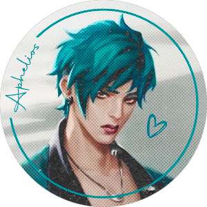
That?? That's his type without a doubt
He lives for the alternative aesthetic and people shorter than him
He himself is probably alt, but he loves to mismatch with his sister
In solo pictures, he's alt, but in pictures with his sister, he's literally wearing the opposite of his sis
Now, he has a reason to wear more black
He would love to match with you in anything you wear out
He'd bring you gifts
From black press ons to some expensive obsidian necklace or leather gloves to fit your style
Anything and everything for you
He'd indulge you with skulls and bones, tarot cards if you're into things like that
He'll even let you wear his precious hoodies and jackets that were made by sett or bought by his sister
Though, when he finds out that you religiously play games he likes and watch the same shows he does
His affections develop rapidly into love
He has more things to both bond and relate to you
He would feel more comfortable with you instantly
Most of the time, it's difficult to relate to people
So, with you by his side, someone who understands him in style and emotionally goes a long way.
EZREAL

Ezreal would not mind at all
Height or style
Actually he loves your aesthetic!
He feels like it's something that represents you, and he loves anything about you
He's all about aesthetic and true representation, and if black clothing, black nails, extraordinary makeup, and skulls are what you like
So be it! Go you!
He might not match you and your energy, but you know what they say.
Opposites attracts 💚
He's so cringe
He literally says that every time when someone asks why he's with someone like you
And he always tells them off after that because that was just rude!
He'd make a special bouquet for you with black and white flowers
He'd buy you fake skulls and skeletons for you to decorate your space
Buy your books and games
He's so in love with how you show yourself off
You can clearly tell he's always mesmerized by your style
Whether you're wearing skirts, leather pants, dresses, or large ripped jeans
Or even if you're wearing a black tank, with a black graphic jacket on your hips and pj pants
He's so into you and how different you are
Every time he sees you, his eyes are literally hearts
SETT
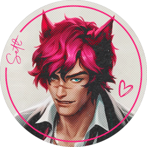
He thinks it's so cool
And he thinks you're so cute with a petite you are
Especially compared to him
Like, an amazing amount of cool
He loves your style and would support it in giants amounts
He would literally be your stylist
You rip your favorite black shirt? He both fixes it and makes it look like a different shirt while matching your style
Is that jacket too expensive? He can diy one just for you that is way better than the one you liked
He'll also ask k'sante to design some clothing for you
The best quality clothing and costumes are given to you as gifts for important days
Dates? There's a gift box on your bed with some clothing that he fixed up for you
B-day? You know those boots you've been eyeing for a while? Wellll, they're on your bed now screaming for you to try them on
And inside the boots, there's a letter
"PLEASE SEND PICS WHEN YOU TRY THEM ON!"
He's so goofy
He'd support you by giving you more clothes and such
KAYN
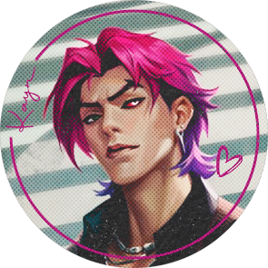
He doesn't care, actually
But he will tease you about your height
But clothing wise?
You can go anywhere with whatever clothes and he would love you all the same
The only way he'll care is if you're bare outside, OR someone says some shit about you
That's when he really cares
The first scenario is because he can't handle himself and will snatch you and eat you 😏
The second scenario?
He's throwing hands and giving the person a piece of his mind
He goes crazy for you, but that's also the main reason why you guys mostly have indoor dates
Either way, he doesn't give a damn as to what you wear
He will love you because you tolerate him and keep him in place
Either way, indoor dates mean more time with you and your snazzy self
He will give you a good time after or during the "date"
K'SANTE
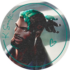
(This headcanon is mainly for the boys die ti k'sante being a gay man!! I'm so happy I get to write a male implied reader!! Woop woop!)
He finds it cute, actually!
Like really adorably cute
With how big he is and how small you are, it's actually comical
But you accommodate your height with platforms and your looks and that totally fine!
He finds you attractive all the same
He will design you clothes, and even ask for help for some ideas as to what the guys would look good in!
Just imagine
Your head is laying on K'sante's lap, playing a game of your switch that he recently bought you as an appreciation gift.
You were just about to beat this damn boss you'd been stuck on since yesterday, but he send an unexpected attack at your character and sends you to a fame over screen.
With a huff, you let go of the switch and sigh in annoyance.
"Hey, love?"
"Yeaaah, I see that, thanks"
"Mhm?"
"Would Yone and Ezreal look good in short crops?"
"Ezreal yes, Yone sadly no"
"I can see that, thanks"
"Of course love"
"Wait, would Aphelios look good in hip hop pants?"
"Phel would look good in anything Sante, but he'd really rock the cyber aesthetic,"
AAAA
You'd both indulge in different aesthetics, but he'd 100% make clothes for you to make you feel like the best of the best
YONE
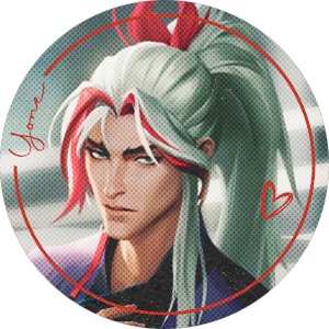
Yone would not care at all
Height or clothibg
You wear What you want, when you want
If someone says anything about it, he will give them a look that would make them keep their disgusting opinions to themselves
Even though its not something he relates to, whatever makes you happy and more comfortable with yourself the better
And if that means black clothing, skulls, and more darker stuff
Then so be it.
But the number of games reminds him of Aphelios
And the amount of anime and manga reminds him of his bother
Though not in a bad way!
Either way, he will indulge you by giving you things he finds that remind him of you
He once brought you one of those cute black death doctor plushies
You literally almost cried, but you gave him a present after turning your plush/plushies towards the wall.
---------------------------
Note!
AAAA SUCH A CUTE REQUEST!!! 🧡🧡🧡
I tried something new with the display, so instead of gifs, I used some pictures of the boys because the gifs wouldn't load.
I also tried something new with the headcanons and placed a small scenario. I just wanna see opinions on it! Hope you don't mind lovely!! Please do request again!! 🧡🧡🧡🧡🧡
Imma go sleep in a min now 🧡
#heartsteel#heartsteel kayn#heartsteel sett#heartsteel yone#heartsteel aphelios#aphelios#heartsteel ezreal#heartsteel k'sante#ezreal#heartsteel x gn!reader#heartsteel headcanons#heartsteel x reader#kayn x reader#heartsteel aphelios x reader#aphelios x reader#sett x reader#k'sante x reader#yone x gn!reader#ezreal x gn!reader#sett x gn!reader#ezreal x reader#yone x reader#kayn x gn! reader#k'sante x male reader#k'sante x gn!reader
407 notes
·
View notes