#did tumblr change its ui
Explore tagged Tumblr posts
Text

ikatako yuri strikes again
#ikatako#takoika#octoling x inkling#splatoon#splatoon 1#splatoon 3#splatoon fanart#inkling#inkling oc#octoling#octoling oc#did tumblr change its ui#inkling girl#wlw#gl#lesbian
86 notes
·
View notes
Text
Its insane how many people here, when criticizing staff's shitty decision making, they completely fail to take into account how IT companies actually work and just spew bullshit like its some gotcha at the staff. Yall are making all of us rightfully criticizing their terrible decisions like fools that have no idea what they're talking about.
#misc#its insane#just saw a post implying staff hired UI artists outta blue to make UI changes#as if being an UX artist isn't a full time job and that most people working on it have been working on Tumblr for years???#and that's not even taking into account all the shit takes that are#''HA! I did a poll and it has 90% saying they're on tumblr for 10+ years! gottem staff!''#like yeah bestie... that's why they're changing the UI... because the only people using this site are here since before 2013#and us being here isn't profitable enough to keep the site running? because they have since 2013 sold the site... twice#I'm all for yelling at them for making shit decisions because they have been on a stream of making terrible terrible decisions#but like...#don't make up how the site works as a gotcha#you are 90% of the time painfully wrong#yall sound like elon musk explaining how twitter works to his circlejerk before breaking the site with a shitty decision#anyway can we go back to shitting on the new UX without acting smart about how site management works
5 notes
·
View notes
Text

like Maybe if her comments weren't repeating EXACTLY WHAT YOU CAME HERE FOR IN THE FIRST PLACE THAT SHE HERSELF DIRECTED YOU TO she would be f i n e . . .
teehee afternote from the tags below lmao
i maxxed out the tags by accident but it ended up being the last one i wanted to put in there anyways... but then i got sad i couldnt add more so that would've been another tag to add but then it wouldn't have been necessary? love that
i do like the posting ui. u can save drafts and it actually keeps ur tags, add the post to the post queue, also can set to post at a specific time/date very cool! there's good colors to choose from too! u can super easily add pictures gifs links audioclips make polls and you can make a break in the page for optional more content for the readers. that could negate the tag thing but we all know there's the shows and book and movies etc. that have a million characters and 30 wouldn't be enough for all the characters LMAOOO
ANYWHOOOOO time to learn how to fix this and get hired at tumblr to sort out the tag situation
also also first post that isn't a repost i think? omg mom look im doing it am i doing it right?
#loz skyward sword#skyward sword link#skyward sword fi#please nintendo why#teehee extra rant xPP#its not fine actually#she Also repeats exactly what you just learned Two Seconds Ago#she actually for real does that and its so aggravating#she makes this game so hard to play#its not a Difficult game its just So Hard to go through it and not want to chuck the wii remote at her face when she says stupid shit#AUGHHHHHH#im still forever obsessed with skyward sword its just so silly and goofy pilled#shout to my boy groose#the silliest and goofiest of guys#be like groose learn from your mistakes and change your ways#but seriously why is fi here#starting a gofundme to remaster the game Without fi or like idk maybe give her helpful dialogue or witty jokes like midna????!!!!!#man i love twilight princess#except for the stupid hard chase scene with Ilia and the sick zora prince in the cart going across hyrule field#shit suckkkkkeeeddddd and i did it with a gamepad for the gamecube its even Worse on the wii#but nonetheless twilight princess is so slay#im in love with the entire loz franchise tho so i cant say anything about favorites#i could Get Into That Shit And Talk All Damn Day if you let me cuz there are so many good ones and bad ones and nostalgic ones and blah bla#this shit took me like an hour to make#the picture was the easy part but DAMN the tagging ui on the tumblr mobile app is So Bad#why cant i edit tags after i see they're misspelled when i add them too quickly#AND WHY IS IS IMPOSSIBLE TO REARRANGE THE TAGS AFTER ADDING THEM#i try and move a tag up One and it goes All The Way To The Top then i try to move one down and it just Doesnt Move#WHY IS IT ALSO SO QUICK TO DELETE THE TAGS WITH THE BACKSPACE BUTTON WHYYYYY#discovering the pain of this app as we go but we go anyways 🤪
0 notes
Text
Vertical Slice Breakdown - Dragon Age Veilguard
youtube
It's been a few days since the Dragon Age Veilguard gameplay video was released. I posted a challenge for aspiring developers to identify as many specific features and systems as they could spot. My expertise is in gameplay, so that's where I will be focusing. Expertise on visuals like lighting, rendering, shaders, etc. should be directed elsewhere.
0:22 - In-Game Cinematic with moving cameras 0:30 - Seamless cinematic transfer to gameplay, quest tracking UI element, different walking speeds 0:36 - Interactable element with UI 0:43 - Camera movement - orbital motion, but likely not detachable 0:53 - Party member movement, including waiting for the player as part of an escort sequence 2:08 - Uninteractable NPC actors perform animations 2:13 - Scriptable terrain changes/destruction 2:18 - Scriptable interactions with multiple actors 2:29 - Uninterrupted conversations when transitioning from gameplay to in-game cinematic 2:39 - Context-specific traversal method with special traversal animation (balancing across a thin beam) 2:50 - Small sequence that is likely unloading the last area and loading in data for the next environment. Likely also locks players off from returning to the previous area. 3:22 - Conversation wheel with "personality" icons and paraphrased words 3:39 - Dynamic inventory in game cinematics, show player's items 3:46 - Scripted Player equipment change during cinematic 4:04 - Quest variables (e.g. player background) result in different NPC response 4:27 - Combat UI including current target (four red dots), Combat log 4:30 - Player can jump 4:33 - UI Melee danger indicator for incoming attacks - silver for enemy attacking, gold for shortly impending damage 4:35 - Player can dash/dodge 4:39 - Event log - Items/Loot notification 4:42 - Shooting UI including hit/miss indicator (red reticle), time scaling, arrow charging (rounded purple bar above arrow count), arrow refill cooldown 5:03 - Some kind of special charge/jumping attack 5:09 - XP gain UI, Quest objective completion UI, Quest objective map indicator UI 5:12 - Auto sheath weapons 5:15 - Potion use/Health recovery 5:18 - Recover potions from the environment 5:40 - Quest objective indicator change on approach 5:49 - Ranged attack danger indicator 5:51 - Defensive action (player reflects damage back on ranged attacker) 6:06 - Enemies can be knocked off edges when fatal 6:10 - Destructible objects in combat, can be scripted 6:16 - Some kind of "special" dodge skill with VFX, likely a rogue class skill 6:51 - Second context-specific traversal method (sliding down a slope) also likely a second "can't go back" type of lockoff 7:01 - Action/Command UI (party/self ability commands) 7:06 - Specific skill used, skill cooldown, enemy debuffed + UI (weakened), resource used (purple bar at bottom of screen) 7:07 - Quick use button mapping, likely for controller face buttons 7:09 - Resource bar refills on its own and on attack damage 10:47 - Different kinds of health bars (likely magical shield and armor) 11:59 - Boss UI with both magical shield and armor bars. Not sure what the number 4 there indicates 12:15 - Telegraphed danger zones projected onto the floor 12:22 - Quick recover timing event 14:45 - Conversation option for branching cinematic 14:51 - Follower approval UI event log 18:49 - Destructible object with health bar and UI highlighting
Each of these elements is something that would need to be designed and implemented by someone on the gameplay team working with UI, engineering, and art. See anything I missed? Which did you get?
[Join us on Discord] and/or [Support us on Patreon]
Got a burning question you want answered?
Short questions: Ask a Game Dev on Twitter
Long questions: Ask a Game Dev on Tumblr
Frequent Questions: The FAQ
152 notes
·
View notes
Text
my life has been greatly improved after i did this and i want to help my fellow mobile warriors, but there are no full clear tutorials on it out there, so im making my own
under the cut there'll be an overly extensive but hopefully helpful tutorial on how to use revanced (of youtube revanced fame) to get a patched version of the tumblr mobile app which can reverse annoying UI changes, get prev tags back, and get rid of tumblr live permanently
first of all, this only works on android. sorry. but that said here we go
firstly go on the play store and turn off Play Protect. you'll generally need to turn off/ignore any safety checks you get, and allow to "download from unverified sources" (dw this process is safe, you can turn these back on after you're done)
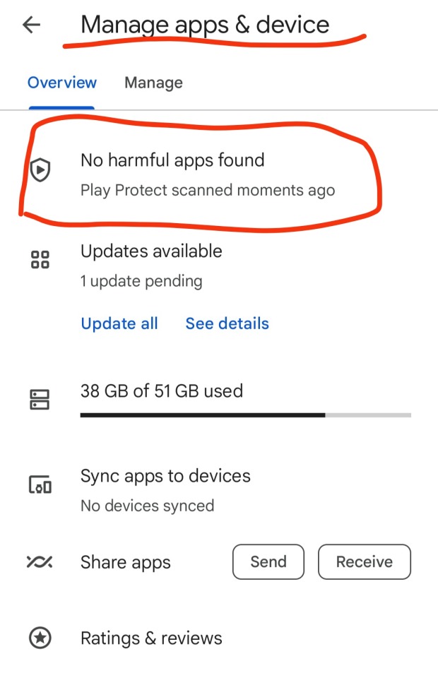
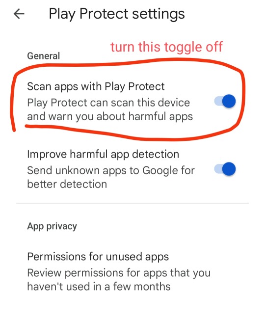
uninstall the tumblr app you currently have on your phone (the one from the play store)
download Vanced MicroG and ReVanced Manager. install both. ReVanced Manager will become an app you'll need to use for this
go to this link. generally youre supposed to be careful when downloading apks off the internet, but i can testify the ones from apkmirror are safe
now this is where the magic happens. apkmirror has the apks for ALL versions of the tumblr app, from the most recent one as far back as 2015
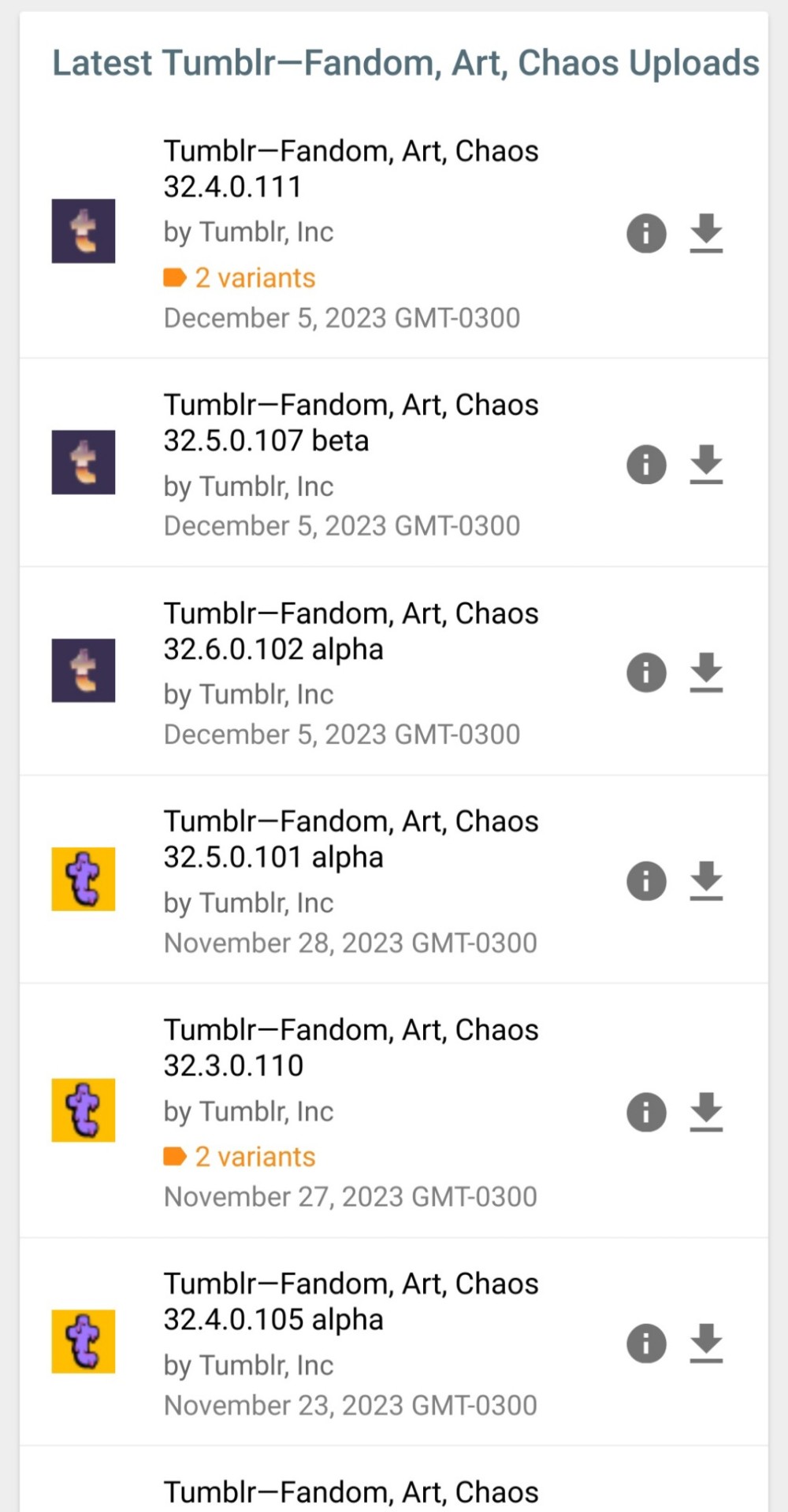
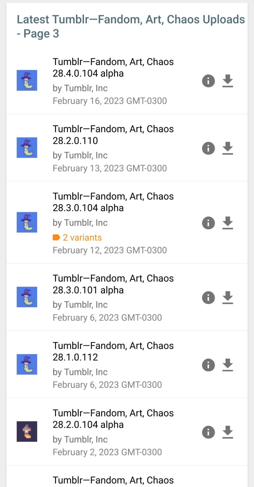
this is how you can reverse any changes to the tumblr app you dont like, simply get an apk from before the change was made
the one im currently using is v29.1.1.100

pros of this one:
- the old image viewer (you can click on images to zoom in without the weird transparent background and scrolling taking you to unrelated posts)
- prev tags (aka you can click on a post or a reblog to be taken directly to that version of the post or the reblog instead of just going to the top of op's blog)
- general reversal of recent UI changes, like the DM redesign and the update that made everything smaller and round
having chosen an apk, download it. i heard some people say you should only download and not install it right away, but mine only worked when i had it installed, so it might depend for you
now go to the ReVanced Manager app you downloaded earlier
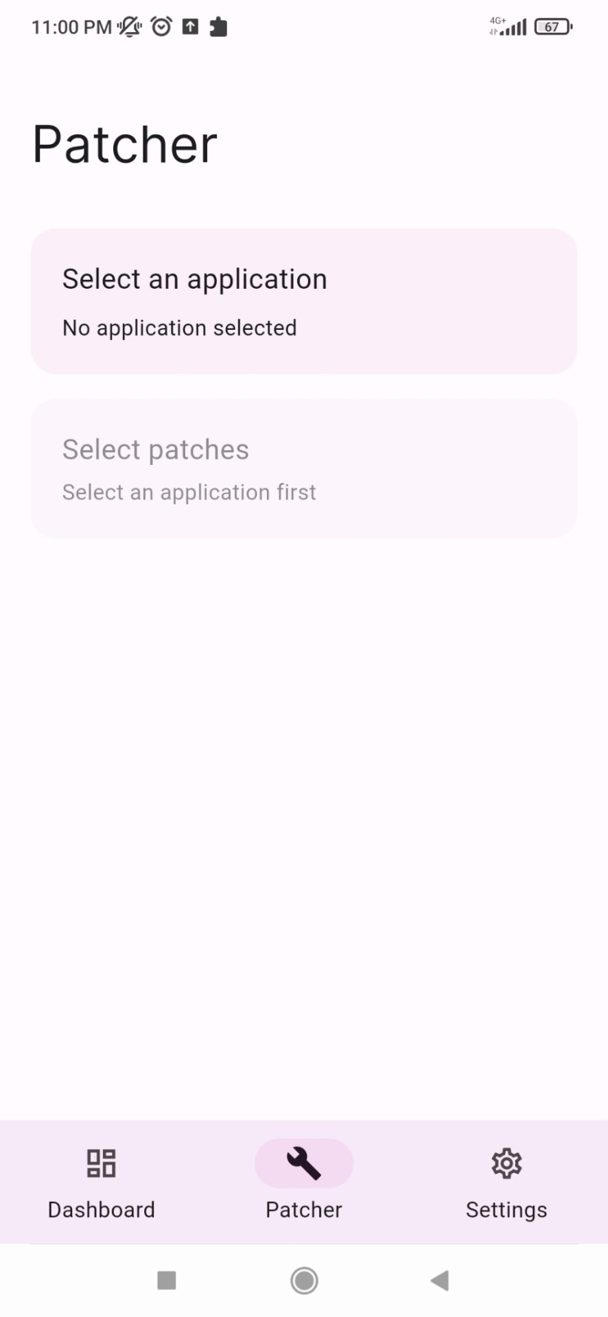
go to the Patcher tab, and there click on Select and application, there you can select the tumblr apk you just downloaded
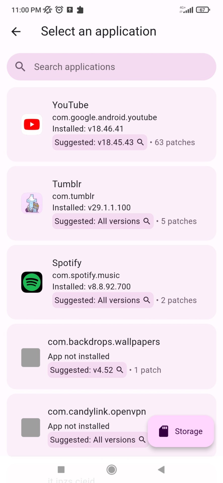
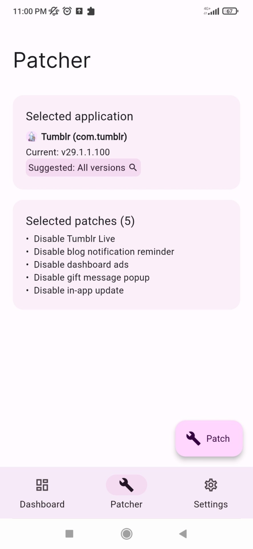
there you can see the available patches, simply click on patch and wait until its done
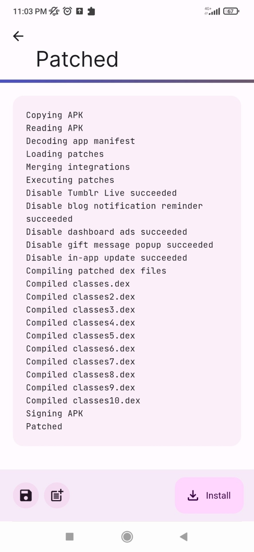
i believe if you did not need to install your apk earlier you can just click "install" and install the patched version right away.
but for me, since i had to install my apk, what i had to do was, once my app was patched, click on the folder icon on the bottom left, save the patched app to my phone files (besides the og one, not replace it), then i went to my file manager, deleted the original apk, THEN installed the revanced version
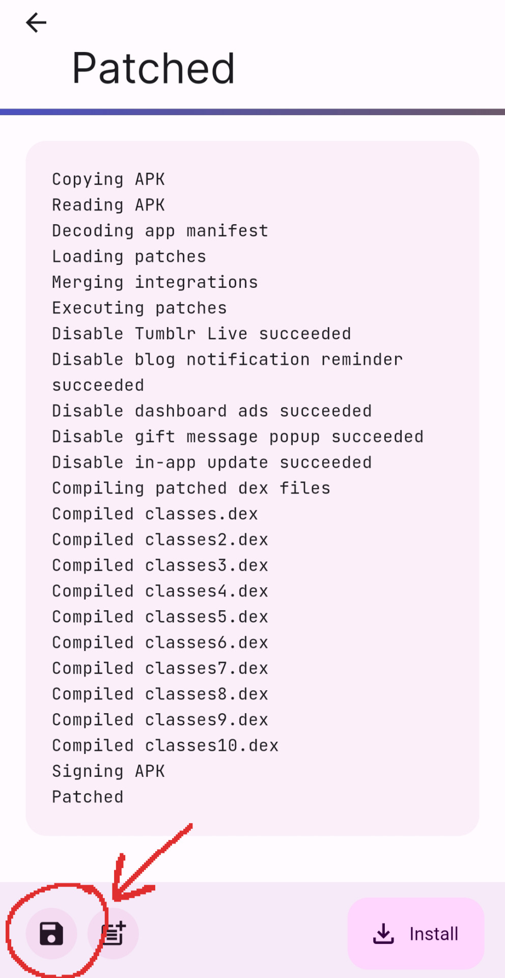
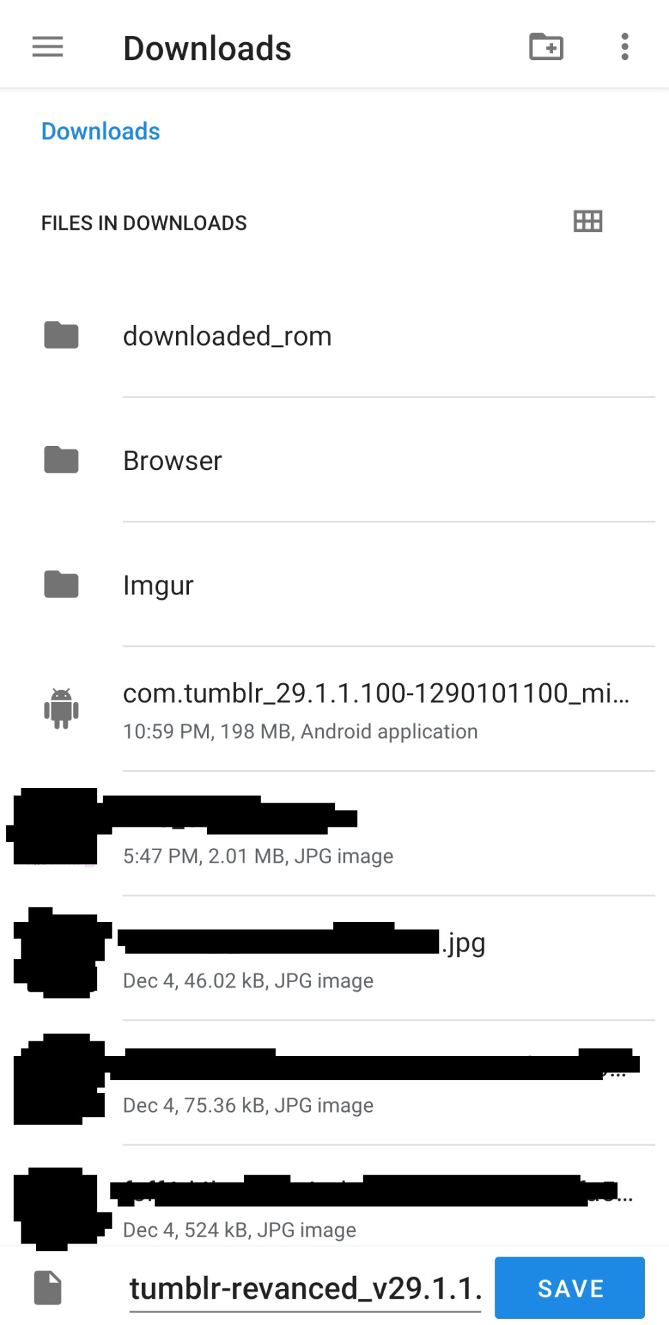
idk if you'll need to do this but it was a pain for me to figure this out so if it helps someone else 👍
and with that its done! if you manage to install it sucessfully, you can just open the app, log in, and youll see if its working if tumblr live is completely gone and all other changes are applied o7
#finally finished writing this. time to release it into the wild#hope this helps somebody else my life is so much easier now#🧃.txt
376 notes
·
View notes
Text
long ramble, progress update, & potential release timeframe below:
hii! i got a lot of coding done and i think im finally satisfied with how the game looks (for now…)
here are some screenshots of what some of it will look like on mobile!
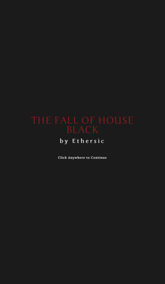
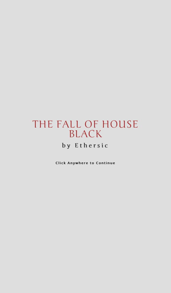
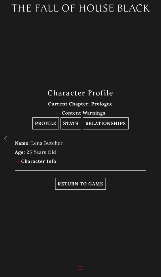
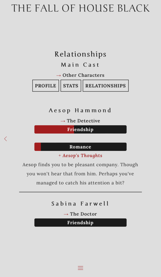
the friendship and romance levels shown in the relationship menu are just random as is the blurb for Aesop’s thoughts, they’re just for the example! (also characters thoughts are hidden by default, you click to reveal, then hide, them)
the stat bars were giving me hell but i finally figured them out with the the help of some forums and tumblr posts
i liked how in when twilight strikes by evertidings, the menu buttons (i.e. profile, stats, relationships) are listed at the top of the page so i took inspiration from that! and the many IFs that have a splash (?) screen at the beginning with the title
compared to when i started using twine (i think august 2023 was the first time i gave it a try), i’ve learned so much and there’s still so much to learn as well, i think coding has become my favorite part (making things looks pretty hehe)(with the help of amazing templates & ppl smarter than me, they do the heavy lifting fr)
with all the coding done (appearance wise) it’s lock in time for the revised prologue and chapter 1
the prologue has undergone a fair bit of change with the help of feedback & i’ve (hopefully) better established the setting and story.
some things that have changed besides wording and sentence structure, etc.: being able to choose what you did as a job (ex. working at the family inn) and meeting a new character (more like an old friend?)(no spoilers:))
some things i’ve been considering (SLIGHT SPOILER FOR CH.1 MAYBE): merging the revised prologue and chapter 1 into just the prologue bc chapter 1 differs a bit from the other chapters, but then the prologue would maybe be too strange timeframe wise? it’s a time skip after the events of the prologue (is that considered a spoiler, i don’t think so but???) that connects to the next chapters so maybe it’d just be better as its own chapter? or dropping the revised prologue by itself along with the updated ui/appearance then chapter 1 sometime after, or dropping the revised prologue and chapter 1 together, idk these are all just ideas i’ve been thinking about maybe i’ll do a poll
if you have anything you’d like to see, for example a specific job your MC worked, certain personality traits, or something like that, feel free to let me know & i’ll take them into consideration! i think now is the best time to add things bc it’s early development days & it’ll be easier to do so now than later
i’ve also decided to lean a little more into the supernatural aspect which i’m excited for (one specific thing really, i can’t wait to get to it🤭) the story’s world itself is fairly grounded in reality (as in the supernatural is unknown to most) but i’m looking forward to exploring it more
what you’re probably reading this for: depending on how i end up going about the prologue-chapter 1 merge decision & whether anything is added from requests/feedback, i’m aiming for a june release, july at the latest (fingers crossed). now that the appearance and function coding is complete (besides stat/choice tracking & other story related things), finishing the writing and coding it in is all that’s left
my schedule has done a 180 & some things are less than ideal at moment but it should all (hopefully) go smoothly from here! should anything change, i’ll let you all know
anyways, that’s all i have to say for now! ty for being patient & for reading this mess, i appreciate you all :)
#✻ — e talks#✻ — coding ramble#✻ — progress update#(albeit a messy one)#the fall of house black#the fall of house black if#tfohb if#if wip#interactive fiction
112 notes
·
View notes
Note
hi! about the "learn how it works before you start making assumptions" about the bluesky post and its networks; what assumptions should we be looking out for? that its not twitter and not everyone is going to be connected like on there? your description of federated networks is understandable, but the default domain it seems to have at signup is bluesky's. I feel like most people would be using this, and only people looking for a certain thing and knowingly leaving that "sphere" will know that theyre isolating to a different community.
I'm new to this too and theres very very minimal, well explained things about it online, and youre the only person I've come across who seems to know anything, so if you have more advice to share I'd appreciate it!
as much as I would like to answer this as an authority and really contribute to the nascent understanding of federated instances as an alternative to current social media platforms, the fact of the matter is that im not. i have a basic understanding of the way in which they work and how to use them, and I dont think im the best source of information. this being the case, since i did bring it up and i did get an ask, i'll try to explain the best i can.
the "fediverse" (dont mind the silly name, we know its silly) might best be explained with the similarities to email. Misskey, Mastodon, and others marketing themselves as federated instance platforms are basically like if you took your email account and stapled twitter to it: Misskey/Mastodon are not platforms themselves, so much as they are frameworks for web servers that connect to one another independently and are run by individuals. These frameworks are usually open source, have different alternative forks that offer different additional features/ui elements, and ultimately all connect to one another regardless. but they are not "platforms" like tumblr or twitter or facebook. anyone can make their own federated instance, and what that instance looks like depends on what framework they used to set it up.
Bluesky and Threads are different. Bluesky differs in that it is run on a private protocol-- it runs differently to the protocols used by the aforementioned open source alternatives and currently cannot connect with them. It's still in beta and its too early to call how it will operate. Threads, like Bluesky, is also a private protocol. At current, it merges your information with other Facebook/Meta products (facebook, instagram, etc). Supposedly, these will eventually be able to communicate with the Fediverse at large, but you should keep a great amount of suspicion with them, as both are run by billionaires. Bluesky is the project of the former head of twitter, and Threads obviously belongs to Zuckerburg and Facebook.
If you head about "x platform is homophobic/racist" in reference to the earlier federated instance frameworks, understand this very crucial thing about Mastodon/Misskey/etc:
They are not websites. They do not have established moderation policies and staff dedicated to managing who posts what.
as stated, Masto/Misskey are just server frameworks. Each federated instance using those frameworks is run by individuals on their own private web servers that they either operate themselves or rent out from a company. the largest Misskey instance, Misskey.io, is currently under fire for having homophobic moderation practices. This does not mean that every instance of Misskey is moderated with homophobia in mind, and homophobic moderation tools are not built into the code of Misskey.
As the old guard of web 2.0 crumbles, the internet is changing again. whether we fall back into the ad-friendly hellhole of yesteryear or we enter a new phase of the internet's wild west depends on platform migration patterns and whether or not people develop some pretty basic web and internet literacy that's been lost over the last 20 years as the internet corporatized and users had to learn less and less about how the websites they used work. my explanation here probably has incorrect information and holes in it, but that is because i, myself, do not fully understand the total extent to which the fediverse and federated protocols operate; i, too, am a layman.
that being said, i hope this was helpful to anyone trying to figure this stuff out. i've already carved my own space on a small, invite-only instance with friends, but i've got no plans to move shop until this place really does burn down to the ground. hope that helps. good luck!
#asktag#Anonymous#long post#fediverse#misskey#bluesky#this is why i said someone who can actually explain this and has an audience needs to get ahead of the curve#i dont think federated instances are super complicated if you have some webdev knowledge#but this new generation of people who grew up with the corporate internet might not have the first clue about operating it#in the end#all we can do is learn and adapt#if someone wants to poke a dozen holes in this post and better explain it#go for it
61 notes
·
View notes
Note
hi!!! i love for custom blog theme,, do you have a link to the code or creator 0:?
ya!
so my theme is actually a heavily modified version of redux edit #1 by lopezhummel (current url: holyaura). i always remind users that most tumblr themes are old and that you'll need to replace all instances of "http://" in the code with "https://" so tumblr will save the theme. i had to do it with this one
these are the modifications i made to the theme. i edited this theme over the course of at least a year or so and don't quite recall how i did all of these things. but to the best of my ability:
i moved the "left side img" to the right side of the screen. i also made this element "responsive" so the image will never get cropped when you resize your screen. this was a bitch and a half to figure out and i truthfully do not remember how i did it
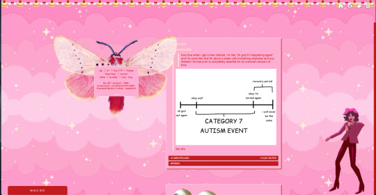
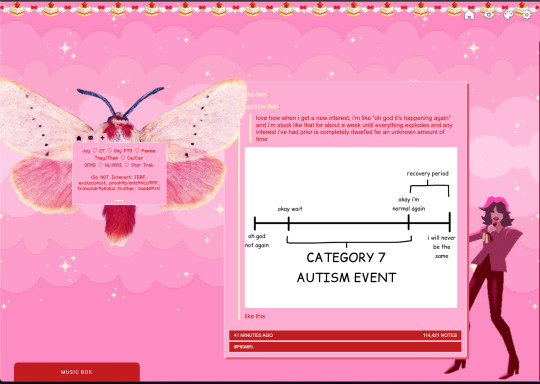
i deleted the text in the drop-down navigation so it appears as a little line that is otherwise not noticeable. this type of theme, the "redux edit," used to be very popular because having a drop-down menu let you cram a bunch of links that lead to sub-pages on your blog. i've done away with my sub-pages, but i still like the format of the "redux style" tumblr theme, for its minimal UI and for its customization options.
i separated my mobile description from my web description for formatting reasons. basically, most elements in tumblr themes are connected to specific text fields and toggles. i simply went to the section that was connected to my blog description and deleted it. the web description has to be manually typed inside of the CSS/HTML editor when i want to change it. whereas my mobile description is whatever i type in the "description" box of the normal tumblr theme editors.
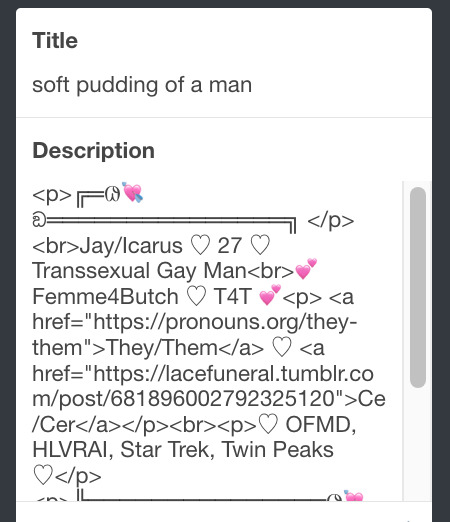

i added code someone else made ("NoPo" by drannex42 on GitHub) which allows you to hide posts with certain tags on them. i did this to hide my pinned post, as it looks bad on desktop.
i replaced the tiny pagination arrows at the bottom with images that literally say "next" and "back" because the arrows were far too small/illegible. i know they aren't centered in the container i'm not sure how to fix that lol

i added a cursor

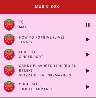
i installed a working music box ("music player #3" by glenthemes), and then added music by uploading MP3 files to discord and then using the links of those files as the audio sources. iirc i also had to make this element responsive and i aligned it so it would sit on the left side of my screen. i made the "album art" for each one the same strawberry pixel art
the moth is just a PNG i added and then moved around so it was behind my sidebar using the options that came pre-packaged with the theme
if you want something like the strawberry shortcake decoration at the top (called "banner" in the theme) your best bet is to google "pixel divider"
theme didn't support favicon so i added that in so i could have a little heart

ALSO:
this theme is. really weird about backgrounds. any background that i have ever set for it, i've had to do weird shit in photoshop. like making the background HUGE, mirroring it, etc. - because it would crop the image weird, or there would be a gap where there was no image. idk man, it's haunted. i'm sure there's a way to fix this but i am NOT tech savvy enough. anyway, patterns are probably your best friend. and if you DO want something that isn't a pattern, it's going to take a lot of trial and error. but i love this theme so i deal with it 😭
the sidebar image and the floating image do not scale. if your image is 1000 pixels, it will display at 1000 pixels. you'll either have to edit the code so that the theme scales the image for you, or resize any images before you add them
my white whale of theme editing (aside from the Weird Background thing) is that i cannot get infinite scrolling to work. i have tried every code out there. all of them break my theme. it makes me sad because like. i have music there for a reason. the idea is that people would listen to it while they scroll. unfortunately, the way it's set up now, the music will stop every time someone clicks "next" or "back" 💀
anyway sorry for rambling but i hope you enjoy the the theme and customizing it in the way that you want to!
21 notes
·
View notes
Text
So, in the span of 1 year, pretty much all social media account that i use for work has fucked me over in one way or another.
Twitter got fucked by muskrat and deleted my 3k follower account.
Tumblr got me banned for 2 months and I almost lost this 10yo account.
Instagram is, well, instagram, and it has been fucking over small artists and businesses for a long time with its angoreethism bullshit. I got really fed up with it and decided to private my acc.
Artstation got blocked in VN.
Behance doesn't work for anything at all.
Pixiv deleted my account without warning and I cannot get back that old username.
RedBubble starts charging artists more.
Society6 also starts charging artists more.
Kofi is pretty ok, but it did ate up a payment from one of my clients and that never got resolved and I still feel super guilty about it.
Patreon is changing its UI and shit, so everything is kinda chaos over there. And it's also notorious for randomly delete artists who give adult contents so i'm still looking for a friendlier alternative with an equally good userbase, which is impossible.
Did I forgot somethings else?
Idk what the fuck happened last year lmao. Right now I'm only on tumblr, kofi (for donation), InPrint (that nobody uses), and Patreon (that I'm struggling to regularly update kek).
#could it be a post covid phenomena?#idk#anyway im tired but im over it now#and im happier that i only concentrate my efforts on a few things instead of spreading out#also even tho tumblr sucks#but it sucks in a way that im more comfortable with#so its a hellsite affectionate#cryptic na posting
7 notes
·
View notes
Text
why did tumblr mobile change its ui for the notifs menu. why is every company ever absolutely bellbent on getting uglier

BOOOOOOOOO BOOOOOOOOOOOOOOOO
#also yeah ive had my notifs off for tumblr for Ever and i keep acknowledging the stupid ass banner and it keeps COMING BACK#IM SAYING NO. STOP TRYING TO CHANGE MY MIIIINDD
9 notes
·
View notes
Text

Blue (Retro) Mode UI
As its name says, it is a mod that changes the appearance of the interface of The Sims 4, simulating that the "Blue mode" is activated.
You can comment, criticize and suggest about the mod with complete confidence.
------------------------------------------------------------------------


------------------------------------------------------------------------
Also see these alternatives.
Dark Mode UI
Pink Mode UI
Purple Mode UI
Retro (Blue) Mode UI
Medieval Interface for The Sims 4
Green Mode UI
Red Orange Mode UI
Coming soon
Yellow Mode UI [The Alphas begins in November 2023.]
Pink - Dark Mode UI [?????????????????????????]
------------------------------------------------------------------------
Want even more customization, check out this collaboration I did with Hepandeerus

Check here to find out more.
------------------------------------------------------------------------
Many thanks to:
Miri-amm?
Luvrsrock
Your comments were very helpful for the creation of this mod.
------------------------------------------------------------------------
Notes:
The mod is compatible with the Smarter Pie Menu mod.
------------------------------------------------------------------------
It is recommended to remove previous versions before upgrading.
Do you have any conflict with a mod? check or report it from here.
You can also give your opinions, either in the comments, X (Twitter), Instagram, Tumblr.
Download [from patreon]
8 notes
·
View notes
Text
A World Without You by jaunefleur
An Anti-Romance Jam entry. > Note: this entry was submitted as a demo. containing a prologue and 3 Chapters. The review will only reflect what is there. Still the demo is quite long. I maybe needed a few hours to read it all (on playthrough).
Entry - More by Jaune - @jaunefleurwrites CW: terminal illness, impending death, anxiety, death, teen pregnancy
Dealing with a World without You
You are going to die. You know it. Nothing will change from the facts that your illness is incurable and that you only have few moments left before your inevitable demise. You resigned yourself to your fate. But when Damin, a bubbly bubblegum-haired [person] crosses your path, everything you thought about life flips upside down. This is the premise of the project. At the current state of the demo, you've met that person, but sparks haven't quite flown just yet between you two.
From the start, it is clear AWWY is quite anchored in the Tumblr/CoG school of IF, with its custom UI, expected extensive length, and flowery style. However, instead of focusing on branching and choices, AWWY takes a more linear approach with a twist. This makes sense with the story told, considering the MC's fate is sealed - unless a magical cure comes at the last minute, they will die no matter what. So, rather than giving player a plethora choices, the demo subvert expectations by switching POVs within a chapter, limiting choices to one or two for flavour within a chapter. You may start the chapter with your MC, before the story is cut to your mother's POV or your brother's or Damin's. Parsed through those, you are treated to some flashbacks, exploring the different character's pasts, and how those events shaped their present. This creates an interesting dynamic, making the story feel at times more like a movie than and interactive game. The switches between POV or time period are also clearly indicated at the start of each part. Having to control the MC through the eyes of another character was a bit surreal, but in a good way!
Maybe a downside to this approach is the evident lack of player agency throughout the story. Even with the MC referred as 'you' in their POV, you feel more like a spectator than an active participants. While again, this make sense considering the context - you can't affect the end - it does take a bit away from the interactivity of the game, making the project look more kinetic than interactive in nature. This is not an inherent critique of this aspect of the project, as kinetic stories can pull a bigger punch than a choke-full-of-choice game. And I can see this story being one of those. It is just that, at time, some opportunities to elevate a scene through interactivity were missed, which could have made important beats more impactful (like the scene where the MC claims to hate everyone). On the other hand, it did work quite well for the character creation, avoiding any potential choice-fatigue for the player by spreading out those choices throughout the story - only bringing up relevant elements when necessary.
I struggled as well with the pace of the story, as it went back and forth between past and present, and between POVs, making something the sequence of events a bit... confusing. A perhaps good example would be when Damin meets the MC at the butterfly grove*, for the first time it seems, but doesn't seem to recognise the MC (who turns out to be their neighbour) in the next chapter, or whether Damin arrived before the MC into town or the reverse. This resulted in some high-pressure events, like the fight between the MC and Damin, feeling a bit coming out of nowhere (unless it was supposed to be a flashforward?). In the same vein, it seemed like the prose focused a bit too much on (over)telling the player what was happening, rather than let the scene speak for itself. This lead often to repetitions in one same passage/paragraph*. I thought this was a bit of a shame, since there are pretty poetic descriptions of actions/setting, but were drowned in explanations. A bit more TLC on the prose will help the flow of the story. For example, hinting at a character's feelings through action only (instead of the action + description of the feeling) - like breathing a bit too fast or twitching when anxious, or freezing when someone is angry talking to you - or use punctuation and formatting to establish at a tone (instead of describing the tone then the uttered words) - like three dots to show uncertainty or disdain, or a en-dash to choke on words when emotional. *Sidenote: this scene felt pretty magical with the butterflies dancing! *Repetition can be useful, but should be used in moderation for strongest impact.
Underneath it all, there is a good base for an interesting story. The characters, though clearly flawed (good!), feel believable and quite human (especially the moody teenagers). Their pain will still pull your heartstrings. It is set up to be a tearjerker, for sure! Most introduced characters have clear motivations, goals, and challenges to overcome - mainly carrying on after MC passes. It is quite clear where the story is going, and it could make for quite the heartbreaking and bittersweet conclusion. Out of all characters introduced so far, I particularly enjoyed Damin's sassy grandmother. She seems like a treasure, and a needed comedic relief in this heavy story. I hope we see more of (and learn more about) her in future chapters.
Another aspect I quite enjoyed was the addition of assets in the game, particularly the images. The demo gave a neat way of choosing Damin's gender (and inherent design), as well as customising our room (by choosing one of "our" drawing). Seeing our sketchbook getting filled as we move from chapter to chapter, used as an alternative to a written journal, was a nice touch. I hope more are planned for the future, their designs were lovely. Note: I picked the hippopotamus :P
The premise of the game made me thing of The Fault in Our Stars by John Green, which I think it took inspiration from?
There was supposed to be audio according to the credits, but I didn't hear any music during my playthrough. I had some small issues with the game itself, with the OpenDyslexic font not working, or the colour palette not being quite accessible (not contrasted enough) for easy reading. I also picked up on a few wrong pronouns for Damin and wrong names for myself.
11 notes
·
View notes
Text
I do (ironically) love it when people make posts about how little fucks they give about tumblr changes, and making a point to ridicule the people who were, in fact, upset by those changes. Very cool. :)
And now seriously?
UI change is not the worst thing on earth, and often can actually improve the quality of life and make the place better.
While yes, the tumblr user base does not typically receives change happily (unless it's good, polls, am i right?) to say that this is all about the users being 'bitchy' or 'silly' is a gross understatement of what upsets people in reality and is pretty damn rude.
I will not go down to every single point of why it's bad, but I'll bring forth a few points nevertheless.
Releasing a massive UI change while there's still active and major bugs and issues in the main functionality of your platform is not only bad towards a loyal user base that is used to a certain way of things, it's also unprofessional, incompetent, and quote frankly—stupid.
Here is an example of main tumblr functionality, the post editor on web. As a website that is heavily reliant on text posts, and the ability of users to be able to write quality posts, the fact that as of today, the text editor is heavily bugged, is truly a thing to be astonished by.
Especially considering the fact that some users (namely me) made a point of sending them a proper documentation of the bug, along with full descriptions and even a screen recording for an easy recreation of the issue on their side.
Following image was submitted with my feedback months ago:

In case you were wondering what response did I get—well— TL:TR they say that there's an issue, and IF they find the issue, they will fix it :)
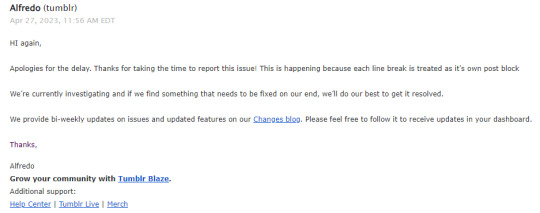
So now with this in mind, and many other bugs like this still present, since April they could not have fixed the post editor— but they could add numerous and absolutely pointless UI changes, right?
Now taking it a step further, let's address the UI changes, why not?
The changes they're rolling out are clearly unpolished, unfinished and untested. The audacity to force hardly-working versions onto people without any sort of consent as is customary in such an unpolished version of a product is something that I have no other words for other than absolutely shameless.
Even look at the Chat UI change, the text is smaller, the windows cover other parts of the dashboard, the Chat visually changes from section to section of the website (for instance it's new on main, it's old on support page) and again, endless amount of other bugs.
What's worse? And I will not go into depth about this particular topic as not so many people are from 10+ years ago still here, but just in short: The loss of identity that tumblr had prided itself for so long with. We are not like other social media, right? Or well, so we thought. As it seems like tumblr is adamant to change and curate for new users that will, frankly, leave the moment their social media gets fixed. Some will stay, and they are warmly welcome to, however most will leave just as they did last time twitter had a crisis.
P.S You have to appreciate the irony of tumblr making money out of making fun of twitter, and the user base supporting it because that's the sort of UI changes we do enjoy— only for tumblr to copy paste twitter some months after :)
But yes, why not, call everyone a crybaby, since siding with a staff that simply does not listen to its user base or cares about fixing current and relevant bugs—is the way to go!
P.S2 it's absolutely fine if you're unbothered by the change or simply don't care. Ain't nothing wrong with having some good proportion on things. However please don't embarrass yourself by making fun of the people who actively care and worry about how this place operates and what sort of platform we'll be engaging in the future.
#I try very very very hard to not get aggressive ever in my posts#I much rather explain and rationalize things to people#as understanding it the best way to come to an agreement#And franky I was not even going to speak of this topic in this manner#HOWEVER SOME LITTLE :) DECIDED TO WRITE ABOUT HOW STUPID EVERYONE IS AND PISSED ME OFF :))))#siding with the uppers against your own fellow people is SO wow. :)))))))))#tumblr#tumblr issues#much longer than i had ever intended#but this is my stance and it's where i'll stand.#it's just how it is.#again. no issues whatsoever with anyone who simply doesn't care.#but come on-- what do you gain from making fun of literally your fellow fans. what on earth do you get out of it.#does it make you feel good?#this is such a bad attitude.#I relaxed a bit and placed it under readmore since it's too long
8 notes
·
View notes
Text
Living with the Left Nav on Tumblr
So if you don't mind the left nav Tumblr has moved to, but feel it's annoying the way it squishes in on the dashboard, then I've got a few minor tweaks you can do with a simple css editor - like stylus.
.ZkG01 { justify-content: normal; } .ZkG01 ._3xgk { margin-left: auto; margin-right: auto; } [title~="Live"] { display: none; }
So what this does:
1.) Changes the page justification with the first section. This puts the left nav permanently on the left side of the screen. Where a left nav actually belongs, not crowding in on the center with space on it's left. It's a left nav, it does not need to creep inwards to make the rest of the page harder to read.
Except now the dash has crept over to the left too which is where section 2 comes in.
2.) Puts automatic margins on the dashboard area - this includes the search bar and all the clutter beneath it (x-kit rewritten is useful for hiding that clutter) - to both the left and the right. What this means is that the content will be centered with equal sized margins on either side. So the dashboard + margins will, together, fill up the entire space to the right of the left nav with the dashboard centered within that space.
That takes care of the page spacing concerns with the left nav... so what's that third css section doing? (I bet you can guess.)
3.) It also hides the tumblr live button on the left nav. Apparently the latest update from snoozing 7 days to snoozing 1 month has changed it so that it no longer hides the nav item. That sucks. But with this little piece of css + x-kit rewritten hiding the carousel... it's like Live doesn't even exist. Even when the snooze comes to an end.
This works great if you choose not to use the Tumblr Dashboard Unfucker script - I did use the Dashboard Unfucker for a while during the missing avatar phase and if the avatars go away again (or some other accessibility unfriendly decision is made) then I'll be using the Dashboard Unfucker again. But I'm actually okay with the left nav, aside from feeling it needs a few minor tweaks to be decently usable.
Tumblr has given in to peer pressure (current industry 'standard' UI practices) but it's not entirely bad. The old flow was better for noticing activity and messages, but the new flow makes it a lot clearer what the nav icons are for now that they have actual text. I'm also a lot less likely to click the wrong thing by accident as there was some hit-box overlapping in a few places when it was a top nav.
There are a couple of things, though, that I'd still like to see happen with the left nav. The first is a toggle of some kind for collapsing the left nav to just icons again. On small screens - but not small enough to trigger the collapse on its own - being able to toggle the menu open/close would be pretty useful to help conserve space for the dashboard. Second is moving the search bar into the left nav. It makes way more sense in the left nav than it does to the right of the dashboard. And that may wind up being what pushes me to give creating my own userscript a try, if I decide I want that search bar moved badly enough.
5 notes
·
View notes
Text
sims get to know me tag !!
thank you sm @duusheen for tagging me 🥹💛
1. What’s your favourite sims death? cowplant lmao
2. Alpha CC or Maxis Match? I like maxis mix!
3. Do you cheat when your sims gain weight? no
4. Do you use move objects? I can't build without it 😅
5. Favorite mod? this is super tough but I couldn't play without mccc and ui cheats!
6. First expansion/game/stuff pack you got? outdoor retreat!
7. Do you pronounce “live mode” like aLIVE or LIVing? I feel like it's changed so many times throughout the years but lately it's been exclusively LIVing
8. Who’s your favorite sim that you’ve made? a sim called Nex that I've never shared and Elowen! ofc lucine and flourish too but they're dnd characters before they are sims 😅
9. Have you made a simself? I did yearsss ago but she looks absolutely nothing like me lmao. I do kinda wanna try again tho?
10. What sim traits do you give yourself? I'm picking 5 bc that's how it should be in sims 4 *cough cough* family oriented, hopeless romantic, animal lover, geek, and socially awkward! I know some of those are sims 3 traits but its ok 😭
11. Which is your favorite EA hair color? red and green! I have to resist the urge to give all my sims bright red hair 🫶 I love super dark black hair but it's such a hit or miss whether the swatch is gonna be gray, blue, or pitch black
12. Favorite EA hair? off the top of my head, I love the one we got with that sdx drop with the ombre roots and like 3 different high school years ones lol
13. Favorite life stage? I love infants bc 🥹🥹 but also teens and YA! even tho teens and young adults are pretty much the same 😐 it's one of the best parts of legacies when a child ages up into a teen!
14. Are you a builder or are you in it for the gameplay? gameplay and cas! I'm not great at building and only do it when I need to but creating characters and playing with families are my fav <3
15. Are you a CC creator? no lmao. I would like to make some more recolors but I only ever make them for personal use! maybe one day I'll release some 🤔
16. Do you have any simblr friends/a sim squad? I've met some really good people on here that I just adore talking to <33 and I always think of my mutuals as my lil sims buddies 🥺
17. What’s your favorite game? 2 and 4! sims 3 is so good but 2 has my heart.
18. Do you have any sims merch? I used to have those headphones with the plumbobs that changed based on your sims emotions and they were so nice but they broke yearssss ago :( other than that no unless we're counting the freezer bunny I'm crocheting lol
19. Do you have a YouTube for sims? no :(( I've wanted to start a youtube channel since I was just lil child but I'm so scared 🙃
20. How has your “sim style” changed throughout your years of playing? I honestly don't think I have a sim style? but I do think I've gotten better at making sims in general? I'm much better at using different faces and making sims look different now!
21. What’s your Origin ID? druidberries but i don't upload anything to the gallery
22. Who’s your favorite CC creator? trillyke, simstrouble, ah00b, ratboy, simandy, squea, ladymoriel, praline and literally so many more I could go on forever
23. How long have you had a simblr? I've had tumblr for ages like lurking but I think I started my first simblr around 2016-2017? I used that one on and off for so long and I always lost motivation but finally what like 2 months? ago I made this one and got a nice clean fresh start 😌
24. How do you edit your pictures? I use photoshop and I pretty much always do topaz, noise, and sharpen, and then from there I decide if I wanna do some brightening or whatever. I do use actions sometimes too! I really have no clue what I'm doing when it comes to editing 😭
25. What expansion/game/stuff pack is your favorite so far? all of the occult packs ofc + growing together and cottage living <33 I also really love nifty knitting bc most of my sims knit lmao
26. What expansion/game/stuff pack do you want next? I really want them to make a fairies pack 🧚♀️🫶
feel free to ignore this but I'm tagging: @buttertrait. @potionio, @aurorangen, @estah, @sinfulwunders, @salemssimblr, @duskiivy and @simlishpiadina
#this was fun!#tag games#my old blog just never got any activity and i think i just got so bored every time#ofc you shouldnt care about that and i really didnt want to but i coudlnt help getting demotivated when i was just posting for me to see#but now if a post doesnt get activity im like ok whatever lmao#im also better at like? posting and stuff now i think#between writing and editing and developing characters#i just needed to like STICK THROUGH learning it but i didnt 🙃#druidberryspeaks#also I think like 2 years ago was when i was like ok no more simblr i get demotivated everytime and stopped with that blog once and for all#but now here i am hehehe#and maybe TOO motivated 😅
12 notes
·
View notes
Note
Sorry if this is a weird and out of left field ask, but as the creator of Dashboard Unfucker, you seemed like a logical person to ask so. Patreon has just overhauled their UI (desktop & app) and killed their chronological feed among a bunch of other just awful changes, and I was wondering if you knew if it would even be /Possible/ for someone to fix it with an extension/tampermonkey script/magic sigil etc. or if they've fucked it too much to Unfuck? Also much love and appreciation for Dashboard Unfucker, you're a saint.
Maybe? I've never used Patreon so I have no frame of reference. For all its faults, Tumblr at least has a free API, no clue about Patreon, but if it did it would likely simplify the process.
3 notes
·
View notes