#della-robbia-productions
Explore tagged Tumblr posts
Note
Hey yumi. Did you try to kill Belpois?
if so, can i join you? he's also made posts about me
-your martial arts classmate

❀;; -- "Not yet. That Belpois kid has been hiding out on my I think. The only time I've seen him recently he's been hanging out with that new blond-haired kid. Not sure if he's a body guard or what.
"But by all means, join me. Especially since he's definitely been talking about you too."
Don't think too much about it. Don't get all blushy least that Belpois kid gets more ammo for those posts of his.
@computer-einstein @della-robbia-productions
#// I AM SCREAMING OMG#gym girl saga#computer-einstein#della-robbia-productions#❀;;my answers ( asks )#ask#anon#ic crack
4 notes
·
View notes
Text
Update: Apparently @della-robbia-productions DOES know how to lockpick doors (and kept saying I had no rizz apparently).
PERFECT!
Well, as I write this, the door is open. On the other side, there seems to be some kind of tunnel. Its made of dirt and has cables running along the sides, so I've personally come to the conclusion that this may be a maintenance tunnel.
Me and Odd (that's his name, which actually surprised me) are gonna do a thing of rock paper scissors to see who will go down first.
#einstein talks#einstein's investigation#hope he doesn't cheat me into hell#//#code lyoko#time to have an implied rock paper scissors thing with jam XDD#interacting: della-robbia-productions(odd)#the locked red door
11 notes
·
View notes
Text
20 Years Ago On September 3rd, 2003
FROM ANTEFILMS PRODUCTION & MOONSCOOP GROUP, FRANCE 🇫🇷 3 & CANAL J PRESENTS
THE BEST FRENCH ANIMATION CARTOON EVER MADE
Jeremy Belpois, an 8th grade prodigy attending boarding school at Kadic Academy, discovers a quantum supercomputer in an abandoned factory near his school. Upon activating it, he discovers a virtual world called Lyoko with an artificially intelligent girl named Aelita trapped inside it. Jeremy learns of XANA, a fully autonomous, malevolent, and highly intelligent multi-agent system, that also dwells within the Supercomputer.
Using Lyoko's powers, XANA can possess electronics and objects in the real world like a virus to wreak havoc. XANA's primary objective is to eliminate anyone aware of the Supercomputer's existence so that it will be free to conquer the real world and destroy all humanity.
Jeremy works tirelessly to materialize Aelita into the real world and stop attacks caused by XANA. Jeremy is aided by his three friends Odd Della Robbia, Ulrich Stern, and Yumi Ishiyama, who are virtualized into Lyoko to save both worlds from the sinister virtual entity. They achieve this by escorting Aelita to various Towers on Lyoko, which serve as interface terminals between Lyoko and Earth. Once the Tower is deactivated, Jeremy can launch a "Return to the Past" program, which sends the world back in time to undo any damage caused by XANA, while anyone scanned into the Supercomputer retains their memory of the events. In "Code: Earth," Aelita is finally materialized, but the group discovers that XANA had planted a virus inside of her that will kill her if the Supercomputer is turned off. They realize that they cannot destroy XANA, or Aelita will be destroyed along with it.
ITS UP TO OUR LYOKO WARRIORS TO SAVE THE WORLD 🌎 AS WE KNOW IT AND MAKE THE EVIL SUPERVIRUS KNOWN AS XANA. GO AWAY
HAPPY BELATED 20TH ANNIVERSARY TO ANTEFILMS PRODUCTION & MOONSCOOP GROUP, FRANCE 🇫🇷 3 & CANAL J
CODE LYOKO 💻 #CodeLyoko


26 notes
·
View notes
Text
youtube
The video accompanying this project (turn the english subtitles ON ^^)
So far, I have mainly worked American, Japanese or Danish films/series. The only time I mentioned France was for a co-production with Italy and Canada. We'll therefore try to console ourselves with a little nostalgic chauvinism. And for that, nothing better than the show that made the days of many 2000s kids : "Code Lyoko".


Jeremy Belpois, Master of the lab
Alias : Einstein, Eyeglasses Age : 13 Role : Guide and Advisor Skill(s)/Power(s) : programming, hacking, robot ingeneering Weapon(s) : keyboard, tools
If I had to rewrite the series'pitch, I'd imagine my Jeremy a little more shy than we had seen in the original version. Passionate about robots since years, he's so often in his own universe that he's developed difficulties to socialize with children his age. For a long time, he had little to no friends until he hears rumors about a disused factory near the school. This leads to the discovery of the supercomputer, Lyoko, scanners, Aelita and X.A.N.A. Initially, he wants to protect his virtual waifu alone -even if he doesn't dare to join her on Lyoko. Until the day when three other students from his school will join him in the factory and decide to buy time until Jeremy manages to materialize Aelita. The series will then be an opportunity for him to learn to trust others more and to understand that human bonds are more complex but more nourishing than bonds with robots.

Ulrich Stern, the dark samurai
Age : 13 Role : Commando, aerobatic duels Skill(s)/Power(s) : super-speed, duplication, martial arts Weapon(s) : laser katana
If I had to rewrite the series'pitch, I'd like to make Ulrich a chill dude. He would be a guy who takes everything lightly so he doesn't have to face his own insecurities. As a result, he sometimes struggles to be aware of others'concerns, which makes him ridiculously clumsy. During the series, he would learn to face his worries and thus becoming better at helping his friends with theirs.

Odd Della Robbia, the cat archer (I know, it's off-topic but I couldn't come up with something better)
Age : 13 Role : Scout, improvised duels Skill(s)/Power(s) : agility, premonition Weapon(s) : laser kusari-fundo, clawed scarf
If I had to rewrite the series'pitch, I'd imagine Odd as an over-excited adrenaline/extreme sports-addict. Skateboard, roller, climbing, bungee jump, you name it. Like Ulrich, he would take things with humor and like in the show, he would remain a gluttonous bragging brat. But nveretheless, he would be more attentive to other people's feelings and more able to give advice and/or console his friends in distress.

Yumi Ishiyama, the deadly geisha
Age : 15 Role : Field observation, Troop management Skill(s)/Power(s) : gymnastics, martial arts, telekinesis Weapon(s) : metal fans
If I had to rewrite the series'pitch, I'd want to make Yumi the one who absolutely wants to assume the role of leader, as a big sister and the oldest of the gang. Therefore, she takes all their failures to heart, almost as much if not more than Jeremy. But it is double-edged because she very often wants to do too much despite her physical and/or mental health. The goal for her would be to learn to delegate and to trust her friends more.

Aelita, more than AI
Age : unknown, (looks like a 13 years-old) Role : Lyoko's Guardian, towers'deactivation Skill(s)/Powers : fly, ex-nihilo creation Weapon(s) : none
If I had to rewrite the series'pitch, I'd make Aelita a project that Franz Hopper developed when he worked for the government. However, he eventually grown attached to his creation, which he saw as his own daughter, and sells a less complex but just as effective AI. He would then goes into exile in France with Aelita as well as the bases of a virtual world that he will perfect in a disused factory. Later, Hopper will transfer her on Lyoko then virtualize himself to go with her. But the other AI, now named X.A.N.A, has become a semi-conscious virus determined to destroy humanity in revenge for being left away by its creator. Hopper will put the computer on standby, which will plunge them into a deep sleep while locking X.A.N.A in the machine. When Jeremy rekindles the supercomputer, Aelita will wake up amnesic and the series can begin. I imagine the character more reserved than in the original version. She has certainly developed emotions, but still struggles to process them and prefer to observe things in her corner, even if it makes her look like a creep. Her long-term goal will obviously be to stop X.A.N.A once and for all, but also to recover her memories and develop her humanity.
#noaiart#redesign youtube#code lyoko#2000s kid#character design#character redesign#redesign youtube season 1#Youtube
14 notes
·
View notes
Text
Must-See TV (Episode 2)
And now, for the art history.
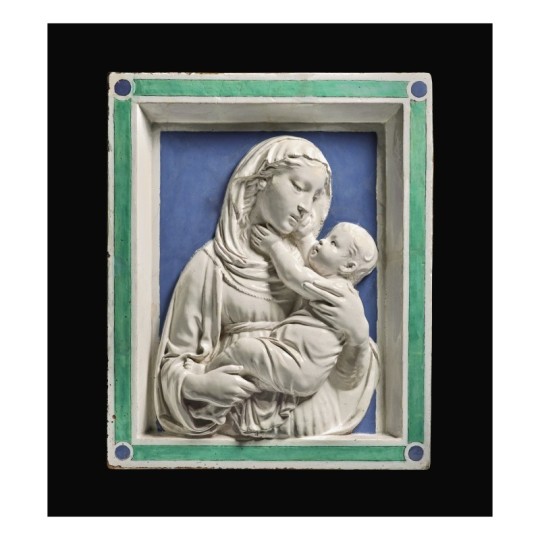
Luca della Robbia (Italian, 1399-1482), Madonna and Child, ca. 1450, tin-glazed terracotta (18½ x 15¾ in.). Photo credit: Sothebys.com.
There were a number of items in Sotheby’s January 28 sale that caught my attention because of their association with Hyde pieces. The first was Lot 2, Luca della Robbi’s terracotta relief, Madonna and Child. Luca (1399-1482) founded a multi-generational family workshop that was famous for its terracotta sculptures covered in a gleaming, pure, white glaze—its formula, a closely-guarded family secret—that made the fired clay pieces impermeable to the elements and gave them the appearance of much more expensive marble. The reliefs were cast in molds, allowing for a degree of mass-production that expanded the clientele for such fine works of art to include the successful merchant and banking class of Renaissance Italy’s major cities.
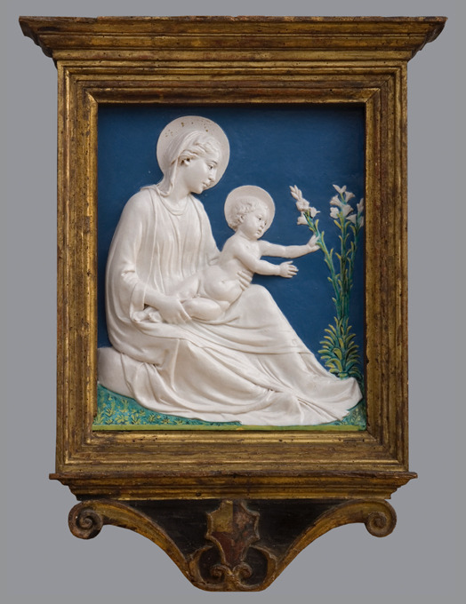
Luca della Robbia (Italian, 1399-1482), Madonna of the Lilies, ca. 1450-1460, tin-glazed terracotta (20 1/4 × 16 1/8 in.) The Hyde Collection, Glens Falls, New York, Gift of Charlotte Pruyn Hyde, 1971.99. Photography by Michael Fredericks.
Like The Hyde’s Madonna of the Lilies, the Sotheby’s relief was intended for the domestic market. It was undoubtedly used in the home as the focus of private, family devotion to the Virgin and Christ Child, and indeed, Sotheby’s expert Giancarlo Gentilini proposes that the relief was commissioned by Bosio I, Count of Santa Fiora in Tuscany for this wife Cecilia, sometime between 1439 and 1451.
It is striking how intimate the viewer’s relationship with the Madonna and Christ Child is, more so than in our terracotta. So high is the relief carving, the divine pair actually breaks out of their tightly constrained space into our world. The sculpture affirms the Christian belief that God was incarnate in Christ, here the robust child, tenderly held in his mother’s arms. His divinity and her purity are expressed through the terracotta’s unblemished white glaze.
Surprisingly, the two reliefs “met” once. They were both included in an exhibition at the Detroit Institute of Arts in 1938 that was curated by William Valentiner, the museum’s director and Mrs. Hyde’s art advisor. Both sculptures have been praised by experts as being “autograph;” that is, they are so fine in their execution, even though other examples survive, that the hand of the master, Luca, has been discerned over that of his workshop assistants.
Lot 14, Sano di Pietro, Nativity.

Sano di Pietro (Italian, 1405-1481), Nativity, tempera and gold ground on panel (20 5/8 by 15 7/8 in.). Photo credit: Sothebys.com.
There is a clear resemblance between the form of Virgin Mary’s head in this depiction of the Nativity and that of the Archangel Gabriel’s in The Hyde’s panel that formed one half of an Annunciation scene.
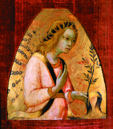
Sano di Pietro (Italian, 1405 - 1481), Angel of the Annunciation, ca. 1450, tempera and gilding on panel (14 1/2 × 13 1/2 in.); The Hyde Collection, Glens Falls, New York, Bequest of Charlotte Pruyn Hyde, 1971.44. Photo credit: Mclaughlinphoto.com.
Sano di Pietro (1405-1481) was a leading painter in Siena in the first part of the fifteenth century. In the Sotheyb’s panel, we have the chance to examine his use of color and composition in constructing narrative scenes. The primary storyline, Christ’s birth in a stable, dominates the foreground. The secondary narrative, the annunciation to the shepherds, occurs in the middle distance. The principal figures, including the ox and ass, are modeled with evenly modulated light. They have a sense of early Renaissance volume and weight lacking in the rather flimsy Gothic architecture of the stable. A brightly colored choir of angels watches over the Christ Child, and God sends down the dove of the Holy Spirit in a shaft of divine light to illuminate the newborn, who lies in an aureole of straw and light that signals His divinity.
There is some debate as to whether this panel was part of a small chapel altarpiece or intended for use in a domestic setting. Last year, a student from Florence wrote to The Hyde asking for particular information about our panel. She thought she might know the altarpiece from which our Angel came. The piecing together of dismembered altarpieces, often by studying physical elements such as the thickness of the panel and the pattern of growth rings, is an emerging field of research. It educates art historians in the more practical and physical aspects of art production. I have tried to follow up, but, as of yet, still await news of her findings.
Lot 15. Sandro Botticelli, Portrait of a Young Man Holding a Roundel.
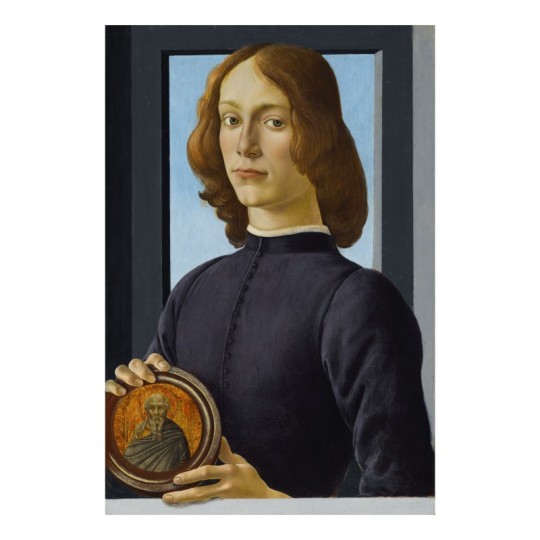
Sandro Botticelli (Italian, 1444-1510), Portrait of a Young Man Holding a Roundel, n.d., tempera on panel (23 x 15 ½ in.). Photo credit: Sothebys.com
This is the auction item that everyone is talking about. It sold for $80M (with commissions, etc., it came to $92,184,000).
There was little drama in the sale itself. The opening bid was $70M. The sale ended five bids later, in increments of $2M, at $80M. With commissions and fees, the work topped out at over $92M, the most ever spent for a Florentine Renaissance Master.
As in the della Robbia discussed above, the artist uses the architectural framing within the piece to push the figure forward. Through the illusion of a finger extending beyond the painted lower ledge, Botticelli suggests that the young man is real and actually standing in the viewer’s space. Elegance is the watchword for this painting. It is present in Botticelli’s use of line and form and in the artist’s self-assurance and that bestowed upon the figure and character of the sitter. These are qualities that we can sense in The Hyde’s small predella panel depicting the Annunciation.
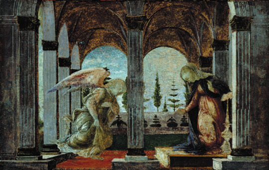
Sandro Botticelli (Italian, 1444-1510), Annunciation, ca. 1492, tempera on panel (7 x 10 9/16 in.). The Hyde Collection, Glens Falls, New York, Gift of Charlotte Pruyn Hyde, 1971.10. Photography by Joseph Levy.
Mary reacts in a graceful and demure manner as Gabriel glides in to the loggia where she was reading her devotional book. The angel’s robes flutter, perhaps a little fussily. Where our sadly abraded panel gives only a hint of Botticelli’s command of delicate shades and tones, the remarkably well-preserved Sotheby’s portrait gives ample evidence of Botticelli’s mastery of tempera painting.
The roundel the young man holds is a very peculiar detail. It is a separate work of art by the Sienese artist Bartolomeo Bulgarini from roughly a century earlier, and it has been pieced into Botticelli’s panel. Quite what Botticelli meant to signify by this is debated by scholars. Was he suggesting a genealogical link between the two, a shared character trait, or perhaps a strong devotion by the young man to the unidentified saint?
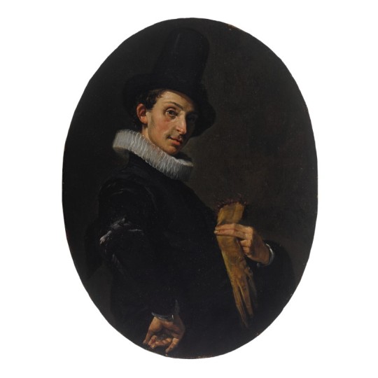
School of Haarlem (Dutch, 1600-1699), Portrait of a young man holding his gloves and wearing a tall hat, his arm akimbo, oil on panel, an oval, (10 by 7 ½ in.). Photo credit: Sothebys.com.
I was curious about the next lot, rather cautiously identified by Sotheby’s as “School of Haarlem, Portrait of a Young Man Holding his Gloves, circa 1615.” I thought immediately of the small oval portrait in Hyde House dining room that we now attribute to the Circle of Frans Hals.
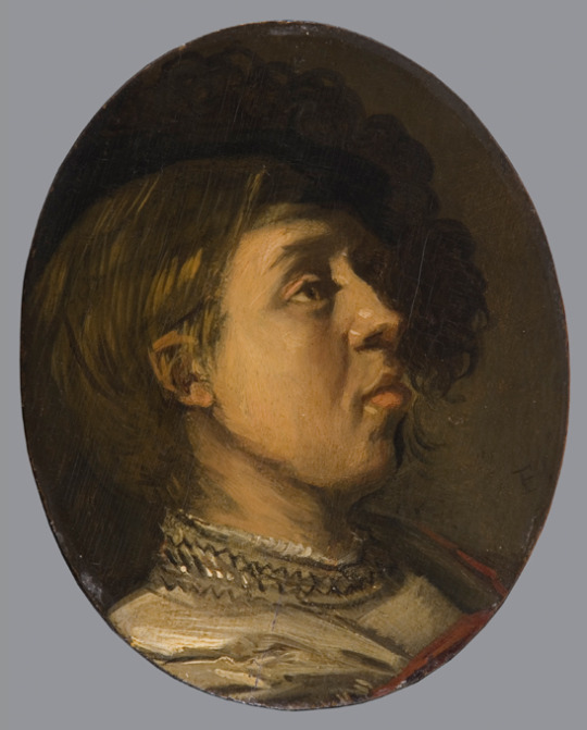
Circle of Frans Hals, (Dutch, 1580-1666), Portrait of the Artist's Son, ca. 1630, oil on panel(7 7/16 × 6 1/2 in.). The Hyde Collection, Glens Falls, New York, Bequest of Charlotte Pruyn Hyde, 1971.21. Photography by Michael Fredericks.
Like ours, the Sotheby’s painting was once thought to be by Frans Hals himself. Hals (1580-1666) is famous for portraits that both in the manner of their execution and in the personality of their sitters, are full of dash and swagger. In the catalogue entry, Sotheby’s favored an attribution to a contemporary of Hals, Willem Buytewech (1591-1624). The market didn’t agree. Bidding started at $30,000 for this small oval work that measures 10 x 7½ inches. It finally came to a stop after helter-skelter bidding at $390,600 (with fees)! There were plenty of bidders, who evidently thought this to be by Frans Hals. Would someone care to reconsider our painting? Like the Sotheby’s piece, the Hyde portrait was authenticated as a Hals by William Valentiner, but subsequently downgraded by several scholars, among them Seymour Slive, who reattributed the Sotheby’s work to Buytewech.

Hubert Robert (French, 1733-1808), View of a Garden with a Large Fountain and View of a Walled Garden Courtyard, n.d., oil on canvas (99¼ x 56¼ in.). Photo credit: Sotheby’s.com
It was a detail in Lot 39, the eponymous fountain in Hubert Robert’s View of a Garden with a Large Fountain, that caught my attention. It recalled to mind the vertical jet fountain in The Hyde’s drawing, Château in the Bois de Boulogne, ca. 1780.
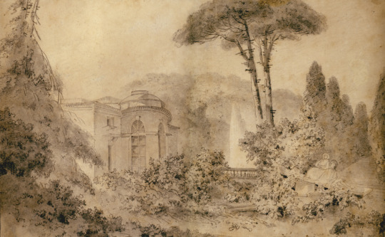
Hubert Robert (French, 1733-1808), Château in the Bois de Boulogne, ca. 1780, graphite on paper (9 3/16 x 15 3/4 in.). The Hyde Collection, Glens Falls, New York, Bequest of Charlotte Pruyn Hyde, 1971.103. Photography by Steven Sloman.
Such powerful vertical jets of water first became popular in French garden design at Versailles, where they symbolized the power of the Sun King. By the eighteenth-century, pleasure rather than power was the primary objective of art, architecture, and garden design. Robert was popular among the French aristocratic elite for painting large-scale decorative schemes for their grand houses. He often depicted pleasure gardens, bucolic scenes, and romantic ruins. In 1778, the painter was appointed designer of the king’s gardens. In the Sotheby’s piece the vertical jet of water makes a suitable compositional focal point in a panel that measure 8’ 3” in height.
A similar jet fountain appears in a decorative room panel signed and dated by Robert in 1773, executed for the financier Jean-François Bergeret de Frouville. Exhibited at the Salon of 1775, it was entitled The Portico of a Country Mansion, near Florence, and is now in the possession of the Metropolitan Museum of Art.
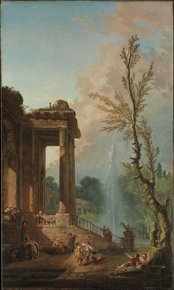
Hubert Robert (French, 1733-1808), The Portico of a Country Mansion, near Florence, 1773, oil on canvas (80 3/4 x 48 1/4 in.). The Metropolitan Museum of Art, Bequest of Lucy Work Hewitt, 1934, 35.40.2. Photo credit: Metmuseum.org.
In our drawing, Robert drew a actual fountain, one that dominated the parterre behind the Château de Bagatelle in the Bois de Boulogne, on the outskirts of Paris. The château was built by the Comte d’Artois, the brother of Louis XVI. Marie Antoinette had bet him that he could not build his little pleasure palace within three months. Designed by the architect Francois-Joseph Belanger (1744-1818) in the Neoclassical Style, the party house was constructed in just 63 days. Robert decorated its salle de bains with six panels that depicted the Italian countryside, classical buildings, and various forms of entertainment, like dancing, swinging, and bathing. These panels, too, now reside at the Met.
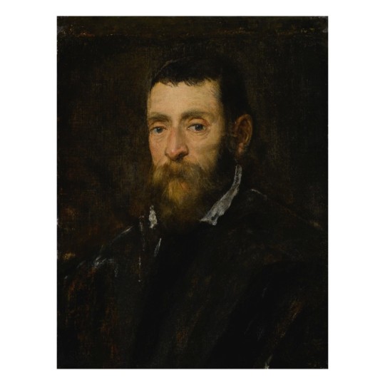
Jacopo Robusti, called Jacopo Tintoretto (Italian, 1518-1594), Portrait of a Bearded Man, 1560s, oil on canvas (23 3/8 x 18 in.). Photo credit: Sothebys.com.

Jacopo Robusti, called Jacopo Tintoretto (Italian, 1518-1594), Portrait of the Doge Alvise Mocenigo, ca. 1570, oil on canvas (21 1/2 x 15 1/2″); The Hyde Collection, Glens Falls, New York, Gift of Charlotte Pruyn Hyde,, 1971.49.
I have taken this last work out of turn, but I thought I would end with a comparison of hipster beards. Lot. 23 was Jacopo Tintoretto’s, Portrait of a Bearded Man. It was probably painted within a decade of The Hyde’s Portrait of the Doge Alvise Mocentigo (ca. 1570). The two share many traits. They are both portraits of self-possessed, wealthy men. Their dark somber clothing signals that. They dress according to the dictates of the style-setter for courtiers, Baldasare Castiglione (1478-1529), who wrote that “ the most agreeable color is black, and if not black, then at least something fairly dark.” Presented at only bust length, their torsos turned slightly away from the viewer but engaging directly with their eyes, these portraits convey a sense of intimacy and dialogue. The sitter’s face emerges from a dark background, its features modeled in warm lighting.
There are no known preparatory drawings by Tintoretto for portraits. He seems to have worked directly on the canvas before him. This would have appealed to his primarily male sitters because it undoubtedly reduced the number and length of sittings. As a side note, while it was acceptable for a man to sit or his portrait in a painter’s studio, it was not for a woman. Inconveniently for the portraitist and patron, the painter had to set up his easel and paint with oils in a female sitter’s house. Thus, the cost of a woman’s portrait was often more expensive. The conservative taste of the Venetian elite ensured that the compositional characteristics of this portrait had not changed in a generation. Where Tintoretto excelled was in the mastery and boldness of his brushstrokes and the accompanying speediness of execution. Notice, particularly in the Sotheby’s painting, the freedom and liveliness of the white brushstrokes with which he defines the shirt collar, distinguishes between the sitter’s beard and dark clothing, and spatially locates the different elements of the body within the otherwise ill-distinguished depth of the painting. Patrons valued Tintoretto’s masterly touches with the brush, the contrasts between areas of thickly applied paint and those where it is so thinly applied that one can discern the weave of the canvas. Working with accepted conventions, Tintoretto was able to convey something of what made his bearded male sitter unique.
There is always something of the wishful shopper, when I flip through a sales catalogue. But I am always excited when I discover something that relates to a work in our collection, and I ultimately never cease to marvel at the judicious purchases made by Louis and Charlotte Hyde.
#hydecollection#sotheby's#frans hals#sano di pietro#luca della robbia#botticelli#hubert robert#Tintoretto
3 notes
·
View notes
Text
Long Demonized in Art, Eve Has Become a Pop Culture Icon
Divinely inspired or otherwise, the Old Testament story of Adam and Eve in the Garden of Eden is deeply rooted in the Western psyche. Eve occupies mere pages of the Genesis epic, but women have spent millennia atoning for her original sin. For the last 2,000 years, Eve has been invoked in the monotheistic world to suppress women’s rights and defame their characters. How many misogynistic stereotypes and prejudices stem from the reputation of the much-maligned, archetypal first woman?
The apostle Paul cited Eve’s narrative to justify women’s subservience to men, writing in the apocryphal book of Timothy that women should “keep silent” because “Adam was formed first, then Eve. And Adam was not deceived, but the woman was deceived and became a transgressor.” In the Middle Ages, St. Bernard of Clairvaux sermonized to rapt audiences of men and women that Eve was “the original cause of all evil, whose disgrace has come down to all other women.” More recently, at a legislative dinner in 2015, South Carolina Senator Tom Corbin was confronted for his combative remarks about women’s right to participate in the state’s General Assembly. “Well, you know God created man first,” he quipped. “Then he took the rib out of man to make woman. And you know, a rib is a lesser cut of meat.”

Adam and Eve, 2015. David LaChapelle MARUANI MERCIER GALLERY
From these rigid perspectives, Eve is one-dimensional: inherently wicked and an afterthought to Adam. Yet across popular culture and the history of art, Eve appears as a paradox. She is guileful and naive, earth mother and fatal seductress; she is the problem of man, his downfall, his eternal scapegoat.
Such depictions have structured our ideas of beauty, gender, and morality. The oldest conceptions of Eve play out again and again in all reaches of contemporary culture. A judiciously placed apple in a woman’s hand in art, advertising, or film can immediately invoke Eve’s devious sexuality, and still other references abound. The Handmaid’s Tale (2017–ongoing), adapted by Hulu from Margaret Atwood’s dystopian novel, features a young, religious character named Eden, who is expected to help repopulate the country. By the same token, in Pixar’s animated children’s movie WALL-E (2008), the title robot meets a fellow android who has come to bring new human life to Earth. Her name? EVE.
Forbidden fruit
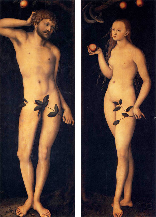
Lucas Cranach the Elder, Adam and Eve, 1528. Courtesy of the Uffizi Gallery.
Though never explicitly named in the Bible, the apple has become the de facto “forbidden fruit”—powerful nomenclature for that which is fatally desirable, and therefore all the more tempting and worthy of moral rule-breaking. The apple’s shiny red skin and juicy interior make it an apt stand-in for sex, and the seductive way in which Eve is often depicted eating it only reinforces its libidinal connotations. Genesis records that after Eve takes a bite of the fruit, she simply “gave some to her husband and he ate.” St. Jerome, however, used the Latin word seducta to describe Eve’s transgression.
During the Northern Renaissance, German artist Lucas Cranach the Elder perfected the bewitching female nude. In his Adam and Eve diptych from 1528, the couple faces one another beneath the Tree of Knowledge, little red apples bobbing tantalizingly above their heads. A self-possessed Eve holds one perfect fruit out to her husband, who scratches behind his ear in apparent befuddlement. In Cranach’s depiction, it’s not the serpent whispering in Eve’s ear or even the apple that is dangerous, but the perfectly beautiful and alluring woman who will be his pleasure—and his downfall.

Domenichino, The Rebuke of Adam and Eve, 1626. Courtesy of the National Gallery of Art.
Men are often shown as helpless in the face of this female threat. In Domenichino’s 1626 painting, The Rebuke of Adam and Eve, God and his coterie of cherubim float down from heaven to reproach Adam. The first man throws up his hands in what looks like confusion or exasperation, diverting the entirety of the blame to his wife.
The image of Eve as sexual temptress has remained frighteningly constant, even in products and programs that purport to challenge ingrained sexist tropes. In the early aughts, for example, the soapy comedy-drama Desperate Housewives was lauded for casting five middle-aged women in the lead roles. The intended audience for the salacious TV show was presumably women, yet the impossibly fit, botoxed, and high-heeled characters seemed designed to appeal to men.
The apple’s shiny red skin and juicy interior make it an apt stand-in for sex, and the seductive way in which Eve is often depicted eating it only reinforces its libidinal connotations.
Red apples played prominently in promotional materials for the show. In the title sequence, an animated version of Cranach’s Adam is crushed by a giant falling apple as a blasé Eve looks on. In posters ahead of season five, the topless cast smiles coyly from behind a row of apples and the tagline “Even Juicier.”
So should one eat the apple or abstain? Designer Donna Karan exploited this ambiguity for her long-running DKNY scent Red Delicious. In the ads, a pouty model has just bitten into a green apple (how subversive), and the perfume packaging itself is shaped like the fruit. Sin is no longer the province of Eve alone: The “new temptation in fragrance” was marketed to both women and men.
Once in a while, the story of a woman with an apple doesn’t explicitly end with damnation or sex. In Disney’s Aladdin, the apples Princess Jasmine steals for a young, hungry boy lead to her meeting the titular male hero. They go on to have fabulous adventures together, but it’s Aladdin who reveals the world to Jasmine, and not the other way around. Sometimes apples—potent transmitters of dangerous information—are exchanged between women. In the 19th-century fairy tale that would later become a Disney classic, a witch proffers the poison apple that puts Snow White to sleep.
Snake charmer
In the book of Genesis, the tempting creature is explicitly referred to as “he” and is described only as a serpent. Yet Eve’s casting as an evil temptress gave rise to the belief that the duplicitous snake was female, too. In art, it was often depicted with a womanly upper body and a reptilian lower half. If wickedness is associated with femininity even before Eve gives Adam the Forbidden Fruit, which came first, woman or sin?
Michelangelo’s Sistine Chapel version of the Fall sees his muscular Adam and Eve joined by an equally hulking snake-woman wrapped around the tree. Her right arm grasps the trunk for support as she stretches out to meet Eve’s upraised hand. Both Eve and the serpent use their left, or “sinister,” hands, further signaling their deviousness.

Michelangelo, The Fall of Man, 1512. Image via Wikimedia Commons.
Michelangelo was merely following a popular convention of his time. During the Renaissance, snake-women appear in Hugo van der Goes’s The Fall of Man and The Lamentation (ca. 1470–75); a terracotta sculpture of Adam and Eve by the workshop of Giovanni della Robbia (ca. 1515), which took inspiration from a famous Albrecht Dürer engraving; and the stone facade of Notre Dame. A blonde-headed serpent woman in Masolino’s Temptation of Adam and Eve (ca. 1425), a fresco in Florence’s Santa Maria del Carmine, is frighteningly funny: She snakes along the Tree of Knowledge with her comically tiny head popping out of the end of her skinny green body.

Left: Hugo van der Goes, The Fall of Man and The Lamentation, 1470–75. Courtesy of the Kunsthistorisches Museum. Right: Masolino da Panicale, Temptation of Adam and Eve, ca. 1425. Courtesy of Cappella Brancacci.
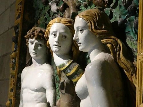
Giovanni della Robbia, Adam and Eve, ca. 1515.
Even before the Bible story, snakes were associated with women in cultures around the globe. The hostility that is created between them in the Bible may have been a way to separate the nascent Jewish community from pagan traditions that had a snake as a powerful female goddess. The Canaanite cult of Baal-Asherah heavily influenced the newly formed Israelite nation. In the predominantly female cult, Baal appeared in the form of a serpent with his wife, Asherah, at his side. When the Israelites entered Canaan, pagan religions were demonized in lieu of monotheism.
In this light, the story of Adam and Eve has political undertones. The biblical narrator may have already witnessed an established association between the serpent and the woman in neighboring tribes. When God punishes them, a wedge is driven between the serpent and the woman, cursing everlasting “enmity” between them and their offspring. The story successfully alienates the woman from her longtime ally.
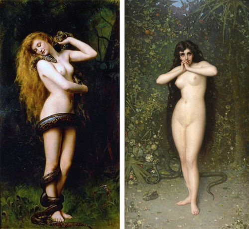
Left: John Collier, Lilith, 1887. Image via Wikimedia Commons. Right: Pantaleon Szyndler, Eve (Temptation), 1889. Courtesy of the National Museum in Warsaw.
They are indeed powerful together. Who can forget the 2001 MTV Video Music Awards, when Britney Spears walked onstage with an albino python draped across her neck? Dressed as an exotic snake charmer and scantily clad in artfully tattered rags and glitter, Spears fully assumed her onstage persona as an outlet to embrace her newfound sexual freedom. The conflation of the pop star with a sexual goddess transpired before millions of girls and women in the public forum of television. With that scene from Genesis, snakes and women received their eternal reputation of immorality. The snake became an erotic symbol as “the bad girl” gained sex appeal.
The fall of (wo)man

Britney Spears performs at the 2001 MTV Video Music Awards. Photo by Kevin Mazur/WireImage.
Spears’s performance resonates with an artwork made over a century earlier by Pre-Raphaelite painter John Collier. With her perfect, naked body and long blonde hair, the woman in the 1887 painting who nuzzles the head of the giant snake sensually coiled around her looks like Eve. But in fact, it’s her alter ego, the legendary femme fatale, Lilith.
Fed-up women looking for a new matriarchal origin story have taken in Eve beneath their own gaze. They have embraced the qualities—independence, curiosity, sexuality—that once demonized her.
In Jewish literature, the enchantress Lilith is described as Adam’s first wife, before Eve. Lilith was man’s equal but was devilish in her sexuality. According to legend, she felt repressed by Adam’s side, and she eventually leaves him to cohabit with demons in deep waters. In folklore and pop culture, she has come to be known as the mother of demons and vampires, eater of babies, husband of Satan—in short, a dangerous, sexually liberated woman.

Lilith Fair, 1998, Mountain View California. Image by Tim Mosenfelder / ImageDirect via Getty Images.
Finally, in our modern era, fed-up women looking for a new matriarchal origin story have taken in Eve, and her alter ego Lilith, beneath their own gaze. They have embraced the qualities—independence, curiosity, sexuality—that once demonized her.
Kiki Smith’s take on Lilith (1994) is a powerful and disturbing sculpture—a black-bronze horror movie demon, nude and crouched in a spider-like position high up on the wall. The glass grey eyes startle any viewer. An unlikeable woman, who is not sexually available, nor coy, is a forcefully unusual statement.
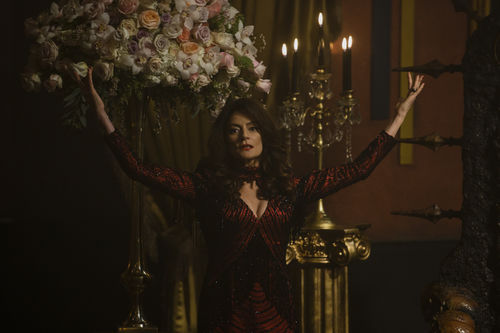
Madam Satan from The Chilling Adventures of Sabrina. Photo by Diyah Pera. Courtesy of Netflix.
Lilith appears in many guises in TV and movies: the progenitor of the vampire race in True Blood (2008–14); Madam Satan on The Chilling Adventures of Sabrina (2018–ongoing); the frigid, hated ex-wife of sitcom icon Frasier. The sci-fi movie The Fifth Element (1997) turns the concept of Lilith on its head by having the main character Leeloo—a variation on Lilith—save humanity instead of devouring it. Her name has also been invoked as a statement of feminist independence: The Lilith Fair of the late 1990s adopted the legendary woman’s name for a music festival that showcased only female artists or woman-led bands.
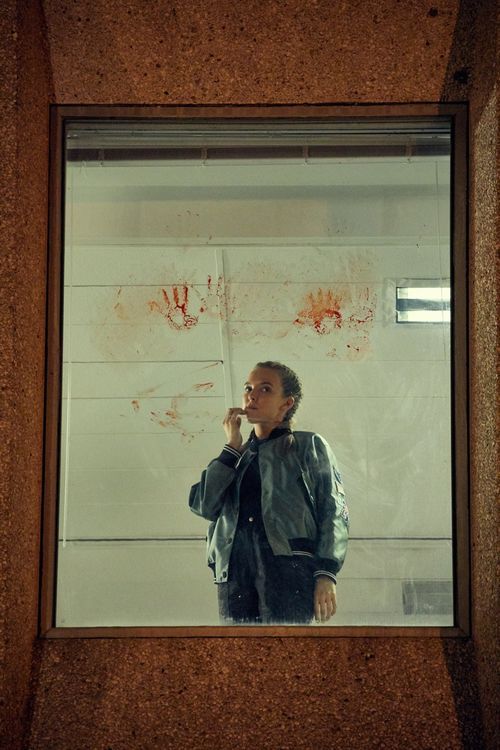
Villanelle from Killing Eve. Courtesy of the BBC.
One recent TV show has gone above and beyond in complicating our understanding of Eve, and women. The BBC series Killing Eve (2018–ongoing), which follows an M15 agent, played by Sandra Oh, as she tracks down a psychopathic female assassin portrayed by Jodie Comer. Guess who is Eve? It’s not the assassin. The delight of the show is seeing the intense connection unfold between the so-called good and bad guys. Who is on which side becomes impossible to understand—both women contain multitudes. The sexual drama lies between the killer, Villanelle, and Eve—not a man. Though the title of the show probably refers literally to Villanelle’s overarching plans, it’s also a fitting metaphor for the destruction of the story of Eve itself—and all the misery, unfair expectations, and misrepresentation that have come along with it.
from Artsy News
4 notes
·
View notes
Text
Wife of Bath in Florence--Part 7: Il Duomo
We’ve come to the end of the Florence trip 2014 recap, just in time for the Florence 2019 trip! Which will probably not get this in-depth treatment because 1) I’m staying for longer so I can’t do a day-by-day breakdown and 2) this trip is for research: dissertation and otherwise *shifty eyes*.
Friday was the last day of the class, and I wasn’t flying home until Sunday, so Saturday was my completely free day. I figured it would be a good time to wander around and maybe see some of the things I had either missed or wanted to see one more time.
I had decided to have breakfast out, so I popped into one of the little cafes for a hot chocolate and a croissant. Good timing too because the bottom of the sky decided to drop out just as I went in.

Nom nom nom
I had been forewarned that hot chocolate in Italy was very thick and very rich. So true! It was also very, very hot and burned my tongue, but it was really good.
At first, I thought I would go back to the Uffizi, but when I got there, the line was already crazy long (and this in the off season!). So I said nope to that and decided to head to the Duomo. Now, when you go to the cathedral, you can purchase a ticket to go to the crypt, the cathedral’s museum, up into the dome, the bell tower, and the baptistery. I wasn’t interested in climbing the dome or bell tower, and the baptistery was closed for restoration, so I headed down into the crypt.
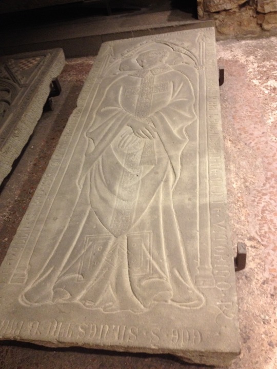
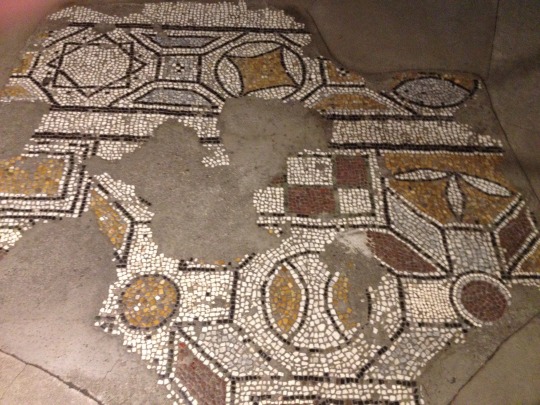
The crypt is the remains of the earlier church, Santa Reparata, which was excavated in the 1900s.

Painted Italo-Byzantine cross, very relevant to my interests now.
Sculpture of Santa Reparata
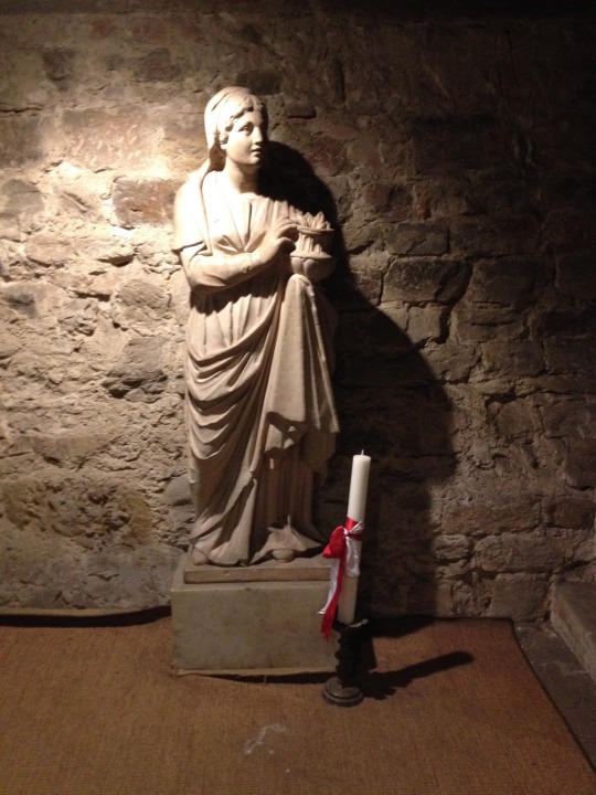
Hard to see because of the glare but these are her relics.

Tomb slab
Early Christian floor mosaics
Somehow I missed Brunelleschi’s tomb, though
The cathedral’s museum is a great hidden spot with a lot of neat things inside. Highly recommend taking a look. I barely scratched the surface of the goodies here.
Fragments of the old façade of the cathedral

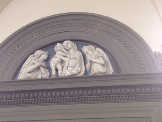
Della Robbia!
Ghiberti’s Baptistry doors aka the Gates of Paradise. Got a little glare because they’re behind glass.
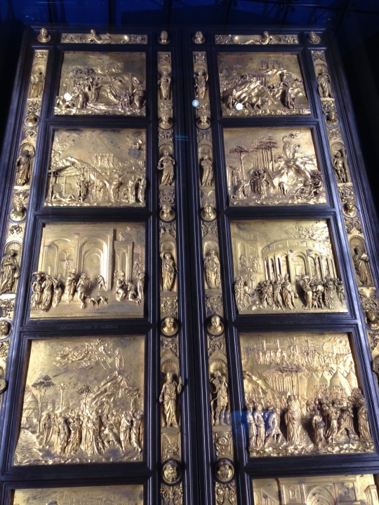

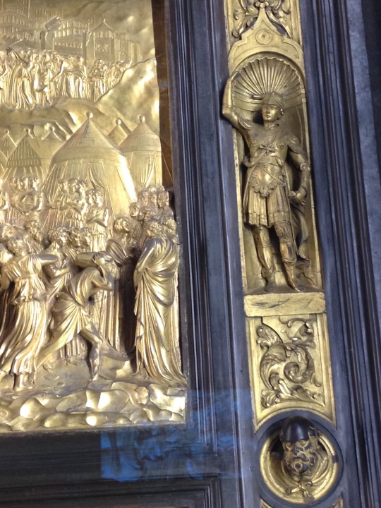
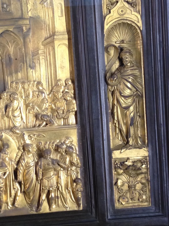
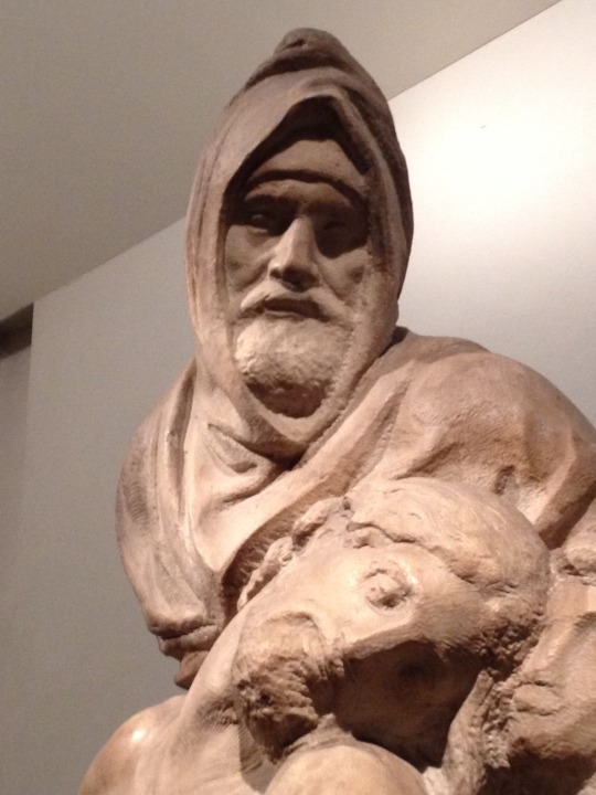
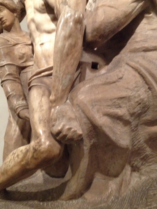
Michelangelo’s Bandini Pietà/Deposition. This passion project for Michelangelo was supposed to go over his tomb and unfortunately caused him great frustration to the point where he tried to destroy it. It is an ambiguous composition, and there are a lot of different theories about why he designed this piece the way he did.
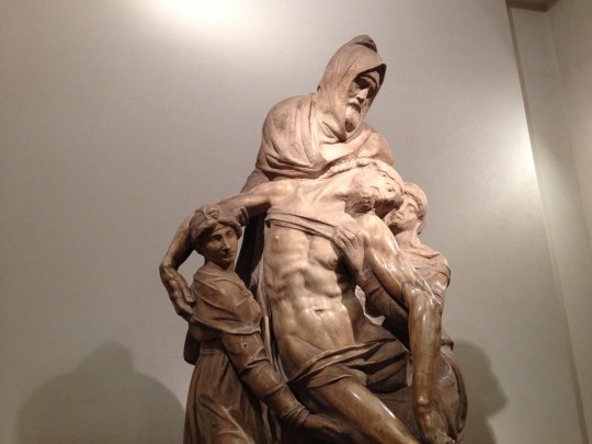
The face of Nicodemus is a self-portrait.
The famous missing leg, subject of much speculation
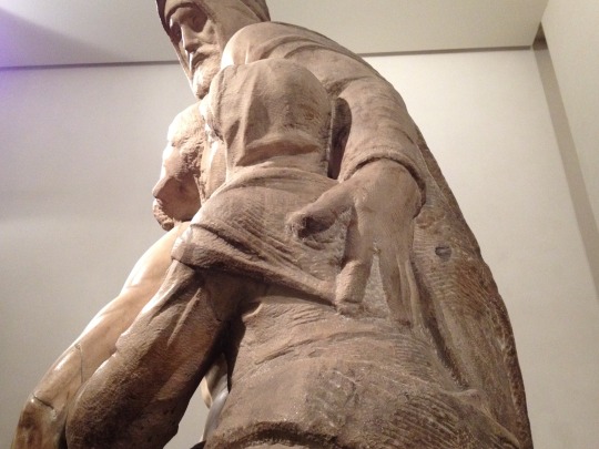
Afterwards, I decided to walk around a little in the Palazza della Signoria.
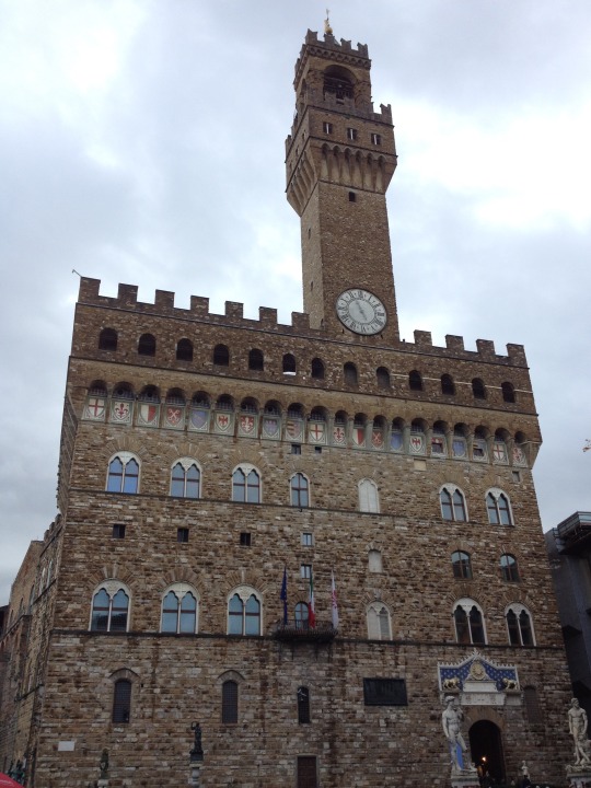
Ducked into the Palazzo Vecchio, although I didn’t stay for the tour.
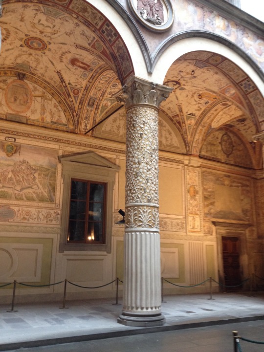
Lunch at the Ristorante Caffe Giotto. Again, one of the spots near the cathedral. Had the gnocchi with truffles, which was good, but most importantly, it introduced me to the wonders of gnocchi!

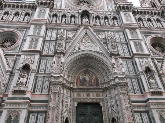
After lunch the sun came out, which made it great weather for pictures of the cathedral.
Giotto’s bell tower

I love the Neo-Gothic façade of the cathedral. Although begun in the 1300s, the exterior was not complete until the 19th century.

So much pink and green!


And of course the Dome.
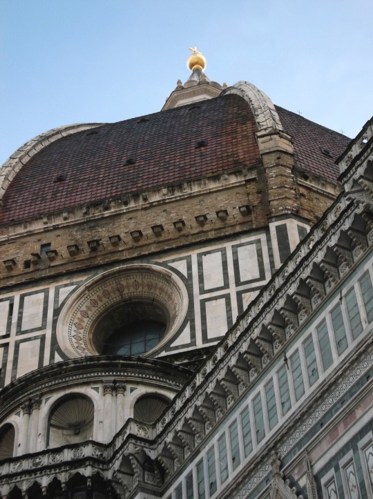
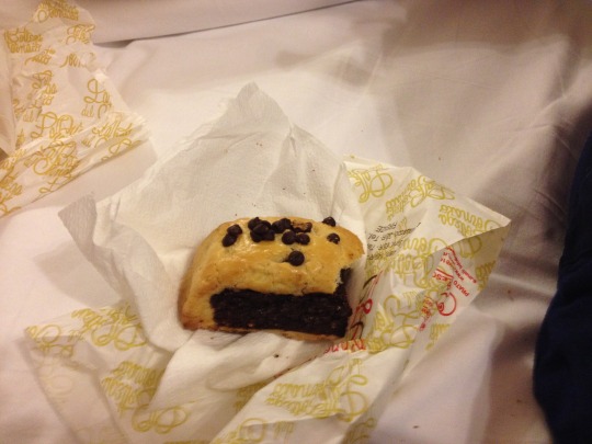
I decided to head back to the room a little early so I had plenty of time to get my things together for my flight early the next morning. On the way back to my B&B, I picked up a couple of pastries, a spinach and cheese and a chocolate one. Like the spinach and cheese but I thought the chocolate tasted oddly fruity.

One more shot of the gorgeous ceiling in my room. I was so sorry to leave it.

And that was it for my 2014 trip to Italy. Hopefully the next one will be even more productive (hope, hope, hope)!
3 notes
·
View notes
Photo
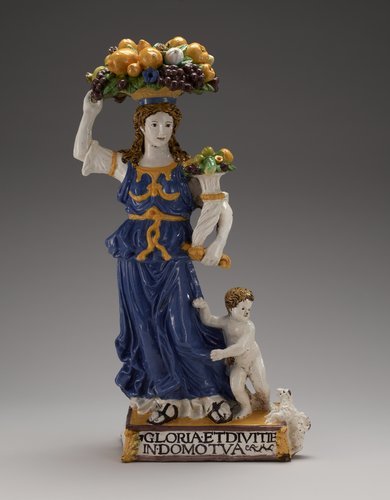
Dovizia, Giovanni della Robbia, c. 1520, Minneapolis Institute of Art: Decorative Arts, Textiles and Sculpture
Terracotta, Italian XVIc cat. card dims H 27 x L 8 x W 12'; Figure carries on her head a basket filled with fruit and in her hand a brimming cornucopia. Little boy at her feet turns to her for protection from a barking dog. Blue gown with golden yellow decoration; yellow, green and violet fruit. Since ancient times, a female figure carrying fruit has personified abundance or wealth (dovizia in Italian). This colorful ceramic statuette is based on a famous Renaissance sculpture by Donatello (1386–1466) that once towered over the market square in Florence. Donatello’s Dovizia advertised agricultural products while celebrating the ideal of public prosperity through trade. Della Robbia’s small version, meant for a private home, embodies the idea of happy family life as well as wealth. The inscription turns a verse from the Psalms of David into a blessing: GLORIA ET DIVITI[A]E IN DOMO TVA (Honor and wealth [shall be] in your home). Size: 27 1/4 x 14 3/4 x 8 1/4 in. (69.2 x 37.5 x 21.0 cm) Medium: Glazed terracotta, polychromed
https://collections.artsmia.org/art/57/
0 notes
Note
Hey Yumi, @computer-einstein said to tell you that if he and @della-robbia-productions don't come back from some red door (maintenance tunnel??) to tell you that you and pencak silat kid would be besties.
If they do come back, disregard I guess

❀;; --"Wait, what red door? Maintenance tunnel? I'm confused what are Belpois and Della Robbia up to? What is going on? Never mind I don't think I want to know.

"And why is this Belpois kid still trying to get me and that Stern kid to be all buddy buddy? I mean...uh....Sure we both practice Pencak Silat and all but that doesn't make us instantly buds. "
Or romantically involved.
@computer-einstein @della-robbia-productions
#computer-einstein#della-robbia-productions#gym girl chronicles#anon#ask#❀;;my answers ( asks )#// she is so confused and so unsure of anything thats going on#and i love it lmao
1 note
·
View note
Text
Update: Uhhhh...apparently @della-robbia-productions wasn't joking. I see a wildly dressed, gay-looking, scrawny italian heading my way now. I...guess I'm gonna direct him to the red door???
Man, no offense, but you looks like something out of a 90s commerical.
#einstein talks#so ummm#yeah#guess i'm gonna record my efforts to figure out the door???#einstein's investigation#//#code lyoko#interacting: della-robbia-productions(odd)#i had fun trying to imagine what words jeremie would use to describe odd#the locked red door
11 notes
·
View notes
Text
Oceanfront Penthouse Renovation
Designed by Corine Maggio of CM Natural Designs (previously featured here, here, here and here), this ocean front penthouse, located on the island of Coronado, CA, is layered in natural textures.
Here, the designer share more details about this oceanfront penthouse renovation:
“The open concept layout is light, bright and airy with a sophisticated beach style. We loved collaborating with our clients on this home to showcase their simple and elegant aesthetic. Each space is optimized for entertaining and comfortable living while still taking full advantage of the breath-taking views. The textiles used are performance fabrics to encourage the indoor/outdoor living that the space calls for located directly at the coast. Oceanside living at its finest!”
Oceanfront Penthouse Renovation
The entire home feels elegant without being compromised on comfort, which is always key.
The flooring and paint color were existent.
Similar Paint Color: Benjamin Moore White Dove.
Console: Bernhardt Savoy Place Raffia Sideboard. Others: here, here & here.
Lamp: Mitchell Gold Bob Williams; Rubix Lily – Other Table Lamps: here, here, here & here.
Art: Gray Malin, 24″ x 36″, White Frame.
Accessories, Clients Own.
Kitchen Counterstools
These comfy leather counterstools bring a subtle color to the kitchen area.
Stools: Palecek; Stillwater 24″ Counter Stool. Leather: Delany and Long; Outdoor Leather, Sky DL8001-06 (custom) – Other Affordable Counterstools: here, here, here, here, here & here.
Island Wallpaper: Cowtan and Tout; Travertine 20397-01, Color: Grey, White, Content: Cork.
Tile: Ray Thassos with Silver Marble Mosaic Tile from AKDO – Others: here, here, here, here & here.
Dining Area
The dining area is located just off the kitchen and it features a large oval dining table with rope and Teak dining chairs.
Table: Modloft; Sullivan Dining Table, White Lacquer, 95w x 43d x 30h.
Dining Chairs: Palecek; San Martin Outdoor Side Chair No. 7116-79 Fabric Grade in: #64 Sailcloth Salt.
Bench: Della Robbia; Monti (Custom), Armless Bench, 94″L, Commercial Fill, COM, Bench Fabric; Sunbrella; 8351-0000 Linen Silver – Other Dining Benches: here, here, here, here & here.
Wall Decor: Palecek; Indoor/outdoor Deco Leaf Wall Decor – Others: here & here.
View
Neutral decor allows that impressive ocean view to the main focus of the home.
Console: Kathy Kuo; Igmar Rustic Lodge Parson Herringbone Wood Console Table – Other Affordable Consoles: here, here, here & here.
Lamp: Arteriors; Tortoise Lamp – similar here & here.
The Limestone flooring was existent – Similar: here.
Similar Basket: here.
Living Room
The main sitting area feels collected yet casual. You can entertain in this space but also relax at the end of the day.
Sofa: Della Robbia; Nolan, 94″ Sofa – Fabric for Sofa: Perennials; Ritzy, Style 978-270, White Sands – Similar: here, here, here & here.
Side Chairs; Palecek; President’s State Chair with custom fabric – similar here & here.
Swivel Chairs: Thayer Coggin; Turn, 1170-113 with Sunbrella 1959-10 fabric – similar here.
Media Cabinet: Bungalow 5 – Other Beautiful Options: here, here, here, here & here.
Planter: CB2.
End Tables: World’s Away.
Pillows from Lacefield, Bandhini and Ryan Studio.
Fresh Pillows for a Happy Home:
(Scroll to shop)
!function(d,s,id){var e, p = /^http:/.test(d.location) ? 'http' : 'https';if(!d.getElementById(id)) {e = d.createElement(s);e.id = id;e.src = p + '://' + 'widgets.rewardstyle.com' + '/js/shopthepost.js';d.body.appendChild(e);}if(typeof window.__stp === 'object') if(d.readyState === 'complete') {window.__stp.init();}}(document, 'script', 'shopthepost-script');

JavaScript is currently disabled in this browser. Reactivate it to view this content.
Coffee Table
Coffee Table is Bernhardt; Allegra Metal Coffee Table (discontinued) – Others: here, here & here.
Large Seagrass Tray: here.
Rug: Custom Rug from Aja Rugs in La Jolla, CA 9×12 rug (similar here) – Other Beautiful Rugs: here, here, here, here & here.
Entertainment Area
What an inviting sitting area! I am loving the accent chairs and the round coffee table.
Coffee Table: Bassett Mirror; Cristal Round Cocktail Table: 42″ Dia, 18″H – Very similar: here.
Chairs: Selamat; Tivoli Lounge Chair – Nutmeg – similar here.
Pillows: Lacefield; Chevron Mineral Embroidery 13×22.
Round Trays: here & here.
Bridge View
This penthouse is surrounded by stunning views.
Bar
The penthouse also features a sleek bar with white Quartz countertop and mosaic tile backsplash.
Wallpaper: Cowtan and Tout.
Stools: World’s Away Nickel Bamboo, Turquoise Velvet Cushion.
Tile: AKDO Luminous beam – Other Unique Tiles: here, here, here, here, here, here & here.
Guest Bedroom
How can you get out of the bed with a view like this, right?

I also love the decor… the color palette is perfect!
Bed: Somerton Dwelling, White Linen: Queen – Similar here – Other Upholstered Beds: here, here & here.
Bedside Tables: World’s Away.
Lamps: J Alexander – Others: here, here, here & here.
Duvet: Williams Sonoma; Two-Tone Border Bedding: Seafoam: Queen – on sale!
Chair and ottoman: Selamat; Sasha Lounge Chair.
Rug: Ralph Lauren Collection RLR2867A Canyon Stripe Patch Color: Sky 8×10.
Master Bedroom
The master bedroom feels peaceful, very comfortable and you don’t need to close your eyes to dream!

Side Chair: Crate and Barrel 360 Swivel Chair.
Duvet Cover: Restoration Hardware, King – similar here.
Bed: Restoration Hardware, King – similar here.
Shams: Williams Sonoma Euro Shams.
Mirrors: Uttermost; Mackai.
Quilt: Williams Sonoma, in Seafoam.
Rug; Feizy.
Nightstand
How gorgeous is this nightstand decor? The vignette is perfect for a chic beach house!
Bedside Tables: Global Views, AG2.20009 Argento Bedside Chest.
Lamps: Pottery Barn.
Many thanks to this talented interior designer for sharing the details above!
Interior Design: CM Natural Designs (Instagram – Facebook)
Photography: Chipper Hatter.
!function(d,s,id){var e, p = /^http:/.test(d.location) ? 'http' : 'https';if(!d.getElementById(id)) {e = d.createElement(s);e.id = id;e.src = p + '://' + 'widgets.rewardstyle.com' + '/js/widget.js';d.body.appendChild(e);}if(typeof(window.__moneyspot) === 'object') {if(document.readyState === 'complete') {window.__moneyspot.init();}}}(document, 'script', 'moneyspot-script');

JavaScript is currently disabled in this browser. Reactivate it to view this content.
JavaScript is currently disabled in this browser. Reactivate it to view this content.
JavaScript is currently disabled in this browser. Reactivate it to view this content.
Best Sales of the Month:
Thank you for shopping through Home Bunch. I would be happy to assist you if you have any questions or are looking for something in particular. Feel free to contact me and always make sure to check dimensions before ordering. Happy shopping!
Serena & Lily: Enjoy 60% Off hundreds of sale styles!
Wayfair: Up to 70% OFF – Home Remodel Sale!!!
Joss & Main: Warehouse Clearout – Up to 70% off!
Pottery Barn: 40% OFF EVERYTHING + Free Shipping – Use code: FREESHIP
One Kings Lane: High Quality Design Decor for Less.
West Elm: Best time to shop. Up to 40% off Everything!!!
Anthropologie: See the super-popular Joanna Gaines Exclusive line!
Urban Outfitters: Hip & Affordable Home Decor.
Horchow: High Quality Furniture and Decor. Up to 30% off the entire site!
Nordstrom: Up to 40% OFF. New Easter Decor!
Posts of the Week:
Transforming a House Into a Home.
Small lot Beach House.
Small Lot Modern Farmhouse.
Coastal Farmhouse Home Decor.
Beautiful Homes of Instagram: Fixer Upper.
Modern Coastal Shingle Home.
2019 New Year Home Tour.
Modern Farmhouse with Front Porch.
Full-scale Home Remodel Inspiration.
Beautiful Homes of Instagram: How to Build your own Home.
Classic Colonial Home Design.
Painted Brick Cottage.
Before and After Bathroom Renovation.
New England Home.
Connecticut Beach House.
New Year, New Beautiful Homes of Instagram.
Grey Kitchen Paint Colors.
Follow me on Instagram: @HomeBunch
You can follow my pins here: Pinterest/HomeBunch
See more Inspiring Interior Design Ideas in my Archives.
“Dear God,
If I am wrong, right me. If I am lost, guide me. If I start to give-up, keep me going.
Lead me in Light and Love”.
Have a wonderful day, my friends and we’ll talk again tomorrow.”
with Love,
Luciane from HomeBunch.com
Come Follow me on
Come Follow me on
Get Home Bunch Posts Via Email
Contact Luciane
“For your shopping convenience, this post might contain links to retailers where you can purchase the products (or similar) featured. I make a small commission if you use these links to make your purchase so thank you for your support!”
from Home http://www.homebunch.com/oceanfront-penthouse-renovation/ via http://www.rssmix.com/
1 note
·
View note
Text
And So They Lived (2/6)
Part 1
On Monday Odd still had a bandage on his cheek. Not because the scabs hurt, but because he had made up an outlandish story about standing up too fast after retrieving his armful of junk food, losing his balance, and smashing his face on the side of the vending machine. It was better to have everyone laughing then asking questions.
“Do you think someone hit her?” Yumi said when they saw Sissi that morning, stalking across the quad to the science building. She was wearing huge, tan sunglasses with gold tinted lenses. They were perfectly coordinated with her camelskin coat and light brown calf high boots, unlike the enormous bruise on her cheek. It was quite a sight, dark purple in the center, radiating outward into overlapping shades of green and yellow. She looked like she had fallen face first into a plate of moussaka and not bothered to wipe it off.
“If they had we’d have heard about it.” Aelita said, “She would have gone straight to her father and had them expelled.”
Ulrich shrugged. “Maybe she leaned into the mirror to kiss herself and slipped.”
“Wouldn’t she have covered it up if she got it doing something stupid?” Jeremie said. “She’s been wearing makeup since the sixth grade.”
“Sixth?” Odd asked idly.
“I think so. Ulrich, when was the first time she got lipgloss on your face?”
Ulrich gave Jeremie a shove, and they laughed, remembering how sometimes Sissi would throw her arms around Ulrich and leave a shiny smear on his cheek, or mascara smudges on his temple. Of course, Sissi wouldn’t remember that since it was usually after he had saved her life.
“Odd?” Yumi said, snapping him out of his thoughts. “You okay?”
“I just don’t think we should kick a dog while it’s down.”
There was laughter again, and Odd heard what he had said. He opened his mouth, flustered, wanting to correct them, but he decided not to. He had gotten the phrases mixed up. He wasn’t sure where his head was these days. He was thinking of ‘Let sleeping dogs lie’. Something he desperately needed to learn before he wound up at Sissi’s room again, holding a movie and candy.
Oops.
He knocked.
“Who is it?”
“I wanted to apologize.”
Silence.
Silence was good, Odd told himself, it meant she was thinking.
There was the sound of a chair being pushed back and she appeared at the door.
“Oh.” She said, looking at the gifts in his hands. “You’re serious.”
“Yeah. I didn’t know what kind of stuff you liked, so I just got these.” He held out the glass canister full of chocolate candies. They shined like pearls, or at least plastic beads. They were just fancy m&ms, but he had a feeling she might appreciate them. Also, going into town had given him an excuse to leave Yumi and Ulrich alone, so now they owed him a little.
“I’ve had them before.” Sissi said as she took them. “They’re good.”
“And this.” He handed her the dvd case.
She studied it for a moment. “Eraserhead?”
“It’s a classic.”
“Kind of looks like a horror.”
“It’s more surrealist, really.” Odd was about to explain the work’s history, but her face was already screwed up.
“Definitely a horror, then.”
“Only if you find unplanned pregnancy horrific.”
They stood there for a moment, listening to the deafening silence that comes after a terrible joke. Odd shifted from foot to foot. He had been expecting her to say something like ‘apology accepted’ so that he could leave and things could go back to normal between them.
“You have to watch it with me.”
Odd’s train of thought came to a screeching halt.
“And if it is a horror, then I get to punch you or something.”
Odd touched his cheek. “I think we’re already fair on that account.”
Sissi rattled the candies inside their glass box. “I said, ‘or something’. We’ll decide once I tell you that this is a horror movie.”
Once they were in her room Sissi took her laptop off her bed and set it on the floor, so that she could sit with her back against her bed. Odd looked around as she set up the movie. He had been in here a few times over the years, but he was usually snooping through her things or trying to save her from being murdered by her own curling iron, so he never really remembered the decor aside from the scent of a million different beauty products and an overwhelming sense of pink.
Odd had thought pink was something you grew out of, but Sissi stuck with it as stubbornly as her nickname. It wasn’t the monotone of a baby girl’s room, but almost everything had a pink accent. The handles on her desk, the trim of her dresser, the tassels on the drawstring of her blinds. Her comforter was a pale shade, her pillow cases hot, along with a few throw pillows ranging from red to almost orange. They could have sat on the bed instead of the floor, come to think of it, but then they’d be sitting on her bed together. Too weird.
As though voluntarily watching a movie with her wasn’t weird enough.
Sissi hit play and muscled the lid off the candy. The smell of chocolate wafted towards them and Sissi smiled.
“You can have some if you want.” She said, holding them out to him.
“Thanks.” He took a few and popped them into his mouth. She watched him carefully. “They aren’t poisoned, y’know.” He said through his mouthful of chocolate.
“Actually I was thinking maybe you swapped them out with beads.”
“Yeah, poison’s a little extreme.”
Sissi frowned at him and turned to the movie.
“Did I miss something important just now?” She said, as a man The Man in the Machine worked his was across the screen. “What the fuck is going on?”
Odd bit back a smile. “Just go with it.”
To Sissi’s credit, she really tried. She was green by the man-made chicken scene, but she just clutched the candy container and soldiered on. It was when the baby was revealed that she lost it.
“No, no, nononononono.” She said, bashing the eject button. “Jesus christ, no. Oh god.” She shuddered. “Why does surrealism always have to be disgusting? Why can’t it be happy and fun and weird?”
“Oh, come on,” Odd had been kind of hoping she would make it through the whole thing. That or actually throw up. “It’s not that bad.”
Her look of horror was almost better than seeing her vomit.
“You are a sick, sick man Odd Della Robbia.” She said as she pulled the dvd from her computer and put it back in its case, snapping it shut like she wanted to snap the disk instead.
“Okay, you won. Guess I better be going.” Odd started to stand, but Sissi grabbed him by the sleeve and yanked him back down.
“Oh no you aren’t. You owe me.”
Odd couldn’t stop from wincing. “You know what you want?”
“Yup.” Sissi threw open her dresser and ran her finger down a stack of dvds. Odd vaguely remembered seeing them before, but the pile had been a lot smaller then. She selected something, twirled on her heel, and plopped back down next to him.
“You have to watch something I want to watch.” She said, holding up the dvd case. “Have you ever seen, When Harry Met Sally?”
“No.”
“I figured.” She slid the dvd in and tapped her computer as it hummed and whirred.
“What’s it about?”
“Two people.”
Odd laughed. “Oh god, it’s a chick flick, isn’t it?”
Sissi looked him right in the eye, “That’s right. It’s in color, and it’s happy and funny, and two people fall in love. It doesn’t even make you want to vomit.”
Odd bit his tongue. She was so serious. It was like he called her mother a whore, and her response was that yes, she was, and she made very good money. Her expression dared him to make a comeback. It said that she would crush him if he did.
Odd fidgeted against the bed and picked up a handful of candy, rolling the little balls in his palm as a couple appeared on screen, talking about how they met. It occurred to him that he wouldn’t be able to cut this short by saying the movie sickened him. No way he could convince Sissi that drivel made him physically ill. At least he had the chocolate to comfort him.
And then something bizarre happened. The stupid little 90’s rom-com, it was…Good. Odd found himself laughing. He hadn’t even realized that he was enjoying himself until he looked at Sissi and saw that she was watching him instead of the movie. And she was smiling again.
It wasn’t a song that stuck in Odd’s head that night as he tried to sleep, it was that smile. He traced the scratches on his cheek, trying to conjure the image of the girl who had inflicted them. They throbbed after being stretched out from all the laughing, but Sissi’s bruise must have ached to the bone just from smiling at him.
It took Odd a moment to remember how bruises like that felt. Jeremie still had electrical burns on his arms from XANA’s last effort to stop them, but all the injuries Odd had sustained that day were well healed. The only marks left was puckered, dusky-pink skin that he knew would take ages to disappear. They would be there long after he forgot the pain of shrapnel slicing into him, or an elevator door slamming shut on his leg.
Odd’s fingers were locked around the edges of his blanket. He forced himself to relax them. His mind drifted back to the color of Sissi’s sheets. He closed his eyes and tried to remember how many throw pillows she had and what color each one was. It was better than staring into the dark seeing the burn scar that now curled down the side of Aelita’s face, framing her left eye. His chest tight and his breath short, all he could think too close too close tooclose
He woke panting, but he slept through the night.
A/N: Don't look up Eraserhead, it's...the climax is a guy cutting the swaddling cloth off his child to find out it doesn't have any skin. And the rest ain't a picnic. Do not go near it unless you know you can handle stuff like that.
When Harry Met Sally, though, is often called one of the best rom-coms. It's basically just two people, wandering around and having snarky conversations in between trying to live their lives, and probably why people like it because it doesn't require them to believe in fate and perfect timing the way some movies do. It's all about the characters, which is the core of romance. Also, it's hella funny.
Part 3
#code lyoko#sissi delmas#odd della robbia#elizabeth delmas#hurt/comfort#angst with a happy ending#fanfiction#multi-chapter
6 notes
·
View notes
Text
Inside the Mets construction of a museum without walls
On October 4, the Met’s photographers and editors digitized Luca della Robbi’s ‘Madonna and Child with Scroll.’
Image: kevin urgiles/mashable
The baby Jesus in Italian sculptor Luca della Robbia’s “Madonna and Child with Scroll” is surprisingly…sassy. Wrapped in his placid mother’s arms, he even seems to be serving a “girl, please” side-eye. His whole figure is full of personality and detail; his baby hands and ears, though porcelain, look chubby enough to bite. Up close — very up close — he even has baby teeth.
On October 4, Joe Coscia, Jr., the Metropolitan Museum of Art‘s quiet but devoted chief photographer, undertook the task of capturing the Madonna, and her child with their scroll, digitally.
“How often do you get to photograph a della Robbia?” Coscia said while he worked. “Maybe once in a lifetime — twice if you’re lucky.”
This is what Coscia and the imaging team do day in and day out: carefully stage, light, photograph, edit, and render the digital files of the Met’s 1.5 million artifacts, and send them off to curators, publishers, and, frequently, the digital department, for publishing online.
SEE ALSO: Bring on museum companion apps — but only if they’re absolutely awesome
Since the creation of the digital division in 2009, the Met — like most cultural institutions — has been proactively wrestling with the question of what it means to be a museum in the digital age. How should the reach of a museum extend beyond its walls?
Some museums choose to guard and curate their collections online just as they would in their buildings. Others fling open their digital doors, and let go of control over their collections in the name of reaching more people, and enabling further study and creation.
“Now that many people can access representations of museums and objects online, it’s forced museums to really think about what aspect of artwork they think is really special,” Dr. Miriam Posner, an assistant professor of Information Studies at UCLA, said. “Every museum has to decide what its priorities are.”
Zoomed in to the 100 million megapixel photo file, you can see that the “child” has teeth.
Image: KEVIN URGILES/MASHABLE
For the most part, the Met has staked its flag on the side of open access; in 2017, it released 375,000 images of its public domain art objects on its website under Creative Commons Zero (CC0) license. That means any person can download, use, and change these images however they see fit.
On Thursday, it went further. The Met has now released a public API connecting to over 200,000 open access pieces in its collection.
An API, or Application Programming Interface, is a tool that allow computers to read and analyze a changing set of information. With the Met’s API, researchers, students, social media platforms, or anyone who can run code that interfaces with a digital database, will have access to information about — as the Met’s head of digital, Loic Tallon, is fond of saying— “5,000 years of human history.”
“In many ways we’ve been working towards this for a while, building on the launch of Open Access,” the Met’s director, Max Hollein, told Mashable. “We hope people will be creative and hands-on with our collection, emboldened to engage with it in new ways, and—through the data that is now available for every object, painting, sculpture in the public domain—we hope there will be a deep exploration of and fresh appreciation for the historical context, beauty, and resources that exist within this unparalleled collection.”
“We hope people will be creative and hands-on with our collection, emboldened to engage with it in new ways.”
The museum is launching the API in partnership with Google, which is using the API to pull these objects into the Google Arts & Culture app and web archive.
“Every month and every week with technologies advancing, I’m more convinced that technology can make art make a bigger impact in people’s lives,” Simon Delacroix, program manager for Google Arts & Culture in North America, said.
Although the Met’s collection has had an online presence for the last six years, Tallon and his department hope that the API will help the Met’s archive reach a farther and more diverse audience, whether through exposure on Google, Wikipedia, or even through social media platforms. They envision that it will enable the creation of creative research projects about the collection. Somewhat symbiotically, it could even serve as a resource that programmers can use to train A.I. in the development of image recognition programs.
“The museum is really trying to figure out what it means to open its doors in the digital age to make sure it can reach audiences around the world, to make sure it’s putting as few barriers as possible between people around the world and the objects that can inspire them,” Tallon said. “That really is the global aim here.”
Many cultural institutions are establishing their digital presences, whether through all-access APIs or highly curated digital exhibitions, and everything in between. A museum of the Met’s stature devoting its resources to digitization could provide a path forward for other institutions as they walk the tightrope between access and curation. And, together, define what it means to be a museum, online.
Above the Great Hall
Joe Coscia works in a matte black studio in the imaging department, a space directly above the Great Hall that has housed the department since its founding in 1906. Walking through requires navigating around 10-foot high white halves of spheres — the backside of the museum’s famed domed ceiling. Photographers used to shoot using the natural light from the skylights of the domes, and develop the film on the rooftops of the Met above Fifth Avenue.
Today, this is where imaging, working hand in hand with digital, help digitize the collection.
The process begins with curators who often request photographs of the objects. Every piece of physical art comes with its own metadata — the artist, the date, or any other descriptors. These are initially written by curators and put into the museum’s content management system, created and managed by Tallon’s digital team.
Then specialized art movers in the Met’s riggers department bring the piece into the studio, if it’s able to be moved. A photographer is assigned, based on their expertise (Joe Coscia loves shooting ceramics and bronze, and does a lot of porcelain).
Photographers then stage the piece, making sure that the object stands out without getting lost in the shadows. Each surface, whether paint or bronze or marble, has its unique staging and lighting needs. Photographers then capture all the details requested by the curators, as well as whatever they notice on their own.
“Everything’s a challenge, because every single shot is different,” Coscia said.
Coscia works in his dark studio using a Hasselblad camera, shooting in 100 million megapixels that converts raw files into a 600 MB .TIF file. Coscia says the department has always had top of the line cameras, lights, and software, because “this collection absolutely needs the best equipment. The better the equipment, we can make more beautiful pictures of this incredible collection.” Only when zoomed in hundreds of percents on screen do people notice the baby Jesus’ teeth in the della Robbia.
“When you blow it up huge, sometimes you can see fingerprints, you can see all sorts of great things that the artists might have left,” Coscia said. “The curators love it.”
Joe Coscia shoots the della Robbia.
Image: KEVIN URGILES/MASHABLE
Once a photographer has secured the perfect shot, they send it to advanced post-production to get it ready for distribution.
Heather Johnson is an imaging production assistant. She originally applied to be a museum security guard, but now she has a much different role: editing photographs of objects to make sure, as she says, that objects look in print or on screen just as they do in real life. In service to that mission, shadows are Heather’s nemesis.
“I think the thing that people would be surprised by is how hard it is to make something look like you would see it in real life,” Johnson said. “The first thing I learned here was how to make a shadow look real. Mostly because we’re so used to seeing shadows, that even if you have no sort of technical skills, you can look at an object and be like, something’s off there.”
Heather cleans up the enormous photo files pixel by pixel, which can be both meditative, or a pain. She also makes edits that photographers can’t in real life. The della Robbia came on what Coscia called an “unfortunate” wood pedestal that can’t be removed physically. But Heather can remove it digitally, so the creamy porcelain of Madonna and Child shines against the dramatic gray background, sans ugly wood.
The della Robbia sculpture sits on an ‘unfortunate’ wood pedestal. Advanced photo editors remove features like this in post.
Image: Kevin urgiles/mashable
Once employees like Heather and Joe finish their work, the head of imaging, Barbara Bridgers, hands the baton over to Loic Tallon’s digital team. Under Tallon, the division has 60 employees working on the website and building new digital tools and content. The team running point for the Met’s API is the collections squad, helmed by lead developer Spencer Kaiser.
“We’re responsible for the collection online, the full stack all the way from the databases that the curators use to catalogue the objects,” Kaiser said. “What you see on the website is what we’ve produced.”
With work on building the API coming to a close, Kaiser’s team is now deep in a multitude of projects, including making the website “sexier,” and building an art timeline, to show what was happening in history during the production of various artworks. His team names their sprints based on constellations; at the time we spoke, they were currently finishing up Tucana.
“This collection absolutely needs the best equipment. The better the equipment, we can make more beautiful pictures of this incredible collection.”
With the API and the ongoing digitization process, Kaiser’s team receives digital files from the imaging team, as well as the metadata from curators. A big challenge for his team (and for digitization as a whole) has been making the format of the metadata consistent, since it comprises pieces that have been catalogued continuously over a century and a half.
“Having talked to a lot of museum people about their data projects, we’re all super aware of how hard it is to get presentable data from this, and how much effort it takes to make this happen,” UCLA’s Dr. Posner said.
Organizing databases and programming the API, Kaiser acknowledges that a lot of the technical work is not so different from what any developer making a content management system and API does. The difference is that his team does it at The Met — incidentally, in the same fifth floor space of the museum’s old slide library, where sepia-toned slides of greek statues or European oil paintings are still scattered around the office.
“This type of work, building APIs, can be a similar experience no matter where you are,” Kaiser said. “The real difference is that we get to work with such incredible artworks. The responsibility of getting that out into the world is what really makes a difference for us.”
The old slide library
Loic Tallon works from a standing desk in his office and when he speaks about his work, his words stream out while he simultaneously retrieves supporting documents, or looks up another burgeoning thought online. He recites the full mission statement of The Met at the drop of a hat, so quickly that it seems a talisman rather than a mere collection of words, because he says he is always thinking about the statement and how to best serve it.
Tallon also works closely with institutions outside of the Met to make the collection easy to access wherever people already are online. The department has a “Wikipedian-in-residence,” who helps integrate the collection into Wikipedia articles. It also works closely with Google’s Arts & Culture platform, which serves as a digital portal to museum collections all over the world. And connecting with these platforms, in the case of the API, is really the next step in the process of digitization.
“It might not be sexy, but from a technical point of view, it’s a big step forward.”
“The Met is more than just a physical space—we share our content with the millions of people who follow us on social media and use our website, and digital platforms give us the ability to reach out even beyond these audiences,” museum director Max Hollein said. “This circles right back to the heart of the Museum’s mission—to connect people with art.”
Google’s own goal of organizing the world’s information works curiously well in tandem with the Met’s mission. That synchronicity is part of what’s made the Met partnership and the API a priority for Google Arts & Culture. “It ties back to the general mission statement of Google,” Delacroix said. “And that’s exactly what we’re doing, and doing it at a new scale, with the help of an API.”
Celebrate Raoul Dufy, born #OnThisDay in 1877. Did you know the French Fauvist painter was also a textile designer? Discover his enduring collaboration with couturier Paul Poiret w/ @metmuseum ➡️ https://t.co/kRR6Vwepyg #GoogleArts pic.twitter.com/OvaBjA0ZZ2
— Google Arts&Culture (@googlearts) June 3, 2018
Prior to the API launch, Google engineers manually uploaded the Met’s work onto its platform. But Delacroix says that that process is slow and painstaking. The API will enable the Google platform to ingest a huge amount of dynamic data at once. And while there were previously 2,000 Met works on Google Arts & Culture, the API swells that number to over 200,000.
“An API allows you to do that at scale in a painless way, because you have these two interfaces communicating, and doing the job for themselves,” Delacroix said. “It might not be sexy, but from a technical point of view, it’s a big step forward.”
“With the API coming out, we’re really assertively going down that route of trying to connect everyone in the world to the Met’s collection,” Tallon said. “Reducing the distance between people and the object that’s relevant to them — that’s the global goal.”
Museums log on
Disseminating art across the globe is not a mission the Met is undertaking alone — far from it. Many institutions, particularly internationally, have gone even further in efforts to digitize much larger collections.
“It has been happening for some time, digitization,” Thomas Padilla, a digital research services librarian at the University of Nevada, Las Vegas, who studies how institutions can improve access for computational research, said.
An API like the Met’s comes about when the museum decides that it wants to easily enable access and remix culture, or, the ability to create something new from something old. The Met is not the first to achieve this; The American Library of Congress and the European Union’s digital platform for cultural heritage, Europeana, are some of the institutions with an API. The Netherlands’ Rijksmuseum has been a notable leader in mass digitization, and has offered an API since 2011.
“It’s a more recent development to enable access through APIs or bulk downloading,” Padilla said. “That’s a new chapter that extends and expands the various types of things that people can do with the product of all that digitization effort.”
An API is not the panacea of digitization for all institutions.
But an API is not the panacea of digitization for all institutions. The way that museums have gone about this challenge varies widely. Their approaches depend on the scope of the collection, the financial and personnel resources available, and the institution’s curatorial stance.
“I would never make a blanket statement like everybody has to digitize,” UCLA’s Dr. Posner said. “For some museums, it’s hard enough to keep the lights on.”
The Hammer Museum in Los Angeles has a specialized collection of European, American, and contemporary art. Its project manager for digital initiatives is Philip Leers, who says that the museum approaches digitization in a similar way that it would approach creating a dynamic, context-filled exhibition, rather than digitizing its whole collection en-masse.
“We create digital resources that highlight parts of our collection that we think are important, or hidden, or that we have something interesting to say about,” Leers said. “It presents us with the opportunity to present the works with fairly rigorous context. We think of this as educational resources, and want to provide more than just images.”
The Hammer creates online versions of its popular and notable exhibitions as well. Leers explained that its 2011-2012 exhibition spotlighting 20th century African-American artists in Los Angeles, Now Dig This!: Art and Black Los Angeles 1960–1980, was so popular that it preserved it and has expanded its digital archive in the years since. Popularity wasn’t the only factor that went into the online hub’s creation; the Hammer felt that it was important to elevate the visibility of art and a community that had been brushed over for too long.
See documentation from “Now Dig This!” related programs at the Hammer, @MoMAPS1 + @wcmaart → https://t.co/2LqLhcMRXz pic.twitter.com/cBZ2S4pjwI
— Hammer Museum (@hammer_museum) July 18, 2016
The Smithsonian has a different challenge and approach altogether. Compared with the Met’s 1.5 million object collection, the Smithsonian has 155 million objects. Digitization has provided the Smithsonian with the ability to actually make that gargantuan archive accessible, so it has made it a priority.
“I think it’s a great opportunity, an amazing opportunity,” Diane Zorich, director of Smithsonian’s digitization program office, said. “We have 155 million objects. Less than 1 percent can be exhibited at any time. This gives us an opportunity to make our collections so much more available to people in so many different ways.”
Still, Zorich said that the opportunity is also an obstacle in its own right. “We have a scale challenge that other museums don’t have,” she said. That’s where mass digitization comes in.
For art, design, and scientific sample collections, the Smithsonian has set up systems that involve a huge amount of preparation, but allow for the museum to capture images and create a digital archive much more quickly. It was able to digitize the Smithsonian’s design collection, housed at New York’s Cooper Hewitt, by categorizing objects by size and shape (or, “envelopes”), and using the same production staging for all the items in a given envelope. It even digitized its huge collection of botany samples using an actual conveyer belt.
We’ve hit a huge milestone in digitizing our @NMNH‘s botany collection: 1 million specimens! That’s a lot of 🌿, @SIxDIGI. pic.twitter.com/IaufYuo1s4
— Smithsonian (@smithsonian) March 29, 2017
The Smithsonian and Hammer museums’ approaches to digitization sit on opposite ends of a spectrum, both suited to each institution’s collection and perspective. The Hammer puts out a smaller amount of digital material, but presents it with the same curatorial context that it would in a physical exhibition. The Smithsonian’s mass digitization gives unprecedented access to its collection, but provides the information more as data, and less as “content.”
“Museums are used to doing things slowly and carefully, while the internet is fast-paced and messy, or it can be,” the Hammer’s Leers said. “Some museums are very free and open with their digital presence, and some are more painstaking. I think we’ve kind of erred towards that end of the spectrum.”
“The context versus access debate is a long standing debate that will probably go by the wayside as we move forward,” the Smithsonian’s Zorich said. “It will have to if museums want to stay relevant to their audiences.”
It’s difficult to achieve the best of both worlds, but that’s what the Met is trying to do. Employees like Joe Coscia, Heather Johnson, and Spencer Kaiser ensure that each photograph is beautiful, accurate, and customized; that the metadata is clean, and consistent with the wishes of a curator.
“The quality of the images should match and equal the quality of the art.”
Of course, they are only able to take this kind of slow care in their work because they have the financial resources and institutional support to do so. The Open Access Initiative is specifically funded by Bloomberg Philanthropies.
“Institutions need money in order to do this stuff, and in order to sustain it, and especially in order to staff the initiatives,” Padilla said. “There is a fair amount of disparity in terms of having the financial resources to staff up and sustain effort in this space.”
Even though the Met went through financial trouble in 2017, which resulted in a new CEO/President, and a new director, digital remained. While Tallon’s digital team employs more than 60 people, digital initiatives have continued to become even more deeply ingrained within multiple departments.
In balancing context and access, some of the Met’s objects online come with more curatorial and educational resources than others. The Met is not shooting for “mass digitization,” but it is going for a holistic digital presence that is reflective of the institution itself.
“More than ever, we’re responsible for making sure that we’re sending the contents of this institution outward to the world,” the Met’s head of imaging Barbara Bridgers said. “We’ve just always felt that it was imperative that given the breadth and the depth of the collections in the Met, that the quality and the bar, the standard bar, that we use to capture works of art, should be at the very highest. The quality of the images should match and equal the quality of the art.”
View this post on Instagram
The Met’s Objects Conservation (@metobjectsconservation) and Imaging Departments (@metimaging) recently collaborated with @Hasselblad and @DJIGlobal to conduct a condition survey of the exterior stone of the Fuentidueña Apse, a 12th-century structure originally part of the church of San Martín in Spain, now residing at @TheMetCloisters. The 3,300 blocks of limestone were documented utilizing a Hasselblad camera on a DJI drone. Photo: @joseph.coscia #TheMet #MetCloisters
A post shared by The Met (@metmuseum) on Oct 15, 2018 at 2:34pm PDT
Buried treasure
This August, the Met reunited all 16 of its famous Van Gogh paintings — irises, wheat fields, self-portraits and all — in one gallery. These paintings are usually on loan at exhibitions around the world.
But even before they reached the Met, they criss-crossed the world throughout the centuries. Thanks to digitization, that journey has been uncovered and visualized for anyone to learn from while they take in the paintings in the gallery.
“There are a lot of stories to be found in this data that you might not see in any exhibition,” Parsons professor Richard The told Mashable.
An API is all well and good, but what can it actually do? The Met’s undertaking is yielding, especially with the API, new ways to both access and understand the cultural legacy it contains.
“There are a lot of stories to be found in this data that you might not see in any exhibition.”
Richard The leads a graduate course in data visualization at Parsons. Last year, his students used the Met’s collection data as the bases for their projects. One student made a dynamic, interactive map of where the Van Gogh paintings traveled before they arrived in New York; another plotted how many objects of different metals like gold or silver reside in the Met.
Dr. Posner’s UCLA students work with data from cultural institutions to find stories about the art and objects, yes, but also to reflect on how we as a culture have chosen what to canonize and memorialize about ourselves.
“There’s this whole other side of art that’s really all about information, and can be investigated by looking at trends, artists, nationalities, or genders,” Posner said. “So when you look at those aspects of a collection that can be expressed as data, you can see trends that turn out to be important, but which can’t necessarily be deduced just by looking at individual artworks.”
“You can’t really anticipate all of the types of uses that someone might want to make of a collection,” Padilla said. “Rather than trying to anticipate all of that, you can create an API, and that gives users the ability to remix collections, or even create new forms of access.”
That is exactly how the Met hopes people will come to the collection, now that it’s more accessible and machine-readable than before: with a fresh perspective that they might not have thought of themselves.
Channeled some internet-buzz energies into this @Wikipedia stub on signature quilts. This quilt has 350 signatures including those of eight US presidents. I can show it to you b/c @metmuseum put a CC0 @creativecommons license on it. Thank you! https://t.co/10jcD9NERX pic.twitter.com/B59wWRpVbU
— jessamyn west (@jessamyn) June 14, 2018
Tallon also hopes the API and digitization as a whole enables art to become more seamlessly integrated with everyday life.
“There’s no rule for how you have to engage in this content,” Tallon said. “The dream scenario is every time someone goes online, they see an object from the Met’s collection, and they don’t even realize it’s an object from the Met’s collection. It’s the inspiration point somewhere.”
Tallon envisions .gif keyboards populated with della Robias or Rodins, Pinterest boards filled with patterns from ancient ceramics and fabrics.
“I’m not kidding when I say everyone’s life would be that much better if you woke up and saw a beautiful image of something from around the world, and be able to serve up the image that best serves someone’s mood or personality at the time,” Tallon said. “I think we can do that. And then if people want to dive deeper, and get some more interpretive content, then great. If they just want to be inspired and just think differently for a fraction of their day, god bless too.”
The walls of the Metropolitan Museum of Art are always changing.
Image: H. William Tetlow/Hulton Archive/Getty Images
A museum without walls
Barbara Bridgers’ office is warm in comparison to the concrete technical space of the rest of the imaging department. It has a wall covered in old motherboards, previously left on her desk by employees who figured she would know what to do with them (she did not); curiously, it comprises a sloping concrete ledge, which is really the remnants of a one-time museum wall.
“This was a former external wall of the building,” Bridgers explained, gesturing. “When they were finishing up my office, they called me and said, well, you have a ledge.”
As technology has advanced, museums including the Met have had to decide what the scope of a museum should be.
The choice is not absolute, but institutions like the Met, Hammer, and Smithsonian make judgments about and allocate precious resources toward whether to tear down an institution’s walls, or create a more dynamic space within.
“Putting art on the walls is always going to be what museums do,” the Hammer’s Leers said. “But for a first time in a while, [digital] is putting a broad array of possibilities in front of us, and asking us to choose. Which can be uncomfortable, and scary, and exciting.”
“We’re more than a building now.”
As with the original wall in Bridgers’ office, the Met has chosen to keep the foundation of the institution in tact, while expanding around the center, in order to ultimately transcend any physical space. The light-filled Greek and Roman sculpture gallery will always house figures from the West’s cultural roots. But the purposes of the former slide library and imaging department above will change and grow, and the people who dive deepest into the collection won’t necessarily work within the Met’s walls.
“I’m sure if you asked the people who founded the museum in the 1870s, their aim was to make the collection accessible by putting it on public display, quite literally,” Tallon said. “The technologies and opportunities, what it means to make something accessible, has changed so much. Even just the idea of what a museum is, what the Met is. We’re more than a building now.”
WATCH: You no longer have to go to Italy to study these 300 museum artifacts up close
Read more: https://mashable.com/article/the-met-museum-api/
from RSSUnify feed https://hashtaghighways.com/2018/10/29/inside-the-mets-construction-of-a-museum-without-walls/ from Garko Media https://garkomedia1.tumblr.com/post/179545877914
0 notes
Text
Inside the Mets construction of a museum without walls

On October 4, the Met's photographers and editors digitized Luca della Robbi's 'Madonna and Child with Scroll.'
Image: kevin urgiles/mashable
The baby Jesus in Italian sculptor Luca della Robbia’s “Madonna and Child with Scroll” is surprisingly…sassy. Wrapped in his placid mother’s arms, he even seems to be serving a “girl, please” side-eye. His whole figure is full of personality and detail; his baby hands and ears, though porcelain, look chubby enough to bite. Up close — very up close — he even has baby teeth.
On October 4, Joe Coscia, Jr., the Metropolitan Museum of Art‘s quiet but devoted chief photographer, undertook the task of capturing the Madonna, and her child with their scroll, digitally.
“How often do you get to photograph a della Robbia?” Coscia said while he worked. “Maybe once in a lifetime — twice if you’re lucky.”
This is what Coscia and the imaging team do day in and day out: carefully stage, light, photograph, edit, and render the digital files of the Met’s 1.5 million artifacts, and send them off to curators, publishers, and, frequently, the digital department, for publishing online.
SEE ALSO: Bring on museum companion apps — but only if they’re absolutely awesome
Since the creation of the digital division in 2009, the Met — like most cultural institutions — has been proactively wrestling with the question of what it means to be a museum in the digital age. How should the reach of a museum extend beyond its walls?
Some museums choose to guard and curate their collections online just as they would in their buildings. Others fling open their digital doors, and let go of control over their collections in the name of reaching more people, and enabling further study and creation.
“Now that many people can access representations of museums and objects online, it’s forced museums to really think about what aspect of artwork they think is really special,” Dr. Miriam Posner, an assistant professor of Information Studies at UCLA, said. “Every museum has to decide what its priorities are.”

Zoomed in to the 100 million megapixel photo file, you can see that the “child” has teeth.
Image: KEVIN URGILES/MASHABLE
For the most part, the Met has staked its flag on the side of open access; in 2017, it released 375,000 images of its public domain art objects on its website under Creative Commons Zero (CC0) license. That means any person can download, use, and change these images however they see fit.
On Thursday, it went further. The Met has now released a public API connecting to over 200,000 open access pieces in its collection.
An API, or Application Programming Interface, is a tool that allow computers to read and analyze a changing set of information. With the Met’s API, researchers, students, social media platforms, or anyone who can run code that interfaces with a digital database, will have access to information about — as the Met’s head of digital, Loic Tallon, is fond of saying— “5,000 years of human history.”
“In many ways we’ve been working towards this for a while, building on the launch of Open Access,” the Met’s director, Max Hollein, told Mashable. “We hope people will be creative and hands-on with our collection, emboldened to engage with it in new ways, and—through the data that is now available for every object, painting, sculpture in the public domain—we hope there will be a deep exploration of and fresh appreciation for the historical context, beauty, and resources that exist within this unparalleled collection.”
“We hope people will be creative and hands-on with our collection, emboldened to engage with it in new ways.”
The museum is launching the API in partnership with Google, which is using the API to pull these objects into the Google Arts & Culture app and web archive.
“Every month and every week with technologies advancing, I’m more convinced that technology can make art make a bigger impact in people’s lives,” Simon Delacroix, program manager for Google Arts & Culture in North America, said.
Although the Met’s collection has had an online presence for the last six years, Tallon and his department hope that the API will help the Met’s archive reach a farther and more diverse audience, whether through exposure on Google, Wikipedia, or even through social media platforms. They envision that it will enable the creation of creative research projects about the collection. Somewhat symbiotically, it could even serve as a resource that programmers can use to train A.I. in the development of image recognition programs.
“The museum is really trying to figure out what it means to open its doors in the digital age to make sure it can reach audiences around the world, to make sure it’s putting as few barriers as possible between people around the world and the objects that can inspire them,” Tallon said. “That really is the global aim here.”
Many cultural institutions are establishing their digital presences, whether through all-access APIs or highly curated digital exhibitions, and everything in between. A museum of the Met’s stature devoting its resources to digitization could provide a path forward for other institutions as they walk the tightrope between access and curation. And, together, define what it means to be a museum, online.

Above the Great Hall
Joe Coscia works in a matte black studio in the imaging department, a space directly above the Great Hall that has housed the department since its founding in 1906. Walking through requires navigating around 10-foot high white halves of spheres — the backside of the museum’s famed domed ceiling. Photographers used to shoot using the natural light from the skylights of the domes, and develop the film on the rooftops of the Met above Fifth Avenue.
Today, this is where imaging, working hand in hand with digital, help digitize the collection.
The process begins with curators who often request photographs of the objects. Every piece of physical art comes with its own metadata — the artist, the date, or any other descriptors. These are initially written by curators and put into the museum’s content management system, created and managed by Tallon’s digital team.
Then specialized art movers in the Met’s riggers department bring the piece into the studio, if it’s able to be moved. A photographer is assigned, based on their expertise (Joe Coscia loves shooting ceramics and bronze, and does a lot of porcelain).
Photographers then stage the piece, making sure that the object stands out without getting lost in the shadows. Each surface, whether paint or bronze or marble, has its unique staging and lighting needs. Photographers then capture all the details requested by the curators, as well as whatever they notice on their own.
“Everything’s a challenge, because every single shot is different,” Coscia said.
Coscia works in his dark studio using a Hasselblad camera, shooting in 100 million megapixels that converts raw files into a 600 MB .TIF file. Coscia says the department has always had top of the line cameras, lights, and software, because “this collection absolutely needs the best equipment. The better the equipment, we can make more beautiful pictures of this incredible collection.” Only when zoomed in hundreds of percents on screen do people notice the baby Jesus’ teeth in the della Robbia.
“When you blow it up huge, sometimes you can see fingerprints, you can see all sorts of great things that the artists might have left,” Coscia said. “The curators love it.”

Joe Coscia shoots the della Robbia.
Image: KEVIN URGILES/MASHABLE
Once a photographer has secured the perfect shot, they send it to advanced post-production to get it ready for distribution.
Heather Johnson is an imaging production assistant. She originally applied to be a museum security guard, but now she has a much different role: editing photographs of objects to make sure, as she says, that objects look in print or on screen just as they do in real life. In service to that mission, shadows are Heather’s nemesis.
“I think the thing that people would be surprised by is how hard it is to make something look like you would see it in real life,” Johnson said. “The first thing I learned here was how to make a shadow look real. Mostly because we’re so used to seeing shadows, that even if you have no sort of technical skills, you can look at an object and be like, something’s off there.”
Heather cleans up the enormous photo files pixel by pixel, which can be both meditative, or a pain. She also makes edits that photographers can’t in real life. The della Robbia came on what Coscia called an “unfortunate” wood pedestal that can’t be removed physically. But Heather can remove it digitally, so the creamy porcelain of Madonna and Child shines against the dramatic gray background, sans ugly wood.

The della Robbia sculpture sits on an ‘unfortunate’ wood pedestal. Advanced photo editors remove features like this in post.
Image: Kevin urgiles/mashable
Once employees like Heather and Joe finish their work, the head of imaging, Barbara Bridgers, hands the baton over to Loic Tallon’s digital team. Under Tallon, the division has 60 employees working on the website and building new digital tools and content. The team running point for the Met’s API is the collections squad, helmed by lead developer Spencer Kaiser.
“We’re responsible for the collection online, the full stack all the way from the databases that the curators use to catalogue the objects,” Kaiser said. “What you see on the website is what we’ve produced.”
With work on building the API coming to a close, Kaiser’s team is now deep in a multitude of projects, including making the website “sexier,” and building an art timeline, to show what was happening in history during the production of various artworks. His team names their sprints based on constellations; at the time we spoke, they were currently finishing up Tucana.
“This collection absolutely needs the best equipment. The better the equipment, we can make more beautiful pictures of this incredible collection.”
With the API and the ongoing digitization process, Kaiser’s team receives digital files from the imaging team, as well as the metadata from curators. A big challenge for his team (and for digitization as a whole) has been making the format of the metadata consistent, since it comprises pieces that have been catalogued continuously over a century and a half.
“Having talked to a lot of museum people about their data projects, we’re all super aware of how hard it is to get presentable data from this, and how much effort it takes to make this happen,” UCLA’s Dr. Posner said.
Organizing databases and programming the API, Kaiser acknowledges that a lot of the technical work is not so different from what any developer making a content management system and API does. The difference is that his team does it at The Met — incidentally, in the same fifth floor space of the museum’s old slide library, where sepia-toned slides of greek statues or European oil paintings are still scattered around the office.
“This type of work, building APIs, can be a similar experience no matter where you are,” Kaiser said. “The real difference is that we get to work with such incredible artworks. The responsibility of getting that out into the world is what really makes a difference for us.”

The old slide library
Loic Tallon works from a standing desk in his office and when he speaks about his work, his words stream out while he simultaneously retrieves supporting documents, or looks up another burgeoning thought online. He recites the full mission statement of The Met at the drop of a hat, so quickly that it seems a talisman rather than a mere collection of words, because he says he is always thinking about the statement and how to best serve it.
Tallon also works closely with institutions outside of the Met to make the collection easy to access wherever people already are online. The department has a “Wikipedian-in-residence,” who helps integrate the collection into Wikipedia articles. It also works closely with Google’s Arts & Culture platform, which serves as a digital portal to museum collections all over the world. And connecting with these platforms, in the case of the API, is really the next step in the process of digitization.
“It might not be sexy, but from a technical point of view, it’s a big step forward.”
“The Met is more than just a physical space—we share our content with the millions of people who follow us on social media and use our website, and digital platforms give us the ability to reach out even beyond these audiences,” museum director Max Hollein said. “This circles right back to the heart of the Museum’s mission—to connect people with art.”
Google’s own goal of organizing the world’s information works curiously well in tandem with the Met’s mission. That synchronicity is part of what’s made the Met partnership and the API a priority for Google Arts & Culture. “It ties back to the general mission statement of Google,” Delacroix said. “And that’s exactly what we’re doing, and doing it at a new scale, with the help of an API.”
Celebrate Raoul Dufy, born #OnThisDay in 1877. Did you know the French Fauvist painter was also a textile designer? Discover his enduring collaboration with couturier Paul Poiret w/ @metmuseum ➡️ https://t.co/kRR6Vwepyg #GoogleArts pic.twitter.com/OvaBjA0ZZ2
— Google Arts&Culture (@googlearts) June 3, 2018
Prior to the API launch, Google engineers manually uploaded the Met’s work onto its platform. But Delacroix says that that process is slow and painstaking. The API will enable the Google platform to ingest a huge amount of dynamic data at once. And while there were previously 2,000 Met works on Google Arts & Culture, the API swells that number to over 200,000.
“An API allows you to do that at scale in a painless way, because you have these two interfaces communicating, and doing the job for themselves,” Delacroix said. “It might not be sexy, but from a technical point of view, it’s a big step forward.”
“With the API coming out, we’re really assertively going down that route of trying to connect everyone in the world to the Met’s collection,” Tallon said. “Reducing the distance between people and the object that’s relevant to them — that’s the global goal.”

Museums log on
Disseminating art across the globe is not a mission the Met is undertaking alone — far from it. Many institutions, particularly internationally, have gone even further in efforts to digitize much larger collections.
“It has been happening for some time, digitization,” Thomas Padilla, a digital research services librarian at the University of Nevada, Las Vegas, who studies how institutions can improve access for computational research, said.
An API like the Met’s comes about when the museum decides that it wants to easily enable access and remix culture, or, the ability to create something new from something old. The Met is not the first to achieve this; The American Library of Congress and the European Union’s digital platform for cultural heritage, Europeana, are some of the institutions with an API. The Netherlands’ Rijksmuseum has been a notable leader in mass digitization, and has offered an API since 2011.
“It’s a more recent development to enable access through APIs or bulk downloading,” Padilla said. “That’s a new chapter that extends and expands the various types of things that people can do with the product of all that digitization effort.”
An API is not the panacea of digitization for all institutions.
But an API is not the panacea of digitization for all institutions. The way that museums have gone about this challenge varies widely. Their approaches depend on the scope of the collection, the financial and personnel resources available, and the institution’s curatorial stance.
“I would never make a blanket statement like everybody has to digitize,” UCLA’s Dr. Posner said. “For some museums, it’s hard enough to keep the lights on.”
The Hammer Museum in Los Angeles has a specialized collection of European, American, and contemporary art. Its project manager for digital initiatives is Philip Leers, who says that the museum approaches digitization in a similar way that it would approach creating a dynamic, context-filled exhibition, rather than digitizing its whole collection en-masse.
“We create digital resources that highlight parts of our collection that we think are important, or hidden, or that we have something interesting to say about,” Leers said. “It presents us with the opportunity to present the works with fairly rigorous context. We think of this as educational resources, and want to provide more than just images.”
The Hammer creates online versions of its popular and notable exhibitions as well. Leers explained that its 2011-2012 exhibition spotlighting 20th century African-American artists in Los Angeles, Now Dig This!: Art and Black Los Angeles 1960–1980, was so popular that it preserved it and has expanded its digital archive in the years since. Popularity wasn’t the only factor that went into the online hub’s creation; the Hammer felt that it was important to elevate the visibility of art and a community that had been brushed over for too long.
See documentation from “Now Dig This!” related programs at the Hammer, @MoMAPS1 + @wcmaart → https://t.co/2LqLhcMRXz pic.twitter.com/cBZ2S4pjwI
— Hammer Museum (@hammer_museum) July 18, 2016
The Smithsonian has a different challenge and approach altogether. Compared with the Met’s 1.5 million object collection, the Smithsonian has 155 million objects. Digitization has provided the Smithsonian with the ability to actually make that gargantuan archive accessible, so it has made it a priority.
“I think it’s a great opportunity, an amazing opportunity,” Diane Zorich, director of Smithsonian’s digitization program office, said. “We have 155 million objects. Less than 1 percent can be exhibited at any time. This gives us an opportunity to make our collections so much more available to people in so many different ways.”
Still, Zorich said that the opportunity is also an obstacle in its own right. “We have a scale challenge that other museums don’t have,” she said. That’s where mass digitization comes in.
For art, design, and scientific sample collections, the Smithsonian has set up systems that involve a huge amount of preparation, but allow for the museum to capture images and create a digital archive much more quickly. It was able to digitize the Smithsonian’s design collection, housed at New York’s Cooper Hewitt, by categorizing objects by size and shape (or, “envelopes”), and using the same production staging for all the items in a given envelope. It even digitized its huge collection of botany samples using an actual conveyer belt.
We’ve hit a huge milestone in digitizing our @NMNH‘s botany collection: 1 million specimens! That’s a lot of 🌿, @SIxDIGI. pic.twitter.com/IaufYuo1s4
— Smithsonian (@smithsonian) March 29, 2017
The Smithsonian and Hammer museums’ approaches to digitization sit on opposite ends of a spectrum, both suited to each institution’s collection and perspective. The Hammer puts out a smaller amount of digital material, but presents it with the same curatorial context that it would in a physical exhibition. The Smithsonian’s mass digitization gives unprecedented access to its collection, but provides the information more as data, and less as “content.”
“Museums are used to doing things slowly and carefully, while the internet is fast-paced and messy, or it can be,” the Hammer’s Leers said. “Some museums are very free and open with their digital presence, and some are more painstaking. I think we’ve kind of erred towards that end of the spectrum.”
“The context versus access debate is a long standing debate that will probably go by the wayside as we move forward,” the Smithsonian’s Zorich said. “It will have to if museums want to stay relevant to their audiences.”
It’s difficult to achieve the best of both worlds, but that’s what the Met is trying to do. Employees like Joe Coscia, Heather Johnson, and Spencer Kaiser ensure that each photograph is beautiful, accurate, and customized; that the metadata is clean, and consistent with the wishes of a curator.
“The quality of the images should match and equal the quality of the art.”
Of course, they are only able to take this kind of slow care in their work because they have the financial resources and institutional support to do so. The Open Access Initiative is specifically funded by Bloomberg Philanthropies.
“Institutions need money in order to do this stuff, and in order to sustain it, and especially in order to staff the initiatives,” Padilla said. “There is a fair amount of disparity in terms of having the financial resources to staff up and sustain effort in this space.”
Even though the Met went through financial trouble in 2017, which resulted in a new CEO/President, and a new director, digital remained. While Tallon’s digital team employs more than 60 people, digital initiatives have continued to become even more deeply ingrained within multiple departments.
In balancing context and access, some of the Met’s objects online come with more curatorial and educational resources than others. The Met is not shooting for “mass digitization,” but it is going for a holistic digital presence that is reflective of the institution itself.
“More than ever, we’re responsible for making sure that we’re sending the contents of this institution outward to the world,” the Met’s head of imaging Barbara Bridgers said. “We’ve just always felt that it was imperative that given the breadth and the depth of the collections in the Met, that the quality and the bar, the standard bar, that we use to capture works of art, should be at the very highest. The quality of the images should match and equal the quality of the art.”
View this post on Instagram
The Met’s Objects Conservation (@metobjectsconservation) and Imaging Departments (@metimaging) recently collaborated with @Hasselblad and @DJIGlobal to conduct a condition survey of the exterior stone of the Fuentidueña Apse, a 12th-century structure originally part of the church of San Martín in Spain, now residing at @TheMetCloisters. The 3,300 blocks of limestone were documented utilizing a Hasselblad camera on a DJI drone. Photo: @joseph.coscia #TheMet #MetCloisters
A post shared by The Met (@metmuseum) on Oct 15, 2018 at 2:34pm PDT
Buried treasure
This August, the Met reunited all 16 of its famous Van Gogh paintings — irises, wheat fields, self-portraits and all — in one gallery. These paintings are usually on loan at exhibitions around the world.
But even before they reached the Met, they criss-crossed the world throughout the centuries. Thanks to digitization, that journey has been uncovered and visualized for anyone to learn from while they take in the paintings in the gallery.
“There are a lot of stories to be found in this data that you might not see in any exhibition,” Parsons professor Richard The told Mashable.
An API is all well and good, but what can it actually do? The Met’s undertaking is yielding, especially with the API, new ways to both access and understand the cultural legacy it contains.
“There are a lot of stories to be found in this data that you might not see in any exhibition.”
Richard The leads a graduate course in data visualization at Parsons. Last year, his students used the Met’s collection data as the bases for their projects. One student made a dynamic, interactive map of where the Van Gogh paintings traveled before they arrived in New York; another plotted how many objects of different metals like gold or silver reside in the Met.
Dr. Posner’s UCLA students work with data from cultural institutions to find stories about the art and objects, yes, but also to reflect on how we as a culture have chosen what to canonize and memorialize about ourselves.
“There’s this whole other side of art that’s really all about information, and can be investigated by looking at trends, artists, nationalities, or genders,” Posner said. “So when you look at those aspects of a collection that can be expressed as data, you can see trends that turn out to be important, but which can’t necessarily be deduced just by looking at individual artworks.”
“You can’t really anticipate all of the types of uses that someone might want to make of a collection,” Padilla said. “Rather than trying to anticipate all of that, you can create an API, and that gives users the ability to remix collections, or even create new forms of access.”
That is exactly how the Met hopes people will come to the collection, now that it’s more accessible and machine-readable than before: with a fresh perspective that they might not have thought of themselves.
Channeled some internet-buzz energies into this @Wikipedia stub on signature quilts. This quilt has 350 signatures including those of eight US presidents. I can show it to you b/c @metmuseum put a CC0 @creativecommons license on it. Thank you! https://t.co/10jcD9NERX pic.twitter.com/B59wWRpVbU
— jessamyn west (@jessamyn) June 14, 2018
Tallon also hopes the API and digitization as a whole enables art to become more seamlessly integrated with everyday life.
“There’s no rule for how you have to engage in this content,” Tallon said. “The dream scenario is every time someone goes online, they see an object from the Met’s collection, and they don’t even realize it’s an object from the Met’s collection. It’s the inspiration point somewhere.”
Tallon envisions .gif keyboards populated with della Robias or Rodins, Pinterest boards filled with patterns from ancient ceramics and fabrics.
“I’m not kidding when I say everyone’s life would be that much better if you woke up and saw a beautiful image of something from around the world, and be able to serve up the image that best serves someone’s mood or personality at the time,” Tallon said. “I think we can do that. And then if people want to dive deeper, and get some more interpretive content, then great. If they just want to be inspired and just think differently for a fraction of their day, god bless too.”

The walls of the Metropolitan Museum of Art are always changing.
Image: H. William Tetlow/Hulton Archive/Getty Images
A museum without walls
Barbara Bridgers’ office is warm in comparison to the concrete technical space of the rest of the imaging department. It has a wall covered in old motherboards, previously left on her desk by employees who figured she would know what to do with them (she did not); curiously, it comprises a sloping concrete ledge, which is really the remnants of a one-time museum wall.
“This was a former external wall of the building,” Bridgers explained, gesturing. “When they were finishing up my office, they called me and said, well, you have a ledge.”
As technology has advanced, museums including the Met have had to decide what the scope of a museum should be.
The choice is not absolute, but institutions like the Met, Hammer, and Smithsonian make judgments about and allocate precious resources toward whether to tear down an institution’s walls, or create a more dynamic space within.
“Putting art on the walls is always going to be what museums do,” the Hammer’s Leers said. “But for a first time in a while, [digital] is putting a broad array of possibilities in front of us, and asking us to choose. Which can be uncomfortable, and scary, and exciting.”
“We’re more than a building now.”
As with the original wall in Bridgers’ office, the Met has chosen to keep the foundation of the institution in tact, while expanding around the center, in order to ultimately transcend any physical space. The light-filled Greek and Roman sculpture gallery will always house figures from the West’s cultural roots. But the purposes of the former slide library and imaging department above will change and grow, and the people who dive deepest into the collection won’t necessarily work within the Met’s walls.
“I’m sure if you asked the people who founded the museum in the 1870s, their aim was to make the collection accessible by putting it on public display, quite literally,” Tallon said. “The technologies and opportunities, what it means to make something accessible, has changed so much. Even just the idea of what a museum is, what the Met is. We’re more than a building now.”
WATCH: You no longer have to go to Italy to study these 300 museum artifacts up close

Read more: https://mashable.com/article/the-met-museum-api/
from RSSUnify feed https://hashtaghighways.com/2018/10/29/inside-the-mets-construction-of-a-museum-without-walls/
0 notes
Text
Let’s start with a picture that summarizes Italian summer to me:
I love Italian geraniums!
Okay, so today a friend and I took a beautiful little jaunt through warm and very green Chianti, just outside of Florence to the little village of Impruneta. Impruneta is famed for its proprietorial production of what may well be the world’s finest quality terre cotte. To me, it is just that.
And the most beautiful.
Before I talk about the two pottery businesses I visited today, let me note the use of terra cotta in Impruneta. It’s everywhere! House number plates are terra cotta. Mail boxes are terra cotta. Door bells are surrounded by terra cotta plates. Local altars are terra cotta.
s
Of course window gardens, even those of cactus, are in terra cotta containers.
Many homes enjoy a terra cotta lion guarding the gate.
Sidewalks, stair treads, balustrades are all of terra cotta.
Close to the center of the sweet little village are two businesses within a easy walk. The first we visited was Corsiani Impruneta Terrecotte srcs on Via di Cappello. You can visit this business virtually on their websites: www.terrecottecorsiani.it and www.imprunetaterrecotte.it .
The proprietor could not have been nicer or more welcoming to us, showing us a large hand-formed vessel he was making as well as the furnace in which the pots are fired.
Here’s a look at Corsiani’s vast array of products.
We next walked to another pottery: Antica Furnace Mariani M.I.T.A.L., sas, which you can also visit virtually at www.terrecottemital.it .
Another vast yard, full of terra cotta treasures, awaits your visit! But first, a hydrangea growing in a large vessel.
The containers produced by this pottery seem infinite, though of course I exaggerate. I think you can get a sense of why: as a gardener and an art historian, I was almost hyperventilating from the choices available here!
In addition to garden vessels, this pottery also makes fabulous terra cotta reproductions of some famous art works.
A likeness of Cosimo I among the oleander blossoms.
There is literally something for everyone at this pottery.
My favorite items were some reproductions of famous artworks in nearby Florence:
Dontatello’s David:
Luca della Robbia:
Desiderio di Settignano:
And other Florentine notables:
And then there was the kitch! The human-sized Eiffel Tower!
The human-sized Leaning Tower of Pisa:
Venice’s Rialto Bridge:
And, if you are going to do a bridge, you’ve got to do the Ponte Vecchio! Certo!
Tremendously practical items were made of terra cotta, as in this downspout:
And unusual decorative items such as a fireplace surround, in terra cotta of course:
We had time to return to the center of the sweet, small piazza where we had a nice pranzo while gazing at the town’s main church.
Terre cotte di Impruneta, the world’s finest Let's start with a picture that summarizes Italian summer to me: I love Italian geraniums! Okay, so today a friend and I took a beautiful little jaunt through warm and very green Chianti, just outside of Florence to the little village of Impruneta.
0 notes
Text
I had the great pleasure of visiting the magical Tuscan city of Pistoia in March when I traveled there with renowned Pistoian photographer Luca Bracali. Michela Ricciarelli is lucky enough to also claim the charming Medieval town as her birthplace — and who better than a passionate local to provide authentic insight, photos and travel tips. Thank you, Michela!
Pistoia, Tuscany’s Hidden Gem: More than 5 reasons to visit – a letter to visitors traveling in Toscana from a local!
By Michela Ricciarelli
If you have the chance to visit Tuscany don’t miss my birthplace, Pistoia.
Why?
Because it is an authentic Tuscan town with few tourists and many Tuscan people living in a quiet, peaceful town with stunning, unexpected masterpieces of architecture in his historical center.
Pistoia’s location is ideally located on the northern side of the Tuscany, halfway between Florence & Pisa. You can easily reach it via a direct train from Florence in 40 minutes, with trains running every 20 minutes.
The city is surrounded by hills & mountains – the very well known “montagna pistoiese” with its chestnut forests, just a few kilometers from the city center. A few Pistoian food specialties include chestnut flour, sheep pecorino cheese ( a Slow Food presidium product), honey & white potatoes, along with wild red fruits & mushrooms.
In winter you can sky on one of the tallest mountains, Abetone, just a one hour drive from Pistoia.
In summertime, you can enjoy the beach in the nearby Viareggio on the Tyrrhenian sea, having a great time 🍸🥂in the seaside restaurants & cafès and many fashion shops along with old art nouveau palaces.
Pistoia itself is worth a visit : the Duomo square is one of the most beautiful square of Italy .
Since the Middle Ages in this square, we have been hosted the weekly market with clothes and shoes in another small square in the nearby. So an historical event held two times per week still goes on in 2017!
The old palaces overlooking the main square of the city still have, at the present time,the same purpose for which they were originally constructed: so, we still can be married in the Cathedral, get a mortgage for the new home by the oldest Bank still in activity of the world, get divorced in the beautiful old Court palace and get married again for the second time in the City hall palace! Pistoia has Etruscan origins so if you are interested in visiting the Archeological museum just in the Duomo square you could see old ruins & interesting testimonial of Etruscan & Roman periods.
Who could imagine that such a small town gave birth to a Pope? From the noble Rospigliosi family, Papa Clemente IX was Pope in 1667 and his palace is now a museum that can visited today just close to piazza Duomo. A ticket includes free entry to the Embroidery Museum, unique in Italy and dedicated to a special Pistoia stitch called “punto di Casale.” The museum also features magnificent handmade table cloths, ecclesiastic vests, tapestries and clothes with other beautiful stitches as well. The Medieval romanesque period in arts is well represented in Pistoia with the so-called: “Romanico Pistoiese,” churches with stunning façades with their notable “bicromia” (two-color) white & green marble.


The old hospital, ospedale del Ceppo, founded in 1277, features an amazing della Robbia’s freize dated to the beginning of XVI century and includes an interesting underground path for a guided tour (even in English!). Did you know the third biggest dome of Italy is here? Basilica della Madonna of humility has a beautiful dome dated to 1562 designed by Giorgio Vasari ( yes, the same designer of the Vasarian corridor in Florence). Did you know Pistoia has the biggest library of Tuscany? Biblioteca (library) SanGiorgio, opened just 10 years ago, is located near the train station. And did you know the Forteguerriana Library, founded in Pistoia in 1473, is one of the oldest in Italy with more than 220,00 books,1300 manuscripts,126 incunabula and 3.300 16th century editions & many more? Pistoia has been named Italy’s “Capital of Culture” in 2017 for its rich heritage and for all the cultural events promoted by the City Hall during the past years, but in my opinion it could have been considered even the capital of…..old pipe organs. Pistoia has a tradition of producing pipes for organs since the XVII century! You can visit many of them the city’s churches and even hear them playing during celebrations and the traditional vesprus. Pistoia is also the capital of ……green. Greenhouses have been utilized for propagation for more than a century all around the city’s outskirts. We grow & export plants everywhere in the world and provide landscaping for the villa’s private gardens & public areas too. At the Pistoia’s highway exit you can see the first plant nursery park of Europe with tall trees and great original shape examples of the original topiary industry. For your relaxing moments we have a huge choice of restaurants with genuine food & a colorful vegetable market every morning in a small square near the main one called “La Sala,” where during the weekends, locals stay for aperitivo and dinner with friends until after midnight . For a countryside experience you just need ten minutes of driving away from Pistoia and you can experience a Chianti wine tasting in our hills with tasty extra virgin olive oil from local producers and I can assure you that it is truly a real, rural, authentic experience in little family-run farmhouses . There are many other good reasons to choose Pistoia instead of another city in Tuscany, but I will tell you more in my next letter.
In in the meantime, just let me know if you have ever heard before of my birthplace and if you now, after learning more about it, wish to visit!
About Michela:
I am a certified tour leader and personal shopper for tasty tours in Tuscany. I’m passionate about arts, photography, history, antiques, bookshops, libraries & cappuccino thick foam + chocolate & dessert wine 🤣🤣🤣 in historical cafes 😉
Web: www.passion4tuscany.com
Blog: www.passion4food4fashion.wordpress.com Instagram: @passion4food4fashion Twitter: @passion4food4fashion FB: Michela Ricciarelli / passion4tuscany
Guest Post: Tuscany’s Hidden Gem by Michela Ricciarelli I had the great pleasure of visiting the magical Tuscan city of Pistoia in March when I traveled there with renowned Pistoian photographer…
#Art#culture#Food#International Travel#Italy#Luca Bracali#Michela Ricciarelli#Photography#Pistoia#seetheworld#Solo Travel#Travel#Writing
0 notes