#dark ui vs light ui
Explore tagged Tumblr posts
Visit Tumblr Blog
Explore Tumblr blogs with no restrictions, modern design and the best experience.
Last Seen Tumblr Blogs


Fun Fact
The Tumblr app for Google Glass was released on May 16, 2013.
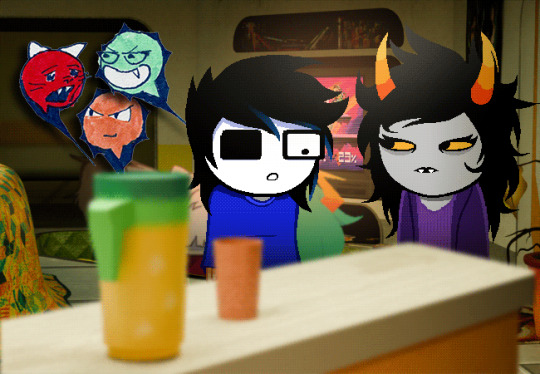
Text
now that palworld is coming to light again (fuck patents by the way) i can finally make fun of people on twitter who were unironically like "this is a much better pokemon inspired game thats ACTUALLY INDIE and made WITH HEART by real artists and not DISGUSTING PLAGIARISTS" and then they would start posting screenshots of some random phone game that looks exactly like this

and when you go and see how it plays it's either the exact same kind of crap that was in every flash game site + facebook 2014 or literally just a pokemon fangame made the type of person that goes "dragon type? bug type? so fucking stupid lmao" (both have ads, paywalling and a ton of mixels and tweening)
#palworld#pokemon#fighting against plagiarism by boosting simplified shovelware versions of the thing that's being copied#“instead of balls our game uses cristals” and “light type vs dark” are the WORST offenders#palworld is a ark clone much MUCH more than it's a pokemon clone like cmon guys#the levels and character customization look and work almost the same and also the UI and item unlock and survival characteristics#at least it's not 600 fucking Gigs
5 notes
·
View notes
Text
It's genuinely kind of upsetting how quickly social media's keep shooting themselves in the foot to just have something to show to higher ups and making their sites more and more user unfriendly. It reminds me of the Oreo CEO skit from College Humor/Dropout TV.
The new Discord update for mobile is genuinely disheartening by how little they seem to care about people hating the new layout. Which honestly, the DMs now being at the bottom and no longer swipping to see server members is annoying. But as someone who very easily gets god awful headaches from heavy contrast and light, the new "default" themes are... very unfriendly to people like me. Let me show you the difference in old Discord's dark mode vs the new:


Like, holy shit, it's Bad. The new one on the right is barely usable for me, it was giving me strain after only an hour or two of use. And it's not even their darkest mode, which is pure black, but it's their only other option aside from pure white in Light Mode.
If you don't want eyestrain, you'll have to pay the 10$ a month nitro not to get migraines. I have the 3$ version, and I can not change the theme with it to their other options. I was able to fix it by fighting all of my settings for an hour to get it back to the original color palette, but jfc. I shouldn't have to reset all my phone setting, open and relaunch discord, and pray that it decides the "automatic setting" is the non-eyeball burning classic dark mode.
The world and social media is just slowly getting more and more unuser friendly, especially towards people with light sensitivity (I can rant for hours about car headlight luminosity regulations). Just kinda disheartening to see Discord so adamantly against changing any of the new UI stuff, especially is they decide to no longer have the class color palette accessible in the future :/
1K notes
·
View notes
Text
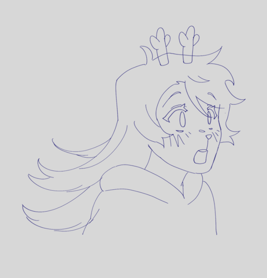
Here's some early marker tests for the pop up emotes in the new Godfeels chapter


yes, the reason they look like paper cutouts is because they actually are drawn on paper. I thought it would be funny and Sarah agreed! originally I planned to have them look like the "BLEH" and "BLUH BLUH HUGE BITCH" scribbles in Homestuck but I'm just not very good at drawing that kind of cartoon frankly, and it also just didn't look as good imo in actual marker vs the hard mspaint brushes. so, I gravitated towards a more game ui influenced look, a little more polished. once I hit on the speech bubble looking icons with just facial expressions inside that felt pretty good, with one weird wrinkle: I was working with this sort of busted staedtler marker that Sarah found in our building's dumpster along with a bunch of other staedtlers and, bafflingly, some totally unused posca paint markers. anyway, I was using it to lay down the dark navy color because I liked how bleedy it was, how quickly the ink started flowing fast and hard. it did make the process more tedious because I had to turn the dumb thing upside down and wait for it to calm down before I did each new set of three sprites but overall I liked the results... until I scanned them in. I think my scanner has a weirdly limited sensitivity to blue generally, and it seems like whatever pigment staedtler uses is... I guess MORE reflective of light? than the tombows I used for the rest of the colors? especially the red tombow I used for Dave's colors. so I had to monkey around in photoshop to drop the blue values down darker, to match how it looked on the actual page.
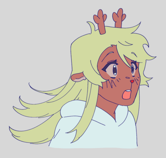
here's the whole sprite sheet, which for whatever reason in this photo is much closer to the physical colors than the scans above are

once I color corrected them, Sarah cleaned them up and Janet composited them in with her sprites and set, resulting in the fun combo of styles in the chapter:
#godfeels#homestuck#june egbert#dave strider#dana straten#lenore lehart#mary lalonde#dare egbert#homestuck postcanon
57 notes
·
View notes
Note
What was your process for making the Noelle amv, if you don't mind sharing?
hii! im not sure how eloquently or clearly ill be able to explain it but i definitely have some pictures you can look at!
(the video)
i actually got the idea while i was away on a trip with very limited wifi -- it wasn't Trust Me that i got an AMV idea for first, but instead it was one of 4syu's other songs, There's Nobody. for such a happy sounding song it really made me so sad, to the point where if i tried to sing it to myself id get choked up by the chorus LMAO. it was baddd
but basically i was rapidly trying to find both songs on spotify so i could listen to them offline, and it only took me a few loops of Trust Me and thinking about the original MV to make me go "ohhhh. how can i make this about noelle." And so i did .
i was thinking about doing a storyboard, but in the past, i've found that doing storyboards for animations/AMVs lowkey... kills my motivation altogether... SAD... but i saw the whole video so clearly in my head, and i didnt want to make the same mistake i made before... so i went right to doing quick sketches (while still on my trip...) just so i could get the ideas out of my head
i was torn on what to do with my style at the time, whether i wanted to make it more similar to the original video, or to her canon appearance, or to MY style and how i draw her. i think it kind of ended up as an amalgamation of all three...? at the very least, her light world color palette definitely was more bland and desaturated, like i purposefully wasn't trying to do anything special with her colors.
after that point, and getting maybe a few of the actual drawings done, my motivation crashed again, and i left it all to marinate for nearly a week. it was baking, guys, it wasn't abandoned, listen to me, why are you throwing tomatoes at me,
i had up to about the "I dreamed about that again" animation done and stopped, and it wasn't until i decided to sit down and start editing it anyway that i really got in my groove again. i got all my little assets into a workable state so i could really try to sit down and make the video come to life and all
the really fun part was honestly working on the desktop backgrounds. i really wanted to limit colorpicking from the original video as much as possible, but i decided that making look as similar as possible to the original could help with the contrast i wanted to add later.
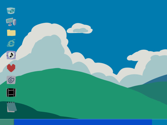

i drew these two backgrounds first. i was hoping i could somehow fit the bunker into the second one, but decided to do something different anyway. the second one's ui didn't actually change until later in the editing process.

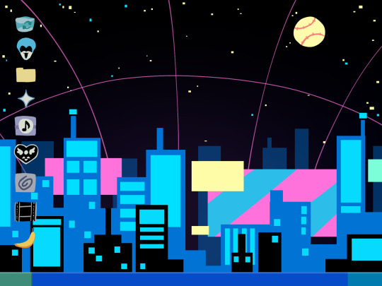
drawing THESE were fun especially, and im happy with how they came out. i think the dark world icons are really cute still. one thing i really did know i wanted to do from the beginning was to turn the soul/undertale icon into the deltarune one.
i was worried if the shift from the Windows Field Background to the dark world would be too sudden, like you would just blink and suddenly it was all different, but i think it ended up all right...?
the not so fun part was drawing all the different boxes, lmao. it go really tedious by the end, so i tried to reuse as many of the same ones as i could.
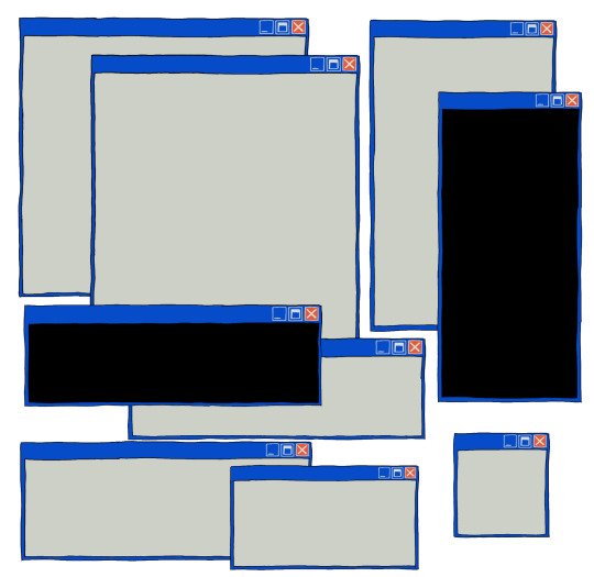
a lot of copy-pasting and tracing rectangles for sure.
i also had to make sure the animations didnt Suck. i brute forced those things and used every last braincell i had in order to make those pictures move bros


fun fact. ive never animated hair like this before. or in any complex manner really. i had to use sooo much brain here... heres how it started vs. how it ended up
had my animator gf hype me up thru the whole thing... i was having a great time based on the filenames alone

aaaand then ummmm i edited it. i learned after effects like 1 month ago. never touched it before. i learned it for internship purposes and then used my newfound powers for evil it seems
i split the whole thing up into multiple compositions of course, but i probably could have split things up more... im sorry for having 84 layers on comp 3 its not my fault
editing a video in 12 fps was a fun change though -- very easy for my brain to go frame-by-frame, and yet still some of the timing ended up being off... tis the goomy way
like i said before, i started editing when i barely had half the drawings done, but seeing it all start to be in motion really pushed me to finish it up. and i mean Really. like i finished the whole thing maybe 48 hours after i first started editing.
and...i think that's it? i do a lot of discord art streaming to friends lately but i kinda kept this one more under wraps compared to usual, i think i just wanted to surprise everyone... look guys i remembered how to make a video! and it's three minutes! waow
sorry if this is way more than you asked for LMAO
also, the AMV hit 5k views on youtube today! ive never had a video do well like that so quickly! thank you!!
128 notes
·
View notes
Text
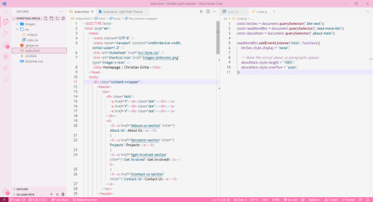
How I pinkify my code editor/IDE!

Continuing on posting about how I making my coding experience more fun, I'll be going to show you what I did to pinkify my:
code editor (VSCode)
IDE (Visual Studio)

Visual Studio
Theme
So, let's start with Visual Studio because I use that the most because of work! I installed themes to it (here is a post I made on how to install the exact ones I have (install once, comes with lots of themes)) and I changed the fonts!
Best you follow my installation post, as the themes I will list now will be from that exact theme set I installed (called "The Doki Theme"). I'm a fan of Light themes more than the Dark ones for VS:
♡ Natsuki Light (the theme in the pictures + my favourite) ♡ Beatrice ♡ Mai Light ♡ Miia ♡ Mioda Ibuki Light ♡ Nakano Itsuki ♡ Nakano Nino ♡ Ram
Themes 'Beatrice' to 'Ram' have pink in the themes but it's not the main colour of the theme, if that makes sense, but still cool to me so I switch to them every so often! ヾ(^-^)ノ
Fonts
Sometimes I get tired of the monospace font on my code editor. I know it's almost a crime to change the font of your code editor/IDE but I get bored so easily, a well-known trait of mine, and want to spice things up again so I change the font! As well as that, my eyes have a hard time reading the code after a while because of the monospace font! I still sometimes use it though~! (´;ω;`)
But first, for those who don't know how to change the font + font size (if you want also) in Visual Studio:
♡ Toolbar > Tools > Options > Environment > Fonts and Colors > Font
Okay, so I split my chosen fonts so you can pick according to your font style taste~! :
Sans Serif
♡ Bahnschrift SemiLight ♡ Calibri ♡ Gadugi ♡ Segoe UI Semilight ♡ Segoe UI Historic ♡ Yu Gothic
Serif
♡ SimSun
Monospace
♡ Modern ♡ Terminal
That's it for Visual Studio!
Visual Studio Code
Theme
These are my favourite themes and the first one is the one I am currently using! To learn how to change the theme on VSCode: here. Now my chosen themes:
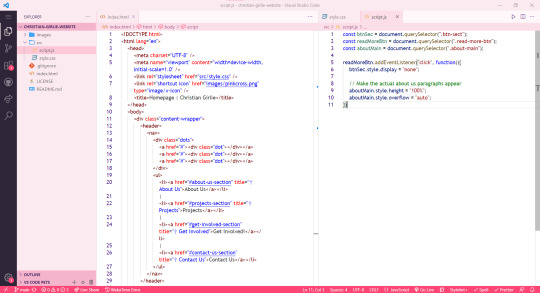
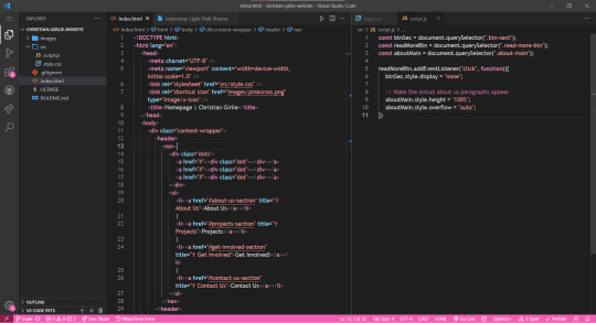
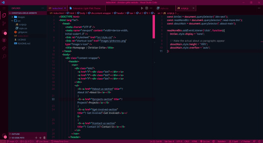
♡ Cute (no. 1 shown) ♡ Fluffy Theme ♡ Huacat Pink Theme ♡ Light Pink (no. 2 shown) ♡ PinkyBoo ♡ Tinacious Design (Light) from Tinacious Design theme ♡ Dark Pink from Light Pink Theme (no. 4 shown) ♡ Her. ♡ Kawaine Theme ♡ Pink Cat Boo ♡ PinkBlue from PinkBlue Theme ♡ Robot Light Pink (no. 4 shown)
Fonts
The current font I have on VSCode is Trebuchet MS. But the font mentioned before are the ones I used in VSCode as well! To change the font in VSCode:
♡ Settings > type in the search bar 'Font' > Editor: Font Family
That's all!
I hope this was a fun read and helps someone! Make you're coding environment fun! (and pink) 🥰💗
#codeblr#coding#progblr#programming#studying#studyblr#comp sci#codeblr pink girl#codeblr girl goals#pink#pink aesthetic#pinkcore#visual studio code#visual studio#vscode#my resources
212 notes
·
View notes
Text
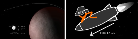
AvPhysics - An Analysis [Part 1]
[Part 1] - Part 2 - Part 3 - Part 4
Disclaimer: This will only be a surface-level analysis for Animation vs. Physics. If you expect something more in-depth, you have to wait for the physicists.
Let's get into it- shall we?
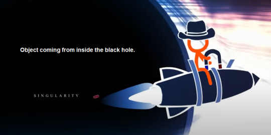
Obviously, TSC spawns from the e✖iT Euler's Identity made in the end of AvMath. For the sake of this analysis, let's call this one, TSC_0.
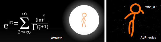
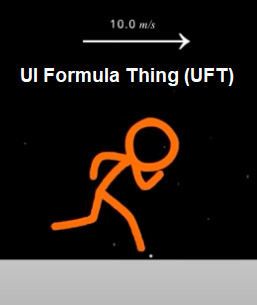
One minute upon arrival, TSC_0 didn't have any personal goal/objective, so he was just running around. This also demonstrates the accuracy of the UI Formula Thing (UFT) that shows up on the screen.
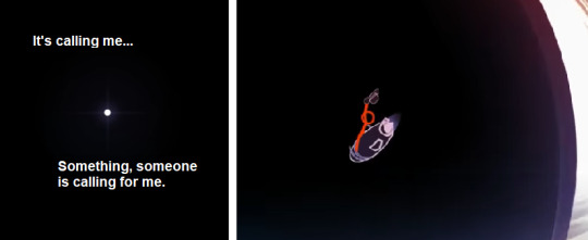
That is, until he found this ball, and then the others after it. Which we eventually realize, all came from The Singularity. Something or someone is trying to get his attention. He needs to reach the Singularity.
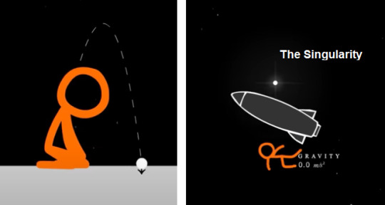
The first thing he realizes is, "Dang, this is gonna take a while".
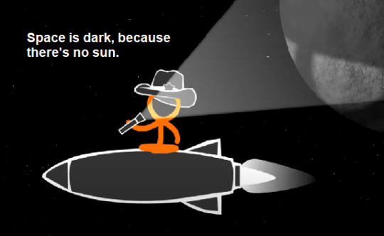
Also, space is dark because there is no sun- specifically, no solar system.
Okay, new goal. We need to get faster. But how?
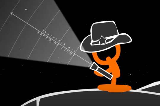
Side Note: Animation vs. Frequency? Animation vs. Color Theory? Animation vs. Sound Waves?

A Solar System (with its own star/sun) spawns in. He did not reach it, it spawned in. It literally did NOT exist prior to the flashlight.
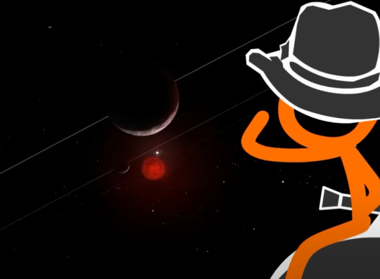
He utilizes the space maneuver called the Gravity Assist. Also called the Slingshot Effect. It's where you use a planet's gravity, by moving around it (but not entering it) to gain significant speed.
Most sci-fi stories use this maneuver to save on propulsion and to change/correct the course of the spacecraft.
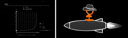
UFT shows that he got faster now, but it's still not enough.
So he does it again with two faster-orbiting planets. Gaining more speed in the process.
He was supposed to make impact with the sun here, although I'm not sure why he didn't. It's probably because a sun along with its own solar system moves through the galaxy. They don't stay in one place.
For example: Our Solar System orbits the Milky Way Galaxy for about 230 million years, which is also called a cosmic year.
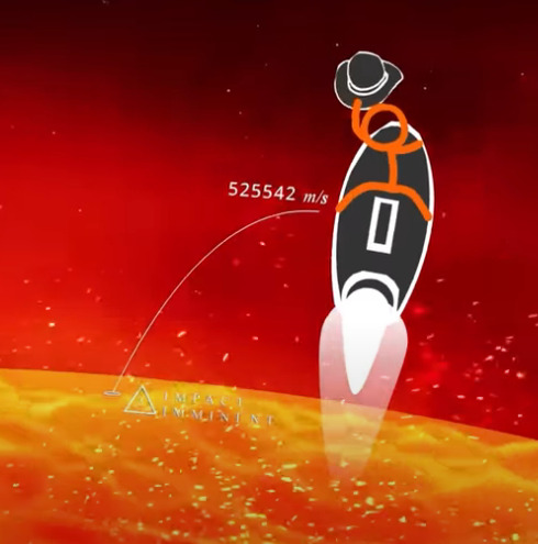
And by moving around the sun but NOT hitting it, gave him even more speed.
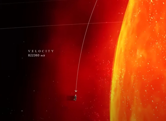
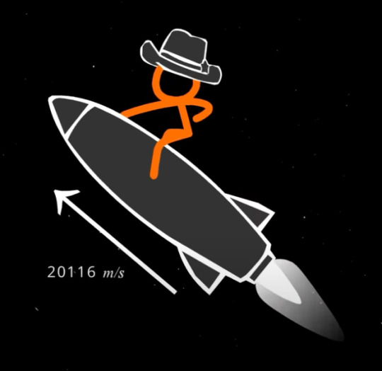
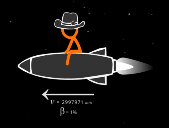
Here's his speed upon exiting the solar system.
He eventually reached 1% of the speed of light. Yep, that whole almost-dying-in-the-sun process, is still not enough to get anywhere.
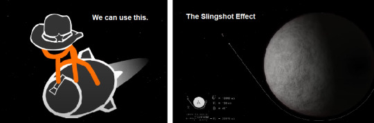
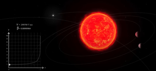
Magnets spawns in. Again, they did NOT exist prior to this.
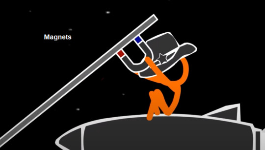
"Hmm... we can use this," he says.
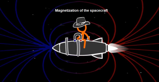
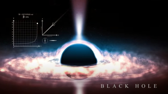
Step 1: Let's magnetize the crap out of this rocket.
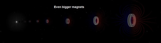
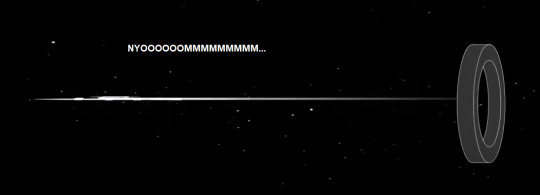
Step 2: Enter the magnet gates.
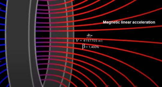
Step 3: We get a magnetic linear accelerator, which utilizes the opposing magnetic fields to propel/launch objects at high speeds. Initially thought this was a particle accelerator, but turns out that's a whole different thing.
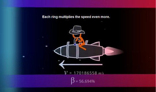
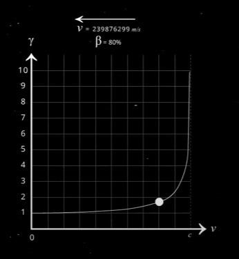
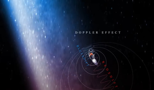
And now we reached 80% of the speed of light.
If you're still following me... good news, we have reached half of the video.
Cool graphics, 'cause why not.

Around this point, TSC_0 experiences Time Dilation. This is important for later.
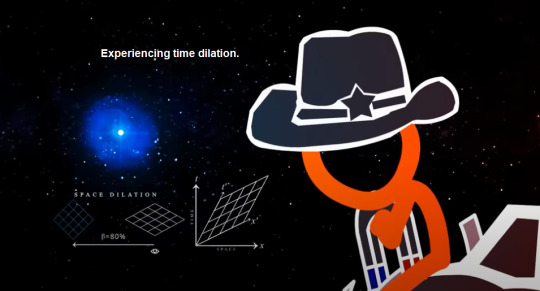
This is because he has now left the galaxy.
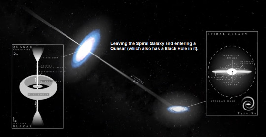
More sci-fi stuff. Everything starts to look more red.
Red-looking black hole.
Something hits him on the head. How is this possible?
Oh no, my apple. Take note, that the apple glows red whenever gravity is messing with it.

Goodbye world, my apple needs me.
Aww... Turns out there is a photo limit per post.
Here's [Part 2].
61 notes
·
View notes
Note
https://www.tumblr.com/ranseur/762392580544692224?source=share
I- fucking.. i never realized i could download and organize fics
I feel stupid now
Never used any app cause ao3's website is amazing and i love it but I CAN DOWNLOAD AND ORGANIZE FICS?? WHAAAT
this is so stupid cause i already have a few downloaded fics i just haven't thought about doing it for more
noo don't feel stupid! but i hope you find that an app boosts your quality of life the app i use on android is called ReadEra. i haven't tested or compared other apps, but i like this one because the UI is so unobtrusive, customizable, and intuitive. tap right/left or top/bottom for page flip, tap middle to hide/show UI, swipe left side to decrease/increase brightness, tap top right to make a bookmark or edit one, top left to swap between two chosen visual themes (i use dark vs darker, but there is light theme and 'paper' offwhite too), if i browse my collection or author list it will keep me in the author and collection i'm 'in' until i back out myself, etc etc i really love how easy this app is to use. the only ad i get is the occasional prompt to go premium but it doesn't impede my reading experience but it could be true that any old app will do all this- find what works for you! enjoy!
#also upon reflection my own personal circumstances might be why i formed the habit of reading everything offline#as recently as 2018 i had a phone plan where i only had 30mb data per month#all of which i saved for emergency map directions only#so i downloaded fic at home and read them offline while commuting to work#i have enough data now that i don't think about conserving every mb#but i still download because i enjoy the organization and security of use. if deleted or Ao3 is offline; i still have everything#anon
3 notes
·
View notes
Note
Hiii haven't used csp in awhile but honestly the default brushes alone are great,but theres a brush and asset store on their site thats made by users and alot of them are free and alot of them tend to be good,some people sell packs but idk if thats what you're looking for so I won't suggest any.The program itself alloes you to jave a light or dark ui,and you can also personalize where everything goes!
im taking suggestions bc i dont even know what is possoble in csp vs. photoshop, so im really open to hear anything :)
6 notes
·
View notes
Note
Some thoughts on Twine vs Choicescript: The user-end UI for Twine is highly modifiable -- it's just CSS and there are several templates out there. Choicescript basically just has a light and dark mode and that's it. So from a user experience perspective, Twine is significantly better, but it might require some CSS knowledge. As far as the coding -- if you prefer the way Choicescript handles it, you can actually just do that. Twine does have a GUI (one which I personally hate), but it's not mandatory. You can just type the code in a text processor or IDE and compile to html. Also, Choice of Games is a trash company and publishing a Choicescript game for any commercial cost *does* require you to go through them (not if it's free though).
Thanks for your thoughts, but I did say my dislike is irrational and autism-induced. Twine is just so broad.
I do have experience with web-design, so I'm not concerned about the look itself should I end up with Twine; my main reason for not deciding on a new engine yet (apart from the poll not being finished) is that, while dynamic object generation is doable in Twine (albeit in a somewhat convoluted way), I'm not sure yet if I can implement the navigation bars for the more complex menus the way I want (I'll make a longer clarification post about the technical stuff when I'm back at home/my pc tomorrow).
When I say I dislike the way Twine code looks I'm referring to the <> form - but tbh, I'm just a C/C++ purist and dislike pretty much every other language (apart from Assembler, my beloved), including ChoiceScript (WHERE ARE MY PARENTHESES?)
Publishing is not a concern since I would never dare to monetize anything I make in the first place.
(edit: my answer feels somewhat passive-aggressive, but that's not intended, and I genuinely don't know how to change this, so - sorry 😞 )
7 notes
·
View notes
Text
Thess vs That Gameplay Trailer
So ... given how my Tumblr dash is blowing up, I don't feel like I have to be particularly careful about spoilers. You've seen it or you haven't. So ... here comes my opinion about the Dragon Age: Veilguard trailer:
It looks fun. I think. It also looks like I might not be able to play it. Like, at all.
And it's not because I'm hating on it, by the way. It looks ... interesting, for sure. My problem is actually accessibility, because there is a lot that gameplay trailers don't show you in games like this.
They're using a controller for input. I cannot use a controller, so I have no idea what the keybinds are going to look like. I don't know if you can lock on to your desired target, I don't know if you have to keep hitting the Attack button just to keep hitting something until it actually dies.
They used the flashiest-looking class, I imagine, so there was Rogue. A lot of dodge-rolling. That plus the "HEY LOOK AT THE WEAK SPOT" targeting spot on larger creatures (and probably the whole "darkness and demons" look to what we saw, honestly, but more on that later) basically put me in mind of Baby's First Dark Souls. Like, Souls-Ultra-Lite. I know that's The Hotness right now, and I'm not hating on that. Honestly, I'm not hating on any of it in and of itself. They went in a direction. Was it a good one? Depends on where you're standing.
Again, my issue is accessibility. Because I came away from that gameplay demonstration with the following:
A collosal migraine
A horrible feeling that the controls are going to be a nightmare for me personally
The migraine was a combination of the heavy contrast between the dark setting and the Big Glowing Demons, with the added fun of the flashy things indicating which direction magic blasts are going to come at you and all of the other artefacts, aaaaaaaaand the way combat moved. Because that much dodge-roll just had the camera going fucking everywhere. I struggle with that a lot. Not as much when I play it as when I'm watching it, because I'm at least nominally controlling it, but ... see, that's the problem. I can choose to not move the camera so much in most of my games. This one ... just the way basic mooks that you hit at level 1 involves so much bouncing around the area that ... yeah, migraine. And that wouldn't be much better if it was me causing all the bouncing around; not with those lighting effects, anyway.
(Also wondering how that's going to work for a mage. The last game I saw that did this kind of thing that I could actually play was Kingdoms of Amalur: Reckoning, and I couldn't play a mage in that because spellcasting took forever and I kept getting interrupted either by being hit or by having to dodge before I could finish casting. But anyway.)
So there's the migraine issue ... and then there's the fibro issue. I can't say for sure without seeing how the UI works when using keyboard and mouse, but this looks like it's going to be torture on bad pain days. I imagine it's going to limit the hell out of what classes I can play, at minimum. (Hell, Inquisition already did that; having to follow enemies around and keep pressing R to stab them repeatedly wasn't something I could do, so I had to leave melee-rogue and warrior alone, sticking entirely with ranged-rogue and mage). I'm reliably informed that you can change playstyle as well as difficulty on this one, but I don't exactly know what that means or how that might be helpful.
All I can really comment on is what I've seen. And what I have seen indicates to me that aside from anything else, Bioware seems to have put the New Hotness of the current style of action RPG ahead of accessibility. That makes me sad and disinclined to discuss the thing, or to get too attached to any of the characters, because it's entirely possible that I may be entirely unable to play it for health reasons anyway, so why bother getting hyped?
Also I am grumpy because, again, migraine. I'm hoping that it's just that one was building anyway and that just tipped me over the edge. Not that that's much better, since sometimes migraines sneak up and I sometimes don't see the edge until it's agony and aphasia, but at least if it was that, I could pretend that there might be some days I could play that game without crippling myself.
6 notes
·
View notes
Text
There probably is some more specialized tool with a more accessible UI somewhere, but despite its branding as a dark theme tool, Dark Reader can be used to enforce light mode too, customizable globally as well as per website, and if you can manage to get through setting it up you shouldn't have to deal with the UI. Only works in browser and it's not perfect, but better than nothing.

This is what tumblr looks like to me normally vs when I turn on Dark Reader with light mode and then under the "more" tab set the theme generation mode to "static".
I hope this helps someone!
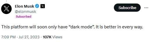
HAHA LETS REMOVE LIGHT MODE BC DARK MODE IS BETTER OOOOH LIGHT MODE BURNS MY EYES HAHA LOOK IM SO RELATABLE LOL ROFL LMAO
i need some of you motherfuckers to understand that many of us use light mode not bc we like it more, but bc we suffer from visual conditions that make dark mode actually more eye straining than light mode to the point some ppl might find dark mode straight up unreadable, removing it is not some quirky funny little thing, its literally removing accessibility options
#accessibility#I use dark mode exclusively and don't use Twitter so I know I'm not the most qualified but I hope it's worth something#And I imagine people who need lightmode wouldn't be looking for it on 'Dark Reader' to find out it can do the opposite#(the link is to the Firefox extension but it looks like there are versions for other browsers too)#Elon Musk#Twitter#Earth season 5783
28K notes
·
View notes
Text
Discord has started to rollout their refreshed UI for their Desktop/Web versions.
Keyword: "refreshed". It's not a complete change, just tweaks here-and-there.
Noteable things:
The Channel List can now be manually resized (via click-and-dragging the divider between it and the Chat)
Two new free default Themes added - "Dark(er)" and "Midnight". The old Dark Theme was renamed to "Grey" Theme. (Yes, you can use these without Nitro).
Text Box in chats has been redesigned. Now the buttons inside it are underneath the Text Box (no more losing text box size on small/tall monitors). The toggleable "Send Message" accessibility button is still inside the text box
Inbox & Support buttons have been moved up to the global title bar, so they can be accessed globally regardless of where in the Discord app you are
The current User box under the Channel List now overlaps into the Server List (goodbye short-lived floating Discovery button I guess).
New User Settings for the density of the UI (in User Settings -> Appearance); choice of "Compact" (similar to old UI) and "Spacious"
Images of the refreshed UI across all four (not two!) default themes - in order; Light, Grey, Dark(er), Midnight:


and images comparing "Compact" vs "Spacious" UI densities:

#discord#discord app#discordapp#discord ui#discord layout#desktop discord#web discord#discord update#discord updates#discord rollout
1 note
·
View note
Text
RED VS BLUE, BLOG POST: Week 1 |
UPDATE 1.2 Texturing The Arena


THE SURFACE SYSTEM:
Main Stage (The Core): Fractured floor reveals pulsing digital arteries Impact-responsive panels ignite with movement Collision point where red digital storm meets blue Reactive chrome catching every data stream Twin Satellite Stages

(The Light Pulse):
Chrome architecture splitting light beams Synchronized circuit paths cutting through space When alpha stage burns red, beta floods blue Digital grid matrix connecting power flows Surface tension between polished and destroyed


The Ceiling (Command):
Master grid system orchestrating light system
Metallic quantum patterns define power flow Neural network of pure digital powerRaw energy clusters pierce through darkness
MY SCREEN THEORY:
Started realising something wild - screens aren't just displays, they're digital windows. Created this workflow:
Layer 1: The Heartbeat
Slow-fading silhouettes
Red bleeds into blue, blue bleeds into static
Numbers float like digital rain
Graphics dissolve into glitch art
Layer 2:
Future UI elements that never quite form
Coordinates that mean nothing and everything
Warning signs that fade before you read them
Data streams that look almost readable

Next up...
| DAZ3D Character & MD Garments
"Digital Fashion Meets Digital Human"
0 notes
Text
Good news!
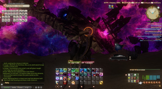
Last night I finished endwalker on my birthday, it only took playing from midnight to 4 am lol
Bad news I forgot to log into genshin and I didn't get my birthday cake :/
Lmao
Anyways I love zenos k onwards to the endwalker patch msq and dawntrail yay yippeee!!!
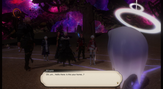
Nov 17th edit: some 7.0 screenshots of my WoL, Cyril, with the great glow up graphic update. au ra enjoyers, elezen enjoyers, we WON!!! YIPEEEEEEEE!!!
also a small comparison of no reshade and reshade also. my color saturation is turned up and the bloom is a bit warm, i love the color. he looks so soft. like, sorry, but even with the wonderful 7.0 looks, the base game is so washed out still. like, maybe i'm used to the photo-realistic and saturated landscape of for example, horizon zero dawn, god of war 2018, also more anime/cartoon-y saturated colorful landscapes of genshin, but ffxiv base game is so faded out to me.
also, although im still a bit miffed at myself for taking literally two years and 6 months to finish endwalker, enough time for the latest expac to come out, at the same time, i'm glad i waited for the 7.0 graphics. ultima thule is amazing! the skybox is amazing! also, the elezen glow up helped the scions a lot, urianger and g'raha look so soft and cute. the twins also have cute cheeks that i want to pinch lol. truly the wol's little brother and sister lol. the elf/elezen ears textsures and the light also going thru the skin a bit helped soften them. just. 7.0 was so good lol.


i will say though, idk what it is about my bloom and keepUI settings. like, maybe i just haven't really set up keepUI/mask UI reshade filters very well, but sometimes in night scenes, also ugh most of the ultima thule area except the omnicron area, the brightness of the dialogue box in cutscenes will make the rest of the screen kinda darken to compensate the bloom effect or soemthing. a bit frustrating tbh.
but anyways beautiful 7.0 crystal mother above!!!! i loved her. QAQ......
the bloom and 7.0 eye updates really helped her eyes pop out and glow.
oh, also i kinda wanna steal pint's reshade settings. i think his settings is technically public, but you have to join his discord?
but also, now that i've caught up, i can see some streamer's reactions and VODs to the end of endwalker. since many of them didn't delay like i did, i see the old graphics and i'm like. oh god. OH GOD, THEY LOOKED LIKE THAT????? (weird default shaders, angular elezen, etc., lol) crazy how you can just get used to the new stuff in such a short amount of time, seeing the stuff i was used to for like 2-3 years, it's really like that dang bitch you live like this meme. lol
oh yeah, here's a screenshot from july when dawntrail first released. truly the fate farming craze!!! incredible.

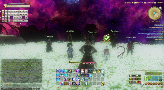
also, me, two of my friends, and one friend's younger sister all partied together to complete the coils of bahamat. we unsynced to carry my friend who is still in ARR/level 50-60 ranges. like literally just zooming thru the combat as 3 lvl 90 players and our baby level 50 friend to get to the dialogue and cutscenes lol.


oh yeah rip huiton. BUT ALSO THE ULTIMA THULE SKYBOX AND STARS OOOOOOOGH THAT IS BEAUTIFUL!!!
also, nastrond. also spineshatter dive. also eye of the dragon buddy system. just. oof. i know i' not a very high level dragoon, i think only mid 70, so i didn't even get to all the fun full rotation level 80-90 stuff, but god dang. bruh moment. sorry for your loss, other dragoon mains and enjoyers.
(note, i am an healer main, astro enjoyer, and i also loved plunge for dark knight. i get it uuuuuu QAQ....)
also! bloom vs no bloom.

OK, NGL, THIS WAS A MARRIAGE PROPOSAL, RIGHT ISHIKAWA???????? YOU LOVE YOUR CATBOY SON OC. YOU MAKE US LOVE YOUR CATBOY SON OC. I GET IT, HE'S THE SPECIALEST BOY EVER. UGHREAUGHEOGAHOUH. I LITERALLY WAS WATCHING THIS PART OF THE CUTSCENE A BIG DOPEY GRIN ON MY FACE, SQUEALING UNCONTROLLABLY. AND LIKE ALL THE STREAMERS I WATCHED VODS OF ALSO WERE JUST LIKE AWWWW. G'RAHA.... :D

oh also some gpose with the kiddos during Forge Ahead companion MSQ walking up the path Raha made for us. also ngl, it was so so funny to me whenever i got "this NPC is now following you" quests lol. like, SE was really like. LOOK! LOOK AT OUR LATEST ESCORT QUEST TECHNOLOGY! lol

so my reaper was lvl 89, not enough for the final lvl 90 msq lol. so, as i always planned anyways, i switched to white mage for the final msq. like, my first class and job were conjurer/white mage, so it only felt appropriate to end with that job.

So, i'll be honest also. i knew some plot points of endwalker. on social media and such, it's kinda inevitable to see spoilers, especially when everyone is literally 2 years ahead of you. however, i did not know the full context or the order in which some snippets and events would happen. also, the only two things i really kept for myself was listening to flow and close in the distance. like, i succeeded in skipping them or tabbing out and stuff whenever i heard the first few notes. so, hearing both for the first time was great. close in the distance playing in the background and slowly revealing itself and more instruments as the msq and scions' sacrifices went on was beautiful. using the instrumental for the dead ends dungeon was good too. i also loved seeing the alien worlds in the dead ends. of course, im sure that it may lose its magic when i have to play it like a thousand times to get my starbird minion.

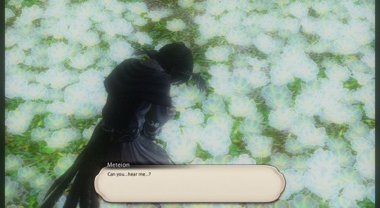
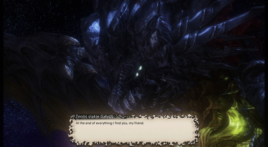
also ZENOS MY ENEMY, MY FRIEND!!! :D
so also if you got me at 3am in jenova/ EST time, i am so so sorry lmao. i died like 6 times to the stupid planet throwing and somehow got 1 commendation. i'm sure it was a pity commendation lmao. QAQ i've never been so embarrassed in my life i stg!!!
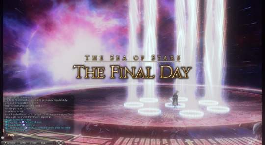
OOPS ONLY 30 IMAGES ALLOWED PER POST LMAO OK, PART 2 INCOMING. THERE'S ONLY A TINY BIT OF MSQ LEFT BUT I KINDA HAD A GPOSE PHOTOSHOOT WITH MY BESTIE/WORSTIE/HUSBAND ZENOS AT THE END OF THE UNIVERSE BEFORE WE BEAT THE SHIT OUT OF EACH OTHER LOL
1 note
·
View note
Text
Key Elements of a Sleep Monitoring App Design
Designing a Sleep Monitoring App involves creating a user-friendly interface that provides insights into sleep patterns, offers actionable feedback, and helps improve sleep quality through personalization. Below is a breakdown of the key components and considerations when designing such an app.
Key Elements of a Sleep Monitoring App Design
1. Onboarding & Setup
Seamless Onboarding: A guided setup for first-time users, explaining key features of the app. Make it clear how the app tracks sleep, collects data (e.g., through a wearable device or phone sensors), and how users can benefit from it.
Personalization: Gather initial data like age, sleep goals, and lifestyle factors (work shifts, fitness level, health concerns) to offer a personalized experience.
Integrations: Provide integration options with health apps (e.g., Apple Health, Google Fit) and wearable devices (smartwatches, fitness bands) to synchronize sleep data automatically.
2. Home Screen & Dashboard
Daily Sleep Summary: Display a visual overview of the user’s last sleep session, including total sleep time, sleep stages (light, deep, REM), and interruptions.
Sleep Score: Offer a clear, simple score (out of 100) based on various metrics like sleep duration, quality, and efficiency.
Trends & Insights: Include a scrollable section where users can view recent sleep trends over days, weeks, or months. Offer visual graphs that show changes in sleep patterns, and highlight potential issues such as sleep debt or irregular sleep schedules.
3. Sleep Tracking & Recording
Sleep Tracker Screen: Provide a "Start Sleep Tracking" button with an intuitive interface that allows users to initiate and end sleep tracking easily. If using sensors, keep the interface clean while tracking happens in the background.
Smart Alarm: Include an option for users to set a smart alarm that wakes them up at the optimal time during their sleep cycle (e.g., during light sleep).
Ambient Features: Offer calming sounds or white noise options that can help users fall asleep more quickly. Add settings for automatic shutdown once the app detects that the user has fallen asleep.
4. Sleep Analysis & Reports
Sleep Cycle Breakdown: Visualize data about sleep stages—light, deep, REM, and awake times. A circular or bar graph design works well to showcase this breakdown.
Detailed Metrics: Provide key metrics such as time to fall asleep, sleep efficiency (time asleep vs. time in bed), heart rate, and oxygen levels (if available through wearables).
Sleep Diary: Enable users to log subjective information like how refreshed they feel upon waking, any dreams they remember, or notable factors that affected their sleep (e.g., caffeine intake, stress).
5. Personalized Feedback & Recommendations
AI-Powered Insights: Use data analysis to provide users with actionable insights. For example, “Your average REM sleep has decreased by 10% over the past week. Try to go to bed 30 minutes earlier to improve sleep quality.”
Sleep Tips: Offer expert advice based on sleep data, such as bedtime routines, relaxation exercises, or ideal sleeping environments (temperature, lighting).
Goal Setting: Allow users to set specific goals (e.g., "sleep 8 hours each night" or "reduce wake-up times") and provide reminders or motivational prompts to help achieve them.
6. Night Mode & Minimal Distractions
Dark UI for Night Use: Include a dark mode or night-friendly interface with minimal brightness to reduce eye strain during bedtime usage.
Reduced Notifications: Offer a "Do Not Disturb" mode for nighttime, disabling unnecessary alerts and minimizing distractions.
7. Weekly & Monthly Trends
Weekly Overview: Provide a weekly summary with average sleep time, consistency, and patterns. Highlight any anomalies or improvements in sleep quality.
Monthly Trends: Use longer-term data to show trends that may influence sleep (e.g., stress periods, lifestyle changes). Include comparative graphs for month-over-month analysis.
Sleep Efficiency Score: Offer a consistent sleep score to reflect how well users are adhering to their goals, based on various factors like sleep regularity, wake times, and restfulness.
8. Sleep Environment Monitoring
Environmental Data: If possible, include sensors or integration with smart home devices to monitor the sleeping environment (e.g., temperature, humidity, noise levels) and provide insights into how these factors impact sleep.
Snoring & Movement Detection: For users with wearables or phone-based sensors, offer insights into disturbances like snoring or excessive movement during sleep, which may indicate restlessness or poor sleep quality.
9. Calming Sleep Aids
Guided Meditations & Breathing Exercises: Include audio-guided sleep meditations or breathing exercises to help users unwind before bed.
Soundscapes: Offer relaxing ambient sounds like rain, ocean waves, or forest sounds. Allow users to customize the length and type of sounds.
Sleep Ritual Reminders: Include personalized reminders based on user behavior, like suggesting a calming routine if the app detects poor sleep patterns.
10. Social & Sharing Features
Sleep Challenges: Introduce gamified elements where users can set challenges (e.g., “Improve sleep score by 10 points in the next week”) or participate in community-wide sleep challenges.
Shareable Reports: Allow users to share their sleep reports with family members or health professionals directly from the app, in case they need advice or medical consultation.
11. Settings & Customization
Alarm Customization: Let users set custom alarm tones, snooze intervals, and wake-up light features (if integrated with smart home devices).
Notifications & Reminders: Users can enable reminders for bedtime, hydration, or evening wind-down routines. Ensure these are fully customizable to suit each individual’s schedule.
Integration with Other Apps: For users with fitness goals, sync sleep data with fitness apps to provide a holistic health analysis. This can also connect with mental health apps to identify the correlation between stress and sleep.
Visual Design Considerations
Minimalist & Clean Design: Sleep monitoring apps should have a calming, minimalistic interface. Soft tones like blues, purples, and pastels help create a relaxing environment conducive to sleep.
Typography & Icons: Use soft, rounded typography and iconography to maintain a gentle and inviting visual tone. Avoid harsh lines or overly bold fonts.
Animations & Micro-interactions: Subtle animations, such as a moon icon slowly dimming as the user approaches bedtime, can make the experience more engaging without disrupting the overall calming experience.
Conclusion
Designing a Sleep Monitoring App requires balancing functionality and ease of use, all while ensuring that the app is calming and conducive to improving sleep quality. By focusing on key features such as personalized insights, clear data visualization, and user-centric design, you can create a comprehensive tool to help users track and improve their sleep habits, resulting in a better, healthier lifestyle.
#uxbridge#uxuidesign#ui ux development services#ui ux agency#ux#uxinspiration#ui ux development company#ux tools#ux design services#ux research#i need sleep#bambi sleep#rest#dreams#problems
0 notes
Text
Samsung Galaxy A71 vs. Samsung Galaxy A71 5G: An In-Depth Comparison
Introduction
In the ever-evolving world of smartphones, Samsung continues to be a dominant player, offering a wide range of devices catering to different needs and budgets. The Samsung Galaxy A71 and the Galaxy A71 5G are two such models that have garnered significant attention. Although they share a name and several features, there are critical differences that set them apart. This blog will delve into a detailed comparison of these two models to help you make an informed decision.
Design and Build
Samsung Galaxy A71:
The Samsung Galaxy A71 boasts a sleek and modern design with a glossy plastic back that mimics glass, providing a premium look without the fragility. It features a 6.7-inch Super AMOLED Plus display with a resolution of 1080 x 2400 pixels. The phone's dimensions are 163.6 x 76.0 x 7.7 mm, and it weighs 179 grams, making it relatively light and easy to handle.
Samsung Galaxy A71 5G:
The Galaxy A71 5G shares a similar design language with its 4G counterpart, including the same display size and resolution. However, due to the additional 5G hardware, it is slightly thicker and heavier, with dimensions of 162.5 x 75.5 x 8.1 mm and a weight of 185 grams. The difference in thickness and weight is minimal, but it might be noticeable to some users.
Display
Both models feature the same 6.7-inch Super AMOLED Plus display, which offers vibrant colors, deep blacks, and excellent viewing angles. The resolution of 1080 x 2400 pixels ensures sharp and clear visuals, making both phones ideal for media consumption, gaming, and general use.
Performance and Hardware
Samsung Galaxy A71:
The Galaxy A71 is powered by the Qualcomm Snapdragon 730 processor, paired with 6GB or 8GB of RAM, depending on the variant. The Snapdragon 730 is a capable mid-range processor that handles everyday tasks, multitasking, and gaming with ease. The phone comes with 128GB of internal storage, which is expandable via a microSD card up to 1TB.
Samsung Galaxy A71 5G:
The Galaxy A71 5G, on the other hand, is equipped with the Exynos 980 processor, which includes an integrated 5G modem. This chipset is designed to offer enhanced performance and efficiency, particularly with 5G connectivity. The A71 5G also comes with 6GB or 8GB of RAM and 128GB of internal storage, expandable up to 1TB with a microSD card. The Exynos 980 provides a slight edge in performance over the Snapdragon 730, especially in 5G-enabled areas.
Camera Capabilities
Rear Cameras:
Both the Galaxy A71 and A71 5G feature a quad-camera setup on the back. The primary sensor is a 64 MP shooter with an f/1.8 aperture, capable of capturing detailed and vibrant photos. The other three sensors include a 12 MP ultrawide camera, a 5 MP macro camera, and a 5 MP depth sensor. This versatile camera setup allows for a wide range of photography options, from expansive landscapes to close-up macro shots.
Front Camera:
For selfies, both models are equipped with a 32 MP front-facing camera with an f/2.2 aperture. This high-resolution sensor ensures clear and detailed selfies, even in less-than-ideal lighting conditions.
Battery Life
Samsung Galaxy A71:
The Galaxy A71 houses a 4500 mAh battery, which is more than adequate for a full day of use under typical conditions. It supports 25W fast charging, allowing you to quickly recharge the battery and get back to using your phone.
Samsung Galaxy A71 5G:
The Galaxy A71 5G also comes with a 4500 mAh battery and supports 25W fast charging. However, due to the 5G capabilities, the battery life might be slightly shorter compared to the 4G variant, especially if you're in an area with extensive 5G coverage and are frequently using the high-speed network.
Software
Both the Galaxy A71 and A71 5G run on Samsung's One UI, which is based on Android 10 out of the box. Samsung's One UI is known for its user-friendly interface, with features like Dark Mode, Digital Wellbeing, and a host of customization options. Both devices are eligible for updates to newer versions of Android, ensuring you get the latest features and security patches.
Network Connectivity
Samsung Galaxy A71:
The Galaxy A71 supports 4G LTE networks, which are still widely available and provide sufficient speed for most users. It includes standard connectivity options such as Wi-Fi 802.11 a/b/g/n/ac, Bluetooth 5.0, NFC, and a USB Type-C port.
Samsung Galaxy A71 5G:
The standout feature of the Galaxy A71 5G is its support for 5G networks. This next-generation connectivity offers significantly faster download and upload speeds, lower latency, and a more reliable connection in densely populated areas. Aside from 5G, it also supports the same connectivity options as the 4G variant, including Wi-Fi, Bluetooth, NFC, and USB Type-C.
Price and Value
Samsung Galaxy A71:
The Galaxy A71 is priced more affordably compared to its 5G counterpart. It offers excellent value for money, especially for users who do not have immediate access to 5G networks or do not require the extra speed.
Samsung Galaxy A71 5G:
The Galaxy A71 5G is slightly more expensive due to the added cost of 5G hardware. However, if you live in an area with good 5G coverage or want to future-proof your device, the additional investment might be worthwhile.
Conclusion
In summary, the Samsung Galaxy A71 and Galaxy A71 5G are both impressive mid-range smartphones that offer excellent performance, versatile camera setups, and long battery life. The primary difference lies in the network connectivity and the processor. If you are looking for a more affordable option and do not need 5G connectivity, the Galaxy A71 is an excellent choice. However, if you want to take advantage of the latest 5G technology and slightly better performance, the Galaxy A71 5G is the way to go.
Final Thoughts
Choosing between the Samsung Galaxy A71 and the Galaxy A71 5G ultimately depends on your specific needs and budget. Both devices offer great features and performance, making them solid choices in the mid-range smartphone market. Consider your priorities, such as network connectivity, performance, and price, to make the best decision for your next smartphone purchase.
#Samsung#GalaxyA71#GalaxyA71Comparison#5GSmartphone#MidRangePhones#SamsungComparison#TechReview#SmartphoneBattle#MobileTech#AndroidPhones#5GTechnology#Snapdragon730#Exynos980#SuperAMOLED#CameraComparison#BatteryLife#TechBlog#GadgetReview#PhoneComparison#TechTrends#FutureProof#MobileReview#SamsungA71Specs#5Gvs4G#SmartphoneFeatures#TechGuide#MobilePhotography#FastCharging#PhonePerformance#SamsungFans
0 notes