#cursive font download
Text
alternian fonts........ 3rd


that's right, we're back with four more alternian fonts.
(including accursed, which is meant to be a type of lazy alternian cursive, but it was very hard to implement and you may have to reduce your letter spacing while typing, unfortunately.)
you can download them here!
and the other alternian fonts (and emojis!) are still available on my shop as well. happy writing :D
116 notes
·
View notes
Text
dw im still working on transcribing the architect alphabet.
Good news is after replaying S1 I have a clear read on the final three letters (found only on download terminals)


and im so glad i did. i mean just look at the quality difference from my sc vs the wiki image, I thought it was like that in game (the tablet is, its fixed at a certain resolution)
embarrassing but this is what I transcribed from the online sc (blue letters)

yeah.
interesting in my opinion though that there's a lot of similarities between the tablet alphabet(second set) and the terminal alphabet(top set), but no concrete identical matches.
For this I'm going with the interpretation that these larger letters we find on data terminals are simply a different font than the chiselled eroded letters of the tablets, which had to be simplified for practicality's sake. For that I want to make a full alphabet interpreting the tablet letters in to the terminal font, but getting shapes that look canon is kind of difficult.
I've also found that these letters look absolutely stunning with a square angled nib, it's very easy to look so elegant and almost like a manuscript. (dark green)
On the other end a softer hand and some creative cadence you can get a very natural and elegant script that is incredibly reminiscent of Hindi or ancient Hebrew. (bottom black script)
What I was not able to achieve though was a good looking script with a calligraphy or brush nib without majorly changing the shapes of the letters. I might still take a crack at it, but this alphabet is majorly optimized for that kind of lettering. A cursive font might be achievable with a square cursive nib but the architect alphabet is really, really squarish. Doing so would probably look like an entirely different font entirely.
As for translating, still struggling with that. I'm not making it a huge priority and instead just assigning arbitrary letters. I do hope to document my sources though so other fans can take a crack at it.


it's been a huge pain in the ass cause just look at it. The in game model has entirely different lettering than the scan. And its cut off by the other energy arrays!!!!!
Some letters are flipped, others are rotated 90deg. And for what???
Anyway thats the update thank you
47 notes
·
View notes
Note
Hi!! I saw your blog and it's beautiful! I'd like to ask if you could share some tips about editing posts, specifically changing the font color and doing that cool effect where it has more than one color on the same font ☺ if you're not comfortable teaching that's okay too! Have a good night

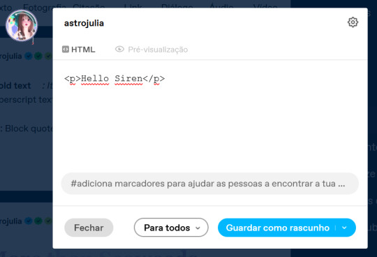
Hello Siren,
Thank you for the compliment. Yes, I can teach you. Just follow a tip from Auntie here: do it because you genuinely like the aesthetic. The time you spend writing the post is sometimes the same as editing it, and in my experience, this won't necessarily translate into more likes or reblogs. So, do it because you think it's beautiful.
As comical as it sounds, I won't be using HTML in this post because using the codes could cause problems. I've seen some tutorials, but I just really learned when I searched on my own.. I also do all my editings on my notebook. So, here's everything I use:

Websites I use for editing:
HTML Code Editor: While you're creating your HTML, you can simultaneously see if it's working
BBcode & HTML Text Colorizer: This is where you'll create the gradient
Browserling: I use this site to make the gradient code compatible for Tumblr
Aesthetic Symbols: this is for that cute symbols
Piliapp: more copy/paste symbols
Fontes e Letras: copy/paste fonts
Canva: This is where I create some of my designs. I also use Photoshop
Deviantart: a lot of material for Photoshop like templates, PSDs and Renders (PNG image with a good resolution), you can see the ones I use the most in my sources
@animatedglittergraphics-n-more: dividers
@saradika: dividers
@engrampixel: cute material
Color Hunt: if you don't have a color pallete in mind, here you can find a lot of options
Adobe Color: if you want to create your own HTML color palette this site can help
DaFont: where I download my fonts, the ones I use the most are: Betterfly, Arcadepix, Starborn, Lemon Milk, Cursive Sans and BubbleGum
EmojiTerra: as I use tumblr on my notebook, this is where I get my emojis
HTML Text Editing
Important:
Go use the HTML Code Editor in this part and your life will be way easier.
Some things I do right here in the tumblr editor, like putting the images and different fonts like Lucille.
All HTML code starts with < > and ends with , that is, when you start a paragraph you will write <p> and when you finish you will write </p> (HTML Code Editor ends your coding automatically)
I'm teaching all this because if you want to make gradients in your entire text and not just in the title, you'll need to know about html
To start your HTML you will need to go to the gear that appears on the right side when you are writing your post, go to the bottom until you find the Text Editor and switch to HTML.

The Codes
<p> start a paragraph </p>
<br> to make a space between text less than a paragraph (good to use in indented text) you don't need to put </br>
<b> make the text bold </b>
<i> leave the text in italics</i>
<strike> leave the text crossed out </strike>
<small> make the text small like this </small>
<h1> make the text large like this </h1>
<h2> make the text large like this </h2>
<ul> Create unordered list (dotted) </ul>
<ol>Create lists with order (numeric) </ol>
*instead of making paragraphs you will create new items in the list using the code <li> </li>
<blockquote class="npf_indented"> make the text indented </blockquote>
<span style="color: #HTML"> Code to color your texts, pay attention that it uses (") instead of (') and doesn't use (;) </span>
Tutorial on creating invisible spaces, just like I use to do the navigation, if I put it here everything bugs. PT-BR
<a href="URL">Link Text</a>: Creates a hyperlink
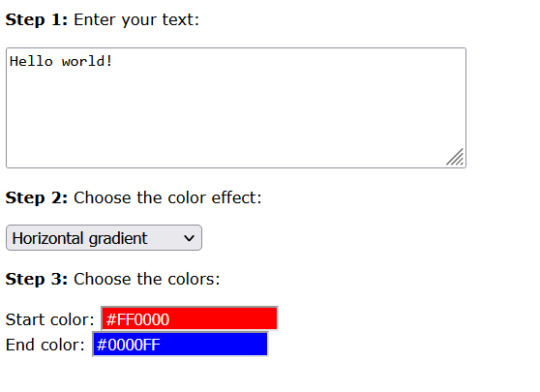
Making your Gradient
Go to BBCode and HTML already with your HTML text and colors in hand. Write or copy your text in the box, choose the gradient type (I use middle) and select your colors (from one to three different colors)

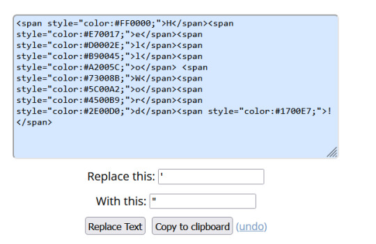
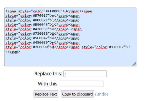
Now copy the text in the "HTML code for this text: (To use on your website)" box and go to the Browseling, you will replace the (') to (") and the (;) for nothing
Copy and paste your new code direct in your tumblr post editor or in the HTML Code Editor. Success!!
I think that's all. Kisses from the Sea! 🐚
144 notes
·
View notes
Text

Libretto is a script font modeled after hand-written cursive with hints of Old English typefaces and the aspirations of penmanship worksheets from elementary school
Free to download on gumroad (suggested donation of $8 if you’re able :)
#ian o'hara#art#script font#custom fonts#type design#libretto#gumroad#type#font#cursive#creative commons
30 notes
·
View notes
Text


A new project to share! When I read An Affirming Journal, by EDWARD “BLACKBEARD” TEACH, Currently Aboard the REVENGE in the Year of Our Lord 1717, Having Commandeered Her from STEDE BONNET, Gentleman Pyrate, by imperfectcircle, raven (@singlecrow), soupytwist, and tatteredbookmark, I knew I had to bind it.
See, I am a font fiend, particularly for historical fonts. I have a whooooooole bunch that I downloaded from KPS Fonts, which I hardly ever get to use because they're like ... too authentic. Most of them are unreadable paleographic ancient/medieval handwriting!
The fic itself is also delightful. The premise is that Stede had one of those "affirmation journals" pre-printed with inspiring questions to help you discover your best self and all that and filled it out, and then after he left Ed went through it with Lucius, having Lucius enter Ed's answers and his commentary on Stede's (while Lucius leaves his own commentary on Ed's). So it's funny AND heart-wrenching in turns.
The authors formatted the fic with different normal fonts, so I felt a bit guilty about changing them, but it was just a perfect opportunity to be weird with barely-legible paleographic text. For the pre-printed journal questions and titles, I went with 1782 Thurneysen, a very legible but still clearly 18th century typographic font with the long S for maximum historicity. Stede's handwriting is 1739 Bickham, a very elegant cursive. Lucius's is 1475 Humanistica Cursiva, which isn't really as good as Lucius's handwriting looks to be on the show, but ... I had to give Stede very pretty writing and I needed the distinction to be clear at a glance. Humanistica Cursiva also has the long S and it is pretty readable. Ed himself only writes a little bit, but he presented a challenge because I needed something else distinct but also legible but also a handwriting font - in the end I went with 2000 Bastarda, which is not a genuine historical font but a cleaned up version of lettre bâtarde/lettre bourguignonne, a late medieval script style that combined elements of Gothic Textura (blackletter) and calligraphy.
(Not much to say about the binding, it's a basic pamphlet bind with a single signature and a cardstock cover, the stitching covered with washi tape.)
Please go read the fic if you haven't already!
148 notes
·
View notes
Note
Hi Ahn, if you don’t mind me asking, what fonts did you use on the beautiful teasers you just posted? 💟

AINE ˳ ⠀⠀⠀ fkakd wow everyone is so interested in the fonts lol but i don't mind sharing them with y'all! so the font for TRUE VALENTINE is NEUE MONTREAL! i downloaded the whole family from this site, but i used the bold one for the main letters. the cursive one is called SVN NAUTICA, but unfortunately, i can't remember where i downloaded it from, so if you can't manage to find a free version somewhere online, i can send it through discord <3
#⩩ ♡⃗ heart attack .ᐟ ⠀ ⠀ ⠀ ⠀ 〳 ⠀ ⠀ ⠀ ⠀ ooc ‵#anon <3#june & lia i hope you see this as well! and lmk if you want this font!
2 notes
·
View notes
Note
hii could you please give tips on how to find fonts for your fic banner + the the font you have in your tags and navigation page. i also want to know how to find aesthetic pictures like you find them. i also want to know what are the best times to post on tumblr, and i also want to know how do you over come writer's block and get ideas fpr your fics/headcanons. sorry if i am being a bother and sorry for asking too much. pls do ignore me if you dont have time. i am sorry
hello ^_^ please don't apologise for asking, i'm always ready to help if possible :]
— FONTS
for banners, i use canva and the fonts provided there. some of my favourites are abril fatface, bernoru, burgues script, charm, coterie, slight, more sugar, apricots. there are a bunch of free options so just hit and try to see which one suits your design the most
for tags and navigation, i use yaytexts. cursive one is the cursive script, paragraph of text on the pinned is in sans serif and title is in sans serif bold. you can scroll down the styles column to find these
— AESTHETIC PICTURES
i use pinterest and there is no way except searching and curating your feed. try to specify your searches as much as you can. some keywords are : white typography ( or any colour, ) [ brand ] aesthetic, [ colour ] gradient, acubi. try using visual search or reverse image search. you can download images from mood boards on tumblr too
— POST TIMING
you need to know your audience for this, as in their demographic distribution, when they are most active. for me, it's usually after 6 pm ist. to find yours, try posting at different times and see when you got the most notes in a specific period of time ( like an hour or two, or more maybe ) that is most likely when your readers are most active.
there isn't really a set way to find or maybe i don't know that yet, but another way to make sure your work reaches more audience is self reblogs. it simply means reblogging your work every few hours, preferably two or three ( you can schedule it ) to make sure it hits almost every timezone. the icymi tags are for this purpose only
— WRITER'S BLOCK
i get the worst writer's blocks and i literally force myself to write or else i will be posting once bimonthly TT what i recommend in writing whenever you get inspiration. it can be anywhere, you don't have to worry about grammar, vocabs or sentences, just jot down the ideas as soon as you get them.
another thing i do is read a lot. it helps me get back to writing, sometimes gives me inspiration. reading helps with vocabulary as well so that's double the benefit
— INSPIRATION
songs, movies, webtoons, prompts on tumblr or pinterest, books. you need to keep your brain juices flowing. try to think about how a single dialogue prompt can be used in fluff and angst works both, for example. sometimes, random scenarios come to me out of no where, but i think you will get there when you start writing / get in the flow of writing
alternatively, discussing with friends, other reads / writers, reading ( very important, i cannot stress enough ) can help you come up with ideas for fics. for headcanons, a thousand of them have been done you can literally start by picking one and doing your take on it.
4 notes
·
View notes
Note
Heyyyyy :D
I'm curious... How exactly do you make a font??? What did you do to create the Maverick Font???? 😱😱😱😱
This is awesome btw! I'm going to use it to make him write cute letters!!!!! :P

Ayeee thank you!! Okay lemme do a break down of how I did it:
So this was all inspired by someone in another server saying they just traced some of the letters from his calendar for some art and I went "oh, I think I'm insane enough to make a whole font with absolutely no experience and only google!"
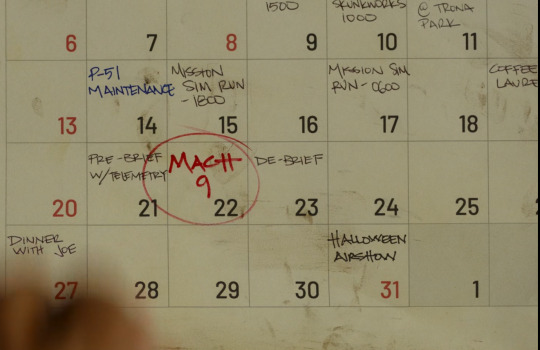
So I grabbed the calendar screenshot:
And from there I isolated as many letters as I possibly could to get a good reference for how he writes each letter. I organised it like this initially:
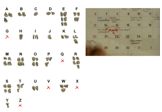
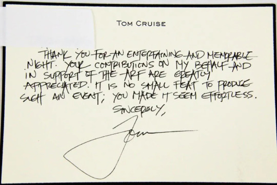
Obviously there was going to be missing letters. I managed to get 21/26 characters just from the calendar which was pretty sick! In hopes of getting the others, I figured I'd see what Tom Cruise's handwriting was like and see if it fits. I found one photo of a card he signed but I'm not 100% sure if the writing was actually his cause his handwriting is more curly and cursive. This is that card:
So then I ended up with this (I decided to do numbers as well):

From there i just started tracing the letters and writing them out myself to try and get ones that I liked and felt looked good and matched his style. I also wrote a bunch of notes analysing some of the letters so I could try and keep it consistent:
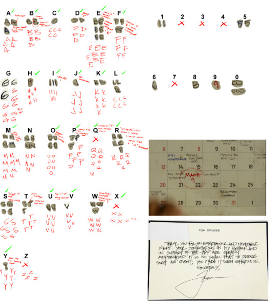
Planning Page looked like this in the end (I think you can zoom in on this one and read my notes loI):
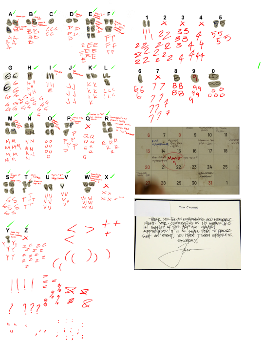
From there I took the ones i liked the best, put it into a 1000x1000 canvas (probably an overkill size lol) and cleaned it up as nice as I could! I saved them all out as transparent PNGs:
Then I found a software, Calligrapher I believe, that creates fonts, downloaded the template, imported all the PNGs and made the punctuation I was missing and then uploaded it! Saved the files and here we are!
I honestly still can't believe I pulled this off, and from only one screenshot of his handwriting! I'm over the moon excited to see what people make with it!! I don't expect to be credited everytime someone uses the font or anything but I'd love to be tagged to see what people make!!
Thank you for the ask!!!
MAVERICK HANDWRITING FONT LINK HERE!
#sam answers#ask#redfurrycat#top gun 1986#top gun fanart#top gun maverick#maverick#pete maverick mitchell#pete mitchell#font#resource#reference#tom cruise#break down
31 notes
·
View notes
Note
Can you make one for he/she please?
of course :)

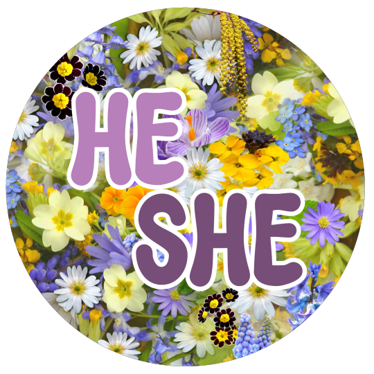
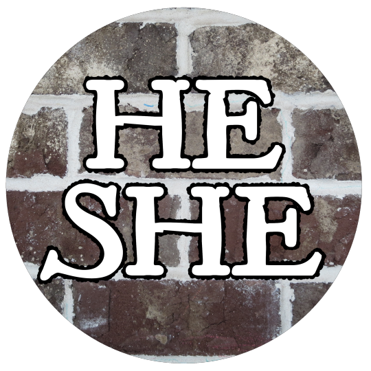
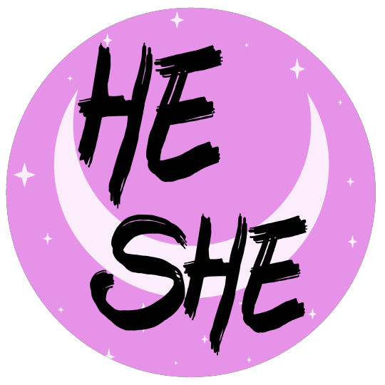

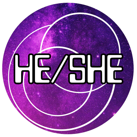


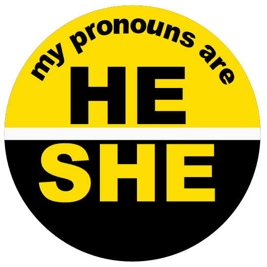
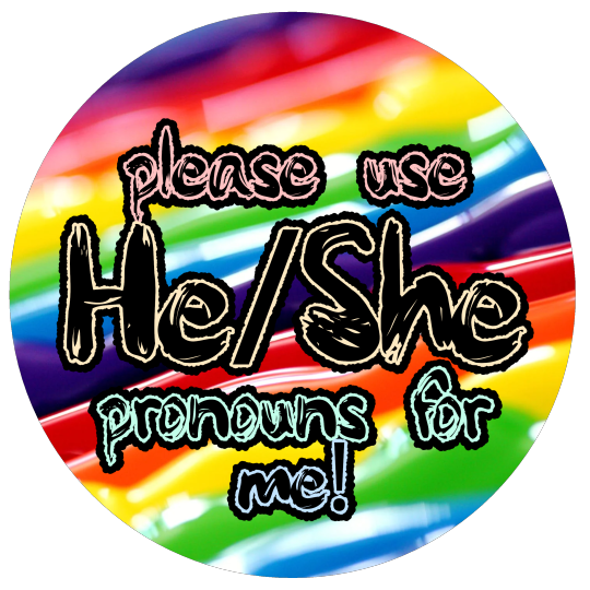
[ID: Eleven circular pronoun pins with transparent backgrounds.
The first is black, with a white ring around the outer edge, with "he" written in white text, and "She" written in yellow.
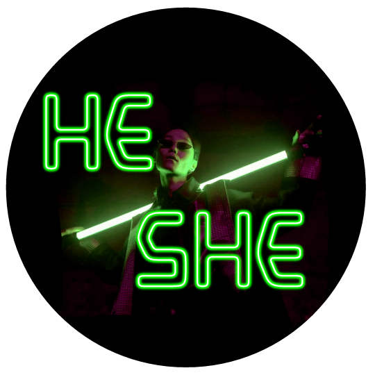
The second is a stock photo of a cyberpunk, Matrix-style person in dark sunglasses, holding a neon rod behind their head, with "he-she" written in neon-style green text.
The third is covered in different wild flowers, with "he she" in light and dark purple text with a white outline.
The fourth is a grey brick wall, with antique style white font with a black outline reading "he she"
The fifth is a drawing of a crescent moon with small white stars, and black text.
The sixth is a half photo, half digital painting of a realistic crescent moon in a black-to-blue gradient sky scattered with tiny stars while clouds lit grey and orange by the sunset below, and cursive white text that reads, "my pronouns are he she".
The seventh is a purple galaxy background, with concentric white rings, and "he/she" in white text with a bold outline in a computerized style font.
The eighth is a phooto of ocean waves from above, with bold black text that reads "he she"
The ninth is a swirling abstract background of black, blue, and red, with white text that reads, "My pronouns are he/she - that means you refer to me as both 'he' and 'she'".
The tenth is half yellow and half black, with black text curving across the top that reads, "my pronouns are", then "he" in black on the yellow half, and "She" in yellow on the black half.
The eleventh is colorful stripes of rainbow paint, with text with a black outline and center, and pastel inner edges, that reads, "please use He/She pronouns for me!"
End ID.]
You can download the HD versions from the web archive!
"https://archive.org/details/he-she-pronoun-pins-by-request-september-5th-2023"
These are free to download and print out, and you're welcome to share them to other sites, or use for icons / headers, in art, ect! All I ask is that you include an image description to make the post accessible! Copying and paste the relevant section above is the easiest way to do this :)
Requests are always open!
These designs will appear in this collection in my threadless store when they're done uploading, so you can buy them as buttons, shirts, stickers, ect! :)
11 notes
·
View notes
Text
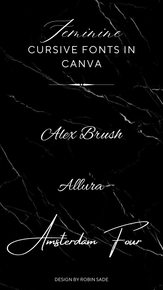
Feminine Cursive Font In Canva
Elevate your designs with Canva's exquisite collection of Feminine Cursive Fonts. Infuse elegance and charm into your creations, captivating your audience with visually stunning typography. These graceful fonts are sure to enhance engagement across your designs and social media content, thanks to their aesthetic appeal. Downloading is a breeze as well; ensuring seamless integration into your projects. Allow your creativity to flourish with Canva's Feminine Cursive Fonts today. - Design By Robin Sade
#canva template#canva#luxury#aesthetic#design by robin sade#fashion#influencer#social media#style#beauty#typography#fonts#free fonts#vintage fonts#cute fonts#fontstyle#aesthetic fonts#cursive#best fonts
5 notes
·
View notes
Text
17 of the Best New Font Releases: March 2024
New Post has been published on https://thedigitalinsider.com/17-of-the-best-new-font-releases-march-2024/
17 of the Best New Font Releases: March 2024
Check out the best new font releases for March 2024! Often new fonts are released with some nice discounts, so it can be the perfect time to pick them up when they’re fresh out of the font foundry. Some of these typefaces have up to 60% off, and certain fonts can even be downloaded free!
[embedded content]
Up first is an expertly designed font called Garrison, it’s a nice modern sans serif with a humanist style, a little like the classic Gill Sans. This one comes packed with 21 individual fonts in a variety of weights and styles, and what’s more it’s currently 60% off as part of its launch sale.
Next up is a great looking new condensed sans named Entropia. It’s another family of loads of styles, including a rather unusual backslant version, for those rare occasions you might want an italic but leaning the opposite way. The full collection is quite pricey at almost £300, but you can pick up 3 versions for free. You could even combine them with a selection Regular, Bold, Black and Heavy fonts to build your own much more cost-effective bundle.
Petrov Sans is another highly ranked new release. This modern sans has quite a futuristic look to it and includes 19 styles ranging from Thin and Extra Light all the way to Black and Extra Black. It’s another font that is currently on offer at 60% off.
Greater Neue Condensed… Or ‘NOIER’ is if I was to pronounce it correctly… is a nice new industrial style condensed sans that’s right up my street. I can see myself only using this in its heavier weights and only in all caps for logos or headlines, so the full price of £200 probably wouldn’t be worth it for me, but it just happens that you can pick up the individual Greater Neue Condensed Heavy font for free.
Script fonts have been in trend for several years now, but this new Retro Script named The Original stands out with a pretty unique style. It’s based on vintage car badge inscriptions, so it’s much slimmer than some other scripts and has a large selection of elegant swashes to completely customise its appearance.
Font Duos take the hassle out of having to find two separate typefaces to pair together. Hajime is the perfect combo of bold condensed sans and a cursive script. You can use them individually in your regular design work, or together to create cool quote art. At the $10 discount price it’s definitely worth adding to your collection.
Brush scripts are one handwritten lettering style that fully makes use of SVG font technology. With SVG Fonts like the new Beast Mode you can include the authentic texturing of hand painted lettering directly into each glyph, rather than it just being a solid letter shape. Several of Sam from Set Sail Studio’s fonts are amongst my go-to favourites in my library so I think Beast Mode definitely needs to be added to the collection, especially with such a memorable name!
The name of Qumer Pefolijqey probably *isn’t* one of the most memorable font names, but this new script font needs to be one to remember for when you need a cursive, monoweight typeface. With 363 glyphs comprising of multilingual characters and several ligatures it’s capable of displaying whatever words you need it to. This is one of a few fonts in this roundup from Envato Elements, so it can be downloaded as part of your subscription if you’re a member like me. Check the link in the description to sign up to the biggest creative library out there.
Millaris is another font with extensive multilingual support, but the reason I chose it for this roundup is its lovely design. It’s described as a modern retro serif. It doesn’t come in any other weights or styles, but with a decent selection of alternates and ligatures it would be a great choice for logos or even editorial titles.
Kirgina is a Modern Condensed Sans with a cool unique style. It has some really high contrast in its letter shapes and tight angles which makes it almost a display font, but it comes in plenty of styles from Light to Extra Bold. This is another font that’s available to download from Envato Elements.
Brickers is a really narrow condensed sans that doesn’t come in any additional weights, but some of the ligatures do transform this font with some quirky and unusual layouts that would make great logos or quote art. It’s available in an inline version too, but to be honest you could save some money by just picking up the main regular version and apply your own stroke.
The Brucken is another brush script, but this one is more in the style of the popular brush script fonts with its fatter appearance and simpler swooshes. There are loads of these kinds of brush scripts out there but the best ones are those that include lots of stylistic alternates so you can tweak it to perfectly suit your wording. The Brucken has plenty to choose from!
If you already have some of the classic Swiss neo grotesque fonts such as Helvetica, Univers or Akzidenz then there might not be much reason to spend $360 on Solidus Open as a newcomer in 2024 compared to those timeless typographic icons from centuries past. But if you look closely it does have some really nice features, namely the opened up terminals which gives it a really cool appearance. It also comes in a huge selection of 19 styles with weights from Hairline to Black.
Massivemoon is one font I wasn’t going to include in this roundup with it being more of a display typeface, but I really like its retro style and it has some unique alternate characters that can inject ludicrously stretched out letters. I’m not entirely sure when you might need to create such a typographic layout, but the main reason it made the pick was its bargain price at just $5 for the main desktop version.
Variable Fonts are the latest typographic technology. Rather than have several separate font files for each weight, variable fonts combine them into one so you can essentially stretch the font to the exact size you need and the font will fill the space with the relevant weight without affecting the typefaces proportions. Check out Graveur as a classy looking serif that’s ideal for headings and even small book text.
Corsario is another variable serif font, but this time with a much more modern style. This was designed with magazine and editorial use in mind, so if you’re in that field of graphic design, it could be a great choice for a headline, especially with it being easily accessible directly in InDesign via Adobe Fonts.
And to finish off this first roundup of the best new fonts we have another variable font choice from Adobe Fonts named Picholine Antique. This one is a slab serif with some nice curves that help soften it up compared to many other hard slab serif styles. What’s great about the Adobe Fonts library is not only are these hot new variable fonts available for use directly in your software at no extra cost, they’re also cleared for commercial use too.
#2024#adobe#Art#badge#book#bundle#Design#desktop#display#editorial#Features#fonts#Full#Graphic design#hand#icons#it#italic#layout#Light#Link#Logos#mind#money#namely#News#One#opposite#Other#price
2 notes
·
View notes
Text
An anon was looking for a cis-apathetic flag, and it doesn't look like there's any others, so here's one!

[ID: A pride flag with seven horizontal stripes of: berry red, black, grey, yellow, grey, black, and teal. The black stripes are represented by a very dark grey rather than true black. End ID.]
This flag is public domain -- use or edit it for anything you want! You can download it here from the Internet Archive.
Edit: Stripe meanings:
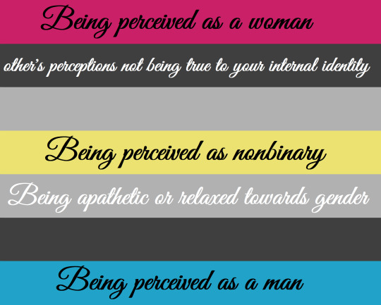

[ID: Two more versions of the flag above with the colors for each stripe labeled, first in a cursive font "Great Vibes", then reguar Arial. The red is for "Being perceived as a woman". The black is for "other's perceptions not being true to your internal identity". The grey is "being apathetic or relaxed towards gender". The yellow is for "being perceived as nonbinary". The blue is for "being perceived as a man". End ID.]
#cis apathetic#pride flag#Queer#LGBT#MOGAI#gender#gender flags#pride flags#cis-apathetic#cisapathetic#cis apathetic flag
5 notes
·
View notes
Text
downloaded a new font for vscode that has like a cursive italic format for comments and its so interesting i didnt think id like it but i kinda do
#i think i need to change my theme though its not vibing w the font#and i better change it before i get too used to it lol
3 notes
·
View notes
Text
Current placeholder for a cover image for my latest fic

Tiger image is from Pixabay and is therefore free use, and the fonts (Gourdie Cursive and IM Fell English SC) are both free use as well.
This cover is going to get used as a placeholder for when the completed story is uploaded as a PDF to my itch page. It will be free to download there, but there will be a tipping option that I sincerely hope you take advantage of.
The placeholder cover will be replaced with a proper cover image when my dear partner @mikk1n has the time & energy to paint one for the project amidst his commissions and personal work. We're still brainstorming what it should look like, though, so don't hold your breath.
#original fiction#monster romance#monster x human#monster lover#historical fiction#historical romance#mlm romance#queer fiction#lgbt fiction#monster boyfriend#weretiger
8 notes
·
View notes
Text
hi!! i was wondering how you made that cool profile thing you did for your invincible oc?? it looks super neat and i’m genuinely really curious bc i wanna do stuff like that meself cause i think it’d be really cool

ahhh thank you so much, and thank you for the submission <33
i use canva!!
i’m generally pretty scared to touch photoshop cause it looks intimidating, but i really like using canva! it’s easy to navigate and use, you can download the app or use its website (although my go-to is definitely the website, i edit on my laptop cause my eyesight needs it)
disclaimer: canva has a canva pro option where you pay so you have access to all templates, pics, and other elements. but good news, even without canva pro, there’s already a lot of free stuff in it.
this post is long-ish so under cut is a breakdown of my process :3
so before i got to make these:

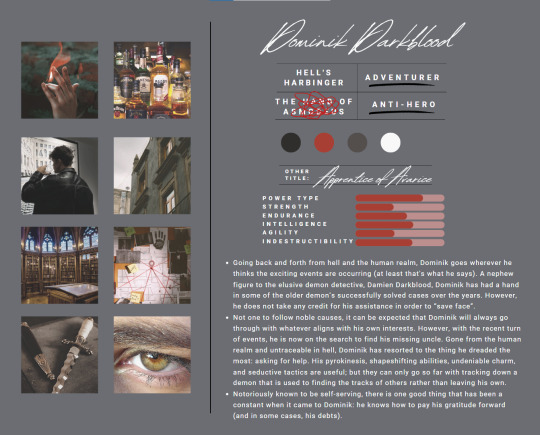
i started out with this as my base/inspiration:
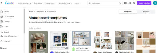
the best thing about canva is that it has tons of templates. if you have something specific in mind you can freestyle it. and if you want inspiration, you can always search it up and canva will offer you tons of pre-made stuff to choose from.
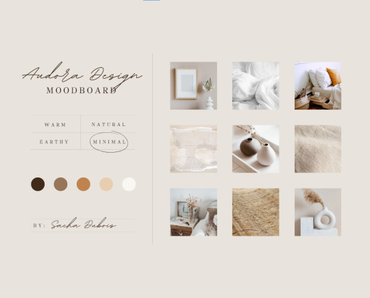
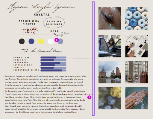
2. i mostly go for minimalistic templates for a clean look, especially if i’ll be including a lot of text in the edit. the size of the audora design moodboard thing earlier is 20x25 cm which was enough space for me, but you can always customize that to any size you need it to be.

^^ for a specific size, click on ‘create a design’ then pick the plus sign that has 'custom size’
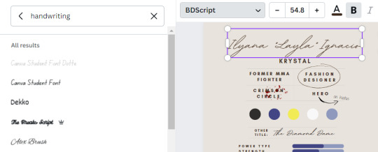
3. i start out with changing the fonts first. since i’m making character profiles, i wanted to incorporate their handwriting. i put 'handwriting’ in the font style search so i can pick styles that resembles it (i love that canva has a lot of aesthetic cursive styles <33)
if you’re not sure on which fonts to use or which combinations look good, there are options under text that you can pick from


and if you have a font you already like but want to modify it, go click on that text and pick 'effects’
the effects work best when the text is bold but it’s still good with unbolded text too. the effects i use the most are shadow and lift (shadow if the background is a solid color and lift if the background is a photo)

4. to add little designs and details (like the blood splatter, circle, arrow, etc.), go to 'elements’. graphics portion is the one i use the most. but if you need photos or moving graphics, canva has those too! i promise they literally have everything
just drag the graphics to where you want to place it and resize it with how big or small you want it to be by pulling on one of those white circles around it.
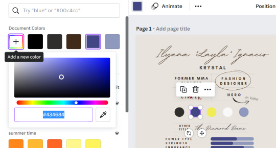
you can also change the colors of some stuff. just pick what you want to change, then the square that shows its color, and click the ’+’ thing - feel free to drag through it if you want to play with a shade or put the hex code
there are a few graphics that have a default color scheme tho, so there’s some stuff that you can’t change the colors
5. now you’ll notice this from time to time (especially when you have a lot of stuff in a page) that when you move text boxes and details, there’s always those pink lines that show up. sometimes they even have certain measures that let you know the distance of certain items from each other
^^ you can ignore them if you’re casually moving stuff but if you want items to be aligned or placed accordingly in the middle or have equal distances from each other, i recommend using it for basis so you don’t get lost (sometimes i get frustrated with using the mouse cause it moves a bit more than i want it so i use the arrow keys)
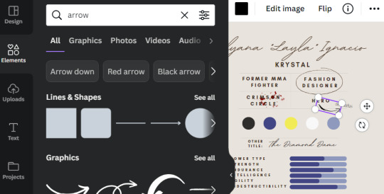
6. after having my texts and details, i move on with the photos. you can simply paste a photo as is, but if you want it to be inside a certain shape, put 'photo holder’ under element’s graphics.
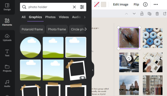
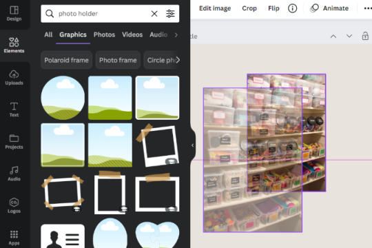
^^ you need to paste your photo on the page first. after pasting your photo, select which photo holder you want. now that both items are on your page, simply drag the photo inside the photo holder and it’ll be inside it (you can always crop the photo before dragging it inside the photo holder if you got to take out specific portions you don’t want to be included)
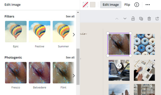
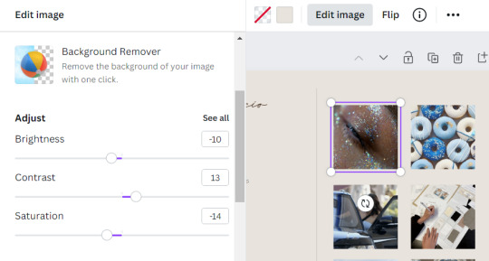
7. canva has multiple features that can help you a change your photos too! just pick the photo you want to alter and then click on 'edit image’
there are filters, a background remover (although sometimes it doesn’t totally take out the whole background but it’s a good 8/10 feature for me), and options for you to adjust brightness, contrast, and saturation
notes:
def take time to check out canva’s walkthrough (is that what it’s called?? i’m not sure haha). i remember that canva showed the ropes on the basic stuff so first time users get a general feel of how stuff works.
check out the labels. i really like canva cause all the tools have its name listed below it so i know exactly what they’re for. and if they’re not written bellow, let your mouse kind of just hover on it and then the label will appear.
there’s no proper arrangement of what to do first and do last. if you wanna focus on the photos first, def go for it. if you wanna type the content before adding any design, add the text first.
when i finished making my first page for my oc’s profile, i roll on from there :3 i use similar font styles and color scheme on the following pages.
have fun!! experiment with styles you see on pre-made templates, take out stuff and slap on things you want, rearrange some things, change the colors. the more you experiment and explore the options, the more you’ll get the hang of canva <33
#i hope this helps and you enjoy editing! im open for dms if you wanna talk about it <33#invincible oc#canva#tutorial#summer askbox#well more on:#summer submissions#this is my first time to make a tutorial-ish thingy so if there's need for clarification feel free to hmu :3#summer.txt
12 notes
·
View notes
Note
Hiii, I was wondering what fonts you used for this gif? It’s totally okay, if you don’t feel comfortable sharing <33
https://www.tumblr.com/yasminkahns/731653793031372800/marina-tsvetaeva-from-poem-of-the-end
yeah of course!! weirdly but thankfully i actually remember what fonts i used (bc i can never remember most of the time) but here they are
gif 1: victoria
gif 2: william narasi
gif 3: afrah
just a side note, i cant find the victoria font download anywhere online. i got it from a font resource post on here like 2 years ago? but i when i look it up i can only find cursive fonts :(
2 notes
·
View notes
Last Seen Blogs
cmxoxoo
x

animechrisgames
Youtuber!

methebellic
MalaysianGuy

teacapq27
Breawashere

displeasinggatesofhell
Solar, She/Her