#css menu hover
Explore tagged Tumblr posts
Text

Navbar Animation with Moving Hover Effect
#codingflicks#html css#frontend#css#html#frontenddevelopment#webdesign#css menu hover#css menu hover effects#html css menu#navbar animation#css3#moving hover animation#navigation menu#navigation bar
14 notes
·
View notes
Text
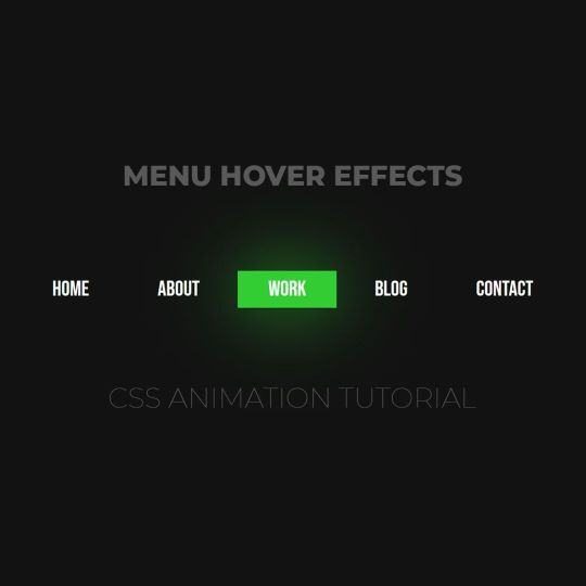
Animated menu hover
#animated menu hover#css menu hover#html css#html5 css3#codenewbies#frontenddevelopment#webdesign#css animation examples#css animation tutorial#pure css animation#css#html css animation#css menu#html css menu
7 notes
·
View notes
Text
CSS Menu Hover Effects
#css menu hover effects#css menu hover#css animation tutorial#html css#frontenddevelopment#code#css#html#css3#divinectorweb#learn to code#css animation examples#navigation menu#webdesign#divinector
0 notes
Text
Clarifying the Relationship Between Popovers and Dialogs
New Post has been published on https://thedigitalinsider.com/clarifying-the-relationship-between-popovers-and-dialogs/
Clarifying the Relationship Between Popovers and Dialogs
The difference between Popovers (i.e., the popover attribute) and Dialogs (i.e., both the <dialog> element and the dialog accessible role) is incredibly confusing — so much that many articles (like this, this, and this) have tried to shed some light on the issue.
If you’re still feeling confused, I hope this one clears up that confusion once and for all.
Distinguishing Popovers From Dialogs
Let’s pull back on the technical implementations and consider the greater picture that makes more sense and puts everything into perspective.
The reason for this categorization comes from a couple of noteworthy points.
First, we know that a popover is content that “pops” up when a user clicks a button (or hovers over it, or focuses on it). In the ARIA world, there is a useful attribute called aria-haspopup that categorizes such popups into five different roles:
menu
listbox
tree
grid
dialog
Strictly speaking, there’s a sixth value, true, that evaluates to menu. I didn’t include it above since it’s effectively just menu.
By virtue of dialog being on this list, we already know that dialog is a type of popover. But there’s more evidence behind this too.
The Three Types of Dialogues
Since we’re already talking about the dialog role, let’s further expand that into its subcategories:
Dialogs can be categorized into three main kinds:
Modal: A dialog with an overlay and focus trapping
Non-Modal: A dialog with neither an overlay nor focus trapping
Alert Dialog: A dialog that alerts screen readers when shown. It can be either modal or non-modal.
This brings us to another reason why a dialog is considered a popover.
Some people may say that popovers are strictly non-modal, but this seems to be a major misunderstanding — because popovers have a ::backdrop pseudo-element on the top layer. The presence of ::backdrop indicates that popovers are modal. Quoting the CSS-Tricks almanac:
The ::backdrop CSS pseudo-element creates a backdrop that covers the entire viewport and is rendered immediately below a <dialog>, an element with the popup attribute, or any element that enters fullscreen mode using the Fullscreen API.
That said, I don’t recommend using the Popover API for modality because it doesn’t have a showModal() method (that <dialog> has) that creates inertness, focus trapping, and other necessary features to make it a real modal. If you only use the Popover API, you’ll need to build those features from scratch.
So, the fact that popovers can be modal means that a dialog is simply one kind of popover.
A Popover Needs an Accessible Role
Popovers need a role to be accessible. Hidde has a great article on selecting the right role, but I’m going to provide some points in this article as well.
To start, you can use one of the aria-haspopup roles mentioned above:
menu
listbox
tree
grid
dialog
You could also use one of the more complex roles like:
treegrid
alertdialog
There are two additional roles that are slightly more contentious but may do just fine.
tooltip
status
To understand why tooltip and status could be valid popover roles, we need to take a detour into the world of tooltips.
A Note on Tooltips
From a visual perspective, a tooltip is a popover because it contains a tiny window that pops up when the tooltip is displayed.
I included tooltip in the mental model because it is reasonable to implement tooltip with the Popover API.
<div popver role="tooltip">...</div>
The tooltip role doesn’t do much in screen readers today so you need to use aria-describedby to create accessible tooltips. But it is still important because it may extend accessibility support for some software.
But, from an accessibility standpoint, tooltips are not popovers. In the accessibility world, tooltips must not contain interactive content. If they contain interactive content, you’re not looking at a tooltip, but a dialog.
You’re thinking of dialogs. Use a dialog.
Heydon Pickering, “Your Tooltips are Bogus”
This is also why aria-haspopup doesn’t include tooltip —aria-haspopup is supposed to signify interactive content but a tooltip must not contain interactive content.
With that, let’s move on to status which is an interesting role that requires some explanation.
Why status?
Tooltips have a pretty complex history in the world of accessible interfaces so there’s a lot of discussion and contention over it.
To keep things short (again), there’s an accessibility issue with tooltips since tooltips should only show on hover. This means screen readers and mobile phone users won’t be able to see those tooltips (since they can’t hover on the interface).
Steve Faulkner created an alternative — toggletips — to fill the gap. In doing so, he explained that toggletip content must be announced by screen readers through live regions.
When initially displayed content is announced by (most) screen readers that support aria-live
Heydon Pickering later added that status can be used in his article on toggletips.
We can supply an empty live region, and populate it with the toggletip “bubble” when it is invoked. This will both make the bubble appear visually and cause the live region to announce the tooltip’s information.
<!-- Code example by Heydon --> <span class="tooltip-container"> <button type="button" aria-label="more info" data-toggletip-content="This clarifies whatever needs clarifying">i</button> <span role="status"> <span class="toggletip-bubble">This clarifies whatever needs clarifying</span> </span> </span>
This is why status can be a potential role for a popover, but you must use discretion when creating it.
That said, I’ve chosen not to include the status role in the Popover mental model because status is a live region role and hence different from the rest.
In Summary
Here’s a quick summary of the mental model:
Popover is an umbrella term for any kind of on-demand popup.
Dialog is one type of popover — a kind that creates a new window (or card) to contain some content.
When you internalize this, it’s not hard to see why the Popover API can be used with the dialog element.
<!-- Uses the popover API. Role needs to be determined manually --> <div popover>...</div> <!-- Dialog with the popover API. Role is dialog --> <dialog popover>...</dialog> <!-- Dialog that doesn't use the popover API. Role is dialog --> <dialog>...</dialog>
When choosing a role for your popover, you can use one of these roles safely.
menu
listbox
tree
grid
treegrid
dialog
alertdialog
The added benefit is most of these roles work together with aria-haspopup which gained decent support in screen readers last year.
Of course, there are a couple more you can use like status and tooltip, but you won’t be able to use them together with aria-haspopup.
Further Reading
#Accessibility#alerts#API#aria#Article#Articles#code#container#content#course#CSS#css-tricks#data#dialog#Difference Between#Explained#explanation#Features#focus#gap#grid#History#hover#it#Light#list#menu#Method#Mobile#mobile phone
0 notes
Text
How I added "instant translation" to the non-english text on my fic: a very easy 3 step guide
Hello!
I recently posted a Wolfstar fanfic called Instance of Happenstance and received a lot of compliments on a small piece of code I used. Both @marigold-hills and @leavesthatarebrown suggested I share how I did it, so here I am, finally explaining it in a Tumblr post!
Before diving into the details, I want to clarify that I didn't write this code myself.
Initially, I tried following this tutorial, but I stumbled upon a better solution in the comments of that post. The code on the tutorial itself does work, but a) it's harder to use and b) it doesn't work as well if you're planing to have multiple paragraphs that you need to show the translation on the same fic.
The solution someone presented on the comments, however, is very simple and easy to use for as many paragraphs as you need, but the explanation there wasn’t too clear, so I decided to expand on it to make it easier for others to implement.
All credit to Ao3 users La_Temperaza (who wrote the orginal post) and Nikkie2571 (who posted this code on the comments).
What Does This Code Do?
This code adds an interactive feature to your fanfic, allowing readers to hover over a specific paragraph (or tap on it if they’re on mobile) to instantly change the text to something else — also set by you.
While this can be used for various purposes, I think it's particularly useful to display instant translations of non-English dialogue/text directly in the story. The code offers a much smoother alternative to the clunky “see end notes for translation” thing—which, let's be honest, can be a pain for readers, especially in long chapters.
For example, in instance of happenstance, Sirius discovers an old journal written entirely in French. I wanted to maintain the sense of mystery and intrigue that would be lost if I simply said the journal was in French, but wrote the text in English.
This solution let me keep the best of both worlds—retaining the authenticity and the immersion of the French, while still making the story easy to follow for the readers.
Now, I know this sounds complicated, but I assure you, it's not!
Down bellow is a quick, 3 steps tutorial on how to do it. I hope this is helpful! (:
(I'm doing this on the computer, if you're doing it on mobile, the layout of the website might be different from my printscreens)
Step 1 - Create The Work Skin
I'm gonna go right to the point here, but if you want to know about Work Skins in detail, I suggest this Ao3 Article.
On your Ao3 Dashboard, click on the fourth link on the sidebar, which is "Skins".
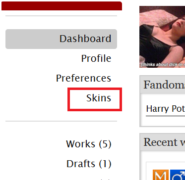
Then, on the page that opens up, click on "My Work Skins"

Then, on the top of the page, select "Create Work Skin"

Now, you'll see the form to create your skin, which looks like this:
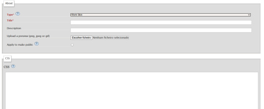
Leave the "Type" as "Work Skin". On the Title, you can give any name you want to your skin, but I suggest you choose the same title as your fic or something like "instant translation", so you'll know what it's about later.
You don't have to worry about any of the other fields, except for the CSS one, where you should copy and paste exactly what I'll put bellow:
#workskin .change_on_hover:not(:hover) .on, #workskin .change_on_hover:hover .off { display: none; }
So, now, you'll have something like this...
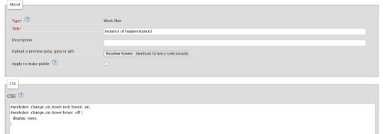
... and you just have to click "save" on the bottom of the page, and this step is done.
Step 2 - Apply the Skin you created to your fic
For a new work, click on "New Work" as usual. If it's a fic you're already posting, you can add this as well, just click the "Edit" button.
Now, on the form of your fic, on the "Associations" tab, right under the menu where you select the language of your fic, you'll see a "select a work skin" option.

On this field, you should select the workskin you just created on the previous step, searching by the name you gave it on the "Title" field.
Step 3 - Insert the text
The code we're gonna use is this one:
<p class="change_on_hover"> <span class="off"> paragraph in foreing language </span> <span class="on"> paragraph in english </span> </p>
If you have no idea what this means, hold my hand, we're gonna get through it together!
First, copy your fic’s text into the AO3 text box as you normally would. Then, switch the text box to HTML mode so you can see the underlying code.

Now, scroll down until you find the paragraph you want to translate. After pasting, it will likely look something like this:

Note how each paragraph in HTML starts with <p> and ends with </p>. These tags indicate where a paragraph begins and ends.
Our goal is to modify that first <p> tag so it tells the browser, “Hey, this paragraph is different from those other ones. It should change when hovered over or clicked.”
To do this, we’ll change <p> to <p class="change_on_hover">. This marks the paragraph as special—one that should switch text when interacted with.

Now note how instead of having a single paragraph, we need two versions of the text:
In blue, the original (non-English) text, which will be shown by default.
In red, the translated (English) text, which will appear when the reader hovers over or clicks on it.
For the original text, wrap it inside a <span class="off"> tag, ending with </span> like this:
<span class="off"> insert here the whole text of the paragraph in the foreign language </span>
For the translated text, wrap it inside a <span class="on"> tag, also ending with </span>. This will replace the original text when hovered over or clicked:
<span class="off"> insert here the whole text of the paragraph in english </span>
And don't forget to end the whole thing again with </p>
Again, here's how it looks on my fic:

With the paragraphs that come before and after the translated text, just leave them as they are. They should still start with <p> and end with </p>. No changes needed!
You can use this method for as many paragraphs as you want, whether in the same chapter or across different chapters. As long as the Work Skin is active, the effect will work seamlessly throughout your fic.
#fanfiction#ao3#ao3 work skins#work skins#translation on text#ao3 fanfic#ao3 coding#tutorial#step by step#fanfic#wolfstar#marauders
69 notes
·
View notes
Text
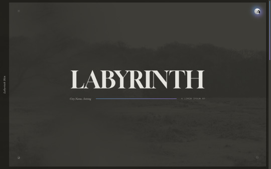
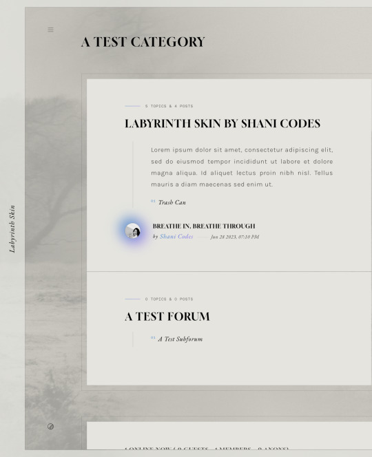

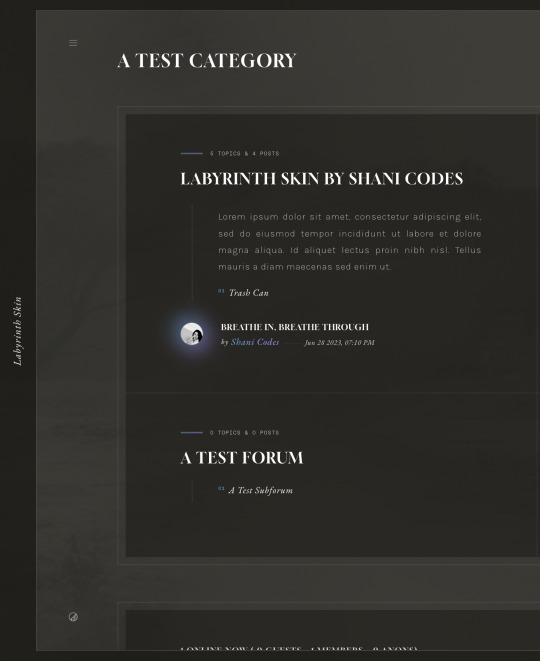
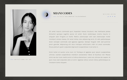
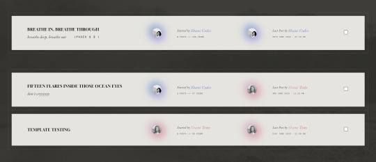
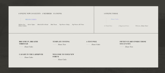
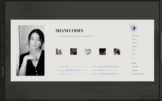
Labyrinth Skin ($65, Unlimited) by Shani Codes
LABYRINTH is a responsive skin for JCINK forums and is optimized for Google Chrome. If you have questions about the skin, or seeing a full preview, feel free to join my support discord: discord[DOT]gg/G9zb4sQxdp
SKIN INCLUDES:
Two pop-ups for Navigation menu and for User Links,
A color mode toggle with three themes: light, medium, and dark modes
Full responsiveness for various screen resolutions, supporting both mobile and smaller screens,
Easy to edit member group variables,
CSS variables for fonts, colors, images, sizes, etc. for easy customization,
Post row with a sticky, hover mini profile,
A tabbed, pop-out main profile ft. attribute sliders, aesthetic images, sections for freestyle and shipper, and automatic thread tracker,
A filterable, searchable, and sortable isotope member list with counts,
And an included installation guide PDF with comprehensive instructions.
NOTES:
A low-contrast, bright background image is recommended to match all three color modes.
Accents can easily be switched from gradients to solid colors.
PURCHASE LINK: ko-fi[DOT]com/s/b164fd2264
#jcink skin#jcink skins#jcink skins for sale#jcink codes#jcink code#really excited about this one! it's my most customizable skin yet!!!#for sale
98 notes
·
View notes
Note
hi so i was playing around with my codes and the link color does not work ? the hover , active , and visited does but the actual link itself will not change the color or text decoration. also wayfarer works pretty well on mobile nested nicely on screen. what code did you use because the code i am using makes it all squished thanks !
The CSS for the hover is separate from the CSS for the link.
Here's the CSS from the default Sugarcube UI. The element a (anchor, which creates links) controls your link styling. a:hover controls the styling for when the cursor hovers over it. a[disabled] controls a disabled/visited link. You can see how they have different colours and text decorations.
a { cursor: pointer; color: #68d; text-decoration: none; transition-duration: 200ms; } a:hover { color: #8af; text-decoration: underline; }
a[disabled], span.link-disabled { color: #aaa; cursor: not-allowed !important; text-decoration: none; }
Making your game responsive isn't a one-size fits all scenario. It depends on the dimensions of your UI and a number of other unique factors. You can use media queries to change what your game looks like on different viewport sizes.
If you open your game in a browser, right click and hit Inspect, you can test what it looks like with different resolutions. Switch it to mobile mode and there will be a dropdown menu with the dimensions for different common phones and tablets.

You can switch through them to see how your media queries are working with each size; usually you will have to fiddle with things to get it to fit right.
10 notes
·
View notes
Text
How to Create Mobile-Friendly Websites with Responsive Design
In today’s digital era, where mobile devices dominate web traffic, creating mobile-friendly websites has become more important than ever. As users increasingly access the internet through smartphones and tablets, businesses must ensure their websites are optimized for a seamless mobile experience. This is where responsive design comes into play. At Nividaweb, a leading responsive web design agency in Vadodara, we specialize in crafting websites that look and perform flawlessly on any device.
Here is a comprehensive guide on how to create mobile-friendly websites with responsive design:
What is Responsive Design?
Responsive web design is a design approach that ensures a website's layout and content adapt dynamically to different screen sizes and resolutions. Whether your users are browsing on a desktop, tablet, or smartphone, a responsive website delivers a consistent and user-friendly experience. This adaptability is essential for improving user engagement, reducing bounce rates, and enhancing overall website performance.
Why Responsive Design Matters?
Before diving into the how-to, let us understand why responsive design is crucial:
Improved User Experience: A responsive website ensures that users can navigate and interact with your site effortlessly, regardless of their device.
Higher Search Engine Rankings: Search engines like Google prioritize mobile-friendly websites in their rankings, making responsive design a key factor in SEO.
Increased Conversion Rates: With a user-friendly interface, responsive websites encourage visitors to stay longer and take action, boosting conversions.
Cost-Effective Maintenance: Instead of maintaining separate websites for desktop and mobile users, a responsive design simplifies updates and reduces costs.
Steps to Create a Mobile-Friendly Website with Responsive Design
1. Start with a Mobile-First Approach
The mobile-first approach involves designing the website for smaller screens first and then scaling up for larger devices. This method ensures that the core elements are optimized for mobile users. A responsive web design company in Vadodara like Nividaweb emphasizes this approach to ensure a seamless user experience on all devices.
2. Use a Flexible Grid Layout
A flexible grid layout is the foundation of responsive design. It allows website elements to adjust proportionally based on the screen size. Instead of fixed-width layouts, use percentages and relative units like ems or rems to define dimensions. This ensures that your website adapts smoothly to different screen resolutions.
3. Optimize Images and Media
Large images and media files can slow down your website, especially on mobile devices. To enhance performance:
Use responsive images that scale according to screen size.
Implement modern image formats like WebP for better compression.
Use CSS media queries to serve appropriate image sizes based on the user’s device.
At Nividaweb, a trusted responsive website design company in Gujarat, we leverage advanced tools to optimize images and improve loading times.
4. Implement CSS Media Queries
CSS media queries are essential for responsive design. They enable you to apply specific styles based on the device’s characteristics, such as screen width, height, or resolution.
5. Prioritize Touch-Friendly Navigation
Mobile users interact with websites using touch gestures, so it is essential to design navigation that is easy to use. Key considerations include:
Larger buttons and clickable areas.
Simplified menus with collapsible options for smaller screens.
Avoiding hover-dependent features, as they do not work well on touch devices.
6. Test on Multiple Devices and Browsers
Testing is a critical step in creating a mobile-friendly website. Use tools like Google’s Mobile-Friendly Test and browser developer tools to simulate various devices and screen sizes. Additionally, test your website on physical devices to identify and resolve any usability issues.
7. Ensure Fast Loading Times
Mobile users expect websites to load quickly. A slow-loading site can lead to higher bounce rates and lost opportunities. To optimize loading times:
Minimize HTTP requests by combining CSS and JavaScript files.
Enable browser caching and compression.
Use a Content Delivery Network (CDN) to deliver content faster.
As a responsive web design company in Vadodara, Nividaweb employs performance optimization techniques to ensure your website loads swiftly across all devices.
8. Leverage Responsive Typography
Typography plays a crucial role in readability and user experience. Use scalable fonts that adapt to screen sizes and maintain legibility on smaller devices. Tools like CSS’s viewport units (e.g., vw, vh) can help create fluid typography that adjusts dynamically.
9. Incorporate Mobile-Friendly Features
Enhance your website's usability by integrating features tailored for mobile users:
Click-to-call buttons for quick communication.
Location-based services like maps.
Fast and secure payment options for e-commerce websites.
10. Work with Experts in Responsive Design
Creating a truly responsive and mobile-friendly website requires expertise and experience. Partnering with a reputable responsive web design agency in Vadodara, like Nividaweb, ensures that your website meets the highest standards of design and functionality.
Why Choose Nividaweb for Responsive Website Design
Nividaweb is a leading responsive website design company in Gujarat, dedicated to transforming your online presence. Here is why businesses trust us:
Tailored Solutions: We understand that every business is unique. Our team works closely with clients to deliver customized designs that align with their brand identity and goals.
Cutting-Edge Technologies: We stay ahead of industry trends and utilize the latest tools and techniques to create responsive websites.
Experienced Team: Our skilled designers and developers have extensive experience in crafting mobile-friendly websites across diverse industries.
End-to-End Services: From design and development to testing and optimization, we provide comprehensive solutions for all your web design needs.
The Future of Mobile-Friendly Websites
As technology evolves, so do user expectations. Emerging trends like voice search, augmented reality, and progressive web apps are reshaping the way users interact with websites. At Nividaweb, we are committed to staying at the forefront of these developments, ensuring our clients remain ahead of the curve.
Conclusion
Creating a mobile-friendly website with responsive design is no longer optional; it is a necessity. By following the steps outlined in this guide and partnering with a reliable responsive web design agency in Vadodara, you can create a website that delivers exceptional user experiences, drives engagement, and boosts conversions.
Ready to take your website to the next level? Contact Nividaweb, the trusted responsive website design company in Gujarat, and let us help you create a website that stands out in today’s competitive digital landscape.
#Responsive web design agency in Vadodara#Responsive web design company in Vadodara#Gujarat#Responsive website design company in Gujarat#Vadodara#Website design and development company in Gujarat#India#Web design and development agency in Gujarat#Website design and development company in Vadodara#eCommerce web design in Vadodara#eCommerce website developer in Gujarat#eCommerce website developer in Vadodara#Best web design agencies in Vadodara#Web design company in Vadodara#Best website design company in Vadodara
5 notes
·
View notes
Note
hi!!! i love for custom blog theme,, do you have a link to the code or creator 0:?
ya!
so my theme is actually a heavily modified version of redux edit #1 by lopezhummel (current url: holyaura). i always remind users that most tumblr themes are old and that you'll need to replace all instances of "http://" in the code with "https://" so tumblr will save the theme. i had to do it with this one
these are the modifications i made to the theme. i edited this theme over the course of at least a year or so and don't quite recall how i did all of these things. but to the best of my ability:
i moved the "left side img" to the right side of the screen. i also made this element "responsive" so the image will never get cropped when you resize your screen. this was a bitch and a half to figure out and i truthfully do not remember how i did it
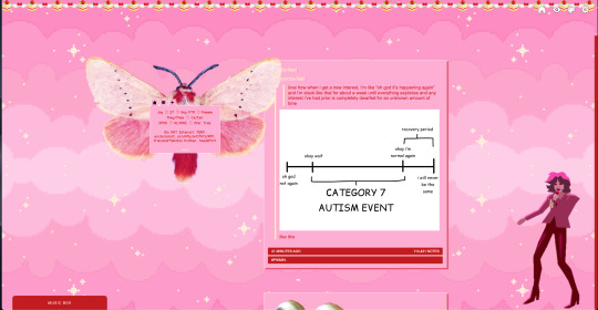
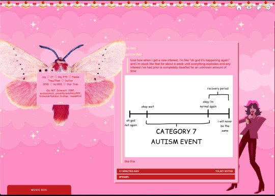
i deleted the text in the drop-down navigation so it appears as a little line that is otherwise not noticeable. this type of theme, the "redux edit," used to be very popular because having a drop-down menu let you cram a bunch of links that lead to sub-pages on your blog. i've done away with my sub-pages, but i still like the format of the "redux style" tumblr theme, for its minimal UI and for its customization options.
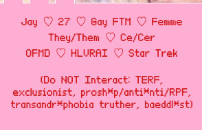
i separated my mobile description from my web description for formatting reasons. basically, most elements in tumblr themes are connected to specific text fields and toggles. i simply went to the section that was connected to my blog description and deleted it. the web description has to be manually typed inside of the CSS/HTML editor when i want to change it. whereas my mobile description is whatever i type in the "description" box of the normal tumblr theme editors.
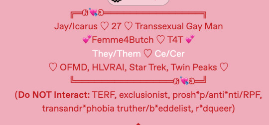
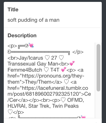

i added code someone else made ("NoPo" by drannex42 on GitHub) which allows you to hide posts with certain tags on them. i did this to hide my pinned post, as it looks bad on desktop.
i replaced the tiny pagination arrows at the bottom with images that literally say "next" and "back" because the arrows were far too small/illegible. i know they aren't centered in the container i'm not sure how to fix that lol

i added a cursor

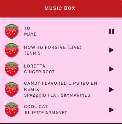
i installed a working music box ("music player #3" by glenthemes), and then added music by uploading MP3 files to discord and then using the links of those files as the audio sources. iirc i also had to make this element responsive and i aligned it so it would sit on the left side of my screen. i made the "album art" for each one the same strawberry pixel art
the moth is just a PNG i added and then moved around so it was behind my sidebar using the options that came pre-packaged with the theme
if you want something like the strawberry shortcake decoration at the top (called "banner" in the theme) your best bet is to google "pixel divider"
theme didn't support favicon so i added that in so i could have a little heart

ALSO:
this theme is. really weird about backgrounds. any background that i have ever set for it, i've had to do weird shit in photoshop. like making the background HUGE, mirroring it, etc. - because it would crop the image weird, or there would be a gap where there was no image. idk man, it's haunted. i'm sure there's a way to fix this but i am NOT tech savvy enough. anyway, patterns are probably your best friend. and if you DO want something that isn't a pattern, it's going to take a lot of trial and error. but i love this theme so i deal with it 😭
the sidebar image and the floating image do not scale. if your image is 1000 pixels, it will display at 1000 pixels. you'll either have to edit the code so that the theme scales the image for you, or resize any images before you add them
my white whale of theme editing (aside from the Weird Background thing) is that i cannot get infinite scrolling to work. i have tried every code out there. all of them break my theme. it makes me sad because like. i have music there for a reason. the idea is that people would listen to it while they scroll. unfortunately, the way it's set up now, the music will stop every time someone clicks "next" or "back" 💀
anyway sorry for rambling but i hope you enjoy the the theme and customizing it in the way that you want to!
22 notes
·
View notes
Note
Anon so this doesn't come from my main but it's nsfruitw- I LOVE YOUR BLOG CODING OMG??? THE WORKING BUTTONS AND MOVING WINDOWS ARE SO AWESOME???? I'm so excited for Dee's ask blog!!!
<OOC:>
Ahhhhhh!!! thank you!!! I had three different potential blogs.. but a lot of them didn't really met my wishes/criteria.
Which in case you're interested were:
Windows 98 look
Search bar
Visible tags
One Column
Separate Window for your Profile Info with a picture. (maybe separate icons or a lil menu for links)
No endless scrolling/seperate pages
I will put everything else under the cut since the post became quite long haha
This was one of the first themes I tried out (tbh I kinda jumped between all of them, trying stuff out)
I loveeee the start bar on this one, the icons and that it can be one or two columns. But it has no search bar and I didn't like that the profile section is super small, has no picture and couldn't be swapped to the left instead of the right side. I'm not confident enough in my html/css skills to competently yoink that start bar and transplant it into a different theme
Pros VS Cons: + animated start-bar (with accurate time in the corner) + one column (or two columns) + Windows 98 look + functional corner buttons + icons + custom background picture - no search bar - tiny info profile window, no picture (can't be moved to the left side) - endless scrolling - no visible tags

I prefer this theme for the most part over the previous one.. even if i loveee the functional startbar feature there! Its practically perfect. it can be one or two columns (i prefer one column blog layouts personally) You can add a lil picture in the profile section, its on the left side and you have a search bar!
I also looooveee that the post windows look extremely accurate and that the tags are always visible. (< another thing thats often kinda hidden in themes, so i tend to forget about it) Also the lil corner buttons can actually be used to like or reblog the post! what a highlight<3. my only issue was that i couldnt add a background picture.. and i kinda liked the idea of having separate icons for obvious links like I do now.
Pros VS Cons: + Windows 98 look + functional corner buttons + one column (or two columns + No endless scrolling (page by page) + Left side Info Window with picture and links + Visible tags
- no custom background picture

Another theme that I tried out is this one
They made the same theme I ended up using. It has a built in music player (that wont auto run!) a profile section + picture, customizable icons and background. But the biggest thing for me is that it doesn't have a search bar and I really need/want searchbars in my themes.
It's a really solid theme! It just fell a lil short for what I wanted to have
Pros VS Cons: + Windows 98 look + one column + No endless scrolling (page by page) + Left side Info Window with picture and links + Visible tags + music player (bonus) + custom icons and custom background picture + custom lil link window
- no searchbar (my biggest issue with a lot of themes haha)

Okay so last is the theme I ended up using which is this one:
It's very similar to the previous theme (Nostalgia 98) and was made by the same person. I edited the code a lil to have the tags be visible instead of needing to hover and to add another icon for links. It works but it’s also the only icon that isn’t draggable haha
Pros VS Cons: + Windows 98 look + one column + No endless scrolling (page by page) + Left side Info Window with picture and links + custom icons and custom background picture + custom icons for custom links
- no visible tags (I edited the code a lil so they're permanently visible)
5 notes
·
View notes
Text
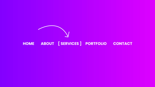
CSS Menu Hover Animation
#css menu hover effects#css menu hover animation#css menu hover#html css#frontend#css#html#frontenddevelopment#webdesign#css3#html css menu#css menu#css animation tutorial#css animation examples
9 notes
·
View notes
Text
Creative CSS Menu Hover
#css menu hover#pure css animation#css animation tutorial#css animations#html css#codenewbies#pure css tutorial
1 note
·
View note
Text
CSS Creative Menu Hover Effects
#css menu hover effects#css menu hover#html css menu#pure css animation#css animation examples#css animation#learn to code#code#html css#frontenddevelopment#css#css3#html#divinectorweb#navigation menu css#css navbar#navbar
1 note
·
View note
Text
Mastering the Art of CSS Translate Property
Do you want to elevate your CSS skills? 🌟 💡 Ever wondered how to create stunning web animations and smooth transitions? Check out our latest blog post: Mastering the Art of CSS Translate Property: A Comprehensive Guide with 7 Examples In this guide, you will learn all about the CSS Translate property and how it works, along with key insights on the Transform property. Discover 7 hands-on examples, including how to create sliding menus, animated flip cards, stylish draggable elements, centered image galleries with hover effects, smooth and responsive modals, expanding search bars, and dynamic search bars. Don't miss out on these powerful techniques to enhance your web projects! 🚀 Read the full guide now and start creating amazing CSS animations today! 👇
#WebDesign#CSS#FrontendDevelopment#WebDevelopment#CSS3#Programming#WebDev#Animation#UXDesign#JavaScript#skillivo#skillivoBlogs $hashtag#slidingMenus#animatedFlipCards#CSSmodals
3 notes
·
View notes
Text
Solutions for web designers out there
( All animations and movement on a page should be considered for photo-sensitivity including motion sickness and vertigo. )
For animated .GIF image files:
Create a .JPG or .PNG still image version of the animations from their most important or appealing frame. That should be loaded into the HTML first instead of the .GIF.
And before we go into the optimal JavaScript interaction, let’s stick with the HTML a little more...
If you have images that are not already hyperlinked, you can instead make them link to their animated GIF version to open in a new tab (target=“_blank”). Be sure to have appropriate warnings about those links leading to the animated version of that image, right before/above the image itself for those who may be going through the page in order with some accessibility devices. (Thus, they read the warning before they interact with the link.)
Then, from there, we do the script side for this. You can store the different image file paths into your JavaScript and use mouseover/mouseout events to change the file path inside your src=“” attribute. (Here’s how you can dynamically and efficiently do this for many images and give them their own Event Listener: My JSFiddle Example.)
EDIT: I've updated the example to have a 1-second delay for the images to change into animations in case someone accidentally has their mouse over the image after the page loads in. It'll be best to also make hover/active animations optional, which will tie into the JavaScript needed to achieve the hover/active functions to begin with.
Also added a few more in-code comments for extra instruction and clarity.

Another idea with JavaScript is to have a “toggle” sort of <button> on your page that someone can click/confirm whether or not everything on a page should animate/move or not. If you’re nicely familiar with JavaScript, you can make a more in-depth options menu for this sort of thing too!

This is also a great solution since there are web users who look at webpages either in a simplified view or blocking all scripts (like JavaScript) from your website. They could be viewing your website like this due to personal needs, or technological limitations. And so, having a still image in your HTML by default is MUCH preferred!
For CSS @ keyframe animations:
In the raw CSS file, the default value for the animation-play-state property should be paused. We have to keep simplified view users and script-blocking users in mind for moving objects and images on our webpages. So, whatever is loaded in by default must maintain this priority.
Thankfully, sticking with the CSS, we can just as easily changed the animation-play-state to running when the element is hovered (for mouse users) or active (for touch-screen users).
For sprite sheet animations:
If you’ve figured out how to make sprite animations on a web doc, then you’re already involved in the JavaScript for it and familiar with the code. Or, you're doing it the pure CSS way (see here). In which you can refer back to the @ keyframe section above.
So, here’s a general guideline that you can follow in JavaScript!
The sprite sheet element in your CSS should focus on your most important frame that you want to be seen by users on the default page appearance. Set its background-position to that frame inside the CSS.
For users who can load JavaScript on the page, set that element to toggle its animation by mouseover/mouseout or clicking.
For users who cannot load the JavaScript, the next best thing is to build the sprite animation from CSS keyframe steps().
And for most absolute safe case scenario in case of browser or device compatibility issues with any of these properties in the CSS, you could make an animated .GIF file of your sprite sheet. Make sure it's under 1Mb for users in this category who are also likely to be viewing your page from slow download speeds. With that, refer back to the section for handling image files without JavaScript.
Hopefully this is of great help, if not a starting point for accessibility ideas and considerations for your websites!
pleeeeeeeease indie web and scenecore and whatever other subcultures.... have fun and be cringe but PLEASE be careful with your blinkies. if your website has flashing lights that are on by default or that can't be turned off, then it is inaccessible to photosensitive people. if your post has flashing lights, it needs to be tagged. PLEASE. i love indie web stuff but the prevalence of unavoidable flashing lights makes me really anxious!! people have migraines and seizures! please use tags like "flashing lights" and "eye strain," NOT "epilepsy" or "epilepsy warning," and please consider making your site accessible by removing flashing lights or making them avoidable. PLEASE. make the web usable for photosensitive people.
#web design#web development#retro internet#old internet#neocities#accessibility#a11y#wk speaks#wk replies#reference#resources#guides#important#epilepsy support#disability awareness#internet safety#photosensitivity#old web#html#css#javascript
5K notes
·
View notes
Text
How to Make Your ASP NET Website Work Smoothly on Mobile Devices
Turning your ASP NET website into a mobile-friendly platform starts with designing a layout that can flex and adapt to different screen sizes. One of the smartest moves is to use a responsive front-end framework like Bootstrap, Tailwind CSS, or Foundation. These tools come with built-in grids and mobile-first design features that help your website look great and function well across desktops, tablets, and smartphones.
Don’t forget the small but essential stuff—like adding a viewport meta tag in your HTML <head>. This tag helps the browser adjust the page’s width and scale according to the device, so users don’t need to zoom or scroll sideways. Without it, even a responsive layout might display incorrectly on smaller screens.
When designing for mobile, keeping things simple is key. Make sure buttons are big enough to tap comfortably, skip hover-based features that won’t work on touchscreens, and use a clean menu style—like a hamburger menu—for easier navigation on compact screens.
To fine-tune how your site looks on different devices, CSS media queries come in handy. They let you tweak your styles depending on the screen’s size, ensuring your content stays readable and well-organized whether it's viewed on a phone or a laptop.
Testing your site across a variety of screen sizes is just as important as building it. Use browser dev tools to preview how things appear on mobile, or go further with device-testing services like BrowserStack to spot issues on real phones and tablets.
If you’re still using an older version of ASP NET, it might be time to upgrade to ASP NET Core. It runs faster, works across platforms, and plays nicely with modern front-end tools—making it a great match for mobile web development.
Speed matters a lot on mobile. To keep your site fast, minimize the size of your CSS and JavaScript files, compress images, use caching wisely, and load static files from CDNs. This not only shortens load times but also improves the overall experience, especially for users on slower mobile networks.
Think beyond design and performance—add touch-friendly features too. Tools like Hammer.js can bring in swipe gestures, and FastClick.js helps reduce touch input delays on older devices. These small upgrades make your site feel more polished and responsive to real users.
Making your ASP NET site mobile-compatible doesn’t have to be complicated. Focus on clean design, smart navigation, fast loading, and thorough testing. Whether you’re starting fresh or updating an existing site, these steps can help you create a better experience for every visitor—no matter what screen they’re using.
1 note
·
View note