#navbar animation
Explore tagged Tumblr posts
Text

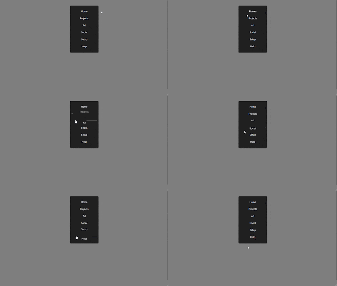
Navbar Animation with Moving Hover Effect
#codingflicks#html css#frontend#css#html#frontenddevelopment#webdesign#css menu hover#css menu hover effects#html css menu#navbar animation#css3#moving hover animation#navigation menu#navigation bar
13 notes
·
View notes
Photo
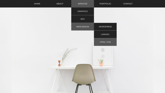
Animated Dropdown menu Check out Divinector YouTube Channel For more
#css menu#html css dropdown menu#drop down menu css#css dropdown menu#css dropdown#html css#css animation examples#css animations#pure css animation#html5 css3#dropdown navbar#divinector#learn to code#code
2 notes
·
View notes
Note
ur website is awesome where did you learn html and css!! ive been looking for months now but i cant find any starting points i can easily understand
Thank you! I kind of mostly used to do Neopets template junk in 2007 and had some extremely basic and outdated HTML knowledge until recently LOL (As in that my knowledge was basically knowing that <i> made your text italic and if I typed color="blue" it would change the color of the text haha)
But yeah, I'm basically self-taught! One of the courses I did in the past did have a few Web Design classes, but I had a really hard time understanding any of it and my grades were awful, so I hardly count that as having contributed anything to my knowledge x) (We were forced to make the most bland minimalistic corporate websites so the lack of fun in that definitely contributed hahaha)
I guess starting out really depends on what you're personally comfortable with? The way I personally started was that I used one of those Free Website Makers like Wix/Weebly/etc to try and "sketch" my website! I had this old unused !Weebly portfolio website I wasn't doing anything with, so I used that
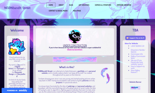
W3Schools is the MVP for this stuff since it has basically everything you can learn about HTML/CSS/etc! For my Website I remember first starting by trying to create the navbar, looking at the Weebly mockup and trying to mentally deconstruct it all into boxes to try and understand how I could recreate it with my own code!
(The reason my navbar looks so different from the screenshot was because I had a really hard time recreating it xD And I ended up with something a lot more basic to match my skillset!)
Something that always worked for me was using templates and just trial and error my way into trying to understand what did what x)
Considering my website has the three-column format, I do recall using SadGrl's Layout Maker code as a reference for my own!
And I guess that's advice I can give?? Finding websites you like, or if you're wondering how someone did something, how their font has weird colours, what animations they're using, etc etc, just go look into their source code, or use the Inspect Tool (F12) and select elements to try and understand the code!
I do sometimes hide goofy hidden text and easter eggs in my source codes, so I'm personally cool with people looking through mine to understand how I did things :)
I definitely relate to this all being overwhelming or confusing at the start, so I'd say just take it slow and make things fun for yourself! I used weird fonts and bright colours when trying to see what does what, use dumb placeholder texts and images too LMAO
Another thing that helped was that I found gifs and images I liked to place on the website and try to make it feel all the more personal and cozy!
Again this is just my personal experience and what I did to make the learning experience more enjoyable :)
#Jay Asks#Anonymous#Neocities Tag#Sorry for the long ramble!#People don't tend to be very receptive to my methods when I share how I do things x) So take it with a grain of salt#I'm very adamant over the Doing what works best for you logic
19 notes
·
View notes
Text
website update blog #12 (May 22nd, 2022)
hello! i'm back with some actual changes to the site now!
i apologize if the last website update blog was like...
hold on lemme check my tumblr-
wait a minute...

ALMOST 1 MONTH???
damn. well, i got some changes to show yall anyway sooo lets start!
last time i discussed my website, i told yall that i will remake the whole thing over, and THAT, is going to be my main focus.
so i moved the old files to a new folder called /legacy and made a new html file and css file.
i then thought of how im going to go about organizing this thing. i thought about it for an absurdly long time, and then i had an idea.
what if we organized it as such where the style of an html element can be changed just by using the "class" attribute?
its hard to explain so ill just show you what im talking about: (if you dont want to read this part just scroll down until you see the word SKIP HERE!)
ill give you a div element:
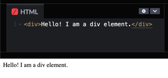
but i want to change how it looks, since its just bland text on the preview shown.
that's where these classes come in!

these classes are basically just there to change how any html's look! (with the help of the class attribute)
turning the div into a black rectangle with a shadow
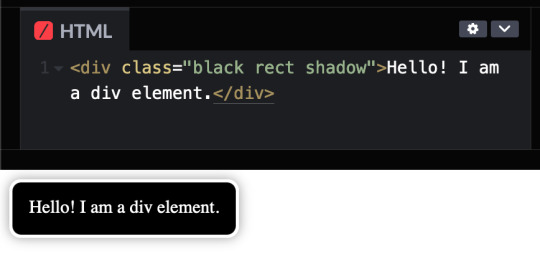
turning the div into a white rectangle with shadow
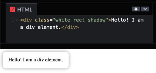
turning a div into a white rectangle (no shadow needed (although it looks like the rectangle isnt there anymore, but trust me, it still does)
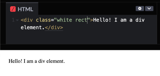
and more! you can do a whole lot with these combinations, and theres even more classes i havent told you yet, like the button and flex classes, but to put it simply, button adds a transition where the rectangle changes color from white to black and and animation that makes the rectangle slightly go up and flex is to arrange the rectangles in rows and columns.
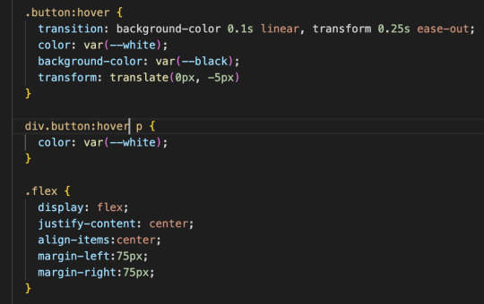
SKIP HERE!
anyway back to the website...
this was the breakthrough idea that made recreating the website SO MUCH EASIER.
aaand after only 10 days, i finally finished!


i will now explain the changes i have made with the website (compared to my website before i recreated it)! it should be obvious but i will do it anyway.
- i added a github button!

this button serves two purposes:
its a button to redirect you to the github repository of the website!
its to get the /section buttons to actually look like they are centered. the main problem of the old navbar was that it did not look centered AT ALL, so i couldnt really center the thing without looking off and weird...

and now, with the github button, everything looks decent!

- changed the footer to look like a simple (rounded) rectangle at the bottom of the page.

this was to "solve" the problem which i had with the footer thingy which was that:
if i wanted the footer to fix on the bottom of the textbox,

but when i zoom out theres so much visibe dead space at the bottom.

and another thing, if i want the footer to stay at the bottom of the screen, it doesnt look like theres dead space, buttttt

the damn footer takes up 10% of the total screen space

so i had an idea...
what if we just contain it in a small rectangle instead of looking like the navbar?
it clearly does not solve the dead space at the bottom problem, but atleast it looks nicer than before and it doesnt look like the navbar anymore :D

oh and also
- I FINALLY FINISHED THE SLOOSHI PHOTO IN THE SIDE OF THE TEXTBOX AFTER LIKE 1 MONTH
YOU CAN SEE THE CHARACTER ON THE IMAGE I JUST SHOWED YOU IF YOU HAVENT NOTICED YET
THIS SHIT TOOK ME SO LONG TO ADD ARMATURES AND POSES AND I FINALLY FINISHED ITHBHRDJ FNJKCKXLM<
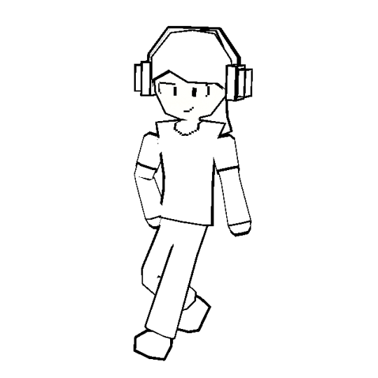
i just hope yall like it :>
aaaaaaand thats all that i have changed while recreating the thingy!!!
now the new stuff (theres only one):
- I added a new section on my website called sushiwt/lite!
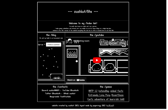
based on @pagerorgy's sc36.net (and by based i mean i downloaded the html file of the website and edited it), this WAS a temporary home while i was remaking it, but now its just a place where you can see EVERYTHING the site has to offer (in only 1 table)!
i apologize of the fact that this blog is so long, so heres a tl;dr
i remade the website with a convenient way to change the look of an element
i changed the footer's look, added big slooshi, and
added sushiwt/lite, everything in my site in one table
ok goobai :D
- sushiwt <3
7 notes
·
View notes
Video
youtube
How To Create Animated Navbar With Menu Hover Animation Effects Using HT...
1 note
·
View note
Text
MP - Webflow Integration (LO2)
I tried to do it all on Webflow but everything was static, I also needed to create more pages for the static site so I decided to do it on Spline first to allow me to animate it all. Thus, I will complete it all on Spline and then input into Webflow for the navbar.
0 notes
Text
3D Tablet Pill Mockup - 10 Animated Templates
STEP 1: Open the /PSD/Design by Dirtybarn.psd file. Add your design according to the template. If your design is not black and white, make it black and white. We will add this design as a bump to our 3D asset. Black areas will be deeper, while areas closer to white will be less deep. You can prepare accordingly. Note: You will see noise in the background in the work file. This noise is added to give the dotted structure of the pill. If you want to reduce it, you can reduce the opacity of these dots. Overwrite the design you made (SAVE AS->SAVE FOR WEB) on the BLENDERtexturespill.009.png image. STEP 2: At this stage, we will use Blender but only for rendering. So you will not need to know Blender at all. 1.First of all, we download Blender 3.3. https://www.blender.org/download/lts/3-3/ 2.After installing, we look at the ID of the template we like in the folder named BLENDER and double-click on the appropriate Blender file. 3.Click on the button on the right and select OUTPUT to choose which path our video will take.

4.From the top navbar, under the RENDER tab, click on RENDER ANIMATION.

Read the full article
0 notes
Text
100+ Navigation Bar HTML and CSS (Free Demo +Source Code)
Navigation Bar Using HTML and CSS
Hello Developers! Welcome to Codewithrandom with another informative blog. Today we’ll see how to make a Navigation Bar with Source Code. Here is the Latest Collection of free Navigation Bar codes in HTML and CSS. This is the Updated Collection of April 2023 with 36 New Navbar Source codes added.
What is a navigation bar?
A Navigation bar or a side menu is an integral part of any website, used for quick navigation links, a search bar, login/signup links, company logos, etc. Without a Navbar, any website looks incomplete.
Here we’ll show you how to create a Simple Navigation Bar In HTML and CSS with 100+ examples.
Related article — 100+ HTML, CSS, and JavaScript Projects With Source Code ( Beginners to Advanced)
Restaurant Website Using HTML And CSS With Source Code
Let’s see some cool Navigation bars in HTML and CSS.
1. Responsive Side Navigation Bar
Let’s start our list with a simple, light-themed left-sided navigation bar. Only navigation bar icons are visible on load but on clicking the hamburger icon side bar expands.
2. Bootstrap Navigation Bar
Simple and responsive navigation bar. This one is on top with several different categories and also a search bar. Additionally, it also has a login and signup button.
How To Build Interest Calculator Using JavaScript
3. Transparent Navigation
This is a very well made Navigation bar by Manas Yadav, when you click a navigation bar button it auto scrolls to its location on the page. Can be used for homepages.
4. Sticky Slider Navigation (Responsive)
Another navigation bar auto-scrolls but this one is even better with more satisfying animations and design.
5. Navigation bar design
A navigation bar with a gradient in its background with a cool gradient and blinking effect on hover.
That’s it, folks. In this article, we shared the Navigation Bar In HTML And CSS Source Code with cool and different designs. We covered everything from simple and minimal Navigation bars to bars with auto scrolls, cool transitions, and even 3D icons. Hope you liked this article. Share this with your fellow developers. Comment down below with your thoughts and suggestions
See our other articles on Codewithrandom and gain knowledge in Front-End Development.
Thank you
read full article and get complete source code
1 note
·
View note
Text
Novedades Novedosas
¡Hola! A partir de Enero abriré comisiones de Skins. Vale, me explayaré un poco más. El skin que estoy trabajando, que base con los gráficos del RE2R, será de uso libre y con posibilidad de si, alguien se anima, edición de quien lo tome mientras me deje los créditos correspondientes. Terminado este skin pretendo hacer un nuevo skin basado en la temática de Good Omens para venta compartida. Dicho esto, pasaré a explicar lo que quizás interese o no. El skin compartido tendrá este y todos sus subsiguientes un valor de 15 dólares (inlcuirá un par de tablillas random para uso); como es de esperarse, el valor es medianamente bajo, pero sin perder de vista el trabajo empleado en dicho. Por otro lado, los skins "personalizados" saldrán 20 dólares, a modo simple de sumatoria parece una diferencia mínima pero que sé, que poniéndolo en modo realista, es realmente una gran diferencia de dinero para los consumidores. Los detalles de las modalidades y como se harán lo subiré en cuando lo tenga pero este es el precio por un skin simple:
Header, tablón (insertado en la cabecera o no), navbar, un formato de foro (adaptable o no), leyenda. Interno de temas, interno de post. Perfil simple (nada de tabs y cosas que te vuelan la cabeza), lista de usuarios, lista de grupos. Y como regalo, tres tablillas random a mi elección presuntamente útiles.
La modalidad será entregar todos makeups de como podría verse el skin, de cada parte en cuestión y una vez que sea todo aceptado por el comprador, se comenzará a pasar a código, con pequeñas modificaciones necesarias en caso de requerirse o bueno, pensarse; pero la idea es que ya tengamos todo lo fino hilado antes de comenzar. Mas o menos eso. Sí.
Para quienes preguntaban por el skin de la librería, publicado al comienzo del trato, intentaré terminarlo si es que me nace la posibilidad y ponerlo en venta compartida. No puedo prometer nada, pero no descarto actualmente la posibilidad.
Dicho esto. Seguiré con el gratuito a ver si cuando abra comisión ya está terminado.
¡Feliz Año si no nos vemos!

PD: Hay temáticas de skins que amaría trabajar y estas son: Pokemon, Comics (Marvel / Dc / Otra editorial), Espacial (serie/película/anime/libro o generalizado) o magia (que no implique HP).
1 note
·
View note
Text
Explore 15+ CSS Sidebar Menus
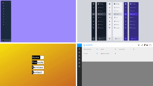
Dive into our curated assortment of complimentary HTML and CSS sidebar menu code snippets at CSS Monster. Culled from diverse platforms like CodePen and GitHub, this August 2023 update introduces two fresh additions for your exploration. Sidebar menus, synonymous with side navigation bars, are graphical elements housing multiple navigation options arranged vertically. These elements are integral in web design, streamlining navigation for websites and applications. Embracing various advantages, sidebar menus excel in space efficiency by maximizing vertical layout, ensuring a clear and organized navigation system, and showcasing versatility by accommodating user information, forms, and interactive elements. Our collection showcases an array of sidebar menus, each boasting unique designs and functionalities. Whether you seek a sleek, minimalist layout or a sophisticated design with advanced features, you're bound to discover an option that aligns with your preferences. Stay tuned for ongoing updates as we consistently expand our collection with cutting-edge CSS sidebar menu designs. Happy coding! Author uahnbu July 10, 2021 Just Get The Demo Link How To Download - Article How To Download - Video Author HTML (Pug) / CSS (Sass) NAVBAR PURE CSS Compatible browsers: Chrome, Edge, Firefox, Opera, Safari Responsive: no Dependencies: font-awesome.css Author Rob Stinson December 5, 2020 Just Get The Demo Link How To Download - Article How To Download - Video Author HTML / CSS APP ADMIN MENUS Compatible browsers: Chrome, Edge, Firefox, Opera, Safari Responsive: no Dependencies: font-awesome.css Author alphardex August 3, 2020 Just Get The Demo Link How To Download - Article How To Download - Video Author HTML / CSS (SCSS) MENU HOVER SLIDE FILL Compatible browsers: Chrome, Edge, Firefox, Opera, Safari Responsive: no Dependencies: font-awesome.css Author Cassandra January 20, 2020 Just Get The Demo Link How To Download - Article How To Download - Video Author HTML / CSS PURE CSS SINGLE PAGE APPLICATION Compatible browsers: Chrome, Edge, Firefox, Opera, Safari Responsive: no Dependencies: font-awesome.css Author Comehope May 15, 2018 Just Get The Demo Link How To Download - Article How To Download - Video Author HTML / CSS MENU EFFECT Compatible browsers: Chrome, Edge, Firefox, Opera, Safari Responsive: no Dependencies: font-awesome.css
Author sean_codes May 18, 2017 Just Get The Demo Link How To Download - Article How To Download - Video Author HTML (Pug) / CSS CSS ONLY NAVIGATION FOR SIDEBAR Compatible browsers: Chrome, Edge, Firefox, Opera, Safari Responsive: no Dependencies: font-awesome.css
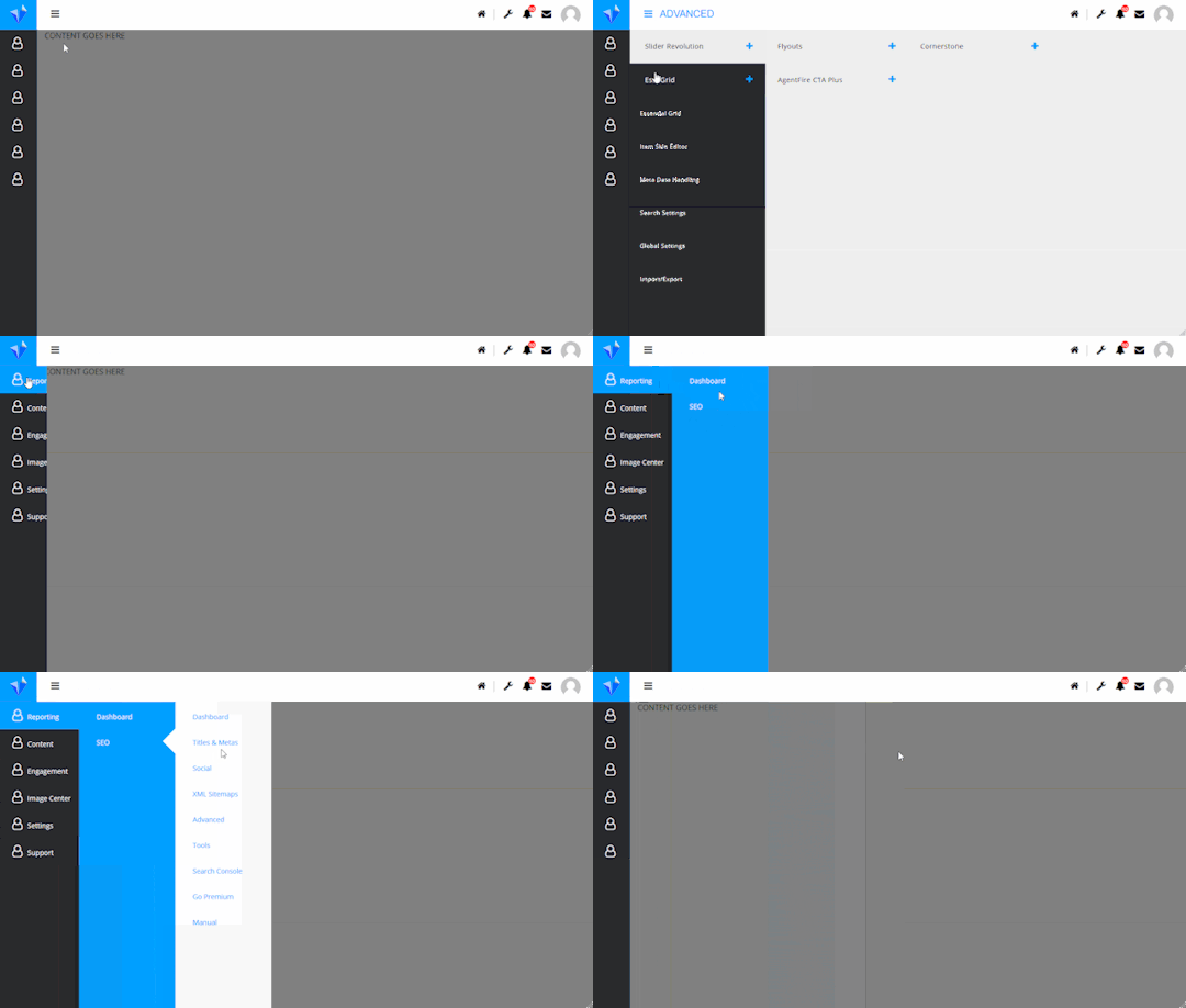
Author Milica April 17, 2017 Just Get The Demo Link How To Download - Article How To Download - Video Author HTML / CSS (SCSS) CSS SIDEBAR MENU Compatible browsers: Chrome, Edge, Firefox, Opera, Safari Responsive: no Dependencies: font-awesome.css
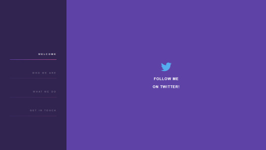
Author Shawn Reisner January 12, 2017 Just Get The Demo Link How To Download - Article How To Download - Video Author HTML / CSS (SCSS) PURPLE SIDEBAR MENU Compatible browsers: Chrome, Edge, Firefox, Opera, Safari Responsive: no Dependencies: font-awesome.css
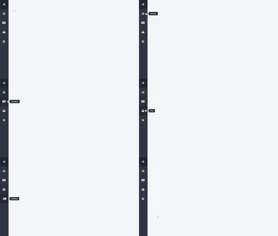
Author Daniel February 17, 2016 Just Get The Demo Link How To Download - Article How To Download - Video Author HTML SIDEBAR NAVIGATION Compatible browsers: Chrome, Edge, Firefox, Opera, Safari Responsive: no Dependencies: font-awesome.css
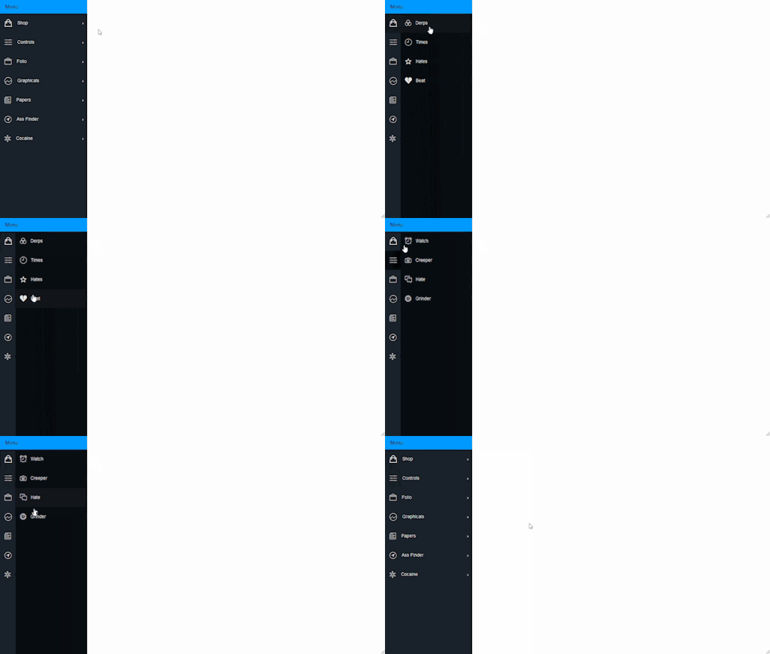
Author Stephen Scaff August 27, 2015 Just Get The Demo Link How To Download - Article How To Download - Video Author HTML / CSS (SCSS) PURE CSS FLY IN SIDEBAR NAVIGATION Compatible browsers: Chrome, Edge, Firefox, Opera, Safari Responsive: no Dependencies: font-awesome.css

Author magnificode June 8, 2015 Just Get The Demo Link How To Download - Article How To Download - Video Author HTML / CSS (SCSS) SIDEBAR NAVIGATION ANIMATION Compatible browsers: Chrome, Edge, Firefox, Opera, Safari Responsive: no Dependencies: font-awesome.css
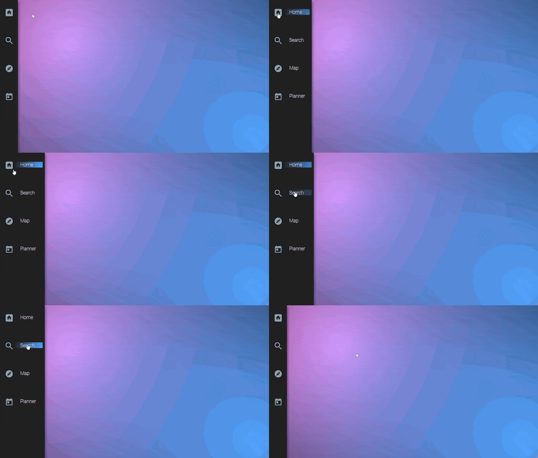
Author Vince Brown November 12, 2014 Just Get The Demo Link How To Download - Article How To Download - Video Author HTML / CSS (SCSS) FIXED HOVER NAVIGATION Compatible browsers: Chrome, Edge, Firefox, Opera, Safari Responsive: no Dependencies: font-awesome.css
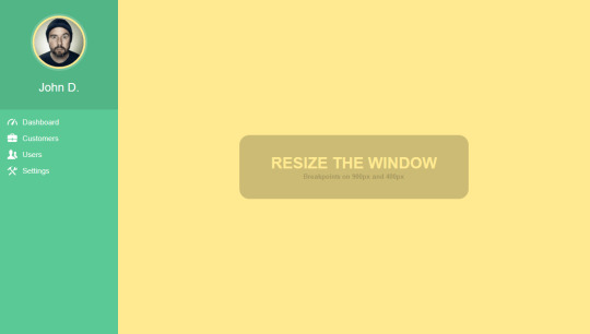
Author Claudio Holanda March 19, 2015 Just Get The Demo Link How To Download - Article How To Download - Video Author HTML / CSS (Less) FULLY RESPONSIVE CSS3 SIDEBAR MENU Compatible browsers: Chrome, Edge, Firefox, Opera, Safari Responsive: no Dependencies: font-awesome.css
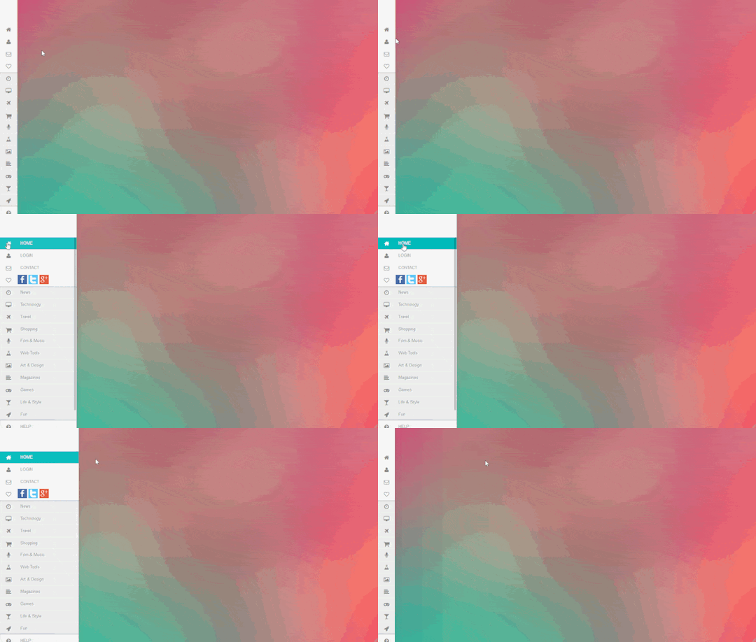
Author Eduard L. March 30, 2014 Just Get The Demo Link How To Download - Article How To Download - Video Author HTML / CSS SIDEBAR SLIDING MENU CSS Compatible browsers: Chrome, Edge, Firefox, Opera, Safari Responsive: no Dependencies: font-awesome.css

Author Arjan Jassal May 31, 2014 Just Get The Demo Link How To Download - Article How To Download - Video Author HTML / CSS 3D ROTATING SIDEBAR NAVIGATION Compatible browsers: Chrome, Edge, Firefox, Opera, Safari Responsive: no Dependencies: font-awesome.css
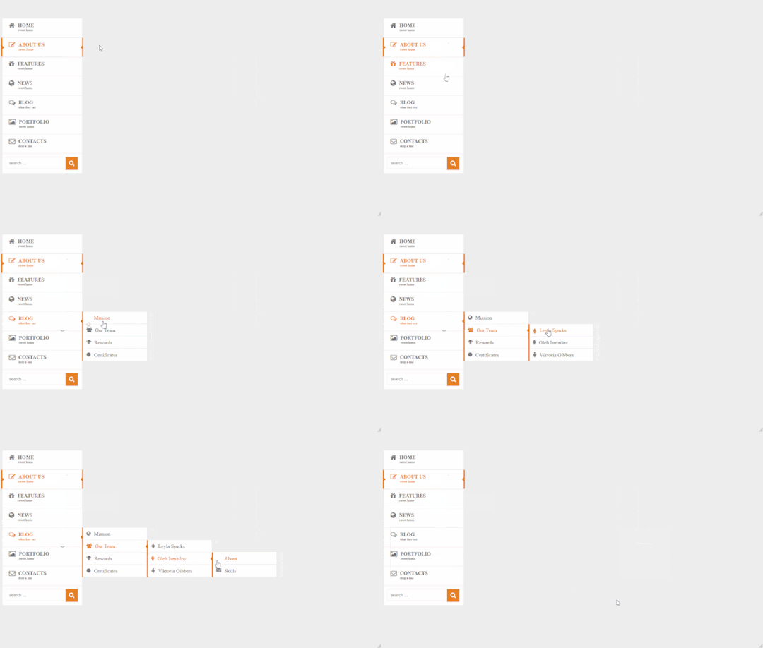
Author Rizky Kurniawan Ritonga April 2, 2014 Just Get The Demo Link How To Download - Article How To Download - Video Author HTML / CSS PURE CSS3 SIDEBAR MENU Compatible browsers: Chrome, Edge, Firefox, Opera, Safari Responsive: no Dependencies: font-awesome.css
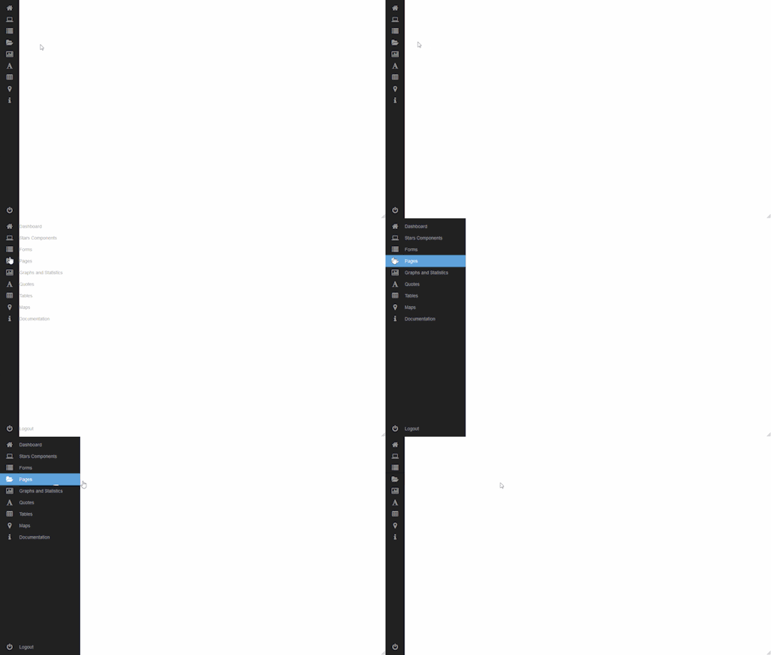
Author JFarrow February 12, 2014 Just Get The Demo Link How To Download - Article How To Download - Video Author HTML / CSS SIDEBAR MENU CSS Compatible browsers: Chrome, Edge, Firefox, Opera, Safari Responsive: no Dependencies: font-awesome.css
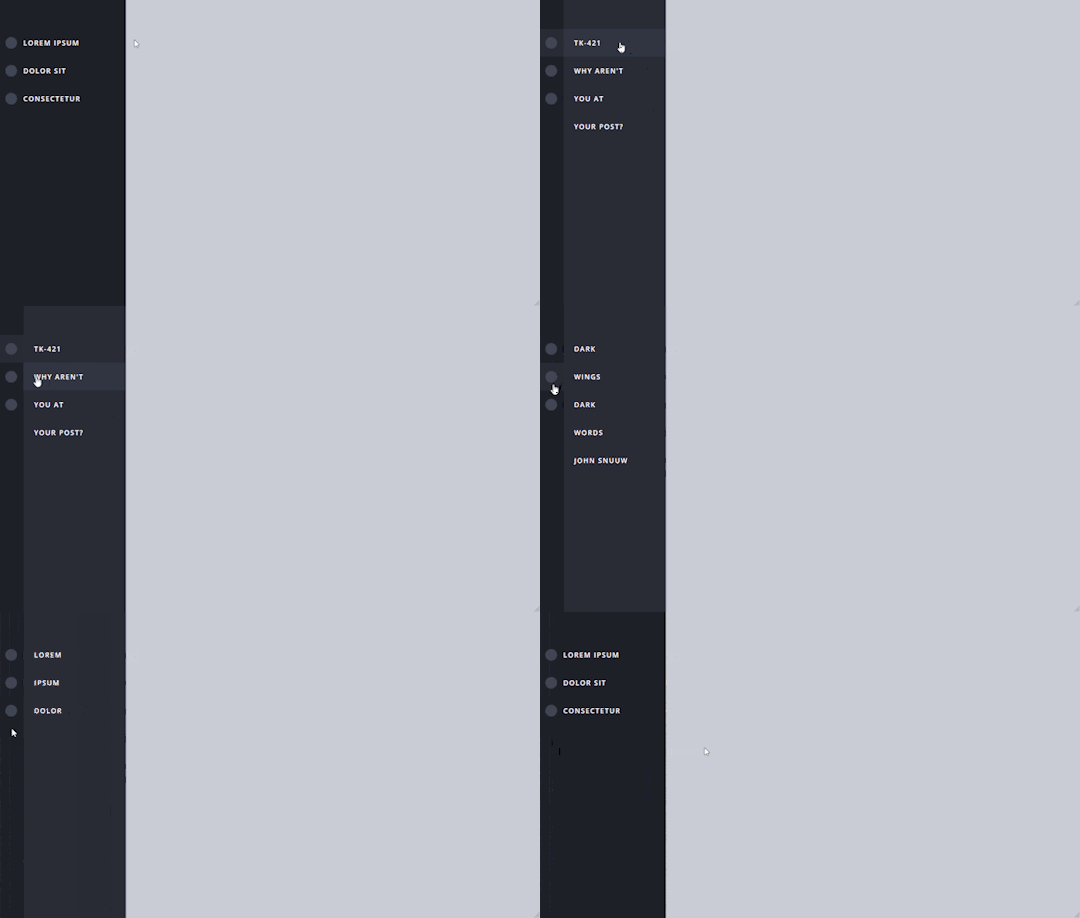
Author Jon Ambas January 3, 2014 Just Get The Demo Link How To Download - Article How To Download - Video Author HTML / CSS (SCSS) CSS SIDEBAR MENU Compatible browsers: Chrome, Edge, Firefox, Opera, Safari Responsive: no Dependencies: font-awesome.css
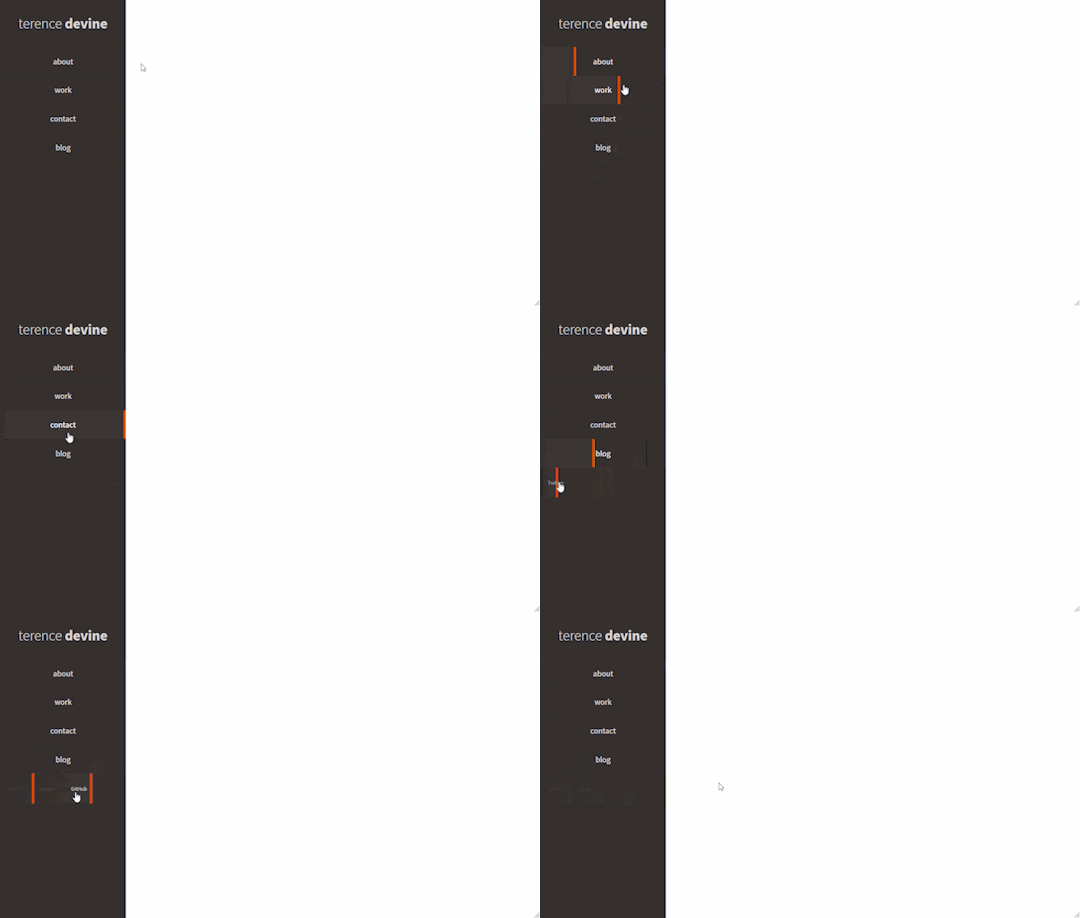
Author Terence Devine August 11, 2013 Just Get The Demo Link How To Download - Article How To Download - Video Author HTML / CSS (SCSS) FIXED NAVIGATION HOVER EFFECT Compatible browsers: Chrome, Edge, Firefox, Opera, Safari Responsive: no Dependencies: font-awesome.css
Frequently Asked Questions
1. What is the purpose of CSS sidebar menus in web design? CSS sidebar menus, also known as side navigation bars, serve as graphical elements that house multiple navigation options displayed in a vertical orientation. They play a crucial role in enhancing the navigation experience for websites and applications. 2. Where are the CSS sidebar menu examples in this collection sourced from? Our CSS sidebar menu examples are meticulously gathered from diverse platforms such as CodePen, GitHub, and other reputable online resources. This ensures a rich and varied collection to cater to different design preferences. 3. What advantages do sidebar menus offer in web design? Sidebar menus offer several advantages, including efficient use of space by maximizing the vertical layout, providing a clear and organized navigation system, and showcasing versatility by accommodating various elements such as user information, forms, and interactive components. 4. How can CSS sidebar menus improve website navigation? CSS sidebar menus contribute to improved website navigation by offering a visually appealing and organized layout. They make it easier for users to find and access different sections of a website or application in a seamless and intuitive manner. 5. Can these CSS sidebar menu examples be customized for specific design preferences? Absolutely. Our collection features a variety of sidebar menus with unique designs and functionalities. Whether you prefer a simple, minimalist layout or a more intricate design with advanced features, there are options to suit various design preferences. 6. Are there plans to update the CSS sidebar menu collection with new designs? Yes, our commitment is to consistently expand the collection with the latest and most innovative CSS sidebar menu designs. Stay tuned for ongoing updates to ensure access to cutting-edge options for your web design projects. 7. How can I stay informed about updates to the CSS sidebar menu collection? To stay informed about updates, continue following CSS Monster and check our website regularly. We'll be sharing announcements and featuring new additions to the CSS sidebar menu collection.
Conclusion:
In conclusion, our CSS sidebar menu collection offers a diverse range of design options sourced from reputable platforms. These menus enhance website navigation, providing efficiency in space utilization and offering versatile solutions. As we continue to update the collection, we encourage you to explore and stay connected for the latest and most innovative CSS sidebar menu designs to elevate your web design projects. Happy coding! Read the full article
0 notes
Text

Navbar Animation with Moving Hover
#navbar animation#html css animation#html css#frontend#html#css#css3#frontenddevelopment#neduzone#css hover animation#css hover effects#css menu hover#css menu hover effects#css animation examples#css animation tutorial
5 notes
·
View notes
Text

Animated Sidebar Navigation
#animated sidebar#animated side navigation#css side navbar#side navigation bar#html css#divinector#webdesign#frontenddevelopment#html#css3#divinectorweb#css#animation
1 note
·
View note
Text
10 Exciting Web Development Projects Using HTML CSS and JavaScript with Source Code

Web development projects using HTML, CSS, and JavaScript with source code are crucial for developers to solidify their skills and gain practical expertise. In this comprehensive article, we explore the significance of hands-on projects and provide an overview of the purpose and topics covered. Whether you’re a beginner or an experienced developer, there’s something for everyone.
These projects offer several advantages, including the opportunity to apply theoretical knowledge to real-world solutions, develop problem-solving abilities, and build a strong portfolio.

We delve into ten exciting projects, such as creating a responsive portfolio website, an interactive image gallery, form validation with JavaScript, an animated CSS pricing table, a JavaScript quiz application, a responsive navbar, a CSS grid layout for an image gallery, a JavaScript countdown timer, a responsive card design, and a JavaScript weather app.
By actively engaging in these projects and working with the provided source code, developers can enhance their skills, problem-solving abilities, and familiarity with industry-standard technologies. These hands-on experiences are invaluable for aspiring developers, allowing them to sharpen their skills, build a strong portfolio, and stay relevant in the ever-evolving world of web development. Dive into these projects, experiment with new techniques, and embrace the challenges and rewards of hands-on practice in web development.
If you’re looking to build amazing web development projects, be sure to check out our comprehensive article for inspiration and practical guidance.
0 notes
Text
CHOOSING THE RIGHT TECH STACK FOR YOUR PROJECT
Choosing the right tech stack is one of the most critical decisions for a startup founder. A tech stack is a set of technologies stacked together to build an application. It determines the type of applications you can create, the level of customizations you can perform, and the resources you need to develop your application. The choice of the tech stack can make or break the product's success and, as a result, the business's overall success. There can be several reasonable solutions for the same product. Still, when making a final choice, it is vital to keep in mind that the primary purpose is to create a product that's not only modern looking but also stable, reliable, and maintainable.
Most tech stacks combine front-end (the client side) and backend technologies (the server side). Client-side tech stacks can also be grouped into web and mobile tech stacks.
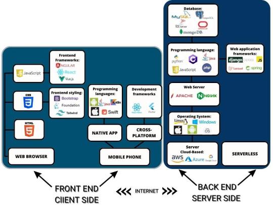
FRONT-END TECH STACK
The front end is the client's side interface, which can be a web browser or mobile phone screen that enables the user to interact with the app.
WEB TECH STACK
For most web applications, the tech stack remains very similar as there aren't many options. All modern web applications are based on HTML, CSS, JavaScript, TypeScript, and UI frameworks and libraries.
HTML (Hypertext Markup Language) defines the web page's structure, i.e., how the information is displayed to a user in a web browser. For instance, structure sections, bulleted points, headings, tables, links, and paragraphs are created using HTML tags. HTML5 is the latest version of the Hypertext Markup Language used to structure and present website content.
CSS (Cascading Style Sheets) is a style sheet language used for describing the presentation of a document written in a markup language such as HTML or XML. It defines all the styling of the displayed data by controlling layouts, colors, fonts, text sizes, spacing between elements, how elements are positioned, background, etc. CSS3 is the latest version of the Cascading Style Sheets language.
JavaScript is a programming language that enables the creation of interactive and dynamic effects within web browsers without page refreshing. Such effects include animated graphics, photo carousels, pop-up animation, and color changing when hovering a mouse over an image or button. Such animated effects significantly improve the user experience while interacting with the app.
TypeScript is a strongly typed programming language that is a syntactic superset of JavaScript, which adds static typing and improves the developer experience. It supports class-based object-oriented programming (OOP) concepts like classes, type aliases, interfaces, function overloading, tuple, generics, inheritance, and more.
So, the choice of technologies in the front-end tech stack is actually between frameworks and libraries that developers extensively use to facilitate the development process. There are several frameworks used for HTML and CSS. Bootstrap, Foundation and Tailwind CSS are the most popular frameworks used for front-end stylingS.
Bootstrap is a free, open-source, popular CSS framework with extensive community support. It contains reusable bits of code written in HTML, CSS, and JavaScript for web design components and functions. Bootstrap is used for creating responsive web applications.
Foundation is the open-source advanced front-end framework for developing agile, responsive websites. It is customizable, readable, flexible, and semantic. Foundation is suitable for web applications that need a lot of styling.
And Tailwind is a free, open-source, utility-first low-level CSS framework that can be composed to build any design without writing custom CSS and without leaving HTML. Unlike other CSS frameworks like Bootstrap and Foundation, Tailwind doesn't offer fully styled components like buttons, dropdowns, and navbars. Instead, it provides utility classes so developers can create their reusable components. It is used for quickly building and customizing applications.
The top 3 most popular front-end JavaScript frameworks and libraries are React, Vue, and Angular.
React is an open-source JavaScript library created by Facebook for developing dynamic UIs using reusable components. Being a library rather than a framework, it offers flexibility to developers as it does not impose any restrictions or conventions on the application design. It can be supplemented with other libraries. It focuses on designing interfaces for single-page applications, which means an app can show different data on the same page without reloading it.
Angular is a TypeScript-based framework developed by Google, used to design a dynamic data structure for large-scale enterprise applications. It is a full package, versatile, well-maintained, and performs well when building apps for different platforms at once.
Vue.js is an open-source lightweight JavaScript framework that has attained much popularity among developers in a relatively short time, and its popularity continues to grow. Developers value its ease of use and scalability - it can quickly scale between a library and a full-fledged framework. It allows the creation of interactive UI elements that are lightweight and easy to adapt, with a possibility for small projects to scale up to larger ones.
Based on our overall development experience, we can recommend Angular for complex and large-scale projects. If you have limited time and need a small project, you can confidently choose Vue. React is excellent in all other cases, but especially if you need high performance and the project needs to be implemented in a tight timeframe. For a detailed analysis of the best Javascript libraries and frameworks with their pros and cons, please refer to our article "Front-End frameworks to use in 2023".
It is worth mentioning that though JavaScript, HTML, and CSS are regarded as conventional standards in front-end web development, it is possible to substitute them with such development tools as Apache Flex. The Apache Flex SDK is a highly productive, open-source application framework for building and maintaining expressive applications that deploy consistently on all major browsers, desktops, and devices (including smartphones, tablets, and tv). Flex applications are deployed as Small Web Format files (SWF) plus an HTML wrapper, the CSS file(s), and any server-side script files (i.e., Java, CFM, PHP, etc.) to the server.
MOBILE TECH STACK
Mobile app development can follow a native or a cross-platform development path. Native app development means creating a mobile application that is tailored and dedicated to a specified platform, be it iOS or Android. A cross-platform development aims to create an app compatible with major operating systems, such as iOS, Android, macOS, and Windows. The main reason that stands behind cross-platform development popularity is that it is cost and time efficient. With one code required to run an app on several systems, the development costs go down, time to market gets shorter, and an app reaches a broader audience easier. Native development offers higher security measures and allows an app to work offline. It also provides a better user experience, achieved by full access to a device, its operating system, camera, microphone, GPS, and more. Any of the above can be a crucial reason for some businesses to opt for native development despite higher costs and longer time to market.
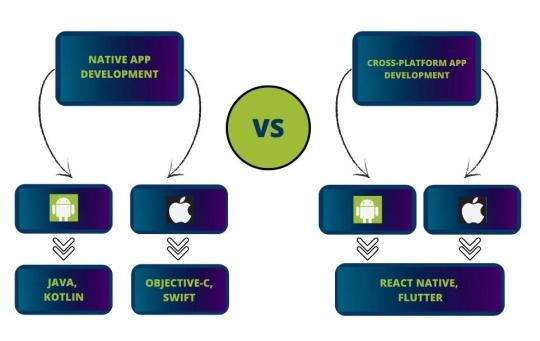
The programming languages battle in Android native development is between the two most popular languages intended specifically for Android - old and mature Java vs. young and modern Kotlin.
Java is a general-purpose, class-based, object-oriented programming language that has gained incredible popularity because of its performance, simplicity, open-source libraries, and wide range of possible applications. It is the world's third most popular programming language, after Python and C – according to the TIOBE index, which evaluates programming language popularity.
Kotlin is a statically typed, open-source, general-purpose programming language with type inference that can run on the Java virtual machine. In a nutshell, Kotlin is a streamlined version of Java, its advancement, rather than an entirely new language. It combines both acquisitive and functional programming features and focuses on readable syntax, functional code, and interoperability using existing Java libraries.
Both Java and Kotlin are good options for native Android development. Each language has its share of dedicated fans. From the developers' view, both programming languages should be in Android developers' arsenal. From the future application owners' view, Kotlin may seem more modern and offer faster development. Still, there are not so many experienced Kotlin developers now that it can have the opposite effect on the development time.
When it comes to native app development tools, the most common tools for Android are Android Studio and Android SDK.
Android NDK(Native Development Kit) is a set of tools that allows developers to implement parts of an app in native code, using languages such as C and C++. It provides platform libraries to manage native activities and access physical device components, such as sensors and touch input.
Android Studiois the open-source official Integrated Development Environment (IDE) for Android app development, based on IntelliJ IDEA. It offers build automation, dependency management, and customizable build configurations. The tool provides an auto-generated code editor for Kotlin, Java, and C/C++. Android Studio offers such functions as a flexible Gradle-based build system, a rapid emulator for different configurations, an efficient visual layout editor, built-in profiling tools, built-in support for the Google Cloud Platform, etc.
Jetpack Compose and Android UI kit are the most common UI frameworks for Android.
Jetpack Compose is Android's recommended modern framework for building fast, beautiful, and reliable native user interfaces. It simplifies and significantly accelerates UI development on Android using the declarative approach.
Android UI kit is a components-driven library for Figma. It consists of responsive application templates made of constrained UI components. A must-have design system to prototype mobile layouts faster.
The iOS programming languages battle is mainly between Objective-C and Swift, as Apple backs up both languages.
Objective C is a general-purpose programming language that is safe for different data types and focuses on objects. It is a predecessor of Swift, and if compared to it, it lacks modern tools and properties.
Swift is a compiled programming language for iOS, macOS, watchOS, tvOS, and Linux applications. Swift achieves a faster development process via its simplified syntax and grammar. The language uses LLVM as its compiler framework for programmatically creating machine-native code. Swift has many modern features, including type inference, option types, modules, closures, generics, tuples, extensions, argument labels, and collection literals, simplifying common patterns used in Objective-C.
So,Swift is the apparent winner in the iOS programming languages battle. It has undoubted benefits over its main competitor Objective-C. It is your right option for iOS native development in 2023.
The most common development tools for iOS - are Xcode and AppCode.
Xcode is Apple's open-source integrated development environment for iOS platforms. It contains SDK, tools, compilers, and frameworks to design the user interface, write app code, compile code, test the code, and debug to receive great quality products.
AppCodeis an integrated development environment that natively supports Objective-C, Swift, C, and C++, as well as JavaScript, XML, HTML, CSS, and XPath. It's fully compatible and interoperable with Xcode. It uses the same project model and project file and synchronizes all changes with Xcode. The IDE comes with strong refactoring capabilities, on-the-fly code analysis, debugging, and support of several testing frameworks. It is not free, though. AppCode is offered to individual customers and businesses according to several pricing plans.
The most common UI frameworks for iOS are UIKit and SwiftUI. UIKit and SwiftUI are open-source frameworks providing various features for creating UI for iOS applications.
Still, SwiftUIis declarative in contrast to UIKit, an imperative framework, and the former is regarded as a much more robust library.
UIKitwas developed and released based on the Objective-C language. SwiftUI is written in Swift, which is currently the recommended language for building iOS applications. Therefore, SwiftUI will likely continue to evolve with time, while UIKit will receive less support from Apple.
In our article "Top programming languages for native apps" you can check our detailed analysis of native development programming languages if you opt for this path.
As for cross-platform development tools, there are a huge number of them, but React Native and Flutter are the leaders in 2023.
React Native is an open-source JavaScript framework launched by Facebook. The main advantage of React Native is that it allows the creation of cross-compatible mobile applications using only JavaScript. It does not rely on a third-party API to access device functionality. It has intuitive architecture, hot reloading, quick development timeframes, good performance, and code reusability between iOS, Android, and web platforms.
Flutter is the newest technology launched by Google. The framework is a complete SDK, including a rendering engine, ready-made widgets, testing and integration APIs, etc. Flutter applications are written in the Dart language. Since Dart compiles directly to native code, it doesn't require any additional bridge to communicate with mobile platforms, as does React Native. It considerably improves deployment times and speeds up overall application performance.
If you are building a mobile application in 2022, choosing either React Native or Flutter would be a great option because of the mix of performance, robust community support and positive future outlook. In one of our previous articles," The State of the Mobile Market: React Native Supremacy, the Fall of Ionic and What To Expect from Flutter?" we have analyzed the most popular cross-platform development tools. Please check it out for more details.
BACK-END TECH STACK
Back-end development is a server-side development covering anything that relates to the under-the-hood functionality of web applications, including app performance, security, scalability, ease of maintenance, etc. Developing the back end of your application is the most essential part of your project. The back-end development includes:
The operating system: macOS, Linux, Windows, as well as Android, and iOS.
The web server, providing data on request: Nginx, Apache, or Microsoft's Internet Information Server (IIS).
The application code that transmits it,
The programming language used to write an app code: Python, Javascript, PHP, Java, Ruby, Kotlin, etc.
Various frameworks built on top of programming languages for faster and easier development: Spring, .NET, Django, Flask, etc.
The database that contains and organizes the information: MySQL, Microsoft SQL Server, MongoDB, PostgreSQL, Oracle, etc.
A back-end's OS (operating system) is the interface where the frameworks, runtime, servers, and other components exist and access resources required to perform their functions. The top operating systems are macOS, Linux, and Windows, as well as Android and iOS for mobile. Usually, any stack may be equally well employed in Linux, Windows, or macOS without compromising the quality of the resulting application.
A web server processes the requests submitted from the client side, i.e., application users. It stores, processes, distributes, and maintains dynamic and static information. According to the below statistics published by Web Technology Survey, almost all web apps are developed using Nginx and Apache. There is also a Microsoft IIS Server, which has a significant market share, but it can only run on Windows operating systems. IIS is used mainly when it is necessary to host a .NET or ASP-based web application.
Apache server is free and open-source and can be used on any operating system. It is suitable for low-traffic websites with highly dynamic content. It is very flexible, so it is also a go-to option when configuration and customization are the main priority.
Nginx is a free, open-source, high-performance HTTP server and reverse proxy, as well as an IMAP/POP3 proxy server. It is preferred when it is necessary to improve performance for static content. It is also a go-to option for high-traffic websites. On top of that, Nginx is regarded to be slightly more secure than Apache.
1 note
·
View note
Text
website update log #18 (December 11th, 2023)
let's just go straightforward into the changes !!
new title

located in the navbar, i made a new and silly logo for the website!!! it wont have the pixel art look anymore, since its replaced by this cool flash brush gif (its also animated but none of the videos i recorded work smh)
------------------------------------------------------------------------------
the night mode button has been changed to a lightswitch!

the button look didnt really look good, so i decided to change it to a switch instead !!!! now the right side of the screen is just icons now (the buttons still dont work btw)
------------------------------------------------------------------------------
added og metadata for other websites such as discord

so you can see what the website is about while still being in the appl!
i think thats it.....thats all i have to say now lol, im gonna figure out ow to give this website more personality and i think that the new logo is a great start!
thank you, the two people that look at my logs :> i love youguys <3
- sushiwt <333
4 notes
·
View notes
Text
MP: Interactions and animation course on Webflow (LO1)
The notes I took this time was incomprehensible and the course would seem more effective when I am using the software so I stopped midway to manage my time.
Interpolation, easing and smoothing.
Interpolation - swift motions between frame.
Easing - distance and time is considered.
Smoothing/damping - add the effect to consider the scrolling. More smooth allows a fullblown animation.
Triggers and animations
Element and page trigger.
Quick Effects
Slide animation - scroll into view in interactions.
Grow animation - same class apply (trigger settings.
Rubberband
Horizontal movement on scroll
While page is scrolling - move and opacity
Trigger control smoothing.
Rotation on hover
Add perspective on element to affect child.
Trigger on mouse hover (interactions) rotate on y and x axis
Add smoothing
Restating state - interactions setting - 50 percent
Highlight - set relative - absolute position. Overflow is none. Add div block as highlight. Position to top left. Add blur. Add movement. On mouse y and x actions.
Scroll progress indicator
Add scroll trigger.
Scroll animation. move
Origin - set transform origin on the class on the left
Show and hide navbar on scroll
Leave on scroll down - fixed on the viewport.
Nav enter and leave (seperate animation)
Reveal elements on scroll
Trigger - scroll into view.
Show & hide elements
Set a trigger
Hide and show - none animation
Add opacity
Reveal elements on hover
Hover in animation =
0 notes