#drop down menu css
Explore tagged Tumblr posts
Visit Tumblr Blog
Explore Tumblr blogs with no restrictions, modern design and the best experience.
Last Seen Tumblr Blogs


Fun Fact
Post activity is at the highest at 4:00 pm EDT; notes peak at 10:00 pm EDT.
Text

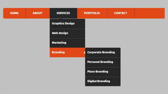
Drop Down Menu On Hover
#dropdown menu on hover#html css dropdown menu#html css#divinectorweb#css#html#frontenddevelopment#css3#html5#css dropdown menu#drop down menu css#dropdown list#pure css dropdown menu#webdesign#learn to code#css snippets
5 notes
·
View notes
Text

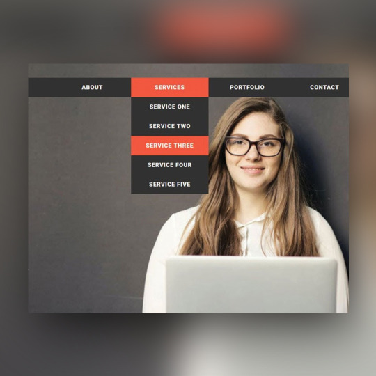
CSS Drop Down Menu
#css drop down menu#drop down menu css#html css dropdown menu#css menu#html css navigation menu#html css#frontend#css#html#frontenddevelopment#css3#learn to code#webdesign
3 notes
·
View notes
Text

CSS Drop Down Menu
1 note
·
View note
Note
Hi hi! I hope you're having a good day so far! 😊 I have been super appreciating seeing you creating site skins and I saw you said you were self taught. I wanted to ask if you might share some of the resources you've found helpful in learning to make them. I've gone through the posts ao3 has in the FAQ and I have got some limited experience with html from the myspace/livejournal/early tumblr days (though it's been a while since I used them and am definitely rusty lol) so I got a grasp on basics. I can figure out how to make changes like color and font and padding and etc, but where I've been struggling is trying to figure out what the available selectors are and what they control. Like .workskin and .bookmarks. I've tried to find something like a glossary or list of what's available to mess with and I've tried just going through other people's skins to see what I can decipher, but it's definitely been a struggle to process and understand working that way. Any pointers or resource suggestions you might have are greatly appreciated! Thank you!
My main resource for the CSS code skills is W3Schools.com. The tutorials are mostly easy to follow, and most of them have an option where you can run their code and then modify it to run your own version.
If I can't find what I need there then I just google "CSS drop cap" or whatever I'm trying to do and something usually pops on StackOverflow or CSS Tricks.
As for the selectors, that's where you want to be on a computer instead of a mobile device so that you can use your browser's Inspect feature. Right click on the page you want to look at and this menu pops up. You can choose Inspect down there near the bottom.
Using a cut because of length and screenshots.

This is what AO3 looks like with the Inspect window open in the Firefox browser. If you're using Chrome, the window will open along the right hand side instead.
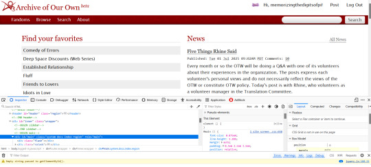
The thing that makes the magic happen is the tiny little arrow inside the tiny little box in the far left upper corner.
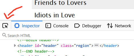
Click on that little arrow and then hover your mouse over the website. As you move your mouse around, different areas will highlight. You'll also see some mouseover text telling you the selector for that element.

a.tag is still pretty generic, though. That just tells you it's a link (the html a tag) that is also a tag. So how do you get to know that specific link in particular in that specific part of that specific page?
Click on it. When you do that, the inspect window will shift automatically to that exact area of the code, including selectors
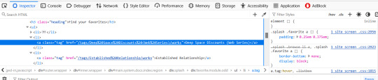
On the left, you can see the favourited tag link is highlighted. On the right, you can see a couple of different snippets of code that start with .splash .favorite a
if I scroll down within that window, I can see more code for that area of the page
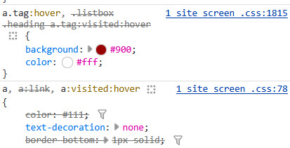
this shows me that tag links have a red background and white text when you hover over them
a.tag:hover { background: #900; color: #fff; }
The great thing about the inspect window is that you can do temporary edits in there to try stuff out. So you could change that red to a blue. You could change the white to black. You can add more lines of code like a border or increased padding etc and see it change live on the screen. All changes will revert if you refresh the page.
The other thing, that I only JUST noticed as I was making that medieval skin (or maybe the rustic hospitality one I made just before it?) is that there's also a breadcrumb along the bottom of the lefthand window!
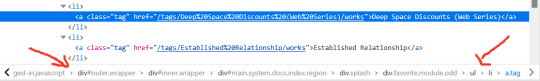
That breadcrumb shows me the exact selector I need for the element I clicked on! In this case, that favourited tag can be styled with
.splash .favorite.module.odd li a
I have no memory of why I know this but you leave off the div when you're writing the CSS
You can get as specific as a link (and even use a pseudo-class like nth-of-type if you want to make each one of those links a different colour) or you can leave off the li a (list item link) and just style the box itself. That's how I added the woman throwing hearts into the favourites in the medieval skin.
This might be too much information or it might make you crave even more, but either way I hope it gets you started? Good luck!
53 notes
·
View notes
Text

Well no, it’s Thursday, but I wanted to share some wips anyway- better late than never, right? 😅
Thank you for the tags @fiend-for-culture @thewholelemon 🥰 I had planned on catching up on everyone’s posts last night, but thought to myself “I’ll just doodle for half an hour before bed, as a treat” and when I next looked up it was 4 hours later.
Three WIPs for your viewing pleasure


1. My dang website
I’ve been updating my portfolio for what feels like a century, though my calender insists it’s only been a week. Working on my website is always something I find really hard— not for lack of technical ability but because I am riddled with self doubt when it comes to presenting my work professionally. I’ve still got a bit to tweak since Squarespace has some irritating limitations, so I’m going to have to add some custom CSS code for things like the drop down menu (why is it so squished up?? Let me edit the spacing!!) and the odd choices in default line height for all my headings (ironically this is the spacing I’d like for my drop down menu, but it looks ridiculous with the main text). Wild to me that you can only edit the headings as a whole, and not set individual line height preferences for h1/h2/h3 etc. So I will persist while also hating every second of it.
Wips 2 and 3 under the cut! Also cw for the lack of clothing in my 3rd wip artwork (this is the sketch I lost 4 hours to last night because reading rote is killing me)


2. Heartstone Town Concept Art
I shared the first image of this a few weeks ago, but I’m posting it again so you can compare it to the latest version and see my progress. I haven’t had much time to work on it since the last time I shared it, but I’ve added a few layers of shadow and I’ve mostly figured out the colour palette now, so the houses in the foreground are more or less complete. Having added the ‘Scenes & Settings’ page to my website, I’m pleased to be adding to this part of my portfolio more. I have other settings planned and I’m excited to explore those when this one is done.
3. On my Fitzloved BS
As mentioned, I set about doing an indulgent but brief doodle last night as a reward for working on my website all day. Then I found a great pose reference and I thought ‘what if Fitz and the Fool?!?’ and suddenly it was 4 hours later and this had happened. (Honestly I probably spent like 2 hours purely on Beloved��s feet and nipple placement… and I’m still not sure about it). I’d like to add colour and maybe a background— I’m picturing this being a kind of post Fool’s Fate au where they go back to Fitz’s cabin, vaguely fitting in with @tragediegh’s OCACD fic, but I also love the distinct colouring of Fitz’s white hair streak and the Fool when he’s golden, so I may end up setting it around the Fool’s Errand cabin era instead. Either way, they are cosy on the rug by the fire, not confusing love with plumbing.

I never know whether to add tags when I’m late for a thing.. but just to say hi and I hope you’re having a good week:
@youarenevertooold @iamamythologicalcreature @alexalexinii @cattocavo @that-disabled-princess
@orange-peony @cutestkilla @rimeswithpurple @larkral @best--dress
@scribble-tier @theimpossibledemon @artsyunderstudy @raenestee @thewholelemon
@nightimedreamersworld @itriednottothinkaboutit @you-remind-me-of-the-babe @angelsfalling16
@the-beard-of-edward-teach @monbons @katatsumuli @fiend-for-culture
@aristocratic-otter @snowbazdaily @argumentativeantitheticalg @lovelyladzzzz @nausikaaa
#wip Wednesday#it’s actually Thursday but what even is time anyway#sneaking fan art into my professional portfolio and website#rote spoilers#fools errand#fools fate#but also fool’s date?#love and plumbing#fitzloved#fitzchivalry farseer#lord golden#still not okay about these books
18 notes
·
View notes
Text
css/coding question for Ao3
i have a coding question for those who know css, because i'm hoping to use it for Ao3 in a site skin/alter some site skins i love and use but are a little annoyed at atm lol
is there any way to move the buttons/drop down menu's for the "hi, [username]" and "post"; so it's in the same banner as/in-line with the "fandoms", "browse", "search", and "about" links? (and potentially log in/out but i'm less concerned about that tbqh i don't use it ever).
just the site skin i use most often, i finally fixed it so the buttons aren't overlapping with the header (whoo!) but it still looks like crap on mobile (if not more so now), and in general i just think i would prefer them there?
or, alternatively: if there is a way to keep the like positioning fixed with a header image so that the links don't overlap a header image/banner? (see read more for what i mean, hopefully)
i can't find any skin though that does that atm; and it's not the only skin i'd like to apply it too, and what not. i just know it's also a different classification, if i understand this right. they're under like "greeting" so idek how possible it is...
images under the cut
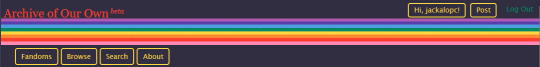
^ this is what i got it fixed too, and it looks nice now. but on mobile it looks like this:
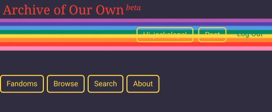
so if there is just a way to like, either get them all inline or keep it so the header image is like always between them, etc. so there is no overlap?
5 notes
·
View notes
Text
launching my personal website!
finally, it is here: the website i created, powered by astro and github books!
currently featuring:
dark mode toggle
mobile friendly layouts
reader controls on my project pages
auto-generated links and layouts for new chapters in each project
css only menu drop downs & table of contents sidebar
some cool google fonts
a few of my favorite bug glyphs (mostly on desktop/tablet)!
i'll be using this website to host my personal projects, including my writing projects, comics, and perhaps a gallery of personal art unconnected to any larger theme.
roadmap:
autogenerated page descriptions in html head, for better previewing
rss feed
more commenting options
guestbook
and perhaps... more?!
come take a look at my website, i'd love to know what you think! :] you can always ask me about how i implemented features on my website -- i would more than welcome the opportunity to gab.
thanks for stopping by!
3 notes
·
View notes
Note
hi!!! i love for custom blog theme,, do you have a link to the code or creator 0:?
ya!
so my theme is actually a heavily modified version of redux edit #1 by lopezhummel (current url: holyaura). i always remind users that most tumblr themes are old and that you'll need to replace all instances of "http://" in the code with "https://" so tumblr will save the theme. i had to do it with this one
these are the modifications i made to the theme. i edited this theme over the course of at least a year or so and don't quite recall how i did all of these things. but to the best of my ability:
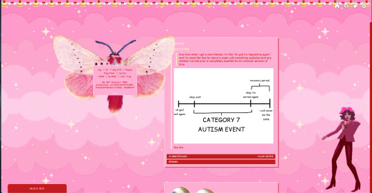
i moved the "left side img" to the right side of the screen. i also made this element "responsive" so the image will never get cropped when you resize your screen. this was a bitch and a half to figure out and i truthfully do not remember how i did it
i deleted the text in the drop-down navigation so it appears as a little line that is otherwise not noticeable. this type of theme, the "redux edit," used to be very popular because having a drop-down menu let you cram a bunch of links that lead to sub-pages on your blog. i've done away with my sub-pages, but i still like the format of the "redux style" tumblr theme, for its minimal UI and for its customization options.
i separated my mobile description from my web description for formatting reasons. basically, most elements in tumblr themes are connected to specific text fields and toggles. i simply went to the section that was connected to my blog description and deleted it. the web description has to be manually typed inside of the CSS/HTML editor when i want to change it. whereas my mobile description is whatever i type in the "description" box of the normal tumblr theme editors.
i added code someone else made ("NoPo" by drannex42 on GitHub) which allows you to hide posts with certain tags on them. i did this to hide my pinned post, as it looks bad on desktop.
i replaced the tiny pagination arrows at the bottom with images that literally say "next" and "back" because the arrows were far too small/illegible. i know they aren't centered in the container i'm not sure how to fix that lol

i added a cursor

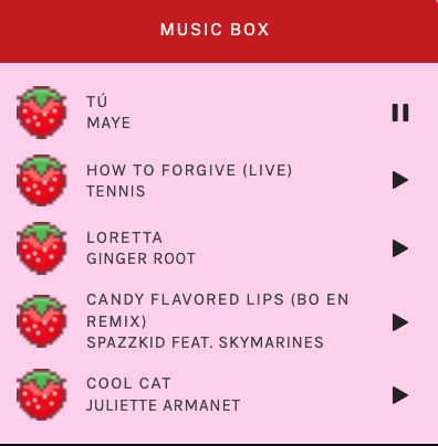
i installed a working music box ("music player #3" by glenthemes), and then added music by uploading MP3 files to discord and then using the links of those files as the audio sources. iirc i also had to make this element responsive and i aligned it so it would sit on the left side of my screen. i made the "album art" for each one the same strawberry pixel art
the moth is just a PNG i added and then moved around so it was behind my sidebar using the options that came pre-packaged with the theme
if you want something like the strawberry shortcake decoration at the top (called "banner" in the theme) your best bet is to google "pixel divider"
theme didn't support favicon so i added that in so i could have a little heart
ALSO:
this theme is. really weird about backgrounds. any background that i have ever set for it, i've had to do weird shit in photoshop. like making the background HUGE, mirroring it, etc. - because it would crop the image weird, or there would be a gap where there was no image. idk man, it's haunted. i'm sure there's a way to fix this but i am NOT tech savvy enough. anyway, patterns are probably your best friend. and if you DO want something that isn't a pattern, it's going to take a lot of trial and error. but i love this theme so i deal with it 😭
the sidebar image and the floating image do not scale. if your image is 1000 pixels, it will display at 1000 pixels. you'll either have to edit the code so that the theme scales the image for you, or resize any images before you add them
my white whale of theme editing (aside from the Weird Background thing) is that i cannot get infinite scrolling to work. i have tried every code out there. all of them break my theme. it makes me sad because like. i have music there for a reason. the idea is that people would listen to it while they scroll. unfortunately, the way it's set up now, the music will stop every time someone clicks "next" or "back" 💀
anyway sorry for rambling but i hope you enjoy the the theme and customizing it in the way that you want to!
24 notes
·
View notes
Text
What Is Web Development?
In the era of the digital marketplace, it takes more than just an online presence to lure in and retain customers. It requires a visually appealing, immersive and user-friendly website to build trust with visitors and keep them coming back for more.
Companies need to update and optimize their websites constantly to meet this standard. This makes the need for professionals who understand both web design and web development incredibly crucial.
If a company’s site looks outdated or is difficult to navigate, it risks losing potential sales and damaging its brand image. This puts the need for front-end, back-end and full-stack developers at an all-time high. You can choose Web Development Company UK.

While there are many ways to become a developer, there are a few basic steps that you should take if you’re interested in embarking on this exciting career path.
The first step is to find an educational program that fits your learning style and provides the resources, support, and education you need to thrive. This may include an in-person or remote coding boot camp or full-stack web development courses that offer mentor and tutor support.
Web development is typically broken down into two parts: the front end and the back end. Front-end devs focus on what is seen and used by a website’s visitors, including the layout, drop-down menus and text.
This type of developer uses programming languages like HTML, CSS and JavaScript to create the visual elements that form a website.
Back-end devs engineer what’s going on behind the scenes, including the server that hosts the site, the application that runs it and the database that contains the data. They use computer programs to ensure these three components are all running smoothly together.
There are different types of Web development:-
Django Web Development:- Using models, views, and templates to manage data, display dynamic content, and create web pages. Models are Python objects that represent data. Many companies provide Django Web Development Services.
It’s best practice to write well-documented code. This helps keep your code organized and makes it easier to collaborate with other developers.
PHP Development:- Ensure they have a good work portfolio and have worked on projects similar to yours. Also, examine their expertise and technical proficiency in PHP & the appropriate frameworks.
Look for a full-cycle PHP Development company that delivers effective solutions and strategic support based on structured processes, healthy communication, and client-satisfying results. Examples include Urban Insight and Digital Echidna.
WordPress Web Design London:- A great website is vital for attracting new customers. With a wide array of plugins that facilitate SEO, lead capture and analytics, WordPress experts equip your business site to perform at its best. Mont Digital offers WordPress Web Design London.
This one-page interior design agency website artfully demonstrates WordPress's captivating blend of style and functionality. Their simple, sleek aesthetic perfectly complements their extensive portfolio.
Vue Js Development:- Vue is a progressive JavaScript framework that can be incrementally adopted and avoids the baked-in fallacies of monolithic frameworks like React and Angular.
It uses a component model that represents encapsulated elements of your interface. This makes code easier to read, maintain and fix. You can choose Vue js development company.
Interactive Web Design:- As a small business, you want customers to interact with your content. It builds customer satisfaction and provides valuable feedback.
Interactive web design makes this interaction possible. It can range from simple animations to dynamic content to engaging feedback tools.
#Web Development#Webdevelopmentcompanyuk#Web Development Company#Web Development Services#Web Development Agency#web design#website design#website#web
1 note
·
View note
Note
feel free to message me if you need help with your translation project! my only fluent language is English but I can maybe help with the CSS selectors lol. If you want commented code, I think the one called Rustic Hospitality is your best bet. I commented that one fairly well. I think I commented the Game Changer one too, maybe? But most of them are just the straight code because AO3 doesn't save comments and I usually forget what I've done 24 hours after doing it
I really like your Medieval and Rustic skins! Your code also a lot more concise than mine xD
It's basically exercise in frustration and positioning, since you need to write down pretty much every element you want translated.
(The largest Russian fanfiction website is experiencing pretty large turbulence due to government equalising lgbtqia with terrorism and many people (me included) are trying to persuade larger fandom on ao3, but having unfamiliar UI in English is pretty large objection, so I figured I'll do something about it)
I finished some course on web design, but my current work is inspired by very rudimentary skin with similar purposes. (They changed mostly static text where they could: main page titles, the fic preview rubrics and such...) But fiddling with their code gave me idea how one can approach such task (they used a lot of pseudoelements and classes that address specific element). So I, filled with arrogance, showmanship and course skills, decided to make skin that will retain click behaviour and relevant design.
Idk iff it will be all that interesting, but here's my code on GitHub. But it's commented in russian.... And end result makes to main page and some menus appear in Russian... And I am frankly not sure you can Google translate pseudoelements.......
But hey there's clickable translated search button that I spent eternity on perfecting (it's actual button in the code, not a link, so it's extremely resistant to being covered up and still clickable)
The last thing I worked on is translation of drop-down menus in the header (for now without dynamic design). But I combined it with my previous code and there's obviously some conflicting code elements and I am not thrilled to try and hunt them down.
I don't think what are we doing is quite the same, but I appreciate the offer and interest. Feel free to message me (to bully me into to actually comment code in English or something) or offer corrections on the code if you have any to offer.
P. S. I wanted to also mentioned side project I was poking at. The skin, imitating aforementioned popular fanfiction website, made by other amazing person (which actually functions like one and not css mended with ducttape). But it kinda bothered me that background of website was really simplified, so I decided to figure out how could you make it better.
They actually changed it to even more simplified mobile version, and that ridiculous amazing art piece of webdesign is, now, only in my thoughts and on web archive.

There's backdrop of wood, than there's backdrop of leather, the stitching and handful of pages (and I kid you not each of them was made with a separate div).

And I figured out how to add metal bookcorners on it without much trouble. But stitching beats me and so do, freaking, pages. I figured it's impossible to do it without sacrificing adjustability to mobile devices, but I am curious what you think
If nothing else you can look at this Majestically Questionable decision of webdesign that they held for 8 solid years.
(before that it was just one image of pages and no stitching)(which might be the secret answer, but I am pretty sceptical about how it will do on the phones)
Sorry for impromptu fanfiction webdesign history lesson I just equally love and hate it
💛💛💛
0 notes
Text
Your Website Engagement Is Dropping — You Are Doing a Mistake
Imagine this: You’ve spent weeks designing the perfect website. You’ve refined every pixel, optimized every paragraph, and launched it with excitement. But after a few months, you notice something worrying — your website engagement is dropping.
Fewer people are clicking through your pages, filling out forms, or interacting with your content. If you’re a Freelance Web Designer, Freelance Website Designer, or Freelance Web Developer, especially in a competitive market like Singapore, this can feel like a nightmare. After all, engagement is the lifeblood of a website. It’s what turns visitors into leads and customers.
In this article, we’ll explore the most common mistakes causing a drop in website engagement, how to identify them, and most importantly, how to fix them. Whether you're a Freelance Web Designer Singapore, Freelance Website Developer Singapore, or running a business in web design Singapore, these insights are crucial.
Why Engagement Matters
Website engagement refers to how visitors interact with your website. Do they scroll down? Click buttons? Fill out your contact forms? Download your e-book?
High engagement indicates that your content is valuable, your design is intuitive, and your user experience is excellent. Low engagement, on the other hand, signals that something is pushing visitors away — and it may even affect your search engine rankings over time.
Mistake #1: Ignoring User Experience (UX)
A common mistake among many website owners and even some Freelance Web Designers is focusing too much on visual appeal and neglecting usability. A beautiful website is important, but if users can’t navigate it easily, they’ll leave.
Solution
Simplify your navigation. Limit menu items and use clear labels.
Make your CTAs (calls to action) obvious and inviting.
Reduce clutter and use white space to create breathing room.
Test your website’s usability on both desktop and mobile.
Mistake #2: Slow Page Load Speeds
Nothing frustrates a visitor more than a slow-loading website. If your site takes more than three seconds to load, you risk losing nearly half your visitors.
For a Freelance Website Designer Singapore, showing potential clients that you understand speed optimization is crucial.
Solution
Use tools like Google PageSpeed Insights to analyze your site.
Compress images without sacrificing quality.
Use a content delivery network (CDN).
Minify CSS, JavaScript, and HTML.
Mistake #3: Not Optimizing for Mobile
In Singapore, where mobile penetration is extremely high, having a mobile-optimized website is non-negotiable.
A Freelance Web Designer Singapore or Web Developer Singapore who fails to prioritize mobile design risks losing a huge portion of potential clients.
Solution
Design with a mobile-first approach.
Use responsive design techniques so your layout adapts to all screen sizes.
Optimize touch elements for smaller screens.
Mistake #4: Weak Content Strategy
Content is the reason people visit your website. If your content is outdated, irrelevant, or poorly written, engagement will plummet.
Whether you’re offering services as a Freelance Website Designer or showcasing your work as a Freelance Web Developer, your content must be valuable and persuasive.
Solution
Update old blog posts and service pages regularly.
Use multimedia (videos, infographics, images) to make content more engaging.
Answer common client questions clearly and thoroughly.
Use keywords naturally, like web design Singapore, Website Developer Singapore, and Freelance Web Designer Singapore.
Mistake #5: Ignoring Analytics
Many website owners don’t pay enough attention to analytics. Without data, you’re guessing at what works and what doesn’t.
Solution
Use Google Analytics and heat mapping tools to understand user behavior.
Identify high-exit pages and improve them.
Track which CTAs are getting clicks and which aren’t.
Mistake #6: Lack of Clear CTAs
Visitors need to be guided on what to do next. A website without clear CTAs will leave visitors lost and disengaged.
Solution
Make your CTAs prominent and action-oriented (e.g., "Book a Free Consultation", "See My Portfolio").
Use consistent messaging to guide visitors toward conversion.
Test different CTA placements and wordings to see what resonates best.
Mistake #7: Overuse of Pop-Ups and Ads
While pop-ups can be useful for growing an email list or highlighting promotions, overusing them can drive visitors away.
Solution
Limit the use of pop-ups and ensure they don’t appear immediately.
Use exit-intent technology so pop-ups only appear when someone is about to leave.
Avoid obstructing content with aggressive ads.
Mistake #8: Not Showcasing Trust Signals
Trust is crucial, especially for service providers like Freelance Website Designers, Web Developers, and Website Designers Singapore.
If your site lacks social proof, testimonials, or trust badges, visitors might hesitate to engage.
Solution
Display client testimonials prominently.
Show logos of companies you've worked with (if allowed).
Add certifications or awards related to web design Singapore or other credentials.
Mistake #9: Poor Visual Hierarchy
A confusing design where important elements don’t stand out can cause visitors to leave without interacting.
Solution
Use contrasting colors to highlight CTAs.
Arrange content logically from most to least important.
Use larger font sizes for headings and key messages.
Mistake #10: Inconsistent Branding
Inconsistent colors, fonts, and messaging can make your website look unprofessional and confuse visitors.
Solution
Develop a brand style guide and stick to it.
Ensure consistency across your website and all digital touchpoints.
Align your website messaging with your services as a Freelance Web Designer Singapore or Freelance Website Developer Singapore.
Mistake #11: Ignoring SEO Basics
SEO doesn’t just drive traffic; it also affects engagement. If your content doesn’t match user intent, visitors will bounce quickly.
Solution
Use keywords strategically, including Freelance Web Designer, Web Developer Singapore, and web design Singapore.
Create content that solves problems and answers user questions.
Optimize meta descriptions to accurately reflect page content.
Mistake #12: Not Personalizing User Experience
Personalization increases engagement significantly. If you treat all visitors the same, you miss opportunities to connect deeply.
Solution
Use dynamic content to show relevant services based on user location or behavior.
Recommend related blog posts or portfolio items.
Segment email marketing and retargeting campaigns.
Mistake #13: Low-Quality Images and Videos
Using generic stock images or poorly produced videos can reduce engagement and undermine your professional image as a Freelance Web Designer.
Solution
Invest in high-quality visuals that represent your unique style.
Showcase real project images from your Freelance Website Designer Singapore portfolio.
Use video testimonials or behind-the-scenes videos to build authenticity.
Mistake #14: Overcomplicated Forms
Long, complicated forms discourage visitors from reaching out or signing up.
Solution
Keep forms short — ask only for essential information.
Use multi-step forms to make longer forms feel easier.
Highlight privacy policies and reassure users their data is safe.
Mistake #15: Forgetting to Build a Community
A website is more than a digital brochure. Building a community keeps visitors returning and boosts engagement.
Solution
Enable blog comments and actively reply.
Create forums or discussion spaces.
Encourage social media interaction and share user-generated content.
Recovering Your Engagement
If your engagement has already dropped, don’t worry — it’s possible to turn things around.
Step 1: Audit Your Website
Conduct a full audit of design, content, and analytics. Identify pages with high bounce rates and low interaction.
Step 2: Re-Optimize Key Pages
Update service pages showcasing Freelance Web Designer Singapore, Website Designer Singapore, and other relevant services. Refresh your portfolio and make it easy for users to explore.
Step 3: Improve Content Quality
Focus on creating engaging, high-value content. Incorporate keywords naturally and aim to address the needs and pain points of your audience.
Step 4: Simplify UX and Navigation
Make your website intuitive and enjoyable to use. Test new layouts and CTA placements.
Step 5: Strengthen Your Brand and Trust
Add new testimonials, client logos, and case studies. Build authority in your field, whether it's web design Singapore or full-stack development.
Step 6: Implement Personalization
Show relevant services to different visitor segments. Personalize email campaigns and retargeting ads to bring users back.
Future-Proofing Your Engagement
Once you've recovered your engagement levels, focus on future-proofing:
Regularly update your website content and design.
Keep up with trends in web design Singapore and global UX standards.
Engage consistently on social media and build an email list.
Monitor analytics weekly to catch early signs of engagement drops.
Conclusion
As a Freelance Web Designer, Freelance Website Designer, or Freelance Web Developer, your website is often the first — and most important — impression potential clients get. Dropping engagement signals deeper issues that can affect your credibility and revenue.
By recognizing these mistakes and taking action, you can transform your website into a dynamic, engaging, and conversion-focused tool. Whether you are in Singapore or anywhere else in the world, keeping your website optimized and your visitors engaged is non-negotiable for long-term success.
So, if you notice your website engagement is dropping, remember: you are doing a mistake — but you can fix it. Analyze, optimize, and adapt. In no time, your website will not only regain its engagement but become a stronger lead magnet than ever before.
Visit https://www.freelancewebdesigner.sg for more information
#freelance web designer singapore#web design singapore#web designer singapore#website developer singapore#web developer singapore#website designer singapore#seo service singapore#freelance website developer singapore#freelancce website designer singapore
0 notes
Text
Dropdown Navigation Menu
#css dropdown menu#drop down menu css#dropdown menu#css menu#learn to code#html css#frontenddevelopment#css#html#css3#divinectorweb#code#divinector
0 notes
Text

Drop Down Menu HTML CSS
#pure css dropdown menu#dropdown menu#codingflicks#html css#frontend#css#html#css3#code#frontenddevelopment#webdesign#html css menu#css menu#drop down menu
14 notes
·
View notes
Text
CSS Drop down Menu
#drop down menu html#codenewbies#html css#html5 css3#css#css menu#drop down html#css drop down menu#html drop down menu#webdesign#frontenddevelopment
1 note
·
View note
Text
Hit a bit of a wall-
I'm trying to make it so that the reader is able to change the UI design via a drop down menu mixed with variable calling with additional HTML code but it just isn't working? I used the Link rerun method and even that didn't work, it worked with one of them but the other just refuses to switch. I'm using Harlowe 3.3.9, I'll post the code I'm using in under the read more to not clutter anything (and hopefully get some feedback/help on this, I suspect it has something to do with the text color Css)
Stylesheet code:
html.UIDefaultGlow tw-passage { position: static; border: 4px white; border-style: solid; border-radius: 15px; margin: auto; padding: 20px; box-shadow: 5px 10px 10px 10px white; background: linear-gradient(gray,#dcdbdd); opacity: 0.3 color: black; }
html.UIDefaultGlow tw-link { background-color: transparent; border: 2px solid white; border-radius: 15px; padding: 5px; color: white;}
html.UIDefaultGlow tw-link:hover {background-color: transparent; border: 2px solid white; border-radius: 15px; box-shadow: 5px 10px 15px 10px white, 10px 15px 20px 15px black;; padding: 5px; color: white; text-shadow: 10px 10px 20px black, 5px 5px 15px white;}
html.UIDefaultGlow tw-link.visited { background-color: transparent; border: 2px solid #dd9d9d; border-radius: 15px; padding: 5px; color: #dd9d9d;}
html.UIDefaultGlow tw-link.visited:hover {background-color: transparent; border: 2px solid #dd9d9d; border-radius: 15px; box-shadow: 5px 10px 15px 10px #dd9d9d; padding: 5px; color: #dd9d9d; text-shadow: 5px 5px 15px #dd9d9d;}
html.UIDefault tw-passage { position: static; border: 4px white; border-style: solid; border-radius: 15px; margin: auto; padding: 20px; box-shadow: 5px 10px 10px 10px black; background: linear-gradient(gray,#dcdbdd); opacity: 0.3 color: black; }
html.UIDefault tw-link { background-color: transparent; border: 2px solid white; border-radius: 15px; padding: 5px; color: white;}
html.UIDefault tw-link:hover {background-color: transparent; border: 2px solid white; border-radius: 15px; box-shadow: 5px 5px 10px 15px black; padding: 5px; color: white; text-shadow: 5px 5px 10px black;}
html.UIDefault tw-link.visited { background-color: transparent; border: 2px solid #dd9d9d; border-radius: 15px; padding: 5px; color: #dd9d9d;}
html.UIDefault tw-link.visited:hover {background-color: transparent; border: 2px solid #dd9d9d; border-radius: 15px; box-shadow: 5px 10px 15px 10px black; padding: 5px; color: #dd9d9d; text-shadow: 5px 5px 15px #dd9d9d;}
Passage/UI selection code:
{(set: $UI to "Default Glow")}
{[(set: $UI to "Default Glow") (set: $UI to "Default")]} (dropdown: 2bind $UI,"Default Glow","Default") {(if: $UI is "Default Glow") <script>$('html').removeClass("red yellow blue").addClass('UIDefaultGlow');</script>] (if: $UI is "Default")[<script>$('html').removeClass("UIDefaultGlow").addClass('UIDefault');</script>]}
0 notes
Text
Your First Website, One Step at a Time: A Beginner’s Guide to Web Development

Building a website might seem like something only tech pros or coders can do—but the truth is, getting started is easier than you think. Whether you’re launching a small business, creating a personal portfolio, or just exploring something new, you don’t need to be a programming wizard to take the first steps.
This guide is written for beginners—no jargon, no fluff. Just the essentials you need to confidently build your first website.
What Is Web Development, really?
Let’s strip away the buzzwords. At its core, web development is about building and maintaining websites. That’s it. Think of it as constructing a digital home.
There are two main sides:
Front-end development – What visitors see and interact with (buttons, menus, layouts)
Back-end development – The behind-the-scenes logic that makes the site function (servers, databases, etc.)
As a beginner, your focus will be mostly on the front-end. It’s where you can get hands-on quickly and see instant results.
Meet Your Building Blocks: HTML, CSS, and JavaScript
Just like you’d build a house with wood, nails, and insulation, websites are built with three core materials:
HTML (HyperText Markup Language): This is your website’s skeleton. It tells browsers what content is on your page—headings, paragraphs, images, and links.
CSS (Cascading Style Sheets): This gives your site style—colors, fonts, spacing, and layout. It turns your skeleton into something that looks polished and professional.
JavaScript: Want a button that shows a message when clicked? Or a menu that drops down? JavaScript adds interactivity and behavior.
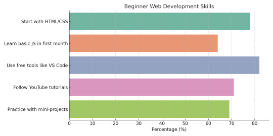
These three tools work together—and the best part? You can start using them in less than an hour. Curious how others start? Here’s what most beginners do first when learning web development:
Tools You Already Have (and Free Ones to Try!)
You don’t need expensive software to build a website. In fact, you already have what you need:
Text Editor: Your computer has Notepad (Windows) or TextEdit (Mac). But free editors like VS Code or Sublime Text offer more helpful features for beginners.
Web Browser: Chrome, Firefox, or Safari will work perfectly for viewing your site and testing changes.
Free Learning Platforms: Websites like freeCodeCamp, W3Schools, and MDN Web Docs are loaded with beginner-friendly tutorials.
The key is not to overthink it. Pick a tool and get comfortable. You’ll learn faster by doing.
Create Your First Web Page (Yes, You Can!)
Here’s the moment you take the leap.
Step 1: Choose Your Text Editor
Open VS Code or Notepad. Create a new file called index.html.
Step 2: Add Basic HTML
Copy and paste this into your file:
<!DOCTYPE html>
<html>
<head>
<title>My First Web Page</title>
</head>
<body>
<h1>Hello, world! </h1>
<p>Welcome to my very first website. </p>
</body>
</html>
Save it. Then double-click the file to open it in your browser. Boom—you’ve made a website.
Step 3: Add Some Style
Now create a file called style.css and link it in your HTML like this:
<head>
<link rel="stylesheet" href="style.css">
</head>
In style.css, add this:
body {
font-family: Arial, sans-serif;
background-color: #f4f4f4;
text-align: center;
}
Step 4: A Touch of JavaScript
Create a script.js file and link it just before the </body> tag:
<script src="script.js"></script>
In script.js, try:
alert ("Thanks for visiting!");
You’ve just built a functioning, styled web page—with interaction.
Now What? Where to Go After Your First Page
So, you’ve built a page. What’s next?
Learn to Code at Your Own Pace
Start small with mini projects—like a to-do list or digital business card. Use platforms like CodePen, Replit, or Glitch to experiment online.
Understand Domains and Hosting
To make your website public, you’ll need:
A domain name (yourwebsite.com)
A hosting provider (like Bluehost, Netlify, or GitHub Pages)
Many beginners start with GitHub Pages because it’s free and doesn’t require advanced setup.
Try a CMS Like WordPress
If you want to build more without coding, platforms like WordPress or Wix let you design websites visually while still learning the ropes underneath.
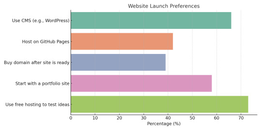
Wondering where to host or what platform to use next? Here’s what most first-time web builders decide:
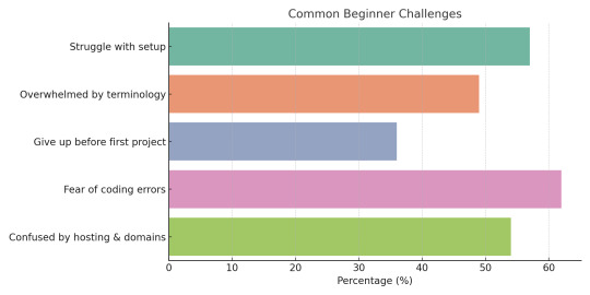
Common Mistakes Beginners Make—and How to Avoid Them
Learning web development comes with a few bumps. Here are some common hurdles—and how to overcome them:
Overcomplicating too early Stick with HTML, CSS, and small JavaScript snippets until you’re comfortable.
Trying to learn everything at once Master one concept at a time. You don’t need to learn React or server-side code right away.
Ignoring practice Build small things regularly. Progress doesn’t come from watching videos—it comes from doing.
Giving up on errors Mistakes are part of the process. Use Google and developer communities like Stack Overflow to find answers.
You're not alone. Here’s a look at the most common roadblocks new web developers face—so you know what to expect (and how to beat them):
Additional Resources:
Will Web Development Die in 10 Years? Here’s Why the Answer is No
Your Next Website Might Live in Your Glasses: The Rise of AR-Ready Web Design
The Cost of a Slow Website: Speed vs. Bottom Line
Affordable Website Design: A Startup’s Guide to Building a Strong Online Presence
Beginner Questions About Web Development, Answered Simply
1. Do I need to know coding to build a website?
No! Platforms like WordPress allow for visual building. But learning a bit of HTML and CSS gives you way more control.
2. How long does it take to build a basic site?
In a few hours, you can have a simple site with your name, info, and photos. With practice, you’ll get faster.
3. Is web development expensive to start?
Not at all. Most tools are free. You can learn and build for $0. When ready, domains and hosting cost under $100/year.
4. What’s the best language to start with?
Start with HTML and CSS. Then add JavaScript for interaction. That trio forms the front-end foundation.
5. Can I build a site on my phone?
It’s possible, but clunky. A computer makes editing easier and gives access to better tools.
6. What’s the difference between a website and a blog?
A website is a broad term—blogs are just one type. A blog focuses on articles; a site can do much more.
7. Will I need to update my website often?
That depends on the purpose. A portfolio may stay static. A business site should be updated regularly to stay relevant.
Final Thoughts: You’ve Already Started
If you’ve read this far, you’re no longer “thinking” about building a website—you’ve already started. You’ve seen how websites are made, tried a few simple lines of code, and explored where to go next.
The digital world isn’t closed off to non-coders. With the right mindset and resources, you can absolutely build something real, useful, and even beautiful. Start small, stay consistent, and don’t be afraid to experiment.
Who knows—today it’s a personal page. Tomorrow, it could be your business, your brand, or your new career.
“Bio:Maede is a content curator at UnlimitedExposure, a company dedicated to providing a wide range of digital marketing resources. Their expertly curated content helps both beginners and seasoned professionals stay ahead of industry trends. Whether you need beginner-friendly tutorials or in-depth analyses, UnlimitedExposure equips you with the knowledge to grow and succeed in today’s fast-paced digital world. Explore their collection to enhance your skills and stay competitive.
UnlimitedExposure Online is also recognized an Website Design Agency Toronto”
#web development services near me#web development firm#web development toronto#web development company#web development#Website Design Agency Toronto#Learn Web Design#Mississauga#Scarborough
0 notes